
Chapter 4
User Interface Design for iOS Devices
“Simplicity is the ultimate sophistication”
—Leonardo da Vinci
The user interface design phase is one of the most important stages of your entire project. The user interface is the foundation of everything in your WebApp: content, functions, and all types of services are all accessed through the elements that compose your user interface.
In this chapter, we define what an interface is inside a touch-screen ecosystem. We explore the concept of positive and negative space as it comes into play in the user interface design phase and see how the rule of perceptions helps us to conceptualize our interface design in our minds.
We discuss color psychology theory, suggesting how you can combine colors in an effective and pleasing way, and look at how colors affect the user's mood. Then we examine user reading patterns and see how you can influence them with your interface design.
In the last part of this chapter, we examine the user interface design process through all its phases and then we implement it in three different projects: one compatible with iPad, one with a native-like structure specific to iPad, and one with a native-like structure only for the iPhone.
User Interface Design
Most designers place simplicity above all else, and so do we. We value simple things, because they easily do all the things we need and none of the things we don't. Simplicity is harmonious. Leonardo da Vinci is quoted as saying, “simplicity is the ultimate sophistication.”You should always keep this quote in mind when you sit in front of your computer to design your user interfaces. To be simple is to be elegant.
Over the years, we have seen how Apple style has changed, evolving its own interpretation of “simplicity,”. In Figure 4–1, you can see how the surrounding world has been influenced by this style.

Figure 4–1. Different brand, same style: Apple (left) and Palm (right).
Palm is a big company that has changed the way of marketing its brand following the path blazed by Apple. Even the most recent ads of other companies, like Microsoft, are inspired by this way of thinking. Simplicity is quickly becoming the foundation of the new technology revolution, which is based on a touch-screen display.
Having completed the Analysis phase in step 0 of our project flow, we pass to the Design phase in step 1. In this phase, we start to work on our interface. As we can see from Figure 4–2, the user interface design is a sub-step of the entire Design phase and everything that is designed and approved in this phase is developed in the next phase of the project flow called “Implementation.”
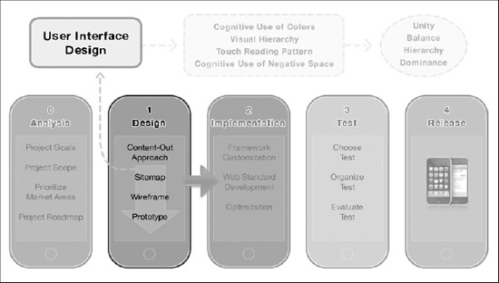
Figure 4–2. The user interface design phase in the project flow context
The user interface design process that isexamined in this chapter is based on simplicity. After introducing some important subjects, such as negative and positive space, active and passive space, the theory behind color psychology, and reading patterns, we discuss how to go from the first step of compatibility, the compatible WebApp, to the full compatible native-like approach.
Before we start, we need to introduce an important new concept: what does the word “interface” really mean in the touch-screen ecosystem? Let's take a look at that now.
What Is an Interface?
As designers, you are familiar with the concept of user interface, but there are many kinds of interfaces all around us. Anytime we have an object we want to control or interact with, there is some kind of interfacebetween this object and ourselves. The interface gives us a simple method to achieve our goal.
DEFINITION: Interface
Point of Interaction between two systems.
Visual part of a computer application or operating system through which a user interacts with a computer or software.
With a device like the iPhone or the iPad, we have two kinds of interfaces, as shown in Figure 4–3:
- Software interface
- Hardware interface
iOS offers us some different software interfaces, and each different iPhone view has its own particular type. An address book style view uses the typical list approach interface with edge-to-edge links, the About Us style view might use a rounded rectangle approach.

Figure 4–3. The types of iPhone's interfaces: software interface (left) and hardware interface (right).
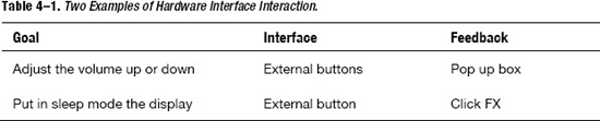
Beneath the software interfaces, we have a more primitive layer of interaction offered by the hardware interfaces. These software and hardware interfaces enable the user to interact with every aspect of the device. Using the hardware interface shown in Table 4–1, you can adjust the mic and speaker volume, turn the device on and off, and, with the touch-screen, use all the software interfaces offered by the operating system.
When we use any kind of mobile software on iOS devices, we also use the touch screen to perform the interaction. The display in our touch-screen context is also a hardware interface. This is an important point because it leads us straight to a new kind of paradigm that we have never seen before with the classic desktop or with the old mobile phone approach: everything is an interface.
Everything Is an Interface
What do we mean by this? With these words, we refer to iOS, in whichevery part in your software becomes an interface because of its touch-screen capabilities. In this chapter, we see how to design every WebApp part that is technically touchable and not just the “classic interface” used in the past by the desktop paradigm.
Using the touch screen, you can zoom, pinch, scroll, and do other gestural movements. These gestures enable the user to interact with all objects contained in the entire viewport—in other words, with all visible parts of our WebApp. Figure 4–4 shows how, with a touch-screen device, even the content must be treated as an interface, which is a passive interface in this case.
Figure 4–4. The kind of iPhone's interfaces: active interface (left) and passive interface (right).
In the classic navigation paradigm, when you use a mouse (or a stick in older mobile phones), you typically point to or choose only linkable parts of a WebApp. Nobody attempts to click in a dead-zone with the expectation that some action will occur.
NOTE: The word dead-zonerefers to a non-clickable zone inside the layout. Because it's non-clickable, a dead-zone part of a layout doesn't offer any level of interaction to the user.
Once you have understood this important concept, you can appreciate that every part of your interface, and every part of your WebApp, needs to be designed with care.
From now on, we will use active interface for the touchable or clickable part of our interface, and we will use passive interface for the merely touchable (zoomable) parts of our layout. Remember that the active interface is based on software capability (links) and the passive interface is based on hardware capability (touch-screen display). In Figure 4–4, you can see the active and passive interfaces in an iPhone and iPad“compatible” website.
As designers, being aware of this concept dramatically improves your design skills and raises the level of user experience offered by your project.
The new touch paradigm also changes the requirements of your interfaces and layouts, so the question now is, how should you design your touch interface and layout with this in mind?
Your touch interface and layout design is based on:
- A Cognitive Use of Colors
Moods obtained using color reinforces the brand message. - A New Visual Hierarchy
Prioritizing interfaces and layouts, optimizing for touch-screen devices. - A New Touch-Screen Reading Pattern Structure
Optimizing the touch-screen UX in both native-like and compatible projects. - A Cognitive Use of Passive and Active Negative Space
Both active and negative spaces are based on the laws of perception.
Now that you know the tools to use, the question is, “What do you want to achieve using these tools?”
In designing your interface and layout, you should strive for:
- Unity
Create harmony between the interface and the layout elements. - Balance
Create a visual equilibrium using the interface and the layout elements. - Hierarchy
Prioritize the interface and the layout elements. - Dominance
Create focal points on the interface and the layout elements.
All of these are important to understand as concepts. But being aware of them, recognizing them, and using them in your design is another matter altogether and requires practice.
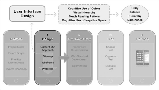
Figure 4–5. The tools and the goals in the user interface design phase.
First, we introduce a fundamental concept for this new touch paradigm: the negative space concept. You see how this simple idea completely changes your design style, and how closely related it is to the touch-screen paradigm.
The Rules of Perception in User Interface Design
The rules of perception are fundamental for every kind of designer. These rules are the filters thatare used for interactions in life and are the foundation of our experiences. The role of these rules is to interpret and integrate single stimulus from the external environment into a single continuative form.
When designing interfaces for your Apple device, it is important to be aware of these rules in order to achieve specific goals with your design. Sometimes, you may want to transmit passion, energy, simplicity, or just be minimalist. The rules of perception help you to achieve better results in terms of quality and make the whole process even easier.
The Law of Proximity states that proximal elements in the perceptive field are perceived as a single entity. You can use this rule to create semantically–based groups or entities to the design.
Figure 4–6. Law of Proximity in two-column design.
The Law of Similarity states that similar elements in the perceptive field are perceived as part of the same entity based on its geometry, color, or dimension. You can use this rule to create consistency in design between non-proximal elements.

Figure 4–7. Law of Similarity in Site menu and in product details.
The Law of Continuity states that continual elements in the perceptive field are perceived as joined into a single entity with a pattern and a direction. You can use this rule to create and add visual patterns and connections to the design.
Figure 4–8. Law of Continuity in cover flow design.
The Law of Closure states that some kinds of elements in the perceptive field are perceived as a certain form, even if some visual information is missing. We can use this rule to create visual forms or elements into design where physically it isnot possible. In Figure 4–9, you can see how almost all corners are physically opened (red circles in Figure 4–9), but the mind, using the Law of Closure, fills this information gap andperceives continuative lines (and forms).
Figure 4–9. Law of Closure in layout page design.
The Law of Common Fate states that elements with the same direction in the perceptive field are perceived as a single moving entity. You can use this rule to create movement and add direction to the design.
Figure 4–10. Law of Common Fate in spotlight design.
The Law of Figure Ground Relationship states that Elements in the perceptive field are perceived as the union of its form with its background. You can use this rule to create connection between single elements, create dominance, and add contrast into design.
Figure 4–11. Law of Figure Ground Relationship in logo design.
The Law of Past Experience states that elements in the perceptive field are perceived in accordance with our past experience and its meanings. Past experience is stored in long-term memory and current experience is compared to already stored information. An example is shown in Figure 4–12. The word is not complete but, according to the Law of Past Experience, you are able to determine that the correct word is“iPhone4.”You can use this rule to optimize every kind of visual perception related with the design and its userexperience.

Figure 4–12. Law of Past Experience in logo design
Negative Space
In Chapter 3, we began to understand why space in your interface and layout is such an important consideration. Users perform actions using their fingers and need more physical space in order to interact with your interfaces in a comfortable way.
In addition, as youlearned in the previous section, consider that every figure you see is in relationship with a ground. To us as designers, this means that every part of our interface or layout is in close relationship with the space around it. Working with this space, you can dramatically change the emotional effect on the user and change the level of user experience.
For our purposes, negative space, also known as whitespace, can be generally defined as the area of a certain page or interface not occupied by content. For a designer, negative space is the space between specific items on the page and does not have to be white or solid in color; it might contain gradients, patterns, or background objects.
The space around and between the subject or subjects of an image. The negative space might be most evident when the surrounding space, and not the subject itself, forms an interesting or artistically relevant shape. The use of negative space is a key element of artistic composition.
Designing a webpage or a user interface involves taking diverse objects and arranging them in a logical, functional, and attractive manner. The key concept to remember is that the attractiveness of your interface goes well beyond the design elements you use; you must also take into account the aesthetic quality of the negative space surrounding those elements.
The physical space occupied by each element is in relation to all the other items on the page. This physical space has its own rules. These rules, from the simple to the complex, depend on context. They all share the same key-point: they are subject to the influence of negative space.

Figure 4–13. An example of perfect use of negative space in logo design (image Richard Fonteneau).
The first thing you need to learn is how to see negative space in your interface or layout. What you must do is retrain your brain to look not only at the content, but also at the inverse of the content. If you think of an element as the combination of an item and the space around the item itself, your brain, using a process called the Law of Figure Ground, combines both the item and the negative space around it in order to represent the element.
Even though you are now familiar with the concept behind negative space, deciding on the right amount of negative space for your design requires a great deal on visual sensitivity and skill. Basically, the right amount of negative space is dictated by three factors:
- Mood You Want to Obtain
(a portfolio website needs more space than an online magazine) - Quantity of Information to Be Delivered
(because negative space is expensive) - Medium You Are Designing for
(iPhone, iPad, desktop PC, Printer, and so on, might require different amounts)
Before understanding how to manipulate negative space, you need to consider the two kinds that might be important in our design:
- Active Negative Space
(Used to lead the viewer from one element to another) - Passive Negative Space
(Used for creating balance, harmony, and breathing room)
Now, we offer some approaches to help make use of this powerful tool easier.
Passive Negative Space
This kind of negative space is important for obtaining certain moods and to reinforce the message behind your brand. In Figure 4–14, you can see the large amount of passive negative space used on the Apple website. Apple makes extensive use of this technique in order to promote and spread its brand in just the right way. At this point, it's important to remember that effective use of negative space is not just a matter of quantity but one of proper utilization. Sometimes it will be a good idea to add more space, and at other times you will want to eat up some of the empty space in your design.
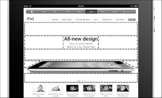
Figure 4–14. The use of passive negative space on the official Apple website.
In order to improve your interface and layout design in this example, you need to analyze the current amount and appropriateness of negative space, and then decide which areas have too much of it and which areas have too little. In the case of the Apple website (Figure 4–14), you can see how lots of solid passive negative space can create a classy, elegant, and upscale vibe.
What else can you achieve with passive negative space?
Create Separate Groups of Content
Youcan use passive negative space to separate different groups or areas of information, less space to separate similar groups, and more space to separate groups that are more different. You also create sub-grouping by the way you configure the quantity of space you use.
Typically, this technique uses both a margin and a padding value on the elements. In Figure 4–15, you can see how the right amount of passive negative space creates separate groups of content, where each piece of content is composed of an image and a textual description.
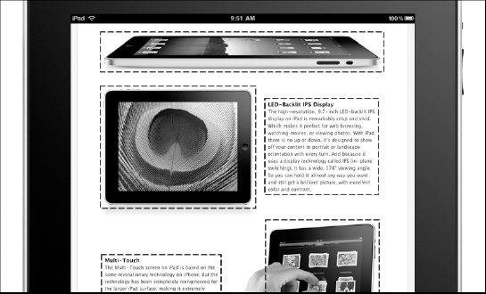
Figure 4–15. The use of negative space to create groups of content and eliminate visual tension.
Eliminate Visual Tension
When a shape is not balanced with other shapes, it suffers aesthetically and the user's cognitive reaction to this unbalanced relationship is a visual tension. Look at Figure 4–16 (and compare it with Figure 4–15) and pay attention where your eyes automatically go when you look at these shapes.

Figure 4–16. An example of visual tension between two groups of content.
Your eyes probably automatically went in the upper-left part of Figure 4–9 where the unbalanced relationship between two groups of content creates a visual tension.
You can use passive negative space to give some rest to the eyes and eliminate visual tension. Typically, this technique uses a margin value between layout elements. You can see an example of how to create separate groups of content in Figure 4–16.
Spotlight an Element
Youcan use passive negative space to spotlight an important element of your interface or layout. A classic example is placing the logo far from the navigation bar (or vice-versa). In this way, you give the element the space it needs to be noticed by the user.
With these techniques, a margin value is typically used between the spotlighted element and the rest of the element's design.
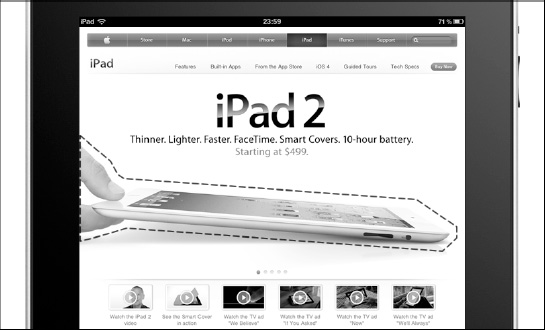
Figure 4–17. The use of negative space to spotlight an element and create dominance.
Create Dominance
You can use the passive negative space to create element dominance inside your interface or layout. Generally, you achieve element dominance using negative space combined with other techniques, but a nice and easy trick to achieve it is to let an element eat another element's negative space. An element that does this tends to stand out, and this technique works even more effectively if the layout or interface elements are equally spaced.
Typically, this technique uses a negative margin value between the dominant element and the adjacent elements. You can achieve the same visual effect without using any margin value and working on the element's perspective and position, as shown in Figure 4–18.
Figure 4–18. A graphic way to achieve element rominance by eating negative space
Improve Reading Experience and Understanding
Youcan use passive negative space to improve the user's reading experience and understanding on-the-go. When the user attempts to operate a mobile device on-the-go, he/she is always struggling to understand its content because of the circumstances and distractions of the busy real world. Achieving the goal of a good reading experience and user comprehension is equally important on both the iPhone and the iPad, but, because its screen is so much smaller, it is especially important to maintain a high quality user experience on the iPhone.
Typically, this technique manipulates not only the size of the characters, but also passive negative space through the use of line-height, word-space, and letter-space value between words and characters. In Figure 4–19, you can see how the use of the line-height property increases readability of the text and gives you more breathing room in the layout.
Figure 4–19. Finger-friendly icons and well-spaced paragraphs.
Offer a High Level of User Experience
Youcan use passive negative space to design touch-friendly interfaces and layouts. In your WebApp, everything is an interface, and because a finger needs more room than a mouse pointer does, the negative space plays a fundamental role. The worst enemy of every interface is the feeling of frustration generated by a non-touch friendly design. This problem is more common in a compatible WebApp than it is in a native-like one, because the framework used for a native-like, interface-based project guarantees a comfortable navigation to the user.
Typically, this technique uses a line-height value for the main content part and a margin value between the groups of elements composing an interface. In Figure 4–11, you can see how the icons are extremely finger friendly for a compatible website. The whole highlighted zone is touchable, and the element has a width of 73px and a line-height of 1.5em. With this kind of structure, it's actually hard to tap in the wrong place.
Active Negative Space
Once you have defined your content using passive negative space, it's time to define a navigation path for the user using active negative space. Active negative space is important for grabbing the attention of and guiding the user in his journey through the content of your WebApp.
By predicting the navigation path of your user, you are able to optimize the content and therefore the user experience. In Figure 4–20, you can see how, in the Apple website, the bold style is used to direct attention to critical points of the content. In this case, the active negative space is the space created by the bold style—in other words, the space that the bold style adds around all the bold characters.
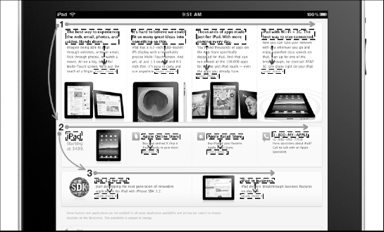
Figure 4–20. The use of negative space and positive space (dashed rectangle) in the official Apple Website.
The active negative space shape creates a path inside the content. In Figure 4–20, you have three different linear paths (from left to right) where the user is free to jump from one to another but always inside the “swim-lines” shaped by the bold characters.
In the final analysis, you can add more room to your composition (interface or layout) to better emphasize or structure the content, and create some sort of path navigation for the user.
A pre-requisite for the active negative space is correct use of the passive negative space, because, if the content complexity is too great, it will be impossible for the user's cognitive process to create any kind of navigation path inside the content. In these cases, the mind is unable to isolate any kind of pattern for deciding how to read thecontent because of the high level of background noise.
Color Psychology
The psychology of color is a complex subject in design theory. The colors you use in your interfaces and layouts significantly impact how the user will perceive your WebApp.
NOTE: As you read in Chapter 2, colors are also fundamental if you want to guarantee a high level of accessibility to your WebApp. When you choose your palette, you must keep this point in mind as much as your brand message.
This book does not cover this aspect in depth, but in order to design simple and effective interfaces, you need to know how to reinforce your message using this powerful tool.
Color can be described in three ways:
- By its name
- By its purity
- By its light/dark value
According to this three-way scheme, some of the terms that are used to describe colors are:
- Hue
The actual color of an object. Green is a hue, as are red, yellow, blue, purple, and so on. - Intensity
The brightness or dullness of a color. Adding white or black to a color lowers its intensity. An intense and highly saturated color has a high chroma. - Saturation
The degree of purity of a hue. Pure hues are highly saturated. When gray is added the color becomes desaturated. - Chroma
The purity of a hue in relation to gray. When there is no shade of gray in a color, a color has a high chroma. Adding shades of gray to a hue reduces its chroma. - Luminance
The measure of the amount of light reflected from a color. Adding white to a hue makes it lighter and increases its value or luminance. Consequently, adding black makes it darker and lowers the value or luminance. - Tone
The result of adding gray to a hue. Shades and tints are tones at the extremes. - Shade
The result of adding black to a hue to produce a darker hue. - Tint
The result of adding white to a hue to produce a lighter hue.
In Figure 4–21, you can observe the Munsell color scheme and see how value, hue, and chroma work together.

Figure 4–21. The Munsell color scheme (image Jacobolus).
HISTORICALNOTE: Albert Henry Munsell (1858-1918) was an American painter, teacher of art, and the inventor of the Munsell color system, an early attempt at creating an accurate system for numerically describing colors.
The colors are typically presented using a wheel where they are divided into two basic groups:
- Warm colors
Red, orange, yellow - Cool colors
Blue, purple, green
Warm colors evoke emotions ranging from feelings of warmth, comfort, and coziness, to anger and aggression. As a rule, cool colors are described as calm and tranquil but can also be associated with sadness or indifference.
Using colors as triggers, you can guide the user in his/her experience, directing his/her attention and creating a visual (reading) path through your content.
How Colors Affect User Mood
It is important to remember that color meanings have their roots in human history, and this means that some meanings are shared by all people in the world, and others are typical of certain cultures and might change over the years.
Despite some differences in color meanings from one culture to another, there are many common factors shared by colors. The most important factor for us is that the user's reaction to color is instantaneous, unconscious, and directly affects his moods. In the following, we present the meaning of all the basic colors in order to help you choose the right one when designingyour user interface.
Blue
This color is seen as trustworthy, dependable, and committed. Blue is the color of the sky and the ocean, and is perceived as a constant of our lives. It invokes rest and causes the body to produce chemicals that are calming. Despite that, not all blues are serene and sedate; electric or brilliant blue becomes dynamic and dramatic.
Blue is the least gender-specific color, having equal appeal to both men and women.
The physical and mental effects are as follows:
- Stimulates calm
- Stimulates cooling
- Encourages and aids intuition
Green
This color occupies more space in the spectrum visible to the human eye. Green is the most pervasive color in the natural world, and natural greens, from forest to lime, are seen as tranquil and refreshing, with a natural balance of cool and warm (blue and yellow) undertones.
The physical and mental effects are as follows:
- Promotes relaxation
- Stimulates smoothing
- Offers a sense of renewal, self-control, and harmony
Yellow
This color shines with optimism, enlightenment, and happiness. Shades of golden yellow carry a positive sense and, in general, optimism, energy, and creativity.
The physical and mental effects are as follows:
- Stimulates mental activity
- Stimulates memory
- Encourages communication
Red
This color has more personal association than any other color. Red is recognized as a stimulant and exciting. The amount of this color directly influences the level of energy perceived. Red draws attention and a keen use of this color as an accent can immediately focus attention on a particular element.
The physical and mental effects are as follows:
- Stimulates energy
- Increases enthusiasm
- Encourages action and confidence
- Offers a sense of protection from fears and anxiety
Orange
This color is a relative of red and is more controversial than any other color in the spectrum. Orange can bring both positive and negative associations and generally elicits a stronger “love it” or “hate it” response from people. Fun and flamboyant orange radiates warmth and energy, and some tones, such as terra cotta, have a broad appeal.
The physical and mental effects are as follows:
- Stimulates creativity
- Stimulates activity and enthusiasm
- Encourages socialization
Purple
This color embodies the balance of red stimulation and blue calm. This dichotomy can cause unrest or uneasiness unless the undertone is clearly defined. At which point, the purple takes on the characteristic of its undertone. Purple gives a sense of mystical and royal qualities, and is often recognized as creative and eccentric.
The physical and mental effects are as follows:
- Stimulates calm
- Encourages creativity
- Offers a sense of spirituality
Brown
This color says stability, reliability, and approachability. Brown is the color of the earth and is associated with all things natural or organic.
The physical and mental effects are as follows:
- Evokes stability
- Gives a feeling of wholesomeness
- Offers a sense of orderliness
White
This color projects purity, cleanliness, and neutrality. White is also related to cleanliness and safety through its association with bright light.
The physical and mental effects are as follows:
- Stimulates and aids mental clarity
- Enables fresh beginnings
- Encourages us to clear clutter or obstacles
- Evokes purification of thoughts or actions
Gray
This color is timeless, practical, and solid. Gray is the color of intellect, knowledge, and wisdom and can mix well with any color, but an overuse can bring a feeling of loss or depression. If used in silver undertones, this color can be associated with a smart and strong character.
The physical and mental effects are as follows:
- Evokes traditionalism and seriousness
- Gives a feeling of expectancy
- Offers a sense of intelligence and wisdom
Black
This color is authoritative and powerful. Black can evoke strong emotions and its overuse can be overwhelming.
The physical and mental effects are as follows:
- Evokes a sense of potential and possibility
- Gives a feeling of inconspicuousness
- Offers a sense of mystery and formality
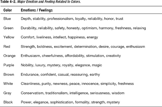
When you design an interface for a website or a web application, it is important to analyze every possible task that the user might want to do when interacting with your user interface. Some tasks work best in a certain environment, whereas others are better accomplished in a totally different one. One example of this might be an online shopping cart, where using too much black in your interfacemight inadvertantly create an ominous feeling of mystery, potentially increasing the percentage of check-out aborts by your users. In Table 4–2, we have a summary of some of the emotions and feelings associated withcolors.
How to Combine the Colors
Once you know the meaning of each color, the obvious question is how do you choose the right colors for your design? The simple answer is that you should always choose one or more colors that reinforce the design message, but what happens if you want to create a palette for your design based on several colors? How can you put together more than one color?
We have three types of patterns to help us create a palette for your design.
Monochromatic Color Scheme
This pattern uses a single color in varying shades (see Figure 4–20). The result is a soothing and pleasing palette that is pleasing to the eye, especially in the blue or green hues.
Analogous Color Scheme
This pattern uses colors that are adjacent to each other on the color wheel.

Figure 4–22. An example of a monochromatic color scheme (left) and analogous color scheme (right).
Complementary Color Scheme
This pattern uses high contrast colors selected from opposite positions on the color wheel (see Figure 4–21). The result is to put together a warm color with a cool color in a way that's pleasing to the eye.
Split Complementary Color Scheme
This pattern uses one color and then two more colors that are adjacent to the complement of the initial color.
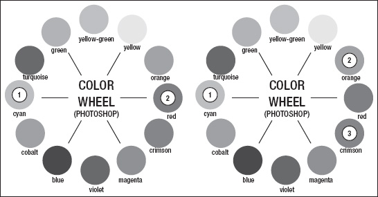
Figure 4–23. An example of a complementary color scheme (left) and split complementary color scheme (right),
Triadic Color Scheme
This pattern uses three colors equally spaced from each other around the color wheel (see Figure 4–22). The result is a harmonious color scheme.
Tetradic Color Scheme
This pattern uses colors at the corner of a rectangle inscribed on the color wheel.
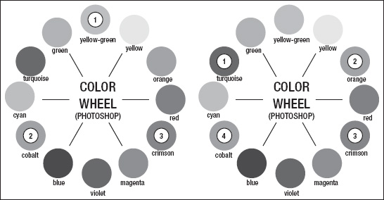
Figure 4–24. An example of a triadic color scheme (left) and tetradic color scheme (right).
Using these six patterns, you can create many palettes based on various kinds of colors. In Figure 4–24, you can see an example of how to choose colors following the triple and complementary color scheme.
At the end of this chapter, we suggest some tools for choosing or generating colors for your palette. However, it's always important to remember what meaning is behind a certain color. In order to be coherent with the brand of your WebApp, you need to choose the rightcolors.
The Interface Hierarchy
The primary role of your active interface is to create a connection between different parts of your content, and, for the passive interface, to give a general structure to your overall content. Beyond that, both active and passive interfaces have a more important role: to guide the user.
Interfaces guide the user through your content. Your interface must also be prioritized because the different parts of your content are prioritized, too. Directing the user through your content is an important goal to keep in mind when you design your user interfaces.
The prioritized content you use for an iPad native-like version is a proper subset of your desktop content and the prioritized content you use for a native-like iPhone version is a proper subset of your iPad content and desktop.
When we introduced the concept of Mobile Information Architecture, you saw how important it is to prioritize content in a mobile device. But how do you prioritize your interfaces when implementing a visual hierarchy?
NOTE: A visual hierarchy is used in page design to help the viewer process information. Visual hierarchy is the order in which most people see and identify your content's elements.
Besides the use of active and negative space previously introduced in this chapter, you will now learnwjat other tools can help you implement a visual hierarchy in your active and passive interfaces.
You can create a hierarchy in your design by adjusting the visual weight of your elements. More visual weight is generally seen as more important and more easily noticed by the user, and less visual weight is seen as less important.
- Size
Larger elements carry more weight and focus the user's attention. - Color
Some colors are perceived as having more weight than others. Red seems to be the heaviest, whereas yellow seems to be the lightest. - Density
Increasing the number of elements in a certain space gives more weight to that space. - Value
A darker object has more weight than a lighter object. The reason why red is perceived as the heaviest color is still unknown. - Negative Space
Using the Law of Perception, you can create many levels of hierarchy.
As you can see from Figure 4–26, hierarchy helps to give order to your active and passive interfaces. Hierarchy priority interfaces with and aids in communication. In Figure 4–26, you can see how much heavier the reading experience is with the hierarchy on the right. This creates extra demands on the user's cognitive resources and results in a less satisfactory user experience.

Figure 4–25 Differences between good content hierarchy (left) and bad content hierarchy (right).
Creating our hierarchy should begin with thoughtful consideration of the page's goal. Only when you intellectically decide on the hierarchy of uour page should you attempt to visually design that hierarchy.
Reading Patterns
The first time we run a usability test on a WebApp, we always receive the results with a surprised face. The fact is the reality that the user reading pattern is totally different from what you expected when you were designing your interface.
In reality, the phrase “reading pattern” is appropriate because users don't actually read pages, they scan them. They skim them looking for words or phrases that catch their eye. Now the question is: why do users do this? We can suggest several answers.
- User Is Usually in a Hurry
The user browsing the web is motivated by the desire to save time, because he knows that the answer is somewhere nearby and his objective is just to discover where he needs to look. - User Knows He/She Doesn't Need to Read Everything
The user knows that most of time he/she will be interested in only a portion of the content offered by a page. For this reason, the user will only look for relevant bits of content and ignore all other parts that he/shedeem as irrelevant. - User Has Learned to Scan Using Other Media in the Past
The user, in past experiences with magazines, newspapers, or books, has learned to scan content in order to find the parts they they're interested in.
NOTE: Reading patterns vary according to the different reading-directions adopted by different cultures. It is important to remember that what we discuss in this section applies only to right-to-left reading cultures.
Despite the fact that users scan content instead of reading it, in the world of left-to-right readers, we can still isolate some reading patterns. These patterns are highly influenced by images that appear in the content but the interesting thing here is that, instead of using a micro or macro linear pattern, the user tends to read using an“F” or a“Z” pattern on our WebApp. This means that we have two different major approaches to content, both based on conventions that the user has adopted during 10 or 20 years or more of content browsing.
Users have been trained to pay attention to certain spots because that's where the most important information usually resides. For this reason, it is important to remember that if we deviate from these conventional patterns in designing our interfaces, we do so at our peril.
The Z-Shaped Pattern
The Z reading pattern is the typical pattern that comes to mind when we think about reading web content. Typically, we start from the left-top position where the logo is situated, and then drop down to the content's first paragraph, where we start the Z movement.
If the user is satisfied with the content after he reads the first line of the paragraph, he will continue reading and jump to the next line of the same paragraph.
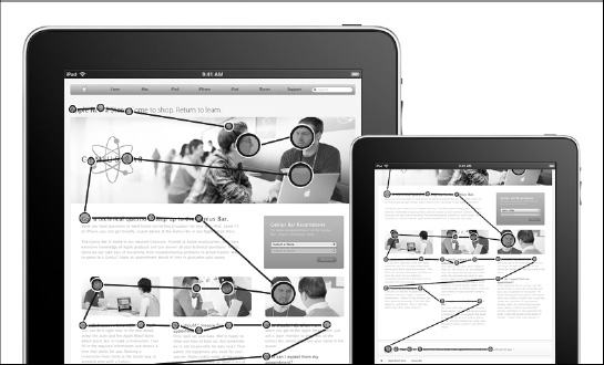
Figure 4–26. The Z-shaped pattern in the Apple Genius Bar page.
The story changes when, after having read the first line of the paragraph, the user decides that the content is not what he was looking for. In this case, the user will jump directly to the first line of the next paragraph or the next portion of content.
This changes the height of each Z sub-pattern and the number of Z sub-patterns that compose the overall Z reading pattern. In Figure 4–27, we can see how the Z pattern changes depending on whether the user is interested in the first line of a paragraph.
Implications of the Z-Shaped Pattern
The Z pattern is closely related to the classic reading pattern from hard-copy newspapers, magazines, or journals, and shares the same implications:
- User Can Jump from One Paragraph to Another
If the user is not interested in the first line of the paragraph, he will jump to the first line of the next paragraph or the next group of content. - User Will Always Look in the Left-Bottom Part of the Pattern
The designer can be assured that the user will look at a certain part of the content, and he can make use of this information by placing some important call-to-action buttons in this zone.
The Z pattern is more common in non-expert users or more generally when a user finds interesting content. Despite the fact that it's generally not the most common pattern, it's important to keep it in mind because the user will tend to switch to this kind of pattern every time he/she finds an interesting bit of content. This means that a user can start with a different pattern and then switch to a Z pattern before returning again to the original one.
The F-Shaped Pattern
The F reading pattern is typically composed of two horizontal stripes followed by a vertical stripe. The F can also stand for fast, because this is the typical pattern used by a user in a hurry-mode.
This pattern is composed of three eye movements:
- The user reads in a horizontal movement across the upper part of the content area. This element forms the F's top bar.
- The user then moves down the page a bit and begins to read across in a shorter second horizontal movement. This element forms the F's lower bar.
- The user scans the content's left side in a vertical movement. This element forms the F's vertical stem.
In this mode, the user's reading patterns are not always composed of exactly three parts and are not always like the letter F, but we can easily recognize the pattern even in its different variations.

Figure 4–27. The F-shaped pattern in the Apple Support page.
Anyone familiar with object-oriented programming can see that the F reading pattern is like the super-class and that different user behaviors are like different implementations of the super class.
Implications of the F-Shaped Pattern
The implications of the F pattern show how important it is to follow a guideline in the design phase in order to optimize the user experience. These implications are as follows:
- User Won't Read the Content thoroughly in a Word-by-Word Manner
Exhaustive reading is rare, especially during Internet research. Some users might read a larger portion of your contents but most won't. - Most Important Information Must Be Stated in the First Two Paragraphs
That's the only way to have some hope that the user will actually read the content. Reading more of the first paragraph probably will drive the user deeper into the content. - Begin Paragraphs with Information-Carrying Words
This is because the stem of the “F” pattern will have less chance of grabbing the user's attention than will the top bar. In this part of the pattern, the user reads only the first words of the paragraph. - Insert the Most Important Links of the User Interface on the Left Side
The F pattern decreases the user attention from left-to-right; links on the far right part of the user interface are less likely to be noticed.
An important factor concerning the F reading pattern is that it might also be influenced by the browsing context. If a user looks for something that contains numbers, a price for example, the F pattern could be transformed in an “E” or a “Comb”pattern.
Images in Reading Patterns
Images are a powerful tool of web design. By using the correct image, you can explain a concept or evoke a feeling and so improve the level of user experience and the likelihood of passing the right message to the user.
A tool can be used in either one of two ways, one good and the other bad. Using the wrong image can waste space in your layout, confusing the user, and breaking his reading pattern without a constructive purpose.
What can really catch the user's attention and draw him to an image? According to the latest research from the Norman Nielsen Group, the images users choose to look at have the following characteristics:
- High Contrast and High Quality
Crisp and colorful. - Cropped rather than Overlay Reduced
When necessary fit a small space. - Easy to Interpret and Almost Iconic
When are not excessively detailed. - Highly Related to the Content
To the content of the page. - Possess Magnetic Features
When an image is full of charisma.
Magnetic features are important in an image, but what kind of image is a magnetic one? Magnetic images include the following:
- Approachable and Smiling Faces
- People Looking at the Camera
- Sexual Anatomy
- Appetizing Food
- Clear Instruction or Information
- Shape Dynamism
In choosing your images, you also need to know what kind of images users ignore. These kinds of images have the following characteristics:
- Low Contrast and Low Quality
- Cold, Fake, or Too Polished
- Busy for the Space
- Generic, or Obvious Stock Art People or Objects
- Not Related to the Content
- Boring
When you use bad images in your layout, the user perceives them as obstacles in his/her journey through the content. They alter the user's reading pattern, absorb an extra amount of their cognitive resources, and generally decrease the quality of his/herexperience.
Influencing the Reading Pattern
The rules about the reading pattern are general ones that are applicable to the majority of situations. The interesting thing is that, in some cases, we can influence the reading pattern using some strong visual hierarchy.
In Figure 4–29, we can see how, in some cases, a strong visual hierarchy can disrupt the user focus and break the “F” or “Z” pattern rule. In this example, everything is intentionally designed to optimize the brand message without compromising the user's reading experience.
The strong visual hierarchy guides the user from the page title, through the image, to the spotlighted page sub-title, and, in the end, to the sub-section of the website. These kinds of design techniques are important for anyone who wants to bring their design skills to the next level, because they can make the difference between a good design and a professional one.
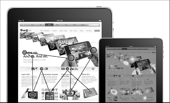
Figure 4–28. The eye-tracking test (left) and the corresponded heat map (right).
As we can see in Figure 4–29 (right), eye-tracking tests are often represented with a heat map. A heat map is a graphical representation of data where the values taken by a variable in a two dimensional table are represented as colors. A heat map adds the third dimension to the eye-tracking test table representing large values with red colors and smaller values with blue colors.
There is also another side of the coin. As Stan Lee has written“with great power there must also come—great responsibility.”This is true because, if a designer is not aware of these rules, he will risk unwittingly altering the reading pattern and compromising the interface hierarchy by incorporating non-essential information on the page. In other words, visitors might leave the page before finding what they were looking for, because they might think it isn't present in the content.
HISTORICAL NOTE: Stan Lee is an American writer, editor, and memoirist, who introduced complex, naturalistic characters, and a thoroughly shared universe into superhero comic books.
DEFINITION: A shared universe is a fictional universe to which more then one writer contributes. (source Wikipedia)
As the final point of this section, we want to point out that these days the user doesn't have an optimized reading pattern for touch-screen devices, at least not for devices with anything bigger than iPhone's 3.5-inch display. The iPad's 9.7-inch display will change the user's browsing habits in the next few years, and so will Safari Mobile's capability to break the vertically–oriented reading flow, which enables the user to jump from one point to another using a double-touch, or by zooming and pinching on the content. This tendency will probably create a new tablet reading flow composed of many micro F and Z reading patterns.
As designers and developers, you need to pay attention to collecting as much feedback as possible. Nowadays, the user is the only source of reliable information for establishing a new approach to designing the next generation of touch-screen user experience.
Reading Pattern Guideline
So far, we have presented the F and Z paths, the most common user reading patterns. We saw how, in some cases, it can be useful to change these patterns in order to achieve specific goals.
Eye-tracking studies have revealed valuable information about how people read and interact with websites and web applications. What we can learn from these studies are some tactics to optimize our interfaces.
These tactics are summarized as follows:
- Logo in the Top-Left Positions Works Best
As we saw in the first part of this section, the user has been trained over the years to look in the upper left part of a page for specific kinds of information, such as brand logos. Only famous brands, well–known throughout the world and recognized immediately by the user, have the option to break this rule. - Tagline under the Logo Improves General Page Understanding
This is related to the previous point. When the user looks at the logo, a tagline underneath gives him a better understanding of the logo and a better chance of understanding the content, and there will be less likelihood of his leaving the page. - Navigation at the Top of the Page Works Best
As primary navigation, a horizontal navigation bar works better than a vertical one on the side. - Headline Must Grab Attention in Less than 1 Second
You need to grab the user attention in a fast way and get to the point instantly. - Headlines Draw User's Eyes before Pictures Do
If you use a strong headline, you can dominate any other influence, even from images. In Figure 4–27, you can see how the headline “iPod Touch” has been reduced to a light weight compared with the image in order to avoid interfering with it. - Pure Reading Patterns Are Appropriate Only “Above the Fold”
Today, scrolling a page is not the source of frustration and confusion that it was in the 90s. Now, with a touch-screen device, the user is able to scroll down a page faster than he/she ever could with a mouse. This means that reading patterns “below the fold” have become much more unpredictable. If your design works because of certain eye movement patterns on the part of the user, you must be sure that every important element of your design is in the first visible part of your WebApp where the user “reads” using a higher degree of focus on the content. - User Often Scans Only the First Few Words of a Headline
This means that long headlines don't work well. In these cases, the user scans the first few words before deciding whether to continue reading. For this reason, it's important to front-load the headlines with the most interesting and provocative words. - People Scan the Left Side of a List of Headlines
This is related to the previous point. When presented with a list of headlines or links, the user will scan down the left side of the list, looking at the first couple of words, to find something he/she is interested in. The user will not necessarily read each line from beginning to end. For the same reason we discussed before, you need to insert the most mind-catching words up front. - Bigger Font Size Improves the User Experience
If the user is not forced to zoom in and out, his/her level of frustration decreases and, inversely proportionally, the user experience is improved. Implementing this approach with an iPhone is not always possible but when designing an iPad-compatible WebApp, this is an important requirement to remember. - Short Paragraphs Encourage Reading
Big blocks of type look imposing and difficult to read. For this reason, it's better to organize the content into a flow of ideas rather than large, distinct paragraphs. - More Negative Space Between Paragraph Helps to Focus User Attention
If a user is searching for something in your content, having “enough” space between paragraphs will suggest a landing point, emphasizing the first line of the following paragraph. - Multimedia Works Better than Text for Unfamiliar or Conceptual Information
Or to put it another way, “one picture is worth a thousand words.” Reading relies on people having some understanding of the subject. The more unfamiliar a user is with a subject, the faster and more easily he/she will understand it if you use a multimedia message instead of text. - Call-to-Action Buttons at the End of the Reading Pattern Work Best
The natural position for a call-to-action button is at the end of a reading pattern. The button could be placed at the end of the content and/or at the end of a single paragraph. - Strong Visual Hierarchy can Influence User Reading Pattern
By adding some weight and dynamics with an image or a headline, we can change the structure of a reading pattern.
Most of these tactics work in both a desktop and mouse context and a touch-screen and finger context because the user is not a variable but a constant in this equation. What is a variable are the hardware interfaces that the user uses to interact with the software interfaces. In the next paragraphs, we will see how this slightly changes the user experience in certain cases.
It is also important, where possible, to continue to design using these conventions and habits in order to offer a smooth transition between a desktop PC–user experience and the new touch-screen user experience. The passage of time and natural human evolution do the rest. Now, we are ready to look at the user interface designprocess.
The User Interface Design Process
This process involves some steps that you have already seen in Chapter 2. You start the process by planning the interface. You sketch its structure and study the level and type of interaction that happen between the user and the interface. You create the aesthetic of the interface, and finally produce a deliverable for the development phase. If you remember the Information Architecture Process presented in the Chapter 2, you will go smoothly through the following phases.
Research
The research phase is too often misunderstood and overlooked; sometimes because we are working with a small budget and sometimes just because it is less tangible than other phases in the process.
Despite that, the fact is that without good research, you can't truly understand the requirements of your interface, or have an idea of what your competitors in the market have done before. Even worse, you won't have a clear idea of what will be the level and type of interaction you want from your interface.
As you previously saw in Chapter 2, the information that is collected in this phase is fundamentally important for the final result, and an error at this point dramatically impacts the entire process.
Structure
Designing the structure of our interfaces, you need to consider two cases:
- Active Interface
Interface based on active links—for example, Navigation Bar - Passive Interface
Interface based on passive negative space—for example, page layout
You start by designing the passive interfaces using the negative space concept to choose which layout areas will be filled with a portion of your content and which will be left blank. As you now know, negative areas are important in our layout for cognitive and interactive reasons.
Once you define the negative and positive space of your layout, you start designing the active interface and sketching its content structure. The tools upi use are a flow chart and then a site map to plan the active interface's content.
In keeping with our content-out approach, once you have a clear idea about the interface's content, you start to organize its visual structure. The visual structure is sketched using wireframes and paper prototypes.
Aesthetic
Onceyou know the structure of your interfaces, you can take a deep breath and keeping in mind the rules of perception, enjoy the next step: designing the interface's aesthetic. This is usually the most satisfying part of the process for every designer. For this step, you use your preferred graphic design program. In the following section, we assume that you're going to use Adobe Fireworks, but the choice is up to you. It's important to remember that working on the aesthetic part of our interfaces means working on both design style and typography.
Interaction
Once the interfaces are structured and designed to your aesthetic satisfaction, you need to work on their interaction with the user. For this phase, use sequence diagrams for developing the use-cases, and electronic prototypes to test them in a real environment. If you need to develop a simple use-case for your interfaces that doesn't have a complex context, and you just want to have an idea of “what the user will do,”you can use use-case diagrams, saving both time and effort. Working on the interface's interaction means working on navigation elements, form elements, audio and video elements, and passive interfaces based on negative space.
Deliverables
When the artistic part of your interaction design work is finished, you need to produce deliverables for the next phase of development. To accomplish this last step of the process, you work on the design composition, electronic prototype, and style guide.
Design Composition
Design composition is the artwork that shows the entire interface, composed of active and passive interfaces. This deliverable is also used to show the client the project's status because it serves as a picture of what will eventually be your WebApp.
Electronic Prototypes
An electronic prototypes is an interactive version of our design based on HTML5, CSS3, and Javascript. We have several frameworks available on the Internet that can help us to develop our electronic prototype without wasting much time. In the last paragraph of this chapter, you will find the tools used in the interface design process.
Style Guides
By designing styleguides, you ensure that the brand will be carried through the next phase of development. Style guides are like page templates where the designer shows how certain sections of the design can be applied to a page, regardless of the variable content.
If you are an independent designer and developer working by yourself, you can skip some of these deliverables, such as design composition or electronic prototypes, but we still suggest that you produce some style guides just in case you ever need to go back to your project at some point in the future. Style guides help you avoid mistakes that might happen because you forget the message, the style, or other details of your project.

Figure 4–29. The mobile information process applied to the interface design process.
As you might notice, we applied the same process that we used in our mobile information architecture process. In fact, the interface design process is a micro-cycle inside the mobile information architecture process and is based on the same pattern.
In the next section, we implement the interface design process, and we design an iPhone and iPad compatible layout for a WebApp.
iPhone and iPad Compatible User Interface Design
For a WebApp to be iPhone and iPad compatible, it must satisfy the first level of Apple device compatibility. As you saw in the Chapter 3, to be iPhone and iPad ready doesn't mean having an HTML5 and CSS3 compliant layout; it means that it is designed in a touch-screen oriented way.
From the standpoint of iPhone development, this problem is less important because, although Safari Mobile has revolutionized the mobile browsing experience in the past three years, a real native-like layout is needed in order to let the user experience an optimized level of interaction with the WebApp. For this reason, if a WebApp is not touch-screen optimized for the iPhone, it's not such a bad thing. The compatible version is not the primary source of information for an iPhone, because a native version of the same layout is also releasedin most cases.
Things change when we get to the iPad because the 9.7-inch display offers a 1024768 pixel resolution. This means that a compatible layout might be a reasonable option in a WebApp mobile strategy. An iPad native-like layout will always offer the best user experience for the user, but for the iPad, a compatible version is still able to offer the next best thing.
Now, let's (re)design a touch-screen oriented version of the official Apple website while making sure to apply all the principles previously presented. The Apple website is well-designed. From an aesthetic point of view, it's impeccable, and we have used it in almost all of our design examples so far, despite the fact that it is not very touch-screen oriented or as cognitively optimized as it could be.
Research
The research phase is based on many techniques, from the simple use of a search engine looking for competitors to advanced market research techniques. In this phase, you use flowcharts and a site map so that you have a visual representation of the content and its deployment.
The research phase aims to understand three points:
- Competitor Comparison
Ascertain how different the actual design is compared with that of your competitors. This is a wide-ranging research task and covers many areas from branding to market projection, comparing everything from offered services to user experience. - Weak Points Research
Identify the weak points in the design structure. - Design's Improvement
Identify ways to improve the actual design.
Working on the Apple website use-case, we left out the competitor comparison because the Apple brand is one of the most beautiful and functional on the market and doesn't need to be improved. In this use-case, we go straight to point 2: Weak Point Research.
It's a different story when we look at things in terms of usability, especially touch-screen usability. The first thing that the Weak Point Research tells us about the Apple website is that its three-column layout structure leaves something to be desired.
This structure consists of a main content area bordered on either side by a narrow sidebar column. The three-column structure was and remains a popular choice for blogs and online stores. Two of the most famous stores in the world are based on this kind of layout: the Apple Store and Amazon.
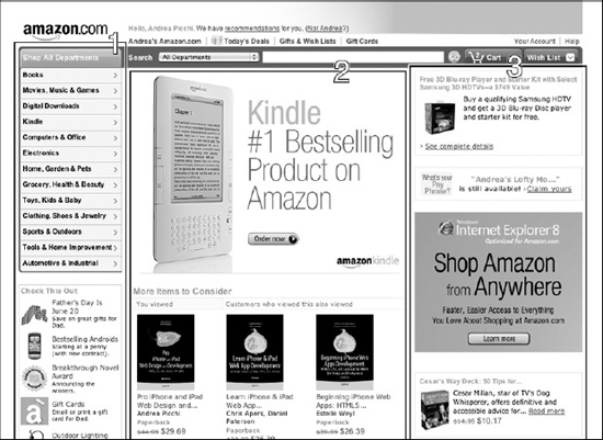
Figure 4–30. The three-columns layout structure used by Amazon.com.
From a logical point of view, the three-column layout might seem like a good choice because it enables us to isolate three different kinds of content. In a blog, there is usually a menu or assorted links related to the website in the left column, and various kinds of advertisements in the one on the right.
In recent years, many blogs have converted their structure to a more functional and usable two-column layout, but the same thing hasn't happened to the majority of online store sites. With the two-column layout, we usually have the main menu and other links related to the website in the left column, and the shopping cart with some promotional banners in the right column.
We can summarize the pros of three-column layout as the following:
- Symmetry Can Be Pleasing
- Three Columns Offer Three Different Content Areas
- Centered Main Content Helps the User to Focus on It
The following are cons of the three-column layout:
- Symmetry Works Against Visual Content Hierarchy
- Symmetry Consumes More Cognitive Resources from the User
- Two Sidebars Introduce Visual Noise, Distracting from Content
- Three-Column Layout Makes the Reading Pattern Unpredictable
In addition to these layout problems, there is also a lack of usability when users need to interact with the active interfaces using a small screen-based device like an iPhone. In this context, the user is often obliged to use the zoom function in order to increase content readability.
Browsing with an iPad is a different story because the iPad user, with his 9.7-inch display, can browse compatible and native-like WebApps equally well. In this case, the user has a high expectation about the usability of both compatible and native-like contents.

Figure 4–31. User must zoom in for have a comfortable touch-interaction with a sidebar's link.
As we suggest in the previous chapter, links must be finger-friendly and touchable without forcing the user to use the zoom function, because the lack of negative space increases the risk of touching the wrong spot. In the Structure phase, we see how to overcome this problem in our current use-case.
Often a report is produced at the end of the Research phase. Usually this report is used to show the client, but it is for our referencein this case. We can summarize the results of our research phase as follows:
- Web Site Information
Apple Store (www.apple.com) - Strong Point
Use of block model page
Use of visual hierarchy
Brand and identity - Weak Points
Three-column layout structure
Most active interfaces are not touch-friendly - Improvement Points
Use of two-column layout structure
Use of passive negative space on active interfaces
Now that we collected all the information, we have a better idea of what works and what doesn't work in our project, and we are ready to move to the next step: the (re)design.
Structure
The research phase tells you everything ou need to know about the design, in that you come to know its weak points and how to improve them. The first step is to sketch the structure using a wireframe technique using two-column layout, but it is important to keep in mind the goal you want to achieve.
The structure phase needs to achieve the following goals:
- Offer a Better Layout Structure
The two-column layout offers a better structure for presenting and finding the content, enabling the user to save his limited cognitive resources for understanding the content instead of looking for it. - Offer a Touch-Friendly Interface
Enable the average user to browse the content without using the zoom function, improving the level of user experience.
In the next section, we see how to approach these goals designing a touch-friendly layout and then working on touch-friendly typography.
Touch-Screen Layout
At this point, you need to keep in mind the strong point of the existing design and keep everything working well in the structure. You should keep the original block structure because it's perfect for any kind of touch-screen device with a zoom function, and working in this way you won't have to alter the passive negative space between each single block of content.
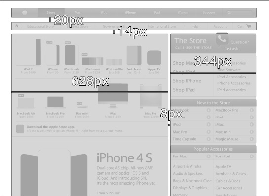
Figure 4–32. The new iPad two-column layout structure based on the old web three-column layout.
In Figure 4–34, we can see how, from top to bottom, we have left untouched the Primary Navigation Bar of 980x38 pixels (Figure 4–34, Number 1) and likewise the space between this bar and the Breadcrumb Bar.
We took the Breadcrumb Bar and, without changing its height of 30 pixels, we transformed it into a Secondary Navigation Bar of 980 pixels (Figure 4–34, Number 2), adding several links to the various Apple Store instances.

Figure 4–33. The new two-column layout structure based on the old three-column layout.
We moved the main content (Figure 4–34, number 3) to the left and kept the 8-pixel gutter we merged the two sidebars in a semantic way. Instead of placing them side by side, we grouped each single sidebar and its content into a single sidebar composed of a two-column box. Using this box, the user can easily find information about the subject at a glance without scrolling down as far as he would have needed to in the old design.
Inside the sidebar, we increased the box header (Figure 4–34, number 7) height from 24 to 32 pixels and the sub-title row (Figure 4–34, number 8) height from 24 to 30 pixels. We also changed the typography inside the sidebar box, which we will discuss next.
Touch-Screen Typography
So faryou have tried to create a more conformable space for user's fingers by increasing various heights in the structure until you reach a minimum height of 30 pixels. As is shown in Chapter 3, we can be pretty safewith a target of 30 pixels, considering the average finger dimensions of our users. If you have the opportunity, you can set a lower-bound of 40 pixels for each single space in our layout, but in this case, it's not possible without introducing the risk of breaking the light visual equilibrium of the design.
From top to bottom, we change the font size in the Primary Navigation Bar (Figure 4–35, number 1), increasing the value from 12 to 14 pixels, and, in the Secondary Navigation Bar (Figure 4–35, number 2), we increase the value from 10 to 12 pixels.
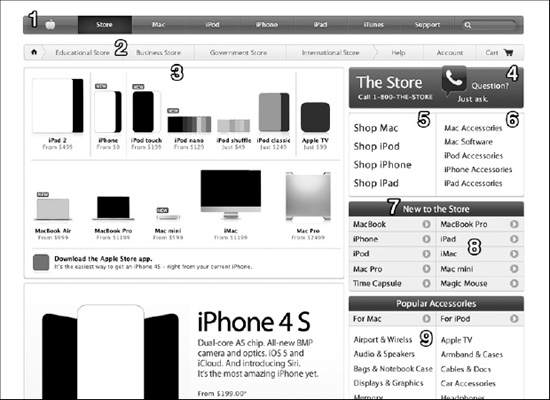
Figure 4–34. The (re)design order of the new two-column layout structure.
In the Sidebar main menu, we change the font side from 14 to 16 pixels and set a line height of 20 pixels for the left column (Figure 4–35, number 5) and a font size of 14 pixels with a line height of 18 pixels for the right column (Figure 4–35, number 6).
In the Sidebar Box Header (Figure 4–35, number 7), we increased the font size from 12 to 14 pixels and the size of the call-to-action circle from 13 to 16 pixels. In the content list part of the sidebar box (Figure 4–35, number 9), we increased the font size value from 10 to 12 pixels and we set the line height to 20 pixels.
Aesthetic
The aesthetic part of the design is almost the same; we want to change a few things so they work better with the new structure.
We integrate the call center icon into the Sidebar Main Header (Figure 4–35, number 4) and we remove the search engine box in order to avoid redundancy in the design after we move the Sidebar Main Header from the left to the right side of the page. In the right part of the (re)design, the sidebar main header is under the Primary Navigation Bar, which already includes its own search engine box.
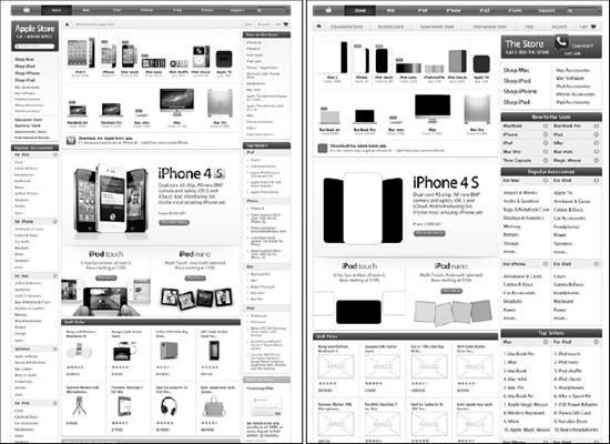
Figure 4–35. The before (left) and after (right) the (re)design. Interfaces are more accessible and finger friendly.
The call center icon in the Sidebar Main Header (Figure 4–35, number 4) uses the same technique we saw in Figure 4–10 for creating dominance in the visual hierarchy and attracting the user's attention. The icon eats some of the negative space between the Sidebar Main Header and the Secondary Navigation Bar.
Interaction
What we have done so far serves to guarantee a touch-friendly interaction that, in most cases, doesn't require any use of the zoom function. Increasing the font size value, resetting the line height values, and increasing the row space in the sidebar enables the user to touch every link without the risk of tapping on the wrong spot. These simple changes have had an enormous impact on the quality of user experience.

Figure 4–36. The (re)designediPad interface now offers the user a conformable touch-interaction.
Once all the interfaces are ready to be tested, you need to develop some use-cases and then implement it using the Sequence diagrams or the Use-Case diagrams if we work with low complexity cases. Figure 4–35 represents an example of a Use-Case diagram for the two use-cases: Buy the New iPhone and Search the New iPhone.
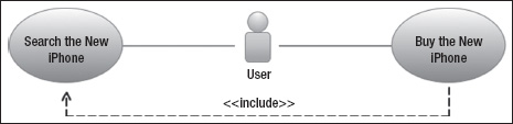
Figure 4–37. An example of UML Use-Case diagram for representing a user interface interaction.
Please note that the user icon is not the standard one. We use this icon for two reasons. The first is because, when possible, we always try not to offend our eyes when we work, and so we avoid the sort of generic “We are a PC” styles that are too often adopted as standard. The second is because these diagrams are exclusively for our own reference, or at least for our small team. If we need to share our diagrams with our teams or when we work for a big company, we must use standard notation.
The next step is to test the use-case/s using an electronic prototype. In order to do that, we need to use an HTML5, CSS3, and Javascript framework. By using electronic prototypes, we can have a realistic idea of the real finger-friendly capabilities of our interfaces. If, for some reason, we must move on in the process without having the time or the budget to do any electronic prototypes tests, we have to be sure to do at least few quick tests with paper prototypes.
Deliverables
When the interaction phase is complete, we need to prepare deliverables for the next phase in the process: the implementation. If you are working by yourselves, deliverables are useful only if you need to get back on the project months after it is released, so that you can remember at a glance important points about your design. When you work in a team, you must be sure that your deliverables “talk for us” and show your design clearly, avoiding any possible doubt in the developer's mind.
As previously explained, you produce three kinds of deliverables: a design composition, a design style guide, and an electronic prototype. The design composition, as the name implies, shows the composition of your design, and the design style guide shows, using templates, how to apply our design to various types of pages. If you have an important message to pass on, you can also analyze, explain, or highlight a specific part of your design, adding notes and description. The electronic prototype shows how the design works in an interactive way. The same prototype is used by us and the developer for the startup phase of implementation.
iPad Native-Like User Interface Design
Designing an iPad version of your website and web application is not as important because you are creating the iPhone version. If the compatible version has a touch-screen optimized structure and offers a high quality user experience, it's most important to first focus your energy on designing an iPhone version of your content.
The iPad's browsing capabilities enables the user to do so with a high level of user experience through any desktop content. Nevertheless, developing a native-like experience for an iPad user should always be your first priority. A native-like structure always offers a higher level of user experience.
You will be seeing many iPad native-like WebApps in the near future, so we suggest that you don't omit this option, but make sure to include it in your project roadmap.
Research
When you perform the research phase for the compatible version, you are working on all our planned versions simultaneously. This is because we reuse our research results for our other iPad versions and later for the iPhone research step. In this way, we optimize the budget, saving money and time, and amortize a fixed cost in our process.
Market research tells us which portion of our content to insert in our iPad version and which is better left exclusively for the compatible version.
Structure
Whenyou work on the native-like version of your site or application, you can't redesign the structure as you previously did in the compatible version. The compatible version was focused on improving the structure in order to offer a finger-friendly user experience. Here, the emphasis is on how to prioritize the content with respect to the native-like structure.
How to prioritize your content is a choice that relies on market research and is not up to the designer. When the research phase has determined which part of the content to include and which parts to leave for the desktop version, only then can you start to organize the native-like layout.
Compared with an iPhone native-like version, the iPad native-like version can offer a large portion of the desktop content, and it can include all of itin some cases. When that happens, our job is simply to give it a native-like and optimized structure, without having to cut anything.

Figure 4–38. The iPad native two-column layout structure and its (re)design order.
As seen in Figure 4–39, from top to bottom and left to right, you insert the Store menu (Figure 4–39, number 1) in the top position in order to enable the user to choose a contextualized path from his/her first touch.
Just below that, we insert the option to change the store and its configuration (Figure 4–39, number2), and then we insert the option to directly access service support (Figure 4–39, number3).
The main content, which is not related to the links in the sidebar, shows the hero image (Figure 4–39, number4) and, below that, all of the entry level products (Figure 4–39, number5) with a link to their specific pages. This zone is exactly the same as the compatible and original designs, because it is the most finger-friendly part of the entire site.
Aesthetic
The iPad native-like structure offers a lot of space in the content column. The main goal is to be consistent with a strong brand aesthetic and to be able to offer it with an optimized structure. In the iPad version, it's easy because we just need to scale it to the content column size and the work will be done. This time the room offered by the 9.7-inch iPad display made our job easy.
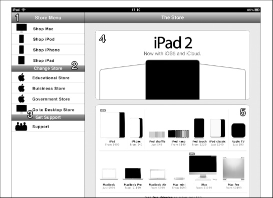
Figure 4–39. The iPad native-like (re)design of our Apple Store use-case.
From top to bottom in the content column (Figure 4–40, number 4), you insert the hero image, which in the compatible version played the role of an intro page. As we said, the style is exactly the same as what you saw in the original and compatible versions.
Below the hero image, you insert the entry level product box. Every product has its entire visible area touchable, and it is just like inserting another menu in the content column. In this way, we can insert just the essential entries in the Store menu (Figure 4–40, number1), reducing the cognitive noise in the user experience.
Interaction
What you need to do in this phase is test the consistency of your interfaces and see whether the user using these interfaces is able to access the specific content that he/she is looking for. We can set up some preliminary tests based on the most important use-cases for checking the user interface consistency and the quality of the user experience.

Figure 4–40. The (re)designed iPad native-like interface offer is now the highest level of user experience.
The big advantage to using a native-like structure is that you have a solid foundation for your content. Nevertheless, that doesn't prevent us from inserting the wrong content, the wrong links, or using the wrong typography. We must pay attention to these details, because they are exactly what we test for in this phase.
Deliverables
At the end of the process, you need to produce the same deliverables as you did for the compatible version based on design composition, style guide, and electronic prototype.
iPhone Native-Like User Interface Design
An iPhone native-like interface is the only way to offer a quality user experience, because a native-like interface is the only solution that optimizes the use of the 3.5-inch built-in iPhone display. Unfortunately, the Apple Store offers an incredible amount of content and so prioritizing forces us to make some tough decisions in this example.
When you prioritize the content, as you must do in every mobile WebApp, you are forced to cut some important parts. This is the main reason why an iPhone version of the Apple website has not yet been developed as of this writing. What you can do is prioritize its content and offer a link to the desktop version of the site if the user is looking for something that is not offered by the iPhone version.
Research
What was said about the research phase in the iPad process still appliesfor the compatible version. In the iPhone interface design process, the research phase even more pressingly needs to address the problem of prioritizing content. We use only the most important content, like we did with the iPad version, and we might even change the presentation order.
Once the market research has told you which portion of your content will be included in your iPhone version, it's time to move on to the next step of the process.
Structure
Working on the iPhone native-like version, exactly as was done with the iPad native-like version, we can't change the structure because that structure is the strength of the native-like solution. As you saw in Chapter 2, the iPhone adopts a structure called “iPhone Page Model.”
The structure phase aims to achieve the following goals:
- Apply the Original Brand to the iPhone Page Model
It is important to develop a connection between the compatible and the iPhone versions, ensuring that the brand is carried across the design. - Offer the Prioritized Part of Contents
If we want to retain a high quality user experience, you can't insert all your content in the iPhone page model. You need to prioritize the content and choose the most important parts to include and leave the rest exclusively for the compatible version. - Use an Appropriate Link Structure
The right link structure enables the user to access your content in a comfortable way, even if there is a large quantity of information. - Provide Orientation to the User
In a mobile context, it's easy for the user to lose his orientation inside our site map, and this probability is even greater when there is a lot of content.
What you do, to an even greater extent than you did in the iPad native-like version, is to prioritize your content for the native-like structure. This time, only the most crucial elements of the content will be available to the user. A link to the desktop version guides him/her to the other parts if needed.
NOTE: We always try to avoid deep mobile site maps because the (mobile) user can easily lose his orientation. When for some reason, you have no choice, it is important to use an appropriate navigation structure and to show clearly the navigation path using a breadcrumb or other technique as described in the Chapter 2.
Starting from top to bottom, we find the Branding area (Figure 4–43, number 1) and inside this area, we design the breadcrumb in order to provide orientation to the user. Semantically speaking, the Branding area also contains the part below, called the “hero image” (Figure 4–41, number 2). The hero image visually represents the main message of the page and changes to one of the other images each time the user loads the page. In this case, you have three hero images available.
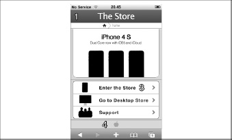
Figure 4–41. The iPhone native-like one-column layout structure and its (re)design order.
Below the Branding area, you design the Content area, adopting edge-to-edge navigation (Figure 4–41, number 3) with only three basic options. Because the iPhone version is loaded automatically, you need to give the user the ability to switch back to the compatible version, or if he/she needs it, direct access to the support page. In case the user needs to enter the store, he can touch the first link and the store homepage will load.
NOTE: In modern web design, you always try to avoid intro pages but in this case we keep the structure of the original design that offers a big visual message using an introductory page.
At the end of the page, you have the Site Information part. You use the same approach used by Apple in mobile pages, like MobileMe with a minimalist approach, inserting only the Apple logo without any kind of supplementary information.
Aesthetic
When we work on a mobile version of a site like the Apple Store with a strong brand and a lot of sexy visual appeal and great design, the aesthetic phase becomes the easiest part of the job. In these cases, what we need to do is just keep the look-and-feel of the desktop site and adapt it for the smaller screen without ruining it.
The (layout) rules in a native-like version are even more strict than those in the iPad version. Here there is little room for fancy design but the laws of perception still help us to offer your user a better visual hierarchy and a pleasant look.
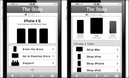
Figure 4–42. The iPhone native-like (re)design of our Apple Store use-case.
The Branding area keeps the style of the Sidebar Main Header (Figure 4–35, number 4) designed for the iPad compatible version with the breadcrumb sitting below that. We always insert the hero imagein the Branding area. Below that, we apply the same style to the Content area.
Usually, designers don't use too much space to display an image in an iPhone version because the limited available room in a 3.5-inch display is often perceived as a problem to solve instead of an opportunity. With this (re)design, we want to break this rule and we are happy to report that the latest (native) application called Apple Store and developed by Apple uses the same approach.
Interaction
If the Aesthetic phase is limited by the strict layout rules of the native-like structure, the same rules make it much easier to work on the Interaction phase because they offer some standard structures that have been specially developed to enable the user to have a comfortable interaction with the mobile device.
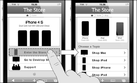
Figure 4–43. The (re)designed iPhone native-like interface offer now the highest level of user experience.
Exactly as we did for the iPad version, we just need to test the right use of the interfaces offered by the native-like environment. If the user touches a link intending to access a specific piece of information and is successful, this means that your interface works correctly and you did a good job. If this doesn't work, you can try inserting different interface parts, as you might with pieces in a jigsaw puzzle, until everything works correctly (at least inside the test context) and you have created a semantically correct structure.
Deliverable
At the end of the process, if you created compatible iPad and iPhone versionsin your project, you might have the option of sending all the deliverables together to the developer team but this is possible only when working on small projects. For a larger project, and where possible, it is always preferable to create some sort of parallel workflow between the different parts of the team.
Tools for User Interface Design
Tools used in this chapter are both application and web application types. Table 4–3 lists some of the useful tools that you can use for designing your next userinterfaces.
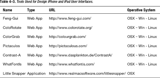
Summary
In this chapter, we introduced the interface design process. You saw that designing for a touch device means having a different approach to the interface design concept because of the zoom function that every device offers to the user, so that everything becomes touchable and everything becomes an interface.
We introduced a new concept, defining what active and passive interfaces are in a touch-screen design process, and learning how we can use them for optimizing the structure inside our WebApp.
Following this new approach, we also explored the use of active and passive negative space, the foundation of color psychology, and how colors affect users' moods.
We introduced the visual hierarchy concept, the most common user reading patterns, and discussed how to use a strong visual hierarchy to influence those patterns and achieve specific goals in your design.
In the second part, we worked on a compatible design using the Apple Store use-case. We presented the use of negative space and touch-oriented typography to optimize the user experience of a desktop-based website for Apple's tablet and its 9.7-inch display. In the third part, we used the same approach but oriented to an iPad native version of our Apple Store use-case. Always following the same interface design process, we designed an iPhone version of the Apple Store websitein the fourth part.