
Chapter 7
Advanced Report Design
What's in this chapter?
Adding report and page headers and footers
Using aggregate functions
Adding group totals
Creating report templates
Creating composite reports
Embedded formatting
Designing master/detail reports
Designing subreports
Navigating reports and using actions
Reporting on recursive data
The real power behind Reporting Services is its ability to creatively use data groups and combinations of report items and data regions. You can add calculations and conditional formatting by using simple programming code. Whether you are an application developer or a business report designer, this chapter contains important information to help you design reports to meet your users' requirements and to raise the bar with compelling report features.
This chapter covers the following topics:
- Advanced data grouping features
- Headers and aggregation
- Lists and data regions
- Links and drill-through reports
- Using custom code to extend formatting and apply business logic
- Advanced charting features
Headers and Footers
Page headers and footers can be configured so that they are displayed and printed on all pages or omitted from the first and/or last page. Unlike many other reporting tools, there is no designated report header or footer. This is because the report body acts as a header or footer, depending on where you place data region items. If you were to place a table an inch below the top of the report body, this would give you a report header 1 inch tall. And because there is no set limit to the number of data regions or other items you can add to a report (and you can force page breaks at any location), all the space above, below, and between these items is essentially header and footer space.
You have a lot of flexibility when displaying header and footer content. In addition to the standard report and page headers and footers, data region sections can be repeated on each page, creating additional page header and footer content. Figure 7.1 shows a table report with each of the header and footer areas labeled.

To make this report easier to view, I've shortened the page height on this report to 5 inches. Figure 7.2 shows the first rendered page of this report.

Note the page header containing the date at the top of this page, the repeated table header, and the table footer showing the continuation of the CategoryName group and then the page footer with the page number and page count.
In earlier versions of Reporting Services, you were restricted from placing fields in the page headers and footers. These areas were added to the final report output after the data was processed and before the rendering extension applied pagination. This restriction is no longer in place. As you can see, I am referring to the CalendarYear field in the page footer. You also have access to several resources, such as global variables, parameters, and report items.
The following are the steps used to design this report if you want to build it from scratch. The report in Design view is shown in Figure 7.3. You can also review the finished report in the Chapter 7 sample project and follow these steps to review the design:

SELECT * FROM vResellerSalesProdTerrDate


The rest of the table design is up to you. Set the Format properties for the SalesAmt and OrderQty columns, as we did in Chapter 4. Change the font weight, background color, and add borders to the table rows and cells to suit your taste. Rather than giving specific directions, I encourage you to experiment with these attributes to find the best presentation. You can refer to Figure 7.3 or look at the finished report from the book downloads to match the style and formatting. I used a combination of LightBlue and LightSteelBlue for the table header and group total row background colors.
The CalendarYear range I added to the left side of the page footer is an example that we will cover in greater detail later. You can omit this for now. You can add a variety of expressions and text to a page header or footer. Expressions and custom code are covered at length in Chapter 21.
Aggregate Functions and Totals
So far you've seen that if you drop a numeric field into a group or table footer cell, an expression is added applying the SUM() aggregate function. The Designer assumes that you will want to sum these values, but this function can be replaced with one of several others.
Reporting Services supports several aggregate functions, similar to those supported by the T-SQL query language (see Table 7.1). Each aggregate function accepts one or two arguments. The first is the field reference or expression to aggregate. The second, optional argument is the name of a dataset, report item, or group name to indicate the scope of the aggregation. If not provided, the scope of the current data region or group is assumed. For example, suppose a table contains two nested groups based on the Category and Subcategory fields. If you were to drag the SalesAmount field into the Subcategory group footer, the SUM(SalesAmount) expression would return the sum of all SalesAmount values within the scope of each distinct Subcategory group range.
| Function | Description |
| AVG() | The average of all non-null values. |
| COUNT() | The count of values. |
| COUNTDISTINCT() | The count of distinct values. |
| COUNTROWS() | The count of all rows. |
| FIRST() | Returns the first value for a range of values. |
| LAST() | Returns the last value for a range of values. |
| MAX() | Returns the greatest value for a range of values. |
| MIN() | Returns the least value for a range of values. |
| STDEV() | Returns the standard deviation. |
| STDEVP() | Returns the population standard deviation. |
| SUM() | Returns a sum of all values. |
| VAR() | Returns the variance of all values. |
| VARP() | Returns the population variance of all values. |
In addition to the aggregate functions, some special-purpose functions behave in a similar way to aggregates but have special features for reports, as shown in Table 7.2.
| Function | Description |
| LEVEL() | Returns an integer value for the group level within a recursive hierarchy. The group name is required. |
| ROWNUMBER() | Returns the row number for a group or range. |
| RUNNINGVALUE() | Returns an accumulative aggregation up to this row. |
Examples of aggregate function expressions and recursive levels are found in the following sections for table and matrix report items. Refer to Chapter 21 to learn more about expressions and custom code.
Adding Totals to a Table or Matrix Report
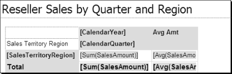
Because the matrix and table data regions are both based on the tablix data region, design techniques work the same way for both of these report types. Adding a total to a row group adds a new row that applies an aggregate function to all the members of that group. The same applies to a total added to a matrix column group. If you think about this, you're actually adding a total that applies to the parent of the group. Consider this example: Suppose columns are grouped by quarter and then by year. If you were to add a total to the Quarter column group, the total would be for all the quarters adding into the year. This means that a total applied to the topmost group will always return the grand total for all records in the data region. We've included a report with the samples to help make this point. Figure 7.8 shows a simple example.
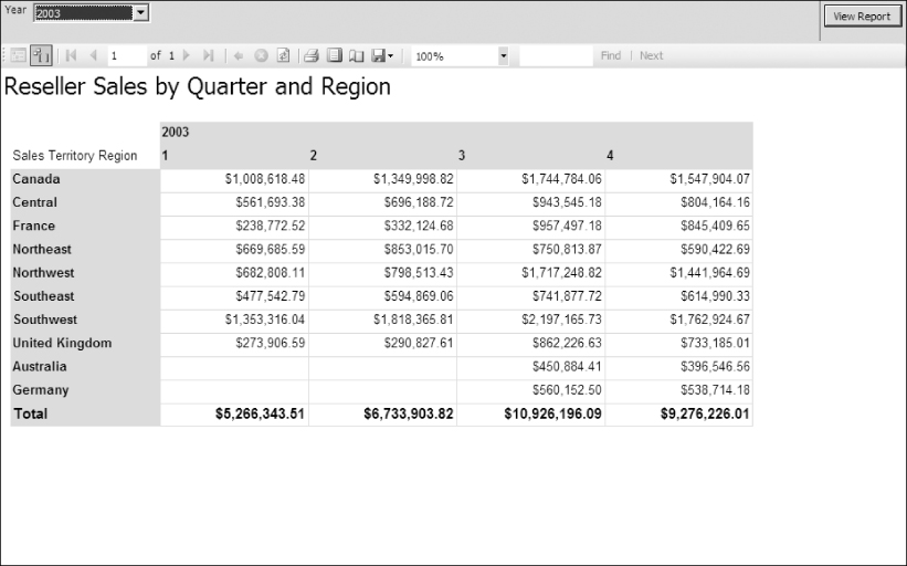
Adding a total to a group displays total values for all fields in the data area of the matrix. Because this matrix contains only the SalesAmount field, this is the value that is totaled. If the objective is to define a total for all CalendarYear group values (the top-level column group), this will essentially be a grand total for all rows. Defining a total for a group at a lower level would create a subtotal break. Totals can be placed before or after group values. For a column group, adding totals after the group inserts a total column to the right of the group. Inserting a total before the group places totals to the left of the group columns.
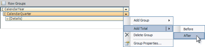
In the earlier exercise, you added a total to the row group. Totals can also be added using the right-click menu for a group header cell. Figure 7.9 shows how this is done for a matrix column group header.
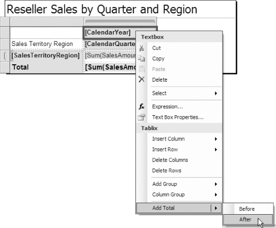
The new column is added to the right of the CalendarYear and the associated cells. By default, group totals are aggregated like the data cells in the same group, using a sum in this case. Because each total cell has its own expression, different aggregate functions can be used in each cell or total. For example, the expression [Sum(SalesAmount)] could be modified to use the AVG() function. In Figure 7.10, detail cells are summed, and the column total cells are averaged. Figure 7.11 previews the report after this design change.

Groups, headers, footers, and totals are all related design elements that can take a simple report to the next level and provide significant value. In the book download samples, we've included another version of this report for you to analyze. It demonstrates a more complex matrix report with row and column totals at a few more levels.
Groups are an essential design concept and a number of more advanced capabilities have been added as Reporting Services has evolved through newer versions. At the group level, you can now conditionally control things like page breaks and page numbers. After you've mastered the basics, go back and take a close look at the group properties in the Properties Window. There you will find several useful features. For more specific examples of these and other related group features, check out the sample downloads on the Wrox.com site for the book titled “Microsoft SQL Server Reporting Services Recipes for Designing Expert Reports.”
Creating Report Templates
When you choose to create a report from the Solution Explorer or File menu in SSDT, the new RDL file is actually copied from a selected template. A template is really nothing more than a partially completed report file. You can add your own report templates to the SSDT report project template items folder. The default installation path for this folder is C:Program Files (x86)Microsoft Visual Studio 10.0Common7IDEPrivateAssembliesProjectItemsReportProject.
Simply design a report with any settings, items, and formatting you want to use as a starting point for new reports, and save the RDL file to this location.
![]()
Figure 7.12 shows a simple example. This report contains a page header and footer with tiled background images and some standard built-in fields and titles. The report header contains our company logo image and a textbox with the formatted report execution date and time. The report page size height and width properties are set for a portrait and landscape version of this file.
To make these templates available for future report design, copy them to the project template items folder. To use the templates, right-click the Reports folder in Solution Explorer and choose Add ![]() New Item. When the Add New Item dialog opens, the new report templates are available as a starting point for all new reports.
New Item. When the Add New Item dialog opens, the new report templates are available as a starting point for all new reports.
Creating Composite Reports
This section shows you how to build more capable reporting interfaces by combining data regions and other report items.
As a product like Reporting Services matures, it will inevitably become easier to use. Compared to prior versions, it's much easier to design a report by simply dragging and dropping objects onto the design surface. To design more advanced reports, you often need to work with objects at a lower level and to understand their core architecture, rather than relying so much on the simplified design tools.
Before you begin building bigger, better, and more sophisticated reports, let's go back to the basics and take a closer look at a few of the fundamental report design components in more detail.
Anatomy of a Textbox
The textbox is one of the most fundamental and common report items. Generally, all text and data values are displayed using textboxes. The cells of a table and matrix contain individual textboxes. In addition to the text displayed, several useful properties manage the placement, style, and presentation of data. The Font, Color, BackGroundColor, and BackGroundImage properties make it possible to dress up your report data with tremendous flexibility.
The BorderStyle properties of a textbox are similar to those of other report items (such as a rectangle, list, table, and matrix). Once you have mastered the textbox properties, you should be able to use these other items in much the same way. With a table, group separation lines are created by setting the border properties for textboxes in header and footer rows (typically by selecting the entire row and setting the textbox properties as a group).
Three property groups are used for borders. In the Properties window, these groups are expanded using the plus sign (+) icon to reveal individual properties. The group summary text can actually be manipulated without expanding the properties, but it's usually easier to work with specific property values. The BorderColor, BorderStyle, and BorderWidth properties each contain a Default value that applies to individual properties (Left, Right, Top, and Bottom) that have not otherwise been set. This provides a means to set general properties and then override the exceptions. By default, a textbox has a black BorderColor and a 1-point BorderWidth, with the BoderStyle set to None. To add a border to all four sides, simply set the Default BorderStyle to Solid. Beyond this, you may use individual properties to add more creative border effects. Figure 7.13 shows a textbox with border styles.
Padding and Indenting
Most report items support padding properties, which are used to offset the placement of text and other related content within the item. Padding is specified in points. A unit of measure from the printing industry, a PostScript point is 1/72nd of an inch, or approximately 1/28th of a centimeter.
Figure 7.14 shows the four padding properties, in the Padding group of the Properties pane, applied to all textbox items. The Padding properties provide an offset between textbox borders and the contained text. This can be used to indent text and provide an appropriate balance of white space.

Three similar properties provide more flexibility for text indentation. You can use the HangingIndent, LeftIndent, and RightIndent properties to control paragraph-style text in rich-formatted textboxes. These properties also enable the new Word rendering extension to apply hanging, static text indentations.
Embedded Formatting
This feature allows the text in a textbox to be structured and formatted, much like a document or web page. Textboxes support two modes: a single-value expression or a range of text containing multiple expression placeholders.
To format a range of text, simply highlight the text in the textbox and use the toolbar or Properties window to set properties for the selected text. Figure 7.15 shows a range of highlighted text with the HangingIndent and LeftIndent properties set to 18 points and 12 points, respectively. Note that certain keywords and phrases within the text are also set using bold and italic. Some title text has also been isolated with bold and larger fonts.

Embedded HTML Formatting
Another option is to embed simple HTML tags within text. This provides a great deal of flexibility for using expressions or custom code to return formatted text. The HTML tags listed in Table 7.3 are supported.
| Tag | Description |
| <A> | Anchor.
For example: <A href=“http://www.somesite.com”>Click Here</A> |
| <FONT> | Sets font attributes for a group of text. Used with the attributes color, face, point size, size, and weight.
For example: <FONT color=“Blue” face=“Arial” size=“6”>Hello</FONT> |
| <H1>, <H2>, <H3>, <H4>, … | Headings. |
| <SPAN> | Used to set text attributes for a range of text within a paragraph. |
| <DIV> | Used to set text attributes for a block of text. |
| <P> | Paragraph break. |
| <BR> | Line break. |
| <LI> | List new line. |
| <B> | Bold. |
| <I> | Italic. |
| <U> | Underscore. |
| <S> | Strikeout. |
| <OL> | Ordered list. |
| <UL> | Unordered list. |
Figure 7.16 shows a textbox with text containing embedded HTML tags. This text can also be stored in a database table and bound to the textbox using a Dataset field.

When you use static text, rather than text fed from a dataset, you must set one more property — MarkupType. Highlight the text containing the embedded HTML tags, right-click, and choose Text Properties. In the Text Properties dialog, on the General page, set the Markup type property to the selection shown in Figure 7.17, “HTML - Interpret HTML tags as styles.”

Figure 7.18 shows the output for the rendered report.

Designing Master/Detail Reports
Most data can be expressed in a hierarchal fashion. Whether data is stored in related tables in a relational database, as dimensional hierarchies in a cube structure, or as separate spreadsheets or files, this information can usually be organized into different levels. This is often a natural way to present information for reporting. Common examples of master/detail data include invoices and line items, customers and orders, regions and sales, categories and products, colors and sizes, and managers and workers.
The best way to organize this data in a master/detail report depends largely on how your users want to see the data visualized. For each master record, details may be presented in a rigid tabular or spreadsheet-like form or in free-forum layout with elements of different sizes and shapes placed at various locations within a repeating section. And, of course, details may also be expressed visually using charts, icons, and gauges.
The last consideration for master/detail report design is whether the data source for the master records and detail records can be combined into a single data stream. If records exist in different tables in the same database, this is a simple matter of joining tables using a query. If the records can't be combined in a query or view, the two result sets should expose the fields necessary to join them, and a subreport can be used. This section about composite reports explores techniques for combining data ranges to filter a single dataset and then uses subreports to combine two separate data sources.
Groups and Dataset Scope
One of the fundamental reasons that composite reports work — and are relatively easy to construct — is the principle of dataset scope. The term scope refers to the portion of data from a dataset that is available within a group. When a data region, such as a table, list, or matrix, is rendered, the data is sectioned into the subranges according to a group definition. Any report items or data region items placed in a grouped area, header, or footer are visible only to the data currently in scope. This means that if a table, for example, has a group based on the ProductCategory field and another table is placed in the group header, a table is rendered for each distinct ProductCategory value. Each table instance “sees” a range of detail records filtered by this group value. This can be an incredibly powerful feature, because there is no stated limit on how many items can be embedded within a group; nor is there a limit on group levels and nested embedded data regions. With that said, we have found it impractical to embed several data regions to create overly complex reports.
In this section, we will apply this principle of group embedded data regions for each data region container. This includes the list, table, and matrix.
Using a List to Combine Report Items and Data Regions
The list item is the simplest of all data regions. Like the table and matrix, a list is an implementation of the tablix report item with certain properties preset to provide the list behavior. It contains one cell with no headers or footers, and, instead of a textbox, it contains an embedded rectangle item. This allows other report items to be dragged and dropped anywhere within the list area.
![]()
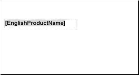
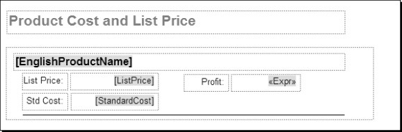
One list visually represents one group, and the body of the list is simply repeated for each underlying data row. Using the properties for the list, it is associated with a dataset. After you place a list item on the report, fields dragged from a dataset in the Report Data pane bind the list to the dataset and create data-bound textboxes. Figure 7.19 shows formatted textboxes used for labels and values, and a line used as a row separator. The textbox on the right contains an expression to calculate a product's profit margin by subtracting the StandardCost from the ListPrice field values.
Like most report items, you may set properties for the list using the standard Properties window or the custom Properties dialog.
We've already defined a dataset for this report. The DataSetName property for the list was set when we dragged a field from this dataset into the list item in the Report Designer. We'll set the Grouping in the next step.
Note that a list contains a details group by default, but this needs to be set up to group on a distinct field value. This is usually a field with redundant values so that each group contains multiple detail rows.
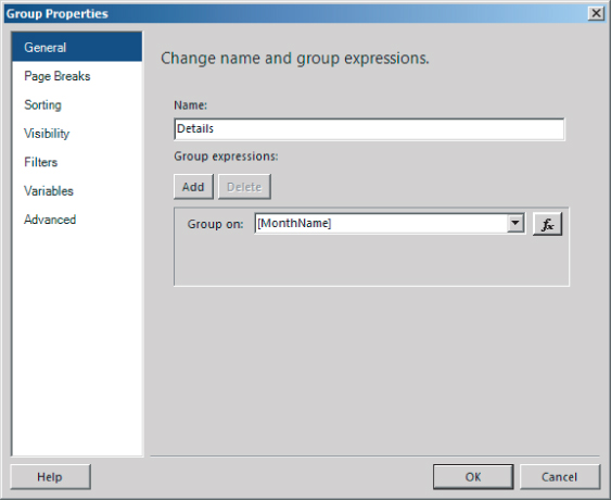
Click the drop-down list on the (Details1) Row Groups and choose Group Properties from the menu, as shown in Figure 7.20.
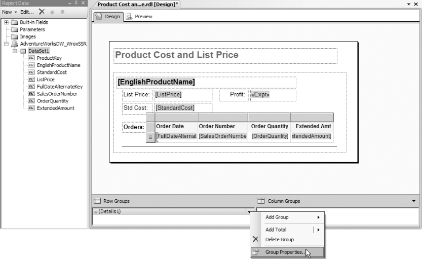
In the Group Properties dialog, shown in Figure 7.21, add a group expression, and select the EnglishProductName field in the “Group on” row. Click OK to save this setting.
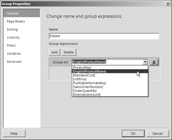
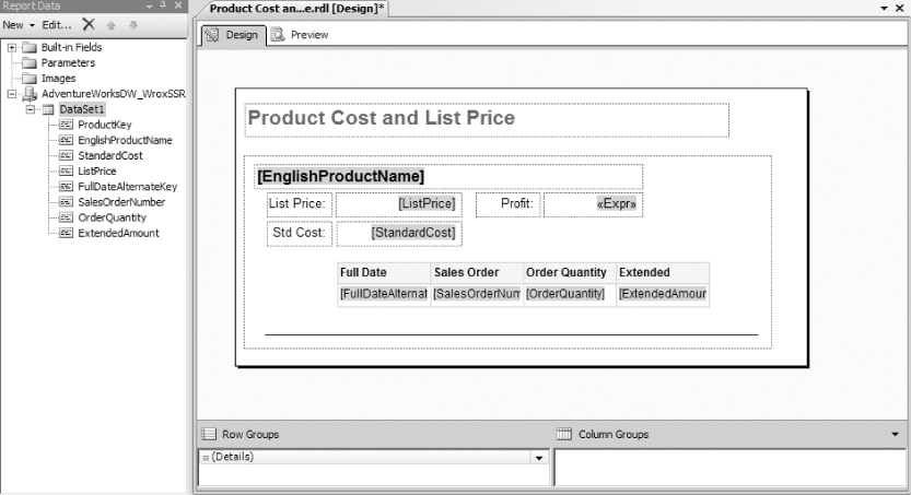
Figure 7.22 shows what the report looks like in preview.

For each product, I want to see the related orders. To do this, I expand the list height to make some room, and add a table within the list area. Then I drag appropriate order detail fields to the table. Figure 7.23 shows this table and the fields we've added.
A finished copy of the following report in the sample project is named Product Cost and List Price — Embedded Table.
When previewed, this report shows order detail in a table below each product-detail section, as shown in Figure 7.24.

To demonstrate how the list can be used as a container for other data range items, we've added a chart item to the list in place of the table. Because the list contains a detail group that returns only one record at a time and the chart is configured to recognize this parent group, the chart has visibility to this level of detail. In other words, each instance of the chart sees only one product record.
Data fields (or data point fields) are dropped into or selected in the drop zone at the top of the chart. If a pie chart has a Series Axis expression (drop zone to the right), multiple pie slices are rendered for each distinct group value. Because this chart has no series value, two fields will result in two slices: one for the StandardCost and another for the ListPrice field value. You'll learn more about configuring this chart later in this chapter.
Figure 7.25 shows the finished sample report, named Product Cost and List Price — Embedded Chart.

Figure 7.26 shows this report in preview. Each row of the report displays a pie chart with the calculated profit as a percentage of the ListPrice field value.

Now the best of both worlds: the sample report named Product Cost and List Price — Embedded Table and Chart contains both the table and the chart. Figure 7.27 shows it in preview.

The list item works well when repeating graphical items such as images and charts. Although the list offers a great deal of flexibility, it can require quite a lot of detail work if used for complex columnar reports and those with multiple levels of grouping. Consider using a table instead of a list when all the data fits into rows and columns.
The next couple of reports, showing a chart embedded in a table and a matrix, are created using the same basic pattern, so we need not go over the design details. These are included in the sample project. The report shown in Figure 7.28 is a table report grouped on Fiscal Year and then Fiscal Quarter. You cannot have an embedded object within a details group, so we removed the details group in the Row Groups pane. The chart is dragged into an empty cell. With the details group removed, the SalesAmount and the embedded chart are in the scope of the lowest-level table group (which is the Fiscal Quarter).
As you can see, the chart category axis is grouping on the product category field with a single data point based on the sales quantity field. Each instance of the table shows the isolated sales quantities across each product category for a specific fiscal quarter.
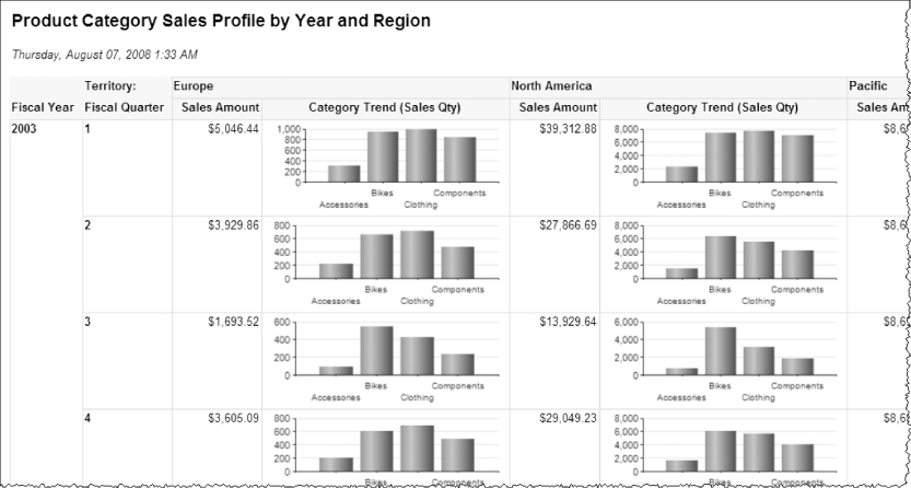
A chart can also be placed in a matrix group in the same manner. The Product Category Sales Profile by Year and Region report (shown in Figure 7.29) has a column group defined on the SalesTerritoryGroup field. Because columns are rendered for each distinct group value, the chart is repeated in each column group, and the scope of the chart is for a combination of fiscal quarter and sales territory group.
In summary, data region objects (such as charts, tables, and matrices) can be embedded within other data region groups, as long as the data is served from a single dataset.
Designing Subreports
The concept of a subreport isn't new. In fact, most reporting tools offer this feature, and the Reporting Services implementation of subreports is not much different from tools such as Microsoft Access and Crystal Reports. Before getting into the details of subreport design, let's review some basic guidelines.
When I started using Reporting Services to design reports with nested groups and data regions, my first impulse was to use subreports. This seemed like the best approach because I could design simple, modular reports and then put them together. The programming world promotes the notion of reusable objects. However, the downside of this approach is that subreports can create some challenges for the report rendering engine, resulting in formatting issues and poorer performance. In SQL Server 2000 and 2005, subreports didn't render in Excel. Improvements have been made for Excel rendering, but I'm not quite ready to dismiss my bias and recommend the use of subreports in all cases. When using subreports, carefully test the report to be sure that it will render in the target format.
The bottom line is that subreports are useful for implementing a variety of design patterns, but they are not a cure-all. If you can design a report by embedding data regions into a list, table, or matrix, you may get better results than if you use a subreport to do the same thing.
A subreport is a stand-alone report that is embedded into another report. It can be independent, with its own dataset, or, using parameters, you can link the contents of a subreport to data in the main report.
There are some limitations to the content and formatting that can be rendered within a subreport. For example, a multicolumn report may not be possible within a subreport (depending on the rendering format used). If you plan to use multiple columns in a subreport, test your report with the rendering formats you plan to use.
Subreports generally have two uses. The first is for embedding one instance of a separate report into the body of another report with an unassociated data source. The other scenario involves using the subreport as a custom data region to display repeated master and detail records in the body of the main report. From a design standpoint, this makes perfect sense. Using a subreport allows you to separate two related datasets and perhaps even data sources, linked as you would join tables in a SQL query. It allows you to reuse an existing report so that you don't have to redesign functionality you've already created. However, there may be a significant downside. If the master report will consume more than just a few records, this means that the subreport must execute its query and render the content many times. For large volumes of data, this can prove to be an inefficient solution. Carefully reconsider the use of subreports with large result sets. It may be more efficient to construct one larger report with a more complex query and multiple levels of grouping, rather than assume the cost of executing a query many times. I rarely use subreports in standard reporting scenarios. If I do, the main report is limited to one or a few records.
A subreport can be linked to the main report using a correlated parameter and field reference so that it can be used like a data region, but this is not essential. A subreport could be used to show aggregated values unrelated to groupings or content in the rest of the report.
Creating a subreport is like creating any other report. You simply create a report and then add it to another report as a subreport. If you intend to use the main report and subreport as a Master/Detail view of related data, the subreport should expose a parameter that can be linked to a field in the main report. In the following walk-through, you'll build a simple report that lists products and exposes a subcategory parameter. The main report will list categories and subcategories, and the product list report will then be used as a data region, like a table or list in previous examples.
Federating Data with a Subreport
When the data source for a master data region is different from the data source for detail records, using a subreport can be just the ticket for creating a master/detail report. The following example combines report data from two different data sources.
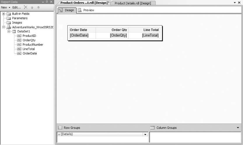
In the sample project, you will find two reports named Product Details and Product Orders Subreport. The Product Details report contains a list whose data source is the data-warehouse database: AdventureWorksDW_WroxSSRS2012. The Product Orders Subreport contains a table with a data source based on the OLTP database: Adventure Works DW Multidimensional_WroxSSRS2012. Records in the DimProduct table, located in the AdventureWorksDW_WroxSSRS2012 database, can be related using the ProductAlternateKey column. This contains ProductNumber values from the Product table in the AdventureWorksDW_WroxSSRS2012 database.
Figure 7.30 shows the Product Orders Subreport in the Designer. This report is simply a table bound to the following query. The data source for this dataset is the AdventureWorksDW_WroxSSRS2012 transactional database.
SELECT
     Sales.SalesOrderDetail.ProductID
   , Production.Product.ProductNumber
   , Sales.SalesOrderDetail.OrderQty
   , Sales.SalesOrderDetail.LineTotal
   , Sales.SalesOrderHeader.OrderDate
FROM
     Sales.SalesOrderDetail
     INNER JOIN Sales.SalesOrderHeader
     ON Sales.SalesOrderDetail.SalesOrderID = Sales.SalesOrderHeader.SalesOrderID
     INNER JOIN Production.Product ON Sales.SalesOrderDetail.ProductID =
Production.Product.ProductID
WHERE
     Product.ProductNumber = @ProductNumber
ORDER BY Sales.SalesOrderHeader.OrderDate
![]()
Note the ProductNumber parameter, which will be passed from the master report. Each instance of this report will be filtered for a specific product.
The master report is shown in Figure 7.31. This report contains a list data region that is bound to the following query and whose data source is the AdventureWorksDW_WroxSSRS2012 data warehouse database:

SELECT
       ProductKey
     , ProductAlternateKey
     , EnglishProductName
     , StandardCost
     , ListPrice
FROM   DimProduct
WHERE  (StandardCost IS NOT NULL) AND (ListPrice IS NOT NULL)
ORDER BY EnglishProductName
![]()
The details group for the list is set to the EnglishProductName field. This satisfies the requirement that, for a data range to contain a nested data range object, it must have a group defined. You create the subreport by dragging and dropping the Product Orders Subreport report from the Solution Explorer into the list area.
Note that regardless of the dimensions of a subreport at design time, when dropped into a containing report, it always appears as a square area that usually takes up more design space than necessary (which also expands the dimensions of its container). After resizing the subreport, I also had to resize the list to appear as it does in Figure 7.31.
Right-click the subreport and choose Subreport Properties to set the parameter/field mapping, as shown in Figure 7.31. The Subreport Properties dialog, shown in Figure 7.32, is used to map a field in the container report to a parameter in the subreport.

Navigate to the Parameters page, and then click Add to define a parameter mapping. Under the Name column, select the ProductNumber parameter. Under the Value column, select the ProductAlternateKey field. Click OK to save these changes and close the Subreport Properties dialog.
This completes the report design. Using lists and subreports typically makes the design process more ad hoc and artful than when you use more rigid tables. Go back and check the size and placement of items so that they fit neatly within the subreport space. You often have to go through a few iterations of preview and layout to make the appropriate adjustments.
At this point, you should be able to preview the report and see the nested table/subreport, as shown in Figure 7.33.
Execution and Resource Implications
There is no doubt that subreports enable you to do some things you can't do with any other report design technique. But to help you appreciate the ugly side of subreports, let's run a trace using SQL Server Profiler to compare the embedded table report we just created to this subreport. Let's see how many queries run on the server and how individual connections are required. We'll start the Profiler trace and then run the Product Cost and List Price — Embedded Table report.
Figure 7.34 shows the trace results. As you can see, after the initial session start-up, only one query runs. (Each query will have a BatchStarting and BatchCompleted event.)

Contrast this with the subreport. We'll start a new trace and then run the subreport. Figure 7.35 shows the trace results in SQL Server Profiler. Note the height of the vertical scroll bar; this is only the last page of a very long set of trace results. The entire trace screen capture would be 12 pages long! To save a tree or two, imagine what this would look like. Then suppose that after this report were put into production for a few years and business expanded, it was run for a thousand products. Never assume that data volumes will always be small or that users will always make reasonable parameter selections before running a report.
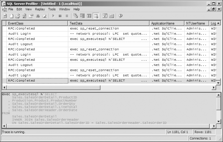
The Profiler trace for this report recorded 294 individual query executions (once for the master query, returning products in the AdventureWorksDW_WroxSSRS2012 database, and then once for each of the corresponding product orders in the AdventureWorks_WroxSSRS2012 database). For each query, a connection is open, an execution plan is prepared and run, and the connection is reset — 294 times. Although the .NET native SQL Server client and the database engine optimize this process by recycling connections and query execution plans, the overall result certainly is not as efficient as a report running on a single query.
In the final analysis, if you must coordinate data in a master/detail fashion, you generally have three options:
- Stage the data into one physical database.
- Create a federated view on the server using a linked server or OPENROWSET query.
- Create a subreport like the one you just examined.
In any case, try to keep the number of master records to a minimum by using a static filter or parameter in the WHERE clause. If you can source the data for the report's master and detail area from a single query and you can't limit the scope of the master records, avoid using a subreport, and use an embedded data range instead.
Navigating Reports
Reports of yesterday were static, designed for print. At best, they could be previewed on a screen. To find important information, users had to browse through each page until they found the information they were looking for. Today, you have several options to provide dynamic navigation to important information — in the same report or to content in another report or an external resource.
Creating a Document Map
The document map is a simple navigation feature that allows the user to find a group label or item value in the report by using a tree displayed along the left side of the report. It's sort of like a table of contents for report items that you can use to quickly navigate to a specific area of a large report. You typically will want to include only group-level fields in the document map rather than including the detail rows.
![]()
The sample report provided in the Chapter 7 project is Products by Category and SubCategory (Doc Map). We've added the CategoryName and SubCategoryName groupings to the document map. In the Group Properties dialog for the Category row group (see Figure 7.36), on the Advanced page, set the Document map property using the drop-down list to the ProductCategoryName field.
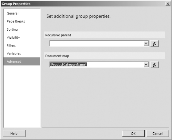
Be careful to specify the document map label property only for items you want to include in the document map. For example, if you specify this property for a grouping (as is done here), don't do the same for a textbox containing the same value. Otherwise, you will see the same value appear twice in the document map.
Figure 7.37 shows a report with a document map. The report name is the top-level item in the document map, followed by the product category and subcategory names.

You can show or hide the document map using the leftmost icon in the Report Designer's Preview or the Report View toolbar in the Report Manager or SharePoint Report Viewer web part after the report is deployed to the server.
![]()
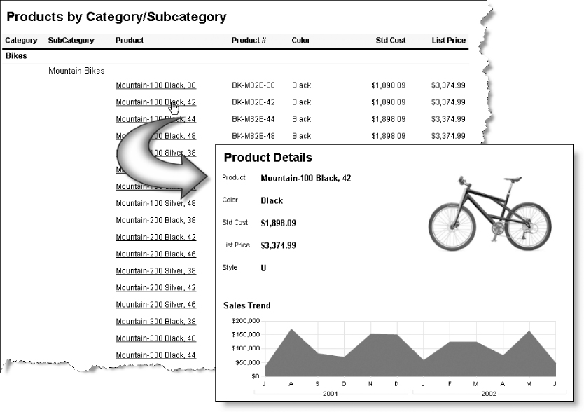
Links and Drill-Through Reports
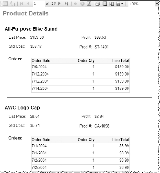
Links and drill-through reports are powerful features that enable a textbox or image to be used as a link to another report by passing parameter values to the target report. The target report can consist of a specific record or multiple records, depending on the parameters passed to the target report. The following example uses the Products by Category report in the sample project. The Product Name textbox is used to link to a report that will display the details of a single product record. The Product Details report, shown in Figure 7.38, is simple. It contains only textboxes and an image bound to fields of a dataset based on the Products table. This report accepts a ProductID parameter to filter the records and narrow down to the record requested.
Any textbox or image item can be used for intrareport or interreport navigation, for navigation to external resources such as web pages and documents, and to send e-mail. You enable all these features using navigation properties you can specify in the Textbox Properties or Image Properties dialog. First, open the Text Box Properties dialog by right-clicking the textbox and selecting Properties. In the Text Box Properties dialog, use the Actions page to set the drill-through destination and any parameters you would like to pass.
Figure 7.39 shows the Text Box Properties dialog Action page for the Products_Details — Table with Groupings and Drillthrough report in the sample project.

Note the navigation target selections under the “Enable as a hyperlink” option list. When you choose “Go to report,” the report selection drop-down is enabled, listing all reports in the project. A report selected from this list must be deployed to the same folder on the Report Server as the source report. A drill-through report typically is used to open the report to a filtered record or result set based on the value in this textbox. (Remember that the user clicked this textbox to open the target report.) The typical pattern is to show a user-friendly caption in the textbox (the product name in this case) and then pass a key value to the report parameter to uniquely identify records to filter in the target report. In this case, the ProductID value is passed.
To enable this behavior, add a parameter reference that will be used in the target report to filter the dataset records. All parameters in the target report are listed in the Name column. In the Value column, select a field in the source report to map to the parameter. A new feature is apparent in the rightmost column. An expression may be used to specify a condition in which the parameter is not passed to the target report. Expressions are short pieces of VB.NET code, and can be used to call custom code functions and even code libraries referenced as .NET assemblies. You'll see how to do this in Chapter 21.
By default, drill-through reports are displayed in the same browser window as the source report. There are a few techniques for opening the report in a secondary window, but none are out-of-the-box features. My favorite technique is to use the “Go to URL” navigation option and open the target report using a URL request. Although this is a little more involved, it provides a great deal of flexibility.
To navigate to a report in a separate web browser window, call a JavaScript function to create a pop-up window using any browser window modifications you like. The function call script, report folder path, report name, and filtering parameters are concatenated using an expression. Here are two examples. The first is simple and opens the report in a browser window in default view:
="JavaScript:void window.open(‘http://localhost/reportserver?/Sales Reports/
Product Sales Report’);"
The second, somewhat more elaborate example adds report parameters, hides the report viewer toolbar, and customizes the browser window size and features:
="JavaScript:void window.open(‘http://localhost/reportserver?/Sales Reports/
Product Sales Report&rc:Toolbar=False&ProductID=" & Fields!ProductID.Value &
"’, ‘_blank’, ‘toolbar=0,scrollbars=0,status=0,location=0,menubar=0,resizable=0,
directories=0,width=600,height=500,left=550,top=550’);"
The report name can be parameterized and modified using custom expressions. Expressions and custom code are discussed at length in Chapter 21, but these short examples give you an idea of the kinds of customizations possible with custom code and expressions.
Navigating to a Bookmark
A bookmark is a textbox or image in a report that can be used as a navigational link. If you want to allow the user to click an item and navigate to another item, assign a bookmark value to each target item. To enable navigation to a bookmark, set the “Go to bookmark” property to the target bookmark.
Using bookmarks to navigate within a report is easy. Each report item has a BookMark property that can be assigned a unique value. After adding bookmarks to any target items, use the “Go to bookmark” selection list to select the target bookmark in the properties for the source item. This allows the user to navigate to items within the same report.
Navigating to a URL
You can use the “Go to URL” option to navigate to practically any report or document content on your Report Server; files, folders, and applications in your intranet environment; or the World Wide Web. With some creativity, this may be used as a powerful, interactive navigation feature. It can also be set to an expression that uses links stored in a database, custom code, or any other value. It's more accurate to say that any URI (Uniform Resource Identifier) can be used, because a web request is not limited to a web page or document. With some creative programming, queries, and expressions, you can design your reports to navigate to a web page, document, e-mail address, Web Service request, or custom web application, directed by data or custom expressions.
![]()
Reporting on Recursive Relationships
Representing recursive hierarchies has always been a pain for reporting and often is a challenge to effectively model in relational database systems. Examples of this type of relationship (usually facilitated through a self-join) can be found in the DimEmployee table of the AdventureWorksDW_WroxSSRS2012 sample database. Most reporting tools were designed to work with data organized in traditional multitable relationships. Fortunately, our friends at Microsoft built recursive support into the reporting engine to deal with this common challenge. A classic example of a recursive relationship (where child records are related to a parent record contained in the same table) is the employee/manager relationship. The Employee table contains a primary key, EmployeeID, that uniquely identifies each employee record. ManagerID is a foreign key that depends on the EmployeeID attribute of the same table. It contains the EmployeeID value for the employee's manager. The only record that wouldn't have a ManagerID would be the president of the company or any such employee who doesn't have a boss.
Representing the hierarchy through a query would be difficult. However, defining the dataset for such a report is simple. You just expose the primary key, foreign key, employee name, and any other values you want to include on the report.
To see how this works, follow these steps:
SELECT    EmployeeKey, ParentEmployeeKey, LastName, Title
FROM      DimEmployee
WHERE     Status = ‘Current’
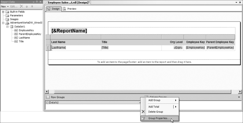
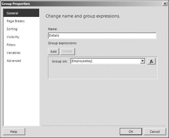
This action opens the Group Properties dialog, shown in Figure 7.41. To define a recursive group, you must set two properties. First, the group must be based on the unique identifier for the child records. This is typically a key value and must be related to the unique identifier for parent records — usually a parent key column in the table. Second, the Recursive parent property is set to relate the parent key to the table's primary key.

You're not done. The report still isn't very visually appealing, so let's indent each employee's name according to his or her level. The easiest way to do this is to use a little math to set the Left Padding property for the LastName textbox. You'll start with the same expression as before. Padding is set using PostScript points. A point is about 1/72nd of an inch, and there are about 2.83 millimeters to a point. Because this is such a small unit of measure, we'll indent our employee names by 20 points per level.
=((LEVEL(“Details”) * 20) + 2).ToString & “pt”

Don't be concerned if your results don't match Figure 7.44 exactly. The employee data has been modified in various versions of the sample databases. The point of this exercise is to see the hierarchal relationship between various employee records.

Summary
Building on the basic design concepts and building blocks you learned in the previous chapters, you have raised the bar and created more powerful and compelling reports using a variety of design techniques.
You can define report page headers and footers in a report template, where you can reuse the design in all your new reports. You can add built-in fields and summary information to page headers and footers to display and print useful information such as the report name, execution date and time, page numbers, and the report user. These provide important context information if the report is printed or archived.
The essential design patterns for composite reports include the use of embedded data regions and subreports. Report elements, including complex data regions, can be nested in a list, table, or matrix to create more sophisticated interface paradigms. Subreports can provide this same functionality when a master/detail report must coordinate related information managed in different data sources. Report navigation features take reporting beyond static, passive data browsing. Document maps, as well as drill-down and drill-through techniques, allow users to interact with reports to create a dynamic information analysis and discovery experience.
Expressions and custom programming take report design to new heights by allowing a single report to deliver more functionality, behaving more like a multifunction business application than a traditional report.