
Chapter 8
Chart Reports
What's in this chapter?
Chart types and design approaches
Anatomy of a chart
Chart objects and collection hierarchy
Creating a multiseries chart
Multiple chart areas
Useful properties and settings
A chart data region is based on a dataset just like any other data region. It uses groups, query parameters, and filters in much the same way as a table, list, or matrix. Of course, the difference is that a chart consumes the data and then visualizes the grouped aggregate values in the form of bars, columns, lines, points, bubbles, or slices.
Before we get into the details, let's cover the simple method of chart design. After you add a chart to the report, you see a simple chart design user interface. Using the Chart Data window, you select the type of chart you want and then add fields to define a category and a field for the series value. Then — badda boom, badda bing — you have a working chart. Easy, right? Designing simple charts is a fairly easy task, but adding features and customizing a chart can require a lot more effort.
After placing the chart in the report body, you can drag fields from the Dataset window directly onto the chart design surface. At the minimum, a chart should have one aggregated field for the value and one grouped field for the category. The category and series groups represent the x-axis and y-axis in bar, column, line, area, and point charts.
With each version of Reporting Services, the charting capabilities keep getting better and more powerful. There's both good news and bad whenever a product grows and becomes more capable. The good news is that you have a great deal of flexibility and power and can create just about any chart style or format you can imagine within the broad confines of the 58 chart types the product supports. With all this flexibility comes the potential for a good deal of complexity. All told, the chart data region and its constituent objects support approximately 150 to 200 individual properties. Some of these properties apply to only certain chart types. But no matter how you look at it, that's a lot of properties to dig through and keep track of! However, with a little experience and a basic understanding of how the chart objects are organized, this task is not as daunting as it may seem.
Ever since Microsoft acquired the code base for Dundas Software's .NET charting components and added newer versions along the way, it has done a remarkable job of simplifying the design interface. You can take chart design as far as you need to. The necessary effort to design charts may range from simple to tedious. Having been down this road many times, I recommend that after you familiarize yourself with charting basics, you approach the design with some specific objectives. Otherwise, you're likely to get lost in the interface.
The purpose of a chart is to highlight important information and let it tell a story. Different report types can effectively convey comparisons or trends, but it's important to use the right chart for your data. Before we move on, I want to make an important point. If you work in a field where specialized visualizations are useful and appropriate, you may find some of the more abstract and special-purpose charts of great value. But for day-to-day business reporting, it's common to use just a handful of traditional charts to visualize business metrics. So, even though Polar, Stock, and Funnel charts look cool, they may not help you convey an effective message. In business, 99 percent of the industry uses about 5 percent of the available chart types.
Chart Types
Some of the more common chart types (such as column, bar, line, and area) can be used for different views of the same data. Pie charts present a more simplified view and work well with fewer category values. Other charts are more specialized and may be appropriate for multivalue data points, range values, and variances. All the chart types support dynamic capabilities, such as actions and tooltips. Using these features in report design, a chart user can get more information and details by hovering over or clicking a range, point, or area of the chart.
Column Charts
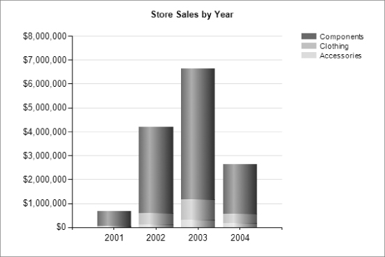
Figure 8.1 shows a simple column chart. The horizontal x-axis series values are product categories, and the vertical y-axis values represent annual sales revenue. You can modify several visual elements to alter the color, shading, borders, text, formatting, labeling, and value placement. Figure 8.1 shows the default property settings.
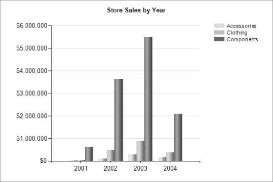
Figure 8.2 shows the same chart with default three-dimensional (3D) modeling.
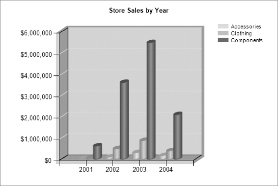
This view is boxy and uses space inefficiently without lending more value to the data presentation. You can use 3D modeling to show data in a more interesting presentation, but this can also be distracting and less effective for analysis. Figure 8.3 shows a more extreme 3D view of the same data with perspective. This chart is set up with a fairly extreme 3D and perspective view to show you what can be done. This type of view tends to distort the values, and the clustering (stacking the columns along the z-axis — the third axis in a 3D coordinate system) can hide some columns from view.
As a rule, keep chart visual effects to a minimum. Effects are the trim, not the substance, of the data message, so don't let them get in the way. If in doubt, reduce or eliminate an unnecessary effect. You have control over several 3D properties to generate more realistic representation of the chart data. Be careful to maintain the appropriate balance between artistry and accuracy. Note that it's difficult to quantify and distinguish the difference in height between the front-right column and the rightmost column in the back. The degree to which it makes sense to use these features depends largely on the chart's purpose. Is it sufficient to demonstrate that one data point is less than or greater than another, or do these points need to be strictly measurable? This type of view can be effective for making an impact, but a flatter view is usually more appropriate to maintain accuracy.
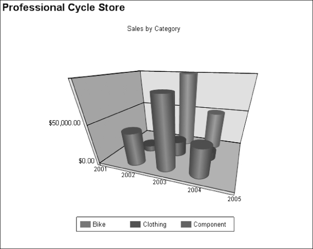
Figure 8.4 is a 3D view with cylindrical columns arranged in a clustered formation. When used correctly and in moderation, this 3D chart adds a sense of realism while remaining readable.
Stacked Charts
Column and bar charts can have their bars stacked, as shown in Figure 8.5. This appends the different colored bars (for a like series value) into one bar with multiple colored bands. This may be an appropriate method for showing the accumulation of all values within the series point. The individual values are displayed in a different color as a percentage of the bar. In essence, each bar becomes like a linear pie chart.
To emphasize the proportion of like values rather than the comparative accumulation, the 100 percent stacked view (not pictured) makes all the bars in the chart the same length rather than depicting the sum of all the values in the bar.
Area and Line Charts
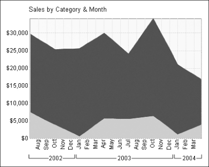
An area chart, shown in Figure 8.6, plots the values of each point and then draws a line from point to point to show the progression of values along the series. This is an effective method for analyzing trends and works well when values tend to climb, decline, or remain level in the series. This type of chart is accurate when data exists for all category values on the x-axis. It typically doesn't work well to express a series of values that are not in a relatively uniform plane.
A line chart is a variation of an area chart using a line or ribbon rather than a solid area. The line chart works better than the area chart for comparing multiple categories for a series of values, because one layer may obscure another in the area view. In the preceding example, the area chart works because of how the values are sorted. Larger values are in the background, and other points in the foreground are smaller, and the trend increases back to front.
Pie and Doughnut Charts
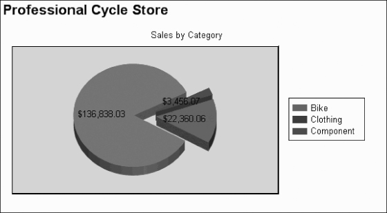
A pie chart is an excellent tool for comparing proportional values. Display options for a pie chart include exploded and 3D views. The 3D pie chart pictured in Figure 8.7 shows that there are three different grouped values. Point labels displayed over each slice provide specifics where the chart visual just gives proportions, and using both can add value in the right types of report scenarios. I call this piece “Pac-Man Gets a Root Canal.”
The purpose of a chart is to tell a complete story about the data and it's important to label it clearly so we know what the groups represent. Group values can be titled using point labels, call-out labels, or in a legend.
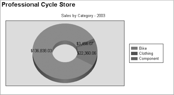
A doughnut chart is a pie chart with a hole. When a pie chart has several smaller slices, the doughnut chart can be easier to read and provides a variation on an age-old chart theme. Figure 8.8 is the same as Figure 8.7, but without the exploded view and with a legend showing the series labels.
Pie charts traditionally are used to show multiple slices representing their percentage of the whole. In the usual form, data values grouped on another axis result in slices automatically generated with the same style settings and contrasting colors from a standard color palette. The Designer provides eight color palettes. Sometimes data may need to be presented as a percentage value, or you might have two values and need to express one as a percentage of the other. You can do this by adding multiple value groups to the chart, with each representing a specific slice. Figure 8.9 shows only two values. In this example, values in the dataset exist for Bike Sales and Total Sales. Using an expression or a calculation in the query, subtracting Bike Sales from the total provides a value for Other Sales.
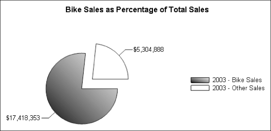
I created a specific group for these two values. Another advantage of using this approach is that you can set the color and styles for each slice independently.
Bubble and Stock Charts
Bubble charts are essentially a point plotted in a grid representing three dimensions. The value of the z-axis is expressed by the size of the bubble. Imagine that the bubble exists in a 3D plane and appears larger if it is closer to you. Actually, the bubble can be a circle, square, triangle, diamond, or cross shape. This also means that a combination of shapes can be used to represent different data elements in the same chart space.
In Figure 8.10, employees' vacation and sick hours are plotted above their names. The number of vacation hours is represented by the bubble's vertical distance from the 0 baseline, and the number of sick hours is represented by the size of the bubble.
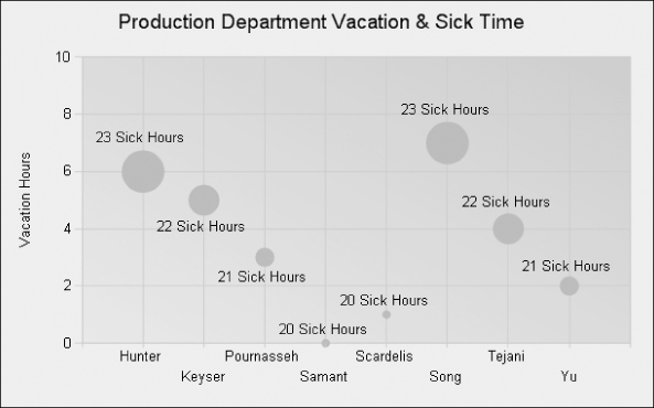
Figure 8.11 is a stock chart. For each product, a line is plotted to span a range of values. Each line has a large tick mark to indicate the position of a value within the high/low range. In this example, the beginning of the range (the lowest point of the line) is the standard cost of the product. The tick mark represents the last receipt cost, and the high range of the line is the list price.
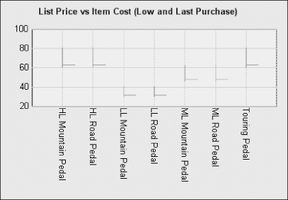
Chart Type Summary
Twelve general chart types are available, as described in Table 8.1.
| Chart Type | Description | Best Use |
| Column | A classic vertical bar chart with columns representing values along the y-axis. Like-valued items along the x-axis are grouped, and bars representing the same x-axis values in each group have the same colors or patterns. Series values may also be grouped and subgrouped. Columns can have point labels, and the colored bars may be labeled using a legend. Columns may be arranged side by side (along the x-axis) or in front of one another (along the z-axis.) Columns may appear to be extruded from their base using a rectangular or circular (cylindrical) shape. | Discrete group values on the Category (x) axis. Also effective with linear time-series periods broken into discrete buckets (such as days, weeks, or months). |
| Bar | Functionally the same as a column chart turned 90 degrees. It has the advantage of more accurately depicting value comparisons for layouts in which you have more available horizontal space. | Used only with discrete group values, not for linear series groups. |
| Line | Like the area chart, but the charted area isn't filled. This type of chart is useful for comparing multiple series (along the z-axis) without obscuring trend lines behind a series. | Time-series and linear interval category groups (time, dates, and progressive numeric values). |
| Area | Like a column chart with a trend line drawn from one point to the next in the series. This type of chart is appropriate for a series of values that tend to progress over a relatively even plane that describes a “level,” “up,” or “down” trend. It is inappropriate for series values that tend to jump around. The solid shading of the charted area depicts a volume of data values. | Time-series and linear interval category groups. |
| Pie | The classic pie chart is an excellent tool for comparing relative values. Unlike bar, column, line, and area charts, the aggregate value isn't quantified. Users understand pie charts because they put comparative values into a proportional context and can drive quick decision support at a glance. Pie chart views can be exploded to visually separate each slice. Consider using a column or bar chart when more accurate comparisons are needed. | Use only for discrete category groups and never for linear series values. However, may be used for discrete bucket values. Typically, use pie charts with no more than 10 to 15 slices. |
| Doughnut | A doughnut is a pie with a hole in the middle. It's more effective as a bold marketing visual. A 3D doughnut rendering may expose smaller slices more clearly than a pie chart because each slice has four sides rather than three. | Use with 3-D effect for conveying a bold statement and not for accurately measuring business metrics. Typically, limit slices to 10 or 15. |
| Scatter | Plots several points in a range (both x and y) to show trends and variations in value. The result is more like a cloudy band of points rather than a specific aggregated point or line. | Used with dozens to hundreds of data points when analyzing the general trend is of greater value than seeing a specific point. |
| Bubble | A technique for charting points on three dimensions. Values are plotted using different-sized points, or bubbles, on a two-dimensional (2D) grid. The size of the bubble indicates the related value along the z-axis. | Appropriate when measuring two different series values along two different linear axes where size represents one value and position represents the other. |
| Ranges | Range and Gantt charts are often used to visualize project phases and the progress of stages in a process along a linear series. | Used when each data item (project, commodity, unit of work) has a beginning and end value on a linear axis. |
| Stock | This category of charts (sometimes called candlestick or whisker graphs) plots values vertically like a column chart having variable start and end points. For each item along the y-axis series, a vertical line indicates a start and end value for the range. A tick mark in the line can indicate a significant value in that range or an aggregation of the range. This type of chart is useful for showing trading stocks with opening, closing, and purchase values; wholesale, retail, and discount prices; and so on. | A specialized kind of visual for discrete data items that have multiple events along a linear axis, typically multiple start and end values. |
| Shapes | Shape charts like the funnel and pyramid are effectively a single, stacked column chart. These typically are used to model sales and production against goals, and sales opportunity pipelines. | Used in specific business scenarios where data items progress through ranked stages. |
| Polar | Polar and radar charts plot points from a central hub at different angles and distances in a radial fashion. This kind of visual does have some useful applications, but traditional nonlinear charts, such as a column or bar, are often more suitable. | A specialized visual. Can be used with discrete, nonlinear but related categories. Best used to express that no category exists at the beginning or end of the range. |
The Anatomy of a Chart
Much detail work typically is involved in chart design; there are many properties to manage. Figure 8.12 shows the major property groups for charts. Although some charts have a few unique properties and some may not support all properties, generally these properties are shared across all chart types.
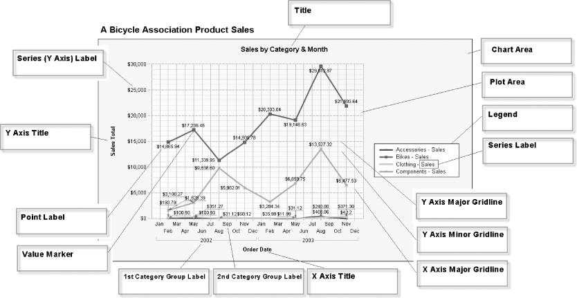
Chart objects are organized into the following hierarchy. Understanding this structure and the relationships between these objects will save you a lot of time and effort. See Figure 8.13.
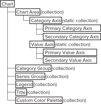
The Chart object is really is just a container. The Chart Area does most of the work and contains most of the useful properties. I recommend that you take some time to explore the chart objects in the design interface. Because there are so many different objects, selecting the right object can be tricky at first, but with a little experience, you'll get used to the interface. With a chart open in the designer, show the Properties Window and then click on different areas of the chart to select and view the name of various objects. Use the chart objects hierarchy as a reference as you click different areas to select objects. You can also right-click an object to reveal menu options that will take you to subordinate objects and collections. For example, if you were to right-click on the Chart object, the Properties Window and the right-click menu will let you find the Chart Areas. Taking time to do this now will save you time and effort when you follow the next exercise.
Note that many of these objects are organized into collections to make them fit neatly into the standard properties windows and design interface. As a rule, you can select an object and set its properties in one of two ways. If you right-click an object in the chart designer, you see a menu item to edit the object's properties. That menu may also include related objects that you can edit. Choosing this menu option opens a custom property page for the object. Choosing an option in a property page to edit another object opens another property page. These are stacked in the order in which they were opened. Some properties are actually object collections. Clicking an ellipsis (…) button for that collection opens a dialog with the object collection and associated properties. In addition to the custom properties pages for each chart-related object, you can edit properties in the standard Properties window.
Creating a Multiseries Chart
In Chapter 5 you learned how to design a basic column chart with one series and axis. Charts can be used to visualize multiple values with different axes and scales. In the following exercise, you will design a chart report with two different series axes that align to a common category axis. One series will show sales currency values on one scale, and the other series will show order quantity values on a different scale within the same chart area. You will also use different chart types to visually separate the two series. Finished copies of all these reports are in the Chapter 8 sample project.
SELECT
      CalendarYear, MonthNumberOfYear,
      MonthName, SalesAmt, OrderQty
FROM  vSalesByTimeAndTerritory WHERE CalendarYear = @Year
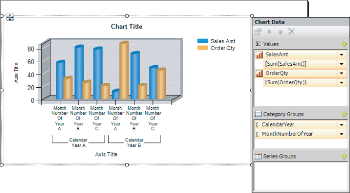
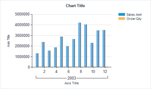
The chart plots both series values on the same axis. Because the OrderQty values are significantly smaller than the SalesAmt currency values, those columns are barely visible. The left axis values are an irrelevant scale for the OrderQty; this should be rectified.
The chart is functional at this point but there are a few adjustments you can make to tidy things a bit.
Using Multiple Chart Areas
Reporting Services charts support multiple chart areas. This powerful feature enables you to place multiple charts, of different types and characteristics, in the same chart container. Each of these chart areas are based on the same dataset, and can be aligned and correlated with a sibling chart in a variety of ways. The following is a simple example.
Using the chart report we have been designing, you will separate the two data fields into different chart areas, arranged vertically. When you align the Category Axis, any changes in the data are consistently reflected in both chart areas.
To make room for the second chart area, increase the chart's height by stretching it vertically. Right-click the chart and choose Add New Chart Area, as shown in Figure 8.17.
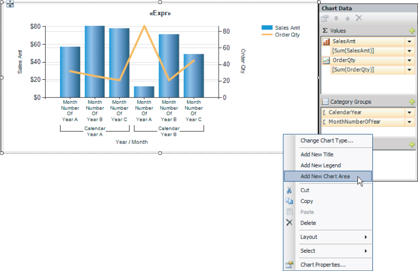
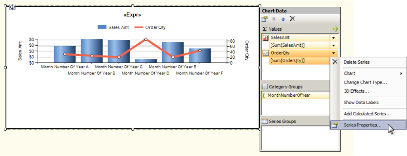
The new chart area appears as only white space below the original chart until a series axis is assigned to it. Right-click the Cost field in the Chart Data Values pane, and choose Series Properties, as shown in Figure 8.18.
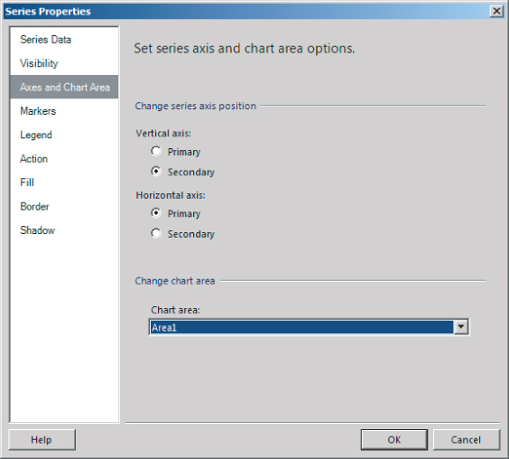
In the corresponding Series Properties dialog, on the Axes and Chart Area page, use the “Change chart area” drop-down list to select the new chart area. Verify your settings with Figure 8.19, and then click OK to close the Series Properties dialog.
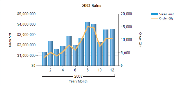
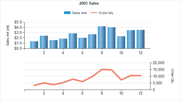
The finished report, shown in Figure 8.20, shows a chart visual very similar to the previous example. However, the line chart and its axis have been moved to the second chart area.
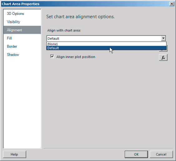
To set properties for the chart area, right-click the chart in the Designer and choose Chart Area Properties. Selecting the chart area can be a little tricky. I have found it easiest to right-click the second chart area without selecting it first. When you right-click, the designer selects the chart area and displays the appropriate menu option. The Chart Area Properties dialog is shown in Figure 8.21. On the Alignment page, use the “Align with chart area” drop-down list to choose the Default chart area. Click OK to accept this change, and then preview the report.
This last change ensures that the horizontal axis scales always align. Although the two chart areas appear to be separate charts with distinct chart types, they both use the same scale so that data in the two chart areas can be used for comparison.
Useful Properties and Settings
Hundreds of chart design variations exist. After many years of chart report design, I have some favorite features and settings. The following sections describe a few I've collected. For a comprehensive guide to chart styles and updated advanced report tips, refer to Microsoft SQL Server Reporting Services Recipes: For Designing Expert Reports (Wrox) and the authors' respective blog sites.
Control the Number of Items Displayed on an Axis
Select Chart ![]() Axis.
Axis.
Interval property − 1 means display every value regardless of whether the text fits when rendering the axis labels.
Manage Axis Text Placement and Rotation
Select Chart ![]() Axis
Axis ![]() Labels group/page.
Labels group/page.
Disable auto-fit and set the rotation angle. Try 45 or experiment with other values.
Manage the Format of Axis Values
Select Chart ![]() Axis
Axis ![]() Number group/page.
Number group/page.
Choose a format option or use a custom format string such as “#,##0” or “$#,##0.00”.
Change the Color and Width of a Series Line
In a line chart, click a series line or series value in the Chart Data window. Change the Color and BorderWidth properties.
Set a Tooltip for a Chart Value
In the chart designer, click a series value or the item in the Chart Data window Values pane.
Set the ToolTip property using an expression.
Using the expression builder, reference fields and concatenate a string value with formatted text and carriage return characters. For example:
=Fields!FirstName.Value & " " Fields!LastName.Value & vbCrLf & "Income: "
& Format(Fields!Income.Value, "$#,##0")
Control the Width and Gap Between Columns or Bars
In the chart designer, click a series value or the item in the Chart Data window Values pane. In the properties for the chart series, select CustomAttributes ![]() PointWidth.
PointWidth.
A value of 1 fills the gap between columns or bars. Less leaves a space, and more causes overlap.
For a Chart with Multiple Chart Areas, Control the Exact Position of Each Chart Area
Chart area size and positions are managed automatically by default. To override this behavior, edit the chart area properties. Set the CustomPosition ![]() Enabled property to True, and then set the Height, Width, Left, and Top properties. To control the placement of the chart area plotted content, repeat these steps for the CustomInnerPlotPosition properties group.
Enabled property to True, and then set the Height, Width, Left, and Top properties. To control the placement of the chart area plotted content, repeat these steps for the CustomInnerPlotPosition properties group.
Dynamically Increase a Chart's Size
Edit the Chart properties.
Set the DynamicWidth property to expand the size of a column, area, or line report. Use an expression to increase the width based on the number of records or distinct group values. For example:
=(1 + COUNT(Fields!Country.Value, "Chart1")) & " in"
Summary
The charting capabilities in Reporting Services have improved over the years with new product versions. New chart types provide more options to visualize business data to information workers. Advanced charts provide a more flexible means to deliver actionable information through compelling new features that include multiseries charts and chart areas.
The chart design skills you've learned in this chapter can be extended to specialized chart types and more advanced styles of chart reports based on the same properties and capabilities. Most of the additional properties you'll find in the designer are used to manage the aesthetic qualities of charts, which you can use to customize the style and fine-tune your chart reports.