
Chapter 8. Table Views and Collection Views
I’m gonna ask you the three big questions. — Go ahead. — Who made you? — You did. — Who owns the biggest piece of you? — You do. — What would happen if I dropped you? — I’d go right down the drain.
Dialogue by Garson Kanin and Ruth Gordon, Pat and Mike
A table view (UITableView) is a vertically scrolling UIScrollView (Chapter 7) containing a single column of rectangular cells (UITableViewCell, a UIView subclass). It is a keystone of Apple’s strategy for making the small iPhone screen useful and powerful, and has three main purposes:
- Presentation of information
-
The cells typically contain text, which the user can read. The cells are usually quite small, in order to maximize the quantity appearing on the screen at once, so this text is often condensed, truncated, or simplified.
- Selection
-
A table view can provide the user with a column of choices. The user chooses by tapping a cell, which selects the cell; the app responds appropriately to that choice.
- Navigation
-
The appropriate response to the user’s choosing a cell is often navigation to another interface. This might be done, for example, through a presented view controller or a navigation interface (Chapter 6). An extremely common configuration is a master–detail interface, where the master view is a table view within a navigation interface: the user taps a table view cell to navigate to the details about that cell. This is one reason why truncation of text in a table view cell is acceptable: the detail view contains the full information.
In addition to its column of cells, a table view can be extended by a number of other features that make it even more useful and flexible:
-
A table can display a header view at the top and a footer view at the bottom.
-
The cells can be clumped into sections. Each section can have a header and footer, and these remain visible as long as the section itself occupies the screen, giving the user a clue as to where we are within the table. Moreover, a section index can be provided, in the form of an overlay column of abbreviated section titles, which the user can tap or drag to jump to the start of a section, thus making a long table tractable.
-
Tables can be editable: the user can be permitted to insert, delete, and reorder cells.
-
A table can have a grouped format, with large section headers and footers that travel with their neighbor cells. This is often used for presenting small numbers of related cells; the headers and footers can provide ancillary information.
Table view cells, too, can be extremely flexible. Some basic cell formats are provided, such as a text label along with a small image view, but you are free to design your own cell as you would any other view. There are also some standard interface items that are commonly used in a cell, such as a checkmark to indicate selection or a right-pointing chevron to indicate that tapping the cell navigates to a detail view.
Figure 8-1 shows two familiar table views: Apple’s Music app and Contacts app. In the Music app, each table cell displays a song’s name and artist, in truncated form; the user can tap to play the song. In the Contacts app, the table is divided into sections; as the user scrolls, the current section header stays pinned to the top of the table view. The table can also be navigated using the section index at the right.
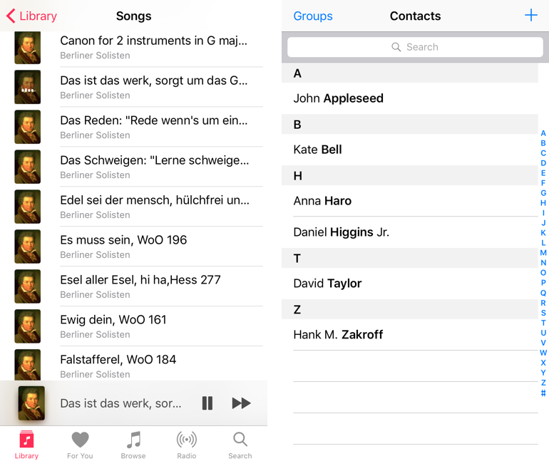
Figure 8-1. Two familiar table views
Figure 8-2 shows a familiar grouped table: Apple’s Settings app. It’s a master–detail interface. The master view has sections, but they aren’t labeled: they merely clump related topics. The detail view often has a single cell per section, using section headers and footers to explain what that cell does.
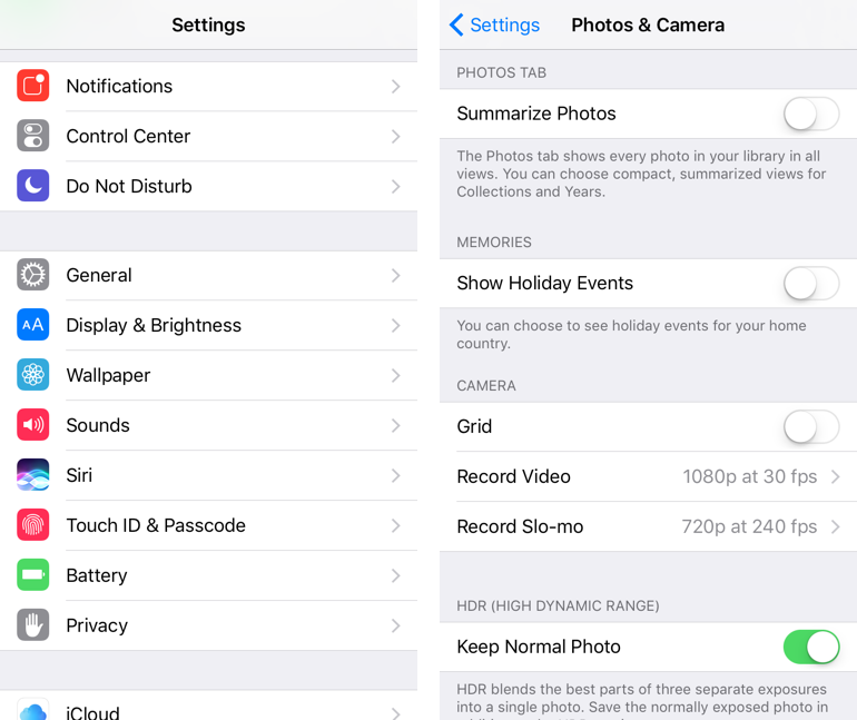
Figure 8-2. A familiar grouped table
It would be difficult to overstate the importance of table views. An iOS app without a table view somewhere in its interface would be a rare thing, especially on the small iPhone screen. I’ve written apps consisting almost entirely of table views. Indeed, it is not uncommon to use a table view even in situations that have nothing particularly table-like about them, simply because it is so convenient.
For example, in one of my apps I want the user to be able to choose between three levels of difficulty and two sets of images. In a desktop application I’d probably use radio buttons; but there are no radio buttons among the standard iOS interface objects. Instead, I use a grouped table view so small that it doesn’t even scroll. This gives me section headers, tappable cells, and a checkmark indicating the current choice (Figure 8-3).
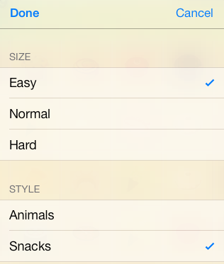
Figure 8-3. A grouped table view as an interface for choosing options
There is a UIViewController subclass, UITableViewController, whose main view is a table view. You never really need to use a UITableViewController; it’s a convenience, but it doesn’t do anything that you couldn’t do yourself by other means. Here’s some of what using a UITableViewController gives you:
-
UITableViewController’s
init(style:)initializer creates the table view with a plain or grouped format. -
The view controller is automatically made the table view’s delegate and data source, unless you specify otherwise.
-
The table view is made the view controller’s
tableView. It is also, of course, the view controller’sview, but thetableViewproperty is typed as a UITableView, so you can send table view messages to it without casting.
Table View Cells
Beginners may be surprised to learn that a table view’s structure and contents are generally not configured in advance. Rather, you supply the table view with a data source and a delegate (which will often be the same object), and the table view turns to these in real time, as the app runs, whenever it needs a piece of information about its own structure and contents.
This architecture may sound odd, but in fact it is part of a brilliant strategy to conserve resources. Imagine a long table consisting of thousands of rows. It must appear, therefore, to consist of thousands of cells as the user scrolls. But a cell is a UIView and is memory-intensive; to maintain thousands of cells internally would put a terrible strain on memory. Therefore, the table typically maintains only as many cells as are showing simultaneously at any one moment (about twelve, let’s say). As the user scrolls to reveal new cells, those cells are created on the spot; meanwhile, the cells that have been scrolled out of view are permitted to die.
That’s ingenious, but wouldn’t it be even cleverer if, instead of letting a cell die as it is scrolled out of view, it were whisked around to the other side and used again as one of the cells being scrolled into view? Yes, and in fact that’s exactly what you’re supposed to do. You do it by assigning each cell a reuse identifier.
As cells with a given reuse identifier are scrolled out of view, the table view maintains a bunch of them in a pile. As cells are scrolled into view, you ask the table view for a cell from that pile, specifying it by means of the reuse identifier. The table view hands an old used cell back to you, and now you can configure it as the cell that is about to be scrolled into view. Cells are thus reused to minimize not only the number of actual cells in existence at any one moment, but the number of actual cells ever created. A table of 1000 rows might very well never need to create more than about a dozen cells over the entire lifetime of the app.
To facilitate this architecture, your code must be prepared, on demand, to supply the table with pieces of requested data. Of these, the most important is the cell to be slotted into a given position. A position in the table is specified by means of an index path (IndexPath), used here to combine a section number with a row number, and is often referred to simply as a row of the table. Your data source object may at any moment be sent the message tableView(_:cellForRowAt:), and must respond by returning the UITableViewCell to be displayed at that row of the table. And you must return it fast: the user is scrolling now, so the table needs the next cell now.
In this section, I’ll discuss what you’re going to be supplying — the table view cell. After that, I’ll talk about how you supply it.
Built-In Cell Styles
The simplest way to obtain a table view cell is to start with one of the four built-in table view cell styles. To create a cell using a built-in style, call init(style:reuseIdentifier:). The reuseIdentifier: is what allows cells previously assigned to rows that are no longer showing to be reused for cells that are; it will usually be the same for all cells in a table. Your choices of cell style (UITableViewCellStyle) are:
.default-
The cell has a UILabel (its
textLabel), with an optional UIImageView (itsimageView) at the left. If there is no image, the label occupies the entire width of the cell. .value1-
The cell has two UILabels (its
textLabeland itsdetailTextLabel) side by side, with an optional UIImageView (itsimageView) at the left. The first label is left-aligned; the second label is right-aligned. If the first label’s text is too long, the second label won’t appear. .value2-
The cell has two UILabels (its
textLabeland itsdetailTextLabel) side by side. No UIImageView will appear. The first label is right-aligned; the second label is left-aligned. The label sizes are fixed, and the text of either will be truncated if it’s too long. .subtitle-
The cell has two UILabels (its
textLabeland itsdetailTextLabel), one above the other, with an optional UIImageView (itsimageView) at the left.
To experiment with the built-in cell styles, do this:
-
Start with the Single View app template.
-
We’re going to ignore the storyboard (as in the examples at the start of Chapter 6). So we need a class to serve as our root view controller. Choose File → New → File and specify iOS → Source → Cocoa Touch Class. Click Next.
-
Make this class a UITableViewController subclass called RootViewController. The XIB checkbox should be checked; Xcode will create an eponymous .xib file containing a table view, correctly configured with its File’s Owner as our RootViewController class. Click Next.
-
Make sure you’re saving into the correct folder and group, and that the app target is checked. Click Create.
-
Rewrite AppDelegate’s
application(_:didFinishLaunchingWithOptions:)to make our RootViewController the window’srootViewController:self.window = self.window ?? UIWindow() self.window!.rootViewController = RootViewController() // * self.window!.backgroundColor = .white self.window!.makeKeyAndVisible() return true
-
Now modify the RootViewController class (which comes with a lot of templated code), as in Example 8-1.
Run the app to see the world’s simplest table (Figure 8-4).

Figure 8-4. The world’s simplest table
Example 8-1. The world’s simplest table
let cellIdentifier = "Cell"
override func numberOfSections(in tableView: UITableView) {
-> Int {
return 1  }
override func tableView(_ tableView: UITableView,
numberOfRowsInSection section: Int) -> Int {
return 20
}
override func tableView(_ tableView: UITableView,
numberOfRowsInSection section: Int) -> Int {
return 20  }
override func tableView(_ tableView: UITableView,
cellForRowAt indexPath: IndexPath) -> UITableViewCell {
var cell : UITableViewCell! = tableView.dequeueReusableCell(
withIdentifier: cellIdentifier)
}
override func tableView(_ tableView: UITableView,
cellForRowAt indexPath: IndexPath) -> UITableViewCell {
var cell : UITableViewCell! = tableView.dequeueReusableCell(
withIdentifier: cellIdentifier)  if cell == nil {
cell = UITableViewCell(style:.default,
reuseIdentifier:cellIdentifier)
if cell == nil {
cell = UITableViewCell(style:.default,
reuseIdentifier:cellIdentifier)  cell.textLabel!.textColor = .red
  }
cell.textLabel!.text = "Hello there! (indexPath.row)"
}
cell.textLabel!.text = "Hello there! (indexPath.row)"  return cell
}
return cell
}The key parts of the code are:
Our table will have one section.
Our table will consist of 20 rows. Having multiple rows will give us a sense of how our cell looks when placed next to other cells.
In
tableView(_:cellForRowAt:), you always start by asking the table view for a reusable cell. Here, we will receive either an already existing reused cell ornil; in the latter case, we must create the cell from scratch, ourselves.If we did receive
nil, we do create the cell. This is where you specify the built-in table view cell style you want to experiment with.At this point in the code you can modify characteristics of the cell (
cell) that are to be the same for every cell of the table. For the moment, I’ve symbolized this by assuming that every cell’s text is to be the same color.We now have the cell to be used for this row of the table, so at this point in the code you can modify characteristics of the cell (
cell) that are unique to this row. I’ve symbolized this by appending the row number to the text of each row. Of course, in real life the different cells would reflect meaningful data. I’ll talk about that later in this chapter.
Now you can experiment with your cell’s appearance by tweaking the code and running the app. Feel free to try different built-in cell styles in the place where we are now specifying .default.
The flexibility of each built-in style is based mostly on the flexibility of UILabels. Not everything can be customized, because after you return the cell some further configuration takes place, which may override your settings. For example, the size and position of the cell’s subviews are not up to you. (I’ll explain, a little later, how to get around that.) But you get a remarkable degree of freedom. Here are a few basic UILabel properties for you to play with now (by customizing cell.textLabel), and I’ll talk much more about UILabels in Chapter 10:
text-
The string shown in the label.
textColor,highlightedTextColor-
The color of the text. The
highlightedTextColorapplies when the cell is highlighted or selected (tap on a cell to select it).
textAlignment-
How the text is aligned; some possible choices (NSTextAlignment) are
.left,.center, and.right. numberOfLines-
The maximum number of lines of text to appear in the label. Text that is long but permitted to wrap, or that contains explicit linefeed characters, can appear completely in the label if the label is tall enough and the number of permitted lines is sufficient.
0means there’s no maximum; the default is1.
font-
The label’s font. You could reduce the font size as a way of fitting more text into the label. A font name includes its style. For example:
cell.textLabel!.font = UIFont(name:"Helvetica-Bold", size:12.0)
shadowColor,shadowOffset-
The text shadow. Adding a little shadow can increase clarity and emphasis for large text.
You can also assign the image view (cell.imageView) an image. The frame of the image view can’t be changed, but you can inset its apparent size by supplying a smaller image and setting the image view’s contentMode to .center. It’s probably a good idea in any case, for performance reasons, to supply images at their drawn size and resolution rather than making the drawing system scale them for you (see the last section of Chapter 7). For example:
let im = UIImage(named:"moi")!
let r = UIGraphicsImageRenderer(size:CGSize(36,36))
let im2 = r.image { _ in
    im.draw(in:CGRect(0,0,36,36))
}
cell.imageView!.image = im2
cell.imageView!.contentMode = .center
The cell itself also has some properties you can play with:
accessoryType-
A built-in type (UITableViewCellAccessoryType) of accessory view, which appears at the cell’s right end. For example:
cell.accessoryType = .disclosureIndicator
accessoryView-
Your own UIView, which appears at the cell’s right end (overriding the
accessoryType). For example:let b = UIButton(type:.system) b.setTitle("Tap Me", for:.normal) b.sizeToFit() // ... add action and target here ... cell.accessoryView = b indentationLevel,indentationWidth-
These properties give the cell a left margin, useful for suggesting a hierarchy among cells. You can also set a cell’s indentation level in real time, with respect to the table row into which it is slotted, by implementing the delegate’s
tableView(_:indentationLevelForRowAt:)method. separatorInset-
A UIEdgeInsets. Only the left and right insets matter. The default is a left inset of
15, but the built-in table view cell styles may shift it to match the left layout margin of the root view (so,16or20). This property affects both the drawing of the separator between cells and the indentation of content of the built-in cell styles. If you don’t like the default, you can take control of the inset by setting theseparatorInsetyourself (though this was not so easy on earlier versions of iOS). selectionStyle-
How the background looks when the cell is selected (UITableViewCellSelectionStyle). The default is solid gray (
.default), or you can choose.none.
backgroundColorbackgroundViewselectedBackgroundView-
What’s behind everything else drawn in the cell. The
selectedBackgroundViewis drawn in front of thebackgroundView(if any) when the cell is selected, and will appear instead of whatever theselectionStyledictates. ThebackgroundColoris behind thebackgroundView. There is no need to set the frame of thebackgroundViewandselectedBackgroundView; they will be resized automatically to fit the cell.
multipleSelectionBackgroundView-
If defined (not
nil), and if the table’sallowsMultipleSelection(or, if editing,allowsMultipleSelectionDuringEditing) istrue, used instead of theselectedBackgroundViewwhen the cell is selected.
In this example, we set the cell’s backgroundView to display an image with some transparency at the outside edges, so that the backgroundColor shows behind it, and we set the selectedBackgroundView to an almost transparent blue rectangle, to darken that image when the cell is selected (Figure 8-5):
cell.textLabel!.textColor = .white
let v = UIImageView() // no need to set frame
v.contentMode = .scaleToFill
v.image = UIImage(named:"linen")
cell.backgroundView = v
let v2 = UIView() // no need to set frame
v2.backgroundColor = UIColor.blue.withAlphaComponent(0.2)
cell.selectedBackgroundView = v2
cell.backgroundColor = .red
If those features are to be true of every cell ever displayed in the table, then that code should go in the spot numbered 5 in Example 8-1; there’s no need to waste time doing the same thing all over again when an existing cell is reused.

Figure 8-5. A cell with an image background
Finally, here are a few properties of the table view itself worth playing with:
rowHeight-
The height of a cell. A taller cell may accommodate more information. You can also change this value in the nib editor; the table view’s row height appears in the Size inspector. With a built-in cell style, the cell’s subviews have their autoresizing set so as to compensate correctly. You can also set a cell’s height in real time by implementing the delegate’s
tableView(_:heightForRowAt:)method; thus a table’s cells may differ from one another in height (more about that later in this chapter). separatorStyle,separatorColor,separatorInset-
These can also be set in the nib. The table’s
separatorInsetis adopted by individual cells that don’t have their own explicitseparatorInset. Separator styles (UITableViewCellSeparatorStyle) are.noneand.singleLine.
backgroundColor,backgroundView-
What’s behind all the cells of the table; this may be seen if the cells have transparency, or if the user scrolls the cells beyond their limit. The
backgroundViewis drawn on top of thebackgroundColor. tableHeaderView,tableFooterView-
Views to be shown before the first row and after the last row, respectively (as part of the table’s scrolling content). Their background color is, by default, the background color of the table, but you can change that. You dictate their heights; their widths will be dynamically resized to fit the table. The user can, if you like, interact with these views (and their subviews); for example, a view can be (or can contain) a UIButton.
You can alter a table header or footer view dynamically during the lifetime of the app; if you change its height, you must set the corresponding table view property afresh to notify the table view of what has happened.
Registering a Cell Class
In Example 8-1, I used this method to obtain the reusable cell:
-
dequeueReusableCell(withIdentifier:)
However, there’s another way:
-
dequeueReusableCell(withIdentifier:for:)
The outward difference is that the second method has a second parameter — an IndexPath. This should in fact always be the index path you received to begin with as the last parameter of tableView(_:cellForRowAt:). The functional difference is very dramatic. The second method has three advantages:
- The result is never
nil -
Unlike
dequeueReusableCell(withIdentifier:), the value returned bydequeueReusableCell(withIdentifier:for:)is nevernil(in Swift, it isn’t an Optional). If there is a free reusable cell with the given identifier, it is returned. If there isn’t, a new one is created for you. Step 4 of Example 8-1 can thus be eliminated! - The cell size is known earlier
-
Unlike
dequeueReusableCell(withIdentifier:), the cell returned bydequeueReusableCell(withIdentifier:for:)has its final bounds. That’s possible because you’ve passed the index path as an argument, so the runtime knows this cell’s ultimate destination within the table, and has already consulted the table’srowHeightor the delegate’stableView(_:heightForRowAt:). This makes laying out the cell’s contents much easier. - The identifier is consistent
-
A danger with
dequeueReusableCell(withIdentifier:)is that you may accidentally pass an incorrect reuse identifier, and end up not reusing cells. WithdequeueReusableCell(withIdentifier:for:), that can’t happen (for reasons that I will now explain).
Before you call dequeueReusableCell(withIdentifier:for:) for the first time, you must register with the table view itself (unless the cell is coming from a storyboard, as I’ll describe later). You can do this by calling register(_:forCellReuseIdentifier:). The first parameter can be a class (which must be UITableViewCell or a subclass thereof). You have now associated this class with a string identifier. That’s how dequeueReusableCell(withIdentifier:for:) knows what class to instantiate when it creates a new cell for you: you pass an identifier, and you’ve already told the table view what class it signifies. The only cell types you can obtain are those for which you’ve registered in this way; if you pass a bad identifier, the app will crash (with a helpful log message).
This is a very elegant mechanism. It also raises some new questions:
- When should I register with the table view?
-
Do it early, before the table view starts generating cells;
viewDidLoadis a good place:override func viewDidLoad() { super.viewDidLoad() self.tableView.register( UITableViewCell.self, forCellReuseIdentifier: "Cell") } - How do I specify a built-in table view cell style?
-
We are no longer calling
init(style:reuseIdentifier:), so where do we make our choice of built-in cell style? The default cell style is.default, so if that’s what you wanted, the problem is solved. Otherwise, subclass UITableViewCell and overrideinit(style:reuseIdentifier:)to substitute the cell style you’re after (passing along the reuse identifier you were handed).For example, suppose we want the
.subtitlestyle. Let’s call our UITableViewCell subclass MyCell. So we now specifyMyCell.selfin our call toregister(_:forCellReuseIdentifier:). MyCell’s initializer looks like this:override init(style: UITableViewCellStyle, reuseIdentifier: String?) { super.init(style:.subtitle, reuseIdentifier: reuseIdentifier) } - How do I know whether the returned cell is new or reused?
-
Good question!
dequeueReusableCell(withIdentifier:for:)never returnsnil, so we need some other way to distinguish between configurations that are to apply once and for all to a new cell (step 5 of Example 8-1) and configurations that differ for each row (step 6). The answer is: It’s up to you, when performing one-time configuration on a cell, to give that cell some distinguishing mark that you can look for later to determine whether a cell requires one-time configuration.For example, if every cell is to have a two-line text label, there is no point configuring the text label of every cell returned by
dequeueReusableCell(withIdentifier:for:); the reused cells have already been configured. But how will we know which cells need their text label to be configured? It’s easy: they are the ones whose text label hasn’t been configured:override func tableView(_ tableView: UITableView, cellForRowAt indexPath: IndexPath) -> UITableViewCell { let cell = tableView.dequeueReusableCell( withIdentifier:"Cell", for: indexPath) as! MyCell if cell.textLabel!.numberOfLines != 2 { // never configured cell.textLabel!.numberOfLines = 2 // other one-time configurations here ... } cell.textLabel!.text = // ... // other individual configurations here ... return cell }
Based on our new understanding of dequeueReusableCell(withIdentifier:for:), let’s rewrite Example 8-1 to use it. The result is Example 8-2, representing the universal scheme that I use in real life (and that I’ll be using throughout the rest of this book).
Example 8-2. The world’s simplest table, take two
let cellIdentifier = "Cell"
override func viewDidLoad() {
    super.viewDidLoad()
    self.tableView.register(
        UITableViewCell.self, forCellReuseIdentifier: cellIdentifier)
}
override func numberOfSections(in tableView: UITableView) {
    -> Int {
        return 1
}
override func tableView(_ tableView: UITableView,
    numberOfRowsInSection section: Int) -> Int {
        return 20
}
override func tableView(_ tableView: UITableView,
    cellForRowAt indexPath: IndexPath) -> UITableViewCell {
        let cell = tableView.dequeueReusableCell(
            withIdentifier: cellIdentifier, for: indexPath)
        if cell.textLabel!.numberOfLines != 2 {
            cell.textLabel!.numberOfLines = 2
            // ... other universal configurations here ...
        }
        cell.textLabel!.text = "Hello there! (indexPath.row)"
        // ... other individual configurations here ...
        return cell
}
The key parts of the code are:
Register the cell identifier with the table view. No law requires that this be done in
viewDidLoad, but it’s a good place because it’s called once, early. You might specify a UITableViewCell subclass here — or, as I’ll explain later, a nib. (This step must be omitted if the cell is to come from a storyboard. I’ll explain about that later, too.)Give the number of sections our table is to have.
Give the number of rows each section is to have.
Obtain a cell for the cell identifier, passing along the incoming index path. (If the registered cell class is a UITableViewCell subclass, you’ll probably need to cast down here.)
If there are configurations to be performed that are the same for every cell, look to see whether this cell has already been configured in this way. If not, configure it.
Modify characteristics of the cell that are unique to this row, and return the cell.
Custom Cells
The built-in cell styles give the beginner a leg up in getting started with table views, but there is nothing sacred about them, and soon you’ll probably want to transcend them, putting yourself in charge of how a table’s cells look and what subviews they contain. You are perfectly free to do this. The thing to remember is that the cell has a contentView property, which is one of its subviews; things like the accessoryView are outside the contentView. All your customizations must be confined to subviews of the contentView; this allows the cell to continue working correctly.
I’ll illustrate four possible approaches to customizing the contents of a cell:
-
Start with a built-in cell style, but supply a UITableViewCell subclass and override
layoutSubviewsto alter the frames of the built-in subviews. -
In
tableView(_:cellForRowAt:), add subviews to each cell’scontentViewas the cell is created. -
Design the cell in a nib, and load that nib in
tableView(_:cellForRowAt:)each time a cell needs to be created. -
Design the cell in a storyboard.
Tip
As long as you never speak of the cell’s textLabel, detailTextLabel, or imageView, they are never created or inserted into the cell. Thus, you don’t need to remove them if you don’t want to use them.
Overriding a cell’s subview layout
You can’t directly change the frame of a built-in cell style subview in tableView(_:cellForRowAt:), because the cell’s layoutSubviews comes along later and overrides your changes. The workaround is to override the cell’s layoutSubviews! This is a straightforward solution if your main objection to a built-in style is the frame of an existing subview.
To illustrate, let’s modify a .default cell so that the image is at the right end instead of the left end (Figure 8-6). We’ll make a UITableViewCell subclass, MyCell, remembering to register MyCell with the table view, so that dequeueReusableCell(withIdentifier:for:) produces a MyCell instance; here is MyCell’s layoutSubviews:
override func layoutSubviews() {
    super.layoutSubviews()
    let cvb = self.contentView.bounds
    let imf = self.imageView!.frame
    self.imageView!.frame.origin.x = cvb.size.width - imf.size.width - 15
    self.textLabel!.frame.origin.x = 15
}

Figure 8-6. A cell with its label and image view swapped
Adding subviews in code
Instead of modifying the existing default subviews, you can add completely new views to each UITableViewCell’s content view. The best place to do this in code is tableView(_:cellForRowAt:). Here are some things to keep in mind:
-
The new views must be added when we instantiate a new cell — but not when we reuse a cell, because a reused cell already has them. (Adding multiple copies of the same subview repeatedly, as the cell is reused, is a common beginner mistake.)
-
We must never send
addSubview(_:)to the cell itself — only to itscontentView(or some subview thereof). -
We should assign the new views an appropriate
autoresizingMaskor constraints, because the cell’s content view might be resized. -
Each new view should be assigned a tag so that it can be identified and referred to elsewhere.
I’ll rewrite the previous example (Figure 8-6) to use this technique. We are no longer using a UITableViewCell subclass; the registered cell class is UITableViewCell itself. If this is a new cell, we add the subviews and assign them tags. (Since we are now adding the subviews ourselves, we can use autolayout to position them.) If this is a reused cell, we don’t add the subviews — the cell already has them! Either way, we then use the tags to refer to the subviews:
override func tableView(_ tableView: UITableView,
    cellForRowAt indexPath: IndexPath) -> UITableViewCell {
        let cell = tableView.dequeueReusableCell(
            withIdentifier:"Cell", for: indexPath)
        if cell.viewWithTag(1) == nil { // no subviews! add them
            let iv = UIImageView(); iv.tag = 1
            cell.contentView.addSubview(iv)
            let lab = UILabel(); lab.tag = 2
            cell.contentView.addSubview(lab)
            // autolayout
            let d = ["iv":iv, "lab":lab]
            iv.translatesAutoresizingMaskIntoConstraints = false
            lab.translatesAutoresizingMaskIntoConstraints = false
            var con = [NSLayoutConstraint]()
            con.append(iv.centerYAnchor.constraint(
                equalTo:cell.contentView.centerYAnchor))
            con.append(iv.widthAnchor.constraint(
                equalTo:iv.heightAnchor))
            con.append(contentsOf:
                NSLayoutConstraint.constraints(
                    withVisualFormat:"V:|[lab]|",
                    metrics:nil, views:d))
            // horizontal margins
            con.append(contentsOf:
                NSLayoutConstraint.constraints(
                    withVisualFormat:"H:|-15-[lab]-15-[iv]-15-|",
                    metrics:nil, views:d))
            NSLayoutConstraint.activate(con)
            // ...
        }
        // can refer to subviews by their tags
        let lab = cell.viewWithTag(2) as! UILabel
        let iv = cell.viewWithTag(1) as! UIImageView
        // ...
        return cell
}
Designing a cell in a nib
We can avoid the verbosity of the previous code by designing the cell in a nib. We start by creating a .xib file that will consist, in effect, solely of this one cell; then we design the cell:
-
In Xcode, create the .xib file by specifying iOS → User Interface → View. Let’s call it MyCell.xib.
-
In the nib editor, delete the existing View and replace it with a Table View Cell from the Object library.
The cell’s design window shows a standard-sized cell; you can resize it as desired, but the actual size of the cell in the interface will be dictated by the table view’s width and its
rowHeight(or the delegate’s response totableView(_:heightForRowAt:)). The cell already has acontentView, and any subviews you add will be inside that; do not subvert that arrangement. -
You can choose a built-in table view cell style in the Style pop-up menu of the Attributes inspector, and this gives you the default subviews, locked in their standard positions; for example, if you choose Basic, the
textLabelappears, and if you specify an image, theimageViewappears. If you set the Style pop-up menu to Custom, you start with a blank slate. Let’s do that. -
Design the cell! For example, let’s implement, from scratch, the same subviews we’ve already implemented in the preceding two examples: a UILabel on the left side of the cell, and a UIImageView on the right side. Just as when adding subviews in code, we should set each subview’s autoresizing behavior or constraints, and give each subview a tag, so that later, in
tableView(_:cellForRowAt:), we’ll be able to refer to the label and the image view usingviewWithTag(_:), exactly as in the previous example.
The only remaining question is how to load the cell from the nib. It’s simple! When we register with the table view, which we’re currently doing in viewDidLoad, when we call register(_:forCellReuseIdentifier:), we supply a nib instead of a class. To specify the nib, call UINib’s initializer init(nibName:bundle:), like this:
self.tableView.register(
    UINib(nibName:"MyCell", bundle:nil), forCellReuseIdentifier: "Cell")
That’s all there is to it. In tableView(_:cellForRowAt:), when we call dequeueReusableCell(withIdentifier:for:), if the table has no free reusable cell already in existence, the nib will automatically be loaded and the cell will be instantiated from it and returned to us.
You may wonder how that’s possible, when we haven’t specified a File’s Owner class or added an outlet from the File’s Owner to the cell in the nib. The answer is that the nib conforms to a specific format. The UINib instance method instantiate(withOwner:options:) can load a nib with a nil owner, and it returns an array of the nib’s instantiated top-level objects. A nib registered with the table view is expected to have exactly one top-level object, and that top-level object is expected to be a UITableViewCell; that being so, the cell can easily be extracted from the resulting array, as it is the array’s only element. Our nib meets those expectations!
Warning
The nib must conform to this format: it must have exactly one top-level object, a UITableViewCell. This means that some configurations are difficult or impossible in the nib. For example, a cell’s backgroundView cannot be configured in the nib, because this would require the presence of a second top-level nib object. The simplest workaround is to add the backgroundView in code.
The advantages of this approach should be immediately obvious. The subviews can now be designed in the nib editor, and code that was creating and configuring each subview can be deleted. All the autolayout code from the previous example can be removed; we can specify the constraints in the nib editor. If we were assigning the label a font, a line break mode, a numberOfLines, all of that code can be removed; we can specify those things in the nib editor.
But we can go further. In tableView(_:cellForRowAt:), we are still referring to the cell’s subviews by way of viewWithTag(_:). There’s nothing wrong with that, but perhaps you’d prefer to use names. Now that we’re designing the cell in a nib, that’s easy. Provide a UITableViewCell subclass with outlet properties, and configure the nib file accordingly:
-
Create a UITableViewCell subclass — let’s call it MyCell — and declare two outlet properties:
class MyCell : UITableViewCell {
    @IBOutlet var theLabel : UILabel!
    @IBOutlet var theImageView : UIImageView!
}
That is the entirety of MyCell’s code; it exists solely so that we can create these outlets.
-
Edit the table view cell nib MyCell.xib. Change the class of the cell (in the Identity inspector) to MyCell, and connect the outlets from the cell to the respective subviews.
The result is that in our implementation of tableView(_:cellForRowAt:), once we’ve typed the cell as a MyCell, the compiler will let us use the property names to access the subviews:
let cell = tableView.dequeueReusableCell(
    withIdentifier:"Cell", for: indexPath) as! MyCell // *
let lab = cell.theLabel! // *
let iv = cell.theImageView! // *
// ... configure lab and iv ...
Designing a cell in a storyboard
If your table view is instantiated from a storyboard, then, in addition to all the ways of obtaining and designing its cells that I’ve already described, there is an additional option. You can have the table view obtain its cells from the storyboard itself, and you can also design those cells directly in the table view in the storyboard.
Let’s experiment with this way of obtaining and designing a cell:
-
Start with a project based on the Single View app template.
-
In the storyboard, delete the View Controller scene.
-
In the project, create a file for a UITableViewController subclass called RootViewController, without a corresponding .xib file.
-
In the storyboard, drag a Table View Controller into the empty canvas, and set its class to RootViewController. Make sure it’s the initial view controller.
-
The table view controller in the storyboard comes with a table view. In the storyboard, select that table view, and, in the Attributes inspector, set the Content pop-up menu to Dynamic Prototypes, and set the number of Prototype Cells to 1 (these are the defaults).
The table view in the storyboard now contains a single table view cell with a content view. You can do in this cell exactly what we were doing before when designing a table view cell in a .xib file! So, let’s do that. I like being able to refer to my custom cell subviews with property names. Our procedure is just like what we did in the previous example:
-
In the project, add a UITableViewCell subclass — let’s call it MyCell — and declare two outlet properties:
class MyCell : UITableViewCell { @IBOutlet var theLabel : UILabel! @IBOutlet var theImageView : UIImageView! } -
In the storyboard, select the table view’s prototype cell and change its class to MyCell.
-
Drag a label and an image view into the prototype cell, position and configure them as desired, and connect the cell’s outlets to them appropriately.
So far, so good; but there is one crucial question I have not yet answered: how will your code tell the table view to get its cells from the storyboard? The answer is: by not calling register(_:forCellReuseIdentifier:)! Instead, when you call dequeueReusableCell(withIdentifier:for:), you supply an identifier that matches the prototype cell’s identifier in the storyboard. So:
-
If you are calling
register(_:forCellReuseIdentifier:)in RootViewController’s code, delete that line. -
In the storyboard, select the prototype cell. In the Attributes inspector, enter
Cellin the Identifier field (capitalization counts).
Now RootViewController’s tableView(_:cellForRowAt:) works exactly as it did in the previous example:
let cell = tableView.dequeueReusableCell(
    withIdentifier:"Cell", for: indexPath) as! MyCell
let lab = cell.theLabel!
let iv = cell.theImageView!
If you are trying to get your UITableViewController’s table view to get its cells from the UITableViewController scene in the storyboard, there are several ways to go wrong. These are all common beginner mistakes:
- Wrong class
-
In the storyboard, make sure that your UITableViewController’s class, in the Identity inspector, matches the class of your UITableViewController subclass in code. If you get this wrong, none of your table view controller code will run.
- Wrong cell identifier
-
In the storyboard, make sure that the prototype cell identifier matches the reuse identifier in your code’s
dequeueReusableCell(withIdentifier:for:)call. If you get this wrong, your app will crash (with a helpful message in the console). - Wrong registration
-
In your table view controller code, make sure you do not call
register(_:forCellReuseIdentifier:). If you do call it, you will be telling the runtime not to get the cell from the storyboard.
Table View Data
The structure and content of the actual data portrayed in a table view comes from the data source, an object pointed to by the table view’s dataSource property and adopting the UITableViewDataSource protocol. The data source is thus the heart and soul of the table. What surprises beginners is that the data source operates not by setting the table view’s structure and content, but by responding on demand. The data source, qua data source, consists of a set of methods that the table view will call when it needs information; in effect, it will ask your data source some questions. This architecture has important consequences for how you write your code, which can be summarized by these simple guidelines:
- Be ready
-
Your data source cannot know when or how often any of these methods will be called, so it must be prepared to answer any question at any time.
- Be fast
-
The table view is asking for data in real time; the user is probably scrolling through the table right now. So you mustn’t gum up the works; you must be ready to supply responses just as fast as you possibly can. (If you can’t supply a piece of data fast enough, you may have to skip it, supply a placeholder, and insert the data into the table later. This may involve you in threading issues that I don’t want to get into here. I’ll give an example in Chapter 23.)
- Be consistent
-
There are multiple data source methods, and you cannot know which one will be called at a given moment. So you must make sure your responses are mutually consistent at any moment. For example, a common beginner error is forgetting to take into account, in your data source methods, the possibility that the data might not yet be ready.
This may sound daunting, but you’ll be fine as long as you maintain an unswerving adherence to the principles of model–view–controller. How and when you accumulate the actual data, and how that data is structured, is a model concern. Acting as a data source is a controller concern. So you can acquire and arrange your data whenever and however you like, just so long as when the table view actually turns to you and asks what to do, you can lay your hands on the relevant data rapidly and consistently. You’ll want to design the model in such a way that the controller can access any desired piece of data more or less instantly.
Another source of confusion for beginners is that methods are rather oddly distributed between the data source and the delegate, an object pointed to by the table view’s delegate property and adopting the UITableViewDelegate protocol; in some cases, one may seem to be doing the job of the other. This is not usually a cause of any real difficulty, because the object serving as data source will probably also be the object serving as delegate. Nevertheless, it is rather inconvenient when you’re consulting the documentation; you’ll probably want to keep the data source and delegate documentation pages open simultaneously as you work.
Tip
When you’re using a table view controller with a corresponding table view in the storyboard (or in a .xib file created at the same time), the table view controller comes to you already configured as both the table view’s data source and the table view’s delegate. Creating a table view in some other way, and then forgetting to set its dataSource and delegate, is a common beginner mistake.
The Three Big Questions
Like Katherine Hepburn in Pat and Mike, the basis of your success (as a data source) is your ability, at any time, to answer the Three Big Questions. The questions the table view will ask you are a little different from the questions Mike asks Pat, but the principle is the same: know the answers, and be able to recite them at any moment. Here they are:
- How many sections does this table have?
-
The table will call
numberOfSections(in:); respond with an integer. In theory you can sometimes omit this method, as the default response is1, which is often correct. However, I never omit it; for one thing, returning0is a good way to say that you’ve no data yet, and will prevent the table view from asking any other questions. - How many rows does this section have?
-
The table will call
tableView(_:numberOfRowsInSection:). The table supplies a section number — the first section is numbered0— and you respond with an integer. In a table with only one section, of course, there is probably no need to examine the incoming section number. - What cell goes in this row of this section?
-
The table will call
tableView(_:cellForRowAt:). The index path is expressed as an IndexPath; UITableView provides a category on it that adds two read-only properties —sectionandrow. Using these, you extract the requested section number and row number, and return a fully configured UITableViewCell, ready for display in the table view. The first row of a section is numbered0. I have already explained how to obtain the cell in the first place, by callingdequeueReusableCell(withIdentifier:for:)(see Example 8-2).
I have nothing particular to say about precisely how you’re going to fulfill these obligations. It all depends on your data model and what your table is trying to portray. The important thing is to remember that you’re going to be receiving an IndexPath specifying a section and a row, and you need to be able to lay your hands on the data corresponding to that slot now and configure the cell now. So construct your model, and your algorithm for consulting it in the Three Big Questions, and your way of configuring the cell, in accordance with that necessity.
For example, suppose our table is to list the names of the Pep Boys. Our data model might be an array of string names (self.pep). Our table has only one section. We’re using a UITableViewController, and it is the table view’s data source. So our code might look like this:
let pep = ["Manny", "Moe", "Jack"]
override func numberOfSections(in tableView: UITableView) -> Int {
    return 1
}
override func tableView(_ tableView: UITableView,
    numberOfRowsInSection section: Int) -> Int {
        return self.pep.count
}
override func tableView(_ tableView: UITableView,
    cellForRowAt indexPath: IndexPath) -> UITableViewCell {
        let cell = tableView.dequeueReusableCell(
            withIdentifier:"Cell", for: indexPath)
        cell.textLabel!.text = pep[indexPath.row]
        return cell
}
At this point you may be feeling some exasperation. You want to object: “But that’s trivial!” Exactly so! Your access to the data model should be trivial. That’s the sign of a data model that’s well designed for access by your table view’s data source. Your implementation of tableView(_:cellForRowAt:) might have some interesting work to do in order to configure the form of the cell, but accessing the actual data should be simple and boring.
Note
If a table view’s contents are known beforehand, you can alternatively design the entire table, including the contents of individual cells, in a storyboard. I’ll give an example later in this chapter.
Reusing Cells
Another important goal of tableView(_:cellForRowAt:) should be to conserve resources by reusing cells. As I’ve already explained, once a cell’s row is no longer visible on the screen, that cell can be slotted into a row that is visible — with its portrayed data appropriately modified, of course! — so that only a few more than the number of simultaneously visible cells will ever need to be instantiated.
A table view is ready to implement this strategy for you; all you have to do is call dequeueReusableCell(withIdentifier:for:). For any given identifier, you’ll be handed either a newly minted cell or a reused cell that previously appeared in the table view but is now no longer needed because it has scrolled out of view.
The table view can maintain more than one cache of reusable cells; this could be useful if your table view contains more than one type of cell (where the meaning of the concept “type of cell” is pretty much up to you). This is why you must name each cache, by attaching an identifier string to any cell that can be reused. All the examples in this chapter (and in this book, and in fact in every UITableView I’ve ever created) use just one cache and just one identifier, but there can be more than one. If you’re using a storyboard as a source of cells, there would then need to be more than one prototype cell.
To prove to yourself the efficiency of the cell-caching architecture, do something to differentiate newly instantiated cells from reused cells, and count the newly instantiated cells, like this:
override func numberOfSections(in tableView: UITableView) -> Int {
    return 1
}
override func tableView(_ tableView: UITableView,
    numberOfRowsInSection section: Int) -> Int {
        return 1000 // make a lot of rows this time!
}
var cells = 0
override func tableView(_ tableView: UITableView,
    cellForRowAt indexPath: IndexPath) -> UITableViewCell {
    let cell = tableView.dequeueReusableCell(
        withIdentifier:"Cell", for: indexPath) as! MyCell
    let lab = cell.theLabel!
    lab.text = "Row (indexPath.row) of section (indexPath.section)"
    if lab.tag != 999 {
        lab.tag = 999
        self.cells += 1; print("New cell (self.cells)")
    }
    return cell
}
When we run this code and scroll through the table, every cell is numbered correctly, so there appear to be 1000 cells. But the console messages show that only about a dozen distinct cells are ever actually created.
Be certain that your table view code passes that test, and that you are truly reusing cells! Fortunately, one of the benefits of calling dequeueReusableCell(withIdentifier:for:) is that it forces you to use a valid reuse identifier.
Warning
A common beginner error is to obtain a cell in some other way, such as instantiating it directly every time tableView(_:cellForRowAt:) is called. I have even seen beginners call dequeueReusableCell(withIdentifier:for:), only to instantiate a fresh cell manually in the next line. Don’t do that. Don’t subvert the architecture of cell reuse!
When your tableView(_:cellForRowAt:) implementation configures individual cells (step 6 in Example 8-2), the cell might be new or reused; at this point in your code, you don’t know or care which. Therefore, you should always configure everything about the cell that might need configuring. If you fail to do this, and if the cell is reused, you might be surprised when some aspect of the cell is left over from its previous use; similarly, if you fail to do this, and if the cell is new, you might be surprised when some aspect of the cell isn’t configured at all.
As usual, I learned that lesson the hard way. In the TidBITS News app, there is a little loudspeaker icon that should appear in a given cell in the master view’s table view only if there is a recording associated with this article. So I initially wrote this code:
if item.enclosures != nil && item.enclosures.count > 0 {
    cell.speaker.isHidden = false
}
That turned out to be a mistake, because the cell might be reused. Every reused cell always had a visible loudspeaker icon if, in a previous usage, that cell had ever had a visible loudspeaker icon! The solution was to rewrite the logic to cover all possibilities completely, like this:
cell.speaker.isHidden =
    !(item.enclosures != nil && item.enclosures.count > 0)
You do get a sort of second bite of the cherry: there’s a delegate method, tableView(_:willDisplay:forRowAt:), that is called for every cell just before it appears in the table. This is absolutely the last minute to configure a cell. But don’t misuse this method. You’re functioning as the delegate here, not the data source; you may set the final details of the cell’s appearance, but you shouldn’t be consulting the data model at this point. It is of great importance that you not do anything even slightly time-consuming in tableView(_:willDisplay:forRowAt:); the cell is literally just milliseconds away from appearing in the interface.
An additional delegate method is tableView(_:didEndDisplaying:forRowAt:). This tells you that the cell no longer appears in the interface and has become free for reuse. You could take advantage of this to tear down any resource-heavy customization of the cell or simply to prepare it somehow for subsequent future reuse.
Table View Sections
Your table data may be expressed as divided into sections. You might clump your data into sections for various reasons (and doubtless there are other reasons beyond these):
-
You want to supply section headers (or footers, or both).
-
You want to make navigation of the table easier by supplying an index down the right side. You can’t have an index without sections.
-
You want to facilitate programmatic rearrangement of the table. For example, it’s very easy to hide or move an entire section at once, optionally with animation.
Section Headers and Footers
A section header or footer appears between the cells, before the first row of a section or after the last row of a section, respectively. In a nongrouped table, a section header or footer detaches itself while the user scrolls the table, pinning itself to the top or bottom of the table view and floating over the scrolled rows, giving the user a sense, at every moment, of where we are within the table. Also, a section header or footer can contain custom views, so it’s a place where you might put additional information, or even functional interface, such as a button the user can tap.
Tip
Don’t confuse the section headers and footers with the header and footer of the table as a whole. The latter are view properties of the table view itself, its tableHeaderView and tableFooterView, discussed earlier in this chapter. The table header appears only when the table is scrolled all the way down; the table footer appears only when the table is scrolled all the way up.
The number of sections is determined by your reply to the first Big Question, numberOfSections(in:). For each section, the table view will consult your data source and delegate to learn whether this section has a header or a footer, or both, or neither (the default).
The UITableViewHeaderFooterView class is a UIView subclass intended specifically for use as the view of a header or footer; much like a table view cell, it is reusable. It has the following properties:
textLabel-
Label (UILabel) for displaying the text of the header or footer.
detailTextLabel-
This label, if you set its text, appears only in a grouped style table.
contentView-
A subview of the header or footer, to which you can add custom subviews. If you do, you probably should not use the built-in
textLabel; thetextLabelis not inside thecontentViewand in a sense doesn’t belong to you. backgroundView-
Any view you want to assign. The
contentViewis in front of thebackgroundView. ThecontentViewhas a clear background by default, so thebackgroundViewshows through. An opaquecontentView.backgroundColor, on the other hand, would completely obscure thebackgroundView.If the
backgroundViewisnil(the default), the header or footer view will supply its own background view whosebackgroundColoris derived (in some annoyingly unspecified way) from the table’sbackgroundColor.
Warning
Don’t set a UITableViewHeaderFooterView’s backgroundColor; instead, set the backgroundColor of its contentView, or assign a backgroundView and configure it as you like. Also, setting its tintColor has no effect. (This feels like a bug; the tintColor should affect the color of subviews, such as a UIButton’s title, but it doesn’t.)
There are two ways in which you can supply a header or footer. You can use both, but it is better to pick just one:
- Header or footer title string
-
You implement the data source method
tableView(_:titleForHeaderInSection:)ortableView(_:titleForFooterInSection:)(or both). Returnnilto indicate that the given section has no header (or footer). The header or footer view itself is a UITableViewHeaderFooterView, and is reused automatically: there will be only as many as needed for simultaneous display on the screen. The string you supply becomes the view’stextLabel.text.(In a grouped style table, the string’s capitalization may be changed. To avoid that, use the second way of supplying the header or footer.)
- Header or footer view
-
You implement the delegate method
tableView(_:viewForHeaderInSection:)ortableView(_:viewForFooterInSection:)(or both). The view you supply is used as the entire header or footer and is automatically resized to the table’s width and the section header or footer height (I’ll discuss how the height is determined in a moment).You are not required to return a UITableViewHeaderFooterView, but you will probably want to, in order to take advantage of reusability. To do so, the procedure is much like making a cell reusable. You register beforehand with the table view by calling
register(_:forHeaderFooterViewReuseIdentifier:)to register the UITableViewHeaderFooterView class or a subclass. To supply the reusable view, calldequeueReusableHeaderFooterView(withIdentifier:)on the table view; the result will be either a newly instantiated view or a reused view.You can then configure this view as desired. For example, you can set its
textLabel.text, or you can give itscontentViewcustom subviews. In the latter case, be sure to set proper autoresizing or constraints, so that the subviews will be positioned and sized appropriately when the view itself is resized.
Warning
The documentation says that you can call register(_:forHeaderFooterViewReuseIdentifier:) to register a nib instead of a class. But the nib editor’s Object library doesn’t include a UITableViewHeaderFooterView, so this approach is useless.
In addition, two pairs of delegate methods permit you to perform final configurations on your header or footer views:
tableView(_:willDisplayHeaderView:forSection:)tableView(_:willDisplayFooterView:forSection:)-
You can perform further configuration here, if desired. A useful possibility is to generate the default UITableViewHeaderFooterView by implementing
titleFor...and then tweak its form slightly here. These delegate methods are matched bydidEndDisplayingmethods. tableView(_:heightForHeaderInSection:)tableView(_:heightForFooterInSection:)-
The runtime resizes your header or footer before displaying it. Its width will be the table view’s width; its height will be the table view’s
sectionHeaderHeightorsectionFooterHeightunless you implement one of these methods to say otherwise. ReturningUITableViewAutomaticDimensionmeans0iftitleFor...returnsnilor the empty string (or isn’t implemented); otherwise, it means the table view’ssectionHeaderHeightorsectionFooterHeight. Be sure to dictate the height somehow or you might not see any headers (or footers).
Some lovely effects can be created by making use of the fact that a header or footer view in a nongrouped table will be further forward than the table’s cells. For example, a header with transparency, when pinned to the top of the table view, shows the cells as they scroll behind it; a header with a shadow casts that shadow on the adjacent cell.
When a header or footer view is not pinned to the top or bottom of the table view, so that there are no cells behind it, there is a transparent gap behind it. If the header or footer view has some transparency, the table view’s background is visible through this gap. You’ll want to take this into account when planning your color scheme.
Section Data
Clearly, a table that is to have sections may require some advance planning in the construction and architecture of its data model. The row data must somehow be clumped into sections, because you’re going to be asked for a row with respect to its section. And, just as with a cell, a section title must be readily available so that it can be supplied quickly in real time. A structure that I commonly use is a pair of parallel arrays: an array of section data, and an array of arrays of row data for each section. This isn’t a very sophisticated data structure, but it works, and I’ll use it for examples throughout the rest of this chapter.
To illustrate, suppose we intend to display the names of all 50 U.S. states in alphabetical order as the rows of a table view, and that we wish to divide the table into sections according to the first letter of each state’s name. Let’s say I have the alphabetized list as a text file, which starts like this:
Alabama
Alaska
Arizona
Arkansas
California
Colorado
Connecticut
Delaware
...
I have properties already initialized as empty arrays, waiting to hold the data model:
var sectionNames = [String]()
var cellData = [[String]]()
I’ll prepare the data model by loading the text file and walking through it, line by line, creating a new section name and a new subarray when I encounter a new first letter:
let s = try! String(contentsOfFile:
    Bundle.main.path(forResource: "states", ofType: "txt")!)
let states = s.components(separatedBy:"
")
var previous = ""
for aState in states {
    // get the first letter
    let c = String(aState.characters.prefix(1))
    // only add a letter to sectionNames when it's a different letter
    if c != previous {
        previous = c
        self.sectionNames.append(c.uppercased())
        // and in that case also add new subarray to array of subarrays
        self.cellData.append([String]())
    }
    self.cellData[self.cellData.count-1].append(aState)
}
The value of this preparatory dance is evident when we are bombarded with questions from the table view about cells and headers; supplying the answers is trivial, just as it should be:
override func numberOfSections(in tableView: UITableView) -> Int {
    return self.sectionNames.count
}
override func tableView(_ tableView: UITableView,
    numberOfRowsInSection section: Int) -> Int {
        return self.cellData[section].count
}
override func tableView(_ tableView: UITableView,
    cellForRowAt indexPath: IndexPath) -> UITableViewCell {
        let cell = tableView.dequeueReusableCell(
            withIdentifier:"Cell", for: indexPath)
        let s = self.cellData[indexPath.section][indexPath.row]
        cell.textLabel!.text = s
        return cell
}
override func tableView(_ tableView: UITableView,
    titleForHeaderInSection section: Int) -> String? {
        return self.sectionNames[section]
}
Let’s modify that example to illustrate customization of a header view. I’ve already registered my header identifier in viewDidLoad:
self.tableView.register(UITableViewHeaderFooterView.self,
    forHeaderFooterViewReuseIdentifier: "Header")
Now, instead of tableView(_:titleForHeaderInSection:), I’ll implement tableView(_:viewForHeaderInSection:). For completely new views, I’ll place my own label and an image view inside the contentView and give them their basic configuration; then I’ll perform individual configuration on all views, new or reused:
override func tableView(_ tableView: UITableView,
    viewForHeaderInSection section: Int) -> UIView? {
        let h = tableView.dequeueReusableHeaderFooterView(
            withIdentifier:"Header")!
        if h.viewWithTag(1) == nil {
            h.backgroundView = UIView()
            h.backgroundView?.backgroundColor = .black
            let lab = UILabel()
            lab.tag = 1
            lab.font = UIFont(name:"Georgia-Bold", size:22)
            lab.textColor = .green
            lab.backgroundColor = .clear
            h.contentView.addSubview(lab)
            // ... add constraints ...
        }
        let lab = h.contentView.viewWithTag(1) as! UILabel
        lab.text = self.sectionNames[section]
        return h
}
Section Index
If your table view has the plain style, you can add an index down the right side of the table, where the user can tap or drag to jump to the start of a section — helpful for navigating long tables. To generate the index, implement the data source method sectionIndexTitles(for:), returning an array of string titles to appear as entries in the index. For our list of state names, that’s trivial once again, just as it should be:
override func sectionIndexTitles(for tv: UITableView) -> [String]? {
    return self.sectionNames
}
The index can appear even if there are no section headers. It will appear only if the number of rows exceeds the table view’s sectionIndexMinimumDisplayRowCount property value; the default is 0, so the index is always displayed by default. You will want the index entries to be short — preferably just one character — because they obscure the right edge of the table; plus, each cell’s content view will shrink to compensate, so you’re sacrificing some cell real estate.
You can modify three properties that affect the index’s appearance:
sectionIndexColor-
The index text color.
sectionIndexBackgroundColor-
The index background color. I advise giving the index some background color, even if it is
clearColor, because otherwise the index distorts the colors of what’s behind it in a distracting way. sectionIndexTrackingBackgroundColor-
The index background color while the user’s finger is sliding over it. By default, it’s the same as the
sectionIndexBackgroundColor.
Normally, there will be a one-to-one correspondence between the index entries and the sections; when the user taps an index entry, the table jumps to the start of the corresponding section. However, under certain circumstances you may want to customize this correspondence.
For example, suppose there are 100 sections, but there isn’t room to display 100 index entries comfortably on the iPhone. The index will automatically curtail itself, omitting some index entries and inserting bullets to suggest the omission, but you might prefer to take charge of the situation.
To do so, supply a shorter index, and implement the data source method tableView(_:sectionForSectionIndexTitle:at:), returning the number of the section to jump to. You are told both the title and the index number of the section index listing that the user chose, so you can use whichever is convenient.
Refreshing a Table View
The table view has no direct connection to the underlying data. If you want the table view display to change because the underlying data have changed, you have to cause the table view to refresh itself; basically, you’re requesting that the Big Questions be asked all over again. At first blush, this seems inefficient (“regenerate all the data??”); but it isn’t. Remember, in a table that caches reusable cells, there are no cells of interest other than those actually showing in the table at this moment. Thus, having worked out the layout of the table through the section header and footer heights and row heights, the table has to regenerate only those cells that are actually visible.
You can cause the table data to be refreshed using any of several methods:
reloadData-
The table view will ask the Three Big Questions all over again, including heights of rows and section headers and footers, and the index, exactly as it does automatically when the table view first appears.
reloadRows(at:with:)-
The table view will ask the Three Big Questions all over again, including heights, but not index entries. Cells are requested only for visible cells among those you specify. The first parameter is an array of index paths; to form an index path, use the initializer
init(row:section:). reloadSections(_:with:)-
The table view will ask the Three Big Questions all over again, including heights of rows and section headers and footers, and the index. Cells, headers, and footers are requested only for visible elements of the sections you specify. The first parameter is an IndexSet.
The latter two methods can perform animations that cue the user as to what’s changing. For the with: argument, you’ll specify what animation you want by passing one of the following (UITableViewRowAnimation):
.fade-
The old fades into the new.
.right,.left,.top,.bottom-
The old slides out in the stated direction, and is replaced from the opposite direction.
.none-
No animation.
.middle-
Hard to describe; it’s a sort of venetian blind effect on each cell individually.
.automatic-
The table view just “does the right thing.” This is especially useful for grouped style tables, because if you pick the wrong animation, the display can look very funny as it proceeds.
If all you need to do is to refresh the index, call reloadSectionIndexTitles; this calls the data source’s sectionIndexTitles(for:).
Direct Access to Cells
It is also possible to access and alter a table’s individual cells directly. This can be a lightweight approach to refreshing the table, plus you can supply your own animation within the cell as it alters its appearance. It is important to bear in mind, however, that the cells are not the data (view is not model). If you change the content of a cell manually, make sure that you have also changed the model corresponding to it, so that the row will appear correctly if its data is reloaded later.
To do this, you need direct access to the cell you want to change. You’ll probably want to make sure the cell is visible within the table view’s bounds; nonvisible cells don’t really exist (except as potential cells waiting in the reuse cache), and there’s no point changing them manually, as they’ll be changed when they are scrolled into view, through the usual call to tableView(_:cellForRowAt:).
Here are some UITableView properties and methods that mediate between cells, rows, and visibility:
visibleCells-
An array of the cells actually showing within the table’s bounds.
indexPathsForVisibleRows-
An array of the rows actually showing within the table’s bounds.
cellForRow(at:)-
Returns a UITableViewCell if the table is maintaining a cell for the given row (typically because this is a visible row); otherwise, returns
nil. indexPath(for:)-
Given a cell obtained from the table view, returns the row into which it is slotted.
By the same token, you can get access to the views constituting headers and footers, by calling headerView(forSection:) or footerView(forSection:). Thus you could modify a view directly. You should assume that if a section is returned by indexPathsForVisibleRows, its header or footer might be visible.
Refresh Control
If you want to grant the user some interface for requesting that a table view be refreshed, you might like to use a UIRefreshControl. You aren’t required to use this; it’s just Apple’s attempt to provide a standard interface. It is located behind the top of the scrolling part of the table view. To request a refresh, the user scrolls the table view downward to reveal the refresh control and holds long enough to indicate that this scrolling is deliberate. The refresh control then acknowledges visually that it is refreshing, and remains visible until refreshing is complete.
To give a table view a refresh control, assign a UIRefreshControl to the table view controller’s refreshControl property. Alternatively, assign the refresh control to the table view’s refreshControl property; this property is new in iOS 10, and is actually inherited from UIScrollView. In a UITableViewController, the two are equivalent; if you have old code that refers to the refreshControl as a property of the table view controller, that code will continue to work.
A refresh control is a control (UIControl, Chapter 12), and you will want to hook its Value Changed event to an action method; you can do that in the nib editor by making an action connection, or you can do it in code. Here’s an example of creating and configuring a refresh control entirely in code:
self.tableView!.refreshControl = UIRefreshControl()
self.tableView!.refreshControl!.addTarget(
    self, action: #selector(doRefresh), for: .valueChanged)
Once a refresh control’s action message has fired, the control remains visible and indicates by animation (similar to an activity indicator) that it is refreshing, until you send it the endRefreshing message:
@IBAction func doRefresh(_ sender: Any) {
    // ...
    (sender as! UIRefreshControl).endRefreshing()
}
You can initiate a refresh animation in code with beginRefreshing, but this does not fire the action message or display the refresh control; to display it, scroll the table view:
self.tableView.setContentOffset(
    CGPoint(0, -self.refreshControl!.bounds.height),
    animated:true)
self.refreshControl!.beginRefreshing()
self.doRefresh(self.refreshControl!)
A refresh control also has these properties:
isRefreshing(read-only)-
Whether the refresh control is refreshing.
tintColor-
The refresh control’s color. It is not inherited from the view hierarchy (I regard this as a bug).
attributedTitle-
Styled text displayed below the refresh control’s activity indicator. On attributed strings, see Chapter 10.
backgroundColor(inherited from UIView)-
If you give a table view controller’s
refreshControla background color, that color completely covers the table view’s own background color when the refresh control is revealed. For some reason, I find the drawing of theattributedTitlemore reliable if the refresh control has a background color.
Variable Row Heights
Most tables have rows that are all the same height, as set by the table view’s rowHeight. However, the delegate’s tableView(_:heightForRowAt:) can be used to make different rows different heights. You can see an example in the TidBITS News app (Figure 6-1).
Back when I first wrote TidBITS News, variable row heights were possible but virtually unheard-of; I knew of no other app that was using them, and Apple provided no guidance, so I had to invent my own technique by sheer trial-and-error. There were three main challenges:
- Measurement
-
What should the height of a given row be?
- Timing
-
When should the determination of each row’s height be made?
- Layout
-
How should the subviews of each cell be configured for its individual height?
Over the years since then, implementing variable row heights has become considerably easier. In iOS 6, with the advent of constraints, both measurement and layout became much simpler. In iOS 7, new table view properties made it possible to improve the timing. And iOS 8 permitted variable row heights to be implemented automatically, without your having to worry about any of these problems.
I will briefly describe four different approaches that I have used, in historical order. Perhaps you won’t use any of the first three, because the automatic variable row heights feature makes them unnecessary; nevertheless, a basic understanding of them will give you an appreciation of what the fourth approach is doing for you. Besides, in my experience, the automatic variable row heights feature can be slow; for efficiency and speed, you might want to revert to one of the earlier techniques.
Manual Row Height Measurement
The TidBITS News app, in its earliest incarnation, works as follows. Each cell contains two labels. The measurement question is, then, given the content that each label will have in a particular cell in a particular row of the table, how tall should the cell be in order to accomodate both labels and their contents?
The cells don’t use autolayout, so we have to measure them manually. The procedure is simple but somewhat laborious. The NSAttributedString method boundingRect(with:options:context:) (Chapter 10) answers the question, “How tall would this text be if laid out at a fixed width?” Thus, for each cell, we must answer that question for each label, allow for any vertical spacing above the first label, below the second label, and between the labels, and sum the results.
Then, however, the question of timing intrudes. The problem is that the moment when tableView(_:heightForRowAt:) is called is very different from the moment when tableView(_:cellForRowAt:) is called. The runtime needs to know the heights of everything in the table immediately, before it starts asking for any cells. Thus, before we are asked tableView(_:cellForRowAt:) for even one row, we are asked tableView(_:heightForRowAt:) for every row.
In effect, this means we have to gather all the data and lay out all the cells before we can start showing the data in any single row. You can see why this can be problematic. We are being asked up front to measure the entire table, row by row. If that measurement takes a long time, the table view will remain blank during the calculation.
In addition, there is now a danger of duplicating our own work later on, during layout (in tableView(_:cellForRowAt:), or perhaps in tableView(_:willDisplay:forRowAt:)); it appears we will ultimately be laying out every cell twice, once when we’re asked for all the heights initially, and again later when we’re asked for an actual cell.
My solution is to start with an empty array of CGFloat stored in a property, self.rowHeights. (A single array is all that’s needed, because the table has just one section; the row number can thus serve directly as an index into the array.) Once that array is constructed, it can be used to supply a requested height instantly.
Calculating a cell height requires me to lay out that cell in at least a theoretical way. Thus, I have a utility method that lays out a cell for a given row, using the actual data for that row; let’s say its name is setUpCell(_:for:). It takes a cell and an index path, lays out the cell, and returns the cell’s required height as a CGFloat.
When the delegate’s tableView(_:heightForRowAt:) is called, either this is the very first time it’s been called or it isn’t. Thus, either we’ve already constructed self.rowHeights or we haven’t. If we haven’t, we construct it, by immediately calling the setUpCell(_:for:) utility method for every row and storing each resulting height in self.rowHeights. (I have no real cells at this point in the story, but I’m using a UITableViewCell subclass designed in a nib, so I simply load the nib directly and pull out the cell to use as a model.)
Now I’m ready to answer tableView(_:heightForRowAt:) for any row, immediately — all I have to do is return the appropriate value from the self.rowHeights array!
Finally, we come to tableView(_:cellForRowAt:). Every time it is called, I call my setUpCell(_:for:) utility method again — but this time, I’m laying out the real cell (and ignoring the returned height value).
Measurement and Layout with Constraints
Constraints assist the process in two ways. Early in the process, in tableView(_:heightForRowAt:), they perform the measurement for us. How do they do that? Well, if the cell is designed with constraints that ultimately pin every subview to the contentView in such a way as to size the contentView height unambiguously from the inside out — because every subview either is given explicit size constraints or else is the kind of view that has an implicit size based on its contents, like a label or an image view — then we can simply call systemLayoutSizeFitting(_:) to tell us the resulting height of the cell.
Later in the process, when we come to tableView(_:cellForRowAt:), constraints obviously help with layout of each cell, because that’s what constraints do. Thanks to dequeueReusableCell(withIdentifier:for:), the cell has the correct height, so the constraints are now determining the size of the subviews from the outside in.
Warning
The one danger to watch out for here is that a .singleLine separator eats into the cell height. This can cause the height of the cell in real life to differ very slightly from its height as calculated by systemLayoutSizeFitting(_:). If you’ve overdetermined the subview constraints, this can result in a conflict among constraints. Careful use of lowered constraint priorities can solve this problem nicely if it arises (though it is simpler, in practice, to set the cell separator to .none).
I’ll show the actual code from another app of mine that uses this technique. My setUpCell(_:for:) no longer needs to return a value; I hand it a reference to a cell, it sets up the cell, and now I can do whatever I like with that cell. If this is the model cell being used for measurement in tableView(_:heightForRowAt:), I call systemLayoutSizeFitting(_:) to get the height; if it’s the real cell generated by dequeuing in tableView(_:cellForRowAt:), I return it. Thus, setUpCell(_:for:) is extremely simple: it just configures the cell with actual data from the model:
func setUpCell(_ cell:UITableViewCell, for indexPath:IndexPath) {
    let row = indexPath.row
    (cell.viewWithTag(1) as! UILabel).text = self.titles[row]
    (cell.viewWithTag(2) as! UILabel).text = self.artists[row]
    (cell.viewWithTag(3) as! UILabel).text = self.composers[row]
}
My self.rowHeights property is typed as [CGFloat?], and has been initialized to an array the same size as my data model (self.titles and so on) with every element set to nil. My implemention of tableView(_:heightForRowAt:): is called repeatedly (self.titles.count times, in fact) before the table is displayed; the first time it is called, I calculate all the row height values once and store them all in self.rowHeights:
override func tableView(_ tableView: UITableView,
    heightForRowAt indexPath: IndexPath) -> CGFloat {
        let ix = indexPath.row
        if self.rowHeights[ix] == nil {
            let objects = UINib(nibName: "TrackCell2", bundle: nil)
                .instantiate(withOwner: nil)
            let cell = objects.first as! UITableViewCell
            for ix in 0..<self.rowHeights.count {
                let indexPath = IndexPath(row: ix, section: 0)
                self.setUpCell(cell, for: indexPath)
                let v = cell.contentView
                let sz = v.systemLayoutSizeFitting(
                    UILayoutFittingCompressedSize)
                self.rowHeights[ix] = sz.height
            }
        }
        return self.rowHeights[ix]!
}
My tableView(_:cellForRowAt:) implementation is trivial, because setUpCell(_:for:) does all the real work:
override func tableView(_ tableView: UITableView,
    cellForRowAt indexPath: IndexPath) -> UITableViewCell {
        let cell = tableView.dequeueReusableCell(
            withIdentifier: "TrackCell", for: indexPath)
        self.setUpCell(cell, for:indexPath)
        return cell
}
Estimated Height
In iOS 7, three new table view properties were introduced:
-
estimatedRowHeight -
estimatedSectionHeaderHeight -
estimatedSectionFooterHeight
To accompany those, there are also three table view delegate methods:
-
tableView(_:estimatedHeightForRowAt:) -
tableView(_:estimatedHeightForHeaderInSection:) -
tableView(_:estimatedHeightForFooterInSection:)
The purpose of these properties and methods is to reduce the amount of time spent calculating row heights at the outset. If you supply an estimated row height, for example, then when tableView(_:heightForRowAt:) is called repeatedly before the table is displayed, it is called only for the visible cells of the table; for the remaining cells, the estimated height is used. The runtime thus has enough information to lay out the entire table very quickly: in a table with 300 rows, you don’t have to provide the real heights for all 300 rows up front — you only have to provide real heights for, say, the dozen visible rows. The downside is that this layout is incorrect, and will have to be corrected later: as new rows are scrolled into view, tableView(_:heightForRowAt:) will be called again for those new rows, and the layout of the whole table will be revised accordingly.
Thus, using an estimated height changes the timing of when tableView(_:heightForRowAt:) is called. To illustrate, I’ll revise the previous example to use estimated heights. The estimated height is set in viewDidLoad:
self.tableView.estimatedRowHeight = 75
Now in my tableView(_:heightForRowAt:) implementation, when I find that a requested height value in self.rowHeights is nil, I don’t fill in all the values of self.rowHeights — I fill in just that one height. It’s simply a matter of removing the for loop:
override func tableView(_ tableView: UITableView,
    heightForRowAt indexPath: IndexPath) -> CGFloat {
        let ix = indexPath.row
        if self.rowHeights[ix] == nil {
            let objects = UINib(nibName: "TrackCell2", bundle: nil)
                .instantiate(withOwner: nil)
            let cell = objects.first as! UITableViewCell
            let indexPath = IndexPath(row: ix, section: 0)
            self.setUpCell(cell, for: indexPath)
            let v = cell.contentView
            let sz = v.systemLayoutSizeFitting(
                UILayoutFittingCompressedSize)
            self.rowHeights[ix] = sz.height
        }
        return self.rowHeights[ix]!
}
Automatic Row Height
In iOS 8, a completely automatic calculation of variable row heights was introduced. This, in effect, simply does behind the scenes what I’m already doing in tableView(_:heightForRowAt:) in the preceding code: it relies upon autolayout for the calculation of each row’s height, and it calculates and caches a row’s height the first time it is needed, as it is about to appear on the screen.
To use this mechanism, first configure your cell using autolayout to determine the size of the contentView from the inside out. Now all you have to do is to set the table view’s estimatedRowHeight and don’t implement tableView(_:heightForRowAt:) at all! In some cases, it may be necessary to set the table view’s row height to UITableViewAutomaticDimension as well:
self.tableView.rowHeight = UITableViewAutomaticDimension
self.tableView.estimatedRowHeight = 75
Thus, to adopt this approach in my app, all I have to do at this point is delete my tableView(_:heightForRowAt:) implementation entirely.
The automatic row height mechanism is particularly well suited to cells containing UILabels whose height will depend upon their text contents. That’s because it revolves around the intrinsicContentSize of the content view’s subviews. If you want to use the automatic row height mechanism in conjunction with your own custom UIView subclass whose height you intend to adjust in tableView(_:cellForRowAt:), don’t set your view’s height constraint directly; instead, have your UIView subclass override intrinsicContentSize, and set some property on which that override depends. For example:
class MyView : UIView {
    var h : CGFloat = 200 {
        didSet {
            self.invalidateIntrinsicContentSize()
        }
    }
    override var intrinsicContentSize: CGSize {
        return CGSize(width:300, height:self.h)
    }
}
Obviously, taking advantage of the automatic row height mechanism is very easy: but easy does not necessarily mean best. There is also a question of performance. The four techniques I’ve outlined here run not only from oldest to newest but also from fastest to slowest. Manual layout is faster than calling systemLayoutSizeFitting(_:), and calculating the heights of all rows up front, though it may cause a longer pause initially, makes scrolling faster for the user because no row heights have to be calculated while scrolling. You will have to measure and decide which approach is most suitable.
And there’s one more thing to watch out for. I said earlier that the cell returned to you from dequeueReusableCell(withIdentifier:for:) in your implementation of tableView(_:cellForRowAt:) already has its final size. But if you use automatic variable row heights, that’s not true, because automatic calculation of a cell’s height can’t take place until after the cell exists! Any code that relies on the cell having its final size in tableView(_:cellForRowAt:) will break when you switch to automatic variable row heights, and may need to be moved to tableView(_:willDisplay:forRowAt:), where the final cell size has definitely been achieved.
Table View Cell Selection
A table view cell has a normal state, a highlighted state (according to its isHighlighted property), and a selected state (according to its isSelected property). It is possible to change these states directly, optionally with animation, by calling setHighlighted(_:animated:) or setSelected(_:animated:) on the cell. But you don’t want to act behind the table’s back, so you are more likely to manage selection through the table view, letting the table view manage and track the state of its cells.
Selection implies highlighting. When a cell is selected, it propagates the highlighted state down through its subviews by setting each subview’s isHighlighted property if it has one. That is why a UILabel’s highlightedTextColor applies when the cell is selected. Similarly, a UIImageView (such as the cell’s imageView) can have a highlightedImage that is shown when the cell is selected, and a UIControl (such as a UIButton) takes on its .highlighted state when the cell is selected.
One of the chief purposes of your table view is likely to be to let the user select a cell. This will be possible, provided you have not set the value of the table view’s allowsSelection property to false. The user taps a cell, and the cell switches to its selected state. Table views can also permit the user to select multiple cells simultaneously; set the table view’s allowsMultipleSelection property to true. If the user taps an already selected cell, by default it stays selected if the table doesn’t allow multiple selection, but is deselected if the table does allow multiple selection.
By default, being selected will mean that the cell is redrawn with a gray background view, but you can change this at the individual cell level, as I’ve already explained: you can set a cell’s selectedBackgroundView (or multipleSelectionBackgroundView), or change its selectionStyle.
Managing Cell Selection
Your code can learn and manage the selection through these UITableView properties and instance methods:
indexPathForSelectedRowindexPathsForSelectedRows-
These read-only properties report the currently selected row(s), or
nilif there is no selection. Don’t accidentally examine the wrong one. For example, asking forindexPathForSelectedRowwhen the table view allows multiple selection gives a result that will have you scratching your head in confusion. (As usual, I speak from experience.) selectRow(at:animated:scrollPosition:)-
The animation involves fading in the selection, but the user may not see this unless the selected row is already visible. The last parameter dictates whether and how the table view should scroll to reveal the newly selected row; your choices (UITableViewScrollPosition) are
.top,.middle,.bottom, and.none. For the first three options, the table view scrolls (with animation, if the second parameter istrue) so that the selected row is at the specified position among the visible cells. For.none, the table view does not scroll; if the selected row is not already visible, it does not become visible. deselectRow(at:animated:)-
Deselects the given row (if it is selected); the optional animation involves fading out the selection. No automatic scrolling takes place.
To deselect all currently selected rows, call selectRow(at:...) with a nil index path.
Selection is preserved when a selected cell is scrolled off the screen, and when it is scrolled back on again. Calling a reload method, however, deselects any affected cells; calling reloadData deselects all selected cells. (Calling reloadData and then calling indexPathForSelectedRow, and wondering what happened to the selection, is a common beginner mistake.)
Responding to Cell Selection
Response to user selection is through the table view’s delegate:
-
tableView(_:shouldHighlightRowAt:) -
tableView(_:didHighlightRowAt:) -
tableView(_:didUnhighlightRowAt:) -
tableView(_:willSelectRowAt:) -
tableView(_:didSelectRowAt:) -
tableView(_:willDeselectRowAt:) -
tableView(_:didDeselectRowAt:)
Despite their names, the two will methods are actually should methods and expect a return value:
-
Return
nilto prevent the selection (or deselection) from taking place. -
Return the index path handed in as argument to permit the selection (or deselection), or a different index path to cause a different cell to be selected (or deselected).
The highlight methods are more sensibly named, and they arrive first, so you can return false from tableView(_:shouldHighlightRowAt:) to prevent a cell from being selected.
Let’s focus in more detail on the relationship between a cell’s highlighted state and its selected state. They are, in fact, two different states. When the user touches a cell, the cell passes through a complete highlight cycle. Then, if the touch turns out to be the beginning of a scroll motion, the cell is unhighlighted immediately, and the cell is not selected. Otherwise, the cell is unhighlighted and selected.
But the user doesn’t know the difference between these two states: whether the cell is highlighted or selected, the cell’s subviews are highlighted, and the selectedBackgroundView appears. Thus, if the user touches and scrolls, what the user sees is the flash of the selectedBackgroundView and the highlighted subviews, until the table begins to scroll and the cell returns to normal. If the user touches and lifts the finger, the selectedBackgroundView and highlighted subviews appear and remain; there is actually a moment in the sequence where the cell has been highlighted and then unhighlighted and not yet selected, but the user doesn’t see any momentary unhighlighting of the cell, because no redraw moment occurs (see Chapter 4).
Here’s a summary of the sequence:
-
The user’s finger goes down. If
shouldHighlightpermits, the cell highlights, which propagates to its subviews. ThendidHighlightarrives. -
There is a redraw moment. Thus, the user will see the cell as highlighted (including the appearance of the
selectedBackgroundView), regardless of what happens next. -
The user either starts scrolling or lifts the finger. The cell unhighlights, which also propagates to its subviews, and
didUnhighlightarrives.-
If the user starts scrolling, there is a redraw moment, so the user now sees the cell unhighlighted. The sequence ends.
-
If the user merely lifts the finger, there is no redraw moment, so the cell keeps its highlighted appearance. The sequence continues.
-
-
If
willSelectpermits, the cell is selected, anddidSelectarrives. The cell is not highlighted, but highlighting is propagated to its subviews. -
There’s another redraw moment. The user still sees the cell as highlighted (including the appearance of the
selectedBackgroundView).
When willSelect is called because the user taps a cell, and if this table view permits only single cell selection, willDeselect will be called subsequently for any previously selected cells.
Here’s an example of implementing tableView(_:willSelectRowAt:). The default behavior for allowsSelection (not multiple selection) is that the user can select by tapping, and the cell remains selected; if the user taps a selected row, the selection does not change. We can alter this so that tapping a selected row deselects it:
override func tableView(_ tableView: UITableView,
    willSelectRowAt indexPath: IndexPath) -> IndexPath? {
        if tableView.indexPathForSelectedRow == indexPath {
            tableView.deselectRow(at:indexPath, animated:false)
            return nil
        }
        return indexPath
}
Navigation from a Table View
An extremely common response to user selection is navigation. A master–detail architecture is typical: the table view lists things the user can see in more detail, and a tap displays the detailed view of the selected thing. On the iPhone, very often the table view will be in a navigation interface, and you will respond to user selection by creating the detail view and pushing it onto the navigation controller’s stack.
For example, here’s the code from my Albumen app that navigates from the list of albums to the list of songs in the album that the user has tapped:
override func tableView(_ tableView: UITableView,
    didSelectRowAt indexPath: IndexPath) {
        let t = TracksViewController(
            mediaItemCollection: self.albums[indexPath.row])
        self.navigationController!.pushViewController(t, animated: true)
}
In a storyboard, when you draw a segue from a UITableViewCell, you are given a choice of two segue triggers: Selection Segue and Accessory Action. If you create a Selection Segue, the segue will be triggered when the user selects a cell. Thus you can readily push or present another view controller in response to cell selection.
If you’re using a UITableViewController, then by default, whenever the table view appears, the selection is cleared automatically in viewWillAppear(_:), and the scroll indicators are flashed in viewDidAppear(_:). You can prevent this automatic clearing of the selection by setting the table view controller’s clearsSelectionOnViewWillAppear to false. I sometimes do that, preferring to implement deselection in viewDidAppear(_:); the effect is that when the user returns to the table, the row is still momentarily selected before it deselects itself.
By convention, if selecting a table view cell causes navigation, the cell should be given an accessoryType (UITableViewCellAccessory) of .disclosureIndicator. This is a plain gray right-pointing chevron at the right end of the cell. The chevron itself doesn’t respond to user interaction; it is not a button, but just a visual cue that the user can tap the cell to learn more.
Two additional accessoryType settings are buttons:
.detailButton-
Drawn as a letter “i” in a circle.
.detailDisclosureButton-
Drawn like
.detailButton, along with a disclosure indicator chevron to its right.
To respond to the tapping of an accessory button, implement the table view delegate’s tableView(_:accessoryButtonTappedForRowWith:). Or, in a storyboard, you can Control-drag a connection from a cell and choose an Accessory Action segue.
A common convention is that selecting the cell as a whole does one thing and tapping the detail button does something else. For example, in Apple’s Phone app, tapping a contact’s listing in the Recents table places a call to that contact, but tapping the detail button navigates to that contact’s detail view.
Cell Choice and Static Tables
Another use of cell selection is to implement a choice among cells, where a section of a table effectively functions as an iOS alternative to macOS radio buttons. The table view usually has the grouped format. An accessoryType of .checkmark is typically used to indicate the current choice. Implementing radio button behavior is up to you.
As an example, I’ll implement the interface shown in Figure 8-3. The table view has the grouped style, with two sections. The first section, with a “Size” header, has three mutually exclusive choices: “Easy,” “Normal,” or “Hard.” The second section, with a “Style” header, has two choices: “Animals” or “Snacks.”
This is a static table; its contents are known beforehand and won’t change. In a case like this, if we’re using a UITableViewController subclass instantiated from a storyboard, the nib editor lets us design the entire table, including the headers and the cells and their content, directly in the storyboard. Select the table and set its Content pop-up menu in the Attributes inspector to Static Cells to make the table editable in this way (Figure 8-7).
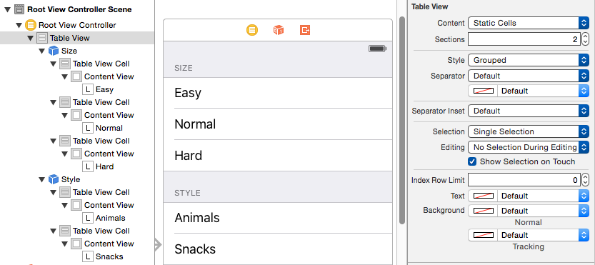
Figure 8-7. Designing a static table in the storyboard editor
Even though each cell is designed initially in the storyboard, I can still implement tableView(_:cellForRowAt:) to call super and then add further functionality. And even though the section header titles are set in the storyboard, I can call tableView(_:titleForHeaderInSection:) to learn the title of the current section. So that’s how I’ll add the checkmarks. The user defaults will store the current choice in each of the two categories; there are two preferences whose key is the section title and whose value is the title of the chosen cell:
override func tableView(_ tv: UITableView,
    cellForRowAt ix: IndexPath) -> UITableViewCell {
        let cell = super.tableView(tv, cellForRowAt:ix)
        let ud = UserDefaults.standard
        cell.accessoryType = .none
        if let title = self.tableView(
            tv, titleForHeaderInSection:ix.section) {
                if let label = ud.value(forKey:title) as? String {
                    if label == cell.textLabel!.text {
                        cell.accessoryType = .checkmark
                    }
                }
        }
        return cell
}
When the user taps a cell, the cell is selected. I want the user to see that selection momentarily, as feedback, but then I want to deselect, adjusting the checkmarks so that that cell is the only one checked in its section. In tableView(_:didSelectRowAt:), I set the user defaults, and then I reload the table view’s data. This removes the selection and causes tableView(_:cellForRowAt:) to be called to adjust the checkmarks:
override func tableView(_ tv: UITableView, didSelectRowAt ix: IndexPath) {
    let ud = UserDefaults.standard
    let setting = tv.cellForRow(at:ix)!.textLabel!.text
    let header = self.tableView(tv, titleForHeaderInSection:ix.section)!
    ud.setValue(setting, forKey:header)
    tv.reloadData()
}
Table View Scrolling and Layout
A UITableView is a UIScrollView, so everything you already know about scroll views is applicable (Chapter 7). In addition, a table view supplies two convenience scrolling methods:
-
scrollToRow(at:at:animated:) -
scrollToNearestSelectedRow(at:animated:)
One of the parameters is a scroll position, like the scrollPosition parameter for selectRow, discussed earlier in this chapter.
The following UITableView methods mediate between the table’s bounds coordinates on the one hand and table structure on the other:
-
indexPathForRow(at:) -
indexPathsForRows(in:) -
rect(forSection:) -
rectForRow(at:) -
rectForFooter(inSection:) -
rectForHeader(inSection:)
The table’s own header and footer are direct subviews of the table view, so their positions within the table’s bounds are given by their frames.
Table View State Restoration
If a UITableView participates in state saving and restoration (Chapter 6), the restoration mechanism would like to restore the selection and the scroll position. This behavior is automatic; the restoration mechanism knows both what cells should be visible and what cells should be selected, in terms of their index paths. If that’s satisfactory, you’ve no further work to do.
In some apps, however, there is a possibility that when the app is relaunched, the underlying data may have been rearranged somehow. Perhaps what’s meaningful in dictating what the user should see in such a case is not the previous rows but the previous data. The state saving and restoration mechanism doesn’t know anything about the relationship between the cells and the underlying data. If you’d like to tell it, adopt the UIDataSourceModelAssociation protocol and implement two methods:
modelIdentifierForElement(at:in:)-
Based on an index path, you return some string that you will later be able to use to identify uniquely this bit of model data.
indexPathForElement(withModelIdentifier:in:)-
Based on the unique identifier you provided earlier, you return the index path at which this bit of model data is displayed in the table now.
Devising a system of unique identification and incorporating it into your data model is up to you.
Table View Searching
A common need is to make a table view searchable, typically through a search field (a UISearchBar; see Chapter 12). A commonly used interface for presenting the results of such a search is a table view! Thus, in effect, entering characters in the search field appears to filter the original table.
This interface is managed through a UIViewController subclass, UISearchController. UISearchController has nothing to do, per se, with table views! A table view is not the only thing you might want to search, and a table view is not the only way you might want to present the results of a search. UISearchController itself is completely agnostic about what is being searched and about the form in which the results are presented. However, using a table view to present the results of searching a table view is a common interface. (A collection view, described later in this chapter, is another common thing to search and to present search results.) So this is a good place to introduce UISearchController.
Configuring a Search Controller
Here are the steps for configuring a UISearchController:
-
Create and retain a UISearchController instance. To do so, you’ll call the designated initializer,
init(searchResultsController:). The parameter is a view controller — a UIViewController subclass instance that you will have created for this purpose. The search controller will retain this view controller as a child view controller. When the time comes to display search results, the search controller will present itself as a presented view controller, with this view controller’s view inside its own view; that is where the search results are to be displayed. -
Assign to the search controller’s
searchResultsUpdateran object to be notified when the search results change. This must be an object adopting the UISearchResultsUpdating protocol, which means that it implements one method:updateSearchResults(for:). Very typically, this will be the same view controller that you passed as thesearchResultsController:parameter when you initialized the search controller, but no law says that it has to be the same object or even that it has to be a view controller. -
Acquire the search controller’s
searchBarand put it into the interface.
Thinking about these steps, you can see what the search controller is proposing to do for you — and what it isn’t going to do for you. It isn’t going to display the search results. It isn’t going to manage the search results. It isn’t even going to do any searching! It owns a search bar, which you have placed into the interface; and it’s going to keep an eye on that search bar. When the user taps in that search bar to begin searching, the search controller will respond by presenting itself and managing the view controller you specified. Then, as the user enters characters in the search bar, the search controller will keep calling the search results updater’s updateSearchResults(for:). Finally, when the user taps the search bar’s Cancel button, the search controller will dismiss itself.
A UISearchController has just a few other properties you might want to configure:
obscuresBackgroundDuringPresentation-
Whether a “dimming view” should appear behind the search controller’s own view. Defaults to
true, but I’ll give an example later where it needs to be set tofalse. hidesNavigationBarDuringPresentation-
Whether a navigation bar, if present, should be hidden. Defaults to
true, but I’ll give an example later where it needs to be set tofalse.
A UISearchController can also be assigned a delegate (UISearchControllerDelegate), which is notified before and after presentation and dismissal. The delegate works in one of two ways:
presentSearchController(_:)-
If you implement this method, then you are expected to present the search controller yourself, by calling
present(_:animated:completion:). In that case, the other delegate methods are not called. willPresentSearchController(_:)didPresentSearchController(_:)willDismissSearchController(_:)didDismissSearchController(_:)-
Called only if you didn’t implement
presentSearchController(_:).
The minimalistic nature of the search controller’s behavior is exactly the source of its power and flexibility, because it leaves you the freedom to take care of the details: what searching means, and what displaying search results means, is up to you.
Using a Search Controller
I’ll demonstrate several variations on the theme of using a search controller to make a table view searchable. In these examples, searching will mean finding the search bar text within the text displayed in the table view’s cells. (My searchable table view will be the list of U.S. states, with sections and an index, developed earlier in this chapter.)
Minimal search results table
Let’s start with the simplest possible case. We will have two table view controllers — one managing the original table view, the other managing the search results table view. I propose to make the search results table view as minimal as possible, a rock-bottom table view with .default style cells, where each search result will be the text of a cell’s textLabel (Figure 8-8).

Figure 8-8. Searching a table
In the original table’s UITableViewController, I configure the UISearchController as I described earlier. I have a property, self.searcher, waiting to retain the search controller. I also have a second UITableViewController subclass, which I have rather boringly called SearchResultsController, whose job will be to obtain and present the search results. In viewDidLoad, I instantiate SearchResultsController, create the UISearchController, and put its search bar into the interface as the table view’s header view (and scroll to hide that search bar initially, a common convention):
let src = SearchResultsController(data: self.cellData)
let searcher = MySearchController(searchResultsController: src)
self.searcher = searcher
searcher.searchResultsUpdater = src
let b = searcher.searchBar
b.sizeToFit() // crucial, trust me on this one
b.autocapitalizationType = .none
self.tableView.tableHeaderView = b
self.tableView.reloadData()
self.tableView.scrollToRow(
    at:IndexPath(row: 0, section: 0),
    at:.top, animated:false)
Warning
Adding the search bar as the table view’s header view has an odd side effect: it causes the table view’s background color to be covered by an ugly gray color, visible above the search bar when the user scrolls down. The official workaround is to assign the table view a backgroundView with the desired color.
Now we turn to SearchResultsController. It is a completely vanilla table view controller, qua table view controller. But I’ve given it two special features:
-
It is capable of receiving the searchable data. You can see this happening, in fact, in the first line of the preceding code.
-
It is capable of filtering that data and displaying the filtered data in its table view.
I’m not using sections in the SearchResultsController’s table, so it will simplify things if, as I receive the searchable data in the SearchResultsController, I flatten it from an array of arrays to a simple array:
init(data:[[String]]) {
    self.originalData = data.flatMap{$0}
    super.init(nibName: nil, bundle: nil)
}
I have stored the flattened data in the self.originalData array, but what I display in the table view is a different array, self.filteredData. This is initially empty, because there are no search results until the user starts typing in the search field:
override func numberOfSections(in tableView: UITableView) -> Int {
    return 1
}
override func tableView(_ tableView: UITableView,
    numberOfRowsInSection section: Int) -> Int {
        return self.filteredData.count
}
override func tableView(_ tableView: UITableView,
    cellForRowAt indexPath: IndexPath) -> UITableViewCell {
        let cell = tableView.dequeueReusableCell(
            withIdentifier:"Cell", for: indexPath)
        cell.textLabel!.text = self.filteredData[indexPath.row]
        return cell
}
All of that is sheer boilerplate and is perfectly obvious; but how does our search results table go from being empty to displaying any search results? That’s the second special feature of SearchResultsController. It adopts UISearchResultsUpdating, so it implements updateSearchResults(for:). And it is the searchResultsUpdater of our UISearchController, so updateSearchResults(for:) will be called each time the user changes the text of the search bar. It simply uses the current text of the search controller’s searchBar to filter self.originalData into self.filteredData and reloads the table view:
func updateSearchResults(for searchController: UISearchController) {
    let sb = searchController.searchBar
    let target = sb.text!
    self.filteredData = self.originalData.filter { s in
        let found = s.range(of:target, options: .caseInsensitive)
        return (found != nil)
    }
    self.tableView.reloadData()
}
That’s all! Of course, it’s an artificially simple example; I’m describing the interface and the use of a UISearchController, not a real app. In real life you would presumably want to allow the user to do something with the search results, perhaps by tapping on a cell in the search results table.
Search bar scope buttons
If we wanted our search bar to have scope buttons, we would set its scopeButtonTitles immediately after calling sizeToFit in the preceding code:
let b = searcher.searchBar
b.sizeToFit() // crucial, trust me on this one
b.scopeButtonTitles = ["Starts", "Contains"]
The scope buttons don’t appear in the table header view, but they do appear when the search controller presents itself. However, the search controller does not automatically call us back in updateSearchResults(for:) when the user taps on a scope button. To work around that, we simply make ourselves the search bar’s delegate, so as to be notified through the delegate method searchBar(_:selectedScopeButtonIndexDidChange:) — which can then turn right around and call updateSearchResults(for:) (provided it has a reference to the search controller, which is easy to arrange beforehand). Here, I’ll make our SearchResultsController respond to the distinction that a state name either starts with or contains the search text:
func updateSearchResults(for searchController: UISearchController) {
    self.searchController = searchController // weak ref
    let sb = searchController.searchBar
    let target = sb.text!
    self.filteredData = self.originalData.filter { s in
        var options = String.CompareOptions.caseInsensitive
        // we now have scope buttons; 0 means "starts with"
        if searchController.searchBar.selectedScopeButtonIndex == 0 {
            options.insert(.anchored)
        }
        let found = s.range(of:target, options: options)
        return (found != nil)
    }
    self.tableView.reloadData()
}
func searchBar(_ searchBar: UISearchBar,
    selectedScopeButtonIndexDidChange selectedScope: Int) {
        self.updateSearchResults(for:self.searchController!)
}
Search bar in navigation bar
No law says that you have to put the UISearchController’s search bar into a table view’s header view. Another common interface is for the search bar to appear in a navigation bar at the top of the screen. For example, assuming we are already in a navigation interface, you might make the search bar your view controller’s navigationItem.titleView. You won’t want the navigation bar to vanish when the user searches, so you’ll set the search controller’s hidesNavigationBarDuringPresentation to false. To prevent the presented search controller’s view from covering the navigation bar, set your view controller’s definesPresentationContext to true; the presented search controller’s view will cover your view controller’s view, but not the navigation bar, which belongs to the navigation controller’s view:
let src = SearchResultsController(data: self.cellData)
let searcher = UISearchController(searchResultsController: src)
self.searcher = searcher
searcher.searchResultsUpdater = src
let b = searcher.searchBar
b.sizeToFit()
b.autocapitalizationType = .none
self.navigationItem.titleView = b // *
searcher.hidesNavigationBarDuringPresentation = false // *
self.definesPresentationContext = true // *
We might also want the search results to appear as a popover on an iPad (Chapter 9). To arrange that, we add one more line:
searcher.modalPresentationStyle = .popover
No secondary search results view controller
You can also use a search controller without a distinct search results view controller. There will be no SearchResultsController; instead, we’ll present the search results in the original table view.
To configure our search controller, we pass nil as its searchResultsController and set ourselves as the searchResultsUpdater. We also set the search controller’s obscuresBackgroundDuringPresentation to false; this allows the original table view to remain visible and touchable behind the search controller’s view:
let searcher = UISearchController(searchResultsController:nil)
self.searcher = searcher
searcher.obscuresBackgroundDuringPresentation = false
searcher.searchResultsUpdater = self
searcher.delegate = self
The implementation is a simple problem in table data source management. We keep an immutable copy of our data model arrays, self.cellData and self.sectionNames — let’s call the copies self.originalCellData and self.originalSectionNames. These copies are unused if we’re not searching. If we are searching, we hear about it through the search controller’s delegate methods, and we raise a Bool flag in a property:
func willPresentSearchController(_ searchController: UISearchController) {
    self.searching = true
}
func willDismissSearchController(_ searchController: UISearchController) {
    self.searching = false
}
Any of our table view delegate or data source methods can consult this flag. For example, it might be nice to remove the index while searching is going on:
override func sectionIndexTitlesForTableView(tableView: UITableView)
    -> [String]? {
        return self.searching ? nil : self.sectionNames
}
All that remains is to implement updateSearchResults(for:) to filter self.originalCellData and self.originalSectionNames into the data model arrays self.cellData and self.sectionNames — or to copy them unfiltered if the search bar’s text is empty, which is also the signal that the search controller presentation is over:
func updateSearchResults(for searchController: UISearchController) {
    let sb = searchController.searchBar
    let target = sb.text!
    if target == "" {
        self.sectionNames = self.originalSectionNames
        self.cellData = self.originalCellData
        self.tableView.reloadData()
        return
    }
    // we have a target string
    self.cellData = self.originalCellData.map {
        $0.filter {
            let found = $0.range(of:target, options: .caseInsensitive)
            return (found != nil)
        }
    }.filter {$0.count > 0}
    self.sectionNames =
        self.cellData.map {String($0[0].characters.prefix(1))}
    self.tableView.reloadData()
}
Table View Editing
A table view cell has a normal state and an editing state, according to its isEditing property.
The editing state (or edit mode) is typically indicated visually by one or more of the following:
- Editing controls
-
At least one editing control will usually appear, such as a Minus button (for deletion) at the left side.
- Shrinkage
-
The content of the cell will usually shrink to allow room for an editing control. If there is no editing control, you can prevent a cell shifting its left end rightward in edit mode with the delegate’s
tableView(_:shouldIndentWhileEditingRowAt:). - Changing accessory view
-
The cell’s accessory view will change automatically in accordance with its
editingAccessoryTypeoreditingAccessoryView. If you assign neither, so that they arenil, the cell’s existing accessory view will vanish when in edit mode.
As with selection, you could set a cell’s isEditing property directly, but you are more likely to let the table view manage editability. Table view editability is controlled through the table view’s isEditing property, usually by sending the table the setEditing(_:animated:) message. The table is then responsible for putting its cells into edit mode.
A cell in edit mode can also be selected by the user if the table view’s allowsSelectionDuringEditing or allowsMultipleSelectionDuringEditing is true.
Putting the table into edit mode is usually left up to the user. A typical interface would be an Edit button that the user can tap. In a navigation interface, we might have our view controller supply the button as a bar button item in the navigation bar:
let b = UIBarButtonItem(barButtonSystemItem: .edit,
    target: self, action: #selector(doEdit))
self.navigationItem.rightBarButtonItem = b
Our action method will be responsible for putting the table into edit mode, so in its simplest form it might look like this:
func doEdit(_ sender: Any?) {
    self.tableView.setEditing(true, animated:true)
}
But that does not solve the problem of getting out of edit mode. The standard solution is to have the Edit button replace itself by a Done button:
func doEdit(_ sender: Any?) {
    var which : UIBarButtonSystemItem
    if !self.tableView.isEditing {
        self.tableView.setEditing(true, animated:true)
        which = .done
    } else {
        self.tableView.setEditing(false, animated:true)
        which = .edit
    }
    let b = UIBarButtonItem(barButtonSystemItem: which,
        target: self, action: #selector(doEdit))
    self.navigationItem.rightBarButtonItem = b
}
However, it turns out that all of that is completely unnecessary! If we want standard behavior, it’s already implemented for us. A UIViewController’s editButtonItem property vends a bar button item that calls the UIViewController’s setEditing(_:animated:) when tapped, tracks whether we’re in edit mode with the UIViewController’s isEditing property, and changes its own title accordingly (Edit or Done). Moreover, a UITableViewController’s implementation of setEditing(_:animated:) is to call setEditing(_:animated:) on its table view. Thus, if we’re using a UITableViewController, we get all of that behavior for free, just by retrieving the editButtonItem and inserting the resulting button into our interface:
self.navigationItem.rightBarButtonItem = self.editButtonItem
When the table view enters edit mode, it consults its data source and delegate about the editability of individual rows:
tableView(_:canEditRowAt:)to the data source-
The default is
true. The data source can returnfalseto prevent the given row from entering edit mode. tableView(_:editingStyleForRowAt:)to the delegate-
Each standard editing style corresponds to a control that will appear in the cell. The choices (UITableViewCellEditingStyle) are:
.delete-
The cell shows a Minus button at its left end. The user can tap this to summon a Delete button, which the user can then tap to confirm the deletion. This is the default.
.insert-
The cell shows a Plus button at its left end; this is usually taken to be an insert button.
.none-
No editing control appears.
If the user taps an insert button (the Plus button) or a delete button (the Delete button that appears after the user taps the Minus button), the data source is sent the tableView(_:commit:forRowAt:) message. This is where the actual insertion or deletion needs to happen. In addition to altering the data model, you will probably want to alter the structure of the table, and UITableView methods for doing this are provided:
-
insertRows(at:with:) -
deleteRows(at:with:) -
insertSections(_:with:) -
deleteSections(_:with:) -
moveSection(_:toSection:) -
moveRow(at:to:)
The with: parameters are row animations that are effectively the same ones discussed earlier in connection with refreshing table data; .left for an insertion means to slide in from the left, and for a deletion it means to slide out to the left, and so on. The two “move” methods provide animation with no provision for customizing it.
If you’re issuing more than one of these commands, you can combine them by surrounding them with beginUpdates and endUpdates, forming an updates block. An updates block combines not just the animations but the requested changes themselves. This relieves you from having to worry about how a command is affected by earlier commands in the same updates block; indeed, the order of commands within an updates block doesn’t really matter.
For example, if you delete row 1 of a certain section and then (in a separate command in the same updates block) delete row 2 of the same section, you delete two successive rows, just as you would expect; the notion “2” does not change its meaning because you deleted an earlier row first, because you didn’t delete an earlier row first — the updates block combines the commands for you, interpreting both index paths with respect to the state of the table before any changes are made. If you perform insertions and deletions together in one updates block, the deletions are performed first, regardless of the order of your commands, and the insertion row and section numbers refer to the state of the table after the deletions.
An updates block can also include reloadRows and reloadSections commands (but not reloadData).
I need hardly emphasize once again (but I will anyway) that view is not model. It is one thing to rearrange the appearance of the table, another to alter the underlying data. It is up to you to make certain you do both together. Do not, even for a moment, permit the data and the view to get out of synch with each other! If you delete a row, you must first remove from the model the datum that it represents. The runtime will try to help you with error messages if you forget to do this, but in the end the responsibility is yours. I’ll give examples as we proceed.
Deleting Cells
Deletion of cells is the default, so there’s not much for us to do in order to implement it. If our view controller is a UITableViewController and we’ve displayed the Edit button in a navigation bar, the interface is managed automatically: when the user taps the Edit button, the view controller’s setEditing(_:animated:) is called, the table view’s setEditing(_:animated:) is called, and the cells all show the Minus button at the left end. The user can then tap a Minus button; a Delete button is shown at the cell’s right end. You can customize the Delete button’s title with the table view delegate method tableView(_:titleForDeleteConfirmationButtonForRowAt:).
What is not automatic is the actual response to the Delete button. For that, we need to implement the data source method tableView(_:commit:forRowAt:). Typically, you’ll remove the corresponding entry from the underlying data model, and you’ll call deleteRows or deleteSections to update the appearance of the table.
To illustrate, let’s suppose once again that the underlying model is a pair of parallel arrays of strings (self.sectionNames) and arrays (self.cellData). Our approach will be in two stages:
-
Deal with the data model. We’ll delete the datum for the requested row; if this empties the section array, we’ll also delete that section array and the corresponding section name.
-
Deal with the table’s appearance. If we deleted the section array, we’ll call
deleteSections(and reload the section index if there is one); otherwise, we’ll calldeleteRows.
That’s the strategy; here’s the implementation:
override func tableView(_ tableView: UITableView,
    commit editingStyle: UITableViewCellEditingStyle,
    forRowAt ip: IndexPath) {
        self.cellData[ip.section].remove(at:ip.row)
        if self.cellData[ip.section].count == 0 {
            self.cellData.remove(at:ip.section)
            self.sectionNames.remove(at:ip.section)
            tableView.deleteSections(
                IndexSet(integer: ip.section), with:.automatic)
            tableView.reloadSectionIndexTitles()
        } else {
            tableView.deleteRows(at:[ip], with:.automatic)
        }
}
The user can also delete a row by sliding it to the left to show its Delete button without having explicitly entered edit mode; no other row is editable, and no other editing controls are shown. This feature is implemented “for free” by virtue of our having supplied an implementation of tableView(_:commit:forRowAt:).
If you’re like me, your first response will be: “Thanks for the free functionality, Apple, and now how do I turn this off?” Because the Edit button is already using the UIViewController’s isEditing property to track edit mode, we can take advantage of this and refuse to let any cells be edited unless the view controller is in edit mode:
override func tableView(_ tableView: UITableView,
    editingStyleForRowAt indexPath: IndexPath)
    -> UITableViewCellEditingStyle {
        return tableView.isEditing ? .delete : .none
}
Custom Action Buttons
When the user slides a cell to the left to reveal the Delete button behind it, or enters edit mode and taps the Minus button, you can add more buttons to be revealed behind the cell’s content view.
To configure the buttons for a row of the table, implement the table view delegate method tableView(_:editActionsForRowAt:) and return an array of UITableViewRowAction objects in right-to-left order (or nil to get the default Delete button). Create a row action button with its initializer, init(style:title:handler:). The parameters are:
style:-
A UITableViewRowActionStyle,
.defaultor.normal. By default,.defaultis a red button signaling a destructive action, like the Delete button, while.normalis a gray button. You can subsequently change the color by setting the button’sbackgroundColor. title:-
The text of the button.
handler:-
A function to be called when the button is tapped; it takes two parameters, a reference to the row action and the index path for this cell.
If you want the user to be able to slide the cell to reveal the buttons, you must implement tableView(_:commit:forRowAt:), even if your implementation is empty. Even if you don’t implement this method, the buttons can be revealed by putting the table view into edit mode and tapping the Minus button. Your handler: can call tableView(_:commit:forRowAt:) if appropriate; a custom Delete button, for example, might do so.
In this example, we give our cells a blue Mark button in addition to the default Delete button:
override func tableView(_ tableView: UITableView,
    editActionsForRowAt indexPath: IndexPath) -> [UITableViewRowAction]? {
    let act = UITableViewRowAction(style: .normal, title: "Mark") {
        action, ip in
        print("Mark") // in real life, do something here
    }
    act.backgroundColor = .blue
    let act2 = UITableViewRowAction(style: .default, title: "Delete") {
        action, ip in
        self.tableView(self.tableView, commit:.delete, forRowAt:ip)
    }
    return [act2, act]
}
Configuration of these buttons is disappointingly inflexible — for example, you can’t achieve anything like the Mail app’s interface — and many developers will prefer to continue rolling their own sliding table cells, as in the past.
Editable Content in Cells
A cell might have content that the user can edit directly, such as a UITextField (Chapter 10). Because the user is working in the view, you need a way to reflect the user’s changes into the model. This will probably involve putting yourself in contact with the interface object where the user does the editing.
To illustrate, I’ll implement a table view cell with a text field that is editable when the cell is in edit mode. Imagine an app that maintains a list of names and phone numbers. A name and phone number are displayed as a grouped style table, and they become editable when the user taps the Edit button (Figure 8-9).

Figure 8-9. A simple phone directory app
We don’t need a button at the left end of the cell when it’s being edited:
override func tableView(_ tableView: UITableView,
    editingStyleForRowAt indexPath: IndexPath)
    -> UITableViewCellEditingStyle {
        return .none
}
A UITextField is editable if its isEnabled is true. To tie this to the cell’s isEditing state, it is probably simplest to implement a custom UITableViewCell class. I’ll call it MyCell, and I’ll design it in the nib editor, giving it a single UITextField that’s pointed to through an outlet property called textField. In the code for MyCell, we override didTransition(to:), as follows:
class MyCell : UITableViewCell {
    @IBOutlet weak var textField : UITextField!
    override func didTransition(to state: UITableViewCellStateMask) {
        self.textField.isEnabled = state.contains(.showingEditControlMask)
        super.didTransition(to:state)
    }
}
In the table view’s data source, we make ourselves the text field’s delegate when we create and configure the cell:
override func tableView(_ tableView: UITableView,
    cellForRowAt indexPath: IndexPath) -> UITableViewCell {
        let cell = tableView.dequeueReusableCell(
            withIdentifier:"Cell", for: indexPath) as! MyCell
        switch indexPath.section {
        case 0:
            cell.textField.text = self.name
        case 1:
            cell.textField.text = self.numbers[indexPath.row]
            cell.textField.keyboardType = .numbersAndPunctuation
        default: break
        }
        cell.textField.delegate = self
        return cell
}
We are the UITextField’s delegate, so we are responsible for implementing the Return button in the keyboard to dismiss the keyboard (I’ll talk more about this in Chapter 10):
func textFieldShouldReturn(_ textField: UITextField) -> Bool {
    textField.endEditing(true)
    return false
}
When a text field stops editing, we are its delegate, so we can hear about it in textFieldDidEndEditing(_:). We work out which cell this text field belongs to — I like to do this by simply walking up the view hierarchy until I come to a table view cell — and update the model accordingly:
func textFieldDidEndEditing(_ textField: UITextField) {
    // some cell's text field has finished editing; which cell?
    var v : UIView = textField
    repeat { v = v.superview! } while !(v is UITableViewCell)
    let cell = v as! MyCell
    // update data model to match
    let ip = self.tableView.indexPath(for:cell)!
    if ip.section == 1 {
        self.numbers[ip.row] = cell.textField.text!
    } else if ip.section == 0 {
        self.name = cell.textField.text!
    }
}
Inserting Cells
You are unlikely to attach a Plus (insert) button to every row. A more likely interface is that when a table is edited, every row has a Minus button except the last row, which has a Plus button; this shows the user that a new row can be appended at the end of the list.

Figure 8-10. Phone directory app in edit mode
Let’s implement this for phone numbers in our name-and-phone-number app, allowing the user to give a person any quantity of phone numbers (Figure 8-10):
override func tableView(_ tableView: UITableView,
    editingStyleForRowAt indexPath: IndexPath)
    -> UITableViewCellEditingStyle {
        if indexPath.section == 1 {
            let ct = self.tableView(
                tableView, numberOfRowsInSection:indexPath.section)
            if ct-1 == indexPath.row {
                return .insert
            }
            return .delete;
        }
        return .none
}
The person’s name has no editing control (a person must have exactly one name), so we prevent it from indenting in edit mode:
override func tableView(_ tableView: UITableView,
    shouldIndentWhileEditingRowAt indexPath: IndexPath) -> Bool {
        if indexPath.section == 1 {
            return true
        }
        return false
}
When the user taps an editing control, we must respond. We immediately force our text fields to cease editing: the user may have tapped the editing control while editing, and we want our model to contain the very latest changes, so this is effectively a way of causing our textFieldDidEndEditing to be called. The model for our phone numbers is an array of strings (self.numbers). We already know what to do when the tapped control is a delete button; things are similar when it’s an insert button, but we’ve a little more work to do. The new row will be empty, and it will be at the end of the table; so we append an empty string to the self.numbers model array, and then we insert a corresponding row at the end of the table view. But now two successive rows have a Plus button; the way to fix that is to reload the first of those rows. Finally, we also show the keyboard for the new, empty phone number, so that the user can start editing it immediately; we do that outside the updates block:
override func tableView(_ tableView: UITableView,
    commit editingStyle: UITableViewCellEditingStyle,
    forRowAt indexPath: IndexPath) {
        tableView.endEditing(true)
        if editingStyle == .insert {
            self.numbers += [""]
            let ct = self.numbers.count
            tableView.beginUpdates()
            tableView.insertRows(at: [IndexPath(row:ct-1, section:1)],
                with:.automatic)
            tableView.reloadRows(at: [IndexPath(row:ct-2, section:1)],
                with:.automatic)
            tableView.endUpdates()
            // crucial that this next bit be *outside* the updates block
            let cell = self.tableView.cellForRow(
                at: IndexPath(row:ct-1, section:1))
            (cell as! MyCell).textField.becomeFirstResponder()
        }
        if editingStyle == .delete {
            self.numbers.remove(at:indexPath.row)
            tableView.beginUpdates()
            tableView.deleteRows(at:[indexPath], with:.automatic)
            tableView.reloadSections(IndexSet(integer:1), with:.automatic)
            tableView.endUpdates()
        }
}
Rearranging Cells
If the data source implements tableView(_:moveRowAt:to:), the table displays a reordering control at the right end of each row in edit mode (Figure 8-10), and the user can drag it to rearrange cells. The reordering control can be suppressed for individual cells by implementing tableView(_:canMoveRowAt:). The user is free to move rows that display a reordering control, but the delegate can limit where a row can be moved to by implementing tableView(_:targetIndexPathForMoveFromRowAt:toProposedIndexPath:).
To illustrate, we’ll add to our name-and-phone-number app the ability to rearrange phone numbers. There must be multiple phone numbers to rearrange:
override func tableView(_ tableView: UITableView,
    canMoveRowAt indexPath: IndexPath) -> Bool {
        if indexPath.section == 1 && self.numbers.count > 1 {
            return true
        }
        return false
}
A phone number must not be moved out of its section, so we implement the delegate method to prevent this. We also take this opportunity to dismiss the keyboard if it is showing:
override func tableView(_ tableView: UITableView,
    targetIndexPathForMoveFromRowAt sourceIndexPath: IndexPath,
    toProposedIndexPath proposedDestinationIndexPath: IndexPath)
    -> IndexPath {
        tableView.endEditing(true)
        if proposedDestinationIndexPath.section == 0 {
            return IndexPath(row:0, section:1)
        }
        return proposedDestinationIndexPath
}
After the user moves an item, tableView(_:moveRowAt:to:) is called, and we trivially update the model to match. We also reload the table, to fix the editing controls:
override func tableView(_ tableView: UITableView,
    moveRowAt fromIndexPath: IndexPath,
    to toIndexPath: IndexPath) {
        let s = self.numbers[fromIndexPath.row]
        self.numbers.remove(at:fromIndexPath.row)
        self.numbers.insert(s, at: toIndexPath.row)
        tableView.reloadData()
}
Dynamic Cells
A table may be rearranged not just in response to the user working in edit mode, but for some other reason entirely. In this way, many interesting and original interfaces are possible.
In this example, we permit the user to double tap on a section header as a way of collapsing or expanding the section — that is, we’ll suppress or permit the display of the rows of the section, with a nice animation as the change takes place. (This idea is shamelessly stolen from a WWDC 2010 video.)
One more time, our data model consists of the two arrays, self.sectionNames and self.cellData. I’ve also got a Set (of Int), self.hiddenSections, in which I’ll list the sections that aren’t displaying their rows. That list is all I’ll need, since either a section is showing all its rows or it’s showing none of them:
override func tableView(_ tableView: UITableView,
    numberOfRowsInSection section: Int) -> Int {
        if self.hiddenSections.contains(section) {
            return 0
        }
        return self.cellData[section].count
}
We need a correspondence between a section header and the number of its section. It’s odd that UITableView doesn’t give us such a correspondence; it provides indexPath(for:) to get from a cell to its index path, but there is no section(for:) to get from a header view to its section. My solution is to subclass UITableViewHeaderFooterView and give my subclass a public property section:
class MyHeaderView : UITableViewHeaderFooterView {
    var section = 0
}
Whenever tableView(_:viewForHeaderInSection:) is called, I set the header view’s section property:
override func tableView(_ tableView: UITableView,
    viewForHeaderInSection section: Int) -> UIView? {
        let h = tableView.dequeueReusableHeaderFooterView(
            withIdentifier:"Header") as! MyHeaderView
        if h.gestureRecognizers == nil {
            let tap = UITapGestureRecognizer(
                target: self, action: #selector(tapped))
            tap.numberOfTapsRequired = 2
            h.addGestureRecognizer(tap)
            // ...
        }
        // ...
        h.section = section // *
        return h
}
As you can see, I’ve also attached a UITapGestureRecognizer to my header views, so we can detect a double tap. When the user double taps a section header, we learn from the header what section this is, we find out from the model how many rows this section has, and we derive the index paths of the rows we’re about to insert or remove. Now we look for the section number in our hiddenSections set. If it’s there, we’re about to display the rows, so we remove that section number from hiddenSections, and we insert the rows. If it’s not there, we’re about to hide the rows, so we insert that section number into hiddenSections, and we delete the rows:
func tapped (_ g : UIGestureRecognizer) {
    let v = g.view as! MyHeaderView
    let sec = v.section
    let ct = self.cellData[sec].count
    let arr = (0..<ct).map {IndexPath(row:$0, section:sec)}
    if self.hiddenSections.contains(sec) {
        self.hiddenSections.remove(sec)
        self.tableView.beginUpdates()
        self.tableView.insertRows(at:arr, with:.automatic)
        self.tableView.endUpdates()
        self.tableView.scrollToRow(at:arr[ct-1], at:.none, animated:true)
    } else {
        self.hiddenSections.insert(sec)
        self.tableView.beginUpdates()
        self.tableView.deleteRows(at:arr, with:.automatic)
        self.tableView.endUpdates()
    }
}
Another useful device is to use an empty updates block — that is, to call beginUpdates immediately followed by endUpdates, with nothing in between. The section and row structure of the table will be asked for, along with calculation of all heights, but no cells and no headers or footers are requested. Thus, this technique causes the table view to be laid out freshly without reloading any cells. Moreover, if any heights have changed since the last time the table view was laid out, the change in height is animated! In this way, you can cause a cell’s height to change in real time, before the user’s eyes.
Table View Menus
A menu, in iOS, is a sort of balloon containing tappable words such as Copy, Cut, and Paste. You can permit the user to display a menu from a table view cell by performing a long press on the cell. The long press followed by display of the menu gives the cell a selected appearance, which goes away when the menu is dismissed.
To allow the user to display a menu from a table view’s cells, you implement three delegate methods:
tableView(_:shouldShowMenuForRowAt:)-
Return
trueif the user is to be permitted to summon a menu by performing a long press on this cell. tableView(_:canPerformAction:forRowAt:withSender:)-
You’ll be called repeatedly with selectors for various actions that the system knows about. Returning
true, regardless, causes the Copy, Cut, and Paste menu items to appear in the menu, corresponding to the UIResponderStandardEditActionscopy,cut, andpaste; returnfalseto prevent the menu item for an action from appearing. The menu itself will then appear unless you returnfalseto all three actions. The sender is the shared UIMenuController. tableView(_:performAction:forRowAt:withSender:)-
The user has tapped one of the menu items; your job is to respond to it somehow.
Here’s an example where the user can summon a Copy menu from any cell (Figure 8-11):
@nonobjc let copy = #selector(UIResponderStandardEditActions.copy)
override func tableView(_ tableView: UITableView,
    shouldShowMenuForRowAt indexPath: IndexPath) -> Bool {
        return true
}
override func tableView(_ tableView: UITableView,
    canPerformAction action: Selector,
    forRowAt indexPath: IndexPath,
    withSender sender: Any?) -> Bool {
        return action == copy
}
override func tableView(_ tableView: UITableView,
    performAction action: Selector,
    forRowAt indexPath: IndexPath,
    withSender sender: Any?) {
        if action == copy {
            // ... do whatever copying consists of ...
        }
}

Figure 8-11. A table view cell with a menu
To add a custom menu item to the menu (other than copy, cut, and paste) is a little more work. Imagine a table of the names of U.S. states, where one can copy a state’s two-letter abbreviation to the clipboard. We want to give the menu an additional menu item whose title is Abbrev. The trick is that this menu item’s action must correspond to a method in the cell. We will therefore need our table to use a custom UITableViewCell subclass; we’ll call it MyCell:
class MyCell : UITableViewCell {
    func abbrev(_ sender: Any?) {
        // ...
    }
}
We must tell the shared UIMenuController to append the menu item to the global menu; the tableView(_:shouldShowMenuForRowAt:) delegate method is a good place to do this:
@nonobjc let copy = #selector(UIResponderStandardEditActions.copy)
@nonobjc let abbrev = #selector(MyCell.abbrev)
override func tableView(_ tableView: UITableView,
    shouldShowMenuForRowAt indexPath: IndexPath) -> Bool {
        let mi = UIMenuItem(title: "Abbrev", action: abbrev)
        UIMenuController.shared.menuItems = [mi]
        return true
}
If we want this menu item to appear in the menu, and if we want to respond to it when the user taps it, we must add its action selector to the two performAction: delegate methods:
override func tableView(_ tableView: UITableView,
    canPerformAction action: Selector,
    forRowAt indexPath: IndexPath,
    withSender sender: Any?) -> Bool {
        return action == copy || action == abbrev
}
override func tableView(_ tableView: UITableView,
    performAction action: Selector,
    forRowAt indexPath: IndexPath,
    withSender sender: Any?) {
        if action == copy {
            // ... do whatever copying consists of ...
        }
        if action == abbrev {
            // ... do whatever abbreviating consists of ...
        }
}
The Abbrev menu item now appears when the user long presses a cell of our table, and the cell’s abbrev method is called when the user taps that menu item. It’s time to implement that method! We could respond directly to the tap in the cell, but it seems more consistent that our table view delegate should respond. So we work out what table view this cell belongs to and send its delegate the very message it is already expecting:
func abbrev(_ sender: Any?) {
    // find my table view
    var v : UIView = self
    repeat {v = v.superview!} while !(v is UITableView)
    let tv = v as! UITableView
    // ask it what index path we are
    let ip = tv.indexPath(for: self)!
    // talk to its delegate
    tv.delegate?.tableView?(tv,
        performAction:#selector(abbrev), forRowAt:ip, withSender:sender)
}
Collection Views
A collection view (UICollectionView) is a UIScrollView subclass that generalizes the notion of a UITableView. Indeed, knowing about table views, you know a great deal about collection views already; they are extremely similar:
-
A collection view has reusable cells. These are UICollectionViewCell instances.
-
Where a table view has rows, a collection view has items.
-
A collection view can clump its items into sections, identified by section number.
-
You’ll make the cells reusable: either you’ll register a class or nib with the collection view or, if the collection view is instantiated from a storyboard, you can get reusable cells from the storyboard.
-
A collection view has a data source (UICollectionViewDataSource) and a delegate (UICollectionViewDelegate), and it’s going to ask the data source Three Big Questions:
-
numberOfSections(in:) -
collectionView(_:numberOfItemsInSection:) -
collectionView(_:cellForItemAt:)
-
-
To answer the third Big Question, your data source will obtain a cell by calling:
-
dequeueReusableCell(withReuseIdentifier:for:)
-
-
A collection view allows the user to select a cell, or multiple cells. The delegate is notified of highlighting and selection. Your code can rearrange the cells, inserting, moving, and deleting cells or entire sections. If the delegate permits, the user can long press a cell to produce a menu, or rearrange the cells by dragging.
-
A collection view can have a refresh control.
-
You can manage your UICollectionView through a UIViewController subclass — a subclass of UICollectionViewController.
A collection view section can have a header and footer, but the collection view itself does not call them that; instead, it generalizes its subview types into cells, on the one hand, and supplementary views, on the other. A supplementary view is just a UICollectionReusableView, which happens to be UICollectionViewCell’s superclass. A supplementary view is associated with a kind, which is just a string identifying its type; thus you can have a header as one kind, a footer as another kind, and anything else you can imagine. A supplementary view in a collection view is then similar to a header or footer view in a table view:
-
You can make supplementary views reusable by registering a class with the collection view.
-
The data source method where you are asked for a supplementary view will be:
-
collectionView(_:viewForSupplementaryElementOfKind:at:)
-
-
In that method, your data source will obtain a supplementary view by calling:
-
dequeueReusableSupplementaryView(ofKind:withReuseIdentifier:for:)
-
The big difference between a table view and a collection view is how the collection view lays out its elements (cells and supplementary views). A table view lays out its cells in just one way: a vertically scrolling column, where the cells’ widths are the width of the table view, their heights are dictated by the table view or the delegate, and the cells are touching one another. A collection view has no such rules. In fact, a collection view doesn’t lay out its elements at all! That job is left to another class, a subclass of UICollectionViewLayout.
A UICollectionViewLayout subclass instance is responsible for the overall layout of the collection view that owns it. It does this by answering some Big Questions of its own, posed by the collection view; the most important are these:
collectionViewContentSize-
How big is the entire layout? The collection view needs to know this, because the collection view is a scroll view (Chapter 7), and this will be the content size of the scrollable material that it will display.
layoutAttributesForElements(in:)-
Where do all the elements go? The layout attributes, as I’ll explain in more detail in a moment, are bundles of positional information.
To answer these questions, the collection view layout needs to ask the collection view some questions as well. It will want to know the collection view’s bounds, and it will probably call such methods as numberOfSections and numberOfItems(inSection:). The collection view, in turn, gets the answers to those questions from its data source.
The collection view layout can thus assign the elements any positions it likes, and the collection view will faithfully draw them in those positions within its content rectangle. That seems very open-ended, and indeed it is. To get you started, there’s a built-in UICollectionViewLayout subclass — UICollectionViewFlowLayout.
UICollectionViewFlowLayout arranges its cells in something like a grid. The grid can be scrolled either horizontally or vertically, but not both; so this grid is a series of rows or columns. Through properties and a delegate protocol of its own (UICollectionViewDelegateFlowLayout), the UICollectionViewFlowLayout instance lets you provide hints about how big the cells are and how they should be spaced out. It defines two supplementary view types, using them to let you give each section a header and a footer.
Figure 8-12 shows a collection view, laid out with a flow layout, from my Latin flashcard app. This interface simply lists the chapters and lessons into which the flashcards themselves are divided, and allows the user to jump to a desired lesson by tapping it. Previously, I was using a table view to present this list; when collection views were introduced (in iOS 6), I adopted one for this interface, and you can see why. Instead of a lesson item like “1a” occupying an entire row that stretches the whole width of a table, it’s just a little rectangle; in landscape orientation, the flow layout fits five of these rectangles onto a line for me (and on a bigger phone, it might be seven or eight). So a collection view is a much more compact and appropriate way to present this interface than a table view.

Figure 8-12. A collection view in my Latin flashcard app
If UICollectionViewFlowLayout doesn’t quite meet your needs, you can subclass it, or you can subclass UICollectionViewLayout itself. (I’ll talk more about that later on.) A familiar example of a collection view interface is Apple’s Photos app; it probably uses a UICollectionViewFlowLayout subclass.
Collection View Classes
Here are the main classes associated with UICollectionView. This is just a conceptual overview; I don’t recite all the properties and methods of each class, which you can learn from the documentation:
- UICollectionViewController
-
A UIViewController subclass. Like a table view controller, UICollectionViewController is convenient if a UICollectionView is to be a view controller’s view, but is not required. It is the delegate and data source of its
collectionViewby default. The designated initializer requires you to supply a layout instance, which will be itscollectionViewLayout. In the nib editor, there is a Collection View Controller nib object, which comes with a collection view. - UICollectionView
-
A UIScrollView subclass. It has a
backgroundColor(because it’s a view) and optionally abackgroundViewin front of that. Its designated initializer requires you to supply a layout instance, which will be itscollectionViewLayout. In the nib editor, there is a Collection View nib object, which comes with a Collection View Flow Layout by default; you can change the collection view layout class with the Layout pop-up menu in the Attributes inspector.A collection view’s capabilities are parallel to those of a UITableView, but fewer and simpler:
-
Where a table view speaks of rows, a collection view speaks of items. UICollectionView extends IndexPath so that you can refer to its
itemproperty instead of itsrowproperty. -
Where a table view speaks of a header or footer, a collection view speaks of a supplementary view.
-
A collection view doesn’t do layout, so it is not where things like header and cell size are configured.
-
A collection view has no notion of editing.
-
A collection view has no section index.
-
Where a table view batches updates with
beginUpdatesandendUpdates, a collection view usesperformBatchUpdates(_:completion:), which takes functions. -
A collection view performs animation when you insert, delete, or move sections or items, but you don’t specify an animation type. (The layout can modify the animation.)
-
- UICollectionViewLayoutAttributes
-
A value class (a bunch of properties), tying together an element’s
indexPathwith the specifications for how and where it should be drawn — specifications that are remarkably reminiscent of view or layer properties, with names likeframe,center,size,transform, and so forth. Layout attributes objects function as the mediators between the layout and the collection view; they are what the layout passes to the collection view to tell it where all the elements of the view should go. - UICollectionViewCell
-
An extremely minimal view class. It has an
isHighlightedproperty and anisSelectedproperty. It has acontentView, aselectedBackgroundView, abackgroundView, and of course (since it’s a view) abackgroundColor, layered in that order, just like a table view cell; everything else is up to you.If you start with a collection view in a storyboard, you get prototype cells, which you obtain by dequeuing. Otherwise, you obtain cells through registration and dequeuing.
- UICollectionReusableView
-
The superclass of UICollectionViewCell — so it is even more minimal! This is the class of supplementary views such as headers and footers. You obtain reusable views through registration and dequeuing; if you’re using a flow layout in a storyboard, you are given header and footer prototype views.
- UICollectionViewLayout
-
The layout workhorse class for a collection view. A collection view cannot exist without a layout instance! As I’ve already said, the layout knows how much room all the subviews occupy, and supplies the
collectionViewContentSizethat sets thecontentSizeof the collection view, qua scroll view. In addition, the layout must answer questions from the collection view, by supplying a UICollectionViewLayoutAttributes object, or an array of such objects, saying where and how elements should be drawn. These questions come in two categories:- Static attributes
-
The collection view wants to know the layout attributes of an item or supplementary view, specified by index path, or of all elements within a given rect.
- Dynamic attributes
-
The collection view is inserting or removing elements. It asks for the layout attributes that an element, specified by index path, should have as insertion begins or removal ends. The collection view can thus animate between the element’s static attributes and these dynamic attributes. For example, if an element’s layout attributes
alphais0as removal ends, the element will appear to fade away as it is removed.
The collection view also notifies the layout of pending changes through some methods whose names start with
prepareandfinalize. This is another way for the layout to participate in animations, or to perform other kinds of preparation and cleanup.UICollectionViewLayout is an abstract class; to use it, you must subclass it, or start with the built-in subclass, UICollectionViewFlowLayout.
- UICollectionViewFlowLayout
-
A concrete subclass of UICollectionViewLayout; you can use it as is, or you can subclass it. It lays out items in a grid that can be scrolled either horizontally or vertically, and it defines two supplementary element types to serve as the header and footer of a section. A collection view in the nib editor has a Layout pop-up menu that lets you choose a Flow layout, and you can configure the flow layout in the Size inspector; in a storyboard, you can even add and design a header and a footer.
A flow layout has the following configurations:
-
A scroll direction
-
A
sectionInset(the margins for a section) -
An
itemSize, along with aminimumInteritemSpacingandminimumLineSpacing -
A
headerReferenceSizeandfooterReferenceSize -
Starting in iOS 9,
sectionHeadersPinToVisibleBoundsandsectionFootersPinToVisibleBounds(causing the headers and footers to behave like table view headers and footers when the user scrolls)
At a minimum, if you want to see any section headers, you must assign the flow layout a
headerReferenceSize, because the default is.zero. Otherwise, you get initial defaults that will at least allow you to see something immediately, such as anitemSizeof(50.0,50.0)along with reasonable default spacing between items and lines.UICollectionViewFlowLayout also defines a delegate protocol of its own, UICollectionViewDelegateFlowLayout. The flow layout automatically treats the collection view’s delegate as its own delegate. The section margins, item size, item spacing, line spacing, and header and footer size can be set for individual sections, cells, and supplementary views through this delegate.
-
Using a Collection View
Here’s how the view shown in Figure 8-12 is created. I have a UICollectionViewController subclass, LessonListController. Every collection view must have a layout, so LessonListController’s designated initializer initializes itself with a UICollectionViewFlowLayout:
init(terms data:[Term]) {
    self.terms = data.sorted {$0.lessonSection < $1.lessonSection}
    // ... other self-initializations here ...
    let layout = UICollectionViewFlowLayout()
    super.init(collectionViewLayout:layout)
}
In viewDidLoad, we give the flow layout its hints about the sizes of the margins, cells, and headers, as well as registering for cell and header reusability:
let HEADERID = "LessonHeader"
let CELLID = "LessonCell"
override func viewDidLoad() {
    super.viewDidLoad()
    let layout = self.collectionView!.collectionViewLayout
        as! UICollectionViewFlowLayout
    layout.sectionInset = UIEdgeInsetsMake(10,20,10,20)
    layout.headerReferenceSize = CGSize(0,40)
    layout.itemSize = CGSize(70,45)
    self.collectionView!.register(
        UINib(nibName:CELLID, bundle:nil),
        forCellWithReuseIdentifier:CELLID)
    self.collectionView!.register(
        UICollectionReusableView.self,
        forSupplementaryViewOfKind:UICollectionElementKindSectionHeader,
        withReuseIdentifier:HEADERID)
    self.collectionView!.backgroundColor = .myGolden
}
The first two of the Three Big Questions to the data source are boring and familiar:
override func numberOfSections(
    in collectionView: UICollectionView) -> Int {
        return self.sectionNames.count
}
override func collectionView(_ collectionView: UICollectionView,
    numberOfItemsInSection section: Int) -> Int {
        return self.cellData[section].count
}
The third of the Three Big Questions to the data source creates and configures the cells. In a .xib file, I’ve designed the cell with a single subview, a UILabel with tag 1; if the text of that label is still "Label", this is a sign that the cell has come freshly minted from the nib and needs further initial configuration. Among other things, I assign each new cell a selectedBackgroundView and give the label a highlightedTextColor, to get an automatic indication of selection:
override func collectionView(_ collectionView: UICollectionView,
    cellForItemAt indexPath: IndexPath) -> UICollectionViewCell {
        let cell = collectionView.dequeueReusableCell(
            withReuseIdentifier: CELLID, for: indexPath)
        let lab = cell.viewWithTag(1) as! UILabel
        if lab.text == "Label" {
            lab.highlightedTextColor = .white
            cell.backgroundColor = .myPaler
            cell.layer.borderColor = UIColor.brown.cgColor
            cell.layer.borderWidth = 5
            cell.layer.cornerRadius = 5
            let v = UIView()
            v.backgroundColor = UIColor.blue.withAlphaComponent(0.8)
            cell.selectedBackgroundView = v
        }
        let term = self.cellData[indexPath.section][indexPath.item]
        lab.text = term.lesson + term.sectionFirstWord
        return cell
}
The fourth data source method asks for the supplementary element views; in my case, these are the section headers. I configure the header entirely in code. Again I distinguish between newly minted views and reused views; the latter will already have a single subview, a UILabel:
override func collectionView(_ collectionView: UICollectionView,
    viewForSupplementaryElementOfKind kind: String,
    at indexPath: IndexPath) -> UICollectionReusableView {
        let v = collectionView.dequeueReusableSupplementaryView(
            ofKind: UICollectionElementKindSectionHeader,
            withReuseIdentifier: HEADERID, for: indexPath)
        if v.subviews.count == 0 {
            let lab = UILabel(frame:CGRect(10,0,100,40))
            lab.font = UIFont(name:"GillSans-Bold", size:20)
            lab.backgroundColor = .clear
            v.addSubview(lab)
            v.backgroundColor = .black
            lab.textColor = .myPaler
        }
        let lab = v.subviews[0] as! UILabel
        lab.text = self.sectionNames[indexPath.section]
        return v
}
As you can see from Figure 8-12, the first section is treated specially — it has no header, and its cell is wider. I take care of that with two UICollectionViewDelegateFlowLayout methods:
func collectionView(_ collectionView: UICollectionView,
    layout lay: UICollectionViewLayout,
    sizeForItemAt indexPath: IndexPath) -> CGSize {
        var sz = (lay as! UICollectionViewFlowLayout).itemSize
        if indexPath.section == 0 {
            sz.width = 150
        }
        return sz
}
func collectionView(_ collectionView: UICollectionView,
    layout lay: UICollectionViewLayout,
    referenceSizeForHeaderInSection section: Int) -> CGSize {
        var sz = (lay as! UICollectionViewFlowLayout).headerReferenceSize
        if section == 0 {
            sz.height = 0
        }
        return sz
}
When the user taps a cell, I hear about it through the delegate method collectionView(_:didSelectItemAt:) and respond accordingly. That is the entire code for managing this collection view!
Deleting Cells
Here’s an example of deleting cells in a collection view. Let’s assume that the cells to be deleted have been selected, with multiple selection being possible. The user now taps a button asking to delete the selected cells. If there are selected cells, I obtain them as an array of IndexPaths. My data model is once again the usual pair of an array of section names (sectionNames) and an array of arrays (cellData); each IndexPath gets me directly to the corresponding piece of data in cellData, so I delete each piece of data in reverse order, keeping track of any arrays (sections) that end up empty. Finally, I delete the items from the collection view, and then do the same for the sections (for the remove(at:) utility, see Appendix B):
@IBAction func doDelete(_ sender: Any) { // button, delete selected cells
    guard var arr =
        self.collectionView!.indexPathsForSelectedItems,
        arr.count > 0 else {return}
    arr.sort()
    var empties : Set<Int> = []
    for ip in arr.reversed() {
        self.cellData[ip.section].remove(at:ip.item)
        if self.cellData[ip.section].count == 0 {
            empties.insert(ip.section)
        }
    }
    self.collectionView!.performBatchUpdates({
        self.collectionView!.deleteItems(at:arr)
        if empties.count > 0 {
            self.sectionNames.remove(at:empties)
            self.cellData.remove(at:empties)
            self.collectionView!.deleteSections(IndexSet(empties))
        }
    })
}
Rearranging Cells
You can permit the user to rearrange cells by dragging them. If you’re using a collection view controller, it supplies a gesture recognizer ready to respond to the user’s long press gesture followed by a drag. (If you’re going to use this gesture recognizer, you’ll have to turn off any menu handling, presumably because they both use a long press gesture.)
To permit the drag to proceed, you implement two data source methods:
collectionView(_:canMoveItemAt:)-
Return
trueto allow this item to be moved. collectionView(_:moveItemAt:to:)-
The item has been moved to a new index path. Update the data model, and reload cells as needed.
You can also limit where the user can drag with this delegate method:
collectionView(_:targetIndexPathForMoveFromItemAt:toProposedIndexPath:)-
Return either the proposed index path or some other index path. To prevent the drag entirely, return the original index path (the second parameter).
To illustrate, I’ll continue with my example where the data model consists of an array of strings (sectionNames) and an array of arrays (cellData). Things get very complex very fast if dragging beyond the current section is permitted, so I’ll forbid that with the delegate method:
override func collectionView(_ collectionView: UICollectionView,
    canMoveItemAt indexPath: IndexPath) -> Bool {
        return true // allow dragging
}
override func collectionView(_ collectionView: UICollectionView,
    targetIndexPathForMoveFromItemAt orig: IndexPath,
    toProposedIndexPath prop: IndexPath) -> IndexPath {
        if orig.section != prop.section {
            return orig // prevent dragging outside section
        }
        return prop
}
override func collectionView(_ cv: UICollectionView,
    moveItemAt source: IndexPath, to dest: IndexPath) {
        // drag is over; rearrange model
        swap(
            &self.cellData[source.section][source.item],
            &self.cellData[dest.section][dest.item])
        // reload this section
        cv.reloadSections(IndexSet(integer:source.section))
}
If you prefer to provide your own gesture recognizer, then if you’re using a collection view controller, set its installsStandardGestureForInteractiveMovement to false. Your gesture recognizer action method will need to call these collection view methods to keep the collection view apprised of what’s happening (and the data source and delegate methods will then be called appropriately):
-
beginInteractiveMovementForItem(at:) -
updateInteractiveMovementTargetPosition(_:) -
endInteractiveMovement -
cancelInteractiveMovement
Custom Collection View Layouts
A UICollectionViewFlowLayout is a great way to get started with UICollectionView, and will probably meet your basic needs at the outset. The real power of collection views, however, is unlocked only when you write your own layout class. The topic is a very large one, but getting started is not difficult; this section explores the basics.
UICollectionViewFlowLayout Subclass
UICollectionViewFlowLayout is a powerful starting point, so let’s introduce a simple modification of it. By default, the flow layout wants to full-justify every row of cells horizontally, spacing the cells evenly between the left and right margins, except for the last row, which is left-aligned. Let’s say that this isn’t what you want — you’d rather that every row be left-aligned, with every cell as far to the left as possible given the size of the preceding cell and the minimum spacing between cells.
To achieve this, you’ll need to subclass UICollectionViewFlowLayout and override two methods, layoutAttributesForElements(in:) and layoutAttributesForItem(at:). Fortunately, we’re starting with a layout, UICollectionViewFlowLayout, whose answers to these questions are almost right. So we can call super and make modifications as necessary.
The really important method here is layoutAttributesForItem(at:), which takes an index path and returns a single UICollectionViewLayoutAttributes object.
If the index path’s item is 0, we have a degenerate case: the answer we got from super is right. Alternatively, if this cell is at the start of a row — we can find this out by asking whether the left edge of its frame is close to the margin — we have another degenerate case: the answer we got from super is right.
Otherwise, where this cell goes depends on where the previous cell goes, so we obtain the frame of the previous cell recursively. We wish to position our left edge a minimal spacing amount from the right edge of the previous cell. We do that by copying the layout attributes object that we got from super and changing the frame of that copy. Then we return that object:
override func layoutAttributesForItem(at indexPath: IndexPath)
    -> UICollectionViewLayoutAttributes? {
        var atts = super.layoutAttributesForItem(at:indexPath)!
        if indexPath.item == 0 {
            return atts // degenerate case 1
        }
        if atts.frame.origin.x - 1 <= self.sectionInset.left {
            return atts // degenerate case 2
        }
        let ipPv =
            IndexPath(item:indexPath.row-1, section:indexPath.section)
        let fPv =
            self.layoutAttributesForItem(at:ipPv)!.frame
        let rightPv =
            fPv.origin.x + fPv.size.width + self.minimumInteritemSpacing
        atts = atts.copy() as! UICollectionViewLayoutAttributes
        atts.frame.origin.x = rightPv
        return atts
}
The other method, layoutAttributesForElements(in:), takes a CGRect and returns an array of UICollectionViewLayoutAttributes objects for all the cells and supplementary views in that rect. Again we call super and modify the resulting array so that if an element is a cell, its UICollectionViewLayoutAttributes is the result of our layoutAttributesForItem(at:):
override func layoutAttributesForElements(in rect: CGRect)
    -> [UICollectionViewLayoutAttributes]? {
        let arr = super.layoutAttributesForElements(in: rect)!
        return arr.map { atts in
            var atts = atts
            if atts.representedElementCategory == .cell {
                let ip = atts.indexPath
                atts = self.layoutAttributesForItem(at:ip)!
            }
            return atts
        }
}
Apple supplies some further interesting examples of subclassing UICollectionViewFlowLayout. For instance, the LineLayout example, accompanying the WWDC 2012 videos, implements a single row of horizontally scrolling cells, where a cell grows as it approaches the center of the screen and shrinks as it moves away (sometimes called a carousel). To do this, it first of all overrides a UICollectionViewLayout method I didn’t mention earlier, shouldInvalidateLayout(forBoundsChange:); this causes layout to happen repeatedly while the collection view is scrolled. It then overrides layoutAttributesForElements(in:) to do the same sort of thing I did a moment ago: it calls super and then modifies, as needed, the transform3D property of the UICollectionViewLayoutAttributes for the onscreen cells.
UICollectionViewLayout Subclass
You can also subclass UICollectionViewLayout itself. The WWDC 2012 videos demonstrate a UICollectionViewLayout subclass that arranges its cells in a circle; the WWDC 2013 videos demonstrate a UICollectionViewLayout subclass that piles its cells into a single stack in the center of the collection view, like a deck of cards seen from above.
A collection view layout can be powerful and complex, but getting started writing one from scratch is not difficult. To illustrate, I’ll write a simple collection view layout that ignores sections and presents all cells as a plain grid of squares.
In my UICollectionViewLayout subclass, called MyLayout, the really big questions I need to answer are collectionViewContentSize and layoutAttributesForElements(in:). To answer them, I’ll calculate the entire layout of my grid beforehand. The prepareLayout method is the perfect place to do this; it is called every time something about the collection view or its data changes. I’ll calculate the grid of cells and express their positions as an array of UICollectionViewLayoutAttributes objects; I’ll store that information in a property self.atts, which is a dictionary keyed by index path so that I can retrieve a given layout attributes object by its index path quickly. I’ll also store the size of the grid in a property self.sz:
override func prepare() {
    let sections = self.collectionView!.numberOfSections
    // work out cell size based on bounds size
    let sz = self.collectionView!.bounds.size
    let width = sz.width
    let shortside = floor(width/50.0)
    let side = width/shortside
    // generate attributes for all cells
    var (x,y) = (0,0)
    var atts = [UICollectionViewLayoutAttributes]()
    for i in 0 ..< sections {
        let jj = self.collectionView!.numberOfItems(inSection:i)
        for j in 0 ..< jj {
            let att = UICollectionViewLayoutAttributes(
                forCellWith:
                IndexPath(item:j, section:i))
            att.frame = CGRect(CGFloat(x)*side,CGFloat(y)*side,side,side)
            atts += [att]
            x += 1
            if CGFloat(x) >= shortside {
                x = 0; y += 1
            }
        }
    }
    for att in atts {
        self.atts[att.indexPath] = att
    }
    let fluff = (x == 0) ? 0 : 1
    self.sz = CGSize(width, CGFloat(y+fluff) * side)
}
It is now trivial to implement collectionViewContentSize, layoutAttributesForElements(in:), and layoutAttributesForItem(at:). I’ll just fetch the requested information from the sz or atts property:
override var collectionViewContentSize : CGSize {
    return self.sz
}
override func layoutAttributesForElements(in rect: CGRect)
    -> [UICollectionViewLayoutAttributes]? {
        return Array(self.atts.values)
}
override func layoutAttributesForItem(at indexPath: IndexPath)
    -> UICollectionViewLayoutAttributes? {
        return self.atts[indexPath]
}
Finally, I want to implement shouldInvalidateLayout(forBoundsChange:) to return true, so that if the interface is rotated, my prepareLayout will be called again to recalculate the grid. There’s a potential source of inefficiency here, though: the user scrolling the collection view counts as a bounds change as well. Therefore I return false unless the bounds width has changed:
override func shouldInvalidateLayout(forBoundsChange newBounds: CGRect)
    -> Bool {
        return newBounds.size.width != self.sz.width
}
Decoration Views
A decoration view is a third type of collection view item, on a par with cells and supplementary views. The difference is that it is implemented entirely by the layout. A collection view will faithfully draw a decoration view imposed by the layout, but none of the methods and properties of a collection view, its data source, or its delegate involve decoration views; for example, there is no support for letting the user select a decoration view or reposition a decoration view, or even for finding out what decoration views exist or where they are located.
To supply any decoration views, you will need a UICollectionViewLayout subclass; this subclass is free to define its own properties and delegate protocol methods that customize how its decoration views are configured, but that’s entirely up to you.
To illustrate, I’ll subclass UICollectionViewFlowLayout to impose a title label at the top of the collection view’s content rectangle. This is probably a silly use of a decoration view, but it illustrates the basic principles perfectly. For simplicity, I’ll start by hard-coding the whole thing, giving the client no ability to customize any aspect of this view.
There are four steps to implementing a decoration view in a layout subclass:
-
Define a UICollectionReusableView subclass.
-
Register the UICollectionReusableView subclass with the layout (not the collection view), by calling
register(_:forDecorationViewOfKind:). The layout’s initializer is a good place to do this. -
Implement
layoutAttributesForDecorationView(ofKind:at:)to return layout attributes that position the UICollectionReusableView. To construct the layout attributes, callinit(forDecorationViewOfKind:with:)and configure the attributes. -
Override
layoutAttributesForElements(in:)so that the result oflayoutAttributesForDecorationView(ofKind:at:)is included in the returned array.
The last step is what causes the decoration view to appear in the collection view. When the collection view calls layoutAttributesForElements(in:), it finds that the resulting array includes layout attributes for a decoration view of a specified kind. The collection view knows nothing about decoration views, so it comes back to the layout, asking for an actual instance of this kind of decoration view. You’ve registered this kind of decoration view to correspond to your UICollectionReusableView subclass, so your UICollectionReusableView subclass is instantiated and that instance is returned, and the collection view positions it in accordance with the layout attributes.
So let’s follow the steps. Define the UICollectionReusableView subclass:
class MyTitleView : UICollectionReusableView {
    weak var lab : UILabel!
    override init(frame: CGRect) {
        super.init(frame:frame)
        let lab = UILabel(frame:self.bounds)
        self.addSubview(lab)
        lab.autoresizingMask = [.flexibleWidth, .flexibleHeight]
        lab.font = UIFont(name: "GillSans-Bold", size: 40)
        lab.text = "Testing"
        self.lab = lab
    }
    required init?(coder aDecoder: NSCoder) {
        fatalError("init(coder:) has not been implemented")
    }
}
Now we turn to our UICollectionViewLayout subclass, which I’ll call MyFlowLayout. We register MyTitleView in the layout’s initializer; I’ve also defined some private properties that I’ll need for the remaining steps:
private let titleKind = "title"
private let titleHeight : CGFloat = 50
private var titleRect : CGRect {
    return CGRect(10,0,200,self.titleHeight)
}
override init() {
    super.init()
    self.register(MyTitleView.self, forDecorationViewOfKind:self.titleKind)
}
Implement layoutAttributesForDecorationView(ofKind:at:):
override func layoutAttributesForDecorationView(
    ofKind elementKind: String, at indexPath: IndexPath)
    -> UICollectionViewLayoutAttributes? {
        if elementKind == self.titleKind {
            let atts = UICollectionViewLayoutAttributes(
                forDecorationViewOfKind:self.titleKind, with:indexPath)
            atts.frame = self.titleRect
            return atts
        }
        return nil
}
Override layoutAttributesForElements(in:); the index path here is arbitrary (I ignored it in the preceding code):
override func layoutAttributesForElements(in rect: CGRect)
    -> [UICollectionViewLayoutAttributes]? {
        var arr = super.layoutAttributesForElements(in: rect)!
        if let decatts = self.layoutAttributesForDecorationView(
            ofKind:self.titleKind, at: IndexPath(item: 0, section: 0)) {
                if rect.contains(decatts.frame) {
                    arr.append(decatts)
                }
        }
        return arr
}
This works! A title label reading “Testing” appears at the top of the collection view.
Now I’ll show how to make the label customizable. Instead of the title “Testing,” we’ll allow the client to set a property that determines the title. I’ll give my layout subclass a public title property:
class MyFlowLayout : UICollectionViewFlowLayout {
    var title = ""
    // ...
}
Whoever uses this layout should set this property. For example, suppose this collection view is displaying the 50 U.S. states:
func setUpFlowLayout(_ flow:UICollectionViewFlowLayout) {
    flow.headerReferenceSize = CGSize(50,50)
    flow.sectionInset = UIEdgeInsetsMake(0, 10, 10, 10)
    (flow as? MyFlowLayout)?.title = "States" // *
}
We now come to a curious puzzle. Our layout has a title property, the value of which needs to be communicated somehow to our MyTitleView instance. But when can that possibly happen? We are not in charge of instantiating MyTitleView; it happens automatically, when the collection view asks for the instance behind the scenes. There is no moment when the MyFlowLayout instance and the MyTitleView instance meet.
The solution is to use the layout attributes as a messenger. MyFlowLayout never meets MyTitleView, but it does create the layout attributes object that gets passed to the collection view to configure MyFlowLayout. So the layout attributes object is like an envelope. By subclassing UICollectionViewLayoutAttributes, we can include in that envelope any information we like — such as a title:
class MyTitleViewLayoutAttributes : UICollectionViewLayoutAttributes {
    var title = ""
}
There’s our envelope! Now we rewrite our implementation of layoutAttributesForDecorationView. When we instantiate the layout attributes object, we instantiate our subclass and set its title property:
override func layoutAttributesForDecorationView(
    ofKind elementKind: String, at indexPath: IndexPath) ->
    UICollectionViewLayoutAttributes? {
        if elementKind == self.titleKind {
            let atts = MyTitleViewLayoutAttributes( // *
                forDecorationViewOfKind:self.titleKind, with:indexPath)
            atts.title = self.title // *
            atts.frame = self.titleRect
            return atts
        }
        return nil
}
Finally, in MyTitleView, we implement the apply(_:) method. This will be called when the collection view configures the decoration view — with the layout attributes object as its parameter! So we pull out the title and use it as the text of our label:
class MyTitleView : UICollectionReusableView {
    weak var lab : UILabel!
    // ... the rest as before ...
    override func apply(_ atts: UICollectionViewLayoutAttributes) {
        if let atts = atts as? MyTitleViewLayoutAttributes {
            self.lab.text = atts.title
        }
    }
}
It’s easy to see how you might extend the example to make such label features as font and height customizable. Since we are subclassing UICollectionViewFlowLayout, some further modifications might also be needed to make room for the decoration view by pushing down the other elements. All of that is left as an exercise for the reader.
Switching Layouts
An astonishing feature of a collection view is that its layout object can be swapped out on the fly. You can substitute one layout for another, by calling setCollectionViewLayout(_:animated:completion:). The data hasn’t changed, and the collection view can identify each element uniquely and persistently, so it responds by moving every element from its position according to the old layout to its position according to the new layout — and, if the animated: argument is true, it does this with animation! Thus the elements are seen to rearrange themselves, as if by magic.
This animated change of layout can even be driven interactively (in response, for example, to a user gesture; compare Chapter 6 on interactive transitions). You call startInteractiveTransition(to:completion:) on the collection view, and a special layout object is returned — a UICollectionViewTransitionLayout instance (or a subclass thereof; to make it a subclass, you need to have implemented collectionView(_:transitionLayoutForOldLayout:newLayout:) in your collection view delegate). This transition layout is temporarily made the collection view’s layout, and your job is then to keep it apprised of the transition’s progress (through its transitionProgress property) and ultimately to call finishInteractiveTransition or cancelInteractiveTransition on the collection view.
Furthermore, when one collection view controller is pushed on top of another in a navigation interface, the runtime will do exactly the same thing for you, as a custom view controller transition. To arrange this, the first collection view controller’s useLayoutToLayoutNavigationTransitions property must be false and the second collection view controller’s useLayoutToLayoutNavigationTransitions property must be true. The result is that when the second collection view controller is pushed onto the navigation controller, the collection view remains in place, and the layout specified by the second collection view controller is substituted for the collection view’s existing layout, with animation.
During the transition, as the second collection view controller is pushed onto the navigation stack, the two collection view controllers share the same collection view, and the collection view’s data source and delegate remain the first view controller. After the transition is complete, however, the collection view’s delegate becomes the second view controller, even though its data source is still the first view controller. I find this profoundly weird; why does the runtime change who the delegate is, and why would I want the delegate to be different from the data source? I solve the problem by resetting the delegate in the second view controller, like this:
override func viewDidAppear(_ animated: Bool)  {
    super.viewDidAppear(animated)
    let oldDelegate = self.collectionView!.delegate
    DispatchQueue.main.async {
        self.collectionView!.delegate = oldDelegate
    }
}
Collection Views and UIKit Dynamics
The UICollectionViewLayoutAttributes class adopts the UIDynamicItem protocol (see Chapter 4). Thus, collection view elements can be animated under UIKit dynamics. The world of the animator here is not a superview but the layout itself; instead of init(referenceView:), you’ll create the UIDynamicAnimator by calling init(collectionViewLayout:). The layout’s collectionViewContentSize determines the bounds of this world. Convenience methods are provided so that your code can access an animated collection view item’s layout attributes directly from the animator.
You’ll need a custom collection view layout subclass, because otherwise you won’t be able to see any animation. On every frame of its animation, the UIDynamicAnimator is going to change the layout attributes of some items, but the collection view knows nothing of that; it is still going to draw those items in accordance with the layout’s layoutAttributesForElements(in:). The simplest solution is to override layoutAttributesForElements(in:) so as to obtain those layout attributes from the UIDynamicAnimator. (This cooperation will be easiest if the layout itself owns and configures the animator.) There are UIDynamicAnimator convenience methods to help you:
layoutAttributesForCell(at:)layoutAttributesForSupplementaryView(ofKind:at:)-
The layout attributes for the requested item, in accordance with where the animator wants to put them — or
nilif the specified item is not being animated.
In this example, we’re in the layout subclass, setting up the animation. The layout subclass has a property to hold the animator, as well as a Bool property to signal when an animation is in progress:
let visworld = self.collectionView!.bounds
let anim = MyDynamicAnimator(collectionViewLayout:self)
self.animator = anim
self.animating = true
// ... configure rest of animation
Our implementation of layoutAttributesForElements(in:), if we are animating, substitutes the layout attributes that come from the animator for those we would normally return. In this particular example, both cells and supplementary items can be animated, so the two cases have to be distinguished:
override func layoutAttributesForElements(in rect: CGRect)
    -> [UICollectionViewLayoutAttributes]? {
        let arr = super.layoutAttributesForElements(in: rect)!
        if self.animating {
            return arr.map { atts in
                let path = atts.indexPath
                switch atts.representedElementCategory {
                case .cell:
                    if let atts2 = self.animator?
                        .layoutAttributesForCell(at: path) {
                            return atts2
                    }
                case .supplementaryView:
                    if let kind = atts.representedElementKind {
                        if let atts2 = self.animator?
                            .layoutAttributesForSupplementaryView(
                                ofKind: kind, at:path) {
                                    return atts2
                        }
                    }
                default: break
                }
                return atts
            }
        }
        return arr
}