Chapter 10. Text
Drawing text into your app’s interface is one of the most complex and powerful things that iOS does for you. Fortunately, iOS also shields you from much of that complexity. All you need is some text to draw, and possibly an interface object to draw it for you.
Text to appear in your app’s interface will be an NSString (bridged from Swift String) or an NSAttributedString. NSAttributedString adds text styling to an NSString, including runs of different character styles, along with paragraph-level features such as alignment, line spacing, and margins.
To make your NSString or NSAttributedString appear in the interface, you can draw it into a graphics context, or hand it to an interface object that knows how to draw it:
- Self-drawing text
-
Both NSString and NSAttributedString have methods (supplied by the NSStringDrawing category) for drawing themselves into any graphics context.
- Text-drawing interface objects
-
Interface objects that know how to draw an NSString or NSAttributedString are:
- UILabel
-
Displays text, possibly consisting of multiple lines; neither scrollable nor editable.
- UITextField
-
Displays a single line of user-editable text; may have a border, a background image, and overlay views at its right and left end.
- UITextView
-
Displays scrollable multiline text, possibly user-editable.
Deep under the hood, all text drawing is performed through a low-level technology with a C API called Core Text. Before iOS 7, certain powerful and useful text-drawing features were available only by working with Core Text. Now, however, iOS provides Text Kit, a middle-level technology lying on top of Core Text. UITextView is largely just a lightweight drawing wrapper around Text Kit, and Text Kit can also draw directly into a graphics context. By working with Text Kit, you can readily do all sorts of useful text-drawing tricks that previously would have required you to sweat your way through Core Text.
(Another way of drawing text is to use a web view, a scrollable view displaying rendered HTML. A web view can also display various additional document types, such as PDF, RTF, and .doc. Web views draw their text using a somewhat different technology, and are discussed in Chapter 11.)
Fonts and Font Descriptors
There are two ways of describing a font: as a UIFont (suitable for use with an NSString or a UIKit interface object) or as a CTFont (suitable for Core Text). Before iOS 7, in order to perform font transformations, it was necessary to convert a UIFont to a CTFont manually, work with the CTFont, and then convert back to a UIFont manually — which was by no means trivial. Now, however, most font transformations can be performed through UIFontDescriptor, and if you need to convert between UIFont and CTFont, you can easily do so by passing through CTFontDescriptor, which is toll-free bridged to UIFontDescriptor (so that you can cast between them).
Fonts
A font (UIFont) is an extremely simple object. You specify a font by its name and size by calling the UIFont initializer init(name:size:), and you can also transform a font of one size to the same font in a different size. UIFont also provides some methods for learning a font’s various measurements, such as its lineHeight and capHeight.
To ask for a font by name, you have to know the font’s name. Every font variant (bold, italic, and so on) counts as a different font, and font variants are clumped into families. UIFont has class methods that tell you the names of the families and the names of the fonts within them. To learn, in the console, the name of every installed font, you would say:
UIFont.familyNames.forEach {
    UIFont.fontNames(forFamilyName:$0).forEach {print($0)}}
When calling init(name:size:), you can specify a font by its family name or by its font name (technically, its PostScript name). For example, "Avenir" is a family name; the plain font within that family is "Avenir-Book". Either is legal as the name: argument. The initializer is failable, so you’ll know if you’ve specified the font incorrectly — you’ll get nil.
System font
The system font (used, for example, by default in a UIButton) can be obtained by calling systemFontOfSize:weight:. A class property such as buttonFontSize will give you the standard size. Possible weights, expressed as constant names of CGFloats, in order from lightest to heaviest, are:
-
UIFontWeightUltraLight -
UIFontWeightThin -
UIFontWeightLight -
UIFontWeightRegular -
UIFontWeightMedium -
UIFontWeightSemibold -
UIFontWeightBold -
UIFontWeightHeavy -
UIFontWeightBlack
Starting in iOS 9, the system font is San Francisco, and comes in all of these weights, except at sizes smaller than 20 points, where the extreme ultralight, thin, and black are missing. A variety of the system font whose digits are monospaced can be obtained by calling monospacedDigitSystemFont(ofSize:weight:).
Dynamic Type fonts
If you have text for the user to read or edit — in a UILabel, a UITextField, or a UITextView (all discussed later in this chapter) — you are encouraged to use a Dynamic Type font. The Dynamic Type fonts are actually the system font in another guise; they have two salient features:
- Their size is up to the user
-
The Dynamic Type fonts are linked to the size slider that the user can adjust in the Settings app, under Display & Brightness → Text Size. Additional sizes may be enabled under General → Accessibility → Larger Text. Possible sizes (UIContentSizeCategory) are:
-
.unspecified -
.extraSmall -
.small -
.medium -
.large -
.extraLarge -
.extraExtraLarge -
.extraExtraExtraLarge -
.accessibilityMedium -
.accessibilityLarge -
.accessibilityExtraLarge -
.accessibilityExtraExtraLarge -
.accessibilityExtraExtraExtraLarge
-
- They are specified by role
-
You specify a Dynamic Type font, not by its size (which, as I’ve just said, is up to the user), but in terms of the role it is to play in your layout. Call the UIFont class method
preferredFont(forTextStyle:). Possible roles that you can specify (UIFontTextStyle) are:-
.title1 -
.title2 -
.title3 -
.headline -
.subheadline -
.body -
.callout -
.footnote -
.caption1 -
.caption2
-
You’ll probably want to experiment with specifying various roles for your individual pieces of text, to see which looks appropriate in context. For example, in Figure 6-1, the headlines are .subheadline and the blurbs are .caption1.
New in iOS 10, Dynamic Type fonts, for the first time since their introduction in iOS 7, are actually dynamic! You set the adjustsFontForContentSizeCategory property of your UILabel, UITextField, or UITextView to true, and the Dynamic Type font will respond automatically if the user changes the Text Size preference in the Settings app. By adopting Dynamic Type in this way, you are requiring that your app’s interface should respond to the possibility that text will grow and shrink, with interface objects changing size in response, possibly necessitating some adjustment of the overall layout; obviously, autolayout can be a big help here (Chapter 1).
Also new in iOS 10, the mechanism by which changes in the user’s Text Size preference are communicated to your app is the trait collection mechanism. The user’s Text Size preference is the preferredContentSizeCategory of a traitCollection. To learn the user’s preference, just read it from any convenient traitCollection (of a view, a view controller, or the screen). If your code needs to hear actively when the user’s preference changes, all you have to do is implement traitCollectionDidChange(_:). Apple suggests that in this way you might make some font in your interface respond to a change in the preferredContentSizeCategory, even if it is not a Dynamic Type font or not in an interface object that implements adjustsFontForContentSizeCategory.
When you call preferredFont(forTextStyle:), the answer comes back in terms of the current trait environment. To specify a Dynamic Type font in terms of some other trait environment, call the UIFont convenience method preferredFont(forTextStyle:compatibleWith:) with a different UITraitCollection as the second parameter.
In the nib editor, wherever the Attributes inspector lets you supply a font for an interface object, the Dynamic Type roles are available in a pop-up menu. But you will have to set the interface object’s adjustsFontForContentSizeCategory in code.
Tip
A UILabel in a UITableViewCell, if its font is a Dynamic Type font, is automatically responsive to changes in the user’s Text Size preference. There is no need to set the label’s adjustsFontForContentSizeCategory.
Adding fonts
You are not limited to the fonts installed by default as part of the system. There are two ways to obtain additional fonts:
- Include a font in your app bundle
-
A font included at the top level of your app bundle will be loaded at launch time if your Info.plist lists it under the “Fonts provided by application” key (
UIAppFonts). - Download a font in real time
-
All macOS fonts are available for download from Apple’s servers; you can obtain and install one while your app is running.
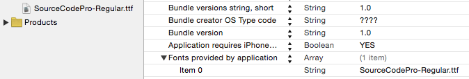
Figure 10-1. Embedding a font in an app bundle
Figure 10-1 shows a font included in the app bundle, along with the Info.plist entry that lists it. Observe that what you’re listing here is the name of the font file.
To download a font in real time, you’ll have to specify the font as a font descriptor (discussed in the next section) and drop down to the level of Core Text (import CoreText) to call CTFontDescriptorMatchFontDescriptorsWithProgressHandler. It takes a function which is called repeatedly at every stage of the download process; it will be called on a background thread, so if you want to use the downloaded font immediately in the interface, you must step out to the main thread (see Chapter 24).
In this example, I’ll attempt to use Nanum Brush Script as my UILabel’s font; if it isn’t installed, I’ll attempt to download it and then use it as my UILabel’s font. I’ve inserted a lot of unnecessary logging to mark the stages of the download process (using NSLog because print isn’t thread-safe):
let name = "NanumBrush"
let size : CGFloat = 24
let f : UIFont! = UIFont(name:name, size:size)
if f != nil {
    self.lab.font = f
    print("already installed")
    return
}
print("attempting to download font")
let desc = UIFontDescriptor(name:name, size:size)
CTFontDescriptorMatchFontDescriptorsWithProgressHandler(
    [desc] as CFArray, nil, { state, prog in
        switch state {
        case .didBegin:
            NSLog("%@", "matching did begin")
        case .willBeginDownloading:
            NSLog("%@", "downloading will begin")
        case .downloading:
            let d = prog as NSDictionary
            let key = kCTFontDescriptorMatchingPercentage
            let cur = d[key]
            if let cur = cur as? NSNumber {
                NSLog("progress: %@%%", cur)
            }
        case .didFinishDownloading:
            NSLog("%@", "downloading did finish")
        case .didFailWithError:
            NSLog("%@", "downloading failed")
        case .didFinish:
            NSLog("%@", "matching did finish")
            DispatchQueue.main.async {
                let f : UIFont! = UIFont(name:name, size:size)
                if f != nil {
                    NSLog("%@", "got the font!")
                    self.lab.font = f
                }
            }
        default:break
        }
        return true
})
Font Descriptors
A font descriptor (UIFontDescriptor, toll-free bridged to Core Text’s CTFontDescriptor) is a way of specifying a font, or converting between one font description and another, in terms of its features. For example, given a font descriptor desc, you can ask for a corresponding italic font descriptor like this:
let desc2 = desc.withSymbolicTraits(.traitItalic)
If desc was originally a descriptor for Avenir-Book 15, desc2 is now a descriptor for Avenir-BookOblique 15. However, it is not the font Avenir-BookOblique 15; a font descriptor is not a font.
You can obtain a font descriptor just as you would obtain a font, by calling its initializer init(name:size:). Alternatively, to convert from a font to a font descriptor, ask for the font’s fontDescriptor property; to convert from a font descriptor to a font, call the UIFont initializer init(descriptor:size:), typically supplying a size of 0 to signify that the size should not change. Thus, this will be a common pattern in your code, as you convert from font to font descriptor to perform some transformation, and then back to font:
let f = UIFont(name: "Avenir", size: 15)!
let desc = f.fontDescriptor
let desc2 = desc.withSymbolicTraits(.traitItalic)
let f2 = UIFont(descriptor: desc2!, size: 0) // Avenir-BookOblique 15
This same technique is useful for obtaining styled variants of the Dynamic Type fonts. A UIFontDescriptor class method, preferredFontDescriptor(withTextStyle:), saves you from having to start with a UIFont. In this example, I prepare to form an NSAttributedString whose font is mostly UIFontTextStyle.body, but with one italicized word (Figure 10-2):
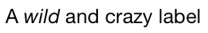
Figure 10-2. A Dynamic Type font with an italic variant
let body = UIFontDescriptor.preferredFontDescriptor(withTextStyle:.body)
let emphasis = body.withSymbolicTraits(.traitItalic)!
fbody = UIFont(descriptor: body, size: 0)
femphasis = UIFont(descriptor: emphasis, size: 0)
This, by the way, is a situation where you might need to use the technique I mentioned earlier, implementing traitCollectionDidChange(_:) in order to catch the change in the user’s Text Size preference. The fbody font is a Dynamic Type font, but the femphasis font is not. Thus, if we’re displaying a UILabel whose text comprises stretches of both fbody and femphasis, and if we want this label to respond to the user changing the Text Size preference, we’d have to form femphasis again and reapply it when the preferredContentSizeCategory trait changes.
You can explore a font’s features by way of a UIFontDescriptor. Some features are available directly as properties, such as postscriptName and symbolicTraits. The symbolicTraits is expressed as a bitmask:
let f = UIFont(name: "GillSans-BoldItalic", size: 20)!
let d = f.fontDescriptor
let traits = d.symbolicTraits
let isItalic = traits.contains(.traitItalic) // true
let isBold = traits.contains(.traitBold) // true
For other types of information, start with the name of an attribute whose value you want and call object(forKey:). For example:
let f = UIFont(name: "GillSans-BoldItalic", size: 20)!
let d = f.fontDescriptor
let vis = d.object(forKey:UIFontDescriptorVisibleNameAttribute)!
// Gill Sans Bold Italic
Another use of font descriptors is to access hidden built-in typographical features of individual fonts. To do so, you need to construct a dictionary containing two pieces of information: the feature type and the feature selector. In this example, I’ll obtain a variant of the Didot font that draws its minuscules as small caps (Figure 10-3):
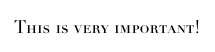
Figure 10-3. A small caps font variant
let desc = UIFontDescriptor(name:"Didot", size:18)
let d = [
    UIFontFeatureTypeIdentifierKey:kLetterCaseType,
    UIFontFeatureSelectorIdentifierKey:kSmallCapsSelector
]
let desc2 = desc.addingAttributes(
    [UIFontDescriptorFeatureSettingsAttribute:[d]]
)
let f = UIFont(descriptor: desc2, size: 0)
New in iOS 10, the system font (and thus the Dynamic Type font) can also portray small caps; in fact, it can do this in two different ways. If the type and selector are kUpperCaseType and kUpperCaseSmallCapsSelector, then uppercase characters are shown as small caps. If the type and selector are kLowerCaseType and kLowerCaseSmallCapsSelector, then lowercase characters are shown as small caps.
Another system (and Dynamic Type) font feature is an alternative set of glyph forms designed for legibility, available with a type of kStylisticAlternativesType. If the selector is kStylisticAltOneOnSelector, the 6 and 9 glyphs have straight tails. New in iOS 10, if the selector is kStylisticAltSixOnSelector, certain letters also have special distinguishing shapes; for example, the lowercase “l” (ell) has a curved bottom, to distinguish it from capital “I” which has a top and bottom bar.
Typographical feature identifier constants such as kSmallCapsSelector come from the Core Text header SFNTLayoutTypes.h. What isn’t so clear is how you’re supposed to discover what features a particular font contains. The simple answer is that you have to drop down to the level of Core Text. For example:
let desc = UIFontDescriptor(name: "Didot", size: 20) as CTFontDescriptor
let f = CTFontCreateWithFontDescriptor(desc,0,nil)
let arr = CTFontCopyFeatures(f)
The resulting array of dictionaries includes entries CTFeatureTypeIdentifier:3, which is kLetterCaseType, and CTFeatureSelectorIdentifier:3, which is kSmallCapsSelector. A more practical (and fun) approach to exploring a font’s features is to obtain a copy of the font on the desktop, install it, open TextEdit, choose Format → Font → Show Fonts, select the font, and open the Typography panel, thus exposing the font’s various features. Now you can experiment on selected text.
Attributed Strings
Styled text — that is, text consisting of multiple style runs, with different font, size, color, and other text features in different parts of the text — is expressed as an attributed string. Attributed strings (NSAttributedString and its mutable subclass, NSMutableAttributedString) have been around in iOS for a long time, but before iOS 6 they were difficult to use — you had to drop down to the level of Core Text — and they couldn’t be used at all in connection with UIKit interface classes such as UILabel and UITextView. Thus, such interface classes couldn’t display styled text. In iOS 6, NSAttributedString became a first-class citizen, able to draw styled text directly, and itself drawable by built-in interface classes.
An NSAttributedString consists of an NSString (its string) plus the attributes, applied in ranges. For example, if the string “one red word” is blue except for the word “red” which is red, and if these are the only changes over the course of the string, then there are three distinct style runs — everything before the word “red,” the word “red” itself, and everything after the word “red.” However, we can apply the attributes in two steps, first making the whole string blue, and then making the word “red” red, just as you would expect.
Attributed String Attributes
The attributes applied to a range of an attributed string are described in dictionaries. Each possible attribute has a predefined name, used as a key in these dictionaries; here are some of the most important attributes:
NSFontAttributeName-
A UIFont. The default is Helvetica 12 (not San Francisco, the system font).
NSForegroundColorAttributeName-
The text color, a UIColor.
NSBackgroundColorAttributeName-
The color behind the text, a UIColor. You could use this to highlight a word, for example.
NSLigatureAttributeName-
An NSNumber wrapping 0 or 1, expressing whether or not you want ligatures used. Some fonts, such as Didot, have ligatures that are on by default.
NSKernAttributeName-
An NSNumber wrapping the floating-point amount of kerning. A negative value brings a glyph closer to the following glyph; a positive value adds space between them.
NSStrikethroughStyleAttributeNameNSUnderlineStyleAttributeName-
An NSNumber wrapping one of these values (NSUnderlineStyle) describing the line weight:
-
.styleNone -
.styleSingle -
.styleDouble -
.styleThick
Optionally, you may append a specification of the line pattern, with names like
.patternDot,.patternDash, and so on.Optionally, you may append
.byWord; if you do not, then if the underline or strikethrough range involves multiple words, the whitespace between the words will be underlined or struck through. -
Warning
The value corresponding to the NSStrikethroughStyleAttributeName key needs to be an NSNumber, but Swift sees NSUnderlineStyle as an enum. Therefore, you will have to take its rawValue, and if you want to append another piece of information such as the line pattern, you’ll have to use bitwise-or to form the bitmask from two raw values. I regard this as a bug.
NSStrikethroughColorAttributeNameNSUnderlineColorAttributeName-
A UIColor. If not defined, the foreground color is used.
NSStrokeWidthAttributeName-
An NSNumber wrapping a Float. The stroke width is peculiarly coded. If it’s positive, then the text glyphs are stroked but not filled, giving an outline effect, and the foreground color is used unless a separate stroke color is defined. If it’s negative, then its absolute value is the width of the stroke, and the glyphs are both filled (with the foreground color) and stroked (with the stroke color).
NSStrokeColorAttributeName-
The stroke color, a UIColor.
NSShadowAttributeName-
An NSShadow object. An NSShadow is just a value class, combining a
shadowOffset,shadowColor, andshadowBlurRadius. NSTextEffectAttributeName-
If defined, the only possible value is
NSTextEffectLetterpressStyle. NSAttachmentAttributeName-
An NSTextAttachment object. A text attachment is basically an inline image. I’ll discuss text attachments later on.
NSLinkAttributeName-
A URL. In a noneditable, selectable UITextView, the link is tappable to go to the URL (as I’ll explain later in this chapter). By default, appears as blue without an underline in a UITextView. Appears as blue with an underline in a UILabel, but is not a tappable link there.
NSBaselineOffsetAttributeNameNSObliquenessAttributeNameNSExpansionAttributeName-
An NSNumber wrapping a Float.
NSParagraphStyleAttributeName-
An NSParagraphStyle object. This is basically just a value class, assembling text features that apply properly to paragraphs as a whole, not merely to characters, even if your string consists only of a single paragraph. Here are its most important properties:
-
alignment(NSTextAlignment)-
.left -
.center -
.right -
.justified -
.natural(left-aligned or right-aligned depending on the writing direction)
-
-
lineBreakMode(NSLineBreakMode)-
.byWordWrapping -
.byCharWrapping -
.byClipping -
.byTruncatingHead -
.byTruncatingTail -
.byTruncatingMiddle
-
-
firstLineHeadIndent,headIndent(left margin),tailIndent(right margin) -
lineHeightMultiple,maximumLineHeight,minimumLineHeight -
lineSpacing -
paragraphSpacing,paragraphSpacingBefore -
hyphenationFactor(0 or 1) -
defaultTabInterval,tabStops(the tab stops are an array of NSTextTab objects; I’ll give an example in a moment) -
allowsDefaultTighteningForTruncation(iftrue, permits some negative kerning to be applied automatically to atruncatingparagraph if this would prevent truncation)
-
To construct an NSAttributedString, you can call init(string:attributes:) if the entire string has the same attributes; otherwise, you’ll use its mutable subclass NSMutableAttributedString, which lets you set attributes over a range.
To construct an NSParagraphStyle, you’ll use its mutable subclass NSMutableParagraphStyle. It is sufficient to apply a paragraph style to the first character of a paragraph; to put it another way, the paragraph style of the first character of a paragraph dictates how the whole paragraph is rendered.
Both NSAttributedString and NSParagraphStyle come with default values for all attributes, so you only have to set the attributes you care about.
Making an Attributed String
We now know enough for an example! I’ll draw my attributed strings in a disabled (noninteractive) UITextView; its background is white, but its superview’s background is gray, so you can see the text view’s bounds relative to the text. (Ignore the text’s vertical positioning, which is configured independently as a feature of the text view itself.)
First, two words of my attributed string are made extra-bold by stroking in a different color. I start by dictating the entire string and the overall style of the text; then I apply the special style to the two stroked words (Figure 10-4):
let s1 = "The Gettysburg Address, as delivered on a certain occasion " +
    "(namely Thursday, November 19, 1863) by A. Lincoln"
let content = NSMutableAttributedString(string:s1, attributes:[
    NSFontAttributeName:
        UIFont(name:"Arial-BoldMT", size:15)!,
    NSForegroundColorAttributeName:
        UIColor(red:0.251, green:0.000, blue:0.502, alpha:1)
])
let r = (s1 as NSString).range(of:"Gettysburg Address")
content.addAttributes([
    NSStrokeColorAttributeName: UIColor.red,
    NSStrokeWidthAttributeName: -2.0
], range: r)
self.tv.attributedText = content
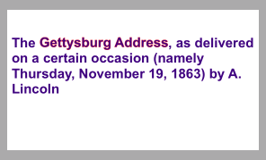
Figure 10-4. An attributed string
Carrying on from the previous example, I’ll also make the whole paragraph centered and indented from the edges of the text view. To do so, I create a paragraph style and apply it to the first character. Note how the margins are dictated: the tailIndent is negative, to bring the right margin leftward, and the firstLineHeadIndent must be set separately, as the headIndent does not automatically apply to the first line (Figure 10-5):
let para = NSMutableParagraphStyle()
para.headIndent = 10
para.firstLineHeadIndent = 10
para.tailIndent = -10
para.lineBreakMode = .byWordWrapping
para.alignment = .center
para.paragraphSpacing = 15
content.addAttribute(
    NSParagraphStyleAttributeName,
    value:para, range:NSMakeRange(0,1))
self.tv.attributedText = content
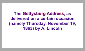
Figure 10-5. An attributed string with a paragraph style
Tip
When working with a value class such as NSMutableParagraphStyle, it feels clunky to be forced to instantiate the class and configure the instance before using it for the one and only time. So I’ve written a little Swift generic function, lend (see Appendix B), that lets me do all that in an anonymous function at the point where the value class is used.
In this next example, I’ll enlarge the first character of a paragraph. I assign the first character a larger font size, I expand its width slightly, and I reduce its kerning (Figure 10-6):
let s2 = "Fourscore and seven years ago, our fathers brought forth " +
    "upon this continent a new nation, conceived in liberty and " +
    "dedicated to the proposition that all men are created equal."
content2 = NSMutableAttributedString(string:s2, attributes: [
    NSFontAttributeName: UIFont(name:"HoeflerText-Black", size:16)!
])
content2.addAttributes([
    NSFontAttributeName: UIFont(name:"HoeflerText-Black", size:24)!,
    NSExpansionAttributeName: 0.3,
    NSKernAttributeName: -4
], range:NSMakeRange(0,1))
self.tv.attributedText = content2
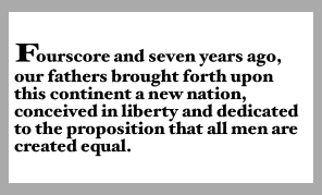
Figure 10-6. An attributed string with an expanded first character
Carrying on from the previous example, I’ll once again construct a paragraph style and add it to the first character. My paragraph style illustrates full justification and automatic hyphenation (Figure 10-7):
content2.addAttribute(NSParagraphStyleAttributeName,
    value:lend {
        (para:NSMutableParagraphStyle) in
        para.headIndent = 10
        para.firstLineHeadIndent = 10
        para.tailIndent = -10
        para.lineBreakMode = .byWordWrapping
        para.alignment = .justified
        para.lineHeightMultiple = 1.2
        para.hyphenationFactor = 1.0
    }, range:NSMakeRange(0,1))
self.tv.attributedText = content2
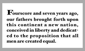
Figure 10-7. An attributed string with justification and autohyphenation
Now we come to the Really Amazing Part. I can make a single attributed string consisting of both paragraphs, and a single text view can portray it (Figure 10-8):
let end = content.length
content.replaceCharacters(in:NSMakeRange(end, 0), with:"
")
content.append(content2)
self.tv.attributedText = content
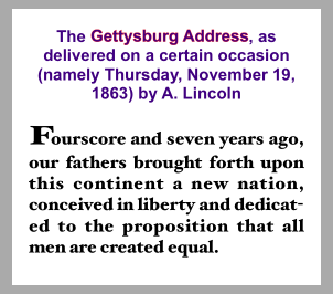
Figure 10-8. A single attributed string comprising differently styled paragraphs
Tab stops
A tab stop is an NSTextTab, a value class whose initializer lets you set its location (points from the left edge) and alignment. An options: dictionary lets you set the tab stop’s column terminator characters; a common use is to create a decimal tab stop, for aligning currency values at their decimal point. The key, in that case, is NSTabColumnTerminatorsAttributeName; you can obtain a value appropriate to a given locale by calling NSTextTab’s class method columnTerminators(for:).
Here’s an example (Figure 10-9); I have deliberately omitted the last digit from the second currency value, to prove that the tab stop really is aligning the numbers at their decimal points:
let s = "Onions	$2.34
Peppers	$15.2
"
let mas = NSMutableAttributedString(string:s, attributes:[
    NSFontAttributeName:UIFont(name:"GillSans", size:15)!,
    NSParagraphStyleAttributeName:lend {
        (p:NSMutableParagraphStyle) in
        let terms = NSTextTab.columnTerminators(for:Locale.current)
        let tab = NSTextTab(textAlignment:.right, location:170,
            options:[NSTabColumnTerminatorsAttributeName:terms])
        p.tabStops = [tab]
        p.firstLineHeadIndent = 20
    }
])
self.tv.attributedText = mas
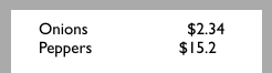
Figure 10-9. Tab stops in an attributed string
In that code, I set the paragraph style’s entire tabStops array at once. The tabStops array can also be modified by calling addTabStop(_:) or removeTabStop(_:) on the paragraph style. However, a paragraph style comes with default tab stops, so you might want to remove them, or replace the tabStops array with an empty array, before you start adding tab stops.
Text attachments
A text attachment is basically an inline image. To make one, you need an instance of NSTextAttachment initialized with image data; the easiest way is to start with a UIImage and assign it directly to the NSTextAttachment’s image property. You must also give the NSTextAttachment a nonzero bounds; the image will be scaled to the size of the bounds you provide, and a .zero origin places the image on the text baseline.
A text attachment is attached to an NSAttributedString using the NSAttachmentAttributeName key; the text attachment itself is the value. The range of the string that has this attribute must be a special nonprinting character whose codepoint is NSAttachmentCharacter (0xFFFC). The simplest way to arrange that is to call the NSAttributedString initializer init(attachment:); you hand it an NSTextAttachment and it hands you an attributed string consisting of the NSAttachmentCharacter with the NSAttachmentAttributeName attribute set to that text attachment. You can then insert this attributed string into your own attributed string at the point where you want the image to appear.
To illustrate, I’ll add an image of onions and an image of peppers just after the words “Onions” and “Peppers” in the attributed string (mas) that I created in the previous example (Figure 10-10):
let onions = // ... get image ...
let peppers = // ... get image ...
let onionatt = NSTextAttachment()
onionatt.image = onions
onionatt.bounds = CGRect(0,-5,onions.size.width,onions.size.height)
let onionattchar = NSAttributedString(attachment:onionatt)
let pepperatt = NSTextAttachment()
pepperatt.image = peppers
pepperatt.bounds = CGRect(0,-1,peppers.size.width,peppers.size.height)
let pepperattchar = NSAttributedString(attachment:pepperatt)
let r = (mas.string as NSString).range(of:"Onions")
mas.insert(onionattchar, at:(r.location + r.length))
let r2 = (mas.string as NSString).range(of:"Peppers")
mas.insert(pepperattchar, at:(r2.location + r2.length))
self.tv.attributedText = mas
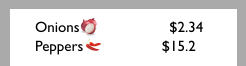
Figure 10-10. Text attachments in an attributed string
Other ways to create an attributed string
The nib editor provides an ingenious interface for letting you construct attributed strings wherever built-in interface objects (such as UILabel or UITextView) accept them as a property; it’s not perfect, however, and isn’t suitable for lengthy or complex text.
It is also possible to import an attributed string from text in some other standard format, such as HTML or RTF. To do so, get the target text into a Data object and call init(data:options:documentAttributes:); alternatively, start with a file and call init(url:options:documentAttributes:). The options: allow you to specify the target text’s format. For example, here we read an RTF file from the app bundle as an attributed string and show it in a UITextView:
let url = Bundle.main.url(forResource: "test", withExtension: "rtf")!
let opts = [NSDocumentTypeDocumentAttribute: NSRTFTextDocumentType]
var d : NSDictionary? = nil
let s = try! NSAttributedString(
    url: url, options: opts, documentAttributes: &d)
self.tv.attributedText = s
I have not experimented to see how much can get lost in the translation or whether longer strings can cause a delay, but this is certainly an excellent way to generate attributed strings painlessly. There are also corresponding export methods.
Modifying and Querying an Attributed String
Although attributes are applied to ranges, they actually belong to each individual character. Thus we can coherently modify just the string part of a mutable attributed string. The key method here is replaceCharacters(in:with:), which takes an NSRange and a substitute string. It can be used to replace characters with a plain string or, using a zero range length, to insert a plain string at the start, middle, or end of an attributed string. The question is then what attributes will be applied to the inserted string. The rule is:
-
If we replace characters, the inserted string takes on the attributes of the first replaced character.
-
If we insert characters, the inserted string takes on the attributes of the character preceding the insertion — except that, if we insert at the start, there is no preceding character, so the inserted string takes on the attributes of the character following the insertion.
You can query an attributed string about its attributes one character at a time — asking either about all attributes at once with attributes(at:effectiveRange:), or about a particular attribute by name with attribute(_:at:effectiveRange:). In those methods, the effectiveRange parameter is a pointer to an NSRange variable, which will be set by indirection to the range over which this same attribute value, or set of attribute values, applies:
var range : NSRange = NSMakeRange(0,0)
let d = content.attributes(at:content.length-1, effectiveRange:&range)
Because style runs are something of an artifice, the effectiveRange might not be what you would think of as the entire style run. The methods with longestEffectiveRange: parameters do (at the cost of some efficiency) work out the entire style run range for you. In practice, however, you typically don’t need the entire style run range, because you’re cycling through ranges, and speed, even at the cost of more iterations, matters more than getting the longest effective range on every iteration.
In this example, I start with the combined two-paragraph Gettysburg Address attributed string constructed earlier, and change all the size 15 material to Arial Bold 20. I don’t care whether I’m handed longest effective ranges (and my code explicitly says so); I just want to cycle efficiently:
content.enumerateAttribute(NSFontAttributeName,
    in:NSMakeRange(0,content.length),
    options:.longestEffectiveRangeNotRequired) { value, range, stop in
        let font = value as! UIFont
        if font.pointSize == 15 {
            content.addAttribute(NSFontAttributeName,
                value:UIFont(name: "Arial-BoldMT", size:20)!,
                range:range)
        }
    }
Custom Attributes
You are permitted to apply your own custom attributes to a stretch of text in an attributed string. Your attributes won’t directly affect how the string is drawn, because the text engine doesn’t know what to make of them; but it doesn’t object to them either. In this way, you can mark a stretch of text invisibly for your own future use.
In this example, I have a UILabel containing some text and a date. Every so often, I want to replace the date by the current date. The problem is that when the moment comes to replace the date, I don’t know where it is: I know neither its length nor the length of the text that precedes it. The solution is to use an attributed string, and to mark the date with a secret custom attribute when I first insert it. My attribute is called "HERE", and I’ve assigned it a value of 1. Now I can readily find the date again later, because the text engine will tell me where it is:
let mas =
    self.lab.attributedText!.mutableCopy() as! NSMutableAttributedString
mas.enumerateAttribute("HERE", in: NSMakeRange(0, mas.length)) {
    value, range, stop in
    if let value = value as? Int, value == 1 {
        mas.replaceCharacters(in:range, with: Date().description)
        stop.pointee = true
    }
}
self.lab.attributedText = mas
Drawing and Measuring an Attributed String
You can draw an attributed string directly, without hosting it in a built-in interface object, and sometimes this will prove to be the most reliable approach. An NSString can be drawn into a rect with draw(in:withAttributes:) and related methods; an NSAttributedString can be drawn with draw(at:), draw(in:), and draw(with:options:context:).
Here, I draw an attributed string, content, into an image graphics context and extract the image (which might then be displayed by an image view):
let rect = CGRect(0,0,280,250)
let r = UIGraphicsImageRenderer(size:rect.size)
let im = r.image { ctx in
    let con = ctx.cgContext
    UIColor.white.setFill()
    con.fill(rect)
    content.draw(in:rect)
}
Similarly, you can draw an attributed string directly in a UIView’s draw(_:) override. For example, imagine that we have a UIView subclass called StringDrawer that has an attributedText property. The idea is that we just assign an attributed string to that property and the StringDrawer redraws itself:
self.drawer.attributedText = content
And here’s StringDrawer:
class StringDrawer : UIView {
    @NSCopying var attributedText : NSAttributedString! {
        didSet {
            self.setNeedsDisplay()
        }
    }
    override func draw(_ rect: CGRect) {
        let r = rect.offsetBy(dx: 0, dy: 2)
        let opts : NSStringDrawingOptions = .usesLineFragmentOrigin
        self.attributedText.draw(with:r, options: opts, context: context)
    }
}
The use of .usesLineFragmentOrigin is crucial here. Without it, the string is drawn with its baseline at the rect origin (so that it appears above that rect) and it doesn’t wrap. The rule is that .usesLineFragmentOrigin is the implicit default for simple draw(in:), but with draw(with:options:context:) you must specify it explicitly.
NSAttributedString also provides methods to measure an attributed string, such as boundingRect(with:options:context:). Again, the option .usesLineFragmentOrigin is crucial; without it, the measured text doesn’t wrap and the returned height will be very small. The documentation warns that the returned height can be fractional and that you should round up to an integer if the height of a view is going to depend on this result.
The context: parameter of methods such as draw(with:options:context:) lets you attach an instance of NSStringDrawingContext, a simple value class whose totalBounds property tells you where you just drew.
Warning
Other features of NSStringDrawingContext, such as its minimumScaleFactor, appear to be nonfunctional.
Labels
A label (UILabel) is a simple built-in interface object for displaying text. I listed some of its chief properties in Chapter 8 (in “Built-In Cell Styles”).
If you’re displaying a plain NSString in a label, by way of the label’s text property, then you are likely also to set its font, textColor, and textAlignment properties, and possibly its shadowColor and shadowOffset properties. The label’s text can have an alternate highlightedTextColor, to be used when its isHighlighted property is true — as happens, for example, when the label is in a selected cell of a table view.
On the other hand, if you’re using an NSAttributedString, then you’ll set just the label’s attributedText property and let the attributes dictate things like color, alignment, and shadow. In general, if your intention is to display text in a single font, size, color, and alignment, you probably won’t bother with attributedText; but if you do set the attributedText, you should let it do all the work of dictating text style features. Those other UILabel properties do mostly still work, but they’re going to change the attributes of your entire attributed string, in ways that you might not intend. Setting the text of a UILabel that has attributedText will basically eliminate the attributes.
Warning
The highlightedTextColor property affects the attributedText only if the latter is the same color as the textColor.
Number of Lines
A UILabel’s numberOfLines property is extremely important. Together with the label’s line breaking behavior and resizing behavior, it determines how much of the text will appear. The default is 1 — a single line — which can come as a surprise. To make a label display more than one line of text, you must explicitly set its numberOfLines to a value greater than 1, or to 0 to indicate that there is to be no maximum.
Line break characters in a label’s text are honored. Thus, for example, in a single-line label, you won’t see whatever follows the first line break character.
Wrapping and Truncation
UILabel line breaking (wrapping) and truncation behavior, which applies to both single-line and multiline labels, is determined by the lineBreakMode (of the label or the attributed string). The options (NSLineBreakMode) are those that I listed earlier in discussing NSParagraphStyle, but their behavior within a label needs to be described:
.byClipping-
Lines break at word-end, but the last line can continue past its boundary, even if this leaves a character showing only partially.
.byWordWrapping-
Lines break at word-end, but if this is a single-line label, indistinguishable from
.byClipping. .byCharWrapping-
Lines break in midword in order to maximize the number of characters in each line.
.byTruncatingHead.byTruncatingMiddle.byTruncatingTail-
Lines break at word-end; if the text is too long for the label, then the last line displays an ellipsis at the start, middle, or end of the line respectively, and text is omitted at the point of the ellipsis.
The default line break mode for a new label is .byTruncatingTail. But the default line break mode for an attributed string’s NSParagraphStyle is .byWordWrapping.
Starting in iOS 9, allowsDefaultTighteningForTruncation, if true, permits some negative kerning to be applied automatically to a truncating label if this would prevent truncation.
Warning
UILabel line break behavior is not the same as what happens when an NSAttributedString draws itself in an image context or a plain UIView, as I described earlier. An NSAttributedString whose NSParagraphStyle’s lineBreakMode doesn’t have wrapping in its name doesn’t wrap when it draws itself — it consists of a single line.
Resizing a Label to Fit Its Text
If a label is too small for its text, the entire text won’t show. If a label is too big for its text, the text is vertically centered in the label, with space above and below. Either of those might be undesirable. You might like to shrink or grow a label to fit its text exactly.
If you’re not using autolayout, in most simple cases sizeToFit will do the right thing; I believe that behind the scenes it is calling boundingRect(with:options:context:).
Warning
There are cases where UILabel’s sizeToFit will misbehave. The problem arises particularly with paragraph styles involving margins (headIndent and tailIndent) — presumably because boundingRect(with:options:context:) ignores the margins.
If you’re using autolayout, a label will correctly configure its own intrinsicContentSize automatically, based on its contents — and therefore, all other things being equal, will size itself to fit its contents with no code at all. Every time you reconfigure the label in a way that affects its contents (setting its text, changing its font, setting its attributed text, and so forth), the label automatically invalidates and recalculates its intrinsic content size. There are two general cases to consider:
- Short single-line label
-
You might give the label no width or height constraints; you’ll constrain its position, but you’ll let the label’s
intrinsicContentSizeprovide both the label’s width and its height. - Multiline label
-
In this case, it is more likely that you’ll want to dictate the label’s width, while letting the label’s height change automatically to accommodate its contents. There are two ways to do this:
- Set the label’s width constraint
-
This is appropriate particularly when the label’s width is to remain fixed ever after.
- Set the label’s
preferredMaxLayoutWidth -
This property is a hint to help the label’s calculation of its
intrinsicContentSize. It is the width at which the label, as its contents increase, will stop growing horizontally to accommodate those contents, and start growing vertically instead.
If a label’s width is to be permitted to vary because of constraints, you can tell it recalculate its height to fit its contents by setting its preferredMaxLayoutWidth to its actual width. For example, consider a label whose left and right edges are both pinned to the superview. And imagine that the superview’s width can change, possibly due to rotation, thus changing the width of the label. Nevertheless, if the preferredMaxLayoutWidth is adjusted after every such change, the label’s height will always perfectly fit its contents.
So how will you ensure that the preferredMaxLayoutWidth is adjusted when the label’s width changes? Before giving the label constraints and text, set its preferredMaxLayoutWidth to 0! This happens to be the default, so there is nothing to do. Now the label will change its preferredMaxLayoutWidth automatically as its width changes, and will therefore always fit its contents, with no further effort on your part. Here’s an example of creating such a label in code:
let lab = UILabel() // preferredMaxLayoutWidth is 0
lab.translatesAutoresizingMaskIntoConstraints = false
self.view.addSubview(lab)
NSLayoutConstraint.activate([
    NSLayoutConstraint.constraints(withVisualFormat:
        "H:|-(30)-[v]-(30)-|",
        metrics: nil, views: ["v":lab]),
    NSLayoutConstraint.constraints(withVisualFormat:
        "V:|-(30)-[v]",
        metrics: nil, views: ["v":lab])
    ].flatMap{$0})
lab.attributedText = // whatever
You can also perform this configuration in the nib editor: at the top of the Size inspector, uncheck the Explicit checkbox (if it is checked). The Preferred Width field says “Automatic,” meaning that the preferredMaxLayoutWidth will change automatically to match the label’s actual width as dictated by its constraints.
Instead of letting a label grow, you can permit its text font size to shrink if this would allow more of the text to fit. How the text is repositioned when the font size shrinks is determined by the label’s baselineAdjustment property. For this feature to operate, all of the following conditions must be the case:
-
The label’s
adjustsFontSizeToFitWidthproperty must betrue. -
The label’s
minimumScaleFactormust be less than1.0. -
The label’s size must be limited.
-
Either this must be a single-line label (
numberOfLinesis1) or the line break mode (of the label or the attributed string) must not havewrappingin its name.
Customized Label Drawing
Methods that you can override in a subclass to modify a label’s drawing are drawText(in:) and textRect(forBounds:limitedToNumberOfLines:).
For example, this is the code for a UILabel subclass that outlines the label with a black rectangle and puts a five-point margin around the label’s contents:
class BoundedLabel: UILabel {
    override func awakeFromNib() {
        super.awakeFromNib()
        self.backgroundColor = .myPaler
        self.layer.borderWidth = 2.0
        self.layer.cornerRadius = 3.0
    }
    override func drawText(in rect: CGRect) {
        super.drawText(in: rect.insetBy(dx: 5, dy: 5).integral)
    }
}
Tip
A CATextLayer (Chapter 3) is like a lightweight, layer-level version of a UILabel. If the width of the layer is insufficient to display the entire string, we can get truncation behavior with the truncationMode property. If the isWrapped property is set to true, the string will wrap. We can also set the alignment with the alignmentMode property. And its string property can be an NSAttributedString.
Text Fields
A text field (UITextField) is for brief user text entry. It portrays just a single line of text; any line break characters in its text are treated as spaces. It has many of the same properties as a label. You can provide it with a plain NSString, setting its text, font, textColor, and textAlignment, or provide it with an attributed string, setting its attributedText. You can learn a text field’s overall text attributes as an attributes dictionary through its defaultTextAttributes property.
Under autolayout, a text field’s intrinsicContentSize will attempt to set its width to fit its contents; if its width is fixed, you can set its adjustsFontSizeToFitWidth and minimumFontSize properties to allow the text size to shrink somewhat.
Text that is too long for the text field is displayed with an ellipsis at the end. A text field has no lineBreakMode, but you can change the position of the ellipsis by assigning the text field an attributed string with different truncation behavior, such as .byTruncatingHead. When long text is being edited, the ellipsis (if any) is removed, and the text shifts horizontally to show the insertion point.
Regardless of whether you originally supplied a plain string or an attributed string, if the text field’s allowsEditingTextAttributes property is true, the user, when editing in the text field, can summon a menu toggling the selected text’s bold, italics, or underline features.
A text field has a placeholder property, which is the text that appears faded within the text field when it has no text (its text or attributedText has been set to nil, or the user has removed all the text); the idea is that you can use this to suggest to the user what the text field is for. It has a styled text alternative, attributedPlaceholder.
If a text field’s clearsOnBeginEditing property is true, it automatically deletes its existing text (and displays the placeholder) when editing begins within it. If a text field’s clearsOnInsertion property is true, then when editing begins within it, the text remains, but is invisibly selected, and will be replaced by the user’s typing.
A text field’s border drawing is determined by its borderStyle property. Your options (UITextFieldBorderStyle) are:
.none-
No border.
.line-
A plain black rectangle.
.bezel-
A gray rectangle, where the top and left sides have a very slight, thin shadow.
.roundedRect-
A larger rectangle with slightly rounded corners and a flat, faded gray color.
You can supply a background image (background); if you combine this with a borderStyle of .none, or if the image has no transparency, you thus get to supply your own border — unless the borderStyle is .roundedRect, in which case the background is ignored. The image is automatically resized as needed (and you will probably supply a resizable image). A second image (disabledBackground) can be displayed when the text field’s isEnabled property, inherited from UIControl, is false. The user can’t interact with a disabled text field, but without a disabledBackground image, the user may lack any visual clue to this fact (though a .line or .roundedRect disabled text field is subtly different from an enabled one). You can’t set the disabledBackground unless you have also set the background.
A text field may contain one or two ancillary overlay views, its leftView and rightView, and possibly a Clear button (a gray circle with a white X). The automatic visibility of each of these is determined by the leftViewMode, rightViewMode, and clearButtonMode, respectively. The view mode values (UITextFieldViewMode) are:
.never-
The view never appears.
.whileEditing-
A Clear button appears if there is text in the field and the user is editing. A left or right view appears if there is no text in the field and the user is editing.
.unlessEditing-
A Clear button appears if there is text in the field and the user is not editing. A left or right view appears if the user is not editing, or if the user is editing but there is no text in the field.
.always-
A Clear button appears if there is text in the field. A left or right view always appears.
Depending on what sort of view you use, your leftView and rightView may have to be sized manually so as not to overwhelm the text view contents. If a right view and a Clear button appear at the same time, the right view may cover the Clear button unless you reposition it.
The positions and sizes of any of the components of the text field can be set in relation to the text field’s bounds by overriding the appropriate method in a subclass:
-
clearButtonRect(forBounds:) -
leftViewRect(forBounds:) -
rightViewRect(forBounds:) -
borderRect(forBounds:) -
textRect(forBounds:) -
placeholderRect(forBounds:) -
editingRect(forBounds:)
Warning
You should make no assumptions about when or how frequently these methods will be called; the same method might be called several times in quick succession. Also, these methods should all be called with a parameter that is the bounds of the text field, but some are sometimes called with a 100×100 bounds; this feels like a bug.
You can also override in a subclass the methods drawText(in:) and drawPlaceholder(in:). You should either draw the specified text or call super to draw it; if you do neither, the text won’t appear. Both these methods are called with a parameter whose size is the dimensions of the text field’s text area, but whose origin is .zero. In effect what you’ve got is a graphics context for just the text area; any drawing you do outside the given rectangle will be clipped.
Summoning and Dismissing the Keyboard
Making the onscreen simulated keyboard appear when the user taps in a text field is no work at all — it’s automatic. Making the keyboard vanish again, on the other hand, can be a bit tricky. (Another problem is that the keyboard can cover the text field that the user just tapped in; I’ll talk about that in a moment.)
The presence or absence of the keyboard, and a text field’s editing state, are intimately tied to one another, and to the text field’s status as the first responder:
-
When a text field is first responder, it is being edited and the keyboard is present.
-
When a text field is no longer first responder, it is no longer being edited, and if no other text field (or text view) becomes first responder, the keyboard is not present. The keyboard is not dismissed if one text field takes over first responder status from another.
Thus, you can programmatically control the presence or absence of the keyboard, together with a text field’s editing state, by way of the text field’s first responder status:
- Becoming first responder
-
To make the insertion point appear within a text field and to cause the keyboard to appear, you send
becomeFirstResponderto that text field.You won’t typically have to do that; usually, the user will tap in a text field and it will become first responder automatically. Still, sometimes it’s useful to make a text field the first responder programmatically; an example appeared in Chapter 8 (“Inserting Cells”).
- Resigning first responder
-
To make a text field stop being edited and to cause the keyboard to disappear, you send
resignFirstResponderto that text field. (Actually,resignFirstResponderreturns a Bool, because a responder might returnfalseto indicate that for some reason it refuses to obey this command.)Alternatively, call the UIView
endEditing(_:)method on the first responder or any superview (including the window) to ask or compel the first responder to resign first responder status.
Tip
In a view presented in the .formSheet modal presentation style on the iPad (Chapter 6), the keyboard, by default, does not disappear when a text field resigns first responder status. This is presumably because a form sheet is intended primarily for text input, so the keyboard is felt as accompanying the form as a whole, not individual text fields. Optionally, you can prevent this exceptional behavior: in your UIViewController subclass, override disablesAutomaticKeyboardDismissal to return false.
There is no simple way to learn what view is first responder! This is very odd, because a window surely knows what its first responder is — but it won’t tell you. There’s a method isFirstResponder, but you’d have to send it to every view in a window until you find the first responder. One workaround is to store a reference to the first responder yourself, typically in your implementation of the text field delegate’s textFieldDidBeginEditing(_:).
Once the user has tapped in a text field and the keyboard has automatically appeared, how is the user supposed to get rid of it? On the iPad, and on the iPhone in landscape, the keyboard may contain a button that dismisses the keyboard. Otherwise, this is an oddly tricky issue. You would think that the Return key in the keyboard would dismiss the keyboard, since you can’t enter a Return character in a text field; but, of itself, it doesn’t.
One solution is to be the text field’s delegate and to implement a text field delegate method, textFieldShouldReturn(_:). When the user taps the Return key in the keyboard, we hear about it through this method, and we tell the text field to resign its first responder status, which dismisses the keyboard:
func textFieldShouldReturn(_ tf: UITextField) -> Bool {
    tf.resignFirstResponder()
    return true
}
(Certain keyboards lack even a Return key. In that case, you’ll need some other way to allow the user to dismiss the keyboard. I’ll return to this issue in a moment.)
Keyboard Covers Text Field
The keyboard, having appeared, has a position “docked” at the bottom of the screen. This may cover the text field in which the user wants to type, even if it is first responder. On the iPad, this may not be an issue, because the user can “undock” the keyboard (possibly also splitting and shrinking it) and slide it up and down the screen freely. On the iPhone, you’ll typically want to do something to reveal the text field.
To help with this, you can register for keyboard-related notifications:
-
.UIKeyBoardWillShow -
.UIKeyBoardDidShow -
.UIKeyBoardWillHide -
.UIKeyBoardDidHide
Those notifications all have to do with the docked position of the keyboard. On the iPhone, keyboard docking and keyboard visibility are equivalent: the keyboard is visible if and only if it is docked. On the iPad, the keyboard is said to show if it is being docked, whether that’s because it is appearing from offscreen or because the user is docking it; and it is said to hide if it is undocked, whether that’s because it is moving offscreen or because the user is undocking it.
Two additional notifications are sent both when the keyboard enters and leaves the screen and (on the iPad) when the user drags it, splits or unsplits it, and docks or undocks it:
-
.UIKeyBoardWillChangeFrame -
.UIKeyBoardDidChangeFrame
The notification’s userInfo dictionary contains information about the keyboard describing what it will do or has done, under these keys:
-
UIKeyboardFrameBeginUserInfoKey -
UIKeyboardFrameEndUserInfoKey -
UIKeyboardAnimationDurationUserInfoKey -
UIKeyboardAnimationCurveUserInfoKey
Thus, to a large extent, you can coordinate your actions with those of the keyboard. In particular, by looking at the UIKeyboardFrameEndUserInfoKey, you know what position the keyboard is moving to; you can compare this with the screen bounds to learn whether the keyboard will now be on or off the screen and, if it will now be on the screen, you can see whether it will cover a text field.
Finding a strategy for dealing with the keyboard’s presence depends on the needs of your particular app. I’ll concentrate on the most universal case, where the keyboard moves into and out of docked position and we detect this with .UIKeyBoardWillShow and .UIKeyBoardWillHide. What should we do if, when the keyboard is shown, it covers the text field being edited?
One natural-looking approach is to slide the entire interface upward as the keyboard appears, just enough to expose the text field being edited above the top of the keyboard. The simplest way to do that is for the entire interface to be inside a scroll view (Chapter 7), which is, after all, a view that knows how to slide its contents.
This scroll view need not be ordinarily scrollable by the user — nor, in fact, does it need to be scrollable by the user even after the keyboard appears, as our purpose is to use it merely to slide the interface. But it will be better if, after the keyboard appears, the scroll view is scrollable by the user, because the user will then be able to view the entire interface at will, even while the keyboard is covering part of it. This is a job for contentInset, whose purpose, you will recall, is precisely to make it possible for the user to view all of the scroll view’s content even though part of the scroll view is being covered by something.
This behavior is in fact implemented automatically by a UITableViewController. When a text field inside a table cell is first responder, the table view controller adjusts the table view’s contentInset and scrollIndicatorInsets to compensate for the keyboard. The result is that the entire table view content is available within the space between the top of the table view and the top of the keyboard.
Moreover, a scroll view has two additional bits of built-in behavior that will help us:
-
It scrolls automatically to reveal the first responder. This will make it easy for us to expose the text field being edited.
-
It has a
keyboardDismissMode, governing what will happen to the keyboard when the user scrolls. This can give us an additional way to allow the user to dismiss the keyboard.
Let’s imitate UITableViewController’s behavior with a scroll view containing text fields. In particular, our interface consists of a scroll view containing a content view; the content view contains several text fields.
In viewDidLoad, we register for keyboard notifications:
NotificationCenter.default.addObserver(self,
    selector: #selector(keyboardShow),
    name: .UIKeyboardWillShow, object: nil)
NotificationCenter.default.addObserver(self,
    selector: #selector(keyboardHide),
    name: .UIKeyboardWillHide, object: nil)
We are the delegate of any text fields, so that we can hear about it when the user taps the Return key in the keyboard. We use that as a signal to dismiss the keyboard, as I suggested in the preceding section:
func textFieldShouldReturn(_ tf: UITextField) -> Bool {
    tf.resignFirstResponder()
    return true
}
When the keyboard appears, we first keep track of the fact that it is appearing; this is because we can receive spurious .UIKeyboardWillShow notifications when the keyboard is already showing, and we don’t want to do anything in that case. We then store the current content offset, content inset, and scroll indicator insets; finally, we alter the insets and allow the scroll view to scroll the first responder into view for us:
func keyboardShow(_ n:Notification) {
    if self.keyboardShowing {
        return
    }
    self.keyboardShowing = true
    self.oldContentInset = self.scrollView.contentInset
    self.oldIndicatorInset = self.scrollView.scrollIndicatorInsets
    self.oldOffset = self.scrollView.contentOffset
    let d = n.userInfo!
    var r = d[UIKeyboardFrameEndUserInfoKey] as! CGRect
    r = self.scrollView.convert(r, from:nil)
    self.scrollView.contentInset.bottom = r.size.height
    self.scrollView.scrollIndicatorInsets.bottom = r.size.height
}
When the keyboard disappears, we reverse the process, which means that we simply restore the saved values:
func keyboardHide(_ n:Notification) {
    if !self.keyboardShowing {
        return
    }
    self.keyboardShowing = false
    self.scrollView.contentOffset = self.oldOffset
    self.scrollView.scrollIndicatorInsets = self.oldIndicatorInset
    self.scrollView.contentInset = self.oldContentInset
}
Meanwhile, behind the scenes, we are already in an animations function at the time that our notifications arrive. This means that our changes to the scroll view’s offset and insets are nicely animated in coordination with the appearance and disappeance of the keyboard.
A secondary benefit of having a flag that keeps track of whether the keyboard is showing is that we can prevent rotation of the interface when the keyboard is onscreen. I like to do that, as it simplifies matters considerably:
override var shouldAutorotate : Bool {
    return !self.keyboardShowing
}
A secondary benefit of using a UIScrollView, as I mentioned earlier, is that its keyboardDismissMode provides ways of letting the user dismiss the keyboard. The options (UIScrollViewKeyboardDismissMode) are:
.none-
The default; if the keyboard doesn’t contain a button that lets the user dismiss it, we must use code to dismiss it.
.interactive-
The user can dismiss the keyboard by dragging it down.
.onDrag-
The keyboard dismisses itself if the user scrolls the scroll view.
A scroll view with a keyboardDismissMode that isn’t .none, in addition to hiding the keyboard, also calls resignFirstResponder on the text field. I generally like to use .interactive in this situation. Such a scroll view is a great alternative or supplement to our misuse of textFieldShouldReturn(_:) as a way of removing the keyboard.
Configuring the Keyboard
A UITextField adopts the UITextInputTraits protocol, which defines properties on the UITextField that you can set to determine how the keyboard will look and how typing in the text field will behave. (These properties can also be set in the nib editor.) For example, you can set the keyboardType to .phonePad to make the keyboard for this text field consist of digits. You can set the returnKeyType to determine the text of the Return key (if the keyboard is of a type that has one). You can give the keyboard a dark or light shade (keyboardAppearance). You can turn off autocapitalization or autocorrection (autocapitalizationType, autocorrectionType), make the Return key disable itself if the text field has no content (enablesReturnKeyAutomatically), and make the text field a password field (secureTextEntry).
You can attach an accessory view to the top of the keyboard by setting the text field’s inputAccessoryView. In this example, the accessory view contains a button that lets the user navigate to the next text field. The accessory view is loaded from a nib and is available through a property, self.accessoryView. When editing starts, we configure the keyboard and store a reference to the text field:
func textFieldDidBeginEditing(_ tf: UITextField) {
    self.fr = tf // keep track of first responder
    tf.inputAccessoryView = self.accessoryView
}
We have an array property populated with references to all our text fields (this might be an appropriate use of an outlet collection). The accessory view contains a Next button. The button’s action method moves editing to the next text field:
func doNextButton(_ sender: Any) {
    var ix = self.textFields.index(of:self.fr as! UITextField)!
    ix = (ix + 1) % self.textFields.count
    let v = self.textFields[ix]
    v.becomeFirstResponder()
}
Observe that this same technique can also provide us with a way to let the user dismiss keyboards whose type has no Return key, such as .numberPad, .phonePad, and .decimalPad. Apparently this is exactly what Apple expects you to do; if you don’t want to use an accessory view, perhaps you’ll have a Done button elsewhere in the interface (and of course, as we’ve already seen, a scroll view’s keyboardDismissMode can solve the problem too).
You can even supply your own keyboard or other input mechanism by setting the text field’s inputView. In this example, our text field’s keyboard is replaced by a UIPickerView that allows the user to choose from the names of the three Pep Boys. We are the text field’s delegate, so we can detect when the user starts editing as a moment to perform the replacement; we also supply a Done button as an input accessory view:
extension ViewController: UITextFieldDelegate {
    func textFieldDidBeginEditing(_ textField: UITextField) {
        let p = UIPickerView()
        p.delegate = self
        p.dataSource = self
        self.tf.inputView = p
        // also supply a Done button
        let b = UIButton(type: .system)
        b.setTitle("Done", for: .normal)
        b.sizeToFit()
        b.addTarget(self, action: #selector(doDone), for: .touchUpInside)
        b.backgroundColor = UIColor.lightGray
        self.tf.inputAccessoryView = b
    }
}
extension ViewController : UIPickerViewDelegate, UIPickerViewDataSource {
    var pep : [String] {return ["Manny", "Moe", "Jack"]}
    func numberOfComponents(in pickerView: UIPickerView) -> Int {
        return 1
    }
    func pickerView(_ pickerView: UIPickerView,
        numberOfRowsInComponent component: Int) -> Int {
            return pep.count
    }
    func pickerView(_ pickerView: UIPickerView,
        titleForRow row: Int, forComponent component: Int) -> String? {
            return self.pep[row]
    }
    func pickerView(_ pickerView: UIPickerView,
        didSelectRow row: Int, inComponent component: Int) {
            self.tf.text = self.pep[row]
    }
}
Instead of using the picker view itself as the inputView, I think Apple would prefer that we use a UIInputView:
let p = // ... as before
let iv = UIInputView(frame: CGRect(origin:.zero, size:CGSize(200,200)),
    inputViewStyle: .keyboard)
iv.addSubview(p)
p.translatesAutoresizingMaskIntoConstraints = false
NSLayoutConstraint.activate([
    p.leadingAnchor.constraint(equalTo: iv.leadingAnchor),
    p.trailingAnchor.constraint(equalTo: iv.trailingAnchor),
    p.centerYAnchor.constraint(equalTo: iv.centerYAnchor)
])
self.tf.inputView = iv
Note
Starting in iOS 8, your app can supply other apps with a keyboard. See the “Custom Keyboard” chapter of Apple’s App Extension Programming Guide.
Starting in iOS 9, bar button items can appear on the iPad in the spelling suggestion bar at the top of the keyboard. You can modify those bar button items. The spelling suggestion bar is the text field’s inputAssistantItem (inherited from UIResponder), and it has leadingBarButtonGroups and trailingBarButtonGroups. A button group is a UIBarButtonItemGroup, an array of UIBarButtonItems along with an optional representativeItem to be shown if there isn’t room for the whole array; if the representative item has no target–action pair, tapping it will summon a popover containing the actual group.
In this example, we add a Camera bar button item to the right (trailing) side of the spelling suggestion bar for our text field (self.tf):
let bbi = UIBarButtonItem(
    barButtonSystemItem: .camera, target: self, action: #selector(doCamera))
let group = UIBarButtonItemGroup(
    barButtonItems: [bbi], representativeItem: nil)
let shortcuts = self.tf.inputAssistantItem
shortcuts.trailingBarButtonGroups.append(group)
The user can control the localization of the keyboard character set in the Settings app, either through a choice of the system’s base language or with General → Keyboard → Keyboards (and possibly Add New Keyboard). In the latter case, the user can switch among keyboard character sets while the keyboard is showing. But, as far as I can tell, your code can’t make this choice; you cannot, for example, force a certain text field to display the Cyrillic keyboard. You can ask the user to switch keyboards manually, but if you really want a particular keyboard to appear regardless of the user’s settings and behavior, you’ll have to create it yourself and provide it as the inputView.
Text Field Delegate and Control Event Messages
As editing begins and proceeds in a text field, various messages are sent to the text field’s delegate, adopting the UITextFieldDelegate protocol. Some of these messages are also available as notifications. Using them, you can customize the text field’s behavior during editing:
textFieldShouldBeginEditing(_:)-
Return
falseto prevent the text field from becoming first responder. textFieldDidBeginEditing(_:).UITextFieldTextDidBeginEditing-
The text field has become first responder.
textFieldShouldClear(_:)-
Return
falseto prevent the operation of the Clear button or of automatic clearing on entry (clearsOnBeginEditing). This event is not sent when the text is cleared becauseclearsOnInsertionistrue, because the user is not clearing the text but rather changing it. textFieldShouldReturn(_:)-
The user has tapped the Return button in the keyboard. We have already seen that this can be used as a signal to dismiss the keyboard.
textField(_:shouldChangeCharactersIn:replacementString:).UITextFieldTextDidChange-
In the delegate method, you can distinguish whether the user is typing or pasting, on the one hand, or backspacing or cutting, on the other; in the latter case, the replacement string will have zero length. Return
falseto prevent the proposed change; you can substitute text by changing the text field’stextdirectly (there is no circularity, as this delegate method is not called when you do that).In this example, the user can enter only lowercase characters:
func textField(_ textField: UITextField,
    shouldChangeCharactersIn range: NSRange,
    replacementString string: String) -> Bool {
        if string == "
" {
            return true
        }
        let lc = string.lowercased()
        textField.text = (textField.text! as NSString)
            .replacingCharacters(in:range, with:lc)
        return false
}
It is common practice to implement
textField(_:shouldChangeCharactersIn:replacementString:)as a way of learning that the text has been changed, even if you then always returntrue. You are not notified when the user changes text styling through the Bold, Italics, or Underline menu items.
textFieldShouldEndEditing(_:)-
Return
falseto prevent the text field from resigning first responder (even if you just sentresignFirstResponderto it). You might do this, for example, because the text is invalid or unacceptable in some way. The user will not know why the text field is refusing to end editing, so the usual thing is to put up an alert (Chapter 13) explaining the problem. textFieldDidEndEditing(_:).UITextFieldTextDidEndEditing-
The text field has resigned first responder. See Chapter 8 (“Editable Content in Cells”) for an example of using
textFieldDidEndEditing(_:)to fetch the text field’s current text and store it in the model.
A text field is also a control (UIControl; see also Chapter 12). This means you can attach a target–action pair to any of the events that it reports in order to receive a message when that event occurs:
-
The user can touch and drag, triggering Touch Down and the various Touch Drag events.
-
If the user touches in such a way that the text field enters edit mode (and the keyboard appears), Editing Did Begin and Touch Cancel are triggered; if the user causes the text field to enter edit mode in some other way (such as by tabbing into it), Editing Did Begin is triggered without any Touch events.
-
As the user edits (including changing attributes), Editing Changed is triggered.
-
If the user taps while in edit mode, Touch Down (and possibly Touch Down Repeat) and Touch Cancel are triggered.
-
When editing ends, Editing Did End is triggered; if the user stops editing by tapping Return in the keyboard, Did End on Exit is triggered first.
In general, you’re more likely to treat a text field as a text field (through its delegate messages) than as a control (through its control events). However, the Did End on Exit event message has an interesting property: it provides an alternative way to dismiss the keyboard when the user taps a text field keyboard’s Return button. If there is a Did End on Exit target–action pair for this text field, then if the text field’s delegate does not return false from textFieldShouldReturn(_:), the keyboard will be dismissed automatically when the user taps the Return key. The action method for Did End on Exit doesn’t actually have to do anything.
Thus we have a splendid trick for getting automatic keyboard dismissal with no code at all. In the nib editor, edit the First Responder proxy object in the Attributes inspector, adding a new First Responder Action; let’s call it dummy:. Now hook the Did End on Exit event of the text field to the dummy: action of the First Responder proxy object. That’s it! Because the text field’s Did End on Exit event now has a target–action pair, the text field automatically dismisses its keyboard when the user taps Return; there is no penalty for not finding a method that handles a message sent up the responder chain, so the app doesn’t crash even though there is no implementation of dummy: anywhere.
Alternatively, you can implement the same trick in code. In this example, I create a UITextField subclass that automatically dismisses itself when the user taps Return:
@objc protocol Dummy {
    func dummy(_ sender: Any?)
}
class MyTextField: UITextField {
    required init?(coder aDecoder: NSCoder) {
        super.init(coder:aDecoder)
        self.addTarget(nil,
            action:#selector(Dummy.dummy), for:.editingDidEndOnExit)
    }
}
Tip
A disabled text field emits no delegate messages or control events.
Text Field Menu
When the user double taps or long presses in a text field, the menu appears. It contains menu items such as Select, Select All, Paste, Copy, Cut, and Replace; which menu items appear depends on the circumstances. Many of the selectors for these standard menu items are listed in the UIResponderStandardEditActions protocol. Commonly used standard actions are:
-
cut(_:) -
copy(_:) -
select(_:) -
selectAll(_:) -
paste(_:) -
delete(_:) -
toggleBoldface(_:) -
toggleItalics(_:) -
toggleUnderline(_:)
Some other menu items are known only through their Objective-C selectors:
-
_promptForReplace: -
_define: -
_showTextStyleOptions:
The menu can be customized; just as with a table view cell’s menus (Chapter 8), this involves setting the shared UIMenuController object’s menuItems property to an array of UIMenuItem instances representing the menu items that may appear in addition to those that the system puts there.
Actions for menu items are nil-targeted, so they percolate up the responder chain. You can thus implement a menu item’s action anywhere up the responder chain; if you do this for a standard menu item at a point in the responder chain before the system receives it, you can interfere with and customize what it does. You govern the presence or absence of a menu item by implementing the UIResponder method canPerformAction(_:withSender:) in the responder chain.
As an example, we’ll devise a text field whose menu includes our own menu item, Expand. I’m imagining here, for instance, a text field where the user can select a U.S. state two-letter abbreviation (such as “CA”) and can then summon the menu and tap Expand to replace it with the state’s full name (such as “California”).
I’ll implement this in a UITextField subclass called MyTextField, in order to guarantee that the Expand menu item will be available when an instance of this subclass is first responder, but at no other time. My subclass has a property, self.list, which has been set to a dictionary whose keys are state name abbreviations and whose values are the corresponding state names. A utility function looks up an abbreviation in the dictionary:
func state(for abbrev:String) -> String? {
    return self.list[abbrev.uppercased()]
}
At some moment before the user taps in an instance of MyTextField (such as viewDidLoad), we modify the global menu:
let mi = UIMenuItem(title:"Expand", action:#selector(MyTextField.expand))
let mc = UIMenuController.shared
mc.menuItems = [mi]
We implement canPerformAction(_:withSender:) to govern the contents of the menu. Let’s presume that we want our Expand menu item to be present only if the selection consists of a two-letter state abbreviation. UITextField itself provides no way to learn the selected text, but it conforms to the UITextInput protocol, which does:
override func canPerformAction(_ action: Selector,
    withSender sender: Any?) -> Bool {
        if action == #selector(expand),
            let r = self.selectedTextRange,
            let s = self.text(in:r) {
                return s.characters.count == 2 && self.state(for:s) != nil
            }
        return super.canPerformAction(action, withSender:sender)
}
When the user chooses the Expand menu item, the expand message is sent up the responder chain. We catch it in our UITextField subclass and obey it by replacing the selected text with the corresponding state name:
func expand(_ sender: Any?) {
    if let r = self.selectedTextRange,
        let s = self.text(in:r),
        let ss = self.state(for:s) {
            self.replace(r, withText:ss)
        }
}
We can also implement the selector for, and thus modify the behavior of, any of the standard menu items. For example, I’ll implement copy(_:) and modify its behavior. First we call super to get standard copying behavior; then we modify what’s now on the pasteboard:
override func copy(_ sender:Any?) {
    super.copy(sender)
    let pb = UIPasteboard.general
    if let s = pb.string {
        let ss = // ... alter s here ...
        pb.string = ss
    }
}
Tip
Implementing toggleBoldface(_:), toggleItalics(_:), and toggleUnderline(_:) is probably the best way to get an event when the user changes these attributes.
Text Views
A text view (UITextView) is a scroll view subclass (UIScrollView); it is not a control. It displays multilined text, possibly scrollable, possibly user-editable. Many of its properties are similar to those of a text field:
-
A text view has
text,font,textColor, andtextAlignmentproperties; it can be user-editable or not, according to itseditableproperty. -
A text view has
attributedText,allowsEditingTextAttributes, andtypingAttributesproperties, as well asclearsOnInsertion. -
An editable text view governs its keyboard just as a text field does: when it is first responder, it is being edited and shows the keyboard, and it adopts the UITextInput protocol and has
inputViewandinputAccessoryViewproperties. -
A text view’s menu works the same way as a text field’s.
A text view provides information about, and control of, its selection: it has a selectedRange property which you can get and set, along with a scrollRangeToVisible(_:) method so that you can scroll in terms of a range of its text.
A text view’s delegate messages (UITextViewDelegate protocol) and notifications, too, are similar to those of a text field. The following delegate methods and notifications should have a familiar ring:
-
textViewShouldBeginEditing(_:) -
textViewDidBeginEditing(_:)and.UITextViewTextDidBeginEditing -
textViewShouldEndEditing(_:) -
textViewDidEndEditing(_:)and.UITextViewTextDidEndEditing -
textView(_:shouldChangeTextIn:replacementText:)
Some differences are:
textViewDidChange(_:)and.UITextViewTextDidChange-
Sent when the user changes text or attributes. A text field has no corresponding delegate method, though the Editing Changed control event and notification are similar.
textViewDidChangeSelection(_:)-
Sent when the user changes the selection. In contrast, a text field is officially uninformative about the selection (though you can learn about and manipulate a UITextField’s selection by way of the UITextInput protocol).
A text view’s delegate can also decide how to respond when the user taps on a text attachment or a link. The text view must have its isSelectable property set to true, and its isEditable property set to false:
textView(_:shouldInteractWith:in:interaction:)-
The third parameter is a range. The last parameter (new in iOS 10) tells you what the user is doing:
.invokeDefaultActionmeans tap,.presentActionsmeans long press,.previewmeans 3D touch. Comes in two forms:- The second parameter is a URL
-
The user is interacting with a link. The default is
true. Default responses are:-
.invokeDefaultAction: the URL is opened in Safari. -
.presentActions: an action sheet is presented, with menu items Open, Add to Reading List, Copy, and Share. -
.preview: a preview of the web page is presented, along with menu items Open Link, Add to Reading List, and Copy.
-
- The second parameter is an NSTextAttachment
-
The user is interacting with an inline image. The default is
false. Default responses are:-
.presentActions: an action sheet is presented, with menu items Copy Image and Save to Camera Roll.
-
By returning
false, you can substitute your own response, effectively treating the link or image as a button.
A text view also has a dataDetectorTypes property; this, too, if the text view is selectable but not editable, allows text of certain types, specified as a bitmask (and presumably located using NSDataDetector), to be treated as tappable links. textView(_:shouldInteractWith:in:interaction:) will catch these taps as well; the second parameter will be a URL, but it won’t necessarily be much use to you. You can distinguish a phone number through the URL’s scheme (it will be "tel"), and the rest of the URL is the phone number; but other types will be more or less opaque (the scheme is "x-apple-data-detectors"). However, you have the range, so you can obtain the tapped text.
Again, you can return false and substitute your own response, or return true for the default responses. In addition to .link, some common UIDataDetectorTypes are:
.phoneNumber-
Default responses are:
-
.invokeDefaultAction: an alert is presented, with an option to call the number. -
.presentActions: an action sheet is presented, with menu items Call, Send Message, Add to Contacts, and Copy. -
.preview: a preview is presented, looking up the phone number in the user’s Contacts database, along with menu items Call, Message, Add to Existing Contact, and Create New Contact.
-
.address-
Default responses are:
-
.invokeDefaultAction: the address is looked up in the Maps app. -
.presentActions: an action sheet is presented, with menu items Get Directions, Open in Maps, Add to Contacts, and Copy. -
.preview: a preview is presented, combining the preceding two.
-
.calendarEvent-
Default responses are:
-
.invokeDefaultAction: an action sheet is presented, with menu items Create Event, Show in Calendar, and Copy. -
.presentActions: same as the preceding. -
.preview: a preview is presented, displaying the relevant time from the user’s Calendar, along with the same menu items.
-
Tip
New in iOS 10 are three more data detector types: shipmentTrackingNumber, flightNumber, and lookupSuggestion.
Text View as Scroll View
A text view is a scroll view, so everything you know about scroll views applies (see Chapter 7). It can be user-scrollable or not. Its contentSize is maintained for you automatically as the text changes, so as to contain the text exactly; thus, if the text view is scrollable, the user can see any of its text.
On some occasions, you may want a self-sizing text view, that is, a text view that adjusts its height automatically to embrace the amount of text it contains. The simplest approach, under autolayout, is to prevent the text view from scrolling — that is, set its isScrollEnabled to false. The text view now has an intrinsic content size and will behave just like a label (“Resizing a Label to Fit Its Text”). Pin the top and sides of the text view, and the bottom will shift automatically to accomodate the content as the user types. In effect, you’ve made a cross between a label (the height adjusts to fit the text) and a text field (the user can edit).
If you want to put a limit on how tall a self-sizing text view can grow, keep track of the height of its contentSize and, if it gets too big, set the text view’s isScrollEnabled to true and constrain its height. In this simple example, a height constraint is stored in a property; the text view’s superview is a view controller’s main view, so the view controller’s viewDidLayoutSubviews is an appropriate place for the code:
override func viewDidLayoutSubviews() {
    let h = self.tv.contentSize.height
    let limit : CGFloat = 200 // or whatever
    if h > limit && !self.tv.isScrollEnabled {
        self.tv.isScrollEnabled = true
        self.heightConstraint.constant = limit
        self.heightConstraint.isActive = true
    } else if h < limit && self.tv.isScrollEnabled {
        self.tv.isScrollEnabled = false
        self.heightConstraint.isActive = false
    }
}
Text View and Keyboard
The fact that a text view is a scroll view comes in handy also when the keyboard partially covers a text view. The text view quite often dominates the screen, or a large portion of the screen, and you can respond to the keyboard partially covering it by adjusting the text view’s contentInset, just as we did earlier in this chapter with a scroll view containing a text field (“Keyboard Covers Text Field”). The text view will then scroll as needed to reveal the insertion point.
Now let’s talk about what happens when the keyboard is dismissed. First of all, how is the keyboard to be dismissed? The Return key is meaningful for character entry; if the virtual keyboard lacks a button that dismisses the keyboard, you aren’t likely to want to misuse the Return key for that purpose.
On the iPhone, the interface might well consist of a text view and the keyboard, which is always showing: instead of dismissing the keyboard, the user dismisses the entire interface. For example, in Apple’s Mail app on the iPhone, when the user is composing a message, in what is presumably a presented view controller, the keyboard is present the whole time; the keyboard is dismissed because the user sends or cancels the message and the presented view controller is dismissed.
Alternatively, you can provide interface for dismissing the keyboard explicitly. For example, in Apple’s Notes app, a note alternates between being read fullscreen and being edited with the keyboard present; in the latter case, a Done button appears, and the user taps it to dismiss the keyboard. If there’s no good place to put a Done button in the interface, you could attach an accessory view to the keyboard itself.
Here’s a possible implementation of a Done button’s action method, with resulting dismissal of the keyboard:
func doDone(_ sender: Any) {
    self.view.endEditing(false)
}
func keyboardHide(_ n:Notification) {
    if !self.keyboardShowing {
        return
    }
    self.keyboardShowing = false
    self.tv.contentInset = .zero
    self.tv.scrollIndicatorInsets = .zero
}
Being a scroll view, a text view has a keyboardDismissMode. Thus, by making the keyboard dismiss mode .interactive, you can permit the user to hide the keyboard by dragging it. Again, the Mail message compose view is a case in point.
Text Kit
Text Kit comes originally from macOS, where you may already be more familiar with its use than you realize. For example, much of the text-editing “magic” of Xcode is due to Text Kit. It comprises a small group of classes that are responsible for drawing text; simply put, they turn an NSAttributedString into graphics. You can take advantage of Text Kit to modify text drawing in ways that were once possible only by dipping down to the low-level C-based world of Core Text.
A UITextView provides direct access to the underlying Text Kit engine. It has the following Text Kit–related properties:
textContainer-
The text view’s text container (an NSTextContainer instance). UITextView’s designated initializer is
init(frame:textContainer:); thetextContainer:can benilto get a default text container, or you can supply your own custom text container. textContainerInset-
The margins of the text container, designating the area within the
contentSizerectangle in which the text as a whole is drawn. Changing this value changes the margins immediately, causing the text to be freshly laid out. layoutManager-
The text view’s layout manager (an NSLayoutManager instance).
textStorage-
The text view’s text storage (an NSTextStorage instance).
When you initialize a text view with a custom text container, you hand it the entire “stack” of Text Kit instances: a text container, a layout manager, and a text storage. In the simplest and most common case, a text storage has a layout manager, and a layout manager has a text container, thus forming the “stack.” If the text container is a UITextView’s text container, the stack is retained, and the text view is operative. Thus, the simplest case might look like this:
let r = // ... frame for the new text view
let lm = NSLayoutManager()
let ts = NSTextStorage()
ts.addLayoutManager(lm)
let tc = NSTextContainer(size:CGSize(r.width, .greatestFiniteMagnitude))
lm.addTextContainer(tc)
let tv = UITextView(frame:r, textContainer:tc)
Here’s what the three chief Text Kit classes do:
- NSTextStorage
-
A subclass of NSMutableAttributedString. It is, or holds, the underlying text. It has one or more layout managers, and notifies them when the text changes. By subclassing and delegation (NSTextStorageDelegate), its behavior can be modified so that it applies attributes in a custom fashion.
- NSTextContainer
-
It is owned by a layout manager, and helps that layout manager by defining the region in which the text is to be laid out. It does this in three primary ways:
- Size
-
The text container’s top left is the origin for the text layout coordinate system, and the text will be laid out within the text container’s rectangle.
- Exclusion paths
-
The
exclusionPathsproperty consists of UIBezierPath objects within which no text is to be drawn. - Subclassing
-
By subclassing, you can place each chunk of text drawing anywhere at all (except inside an exclusion path).
- NSLayoutManager
-
This is the master text drawing class! It has one or more text containers, and is owned by a text storage — thus forming the Text Kit stack. It draws the text storage’s text into the boundaries defined by the text container(s).
A layout manager can have a delegate (NSLayoutManagerDelegate), and can be subclassed. This, as you may well imagine, is a powerful and sophisticated class.
Text Container
An NSTextContainer has a size, within which the text will be drawn. By default, as in the preceding code, a text view’s text container’s width is the width of the text view, while its height is effectively infinite, allowing the drawing of the text to grow vertically but not horizontally beyond the bounds of the text view, and making it possible to scroll the text vertically.
It also has heightTracksTextView and widthTracksTextView properties, causing the text container to be resized to match changes in the size of the text view — for example, if the text view is resized because of interface rotation. By default, as you might expect, widthTracksTextView is true (the documentation is wrong about this), while heightTracksTextView is false: the text fills the width of the text view, and is laid out freshly if the text view’s width changes, but its height remains effectively infinite. The text view itself, of course, configures its own contentSize so that the user can scroll just to the bottom of the existing text.
When you change a text view’s textContainerInset, it modifies its text container’s size to match, as necessary. In the default configuration, this means that it modifies the text container’s width; the top and bottom insets are implemented through the text container’s position within the content rect. Within the text container, additional side margins correspond to the text container’s lineFragmentPadding; the default is 5, but you can change it.
If the text view’s isScrollEnabled is false, then by default its text container’s heightTracksTextView and widthTracksTextView are both true, and the text container size is adjusted so that the text fills the text view. In that case, you can also set the text container’s lineBreakMode. This works like the line break mode of a UILabel. For example, if the line break mode is .byTruncatingTail, then the last line has an ellipsis at the end (if the text is too long for the text view). You can also set the text container’s maximumNumberOfLines, which is like a UILabel’s numberOfLines. In effect, you’ve turned the text view into a label!
But, of course, a nonscrolling text view isn’t just a label, because you’ve got access to the Text Kit stack that backs it. For example, you can apply exclusion paths to the text container. Figure 10-11 shows a case in point. The text wraps in longer and longer lines, and then in shorter and shorter lines, because there’s an exclusion path on the right side of the text container that’s a rectangle with a large V-shaped indentation.
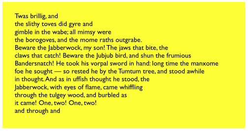
Figure 10-11. A text view with an exclusion path
In Figure 10-11, the text view (self.tv) is initially configured in the view controller’s viewDidLoad:
self.tv.attributedText = // ...
self.tv.textContainerInset = UIEdgeInsetsMake(20, 20, 20, 0)
self.tv.isScrollEnabled = false
The exclusion path is then drawn and applied in viewDidLayoutSubviews:
override func viewDidLayoutSubviews() {
    let sz = self.tv.textContainer.size
    let p = UIBezierPath()
    p.move(to: CGPoint(sz.width/4.0,0))
    p.addLine(to: CGPoint(sz.width,0))
    p.addLine(to: CGPoint(sz.width,sz.height))
    p.addLine(to: CGPoint(sz.width/4.0,sz.height))
    p.addLine(to: CGPoint(sz.width,sz.height/2.0))
    p.close()
    self.tv.textContainer.exclusionPaths = [p]
}
Instead of (or in addition to) an exclusion path, you can subclass NSTextContainer to modify the rectangle in which the layout manager wants to position a piece of text. (Each piece of text is actually a line fragment; I’ll explain in the next section what a line fragment is.) In Figure 10-12, the text is inside a circle.
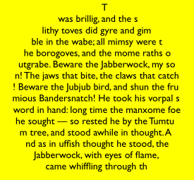
Figure 10-12. A text view with a subclassed text container
To achieve the layout shown in Figure 10-12, I set the attributed string’s line break mode to .byCharWrapping (to bring the right edge of each line as close as possible to the circular shape), and construct the Text Kit stack by hand to include an instance of my NSTextContainer subclass:
let r = self.tv.frame
let lm = NSLayoutManager()
let ts = NSTextStorage()
ts.addLayoutManager(lm)
let tc = MyTextContainer(size:CGSize(r.width, r.height))
lm.addTextContainer(tc)
let tv = UITextView(frame:r, textContainer:tc)
Here’s my NSTextContainer subclass; it overrides just one property and one method, to dictate the rect of each line fragment:
class MyTextContainer : NSTextContainer {
    override var isSimpleRectangularTextContainer : Bool { return false }
    override func lineFragmentRect(forProposedRect proposedRect: CGRect,
        at characterIndex: Int,
        writingDirection baseWritingDirection: NSWritingDirection,
        remaining remainingRect: UnsafeMutablePointer<CGRect>?) -> CGRect {
            var result = super.lineFragmentRect(
                forProposedRect:proposedRect, at:characterIndex,
                writingDirection:baseWritingDirection,
                remaining:remainingRect)
            let r = self.size.height / 2.0
            // convert initial y so that circle is centered at origin
            let y = r - result.origin.y
            let theta = asin(y/r)
            let x = r * cos(theta)
            // convert resulting x from circle centered at origin
            let offset = self.size.width / 2.0 - r
            result.origin.x = r-x+offset
            result.size.width = 2*x
            return result
    }
}
Alternative Text Kit Stack Architectures
The default Text Kit stack is one text storage, which has one layout manager, which has one text container. But a text storage can have multiple layout managers, and a layout manager can have multiple text containers. What’s that all about?
If one layout manager has multiple text containers, the overflow from each text container is drawn in the next one. For example, in Figure 10-13, there are two text views; the text has filled the first text view, and has then continued by flowing into and filling the second text view. As far as I can tell, the text views can’t be made editable in this configuration. But clearly this is a way to achieve a multicolumn or multipage layout, or you could use text views of different sizes for a magazine-style layout.
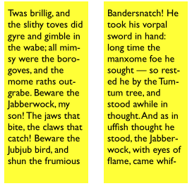
Figure 10-13. A layout manager with two text containers
It is possible to achieve that arrangement by disconnecting the layout managers of existing text views from their text containers and rebuilding the stack from below. In this example, though, I’ll build the entire stack by hand:
let r = // frame
let r2 = // frame
let mas = // content
let ts1 = NSTextStorage(attributedString:mas)
let lm1 = NSLayoutManager()
ts1.addLayoutManager(lm1)
let tc1 = NSTextContainer(size:r.size)
lm1.addTextContainer(tc1)
let tv = UITextView(frame:r, textContainer:tc1)
let tc2 = NSTextContainer(size:r2.size)
lm1.addTextContainer(tc2)
let tv2 = UITextView(frame:r2, textContainer:tc2)
If one text storage has multiple layout managers, then each layout manager is laying out the same text. For example, in Figure 10-14, there are two text views displaying the same text. The remarkable thing is that if you edit one text view, the other changes to match. (That’s how Xcode lets you edit the same code file in different windows, tabs, or panes.)
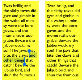
Figure 10-14. A text storage with two layout managers
Again, this arrangement is probably best achieved by building the entire text stack by hand:
let r = // frame
let r2 = // frame
let mas = // content
let ts1 = NSTextStorage(attributedString:mas)
let lm1 = NSLayoutManager()
ts1.addLayoutManager(lm1)
let lm2 = NSLayoutManager()
ts1.addLayoutManager(lm2)
let tc1 = NSTextContainer(size:r.size)
let tc2 = NSTextContainer(size:r2.size)
lm1.addTextContainer(tc1)
lm2.addTextContainer(tc2)
let tv = UITextView(frame:r, textContainer:tc1)
let tv2 = UITextView(frame:r2, textContainer:tc2)
Layout Manager
The first thing to know about a layout manager is the geometry in which it thinks. To envision a layout manager’s geometrical world, think in terms of glyphs and line fragments:
- Glyph
-
The drawn analog of a character. The layout manager’s primary job is to get glyphs from a font and draw them.
- Line fragment
-
A rectangle in which glyphs are drawn, one after another. (The reason it’s a line fragment, and not just a line, is that a line might be interrupted by the text container’s exclusion paths.)
A glyph has a location in terms of the line fragment into which it is drawn. A line fragment’s coordinates are in terms of the text container. The layout manager can convert between these coordinate systems, and between text and glyphs. Given a range of text in the text storage, it knows where the corresponding glyphs are drawn in the text container. Conversely, given a location in the text container, it knows what glyph is drawn there and what range of text in the text storage that glyph represents.
What’s missing from that geometry is what, if anything, the text container corresponds to in the real world. A text container is not, itself, a real rectangle in the real world; it’s just a class that tells the layout manager a size to draw into. Making that rectangle meaningful for drawing purposes is up to some other class outside the Text Kit stack. A UITextView, for example, has a text container, which it shares with a layout manager. The text view knows how its own content is scrolled and how the rectangle represented by its text container is inset within that scrolling content. The layout manager, however, doesn’t know anything about that; it sees the text container as a purely theoretical rectangular boundary. Only when the layout manager actually draws does it make contact with the real world of some graphics context — and it must be told, on those occasions, how the text container’s rectangle is offset within that graphics context.
To illustrate, I’ll use a Text Kit method to learn the index of the first character visible at the top left of a text view (self.tv); I’ll then use NSLinguisticTagger to derive the first word visible at the top left of the text view. I can ask the layout manager what character or glyph corresponds to a certain point in the text container, but what point should I ask about? Translating from the real world to text container coordinates is up to me; I must take into account both the scroll position of the text view’s content and the inset of the text container within that content:
let off = self.tv.contentOffset
let top = self.tv.textContainerInset.top
var tctopleft = CGPoint(0, off.y - top)
Now I’m speaking in terms of text container coordinates, which are layout manager coordinates. One possibility is then to ask directly for the index (in the text storage’s string) of the corresponding character:
let ixx = self.tv.layoutManager.characterIndex(for:tctopleft,
    in:self.tv.textContainer,
    fractionOfDistanceBetweenInsertionPoints:nil)
That, however, does not give quite the results one might intuitively expect. If any of a word is poking down from above into the visible area of the text view, that is the word whose first character is returned. I think we intuitively expect, if a word isn’t fully visible, that the answer should be the word that starts the next line, which is fully visible. So I’ll modify that code in a simpleminded way. I’ll obtain the index of the glyph at my initial point; from this, I can derive the rect of the line fragment containing it. If that line fragment is not at least three-quarters visible, I’ll add one line fragment height to the starting point and derive the glyph index again. Then I’ll convert the glyph index to a character index:
var ix = self.tv.layoutManager.glyphIndex(for:tctopleft,
    in:self.tv.textContainer, fractionOfDistanceThroughGlyph:nil)
let frag = self.tv.layoutManager.lineFragmentRect(
    forGlyphAt:ix, effectiveRange:nil)
if tctopleft.y > frag.origin.y + 0.5*frag.size.height {
    tctopleft.y += frag.size.height
    ix = self.tv.layoutManager.glyphIndex(for:tctopleft,
        in:self.tv.textContainer, fractionOfDistanceThroughGlyph:nil)
}
let charRange = self.tv.layoutManager.characterRange(
    forGlyphRange: NSMakeRange(ix,0), actualGlyphRange:nil)
ix = charRange.location
Finally, I’ll use NSLinguisticTagger to get the range of the entire word to which this character belongs:
let sch = NSLinguisticTagSchemeTokenType
let t = NSLinguisticTagger(tagSchemes:[sch], options:0)
t.string = self.tv.text
var r : NSRange = NSMakeRange(0,0)
let tag = t.tag(at:ix, scheme:sch, tokenRange:&r, sentenceRange:nil)
if tag == NSLinguisticTagWord {
    print((self.tv.text as NSString).substring(with:r))
}
Clearly, the same sort of technique could be used to formulate a custom response to a tap (“what word did the user just tap on?”).
By subclassing NSLayoutManager (and by implementing its delegate), many powerful effects can be achieved. As a simple example, I’ll carry on from the preceding code by drawing a rectangular outline around the word we just located. To make this possible, I have an NSLayoutManager subclass, MyLayoutManager, an instance of which is built into the Text Kit stack for this text view. MyLayoutManager has a public NSRange property, wordRange. Having worked out what word I want to outline, I set the layout manager’s wordRange and invalidate its drawing of that word, to force a redraw:
let lm = self.tv.layoutManager as! MyLayoutManager
lm.wordRange = r
lm.invalidateDisplay(forCharacterRange:r)
In MyLayoutManager, I’ve overridden the method that draws the background behind glyphs. At the moment this method is called, there is already a graphics context.
First, I call super. Then, if the range of glyphs to be drawn includes the glyphs for the range of characters in self.wordRange, I ask for the rect of the bounding box of those glyphs, and stroke it to form the rectangle. As I mentioned earlier, the bounding box is in text container coordinates, but now we’re drawing in the real world, so I have to compensate by offsetting the drawn rectangle by the same amount that the text container is supposed to be offset in the real world; fortunately, the text view tells us (through the origin: parameter) what that offset is:
override func drawBackground(forGlyphRange glyphsToShow: NSRange,
    at origin: CGPoint) {
        super.drawBackground(forGlyphRange:glyphsToShow, at:origin)
        if self.wordRange.length == 0 {
            return
        }
        var range = self.glyphRange(forCharacterRange:self.wordRange,
            actualCharacterRange:nil)
        range = NSIntersectionRange(glyphsToShow, range)
        if range.length == 0 {
            return
        }
        if let tc = self.textContainer(forGlyphAt:range.location,
            effectiveRange:nil, withoutAdditionalLayout:true) {
                var r = self.boundingRect(forGlyphRange:range, in:tc)
                r.origin.x += origin.x
                r.origin.y += origin.y
                let c = UIGraphicsGetCurrentContext()!
                c.saveGState()
                c.setStrokeColor(UIColor.black.cgColor)
                c.setLineWidth(1.0)
                c.stroke(r)
                c.restoreGState()
        }
}
Text Kit Without a Text View
UITextView is the only built-in iOS class that has a Text Kit stack to which you are given programmatic access. But that doesn’t mean it’s the only place where you can draw with Text Kit! You can draw with Text Kit anywhere you can draw — that is, in any graphics context (Chapter 2). When you do so, you should always call both drawBackground(forGlyphRange:at:) (the method I overrode in the previous example) and drawGlyphs(forGlyphRange:at:), in that order. The at: argument is the point where you consider the text container’s origin to be within the current graphics context.
To illustrate, I’ll change the implementation of the StringDrawer class that I described earlier in this chapter. Previously, StringDrawer’s draw(_:) implementation told the attributed string (self.attributedText) to draw itself:
override func draw(_ rect: CGRect) {
    let r = rect.offsetBy(dx: 0, dy: 2)
    let opts : NSStringDrawingOptions = .usesLineFragmentOrigin
    self.attributedText.draw(with:r, options: opts, context: context)
}
Instead, I’ll construct the Text Kit stack and tell its layout manager to draw the text:
override func draw(_ rect: CGRect) {
    let lm = NSLayoutManager()
    let ts = NSTextStorage(attributedString:self.attributedText)
    ts.addLayoutManager(lm)
    let tc = NSTextContainer(size:rect.size)
    lm.addTextContainer(tc)
    tc.lineFragmentPadding = 0
    let r = lm.glyphRange(for:tc)
    lm.drawBackground(forGlyphRange:r, at:CGPoint(0,2))
    lm.drawGlyphs(forGlyphRange: r, at:CGPoint(0,2))
}
Building the entire Text Kit stack by hand may seem like overkill for that simple example, but imagine what else I could do now that I have access to the entire Text Kit stack! I can use properties, subclassing, delegation, and alternative stack architectures to achieve customizations and effects that, before Text Kit was migrated to iOS, were difficult or impossible to achieve without dipping down to the level of Core Text.
For example, the two-column display of U.S. state names on the iPad shown in Figure 10-15 was a Core Text example in early editions of this book, requiring 50 or 60 lines of elaborate C code, complicated by the necessity of flipping the context to prevent the text from being drawn upside-down. Nowadays, it can be achieved easily through Text Kit — effectively just by reusing code from earlier examples in this chapter.
Figure 10-15. Two-column text in small caps
Furthermore, the example from previous editions went on to describe how to make the display of state names interactive, with the name of the tapped state briefly outlined with a rectangle (Figure 10-16). With Core Text, this was almost insanely difficult, not least because we had to keep track of all the line fragment rectangles ourselves. But it’s easy with Text Kit, because the layout manager knows all the answers.

Figure 10-16. The user has tapped on California
We have a UIView subclass, StyledText. In its layoutSubviews, it creates the Text Kit stack — a layout manager with two text containers, to achieve the two-column layout — and stores the whole stack, along with the rects at which the two text containers are to be drawn, in properties:
override func layoutSubviews() {
    super.layoutSubviews()
    var r1 = self.bounds
    r1.origin.y += 2 // a little top space
    r1.size.width /= 2.0 // column 1
    var r2 = r1
    r2.origin.x += r2.size.width // column 2
    let lm = MyLayoutManager()
    let ts = NSTextStorage(attributedString:self.text)
    ts.addLayoutManager(lm)
    let tc = NSTextContainer(size:r1.size)
    lm.addTextContainer(tc)
    let tc2 = NSTextContainer(size:r2.size)
    lm.addTextContainer(tc2)
    self.lm = lm; self.ts = ts; self.tc = tc; self.tc2 = tc2
    self.r1 = r1; self.r2 = r2
}
Our draw(_:) is just like the previous example, except that we have two text containers to draw:
override func draw(_ rect: CGRect) {
    let range1 = self.lm.glyphRange(for:self.tc)
    self.lm.drawBackground(forGlyphRange:range1, at: self.r1.origin)
    self.lm.drawGlyphs(forGlyphRange:range1, at: self.r1.origin)
    let range2 = self.lm.glyphRange(for:self.tc2)
    self.lm.drawBackground(forGlyphRange:range2, at: self.r2.origin)
    self.lm.drawGlyphs(forGlyphRange:range2, at: self.r2.origin)
}
So much for drawing the text!
When the user taps on our view, a tap gesture recognizer’s action method is called. We are using the same layout manager subclass developed in the preceding section of this chapter: it draws a rectangle around the glyphs corresponding to the characters of its wordRange property. Thus, all we have to do in order to make the flashing rectangle around the tapped word is work out what that range is, set our layout manager’s wordRange property and redraw ourselves, and then (after a short delay) set the wordRange property back to a zero range and redraw ourselves again to remove the rectangle.
We start by working out which column the user tapped in; this tells us which text container it is, and what the tapped point is in text container coordinates (g is the tap gesture recognizer):
var p = g.location(in:self)
var tc = self.tc!
if !self.r1.contains(p) {
    tc = self.tc2!
    p.x -= self.r1.size.width
}
Now we can ask the layout manager what glyph the user tapped on, and hence the whole range of glyphs within the line fragment the user tapped in. If the user tapped to the left of the first glyph or to the right of the last glyph, no word was tapped, and we return:
var f : CGFloat = 0
let ix =
    self.lm.glyphIndex(for:p, in:tc, fractionOfDistanceThroughGlyph:&f)
var glyphRange : NSRange = NSMakeRange(0,0)
self.lm.lineFragmentRect(forGlyphAt:ix, effectiveRange:&glyphRange)
if ix == glyphRange.location && f == 0.0 {
    return
}
if ix == glyphRange.location + glyphRange.length - 1 && f == 1.0 {
    return
}
If the last glyph of the line fragment is a whitespace glyph, we don’t want to include it in our rectangle, so we subtract it from the end of our range. Then we’re ready to convert to a character range, and thus we can learn the name of the state that the user tapped on:
func lastCharIsControl () -> Bool {
    let lastCharRange = glyphRange.location + glyphRange.length - 1
    let property = self.lm.propertyForGlyph(at:lastCharRange)
    let mask1 = property.rawValue
    let mask2 = NSGlyphProperty.controlCharacter.rawValue
    return mask1 & mask2 != 0
}
while lastCharIsControl() {
    glyphRange.length -= 1
}
let characterRange =
    self.lm.characterRange(forGlyphRange:glyphRange, actualGlyphRange:nil)
let s = (self.text.string as NSString).substring(with:characterRange)
Finally, we flash the rectangle around the state name by setting and resetting the wordRange property of the subclassed layout manager:
let lm = self.lm as! MyLayoutManager
lm.wordRange = characterRange
self.setNeedsDisplay()
delay(0.3) {
    lm.wordRange = NSMakeRange(0, 0)
    self.setNeedsDisplay()
}