We begin this book with a visual tour of the SAP application window1 and a discussion of the design and operation of its screen elements.
When you launch SAP, a session or an application window appears on your computer desktop with a display of a scene or screen inside its frame. This screen changes in its appearance and function as you progress through the SAP workflow from the SAP Easy Access screen (the default “home page” of the system) to the initial screen of a transaction (where you set up and execute it) and finally to the output for that transaction.
Regardless of their function, however, seven features or elements are found on every screen of the SAP application window (Figure I.1):
 Menu bar (A)
Standard toolbar (B)
Title bar (C)
Application toolbar (D)
Central work area (E)
Status bar (F)
Popup screens (not shown here)
Figure I.1 The SAP Easy Access screen contains all the elements found on other screens in the system.

This lesson describes the design and operation of these screen elements—all of which should be familiar to the reader, by the way, as they can also be found in the application windows of many common desktop software applications, such as MS Word and Excel. We use the SAP Easy Access screen as the principal source of our screen images in this introduction because it contains all these screen elements and should be familiar to even the novice users of the system, but we also present images from other SAP screens to bring some variety to this discussion.
Incidentally, this introduction focuses on the design and operation of the SAP application window as it appears in the desktop GUI. However, some end users access SAP through Web browsers such as MS Internet Explorer, where the SAP application window is condensed into a simpler format. We describe and illustrate this condensed design at the end of this introduction.
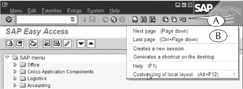
The menu bar is the uppermost element on all screens. It contains three components (Figure I.2):
Menu headers (A)
System shortcut menu icon (B)
Control buttons (C)
Figure I.2 The menu bar and its components, with a display of the Favorites menu and one of its submenus.
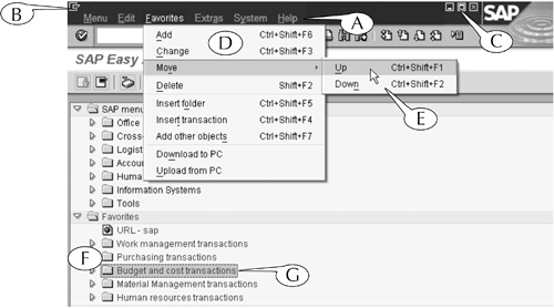
When the menu headers are clicked, they display lists or menus (D) of nearly every command that can be executed on a screen. Some of the commands in the menus have their own submenus (E), which are displayed when your cursor lands on those commands. The presence of such submenus is indicated by arrows to the far right of the commands.
To execute a command from the menu bar with your mouse:
Click a header to display its menu.
Scroll down and across the menu and submenus to the desired command. Notice that each command is highlighted when your cursor lands on it.
When you reach the desired command, click your mouse again to select it.
For example, the SAP Easy Access screen contains a set of folders called the Favorites (F), in which you can store links to the initial screens of frequently run transactions (see Lesson 6). You can shift the Budget and cost transactions folder (G) upwards through the list of these folders by doing the following:
Click the folder to select and highlight it (G).
Click the Favorites header to display its menu (D).
Scroll down to the Move command, then slide over to the Up command and click it.
This sequence of actions is called the menu path for that command. It is presented throughout this book in this format:
Favorites > Move > Up
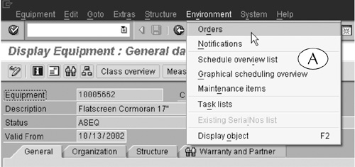
Menu bars are generally screen specific; that is, they change with the scene inside the application window. For an example, let us compare the menu bars of the SAP Easy Access screen (Figure I.2) and the output screen of the IE03 transaction (Figure I.3).
Figure I.3 The menu bar of the output screen of the IE03 transactions contains headers that are appropriate to equipment displays.
The SAP Easy Access screen appears when you log on to the system and is the starting point in the SAP workflow. From here, you move or navigate to the initial screen of a transaction, where you set it up and execute it. Consequently, the first four menus in its menu bar—Menu, Edit, Favorites, and Extras—contain commands for customizing the screen for easier navigation. For example, the Favorites menu (D) contains all sorts of commands for working with the Favorites folders, where links to your frequently run transactions are stored (see Lesson 6).
In contrast, the output screen of the IE03 transaction displays data about a piece of equipment. Consequently, the first six menus in its menu bar—Equipment, Edit, Goto, Extras, Structure, and Environment—contain commands for working with such data. For example, the Environment menu (Figure I.3A) contains commands such as Orders, which displays a list of all the maintenance work done on the equipment; Notifications, which displays a list of all maintenance requests for it; and Schedule overview list, which displays its maintenance schedule.
However, the menu bar of every screen contains the System and Help menus at its right end. The first menu contains commands for opening, closing, and customizing the SAP application window, printing screens, logging off, and other system-related processes, and the second gives you access to the help features of the system. We describe some of the commands of these two menus in the lessons of Part I of this book.
When it is clicked, the system shortcut menu icon displays a short menu of commands (Figure I.4A) for working with the SAP application window. Most of these commands can also be executed by the System menu of the menu bar and by other, more convenient, means. The single exception is the Stop transaction command, which kills a transaction after you start its execution.

We describe the system shortcut menu and its functions in more detail in Lesson 2 of this book.
The control buttons (Figure I.2C) of the menu bar affect the application window in three ways when they are clicked. (You should be familiar with their functions from other applications, which often have these same buttons in the same location.) The first reduces the window to a small application bar at the bottom of the Windows desktop; the second maximizes and minimizes its size; and the third closes it.
We describe and illustrate the uses of the control buttons in more detail in Lesson 2 of this book.
You can use your mouse in four ways on the screen elements of the SAP application window: You can click, right-click, double-click, and click-and-drag.
When you are instructed to click a screen element, move your cursor atop that element and then quickly click and release the left button on your mouse.
When you are instructed to right-click a screen element, move your cursor atop that element and quickly click and release the right button on your mouse.
When you are instructed to double-click a screen element, move your cursor atop that element and quickly click and release the left button on your mouse twice.
When you are instructed to click-and-drag a screen element, move your cursor atop that element; click and hold down the left button on your mouse; slide the cursor across the screen to its destination, then release the left button.
You can also use single or combination keystrokes to execute certain commands. Keystrokes are written in this book in bold letters (for example, “hit the Enter key”) to remind you that the action takes place on your keyboard rather than your monitor.
Some keyboard commands require that you press and hold down one key and then press a second key. For example, you can print a screen by pressing and holding down the Control (Ctrl) key and then pressing the P key on your keyboard. This particular command is presented in the format Ctrl + P in this book.
The standard toolbar (Figure I.5) contains the command field and several command buttons for working on screens and navigating between them. The name of this toolbar comes from the fact that the functions of these components are commonly executed on, or universal to, every screen, regardless of its specific purpose. Consequently, this toolbar is found on every screen in the SAP application.

The command field is another tool for navigating to the initial screens of transactions. Every initial screen in the SAP application is identified by a unique transaction code. You can navigate to that screen by entering that code in this field.
The command field also contains a list icon at its right end (Figure I.6A). This feature, which is found inside other fields on many screens, displays a list of recently entered transaction codes (B) when it is clicked.
Figure I.6 The history button (A) of the Command field reveals a list of recently used transaction codes (B).

Lastly, the command field is accompanied by its own control arrow (C), which displays or hides the field when it is clicked. (We recommend that you keep this field open at all times so that you can use it for navigation.)
We describe the use of the command field in more detail in Lesson 7 of this book.
The command buttons execute universal tasks, such as entering and saving data, printing a screen, and navigating back to the previous screen, when they are clicked. You can display a label that describes the function of a button by placing your cursor over it (Figure I.7). If the command can also be executed from your keyboard, the keystroke will also be displayed in parentheses in the label.
Figure I.7 Place your cursor over a button to see a label with its description and an alternative keystroke for that command (in this case, the F3 function button).
Here are some of the important design and operation features of the standard toolbar.
1. You can vary the width of the application window with the frame grabber in its lower-right corner (see Lesson 2). But if the window is too narrow, the buttons on the right end of the standard toolbar are cut off and replaced by a list button (Figure I.8A). However, you can click this button to display a menu of the hidden commands (B), then scroll down and click one to execute it.
Figure I.8 You can display the hidden commands of a shortened standard toolbar by clicking the list button (A).
2. Some of the buttons in the standard toolbar provide convenient shortcuts for commands that can be executed from the menu bar. For example, the Create session and Create shortcut buttons are shortcuts for the same commands in the System menu.
3. Some of the functions of the buttons can also be executed with keystrokes. For example, you can print a screen’s content either by clicking the Print button in the standard toolbar or by the keystroke Ctrl + P.
Similarly, you can enter data on a screen by clicking the Enter button in the standard toolbar or by hitting the Enter key on your keyboard. We always instruct you to use the keyboard for this command because it is faster.
4. On any given screen, some of the buttons in the standard toolbar appear in full color and others are “grayed out.” The full-colored buttons are active or hot—that is, they function on that screen—while the gray ones are inactive or cold because they serve no purpose there.
For example, the Save, Back, and Cancel buttons are all grayed out on the SAP Easy Access screen because there is nothing to save, no screen to return to (this is the “home page”), and nothing to cancel (Figure I.1).
The title bar displays the name of the screen in the application window. The title bars of initial screens usually indicate the transaction type (see the Coda for a discussion of transaction types) and the object of the transaction (Figure I.9A), while the title bars of output screens usually display these same data along with the code for the object of the transaction (Figure I.9B).

In this book, we refer to all screens by the name in their title bars, printed in bold letters. When we refer to the name of an output screen, we replace the specific object code with a general reference. For example, we would present the title of the screen in Figure I.9B as Display Service Order [Order Number]: Central Header.
The application toolbar contains a second row of command buttons for executing certain tasks. Like the standard toolbar, the buttons of the application toolbar replicate commands in the menu bar. In addition, you can display a label that describes the function of any button by placing your cursor over it. But unlike the standard toolbar, the buttons of the application toolbar change from screen to screen—that is, they change with the application or function of the screen.
For instance, the central work area of the SAP Easy Access screen (Figure I.1E) displays the SAP User and Favorites folders, which contain links for moving to the initial screens of transactions as well as the Business Workplace screen. The application toolbar of this screen contains eight buttons for issuing commands that are related to these screen elements (Figure I.10).
The first two buttons (A) display different versions of the folder sets in the central work area (see Lesson 5).
The third button (B) calls up the Business Workplace screen (see Lesson 17).
The last five buttons (C) enable you to create and manage the Favorites folders of the central work area (see Lesson 6).
Figure I.10 The application toolbar of the SAP Easy Access screen has its own unique set of command buttons.

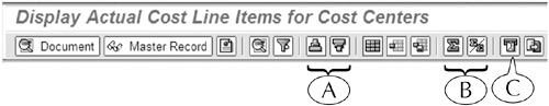
On the other hand, the Display Actual Costs Line Items for Cost Centers screen displays data about the expenditures for a department (or cost center) in a company in a multicolumn line-item report (Figure I.11). Its application toolbar contains a completely different set of buttons for working with this report. For instance, it contains buttons for sorting its contents (A), summing up the numerical values in its columns (B), and e-mailing the report to another SAP user (C).
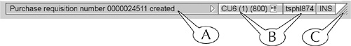
The status bar (Figure I.12) contains three components: the message field (A), system data field (B), and frame grabber (C).
The message field is one of two screen elements (the second is popup screens) by which the system displays confirmations, warnings, errors, and other messages to users. For example:
When you set up and execute a transaction for creating a requisition, the system confirms you have successfully completed the transaction and displays by default the new requisition number in the message field (Figure I.12A). You don’t have to respond to the system in any way, although you should probably record the requisition number.
If you try to log on with the wrong user ID or password, the system displays an error message to this effect in the message field. Once again, you do not have to respond directly to this message, but you must correct your error when you try to log on again. You can also see more information about a warning or an error by double-clicking the message.
The system data field displays technical data about your SAP environment; that is, its hardware and software. Some of these data appear directly on the status bar. For example, the system data field in Figure I.12 displays the name of the database (CU6 (1) (800)) that we used to capture the screen images for this book, and the server (tsphl874) through which we accessed this database (B).
You can also click the list icon (Figure I.13A) in the system data field to display other sorts of technical data, including the name of the database (System) and SAP server (Host name), your user ID (User), and the transaction code of the screen (Transaction). You can permanently display one of these datatypes directly in the first compartment of the status bar by scrolling down to it and clicking it so that a check appears to the left of its name (B).

Finally, you can display or hide the system data field by clicking the control arrow (C) to its left.
The frame grabber (Figure I.12C) allows you to adjust the size and shape of the application window by clicking-and-dragging it into a new position.
The central work area (technically called the Dynpro) lies between the application toolbar and status bar of every screen. This is the principal working environment for the SAP application. It contains many different screen elements for navigating between screens, setting up transactions, and working with their output. We describe the design and operation of these screen elements in the remaining pages of this introduction.
The central work area can contain one or more panels. Single-panel work areas are most common, but two- and three-panel work areas can also be found on the SAP Easy Access screen and some initial and output screens (Figure I.14). Wherever you find multiple panels, you can adjust their sizes by clicking-and-dragging the dividers or panes between them (Figure I.14A).
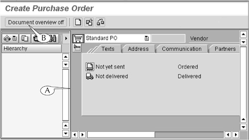
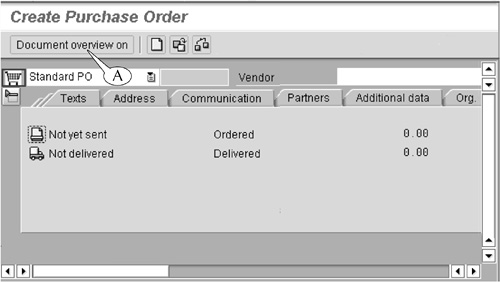
Some multipanel screens have buttons in their main application toolbars (or in secondary toolbars above the panels themselves) for displaying and hiding panels. For example, the initial screen for the Create Purchase Order transaction (Figure I.14) has a side panel that can be used for searching for older requisitions. You can hide this panel, which is not required for running the transaction, by clicking the Document overview off button2 (B) in the main application toolbar of the screen. When this panel is hidden, this button changes into the Document overview on button (Figure I.15A), which can be used to display the panel.
Storage folders are present in the central work areas of two screens: the SAP Easy Access screen, the “home page” of the system (Figure I.1) and the SAP Business Workplace screen (Figure 17.17 on page 243), where you can create and manage your e-mail. The folders of the first screen contain links to the initial screens of transactions (see Lesson 5), and the folders of the second screen store e-mails and their attached documents.
The storage folders of these two screens are exactly the same in their design and operation as the file storage folders in your personal computer. They are organized in a hierarchical or multilevel structure of folders and subfolders that you can open and close by clicking the arrows to their left or double-clicking their names.
We describe the design and operation of the storage folders of the SAP Easy Access and SAP Business Workplace screens in more detail in Lessons 5 and 17.
Data fields are rectangular boxes that are found on nearly every initial and output screen in the SAP system (Figure I.16). There are two types of these elements.
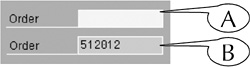
Data entry fields: These display their contents against a white background (A). They are read-write fields. You can enter data inside them if they are empty, or edit their contents if they are already filled or prepopulated with content.
Data display fields: These display their contents against a gray background (B). They are strictly read-only fields. You cannot enter data in them or edit their contents.
Data fields are always accompanied by a label that identifies the class of data or datatype that they can display or hold. These data can consist of object codes, which are assigned to all activities and objects tracked by SAP; calendar dates, such as 01/01/2005; and alphanumerical text, such as USD or Vehicle needs an oil change.3
We describe the design and operation of data entry fields in more detail in Part II of this book.
Some initial and output screens contain dozens and sometimes hundreds of data fields. When this occurs, the fields are typically parceled out into separate field areas, sometimes called frames, and tabbed subscreens (Figure I-17).
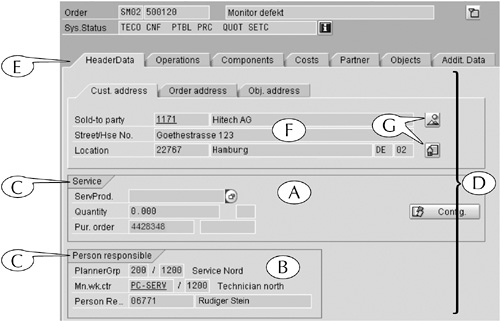
Field areas are groupings of data of related types (for example, Figure I.17 A and B). Each field area is surrounded by a border and headed by a label (C), which describes in general terms the contents of its fields. Where there are many field areas, they are further separated onto subscreens (D). You can display one subscreen at a time by clicking its tab (E), which identifies its contents.
For example, Figure I.17 illustrates the central work area of the output for the Display Equipment (IE03) transaction, which displays data about the installation and maintenance of equipment. This output contains a huge volume of technical and logistical data about the equipment and its history.
This mass of data is organized by parceling out the data onto ten subscreens, including the HeaderData subscreen, which is shown in this figure. This particular subscreen contains field areas for service data (A) and the name of the physical plant and plant manager responsible for the equipment (B), as well as its own tabbed subscreen for address data (F).
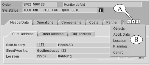
Incidentally, the application window for the screen in Figure I.17 is wide enough to display all the tabs of its subscreens (E). When the application window is too narrow, the tabs on the right end of the subscreens are cut off and replaced by left and right control arrows and a list menu icon (Figure I.18A). You can display a subscreen, despite the fact that its tab might be cut off, in one of two ways.
Click a control arrow to display the next subscreen to the left or right, or
Click the icon to display a list of the available subscreens (B), then scroll down and click a subscreen’s name.
Figure I.18 By clicking the list menu icon, you can display a list of those subscreens whose tabs are hidden.
Finally, you can display or hide some field areas and tabbed subscreens by using the Expand/close button, which lies directly outside their upper-left corner.
For example, the initial screen for the Create a Purchase Requisition (ME51N) transaction (Figure I.19) contains two tabbed subscreens (Header at its top, Item at its bottom) and a line-item table (at mid-screen) for entering data about the requisitioned materials. When they are all displayed, this screen is fairly long, and part of its content is hidden from view.
Figure I.19 The Expand (A) and Close (B) buttons display and hide (respectively) parts of the central work area. In this image, the Header and Item subscreens are both hidden, and only their names appear.
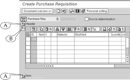
Therefore, it is common practice to display and work on only one part of this screen at a time and keep the other two areas hidden from view. This can be done with the Expand button (Figure I.19A), which displays an area when it is hidden, and the Close button (B), which hides an area when it is displayed. We have displayed the line-item table and hidden the Header and Item subscreens above and below it (so that only their names appear) by these means in our example.
Selection boxes (Figure I.20) and check boxes (Figure I.21) are found on the initial and output screens of many transactions, where they can be used to select one or more options, objects, or commands from a roster of items. You can select and deselect items in these rosters by clicking these boxes.

The difference between selection boxes and check boxes is simply the result of clicking them. When you click a selection box, it highlights the name of the selected item (Figure I.20A); when you click a check box, a check appears inside it.
Radio buttons (Figure I.22) serve a similar function to selection and check boxes: they allow you to select an option, object, or command from a roster of such items. However, they differ in one key regard: you can only select one item from the roster with a radio button.
Command buttons can often be found in the central work areas of screens (see Figure I.17G). Like the buttons of the standard and application toolbars, they execute a specific task, which you can identify by placing your cursor over them to display their label.
Scroll bars appear along the bottom and right margin of especially long or wide screens. You use them to shift the scene in the central work area in the horizontal or vertical direction (Figure I.23) in one of three ways.
1. Click the arrows at the end of a bar (A) to move the scene in small increments. This is the least effective and most tedious method, because the scene “creeps” slowly through the central work area.
2. Click the blue stripe of the bar (B) to move the scene in large increments.
3. Click-and-drag the white bar (C) to move the scene by any distance.

You can also use the four page control buttons in the standard toolbar (Figure I.5 on page 7) to shift the scene in a long central work area in the vertical direction.
The first and last buttons, which have a design of double arrows over a page icon, shift the scene to the very top and very bottom, respectively, of the central work area. The two middle buttons, which have single arrows imposed over a page icon, shift the scene to the next full scene above and below the present one.
Popup screens (also known as dialog boxes) of all different sizes are often displayed within SAP application windows. Some appear in response to an action by you or a command from you to the system, and others appear automatically when the system wants to communicate information to you.
Popup screens can be informational, interrogatory, or procedural in their purpose.
Informational popup screens (Figure I.24) display a message from the system and require only that you acknowledge that message by clicking an Enter button (which usually appears at its bottom) or hitting the Enter key on your keyboard. Such popup screens are generally small, given their limited function, and they appear without a specific command on your part.
Interrogatory popup screens (Figure I.25) display questions from the system in response to some action on your part and require some response from you. For example, when you try to log off the system (see Lesson 1), the system displays a popup screen that asks you to confirm or cancel that action with the Yes and No buttons. Such popup screens are also generally small.

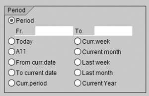
Procedural popup screens allow you to conduct certain procedures outside the central work area of screens. For example, you can control the display in the central work area of the SAP Easy Access screen with a procedural popup screen (Figure I.26), which you can call up by following the menu path Extras > Settings on that screen. Procedural popup screens are medium to large in size and fairly complex in their composition, often containing their own toolbar (which usually runs along their bottoms), tabbed subscreens, and other screen elements.

The name of a popup screen is always displayed in a blue title bar across its top (Figure I-26A). This bar also contains a control button at its right end (B) that you can click to erase the screen. You will also find a button for this purpose, along with other command buttons, in a toolbar at the bottom of a procedural popup screen (C).
Many end users access the SAP system through an application window that is displayed directly on their computer monitor’s desktop, or what is called the client server GUI. However, it is also possible to access the system through a Web browser such as MS Internet Explorer.
When you access SAP through a Web browser, the SAP application window appears within the frame of the browser’s application window (Figure I-27). For the most part, the design and operation of this Web GUI are identical to the design and operation of the desktop window, except in one regard: the menu bar and standard toolbar are collapsed onto the application toolbar, where they are represented by buttons.
Figure I.27 The SAP application window is condensed in design when it appears inside the frame of a Web browser window: Its menu bar and standard toolbar are collapsed onto its application toolbar. Click the Menu button to reveal the menu headers. The commands of the Favorites menu are shown in this image.
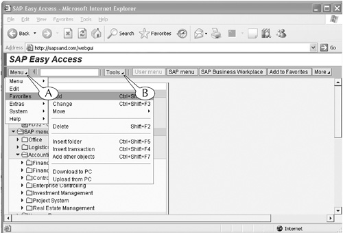
For example, Figure I-27 shows the design of the SAP Easy Access screen within the Web browser window. This screen contains only the title bar and application toolbar at its top; its menu bar and standard toolbar are replaced by the Menu button (A) and Tool button (B), which are situated on the application toolbar. You need only click the Menu button to display and maneuver to all its familiar command menus and submenus, and click the Tool button to display and select from its commands.
1. SAP uses the term session to describe the frame of its screens, but we use the more familiar term application window throughout this book.
2. This button goes by other names, such as Navigation on/off and Close/Open, on other screens.
3. SAP uses the term parameter to describe a datatype, and values to describe data.