
Chapter 3: SAS Add-In for Microsoft Office for the Business Analyst
3.2 Running a SAS Stored Process
3.3 Querying Warehouse Data with SAS Add-In for Microsoft Office
3.4 Analytical Tasks with SAS Add-In for Microsoft Office
3.4.1 Generating Monthly Revenues with Summary Tables Wizard
3.4.2 Using the Summary Tables Task
3.4.3 Using SAS Add-In for Microsoft Office Graph Task
3.5 Customizing SAS Add-Iin for Microsoft Office
3.5.1 Presenting Results in SAS Add-In for Microsoft Office
3.5.2 Scheduling and Sharing within SAS Add-In for Microsoft Office
3.1 Introduction
The analysts in the Finance department at Healthy Living Inc. are experts at financial analysis. Many are actuaries by training, and most are proficient at complex financial modeling. With their tool of choice, Microsoft Excel, they produce sophisticated reports that impress senior management and that set the standard for the rest of the company.
The analysts do not have the technical expertise to query and combine data from the warehouse. As a result, they rely on SAS programmers to provide them with data and periodic reports. But, SAS programmers are often busy, so the analysts have to wait.
SAS Add-In for Microsoft Office enables users to tap into the data management and analytical prowess of SAS within familiar Microsoft Office applications. With SAS Add-In for Microsoft Office, analysts can easily conduct analytical tasks themselves, instead of relying solely on SAS programmers. They can do all of the following:
1. View a SAS report while checking e-mail in Outlook.
2. Update a graph in PowerPoint that shows trends in revenues, costs, and enrollment.
3. Summarize and report on data in Excel after retrieving the data from the company’s data warehouse.
3.2 Running a SAS Stored Process
Here’s the SAS ribbon in Excel:
Figure 3.1: SAS Ribbon in Excel
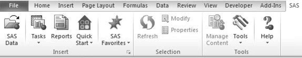
Table 3.1: Commonly Used Icons in the SAS Ribbon in Excel
 |
Query and retrieve data from tables in a database. |
 |
Access SAS analytical tools and wizards, which provide the same functionality and user experiences as they do in SAS Enterprise Guide. |
 |
Run SAS stored processes. |
 |
Determine how SAS output should look in Microsoft Office. |
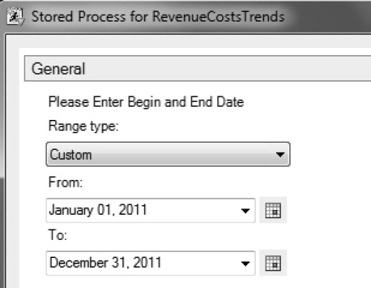
1. To run a stored process in Excel, click Reports in the SAS ribbon.
2. Navigate to STP Folder in Shared Data, and select Stored Process for RevenueCostsTrends.
3. Select the date parameters.
Figure 3.2: Run a Stored Process in Excel
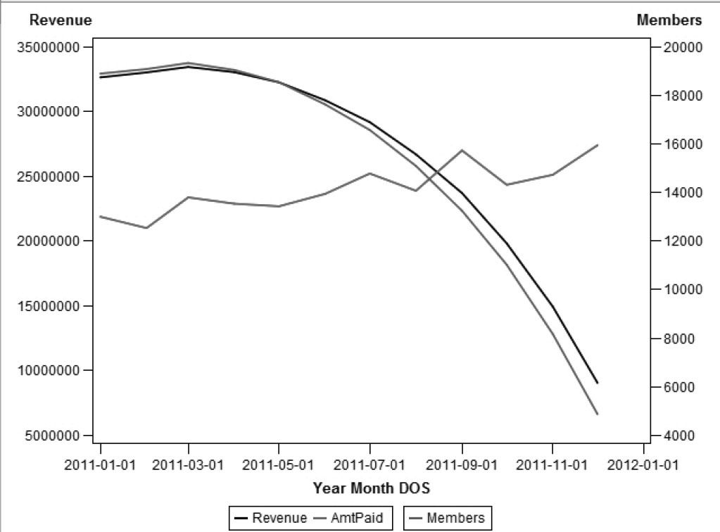
4. Select Existing worksheet in Choose Location. View the results in Excel.
Figure 3.3: Results of a Stored Process
SAS stored processes are run the same way in Microsoft Word and PowerPoint.
The subsequent sections limit discussion of the SAS Add-In for Microsoft Office to Excel. This is because Excel is most business analysts’ tool of choice. Any analysis in Excel can easily be replicated in other Microsoft Office applications.
3.3 Querying Warehouse Data with SAS Add-In for Microsoft Office
An analyst in the Finance department of Healthy Living Inc. needs to identify large medical claims for October 2010. After analyzing claim details, she forwards selected claims to the Medical Management department for medical review. Instead of waiting for a SAS programmer to retrieve data, she can now complete the task herself.
This section shows how the analyst can query data from the company’s data warehouse with SAS Add-In for Microsoft Office.
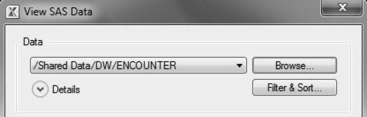
1. Click SAS Data in the SAS ribbon to access tables from the database.
2. In the View SAS Data dialog box, click Browse to select a table.
3. Use Filter & Sort to restrict and sort records from the table.
Figure 3.4: Query the Data Warehouse in Excel
a. The Modify Data Source dialog box has three tabs. On the Variables tab, all columns are selected by default.
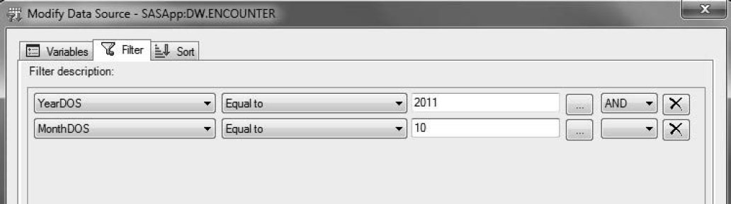
b. On the Filter tab, add two filters to restrict the dates of analysis to October 2011.
Figure 3.5: Data Filtering
c. On the Sort tab, sort AmtPaid as descending.
4. View the results of the highest claims paid in October 2011 by Healthy Living Inc.
Figure 3.6: Highest Claims Paid in October 2011

3.4 Analytical Tasks with SAS Add-In for Microsoft Office
This section creates a graph that trends revenues, costs, and profits of Healthy Living Inc. for the calendar year 2011. Although this graph exists as a stored process in the previous chapter, its creation demonstrates the analytical power of SAS Add-In for Microsoft Office. The task is divided into four parts.
1. Create monthly revenues using the Summary Tables Wizard, which offers step-by-step assistance.
2. Create monthly costs using the Summary Tables task, which is faster than the Summary Tables Wizard.
3. Compute profits in Excel as the difference between revenues and costs.
4. P lot revenues, costs, and profits using the Graph task.
3.4.1 Generating Monthly Revenues with the Summary Tables Wizard
1. Select Summary Tables Wizard from Tasks → Describe.
2. In the Open dialog box, select Revenue. Restrict its records to calendar year 2011.
3. On page 1 of the Summary Tables Wizard, verify the data and its filtering criterion.
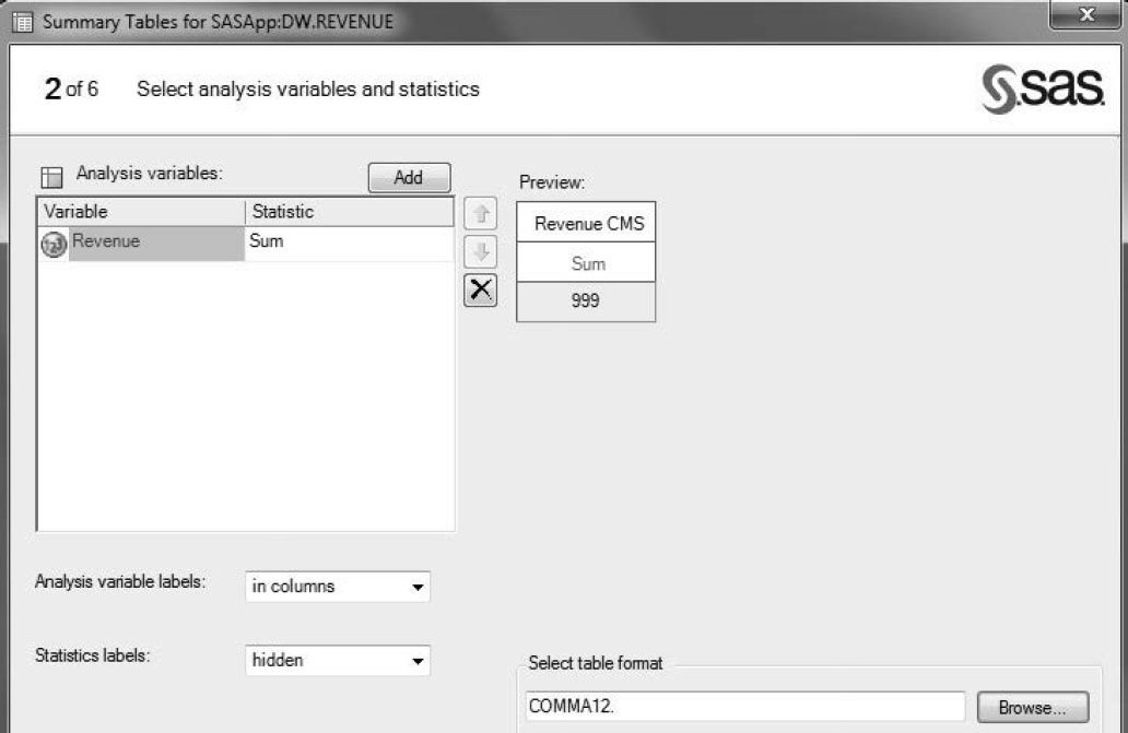
4. On page 2, enter information as shown in Figure 3.7.
a. Select Revenue as the analysis variable and Sum as the statistic.
b. Select hidden in Statistics labels for a neater look.
c. Use Select table format to format results.
Figure 3.7: Perform Tasks in Excel
5. On page 3, use YearMonthDOS for Rows.
6. On page 4, specify totals.
7. On page 6, specify titles and footnotes.
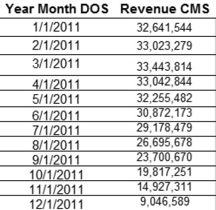
8. View the results.
Figure 3.8: Health Living Inc. Revenues in 2011
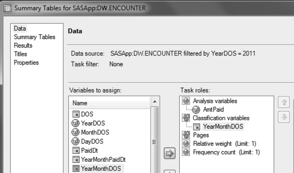
3.4.2 Using the Summary Tables Task
Wizards in SAS Add-In for Microsoft Office are great for step-by-step guidance, but they are more time-consuming than their tasks analogs. In this section, the Summary Tables task retrieves monthly costs from the Encounter table.
1. Select Summary Tables from Tasks → Describe.
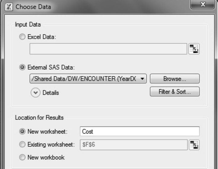
2. Select and filter data as shown in Figure 3.9.
a. In the Choose Data dialog box, select Encounter.
b. Using Filter & Sort, retrieve medical claims for 2011.
c. Place results in a new Excel worksheet.
Figure 3.9: Choose Data
3. Click Data. Place AmtPaid under Analysis variables and YearMonthDOS under Classification variables.
Figure 3.10: Assign Data
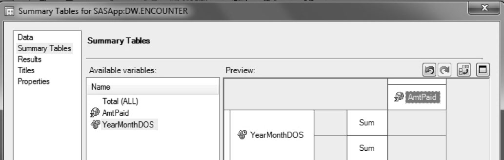
4. Click Summary Tables. Drag and drop AmtPaid and YearMonthDOS to create a tabular presentation of data. Right-click AmtPaid in the Preview window, and select Data Value Properties to format the values.
Figure 3.11: Create Tables
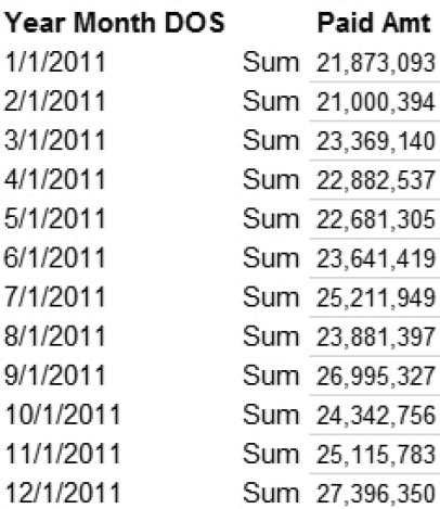
5. View the results.
Figure 3.12: Healthy Living Inc.’s Costs in 2011
3.4.3 Using SAS Add-In for Microsoft Office Graph Task
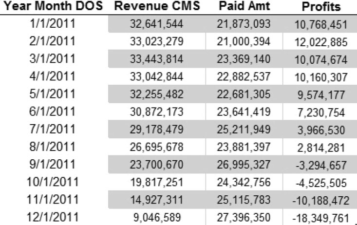
In Figure 3.13, revenue and cost results have been cut and pasted in a new Excel worksheet. Profits have been calculated by subtracting costs from revenues. Figure 3.13 shows a comprehensive picture of Healthy Living Inc.’s financials and is the data used to create a graph.
Figure 3.13: Healthy Living Inc.’s Revenues, Costs, and Profits
1. To create a graph with SAS Add-In for Microsoft Office, select Tasks → Graph → Line Plot.
2. In the Choose Data window, select Excel data as the input data.
3. In the Line Plot dialog box, select Multiple vertical column line plots using overlay.
Figure 3.14: Line Plots in Graph Task
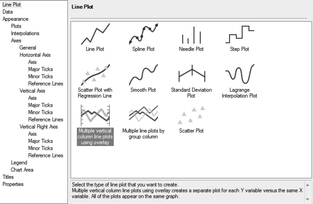
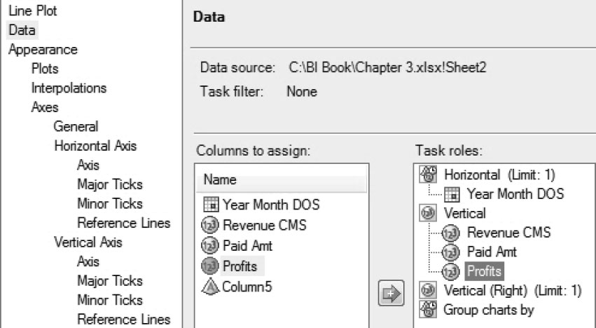
4. Click Data. Specify columns to plot.
Figure 3.15: Create a Line Plot in Graph Task
5. Select Appearance → Plots, and specify the characteristics of the lines for the three values.
Figure 3.16: Customize the Appearance of the Graph

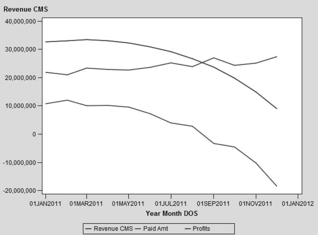
6. View the results.
Figure 3.17: Healthy Living Inc.’s Revenues, Costs, and Profits
3.5 Customizing the SAS Add-In for Microsoft Office
This section teaches you how to customize results so that Excel reports have a consistent look. It describes how workbooks can be refreshed periodically using scheduled tasks.
3.5.1 Presenting Results in the SAS Add-In for Microsoft Office
To view the styles provided by SAS, select Tools → Style Manager. Figure 3.18 shows a plethora of available styles.
Figure 3.18: Select and Modify Styles
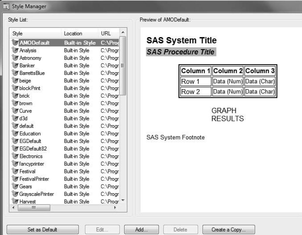
The Preview window shows what each style looks like. Existing styles can be modified by creating a copy of the style, and then editing it.
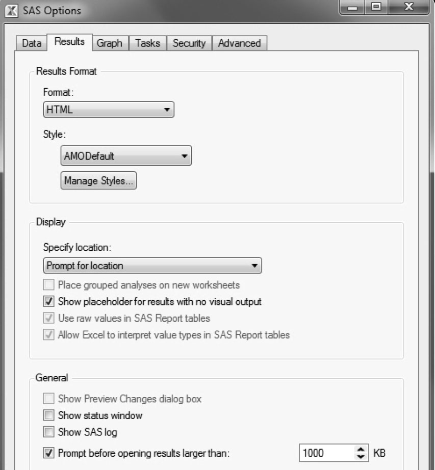
1. To control the appearance of SAS Add-In for Microsoft Office results, select Tools → Options.
2. As Figure 3.19 shows, the Results tab enables you to control the display of SAS output in Excel.
a. The Place grouped analysis on new worksheets check box is unchecked by default. If it is checked, results from SAS procedures containing BY statements are placed in separate, appropriately named worksheets.
b. Prompt before opening results larger than 1000 KB prevents the user from downloading excessive volumes of data. This limit can be increased.
Figure 3.19: Control SAS Output
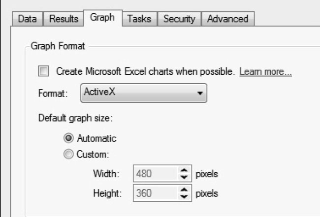
Clicking Graph enables you to download graphs in different formats and to change the size of a graph.
As Figure 3.20 shows, the default format of a graph is ActiveX. This generates an interactive file, displaying values when the mouse is positioned over an element. Other formats, such as PNG and GIF, produce static images.
Figure 3.20: Control Graph Appearance
Clicking Tasks enables you to control various other options, including default SAS footnotes.
3.5.2 Scheduling and Sharing in SAS Add-In for Microsoft Office
SAS Add-In for Microsoft Office gives you the option to refresh your workbooks periodically.
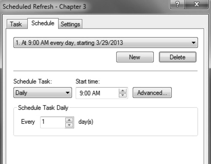
1. To schedule a workbook refresh, select Tools → Create Schedule.
2. Specify the time for a workbook refresh on the Schedule tab.
Figure 3.21: Schedule Workbooks
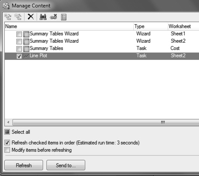
SAS Add-In for Microsoft Office makes it easy to share results with other Microsoft Office applications.
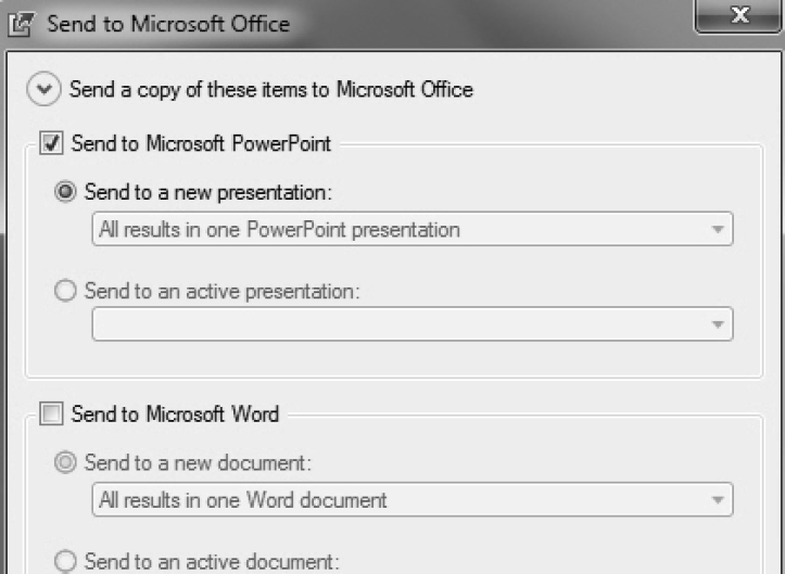
1. To send a graph to a PowerPoint document, click Manage Content from the SAS ribbon.
2. Select Line Plot, and then click Send to.
Figure 3.22: Manage and Share Content in Microsoft Office
3. Select Send to Microsoft PowerPoint.
Figure 3.23: Share Content in Microsoft Office
3.6 Conclusion
SAS Add-In for Microsoft Office enables users to tap into the power of SAS programming and analytics, thus saving SAS programmer time and resources. In this chapter, you learned how to use SAS Add-In for Microsoft Office in three different ways. First, you accessed a SAS stored process. Second, you performed an ad hoc analysis, retrieving the highest paid claims for a given month. Third, you leveraged the power of SAS analytics to create summary reports and graphs. In addition, you learned how to configure SAS Add-In for Microsoft Office to make it work for you.
Although the business analyst is now able to access summary and detailed information, there is no information highway between these two types of analyses. In the next chapter, SAS cubes enable analysts to traverse the road between different aggregations of data.