
Chapter 9: Creating Dashboards for the Health-Care Industry
9.2 Elements of Effective Dashboards
9.3 SAS BI Tools for Dashboards
9.4.1 A First Look: Overall Dashboard Organization
9.4.2 A Quick Introduction to SAS BI Dashboard
9.4.3 Creating Indicator Objects
9.4.4 Linking Indicator Objects for an In Depth Analysis
9.4.5 Putting It All Together in a SAS Dashboard
9.4.6 Placing a Dashboard in SAS Information Delivery Portal
9.5 The Medical Management Dashboard
9.5.1 Overview of the Medical Management Dashboard
9.5.2 Understanding Medical Management Dashboard’s Indicator Objects
9.5.2 Understanding a Stored Process as a Data Source to an Indicator Data
9.1 Introduction
In this chapter, you create two different dashboards for Healthy Living Inc. The Executive Dashboard is designed to be used by the executive team. The Medical Management Dashboard is constructed for the company’s clinicians and their support staff.
The Executive Dashboard paints an overall picture of the company in several comprehensible visual displays. An executive peruses the dashboard to quickly absorb key characteristics about the company’s members and their clinical conditions. The executive views high-level trends in revenue, costs, and enrollment. He or she clicks on a display to access a more detailed display.
The Medical Management Dashboard helps clinicians identify patients who require additional intervention. A clinician chooses a population group on the basis of multiple criteria, triggering an instant update of the dashboard’s displays. The clinician views a demographic and clinical profile of the selected cohort. He or she scans a detailed patient-level report to identify an individual patient. After reviewing a patient’s health utilization history, the clinician intervenes on the patient’s behalf.
All dashboards tell a story. Just as a story is more than the sum of its words, a dashboard is larger than the sum of its displays. Before plunging into a dashboard’s individual components, consider first the design work that precedes an effective dashboard.
9.2 Elements of Effective Dashboards
Although each dashboard is unique, effective dashboards share some common elements.
1. An effective dashboard is customized for its users. The Executive Dashboard presents information at an aggregate level because the executives who use it focus on company strategy. They do not need to see member-level details, so the dashboard does not contain drill-downs to individual patients. Clinicians, on the other hand, work with individual patients. The Medical Management Dashboard enables them to navigate from population cohorts to individual patients.
2. A good dashboard tells its story in a simple and clear manner. Each visual display must be carefully chosen so that its graphics deliver, rather than obfuscate, its message.
3. An effective dashboard organizes information in a logical way. The Executive Dashboard presents information from demographic, clinical, and financial perspectives, so it is divided into three logical segments.
4. Dashboard design is an iterative process, often requiring several rounds of prototyping and developing.
9.3 SAS BI Tools for Dashboards
In SAS BI, the following tools are used to create dashboards:
• SAS BI Dashboard is used to create a dashboard and its related contents. The primary product of this tool is the SAS dashboard object, which is generally composed of several display objects.
• SAS Information Delivery Portal displays dashboards created by SAS BI Dashboard. Users log on to this tool to view one or more pages of content.
• SAS Information Map Studio, SAS Stored Processes, SAS Web Report Studio, and other BI content previously developed in this book are used to deliver a one-stop-shop analytical application.
SAS Information Delivery Portal users can justifiably take exception to the statement that this tool simply displays dashboards built by SAS BI Dashboard. Indeed, it does a lot more. In SAS Information Delivery Portal, users can subscribe to e-mail channels, personalize content, and link directly to SAS BI content such as SAS stored processes and SAS Web Report Studio reports. A detailed explanation of the capabilities of SAS Information Delivery Portal is outside the scope of this book.
The building block of a SAS dashboard is an indicator, which is a metric display. SAS BI Dashboard offers many choices for display, including pie and bar charts, line plots, and many more. As Figure 9.1 shows and Table 9.1 explains, an indicator consists of two or often three components.
Figure 9.1: Components of an Indicator
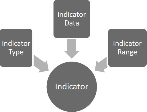
Table 9.1: Components of an Indicator
| Indicator Type | Determines the display of the indicator. Examples include a graph, pie chart, and line plot. |
| Indicator Data | Creates data for the indicator. SAS BI Dashboard allows data to come from several sources, such as an SQL query, a data table, a SAS stored process, or even an information map. |
| Indicator Range | Collapses indicator data into color-coded groupings. This is required for certain indicator types. |
Indicators can be connected to other SAS BI content, elevating them from independent pieces of information to well-integrated applications. An indicator can be linked to another indicator, a SAS stored process, or a SAS Web Report Studio report. A typical SAS dashboard includes several indicators.
9.4 The Executive Dashboard
This section presents the Executive Dashboard. The Executive Dashboard’s individual components are described, and you can learn how to build the Executive Dashboard.
9.4.1 A First Look: Overall Dashboard Organization
The Executive Dashboard is organized into three different sections that are presented seamlessly on a web page.
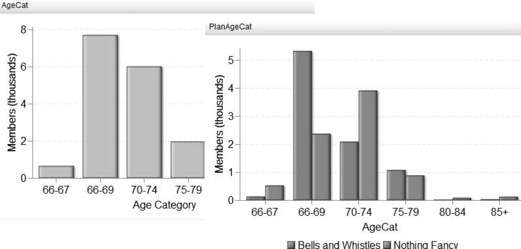
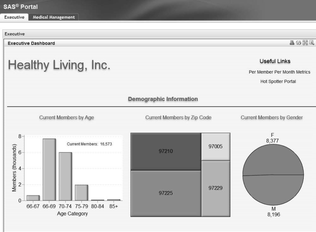
As shown in Figure 9.2, the first section of the dashboard shows demographic information about Healthy Living Inc.’s members. This is important because the first question executives have is, “Who are our members?”
Figure 9.2: Demographic Information
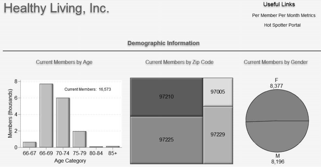
The demographic information answers the following questions in a visually compelling way:
1. How many members does Healthy Living Inc. have? According to Current Members by Age, there are currently 16,573 members, the majority of whom are in the 66-69 age group. Healthy Living Inc.’s membership consists of mainly younger Medicare enrollees.
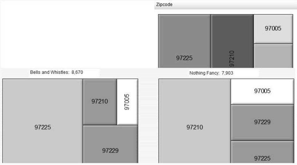
2. Where do the members live? Current Members by Zip Code shows the relative contribution of each area or ZIP code to the total demographic mix. The display does not show exact numbers because executives are interested only in an overview. The exact number of enrollees is shown when you hold your mouse pointer over each ZIP code tile.
3. What is the member distribution with respect to gender? According to Current Members by Gender, men and women each constitute approximately half of Healthy Living Inc.’s membership.
An industry implementation should address the following:
1. To reflect a health insurance company’s mix of adult and child members, the age distribution bar chart should reflect age groups with similar levels of health-care utilization. For example, infants under two years of age use more health-care resources than children aged six to 18, so the groups should be presented separately.
2. It would useful to break out the gender pie chart by broadly defined age groups. One slice of the pie could be women of child-bearing age because they use more health care than similarly aged men.
3. To represent a larger membership, the tile chart could use county rather than ZIP code.
As Figure 9.3 shows, the second section of the dashboard provides answers to the following two important questions:
1. What health conditions do the members of Healthy Living Inc. have?
2. How healthy are the members on average?
Figure 9.3: Clinical Information
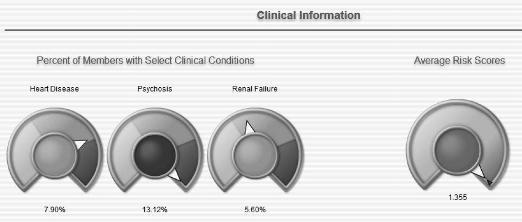
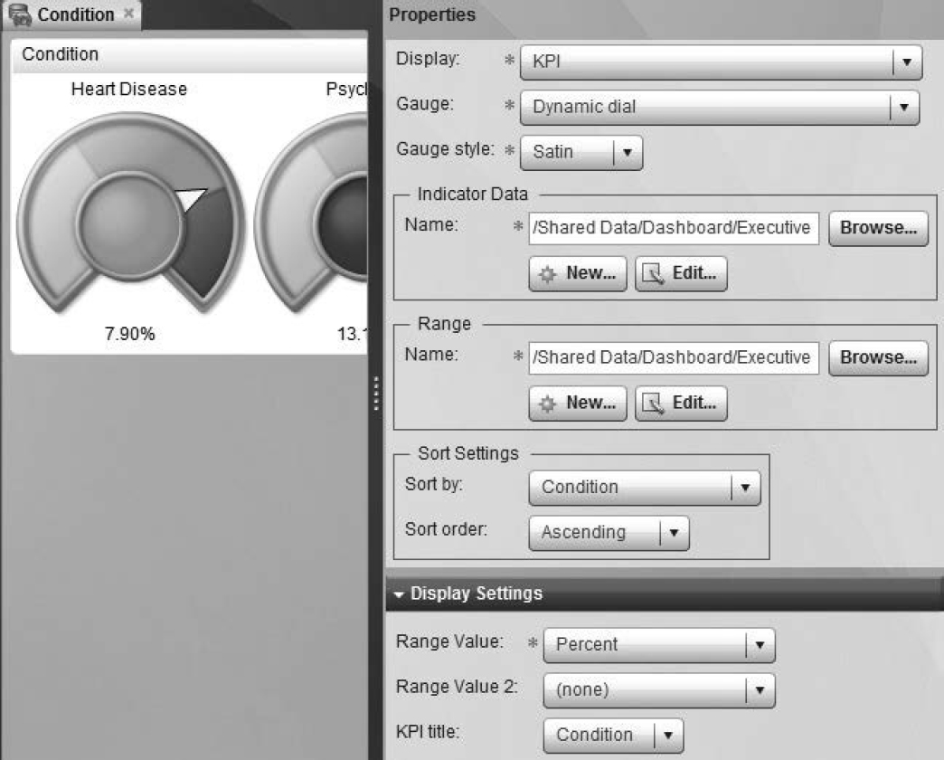
Three dials, each resembling a car’s speedometer, represent three clinical conditions. Heart Disease shows that 7.9% of Healthy Living Inc.’s members have heart disease. The dials classify data by color-coded categories and show Healthy Living Inc.’s benchmarking system.
A health-care company generally has information about dozens, if not hundreds, of clinical conditions in its databases. One way to display clinical information is to divide conditions into two categories–physical and mental. Then, create a grouping with four non-overlapping levels. Report on the percent of members who have the following:
1. Both physical and mental conditions
2. Physical conditions only
3. Mental conditions only
4. No conditions
Another effective way of presenting clinical data is to group conditions that are usually found together. For example, patients with a chronic condition such as diabetes are also often diagnosed with depression.
As Figure 9.4 shows, the third section of the Executive Dashboard displays the financial health of Healthy Living Inc.
Figure 9.4: Financial Information
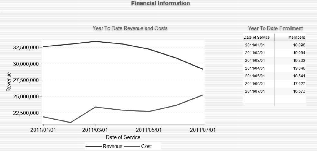
Year To Date Revenue and Costs shows revenue and costs by dates of service. Sadly, Healthy Living Inc. is not very healthy. Its revenues are declining and costs are increasing. The narrowing space between the two lines indicates decreasing profits.
Healthy Living Inc.’s woes extend to enrollment. Year To Date Enrollment shows declining enrollment.
Some health-care executives think about cost and revenue numbers on a per member basis. These metrics can also be presented in a dashboard.
9.4.2 A Quick Introduction to SAS BI Dashboard
SAS BI Dashboard is accessed using a URL provided by a SAS administrator. The URL is usually in the form http://<servername.yourcompanyname.com>:8080/SASBIDashboard. After logging on, click Manage Dashboards to access the Dashboard Designer shown in Figure 9.5.
Figure 9.5: Dashboard Designer
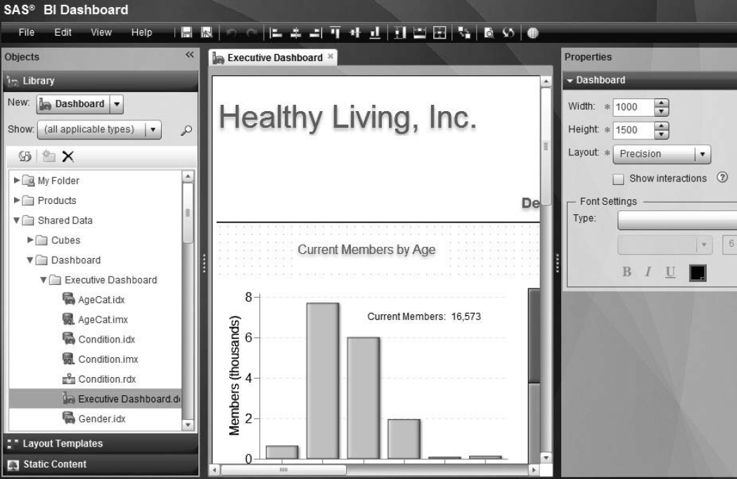
Table 9.2 contains the basics of the Dashboard Designer.
Table 9.2: Basics of Dashboard Designer
| Objects | This pane shows the SAS folder structure. |
| Workspace | An object selected in Objects is displayed in the workspace, the middle pane of the Dashboard Designer. |
| Properties | This pane changes dynamically to reflect the properties of the selected object. |
 |
This is the Go to Dashboard Viewer icon, located above the workspace, which enables programmers to view their dashboards. |
 |
This icon set ups interactions between indicators. It is located to the left of . |
| The indicator icon denotes an indicator, which determines the type of display. | |
| The indicator data icon creates data for the indicator. | |
| The indicator range icon collapses data into color-coded classifications. | |
| The dashboard object icon is the container for all dashboard objects. |
A good organizational practice is to place all objects related to a project in a folder. As Figure 9.5 shows, objects comprising the Executive Dashboard are placed in the Executive Dashboard folder. Moreover, an indicator and its related components are given identical names. Programmers can distinguish identically named objects by their icons.
9.4.3 Creating Indicators
The majority of objects in the dashboard are indicators and their related components. In this section, you learn how to build a few.
9.4.3.1 Create AgeCat Indicator
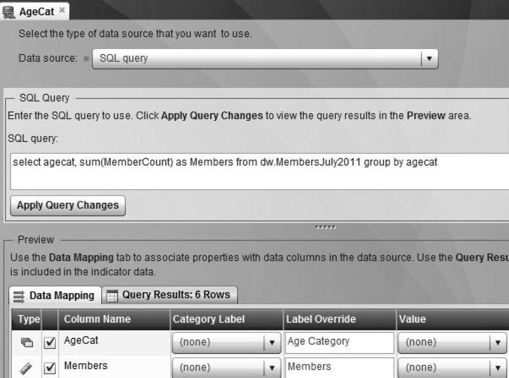
1. Create indicator data in SAS BI Dashboard as shown in Figure 9.6.
a. Select File → New → Indicator Data.
b. Select SQL query for Data source.
c. Enter the SQL code in the SQL Query area.
d. Click Apply Query Changes to execute a query or to test the impact of a query change.
e. Click the Data Mapping tab to view information about columns or to manually change labels.
f. Click the Query Results tab to review results. It is best to limit the rows that are retrieved.
Figure 9.6: Create Indicator Data
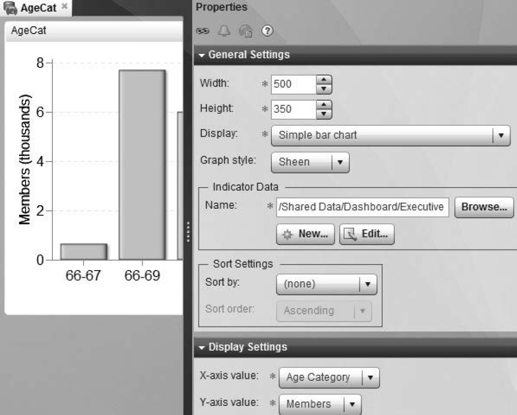
2. Create the indicator as shown in Figure 9.7.
a. Select File → New → Indicator.
b. In the General Settings area, select the indicator data created in step 1 for Indicator Data. Select Simple bar chart for Display.
c. In Display Settings, select Age Category for X-axis value and Members for Y-axis value.
d. The bar chart appears in the workspace.
Figure 9.7: Indicator in SAS BI Dashboard
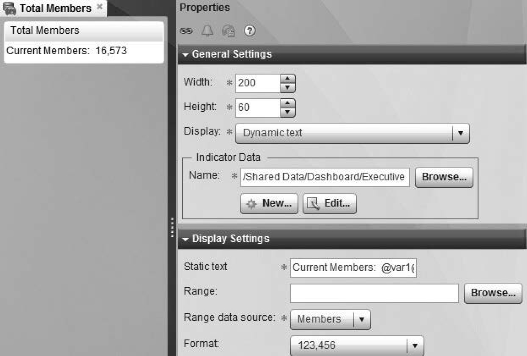
9.4.3.2 Create Current Members Indicator
The Current Members indicator is created through an indicator called dynamic text. Dynamic text combines static text with data.
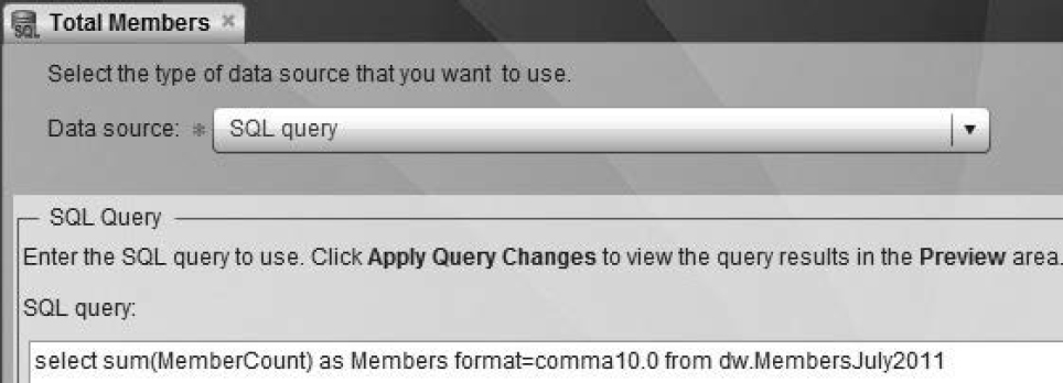
1. Create indicator data as shown in Figure 9.8.
a. Select SQL query for Data source.
b. Enter SQL code in the SQL Query area. Remember that the query needs to retrieve only one variable and one observation.
Figure 9.8: Create Indicator Data
2. Create the indicator as shown in Figure 9.9.
a. Select File → New → Indicator.
b. In the General Settings area, select the indicator data created in step 1 for Indicator Data. Select Dynamic text as Display.
c. Enter text for Static text.
d. Select Members for Range data source.
It is helpful to think of @var1@as a pseudo macro variable, which resolves to the value of Members. Text can be entered before and after the macro variable.
Figure 9.9: Dynamic Text Indicator
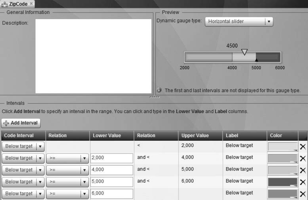
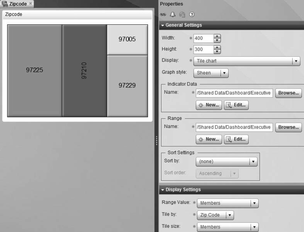
9.4.3.3 Create Current Members by Zipcode
Current Members by Zip Code shows the relative contribution of each ZIP code to the total member mix. It is a tile chart. The size and color of each tile is determined by its number of members.
1. Create the indicator data as described in the previous two sections.
2. Create the indicator range as shown in Figure 9.10.
a. Select File → New → Range.
b. Click Add Interval, and add color-coded classifications of data.
Figure 9.10: Indicator Range
3. Create the indicator as shown in Figure 9.11.
a. Select File → New → Indicator.
b. In the General Settings area, select the indicator data and range created in steps 1 and 2.
c. Select Tile chart for Display.
d. In Display Settings, select Members as Range Value, Zip Code as Tile by, and Members as Tile size.
Figure 9.11: Tile Chart Indicator
9.4.3.4 Create Other Indicators
Percent of Members with Select Clinical Conditions is a KPI (key performance indicator) display. It is designed to give you a quick visual of the metric. It is often in the form of a car speedometer.
1. Create the indicator data and range as described in the previous sections.
2. Create the indicator as shown in Figure 9.12.
a. Select File → New → Indicator.
b. In the General Settings area, select the indicator data and range created in step 1.
c. Select KPI for Display and Dynamic dial as Gauge.
d. In Display Settings, select Percent as Range Value and Condition as KPI title.
Figure 9.12: KPI Indicator
9.4.4 Linking Indicators for an In-Depth Analysis
In addition to providing an overall view of Healthy Living Inc., the Executive Dashboard has an additional layer of visual analytics. Each of its indicators is linked to point to an analysis that breaks out information by the company’s two health plans, Bells and Whistles and Nothing Fancy.
In this section, you learn how to link indicators to other SAS BI components.
SAS BI Dashboard’s key strength is that it promotes linking to indicators, dashboards, external websites, information maps, stored processes, portal pages, and SAS Web Report Studio reports.
9.4.4.1 Creating Links
1. To connect AgeCat to PlanAgeCat, click the ![]() icon in the Properties area of AgeCat.
icon in the Properties area of AgeCat.
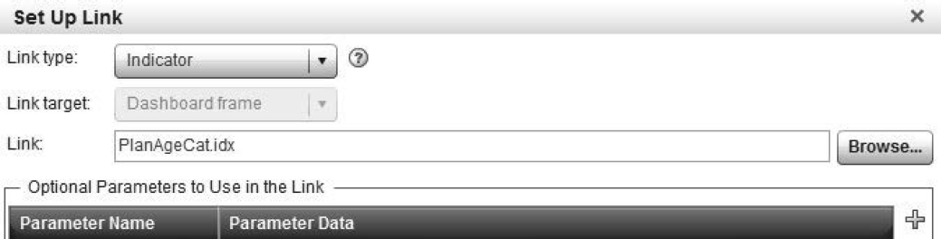
2. In the Set Up Link area, enter information as shown in Figure 9.13.
a. Select Indicator for Link type.
b. Navigate to and select PlanAgeCat for Link.
Figure 9.13: Link Indicators
3. View the results.
Figure 9.14: Indicator Linked to Another Indicator
9.4.4.2 Other Links
As Figure 9.15 shows, Current Members by Zip Code is linked to PlanZipCode, which is a dashboard consisting of several indicators.
Figure 9.15: Indicator Linked to Dashboard
As Figure 9.16 shows, Condition is linked to PlanCondition, each of whose dials contain plan and condition names in their titles.
Figure 9.16: Indicator Linked to Indicator
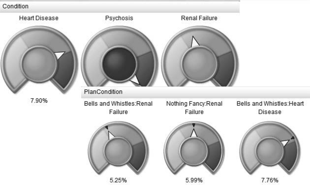
The titles in PlanCondition are created by the following SQL code in the indicator data:
Program 9.1: Populate Indicator Data with UNION SQL Queries
select 'Bells and Whistles:Heart Disease' as Condition, avg(heart) as Percent
format=Percent10.2
from dw.MembersJuly2011
where plan='Bells and Whistles'
union
select 'Bells and Whistles:Renal Failure' as Condition, avg(renal) as Percent
format=Percent10.2
from dw.MembersJuly2011
where plan='Bells and Whistles'
union
select 'Bells and Whistles:Psychosis' as Condition, avg(Psychosis) as Percent
format=Percent10.2
from dw.MembersJuly2011
where plan='Bells and Whistles'
union
select 'Nothing Fancy:Heart Disease' as Condition, avg(heart) as Percent
format=Percent10.2
from dw.MembersJuly2011
where plan='Nothing Fancy'
union
select 'Nothing Fancy:Renal Failure' as Condition, avg(renal) as Percent
format=Percent10.2
from dw.MembersJuly2011
where plan='Nothing Fancy'
union
select 'Nothing Fancy:Psychosis' as Condition, avg(Psychosis) as Percent
format=Percent10.2
from dw.MembersJuly2011
where plan='Nothing Fancy'
As Figure 9.17 shows, Year To Date Revenue and Costs is linked to a SAS stored process, which displays graphs by plan.
Figure 9.17: Link Indicator to a SAS Stored Process
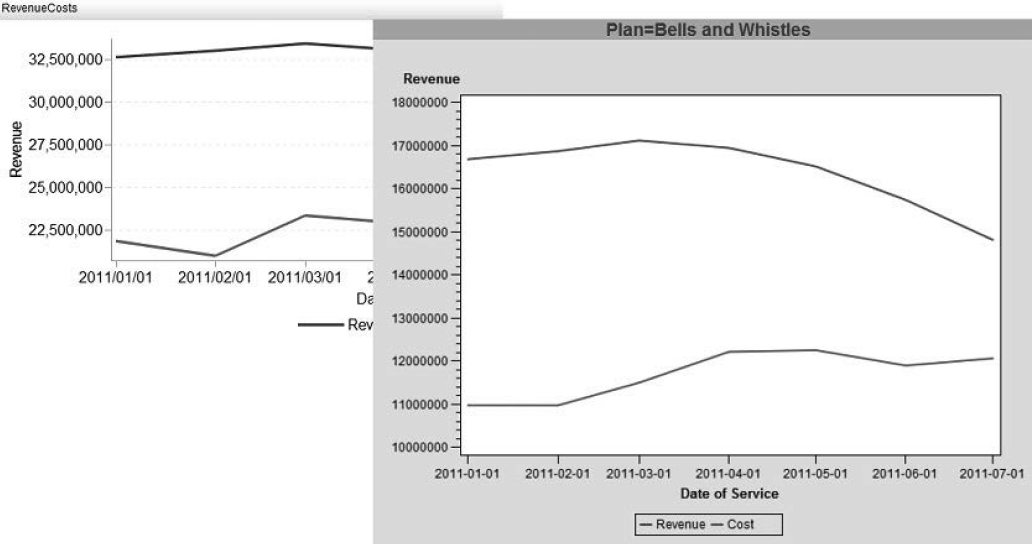
The SAS code for the SAS stored process involves a straightforward use of the GPLOT procedure.
Program 9.2: SAS Stored Process Code
proc sql;
create table Financials as
select plan label='Plan', YearMonthDOS label='Date of Service',
sum(Revenue) as Revenue, sum(Cost) as Cost
from dw.Financials
group by plan, YearMonthDOS;
quit;
symbol1 interpol=join value=none line=1 width=2;
symbol2 interpol=join value=none line=4 width=2;
Legend frame label=(justify=left);
title “Trends in Revenue and Costs by Plan";
proc gplot data=Financials;
label YearMonthDOS='Date of Service';
label Revenue='Revenue';
plot revenue*YearMonthDOS Cost*YearMonthDOS/overlay
frame legend=legend1;
by plan;
run;
quit;
9.4.5 Putting It All Together in a SAS Dashboard
In this section, you learn how to put the Executive Dashboard into a single dashboard.
1. Select File → New → Dashboard.
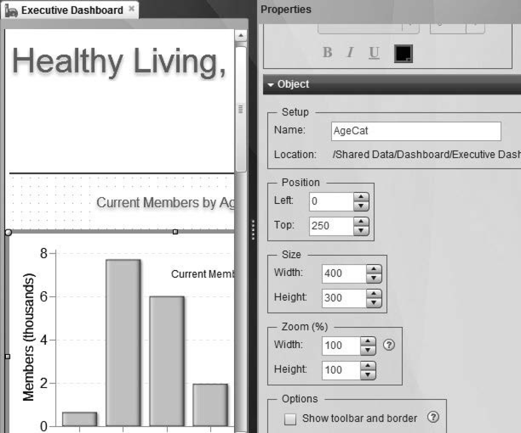
2. Add AgeCat to the dashboard as shown in Figure 9.18.
a. Drag AgeCat from Objects, and drop it onto the dashboard open in the workspace.
b. In the Properties area, adjust AgeCat’s position and size.
c. Deselect the Show toolbar and border check box in Options for a cleaner look.
Figure 9.18: Place an Indicator inside a Dashboard
3. Add other indicators by repeating step 2.
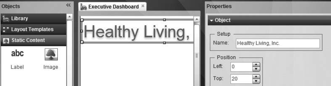
4. To add headings to indicators and to sections within the dashboard, drag and drop Label from Static Content in Objects. Figure 9.19 shows how a label object can be used as a heading.
Figure 9.19: Label as a Heading
5. Use label objects to separate various sections of the Executive Dashboard.
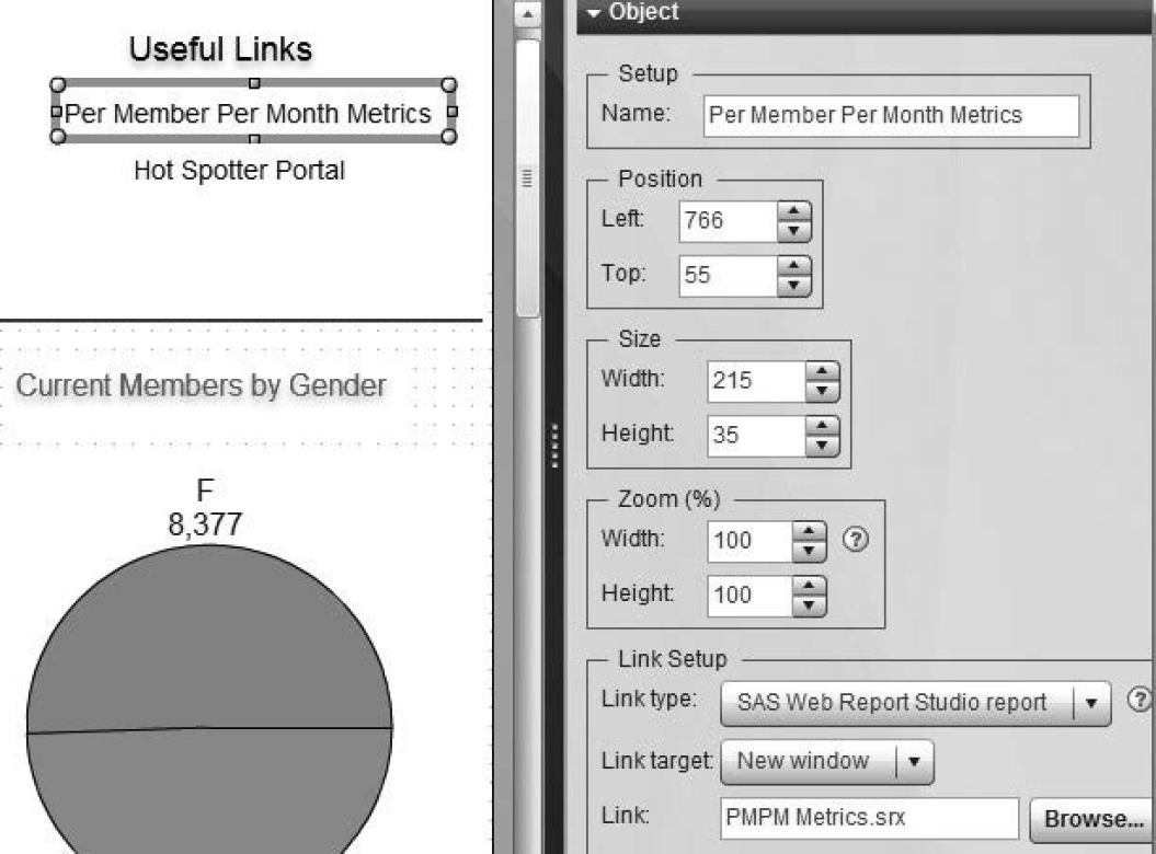
6. Use label objects to link to SAS BI content as shown in Figure 9.20.
a. Select SAS Web Report Studio report for Link type.
b. Select New window for Link target.
c. Click Browse to select a report to appear in Useful Links.
Figure 9.20: Labels as Links to SAS Web Report Studio
9.4.6 Placing a Dashboard in SAS Information Delivery Portal
SAS Information Delivery Portal displays dashboards created by SAS BI Dashboard. A comprehensive overview of SAS Information Delivery Portal is beyond the scope of the book. In this section, you learn how to link a SAS BI Dashboard object to a page in SAS Information Delivery Portal.
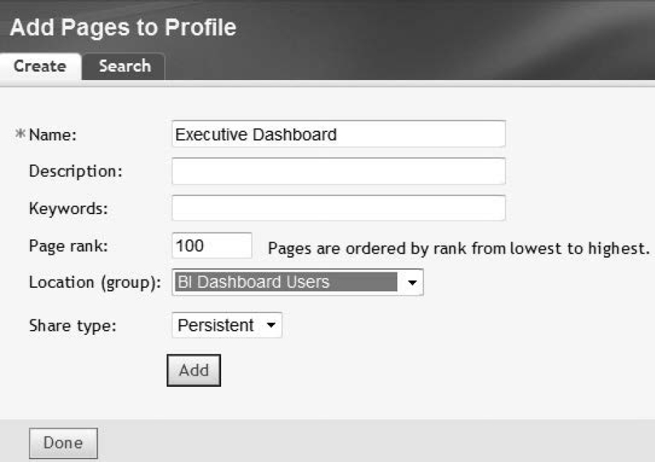
1. To create a new page to house the Executive Dashboard, select Add Page from Customize in SAS Information Delivery Portal.
2. On the Add Pages to Profile page, enter information as shown in Figure 9.21.
a. Enter the name of the page for Name.
b. Select an appropriate group created in SAS Management Console for Location (group). This allows only group users to see the page and is an effective way of ensuring appropriate access.
c. Select Persistent for Share type. This ensures that users cannot remove the page from their portal profiles.
d. Click Add, and then Done.
Figure 9.21: Add Pages in SAS Information Delivery Portal
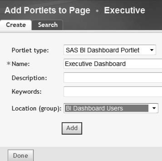
3. The Executive Dashboard page appears in SAS Information Delivery Portal. To populate the page with the dashboard created in the previous section, select Customize → Edit Page → Edit Page Content.
4. Add a portlet to the page as shown in Figure 9.22.
A portlet is a container in SAS Information Delivery Portal that offers a variety of portlet objects.
a. Select SAS BI Dashboard Portlet for Portlet type.
b. Enter a name and description.
Figure 9.22: Add Portlet
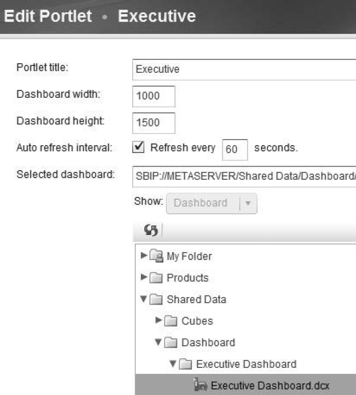
5. Embed the Executive Dashboard created in the previous section within the portlet added in step 4.
a. Click the Edit Content  icon.
icon.
b. As shown in Figure 9.23, select Executive Dashboard from the SAS folders in Dashboard.
Figure 9.23: Add Dashboard to Portlet
6. View the results.
Figure 9.24: View Executive Dashboard in SAS Information Delivery Portal
9.5 The Medical Management Dashboard
The Medical Management Dashboard enables clinicians at Healthy Living Inc. to accomplish the following goals in rapid succession:
1. Identify patient cohorts.
2. Analyze their utilization and clinical patterns.
3. Act on the behalf of individual patients.
The dashboard presents results at a fast pace, enabling clinicians to iterate the entire process or part of the process.
9.5.1 Overview of the Medical Management Dashboard
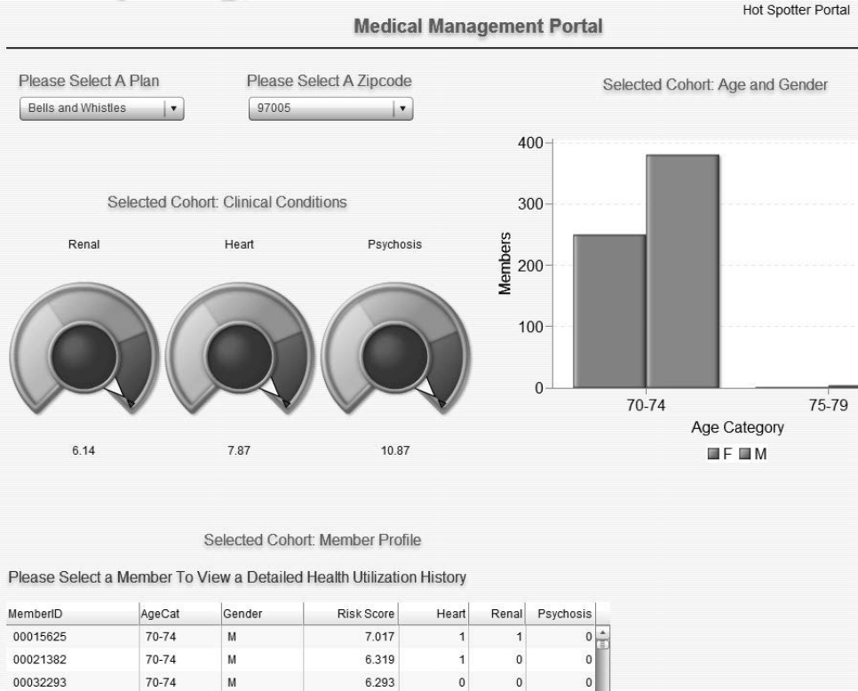
As Figure 9.25 shows, a clinician identifies a patient cohort by selecting values from two drop-down menus. This triggers an automatic update of the displays in the dashboard.
Figure 9.25: Medical Management Dashboard
An industry implementation could include a comprehensive identification algorithm, including clinical measures, cost of care, and utilization history. Consider the following situations:
1. A clinician wants to select a patient cohort consisting of young children with asthma. In addition to geographical area, the clinician answers questions about age, clinical conditions, ER visits, and medications.
2. A clinician wants to target patients with complex medical conditions. The clinician might choose to ignore the age question and focus on the clinician measures and overall costs.
The selections should be comprehensive, allowing the clinician to choose the appropriate ones and ignore the rest.
In the interest of simplicity, the Medical Management Dashboard presents three visual displays. As Figure 9.25 shows, the first and second visuals show cohort distributions of clinical conditions, age, and gender. The third visual shows a member profile.
An industry implementation should consider the following metrics:
1. Health utilization involving inpatient, outpatient, ER, and primary care.
2. Costs associated with health utilization.
3. Top diagnoses and medications.
After reviewing the two displays, the clinician moves ahead with the work process. To identify the individuals benefitting the most from additional intervention, the clinician examines Selected Cohort: Member Profile.
Selected Cohort: Member Profile is a Spark table indicator. Each row summarizes a patient’s demographic and clinical information. As with an Excel worksheet, the clinician sorts it appropriately to find individuals. The table might contain more rows than are visible. Therefore, a scroll bar is included.
The Member Profile table becomes more useful when recent health utilization history information is included. This information can be in the form of three columns, one column each for hospitalizations, ER visits, and primary care visits. Assume that a clinician wants to identify patients who use the ER for their primary care needs. The clinician can sort the Member Profile table by primary care visits and ER visits, ascending and descending, respectively. Patients having the most ER visits and the fewest primary care visits appear at the top of the report.
Having perused the Member Profile table, the clinician clicks on a row to access the patient’s detailed health utilization report created in SAS Web Report Studio. (See Chapter 5, “Building a Data Bridge with SAS Information Map Studio.”) The clinician is now ready to act on the patient’s behalf.
9.5.2 Understanding the Medical Management Dashboard’s Indicators
In this section, you learn how indicators in the Medical Management Dashboard are constructed.
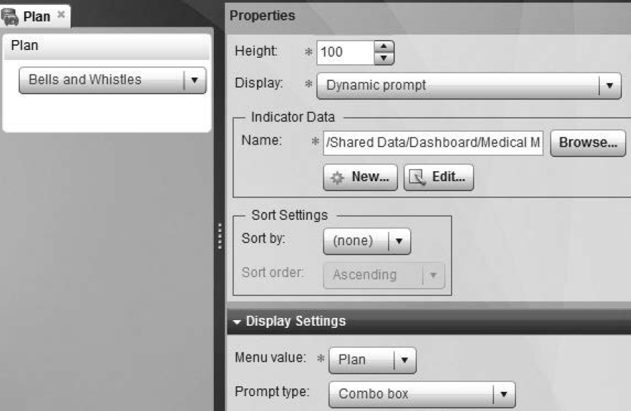
9.5.2.1: Creating a Dynamic Prompt Indicator
Please Select a Plan and Please Select a ZIP Code, the two indicators in Figure 9.25 requiring user selections, are both dynamic prompts. They are both constructed in a similar way, so you can examine how Please Select a Plan is created. Because you learned how to create an indicator in section 9.4.3, “Creating Indicators,” only new steps are listed in this section.
1. Create indicator data using an SQL query.
2. Create an indicator as shown in Figure 9.26.
a. Select Dynamic prompt for Display.
b. Select Plan for Menu value.
c. Select Combo box for Prompt type.
Figure 9.26: Dynamic Prompt Indicator
9.5.2.2: Creating Other Indicators in the Medical Management Dashboard
As Figure 9.25 shows, there are three indicators that display information about a user-selected cohort. These are Clinical Conditions, Age and Gender, and Member Profile. In this section, you learn how to construct these indicators so that they update dynamically.
There are two key differences between the three indicators and the indicators created in section 9.4.3, “Creating Indicators.”
• Indicator data is sourced through a SAS stored process. This is explained in the next section.
• Indicators are all connected so that they update dynamically. This is called indicator interaction.
1. With the Medical Management Dashboard open in the workspace, click Plan, and click the indicator interaction  icon to set up interactions.
2. On the Set Up Indicator Interactions page, select information as shown in Figure 9.27.
a. Select Plan for Source indicator.
b. Select the Condition, AgeGender, and MemberProfile indicators. These are refreshed whenever the user chooses a value under Plan.
c. Select Filter data on remote server for Interaction Type. This causes data filtering to be processed on the server rather than the client.
d. Select Plan for Source Data.
e. Select plan for Target Data. The source value is passed to the target, which causes the stored process to run with the chosen value of Plan.
Figure 9.27: Set Up Indicator Interactions
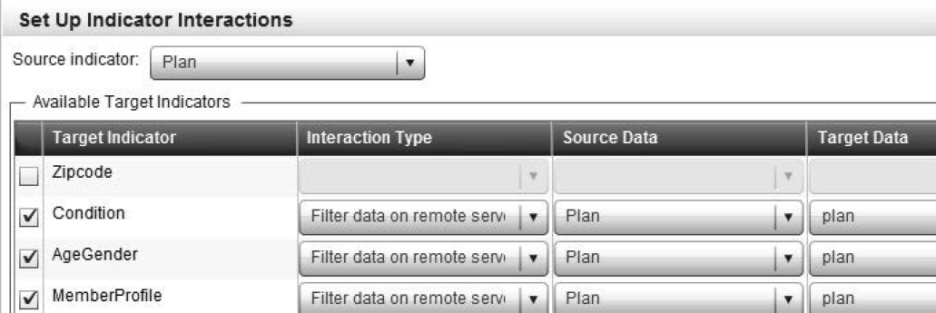
3. Repeat step 2 for the Please Select a ZIP Code indicator.
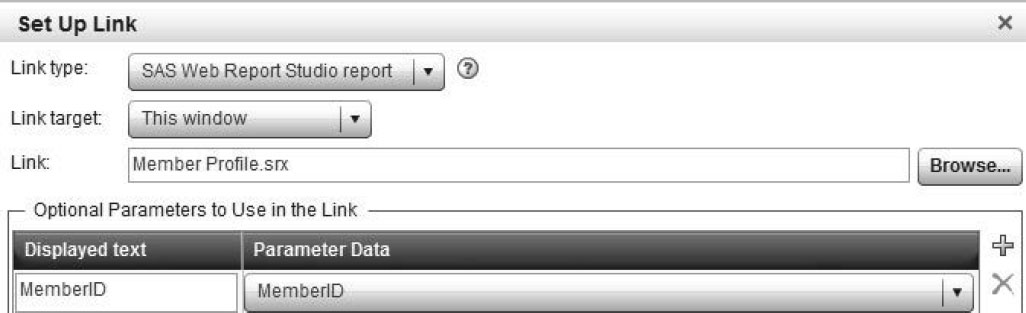
The Medical Management Dashboard has another feature that is worth highlighting. The Member Profile table links to a SAS Web Report Studio report.
1. With the Member Profile table displayed in the workspace, click the ![]() icon.
icon.
2. Enter information as shown in Figure 9.28.
a. Select SAS Web Report Studio report for Link type.
b. Click Browse, and select Member Profile for Link.
c. In Optional Parameters to Use in the Link, enter MemberID for Displayed text, and select MemberID for Parameter Data. This causes the value of MemberID to be passed from the indicator to the MemberID prompt in the SAS Web Report Studio report.
Figure 9.28: Link the Indicator to SAS Web Report Studio
9.5.2 Using a Stored Process as a Data Source for Indicator Data
In this section, you learn how a stored process can be used as a data source for indicator data. Because the methodology for creating stored processes in the Medical Management Dashboard is similar, focus on the stored process sourcing AgeGender.
There are two parts to this methodology. The first part is to generate stored process code. The second part is to correctly register it in SAS metadata.
1. Create the stored process code.
Program 9.3: Stored Process Code to Source Indicator Data
%global plan zipcode;
proc sql;
create table Members as
select memberid, agecat, sex as gender, round(riskscore,.001) as
riskscore, heart, renal, psychosis
from dw.MembersJuly2011
where plan="&plan" and zipcode="&zipcode"
group by gender, agecat;
quit;
a. Create two global macro variables, plan and zipcode, which are actualized from the user’s selections in the dynamic prompts.
b. The SQL step pulls data and places it into the Members data set.
2. Create a macro variable to capture the location of the Members data set so that it is available to SAS BI Dashboard.
a. The Members data set is stored in the Work library of the user, a physical location on the user’s computer or SAS server.
b. Capture the location and place it in a macro variable.
%let temploc=%sysfunc(pathname(work));
3. SAS BI Dashboard reads the Members data set through a published package. A package is published in four steps via the code shown in Program 9.4.
Program 9.4: Create and Publish a Package
data null;
length path $32767;
rc=0;
pid=0;
description='0';
name='';
/*a*/ call package_begin(pid, description, name, rc);
/*b*/ call insert_dataset(pid, "WORK", "Members","Profile",'',rc);
/*c*/ call package_publish (pid, "TO_ARCHIVE",rc,
"archive_path,archive_name, archive_fullpath","&temploc", "Selected
Cohort",path);
call symput ('_ARCHIVE_FULLPATH', path); *populates path;
/*d*/ call package_end(pid, rc);
run;
a. The package_begin routine initializes a package. Its first argument assigns an identifier to the package. The second argument contains a description of the package. The third argument is useful for determining who gets the package. This is not pertinent to you because you initialize this to blank. The fourth argument places a return code. A return code of 0 indicates success.
b. The insert_dataset routine inserts a data set into the package. Its parameters include the library and name of the data set, its description, and the return code.
c. The package_publish routine publishes the package to a place on the user’s computer. It uses a method called TO_ARCHIVE, which creates a SAS package file. The macro variable temploc is fed into the routine.
d. The package_end routine frees up the resources used because the package has been published.
A package is simply a collection of files.
A CALL routine can be thought of as a function.
Why is the length of path so long? This is because a path can be long. On the author’s computer, it resolved to C:UsersJasonAppDataLocalTempSAS Temporary Files\_TD11848_RENU-PC_Prc2CurrentMembers.spk.
4. Combine the code from steps 1 through 3.
5. Create and register the stored process in SAS metadata. See Chapter 2, “Creating SAS Stored Processes for the Finance Department,” for more information.
a. For Execution Options in the Create New Stored Process wizard in SAS Enterprise Guide, select either Default server or Stored process server only for Server type.
b. Select Package for Results capabilities.
c. Create a prompt for both plan and zipcode. On the Prompt Type and Values tab, select default values for each prompt. This ensures that the stored process generates data to be fed to the data indicator before a user selects either a plan or ZIP code.
In an industry implementation, prompts should default to all values. Upon logging on to SAS Information Delivery Portal, the user should see the overall results. He or she can then make selections and view the results.
9.6 Conclusion
In this chapter, two dashboard solutions were shown. Each dashboard delivered integrated information to its target audience.
SAS BI Dashboard and SAS Information Delivery Portal offer myriad ways to integrate and deliver all SAS BI content. You now have the task of further exploring the capabilities of SAS Information Delivery Portal, which has several data delivery options that have not been explored in these solutions.