It’s not an optical illusion; it just looks like one. | ||
| --Phil White | ||
Fortunately, due to its relative simplicity, there are no optical illusions associated with CSS (Cascading Style Sheets); all of the visual “trickery” in CSS is made possible with clear and concise style properties. CSS allows you to attach formatting styles to individual elements within an XML document. These styles are then used to determine how the elements in the document are rendered for display within a web browser. Even though the XML language doesn’t inherently include any mechanism for defining how a document looks, CSS makes it possible to add a view to XML documents. This hour explores CSS inside and out, including how to create style sheets for XML documents with CSS. You find out that CSS style properties, although simple to use, provide a considerable degree of flexibility over the positioning and formatting of XML content. You also learn how to control the flow of text on a page, not to mention how to use fonts, colors, background images, and letter spacing.
In this hour, you’ll learn
The basic structure and syntax of CSS
How to create a basic CSS style sheet for an existing XML document
How to control the layering of elements with CSS
How to use margins and padding to control the spacing around and within elements
How to format text using several different CSS style properties
You learned in the previous hour that CSS allows you to format XML content so that it can be displayed in web browsers. CSS first came about as a means of improving the presentation of HTML content, but it turns out that it also works quite well with XML content. CSS is itself a language that defines style constructs such as fonts, colors, and positioning, which are used to describe how data is displayed. CSS styles are stored in style sheets, which contain style rules that apply styles to elements of a given type. Style sheet rules are usually placed in external style sheet documents with the filename extension .css.
The “cascading” part of CSS refers to the manner in which style sheet rules are applied to elements in an XML (or HTML) document. More specifically, styles in CSS form a hierarchy where more specific styles override more general styles. It is the responsibility of CSS to determine the precedence of style rules according to this hierarchy, which gives the rules a cascading effect. In some ways, you can think of the cascading mechanism in CSS as being similar to genetic inheritance, where general traits are passed on from a parent, but more specific traits are entirely unique to an individual; base style rules are applied throughout a style sheet but can be overridden by more specific style rules.
By the Way
Like many web-related technologies, CSS has undergone revisions since its original release. The original version of CSS was known as CSS1 and included basic support for formatting web page content. CSS2 built on the feature set of CSS1 by adding powerful new features, such as the absolute positioning of content. There is a CSS3 in the works, but popular web browsers only support CSS1 and CSS2. All of the CSS example code in this book is compliant with CSS1 and CSS2, which means you should have no problem using it with popular web browsers.
The application of CSS style rules is determined by selectors, which are CSS constructs that identify portions of an XML document. A selector establishes the link between a document and a style or set of styles. There are three kinds of selectors used in CSS:
An element type selector selects an element of a given type and applies a style or set of styles to it. This is the simplest approach to using CSS because there is a simple one-to-one mapping between element types and styles. As an example, you could use an element type selector to define a set of styles dictating the margins and font for an element named message in an XML document. Any messages marked up with this element would be displayed according to the styles defined in the style rule with the message element type selector. Following is an example of such a style rule:
message {
  display:block;
  margin-bottom:5px;
  font-family:Courier;
  font-size:14pt;
}
This example uses an element type selector to select the message element and apply a series of styles to it. The end result is that all elements of type message appearing in a document will have a 5-pixel margin and will be rendered in a 14-point Courier font. Following is an example of how you might mark up a message in an XML document:
<message>
It's very lonely here — I really miss you.
</message>
By the Way
As you know, there is no standard message element in XML; in fact, there are no standard elements of any kind in XML. This example simply demonstrates how you would apply a style to an element that stores a text message. Notice that the XML code says nothing about how the element is to be displayed—this is relegated to the CSS style rule.
An attribute class selector is a little more specific than the element type selector in that it allows you to apply styles to elements based upon an attribute. In addition to applying styles based upon a type of element, CSS uses attribute selectors to look for specific elements containing a special attribute with a certain value. This attribute is named class and is capable of having virtually any value you desire. The premise of the class attribute is that you use it to define classes of styles within a given element type. Following is an example of how you might define a special class of messages that are urgent:
message.urgent {
  display:block;
  margin-bottom:5px;
  font-family:Courier;
  font-size:14pt;
  font-style:italic;
  color:red;
}
The class name in this example is urgent, which is identified by separating it from the element type with a period (.). Following is an example of how you would mark up a paragraph corresponding to this style rule:
<message class="urgent">
The sky is falling!
</message>
As you can see, the urgent class name is provided as the value of the class attribute of the <message> tag. This is the standard approach to using CSS attribute class selectors in XML documents. However, there is one other option when it comes to using CSS selectors: attribute ID selectors.
For the utmost in styling flexibility, you can use an attribute ID selector, which establishes a style rule that can be applied to any element regardless of its type. Like attribute class selectors, attribute ID selectors rely on a special attribute. However, in this case the attribute is named id, and it isn’t associated with any particular element type. Following is an example of creating a style rule using an attribute ID selector:
#groovy {
  color:green;
  font-family:Times;
  font-style:italic;
  font-weight:bold;
}
This example creates a style rule with an attribute ID selector named groovy; the pound sign (#) is used to indicate that this is an attribute ID selector. To use this style, you simply reference it as a value of the id attribute in any element type. Following is an example of how you might use the style with a message element:
<message id="groovy">
I'm feeling pretty groovy!
</message>
Unlike the urgent attribute class selector, which is specific to the message element, the groovy attribute ID selector can be used with any element, in which case the element will be displayed with the groovy styles. For example, following is an example of how the groovy selector can be used with an element named note:
<note id="groovy">
Pick up leisure suit from laundry.
</note>
Although selectors play an important role in determining how styles are applied to documents, they are only a part of the CSS equation. The other major part of style sheet syntax is the style declaration, which is used to specify a style property and its associated value. You’ve already seen style declarations in the preceding selector examples, but now it’s time to learn how they work. Style declarations in CSS are similar in some ways to XML attributes in that they assign a value to a property. CSS supports a wide range of style properties that can be set to establish the style of a given style rule. Together with selectors, style declarations comprise the syntax of a CSS style rule, which follows:
Selector {
  Property1:Value1;
  Property2:Value2;
  ...
}
Following is the message style rule that you saw earlier, which helps to reveal the structure of style declarations:
message {
  display:block;
  margin-bottom:5px;
  font-family:Courier;
  font-size:14pt;
}
The message example style rule includes four style properties: display, margin-bottom, font-family, and font-size. Each of these properties has a value associated with it that together comprise the style rule of the message element. Notice that each style property and value is separated by a colon (:), whereas the property/value pairs are separated by semicolons (;).
By the Way
Although semicolons are used to separate styles, not terminate them, it’s generally a good practice to terminate the last property/value pair in a style rule with a semicolon so that if you ever decide to add additional styles you will already have a separator in place.
The message example showed how to create a style rule for a single element. It is also possible to create a style rule for multiple elements, in which case the style rule applies to all of the elements. To establish a style rule for multiple elements, you create the style declaration and separate the element types with commas (,) in a single style rule:
ssnum, phonenum, email {
  display:none;
}
In this example, the value none is set in the display style property for the ssnum, phonenum, and email elements. The idea behind this example is that these elements contain sensitive information that you wouldn’t want displayed; setting the display property to none results in the elements not being displayed.
You now have a basic knowledge of CSS style sheets and how they are based upon style rules that describe the appearance of elements in XML documents. It’s now worth taking time to get you acquainted with some of the more commonly used style properties in CSS. CSS includes a variety of style properties that are used to control fonts, colors, alignment, and margins, to name just a few facets of XML content styling. The style properties in CSS can be broadly grouped into two major categories:
Layout properties
Formatting properties
Layout properties consist of properties that impact the positioning of XML content. For example, layout properties allow you to control the width, height margin, padding, and alignment of content and even go so far as to allow you to place content at exact positions on a page.
One of the most important layout properties is the display property, which describes how an element is displayed with respect to other elements. There are four possible values for the display property:
block— The element is displayed on a new line, as in a new paragraphlist-item— The element is displayed on a new line with a list-item mark (bullet) next to itinline— The element is displayed inline with the current paragraphnone— The element is not displayed
It’s easier to understand the display property if you visualize each element in an XML document occupying a rectangular area when displayed. The display property controls the manner in which this rectangular area is displayed. For example, the block value results in the element being placed on a new line by itself, whereas the inline value places the element next to the content immediately preceding it. The display property is one of the few style properties that you will define for most style rules. Following is an example of how to set the display property:
display:block;
By the Way
The display property relies on a concept known as relative positioning, which means that elements are positioned relative to the location of other elements on a page. CSS also supports absolute positioning, which allows you to place an element at an exact location on a page, independent of other elements. You learn more about both of these types of positioning later in the hour.
You control the size of the rectangular area for an element with the width and height attributes. Like many size-related CSS properties, width and height property values can be specified in several different units of measurement:
in— Inchescm— Centimetersmm— Millimeterspx— Pixelspt— Points
These unit types are used immediately after the value of a measurement in a style sheet. You can mix and match units however you choose within a style sheet, but it’s generally a good idea to be consistent across a set of similar style properties. For example, you might want to stick with points for font properties or pixels for dimensions. Following is an example of setting the width of an element using pixel units:
width:200px;
CSS formatting properties are used to control the appearance of XML content, as opposed to controlling the physical position of the content. One of the most commonly used formatting properties is the border property, which is used to establish a visible boundary around an element with a box or partial box. The following border properties provide a means of describing the borders of an element:
border-width— The width of the border edgeborder-color— The color of the border edgeborder-style— The style of the border edgeborder-left— The left side of the borderborder-right— The right side of the borderborder-top— The top of the borderborder-bottom— The bottom of the borderborder— All the border sides
The border-width property is used to establish the width of the border edge and is often expressed in pixels, as the following code demonstrates:
border-width:5px;
The border-color and border-style properties are used to set the border color and style, respectively. Following is an example of how these two properties are set:
border-color:blue;
border-style:dotted;
The border-style property can be set to any of the following values:
solid— A single-line borderdouble— A double-line borderdashed— A dashed borderdotted— A dotted bordergroove— A border with a groove appearanceridge— A border with a ridge appearanceinset— A border with an inset appearanceoutset— A border with an outset appearancenone— No border
The border-style property values are fairly self-explanatory; the solid and double styles are the most common. The default value of the border-style property is none, which is why elements don’t have a border unless you set the border property to a different style.
The border-left, border-right, border-top, and border-bottom properties allow you to set the border for each side of an element individually. If you want a border to appear the same on all four sides, you can use the single border property and express the border styles more concisely. Following is an example of using the border property to set a border that consists of two red lines that are a total of 10 pixels in width:
border:10px double red;
The color of an element’s border can be set with the border-color property, and the color of the inner region of an element can be set using the color and background-color properties. The color property sets the color of text in an element, and the background-color property sets the color of the background behind the text. Following is an example of setting both color properties to predefined colors:
color:black;
background-color:orange;
You can also assign custom colors to these properties by specifying the colors as hexadecimal RGB (Red Green Blue) values. Following is an example of such assignments:
background-color:#999999;
color:rgb(0,0,255);
In addition to setting the color of XML content and its associated background, you can also control the alignment and indentation associated with the content. This is accomplished with the text-align and text-indent properties, as the following code demonstrates:
text-align:center;
text-indent:12px;
After you have an element properly aligned and indented, you might be interested in setting its font. The following CSS font properties are used to set the various parameters associated with fonts:
The font-family property specifies a prioritized list of font family names. A prioritized list is used instead of a single value to provide alternatives in case a font isn’t available on a given system. The font-size property specifies the size of the font using a unit of measurement, usually points. Finally, the font-style property sets the style of the font, whereas the font-weight property sets the weight of the font. Following is an example of setting these font properties:
font-family: Arial, sans-serif;
font-size: 36pt;
font-style: italic;
font-weight: medium;
Style rules wouldn’t be of much use if you didn’t have a means of wiring them to an XML document in order to style the document’s content. Let’s move on and find out how this is done.
CSS style sheets used with XML documents are usually referred to as external style sheets because they are stored in separate text files with a .css extension. The .css file is then referenced by XML documents that use the style sheet to determine how their content is displayed. The xml-stylesheet processing instruction is used to associate an external style sheet with an XML document. This processing instruction includes a couple of attributes that determine the type and location of the style sheet:
type— The type of the style sheet (text/css, for example)href— The location of the style sheet
These two attributes are both required in order to wire a style sheet to an XML document. Following is an example of how to use the xml-stylesheet processing instruction with the type and href attributes:
<?xml-stylesheet type="text/css" href="talltales.css"?>
In this example, the type attribute is used to specify that the type of the style sheet is text/css, which means that the style sheet is a CSS style sheet. The style sheet file is then referenced in the href attribute, which in this case points to the file talltales.css.
By the Way
It is necessary to specify the type of a style sheet in the xml-stylesheet processing instruction because there are other types of style sheets, such as XSLT and XSL-FO style sheets, which you learn about in upcoming lessons.
External style sheets represent the only way to use CSS directly with XML documents without the assistance of any other technology. I say this because it is possible to incorporate style sheets into the formatting of XML documents a little differently when you are also using XSLT. More specifically, with XSLT you are actually translating an XML document into an HTML document for display purposes. Knowing this, it is possible to use inline styles directly with HTML elements in order to apply styles to XML content indirectly. You can also use external style sheets with HTML documents that are translated from XML. You learn how to carry out both of these style approaches in Hour 11, “Getting Started with XSL.”
None of this style sheet stuff would make much sense if you didn’t get to see it in the context of a complete example. Listing 10.1 contains the code for an XML document that stores a couple of contacts. This document is an example of how you might use XML to store a contact list for personal or business contacts.
Example 10.1. The Contacts Example XML Document
1: <?xml version="1.0"?> 2: <?xml-stylesheet type="text/css" href="contacts.css"?> 3: <!DOCTYPE contacts SYSTEM "contacts.dtd"> 4: 5: <contacts> 6: <!— This is my good friend Frank. —> 7: <contact> 8: <name>Frank Rizzo</name> 9: <address>1212 W 304th Street</address> 10: <city>New York</city> 11: <state>New York</state> 12: <zip>10011</zip> 13: <phone> 14: <voice>212-555-1212</voice> 15: <fax>212-555-1342</fax> 16: <mobile>212-555-1115</mobile> 17: </phone> 18: <email>[email protected]</email> 19: <company>Frank's Ratchet Service</company> 20: <notes>I owe Frank 50 dollars.</notes> 21: </contact> 22: 23: <!— This is my old college roommate Sol. —> 24: <contact> 25: <name>Sol Rosenberg</name> 26: <address>1162 E 412th Street</address> 27: <city>New York</city> 28: <state>New York</state> 29: <zip>10011</zip> 30: <phone> 31: <voice>212-555-1818</voice> 32: <fax>212-555-1828</fax> 33: <mobile>212-555-1521</mobile> 34: </phone> 35: <email>[email protected]</email> 36: <company>Rosenberg's Shoes & Glasses</company> 37: <notes>Sol collects Civil War artifacts.</notes> 38: </contact> 39: </contacts>
Notice in the code for the Contacts document that an external style sheet (contacts.css) is associated with the document through the xml-stylesheet processing instruction (line 2). Beyond that, there is nothing specific to style sheets in the XML code. However, it’s important to understand the role of a style sheet in this example, which is to display the mailing address for each contact. Knowing this, it is necessary to hide the phone number and company name when formatting the content for display. This is accomplished in the contacts.css style sheet, which is shown in Listing 10.2.
Example 10.2. The contacts.css Style Sheet Used to Format the Contacts XML Document
 1: contact {
 2:   display:block;
 3:   width:350px;
 4:   padding:5px;
 5:   margin-bottom:10px;
 6:   border:5px double black;
 7:   color:black;
 8:   background-color:white;
 9:   text-align:left;
10: }
11:
12: name {
13:   display:block;
14:   font-family:Verdana, Arial;
15:   font-size:18pt;
16:   font-weight:bold;
17: }
18:
19: address {
20:   display:block;
21:   font-family:Verdana, Arial;
22:   font-size:14pt;
23: }
24:
25: city, state, zip {
26:   display:inline;
27:   font-family:Verdana, Arial;
28:   font-size:14pt;
29: }
30:
31: phone, email, company, notes {
32:   display:none;
33: }
This style sheet relies on familiar style properties that you learned about in this hour. Each relevant element in the Contacts document (contact, name, address, city, state, zip, phone, email, company, and notes) is styled in the style sheet so that its display parameters are clearly stated. A border is established around the contact element (line 6), which contains the remaining elements. The other important code to notice is the code that hides the phone, email, company, and notes elements so that they aren’t displayed (lines 31–33). This style sheet results in the contacts being displayed as a list of mailing addresses that easily could be printed out as address labels (see Figure 10.1).
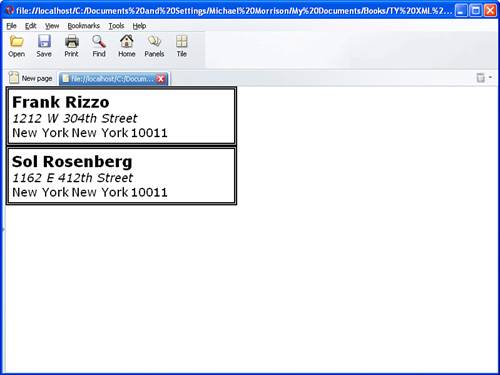
Figure 10.1. The Contacts example document is displayed in Opera using the contacts.css style sheet.
Although the contacts.css style sheet is relatively simple in structure, it is nonetheless a good example of how CSS can be used to format and position XML content on a page for viewing.
Earlier in the lesson you learned how to position XML content using the default approach to CSS positioning, which is known as relative positioning. In relative positioning, content is displayed according to the flow of a page, where each element physically appears after the element preceding it in an XML document. The content for an XML element still appears within a rectangular area, but the area itself is positioned relative to other elements that are being displayed. You can think of relative positioning as being akin to laying out checkers on a checkerboard; the checkers are arranged from left to right, and when you get to the edge of the board you move on to the next row. Elements that are styled with the block value for the display property are automatically placed on a new row, whereas inline elements are placed on the same row immediately next to the element preceding them.
Although relative positioning might sound somewhat limiting, you have to keep in mind that child elements are always positioned relative to their parents. So, the hierarchy of elements in an XML document can dramatically affect how the elements appear when styled with CSS. As an example, take a look back at the code for the contacts.css style sheet in Listing 10.2 in the previous section. You’ll notice that the contact and name elements appear to be completely independent from a CSS perspective, but when used in XML code the name element is a child of the contact element. Therefore, when using relative positioning, the name element is displayed with respect to the contact element. In other words, the name element appears within the rectangular area set aside for the contact element, which in this case is 350 pixels wide.
By the Way
Relative positioning is the default positioning approach used by CSS, so if you don’t specify the positioning of a style rule, it will default to relative positioning.
The other type of positioning supported by CSS is known as absolute positioning because it allows you to set the exact position of XML content on a page. Although absolute positioning gives you the freedom to spell out exactly where an element is to appear, this position is still relative to any parent elements that appear on the page. Even so, absolute positioning allows you to specify the exact location of an element’s rectangular area with respect to its parent’s area, which is very different from relative positioning.
By the Way
There is a potential problem associated with the freedom of placing elements anywhere you want on a page via absolute positioning. I’m referring to overlap, which is when an element takes up space used by another element. In this case, CSS relies on the z-index of each element to determine which element is on the top and which is on the bottom. You learn more about the z-index of elements in the next section. For now, let’s take a look at exactly how you control whether or not a style rule uses relative or absolute positioning.
The type of positioning (relative or absolute) used by a particular style rule is determined by the position property, which is capable of having one of the following two values: relative or absolute. After specifying the type of positioning, you then specify the position of a style rule using the following properties:
left— The left position offsetright— The right position offsettop— The top position offsetbottom— The bottom position offset
These position properties are interpreted differently depending on the type of positioning used. Under relative positioning, the position of an element is specified as an offset relative to the original position of the element. So, if you set the left property of an element to 25px, the left side of the element will be shifted over 25 pixels from its original (relative) position. Because the original position of the element is relative to other elements, the final position is still considered a relative position. An absolute position, on the other hand, is specified relative to the parent of the element to which the style is applied. So, if you set the left property of an element to 25px under absolute positioning, the left side of the element will appear 25 pixels to the right of the parent element’s left edge.
To better understand the difference between absolute and relative positioning, check out the following XML code:
<squares>
  <square class="one">
  Square One
  </square>
  <square class="two">
  Square Two
  </square>
  <square class="three">
  Square Three
  </square>
  <square class="four">
  Square Four
  </square>
</squares>
Admittedly, this XML code doesn’t mean much, but it’s a good way to demonstrate the difference between relative and absolute positioning. Notice in the code that there are several square elements, each with a different class and therefore a different style rule. Listing 10.3 contains a style sheet for this code that uses relative positioning to arrange the squares.
Example 10.3. The squares_rel.css Style Sheet That Uses Relative Positioning to Style the Squares XML Document
 1: square {
 2:   display:block;
 3:   position:relative;
 4:   width:100px;
 5:   height:75px;
 6:   border:10px single black;
 7:   color:black;
 8:   text-align:center;
 9: }
10:
11: square.one {
12:   background-color:red;
13: }
14:
15: square.two {
16:   background-color:green;
17: }
18:
19: square.three {
20:   background-color:blue;
21: }
22:
23: square.four {
24:   background-color:yellow;
25: }
This code sets the position style property to relative (line 3), which explicitly causes the square style rule to use relative positioning. Because the remaining style rules are inherited from the square style rule, they also inherit its relative positioning. In fact, the only difference between the other style rules is that they have different background colors. Figure 10.2 shows the Squares document as it is displayed in Internet Explorer using the style sheet with relative positioning.
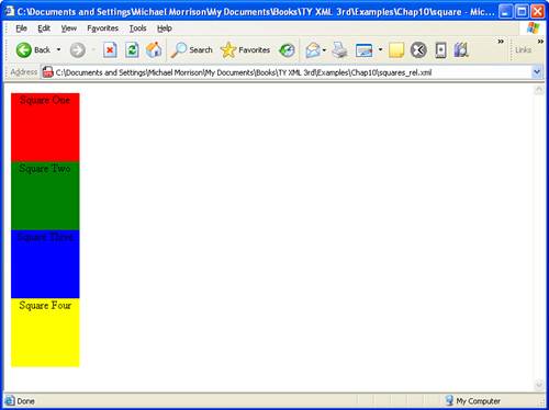
Figure 10.2. The Squares example document is displayed in Internet Explorer using a style sheet with relative positioning.
Notice in the figure that the square elements are displayed one after the next, which is what you would expect from relative positioning. To make things more interesting, you can change the positioning to absolute and explicitly specify the placement of the squares. Listing 10.4 contains a modified style sheet for the Squares document that uses absolute positioning to arrange the squares.
Example 10.4. The squares_abs.css Style Sheet That Uses Absolute Positioning to Style the Squares XML Document
 1: square {
 2:   display:block;
 3:   position:absolute;
 4:   width:100px;
 5:   height:75px;
 6:   border:10px single black;
 7:   color:black;
 8:   text-align:center;
 9: }
10:
11: square.one {
12:   background-color:red;
13:   left:0px;
14:   top:0px;
15: }
16:
17: square.two {
18:   background-color:green;
19:   left:75px;
20:   top:25px;
21: }
22:
23: square.three {
24:   background-color:blue;
25:   left:150px;
26:   top:50px;
27: }
28:
29: square.four {
30:   background-color:yellow;
31:   left:225px;
32:   top:75px;
33: }
This style sheet sets the position property to absolute, which is necessary in order for the style sheet to use absolute positioning (line 3). Additionally, the left and top properties are set for each of the inherited square style rules. However, the position of each of these rules is set so that the elements will be displayed overlapping each other, as shown in Figure 10.3.
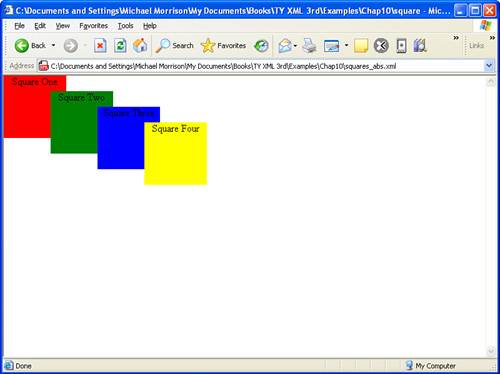
Figure 10.3. The Squares example document is displayed in Internet Explorer using a style sheet with absolute positioning.
This figure shows how absolute positioning allows you to place elements exactly where you want them. It also reveals how easy it is to arrange elements so that they overlap each other. You might be curious as to how a web browser knows which elements to draw on top when they overlap. Fortunately, CSS includes a style property that gives you complete control over the appearance of overlapped elements.
You just saw how it doesn’t take much trouble to position elements on a page so that they overlap each other. There are no doubt situations where you’d like to be able to carefully control the manner in which elements overlap each other. For this reason, CSS includes the z-index property, which allows you to set the order of elements with respect to how they stack on top of each other. Although the name z-index might sound a little strange, it refers to the notion of a third dimension (Z) that projects into the computer screen, in addition to the two dimensions (X and Y) that go across and down the screen. Another way to think of the z-index is the relative position of a magazine within a stack of magazines. A magazine nearer the top of the stack has a higher z-index than a magazine lower in the stack. Similarly, an overlapped element with a higher z-index is displayed on top of an element with a lower z-index.
The z-index of a style rule is specified using the z-index property, which is set to a numeric value that indicates the relative z-index of the rule. The number assigned to a z-index has meaning only with respect to other style rules in a style sheet, which means that setting the z-index for a single rule doesn’t really mean much. On the other hand, if you set the z-index for several style rules that apply to overlapped elements, the elements with the higher z-index values will appear on top of elements with lower z-index values.
By the Way
Regardless of the z-index value you set for a style rule, an element displayed with the rule will always appear on top of its parent.
Listing 10.5 contains another version of a style sheet for the Squares XML document that has z-index settings to alter the natural overlap of elements.
Example 10.5. The squares_z.css Style Sheet Alters the z-order of Elements in the Squares XML Document
 1: square {
 2:   display:block;
 3:   position:absolute;
 4:   width:100px;
 5:   height:75px;
 6:   border:10px single black;
 7:   color:black;
 8:   text-align:center;
 9: }
10:
11: square.one {
12:   background-color:red;
13:   z-index:0;
14:   left:0px;
15:   top:0px;
16: }
17:
18: square.two {
19:   background-color:green;
20:   z-index:3;
21:   left:75px;
22:   top:25px;
23: }
24:
25: square.three {
26:   background-color:blue;
27:   z-index:2;
28:   left:150px;
29:   top:50px;
30: }
31:
32: square.four {
33:   background-color:yellow;
34:   z-index:1;
35:   left:225px;
36:   top:75px;
37: }
The only change in this code from what you saw in Listing 10.4 is the addition of the z-index settings in each of the derived square style rules. Notice that the first square has a setting of 0 (line 13), which should make it the lowest element in terms of the z-index, whereas the second square has the highest z-index (line 20). Figure 10.4 shows the Squares document as displayed with this style sheet, which clearly shows how the z-index impacts the displayed content.
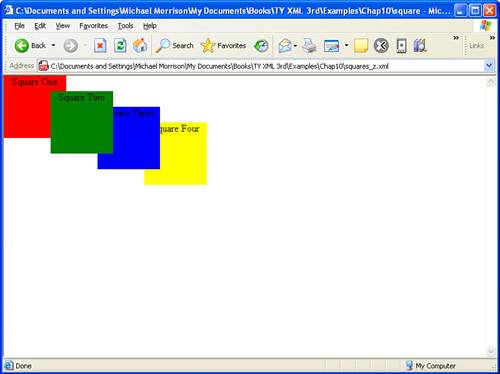
Figure 10.4. The Squares example document is displayed in Internet Explorer using a style sheet that alters the z-order of the squares.
The figure reveals how the z-index style property makes it possible to carefully control the overlap of elements.
CSS supports margins that allow you to add empty space around the outside of the rectangular area for an element. Following are the style properties that you use to set the margins for style rules:
margin-top— Sets the top marginmargin-right— Sets the right marginmargin-bottom— Sets the bottom marginmargin-left— Sets the left marginmargin— Sets the top, right, bottom, and left margins as a single property
You can specify margins using any of the individual margin properties or with the single margin property. Regardless of how you set the margins for a style rule, it’s important to note that you can specify the size of a margin using either units or a percentage. If you decide to set a margin as a percentage, keep in mind that the percentage is calculated based upon the size of the entire page, not the size of the element. So, if you set the margin-left property to 25%, the left margin of the element will end up being 25% of the width of the entire page. The following code shows how to set the top and bottom margins for one of the squares in the Squares XML document that you’ve been working with throughout this hour:
square.two {
  background-color:green;
  margin-top:5px;
  margin-bottom:20px;
}
In this example, the top margin is set to 5 pixels, and the bottom margin is set to 20 pixels. The results of this code are shown in Figure 10.5.
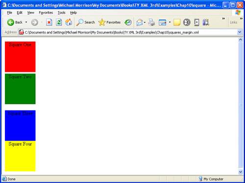
Figure 10.5. The Squares example document is displayed in Internet Explorer using a style sheet that sets top and bottom margins for one of the squares.
This figure shows how the top and bottom margins appear above and below the second square. Keep in mind that these margins don’t encroach on the content area of any of the squares—they all maintain their original size. In other words, the margins appear around the elements.
If you want to set all the margins for a style rule, you’ll probably want to simplify the code and use the margin property. This property is somewhat flexible in that it offers three different approaches to specifying the margins for a style rule. These different approaches vary based upon how many values you use when setting the margin property:
One value— The size of all the margins
Two values— The size of the top/bottom margins and the left/right margins (in that order)
Four values— The size of the top, right, bottom, and left margins (in that order)
As you can see, the margin property allows you to provide one, two, or four values when you set it. Following is an example of how you would set the vertical margins (top/bottom) to 5 pixels and the horizontal margins (left/right) to 10% for a style rule:
margin:5px 10%;
In this code, the top and bottom margins are both set to 5 pixels, whereas the left and right margins are both set to 10%. Of course, if you wanted to be a little clearer you could achieve the same effect with the following setting:
margin:5px 10% 5px 10%;
Similar to margins, padding is used to add extra space to elements via CSS style properties. However, padding differs from margins in that padding adds space inside the rectangular area of an element, as opposed to around it. For this reason, padding actually imposes on the amount of content area available within an element. As an example, if you create a style rule for an element that establishes a width of 50 pixels and a height of 30 pixels and then sets the padding of the rule to 5 pixels, the remaining content area will be 40 pixels by 20 pixels. Also, because the padding of an element appears within the element’s content area, it will assume the same style as the content of the element, such as the background color.
You specify the padding of a style rule using one of the padding properties, which work very much like the margin properties. The following padding properties are available for use in setting the padding of style rules:
padding-top— Sets the top paddingpadding-right— Sets the right paddingpadding-bottom— Sets the bottom paddingpadding-left— Sets the left paddingpadding— Sets the top, right, bottom, and left padding as a single property
Similar to margins, you can set the padding of style rules using individual padding properties or the single padding property. Padding can also be expressed using either a unit of measurement or a percentage. Following is an example of how you might set the left and right padding for a style rule so that there are 10 pixels of padding on each side of an element’s content:
padding-left:10px;
padding0-right:10px;
Also similar to margins, you can set all of the padding for a style rule with a single property, the padding property. You can use the same three approaches available for the margin property to set the padding property. Following is an example of how you would set the vertical padding (top/bottom) to 12 pixels and the horizontal padding (left/right) to 8 pixels for a style rule:
padding:12px 8px;
Following is more explicit code that performs the same task by specifying all of the padding values:
padding:12px 8px 12px 8px;
There are a couple of style properties that allow you to control the alignment of XML content: text-align and vertical-align. The text-align property aligns XML content horizontally within its bounding area and can be set to left, right, or center. Following is an example of using the text-align property to center a contact in the contacts.css style sheet that you saw earlier in the lesson:
contact {
  display:block;
  width:350px;
  margin-bottom:10px;
  border:5px double black;
  color:black;
  background-color:white;
  text-align:center;
}
The last style property defined in this style rule sets the text-align style to center, which results in the text inside of the contact element being centered within the element’s borders.
The vertical-align property is similar to text-align except that it is used to align elements vertically. The vertical-align property specifies how an element is aligned with its parent or in some cases the current line of elements on the page. When I say “current line,” I’m really referring to the vertical placement of elements that appear within the same parent element. In other words, I’m talking about inline elements. If several inline elements appear on the same line, you can set their vertical alignments the same to align them vertically. Following are the acceptable values for use with the vertical-align property:
top— Aligns the top of an element with the current linemiddle— Aligns the middle of an element with the middle of its parentbottom— Aligns the bottom of an element with the current linetext-top— Aligns the top of an element with the top of its parentbaseline— Aligns the baseline of an element with the baseline of its parenttext-bottom— Aligns the bottom of an element with the bottom of its parentsub— Aligns an element as a subscript of its parentsuper— Aligns an element as a superscript of its parent
These property values are self-explanatory for the most part. The only tricky issue relates to whether a value aligns an element with the current line or its parent.
When aligning an element with its parent, the baseline of the parent is the bottom of any text appearing in the parent, excluding letters that reach down below others, such as the letters g and y. Following is an example of how the vertical-align property is used to center text vertically:
contact {
  display:block;
  width:275px;
  margin-bottom:10px;
  border:5px double black;
  color:black;
  background-color:white;
  text-align:center;
  vertical-align:middle;
}
This code shows how simple it is to modify a style rule so that the XML content is aligned vertically.
CSS allows you to position and format a wide range of content, including HTML content, but when it comes to XML content you are primarily dealing with text. Knowing this, it’s important to have a solid understanding of how CSS is used to format text content. The next few sections tackle the following aspects of text formatting with CSS:
Fonts
Colors and image backgrounds
Text spacing
When it comes to text formatting, nothing really impacts the overall appearance of text more so than the font used to display the text. You learned earlier in the lesson that CSS includes several styles for setting the font for text content. However, I now want to take a closer look at these font properties and also show you a more concise way to specify the font for a style rule. Following are the CSS font style properties that you can use to alter the font of text content:
font-style— Sets the style of a fontfont-weight— Sets the thickness of a fontfont-size— Sets the size of a fontfont-family— Sets the family of a fontfont— Sets the style, thickness, size, and family of a font within a single property
If you recall from earlier, the font-style property allows you to set the style of a font and can be set to normal or italic; the default value is normal. The font-weight property sets the weight, or thickness, of a font and can be set to any of the following values: extra-light, light, demi-light, medium, demi-bold, bold, or extra-bold. The default value of the font-weight property is medium, which is an average font weight. The font-size property sets the size of a font using a unit of measure such as points (pt). The I property sets the family, or face, of a font, which is the name used to describe the font. Following is an example of how you use these four style properties together to establish a font style rule:
title {
  display:block;
  font-style:italic;
  font-weight:bold;
  font-size:18pt;
  font-family:Courier, serif;
}
Notice in this code that the font-family style rule actually consists of two family names: Courier and serif. The reason for this is because there is no guarantee that a particular font will be available on a given system. To solve this problem, you can list alternate font families that will be used in the event that the primary family isn’t available. In the title example, the Courier font family is specified as the primary family, but the secondary serif family will be used if the Courier family isn’t available. If none of the font families are available, it is the responsibility of a web browser to find a suitable match within the font families that are available.
Although the previous title example shows a perfectly reasonable approach to setting the font styles for a style rule, there is a better approach if you plan on setting several font styles. I’m referring to the font style property, which combines the other four font styles into a single property. To use the font property, you simply list the style, weight, size, and family of the font separated by spaces. Following is an example of how the font property makes the title style rule much more concise:
title {
  display:block;
  font:italic bold 18pt Courier, serif;
}
As this code reveals, the font property provides a good way to simplify the code for font styles. However, the font property is really only a convenience property and doesn’t actually add any features of its own.
If changing the font of text doesn’t provide you with enough flexibility, you can go a step further and spice up text by altering its color and background appearance. Using CSS, it is possible to set the color of text, the background color shown behind text, and even a background image that appears behind text. Following are the properties that make this kind of visual trickery happen:
color— Sets the foreground color of textbackground-color— Sets the background color of textbackground-image— Sets the background image of textbackground-repeat— Determines how the background image of text appearsbackground— Sets the background color, image, and repeat of text within a single property
The color property sets the color of text and can be set to any of the following standard colors: aqua, black, blue, fuchsia, gray, green, lime, maroon, navy, olive, purple, red, silver, teal, white, and yellow. Following is an example of how you might set the color in a style rule using the color property:
title {
  display:block;
  font:italic bold 18pt Courier, serif;
  color:green;
}
In this example, the text color of the title element is set to green, which results in the text content for the element being displayed in green. If you’d like to specify a color other than one of the standard colors, you can create a custom color and assign it to the color property. To do so, you must create the custom color as a combination of the primary colors red, green, and blue. The combination of red, green, and blue color components is known as RGB and is the color system used to specify custom colors in CSS. The red, green, and blue color components are expressed as hexadecimal numbers that are stuck together to form a complete custom color value, such as #00FF00, which is the color green.
By the Way
If you’ve never worked with hexadecimal numbers they will no doubt look strange to you at first. This is because hexadecimal numbers use a combination of letters and numeric digits, as opposed to just numeric digits. Instead of consisting of numbers from 0 to 10, the hexadecimal system consists of numbers from 0 to F, where the letters A through F continue on from 9. In other words, A is 10, B is 11, and so on. The lowest two-digit hexadecimal number is 00, whereas the highest is FF.
A custom color consists of six digits, which are actually three two-digit pairs, preceded by a number symbol (#). Each one of the two-digit pairs represents one of the three primary color components (red, green, and blue). Perhaps the best way to understand how custom numbers are encoded in hexadecimal is to look at the hexadecimal values for several of the standard colors:
aqua—#00FFFFblack—#000000blue—#0000FFfuchsia—#FF00FFgray—#808080green—#00FF00
These few examples should give you an idea as to how custom colors are described by hexadecimal values. Following is an example of how you would set the color property to the color blue using a hexadecimal value:
color:#0000FF;
Now that you have a better understanding of how color works in CSS, let’s return to the discussion of formatting text with color. Similar to the color property, the background-color property accepts a color, but in this case the color represents the background color of a style rule, not the text color. Following is an example of the background-color property in action:
title {
  display:block;
  font:italic bold 18pt Courier, serif;
  color:green;
  background-color:#808080;
}
In this example, green text is drawn over a gray background thanks to the color and background-color properties. If a background color isn’t quite fancy enough for you, you can specify a background image that is displayed behind the text content of an element. The background-image property accomplishes this task, as the following example reveals:
title {
  display:block;
  font:italic bold 18pt Courier, serif;
  color:green;
  background-image:url(jungle.gif);
}
In this example, the background image named jungle.gif is specified for the title style rule. Notice that the image URL is enclosed in parentheses that follow the word url; this is how image URLs must be specified when using the background-image property.
By the Way
It is possible to specify both a background color and a background image, in which case the background color will show through any transparent areas of the image.
When you set a background image for a style rule, the image is automatically tiled to fill the entire rectangular area of the element that is displayed. If you want to control the manner in which a background image is tiled, you can do so with the background-repeat property, which accepts the following values: repeat, repeat-x, repeat-y, and no-repeat. The default value is repeat. The no-repeat value displays the background image once, whereas the repeat-x and repeat-y values tile the image repeatedly in the X and Y directions, respectively. Following is an example of setting the background-repeat property to have a background image appear only once:
title {
  display:block;
  font:italic bold 18pt Courier, serif;
  color:green;
  background-image:url(monkey.gif);
  background-repeat:no-repeat;
}
If you’d like to specify several background properties without entering as much code, you can use the background property, which sets the background color, image, and repeat properties in a single style. Following is an example of setting the background property for the title style rule:
title {
  display:block;
  font:italic bold 18pt Courier, serif;
  color:green;
  background:green url(jungle.gif) no-repeat;
}
In this example, the background property is used to set a background color, to set a background image, and also to specify that the image be displayed only once.
You can achieve some interesting text effects by playing around with the spacing between characters. There are two CSS style properties that allow you to control the indentation and character spacing of text: text-indent and letter-spacing.
These two properties both can be specified in units that you are hopefully familiar with by now: points (pt), inches (in), centimeters (cm), or pixels (px). Following is an example of how to set the indentation of a paragraph of text using the text-indent property:
message {
  display:block;
  text-indent:1.5in;
}
This code sets the indentation of the message element to one-and-a-half inches, which means the first line of the text in the element is displayed an inch-and-a-half over from the left edge of the element’s rectangular area.
Although the letter-spacing property impacts text much differently than the text-indent property, it is specified similarly. Following is an example of how to alter the character spacing of the message element:
message {
  display:block;
  text-indent:1.5in;
  letter-spacing:5pt;
}
In this example, the letter spacing of the message style rule is set to 5 points, which means the individual characters in the message are separated by an additional 5 points when displayed. An interesting facet of the letter-spacing property is that it can also be used to move letters closer together by specifying a negative value.
It’s time to take a turn for the practical and put together another complete CSS style sheet example. This example involves an XML document called news.xml that contains a news story marked up with XML code. Listing 10.6 contains the code for the News example document, which could feasibly be used by a newspaper or newsletter website to encode stories.
Example 10.6. The News Example XML Document
 1: <?xml version="1.0"?>
 2: <?xml-stylesheet type="text/css" href="news.css"?>
 3:
 4: <news>
 5:   <header>
 6:     <headline>
 7:     Local Author Creates Free Online Music Game
 8:     </headline>
 9:     <byline>
10:     By Brent Andrews
11:     </byline>
12:     <dateline>
13:       <location>Nashville, Tennessee</location>
14:       <date>Monday October 17 2005 12:08 CST</date>
15:     </dateline>
16:   </header>
17:
18:   <story>
19:     <p>Local nerd author Michael Morrison is involved in yet another unusual
20:     project. Following up on the success of his quirky trivia game Tall
21:     Tales, Morrison has gone back to his technical roots with his latest
22:     project, Guess That Groove. Guess That Groove acts as somewhat of an
23:     online version of the popular television game show Name That Tune. What
24:     makes Guess That Groove so unique is how it relies on actual digitized
25:     music recordings to present popular songs from the last seventy years of
26:     music.</p>
27:     <p>Located online at <url>www.guessthatgroove.com</url>, the service is
28:     entirely free. Morrison explained that the business model is based upon
29:     commission fees from linked sites such as Amazon.com and iTunes, which
30:     offer game players an option to purchase CDs and individual music tracks
31:     that they encounter throughout the game. It's too early to tell whether
32:     Morrison has hit on another social phenomonon along the lines of Tall
33:     Tales. Regarding the potential success of the online game, Morrison
34:     replied, <quote>It was a lot of fun to create and I enjoy playing it
35:     myself, so in some ways I already consider it a success</quote>.</p>
36:   </story>
37: </news>
Admittedly, the news story in this case may not qualify as front-page material, but it does reveal how the XML markup is used to add context to the content in the story. The goal of this example is to create a style sheet that displays the news story in a format similar to how you are accustomed to seeing printed stories in a newspaper. In other words, the title should appear in a large font followed by a much smaller byline and dateline and then the body of the story. The elements that factor into the style sheet are headline, byline, dateline, p, url, and quote. You could easily use absolute positioning to carefully lay out each of the elements in this example document, but it is not necessary. Rather than go into the details of absolute positioning, it is simpler in this case to carefully align the elements with the text-align property so that they appear where you want them. Listing 10.7 contains the code for the news.css style sheet, which is used to style the News XML document for display.
Example 10.7. The news.css Style Sheet Used to Format the News XML Document
 1: headline {
 2:   display:block;
 3:   width:450px;
 4:   border-bottom:5px double black;
 5:   text-align:left;
 6:   color:black;
 7:   font-family:Verdana, Arial;
 8:   font-size:26pt;
 9: }
10:
11: byline {
12:   display:inline;
13:   width:200px;
14:   text-align:left;
15:   color:black;
16:   font-family:Verdana, Arial;
17:   font-size:12pt;
18: }
19:
20: dateline {
21:   display:inline;
22:   width:250px;
23:   text-align:right;
24:   color:gray;
25:   font-family:Verdana, Arial;
26:   font-size:10pt;
27: }
28:
29: p {
30:   display:block;
31:   width:450px;
32:   margin-bottom:8px;
33:   color:black;
34:   font-family:Verdana, Arial;
35:   font-size:10pt;
36: }
37:
38: url {
39:   display:inline;
40:   font-weight:bold;
41: }
42:
43: quote {
44:   display:inline;
45:   font-style:italic;
46: }
Although this style sheet is a bit larger than the Contacts style sheet you saw earlier in the lesson, it is actually very straightforward if you study each of the style rules carefully. For example, the headline style rule has a width, bottom border, text color, and font, and it has its text aligned left (lines 1–9). The byline style rule is defined as an inline rule (line 21) and aligns text to the right (line 23). The p style rule sets a bottom margin in order to provide exact spacing between paragraphs (line 32). All of the style rules use different sized fonts except for url and quote, which inherit the font size of their parent style rule, which in this case is p. The resulting view of the News document using the news.css style sheet is shown in Figure 10.6.
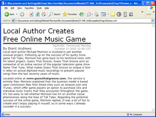
Figure 10.6. The News example document is displayed in Internet Explorer using the news.css style sheet.
Notice in the figure how the style sheet takes the XML data and formats it into a layout resembling a story printed in a newspaper. Additionally, the URL and quote in the story are further styled so that they are called out in the text.
Cascading Style Sheets (CSS) were originally created for use with HTML, but they also work quite well with XML. CSS focuses purely on the positioning and formatting of XML content and doesn’t involve itself with processing or otherwise translating XML code. However, when it comes to positioning and formatting XML content for display within web pages, CSS proves to be a powerful and easy-to-use technology. CSS gives you the ability to carefully control the positioning of XML content on a page and align it as desired. Once you’ve positioned XML content on a page, you have the option of formatting the text using a variety of different CSS style properties. Through these style properties, you can control the font, color, background, and spacing of text, which gives you considerable flexibility in determining the appearance of text.
This hour introduced you to CSS and how it is used to style XML documents. You got started by learning the basics of CSS, including the fundamental layout and formatting styles that are used to style XML content. You then learned how to associate an external style sheet with an XML document, which is a necessity if you plan on seeing the fruits of your CSS labors. You also found out the difference between relative and absolute positioning and how each are used to position elements. You learned about several other CSS positioning features such as z-index, margins, padding, content alignment, fonts, colors, backgrounds, and text spacing. And finally, you wrapped up the hour by exploring a complete CSS example that pulled together most of what you learned throughout the lesson.
The Workshop is designed to help you anticipate possible questions, review what you’ve learned, and begin learning how to put your knowledge into practice.