
Hour 6. Knowing the Capabilities of Mobile Devices
Since we have been through the basics of creating a mobile site, in this hour we focus on some of the aspects of a mobile device.
We start with the various screen sizes and resolutions of different mobile devices and move on to understand the screen depth. We then take a quick look at some current mobile operating systems and finally finish out the hour discussing the jQuery Mobile graded support matrix.
Understanding Screen Resolutions and PPI
Not all mobile devices are created equal, and not just in memory or processing power. The screen sizes of most mobile devices are different and may vary significantly even when compared to a previous version.
Let’s look at the iPhone as an example. Apple originally created the iPhone with a screen size of 3.5 inches and a resolution of 320×480. Apple continued using that screen size and resolution until the iPhone 4, which has the same 3.5-inch display but a substantially increased resolution of 640×960.
While that is great to designers and geeks who obsess over product specifications, you may be asking yourself why the resolution matters and whether it has an effect on anything.
Clearing Up Resolution
Resolution is the amount of pixels displayed on a screen and is generally shown in a width-by-height format. You may already be familiar with resolution and not realize it. For years the most common resolution on a computer was 640×480. If we take that measurement as width-by-height that would mean the screen is 640 pixels wide by 480 pixels tall. As time moved on 800×600 became the next most common resolution, and then 1024×768. Web development has been pushing a maximum width anywhere between 920 and 980 pixels over the last few years as using this width fits the website inside a viewing resolution of 1024×768 and only requires visitors to scroll vertically.
Knowing what the average website visitor screen size is, or what the minimum and maximum resolutions are can drastically alter your website design and style. Visitors who attempt to view or use your site who have a lower resolution than your design will only able to see a small portion of it on initial page load. They can see your content, but they will be forced to scroll horizontally and vertically, and they may miss out on the message or any call to action you are trying to send. This is especially important to mobile devices and can be a design headache as you shift your design to handle the differences in various mobile devices.
Let me bring up one more resolution example that is commonly viewed but not commonly thought too much about. Take a moment and consider the television. I won’t spend time going into the specifics of how a picture is displayed on a television, but try to think about the last time you watched a program in Standard Definition (SD). Now think about the first time you watched a program in High Definition (HD). Did you notice the difference? After viewing a program in HD, watching something SD will have softer edges and may seem to have a touch blur applied to everything. This is because of the resolution differences between SD and HD. The default resolution of SD is generally 640×480, while HD tends to be either 1280×720 or 1920×1080. The difference in resolution is also typically the reason why SD content on some HD televisions has a tendency to look blocky, distorted, or show artifacts since the lower resolution image is forced to be “blown up” to fit the much larger resolution.
Another factor to take into account is not only the resolution of the device, but the physical size of the screen as well. The physical display size and resolution go together to form pixel density.
Pixel Density
Pixel density or Pixels Per Inch (PPI) is the amount of pixels that can be placed in a given area. Going back to the iPhone example, the early generation iPhone contained a resolution of 320×480 with a physical display size of 3.5 inches. After some number crunching, that gives that screen a PPI of 163. The iPhone4 has a resolution of 640×960 and the same physical display size of 3.5 inches. This doubles the PPI to 326. The difference in density is due to the physical screen size and the amount of pixels that can be placed in that area, thereby increasing the resolution that can be displayed.
Tip: Calculating the PPI of a Screen
To figure out the PPI of a display you need to know the physical size of the screen and the resolution that it displays. Starting with the resolution of the device, you take the square root of both the width-squared and height-squared added together and divide it by the physical diagonal display size of the display. For example, a display with a 4-inch screen and a resolution of 480×800 would be calculated by the following:
√4802×8002 = 932.95
932.95/4 = 233.24 PPI
While there are many heated debates over whether PPI matters with digital images when being viewed on a display, you can live by this guideline: It is not the PPI of the image that matters, but the overall resolution of the image and the device that is viewing it.
Let me explain that a little more. Devices with a higher PPI will have a higher resolution, meaning that images appear smaller when displayed on devices with a higher PPI. A great example of this is when you look at an image on a monitor with a display resolution of 640×480 and then switch to a monitor with a resolution of 1280×1024. The image will be displayed twice as big on the 640×480 screen as it will be on the 1280×1024 even though the PPI of the image itself didn’t change. Figure 6.1 and Figure 6.2 illustrate this.

Figure 6.1 640×480 viewing an image that is 400px × 300px

Figure 6.2 1280×1024 viewing an image that is 400px × 300px
When dealing with mobile devices you need to be aware of the differences in screen resolutions so that images and buttons on your site are still big enough for users to access.
Just in case you have started to wonder about common screen resolutions of mobile devices, the following is a list of current sizes. Note that in the list the width and height are generally reversed in most phones.
• Quarter Video Graphics Array (QVGA): 240×320
• Wide Quarter Video Graphics Array (WQVGA400): 240×400
• Wide Quarter Video Graphics Array (WQVGA432): 240×432
• Half Video Graphics Array (HVGA): 320×480
• Wide Video Graphics Array (WVGA800): 480×800
• Wide Video Graphics Array (WVGA854): 480×854
• iPhone 4 (Retina™): 640×960
• Wide eXtended Graphics Array (WXGA): 1280×800
Figure 6.3 shows an overlay of these different sizes so that you can get an idea of just how different the viewing area and aspect are.
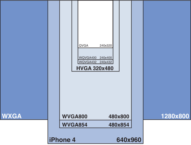
Figure 6.3 The many screen resolutions of mobile devices
The preceding list covers most mobile devices but not all of them. Some phones, tablets, and net-books may contain sizes similar to 1024×600 or 1366×768.
As you look over the list you can see that with the wide variety of resolutions available it can be a daunting task to think of a design and usability that will work for all devices. Luckily this is one of the benefits of using jQuery Mobile. jQuery Mobile allows you to create lists, buttons, and more that remain usable across these devices allowing you to focus on your content and message instead of worrying about users who may not be able to view or use your site.
Additional Mobile Features
Along with a display, mobile devices come with a wide array of additional hardware components that allow them to behave differently than other devices.
Touchscreens
Most modern mobile devices feature a touchscreen for data display and functionality. There are actually many types of touchscreen technologies, but the two most popular for mobile devices are usually resistive and capacitive.
Resistive
Touchscreens that use resistive technology function by using a multilayered screen with two conductive layers in them separated by a gap. When the screen is touched or tapped, the layers touch together to create a point. Those who remember older Personal Digital Assistant devices and even some current gaming devices should be familiar with this type of screen. Devices that use this type of touchscreen generally include a stylus to increase the accuracy of the touch or tap. A downside to this screen type is that it can have a delay when tracking movement making applications and websites feel a bit sluggish compared to capacitive screen devices.
Capacitive
Touchscreens that are capacitive function through the use of sensors placed in various areas of the screen that detect the tiny frequency changes between an insulator and a transparent conductor that occur when the screen is touched or pressed. Frequency changes are dependent on a conductive material touching the screen. This is why when a nonconducting stylus, glove, or similar material touches the screen the frequency will not change and the touch will not be detected. Many mobile devices opt for this type of touchscreen technology because of increased precision when touching the screen.
Orientation
Many portable devices can detect how they are being held and will change how data is displayed to the screen, or use this information as an input device. While it may not seem terribly helpful at first, device orientation can make a large impact on some activities such as reading. This displays the inherent benefit of supporting two viewing resolutions.
Accelerometer
Some devices include a gyroscope or three-way sensor that can return feedback by analyzing movement along the x, y, and z axis. This information is then processed and can be used to adjust the screen orientation, or can be used by some programs or games as a way to move objects along the surface.
Proximity Sensor
This is one sensor that few people think about or even know exists. This may not be included in your mobile device but is found in many current mobile handsets. The main function of this sensor is to perform operations when the device is close to something. An example of this is automated screen operation when the device is placed in a pocket or up to your head. A quick way to tell whether your phone has this feature is to take a call and check to see whether the screen turns off instantly when you place the phone up to your ear. When you pull it away, look to see whether the screen turns back on by itself.
Physical Keyboard
This is another feature that you might not think about when you look at a mobile device. Some devices rely on software keyboards that display keys onscreen that are then touched or typed to use. Other mobile devices have a full set of hardware keys that slide out or are placed below the screen of the device. It is important to be aware that not all devices have a keyboard, especially when designing form input or application controls that use hardware keys as a shortcut.
GPS
If your device contains a Global Positioning System (GPS), it has the ability to look for a network of satellites that are then used to “fix” your location by using a series of coded radio waves and timestamps. This data is then used by various applications for everything from plotting your position on a map, tracking where you’ve been, or even displaying your current speed and direction.
Acquiring your position can take a few minutes so some devices include Assisted GPS. This works by using known positions of cell towers and other known access points to assist the GPS in determining your location.
Barometer
Yes, some mobile devices come with a barometer sensor inside them. While this can help weather applications display air pressure and help predict future weather at your location, the actual intent for this sensor is quite different. The barometer is actually included to assist the GPS unit. The barometer can get a better fix on your altitude and speed up the GPS acquisition of your location.
Camera
Some devices have one camera on the back of the device. Other devices have two cameras, one on the back and one on the front. Generally the front-facing camera has a smaller megapixel count and is used for video chatting or for quick self-portraits.
The camera included on most mobile devices can be used in a variety of ways. Some applications use the camera for simple picture sharing, while others use the image taken to reference against a library of similar pictures to identify it. Other uses of the camera include Alternate Reality, which allows you to view the world through your mobile device while pictures, menus, routes, and guides are superimposed into the environment. A current trend with the camera in your device is to use it so scan Quick Response (QR) codes to view special promotions or to receive coupons for the item you are looking at. Figure 6.4 shows a QR code that you can scan with a mobile device.

Figure 6.4 QR codes are popular for displaying text, address information, and links.
Not all mobile devices include a camera, and some official application marketplaces will not be available if a camera is not included with the device.
Wireless
Many mobile devices come with WiFi for network and Internet usage at home or at various business establishments. The 802.11 version of a wireless card inside varies per device. Some mobile devices opt for a cheaper 802.11g wireless card that may use less power to save battery, while other devices may include a 802.11n wireless card for possible increased speed and distance.
Other mobile devices may include a 3G connection for cellular service. Other devices may also include 4G, LTE, WiMAX, or similar cellular technology for increased bandwidth, connection sharing, and speed. Generally devices that include cellular access capability cost more than their WiFi only counterparts. Also worth noting is that while a data plan is required to use the cellular access, it can still be used with the cellular access turned off.
Looking at Mobile Operating Systems
Just as there are a wide variety of mobile devices there are also a wide variety of operating systems that run them.
iOS
Many are familiar with iOS as it powers many of the “iDevices.” It has been around since 2007 and was originally named iPhone OS. It features tight integration with the Apple OS (known as OSX), iTunes, and the App Store.
When it was originally introduced few apps were available in the App Store, so many developers built web apps that would run in the dimensions of the iPhone. Web apps are still supported by the platform and run inside Mobile Safari (the web browser packaged inside iOS).
Other web browsers are available for iOS and can be purchased in the App Store.
Developers can download the Software Development Kit (SDK) for free but are required to pay a registration fee per year to publish applications in the App Store. Applications must go through a submission process where they are either accepted and placed in the App Store, or rejected and sent back to the developer to fix. While native code is written and compiled from Objective-C, there are frameworks that take HTML, CSS, and JavaScript and compile it to be run as a native app.
Android
Mobile devices that run the Android OS have been on the rise during the last few years. Android was started in 2008 by Google and the Open Handset Alliance and is currently used in tablets, mobile phones, and personal media players. It features the Play Store, Play Music, Play Books, widgets, and extra customization through the use of “rooting” the device to install modified versions of the OS (please be aware that rooting a device will usually void your warranty).
Android originally branched out into versions for small screen devices (phones) and large screen (tablet) devices but is coming into a unity with future versions.
Android ships with a built-in browser based on WebKit (the same WebKit that Chrome is based on). Similar in support to Mobile Safari (which is also based on WebKit) many CSS3 and HTML5 features are supported.
Native application development is done with the Android SDK, which can be downloaded for free. Code is written in Java, extended with API calls, and then compiled for device usage. There is a one-time developer fee to release your app in the Android Market. While applications are somewhat reviewed, the Android Market is much less strict than other marketplaces. When installing an application on Android the app must disclose what features of the phone it is going to access. This puts the onus of responsibility on the individual user instead of the developer. This has also caused some backlash in marketplaces if users believe an app is accessing personal data without reason.
Several external “markets” exist that may be used to download applications. Some of these marketplaces exist due to the restriction that Google has placed on hardware running the Android OS. Devices that do not pass Google certification do not receive access to the Android Market and must either provide their own or make users sideload applications onto their device. This does not mean that all external marketplaces are necessarily less legitimate than the official Play market. For example, the Amazon Market drives the applications available for the Kindle Fire, which is a third-party device that runs a customized version of Android. Other Android-based devices also run customized markets that make sure applications run on their devices before allowing users to download them.
Windows Phone
This is the current name of the mobile OS developed by Microsoft. It was announced in 2010 as a replacement for the Windows Mobile OS. It features a completely redesigned interface dubbed “metro.”
While the initial release of the OS was met with only 10 devices supporting it, Microsoft made a partnership with Nokia in 2011 to help bolster hardware support. The agreement with Nokia also brought support for the Ovi store and Nokia maps to the OS. In addition to these Windows Phone has integration with Bing services and has a Marketplace where applications can be downloaded and installed.
The current release of Windows Phone sports a new version of Internet Explorer Mobile that is based on the desktop version of Internet Explorer 9.
Applications are built using the Windows Phone SDK, which is used in conjunction with Visual Studio and can be downloaded for free. To release an app in the Marketplace you must be either a licensed Xbox Live or Windows Phone developer. All applications are subject to approval and must pass to appear in the Marketplace.
The future of Windows Phone is currently geared toward a more complete integration with Windows 8, including tighter integration for desktops, tablets, and mobile phones.
Bada
This OS is created by Samsung and is still trying to gain traction in the mobile device market. It was introduced in 2010 with a limited number of hardware devices. If you have ever used an Android device from Samsung that runs the touchwiz launcher, then Bada will feel somewhat familiar. Also if you have ever had a Samsung phone before, then you may recognize some of the features as Bada is the current evolution of Samsung’s existing proprietary OS.
Applications are distributed and downloaded through Samsung Apps, the native store for the OS.
Bada currently features a web browser that is based on WebKit. It features many similar functions that you would expect in today’s smartphones, meaning multitouch, pinch-to-zoom, OpenGL support for 3D applications and games, as well as copy and paste features.
Currently the SDK is available for free download as long as you are either a registered developer or have a Samsung user account.
Applications are coded in C++ but share many similarities with Android development. To publish an app you must create a seller account and go through an approval process.
BlackBerry
This OS was created by Research In Motion and was one of the first of the mobile devices to include and support a trackball. The BlackBerry OS was also one of the first devices to offer integration with corporate email systems, making it an ideal choice for businesses worldwide.
BlackBerry Messenger has been one of the most successful features of the OS. It allows users to interact with each other in a chat-like environment, including building chat rooms and groups. Unlike traditional texting, BlackBerry Messenger instead relies on sending messages over the Internet allowing messages to be sent when out of cell phone coverage but within a wireless access point.
BlackBerry currently runs a proprietary browser that varies on each version of the OS. This means that older BlackBerry devices lack support for newer web technologies such as HTML5 and CSS3.
Applications can be downloaded to the device through BlackBerry App World, the official store for BlackBerry apps.
To develop an app for BlackBerry you need to download the SDK and then create your application using either HTML5 or Java. Once your application is completed you must submit the app to App World for approval. If approved it will be placed in App World and become available for download or purchase.
The BlackBerry OS 7 will be the last release not based on QNX, which is what the BlackBerry PlayBook OS was based on. The new BlackBerry OS, named BlackBerry 10 is slated for launch during 2012 and will run on phones and tablet devices. The PlayBook OS supports BlackBerry WebWorks applications as well as Adobe AIR applications. Recent developments allow the tablet to also run Android applications that have gone through a repackaging process. A new development kit is also in the works to allow native application building in C and C++.
Many more mobile operating systems are available, and more are currently in active development. Some mobile devices feature an OS that has taken the core of another mobile OS and applied heavy modifications to both the look and functionality of the system to create a unique user experience.
Learning About Mobile Graded Browser Support
With so many mobile devices in existence, the team at jQuery Mobile has decided to keep a matrix of supported devices.
Before you get too excited, it does not cover every mobile device in existence, but it does cover the popular ones. The list is carved into four major sections or grades.
The A-grade section is a list of browsers that support all the features that jQuery Mobile adds to your site. This means all the special effects including page transitions appear, and all theme and styles will be applied. This also means that pages will be loaded through AJAX and will be dynamically inserted into the DOM giving the user a smoother experience.
The B-grade section still offers an excellent viewing experience with most styles being enabled. Navigation may feel a touch on the slow side because AJAX page loading is not supported. This means that rather than receive loading messages while pages are fetched and inserted into the DOM, pages will have to be navigated to and displayed.
The C-grade section gets you a basic albeit usable site. The pages will still load, and your content will still be there, but everything is reduced to fallbacks. The fancy styles will not be applied. Page transitions will not work.
The last section is more of a message from the development team letting users know that they have not tested every mobile OS and device. What is nice is that there is usually a note why a device is on the list. The reasons may vary from OS not supported to unable to test due to lack of emulation software or hardware available. To view the list of currently supported devices for yourself browse to http://jquerymobile.com/gbs/.
Summary
In this hour you learned about some of the aspects of mobile devices, including screen size and resolution and that each mobile device may display an image at a different size due to resolution.
You learned about the different feature sets that can be found in mobile devices. You also learned about some of the functionality of these features and have an idea about they can be used by developers.
Mobile devices do not all run the same mobile OS, and now you know that mobile devices are generally tied to a store where apps can be purchased or downloaded. Different mobile browsers are used to surf the Internet and view web applications and mobile websites, and you learned that you could develop for these mobile devices with an SDK and knowledge of the native programming language.
Finally you learned that the jQuery Mobile team keeps a support matrix of devices with the expected level of style and functionality for those devices.
Q&A
Q. What is the difference between a native application and a web application?
A. A native application means that the code was written and compiled either using the same language as the OS or into a file that can be understood by the device at an OS level. Native applications give deeper control and access to the hardware components of the device and usually grant access to the local file system. Native applications generally must be coded for each mobile OS individually.
Web applications on the other hand are built to be displayed in the browser or through a special viewer on the mobile device. Web applications are usually built to look and function like a native app but have the advantage of only being written once. There are a few frameworks such as PhoneGap, Sencha Touch, Appcelerator, and Rhodes that you can use to write a web application that will allow you to tie into some of the functionality that native apps can use.
Q. Why isn’t there a mobile standard for devices that everyone can follow so that developing is easier?
A. Some companies have put together agreements to try to standardize some of the feature sets of mobile devices. The problem, however, isn’t really the devices, it is the demand. If a manufacturer has customers demanding a device with a specific size, they will cater to the customer needs. This is also what continues to drive mobile evolution and progress. It may be easier for developers to have cookie-cutter devices, but without new features and changes in device technology development wouldn’t evolve much either.
Q. How does jQuery Mobile help me deal with all these device differences?
A. jQuery Mobile bridges the gap in many places for you. It helps you with a uniform layout that looks nearly the same on every mobile device that views it. It gives you the tools to make a response layout that has the ability to work with browsers on your standard computer as well as on your mobile device. It is geared toward speed and functionality, both of which are important to mobile users. Finally it helps you reduce the bandwidth spent on your mobile site and lets users get to your content faster than loading a full site.
Workshop
The workshop contains a quiz and some exercises to help you check your comprehension and understanding.
Quiz
1. True or False: All mobile devices have the exact same pixel density.
2. True or False: Mobile devices can come with a GPS included that allows users to see where they are on a map, or even how fast they are travelling.
3. True or False: Some mobile devices cannot use cellular technologies for Internet access.
4. True or False: Resistive screens respond quicker than conductive screens, allowing a smoother experience.
5. True or False: All devices will work with all the features of jQuery Mobile.
Answers
1. False. All mobile devices do not even have the same screen size or resolution; it would be impossible for them to all have the exact same pixel density.
2. True. Some mobile devices have a GPS included that can show you where you are, how long it took you to get there, and give a live update of how fast you are currently moving.
3. True. Not every device that is considered mobile is connected through cellular networks. Many devices such as personal media players, tablets, or eReaders use WiFi to connect to the Internet.
4. False. Resistive screens have a harder time tracking movement and may give the feeling of added lag when used.
5. False. Unfortunately not all devices support all the styles or even the JavaScript required for jQuery Mobile to function fully. On the bright side, the jQuery Mobile team has gone to great lengths to include fallback support for legacy devices making sites built with jQuery Mobile still function on older or nonsupported devices.
Exercises
1. Either using your mobile device or a borrowed one, experiment with the various features of the device and see what apps have been developed that use these features. This may include weather applications that use the barometer, image apps that use the cameras, or even apps that track your walking, jogging, or biking.
2. Determine what type of mobile OS and version your mobile device is currently running. Look at the version history online and see what features have been added up to the point of your device. Check to see whether you are even using the new features or whether there are ones that you should be using.
3. Open the browser on your mobile device and browse a few sites. Check to see whether your browser can support multiple tabs or windows. Go to your app marketplace and search for other browsers. Read about them and see what extra functionality they give when compared to the stock or included browser on your mobile device.