
Hour 17. Detecting Mobile Devices
You may have noticed that when you visit some websites on your mobile device you are automatically redirected to a mobile version of the site. While this may seem like Internet black magic, there is a much simpler explanation for the events that happen behind the scenes. Before we get to the magic, let’s take a moment and learn why mobile detection is important.
Learning the Importance of Mobile Detection
Over the last decade we have enjoyed progressively faster and faster connection speeds. Companies have raced to wire every home with broadband connections, satellite service has improved and expanded to remote users, and wireless technology has taken leaps forward in providing service to users on the move. As the connection speed of users has increased developers have continued to cram more and more data down the pipe. The benefit to the amount of data that a developer can send to the user is the ability to create rich user experiences and websites that act like fully installed applications. The downside is that heavy websites bring slow connections to a crawl and force users to watch loading screens while data is painfully pulled down to the client.
You may remember back when you would type in an address for a site and a page would appear asking if you would like the high-bandwidth or low-bandwidth version of the site. The high-bandwidth version often contained animated images, Flash content, and for a while every site had to have music playing. On the other hand, if you chose the low-bandwidth alternative, you were treated to possibly one or two pictures and a screen full of text. This is where mobile detection comes into use.
Mobile detection gives developers the ability to create a lighter experience that can either be made generic or custom tailored to the device requesting the data. In this respect you can choose whether you want to force a large media-filled experience down to a user or trade it out for a minimalistic design. It also allows you to decide to include full size images and backgrounds or to include smaller images and a solid color background instead. Knowing when a mobile device is viewing your site is also important as it gives clues to the audience that is viewing your content and can help you make changes that benefit the main users of your site.
Detecting mobile devices has shifted over the last few years as mobile devices continue to blur the line between desktop browsers and mobile browsers. Methods that used to be valid and indispensible are now flawed and not recommended for filtering traffic from one version of your site to another. One method previously used to determine which devices were mobile was to detect JavaScript support. A test could be run on the client browser and if the JavaScript could not be run then it would run the mobile version of the page. While this worked to some degree, it left large gaps and holes on who would see the mobile page. As smartphones crossed into using browsers with JavaScript support, this method quickly fell from prominent use and is now used for feature detection and fallbacks for browser support.
Today there are methods that still let some devices through but have a greater chance of catching the majority of mobile devices. Let’s take a look at using some server configuration files to find out what device is browsing our network.
Using the .htaccess File
Those familiar with using the Apache web server already know that using .htaccess files can come in handy for a variety of different uses. These files allow you to create server configurations that apply to the folder they are placed in. Configuration changes can range anywhere from redirects to cookie creation to even placing files under authentication. It just so happens that they can also be used to help direct mobile visitors to a different site or page when used.
To use the .htaccess file as a means to redirect traffic you need to learn a little about what a mobile browser reports to the web server. Each mobile browser has a specific string it passes to the server when it requests a file. This is known as the User Agent (UA). By checking the UA when a page is requested you can determine whether the page should be delivered as is, or whether it should tell the browser requesting the page to go to a different directory, domain, or file.
Take a look at the following UA and see whether you can tell where they came from:
• "Mozilla/5.0 (iPhone Simulator; CPU iPhone OS 5_0 like Mac OS X) AppleWebKit/534.46 (KHTML, like Gecko) Version/5.1 Mobile/9A334 Safari/7534.48.3"
• "Mozilla/5.0 (Linux; U; Android 2.3.3; en-us; sdk Build/GRI34) AppleWebKit/533.1 (KHTML, like Gecko) Version/4.0 Mobile Safari/533.1"
• "Mozilla/5.0 (iPod; CPU iPhone OS 5_0_1 like Mac OS X) AppleWebKit/534.46 (KHTML, like Gecko) Version/5.1 Mobile/9A405 Safari/7534.48.3"
• "GET /favicon.ico HTTP/1.1" 404 209 "http://192.168.0.9/" "Mozilla/5.0 (Linux; U; Android 2.3.5; en-us; YP-G70 Build/GINGERBREAD) AppleWebKit/533.1 (KHTML, like Gecko) Version/4.0 Mobile Safari/533.1"
The preceding examples are from both emulators and actual devices. I used both so that you would have an example of how the UA can vary even when it’s coming from an emulator that should be mimicking the actual device you are trying to use. The first two listed above are emulators, an iOS emulator and an Android emulator. The third and forth are actual mobile devices—an iPod Touch running iOS 5.0.1 and a Galaxy Player 5.0 running Gingerbread 2.3.5.
Taking a closer look at these UA strings you can see they have a few similar elements. For example, both the iOS emulator and the iPod have the word iPhone in the UA. For the other two examples, both the emulator and the Galaxy Player have the word Android in them. Knowing this, we can build a simple regular expression (regex) based on finding these keywords in the UA when a page is requested. Listing 17.1 shows a simple .htaccess file used to find iPhone and Android devices.
Listing 17.1 Using regex and .htaccess to Filter Mobile Devices
1: Options +FollowSymlinks
2: RewriteEngine On
3: RewriteCond %{HTTP_USER_AGENT} "android|iphone" [NC]
4: RewriteRule ^(.*)$ http://localhost/mobile/ [L,R=302]
Line 1 shows a statement that is needed by the Apache server to enable the rewrite to work. I have read that if this line is already included in your server configuration it may cause your page to error. While I have not run into this particular problem myself, if you are getting an Error 500 page when this runs, try removing line 1. Line 2 shows the RewriteEngine being enabled. The RewriteEngine is part of the server magic that makes this all run; it enables the server to read the request from the client browser and rewrite it to something else. One other common use for rewriting the request is for blog engines to make the URLs more human readable. Line 3 is where we start using a regex to determine a RewriteCond that checks the UA for the words android and iphone. If you are wondering why I didn’t type “Android” and “iPhone” inside the regex, it is because that particular line has [NC] at the end. The [NC] means “No Case”, meaning that it will ignore the case of the characters in the regex. Line 4 shows what happens when the condition from line 3 is met. The URL that is listed should be where you want the mobile user to go. The [L,R=302] means two things actually; the L means that it is the last rule that should be processed by the RewriteEngine, and the R=302 means that the browser will be told that the original page has been temporarily moved.
While this is a great start, this regex will not work for all mobile devices. In fact, if you crack open a different mobile device, say a BlackBerry, and browse to where the .htaccess file is running, it will not trigger the mobile redirect and you will be treated to the original site. To accurately create your perfect regex you should look at your server access logs and view the different UA strings of users viewing your site and add entries to your regex based on that data. Several catchall scripts and regex strings are available as search results from your favorite search engine as well that you can try. Keep in mind before you push one into your production environment that every script should be looked over carefully and still compared with your server logs to see whether it is needed.
To get a summary of using the .htaccess file for detecting and redirecting mobile devices let’s take a look at the pros and cons.
The pros to using the .htaccess file for mobile detection are
• Fairly easy to manage
• Works at the server level without reliance on client capability
• Does not require any other server-side languages
The cons to using the .htaccess files for mobile detection are
• Can be a strain on the server
• Can create possible redirect loops
• Does not natively work with all web servers
If you have access to your server configuration file (usually a file named httpd.conf), you can do all your rewriting inside that file. This has the added benefit of loading into memory rather than being evaluated on every request.
For those who do not want to mess with any type of configuration file, but still want the server to handle the detection and redirection of mobile devices, you can use server-side languages to get the job done. Let’s take a look at doing this with PHP.
Playing Device Detective with PHP
You have seen how you can use an .htacess file to rewrite the requests coming from mobile browsers to direct them to a mobile section or page of your site. While using that method works, more developers seem to have a deeper knowledge of using PHP than they have of working with .htaccess files. PHP is an excellent language to start with because it is readily available on most web host providers, and it runs with most servers that you can download and use on your own system.
While it is impossible for me to cover everything that you can do with PHP in a couple of pages, I can show you how to detect the UA with PHP. To get started let’s take a look at a built-in PHP variable named $_SERVER.
The $_SERVER variable is actually an array and contains many elements that you can use to find out information about the server itself as well as some information about the client visiting it. It is important to note that when using the $_SERVER variable, it may not always return values. This is because some servers are configured not to pass some data to the PHP variable. Listing 17.2 shows the content of detect.php, a simple PHP file that is being used to display some information using the $_SERVER variable.
Listing 17.2 Using the PHP $_SERVER Variable
1: <!DOCTYPE html>
2: <html>
3: <head>
4: <title>UA with PHP</title>
5: </head>
6: <body>
7: <h1>Using PHP to detect UA</h1>
8: <p>The UA viewing this page is:</p>
9: <p><?php echo $_SERVER['HTTP_USER_AGENT']; ?></p>
10: </body>
11: </html>
The file is really very simple; it starts off on line 1 declaring the HTML5 DOCTYPE and continues setting up the page. In the body element of the file we can see that we have a few elements that are telling us what the page is for, and what the UA of the device viewing the page will be. Line 9 shows the PHP script used to actually get the UA. In PHP, echo outputs whatever is after it to the screen. By using the $_SERVER array object and passing HTTP_USER_AGENT into it we are able to retrieve the value that has been stored there. Depending on the browser we use when we view the page, the information displayed changes. Figure 17.1 and Figure 17.2 show the results of the page being viewed through a desktop browser and on an iPhone simulator.

Figure 17.1 The page viewed in a desktop browser

Figure 17.2 The page viewed from the iOS simulator
Now that we know how to get the UA with PHP, let’s look at actually redirecting the page when a mobile device is detected. Listing 17.3 shows a PHP script that redirects the browser based on the UA.
Listing 17.3 Redirecting a Mobile Device with PHP
1: <?php
2: $ua = $_SERVER['HTTP_USER_AGENT'];
3: if(stripos($ua,'iphone') !== false) {
4: header('Location: http://localhost/mobile'),
5: exit();
6: }
7: ?>
This script should be placed at or near the top of your PHP file so that it executes before the rest of the page is rendered. Line 1 is the standard opening for running PHP. When that is not there, any PHP code will not run. Line 2 shows a variable named $ua being created. This variable contains the UA of the browser viewing the page by being set to $_SERVER['HTTP_USER_AGENT']. Line 3 is a little interesting, but to sum it up it is checking for the existence of the string 'iphone' within the $ua variable. You do not have to worry about case because the PHP stripos method ignores the case of the variable it is checking. When found it executes line 4, which informs the browser viewing the page to redirect the browser to a different location. Line 5 simply stops further execution of the script. Line 6 closes the if block, and line 7 closes our PHP script.
This script can be modified to include more strings to look for either in the current if block, or if you wanted to redirect to different pages or locations based on device type by including an else and/or else if block.
As a summary of using PHP for detecting and redirecting mobile devices let’s take a look at the pros and cons.
The pros to using PHP for mobile detection are
• Cleaner than using and managing .htaccess files
• Compatible with any server that can run PHP
• Not dependent on client-side logic to run
The cons of using PHP for mobile detection are
• Can still be spoofed by modified UA strings.
• Needs to match a string exactly.
• The if block must be updated for new devices.
• May still suffer from redirect issues.
To learn more about other elements and data that you can get out of the $_SERVER variable, visit the PHP manual at http://www.php.net/manual/en/reserved.variables.server.php.
While we have covered two methods of detecting mobile devices from the server, you can also use JavaScript to detect and redirect a browser from the client.
Using JavaScript as a Detection Method
JavaScript can be used in nearly the same manner as using PHP or a .htaccess file. While it does have some rather obvious differences, it is still a method that you may at times want to employ. When using JavaScript you can still get the UA by calling the userAgent property of the navigator object. Listing 17.4 shows the contents of detect_js.html.
Listing 17.4 Displaying the UA with JavaScript
1: <!DOCTYPE html>
2: <html>
3: <head>
4: <title>UA with JS</title>
5: </head>
6: <body>
7: <h1>Detecting the UA with JavaScript</h1>
8: <p>Click the button below to view your device UA.</p>
9: <button type="button" onclick="getUA()">View UA</button>
10: <script>
11: function getUA() {
12: alert(navigator.userAgent);
13: }
14: </script>
15: </body>
16: </html>
The code here looks like some standard test page boilerplate, and it is, so we’ll start on line 9. Line 9 shows a button that calls the getUA() function when clicked. This function is defined inside the script element that starts on line 10. The function is declared on line 11. Line 12 shows an alert() function being called that displays the value of navigator.userAgent when run. Line 13 closes the getUA() function, and line 14 closes the script element.
This shows similar results to what we saw with the PHP tests. Figure 17.3 shows the test being run from a desktop browser, and Figure 17.4 shows it running in an iOS simulator.
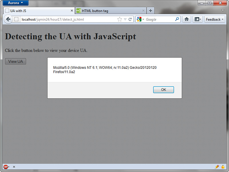
Figure 17.3 Testing the UA with JavaScript on a desktop
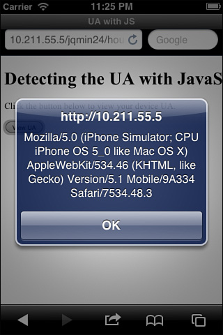
Figure 17.4 Testing the UA with JavaScript on the iOS simulator
Now that we know how to get the UA with JavaScript, let’s parse it and redirect the device to another location on page load. Listing 17.5 shows a script that redirects some mobile devices to another page when loaded.
Listing 17.5 Redirecting the Mobile Browser with JavaScript
1: <script>
2: var ua = navigator.userAgent;
3: if ((ua.match(/iPhone/i)) || (ua.match(/Android/i))) {
4: location.replace("http://localhost/mobile");
5: }
6: </script>
Line 1 begins the script element. Line 2 shows a variable being set up to contain the UA by use of the navigator.userAgent. This variable is important especially if you are going to be doing more than one check because the value will not change, so it can be stored in memory once instead of forcing the browser to grab it and compare it over and over again. Line 3 shows an if block that is using the .match() function on the ua variable. The .match() function takes a regex that it then compares to the string it is attached to, which in this case is the ua variable. The trailing /i on both the iPhone and the Andoid regex strings represents case-insensitivity. If you prefer, you may leave those off and change the ua variable setup to contain the .toLowerCase() function. Before you do that, though, keep in mind that using a regex is about 50% faster than using the .toLowerCase() function on the ua variable. Line 4 shows that when the if block is found to be true, it redirects the browser by using the .replace() function on the location object. Line 5 closes the if block, and line 6 closes the script element.
While this method does a great job of mimicking the server-side versions, you can also use this method to dynamically include different files. Listing 17.6 shows the contents of include_js.html, which gives an example of some JavaScript that includes another JavaScript file (external_script.js) when it detects either an iPhone or Android device.
Listing 17.6 Using JavaScript to Include Files Based on Mobile Detection
1: <!DOCTYPE html>
2: <html>
3: <head>
4: <title>UA with JS</title>
5: <script src="http://code.jquery.com/jquery-1.7.1.min.js"></script>
6: <script>
7: window.onload = function() {
8: var ua = navigator.userAgent;
9: if ((ua.match(/iPhone/i) || ua.match(/Android/i))) {
10: $.getScript('external_script.js'),
11: }
12: }
13: </script>
14: </head>
15: <body>
16: <h1>Including files based on UA with JavaScript</h1>
17: <p>If an alert is displayed, you are using an iPhone or Android device</p>
18: </body>
19: </html>
The file begins as a standard HTML file, but on line 5 we have included the jQuery library. Line 6 then begins a script element. Line 7 shows that we are going to run an anonymous function as soon as the page is loaded. Note that since we are using jQuery you could switch this code to run inside the $(document).ready(). Line 8 shows the setup of a variable named ua that contains the UA. Line 9 shows an if block starting and the ua variable being used with the .match() function to look for certain strings using regex. Line 10 shows an interesting jQuery function. This is a shorthand version of an AJAX call to an external script file. It pulls the external_script.js file into the DOM and executes it as soon as the load is complete. To learn more about the $.getScript() method, visit the official jQuery docs at http://api.jquery.com/jQuery.getScript/. Line 11 closes the if block. Line 12 closes the anonymous function that is running on page load. The rest of the file is mainly some description, so that it can be tested on other devices, or on a desktop. Figure 17.5 shows the results of running this page in the iPhone simulator.

Figure 17.5 The iPhone simulator matches the regex and loads the external JavaScript file.
Using this method you can include extra functions or libraries that you may want to run only on a mobile device. This is especially useful for libraries focused on touch events only.
To summarize the use of JavaScript for detecting and redirecting mobile devices let’s take a look at the pros and cons.
The pros to using JavaScript for mobile detection are
• The client does all the work.
• Can be combined with AJAX to include files dynamically.
• Not dependent on server technology to run.
The cons to using JavaScript for mobile detection are
• Can be ignored by turning off JavaScript on the client.
• Code is visible in the page source.
• Due to connection speeds a page may render before a script has finished executing causing possible site inconsistency for the user.
Now that you know about using the server and client to detect a mobile device, let’s look at a completely different way of handling mobile devices.
Non-Detection Solutions
The future of mobile browsing is changing rapidly, and the very definition of a mobile device is being challenged as the devices we take with us become more powerful and capable. Techniques that were used to detect mobile devices either do not work, or are working on the wrong devices. Another complication is the ability of some mobile browsers to alter the UA that they send to the server. This makes UA-only detecting methods fail, or obsolete.
While there are still some great solutions such as the Wireless Universal Resource FiLe (http://wurfl.sourceforge.net/) that keep an expanding list of mobile devices and provide an API you can use for mobile device detection, you should consider some existing solutions to help combat mobile devices.
Using Responsive Design
Creating a site that changes based on the viewing capabilities of the client certainly seems like best approach. It is comfortable to users because they get an experience that feels like it has been tailored to fit their device. It has been gaining in popularity as more and more sites are taking this approach in handling mobile devices.
Current mobile devices tend to have browsers that support most HTML5 and CSS3 features, making them ideal for use with a responsive design. Devices that have these browsers generally have a big enough processor in them to handle a fair amount of images as well as JavaScript processing. This is important to consider when handling mobile devices.
Device overload is becoming less of a problem, but it wasn’t all that long ago that I built a site that would routinely crash the mobile Safari browser. It was an elusive problem, and it wouldn’t happen every time the site was viewed. The problem turned out to be a couple of sprite images that were too large to be stored in memory and then referenced repeatedly when some elements were injected into the DOM. While this may not happen on current generation devices, older phones may be prone to problems similar to this.
Unless you are planning your site or app to work only with a specific list of devices, you need to rely on the use of analytics to give you clues as to how you should change your site. Many analytics packages are available including some open-source ones that you can compile and run on your own server. For ease of use, I recommend setting up a Google Analytics (http://www.google.com/analytics) account and using it to get a feel for what your users are using to view your site, and how they arrive on your site. With this information you can make a more informed decision on what dimensions your site should be designed for.
Another option you may need to consider with a responsive design is that some users may not want the responsive version of your site. While that may sound a little strange, there is one site in particular that whenever I visit, I instantly click on the View Full Site link. I do this because the mobile version of the site actually leaves out not only the navigation menu I want, but also an entire section of the site. While I may be in the minority, the idea of visiting the full version of the site is something left out of most responsive designs.
To summarize using a responsive design for handling mobile devices let’s take a look at the pros and cons.
The pros to using a responsive design are
• No dependence on the client UA
• Create an experience that fits a wide gamut of device resolutions
• Does not require the use of a separate site to maintain
• Does not require extra views, pages, or directories specifically for mobile users
The cons to using a responsive design are
• May not work with legacy or “dumb” phone browsers.
• The browser on the device must have either CSS3 support to run media queries, or it must be able to run JavaScript and a compatibility script.
• Creating a successful responsive design can take a lot of time and planning.
• Giving the user an option to view the full site is not generally offered and may need to be considered.
Now that we’ve discussed using a responsive design, let’s look at another way to handle mobile detection, without the detection.
Using jQuery Mobile
Why bother checking for a mobile device at all when you can use a framework that handles mobile devices as well as desktops? The jQuery Mobile library makes a fabulous choice when it comes to dealing with cross-platform and cross-device browsers. Only a handful of frameworks allow you to create and manage a mobile site that behaves the same way on a desktop. With jQuery Mobile you know that you are getting a well-tested, community-driven, and proven framework that is already included in everything from blogs to native applications.
jQuery Mobile is an ideal solution because not only does it work on most platforms, it contains a large amount of fallback support for legacy devices. That means that when someone browses your site with a legacy device, they can still use it. While it’s true that site functionality decreases, it does not leave them without a means of navigating. Another reason that makes jQuery Mobile an ideal solution is that it can be blended with custom CSS and JavaScript allowing you to customize your site exactly how you want. You can still use a responsive design with jQuery Mobile, and you can include other plug-ins to extend functionality.
To quickly summarize the use of jQuery Mobile as a method for handling both desktop and mobile devices, let’s take a look at some pros and cons.
The pros of using jQuery Mobile are
• No mobile detection needed, works on most devices.
• Other utilities, plug-ins, and design methods can be combined with jQuery Mobile.
• Part of the jQuery family.
The cons of using jQuery Mobile are
• The framework requires a download of assets including the jQuery library.
• The AJAX navigation model can get a bit complicated when used with template engines.
• Some elements may look a little out of place when viewed on high-resolution screens.
Summary
In this hour you learned not only why mobile detection should be considered, but also how to detect and redirect mobile devices on the server using a .htaccess file and PHP. It is also possible to use JavaScript to do some client-side mobile detection and redirection. These methods are all accomplished by reading the UA of the browser making the request to view the site. While the UA may be spoofed, it does give you a place to start with filtering any mobile devices.
Finally you learned that sometimes it may be better not to direct a user to a special mobile page or site, but instead to leverage a responsive design or just use jQuery Mobile to handle all site visitors.
Q&A
Q. How often do legacy devices really browse websites?
A. Smartphones may seem to be everywhere, but there are still many phones that are text-only or that use the Wireless Application Protocol (WAP). This all comes back to your own site analytics; you really will not know the frequency of legacy devices until you start tracking them.
Q. When can UA detection fail?
A. UA detection can fail when you are trying to target a specific browser. Many browsers have the same name in the mobile version as they use in the desktop version. This has happened in the past when attempting to target Gecko based browsers (Firefox). When creating the regex strings you are going to use, try to be as specific to the mobile device as possible. Even then you may run into trouble, so you need to test with as many devices as you can (both actual devices and emulators), and you need to do periodic updates to the regex strings you are using.
Q. I do not run an Apache server; can I still use a .htaccess file?
A. A few servers support the use of .htaccess files, but for the most part they work only on Apache servers. You can, however, with a little work copy the settings from .htaccess files into your current server config. For IIS v7+ users you can actually do most things you would do in a .htaccess file inside your Web.config file. Other servers such as nginx have support for a module that can be used to perform redirection (http://wiki.nginx.org/HttpRewriteModule). Take a look at your server guide and see whether there is a configuration file or module that works on your server.
Workshop
The workshop contains a quiz and some exercises to help you check your comprehension and understanding.
Quiz
1. What can a .htaccess file be used for?
2. What is a User Agent?
3. Why does using a test for JavaScript support make for an inconsistent detection method?
4. What gives you the best idea of what visitors view your site and on what devices?
5. What makes using jQuery Mobile so ideal for even legacy devices?
Answers
1. A .htaccess file can be used to control file access, read and write cookies, create redirects, and other things that would normally only be configured in server configuration files.
2. The User Agent is a string passed in the HTTP header request of a browser. This contains information about the browser and device that is doing the requesting.
3. While WAP devices will fail the JavaScript check and be directed to the proper page, most smartphones will pass the test and not be redirected.
4. An analytics package gives you a look at how a user found your site, what they came looking at it with, and how long they stayed. This is valuable information that can be used to help you optimize the mobile experience you are trying to convey.
5. Fallback support. Even when a user browses your site on a device that doesn’t provide all the bells and whistles that a newer device gets, they are still able to use the site and to browse it fully.
Exercises
1. Create your own .htaccess file and regex and experiment with using it. Try to redirect the mobile device to another page or site.
2. Using either a server-side method or JavaScript, create a couple of entries using a regex file that will direct different types of devices to different pages. For example, try redirecting tablet users to one page and small-screen devices to a different page.
3. Create a page that uses JavaScript to display the UA of the device viewing the page. If you want to get a little extra fancy, add a second section that uses some PHP to output the same information. Test with your JavaScript processing turned on and off and compare the results between the two methods.