Advanced Linear Model Techniques
By now, you can probably model your current project on a BurnUp Chart and have a pretty good idea of what will be done by when, as long as things progress the way they have been. But what if we run into some bad luck? Or what if our efforts to improve are paying off? This versatile chart can let you model other what-ifs, too, and help you keep a reasonable sense of how things are progressing based on a fuller picture of the situation. Let’s look at some techniques that can help you model what you know or suspect on a simple BurnUp Chart.
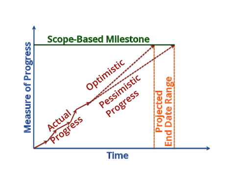
Optimistic and Pessimistic Projections
We started our estimation asking ourselves What Question Are We Answering?, but we might also look at the impression we’re trying to make. Are you looking to impress people with your progress and your software development skills? Are you looking to lower expectations, to avoid future disappointment? Are you considering the bounds of what is likely to happen, in both optimistic and pessimistic futures? The BurnUp Chart can represent all of these and at the same time make clear the future you’ve decided to believe.
As you look into the future, you might be tempted to extend the latest iteration’s rate of progress, especially if it shows a greater slope. You might convince yourself that the problems experienced during prior time periods have been solved.
Some people take a slightly more conservative approach and average the rate of the last three iterations and use that as the assumed future rate of progress.
Others extend the straight line from the beginning of the project to the latest data point, averaging together all of the ups and downs of past experience.
I prefer to eyeball it and draw both optimistic and pessimistic projections, taking into account any other things I know about the past and future rate of work. I know that the worst performance could easily return and the best performance is unlikely to be maintained.
All of these are valid approaches and all have potential to fool us. Question your choices, and get a second opinion if you’re unsure.
Scope Uncertainty
As much as you’d like to think you know exactly where you’re going, your goal line is an estimate of how much you need to build in order to accomplish what you want. You may want to indicate this scope uncertainty in your BurnUp Chart, as it widens the projected end-date range that you can expect. You can do so by marking optimistic and pessimistic scope lines.
If you have estimated a single value of scope, take a quick guess at the error bars around that value. It’s far more likely that you left something out than you will achieve your goals with less, but both are possible. Because of this, you should opt to draw the optimistic scope line closer to your single-value estimate than your pessimistic scope line. I usually expect two or three times the error in the pessimistic direction as in the optimistic, but that’s just a rule of thumb.
When you plot optimistic and pessimistic scope lines as well as optimistic and pessimistic projection lines, these pairs cross each other and bound a trapezoidal space. I call the area in this space the “zone of probability,” as it’s your most probable prediction of scope and schedule. This technique tends to give a reasonably honest amount of precision, as shown in the figure.
Don’t forget that there are numerous estimations contributing to this projection. You’ve estimated the scope you think you need. You’ve estimated the rate at which you think you can implement that scope. You’ve based that estimated rate on your historical measurements of accomplishment. These measurements have their own inaccuracies and uncertainties, and are therefore also estimates. That zone of probability is not a sharply defined trapezoid, after all. It’s an approximate probability. Keep that in mind, even if you don’t model it in your BurnUp Chart.
Despite the caveats about imprecision, it’s pretty easy to get a gut feel for the progress being made toward time and scope goals when looking at such a chart. You can easily reason about scope versus time trade-offs. You can see some of the components that go into the projections, and can question them individually. At the same time, you get a clear overview of the entire situation.
Moving the Goal Line
With agile software development, it’s generally assumed that the scope of work may be variable in achieving more valuable goals. There may be a hard deadline to hit, either to take advantage of an opportunity such as a trade show, or to avoid a penalty, such as a legal requirement. Or the focus might be on achieving a business goal, such as better market penetration, or a certain amount of cost savings, and both scope and schedule are secondary to that.
A BurnUp Chart has advantages over the more widely known BurnDown chart in that it easily displays changes in your goal. If you decide you need, or can afford, more scope, then move the horizontal line at the top of the chart up. If you trim scope, perhaps to meet a deadline, then move it down. Do this at the point the decision was made so the BurnUp Chart gives a record of the scope changes during the life of the project.
Such a chart gives you a clear visual display of how you’re doing, and what adjustments you’ve made. Few people need much explanation about what it’s saying. The rub, of course, is how to measure the total scope and the amount you’ve done so far. These “measurements” amount to estimates of what you really want. As previously mentioned, you’ll probably end up quantifying this in terms of outcomes—the capabilities that the system gives you. You choose outcomes because it’s the closest you can get to the things you really want, without significant measurement delay from when you do the work.
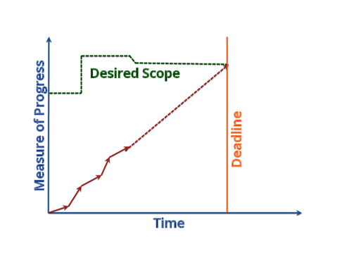
When the BurnUp Lines Don't Cross
I once worked with a project that was going to be done in an agile fashion, with my help, but the manager decided at the last moment not to risk introducing a new methodology. They still wanted my help in running the project, however. One of the things I did was create functional slices from the requirements document, and write them on 3x5 cards. From that, I created a simple BurnUp Chart showing the total number of cards and how many the development team reported were done. Each week, I updated this chart with the progress the team had made, as shown in the figure.
It wasn’t long, though, before we started to get changes in requirements from the business. Sometimes these replaced future cards, but most of the time these changes added new cards. Sometimes the development team was able to make progress against this inflation of expectations, but it was quite easy to lose ground. After a few months, it was easy to spot that the line representing the total amount of work was going up at a greater rate than the work completed line. It was obvious that this was a project that would not accomplish the goals given to it. We didn’t need an estimated completion date to see that.
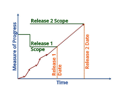
Multiple Milestones
You can do fancy things on one chart, such as track progress toward multiple milestones. We’ll take a deeper look at what some of these milestones might be in Chapter 6, Estimating Milestones, but one of the most obvious uses is estimating successive releases of the same product.
In this chart, you can see that the goals for the first release were lowered at the same time that the second release was planned. Perhaps the addition of additional goals prompted the decision to have a second release. Adding those goals to a single release would have delayed the release date. Instead, some of the original goals were postponed for the second release in order to move the first release earlier. This allows accruing value from the development effort of Release 1 without waiting for the additional value that’s been postponed to Release 2.
A multiple-milestone BurnUp Chart provides you more situational awareness in a complicated context than does an ordinary BurnUp. You can see how today’s efforts affect the plans for multiple milestones. You can shift scope from one milestone to another. And you can see how the work contributes to larger goals which are composed of those milestones.
Cumulative Flow Diagram
You can also enhance your BurnUp Charts to look inside of the work processes. The Cumulative Flow Diagram (CFD) is effectively multiple BurnUp Charts overlaid, showing what work has reached each stage in a multi-stage process.

Here we see a simple CFD with three stages. The light color at the bottom indicates work that has been accepted as finished; the middle is work in progress or waiting for acceptance, and the top is work that has been defined. The chart of accepted work is the same as the progress marked on a typical BurnUp Chart, and the chart of defined work is the same as the scope goal on the same. The area in between gives us a bit more information. It represents work that has been started but has not been accepted as complete.
Where this region widens (top to bottom), the CFD is telling you that there’s a bottleneck. Work is arriving at this stage faster than it’s leaving. The natural consequence is that it creates a buffer of unfinished work.
Most teams try to minimize such work in progress (WIP), as it is considered “inventory” in lean terms. It’s work that has cost, but not yet value.
In this particular chart, you can’t tell whether the development team is diligently working on these User Stories, or if they’re waiting for someone to accept them. Separating these two stages out into separate areas on the CFD would let you see which is typically the bottleneck, or when each constrains the progress. This extra information gives you insight on how to smooth the flow of work.
Of course, when working with a single team, the team members likely have a good understanding of where the bottleneck is. You can ask them. If they have a habit of starting all the work at once, even though they can’t reasonably get it to done for some time, putting this in a picture might be the illustration that helps them decide to change their behavior.
On a larger scale, it may be very hard to judge if WIP is growing overall. A CFD such as this will let you clearly see when it’s happening.