
If you look back at the origins of HTML, you’ll see a handful of particle physicists formulating a method for displaying scientific and educational data. Much of that information lent itself quite well to being displayed in a tabular format, and out of necessity, HTML tables were born.
Note
I kind of squeezed many years into the above paragraph. HTML was actually created in 1989 by Tim Berners-Lee. The first tables appeared in what was called HTML+ some four years later.
Tables are actually an excellent example of the true purpose of HTML. HTML was designed to be a layout language, and within a few years of the invention of HTML, tables began to play an important role in documents on the Web. As the Web progressed and HTML drifted into the hands of a more diverse collection of Web developers, it began to be stretched to limits far outside its original intent.
Over a decade later, Web developers are still using tables prolifically. Web development has drifted away from using tables for tabular data to using tables for complex layouts. You’d be hard-pressed to find a Web page these days that doesn’t contain at least one HTML table, and those that don’t are often the work of Web developers who are proponents of a building movement to trend away from tables in favor of using Cascading Style Sheets (CSS) for layout.
→ | For more information on using CSS, see “How CSS Is Applied”, p. 293 (Chapter 17). |
I’m not going to go into detail about replacing tables with CSS. I’m going to assume that if you’re reading this chapter, you want to learn about how to use tables efficiently, so that’s exactly what we’re going to do starting right now.
HTML tables are made up of hierarchical tags that define one or more columns and rows. A table begins with an HTML <table> tag that defines the properties of the table. The <table> tag has several optional attributes that can be used to control the table’s appearance.
Note
For details on the many attributes (including notations on which attributes are deprecated), see the W3C’s recommendation at http://www.w3.org/TR/html401/struct/tables.html.
I think it’s important for you to understand the basics of how a table is put together in HTML code. It will help you understand the choices you can make in the Expression Web table dialogs.
The next few pages will explain the tags that make up an HTML table. If you’re already familiar with the details of how a table is created in HTML, you can skip ahead to “Tables in Expression Web” on p. 160.
Barring any other formatting that overrides it, a table is aligned on the left of a page by default. The align attribute allows you to align a table on the right or make it centered in the page.
The following <table> tag aligns a table in the center of the page:
<table align="center">
The align attribute is a deprecated attribute, meaning that it is being replaced with a different method of specifying table alignment. The preferred method of aligning tables is to use CSS. However, when you specify alignment in Expression Web, it will use the depreciated align attribute.
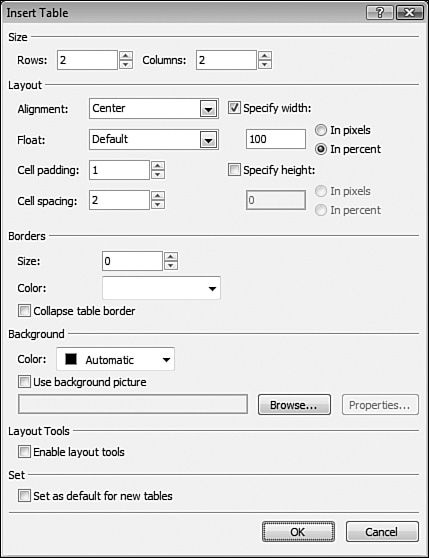
Listing 9.1 is the code that results from selecting Center in the Alignment dropdown of the Insert Table dialog as shown in Figure 9.1.
Example 9.1. HTML Code for a Table Using the Center Alignment Attribute
1 <table style=”width: 100%” align=”center”> 2 <tr> 3 <td> </td> 4 <td> </td> 5 </tr> 6 <tr> 7 <td> </td> 8 <td> </td> 9 </tr> 10 </table>
Notice that Expression Web has aligned the table using the align attribute. This method of aligning tables is deprecated and the preferred method is to use CSS.
→ | For more information on formatting page elements with CSS, see “Creating Style Sheets”, p. 289 (Chapter 17). |
Tip
All table attributes can be adjusted using the Tag Properties or CSS Properties (if applied using CSS) task panes.
→ | For more information on the Tag Properties and CSS Properties task panes, see “Understanding the Tag Properties Task Pane”, p. 216 (Chapter 12) and “Using the CSS Properties Task Pane”, p. 326 (Chapter 18) respectively. |
The border attribute specifies how many pixels to use for a table’s border. Setting this attribute to a value of 0 creates a table with no border. The default value is 1 in Expression Web, but you can easily change that in the Insert Table dialog shown in Figure 9.1.
Tip
If the default table settings that you see in Figure 9.1 don’t suit your needs, you can change them to whatever you wish and then check the Set As Default For New Tables checkbox before you click OK. From then on, the Insert Table dialog will default to your new settings.
A table border is affected not only by size, but also by the cellspacing attribute. In Figure 9.2, the table shown has a border size of 2 and a cellspacing value of 2. Notice that it appears to have a double border. The table in Figure 9.3, on the other hand, has a solid border without the double border appearance. The only difference between the two tables is that the table in Figure 9.3 has a cellspacing value of 0 instead of 2.


Figure 9.3. In comparison to the table in Figure 9.2, this table has a cellspacing of 0. All the other attributes are the same. Notice the double border is now gone.
The cellpadding attribute is a pixel or percentage value that specifies the amount of space between the border of a cell and the contents of the cell.
A common use of cellpadding is to provide a buffer for content in separate cells. The table in Figure 9.4 shows a common use of tables in Web design. An image is in one table cell and the accompanying text is in another table cell. In this example, cellpadding is set to 0. Notice that the text in the second cell is touching the right edge of the image, making the presentation look unprofessional.

In Figure 9.5, I’ve set the cellpadding to 4. All other settings remain the same. Notice that the application of cellpadding has transformed an unprofessional presentation into an attractive and effective one.

As demonstrated earlier in “The border Attribute” section, the cellspacing attribute controls the space between cells. It can be specified in either pixels or a percentage value.
The difference between cellspacing and cellpadding can sometimes be difficult to see. As shown in Figure 9.6, cellspacing adds space between the border of the table and the border of a table cell, as well as adding space between table cells. Cellpadding, on the other hand, adds space between the inside border of a cell and the content occupying the cell.

The frame attribute provides for more granular control over how the border of a table is rendered. Without a border, the frame attribute has no effect.
The frame attribute can be configured in the Tag Properties task pane and can have any one of the following values:
above—. The border across the horizontal top of the table will appear in the browser. Other borders will be ignored.below—. The border across the horizontal bottom of the table will appear in the browser. Other borders will be ignored.border—. A border will be drawn around the table as a box. This setting produces the same output as theboxsetting.box—. A border will be drawn around the table as a box. This setting produces the same output as thebordersetting.hsides—. A border will be drawn on the horizontal sides of the table. In other words, a border will be visible across the top and bottom of the table.lhs—. A border will be drawn on the left side of the table. (LHS stands for left-hand side.)rhs—. A border will be drawn on the right side of the table. (RHS stands for right-hand side.)void—. A border will not be drawn around the table. Even if a border is explicitly set on the table tag, if theframeattribute is set tovoid, the border will not appear.vsides—. A border will be drawn on the vertical sides of the table. In other words, a border will be visible along the left and right sides of the table.
Note
While the frame attribute isn’t deprecated, many Web designer prefer to use the CSS border properties. See http://www.w3.org/TR/REC-CSS2/tables.html#borders for specific information.
Now that you’re familiar with the makeup of the <table> tag, it’s time to dig into the other tags that make up a table.
An HTML table is really just a collection of rows and columns. Rows are defined by <tr> tags and columns are defined by <td> tags. <td> tags cannot exist outside of a <tr> tag. The code in Listing 9.2 defines a simple HTML table containing two rows and two columns.
Example 9.2. Code for Table Containing Two Rows and Two Columns
 1  <table>
 2       <tr>
 3            <td>Row 1, Column 1</td>
 4            <td>Row 1, Column 2</td>
 5       </tr>
 6       <tr>
 7            <td>Row 2, Column 1</td>
 8            <td>Row 2, Column 2</td>
 9       </tr>
10  </table>
Each <td> tag pair that you see in Listing 9.2 represents one cell in the table. In this example, each column and row contain the same number of cells. In some cases, you may want to combine two or more cells into one cell. When you combine cells in a row, you use the colspan attribute on the row. When you combine cells in a column, you use the rowspan attribute on the column.
Figure 9.7 demonstrates the effect of using the colspan and rowspan attributes on a table.
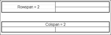
For many people, dealing with the colspan and rowspan attributes in HTML code is difficult and confusing. Fortunately, Expression Web makes it easy, but it’s still helpful to understand what’s going on under the covers.
The code that follows defined the table shown in Figure 9.7, which has a rowspan of 2. Notice that the second <td> pair is missing from the second <tr> tag due to the first column spanning two rows.
<table>
<tr>
<td rowspan="2">Rowspan = 2</td>
<td> </td>
</tr>
<tr>
<td> </td>
</tr>
</table>
The colspan attribute, on the other hand, merges two or more cells horizontally across two or more columns, as shown previously in Figure 9.7. The code that follows defined the table shown in Figure 9.7, which has a colspan of 2.
<table>
<tr>
<td colspan="2">Colspan = 2</td>
</tr>
<tr>
<td> </td>
<td> </td>
</tr>
</table>
In this table, the second <td> pair is missing from the first row because the colspan attribute causes both cells in that row to be merged into one column.
There are several alignment options for table cells. One way to align content in a table cell is by using the align and valign attributes. These attributes are actually deprecated in favor of CSS alignment, but many Web developers still use them because of their widespread support by most browsers.
The align attribute aligns content horizontally in a table cell. Valid values are left, right, and center. The valign attribute aligns content vertically. Valid values are detailed in the following sections.
The baseline value aligns content on a common baseline. This option is best used when a cell contains a single line of text.
If you look at a line of lowercase letters, you’ll see that the bottoms of most letters are aligned horizontally. (Letters such as g, y, and j are exceptions.) That line upon which the letters are aligned is the baseline. Setting the valign attribute to a value of baseline will align the content in your cell on the baseline.
When the valign attribute is set to bottom, the cell’s content is aligned at the bottom of the cell, as shown in Figure 9.8.

A valign value of middle will center the cell’s content vertically, as shown in Figure 9.9. This is the default setting. If no valign attribute is specified, cell content will be centered vertically.

The most common valign value is top. The table in Figure 9.10 shows the result of setting the valign value to top.

This setting is often employed when using tables to align sliced images, as you’ll see later in this chapter.
Now that you know the basics of how a table is built in HTML code, let’s dig into how tables are created in Expression Web.
There are several ways to work with tables in Expression Web, but you can break them all down into five major methods: the Insert Table dialog, Table menu, Tables toolbar (for drawing tables in the designer), the Layout Tables and Cells task pane, and the Tag Properties pane. Each method is suitable to specific types of tasks, but you may find that you gravitate more toward one than the others. Even so, it’s best to learn the strengths of each method so you can efficiently create and manage your tables.
→ | For more information on using the Tag Properties pane, see “Editing Tag Properties”, p. 238 (Chapter 13). |
The Insert Table dialog (see Figure 9.1) is displayed by choosing Table, Insert Table in Expression Web. If a table has already been inserted on your page, you can access the Table dialog by right-clicking on the table and selecting Table Properties from the menu.
The Insert Table dialog is divided into several sections:
Size—. The Size section includes settings for the number of rows and columns.
Layout—. This section includes alignment settings, width and height settings, and
cellpaddingandcellspacingsettings.Borders—. This section includes settings for border size, border color, and a checkbox that allows you to easily collapse the border.
Background—. This section includes a setting for background image and background color.
Layout Tools—. This section includes a checkbox for enabling the table Layout Tools. We’ll discuss the Layout Tools later in this chapter.
Set—. This section includes a checkbox to configure the default settings for future tables.
Expression Web can automatically format your table using the AutoFormat feature. Select Table, Modify, Table AutoFormat to access the Table AutoFormat dialog as shown in Figure 9.11. However, it’s likely that you’ll want more control over the formatting, and for that, you’ll need to use the options available to you on the Table menu.

Tip
You’re not going to want to auto-format your table if you’re using it to control layout. The Table AutoFormat feature is well-suited to displaying data in a table, but it’s not a good choice for a table that defines layout.
The Table menu is actually made up of two menu systems. The Table menu on the main menu bar allows you to insert a new table or draw a new table. After a table has been added to your page, you can use either the Table menu on the main menu bar or the Table context menu (see Figure 9.12), accessed by right-clicking on a table, table row, column, or cell.
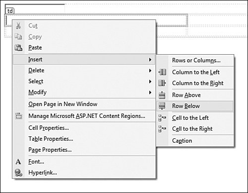
The Table context menu is essentially the same menu that you’ll find on the main toolbar. However, when working on a table in the designer, it’s more convenient to be able to simply right-click on the table to change it. As we go through the rest of this section, you can use the Table menu on the main menu bar and the Table context menu interchangeably.
Let’s work through some common table tasks using the Table menu. Begin by creating a new page. We’ll use this page to experiment with tables throughout the rest of this chapter.
Add a new table to your Web page by selecting Table, Insert Table from the main menu.
Make sure that the number of columns is set to
3, the number of rows is set to2, the border size is set to1, and the width is set to400 pixels.Set the border color to
black.Set
cellspacingandcellpaddingto5and clickOKto insert the table.
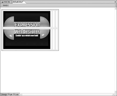
You should now have a table that looks like Figure 9.13.

The table you’ve created has two rows and three columns. Say that you want to add a graphic into the left column of this table, and you want that graphic to take up the entire column. There are a couple of ways to accomplish that. You could slice the graphic into two pieces and insert one piece in each cell in the column. However, because the table has cellspacing and cellpadding values of 5, that won’t result in the effect you want. Instead, as shown in Figure 9.14, you’ll end up with space around the graphic that makes it painfully obvious that it’s two graphic files.
Note
The graphics used in this chapter are located in the ch9filesWebsiteimages folder on the CD that accompanies this book.
In this case, a better solution would be to merge the two cells in the leftmost column into a single cell. You can then insert the Expression Web graphic into that one cell without having to slice it and you’ll end up with exactly what you want.
Tip
An alternative here would be to remove the cellspacing and cellpadding. However, for this example, we want to keep those settings as they are.
The first step in merging the cells in the leftmost column is to select both cells. There are many ways to do that.
Use the Quick Tag Tools.
Move the insertion point to the top of the column until the cursor becomes a downward-pointing arrow and click.
Select the first cell by clicking on it and then drag the mouse downward to select the entire column.
With the insertion point in one of the cells, hold the Ctrl key down and click in the other cell.
Select the HTML code in Code View.
→ | For more information on using the Quick Tag Tools, see “Using the Quick Tag Tools”, p. 227 (Chapter 13). |
→ | For more information on editing HTML code in Code View, see “Using Web Page Views”, p. 127 (Chapter 8). |
I personally prefer to move the insertion point to the top of a column and then click when I see a downward-pointing arrow. After you select the cells, right-click on either of them and choose Modify, Merge Cells. You should end up with a table like Figure 9.15.

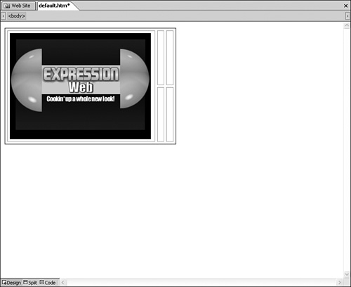
Click inside the cell that you’ve just merged and insert a graphic. You can use the ewd.jpg graphic from the ch10filesWebsiteimages folder on the CD that accompanies this book. Your table should now look like Figure 9.16.
→ | For more information on working with images in Expression Web, see “Using Graphics and Multimedia”, p. 241 (Chapter 14). |
At this point, the alignment in your table looks fine. However, as new content is added, things will change.
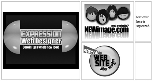
Add the
newimage.jpgimage to the top center cell.Add the
killer.jpgimage to the bottom center cell.Add some text to the upper right and lower right cells.
You should now have a table that looks similar to Figure 9.17. Things have obviously gone terribly wrong and our table doesn’t look good at all at this point.
Fortunately, we can fix this problem with a few tweaks to alignment and a small change in the size of the table.
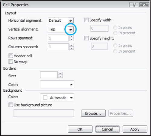
Right-click on the large graphic in the leftmost cell and choose Cell Properties from the menu. The Cell Properties dialog appears.
Click the Vertical Alignment dropdown and select
Top, as shown in Figure 9.18. ClickOK.Repeat steps 1 and 2 for both cells in the right-most column.
Your table should now look like Figure 9.19.

The final step is to change the width of the table. There are several ways to adjust the width of a table.
Select the table and drag the right edge until the table is the desired width.
Edit the HTML in Code View.
Use the Quick Tag Tools.
Select Table, Table Properties, Table on the main menu to access the Table Properties dialog, where you can modify the width.
Right-click the table and choose Table Properties from the menu to access the Table Properties dialog, where you can modify the width.
To alter the width of the table in the Table dialog, check the Specify Width checkbox and enter a new value for the width, as shown in Figure 9.20. I have chosen a width of 765 and I’ve selected the In Pixels radio button so that the table will be 765 pixels in width. Your table should now look like Figure 9.21.


Note

If your table runs way off the right edge of the screen after adjusting the width, see “Table Is Too Wide” in the “Troubleshooting” section of this chapter.
In the example we just worked through, we created a table that had just the right number of rows and columns for our needs. In almost all cases in the real world, you will need to adjust the number of rows and/or columns after a table has already been inserted. Fortunately, Expression Web provides numerous ways for doing this.
It goes without saying that you can open the Table Properties dialog we’ve worked with previously and change the number of rows or columns. Adding a new row using this method will always add the row to the bottom of the table. Adding a new column using this method will always add the new column to the right side of the table. This may not be what you want, so if you want more control, you’ll need to use one of the other methods that Expression Web provides.
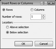
Right-click on the leftmost cell in the table and select Insert, Rows and Columns.
In the Insert Rows or Columns dialog, select
Rows, making sure that the number of rows is set to1, and thatBelow Selectionis selected, as shown in Figure 9.22.Click
OKto insert a new row to the bottom of the table.
We’ve covered most of the basics about tables and how to change the properties of them in Expression Web. Now we’ll get into some more interesting information about what you can actually do with tables.
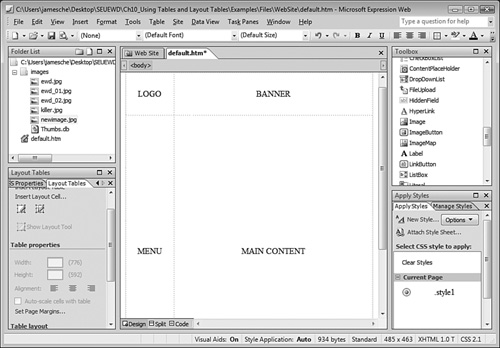
By far, the most common use of tables is to lay out page elements. As I mentioned when I opened this chapter, most Web sites use tables for site layout. However, the tools that we’ve covered up to this point are a bit awkward for designing complex layouts. Wouldn’t it be nice if you could just draw areas on a page with a pencil and let Expression Web create tables for you based on that drawing? It might surprise you to learn that Expression Web allows you to do just that!
The Layout Tool was first introduced by Microsoft in FrontPage 2003. I must admit that because I was so entrenched in the traditional way of working with tables, I largely ignored this feature for quite some time. I must also admit that once I tried the Layout Tool once, I couldn’t live without it.
The Layout Tool bears a slight resemblance to the table features in Adobe Dreamweaver, but it’s much more powerful and flexible. When you activate the Layout Tool, your table borders change to a green color to indicate that the Layout Tool is active. Expression Web provides indicators in the user interface (shown in Figure 9.23) that make precise resizing of cells easy. Simply drag cell borders to the desired dimensions using the size indicators as a guide.

The Layout Tool is designed to assist you with configuring not only table layout, but also the dimensions of your table cells. Setting the dimensions of table cells properly can be challenging. If your table is 700 pixels wide, the combined width of all the columns in the table should add up to 700.
It’s easy to skew the width of a column so that the combined width of all your columns is either less or more than the table’s width. When that happens, it’s likely that you won’t notice it, but you will notice bizarre behavior in your cells. For example, you might set the width to 20 pixels for a particular column and yet no matter what you do, the column appears to be much wider in Expression Web.
The reason for this kind of odd behavior is simple: If you tell Expression Web that a table should be 700 pixels in width, it will expect that all of the columns of that table do actually add up to 700 pixels. When they don’t, Expression Web doesn’t know how to deal with it, so it guesses. One thing’s for sure: If you allow a computer to guess at anything, it will always guess wrong.
Take a look at Figure 9.23 again. Notice the numbers around the edges of the table? These numbers tell you the width and height of the cells in the table. If your table is configured correctly, you will see only one number for each value. However, if there is a contradicting width or height somewhere in the table, Expression Web will display the contradicting value followed by the actual value in parentheses.
I realize this might be a little hard to understand, so let’s have a look at it in detail. Instead of dealing with the entire table from Figure 9.23, let’s just look at the leftmost column. This column contains an image that is 216 pixels in width. The table cell itself is currently 220 pixels in width, but the actual HTML code says that the cell should be 84 pixels wide. Expression Web indicates this by displaying 84(220) in the layout cell, as shown in Figure 9.23.
Tip
Not all widths and heights display by default. If you hover over one of the diamond-shaped areas at the intersection of cells, Expression Web will display the dimensions of that particular cell.
To understand why Expression Web believes this cell should be 84 pixels wide, let’s look at the HTML code for this table. Listing 9.3 shows the HTML for the table.
Example 9.3. HTML Code for the Table in Figure 9.26
1 <table border="0" width="428" height="196"> 2 <!— MSTableType="layout" —> 3 <tr> 4 <td valign="top"> 5 <img src="images/newimage.jpg" width="216" height="162" /></td> 6 <td valign="top"> </td> 7 <td valign="top" height="166" class="style1">NEWimage.com is the 8 8 only Web design shop you'll ever need.</td> 9 </tr> 10 <tr> 11 <td width="84"> </td> 12 <td width="84"> </td> 13 <td height="23" width="238"> </td> 14 </tr> 15 </table>
After reading the material at the beginning of this chapter, this HTML code should be pretty easy to follow. You can see that there are two <tr> pairs, one for each row. Each <td> pair within a <tr> pair represents a column. If you look at Lines 11 and 12, you can clearly see that these cells are explicitly set to a width of 84 pixels. The corresponding cells in the rows above appear on Lines 4 and 6. In those cells, there is no explicit width setting, but the image in the first cell implicitly sets the width of those cells to at least 216 pixels, the width of the image. The result is a contradicting width of 84 pixels.
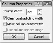
Fortunately, the Layout Tool makes it easy to fix contradicting widths. What you should do in this scenario is explicitly set all the cells in the first column to at least 216 pixels. To do that in Expression Web, click the cell width indicator and select Change Column Width, as shown in Figure 9.24. This will display the Column Properties dialog (see Figure 9.25). In the Column Properties dialog, set the Column Width to the desired value, check the Clear Contradicting Width checkbox, and click OK. In this case, the value we would enter for the column width is 221. By entering 221 for the column width, we account for the column width indicated by the Layout Tool along with the cell padding of 1 pixel.

Let’s have another look at the HTML now that Expression Web has removed the contradicting width.
<table border="0" width="428" height="196">
<!— MSTableType="layout" —>
<tr>
<td valign="top">
<img src="images/newimage.jpg" width="216" height="162" /></td>
<td valign="top"> </td>
<td valign="top" height="166" class="style1">NEWimage.com is the only
Web design shop you'll ever need.</td>
</tr>
<tr>
<td width="221"> </td>
<td width="84"> </td>
<td height="23" width="238"> </td>
</tr>
</table>
Notice that Expression Web did not add a width attribute to the cell containing the image. Instead, it increased the width on the corresponding cell in the second row to 221. The Layout Tool now shows the width without a contradicting width, as shown in Figure 9.26.

Note
If you choose the Clear Contradicting Height or Clear Contradicting Width checkbox and Expression Web still indicates that there is a contradicting width or height, see “Cannot Clear Contradicting Height or Width” in the “Troubleshooting” section of this chapter.
The Layout Tables task pane provides many tools to make creating and arranging layout tables easy. To access the Layout Tables task pane, select Task Panes, Layout Tables.
Tip
The Layout Tables menu item toggles the Layout Tables task pane on and off. If the Layout Tables menu item is checked but the task pane isn’t visible, select Layout Tables to uncheck the item and then select it again to re-check it. When you do, the task pane will receive the focus.
Using the Layout Tables task pane, you can:
Easily draw layout tables using drawing tools.
Draw new cells to arbitrary locations within an existing table.
Drag and drop cells inside a table as if they were self-contained objects.
Extend a table or parts of a table and let Expression Web draw the necessary columns and rows to maintain table integrity.
Force columns and rows to auto-stretch to contain content.
Take advantage of powerful cell formatting features using the Cell Formatting pane.
Ensure that table cells size correctly by inserting graphic spacers.
The Layout Tables task pane is a powerful method of accessing all the formatting features you’ll need to create complex tables of any makeup. If you’re willing to settle for a common layout, you can choose one from the Table Layout section of the task pane to create your table with one click, as shown in Figure 9.27.
There are some tradeoffs to using the automatic layout feature. First of all, the ability to add new layout cells will be limited. You’ll be able to add new layout tables inside existing cells, but Expression Web won’t let you add cells to pre-existing tables using the drawing tools. Another capability that you’ll lose is the ability to drag and drop table cells to reposition them within your table.
Tip
As you are resizing your table cells, you can ensure that empty cells maintain their width by using a column spacing image in the cells.
Expression Web makes it simple to insert a column spacing image. Just click the size indicator for the column with the Layout Tool activated and choose Use Column Spacer Image from the menu.
A better choice than the automatic layout feature is to start by drawing a new layout table using the Draw Layout Table tools shown in Figure 9.28. You can then draw new layout cells within the table using the Draw Layout Cell tool, also shown in Figure 9.28. If you decide that your cell isn’t in quite the right place, you can actually drag and drop the cell right in Design view, which will dynamically recreate the table to match what you’ve drawn.

Note
If you’re unable to drag a cell in layout mode, see “Cannot Drag and Drop Cells in Layout Table” in the “Troubleshooting” section of this chapter.
When I insert my table, the right edge is way off the screen. Why is that happening?
Make sure that you aren’t setting a width of over 100%. This is commonly caused by moving from a pixel setting to a percentage setting. For example, if you have a table that is set to 600 pixels wide and you later decide to change it to a percentage, you might accidentally just select the Percent radio button in the Table dialog. Doing so will set the table to 600%, and such a setting would run clear off the right side of the page.
I am trying to clear contradicting height and width settings in my layout table and Expression Web still shows that one exists even after clearing it.
Expression Web sometimes doesn’t clear contradicting measurements on the first try. In such cases, try increasing the width or height of the cell you are adjusting by a value of 1. That should do the trick.
I am trying to reposition a cell in my layout table. I can drag it around just fine, but when I try to drop it, it just jumps back to its original position.
You can only drag and drop layout cells. Chances are you are trying to drag a table within a table.
The best method of ensuring that you won’t encounter this problem is to create your table as a layout table in the first place using the Layout Tables and Cells task pane.
One of the most frustrating endeavors for Web developers is ensuring that a Web site looks great in all screen resolutions. If you design for a resolution of 1024×768 and someone with a resolution of 800×600 browses your page, it won’t look the same. There are a few different ways you can alleviate this problem.
The first way is the easiest, and that is to set your main content table to a width of around 95%. Why 95% instead of 100%? It will look better if you allow for a small buffer space around the window’s scrollbars, and so on.
The second way is to specify a pixel width for those columns that require it and then have one column that is configured to fill the rest of the available screen space. For example, suppose you have a table with a menu along the left border and some ads along the right border. You would want the left and right borders to be a fixed pixel size so that they match the size of the menu and the ads. The center column can be configured to fill the rest of the screen area by setting it to 100%.
The last method is to create your table so that it will fit nicely in the lowest resolution you believe people will use when visiting your Web site. If you choose this route, you’ll want to make sure that you account for the fact that you don’t really have 100% of the width of the screen to work with. For example, my wife runs her computer at a resolution of 1024×768, but she also always keeps the Favorites panel open in her Web browser. Therefore, she’s got about 800 pixels in width that is visible to her even though her screen resolution is quite a bit higher.
Which method should you choose? The first two are the best choices. If you go with a percentage value, you can always be sure that most people will be able to view all your content without unnecessary scrolling.