Enhancing the Plot
Specifying the Axes Labels
Sometimes you might want to supply
additional information about the axes. You can enhance the plot by
specifying the labels for the vertical and horizontal axes.
Specifying the Tick Marks Values
In
the previous plots, the range on the horizontal axis is from 1960
to 2010. Tick marks and labels representing the years are spaced at
intervals of 10. You can control the selection of the range and the
interval on the horizontal axis with the HAXIS= option in the PLOT
statement. A corresponding PLOT statement option, VAXIS=, controls
the values of the tick mark on the vertical axis.
The forms of the HAXIS=
and VAXIS= options follow. You must precede the first option in a
PLOT statement with a slash.
PLOT vertical*horizontal /
HAXIS=tick-value-list;
PLOT vertical*horizontal /
VAXIS=tick-value-list;
For example, to specify
tick marks every five years from 1969 to 2010, use the following option:
haxis=1960 1965 1970 1975 1980 1985 1990 1995 2000 2005 2010Or, you can abbreviate this list of tick marks:
haxis=1960 to 2010 by 5
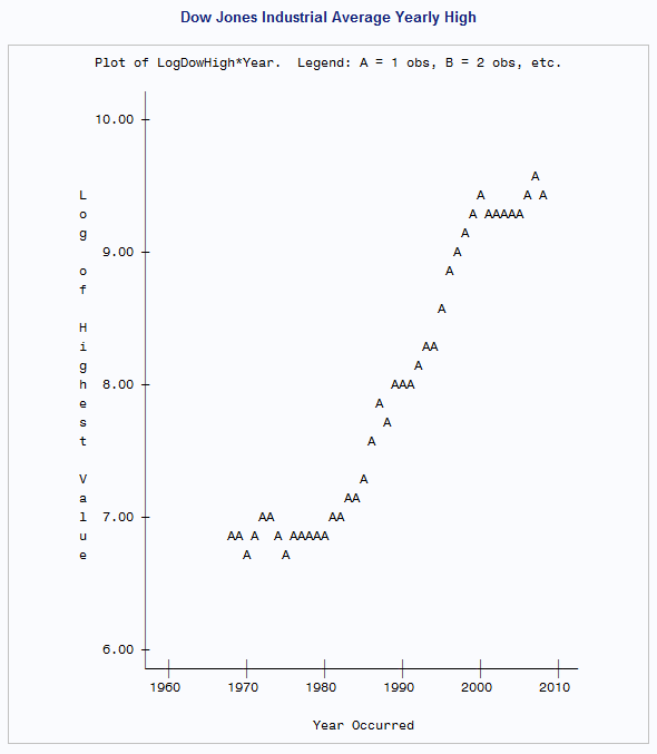
The following program
uses the HAXIS= option to specify the tick mark values for the horizontal
axis:
proc plot data=highlow;
   plot LogDowHigh*Year / haxis=1968 to 2008 by 4;
   label LogDowHigh='Log of Highest Value'
         Year='Year Occurred';
   title 'Dow Jones Industrial Average Yearly High';
run; 
Specifying Plotting Symbols
By
default, PROC PLOT uses the letter A as the plotting symbol to indicate
one observation, the letter B as the plotting symbol if two observations
coincide, the letter C if three coincide, and so on. The letter Z
represents 26 or more coinciding observations.
If you are plotting
two sets of data on the same pair of axes, you can use the following
form of the PLOT statement to specify your own plotting symbols:
PLOT vertical*horizontal='character';
where character is
a plotting symbol to mark each point on the plot. PROC PLOT uses this
character to represent values from one or more observations.
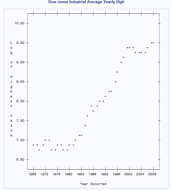
The following program
uses the plus sign (+) as the plotting symbol for the plot:
proc plot data=highlow;
   plot LogDowHigh*Year='+' / haxis=1968 to 2008 by 4;
   label LogDowHigh='Log of Highest Value'
         Year='Year Occurred';
   title 'Dow Jones Industrial Average Yearly High';
run;
The plotting symbol must be enclosed in either
single or double quotation marks.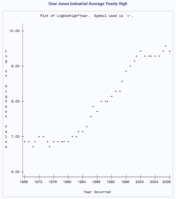
Removing the Legend
Often, a few simple changes to a plot can improve its
appearance. You can draw a frame around the entire plot, rather than
just on the left side and bottom. This makes it easier to determine
the values that the plotting symbols represent on the left side of
the plot. Also, you can suppress the legend when the labels clearly
identify the variables in the plot or when the association between
the plotting symbols and the variables is clear.
The following program
uses the NOLEGEND option to suppress the legend and the BOX option
to box the entire plot:
proc plot data=highlownolegend; plot LogDowHigh*Year='+' / haxis=1968 to 2008 by 4box;label LogDowHigh='Log of Highest Value' Year='Year Occurred'; title 'Dow Jones Industrial Average Yearly High'; run;
..................Content has been hidden....................
You can't read the all page of ebook, please click here login for view all page.