Chapter 4
Light, Color, and Use

Before you shoot, you must understand the end use. If you don’t, you may create some fabulous images, but how they are going to be used is far from what you envisioned. Let’s say your photos make quite a stir on the internet, bringing millions of page views for a web site and your the photographic fame spreads far and wide for those 1530 × 1024 pixel per image JPEG files. When someone offers you a substantial sum of money for 2’ × 3’ prints of those images and you shot them as 1.6 megapixels jpegs, you’re not only out of luck, you’re out of income.
Equally, if you shoot for print publishing and process all of your photos as CMYK, so that you can see exactly how they are going to print, when the client tells you that they accept only RGB, you need to rework the whole job.
You can have complete flexibility in the creation of the raw file, but knowing end use determines how the image is lit and how the color is interpreted.
Newspaper publications and ink jet printers both use cyan, magenta, yellow, and black inks for their color images, but the range of light for the two are completely different. If newspaper is the primary use, you need to calculate for that.
Images that run on high-definition plasma screens have a very different viewing audience than images on the web. However, what prolific television news organization does not run their best content on web pages, too?
Build your imagery house on a firm foundation.
The End Use Determines Everything
Consider a fraction of the end uses that just one of your photographs could have over the vast available media spectrum:
• Small ink jet prints
• Internet
• Books/fine magazines
• Newspaper
• Big screen TV
• Canvas/fine art paper exhibit prints
• Jumbo point of purchase
The only thing that the items on this short list of media have in common is that your work can be the content.
At times the needs are quite specific and at other times they are as vague as they can get.
There are color models and gamuts and resolutions and image sizes and ranges of light and file sizes to consider, before you even begin to plan the shoot.
Tone Compression
There’s a ratio of about 1,000:1 of the tones we see in the sky, on a sunny day. Consider the brightest spot on the top of a bright, glistening fluffy cloud, on one end of the ratio, and the near impossible to see details of under the darkened stairs, at the end of a blind alley on the other.
We reduce that 1,000:1 ratio photographically to less than 100:1.
Once we put that image up on a fine-quality sheet-fed printing press running a high-opacity paper with a bright gloss surface, our ratio gets down to around 20:1, at best.
This ratio reduction is known as “tone compression.” It’s a common problem.
Dynamic Range and the Printing Process
A great photo session can delight the photographer, the client, and everyone involved. Viewing the images at 100% on a large, crisp, bright, calibrated display can bring “Ooo!” and “Ahhh!” responses from all at the brilliant highlights and fabulous shadow details and eye-popping color.
However, once it’s proofed, on press, everyone is disappointed.
What happened?
Using the metering techniques that we discussed in the last chapter, you should be able to hold the details in the highlights and shadows over a range of at least six f-stops, maybe even more.
The printing process converts those continuous RGB tones on your monitor to tiny halftone dots on a CMYK press.
The color model is different. The means of reproducing the photo is different, too.
These differences mean that the sheet-fed press has the ability to reproduce only a four f-stop range. To a pressman, this is known as a density range of around 1.9.
On the Web
Have you ever done an absolutely gorgeous web site for a client that people send you much kudos over, only to hear that it looks dark or the color is off?
You may have calibrated LCD displays but others can be judging your work from five-or ten-year old CRT monitors that know no means of correction for color, brightness, or contrast.
Broadcast Digital Television versus Internet
Broadcasters are in a media-rich environment. It’s not just the six o’clock news. The public’s appetite for information is 24/7/365, and it must be fed constantly.
News is delivered in DV, on the web, in QuickTime, as Flash, in PDF, on iPods. It’s everywhere, in every form. One size does not fit all.
To satisfy these needs, you need an managed workflow. One image must be reprocessed for multiple uses, in multiple sizes, in multiple formats, all in next to no time.
These are exciting times for the image-maker. Embrace the technology. Unleash the creative synergy. Learn how to balance the light and color to its best.
This dramatically enlarged newspaper photo provides a clear view of why the off set printing process has a limited dynamic range of color and light.

Color Models
Color is communicated with an alphabet soup of initials.
Each model has its own qualities and limitations. These models dictate the final appearance of your photographic efforts.
A color model is actually an abstract mathematical model. Each one has three or four component colors. Each component is numbered. When the numeric value of each is adjusted, a separate color is created.
Color models are many. We’re focusing on the ones that you encounter in most photographic work environments.
RGB
This model of red, green, and blue is well known to monitors, cameras, scanners, and televisions. Notice how each of these sources of color information deal with light. RGB is an additive color model. Light is the foundation of additive color. Add red light to green and you get yellow. Switch the light’s green filter to blue and the mix will be magenta. Now mix blue and green and you’ll get cyan. When all three are at full intensity, the result is white. Shut off all three and we get black.
These additive colors are the same as those that stimulate the receptors of our eyes. They are the closest to the human visual experience.
When all three are at full intensity, the result is white. With nothing added and all three shut off, we get black.
RGB has a broad gamut. It’s a larger range of color than the second most popular color model, CMYK. That’s why RGB is an excellent model for your raw images.
Additionally, we have the RGB web colors that are an indexed set of 256 or fewer, specifically for use in web graphics, primarily in the GIF format. These were once critical due to limitations with internet bandwidth and the capabilities of early color monitors.
CMYK
The process colors of the printing press are cyan, magenta, yellow, and black. They are the basis of your ink jet printer, as well.
CMYK is a subtractive color model. It is known as such because it starts with a surface, such as paper, and adds ink or dye over it so that less of the surface is visible.
Cyan light is an equal mixture of green and blue, so cyan ink reflects all but red light.
Yellow is an equal mixture of red and green, so yellow ink reflects all except blue light.
Green light is the only one not reflected by magenta ink. As you may have guessed, it’s an equal mixture of red and blue.
The darkening agent is the black, which also adds an appearance of a more crisp image.
HSB
Hue, saturation, and brightness is also known as HSV and HSL. Those designations call brightness “value” or “lightness.” It’s also known as LCH for lightness, chroma, and hue. It’s all the same thing but with different names, to keep us on our toes.
The HSB model is found in software applications like Adobe Photoshop and is a different representation of RGB. It’s also in some color choosers.
Lab Color
In the Lab color model, the “L” represents lightness and is intended to match how human vision deals with the lightness. The “a” and “b” are two channels of hue and saturation components. It’s intended to have a perceptual uniformity and can be used to make accurate color balance corrections. This is unlike RGB or CMYK, in the sense that they are designed for output devices like cameras and printers, rather than human visual perception.
Lab is also found in Photoshop, so we included it here, but for the most part, it doesn’t fit into color models that you’ll encounter in your day-to-day photographic workflow.
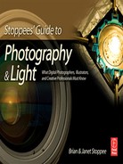
One of the most important things we learn from the full gamut of color models is that there’s a dramatic difference between what the human eye sees and how much of that is reproduced on the off set press’s SWOP CMYK. In between is what our cameras and computer displays show us. As photographers, we need to have an awareness of this in delivering the image for the end use.
Color Gamuts and Working Spaces
Whenever most Photoshop professionals hear the word “gamut,” they think of what is not possible rather that what can be done. Photoshop can show you what colors are out of gamut.
Gamut?
Think of gamut as a range of colors within a color model. The gamut represents what can be successfully displayed or printed. The RGB color model, being larger than CMYK, can display colors on your computer’s monitor that are out of gamut on your CMYK printer. It’s a color alarm that warns, “This won’t work.”
Adobe RGB Workspace
A choice of color workspaces pops up everywhere these days. It’s something you need to be aware of on monitors, cameras, when saving files, doing calibrations, and making choices about printing, to name a few.
Basically, a workspace is a portion of a color model. It’s set aside to assist the user with certain working limitations.
Within the RGB possibilities is Adobe RGB (1998). It’s recommended for projects that go to print. Adobe RGB includes cyans and blues that are not available in the popular workspace sRGB.
With some exception, it’s the choice of many professional photographers and commercial clients.
This more limited workspace is preferred for images that end up in web usage. It’s geared toward standard monitors. sRGB is also popular with entry-level digital cameras.
Some photo labs that service the needs of wedding and portrait photography studios prefer sRGB.
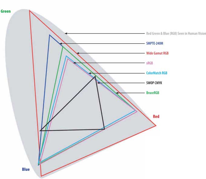
To the left is a typical gamut with Lyson inks, and ink2image paper. The wider white line is an Epson printer, the yellow another brand. Above is a work space with red being Adobe RGB, white, sRGB, and yellow the Epson print space.
Color Depth
Is bigger always better? That’s a very valid question when it comes to color depth (also known as “bit-depth”).
This term describes the number of bits that are used to represent the colors in a single pixel. This is also known as bits per pixel (bpp).
The larger the color depth number, the more distinct the colors should be.
A good way to simplify bit-depth is to think of a one bit pixel. It can be either black or it can be white.
16 Bits per Channel
Those who are hungry for more embrace sixteen bits per channel (bpc). For each primary color this provides a range of 65,000 variations, compared to the 256 per channel with eight bpc. This means that you have 256 tonal steps, in sixteen bpc, for every one tonal step in eight bcp. This makes a great deal of difference when it comes to correcting problem areas on an image.
So with sixteen bpc having so much to offer, why do so many work in eight bpc? File size is a factor. A sixteen bpc image is twice as fat as an eight bpc. For some, that’s a storage problem. For others, it slows down their workflow: their computers take longer to process these bigger images. The biggest argument in favor of eight bpc is that in actual use the difference may not be seen on the screens and prints that the viewing audience has available to them.
32 Bits per Channel-High Dynamic Range
High dynamic range (HDR) images are the source of much discussion among the most diligent photographers. This is something that most cameras cannot capture, printers print, or monitors display.
To make a very fast summary of HDR’s benefits: it allows luminance levels that far exceed that of eight or sixteen bpc. Photoshop professionals make corrections in HDR and then convert down to the tonal range that they want.
In the 500% enlargements (right), the sixteen bit image is on top with the eight bit, below it. Do you see the difference between the two, in print? We don’t. That’s why eight bit is still an industry standard.
File Format and the End Result
There are many file formats out there. New ones pop up from time to time, and old ones get better. For this discussion, we’re going to just visit what your digital single lens reflex (dSLR) camera can record as well as manipulate in postproduction.
Raw
We have devoted the majority of Chapter 6, “Raw Files and Scanned Films,” to this topic. “Camera raw” is a general term. It isn’t a specific file format. Each camera manufacturer manages their own raw format, so the filename extensions vary. You may hear people refer to their raw file format by the extension name. By way of example, the extension name for a Nikon camera raw is “NEF.” For another camera brand, it will be something else.
As the term “camera raw” implies, it’s an image file in its purest form. Just like cutting and polishing a raw gemstone after it has been mined, some of the fine-tuning of the image takes place in postproduction. As we stress elsewhere in the book, this doesn’t mean that you can make a careless photographic mess when you’re shooting, and expect to have a sparkling diamond later.
Chapter 6 takes you deep into what Adobe Camera Raw permits you to do with the image in post. Adobe regularly updates this plug-in.
JPEG
The Joint Photographic Experts Group developed this format in 1990. It’s pronounced “jay peg.” It’s become the most common means of compressing an image.
“Compressing” is the operative word to the wise. A JPEG is a “lossy” format. One of its original intents was to get images out on the World Wide Web in a manner that would allow them to appear as fast as possible for folks who had Internet access via primitive telephone dial-up connections. A JPEG (often seen as “jpg”) does retain the RGB color information, but compresses the file size by selectively throwing away some of the data.
The creator of a JPEG photo can choose what level of compression that they want.
The more they compress, the lower the image quality becomes. When the maximum quality option is chosen, it results in a photo that closely resembles the original.
Most cameras allow you to save as a JPEG. Some permit you to save both a JPEG and a raw file. This allows you to have one great image to manipulate later, and something that you can send to someone right away.
Some photo labs that specialize in wedding and portrait packages encourage photographers to send them maximum-quality JPEGs, right out of the camera, just like they had been shooting film. The photographers report pleasing results and happy customers. It cuts the need for postproduction. Other photographers are in total disagreement.
TIFF
The Tagged Image File Format (TIFF) was developed by Aldus, a company that Adobe acquired. It’s pronounced just like the word that means “to quarrel,” but few take exception to this standard of the publishing industry. The TIFF (also used as just “tif”) goes back to 1992.
When you need to shoot a high-quality, ready-to-use image, this is the way to go. As with a JPEG, a TIFF can be compressed, but that’s not a common practice.
The only downside of a TIFF is that its files are larger than those of the other two popular options. TIFFs consume more space on your camera’s memory card, recording fewer images per card, and taking more time to record from the camera’s buffer to the card.
Size Matters
If a camera raw image equals 16.3 MB, a TIFF will weigh in at 35.9 MB, while a fine-quality JPEG comes in at only 5.7 MB.
A 4 GB memory card will only hold around 106 TIFFs, but 154 NEFs, and a whopping 558 JPEGs.
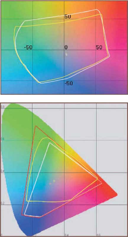
The above tif is reproduced, below, at low, medium, and maximum jpg levels, skipping medium and very high. They’re enlarged to 200%.
jpg low
jpg high
jpg maximum

Understand Image Size
Some refer to those of us who make their living in Adobe Photoshop, Corel Painter, and the like as “pixel pushers” because we manipulate these big files of pixels.
When it comes right down to the heart of digital photography, it’s all about the pixel.
Real-World Megapixels
No matter how computer-savvy we may be, the math behind megapixel can escape us.
The term pixel is derived from the words “picture” and “element.” Obviously, megapixel translates into a million pixels, but how is that relative to making photographs?
In commercial application, an image needs to be at least 10 megapixels (MP). Any worthwhile professional or “prosumer” dSLR can do that.
A 10 MP image is 3,872 × 2,592 pixels, which, sure enough, works out to a total of 10,036,224 pixels.
In English, Please
What’s that in inches?
When you open the image in Adobe Camera Raw, it’s just that: a raw image. You can have Camera Raw process it to a variety of sizes, but if all you want Camera Raw to do is open the file unprocessed in Photoshop, you might still have some size decisions to make, even if you don’t want to resample the image size but you do want to keep it as pure as possible.
Megapixels to Megabytes
These slightly over 10 million pixels vary in file size, based on what’s on the photo. Some images produce bigger files than others, but it weights in at somewhere around 15.2 megabytes, in file size.
Pixel per Inch Usage
There are some industry standards for how many pixels per inch (ppi) are used for different purposes. Some fluctuate based on the end-user and others cannot be changed.
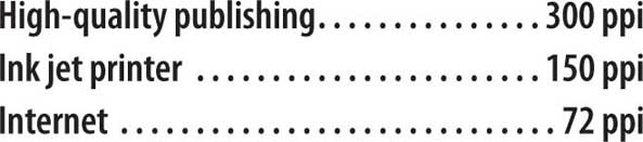
Publishing
In the printing industry, images are converted to halftone screens. All those little dots are measured as lines per inch (lpi). The closer together those lines are, the greater the detail they hold and the sharper the images appear. A high-quality book or fine magazine prints halftones at 150 lpi, on a good-quality paper. Typically, the prepress folks want images that are twice the pixels per inch as the lines per inch. So, if a project runs at 150 lpi, the image needs to be 300 ppi.
Therefore, our 10 MP image, without any resampling, can be as large as:
12.907″ × 8.64″ @ 300 ppi
Ink Jet Printers
Opinions vary on what sort of resolution is best for ink jet printing. Some feel that it needs to be 200 ppi, others think 150 ppi is just fine. Without getting into that discussion, let’s just give the image the benefit of the doubt and go with 150. This conveniently needs to scale down a little to fit through the popular 17″ throat size of high quality printers.
25.813″ × 17.28″ @ 150 ppi
Internet
There’s no room for negotiation when it comes to the needed resolution for the web. It’s 72 ppi.
53.778″ × 36″ @ 72 ppi
Obviously our 10 MP camera is more than qualified for any web images. (That would be one very big monitor!)
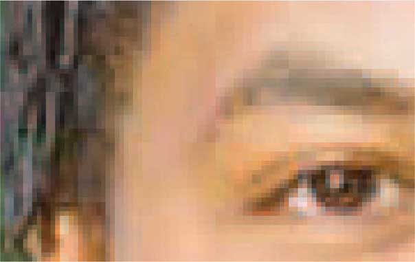
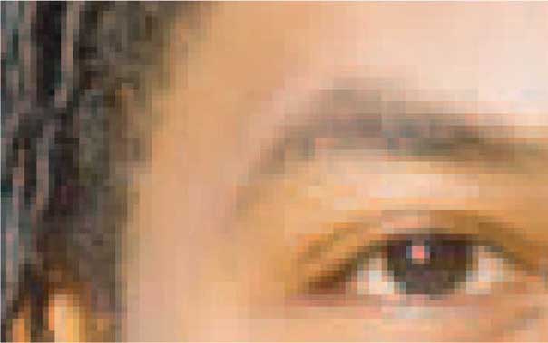
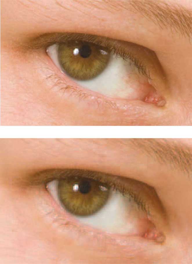
The top image is from a 12.4 MP file, as captured, with no upsampling, and the lower one is at 1.6 MP. The enlargement, on top, is at 300%. Whereas, the lower photo is at 832.5 %. Obviously, the smaller file does not hold up.

Upsampling and Downsampling
Before Adobe Camera Raw takes all the postproduction work that has gone into your raw file and processes it to a dng (digital negative), jpg, psd (Photoshop), or tif file, you need to choose a resolution.
Upsampling: How Big?
Here’s where you get to watch your 10 MP image grow. This is called “upsampling.”
If you’re starting with a 10 MP image of 4,096 × 2,742 pixels per inch (ppi), this process can grow it to a 25.3 MP image of 6,144 × 4,113 ppi.
In the real world, some would run that image through an ink jet printer as an impressive 40.9?” × 27.4?” photo.
Does it work?
Some are purists about a thing like this.
They feel that you should never upsample. Their thinking is that this 72+ MB image loses some of its image quality as it is having its pixels increased.
In commercial application, there isn’t much room for discussion. Something in the vicinity of a 50 MB file is what’s expected.
Please examine the samples to the right. We have enlarged them considerably so that little of what we’re trying to show would be lost in the halftones.
Downsampling
Creating an image at a smaller file size than captured (“downsampling”) is an excellent way to take a bunch of your fully processed and retouched images and turn them into some quick-view JPEGs. Adobe Camera Raw does more than open camera raw files. For example, you can use Camera Raw to open other file formats and create JPEGs from your TIFFs.
For these quick-view images, we choose the smallest resolution, 1,530 × 1,024 ppi, which is the same as an image from a little 1.6 MP camera. This is what downsampling is all about.
The Possibilities and Advice
Our suggestion is to always shoot to the largest size possible and always retouch at the full 25.1 MP size. You can downsample at another time, but the results may be less than satisfactory if you have to upsample, later. An upward interpolation can look a little too rough for many.
The top image was upsampled in Adobe Camera Raw to 25.1 MegaPixels. The lower photo is as shot at 12.2 MP. It takes a 350% enlargement, of the latter to comparatively examine the two. The top image is enlarged to 246%.

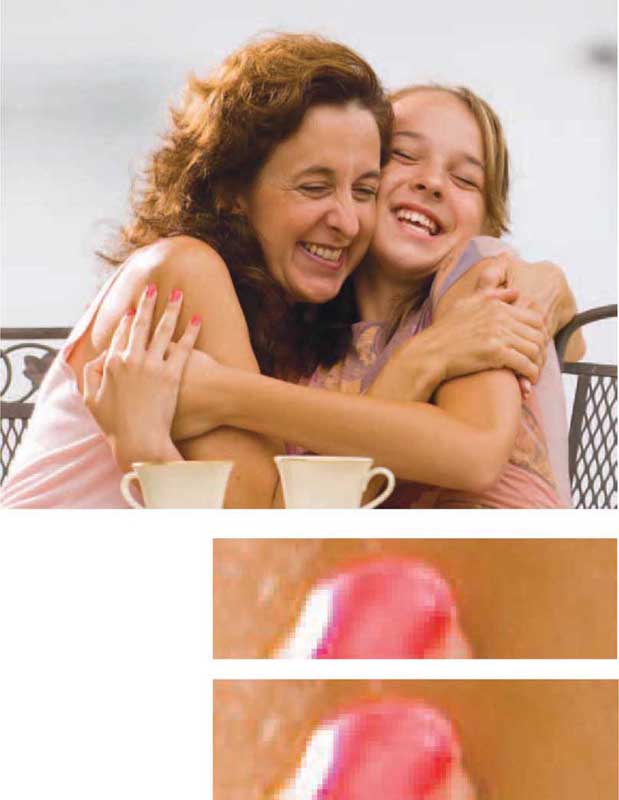
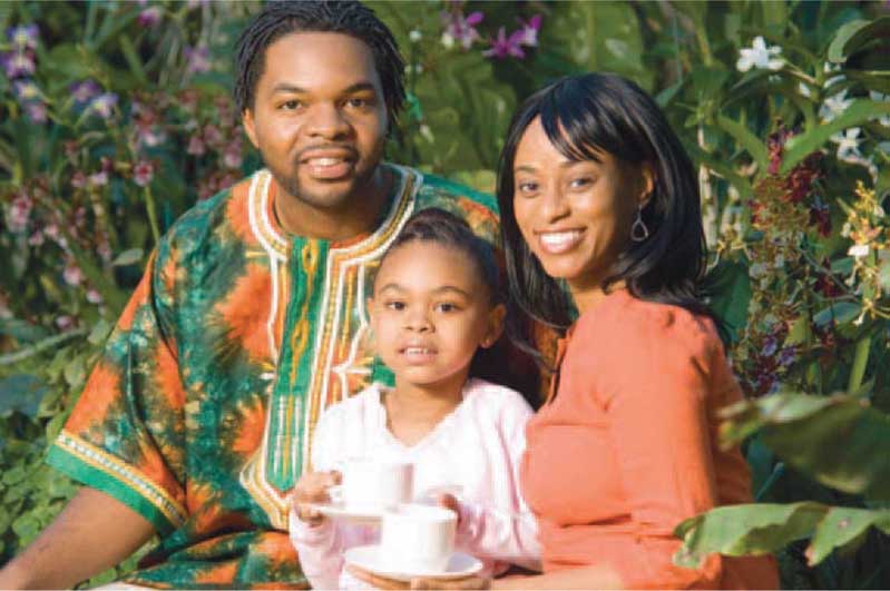
This image of Leah is neither upsampled or downsampled. It’s at 100% of the 12.2 MP file.
