Chapter 12
Walking through a Trade, Swing-Style
IN THIS CHAPTER
![]() Looking for market trends and finding top industry groups
Looking for market trends and finding top industry groups
![]() Choosing the best trade candidates and limiting your losses
Choosing the best trade candidates and limiting your losses
![]() Making the trade and recording it in your journal
Making the trade and recording it in your journal
![]() Watching your positions and improving your system
Watching your positions and improving your system
Remember those times in high school or college when your teacher explained some pretty technical concepts that seemed to fly right over your head? (If this doesn’t apply to you, congratulations, you’re a genius in my book.) I can recall several subjects, both boring and exciting, that I never fully understood, even as the concepts were being explained.
However, when I heard the teacher say, “Let’s walk through an example,” my eyes lit up. Examples bring color to concepts. They elucidate fine points that can’t really be fully understood without practical application.
Consider this chapter your own “Let’s walk through an example” moment. Here, I take the view of the swing trader looking for a trading opportunity, and this chapter provides an example of identifying a potential trade by going through the eight major steps. These steps show you how to integrate concepts covered in other parts of this book. I use the top-down analysis framework (see Chapters 6 and 8) to identify and execute the trade, and all the data I use is actual market data. If you see how I approach and research potential candidates to swing trade, you can build on the techniques I present or incorporate aspects you agree with.
Step 1: Sizing Up the Market
Mr. Market is where all things start for the swing trader. You have to know the state of the equity, commodity, and even currency markets to be a savvy trader. Why? Because these markets are related. For example, if you notice that the dollar is in a bear market (meaning, its value is falling), expect commodity prices to appreciate. For example, rising oil prices positively affect shares of energy companies. Watching all major markets improves your trading ability by giving you an indication of the likely direction of other markets.
Looking for short-term trends on the daily chart
Here I start by analyzing the markets. Figure 12-1 shows a snapshot of a daily chart of the S&P 500 Index in 2018. Also plotted are the MACD indicator and the 17-day moving average. The 17-day moving average smoothes out price changes and helps determine short-term market direction.

Source: Bloomberg Finance L.P.
FIGURE 12-1: The daily chart of the S&P 500 Index in 2018
When I examine any market, I ask myself whether the market is in a trading range or trend. Figure 12-1 shows a market in a trading range. However, it looks to be entering a trend. Notice a steep decline on the left hand of the chart followed by a consolidation period with prices now attempting to break out above the previous peak.
The slope of the 17-day moving average is positive (the dotted line in the chart) whereas MACD is flat (indicating neither major strength of weakness).
The general picture is positive though the testing of the previous peak is key.
Analyzing the weekly chart for longer-term trends
One chart’s time frame isn’t sufficient for your analysis. You must also look at the weekly chart to determine whether the longer trend is up or down.
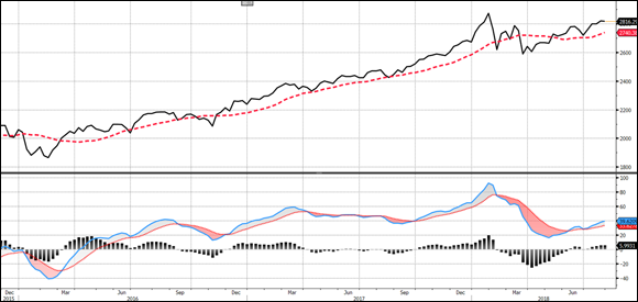
The chart in Figure 12-2 shows the same S&P 500 Index, but in weekly format (each bar represents one week instead of one day, along with the 17-week moving average and the weekly MACD. The intermediate trend is up, as measured by the 17-week moving average’s positive slope. Notice also the weekly MACD is positive.
Source: Bloomberg Finance L.P.
FIGURE 12-2: The weekly chart of the S&P 500 Index.
So how do you synthesize these two charts?
The weekly chart’s strength gives you confidence that the short-term uptrend will continue. The daily chart shows a market with a rising 17-day moving average, a flat MACD histogram, and a potential breakout above a previous peak. The weekly chart shows a rising 17-week moving average and rising MACD.
In general, the longer-term chart should bear more weight than shorter-term charts. However as a swing trader, you can’t trade against the short-term trend. Had the longer-term trend been negative and the short-term trend been positive (meaning, the daily chart bullish and the weekly chart bearish), I would recommend you buy securities with extreme caution and keep stop-loss orders tight. The easiest trade is when the weekly and daily charts are in alignment. In the example presented here, they are both largely in agreement, which gives you confidence to buy securities.
In other words, the short-term chart shows a trading range that looks poised to move higher, and the intermediate trend is clearly in an uptrend. The market is in rally mode, and you want to ride the wave. Perform a similar type of analysis in the currency and commodity markets, which can help inform your equity trades (for example, analyze the daily and weekly chart of the commodity index or the U.S. dollar to understand the macro environment).
Step 2: Identifying the Top Industry Groups
In Step 1, you determined that you should look for candidates to buy given the market’s intermediate and short-term charts (meaning there is no need to stay in cash since the trend is up). To do so, you need to examine the leading industry groups. Buying stocks in leading groups increases the chances your stock will rise with the overall market.
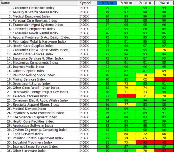
Figure 12-3 shows a chart of the top-performing industry groups for the same time period in the “Step 1: Sizing Up the Market” section. The groups are ranked in order of performance. For example, the Consumer Electronics Index is ranked 99 for the week of July 27, which means it outperformed 99 percent of all industry groups. Put another way, it performed in the top 1 percent among all groups.
Source: HGSI Investment Software
FIGURE 12-3: The top-performing industry groups in mid-2018.
So what does this step tell you? You should start your search for promising swing trades in the industry groups ranking in the top 20 percent (those with relative strength rankings of 80 or higher).
Now that you know which groups are leading, look for candidates in the top few industry groups: Consumer Electronics, Jewelry & Watch Stores, and Medical Equipment group.
Step 3: Selecting Promising Candidates
Knowing which industry groups to focus on is really half the battle, so the first two steps of this process increase the odds of success. The magnitude of success is driven by which individual security you select.
So how can you choose the most promising candidates in the top industry groups identified the previous step? Most swing traders primarily use technical analysis to select a security. I recommend you use fundamental analysis first to select the most promising candidates. Then use technical analysis to time your entries and exits.
Screening securities
- Stock price ≥ $5
- Average daily value traded ≥ $100,000
- Market capitalization ≥ $250 million
Applying this filter to the Consumer Electronics group narrows the list to 12 companies while applying the filter to the Jewelry & Watch Stores group narrows the list to three companies. The filter narrows the number of companies in the final identified industry group, the Medical Equipment group, to 23 companies.
Ranking the filtered securities and assessing chart patterns
After applying a filter to the securities in the leading industry groups, rank the remaining securities by some measure — a fundamental one (such as return on equity) or a technical one (such as days since last DMI crossover, covered in Chapter 5) or a factor that incorporates both technical and fundamental aspects (such as Investor’s Business Daily’s “Composite Ranking” or High Growth Stock Investor’s “ERG,” which stands for earnings rank, relative strength rank, and group rank). After you rank the securities in the industry group, review the securities and isolate the ones that meet your entry criteria (which should be simple and clear, free of subjective interpretations).
So that’s how I go about ranking securities, but your method may vary. You can approach this process in literally an endless number of ways. The important thing is that your method is based on principles that you agree with and that lead to strong performance. If you don’t rank by earnings, I recommend using a combined ranking of fundamental and technical measures.
Chapters 4 and 5 take you through finding securities from the technical side of the market, whereas Chapters 7, 8, and 9 take you through the fundamental steps. In this section, though, I walk you through the process I’d follow if I were trading these securities in real time.
Narrowing your list of prospects
Ranking securities pushes the cream to the top. For this trade, I’ve ranked the securities in both industry groups by return on equity (which is covered in Chapter 8). The results are shown in Figure 12-4.

Source: HGSI Investment Software
FIGURE 12-4: A ranking of stocks by return on equity in two industry groups.
Handpicking the ripe ones
After you rank the securities you zone in on, go through the stock charts to identify criteria that meet your trading strategy. What you look for depends on what you’ve decided to incorporate into your trading plan. Perhaps you’re looking for moving average crossovers in the presence of strong volume. Or maybe you’re looking for cup-and-handle formations. Your trading rules need not be complex.
In fact, simple entry rules trump more complex ones. Buying when the moving average slope turns positive, for example, can be an effective entry criterion. Or you can buy when the MACD line crosses the 0 line. But more complex entry techniques can also work well. Perhaps you implement a trading indicator you read about in a trade magazine, or you wait to trade on divergences between an indicator and the share price. Whatever the method, make sure your entry criteria are clear and not subjective. You don’t want an entry method that gives ambiguous signals or relies on someone’s interpretation to determine whether to buy. Subjective analysis is risky because it opens up trading to inconsistent behavior.
After reviewing the securities listed in Figure 12-4, I find two stocks that meet my entry criteria: Iradimed Corp (symbol: IRMD) and Sony Corp. (symbol: SNE).
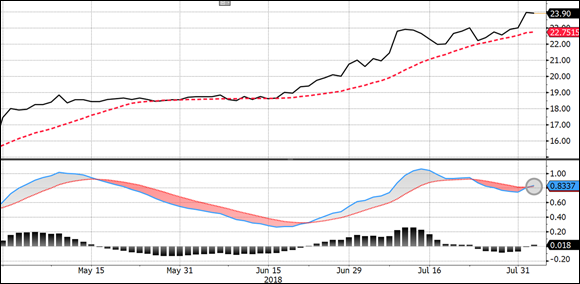
Iradimed’s chart, shown in Figure 12-5, reveals a security that’s been in a clear uptrend. (Iradimed is from the Medical products industry group.) On the far right side of the chart, notice that the MACD line has crossed above its signal line, meeting the entry criterion I outlined earlier. The 17-day moving average was flat earlier in July but has now begun rising. An alternative entry method (in place of the MACD indicator) could have been buying on a breakout above a short trading range formed between late June and July. Typically, price movements occur ahead of indicator signals.
Source: Bloomberg Finance L.P.
FIGURE 12-5: This chart of Iradimed shows the stock moving higher.
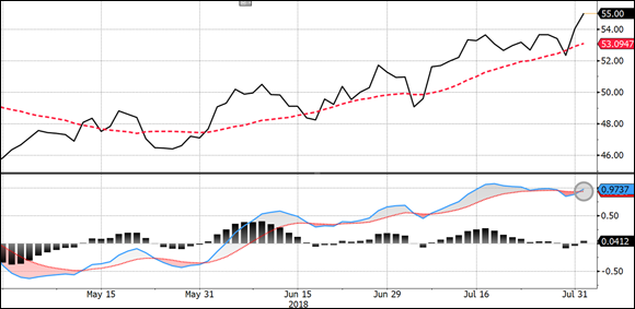
Figure 12-6 shows a chart of Sony Corp. (from the Consumer Electronics group). Like the previous chart, Sony has moved into higher territory with a buy signal from the MACD indicator. Sony fell to its 17-day moving average but found support and moved above a short-term consolidation base.
Source: Bloomberg Finance L.P.
FIGURE 12-6: This chart of Sony Corp. shows a stock continuing an uptrend.
Step 4: Determining Position Size
Okay, so I’ve found my trade, but how much do I allocate to it? Not all of it — nobody’s that certain about a trade unless they have inside information, and even then, there’s never a 100 percent guarantee that things will turn out the way you expect.
Chapter 10 outlines two different ways to set your position size: by percent of capital (not recommended) or by risk level. Determine your position size by identifying your stop-loss level and limiting losses between 0.25 percent and 2.0 percent of your account value should the security reach that stop-loss level. For these two trades, I’m setting my position size based on a risk level. Specifically, I’m going to calculate how many shares I can buy of Iradimed and Sony, assuming I place stop-loss orders below a recent support level.
Setting your stop-loss level
The Iradimed chart (refer to Figure 12-5) has a clear support level of $22.00. If the stock were to trade below $22.00, I believe it would be a sign that the trade had failed. But of course, I never place stop-loss orders at predictable price levels where others may also place their orders. So I’ve decided to set my risk level at $21.80.
The Sony chart (refer to Figure 12-6) has a clear support level of $52.00. If the stock were to trade below $52.00, I believe it would be a sign that the trade had failed. But again, I avoid placing stop-loss orders at predictable price levels. So I’ve decided to set my risk level at $51.40.
Limiting your losses to a certain percentage
Your losses should be limited to some percentage of your total assets. Your position size is based on that percentage. If you limit losses to 2 percent of your total assets (an amount I consider aggressive), you should be able to take larger trades than swing traders who limit losses to 0.5 percent of their account values.
I’m assuming that my investment account is $100,000 and I want to limit my risk to 1 percent of my account. Also, I’m using the closing share price on the day of the MACD signal as my purchase price. For Iradimed, that’s August 2, 2018, and for Sony Corp that’s August 1, 2018.
So how many shares of Iradimed can I buy? Here’s how the math goes:
Subtract the stop-loss level from the purchase price.
$23.90 – $21.80 = $2.10
Multiply the maximum allowable risk by the investment account total.
1% × $100,000 = $1,000
Divide the number in Step 2 by the number in Step 1.
$1,000 ÷ $2.10 = 476 (rounded down)
Hence, I can buy 476 shares of Iradimed. (I recommend rounding down so you don’t increase your risk beyond the 1 percent level.) So, 476 shares multiplied by the $23.90 purchase price yields a total position size (excluding commissions, fees, and so on) of $11,376 or 11.4 percent of the account value.
If your risk control framework includes a maximum position size (it should), you should compare that maximum size to the amount calculated in this step. For example, if your maximum position size is 10 percent and the position size methodology yields a position size above that level, you would only acquire the maximum amount permitted by your risk control framework for the portfolio level.
Assuming the same assumptions as Iradimed (for instance, $100,000 account size, 1 percent risk control level), how many shares of Sony can I buy? To get the answer, I go through the same mathematical procedure as I did with Iradimed:
Subtract the stop-loss level from the purchase price:
$55.00 – $51.40 = $3.60
Multiply the maximum allowable risk by the investment account total:
1% × $100,000 = $1,000
Divide the number in Step 2 by the number in Step 1:
$1,000 ÷ $3.60 = 277 (rounded down)
Hence, I can buy 277 shares of Sony.
Step 5: Executing Your Order
Your order entry strategy should be consistent with your swing trading time commitment. Full-time swing traders can add an intraday trading overlay strategy to attempt to buy at a better price (flip to Chapter 11 for more on using this approach). Part-time swing traders should use limit orders to enter near the closing price on the day the signal was generated.
Personally, I don’t use a secondary trading overlay for the simple reason that I’m not looking to add value on such a micro level. My outperformance (or alpha) should come from holding the trade for a few days or a few weeks. Hence, I’m not as concerned about what the security is doing minute to minute — as long as it holds above my stop-loss level.
The only exception to this rule is for full-time traders who watch their positions during market hours, every day. Such traders can, if they so choose, enter price alerts on their positions at levels where a stop-loss order would be entered. Using shares of Sony from earlier in this chapter as an example, a full-time swing trader may enter the stop-loss level $51.40 as the level when she receives an alert from her broker or trading system (assuming the swing trader is subscribing to real-time quotes) in the form of an email or SMS message. After that alert is hit, the trader can execute the order, perhaps using a Level II quote to assist in the timing of the trade.
But using such mental stop-loss orders has its downsides, the biggest of which is that exiting losing positions isn’t automated. Entering a position isn’t as laced with emotions as exiting for a loss is. When you have to sell a losing position, you may start to second-guess yourself. You may look at the chart to see whether the stop-loss level was set too aggressively. Perhaps there’s a support level a few points below the current price and you’d prefer to nudge down the stop-loss level. And then perhaps while you’re thinking about this, you notice that the price has temporarily recovered above the stop-loss level. “See, I knew this was probably going to turn around.” Before you know it, you’ve come up with perfect excuses on why you should let it run further and cut losses at some other level.
That’s why I prefer automated stop-loss levels. Yes, entering a stop-loss level does officially post my order for all to see. But I’ll take that cost over the possibility of letting my emotions influence my exit from a losing position. The stop-loss order does its job, no emotions involved. It executes, and you’re notified after it happens.
Step 6: Recording Your Trade
Now that I’ve executed my trades, my next job is to record them in my trading journal. The more detailed your journal, the more helpful it is. On the other hand, if you enter so much detail that you come to dread recording your trades, you may fail to keep your journal up to date and the work will eventually pile up. So always try to strike a balance.
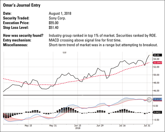
In Chapter 3, I highlight the information your journal should contain — you want to keep it simple but provide enough detail to make the journal useful. Figure 12-7 shows a snapshot of a journal entry for Sony Corp.
Source: Bloomberg Finance L.P.
FIGURE 12-7: Your trading journal should include enough details to make it useful.
Step 7: Monitoring Your Shares’ Motion and Exiting When the Time is Right
After you enter your positions and record them in your trading journal, you should monitor them and focus on your exit strategy, which should tell you when to exit in three scenarios:
- When the position is profitable
- When the position is unprofitable
- When the position meanders sideways
My exit strategy in this example, like my entry strategy, is simple:
- Ideally, I exit on a close below the 17-day moving average. If shares rally, the close below the 17-day average will keep me on an uptrend.
- If and when shares hit their stop-loss level, I exit — pronto.
- If shares meander and do nothing, I exit after ten days so I can deploy the capital elsewhere.
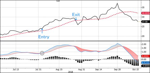
Going back to the examples from earlier in this chapter, right after I purchased shares of Iradimed, the stock rallied before falling below the 17-day moving average on August 28 when it closed at $27.80 (see Figure 12-8). I purchased shares at $23.90 and exited around $27.80, a profit of 16.3 percent before fees, translating into approximately $1,856 if I bought the full position (11.4 percent of the account value) or $1,630 if I bought up to 10 percent of the account value.
Source: Bloomberg Finance L.P.
FIGURE 12-8: Shares of Iradimed rallied after purchase before triggering an exit on August 28.
As for Sony Corp., the trading position turned out differently (see Figure 12-9). Shares of Sony traded sideways after my entry but soon weakened and fell below the 17-day moving average on August 15, 2018, triggering a sale at the closing price of $53.71. Note that the strategy described in this step required me to sell either if the stock broke below its 17-day average or if the stock fell to the stop-loss level of $51.40. It isn’t always the case that the stop-loss level will be below the exit criteria of a strategy. It can vary based on where you place your stop loss.

Source: Bloomberg Finance L.P.
FIGURE 12-9: Shares of Sony stalled after purchase before breaking below the 17-day moving average and generating a small loss.
The loss on this position (sale price of $53.71 and a purchase price of $55.00) is –2.3 percent, which translates into approximately a $357 loss if I purchased the full position in Step 4 (277 shares) or a $236 loss if I bought up to 10 percent of the account value.
Step 8: Improving Your Swing Trading Skills
No swing trader is perfect, and no trading system works 100 percent of the time. You’ll always suffer losses — they’re unavoidable. You must expect losses and work them into your swing trading strategy. Many a good system has been corrupted by an ambitious swing trader tinkering with this and that, trying to achieve a success rate that’s simply unrealistic. So, you have to balance rarely updating your strategy to reflect new market realities with the cost of constantly tinkering with your system and falling into the trap of a curve-risked strategy, meaning a strategy that captures past trades perfectly at the cost of malfunctioning on future trades.
One way to refine your system and become a better trader is to review your journal entries monthly to detect patterns in your winning or losing positions. But don’t change your trading plan often or because of one or two losing trades. Alter your plan only in response to a pattern of losses that you think can be improved upon, or in response to a significant — or potentially significant — loss (such as 5 percent or more of your total account value). For instance, if your losses are large, you likely need to adjust your risk management strategy as opposed to your entry and exit strategy.
Returning to the examples, here are the two trades with an eye on improving the trading strategy.
First, start with Iradimed. Notice from Figure 12-8 that shares of Iradimed recovered after my exit and move even higher, reaching a peak above $37 or 55 percent above my original purchase price and 33 percent above my exit price.
So, perhaps this trade wasn’t as good as I first thought (a gain of +16.3 percent). Should I change the strategy?
The answer: It depends. I can’t change my strategy based on the outcome of one trade. Instead, I should accumulate many trades over time to see how my rules are working in real time. Finding a consistent pattern of exiting prematurely may require me to change my exit strategy. Or, perhaps I may need to use an entirely different indicator, which is better suited to keep me in the trade.
If my problem were a consistent pattern of losses, I’d focus on my entry methodology.
Now look at the second trade in Figure 12-9.
As was the case with Iradimed, Sony shares recovered after the initial decline and moved higher, reaching a peak of $60 on a closing basis. That price point was 9 percent above my purchase price and 11.7 percent above my exit.
If there were more trades where I exited prematurely and left significant money on the table, I would look to refine my strategy. Just keep in mind that the cost of staying in a trade longer is a potentially bigger loss when the trade fails. One way to balance this out is to reduce your risk exposure on each position (say, 0.75 percent of the account value instead of 1 percent) while loosening the exit trigger (for example, using a longer-term moving average instead of a shorter-term moving average like the 17-day average).
These two trades have something in common. The problem wasn’t in identifying trending securities or in exiting too late. I successfully identified trending securities that achieved reasonable prices gain. But I left money on the table by exiting too early. Hence, one possible solution is to modify my exit strategy. Here are three examples of how I may improve my strategy:
- Exit based on a moving average crossover instead of exiting when the stock closes below its 17-day moving average (for example, exit when the 9-day exponential moving average crosses below the 18-day exponential moving average).
- Exit on a close below the 50-day moving average (a longer moving average helps capture large moves without leaving money on the table at the cost of exiting later than a 17-day moving average after the ultimate top is set).
- Exit half of the position on a break below the 17-day average and the remaining half of the position on a break below the 50-day moving average.
Trading is not a one size fits all game. Millions of permutations or combinations can come up with on how to find securities, when to enter them, when to cut losses, when to sell for profits, and how to position size everything. The point is that trading is an evolving game and requires strategy, review, and refinement. It never ends.
 Because you’re likely to trade equities, you may want to closely examine U.S. equity markets to determine which style (growth or value) is performing well and which market cap ranges (large cap, mid cap, or small cap) lead the market. The best way to achieve this analysis is through relative strength charts, which plot one index versus another (see
  I want to stress the importance of considering a company’s fundamentals: Even if it’s simply ranking companies in an industry by their PEG ratios (the lower the better, as explained in
  For the purposes of this example, I’ll buy a security when the MACD line crosses above its signal line, and I’ll exit when the security closes below its 17-day moving average. To be more precise, I’m not looking for securities where the MACD line is simply above its signal line — several securities meet that rather loose criterion. No, I’m looking only for those securities with MACD lines above signal lines today. (You should only go on green. Never jump the gun by buying before a signal is generated and never wait and buy a few days after a signal is given.)