
In the earlier sections, we read about the Text table, which just shows numbers. Then we read about the Highlight table where we used a color in addition to the text to find out which values were high and which values were low. A Heat map is a step advanced than the Highlight table. With a Heat map, we can compare both the size and color values. In a Heat map, we can also compare two different Measures for a combination of Dimensions.
To create a Heat map, we will compare Sales and Profit for product categories across Regions. Let's understand how to build a Heat map.
- Create a new sheet by pressing Ctrl + M on your keyboard and rename it to
Heat map. - Next, let us drag Category into the Rows shelf and Region into the Columns shelf.
- Then we will change the mark type to Squares from the marks dropdown in the Marks shelf. Refer to the following image:

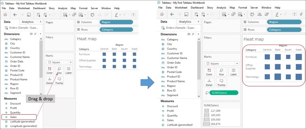
- Next we will Sales from the Measures pane and drop it into the Size shelf in the Marks card. Refer to the following image:
- Next, we will drag Profit from the Measures pane and drop it into the Color shelf in the Marks card. With this, we will get the output shown in the following image:

Size in the preceding image shows Sales and Color indicates profit. Thus, the bigger the square, more the sales, and the darker the blue square, the greater the profit.
In the preceding image, we can see that Furniture in the Central region is light orange in color, indicating that it is a non-profitable venture. Further, Technology in the East region has the biggest square, which indicates that it has the highest number of sales among other categories across regions.