
Another way of comparing multiple measures is by creating a Scatter plot. A scatter plot is an XY axis chart with measures on both the X axis and the Y axis. It helps us find trends, concentrations and outliers by helping us focus on anomalies which are shown by the scattered points.
To create a Scatter plot, we will continue working in the same workbook. However, we will connect to a new data source. We will use the Access data, Sample-Coffee Chain.mdb which has been uploaded on https://1drv.ms/f/s!Av5QCoyLTBpnhj06IKTNX0S9hK48.
For our Mac users, since Tableau doesn't connect to the Access database from Mac, we will have to use the Excel version of this data which is also uploaded on the same link and is called Sample - CoffeeChain (Use instead of MS Access).xlsx.
If you haven't already downloaded these files in Chapter 1, Keep Calm and Say Hello to Tableau, you can download them now and save the files in a new folder called Tableau Cookbook data under Documents | My Tableau Repository | Datasources.
We will use the Sample-Coffee Chain.mdb or Sample - CoffeeChain (Use instead of MS Access).xlsx data source to create the Scatter plot that compares the marketing expenses and the profits we are making for different products across different markets. Let us follow the recipe below and quickly create a Scatter plot.
- Let us a new sheet by pressing Ctrl + M and renaming the sheet to
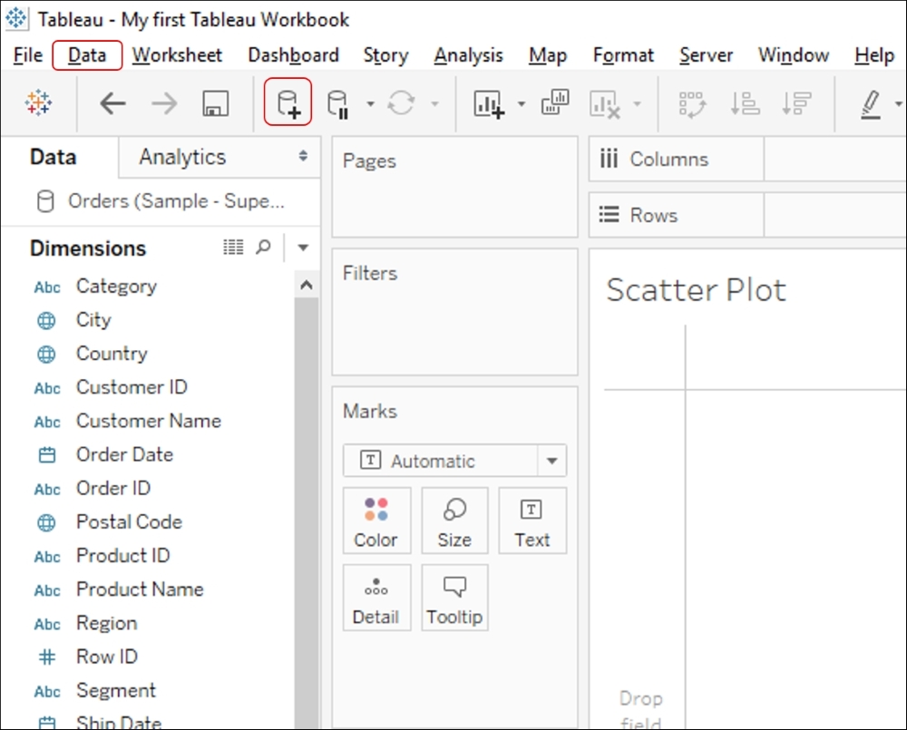
Scatter plot. - In the toolbar, click on Data | New Data Source or press Ctrl + D, or click on the cylinder icon in the toolbar. Refer to the following image:
- Once we use the Connect to data option, we'll see the list of data sources that we can connect to. Let us select the Access option and connect to the
Sample-Coffee Chain.mdbdata file stored in a folder calledTableau Cookbookdata underDocuments|My Tableau Repository|Datasources. If you are a Mac user, select the Excel option and connect to the Sample - CoffeeChain (Use instead of MS Access).xlsx data file which should be stored in the same folder as mentioned earlier. - Select the table named
CoffeeChain Query. Refer to the following image:
- Let us go ahead with the Live option to connect to this data.
- Once we are done connecting the data, we'll click on the New Worksheet tab to see the Dimensions and Measures of the new Access database. Refer to the following image:

- Now let's drag Marketing from the Measures pane and drop it into the Columns shelf.
- Next we will drag the Profit field from Measures and drop it into the Rows shelf. Refer to the following image:

- We will then drag Product Type from the Dimensions pane and drop it into the Shape shelf in the Marks card.
- Next, let's drag Product from the Dimensions pane and drop it into the Color shelf in the Marks card. Refer to the following image:
- The patterns are still not very visible in the above chart. Plus, since we are trying to compare Profit and Marketing, it makes sense to also add Market in the view, as marketing expenses will be different for different products in different markets. So, we will get the Market field from the Dimensions pane and drop it into the Label shelf. Refer to the following image:

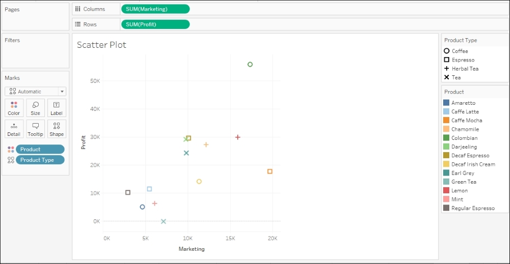
- With Market in the Label shelf, the view becomes slightly cluttered. We could put Market in the Detail shelf so that the additional data points will be visible, but they just won't be explicitly shown via color, size, shape, or label. Thus, the view will be much cleaner, and we can see some patterns in the data. Refer to the following image:

The X axis represents the money spent as a Marketing expense and the Y axis represents the Profit made. The Shape represents the Product Type. The Color indicates the Product. Since the Market is placed in the Level of Detail shelf, it will be visible to us only when we hover over any data point.
Scatter plots give us a very clear indication of outliers. Typically, the majority of data points will follow a certain pattern and will be placed very close to each other, in such a way that the view looks cluttered and gets difficult to read. However, there will be certain data points that are not following the mainstream pattern, and that is what we can track in a scatter plot. These scattered points are called Outliers. These outliers can have a big influence on correlation, and as a good practice, these should be examined to determine whether they are real data values, or some kind of data error.
In the preceding example, we have various scattered points. Refer to the following image:

In the preceding image, the green point on the very top, which is a Colombian product, belonging to Coffee (refer annotation 1), is the point where the Profit is highest, with a Marketing spend of about 5K, whereas the bottom section, (refer annotation 2) is showing us all the Products that are incurring Losses. The worst of the lot is the orange point on the extreme right. This point, Caffe Mocha, belongs to Expresso type and has the highest Marketing spend, yet is incurring heavy Loss.
If we hover over these two data points in Tableau, we will get to see that both belong to the East market. So, the point to investigate would be, within a particular region, how is one product highly profitable whereas the other is making heavy losses even after big spending on marketing campaigns. This insight was quick and easy to understand from a Scatter Plot.