
Tableau provides an option to display data on any given image. Typically, people use background images for displaying data on a custom map image. Even though Tableau allows us to use the default map options, background images can give us the flexibility to use our own custom images, which could be used as a special map. Background images need not necessarily be a custom map; instead it can be any image that corresponds to our data. For example, we may have data that corresponds to a floor plan of a building, or data that corresponds to a baseball game, which needs to be plotted on the baseball pitch, and so on. We can use background images to overlay that data on the actual floor plan of the building or on the baseball pitch image, to give more context.
To display the background image, we'll create an XY axis Scatter Plot. Each data point then has an X coordinate and a Y coordinate. The point to remember here is to have the right coordinates, as this is what will add precision to our view.
We will continue working in our existing workbook. For the following recipe, we will use a custom map image called Custom Background Image.jpg, which can be downloaded from https://1drv.ms/i/s!Av5QCoyLTBpnhkNoaaBmncx0kM2K.
We will save this image in a new folder called Tableau Data Visualization Cookbook Extras, which we will create in the following location: Documents | My Tableau Repository.
Please note that we will use the image downloaded from the preceding link and create a new dataset in Excel, which will be used to plot on this image.
- Let us a new sheet in our existing workbook and rename it Custom Background image.
- Also, open a blank Excel file and save it in the
Documents|My Tableau Repository|Datasources|Tableau Cookbookdata folder as Custom Background image data. - In this Excel file, we will create four columns, named Region, Location, X axis, and Y axis. We will fill in the data as shown in the following image. For now, we will enter the values only for the first row under the X axis and Y axis columns:
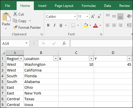
- As mentioned previously, we will create an XY axis scatter plot for this recipe, which is why we have introduced two columns named X and Y. Now we will need the coordinates for each and every location in the Excel file. To begin with, we will put some values for the first row, which is Washington. Since, Washington appears in the top-left corner on the US map, we will give it the coordinates X = 10 and Y = 45. We will then Save the Excel file.
- We will then connect to this Excel file by pressing Ctrl + D on your keyboard. Once we have done that, we will get a new data source in the Data window and we will see the Dimensions and Measures of that particular data source.
- Next, in the toolbar, we will select Map | Background Images | Custom Background Image data. Refer to the following image:

- Once we do that, we will get a small pop-up window as shown in the following image:

- Click on the Add Image… option and we will see the following view:

- Make sure that the X Field dropdown has X, and that the Y Field dropdown has Y. We will then browse the
Custom Background Image.jpgimage file from the following locationDocuments|My Tableau Repository|Tableau Data Visualization Cookbook Extras. Once we do that, we will get the following view:
- Enter values under the X and Y dropdown, as shown in the following image:

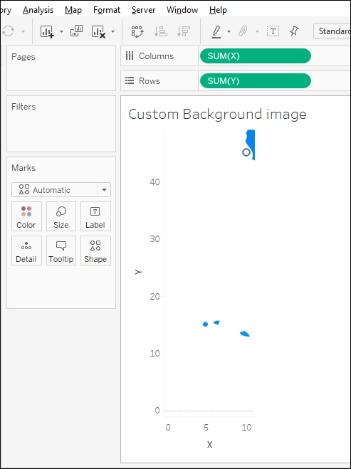
- Let us OK. Here, we quickly need to make sure that the column that says Valid has Yes in it. Yes will essentially mean that we are good to go. Let's click OK once again and then drag the field X from the Measures pane and drop it into the Columns shelf, followed by dragging the field Y from the Measures pane and dropping it into the Rows shelf. We will get the following view:
- Earlier, while calling the image, we entered values as 0 to 100 for both X and Y axes. However, in this view, the X and Y axes start from 0 but are not extending to 100; because of this, we are not getting the complete image. To get the complete image, edit the axes by right-clicking on each axis in the view and selecting the Edit Axis option. Refer to the following image:

- Once we do that, we will get the following view, where we will select the Fixed option and enter the values as 0 and 100 respectively:
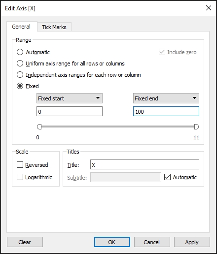
- We will do the same for the Y axis to get the following view:

- Now that we have the image in our view, it is time to plot the data. However, in the Excel file, we only have the data for the X and Y fields for Washington. We don't have the data for any of the other locations. Further more, the point for Washington is shown at the coordinate (10, 45). However, this is not the right position for Washington. Refer to the following image:

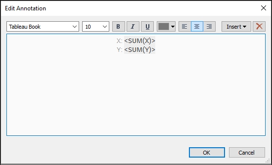
- The reason why we did not fill in the data for columns X and Y is because we need to plot the locations at their correct position on the map. Now that we have the image, we can find the coordinates for each location with respect to the image coordinates, and feed it back into Excel. To do so, we will right-click on the Washington area on the image and select Annotate | Point. Since the area for Washington spans from approximately 15 to 25 on the X axis and 65 to 75 on the Y axis, we need to make sure that we click somewhere in the center of the area. This way we'll get values closer to what I have got. Refer to the following image:

- Once we do that, we see will a textbox, as shown in the following image:
- We will retain all the default settings and click OK to get the following view:

- Now that we have the XY coordinates for Washington, we will update them in our Excel file. Using the same approach, we will find the XY coordinates for the rest of the locations as well. As mentioned earlier, our X and Y values may change depending on the exact point where we right-clicked and enabled the Annotations. After making these entries in the Excel file, save this file. Refer to the following image:

- To maintain consistency, the updated Excel file can be downloaded from https://1drv.ms/x/s!Av5QCoyLTBpnhkRaCtziJ7RmwErb.
- Next, in Tableau, in the Data window, let us right-click on the Custom Background Image data (Custom Background Image data) data source and select Refresh. Refer to the following image:

- We will then drag Location from the Dimensions pane and drop it into the Label shelf. We can clear the annotations by right-clicking on the Annotation and selecting the Remove option. We will have to do so for each and every annotation. After we have removed all the annotations, click on the Color shelf and select the Black color. Once we are done with this, we will have the following:

When we are using the map as an image, the locations in our data may not perfectly fit to the areas on our map image, and these points may not be located exactly where they should be. Thus, in the preceding recipe, we followed a couple of steps to get the X and Y coordinates of these locations with respect to their position on our map image. This way, we were able to plot the locations on their respective positions on our image. There are a lot of other ways that we can use background images, and people have done some great stuff using background images in their Tableau views. Take a look at some of the visualizations that have been posted on the Tableau public gallery:
There are some informative articles on Tableau's website, which will help you understand the concept of using background images in more detail. Refer to the following links:
The primary focus of this chapter was to look into some of the advanced visualizations in Tableau. We saw how to create and use maps in Tableau. We also looked at various chart types, which can be used for comparing multiple measures. There is an additional chart, which can help us to compare two measures. This is called the Bullet Chart, and is typically used to do a Plan versus Performance analysis. We'll learn more about this chart when we talk about Reference Lines in Tableau.