
Reference lines are typically used for providing a visual comparison against benchmark values. Imagine having a vertical bar chart showing product sales. Further, imagine that these products have a budget value that they are supposed to achieve. Now, if we are able to show a small line which represents the budget thresholds for each of the products, then we can provide a quick visual display to see which products are not exceeding target and which products are exceeding the target. The chart type which is typically used to do a target versus actual comparison is called a bullet chart.
Bullet charts were developed by Stephen Few. A bullet chart is an extension of the regular bar chart, where the length or height of the bar represents the actual values and the horizontal or vertical reference line represents the target.
Let us take a look at bullet charts in detail in the following recipe:
For this recipe we will use the fields from the already connected CoffeeChain Query table of Sample-Coffee Chain.mdb file or the Sample-CoffeeChain (Use instead of MS Access) .xlsx file for our Mac users and continue working in our My first Tableau Workbook. We will begin by creating a bar chart by using the Product Type field, Product field and the Sales field. We will also use the Budget Sales field for our reference line. Let us get started with the recipe.
- Let us create a new sheet and rename it as
Reference Line-Bullet chart. - Next, let us make sure that we select the CoffeeChain Query (Sample - Coffee Chain) data source from the Data pane. Following this, we will create a bar chart by dragging Sales field from the Measures pane and dropping it into the Rows shelf and then dragging the Product Type field from the Dimensions pane and dropping it into the Columns shelf, followed by dragging the Product field from the Dimensions pane and dropping it into the Columns shelf, right after the Product Type field. This will create a bar chart as shown in the following screenshot:

- Now, we need small horizontal lines for each Product to show their Budget Sales. For doing this, we will drag the Budget Sales from the Measures pane and drop it into the Detail shelf. Refer to the following screenshot:

- Let us right-click on Sales axis in the view and select the Add Reference Line option. Refer to the following screenshot:

- Once we do that, we will get the dialog box shown in the following screenshot:

- The dialog box gives us a choice to select from either a reference Line or a Band or Distribution, or Box Plot. We will keep the default Line option and then move to the next section which says Scope. In this section, we are presented with three choices: Entire Table, Per Pane and Per Cell. Now, since we want a reference line for each product, we will select the Per Cell option. Refer to the following screenshot:

- The section which is called Line is where we will select the field that we want as a reference. The current selection is Value: | SUM(Sales). We will change that to SUM(Budget Sales). Refer to the following screenshot:

- We will keep the default aggregation as Average. We will then move to the Label: section where we will select the None option. Refer to the following screenshot:

- Keeping the rest of the selections as it is, click OK and our view will update as shown in the following screenshot:
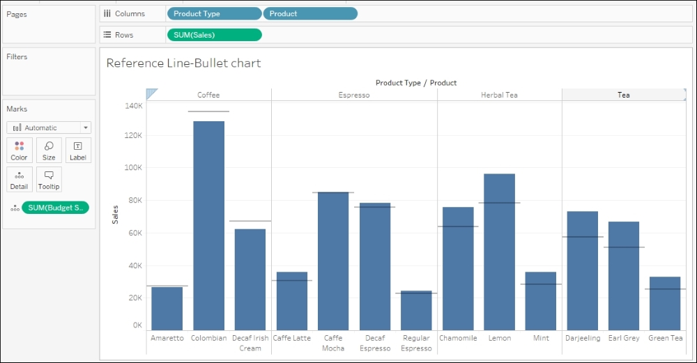
In the previous chart, the height of the bar indicates the actual Sales value whereas the gray horizontal line over each product indicates the Budget Sales value. The products where the bar crosses the line have exceeded their targets, whereas the products where the bar does not cross the line have failed to achieve it. Thus, we can see that Columbian coffee is below-target whereas Lemon herbal tea is over-target.
Previously in the recipe we selected the Per Cell option. This was because we wanted Budget Sales to be shown for all the products individually. However, if we had wanted to look at the Budget Sales for each Product Type, then we would have selected the Per Pane option. The Entire Table option would have given us the Budget Sales for the all the products combined. Refer to the following screenshot:

Further, if we had selected the Band option instead of Line, our dialog box would then update as shown in the following screenshot:

Previously we created the bullet chart from scratch by dragging and dropping fields. However, a quick and easy way of creating a bullet chart is from the Show Me!. To do this, let us select Product Type, Ctrl + select Product, Ctrl + select Sales, and Ctrl + select Budget Sales. Then select the Bullet chart option via Show Me!. Refer to the following screenshot:

We will now get the view shown in the following screenshot:

If we convert the previous horizontal chart to a vertical chart using the Swap button in the toolbar, then our view will update as shown in the following screenshot:

If we look carefully, we will notice that the Sales field and the Budget Sales field have interchanged. So, instead of having Budget Sales in the Detail shelf, we have Budget Sales on the axis, and instead of having SUM(Sales) on the axis, we have it in the Detail shelf. Because of this, the chart is giving a misleading picture where it is showing that Columbian coffee has exceeded target whereas Lemon herbal tea is below target. In order to fix this, we will right-click on the axis which says Budget Sales and select the option of Swap reference line fields. Refer to the following screenshot:

This will update our view as shown in the following screenshot:

Now, in the previous screenshot, we will see the reference line as well as some gray bands. This is the Distribution of Budget Sales. So if we hover over the band, we will see what it is representing. In the previous screenshot, the gray bands indicate 60% of Budget and 80% of Budget. Refer to the following screenshot:

We can edit these distribution bands by right-clicking on the axis and selecting Edit reference line | 60%, 80% of Average Budget Sales. Refer to the following screenshot:

Once we select this option, we will get a view as shown in the following screenshot:

If we change Percentages:, then our view will update to show the gray bands as per our selection.
As we can see in the preceding screenshot, when we select the Distribution option, we can look at Percentages, Percentiles, Quantiles and Standard Deviation.
Further, reference lines can be made dynamic by taking inputs from the end user through parameters. Refer to the following screenshot:
