
When we build dashboards, we give our end users a holistic view of the data. However, to see what is really happening with the data, the users need to interact with the dashboard and uncover insights all by themselves. We can make this process a little easier for the end users by guiding them via some instructions on the dashboard; however, it is still an investigative approach. It can be time-consuming for the end users to first find the insights and then take action, so rather than making our users dig out the findings, it would be great if we could give them some readily consumable insights by placing data in an easy-to-understand manner.
Story points in Tableau help us achieve this objective by giving us a framework for walking the end users through series of data points that require attention. Very simply put, story points in Tableau helps us tell stories about our data while still being connected to the data, so when the data changes, our story updates accordingly.
For this recipe, we will use the fields from the already connected World Indicators.tde dataset that we downloaded for our earlier chapter from the following link: https://1drv.ms/u/s!Av5QCoyLTBpnhks3n2mxItiI7-tb.
We downloaded this extract file earlier and saved it to our Tableau Cookbook data folder in Documents/My Tableau Repository/Datasources. We will continue working in the same workbook My first Tableau Workbook. Since we have already made a connection to this .tde file, it should be available for us to use in the Data window of the Tableau workbook. Let us get started with the recipe.
- Let us create a new sheet and rename it to
Global Energy Usage. - Select the
World Indicators.tdedata source from the Data pane to see the Dimensions and Measures of that data source. Refer to the following screenshot:
- Next, we will drag the Country field from the Dimensions pane and do a Ctrl + select on the Energy Usage field in the Measures pane and then select the filled maps option from Show Me. Refer to the following screenshot:

- Once we do that, we will get the following view:

- In the preceding chart, we can clearly see that the US and China are highest in terms of overall energy usage. Now that we have found this information, the next question that comes to mind is how has the energy usage trend been for both the US and China? Have they been the highest energy consumers all throughout the timespan? And so on. To find this information, we will create a new sheet and rename it
Energy Usage Trend for US & China. - Let us drag Year from the Dimensions pane and drop it into the Columns shelf. Then, drag the Energy Usage field from the Measures pane and drop it into the Rows shelf. Refer to the following screenshot:

- Once we do that, we will get to see the overall energy usage trend. However, we need to focus only on the US and China. So, let us drag the Country field from the Dimensions pane into the Filter shelf and select only United States and China. Refer to the following screenshot:

- Once we do that, once again, drag Country from the Dimensions pane and drop it into the Color shelf. This will update to the following view:

- This view throws out an interesting finding. As we can see, the United States, which is the orange line, has been consuming energy in a steady manner, whereas China, which is the blue line, had a recent exponential growth in energy consumption to the point where it has surpassed the energy consumption of the United States.
- Lastly, let's see whether the increase in energy usage for China has led to an increase in the CO2 emissions as well. In order to find this, let's duplicate the earlier sheet named
Energy Usage Trend for US & Chinaand rename it asEnergy Usage vs CO2 Emissions. We'll then make some quick modifications to this sheet. To begin with, remove Country field from Color shelf and place it in the Rows shelf. Refer to the following screenshot:
- Next, drag the CO2 Emissions field from the Measures pane and drop it onto the Energy Usage axis. Refer to the following screenshot:

- Once we do that, our view will update, as shown in the following screenshot:

- In the preceding chart, we can clearly see that
Energy usage vs CO2 Emissionstrend has been steady for United States whereas for China the CO2 Emissions have increased multiple times with the increase in Energy Usage. Further more, in this chart, the line color indicates the Measures and not the Country, as shown in the previous sheet. This can be confusing for our end users. Therefore, let's quickly make sure to change the color in the preceding chart and to do so, we will right-click on the Color legend and select the Edit Colors… option. Select the new colors and our view will update as shown in the following screenshot:
- Now that we have our sheets ready, let's proceed to create the storyboard. We will begin by selecting the New Story option from either the Story | New Story from the toolbar or from the tab that looks like an open book, next to the New Worksheet and New Dashboard tab at the bottom. Refer to the following screenshot:

- Once we do that, we will get the following view:

- Rename it to
My sample storyboardinstead ofStory 1. Now, just like we dragged the sheets on our dashboard earlier, we will drag the sheets on the Story. Refer to the following screenshot:
- This action will update our following view:

- In the preceding image, we see that there is a vertical scroll on the right-hand side. This is because the Story size on the left-hand side bottom section is currently set to 1016 x 964. Let's change that to Automatic. Refer to the following screenshot:

- Once we do that, we will get rid of the scroll bar and our view will update as shown in the following screenshot:

- Next, let's get the
Energy Usage Trend for US & Chinasheet on the story. We will drag the sheet from our Sheets section on the left-hand side and drop it over the button which reads New Blank Point. Refer to the following screenshot:
- However, when we are in the process of dragging and dropping, the New Blank Point tab changes and reads as Add New Point. Refer to the following screenshot:

- Once we drop the sheet, our view will update, as shown in the following screenshot:

- After we are done with getting the
Energy Usage Trend for US & Chinasheet, let's also get theEnergy Usage vs CO2 Emissionssheet by dragging and dropping it into the next Add New Point tab. Once we do that, our view will be as shown in the following screenshot:
- Now that we have all three sheets on the Storyboard, let's quickly add some finishing touches. There are three tabs which read as Add a caption, so let's begin by clicking on the Add a caption tab which is first from the left. This will show the Global Energy Usage map. Double-click on the tab to start typing. Since this tab gives us the overall energy usage across various countries, we will type
Energy usage across the Globe; on the next Add a caption tab, typeEnergy usage trend across years for US & China, and finally, on the third Add a caption tab, typeEnergy usage vs CO2 emission trend across years for US & China. This will update our view to that shown in the following screenshot: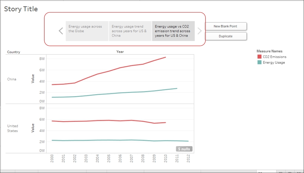
- This is how we create a Story. Now, to run through our Story, we can either click on each of the tabs on top in a sequential manner or use the forward or backward arrows. Next, let's make sure we change the title of our Story to something meaningful: double-click on the text which reads Story Title and change it to
Energy Usage Story. Refer to the following screenshot:
- Lastly, we need to make sure we hide all the extra sheets that are already part of the Story. To do so, right-click on the Story tab which reads as
My sample storyboardand select the Hide All Sheets option. Refer to the following screenshot:
In the preceding recipe, we saw how to create a story. Now, when we click on each tab, it gives us one Story point from the entire Story we are trying to convey to the end user.
In the earlier recipe, we pulled individual sheets on to our storyboard. However, in case we wish to use our dashboards as story points, we can do that as well. When we look at the Sheets section on the left-hand side, we will see the list of all the worksheets, as well as the dashboards we have created so far. Refer to the following screenshot:

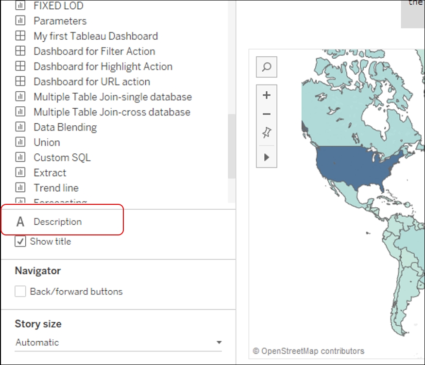
Further more, in the preceding recipe, if we want to give more details to our end user or perhaps explain why we are narrowing our focus only to the US and China, we can do so by adding descriptions to our story points. For this, we can select our desired Story point and then double-click on Description in the left-hand section. Refer to the following screenshot:
To learn more about Story, refer the following link: http://onlinehelp.tableau.com/current/pro/desktop/en-us/stories.html.