Chapter 2
Persuasive Visuals
As filmmakers, we are highly conscious of elements the audience is only unconscious of.
Norman Hollyn
Film Editor
Professor, Usc School of Cinematic Arts
Chapter Goals
The emphasis of this chapter is to illustrate visual literacy. Specifically, to:
 Define “visual literacy” and other key visual composition terms
- Show how to catch and control the eye of the viewer
- Stress that the camera represents the eyes of the audience
- Illustrate the Six Priorities that determine where the eye looks first in an image based on composition
- Illustrate composition techniques we can use to make our images more compelling
- Illustrate the importance of the Rule of Thirds in framing
- Illustrate how camera position, blocking, framing, and angle affect the emotional response an image evokes in our audience
- Discuss whether sex sells
AN IMAGE DOESN’T EXIST IN A VACUUM. Understanding an image involves seeing the content, the environment, and the composition and placement of the image. In other words, every image is seen in the context of everything around it—and around us. The best images are not just “pictures”; they tell stories, like Figure 2.1.

Figure 2.1 Every image tells a story. Just like a story, the more focused the image, the more powerful story it tells. (Image Credit: pexels.com)
A good plan makes for good pictures.
Like any good story, an image improves when you think about:
- What you want to say
- Who you are saying it to
- What you want them to do after you say it
A good plan makes for good pictures.
You tell a funny story differently from a ghost story. A story told to children has different pacing than a story told to adults. Explaining a technical subject to people who are familiar with the subject is different from explaining it to people who are unfamiliar with it.
Not all of us are born storytellers, but all of us can improve with practice. Learning the “rules” of effective visual storytelling will also help. While “rules were made to be broken” remains true, still, to break the rules, you first need to know what those rules are.
What happens if you don’t follow the rules? Well, most likely, no one would yell at you. No one would get hurt. No laws would be broken. Still, your message may lack impact and may not register with your audience. Given all the time and effort it took to create your image in the first place, can you really afford to overlook anything that might improve your results?
My core idea is that, as creators of visual messages, we are in control of where the viewer’s eye looks within an image, the information the image delivers, and the emotion it evokes. By using these rules, we magnify the impact our visuals have on an audience. In this chapter, I’ll illustrate the key visual concepts that we’ll spend the rest of the book putting into practice.
As creators of visual messages, we are in control of where the viewer’s eye looks within an image, the information it delivers, and the emotions it evokes.
Visual Literacy
Whether you are shooting photographs, designing motion graphics, or creating presentation slides, the image you create is what the audience sees. In other words, the image represents the point of view of the audience.
While this seems self-evident, it is hard to remember that when you change the position, the framing, or the content in front of the camera, what you are actually doing is changing what the audience sees and their perception of your message. When you move the camera, you are dragging the audience right along with you.
The quote from Norman Hollyn that started this chapter is one of my favorites. Norman was a highly talented film editor, as well as a professor at the USC School for Cinematic Arts. He and I spent four years coproducing and hosting the 32-part web series 2 Reel Guys (www.2reelguys.com), which we described as “film school for filmmakers who didn’t go to film school.” Working with Norman as we wrote the scripts, then hosted each episode, was a deep-dive into the principles of filmmaking. My strengths are in media and technology; his were in storytelling and editing. What I learned from working with Norman was that the best visual media—even still images—tells a story. As communicators, our job is to figure out what that story is and the best way to tell it.
As an audience, we respond to these visual techniques without understanding why we respond the way we do. Very little in this chapter will be new to a filmmaker or graphic designer—they’ve been using these techniques for decades. However, what’s important is that the rest of us don’t know these techniques.
Let’s set the scene by defining four key terms:
- Visual literacy
- Controlling the viewer’s eye
- Composition
- Frame
Visual literacy. The term “visual literacy” was first coined in 1969 by John Debes, who founded the International Visual Literacy Association. The basic definition is: “The ability to read, write, and create visual images. It is a concept that relates to art and design, but it also has much wider applications. Visual literacy is about language, communication, and interaction. Visual media is a linguistic tool with which we communicate, exchange ideas, and navigate our complex world.”1
[1] (Harrison, 2017)
Unlike real life, each still image and video is viewed through a frame, which creates the illusion of a boundary to every image.
Controlling the viewer’s eye. Because each image tells a story, as communicators we need to make sure that the story the audience perceives is the story we are telling. Norman called this “manipulating” the viewer. I call it “guiding.” Either way, we need to control the eye and mind of the viewer as much as we can to make our message as powerful as possible. Never cede control of your message to the viewer. Over the course of this book, you’ll learn a wide variety of techniques to control your message.
Composition. This is the process of designing the content and technical aspects of an image. This could be as simple as taking a quick snapshot or as complex as shooting a scene for a major motion picture. Composition determines the choice and arrangement of the elements that go into creating an image. (Sometimes it is more important to decide what to leave out than what to put in.)
Frame. In real life, when we look around, we see everything all at once: left/right/up/down, close-up, and far away. But, when we look at any digital image, whether a video or still, we see it through a frame, an arbitrary boundary that determines the edges of the image.
What’s truly important about the frame is that our brain assumes the edges of the frame are the limit of what is actually “there.” The brain jumps to the conclusion that the frame represents the entirety of an image. Even though that’s clearly not true, this false conclusion is impossible to resist. An actor, standing on the set, can easily see things outside the frame. For example, the camera, the crew behind the camera, the set and the lights above the set, the discarded props and costumes, and even actors—such as that blood-thirsty monster—that haven’t appeared on set yet. But to our eyes, looking at the image, all we see is what’s in the frame.
Because of the frame, the brain imposes artificial limits on the image. Those brain-imposed limits allow us, as communicators, to manipulate images to control the content, emotion, composition, and, ultimately, the story that each image tells. In reality, the heroine is not being attacked by the evil monster, but it is impossible to tell our brains that. The frame is a powerful instrument of persuasion.
The Six Priorities Determine Where the Eye Looks First
All things being equal, when looking at an image, we look at faces first. But, things are rarely equal, either by accident or by intent. What if there is more than one face in the image? What if there’s only one face but it’s obscured? What if the face is really small? That’s where these priorities come in; they help us guide the viewer’s eye to where we want it to look first.
I’m indebted to Norman Hollyn who first introduced this concept of visual hierarchy to me, though I’ve modified his order and definitions. Our brain is hardwired to process images in a specific order. We will refer to this list often as we create images because it determines the order in which our audience looks at elements within the image. (In fact, for easy reference, you’ll find these listed at the start of each section in this book.)
When looking at still or moving images, such as Figure 2.2, the eye goes through a “checklist” of where to look first, then second, and so on. I call this checklist “The Six Compositional Priorities that Determine Where the Eye Looks First.” That is, ah, a mouthful, so I’ll abbreviate this as the “Six Priorities.” The eye looks at an image and the elements in it in a specific order, based on these priorities:

Figure 2.2 Why does your eye see the black puzzle piece first? (Image Credit: pexels.com)
1 |
Movement |
2 |
Focus |
3 |
Difference |
4 |
Brighter |
5 |
Bigger |
6 |
In front |
If something is moving, our eyes look there first. If nothing moves, we look at that which is in focus. If everything is in focus, we look at that which is different. And so on. We look at elements that are higher on this list before we look at elements that are lower. These priorities are not only used for images or video; they also apply to how we look at the world around us in real life.
Let me illustrate each of these.
The Six Priorities guide the eye of the viewer so they see what you want them to see in the order you want them to see it.
It is impossible to overemphasize the importance of movement. Long before we learned to write, we were hunters—or being hunted. Our brains are hardwired to pay attention to anything that moves. Our first thought is, “Is that food, or are we food?” Movement always gets our attention.
Obviously, still images don’t “move” as video does. However, we can imply movement, even in a still image. This implied movement often makes for a more compelling image. (When we create video, movement becomes an effective tool for attracting and guiding the eye of the viewer. I’ll cover this in Section 3, “Persuasive Moving Images.”)
Movement is hard to show in a book. For example, if Figure 2.3 were a film, your eye would go first to the lead horse because it is moving and bigger. Here in the book, the image implies movement. A great deal of commercial photography—especially fashion—uses implied movement to attract the eye.

Figure 2.3 Movement. The eye is drawn to movement or, in the case of a still image, the illusion of movement. (Image Credit: pexels.com)
Next, our eye goes to that which is in focus. If everything in the image is in focus, which happens with most smartphone shots, the eye skips to the next lower priority. But, if the focus varies within the image, our eye sees the object that is in focus before anything else, other than movement. This is why so many ads and movies present images where only a small portion of the frame is in focus. It tells the eye where it should look first.
Figure 2.4 illustrates this. The frame is filled with people, but we see the laughing woman first because she is the only one in focus.

Figure 2.4 Focus. Why does your eye see the smiling woman first? Because focus is more important than brightness or position. (Image Credit: Rene Asmussen / pexels.com)
Next, the eye goes to that which is different. This is why the black puzzle piece in Figure 2.2 attracted your attention. The entire image was white except for that one piece. Different could be a different gender or color or shape or…well, just about anything. Our eye instantly spots something that is out of place, or different, from the surroundings.
In Figure 2.5, you saw the rectangular color palette first because every other shape in the image was either curved or lighter in color. In other words, the simple difference of the color palette was enough to attract our attention first.
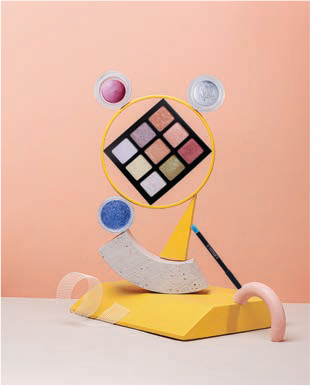
Figure 2.5 Difference. Your eye went first to the square of colors because it is different, in shape, color, and size, than anything else in the frame. (Image Credit: pexels.com)
Continuing down our list of priorities, if there’s no movement, everything is in focus, and all the elements are similar, our eye goes to that which is brighter. This explains why so many headlines in digital images are white. White attracts the eye, as you can see in Figure 2.6. (So does black against a white background, as in Figure 2.2, but that’s because black is different compared to the white background, and difference ranks higher.)

Figure 2.6 Brighter. Your eye went first to the woman on the left, because she is brighter than anything else in the frame.
In fifth position is size; the eye tends to look at the biggest element in the frame first. In Figure 2.7, as the woman looks back at the camera, she is the largest element in the frame. (She is also in focus, which also helps guide the eye.) We see her first and then look over her shoulder into the room to see what the meeting is about.
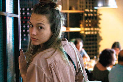
Figure 2.7 Bigger. Your eye went first to the woman on the left, because she is bigger than anything else in the frame. (Image Credit: Elle Hughes / pexels.com)
It is common to combine multiple priorities in a single image to make sure that the eye goes where you want. It is the rare image where only one priority is used.
In the end, if all else is equal, our eye goes to the object in front. In Figure 2.8, all the men are roughly the same height and size. They are all wearing similar clothes. So, where does our eye go first? To the person in the front.

Figure 2.8 In front. Your eye went to the man in front. When other criteria are missing, equal or not relevant, your eye goes to the subject in front. (Image Credit: Clarita Alave / pexels.com)
The Six Priorities are really helpful in understanding how to catch and control the eye of the viewer. The eye doesn’t stop exploring an image after its first look; rather, it explores the image based on the Six Priorities. By designing your image and text with these in mind, you can guide the viewer to see what you want them to see in the order you want them to see it.
Elements of the Six Priorities are rarely used by themselves; combining multiple priorities in the same image drives home where the eye needs to look first. We frequently use a “V” shape when positioning (called “blocking”) actors in dramatic or dance scenes, as you can see in Figure 2.9. Positioning the lead actor or singer at the front of the V, combined with a slightly different—and, often, brighter—costume and increased lighting guarantees that the audience will focus on the person the director wants you to watch, in this case, the lead singer.

Figure 2.9 These concepts can be combined. Your eye must go first to the woman in front, because she is also brighter and bigger than any other person in the shot. (Image Credit: Cottonbro / pexels.com)
Our number one goal is to capture and retain the eye of the viewer so that we can deliver our message. Applying the Six Priorities can help you better control where the viewer’s eye will look first, then second, and then third as it checks down elements on the list.
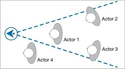
The Camera’s Field of View
The field of view of a camera, unlike our eye, is in the shape of a V, or a cone, as shown. This is one of the main reasons that groups are blocked as a V; there just isn’t enough room for everyone to be in front.
In this illustration, Actor 1 is front and center, and Actors 2 and 3 are visible over the first actor’s shoulder. Actor 4, even though closest to the camera, is invisible because it is outside the field of view of the lens. Video crews take advantage of this field of view to place audio operators, cue cards, or props that need to be close to the talent but not visible.
What Makes an Image Compelling
In 1991, Molly Bang, an award-winning children’s book illustrator, published a trail-blazing book, called How Pictures Work, analyzing how the structure of an image works to engage the emotions of a viewer and how the elements of an artwork can give it the power to tell a story. If you can find a copy in your local library, it is worth spending a couple of hours reading it, because you’ll spend the next year reflecting on it.
In her book, Molly investigated how changing shapes, positions, and colors would affect the visual telling of Little Red Riding Hood. In Figure 2.10, we see a visual representation of Little Red Riding Hood in the middle of the forest, about to meet the wolf. However, while the image evokes the story of Red alone in the forest, it isn’t particularly scary. How could she change the composition of the image to make Red meeting the Wolf scarier?
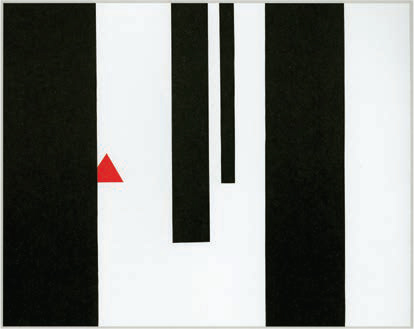
Figure 2.10 Using simple shapes cut from construction paper, Molly Bang experimented with the best way to tell the story of Little Red Riding Hood visually. (From Picture This, ©2000 Molly Bang. Used with permission from Chronicle Books, LLC)
As a result of her work, Molly discovered 12 principles that detail how the structure of an image affects its effectiveness. The first four describe the effects of gravity on how we perceive an image; the last eight reflect the world of the image itself.
Do not worry about whether the picture is pretty. Worry about whether it is effective.
—MOLLY BANG
1 |
Smooth, flat, horizontal shapes give us a sense of stability and calm. In fact, smaller horizontal or horizontally oriented shapes within a picture can also be felt as islands of calm. |
2 |
Vertical shapes are more exciting and more active. Vertical shapes rebel against the earth’s gravity. They imply energy and a reaching toward the heights or the heavens. If a horizontal bar is placed across the top of a row of verticals, stability reigns again. |
3 |
Diagonal shapes are dynamic because they imply motion or tension. We tend to read images diagonally from left to right, the same way Westerners read a page of text. |
4 |
The upper half of a picture is a place of freedom, happiness, and power; objects placed in the upper half also often feel more “spiritual.” The bottom half of a picture feels more threatened, heavier, sadder, or constrained; objects placed in the bottom half also feel more grounded. |
5 |
The center of the page is the most effective “center of attention.” It is the point of greatest attraction and stability. However, shifting an element off-center makes it more dynamic because the edges and corners of the image are the boundaries of the picture world. Everything stops at the edge. |
6 |
In general, white or light backgrounds feel safer to us than dark backgrounds because we can see well during the day and only poorly at night. |
7 |
We feel more scared looking at pointed shapes; we feel more secure or comforted looking at rounded shapes or curves. |
8 |
The larger an object is in a picture, the stronger it feels. |
9 |
We associate the same or similar colors much more strongly than we associate the same or similar shapes. |
10 |
Regularity and irregularity—and their combinations—are powerful. Though perfect regularity and perfect chaos are both threatening. |
11 |
We notice contrasts; put another way, contrast enables us to see. |
12 |
The movement and import of the picture are determined as much by the space between the shapes as by the shapes themselves. |
Molly concludes, “When we look at a picture, we know perfectly well that it’s a picture and not the real thing, but we suspend disbelief. For the moment, the picture is ‘real.’ When we are just beginning [to design], we often constrain our pictures…we make all the elements fairly similar in size; we tend to use the center of the page and avoid the sides; we tend to divide the space into regular sections; we tend to go for realism rather than essence.…And very often we sacrifice emotional impact for ‘prettiness.’ Do not worry about whether the picture is pretty. Worry about whether it is effective.”2
[2] (Bang, 2016, pp. 52–92)
The camera represents the point of view of the audience.
Molly Bang illustrates the power of these principles in Figure 2.11, which is strikingly more dramatic than Figure 2.10. As you’ll learn, her principles extend our original Six Priorities. Let’s explore these ideas further by looking at several specific visual composition techniques.

Figure 2.11 Again, simple shapes, but much more dynamic, exciting, and scary. Molly Bang’s principles explain why. (From Picture This, ©2000 Molly Bang. Used with permission from Chronicle Books, LLC)
Visual Composition Basics
An image contains more than content. Composition, blocking, and framing also play a role in how effectively an image communicates.
Changing Camera Angle: Wide vs. Close
Let’s start with something simple: the angle of a shot. Wide shots show geography, where people and objects are positioned in the frame. We use these to set the scene. As the camera moves closer—and remember, as you move the camera, you are moving the audience—we see more detail. However, and this is important, close-ups also magnify emotion. The closer you get, the more emotion the shot contains.
Clearly, the most emotion is concentrated in the face, but because close-ups magnify even the smallest details—a twitch of a half-covered finger, a shoe moving stealthily across a carpet, or a drop of water hitting a surface—all contain significant emotional impact, depending upon the story.
Figure 2.12 presents the environment where she is dancing, the sweep of her movement, and the reactions of the dancers behind her. The close-up in Figure 2.13, though, showcases the details in her costume and allows us to see the concentration and grace in her face.

Figure 2.12 Compare the emotional difference between this wide shot… (Image Credit: Robert Stokoe / pexels.com)

Figure 2.13 …and this close-up. The wide shot shows the sweep of her movements, while the close-up shows detail and emotion. (Image Credit: Robert Stokoe / pexels.com)
In addition, the camera angle itself conveys emotion. Look at the combination of wide and tight shots in Figure 2.14. The wide shot sets the scene of her isolation, while the close-up explains why. Neither of these shots is “better.” Rather, we need to understand their differences and decide which angle works best for our story.

Figure 2.14 The wide shot (left) emphasizes the isolation she feels, while the close-up (right) explains why. (Image Credit: pexels.com (left), Engin Akyurt / pexels.com (right))
Just as a story needs variations in pacing, so, too, do images. Generally, we tell a visual story by starting wide to show the audience where we are and then gradually move closer to amplify the detail and emotions in our story. Think of getting closer as an “emotional magnifier.” You don’t want to stay wide or tight all the time. The key is to shift position as your story evolves.
I also want to point out that getting extremely close to someone’s face emphasizes the emotions in the image to such an extent that the person appears unattractive. You’ll see extreme close-ups used a lot when we want to make someone seem out of control, out of touch, or generally unpleasant. Extreme close-ups are also often displayed in black-and-white to create a starker look. We’ll discuss color in Chapter 5, “Persuasive Colors.”
While there is a stylistic difference between physically moving the camera closer to a subject versus zooming in, called “depth of field,” the emotional context remains the same. We’ll discuss depth of field later in this chapter.
Changing Camera Position: High, Low, and Eye Level
Let’s continue moving the camera, but rather than moving it closer or farther from our subject, let’s move it vertically. Changing the height of the camera changes both where the eye goes first in the image and the emotional feeling of a shot.
The height of the camera can help control where the viewer’s eye goes first. For example, in Figure 2.15, the height of the camera shifts the viewer’s eye first to the background. Lowering the camera’s height, shown in Figure 2.16, shifts the viewer’s eye to the foreground first. Filmmakers use this trick often, starting with a low angle to identify the subject and then raising the camera to show us the environment they are moving through.

Figure 2.15 High angles emphasize elements in the background. Your eye goes to the background first. The brightness of the hidden sun also helps attract the eye to the background. (Image Credit: Trace Hudson / pexels.com)

Figure 2.16 While low angles emphasize elements in the foreground. Your eye goes to the foreground first. Here, the camera is about 2 feet off the ground. (Image Credit: pexels.com)
High Angles
The camera is raised to emphasize the background. Cranes and tall buildings are often used to get the camera up high enough.
Low Angles
The camera is lowered to emphasize the foreground. Placing the camera a few inches off the ground puts extreme emphasis on the foreground.
There’s another emotional component to the height of the camera. If you think about it, when we were small children, everything around us seemed very big. We were essentially powerless, overwhelmed by our surroundings. As we grew and gained strength, many things that used to tower over us became smaller as we became stronger and more able to take care of ourselves. Now, when we talk with a friend, we try to meet them eye to eye, on the same level as they are.
These emotional values that we experienced growing up translate into how we perceive images:
- When the camera is high, looking down, as in Figure 2.17, it diminishes the subject, making them appear small and weak.

Figure 2.17 The height of the camera, looking down, diminishes the man. (Image Credit: Gerd Altmann / pexels.com)
- When the camera is low, looking up, as in Figure 2.18, it makes the subject look heroic, bigger than life.

Figure 2.18 The hero shot. The camera is lower than the eyes of the two subjects to make these two normal men seem larger than life. The audience is “looking up” to them. (Image Credit: Shannon Fagan / 123RF)
- When the camera is at the same eye level, the subject seems like one of us, a peer (Figure 2.19).
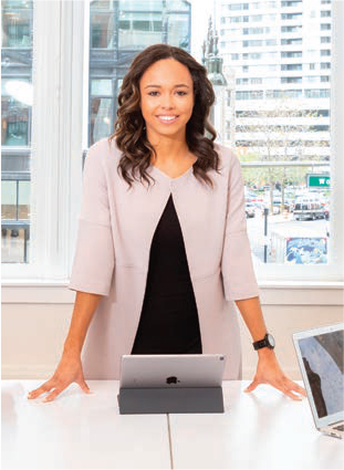
Figure 2.19 Here the camera is at eye level with the subject. Notice how this makes both the subject and the audience seem to be peers, even though she is a CEO. (Image Credit: Rebrand Cities / pexels.com)
You’ll see these angles used constantly in commercials to guide our emotions because they are so ingrained in how we perceive the world.
A low angle looking up (Figure 2.18) is so popular, it even has its own name: the “hero shot.” Virtually every commercial or publicity photo uses this angle because it evokes feelings in the audience that we are not worthy to be associated with something so superior. “Yet,” the narrator intones, “for just a few dollars even you can associate with something this glorious.”
OK, maybe that’s a bit over the top. But this angle is powerful, and it works, reliably, every time. Watch for it—you’ll see it everywhere.
The emotions attached to the angle from which we view something also factor into sculptures of famous figures, like Julius Caesar in Figure 2.20. They are put on pedestals to force us to “look up to them.” (The fact that Julius Caesar is also carved larger than life doesn’t hurt either; it makes him bigger.)

Figure 2.20 A statue of Julius Caesar. (Image Credit: Skitterphoto / pexels.com)
Where You Hold the Camera Affects the Audience
Many times, when we take a photograph, we hold the camera at a height that is comfortable for us. However, that also means we are unconsciously placing an emotional twist on all our images, especially if there’s a big difference in height between the person holding the camera and the subject of the shot.
Remember, the camera is the eyes of the audience. When you take a picture, think about what you want the audience to see and feel. The more you think of the camera as “the eyes of the audience,” the better your pictures will be.
Placing the camera at the same height as the eyes of the subject (Figure 2.19) makes both audience and subject peers. Newscasters use this angle constantly because they want to appear to be “one of the folks.” You’ll also see politicians and business CEOs use this angle. It says, “While I may have a lot of power, really, I’m just the same as you.”
Blocking: Placing People and Cameras
“Blocking” is a term that is used in theater, dance, video, and film. It describes the process of working out the specific positions of actors, dancers, crew, and cameras for a scene or shot.
The technical term for positioning actors and cameras is “blocking.” It’s the choreography of placing elements within the frame to create an image. Just as we can adjust the position of an actor, we can adjust the position, movement, framing, and focus of a camera.
Three terms that we use constantly in blocking are “foreground,” that which is closest to the camera; “background,” that which is furthest from the camera; and “mid-ground,” that which is between the foreground and background.
Look at the image in Figure 2.21 of two women having a conversation. The camera is placed evenly between them—what I call a “center shot”—so that the audience can watch both of them. In fact, it’s hard to tell, from this shot, who’s the subject of this photo; both faces are equal size and somewhat in profile. The eye isn’t sure who to look at first.

Figure 2.21 In this image, the two women have equal “weight.” Both are the same size and seen in half-profile because the camera is centered between them. (Image Credit: Fauxels / pexels.com)
Shooting from an angle is generally more interesting than shooting from the center. However, when you want all subjects to have the same “weight,” shooting from the center is the best option.
Figure 2.22 illustrates another concept: “eye line.” The eyes of both women are focused on the phone. Our eyes follow where their eyes are looking—as though there is a “line” connecting their eyes to where they are looking—leading us to see something specific in the image.

Figure 2.22 Moving the camera to one side allows us to see one person more fully so we can focus on them. Also, our eyes follow their eye line to go from their faces to the phone. (Image Credit: Anastasiya Gepp / pexels.com)
Eye Line
The direction of where someone is looking in the frame.
There’s a general rule in film that, for any given scene, the actor who gets the first close-up is the subject of that scene.
Compare Figure 2.21 with Figure 2.22. Look at what happens as we move the camera to the side to look over the shoulder of one of the women. The couple is still talking, still engaged in a conversation, but now the audience is given a much clearer clue as to whom the scene is about. The audience concentrates on the face it can see. In Figure 2.21, we are shown where everyone is located, but it’s emotionally neutral. The emotion gets a big boost by moving the camera to the side and moving in—called “going tighter”—for a closer, clearer shot.
The Fourth Wall
These two photos of the two women chatting are also a good illustration of the “fourth wall.” This is the concept that the camera acts as a “wall” between what’s in the shot and the audience looking into the shot. In other words, audience members are voyeurs, eavesdropping on scenes and conversations. We can break this wall, and I’ll discuss how in the section on eye contact later in this chapter, but for now, it is important to note that the audience is watching this conversation, not participating in it.
The 180° Rule
Determining the position of the camera in relation to the talent—that is, the people or objects being photographed—is such an important part of photography that it has its own name: the “180° Rule.”
The 180° Rule (Figure 2.23) illustrates where to put cameras to get the best wide shots and close-ups. For example, if you connect the noses of two people talking, the best close-ups come when the camera is placed close to the line, over the shoulder of the person opposite to speaker. When shooting video, the rule further states that, to avoid confusing the audience, all cameras must be on the same side of the line.

Figure 2.23 An illustration of the 180° Rule.
As we move the camera to the side, our ability to read faces quickly improves the image. The center of interest for that shot becomes much more obvious. There’s a lesson here. Get out of the center and move to the edge. Your images will improve.
Figure 2.24 illustrates this. The camera on the left shoots the close-up of the woman on the right. The camera on the right shoots the close-up of the man on the left. The center camera provides the wide shot so we can keep track of everyone in the shot.
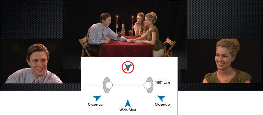
Figure 2.24 An example of the 180° Rule in action in video. (Images courtesy of 2ReelGuys.com)
When shooting stills, the key benefit of the 180° Rule is determining where to get good close-ups. When we get to video, however, this rule assumes a whole new level of importance, which we’ll cover in later chapters.
In Figure 2.25, everyone is the same size. Each is equally remote from the camera. The eye doesn’t know where to look first, except you probably looked at the computer in the foreground first, because it’s the biggest subject in the frame. This is truly a boring shot.

Figure 2.25 Notice how boring this center wide shot is. (Image Credit: Fox / pexels.com)
Walking Toward the Camera
Another note about blocking. It is inherently more interesting to have a subject walk to or from the camera than to walk from one side to another, as you can see by comparing the two shots in Figure 2.26.

Figure 2.26 Walking to or from the camera (left) is much more visually interesting than walking from one side to another (right). (Image Credits: Just Name / pexels.com (left), Clem Onojeghuo / pexels.com (right))
If a subject is walking to the camera, they are also walking into a close-up, which boosts the emotional content of the shot. If they are walking away, they are moving into a wide shot, which, though it minimizes the subject, maximizes our understanding of their relationship to the environment.
Also, in Figure 2.26, we see the woman in the black jacket first because she is different and big. She is also in the center of the frame. However, notice how quickly your eye gets bored and starts looking elsewhere in the frame for something else to look at. We’ll talk about this more in a couple of pages when we discuss symmetry versus balance.
Framing and the Rule of Thirds
Camera framing is how the frame is positioned around the elements in an image. We also use the term to describe how an element within the image is positioned relative to the frame. As we learned from Molly Bang, objects in the center of the frame have the most power, but objects at the edges are more interesting. What I’ve discovered is that our eyes get bored when a subject is placed dead-center. We quickly start exploring the rest of the frame to see what else there is to see. However, images placed toward the edge have a dynamic about them that keeps drawing the eye.
Rule of Thirds
This divides the frame into thirds horizontally and vertically to describe a way of positioning important elements at intersections to achieve a dynamic visual balance.
This observation isn’t unique to me; the Dutch master painters in the 1600s discovered and popularized it through their paintings. Like the 180° Rule, this, too, has its own name: the “Rule of Thirds.” This is another important concept that will recur throughout this book.
The Rule of Thirds divides the screen into three equal rows and columns (Figure 2.27). Important elements of the image should be placed either at one of the four intersections or along one of the lines to create a pleasing, dynamic visual balance.
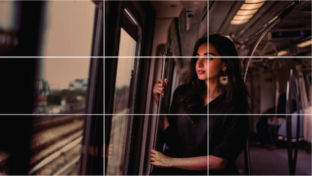
Figure 2.27 A shot framed according to the Rule of Thirds. Notice, also, that she is framed so she has lots of “looking room.” (Image Credit: Mentatdgt / pexels.com)
Looking Room
The distance between a subject’s eyes and the edge of the frame. Reducing looking room increases a sense of limits or claustrophobia.
As you look at Figure 2.27, notice that the woman is not centered. In fact, she is looking “into” the frame, with her body positioned on the side of the frame opposite to where she is looking. This space between her eyes and the left or right edge of the frame is called “looking room.”
When I first presented the concept of the frame, I mentioned that it fools the brain into thinking that only that portion of the image that we see in the frame exists. Looking room reinforces this.
Compare the emotional difference between Figure 2.27 and Figure 2.28. In real life, both are in a similar environment—looking out a train window. However, the image of the woman with lots of looking room feels “normal,” while reducing the looking room makes the shot of the man feel like he is running out of options. The framing differences between these two shots vastly alters how we interpret the emotions in each shot.

Figure 2.28 When the looking room is reduced, the subject feels cramped, pressured, or trapped. (Image Credit: Guilherme Rossi / pexels.com)
Head Room
The distance between the top of a subject and the top of the frame.
In addition to looking room, which adjusts the horizontal distance between the subject and the sides of the frame, there’s also “head room,” which is the distance between the top of a subject and the top of the frame. Here, too, the Rule of Thirds holds sway.
In these last two framing examples—Figures 2.29 and 2.30—did you see that both subjects were framed with looking room? The subject was moved slightly to the left side of the frame (called “panning”) so they can “look into” the wider portion of the frame. Looking into the wider portion of the frame is considered normal framing.
In general, you want the central focus of the subject placed on the upper Rule of Thirds line. In the case of a close-up of a person’s face, that means putting their eyes on the line.
Figure 2.29 illustrates a common problem with amateur photographs: too much, or too little, headroom. If the man is the subject of the photo, as opposed to the building behind him, put his eyes on the top line of the Rule of Thirds.
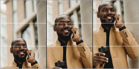
Figure 2.29 Three examples of headroom: too much (left), too little (right), and just right (center). The white lines indicate the horizontal lines from the Rule of Thirds. (Image Credit: Cottonbro / pexels.com)
Another problem, shown in Figure 2.30, is putting the face of the subject in the center of the frame. In both shots, the man’s head is the same size. Yet, look at how much more substantial and forceful the image on the right is. The only change was moving the eyes from the center of the frame to the top Rule of Thirds line.

Figure 2.30 The size of his face is the same; all that’s changed is moving the face from the center of the frame (left) to the top Rule of Thirds line (right). (Image Credit: Malcolm Garret / pexels.com)
Eye Contact Is Nontrivial
Earlier in this chapter, I discussed the concept of the “fourth wall.” This is the assumption that the audience is invisible to the subjects in an image; they are “hiding behind a wall.”
The images in Figure 2.31 make this concept vividly clear. In the left image, we are viewers. In the right image, we are participants. With the image on the left, the audience is invisible, watching a little boy play with a camera and a soccer ball. It’s the type of scene to make a parent smile; because the kid is so caught up in what they are doing, they’ve tuned out everything around them.
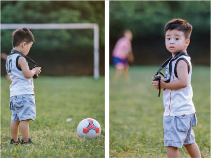
Figure 2.31 Note the emotional difference between looking into the frame and being looked at. (Image Credit: Tuán Kiêt Jr. / pexels.com)
However, the image on the right, where the boy’s eyes connect directly with the camera, means the audience is no longer invisible; we are directly involved in what’s happening in the scene.
This is another important concept. You can’t have talent looking at the camera in one shot and not looking at it in the next shot. It is disjointing to the audience. We don’t know what our role is: Are we viewers or participants? Pick one option and stick with it. This popular, but unsettling, trend of bouncing between eye contact and no eye contact has diminished the impact of many interviews.
You can’t have talent looking at the camera in one shot and not looking at it in the next shot.
Cropping is the process of removing portions of the image, either to get rid of garbage in the shot or to alter the framing. When you crop an image (Figure 2.32), don’t cut someone at body joints, meaning their neck, elbows, wrists, or waist. It is much more pleasing, as Figure 2.32 illustrates, to crop images elsewhere on the body.
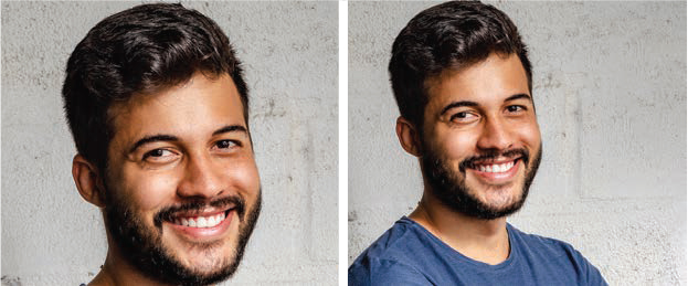
Figure 2.32 Notice how much more pleasing the framing is if you don’t cut someone at body joints. (Image Credit: Italo Melo / pexels.com)
Symmetry vs. Balance
There’s a big difference between symmetry and balance. Symmetry is where both sides of an image are the same, as shown in Figure 2.33. Balance is where the “weight” of images on one side of the frame “balance” those on the other side. This picks up on ideas we first learned from Molly Bang, earlier in this chapter. Symmetry creates lovely images, but balance is more compelling.

Figure 2.33 The symmetry in this photo creates a stunning visual, but, the eye quickly gets bored and looks elsewhere. (Image Credit: pexels.com)
In Figure 2.33, both sides of the image are symmetrical. It’s lovely to look at, but our eyes quickly start looking for something else. There’s too much emphasis on the center of the frame.
See how quickly you stopped looking at the architecture and shifted to the next image to check out the rocks?
We also saw this problem with symmetry in Figure 2.27, with the woman in the black jacket walking up from the beach. She was in the center of the frame, but our eye quickly got bored with the subject in the center.
In Figure 2.34, balance combines with the Rule of Thirds to create a much more compelling image. We see the rocks first, because they are bigger. Then, we start exploring elsewhere in the frame, but we keep coming back to the stack of rocks. That’s the power of the balance—creating dynamic images that capture the eye while allowing it to explore the frame in more detail.

Figure 2.34 These rocks, while off-center (though still framed according to the Rule of Thirds), make for a much more compelling image. (Image Credit: pexels.com)
As another example of balance, the tree image in Figure 2.35 has a number of elements going for it: The tree is brighter than the background, is bigger than other trees near it, is framed according to the Rule of Thirds, and contains different colors when compared to the background. The eye is automatically attracted to it! (The streaks of sunlight serving to backlight it help, too.)

Figure 2.35 Another example of balance, with the brightness of the tree balanced by the heavier, darker woods on the left. (Image Credit: Ray Bilcliff / pexels.com)
The Weirdness of Right-Handedness
There’s a fascinating psychological quirk: right-handedness. Readers of Western languages also tend to “read” images from left to right—the same as a book. This means that our eyes give more weight to where they finish looking (the right side) than where they start (on the left). This often affects how we interpret images.
In Figure 2.36 the photo was flipped horizontally. When it did, the meaning changed. In the left image, we see the opening first; in the right image, we see the man first. Why? Because in both cases, our eye gave more weight to the right side of the image, then we used the right side of the image to interpret the meaning of the complete image.

Figure 2.36 Here’s the same photo. Flipping the image changed the meaning. (Image Credit: Marius Venter /pexels.com)
Depth of Field
Depth of field is principally determined by the lens angle combined with its aperture. Wide shots tend to have a deep depth of field, while close-ups, especially when using a zoom lens, have a shallow depth of field.
The last concept I want to illustrate in this chapter is one of the most important: depth of field. This determines which parts of the image are in focus. Focus, more than any other element aside from movement, determines where the eye will look first.
At the beginning of this chapter, when I listed the Six Priorities, focus was second. Our eye goes to that which is in focus, regardless of where it is located in the frame. Focus, when you can control it, is a great way to make sure the eye sees the subject you want it to see.
There are two types of depth of field: deep and shallow. Deep depth of field allows almost all of the image to be in focus, while shallow means that only a limited portion of the image is in focus.
FigureS 2.37 and 2.38 illustrate the differences between deep and shallow depth of field. We use depth of field to draw the eye to the important elements in an image. In Figure 2.38, the photographer focused on her face. She could just as easily have put the sparklers in focus, with everything else soft. But, she chose to focus on her smile, rather than what was making her smile.

Figure 2.37 This illustrates deep depth of field. Almost everything in this image is in focus. Most cell phones take this type of shot. (Image Credit: pexels.com)

Figure 2.38 In this shot, the depth of field is so shallow that only her face is in focus. Both the sparklers and the background are soft. (Image Credit: Renato Abati / pexels.com)
Does Sex Sell?
Before we close this chapter, we need to talk about the 800-pound gorilla of marketing: sex. (Cue dramatic music, with red arrows pointing to Figure 2.39.)

Figure 2.39 From romance novels to laundry detergent, sex is everywhere—but does it sell? (Image Credit: Majdanski/Shutterstock)
Hooking sex to products has a long history. Starting with Pearl Tobacco (1871) and continuing with Woodbury’s Facial Soap, Jovan Musk Oil, Benetton, Carl’s Jr., Victoria’s Secret, and the poster child for sex in advertising, Calvin Klein jeans, each of these company’s fortunes turned from poor to profitable by painting a direct line from their products to sex (see sidebar, page 49).
Still, does sex sell? In a word: maybe. Even today, with sex in advertising seemingly everywhere, there’s no guarantee that it works.
Matt Flowers, CEO of Ethos Copyrighting, wrote in his blog that if your audience is interested in sex, “Remember that they have access to that content with just the click of a button. So you have to ask yourself, ‘why try to compete with the plethora of online sites that make sex their sole business?’”3
[3] (Flowers, 2018)
According to Magda Kay, writing in Psychology Today, “If you ever wondered whether using sex in advertising helps to sell, here is the answer: it does. Actually, [sex] is one of the strongest and most effective selling tools. The relationship between sex and marketing is a winning combination for almost any business. However, if you don’t know how to use it, you’re risking putting off your potential customers.”4
[4] http://psychologyformarketers.com/sex-and-marketing/
According to Psychology Today, a literature survey in 2017 by Wirtz, Sparks, and Zimbres sought to determine the effects of sexually provocative ads. They assessed effectiveness in terms of:
- How well the ads were recalled
- Whether they generated a positive or negative reaction
- How the sexually oriented ad compared to a similar ad without the innuendo
- What people thought about the brand
- Whether the ad actually generated sales
The results were interesting. In summary:
- In terms of capturing attention, sex works. However, people remembered the ad more than the brand. “While sex might be attention-grabbing, it didn’t seem especially good at getting people to remember the objects being sold.”
- Regarding people’s attitude toward the ads, they were modestly positive for men and modestly negative for women. In other words, it was essentially a wash.
- Curiously, both men and women expressed negative feelings, on the whole, for brands that used sex to sell things.
- When it came to purchase intentions, it seemed that sex didn’t really sell, but it didn’t really seem to hurt, either.
“While it might be useful for getting eyes on your advertisement, sex is by no means guaranteed to ensure that people like what they see once you have their attention. In that regard, sex—like any other advertising tool—needs to be used selectively, targeting the correct audience in the correct context if it’s going to succeed at increasing people’s interest in buying. Sex in general doesn’t sell.”5
[5] https://www.psychologytoday.com/us/blog/pop-psych/201706/understanding-sex-in-advertising
Where It All Started
This ad, from Woodbury’s Facial Soap in 1916, is considered the first mainstream use of sex in advertising. Not surprisingly, the first brands to use sex in their ads were saloons, fashion, tonics, and tobacco. The earliest known use of sex in advertising was in 1871 when Pearl Tobacco placed a lightly draped female figure rising from the waves on its label.6
[6] (1916 Ladies’ Home Journal version of the famous seduction-based ad by Helen Lansdowne Resor at J. Walter Thompson Agency. Public Domain.)

Sex gets attention but doesn’t always drive behavior.
In a 2015 study, authors Robert B. Lull and Brad J. Bushman of Ohio State University wrote, “Brands advertised using sexual ads were evaluated less favorably than brands advertised using nonviolent, nonsexual ads. There were no significant effects of sexual ads on memory or buying intentions. …As intensity of sexual ad content increased, memory, attitudes, and buying intentions decreased.”7
[7] (Lull, Bushman, Brad J., 2015)
I think a good way to summarize these findings is that sex gets attention but doesn’t always drive behavior. Also, keep in mind that sexy ads tend to go hand in hand with objectification. Even today, with raised awareness caused by the #MeToo movement, women are still five times more likely to be shown in revealing clothing than men. As well, sexy ads tend to reinforce stereotypes. “Recent 2017 research from the Geena Davis Institute on Gender in Media,” Matt Flowers wrote, “found that women were 48% more likely to be shown in the kitchen than their male counterparts. Moreover, men are 89% more likely to be depicted as smart in comparison to women.”
Matt Flowers continued, “Sexual content in the age of digital marketing is alive and well as far as organic content is concerned, but you’re not going to run a pay-per-click campaign with that strategy. While innuendos can be funny, suggestive themes can be stylish, and sex can sell, it’s important that marketers consider their audience carefully so as not to offend potential customers nor be provocative for the sake of publicity.
“While using sex in advertising can be a successful tool for drumming up sales, it can also have negative consequences for both your reputation and our culture. For that reason, get to know your brand, what it stands for, and who your audience is.”8
[8] (Flowers, 2018)
Sex is like any other image. Used with purpose and with an understanding of your message and audience, it can work. Used simply to attract the eye without connecting it to your product or message means your visuals join the thousands of others that our eyes glaze over each day.
Key Points
We covered a lot of ground in this chapter, and we’ll return to these concepts many times throughout this book. Here is what I want you to remember:
- The camera represents the point of view of the audience.
- Images, even still images, tell stories and evoke emotional responses in the viewer.
- The eye looks at, and explores, an image based on the Six Priorities of where the eye looks first.
- The mind assumes, when it sees a frame, that there is nothing outside the frame.
- Blocking is the process of positioning elements and the camera to create the best image for the story you want to tell.
- Framing is the process of determining where the frame is placed around the image.
- There are many techniques we can use when we capture or create an image that will enhance the story we are telling and generate an emotional response in the audience.
Practice Persuasion
Using your cell phone or camera, take some photos of a family member or friend. Alter the position of the camera and the framing based on the ideas in the chapter.
Look at the images and see whether they convey different emotions or perspectives to you. Then, show them to someone else and see whether they get the same or different reactions.
Just as a note, don’t ask the person you photographed to critique your photos. They will be too busy worrying about how they look to pay any attention to your photography. For this reason, most talent are not good judges of the programs they are in.
PERSUASION P-O-V
IDEAGRAMS
Dennis Starkovich
Ideagram.co
Website: www.ideagram.co
In 1979, when I was 30 years old, I started creating diagrams of an analytic and personal nature that were an outgrowth of my professional role as a management consultant. I specialized in providing PERT/CPM network analysis for planning, developing, and implementing projects of all types, sizes, and complexity. I realized that this technique could also apply in our personal lives.
This was my initial insight into creating “IdeaGrams.” These took the PERT/CPM methodology of process and project planning into a tool for examining written material and extracting the core elements or ideas into a visual diagram.

I consider an IdeaGram to be a mix of alchemy and artistry for ideas. An IdeaGram (which is my term) is a unique, evolutionary approach to visual diagramming to analyze and convey the intrinsic ideas, content, and wisdom contained in written or narrative material. Mind maps, which you may have heard about, and IdeaGrams are complementary in that the mind map is first and foremost a brainstorming tool while the IdeaGram chart is best suited for analyzing and presenting ideas in a methodical, sequential, and inherently legible manner.
The unique aspect of the IdeaGram charts is that they succinctly and graphically extract the core ideas from a narrative, in a visually sequential and legible manner.
The reference to alchemy is an acknowledgment that concentrating on ideas in this way helps initiate a change in one’s understanding, perspective, and perception. The concentration required to study and extract the information from a written narrative is unique, somewhat difficult to perform, but exceedingly rewarding to undertake and accomplish.
The reference to artistry is that the presentation to an audience of an IdeaGram prepared by another person provides both a view into the mental framework and understanding of the person who created the IdeaGram and an illustration of the thought that had been essential to development of the initial written narrative.
Who could use IdeaGrams? My answer is, everybody! IdeaGrams have unlimited creative as well as professional application. They are useful in areas of new learning, self-improvement, planning, time management, and education. They provide us with a new model for creatively mapping any project, goal, or understanding.
I’m sincerely interested in sharing the clarity of thinking that develops as a result of applying the techniques of critical analysis and concentration that are required to analyze a subject or narrative and create a chart that reflects the content of the process or written material.
The illustration is a sample IdeaGram, in this case to explain the process itself.

Here’s how I define these different steps:
- Personal Study and Understanding. The development of these charts and diagrams over the past 40 years stemmed from a personal vision that sometimes resulted from the necessity of simplifying a complex series of ideas into a simple visual illustration. At other times, the impetus was simply to capture what might have been a complete book into a simple chart.
- Simplify Complex Subjects for Others’ Understanding. This began as I was raising a child and observing and participating in the development of his knowledge growth from kindergarten to adulthood. Having encountered meaningful concepts that I feel others might appreciate, I began a process of categorizing and exhibiting them as IdeaGrams.
- Collaboration. Develop a platform for expanding the “library” of IdeaGrams and enable others to share their creations and subject matter. Similar sites exist for “mind maps,” but mind maps, in my opinion, are not easily read (i.e., left to right, top to bottom, visually organized in logic and categorization).
- Infrastructure. Develop a tool that digitally enables the creation of IdeaGrams in the diagramming format shown.
- Content. Implement the creation of a significant volume of educational material to help others of all ages to understand, experience, and create similar documents and expand their understanding of various subjects.
- Enable Others to Think Clearly. I believe that the clarity of thinking that is required to create an IdeaGram can be learned. This clarity develops as a direct result of the critical thinking and concentration that are required to analyze a subject and create a chart that reflects the content of a process or a piece of written material.
- Charts Become a Graphic Learning Tool. Even as a picture is worth a thousand words, there is something special about an IdeaGram that conveys special insight into a process or narrative. I seek a wider discussion of this concept. I know what the development and use of this process have contributed to my awareness, understanding, and patience regarding my observations. I would like to better understand what effect this tool would have with others as they learn, explore, and collaborate with the use of this tool.
As I write this description for Techniques of Visual Persuasion, I am more and more interested in sharing these techniques with others. I have never stopped reading, learning, studying, diagramming, and applying the process to my personal knowledge, understanding, and development. I invite you to join me on this journey!