Chapter 4
Persuasive Fonts
There’s fashion in typefaces, just as there is in clothes. What is a type style but a suit of clothes for the letters of the alphabet? You can send your words out into the world looking as though they are in touch with modern trends, or stuck in a 1980s timewarp of big-haired power dressing; wearing an old tweed jacket with leather patches on the elbows, or as a total fashion victim.
Simon Loxley1
British Graphic Designer and Author
[1] (Loxley, 2004, p. 3)
Chapter Goals
The goals of this chapter are to:
 Explain what fonts and typefaces are
- Describe different font families and the emotions they suggest
- Provide tips on how best to use fonts in your projects
- Illustrate how to pick the right font for your message
THE YEAR WAS 1989; I was working as a marketing manager for Bitstream in Cambridge, Massachusetts. Bitstream was the first major digital type foundry to devote all its resources to typographic design and digital technology. My job was to launch a new series of typefaces specifically designed for Macintosh computers.
The right typeface ensures that your message gets read and remembered. And adds visual power to your printed words.
The company was founded in 1981 by legendary type designer Matthew Carter, along with Cherie Cone, Michael Parker, and others. A type foundry designs typefaces. At the time, we were competing with Adobe, Linotype, URW, and many others in the exploding world of fonts.
In those days, the world was making the transition from low-resolution computer screens and dot-matrix printers into the scalable world of laser printers and digital printing presses from companies like Heidelberg. When I joined Bitstream, I knew a lot about marketing but nothing about fonts.
As I walked into the basement of the three-story brick building that housed Bitstream, I walked into another world. In that vast, dimly lit space stood row after row of giant computers, each as tall as a man, clad in deep-blue sheet metal with a glowing green screen about the size of a legal sheet of paper. At each system was an artist, each of whom could draw beautiful high-quality letterforms freehand, designing new typefaces with the aid of these computers.
Sitting in meetings, discussing which fonts we should bring to the Mac market, listening to Matthew and other designers discuss the influence of different typefaces—was an unforgettable education for me. I fell in love with type, not as a designer but as a consumer.
About that same time, Kelsey Selander joined the company as vice president of marketing. A bundle of energy and enthusiasm, she also looked at type as a consumer. Her big insight, from my perspective, was that type needed to be marketed not on how the individual letterforms looked but based on the emotions they sparked in the viewer.
“The right typeface ensures that your message gets read and remembered,” Kelsey wrote in a 1989 Bitstream type marketing brochure. “It enlivens and clarifies the meaning of your ideas. And adds visual power to your printed words.”2
[2] (Bitstream Typeface Marketing booklet, 1989)
Designers have always known of the emotional power of type, as Figure 4.1 illustrates. Kelsey’s insight was to focus on the end user, the consumer of type. She kept asking, “How does this font make you feel?” She realized that the more clients knew about type, the more fonts they would use or request of their graphic artists.

Figure 4.1 These words illustrate how different typefaces project different emotions. (Image from a 1989 Bitstream type marketing brochure.)
“Typography is just that: idealized writing,” poet and typographer Robert Bringhurst wrote. “In a badly designed book, the letters mill and stand like starving horses…. In a well-made book, where designer, compositor, and printer have all done their jobs, …the letters are alive. They dance in their seats.”3
[3] (Bringhurst, 2013, p. 19)
A Quick History of Type
Most of us are familiar with the name of Johannes Gutenberg, who is credited, in the West, as the inventor of the printing press, as illustrated in Figure 4.2. It took him about 20 years to develop all the elements necessary for a working press, which was completed in 1439.
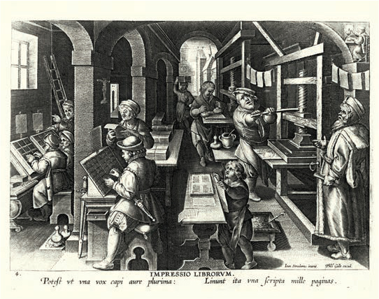
Figure 4.2 Printing books in England during the Renaissance: sorting letters on the left, typesetting in the middle, and printing on the right. (Image from the Walker Art Library / Alamy Images.)
Describing this process, British graphic designer and author Simon Loxley wrote, “When people refer to the birth of printing in Europe, what they actually mean is the birth of type. Movable type—individual letters that could be arranged, edited, printed from, then dismantled and reassembled to print again in a new configuration—this was the real breakthrough, the spark that fired the printing revolution that was to sweep through Europe during the rest of the century.4
[4] (Loxley, 2004, p. 7)
Gutenberg’s many contributions to printing include:
- Mechanical movable type (Figure 4.3)

Figure 4.3 Gutenberg’s masterstroke was his invention of movable type. (Image Credit: Gabe Palmer / Alamy Images.)
- The invention of a process for mass-producing movable type
- Adjustable molds for casting type
- The use of permanent oil-based ink for printing books
- The use of a wooden printing press similar to the agricultural screw presses of the period5
[5] https://en.wikipedia.org/wiki/Johannes_Gutenberg
The introduction of the printing press, along with the mass production of paper to go on it, revolutionized bookmaking. The wide availability of books massively altered the structure of society. Texts no longer belonged principally to the church. People, not just clergy, demanded to learn to read, creating a need for education. Ideas spreading across borders threatened established power structures. Greater education created a middle class. The rise of the middle class fueled the Renaissance. Without question, today’s information-based economy is a direct result of Gutenberg’s invention.
Type designer Matthew Carter once wrote, “Type is a beautiful group of letters, not a group of beautiful letters.” How letterforms work together is critical to readability.
The Design of Type
The creative process of designing typefaces is called “type design.” (Figure 4.4 shows some of the complexity of this.) Type designers work in type “foundries,” so called because, initially, movable type was created by pouring molten lead into molds. When it comes to digital fonts, designers are sometimes called “font developers” or “font designers.”

Figure 4.4 This illustrates the complexities designers consider when creating typefaces that the rest of us take for granted.6
[6] https://dtc-wsuv.org/jrushing17/dtc478/final
These days, “fonts” and “typefaces” have essentially become synonyms, but there are differences. Here are some key terms about type:
- Type. Everything related to typefaces and their design.
- Typeface. A family of fonts of a similar design. Helvetica is a typeface. We often shorten this to “face.”
- Font. A specific design of a typeface. Helvetica Italic is a font.
- Weight. Condensed, bold, and italic are all weights of a typeface; also describes the thickness of a glyph.
- Glyph. The shape of the letters in a typeface. “3” is a number. The shape of the “3” is the glyph. “Letterform” is a synonym for glyph.
- Typography. A way of setting and arranging type to make it easy to read, without losing the emotions inherent in the font.
- Line spacing. The vertical spacing between lines of text.
- Tracking. The horizontal spacing between glyphs; also called “letter spacing.”
- Kerning. Manually adjusting the spacing between selected pairs of letters.
Even with these definitions, “typefaces” and “fonts” are often used interchangeably, both in this book and in real life.
As an interesting piece of trivia, typeface designs in the United States cannot generally be copyrighted, while the names of the designs can. This is why the same design—Helvetica, for example—has so many different names. Helvetica, Swiss, Universe, Arial, Triumvirate, Pragmatics, and Nimbus Sans are all different names for the same font design from different type houses.
There are close to 100,000 fonts in the world.7 The Latin alphabet contains more than 600 characters,8 while more fonts and characters are created every day (all before we add emojis into the mix!). Thankfully, however, we don’t need to learn to use each letter individually. Instead, there are six main “families” of fonts in the Latin alphabet, as opposed to the different word shapes in languages such as Chinese, Arabic, or Hebrew:
[7] (Garfield, 2011)
[8] (Bringhurst, 2013, p. 303)
- Serif
- Sans serif
- Script
- Blackletter
- Monospace
- Specialty
If typefaces and their design interest you, find a copy of The Elements of Typographic Style by Robert Bringhurst. Robert has the eye of a designer and the soul of a poet. Hermann Zapf described this book as “The Typographer’s Bible.” It makes for fascinating reading.
Each of these families has many typefaces within it, each with a particular role to play in connecting your message to specific emotions in your audience.
Compared to print, video and the web are low-resolution. A typical image for a half-page magazine ad is about 20 megapixels. A high-definition (HD) video image is only 2.1 megapixels. (Old-fashioned standard-definition (SD) media was far less resolved at only 0.3 megapixels!) Even a 4K video image is less than 9 megapixels. There isn’t a lot of pixel resolution to work with in digital media.
Additionally, text in moving media needs to be read quickly. Typical television ads hold text on-screen for only two to four seconds. Readability is critical. This means that font selections must be focused on clarity, so the eye can read these messages quickly.
We use fonts to convey a message and wrap it in an emotion. However, if we are not careful, there can be a disconnect between the message we send and the fonts we use.
Figure 4.5 perfectly illustrates when the emotions in a font conflict or complement the message being sent. Compare the spun-sugar feeling of Edwardian Script with the solidity of Giza. You can feel those Giza pipes are solid cast iron.

Figure 4.5 The spidery and ornamental shapes of Edwardian Script (top) are totally at odds with the message, while the slab-serif, solid lettering of Giza (bottom) tells the viewer that these pipes would never dare to leak. Ever.
We have two goals when choosing fonts for our images. First, and most important, we want fonts that are clear and easy to read. Second, we want to use fonts that emotionally reinforce our message, as illustrated in our plumbing logo in Figure 4.5.
There are no “wrong” fonts, but, given a bit of thought, you’ll discover that some fonts fit your message better than others. Remember those six type families mentioned earlier? They can help you find the right font for your project.
Serif Fonts: The Voice of Tradition
“Serif” comes from the Dutch meaning “line, or stroke of the pen.” I think of serifs as fonts with little “feet” at the edges of a glyph. Look at the shapes of the letters in Figure 4.6. See the little feet at the bottom of the “A” or the “jaws” at the ends of lines in the letters “C” and “E.” Those are serifs. (Um, no, designers don’t call them “feet” or “jaws,” but they should.)
Things seem easier to do when they are easier to read.
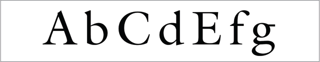
Figure 4.6 A typical serif font; ITC Galliard, in this case.
Serifs are modeled after the way the Romans carved letters into clay. Most often, the edges of a letter had a serif, formed by the tool they used to form the letters.
Serif glyphs descended from Roman lettering of more than 2,000 years ago. In Rome, there’s a statue to the Emperor Trajan sitting at the top of a tall, marble column. At the base of the column is lettering explaining why Trajan was being honored. These letters, hand-carved in the stone, are considered so clear, so readable, and so beautiful that they have been studied and copied for centuries. The Trajan font, Figure 4.7, was modeled after those letters.

Figure 4.7 Trajan, a font designed in 1989, is based on stone carvings from ancient Rome.
This long history is a key personality attribute of serif typefaces. They evoke feelings of tradition, history, reassurance, and professionalism. They are also useful when talking about money, because serifs conjure feelings of banks and conservative financial institutions.
You’ll notice that I don’t mention Times New Roman. The reason, aside from the fact that it is way overused, is that the glyphs are small and hard to read on-screen. There are many serif font options that provide better readability for digital delivery.
Take a look at the five fonts in Figure 4.8. You’ve seen one of the first three in just about every book you’ve ever read. Notice that Baskerville and Palatino have thicker glyphs. This allows them to look good on lower-resolution display screens, though Palatino takes more horizontal space than Baskerville. Garamond is a lovely, refined font, though not as dark as Baskerville or Palatino.
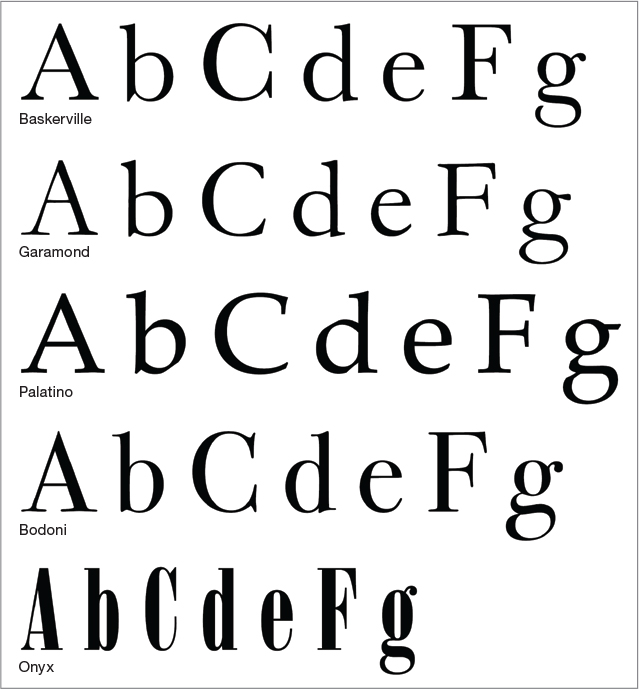
Figure 4.8 Examples of popular serif fonts. These all use the same point size, but I increased the letter spacing to make it easier to see the form of each glyph.
Bodoni and Onyx scream “high-fashion.” They are tall and thin, with delicate strokes and crossbars. However, these thin lines raise a big caution. Fonts like Bodoni and Onyx have such thin serifs that they disappear when displayed on low-resolution devices like monitors at small point sizes. This often converts an “e” to a “c” or an “o” to a “u” because parts of the letterform get lost. It is important to keep in mind that not all serif fonts look good on digital displays.
We use fonts to convey a message and wrap it in an emotion.
When looking at font design, a good place to start is the lowercase “e” and “g”—“e” because that’s where too-thin lines are most visible and “g” because that’s where designers give their art a freer rein. In the fonts in Figure 4.8, see how little space there is above the bar of the “e” in Baskerville or Garamond compared to Palatino. Then compare the Onyx “g” to Garamond. Glyphs are an art in and of themselves.
Serifs typefaces project feelings of:
- Tradition
- Respect
- Reliability
- Comfort
Serif italic fonts (Figure 4.9) extend the creative fancy of the type designer into new areas. Unlike any other type family, serif italics differ wildly from their non-italic version. I first met Galliard, which was designed by Matthew Carter, when I worked at Bitstream. The hand-drawn spirit of its italic letters continues to fascinate me. As does the swooping elegance of Garamond italic, or, the “let’s keep things moving” nature of Baskerville italic.
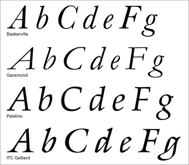
Figure 4.9 Unlike any other font family, serifs have a radically different look when used in italic form.
Spend time exploring the look of different fonts—enlarge them to 400 points and just admire the art. When it comes to emotions, italic serif fonts reflect:
- Style
- Fashion
- Grace
- Elegance
Since serif fonts represent traditional values, what fonts point us into the future? That is the role of sans serif type.
Sans Serif: The Voice of the Future
Sans serif, which is French for “without serifs,” are fonts that don’t have time for the niceties; they have business to conduct. Gone are all those little feet.
Sans serif fonts (Figure 4.10) are designed with today’s digital media in mind: solid glyphs with not a lot of variation in the stroke width. These fonts are designed first for readability, second for art.

Figure 4.10 These popular sans serif fonts all share the same point size and letter spacing. Unlike serifs, there are no “feet.” All the strokes in the same font are about the same thickness.
Futura is a popular workhorse, as is Century Gothic (though Century Gothic has more grace in its design, like putting a font in a business suit). I use Impact whenever it is essential you pay attention to a title, though it is a terrible body copy font. I’m a new fan of Calibri. It doesn’t take a lot of space, looks very clean on the screen, and is eminently readable. Then, compare each of these to the soft flowing letters of Optima. Like a serif, the width of the strokes varies within the letter, though it remains solidly a sans serif font. It is an elegant, yet still modern, font.
What Happened to Helvetica?
You’ll notice Helvetica is not in this list, for the same reason that I omitted Times New Roman—Helvetica is waaaay overused. It is a lovely font but is used everywhere. Just because it is the default for most computer applications does not mean it is the best choice for you. Helvetica needs a rest. As typographer Erik Speikermann wrote, “Most people who use Helvetica use it because it’s ubiquitous. It’s like going to McDonald’s instead of thinking about food. Because it’s there, it’s on every street corner. So let’s eat crap, because it’s on the corner.”9
[9] Erik Spiekermann, Typographer. https://typography.guru/quote/
I don’t think Helvetica is “crap”; it is a lovely typeface that is far too popular. I should also mention that Helvetica is the only typeface to have inspired a feature film: Helvetica, directed by Gary Hustwit and released in 2007.
Sans serif typefaces project:
- Stability
- Strength
- Objectivity
- Cleanliness
- Modernity
- Progressiveness
When in doubt, sans serifs should be your first choice for online and media-related messages. Highly readable, strong, and clear, these may not have the evocative impact of serif fonts, but they make sure your message gets across.
Since we are talking fonts, this book uses Meta Serif Pro Book for body text, Meta Pro Bold and Black for titles, and Ronnia Light for sidebars, captions, and other incidental text. Oh! And Meta Pro Normal for the P-O-V stories at the end of each chapter.
Figure 4.11 illustrates a “waterfall,” the same font displayed at different point sizes. Note how much darker Futura is compared to the same point size of Palatino, and Palatino is darker than many other serif fonts. Darker typefaces tend to be easier to read, especially if the background is busy. Also notice how sans serif fonts are much easier to read at smaller point sizes.
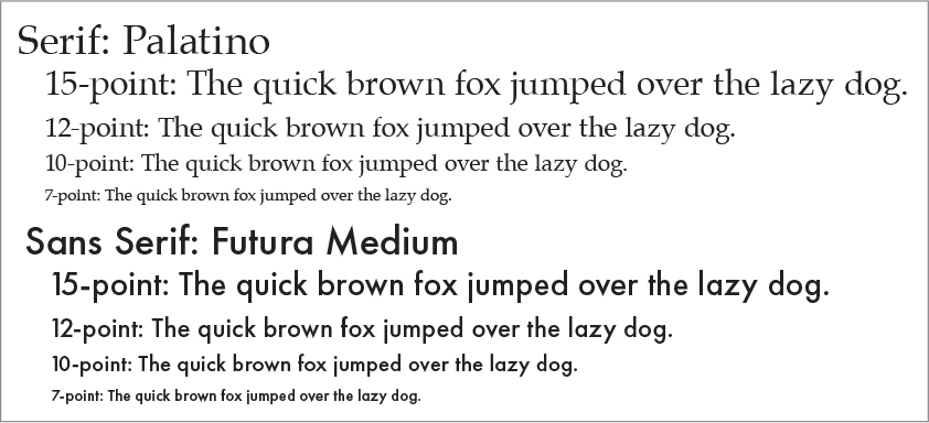
Figure 4.11 See how sans serif fonts tend to be more readable at smaller point sizes?
Script Fonts: Handwriting for Computers
Not all of us have perfect handwriting, I certainly don’t. Script fonts (Figure 4.12) were invented to reflect the personal nature of handwriting, but in a form that computers can easily display.

Figure 4.12 Script fonts are designed to give computers handwriting. All fonts here are the same point size, except for Zapfino, which I reduced by one-third so it would fit with the others.
Script fonts, even more than serif italic, reach new heights of artistic fancy. Whether it’s the yeoman clarity of Brush Script, the teacher-at-the-chalkboard look of Chalkduster, the careful hand-printing of Noteworthy, or the extravagant elegance of Zapfino, script fonts are just plain fun.
Unlike serif and sans serif, script faces generally have only one weight, meaning, for instance, that there would not be an italic version.
But, because of that fun, we sacrifice readability. It takes at least twice as long to read a script font as it does serif or sans serif. It also means that the reader needs to want to read your text. Often, they see script text and say, “This is too hard to read; I’ll read it later.” Only they never come back.
Use script fonts when you know the reader is interested in your subject and when they have time to parse the text. Be sure to use script faces in larger point sizes; never use script as a body text.
Script fonts project:
- Elegance
- Formality
- Affection
- Creativity
- Personality
Blackletter: Extreme Script
Blackletter fonts (Figure 4.13) take us back to medieval times—or a heavy-metal concert. They conjure Gregorian chants and times of dragons, fair maidens, and quests. But they are just awful for readability. Feel free to use these for logos, but if you expect anyone to actually read these, allow an extra week.

Figure 4.13 Blackletter fonts derive from the original handwritten manuscripts of medieval monks carefully brushing ink onto parchment.
You’ll also see blackletter fonts used specifically because they are emotionally so different from the message. Heavy-metal and grunge rock groups use them to emphasize the irony.
Blackletter fonts project:
- Antiquity
- Religion/spirituality
- Classic
- History
Monospace: Return of the Typewriter
You may have heard of typewriters. (Think of them as “manual printers.”) Those machines all used monospace fonts (Figure 4.14). A monospace font is one where all the letters are the same width.

Figure 4.14 The top four are actual monospace fonts. Rockwell is a monospace “ringer,” a variable-spaced font impersonating monospace. Why? To save space on the page.
I’m old enough to have actually used a typewriter for all my school reports. Typewriters were magical to me because they meant I no longer needed to handwrite everything. As fast as I could think, I could put words on the page with perfect legibility except, ah, deleting a typo required either retyping the entire page or smearing the paper with white glue. Typewriters were better than handwriting, and much more legible, but I’m far happier using a word processor today.
The 800-pound gorilla of monospace fonts is Courier. It was the most popular font on the dominant typewriter of the day: the IBM Selectric. (Sigh… Hands-down, the best keyboard ever invented.) In Figure 4.14, look at the clean lines, even strokes, and sheer readability of Courier. Then, look how American Typewriter adds some style quirks. Letter Gothic was designed for speech-writing, while Andale Mono is a blend of Courier’s clean lines with American Typewriter’s style.
Every character in a monospace font has the same width. The reason for this was that a typewriter only moved the paper in front of the keys a fixed distance horizontally for each letter. Thus, the glyphs themselves all had to have the same width. As you can imagine, this caused problems when trying to make an “i” and an “m” look comfortable together.
Variable-space fonts (Figure 4.15) give different widths to different letters; for example, the “l” and “i” are narrow, compared to a “w” or “m.” Typewriters, however, couldn’t deal with letters of different width, so each letter was designed to take the same amount of horizontal space.

Figure 4.15 Compare the glyph widths in a variable-space font (top), a monospace font (middle), and a “pseudo-monospace” font (bottom).
Monospace fonts provide a historical feeling. Telegrams, radio bulletins, and scripts all look better in a monospace font. Portable printers before computers (we called them “typewriters”) all used monospace fonts.
Monospace fonts project:
- A specific period, such as the 1940s and 1950s
- Bulletins and fast-breaking news
- Media, such as television and film scripts
- Antique equipment and communication
Specialty—Creativity Runs Amok
If serif fonts are wallflowers, stoically doing their job without calling attention to themselves, specialty fonts (Figure 4.16) are dancing on the table wearing only a wide smile and scarf, holding a flower between their teeth. Designed strictly for titles, their sole goal is attracting attention—and the more attention, the better.

Figure 4.16 Specialty fonts are narcissists, constantly calling attention to themselves. They are designed solely for titles and sheer exuberance.
These are best used for titles, as they wear out their welcome quickly. Many don’t even have lowercase letters; they aren’t that modest. Everything with them is a CAPITAL LETTER!
Be careful with fonts like Desdemona and Jazz, among others. You need to keep the point sizes large enough that the thin lines in the letterforms don’t break up.
Specialty fonts project, well, just about anything, as long as you keep looking at them. They are very narcissistic; see Figure 4.17.

Figure 4.17 Rosewood was feeling left out and asked to be included.
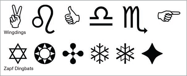
Centuries Before Emojis Came Dingbats
There’s also a class of “letters” called “dingbats.” Dingbats were the emojis of the Renaissance. These are printer’s ornaments that are nothing but symbols; they are like emoji, but centuries older. The most popular dingbat family is called Wingdings, illustrated here.
Font Techniques
Never forget that our number one goal whenever we add text to an image is readability. Why? Because we can’t deliver our message if the viewer is unable to read it. Everything takes second place to catching and holding the eye of the viewer long enough to tell our story.
Thinking of fonts and readability, Philip Snyder sent me this photo (Figure 4.18) of a Geico banner, towed by a small plane over the beaches of Long Island each summer. Designed to be read from a distance of 1,000 feet, look at the simplicity of the design, the use of sans serif fonts, the large text, and a close-up of the spokes-lizard.

Figure 4.18 An example of fonts in service to readability. (Photo courtesy of Philip Snyder.)
With readability as our goal, let’s take a look at a variety of techniques that will help us improve the readability of our text.
Avoid ALL CAPS
Don’t put text in all caps if you want anyone to actually read it (Figure 4.19). For that matter, don’t put body text in a script face. Actually, this whole paragraph is completely unreadable—a classic example of incomprehensibility using perfectly clear fonts.

Figure 4.19 Put text in all caps when you want to be sure no one reads it.
Use Drop Shadows
Many times, we need to put a title into brighter areas of the image, such as white text against the sky. Or, in the example in Figure 4.20, the text is the same color as the background. In either case, the text becomes unreadable. In these situations, putting a drop shadow under the text instantly improves readability.
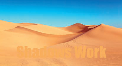
Figure 4.20 Text the same color as the background was added to this image. It is impossible to read. (Image Credit: pexels.com)
The difference in readability between Figure 4.20 and Figure 4.21 is obvious, yet all I did was add a drop shadow to the text. The color of the text is the same in both images. Regardless of whether you are creating still or moving images, always add drop shadows to your text, except under two conditions:
- If the text color is black, drop shadows will only make the text harder to read.
- If the background is black, drop shadows will disappear.
Figure 4.21 Simply adding a drop shadow to the text makes all the difference. (Image Credit: pexels.com)
Recommended Drop Shadow Settings
Here are my recommended drop shadow settings (these should work in virtually every application):
Angle. Adjust shadows to fall down to the right (Photoshop: 135°).
Opacity. 95%.
Distance. Between 5–15 pixels.
Spread. 5–10 pixels.
Kern Title Text
Kerning adjusts the horizontal spacing between two letters. I first ran into the importance of kerning years ago reading about the challenges in Biblical translation where all source text was handwritten. Scholars pointed out how difficult it is to precisely determine meaning because of irregular letter spacing, as shown in Figure 4.22.

Figure 4.22 Kerning helps clarify meaning. Is this text saying “no where” or “now here”? Without better kerning, this could go either way.
Every glyph in every typeface on all computers, in addition to its shape, includes spacing information, called its “bounding box,” that describes how wide and tall each character is, as well as how it fits with the character next to it. (I expanded the spacing between the bounding boxes in the text on the left of Figure 4.23 to make the boxes easier to illustrate.)

Figure 4.23 Kerning adjusts the horizontal spacing between two characters. The boxes on the left indicate bounding boxes for each letter.
But, as the text in Figure 4.23 illustrates, some letter combinations create wide spaces between letters. We fix that with kerning. In general, you don’t kern body text, but do kern title text.
Kerning pairs of characters manually allows us to create a much more pleasing look.
Kerning in Photoshop
In Photoshop on a Mac, place the text cursor between the two letters you want to adjust and press Option+left/right arrow. (On Windows, press Alt+left/right arrow.) This moves the two letters closer together or farther apart.
Tighten Line Spacing for Titles
Another area where tweaking makes a big difference is line spacing titles. Line spacing determines the vertical distance between two lines of text. The default values are set by those bounding boxes I mentioned earlier, and, by default, they expand vertical line spacing by 20 percent to make body text easier to read. The problem is that this makes titles too open, as you can see from the left title text in Figure 4.24.
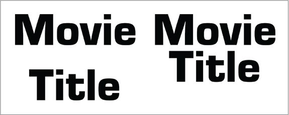
Figure 4.24 Line spacing adjusts vertical position between lines. Reduce line spacing 20 percent to 30 percent for almost all titles.
Reducing the line spacing for titles 20 percent to 30 percent smaller than the point size of the font will make your titles look more readable and professional. As an example, look how much “punchier” the title on the right looks, compared to the spaced-out version on the left. The title on the right looks solid, forcefully highlighting your message.
Avoid making stupid mistakes with your type. To get an idea of the potential icebergs lurking in your path, do a Google search for “Examples of bad typography.” By understanding the differences fonts make in telling your message, you can avoid these obvious mistakes.
Avoid Ransom Note Typography
When in doubt in any situation calling for text, just use one or two fonts: one for titles and other for body text. The days of impressing your audience with multiple typefaces are long gone (Figure 4.25). Today, folks just want to read what you wrote.

Figure 4.25 Need I say anything more? There are 11 different fonts in this visual catastrophe.
Choosing the Right Fonts
When choosing fonts, remember that digital media tends to have lower resolution than print. So, use fonts that:
- Are different from the default fonts of your system (give Helvetica and New Times Roman a rest).
- Are easily readable, especially when used at smaller point sizes.
- Reflect the style and emotion of your message, especially for titles and full-screen graphics.
- Use relatively even strokes in the glyph; avoid glyphs with very thin strokes.
- Contrast with the background color and pattern.
- Finally, give your audience enough time to actually read them.
Key Points
Here’s what I want you to remember from this chapter:
- The fonts we use and how we use them trigger emotional responses in our audience before they even read a word of the text.
- Pick fonts that represent the style and emotional tenor of your message.
- Pick fonts for their readability first, then their design.
- Sans serif fonts tend to read better on digital media.
- Of the two principle font families: serif is traditional; sans serif is modern.
- Fonts with thin elements don’t look good on low-resolution screens.
- Always add drop shadows to title text, except in limited situations.
- Always kern and letter space title text.
Practice Persuasion
Using a word processor, set this headline in different fonts and font sizes. Imagine you are creating two versions: one for a plumbing hardware store and the other for a cupcake boutique.
How does the choice of font affect the emotion and urgency of the message?
New Look! New Colors! New Style!
PERSUASION P-O-V
A PRESS RELEASE THAT SAYS NOTHING
In the chapters on writing and fonts, I’ve emphasized clarity, readability, and thoughtful consideration of your audience and message. Here’s the exact opposite: an actual press release so opaque and self-absorbed as to be completely unintelligible. (I deleted the name of the specific company and product for all the obvious reasons.)
This was sent to a general technology press list, in hopes of generating press coverage. I read this a dozen times and still have no idea what they are talking about or why I should care. This illustrates what happens when what you know gets in the way of clearly explaining it.
“1st Oct 2019: The global product design, development, and IoT company, ___, who is the development and design service provider behind the ___ Smart Ring product has just released a Smart Ring white paper to help brands, manufacturers, and service providers understand this emerging wearable market, and the technology, and gives guidance to create a successful Smart Ring strategy.
“Over the past five years, the Smart Ring market has grown steadily—primarily driven by tech startups. ___, the global product development and IoT firm, and developer of several signature Smart Ring products, predicts that Amazon’s Echo Loop Smart Ring product launch recently marks the beginning of a new era for Smart Rings. Smart Rings have entered the mainstream, and market growth will accelerate accordingly. ___ has published a white paper to analyze the market and help companies define their go-to-market strategy!”
What makes this even more intriguing is if you replace “Smart Rings” with any other high-tech term, this release makes just as much sense. Well, as much sense as this press release actually makes—which is none. They missed the fact that a general tech audience has no clue what they are talking about. They defined nothing. Explained nothing. Never answered why this announcement was important to their audience.
And wasted a lot of people’s time.