Chapter 3
Persuasive Writing
If St. Paul had been talking to a classroom of prospective writers, he might have changed a consonant. Faith and hope must abide, for the writer must have faith in his own ideas, and he must hope that his words will be read, but after faith and hope comes clarity. Without clarity we are not even sounding brass or tinkling cymbals. Be clear, be clear, be clear! Your idea or image may be murky, but do not write murkily about it. Be murky clearly!
James J. Kilpatrick1
Journalist, Author, and Grammarian
[1] (In 1 Corinthians 13:13, St. Paul talks about “faith, hope, and charity.” This quote paraphrases that Bible passage. Kilpatrick, 1984, p. 32)
Chapter Goals
The goals of this chapter are to:
 Explain the importance of finding and crafting the right message
- Explain the role of storytelling
- Define a creative workflow
- Describe how a workflow improves efficiency
- Explain how to plan a story using an “elevator pitch”
- Provide tips for writing smarter and more powerfully
AS I WAS RESEARCHING this chapter, I came across Write Better, Speak Better, a Reader’s Digest book written in 1972, before social media, before email, even before personal computers. Yet, its thoughts are still relevant.
Persuasion is something we do to create a choice for the viewer by developing a focused message, wrapped in a story and delivered with emotion to the right audience.
“Let’s look carefully at this matter of being genuinely persuasive.… Inducing a person to change his mind is a very delicate operation indeed…. Don’t try to bludgeon your listeners into submission with facts, figures and what debaters like to refer to as ‘conclusive proofs.’ Remember, your listener will accept your idea only if he first wants to accept it.”2
[2] (Reader’s Digest, 1977, pp. 528–536)
The Right Message Is the First Step
In the cartoon for Figure 3.1 the two women had the best of intentions. They had a compelling topic and forceful talking points. They were targeting the right audience. But they weren’t connecting. Why? Because they assumed their audience was driven by the same concerns they were. The women were focused on what they felt was important, and, in so doing, they lost sight of what their audience felt was important. Once they took a step back and looked at the problem through the eyes of their audience, they instantly and successfully connected.
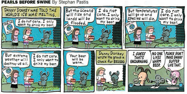
Figure 3.1 Right audience, wrong initial message. Focus on the needs of your audience. (Image Credit: Pearls before Swine by Stephan Pastis)
Persuasion is something we do to create a choice for the viewer. That was true 50 years ago and remains true today. So, how do we set up this choice? By developing a focused message, wrapped in a story and delivered with emotion to the right audience.
It may seem strange, in a book on visual techniques, to devote a chapter to storytelling. But, stories are deeply woven into the human psyche. Stories came first. Sitting around a fire telling stories is as old as humanity itself. Stories provide a direct line to the brain and the heart.
Even in today’s image-oriented world, words matter. Need proof? Look no further than today’s memes.
Memes like Figure 3.2 combine the power of words with the visceral hook of an image. The combination of words and image is far more powerful than just words or image alone.

Figure 3.2 Memes combine the power of words with the eye-grabbing hook of an image. (Image Credit: Ali Pazani / pexels.com)
The basic definition of a story is: “A hero struggles to overcome obstacles to reach an important goal.” Or, as I tell my students: A story takes an audience on a journey, encompassing challenges and change, structured with a beginning, middle, and end.
Stories are not just a report. “The purpose of the report is to point you there,” writes Roy Peter Clark, in his book How to Write Short, “but the story puts you there.”3 I really like his description of reading a report but living a story. Stories are involving and compelling, capturing the imagination. Good stories touch your emotions and make you feel. That, not surprisingly, is also true for images.
[3] (Clark, 2013, p. 67)
We read reports, but live stories. Stories touch our emotions and make us feel.
As famous film director Alfred Hitchcock once said, “There are three elements that make a film great: the script, the script, and the script.”
This raises an important question: What makes a story good? This is like asking, “What’s the best vehicle?” A school bus, pickup truck, or sports car are all “best,” depending upon your task. They can also be the worst, if the task changes. (The image of a sports car carrying plywood came instantly to mind.)
The only answer to “What’s a good story?” is that it depends upon what you need it to do.
Images Evoke Stories
Even if no story is provided, our brains automatically invent one for an image. We don’t simply look at a photo and say, “Oh! That’s a photo.” Instead, we look at it and wonder, “What’s going on? Who is that? Why is this image important?” Without much effort, a story appears in our imagination.
Since this story creation process occurs in our viewers whether we lead them there or not, it is much better for us to suggest the story than have them invent one on their own.
For example, our eye goes first to the firefighter in Figure 3.3 because, according to the Six Priorities, he’s bigger, different, and the most in focus element in this shot. (He’s also framed according to the Rule of Thirds.) As we look at this dramatic action photo, we want to know more: What fire, why is he shouting, and who is he shouting at? Already, our minds are inventing a story to go with the image.

Figure 3.3 Our brain invents stories when it looks at an image. (Image Credit: pexels.com)
If we don’t provide a story to go with our images, the viewer will create a story of their own. We need to control this conversation, not the viewer.
Each image begs us to create a story to explain it. We want to know what happens next. I’m not saying that posed pictures should be avoided. Rather, when we are telling stories, the eye and brain are more engaged by something dynamic, something moving, or something changing than by a lovely static image.
The key point is: If we don’t provide a story to go with our images, the viewer will create a story on their own. It is far better for us to control this conversation than the viewer.
Stories involve change; it’s essential to any story. I illustrate this in my class by inviting one of my students to walk to the front of the room and sit on the edge of a table. All the students watch as she walks up and sits. After a few seconds of the student just sitting there, the class turns their eyes back to me, wondering what will happen next. I say nothing, and after a few more seconds, everyone starts to fidget.
At this point, I ask the student sitting at the front to stand, walk to the wall, turn, walk back, and sit on the table again. Everyone watches as the student does this. At that point, I say, “This illustrates the power of change in your stories. If nothing is happening, you lose the audience. As soon as things start changing, for good or bad, your audience is right back with you.”
In any story, change is essential.
Since we are trying to persuade, that is, to create change through our visuals, these two elements—change and stories—go hand in hand with what we are trying to accomplish.
Get Organized with a Workflow
As we get ourselves organized for storytelling, let me first define some key terms that apply to persuasive storytelling:
- Theme. Also called the “elevator pitch.” This is a short description, only two or three sentences, of what you want to convey and what you want the audience to do with that information.
- Goals. Measurable objectives that will be used to determine whether your messages have any impact. For example, decrease the amount of street trash by 10 percent.
- Audience. The group of people who are the target of your message. A story can exist only in terms of its audience. For example, elementary students, high-school students, and local businesses would each have different stories.
- Message. The content of what you want to tell the audience. For example, “Pick up your trash.”
- Story. The form of how the message is told for each audience. A single message could, and generally does, have multiple stories associated with it. For example, a story for grade-school children would show them where to throw out trash. A story for high-school kids would ask them to volunteer to pick up litter. A story for businesspeople would ask them to provide more recycling opportunities.
- Call to Action (CTA). An explicit action you want the audience to take after seeing your story.
I discovered that I often use “story” and “message” interchangeably, but they really aren’t. The message is the content you want to convey. The story is how that content is conveyed. For example, let’s say the message is: “Don’t pollute.” Stories could be images of recycling or picking up litter or a polluted landscape. In other words, there are multiple stories that can all revolve around the same message.
Efficiency is a theme that recurs throughout this book. One way to boost efficiency is to create a workflow. This is an explicit, usually written, series of steps (called a “process”) for completing a task efficiently. Creating stories for visual persuasion is similar to building widgets. Both are done often, and both consist of repetitive tasks.
Workflow
An explicit, usually written, series of steps for completing a task efficiently.
In today’s world there just isn’t enough time for us to get our work done to our satisfaction. As I tell my students, “Do the best you can in the time you’ve got.” Jan Fedorenko, senior media manager at WLS-TV, shared her mantra: “It’s better than good; it’s done!” We need to be efficient—really efficient—with the time we have.
I’ve learned that the best way to accomplish any repetitive task is to create a workflow for it. By following a workflow, we stay focused on the job at hand and don’t waste time reinventing the wheel.
Creative projects that aren’t repetitive, such as the first time you do something, will benefit from a workflow. However, they will benefit even more from time spent planning. We’ll cover more about planning later in this book.
In a saying first attributed to the poet Paul Valéry, any creative work is never finished—it’s abandoned when time runs out. While, creatively, we can always make our work better, at some point there just isn’t any more time. That’s why efficiency is so important.
For example, here’s a workflow you can use to create a persuasive story:
1 |
Create a theme describing what you want to accomplish. |
2 |
Set measurable goals for that theme. |
3 |
Define your audience. |
4 |
Develop a message targeted at that audience. |
5 |
Create a compelling story from that message. |
6 |
Create an image that illustrates the story. |
7 |
Create a Call to Action that pays off the story. |
Don’t waste time doing something now that you plan to change later.
There’s no sense working on an image if you haven’t figured out the audience yet. Don’t waste time doing something now that you know you will change later in the process. For example, with this workflow, you can concentrate on each storytelling task, complete it, then tackle the next task, without retracing your steps. A workflow provides a map outlining the steps necessary to accomplish a task so you can concentrate on the creative process.
As we saw in Chapter 2, “Persuasive Visuals,” there are many different ways of telling the same story. For example, in the story of Little Red Riding Hood, Molly Bang used construction paper cutouts. Michael Bay would have used a movie camera, while Picasso would have used a paintbrush.
The Essence of Persuasion
The four pillars of trust are reliability, capability, honesty, and empathy.
According to Aristotle, who created the entire field of persuasion, called “rhetoric,” there are three elements of persuasion:
- The character of the speaker (ethos)
- The emotional state of the hearer (pathos)
- The persuasive argument itself (logos)4
[4] https://plato.stanford.edu/entries/aristotle-rhetoric/#4.1
In other words, is the speaker credible, is the audience in an emotional state that allows them to receive the message, and is the message itself compelling?
As we first learned in Chapter 1, “The Power of Persuasion,” what makes persuasion successful is not cleverness, but trust. The viewer has to trust you. “…trust is not only the irreplaceable basis of all communication but is also one of the more profound channels of connection between human beings.”5 The problem is that in today’s world, trust is in very short supply. Your audience automatically assumes you are not telling the truth.
[5] (Bridges & Rickenbacker, 1992, p. 8)
Phillip Khan-Panni describes the “four pillars of trust” as reliability, capability, honesty, and empathy.6 Be careful taking liberties with the truth—even in jest. In today’s connected society, it is far too easy to be found out, and the results won’t be pretty. During the course of this book, you’ll learn how to create, modify, and distribute images. However, to quote the iconic line from Uncle Ben in Spider-Man, “With great power comes great responsibility.” Once you lose the trust of your audience, you will have a hard time getting it back.
[6] (Khan-Panni, 2012, pp. 80–83)
Examples of stretching the truth abound. I began writing this book in the heat of the 2020 American political season. I completed it in lockdown in California during the COVID-19 pandemic. The lack of trust and misinformation surrounding both were pervasive and debilitating. Political ads have refined image manipulation into an art form. Politicians learned long ago that images are far more powerful than policy statements. The problem is that excessive manipulation and exaggeration have also destroyed the trust we need to have in our political institutions. Gaining it back will take a long, long time. There’s a lesson for us and our message amid all this excess as well.
“Persuasion must be sincere.”7 Be careful of using fancy words when a simpler one would work just as well. George Orwell, in his book Politics and the English Language, wrote, “The great enemy of clear language is insincerity. When there is a gap between one’s real and one’s declared aims, one turns as it were instinctively to long words and exhausted idioms, like a cuttlefish spurting out ink…. Never use a long word when a short word will do.”8
[7] (Reader’s Digest, 1977, p. 536)
[8] (Orwell, 1946, p. 252)
Interesting stories have focus, wit, and polish. Like good poetry, no words are wasted; each word needs to carry its own weight. Use these three questions to focus your story:
- Why does this story matter to my audience?
- Why does this story need to be told?
- What’s the point of this story?
Start with the Basics: An Elevator Pitch
The easiest way to plan is to start small. I suggest creating an “elevator pitch,” which is also called an “elevator speech.” Terri Sjodin is the principal and founder of Sjodin Communications, a public speaking, sales training, and consulting firm. She devoted an entire book, Small Message, Big Impact, to creating and presenting an elevator speech.
Chapter 1 stressed that we need to create a clear message. Clarity is at the heart of any elevator speech. As Terry writes, “An elevator speech is a brief presentation that introduces a product, service, philosophy, or idea. The name suggests the notion that the message should be delivered in the time span of an elevator ride, up to about three minutes. Its general purpose is to intrigue and inspire a listener to want to hear more of the presenter’s complete proposition in the near future.”9
[9] (Sjodin, 2011, p. 3)
Who Coined the Term “Elevator Pitch”?
According to Wikipedia, there are at least three possible origin stories, but the one I like is that in the late 1960s, Philip Crosby, a quality test technician at ITT, wanted to propose a change at the company. He waited at the ITT headquarters elevator until the CEO arrived. Crosby stepped onto an elevator with the CEO to deliver his pitch. Once they reached the floor in which the CEO was getting off, Crosby was asked to deliver a full presentation on the topic at a meeting for all of the general managers. Out of that presentation came a promotion and his first book, The Art of Getting Your Own Sweet Way, and, ultimately, his own consulting company.10
Whenever I’m invited to speak at a user group or corporate training session, one of the first questions I ask the event planner is, “In an ideal world, what can I do that would most benefit your audience?” I am always surprised by their answer. In most cases, they don’t need something complex. Rather, it’s something simple that they are puzzled about. There’s an old medical saying: “If you hear hoofbeats, it’s more likely to be horses than zebras.”
In other words, start with the basics and then build from there. Bring your audience along with you. My wife was telling me of a common situation at the medical conferences she’s attended. The presenter stands up and says, “They only gave me 15 minutes, but I need at least 90 minutes to explain this. So, here’s a couple of slides; you can learn the rest from my handouts.”
This is failure at multiple levels: insufficient time from the conference organizer vetting their speakers, the disdain of the presenter for their audience, and, worst, a lost opportunity to educate—at least a little—the audience in a technical subject that could spark their interest to learn more after the session. The best visuals in the world won’t solve this problem, but a clearly thought-out elevator speech can help provide focus.
An elevator speech boils our message down to its core, the “one key thing” we want our audience to take away with them. Far too often, instead of condensing, we keep adding points, until we have a laundry list of the “absolutely, positively, most important 17 concepts you must remember from this speech.” Sigh…that’s a hopeless task for anyone.
“If people don’t understand the change you want them to make, they can’t make that change,” writes business consultant Dianna Booher, whom we first met in Chapter 1. “If they don’t understand your information or explanation, you will have less of a chance to change their minds about that issue. If instructions are too complex, people will likely resist the effort to follow them—or fail to accomplish the task. Simplicity and persuasion are intricately linked.”11
[11] (Booher, 2015, p. 35)
The Four-Step Process of Persuasion
When it comes to persuasion, we can describe the process in four steps using the mnemonic AIDA:
Attention (A). Hook their attention.
Interest (I). Raise their interest.
Desire (D). Make the benefits they get desirable.
Action (A). Issue a clear Call to Action and tell them the next step.
According to Terry Sjodin, an elevator speech has several key characteristics:
- It is a clear, brief message with a purpose.
- Its sole function is to intrigue the listener to learn more.
- It has structure.
- It has a close.
- It helps you earn the right to be heard.12
[12] (Sjodin, 2011, p. 12)
The mission of an ad: attract, interest, convince.
—E. ST. ELMO LEWIS
Start your planning with an elevator pitch; fit it into two to three sentences. Use this to help you figure out what is most important to you. While you can cover multiple ideas in one message, there needs to be a single message that is most important. Don’t spread the attention of your audience across multiple points. A knife cuts best when it has a sharp edge.
Focus, Then Focus Some More
E. St. Elmo Lewis, an American advertising advocate who was posthumously inducted into the Advertising Hall of Fame, foretold today’s media landscape in 1903, when he wrote, “The mission of an advertisement is to attract a reader so that he will look at the advertisement and start to read it; then to interest him, so that he will continue to read it; then to convince him, so that when he has read it he will believe it. If an advertisement contains these three qualities of success, it is a successful advertisement.”13 Change the word “reader” to “viewer” and his advice still applies more than a century later.
[13] (Lewis, 1903, p. 124)
We are not trying to impress viewers with what we know or how smart we are; we want to impress them with an urgency to do something.
Given the opportunity, we could easily list multiple “key points” we want to make in our message. But no viewer wants to watch a laundry list. She just wants to learn about what she is interested in. Dale Carnegie’s “What’s In It For Me?” (WII-FM) remains uppermost in her mind.
To help you figure out what’s most relevant in your message, make a list of all the points you want to make, all your benefits, all the reasons why someone should pay attention to your message. Then, draw a line down the middle of a sheet of paper. On one side, write the positive aspects (pros) of your argument, on the other any potential negatives (cons). (Salespeople call this a “Ben Franklin close.”) This allows you to determine possible objections from your audience then find positive statements to overcome them. Next, combine, consolidate, and compress all your points into three. Why three? Three points are easy for the audience to remember, with a powerful sense of rhythm that echoes across history:
- Faith, hope, charity
- Of the people, by the people, and for the people
- Beginning, middle, end
- Faster, higher, stronger
- Stop, look, and listen
- On your mark, get set, go
“Of the people, by the people, and for the people” fascinates me. Not only is it a rhythmically powerful set of three phrases, each phrase itself is also a set of three. This repetition of a powerful rhythm is what helps make this so memorable.
Your audience has a limited attention span. Present too many points and you’ll lose them.14 Presenting in groups of three forms a powerful rhythm that we can leverage to improve the visceral power of our presentation. Watch how often this rhythm of three occurs in the ads you watch or read.
[14] (Reader’s Digest, 1977, p. 521)
How Many Benefits Are Enough?
Many times, we wrestle with how many benefits we should provide to entice the maximum number of people to respond to our offer. A seminal 2011 marketing study called, The Presenter’s Paradox studied15 whether offering more benefits made an offer more persuasive. What the authors discovered was that “when making an offer, communicators intuitively think more is better. …But listeners don’t look at the situation in the same way. Instead, they ‘average’ all the pieces of information they hear and walk away with a single impression. …Not only did ‘more’ add less, it actually harmed the rest.”16 In other words, limiting what’s contained in an offer makes it more powerful. They found the most successful number of benefits was about two.
[15] (Weaver, Garcia, & Schwartz, 2012, pp. 445–460)
[16] (Booher, 2015, p. 83)
When designing your message, remember the audience is always asking, “What’s In It For Me?” (WII-FM).
Write Short
During my research, I enjoyed reading How to Write Short by Roy Peter Clark. So much of it pertains to what we are talking about. For example, “In the digital age, short writing is king. We need more good short writing—the kind that makes us stop, read, and think—in an accelerating world. A time-starved culture bloated with information hungers for the lean, clean, simple, and direct. Such is our appetite for short writing that not only do our long stories seem too long, but our short stories feel too long as well.”17
[17] (Clark, 2013, p. 4)
Carl Hausman shares his three tips for better writing:
- Keep sentences short.
- Write in a conversational tone.
- Make very short sentences carry the weight.
This last is a potent technique and dirt simple. When you want to make an impact and get across a key point, make it a very short sentence.18
[18] (Hausman & Agency, 2017, p. 15)
In these days of communication through tweets, “short” has developed an entirely new meaning. But, simply because a story is short does not mean it can’t be compelling. Years ago, I read of Ernest Hemingway being challenged to write a story in less than ten words. He needed only six: “For Sale: Baby Shoes. Never worn.” As the father of two and grandfather of two more, the sheer overwhelming emotion in that story continues to ricochet in my mind.
William Strunk, Jr., wrote The Elements of Style in 1918. Dr. Strunk was famous for his rules on writing style. For example, take Rule #13: “Omit needless words.” When Dr. Strunk wrote “Omit needless words,” he then added this paragraph:
Vigorous writing is concise. A sentence should contain no unnecessary words, a paragraph no unnecessary sentences, for the same reason that a drawing should have no unnecessary lines and a machine no unnecessary parts. This requires not that the writer make all his sentences short, or that he avoid all detail and treat his subjects only in outline, but that he make every word tell.
That paragraph contains 65 words, or 386 characters. Nice, but we live in the age of Twitter. What would this look like if it were reshaped for the limited characters of Twitter? Roy Peter Clark did the rewrite: “Write tight. A text needs no extra words as a drawing needs no extra lines. A sentence can be long with detail. But every word must tell.” Wow! 137 characters, extracted from almost 400.
Twitter has expanded their rules to allow 280 character comments. Perhaps, when you read this, even more. But, when it started it limited all comments to a 140 characters, forcing short, clear writing.
So, should you write long and cut back or write short to start with? As Clark summarizes, “There is no right answer, except for this: A good short writer must be a disciplined cutter, not just of clutter, but of language that would be useful if she had more space. How, what, and when to cut in the interest of brevity, focus, and precision must preoccupy the mind of every good short writer.”19
[19] (Clark, 2013, pp. 118–122)
For me, the most powerful way to write short for visuals is to combine the rhythm of human speech with solid content. Avoid sentences, use phrases.
Think Like a Poet
In poetry, words are precious and scarce. By this, I don’t mean that every line needs to rhyme but that every word is important and needs to carry its full weight.
A good example is haiku. Traditional haiku uses three lines containing five, seven, and five syllables to reflect moments in nature. Originating in Japan in the mid-1600s, the “Great Four” haiku poets are Matsuo Bashō, Kobayashi Issa, Masaoka Shiki, and Yosa Buson. Their work, using a form set four centuries ago, is still the model for traditional haiku poetry today.20 Here are three examples from the acknowledged masters of this craft:
[20] https://examples.yourdictionary.com/examples-of-haiku-poems.html
An old silent pond...
A frog jumps into the pond,
splash! Silence again.
Matsuo Bashō
A world of dew,
And within every dewdrop
A world of struggle.
Kobayashi Issa
The light of a candle
Is transferred to another candle—
Spring twilight.
Yosa Buson21
[21] https://www.readpoetry.com/10-vivid-haikus-to-leave-you-breathless/
Each of these poems contains less than 14 words yet still evokes a strong sense of place, pace, and emotion. Just as with haiku, images don’t require lots of words to evoke powerful feelings.
The Battle Between “Think” and “Feel”
Jeremy Dean, in his article “The Battle Between Thoughts and Emotions in Persuasion” in PsyBlog, wrote this:
“Nowadays people tend to use ‘I think’ and ‘I feel’ interchangeably. For some this is a linguistic faux pas, but what about psychologically? Does it make any difference whether what you say is couched in ‘thinking’ or ‘feeling’ terms?
“…a new study published in the journal Personality and Social Psychology Bulletin finds this tiny difference can influence the power of a persuasive message.
“This suggests that if you want to persuade someone, then it’s useful to know whether they are a thinker or a feeler and target your message accordingly. If you don’t already know then the easiest way to find out is listen for whether they describe the world cognitively or affectively.
[The authors reported that] women were more persuaded by an ad for a new movie when it quoted reviews beginning with ‘I feel.’ Men, however, were more persuaded by the same basic ad when it quoted reviews beginning with ‘I think.’”22
[22] (Dean, 2010)
Meet the “Words of Power”
I’ve written that we need to “write short,” think of our writing as more like poetry than prose, and focus on works that “punch.” But, are there “power words” we can use in our writing?
Yes! Paraphrasing George Orwell in Animal Farm, “All words are equal, but some words are more equal than others.”
First, use active words and phrases. Avoid sentences that contain “be,” “have been,” or “was.” As well, most times, the word “that” is not needed. Next, consider the five points Joseph M. Williams presents in his book Style:
- Delete words that mean little or nothing (“kind of,” “really,” actually,” and “in order to”).
- Delete words that repeat the meaning of other words (“various” and “sundry”).
- Delete words implied by other words (“terrible tragedy”).
- Replace a phrase with a word (“in the event that” becomes “if”).
- Change negatives to affirmatives (“not include” becomes “omit”).23
[23] (Clark, 2013, p. 124)
Mary Embree, in The Author’s Toolkit, offers several more suggestions:
- Write from the heart.
- If you would write, read—especially books that touch your feelings.
- Keep your writing simple. Avoid talking “down.”
- Limit the use of adjectives, adverbs, and qualifiers.
- When in doubt about something you wrote, take it out.
- Write in an active voice.
- Limit use of similes, metaphors, and analogies.
- Avoid clichés, um, like the plague.
- Avoid slang, unless it specifically applies to your audience. Avoid jargon for the same reason.24
[24] (Embree, 2010, pp. 33–45)
One of the definitive studies of “power words” was conducted by Gregory Ciotti. He found five words that were simple, efficient, and powerful in speaking persuasively to an audience:
- The viewer’s name. (Dale Carnegie spotted this as well almost 90 years ago.) We all like seeing our name in print.
- Free. This is so powerful people will lean in its favor even when it comes with a hook.
- Because. Asking a favor is fine, but asking a favor followed by a reason is much more effective.
- Instantly. This, along with “immediately” and “fast,” are quick triggers for motivating human behavior.
- New. This is tricky; we want to buy new products, but from recognized brands. “New” is risky; find ways to minimize the risk. Stress the reliability of your company.
Gregory Ciotti ends his blog with this warning: “I can’t stress enough—just as in the application of writing headlines that work—you must understand why these words are persuasive, and you must use them in the contexts that make sense for your audience and your business. If you just start slapping them on every piece of content you create for no apparent reason, you’ll quickly see just how unpersuasive they can be.”25
[25] Gregory Ciotti, (December 6, 2012 ), The 5 Most Persuasive Words in the English Language, Copyblogger Media LLC,
Every story is different, and styles that work for one won’t work in the other. Still, there’s no reason to set yourself up to miscommunicate. And, by the way, the word “please” is pretty darn magical, too. There’s never harm in being polite.
To emphasize the importance of each word, TABLE 3.1 shows some typical word counts for different presentation formats.
TABLE 3.1 Typical Word Counts for Different Presentations
PRESENTATION |
AVERAGE WORD COUNT |
Meme |
Less than 10 |
PowerPoint slide (optimal) |
Less than 20 |
15-second video |
Less than 30 |
Printed poster |
Less than 50 |
30-second video |
Less than 75 |
See What’s in Front of You!
After you’ve designed your message and written your story, there is one last critical task: Proofread your work! The hardest challenge my students have is seeing what’s actually on the screen. Instead, like most of us, they see what they expect to see.
Proofreading is not easy. For example, look at Figure 3.4 again. It looks perfectly fine, except…this is supposed to be an ad for swimming goggles.

Figure 3.4 A student submitted this ad for swimwear as a homework assignment. Yet, there’s something wrong with this text. What is it?
I can’t teach you how to see. But I can personally testify that the darnedest mistakes crop up at the most inopportune times. What I found works for me when proofreading my work is looking at the same thing two different ways—say on-screen then on paper. Or on-screen, but using two different programs so the layout changes.
Anything to help me see the same text displayed differently. It always amazes me how many errors I catch that way, even when I think it’s perfect.
Key Points
Here’s what I want you to remember from this chapter:
- Stories are deeply woven into the way we think and feel.
- Unless guided otherwise, our brains will invent a story for an image.
- In any story, change is essential.
- A workflow makes us more efficient.
- A message is the content, while a story is how that content is delivered.
- Focus your message, and target it at your audience.
- Write short, use active words; think poetry, not essays.
- Proofread your work!
Practice Persuasion
Rewrite the following 119-word paragraph for brevity. Specifically:
- For a 30-second movie trailer
- For an original 140-character Twitter post
- For a 15-word motion graphic video
A Tale of Two Cities (Charles Dickens)
It was the best of times, it was the worst of times, it was the age of wisdom, it was the age of foolishness, it was the epoch of belief, it was the epoch of incredulity, it was the season of Light, it was the season of Darkness, it was the spring of hope, it was the winter of despair, we had everything before us, we had nothing before us, we were all going direct to Heaven, we were all going direct the other way—in short, the period was so far like the present period, that some of its noisiest authorities insisted on its being received, for good or for evil, in the superlative degree of comparison only.
PERSUASION P-O-V
FRESH FISH
Thinking about writing short reminds me of the story quoted in The Art of Persuasion, called “Fresh Fish.”
The fishmonger Klotnick has acquired a nice piece of wood to use as a sign, but he isn’t sure it is big enough for what he wants to say: Fresh Fish Sold Here Daily. Just then his friend Rubinstein comes along, and Klotnick asks for his advice. Well, says Rubinstein, you don’t want to say Fresh—that’ll set people wondering if the fish maybe aren’t so fresh. And you don’t need Sold—would you give them away? Here is a mistake—where else would you sell them? And Daily you don’t need—if the shop’s open, you’re selling. Come to think of it, the people can see the fish in the window—so why bother with Fish?26
[26] (Bridges & Rickenbacker, 1992, p. 112)