
Getting Started with Styled-Components
As apps grow, they can contain thousands of style rules—too many for a single person to keep track of. This leads to unintended conflicts. For example, which of the styles below will apply to a disabled button with the white class?
| | // StylesheetA.css |
| | button.white { |
| | background-color: white; |
| | color: black; |
| | } |
| | |
| | // StylesheetB.css |
| | button:disabled { |
| | background-color: grey; |
| | color: darkgrey; |
| | } |
The answer is that it depends on the order the stylesheets are loaded in, as both selectors have the same level of specificity. This is a very fragile state of affairs for a complex app. Worse, removing style rules becomes a risky endeavor. Let’s say that your app has this style rule:
| | p.alert-message { |
| | color: red; |
| | } |
You search your codebase for alert-message, find no results, and so you remove the style. But your search didn’t match this React code:
| | <p className={`${urgency}-message`}>This is an alert!</p> |
The CSS-in-JS paradigm, exemplified by styled-components,[53] greatly alleviates these problems by allowing a component’s style rules to be written as a function of its props. This offers a number of advantages:
-
No need to search your codebase to find out which styles are associated with a component. Its styles are either in the same module, or imported like any other dependency.
-
Styles are generated as a function of their component’s props and state, just like markup.
-
Styles can be subjected to unit tests.
And unlike the style prop, style rules generated by styled-components have the full range of functionality of ordinary CSS, including support for media queries, keyframe animations, and pseudo-classes.
Let’s start adding some style to test-driven-carousel. Install the styled-components package as a dependency:
| | $ npm install --save [email protected] |
| | + [email protected] |
So far, this book’s modus operandi has been to present tests first, then the code to satisfy these tests. This is, after all, a book about TDD, and TDD is usually taken to mean “writing tests first.” But on a deeper level, TDD is about seeking useful feedback for your code as quickly as possible. Tests are just one possible source of feedback. And when it comes to styles, the most useful source of feedback is usually seeing those styles.
So set tests aside for now. All you’ll need for this section is a live dev server.
Creating a Styled Component
Currently, the <img> created by CarouselSlide is unstyled, which means that it scales to whatever the original size of the image is. That means that the carousel jarringly expands and contracts as users move from slide to slide. Worse, it’ll push other page content around in the process. Clearly, this needs to be fixed!
To do that, we’ll replace the unstyled <img> element with a component generated by styled-components:
| | // src/CarouselSlide.js |
| | import React from 'react'; |
| | import PropTypes from 'prop-types'; |
| | import styled from 'styled-components'; |
| | |
| | const Img = styled.img` |
| | object-fit: cover; |
| | width: 100%; |
| | height: 500px; |
| | `; |
| | |
| | const CarouselSlide = ({ imgUrl, description, attribution, ...rest }) => ( |
| | <figure {...rest}> |
| | <Img src={imgUrl} /> |
| | <figcaption> |
| | <strong>{description}</strong> {attribution} |
| | </figcaption> |
| | </figure> |
| | ); |
| | ... |
styled.img is a function that generates a component that renders an <img> tag with the given styles. When an instance of that Img component is mounted, styled-components will dynamically insert a style rule with the styles you provided, using a class name selector based on the hash of those styles.
There’s some syntactic fanciness here in the form of an ES6 feature called tagged templates:[54] If you put a function directly in front of a template string (the kind delimited by backticks), that function is called with the template string as an argument.
In the case of Img, you could use the normal function call syntax, since the string with the styles is a constant. Where the tagged template syntax unlocks new possibilities is when the string has interpolations (the ${...} syntax): each piece of the interpolated string is passed in to the function as a separate argument. That gives the tag function the chance to process interpolated variables. As we’ll soon see, styled-components takes advantage of this power.
As soon as you hit save, you should see the difference in your browser. Before, the size of the <img> tag was determined by the image file it loaded. Now, it takes up the full width of its container and has 500px of height. The object-fit: cover rule means that the image keeps its aspect ratio as it expands or contracts to those dimensions, getting clipped as needed.
Why 500px? Really, the height of the image should be determined by the app rendering the carousel component. So let’s make these styles dynamic:
| | // src/CarouselSlide.js |
| | import React from 'react'; |
| | import PropTypes from 'prop-types'; |
| | import styled from 'styled-components'; |
| | |
| | const Img = styled.img` |
| | object-fit: cover; |
| | width: 100%; |
| ① | height: ${props => |
| | typeof props.imgHeight === 'number' |
| | ? `${props.imgHeight}px` |
| | : props.imgHeight}; |
| | `; |
| | |
| | const CarouselSlide = ({ |
| | imgUrl, |
| | imgHeight, |
| | description, |
| | attribution, |
| | ...rest |
| | }) => ( |
| | <figure {...rest}> |
| | <Img src={imgUrl} imgHeight={imgHeight} /> |
| | <figcaption> |
| | <strong>{description}</strong> {attribution} |
| | </figcaption> |
| | </figure> |
| | ); |
| | |
| | CarouselSlide.propTypes = { |
| ② | imgHeight: PropTypes.oneOfType([PropTypes.number, PropTypes.string]), |
| | imgUrl: PropTypes.string.isRequired, |
| | description: PropTypes.node.isRequired, |
| | attribution: PropTypes.node, |
| | }; |
| | |
| ③ | CarouselSlide.defaultProps = { |
| | imgHeight: 500, |
| | }; |
| | |
| | export default CarouselSlide; |
- ①
-
This is where styled-components really gets exciting: interpolated values in the style template can be a function of the component’s props! Whereas ordinary CSS is static, these styles are completely dynamic. If the imgHeight prop changes, the styles update automatically.
- ②
-
This code declares imgHeight as a prop that can be either a number (indicating a px value) or a string (such as ’100vh’). Since it doesn’t have isRequired it can also be null; in that case, styled-components would simply omit the height rule from the generated styles.
- ③
-
A React component’s defaultProps are used as fallbacks when the prop’s given value is undefined. Whereas propTypes are only used during development, defaultProps are always applied.
Note that the src prop passed to Img is passed through to the <img> element it renders. Styled-components filters out props like imgHeight that aren’t valid DOM attributes. This means you should be careful what prop names you use for styling. If, for example, we’d named the prop height instead of imgHeight, then it would’ve been passed down as the height DOM attribute of the <img>.
Right now, imgHeight can be overridden on a slide-by-slide basis, since Carousel passes the whole slide data object down to CarouselSlide as props. But in most cases, the Carousel consumer will want it to have a consistent height. So let’s add a prop to Carousel that overrides the default imgHeight on CarouselSlide:
| | // src/Carousel.js |
| | ... |
| | export default class Carousel extends React.PureComponent { |
| | static propTypes = { |
| | defaultImgHeight: CarouselSlide.propTypes.imgHeight, |
| | slides: PropTypes.arrayOf(PropTypes.shape(CarouselSlide.propTypes)) |
| | .isRequired, |
| | }; |
| | |
| | static defaultProps = { |
| ① | defaultImgHeight: CarouselSlide.defaultProps.imgHeight, |
| | }; |
| | ... |
| | render() { |
| | const { defaultImgHeight, slides, ...rest } = this.props; |
| | return ( |
| | <div {...rest}> |
| | <CarouselSlide |
| ② | imgHeight={defaultImgHeight} |
| | {...slides[this.state.slideIndex]} |
| | /> |
| | <CarouselButton data-action="prev" onClick={this.handlePrevClick}> |
| | Prev |
| | </CarouselButton> |
| | <CarouselButton data-action="next" onClick={this.handleNextClick}> |
| | Next |
| | </CarouselButton> |
| | </div> |
| | ); |
| | } |
| | } |
- ①
-
The default value from CarouselSlide’s imgHeight is reused as the default value for defaultImgHeight. Functionally, this is redundant, but defaultProps is also commonly used for documentation, as we’ll see in Chapter 6, Continuous Integration and Collaboration.
- ②
-
Importantly, defaultImgHeight is passed down as imgHeight before the slide data object spread, giving the latter precedence. If it were the other way around, individual slides would be unable to override imgHeight.
If you feel naked without test coverage for all of these changes, you can skip ahead to Testing Styled Components, then come back for a detour into styled-components tooling.
So: How did styled-components get our styles into the <img> tag? If you inspect one of the <img> tags in the browser, as in the next screenshot, you’ll see that its class attribute is full of gobbledigook. Something like class="sc-bdVaJa hhfYDU". The styled-components library generated these class names for you, and injected a corresponding style rule into a <style> tag in the <head> of the page.
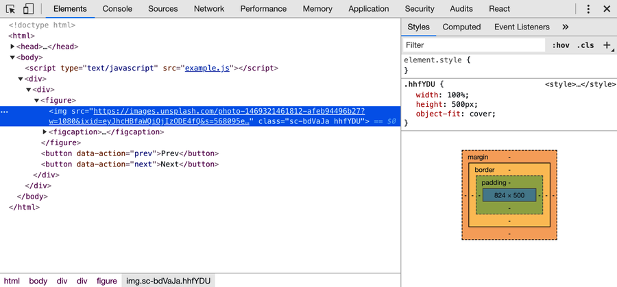
In fact, the <img> element has two classnames generated by styled-components. One of these, the one with the sc- prefix, is a stable class name that styled-components uses for selectors. The other, the one the styles are applied to, is generated from a hash of the styles. In practice, the distinction is just an implementation detail. You should never, ever copy any class names generated by styled-components in your code. All generated class names are subject to change.
Having unreadable class names is an unfortunate drawback of styled-components. Luckily, it can be mitigated with help from our good friend Babel.
Better Debugging with the Babel Plugin
We’ve seen how Babel can bring new features like JSX syntax to JavaScript. But Babel’s language-bending abilities can also be used for subtler purposes, tailoring your code to the needs of specific libraries. That’s what the official styled-components Babel plugin[55] does. It’s a recommended addition for any project that uses styled-components.
Install the plugin with npm:
| | $ npm install --save-dev [email protected] |
| | + [email protected] |
Then add it to your Babel config:
| | // .babelrc.js |
| | module.exports = { |
| | presets: ['@babel/preset-react', '@babel/preset-env'], |
| | plugins: [ |
| | '@babel/plugin-proposal-class-properties', |
| | 'babel-plugin-styled-components', |
| | ], |
| | }; |
Restart your dev server, and inspect the element again:

Notice the difference? For one thing, the short class name has changed. (To reiterate: never copy class names generated by styled-components into your code!) But more importantly, the formerly sc- prefixed class name is now prefixed with CarouselSlide__Img-. Thanks to the Babel plugin, you can now see the module name (CarouselSlide) and component name (Img) associated with every element styled by styled-components. Note, however, that the short class name is still the one used as the selector.
The Babel plugin also brings efficiency improvements, including the removal of comments and unnecessary whitespace from inside of your template literals, allowing you to write your styles in a human-friendly way without having to worry about the impact on your users’ limited bandwidth.
Linting Styles with Stylelint
Once you’re used to writing code with a powerful linter like ESLint, doing without a linter can feel like performing on a trampoline without a net: the slightest error can have dramatic effects! That applies to CSS just as it applies to JavaScript. One typo can ruin the look of an entire page. Worse, because browsers vary widely in how they interpret CSS syntax, malformed style rules may work as intended in your preferred development browser but spawn visual bugs in others.
Happily, it’s possible to use the popular stylelint[56] CSS linter on styles written for styled-components. Since ESLint ignores the contents of those template literals, the two linters have no trouble peacefully coexisting. In fact, they go together like chocolate and peanut butter.
You’ll need a few packages for this: stylelint itself, stylelint-processor-styled-components to tell stylelint which parts of the file to read, stylelint-config-recommended to enable a reasonable set of default rules,[57] and stylelint-config-styled-components to disable some rules that don’t apply in the land of styled-components.[58] Install them as dev dependencies:
| | $ npm install --save-dev [email protected] |
| | [email protected] |
| | [email protected] |
| | [email protected] |
| | + [email protected] |
| | + [email protected] |
| | + [email protected] |
| | + [email protected] |
Then create a .stylelintrc.js file in the project root:
| | module.exports = { |
| | processors: ['stylelint-processor-styled-components'], |
| | extends: [ |
| | 'stylelint-config-recommended', |
| | 'stylelint-config-styled-components', |
| | ], |
| | }; |
And as with ESLint, you’ll want to tell the linter to ignore the dist dir:
| | dist/ |
One more step: add stylelint to the project’s lint script. To keep the line length in package.json manageable, split the script into two parts. Call the existing script lint:js, call the stylelint script lint:css, and run them both from the lint script:
| | "scripts": { |
| | "test": "jest", |
| | "lint:js": "eslint . && prettier-eslint --list-different **/*.js", |
| ① | "lint:css": "stylelint **/*.js", |
| | "lint": "npm run lint:js && npm run lint:css", |
| | "format": "prettier-eslint --write **/*.js", |
| | "build": "webpack --config webpack.config.js", |
| | "dev": "webpack-dev-server --config webpack.config.js --open" |
| | }, |
- ①
-
By default, stylelint doesn’t know what kind of files to look at. The glob argument **/*.js tells it to look at the project’s JS files.
There should be no output (aside from npm’s) if you run the script, indicating that everything is copacetic right now:
| | $ npm run lint |
| | |
| | > [email protected] lint /Users/tburnham/code/test-driven-carousel |
| | > npm run lint:js && npm run lint:css |
| | |
| | > [email protected] lint:js /Users/tburnham/code/test-driven-carousel |
| | > eslint . && prettier-eslint --list-different **/*.js |
| | |
| | > [email protected] lint:css /Users/tburnham/code/test-driven-carousel |
| | > stylelint **/*.js |
If you’re using VS Code, you’ll want to install the stylelint extension by Shinnosuke Watanabe[59] to automatically lint as you type.
From now on, any style code you write will enjoy the benefits of linter coverage. Make a commit:
| | :wrench: Initial stylelint setup |
The stylelint configuration here is just a starting point. For a complete list of rules supported by stylelint that you might want to add to your project, check the official docs.[60]