16 What Is Pictorial Composition?
The space in a photo resembles the tones of a melody that produce a composition. An image is by no means successful simply if everything shown is razor sharp; what is crucial for the quality of a painting or photograph is how the individual pictorial elements relate to one another. An inexperienced viewer looks mostly at the content of an image, but the image is based on an abstract, basic structure that dictates whether its contents will elicit a strong or boring, chaotic or orderly impression—and that is what pictorial composition is all about.
If a classical painter such as Caspar David Friedrich worked on his compositions by sketching various possibilities, we photographers have to proceed in an entirely different way: We imagine how we can frame reality from every conceivable spot at any given time, and we decide upon large frames (wide-angle lenses), medium frames (normal lenses), or small frames (telephoto lenses). We compose pictures only by selecting the frame, the site, and the time. When doing so, we must apply all our pictorial capacity and creative ideas.
Pictorial language has its own laws, very different from verbal language, which is subject to logical thinking. Pictorial laws are partly as old as the Greek principles of harmony. It pays to know these laws so you can apply them to your own composition. The chapters in this section will deal with these laws.
Condensing an Event to a Composition
Let’s see how you can condense a rather banal, everyday situation to a pictorial composition. The weekly Sunday market in Teguise on Canary Island Lanzarote shows a chaotic composition from which it would be difficult to assemble a clearly structured image (figure 16–1). The shapes to the right mesh with one another so chaotically that the photo looks like a typical snapshot devoid of any thought of composition. In addition, the photo has too many elements.
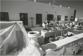

In the second attempt (figure 16–2), the image is structured a bit better compared to the first. As opposed to the first attempt, the camera used in the second attempt was equipped with the 17 mm super-wide-angle lens. The camera was held more to the left so the cross is now on the horizontal center to indicate symmetry: The left market stall, covered with plastic, is symmetrical to the right market stall. Nevertheless, this second attempt is still unsuccessful because the right side is still dominated by clutter.
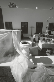
A third attempt to achieve a clear composition was to turn the camera to take a vertical photo (figure 16–3), but this image still does not look entirely convincing: The chaotic right side with its stalls and projecting leaves once again subverts our efforts, and the line formed by the roof of a house does not run parallel to the edge of the image.
We have to ask ourselves: What is really interesting in this image? Certainly of interest is the pottery sitting on the whitewashed wall and the plastic cover in the foreground, plus the white house in the background.
A new attempt to salvage the image would be to keep the vertical format and reduce the composition down to its essentials, namely the white pottery and the plastic, the house façade in the background, the cross, and a passerby (figure 16–4). The image taken with the 31 mm focal length of Canon’s 17–40 mm zoom lens looks a lot less cluttered and has a better composition, but the photo is not perfect yet.
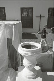
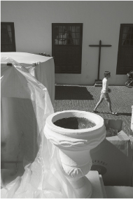
Now it’s time to concentrate on the details. What bothers us is that the face of the passerby projects into the dark window on the right (figure 16-4) and therefore does not stand out well enough against the bright background. The photo was taken one millisecond too late and the baby stroller to the man’s right also bothers us.
A last attempt remains (figure 16–5): It uses the same composition, but the difference is that the young woman walking has been photographed in exactly the right spot—she has just lowered her right foot but not yet raised her left one. The final image has been accomplished with this shoot: Only the cropped stroller and the windows distorted by the perspective of holding the camera slightly downward bother us. However, these small imperfections can be easily corrected with the distortion filter and the Aperture Correction option, where Photoshop’s shift functions are located. With the Aperture Correction option, the falling lines are instantly straightened and the intruding stroller has been removed (figure 16–6).
The composition is now perfect because the image has been reduced to just a few, clearly structured elements. The photo describes a banal, everyday situation that is graphically and compositionally interesting because it is balanced in the picture. This photo could also fall under the concept of street photography. After seeing all these examples, it should become quite clear how difficult it can be to condense a (almost always) cluttered reality into a clearly structured pictorial composition.

Landscape Is More Patient
An interesting landscape is surely easier to incorporate into a photo than the hustle and bustle of a metropolis, and yet a landscape does need the utmost precision in composition. A good photo is not just the product of a quick shoot while strolling by a subject; it requires deep observation and a lot of time.
The wild, rugged volcanic landscape of Lanzarote, for example, may be impressive at every turn, but it can by no means be condensed into a successful pictorial composition from every spot. The landscape is characterized by precipitous, rocky formations and individual volcanoes that project into the wide expanse. If you want to photograph the landscape with a wide-angle lens, you will have to deal with a large foreground area and a big area in the sky that must have interesting shapes in order to have a tight pictorial composition. If you actually experience the reality of a landscape in its three dimensions and are overwhelmed by it, do not forget that this direct three-dimensional spatial impression disappears in a flat image.
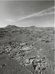
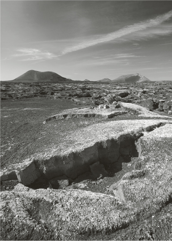
The first attempt to create a perfect image (figure 16–7) is not entirely successful. Although the sky does have a good, diagonal structure due to an interesting vapor trail, the large foreground is not interesting. Looking at the digital display, you can recognize this type of problem early because the display is flat as well. If you have already shot a photo like this and are sincere with yourself, you just can’t be satisfied with the result. So you keep looking and will soon discover that the foundation for a perfect composition is not really far: The photo in figure 16–8 is a lot more powerful than the previous one, and only because a distinct, rocky formation in the foreground is reminiscent of an open mouth with teeth. In addition, the shadow of this formation runs at exactly the same angle as the vapor trail, thereby building a counterpart. There is a strong tension between these two pictorial elements.
The photo was taken digitally using a 26 mm focal length. On this hazy day, it was not very easy to obtain a contrasty black and white photo, and it had to be converted later to black and white using the Photoshop red filter preset. The photo then revealed a crisp contrast between dark sky and bright vapor trail. These photos show the difference between an insufficiently composed photo and an ordered and powerful composition.
Getting to the Heart of an Image
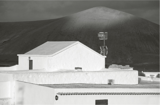
The purpose of the small photographic series in figures 16–9 and 16–10 was to bring together the interplay of Lanzarote’s typical whitewashed architecture, strongly influenced by César Manrique, with the dark volcanoes rising every-where on the island. It becomes quite clear that a more condensed composition achieves a better effect.
The first example (figure 16–9) is certainly a pretty good vacation photo, but in spite of the attempt to unite houses and landscape in one single composition, the image looks cluttered because it still has too many elements to be really powerful. The shape of the house in the foreground is too undefined and its flat construction looks uninteresting. As it so often happens, the solution was found just 70 feet to the right. Here a house with a pointed roof has a more distinct shape.
Now, the time has come to wait for the right light. In the second photo (figure 16–10), the upper half of the volcano is dark, and the dark window in the lower-right corner is a distraction. The window in the lower-right corner is the largest dark spot in the photo and keeps pulling our attention toward this unimportant corner of the picture. It is, therefore, better to walk a couple of meters to the left and make sure that this dark spot is omitted from the composition. In the photo taken from this position (figure 16–11), the perspective is perfect, and you can see that with a little additional patience you can wait for the light to provide the finishing touch as it illuminates the volcano’s summit. A dark area remains between the whitewashed house and the volcano; the antenna clearly stands out from the dark volcanic mass and indicates modernity in this seemingly oriental scene. The illumination of the volcano’s summit and the dark volcanic mass contrast strongly and attract the eye.
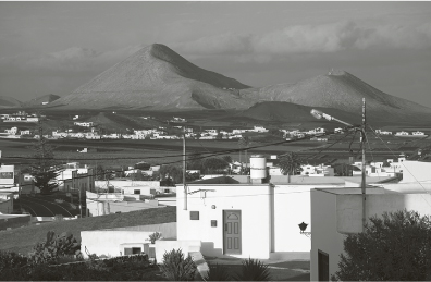
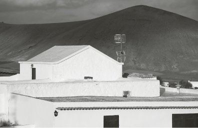
The photo was taken digitally and converted using the Photoshop yellow filter preset. The 154 mm focal length of Canon’s 70–200 mm telephoto zoom lens creates a nice compositional fusion of architecture and landscape. Aperture 9 provides just enough depth of field to have both pictorial elements in focus.
This photo series clearly demonstrates what it means to condense elements of reality to a pictorial composition. Especially if you photograph digitally, it is possible to create sketches (as in painting) in the display. Thus, with the help of several photographic sketches you can easily achieve the perfect composition. Digital photography does not necessarily make you sloppier and more careless, as some critics assume, just because it lets you to take many more photos. On the contrary, this apparent photographic wastefulness creates many photo sketches that serve the purpose of letting you gradually and carefully feel your way to a truly perfect pictorial composition.