20 Less Is More—Reduction and Emphasis
Cluttered photos confuse the viewer, whereas a successful reduction of pictorial elements provides an overview and generally results in powerful photos. What you need to do is to take your time and look critically through the viewfinder. Fewer forms often have a more powerful effect if they are located just to the right in the photo.
When the painter Kasimir Malevich, one of the most important representatives of Russian Constructivism, painted the first monochromatic black painting in the early twentieth century, he caused an uproar, and nobody appreciated his work. Yet, Malevich’s conscious reduction of form and color became the basis of style for twentieth-century painting: the consistently reduced language of form. Picasso is certainly the best-known example, and Piet Mondrian carried out this reduction of form and color in the clearest way. Looking at Mondrian’s body of work, you can understand why his rectangles with the three primary colors have become world famous.
Photography arranges elements within an image or frame, and to restrict their number is a great challenge. More often than not, an image has too many elements. How can you restrict the number of elements in an image? Feininger always recommended looking carefully at the object from many perspectives before shooting, which requires time. It is a good idea to try reducing the pictorial composition with immovable objects, which when using a tripod, takes even more time. Try looking through the viewfinder for a long time and ask yourself these questions:
• Is there still anything superfluous in the photo?
• How can I reduce the elements even further?
• Should I approach the subject even closer?
• Should I choose another lens?
Often, if you just walk a little to the left or right, or take a few steps forward, the reduced composition will look better.
Two masters of such reduced black and white photos are the artistic photographers Michael Kenna and Hiroshi Sugimoto. Sugimoto has reduced the world to ocean, horizon, and sky. Two almost monochromatic pictorial surfaces (ocean and sky) of different gray tones have made him famous in the photographic world.
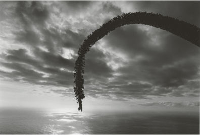
Arch with Sea
The small photo (figure 20–1) shows an image that is the result of little effort, and as a result it is a superficial examination of the object. The backlit sky is interesting, but the foreground is boring. Particularly bothersome is the fact that a bare tree covers the arched plant, and the right jagged plant is superfluous. How can you produce an uncluttered image from all these elements?
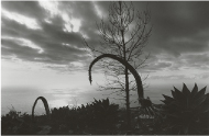
The clearest form here is the arch, so it would be a good idea to position your perspective so that the backlit arch is silhouetted against the sky. Because the left arch is in the wrong angle with respect to the magical sky, the only possibility is to approach the right arch so closely that the uninteresting tree will disappear from the image.
In the photo in figure 20–2, the sun is located exactly where the upper horizontal and left vertical harmonic dividing lines cross. If the arch had run to the left of the sun, the right side would appear too empty; therefore, the arch (as seen from the right) must still be placed before the sun. The clouds in the sky add another clear element to the arch, which is the optical triangle, here hinted at by the perpendicular opening in the sky. This line extends all the way to the left (and right) border of the picture. The base of the triangle is the beginning of the cloud formation in the horizontal line above the horizon.
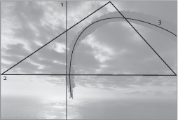
1 Left vertical harmonic dividing line
2 Visual triangle
3 Arch
Thus, five basic elements are arranged within the image: dot (sun), arch, triangle, line (horizon), and rectangular surface (sea), and there is also an organic texture (within the clouds).
This uncluttered and reduced pictorial composition is the formal basis to convey the special atmosphere of this place (La Palma in the Canary Islands) in this instant. The red filter placed before an analog Mamiya 645 reinforced the atmosphere of this photo.
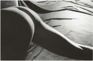
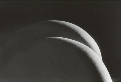
Reduced Nude
The small photo (figure 20–3) attempts to convey the tension existing between the backlit female body and the folds in the bed, but the photo isn’t 100 percent convincing. Therefore, it was essential to take one more step: In the larger photo (figure 20–4), the studio lighting was reduced to only one floodlight that provides a slight backlight (foreground, right). A black cardboard was used to darken the foreground. Now light has been reduced to a hard backlit spotlight that illuminates both buttock halves so they resemble arches.
The camera was placed considerably closer to the subject until the best composition was found—and this composition shows us that, formally speaking, it is enough for the photo to have just two sickle-shaped elements.
The photo was taken with an analog Nikon F4 and normal focal length. The camera was mounted on a tripod.
Digital Control
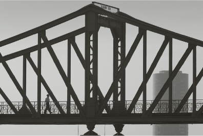
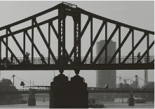
Digital photography has many advantages, but a big advantage is the ability to use the LCD to control the composition of the scene you want to photograph. When I was photographing the Iron Pedestrian Bridge in Frankfurt (figure 20–5), the camera’s display readily showed that the photo—although a nice idea—left a lot to be desired with respect to its execution. Too many forms engage with each other, causing the image to appear a bit cluttered (figure 20–5).
The solution was relatively easy: The focal length of the telephoto zoom lens had to be increased from 180 mm to 280 mm so the image could be reduced to its fundamental graphic composition; all the disturbing elements have thus been eliminated. The task then was to make sure that no passerby would be hidden from view by the bridge braces. The display is ideal for spotting, enlarging, and perfectly controlling these details.
The most convincing image is the one in figure 20–6, in which only one man is seen walking in a triangle between two bridge braces; his silhouette clearly stands out from the bright sky. He is the counterpart to the West Harbor Tower; the bridge almost looks like a scale whose two pillars are anchored in the middle, and it looks like it could tilt to the right or left at any moment. The left figure and the right skyscraper seem to keep the “scale” balanced. Otherwise, the composition is static and almost characterized by folding symmetry.
Because gradient filters are almost useless with long focal lengths, I subsequently added a 15% grayscale gradient to the sky with Photoshop’s Gradient tool to darken the sky a bit toward the top.