
30 Black and White from Color
Every serious photographer knows that in analog photography at least half of the pictorial effect is achieved in the darkroom by dedicated laboratory work. With regard to the possibilities of subsequent image manipulation, can digital photography compete against analog photography in the realm of black and white?
The answer is an emphatic Yes! because one thing is certain: Modern digital cameras have outstanding pictorial quality. And armed with Photoshop, you have subsequent manipulation techniques of high quality at hand; Ansel Adams would have been envious.
The only slight disadvantage to digital black and white is that the high-quality, traditional fiber-based paper is unavailable for the digital process. Although a few laboratories do print digital black and white on fiber-based paper, it may be expensive. Enlargers that can print digital images on fiber-based paper can cost about as much as a medium-priced car. Therefore, the average, not-so-wealthy user is largely restricted to the use of inkjet printers for do-it-yourself printing. Naturally, good professional labs can also process neutral black and white lambda prints on color photographic paper, but they aren’t very economical either, and they certainly do not use fiber-based papers. Paper manufacturers now produce fiber-based papers for use with inkjet printers. Although the surface of such papers still has a very different feel from that of traditional baryta or fiber-based material, papers such as Hahnemühle Baryta offer fine tonal differentiation that is directly comparable with that of analog baryta prints.
In spite of this slight difference in the quality of the end product, this introduction is not a plea for analog photography. The almost endless processing options offered by Photoshop mean that it is now possible to produce better results from digital originals than was ever possible using analog material.
The following chapters deal with numerous manipulation techniques that Photoshop offers for achieving the best possible digital print results, but they nevertheless focus on the truly important techniques, explaining them in the clearest terms possible.
The requirement for you to use the techniques are as follows: Photos must be taken in color mode, either in JPEG format or preferably converted from RAW format to a TIFF or PSD file with the RAW converter. Even if, in my opinion, the JPEG format is not as bad as is sometimes claimed, the RAW mode is certainly better because it gives images a 12-bit to 16-bit color depth instead of the 8 bits in JPEG. These 8 bits correspond to a tone value range of 255 tones, perceived by the eye as a constant gradient. The 16 bits, on the other hand, encompass 65,536 tones, which sounds like a lot, but the differences are barely noticeable to the eye. After a brief optimization, a photo taken in RAW format should be converted to an uncompressed TIFF or PSD file in the opened RAW window to manipulate it with Photoshop’s extensive range of tools.
Conversion from Color to Black and White
The Photoshop CS3 release introduced the Black & White command into the Image > Adjustments menu. This is an important new tool that makes it much simpler to produce effective black and white images from color originals. The tool’s interface provides adjustment sliders for red, yellow, green, cyan, blue, and magenta channels, with which you can fine-tune your gray tones much more selectively than was possible using the earlier Channel Mixer tool. For example, users who were not sure how to mix yellow using the Channel Mixer’s RGB channels now have a dedicated Yellows slider to play with.
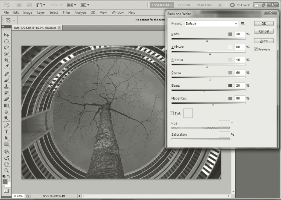
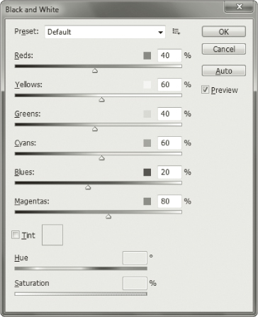
The default settings in the Black & White dialog are 40% red, 60% yellow, 40% green, 60% cyan, 20% blue, and 80% magenta (figure 30–1).
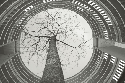
Let’s use an example to see how the tool works: The photo in figure 30–2 of the Omega building in Offenbach, Germany, leaves the contrast between the tree and the sky looking weak if we convert it using the default settings.
Simulating Analog Filter Effects
This is where the Black & White tool’s filter presets and sliders come into play. They allow us to determine precisely which tones we want to darken or brighten and enable us to simulate traditional yellow, red, and blue analog filters.

Figure 30–3 shows the effect of the Blue Filter preset on our sample image. In this case, Reds, Yellows and Greens values are reduced to zero, while the Cyans, Blues, and Magentas values are pushed up to 110%.
The result is a completely different monochrome image in which the simulated blue filter significantly brightens the blue tones in the sky. This increases the contrast between the tree and the sky, but reduces contrast within the building itself.
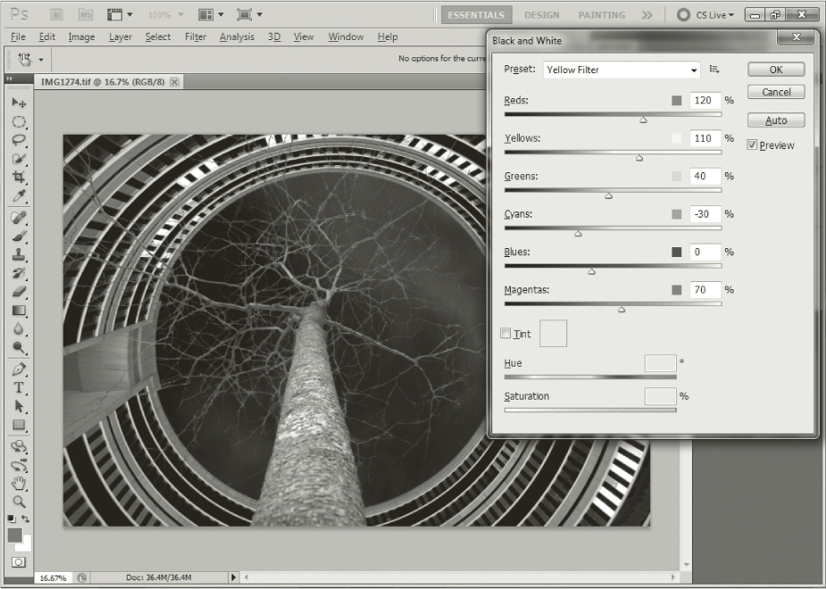
Figure 30–4 shows the result of using the Yellow Filter preset during conversion. Here, the Reds value was increased to 120%, Yellows to 110%, Greens to 40%, Cyans was reduced to −30%, Blues to zero, and Magentas are set to 70%. Once again, the result is a very different looking image, with the complementary colors of the yellow tones appearing much darker. The violet sky and the similar-colored cladding of the building appear almost black. The tree, which is illuminated by orange artificial light, appears much brighter than in the previous version. These effects work in exactly the same way as analog filters, which produce brighter grayscale values for tones similar to the color of the filter itself.
Personally, I find the Photoshop filter presets slightly over the top, but you can always counterbalance their effects by adjusting the color sliders individually until you find the right levels for your particular image.
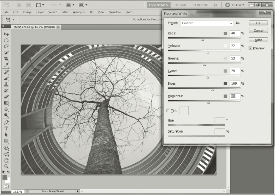
My favorite combination for this image involves setting Reds to 40%, Yellows to 77%, Greens to 53%, Cyans to 75%, Blues to 109%, and Magentas to 81% (figure 30–5). This makes the contrast between tree and sky similar to that produced by the Blue Filter settings but gives the tonal values within the building more contrast while preserving detail in the tree. The result is shown in figure 30–6.
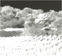
There is no orange filter preset available, although there are Green Filter, Blue Filter, High Contrast Red Filter, and Infrared options (see also the section on infrared photography in chapter 3).
Try out all of the available presets and select the one you like best, or simply tweak the color channels individually until you get a result that you like.
If you click on the image preview while the Black & White dialog is open, the eyedropper tool detects the tone where the cursor is located and allows you to increase or decrease the appropriate slider’s setting by moving the mouse left or right while keeping the mouse button pressed. For example, clicking on the sky in our sample image selects the Blues slider, and all blue tones are then darkened if you move the mouse to the left. Moving the mouse to the right has the opposite effect and brightens the blue channel.
It is also possible to tint entire images during conversion. To do this, simply select the Tint option once you have made your slider settings. You can then use the Hue and Saturation sliders located below the Tint check box to adjust the tint to your liking. The default tint is a light sepia color.
Adjusting the Effects of Filter Presets
The autumnal scene in figure 30–7 was shot using a polarizer filter and causes problems if we convert it to black and white using one of the Photoshop presets. The default conversion values give the image a lifeless look and the bright yellow leaves simply don’t look right. Using the Yellow Filter preset (figure 30–8) gives the resulting image an exaggerated look. The yellow tones at top right are almost burned out and the sky is much too dark. The Red Filter preset effect is even more excessive and the Infrared preset turns the image into a blurred, overexposed mess that has very little to do with the look of a genuine infrared photograph (figure 30–9).
A magnified detail of the infrared version of the image (figure 30–10) shows that the excessive yellow channel value has eliminated nearly all detail in the yellow tones. This demonstrates one of the Black & White tool’s shortcomings in that yellow, red, and green settings of 110% and more cause a significant loss of detail, especially for yellow tones. Fortunately, the tool allows you to adjust all six color channels individually for each preset too, making it a simple task to dial in your own custom values that preserve detail in the areas of the image that are most important to you.
The best way to achieve an individual look is to use the Custom preset option (figure 30–11). For this version of our image, the Yellows value was moderately raised from 60% to 110% and Greens from 40% to 100%. Blues are reduced from 20% to −35%. Here, the bright yellow tones from the original image remain bright without burning out or blurring, and the sky retains its dramatic contrast to the rest of the image.
The Photoshop filter presets don’t represent a 100 percent correlation with their equivalent analog filter effects, but the ability to fine-tune the individual color channels gives the photographer the necessary freedom to produce excellent monochrome conversions from color originals.
The Black & White default conversion values allowed quick conversion from a color photo to a black and white image (figure 30–12). Naturally, you should not save this processed photo in the same folder with the same name because if you do so, the converted black and white image file will replace the original color file. Because there is no second layer with this method, the newly obtained black and white image must be saved either in another folder or in the same one but under a different name. In this procedure, the original color photo is saved as an unmanipulated TIFF file, while the new black and white photo is saved as another version with another name. I believe that it’s not a good idea to rely solely on saving the RAW file because every camera manufacturer still works with its own proprietary RAW converter, and I fully expect JPEG and TIFF, and probably PSD files too, to be around for the next 10 to 20 years. The question of how RAW files will develop remains open in these fast-moving times. To be on the safe side, I therefore recommend saving a TIFF version of your most important images in addition to the RAW file.
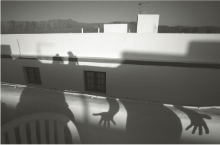
In very rare cases, a black and white photo converted from color looks good and will not need any further manipulation, as is the case here. However, most of the time the black and white photo lacks contrast and even the subject of the photo could look better with a bit more contrast. It is very easy to create more contrast:
- On the toolbar, select Image.
- Select Adjustments.
- Click Brightness/Contrast.
- This tool works with two simple sliders. Move the sliders to the right to make it steeper, or to the left to make it flatter.
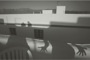
If you move the contrast by 17 points to the plus sign, as in our example, the photo will look good (figure 30–13). The bright areas retain their texture and the dark shadow areas don’t become pitch-black. The tendency of earlier versions of Photoshop to swamp blacks and burn out highlights is not really an issue in more recent versions of the program, making it a quick and reliable tool for making Levels adjustments. This photo was taken with a 19 mm lens.
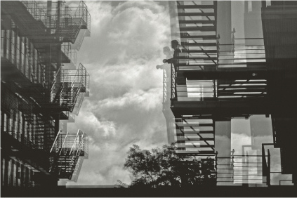
Reflection of Fire Escapes
The example in this section demonstrates the difficulties that arise when contrast is increased and how you can work around them. Reflections on window-panes always look somewhat flat. Digital photography is superior to its analog counterpart for dealing with reflections because the former allows you to increase contrast, as you have already seen.
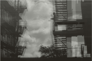
The digital photo (figure 30–14) was converted to black and white using the Photoshop yellow filter preset. The resulting black and white photo, however, looks too flat—and this should not be a surprise because it’s a common problem, as explained earlier. This example also illustrates a mistake often made by amateurs when manipulating contrast: The image’s strength comes from the interplay of the fire escape pattern structure and the clouds. However, if you increase the contrast with the Brightness/Contrast tool as you did with the first photo, the clouds become too bright and detail can get lost (figure 30–15). In my opinion, this is the most common digital problem because such burned-out highlights immediately reveal the digital origin of the photo: In a backlit sky such as this one, the bright areas very easily lose their detail. To help counteract this effect, monitor the indicator that shows the burning out of the highlights with black or red blinking lights; this indicator is provided in almost all digital cameras. You should always make sure that this information is indicated when taking backlit photos because this burning out can be prevented either by placing a gradient filter in front of the lens to gradually darken the sky toward the top (as explained in earlier chapters), and/or by decreasing the exposure until the blinking in the display disappears. After the highlights in the photo are burned out, not even the best image manipulation programs will bring them back. On the other hand, you can more easily compensate for an underexposure, especially in RAW images.
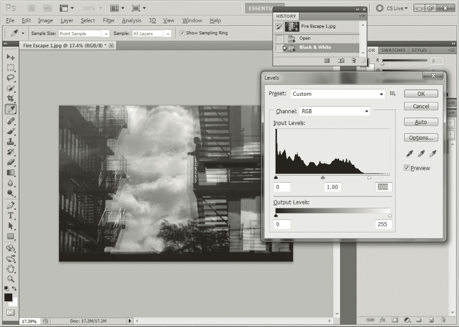
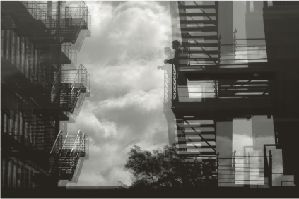
This photo was also underexposed by just one f-stop, so the lights would show all different gradations: It demonstrates how you should naturally retain these gradations in the lights even as you increase contrast. To accomplish this contrast, apply the Adjust Levels tool in the image histogram first rather than using the easy gradation curve of Brightness/Contrast. If you click Image > Adjustments > Levels, a window with the histogram will appear (figure 30–16). The histogram shows the proportions of the various tone values in the image with a diagram: the dark areas on the left, the bright areas on the right, and the middle tones in the center. With three arrows, the dark, bright, and middle tones can be corrected with the help of this diagram. Because this photo was a bit underexposed, the tonal value curve in the highlights is not entirely to the right and you can now move the right white arrow to the edge of the tonal value curve without losing the details in the bright areas. As a countermove, you can move the middle tone arrow a little to the right to significantly increase contrast in the clouds without burning out the highlights.
The resulting photo looks much more pleasing (figure 30–17), but the shadow areas in the left side of the picture lack texture and resemble an ink blot, to put it bluntly.
Note: In addition to the histogram correction, you can also directly adjust the gradation curve by clicking Image > Adjustments. You can move the initially linear gradation curve to any spot to correct tonal values smoothly or strongly in every region. However, you should be very careful when moving the gradation curve because lights can burn out or shadow areas can become ink blots.
Brightening Dark Areas while Increasing Midtone Contrast
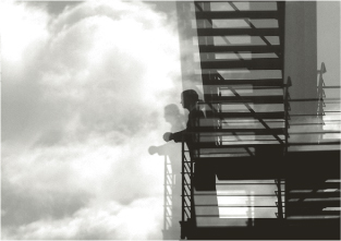
The Shadows/Highlights tool, found by clicking Image > Adjustments, allows you to brighten shadow areas rather easily without affecting light and medium tones in the process. (You will later learn how to process individual areas such as those that have become too dark.) Conversely, you can also darken lights without influencing midtones and shadows, but you should adjust this by no more than 25%, or your photo will start looking a little unnatural. After all, everything is the result of a calculation. At first, it’s confusing that upon opening the tool the shadows are automatically reduced by 50%. To work successfully with this tool, move the shadow slider back to 0. Now you can start brightening up the shadows very carefully. In the example, the use of this tool plus a slight shadow increase of approximately 10% improves the photo. The left building now has a lot more detail and the windows reflect the clouds brightly and clearly.
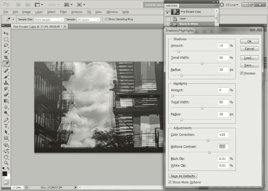
To give the photo a finishing touch, you can increase midtone contrast by 24% (figure 30–18). The midtone contrast option appears when you click Show More Options. This option is one of a number of alternatives to the Shadow/Highlight tool, because it does not allow highlights to burn out or shadows to become ink blots. If you now compare this image (figure 30–19) with the black and white converted version, you can see how the photo (figure 30–14) was improved by using this very simple method: You increased contrast without burning out the highlights while you retained shadow detail.
Adding Grain
In the past, digital photography was often criticized for producing photos that were recognizable as digital images and that looked artificial. In the early days of digital photography, this artificiality was frequently the result of somewhat unnatural colors, but the colors of photos shot in the RAW format are now so natural that this critique has lost its punch. Let’s not forget, however, that digital photography relies on pixels saved in RGB mode, and they are indeed completely different from the grain in a film emulsion.
In my opinion, the aim of digital photography is to reproduce the analog pictorial impression as closely as possible. For this reason, many black and white professional photographers add grain to their photos. This is, of course, not a “must” but a “can,” and it depends exclusively on personal taste. The calculated film grain can be varied according to size and structure. It’s very simple to add grain: In the toolbar, click Filter > Texture, and then select the subcategory Grain. To achieve a resemblance to an analog photo in a larger print, I recommend using an intensity setting of between 12 and 14. Intensity describes grain size and therefore corresponds roughly to the grain of a 100 ASA film. Contrast should be about 50% and the grain type should ideally be uniform. I can guardedly recommend using the Soft setting in the Grain Type drop-down, as well; all other options will look rather unnatural. After you confirm the grain by clicking OK, there’s something you should keep in mind: Grain is already added to the digital image when the photo is converted to black and white from color. Therefore, for a black and white photo, it is indispensable to click Grain, Image, Adjust, and use Reduce Saturation to take the color out of the picture once again. Finally, the photo has been quickly manipulated almost to perfection and will look good in a large-sized Lambda or ink jet print.
Saving Your Images
Generally, a TIFF file is a noncompressed file that contains all information taken by the camera. A PSD file is the Photoshop equivalent of a TIFF file and requires about half as much disk space. A JPEG file, on the other hand, compresses information in a very clever way, but is unable to preserve individual layers the way that TIFF or PSD files can. As already mentioned, you should always shoot in RAW format, never in JPEG format. When converting from RAW format, the loss of quality in a JPEG file compared to a TIFF file is very low, however, and therefore this loss cannot really be recognized in enlargements of 8.3″ × 11.7″ and smaller. Nevertheless, if you think that one day you would like to have your photo printed much larger, it’s better to save the images as TIFF or PSD files. Another disadvantage of a JPEG file is that it recompresses the image every time you open and modify it. If, against my advice, you have photographed only in JPEG format, you should by all means retain one JPEG image in its original state and finish the black and white conversion in one single step whenever possible to retain maximum JPEG quality. Another possibility would be to convert the JPEG photo into a TIFF or PSD file and then save the latter to a hard disk.
As already mentioned, a color photo lacking a second layer that is converted to black and white must either be saved in a new folder or given another name to retain the original color photo in the same folder. To rename and save a photo, do the following:
- Click File > Save As. The last file used will open.
- Give the manipulated black and white photo a new, unique name in the File Name field.
- Select TIFF or Photoshop (PSD, PDD) format and click Save.
- If you choose to save a file as a JPEG, a small Options window will appear after you click Save. The image file size is displayed on the right side of the window below the preview checkbox. Under Image Options, move the slider all the way to the right to select a large file size. If you want to email the photo, move the slider to the left to reduce the file size. On the left edge of the scale, the image can still be displayed reasonably well on the screen, but keep in mind that a 7″ × 9.5″ print is not capable of withstanding such resolution.
- Once you have selected your file size, click OK.
The black and white photo is saved as a second version without losing the original color image.