

Figure 3-1: Lay Brothers’ Refectory, Fountains Abbey
This subject presented a perplexing dilemma: do I lower contrast to retain interior detail, or maintain contrast and lose outside detail? I chose the latter, eliminating the manicured bushes outside. The center of interest is this 100+ yard long refectory (i.e., dining hall) used by the nonecclesiastical workers (the lay brothers) who worked there. Although your eye follows the perspective lines directly to the blank white opening in the distance, that opening is surely not the center of interest. Importantly all interior detail is retained.
CHAPTER 3
Elements of Composition
![]()
IF COMPOSITION IS THE MEANS OF LEADING VIEWERS through your photograph and holding them there until they see your message, there must be methods of composing to achieve maximum strength in your imagery. There are indeed such methods, and they can be put to use by identifying and understanding the elements of composition.
The following is a list of the many elements of composition. We will discuss them and consider how they can be used to enhance a photograph.
- Light
- Color
- Contrast and Tone
- Line
- Form
- Pattern
- Balance
- Movement
- Positive/Negative Space
- Texture
- Camera Position
- Focal Length
- Depth of Field
- Shutter Speed
The following two key considerations must always be included to tie all of these elements together:
- Involvement with the scene
- Relationships
Light and color will be discussed separately in later chapters, for these two elements are so important that they deserve special attention. For readers who are primarily interested in color, the following discussion, seemingly applicable only to black and white, is extremely important for the concepts apply to color just as much as they apply to black and white.
Contrast and Tone
These two subjects are so closely intertwined that it would be nearly impossible to separate them. Every scene has its own inherent contrast range, but it can be increased, decreased, or maintained in either black and white or color photography. Methods of contrast control are explained in chapters 8, 9, and 10 employing traditional methods, and in chapters 11 and 12 for digital means. At this point, suffice it to say that surprisingly large—effectively, limitless—alterations can be made in the contrast level in black-and-white using film (figure 3-1). Contrast control is also possible in color, but to a more limited extent through traditional film methods. Contrast in both black-and-white and color is also exceptional using digital methods.
Contrast is not a true element of composition but rather a technique that derives its importance from the way the eye and the brain work together to see the world. In the previous chapter, we learned that the eye jumps randomly—not in a prescribed manner like a scanner or other such device—from one key area in the scene to another, filling in the spaces of lesser importance in a rather fuzzy manner. The eye doesn’t move randomly about in any specific scene, but it can be considered random in general because it responds to each scene differently. With few exceptions, the eye jumps immediately to the point of the scene possessing the highest contrast. White against dark gray or black is extraordinarily powerful. Black against light gray or white is equally strong. Light gray against a darker or midtone gray will not attract the eye as immediately, nor will a dark gray against a midtone or light gray. The knowing artist employs these devices as desired, going with stronger contrasts for impact and softer contrasts for subtlety.
High contrast gives photographs “snap” and excitement; low contrast usually imparts a gentler mood. Each one has its place, and each has a great effect on the final mood of the image, no matter what the subject matter may be.
Contrast is determined not so much by the range of tones, but by the way they relate to one another. Transitional middle grays soften the contrast of a print that possesses both deep blacks and brilliant whites, making it a medium contrast print. A print lacking either extreme may appear quite high in contrast if the darkest grays are placed next to the lightest grays. This high-contrast effect will be heightened if midtones are absent elsewhere in the image.
It will come as a surprise, but in fact there is no relationship between the tonal range of an image and the contrast of that image. To illustrate this apparent contradiction, suppose you’re a traditional film/darkroom photographer, and you expose a sheet of enlarging paper under the enlarger to white light (with no negative in the enlarger), but first you cover the paper with heavy black cardboard. Then you slowly pull the cardboard across the paper, turning off the enlarger just before the paper is fully revealed. When you develop that sheet of paper, it will run the full gray scale from black (at one end) to white (at the other end) with all midtones in between. Digitally, you can accomplish the same effect by using a gradient tool to create and smooth a range of tones from maximum black at one side of the image file to pure white at the other edge. Though the print or digital file has a full tonal scale, it has no contrast whatsoever! The reason is that contrast implies a juxtaposition of different tones, but every spot on that print is adjacent to a tone that is exactly alike or imperceptibly lighter or darker.
If, on the other hand, a small object (a penny, let’s say) were placed on the enlarging paper on the side that was first revealed when the cardboard was slowly withdrawn, there would be a blank white circle surrounded by black and very deep grays. Digitally, of course, you can create the same effect by simply plunking a white circle down near the dark edge of the file. Though the tonal range remains the same, the print now has high contrast. If the white circle were placed in the middle of the otherwise smooth black-to-white image, it would be surrounded by medium grays, giving the print or digital file moderate contrast, but again it possesses exactly the same tonal range. And, of course, if the white circle were placed at the light end of the enlarging paper, the white circle would be surrounded by very light gray or white tonalities, and contrast would be very low. But the tonal range still remains the same. So image contrast depends on tonal juxtapositions, not on tonal range. An image that goes from white to black may still have an overall “muddy” appearance. Some prints without either a pure white or maximum black have great “snap” and contrast. While tonal range and contrast are often related, exceptions abound.
An image may be high key (with lighter tones predominating), low key (with darker tones predominating), or mixed. Are the moods similar in a high-key and a low-key image? Most likely there will be a wide emotional gulf between them. Two photographs from my English cathedral studies (figures 3-2 and 3-3) illustrate several points about contrast and overall tone. Though the images are quite similar in content, and even somewhat similar in design, the print from Durham has deeper overall tones and higher contrast (though the tonal range of the two images is nearly equal—they both go from white to black). To me, it also has a more brooding tone, while the image from Hereford allows more hope and optimism—despite the fact that the statue at Durham depicts a man reading, and quite alive, while the one at Hereford depicts a dead knight.

Figure 3-2: Statue and Nave Columns, Durham Cathedral
The dark tones convey the mood—the overall darkness—of Durham Cathedral. The statue of lexicographer Samuel Johnson shows a man who was quite alive, though contemplative, yet a brooding, somber quality dominates the image.
Does this mean that dark tones invoke somber moods and light tones invoke greater optimism? Not necessarily, but I suggest they point in those directions more often than not. This is not stated as a rule (always avoid rules because they fail too often), but as a generalization: it tends to be true quite frequently. When you give it a bit of thought, you realize that our everyday language almost equates the two: we speak of a “sunny mood,” of a “dark mood,” of a person with a “bright disposition,” and of an ominous mood as “dark clouds gathering.” This should be understood, because in a photograph, it translates to a significant part of our visual language in conveying our feelings. Overall, high-key images tend to impart a more positive, optimistic mood, whereas low-key images tend to be more somber, sometimes even pessimistic.

Figure 3-3: Tomb of an Unknown Knight, Hereford Cathedral
Middle and light gray tonalities dominate this image, as sunlight pours through the unseen windows at the left. Despite the foreground tomb of a dead knight, this image conveys greater optimism than the one from Durham Cathedral. The lighter tonalities may be the reason for this difference.
Photographs often are hurt by inappropriate contrast or tone that conflicts with the intended mood. I believe the problem can be blamed in part on the unwritten “rule” that states all photographs must have a pure white, a pure black, and tones in between (except in the case of graphic black-and-white photographs, in which case the midtones can be dropped). Not only should this rule remain unwritten, but it should be ignored as well. Two examples will help illustrate this point.
The first example is Sunlight, Capitol Park, Sacramento (figure 3-4). As I set up my camera on the steps of the California State Capitol Building looking into the arboretum that morning, I felt that everything in the scene was filled with light—as if each tree, each blade of grass, each leaf was a source of light. There seemed to be no darkness anywhere. I wanted my image to mirror that feeling of brilliant light and glare. The tones range from white to middle grays; there is no black, and none is needed. I feel that dark tones would be decidedly inappropriate. They would compromise the mood of the morning. Conveying the mood is far more important than complying with an arbitrary rule.
Another photographer standing in that same spot may have experienced a feeling of brilliance, and that feeling may have been translated into a very different image. I have often seen photographs of sunlight pouring through trees in which the trees are silhouetted. That type of rendition would have been perfectly valid and could have been used here, but only by someone who responded differently to the feeling of light.
The second example is drawn from England. Gatehouse, Lanercost Priory (figure 3-5) has no whites and hardly a light gray. It was photographed at dusk with a misty rain falling. In the fading light, it required a 30-second exposure. Though it was a gloomy time, it did not impart a depressing mood.

Figure 3-4: Sunlight, Capitol Park, Sacramento
The darkest portions of this print are barely middle gray. Dark tonalities would have been inappropriate; they would have negated the feeling of light suffusing the scene as morning fog gave way to sunlight. The unwritten rule that prints must have a pure white and a pure black should be ignored, as should all rules dealing with art and personal expression.
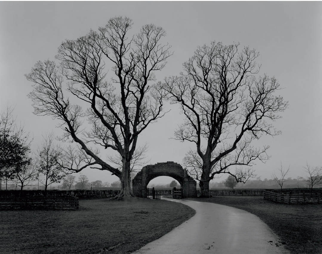
Figure 3-5: Gatehouse, Lanercost Priory
The lightest portion of this image, the sky at the horizon, does not approach white or even a very light gray. At dusk, beneath heavy overcast skies and a light drizzle, detail in the gatehouse and tree was barely visible. Bright tonalities would have been inappropriate. As in “Sunlight Capitol Park” (figure 3-4), the rule that a black and a white are both needed is ignored.
When I first printed the image, I was concerned about the lack of whites (not because of the way it looked, but because I had never made a print without whites or very light grays, and I had so often heard that “all prints need a white, a black, and a good range of midtones”). So I tried printing it in different ways. First, I attempted higher contrast in order to obtain lighter grays while maintaining the dark tones. Then I printed it lighter in tone overall. Neither version conveyed the feeling I had in mind. I returned to my original print of the image, realizing that for the mood I wished to convey—quiet, calm, contemplative—white or light gray was undesirable.
A well-conceived high-key image usually conveys a feeling of enveloping light and overall airiness, and perhaps a degree of optimism. The creative photographer can sometimes use the same tones to convey a somber mood, however. I have seen such effects, and I feel that each photographer should discover when, where, and how they could be achieved.
Can a low-key image impart a feeling of openness and optimism? Ansel Adams’s Moonrise, Hernandez, New Mexico is dominated by deep tones, yet the print overflows with brilliance and optimism. His print is highlighted by gleaming whites and light tones in the moon, the clouds, and even the tiny hamlet and cemetery in the foreground. Could the inherent optimism have been achieved without the brilliant light tones and without the high overall contrast?
In general, deep tones tend to convey strength and stability, and sometimes pessimism, mystery, and somber moods. High contrast imparts brilliance and drama while low contrast imparts quiet. Of course, these statements are true in general! With skill, the creative artist can turn these generalizations around effectively, in a way that enhances the effect because of its unexpected character.
Many photographers, beginners in particular, overemphasize high contrast in most of their images. Rich blacks and gleaming whites usually cause people to have an immediate positive reaction to images because of their eye-catching nature, but often after that initial response, the viewer is left with empty feelings concerning the emotional impact of the image. Unfortunately, the beginner is encouraged by the initial reaction and continues printing or editing with excessive contrast, often with tonalities that are too deep. I cannot count the number of times I have seen student prints at workshops that were printed unnecessarily dark and brooding in an effort to impart dramatic or mysterious effects, only to end up as prints that were unnecessarily dark and brooding! This seems to be a common trap for beginners (myself included) who wish to become an instant Ansel Adams, Brett Weston, or Yousuf Karsh. Only those who are analytical and objective enough to look past the reaction of others to their own reactions can recognize that a more subtle approach may improve many images. Some do require low contrast. And some really require high contrast. It is always better to match the tonalities and contrast level to the desired mood rather than to a standard formula.
What about the midtones, the middle grays? These are often the tones that are hardest to deal with because they can be amazingly boring when used incorrectly. Middle gray, just by its very name, seems to elicit yawns. But consider that those tones can also be middle silver! When the middle grays begin to glow as middle silvers, the photographer has truly achieved something extraordinary.
Subtlety and brilliance in printing comes from all tonal ranges. Too often the midtones are skipped over as mere transitional elements between the “important” black and white tones, but they can be the heart of the image. In portraits, the midtones can convey the character behind the face with richness and authority. Usually, it is not the blacks or whites that carry a portrait, but the midtones that show the smoothness or cragginess of the skin, every pore of the cheeks and nose, and the curves or angularities of the features. Jay Dusard, with whom I have worked for years, is the ultimate master of turning the middle grays into middle silvers. From a distance, many of his prints seem subdued, sometimes even muddy in character, but on closer inspection those tones tend to glow with an internal richness. He tends to have shimmering midtones throughout his imagery, both portraits and landscapes.
Midtones are equally important in landscapes, studio setups, still lifes, product and architectural photographs, and every other conceivable subject matter. In a real sense, the midtones need the greatest care of all because they can be the death of an image. They can also give the image its most subtle characteristics.
You can alter the tonalities of any scene to most effectively express yourself. You can print any image lighter or darker than a literal rendition. This involves the concept of visualizing the final print as you stand there looking at the scene, a concept that will be explored in depth in the next chapter. The print is your creation, and you are free to do whatever you want with your own creation. But always beware of the enticing trap of pushing too hard in an attempt to create a mood, for it will often end up as an artificial mood. Get in tune with your honest feelings and work toward conveying them with the most appropriate tones and contrasts. You will get your strongest photographs with the honest approach.
![]() When the middle grays begin to glow as middle silvers, the photographer has truly achieved something extraordinary.
When the middle grays begin to glow as middle silvers, the photographer has truly achieved something extraordinary.
Line
After contrast and tone, which largely set the mood of the image, we come to line, which is possibly the strongest element of composition. Lines are compelling pulls for the eye, as artists learned in the Renaissance when perspective was first discovered. It was quickly seen that the eye follows a perspective line into the distance as if there were no choice. In essence, there is no choice! The eye will follow a line from beginning to end unless it becomes so convoluted that it is no longer a simple line.
Diagonal lines have powerful compositional effects because of their inherent instability. They create tension. They are not stabilized in either a standing (vertical) position or a reclining (horizontal) position. In effect, diagonal lines are in the process of falling, which gives them powerful dynamics. Both vertical and horizontal lines possess a reduced feeling of dynamics but a heightened feeling of permanence or stability (or even a static feeling, if used in an uninspired manner). Curved lines, too, can be very dynamic or quite relaxed. Tight curves tend to carry more drama than wide, sweeping curves.

Figure 3-6: Circular Chimney, Antelope Canyon
This was my first slit canyon photograph. I did not see it as a canyon of eroded sandstone, but as a floating site in space-time surrounded by cosmic forces. The central black form (a black hole, perhaps?) is surrounded by tightly curved bright lines that grow dimmer as they move away from the center of the image. The eye is immediately drawn toward the central area because of its high contrast, and then spirals outward from there.

Figure 3-7: Fallen Sequoias
The fallen giant creates a strong movement from lower left to upper right, with the branches in the lower-right corner mirroring that angle. Remove the fallen sequoia, and the scene has stately grandeur but is not dynamic. The brightest portion of the print has just a bit of tonality to it, revealing fog; the darkest portion is just as black as the deepest black in “Circular Chimney, Antelope Canyon,” yet the image is not high contrast because the tonal extremes do not come in contact. Much of the image is dominated by middle gray tonalities. Contrast is not determined by the range of tonalities, but by their juxtapositions.
Of course, these tendencies must be considered in combination with other compositional elements. Dominant diagonal lines in a low contrast print may appear to be less dynamic than horizontal or vertical lines in a high contrast print. As each element of composition unfolds in this discussion, it must be considered in relationship with the others (more about this toward the end of this chapter), and ultimately in context with the subject to make real sense. The value of understanding the elements of composition in their pure, abstract form is to ultimately match them with the subject and strengthen the statement you are trying to make.
Two examples will help illustrate the points made so far. Circular Chimney, Antelope Canyon (figure 3-6) directs the eye to the center of the image, where contrast is greatest; the deepest blacks come directly in contact with the brightest whites, and the curving lines are tightest. From there, the eye spirals rapidly outward from the high-contrast, inner curves toward the lower-contrast, outer curves. The combination of high contrast and curved lines makes this image very dynamic.
Fallen Sequoias (figure 3-7) is dominated by the strong diagonal of the fallen tree and its repeated angle in the cluster of branches at the lower right corner that contrasts with the standing trees behind. In this image, the standard associations of vertical and diagonal lines hold true. Remove the diagonal fallen tree and logs, and the photograph becomes one of a primeval forest in fog, strong and permanent, but surely not dynamic.
There is nearly a full tonal range in the print, but it does not have high contrast. The standing trees recede gently into the enveloping fog (which is light gray, not pure white), while light and middle grays dominate the image—except for the upper part of the fallen tree and the branches below, which attain dark grays and blacks. This serves to add three-dimensionality to the image and impart a sense of presence.
Do straight or curved lines have the same emotional feel as jagged lines with pointed edges? Surely not. Do sweeping curves have the same emotional feel as a series of vertical, straight lines? Again, no. Try to fit various types of subject matter into the abstract line structures just mentioned to see how the line structures you envision work with the subject matter. (This can, of course, include curved lines as well as straight lines.)
There are no rules for the emotional connotations of any specific type of line. In conjunction with the subject and other compositional elements, such as contrast and tone, lines can help determine the overall mood of a photograph. In portraiture, often the slight turn of a head can change a straight, stern facial line into a softer, mellower line—and vice versa. Carefully placed and controlled lighting, either harsh or soft, can further accentuate either effect. So the astute portrait photographer thoughtfully controls the angle of the head in relation to the lens of the camera, where and how the hands are placed, the clothing that is worn, where lighting is placed, and the type of lighting used (whether ambient or artificial) to help convey his or her feelings about the person in the portrait.
Be aware of strong lines that pull the eye out of a photograph. Perspective lines, in particular, can often be the culprits, for the eye will follow the line to the edge of the photograph and beyond. Before you know it, you have lost the viewer. Surely you want to hold your viewer’s attention, so strong lines must be carefully controlled, just as loud musical passages must be adroitly balanced with quieter passages, or fast passages must be balanced emotionally with slower passages.
On the other hand, beware of reading lines into a photograph when they exist too faintly or not at all. A photograph often turns out poorly because the photographer overestimated the continuity of lines, particularly when the alleged line ran through several objects, such as a plant and its shadow. Reading weak lines into a photograph is much like reading nonexistent moods into a photograph: it never works. It’s too easy for a photographer to read a series of objects as a line when, in fact, there is no line visible to the viewer. It’s like a connect-the-dots picture we played as children before the dots are actually connected. The photographer may wish for the viewer to quickly connect the dots he wants to be connected, but in reality, they do not beg to be connected.
Sometimes there are enough clues to push the viewer to connect the dots. It turns out that not every line has to be a continuum, like the vertical trunks or diagonal log of Fallen Sequoias, or the sweeping curves of Circular Chimney, Antelope Canyon. Some lines can consist of a sequence of forms that closely relate to one another. In such cases, the eye will truly “connect the dots.” Sometimes such lines can be very fascinating, indeed. They can also create problems. For example, a series of forms might not relate to one another in a scene because they are of different colors. However, if they are translated into similar gray tonalities in a black-and-white photograph, they suddenly relate to one another quite strongly. In some cases, the line may prove to be highly beneficial to the composition, but in other cases it may seriously distract the viewer from the photographer’s intended vision.
Conversely, a series of unrelated forms in a color image may produce a line if they are all of the same color, or closely related colors, especially if they contrast significantly from other colors dominating the image. These are things to watch for, recognizing that they could be quite beneficial for your purposes, or they could be quite destructive.
Form
Simple geometric forms—triangles, circles, rectangles, etc.—create strong designs. Repeated use of these forms and variations of them can add further strength to compositions, especially if there are variations among them in size, tonality, color, texture, or orientation. Of course, forms don’t have to be geometrically simple to be eye-catching when repeated. The forms can be oddly shaped, but seen repeatedly they become visually attractive . . . so much so that they may become the most visually attractive aspect of the image.
Some photographers tend to build their compositions out of an array of forms (or shapes, if you prefer that term), somewhat like a mosaic or a jigsaw puzzle. Jay Dusard tends to organize his image space in this manner. Dusard often uses small forms pieced together in a complex and intricate manner. Other photographers may use larger puzzle pieces. I often find it difficult to build with forms, so my prints generally have strong lines dominating the composition, though there are exceptions.
All photographs have both lines and forms in them (the edge of anything is a line, and the thing itself is a form), but some photographs are clearly dominated by lines while others are dominated by forms (figure 3-8). From these clear distinctions they tend to grade into one another. Is one type inherently stronger than the other? The answer is surely a matter of opinion. I feel that line-dominated images are more assertive than form-dominated images; a line is a dynamic visual attractant, forcing the eye to move along it, while a form causes the eye to stop while studying it. Line-dominated images have greater flow and motion to them. Furthermore, it strikes me that form-dominated images move the eye about in jumps, forcing it to hop from form to form and piece the image together afterwards, whereas line-dominated images move the eye about in smoother, faster sweeps. I have no scientific evidence to prove these observations, but they seem correct to my way of seeing and thinking. Your feelings about my observations may indicate an inclination on your part to one type of composition or the other.

Figure 3-8: The Louvre, Dusk
The dominating forms in this image are the clean triangles of the pyramid (the entry to the museum) and the shapes created by the walkways. These forms also provide a visual counterpoint to the ornate architecture of the old palace. The print is toned to brown to subtly enhance its mood at dusk. (Note the setting sun through the pyramid’s glass.)
Line, Form, Contrast, and Emotion
Before continuing with the other elements of composition, let’s pause for a moment to consider the ramifications of lines, forms, and contrasts on the emotional content of an image. This is of the utmost importance because even the most technically perfect print is meaningless without emotion.
First, imagine two photographs in which the first is dominated by strong whites and deep, rich blacks while the second is characterized by middle gray tonalities. The first photograph will be more active. It will jump out at you. The second will be quieter, more muted, and more passive in feel.
Next, imagine two photographs in which the first is filled with jagged lines and hard-edged forms while the second has curved lines and softly interacting forms. The first photograph of this pair will immediately grab your eye, whereas the second will have a quieter, more passive mood.
Now, let’s combine these qualities to explore the extremes. A photograph with jagged lines, hard-edged forms, and strong blacks and whites will have a raucous, wild, frenetic feel, perhaps even a sense of being out of control. One with curved lines and softly interacting gray tonalities will be relaxing, quiet, and perhaps run the risk of being boring.
This tells us that jagged lines are far more active than curved lines, which themselves are more relaxed. High contrast is far more active than low contrast. Middle gray tonalities impart the quietest, most relaxed mood of all. So jagged, sharp lines or even tightly curving, twisted lines combined with high contrast will be intensely active and highly charged. Gently curved lines along with softly modulating tonalities will impart a quiet, relaxed mood.
I cannot overemphasize the importance of these tonal and line issues because they form the basis of a universal language understood by people worldwide. It doesn’t matter if you’re from Manhattan, France, Botswana, Russia, the Australian outback, China, or Brazil—you’ll read these combinations of line, form, and contrast the same way. It is, in fact, the only universal language on Earth, which adds immeasurably to its power and communicative ability.
Any thinking photographer will use this universal language to his or her advantage. If you want a quiet, reverential mood, you’ll do well to work with curved lines, rounded forms, and subdued contrast. For example, if you want to convey the warm, soft qualities of a person in a portrait, diffused indoor or outdoor light would serve your purpose. But if you want to convey harsher qualities, spotlighting or strong sunlight—highlighting every wrinkle and crag—would be the lighting of choice. Soft light, gray tones, and pastel colors on rounded hills impart the feeling of a gentle, pleasant, livable landscape, whereas strong sidelight on sharp, craggy rock spires imparts excitement and adventure, perhaps even a feeling of foreboding.
Years ago a student at a workshop presented images made at a Japanese Buddhist monastery. I asked him what mood or feelings he had while at the monastery. He said, “Bruce, it was the most peaceful place I’ve ever been.” Though his compositions were beautiful, I focused on the harsh, high-contrast tonalities he employed in his printing. They negated the peaceful mood. We discussed this at length, prompting him to say, “Nobody ever talked about this previously.” He agreed that the high contrast detracted significantly, and that he simply needed to reprint the negatives at a lower contrast level to successfully convey the mood that the monastery evoked.
My experience with students over the years is that there is a tendency—in fact, an overwhelming pull—to drift toward high contrast. The reason seems to be a desire to produce a “rich” print, an exciting print, an eye-catching print, a dramatic print. But maybe what you really want is a quiet, contemplative mood, one that makes the viewer sit down and think rather than jump up and shout. High contrast fights that mood; sharp-edged forms fight that mood.
You’ll do better to create a mood rather than to produce blacks and whites simply for the sake of showing the world that you can produce blacks and whites. With color, there is a similar pull to go for the most saturated colors or strongly clashing colors, such as deep purples against bright yellows, or saturated greens against saturated reds, etc. None of this helps an incisive photographer convey her points with conviction. My advice is to remain true to the mood you want, and when soft pastels are called for, use soft pastels. Photography, like all other art forms, is a means of conveying your thoughts nonverbally, so stick with the appropriate means, not the ones that always elicit an initial “wow” reaction. Keep those in abeyance for the appropriate images that need to be exciting, not for those where the message should to be softer and quieter.

Figure 3-9: Thrusts, Westgard Pass
Eastern California rock columns create a visual rhythm with no apparent scale discernible. The metallic sheen produces a rich tonal palette not often found in nature.
Pattern
Repeated use of lines or forms is the start of pattern. The vertical trunks of a grove of aspen trees may set up a visual pattern, while the horizontal lines of their shadows set up a second pattern in counterpoint to the first. A photograph of this group of trees and shadows is a good example of a photograph that is held together by a “unified thought” rather than a center of interest. The viewer’s eye is not drawn to any one tree (or its shadow) but to the pattern of trees. If one of those trees were removed, the pattern would still exist. In essence, nothing would have changed. Variations in both the vertical and horizontal lines—verticals due to separations between trees as well as their distance from the camera, and horizontals due to irregularities of shadows on the ground—would add further interest to the image.
This is but one example; there are an infinite number of others. Many of my studies of English cathedrals feature a seemingly infinite array of columns and arches from the immediate foreground to the distant background, which set up a pattern of forms and textures that allows the viewer to translate qualities, such as texture, from the closest columns to those in the distance (figure 3-1). The tonal variations in the columns, arches, and shadows set up an interesting interplay within the patterns. Figure 3-9 shows an example of a pattern in nature, not one created by man.

Figure 3-10: Choir Stalls, Chester Cathedral
Note the differences in the faces carved on the choir stalls. At first glance these are not apparent, but on closer inspection they give the carvings, and the photograph of the choir stalls, far greater interest than a quick glance would indicate.
Man-made patterns tend to be regular and repeated, but sometimes with subtle variations, like the carved faces or designs on the choir stalls in English cathedrals (figure 3-10), and most old structures featuring repeated design elements. It’s unlikely that modern architecture or its details would exhibit such interesting variations. Natural patterns, of course, are varied, and sometimes so astoundingly irregular, abstract, or subtle that the patterns are often overlooked as being patterns (figures 3-11 and 3-12).
Such variation is the key to interest in the pattern. Repetition can be strong to a point, but then it can rapidly degenerate into tedium. If the pattern is not broken up in some way, it could just prove to be boring, leading the viewer’s eye into the pattern, through it, and out of it in an instant. You want to avoid such monotonous patterns. Studio still lifes offer great opportunities to create wonderful patterns and variations because the photographer can arrange things precisely as he desires. Landscapes tend to be a bit more arbitrary; you cannot rearrange things, but you can use camera placement and lens focal length effectively to organize the scene into a pleasing pattern.
William Garnett, the noted aerial photographer, once found an ideal situation that lent itself to monotony of pattern as “the strongest way of seeing.” He made a series of aerial photographs of a sprawling housing tract near Los Angeles before, during, and after construction. The photographs are blatantly monotonous, perhaps as much as the housing tract itself, which looks like something out of an old Monopoly game. The monotony is the strength of the photographs because it so perfectly captures the utter dullness of mid-twentieth century suburbia. The fourth photograph that completes the series includes not only the tract in question, but also the entire urban sprawl of Los Angeles as seen from a point southeast of the city. The sameness seems to spread without end. It is magnificently dull!

Figure 3-11: Bristlecone Wood Detail
Can these be old fishermen’s ropes lying in a decaying pile? They almost have that appearance. Yet a closer look reveals wood is the substance. There is a flow and a pattern here, one that would be unlikely in a typical man-made structure.

Figure 3-12: Vortex and Boulder, Little Death Hollow
Little Death Hollow is one of the myriad side canyons of the Escalante River, itself a tributary of the Colorado River. Here in the narrowest section of the canyon, the viewer’s eye is drawn to the near walls framing the nearly circular flow of walls surrounding the large boulder at the center, which sits in the middle like a bullseye. That implication of concentric circles converging toward the boulder is the essence of the image’s inherent pattern.
This is an important example because it shows that even a seemingly strict “rule” (such as “strive for variation within patterns”) always has an exception. The only worthwhile rule is: avoid rules!
Balance
Balance means equality between the left and right halves of a photograph. This can translate into tonal balance or subject/interest balance. Just like a child’s seesaw, in which a heavy object near the fulcrum balances a light object at the other end, an important object near the center of the image “balances” objects near the opposite edge. Dark tones on one half of the image are balanced by dark tones on the other half. An important object, either large or small, placed near the edge of a photograph without a comparably important object on the opposite side creates a distinctly unbalanced photograph.
Imbalance of either tonality or subject interest often creates tension within the viewer, while balanced compositions are more relaxing, more comfortable. Do you want all of your photographs to be comfortable? I don’t. Sometimes I want to create a degree of tension through imbalance. Some photographers strive for imbalance regularly in order to create a feeling of strain or discomfort.
The simplest way to achieve balance is through symmetry (figure 3-13), but unless symmetrical compositions are handled deftly they can be terribly boring. If overused, or used improperly, symmetry becomes hackneyed, and far less than “the strongest way of seeing.” So symmetry is decidedly a double-edged sword, alternately beneficial or harmful, depending on the photographer.
Asymmetrical balance is more difficult but usually more exciting. Figure 3-14 (Malheur Round Barn) appears symmetrically balanced at first glance. Quickly, you notice the large beams in the lower left to be the opened gate into the circular horse exercise area, and then you notice that the entire support structure for the roof is slightly off-center to the left, where the upper-left circle is completed outside of the two support posts while the right side remains between the two large posts. So we have asymmetrical balance, but seeming to be symmetric in many ways.
Figure 3-15 (Indian Head Bas-Relief, Wolverine Canyon) is center-oriented, but decidedly asymmetrical. The viewer’s eye is immediately drawn to the obvious Indian head in profile, seemingly with its headdress, and perhaps even to the ghost images to its left, but it’s the large half-arch sweeping up over the head from the lower right that breaks up any symmetry, while retaining strong balance within the image.
Balance, like the other elements of composition, should be carefully considered so as to be compatible with the desired mood. If you wish to create a strange, mysterious, or disquieting feeling, imbalance may be more effective than balance. Consider this along with the thoughts about lines, forms, and contrasts to help create a mood in your imagery. In addition to the underlying feeling of excitement or relaxation imparted by lines, forms, and contrasts, balance or imbalance can help create comfort or discomfort. The combination can be very powerful indeed.

Figure 3-13: Three Bridges, Venice
Though not exactly symmetric, it is close enough to be viewed as a symmetric image. The white marble bridge railing in the foreground sets the basic tenor of the image, with dark walls converging toward the distance, first to a high bridge between buildings and then to another farther away, just above the water. The camera was carefully placed to take advantage of the inherent symmetry, but to make it just asymmetrical enough to break true symmetry. The key to camera placement was highlighting the central white marble cone of the railing against a dark background, rather than placing it against the reflective brightness of the canal.

Figure 3-14: Malheur Round Barn
Originally a horse barn and now part of the Malheur Wildlife Reserve in eastern Oregon, the noticeable, yet not overt asymmetries give the image a slight imbalance, where true symmetry is violated, creating a more interesting image.

Figure 3-15: Wolverine Canyon Indian Head Bas-Relief
Wolverine Canyon, yet another side canyon in the Escalante River complex of canyons, harbors this astounding American Indian bas-relief (or perhaps an ancient Egyptian king or queen), visible only under soft lighting (i.e., no direct sunlight). I’ve hiked through this canyon several times without ever noticing this bold form, but it jumped at me under the appropriate lighting conditions.

Figure 3-16: Hills and Clouds, Central California
All of the interest in the image is in the lower half, as the sky is pure black. A top/bottom imbalance is not bothersome, but a left/right imbalance is indeed bothersome. Tonal imbalances can create uncertainty and disorientation, but apparently only left/right imbalances can do this.

Figure 3-17: Liquid Ribbons, Coyote Buttes, Utah
Parts of Utah are like outer space: unearthly and seemingly in motion. It appears as though the land is spinning and spiraling around wildly. Unique formations such as this are found nowhere else on earth, and they deserve protection as natural artistic masterpieces.
What about top/bottom balance or top/bottom imbalance of tonality or subject? This is not a problem. The word “balance” implies a left/right equality; “imbalance,” a left/right inequality. In figure 3-16, all of the real interest is in the bottom half of the photograph, with the top half solid black. Tonal or subject imbalance seems to be quite apparent and often disconcerting when it occurs in a left/right orientation, but hardly noticeable when it occurs in a top/bottom orientation. Maybe it’s just the result of the fact that our bodies, faces, etc. have left/right symmetry but not top/bottom symmetry. Perhaps we simply notice differences far more in the left/right direction than the up/down direction.
Movement
The way in which the eye moves through a photograph—along the succession of lines, forms, contrasts, and objects—defines the movement of the photograph. In many of my slit canyon photographs, the movement occurs in a circular, almost spiral fashion, whereas in many of my forest studies the movement comprises up/down verticals along the trunks of the trees. The great conifer forests of the Pacific Northwest consist of noble, straight trees that convey a feeling of stability and strength, whereas the oak forests of the Southeast have intricate, curved forms that convey a range of feelings from wild abandon to gentleness. Movement causes excitement, and the stronger the movement, the greater the excitement.
As seen earlier in this chapter, in Circular Chimney, Antelope Canyon (figure 3-6), the movement occurs in a circular, almost spiral fashion. In Fallen Sequoias (figure 3-7), the movement is strongly upward and to the right, along the trunk of the fallen giant. The same upward, rightward movement is seen in figure 3-9.
In Liquid Ribbons, Coyote Buttes, Utah (figure 3-17), the movement rolls around, apparently bubbling up in the lower center and curving around the diamond form in the upper center. The image almost seems to be in motion, which is true of the land itself. Movement causes excitement, and the stronger the movement, the greater the excitement.

Figure 3-18: Siena Duomo Geometrics
The image has obvious pattern in the repetition of geometric rectangular blocks and parallel black and white marble lines, all punctuated by the three dark gothic windows. Yet each rectangle is different, including the blank one of the sky in the upper left—which does not strike the viewer as out of place because so much light (nearly white) texture relates to it so strongly. There is ample eye movement from block to block, but no fluid movement because of the hard geometric shapes forming the image, somewhat like a mosaic. Further study reveals the three statues and other fascinating variations of pattern.
Movement and balance are interrelated. If movement is from right-to-left, for example, greater weight can be placed on the right to maintain balance, for the leftward movement counterbalances the imbalance on the right. Movement can also be used to create imbalance and tension, and with it a greater degree of excitement.
In the past, I demanded movement in most of my own work, yet my attitude toward the importance of movement has opened up a bit to other possibilities as I have seen more and more fine photographs that stand on their own without a strong directional flow. Perhaps this change of attitude paved the way for my studies of urban centers throughout the United States and Canada. These images rely on the static, cold architecture that now dominates our urban environments. For the most part, the images from this series avoid directional movement and instead search for geometric patterns. Lack of movement does not imply lack of quality. Movement, like contrast and tone, must be compatible with the mood of a print (figure 3-18; also see figure 1-7).
Positive/Negative Space
The light and dark areas in the scene before your eyes, and those same areas in your photographs, are the so-called positive and negative spaces. For the moment, the positive spaces may be thought of as rocks in a stream and the negative spaces as the flowing stream. Does the stream flow? If not, are the interactions between the positive and negative spaces exciting or dull? Are the forms of the positive and negative spaces elegant or inelegant? Are the flow lines interestingly patterned, or static, disconnected, or broken? An easy way to check is to squint your eyes and blur the image (or, if you wear glasses, take them off) so you see only the major forms but not the finer details. Then ask yourself those questions. The general forms and patterns of the interactions are extremely important in the overall design of your photograph.
Also, while the image is blurred, see if the overall effect of the tonal interactions is satisfying or dissatisfying to you. We often get so involved in the details of an image that we fail to see its overall forms and patterns, or the interactions of the positive and negative spaces.
Do the positive and negative spaces balance? This is not to ask whether the image is 50 percent light and 50 percent dark, but rather how the positive or negative spaces on one side or corner compare to the other. Look to see how balanced or unbalanced the photograph may be in terms of positive/negative space.
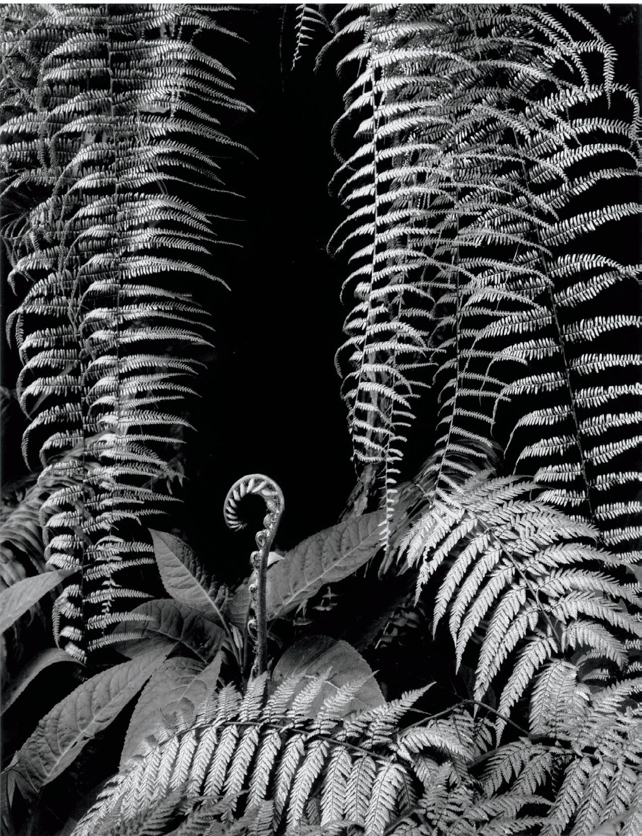
Figure 3-19: Fern in Grotto, Cloud Forest, Mexico
The ferns constitute the positive space; the black hole in the upper center constitutes the negative space, where there is nothing to see, but a pleasing shape, nonetheless.
In the image Fern in Grotto, Cloud Forest, Mexico (figure 3-19), the black space above the unfolding from toward the bottom of the image, and held in by the hanging ferns to the right and left, is the negative space in the image, while the ferns create the positive space. Here the dark area is the negative space; the light areas, the positive. These roles and tonalities can be reversed.
The negative space can be bright as well as dark. As a simple example, if you look at the interior of a room with windows looking out on a bright, blank exterior, the window areas are negative spaces within the image. Looking back to figure 1-6, you’ll see that the near columns and arches are the positive spaces, and the distant nave is the negative space.
Brett Weston was renowned for his use of positive/negative space. He often employed brilliant forms set against a glowing black background. The success of his photographs rests on the interplay of tonalities, as well as the wonderful forms of both the brilliant foreground object(s) and the black background areas. Without the lyrical forms that are so apparent in Weston’s work, the positive/negative interactions would likely come across as little more than excess contrast, but he turned them into elements of rich, flowing design.
Texture
Texture is often overlooked as an element of composition. It can be a most compelling visual treat. Whether it is the roughness of rock, the fluidity of water, the smoothness or cragginess of skin, the sheen of a metallic object, the soft modulations of clouds, or any of an infinite number of other textures, their detailed delineation will immeasurably enhance any photograph (figure 3-20).
Often, two elements within a photograph lie side-by-side with similar tonal values and only textural differences to distinguish them. In nature, a boulder pressed against a tree trunk could be such an example. Textural differences may well be enough to hold the viewer’s attention to a study of nature.
Edward Weston was a foremost exponent of texture. Many of his famous nudes on sand and his rocks at Point Lobos are studies of textures and forms. His unexcelled still lifes, too, are remarkable studies of texture, form, and light. Photographers often underestimate the importance of texture, but in the hands of a master like Weston it becomes a prime element of fine art.
Textures are rarely assertive elements. They must be sought and dealt with carefully and thoughtfully. Used effectively, they can be impressive elements of composition. They can also have the strength to hold a viewer to the photograph as he studies the rendition of textures in their most revealing details. As noted on the first page of this book, the inherent realism of photography is one of its greatest strengths, and studies of texture placed within a well-conceived image can impart surprising strength.
The noted photographer Frederick Sommer cautions that textural studies alone fall flat. He points out that texture is a surface quality, and that if the photograph fails to delve beneath the surface, to uncover inner truths, or ask probing questions, we end up with a print as superficial as the texture. Texture for texture’s sake shows little more than technical competence, but texture used to help bring out a deeper message, a more insightful image, can add realism and pertinence to a photographic statement.
A good photograph is a visual statement, and all the elements of composition are simply the tools used to strengthen it. No compositional element has meaning by itself. Each must be employed in concert with the others to contribute to the unified thought discussed in chapter 2. Toward the end of this chapter, I will discuss this idea further under the subheading “Relationships.”

Figure 3-20: Rocks, Pebble Beach
The smooth, reflective rock textures stand out sharply against the background of small pebbles. There is an overall movement from the lower right to the upper left created by the rippled lines on the foreground rock. The wet rocks reflected a clear, pre-sunrise sky. After sunrise, brilliant specular highlights and deep shadows made the scene virtually impossible to photograph.
Camera Position
Camera placement is critical for bringing out the most in compositional elements. Because we live in a three-dimensional world, objects are arrayed in front of us with some in the foreground, some in the middle ground, and some in the background. As you move, the visual relationships among them change constantly. The optimum camera position is where the relationships are strongest. Sometimes, a change of camera position by merely a few inches makes the difference between an ordinary and a great photograph. Careful positioning can reveal patterns that were otherwise missing, or can create a more interesting interaction between foreground, mid-ground, and background objects (figures 3-21 and 3-22). With clever camera placement, unwanted background objects can sometimes be obscured behind important foreground objects. Precise placement can also be used to create a continuity of lines or forms, which would not exist otherwise, and this is particularly critical when dealing with obstacles in three-dimensional space.
Placing the camera in a specific location in space may reveal (or create) a particularly pleasing, surprising, or poetic relationship between foreground objects and background objects, as I found in the pre-dawn minutes in Toscana, in 2015 (figure 3-23). The fog overlaid the entire scene with a soft blue-gray, but the color was of little consequence. The forms drew my eye, and the connect-the-dots trees in a line on the right became the focus of my attention. It seemed to me that placing the camera in just the right location highlighted that line of trees in the most compelling manner. Camera position may create interesting patterns or relationships of forms or lines that simply don’t exist from any other vantage point. When this occurs, you must be in exactly the right spot, not just close to it. Too many people always shoot from eye level, simply because that’s where they see the world as they pass through it. They rarely investigate the view from waist or knee level, to the left or to the right of their line of travel, or any other unusual point of view, which may prove to be much more exciting or visually compelling. Fortunately, the ever-shifting fog opened up for me long enough to allow an exposure with that full line of trees visible.

Figure 3-21: Branch and Canyon Walls, Unnamed Canyon
I felt a dynamic photograph could be made by crawling under this cottonwood branch that was wedged between the slit canyon’s walls. During the 10-minute exposure, I realized the real dynamic was missing: the low camera position was wrong.

Figure 3-22: Log Between Walls, Unnamed Canyon
Moving the camera to eye level and a foot closer to the branch created greater dynamism. That was my goal. The log explodes toward the viewer, confronting the viewer directly. The only difference between the two images is camera position.
Shortly after exposing figure 3-23 the sun rose, changing everything. Figure 3-24 shows a totally different composition from less than 75 feet away, aimed in a different direction, with the relationships of the warm, sunlit nearby colors contrasted with the cold blue-gray fog in the distance. Thus, I responded to a wholly different set of relationships based on color, not form. See chapter 6 for more on color and color relationships.
During my studies of English cathedrals in 1980 and 1981, I repeatedly used precise camera positioning to bring out the most lyrical interactions between the curve of a foreground arch and the multiple curves of ceiling vaulting in the background. Often, my camera was positioned to block out distractions within the cathedral, such as electronic loudspeakers hung on columns, or visitor signs. Many of my compositions were the result of time-consuming studies of camera positions that would effectively reveal the harmonious interactions of the stone tracery in the foreground with the arches and tracery in the middle ground and background. Not only was it a thoroughly enjoyable effort, but in the process I became intimately aware of the exquisite craftsmanship and genius of invention on the part of the stonemasons who created those masterpieces. For me, virtually all the distractions were modern additions; the original architecture was astoundingly harmonious.

Figure 3-23: Toscana Dawn; Cypresses, Hills & Fog
The viewer’s eye immediately jumps to the three darker forms on the right, where contrast is highest and the forms are most prominent. Prior to sunrise, fog moving in and out, alternately dense and thin, finally cooperated by revealing the trees as I had hoped. They attract the eye instantly, effectively forming a compelling line. Following that, the eye roams to the soft horizontal curves of the layers of hills, and to the home near the upper left and the line of small trees leading from the home toward the tree in the upper right. Further study of the image reveals additional ridges in the far distance, well beyond all trees, yet relating subtly to the near ridges.

Figure 3-24: Toscana Sunrise with Fog
The moment the sun rose the morning I photographed figure 3-23, everything changed, and I did, as well. I put down my 4×5 film camera used exclusively with black-and-white film and picked up my digital camera for color work. The remarkable thing was how the brilliant colors of nearby flowers and elegant weeds disappeared into the soft bluegrays of the more distant fog, a fog bank that barely moved for a period of at least half an hour. You’ve got to roll with the flow, and the flow told me that the earlier black-and-white opportunities had yielded to color immediately after sunrise.
I want to re-emphasize a thought expressed in chapter 1. When you encounter a scene that grabs you—one that has a special magic, that makes you want to shoot it immediately—it is imperative that you respond instantly and spontaneously to that impulse. But that doesn’t mean you instantly shoot the scene. Rather, you immediately investigate it. Take the time to refine your seeing and improve the composition. Avoid the urge to look and snap; instead, investigate and photograph. Those few seconds or minutes spent in refining your seeing will not diminish your spontaneity, and they will surely enhance your imagery. See if the composition would be stronger two inches or two feet to the left or right, higher or lower. Check whether the lines, forms, and patterns are more exciting if you step to one side or the other. You do not have to check through the lens. Put the camera down and check without it. After all, you initially spotted the scene without your eye glued to the viewfinder or ground glass. Move to the left or right, squat down or stand on your tiptoes, edge forward slightly or move back a bit. Where is the composition strongest? When you find it, place the camera there and make your exposure.
![]() When I feel that a scene is worthwhile, I carefully look at it from numerous possible camera positions—an inch or two forward, up and to the right, back and down, etc.—until I find the best possible location for the camera. All this is done with my camera in its case and my tripod in hand.
When I feel that a scene is worthwhile, I carefully look at it from numerous possible camera positions—an inch or two forward, up and to the right, back and down, etc.—until I find the best possible location for the camera. All this is done with my camera in its case and my tripod in hand.
Of course, if you’re shooting with a standard or digital SLR, don’t hesitate! Shoot quickly; then, assuming you have the time, refine the camera position, the seeing, the exposure and even your thinking for additional, better shots. If you are using a small, handheld camera, you are probably after the immediate action rather than the “perfect” composition. With motor drive or a digital camera you can snap off a series of exposures rapidly, then leisurely pick out the best of the series at a later time. (This is where editing becomes the prime tool.) This can be of tremendous value for transient, passing events when you may not have a second chance at composing carefully. Yet, even with motor drives or a digital camera, there is a possibility you can improve on the initial exposures by moving to the left or right, forward or back, up or down—even just by mere inches—before reeling off a few more frames. By doing this often enough, you will evolve into the type of photographer who almost automatically sees the strongest compositional structure as you bring your camera to your eye.
For studio compositions, the subjects as well as the camera can be moved. Place the subject and camera carefully for your initial analysis and composition, then proceed to rearrange the setup—both the scene you intend to photograph and the position of lights (as well as the type of lights used). Move the camera until you achieve the strongest possible composition. The closer you are to your subject, the more critical camera placement becomes.
In a distant panoramic landscape, it is often inconsequential if the camera is moved a foot or two in any direction (unless, of course, the distant panorama includes nearby elements that relate to the distant ones in essential ways). However, such movement can prove pivotal in architectural or portrait photography, and fractions of an inch may be critical in tabletop or any other closeup photography. They certainly proved critical in my cathedral and slit canyon images as well as all detailed imagery within a larger landscape.
Because camera position is so important, I have developed a method of searching for the right location and placing my tripod with real precision. When I feel that a scene is worthwhile, I carefully look at it from numerous possible camera positions—an inch or two forward, up and to the right, back and down, etc.—until I find the best possible location for the camera. All this is done with my camera in its case and my tripod in hand. As soon as I determine the best position, I hold the tripod head at my chin and drop its legs down to the ground. When the camera is placed on the tripod, it will be just where my eye was. All too often I see photographers put their cameras on tripods and then search for the best location. That approach does not work as well.
Focal Length of Lens and Cropping
Camera position must be considered in conjunction with the focal length of the lens used to expose the photograph. Together, the two determine the perspective of the image.
Long focal length lenses (telephoto or similar lenses) tend to compress space, crowding objects together that may be separated in reality. Short focal length lenses (wide-angle lenses) tend to exaggerate space, separating objects that may be close together in reality. Clever use of these effects can produce exciting images of scenes that most people may never see in reality. A high percentage of modern lenses are zoom lenses, each covering a wide range of your field of view—from wide angle to telephoto. No high-quality zoom lens covers the full range from extreme wide angle to long telephoto, but generally two or three will cover the full range. With such convenience, you can quickly zoom from one focal length to another to analyze which gives you the exact coverage you require. Your choice of focal length, along with the type of lighting that exists naturally, or lighting that you produce artificially, can dramatically alter the spatial characteristics of a scene.
If all lenses were infinitely sharp and films were grainless, or if there were an infinite number of pixels on camera sensors, we could easily get by with one wide-angle lens and just crop to the image we really want! That would give us plenty of time to comfortably determine how to approach every image. Unfortunately, we do not have that luxury, so we must burden ourselves with heavy equipment and make decisions on the spot. A key question is this: what should be included in the image, and what should be excluded? Once your decision is made, use the lens that includes what you want, and little, if any, excess.
What about the excess? My approach is to always try to compose full frame, but also to recognize that doesn’t always work. If I feel an image can be improved by cropping (i.e., removing) any portion of it, I don’t hesitate to crop. Sometimes the best image lies between focal lengths of the fixed focal length lenses I am carrying with my 4×5 camera; in that case I use the shorter lens, which includes all of the pertinent imagery plus some excess, then remove the excess. My next longer lens might eliminate an important element of the image. My digital camera gives me zoom lens capability, so I can get closer to achieving the exact image I envision. But, of course, not every image I want to create is the exact proportion of either my 4×5 film camera or my 2 : 3 ratio digital camera, so cropping still may be necessary.
When my camera format is wrong for the image—for example, if I find a long, narrow image of real interest within a 4×5 format or my digital format, or if a square image of real strength appears within either format—I crop to get the image ratio I want. In any case, there is no reason to include the whole frame when a portion of it is considerably stronger. There is no reason to be a slave to any particular camera format. God did not create the world in a 2:3 ratio, a 2¼ square format, nor a 4×5 format! Sometimes after composing full frame, I may discover later that a far stronger image lies within a portion of the frame. In such cases, I crop. I urge you to never hesitate to crop an image in order to make it stronger. It’s no problem. Cropping is legal.
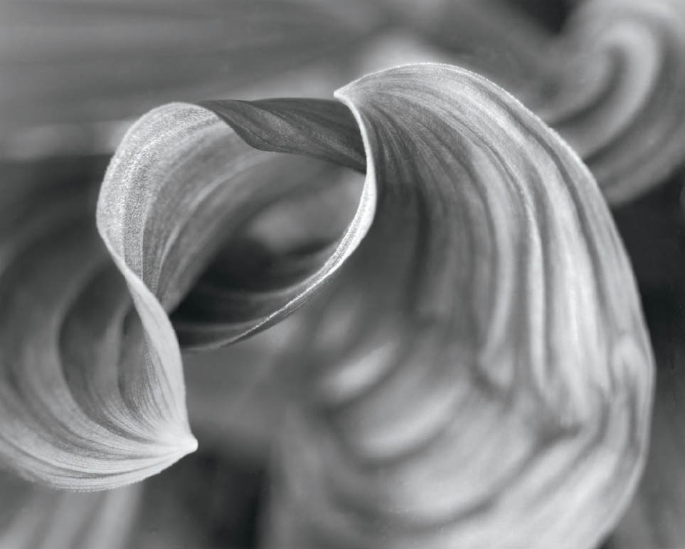
Figure 3-25: Corn Lily Curls
I’m drawn to corn lilies (false hellebore) like bears to honey. Their forms resemble those of slit canyon walls. Allowing the background to softly echo and oppose the foreground forms, with much out of focus, makes an effective portrait of this plant.
Some photographers always feel compelled to present full-frame images. If you can compose full frame as powerfully and as often as Cartier-Bresson did, then do it! But I don’t advise it. Suppose, for example, that you find a camera position that creates a magical relationship between a foreground and a background object, but it includes some major or minor distraction (or even useless, excess information) along one edge. If you print full frame, you get the great relationship, but you’re stuck with the junk on the edge. If you move the camera just a bit, you may be able to eliminate the junk, but the primary relationship isn’t as compelling. What do you do? I advise you to shoot from the best position and crop rather than compromise by either including the distraction or losing the compelling relationship. Remember Edward Weston’s statement, “Good composition is the strongest way of seeing.” An insistence on shooting full frame images may compromise that strength.
Depth of Field
Depth of field and shutter speed (to be discussed next) are the two elements of composition unique to photography. (Camera position is somewhat analogous to a painter choosing a “viewer’s position” for a painting.) A photographer has the option of bringing virtually everything into sharp focus by closing down the lens to its minimum aperture (i.e., f/22, f/32, f/45, etc.); or, of limiting sharp focus to one plane by opening up the lens to its maximum aperture (i.e., f/2, f/2.8, f/4, f/5.6, etc.) and allowing objects in front of the plane and behind it to fade out of focus. I rarely resort to limited depth of field, though I have on rare occasions (figure 3-25). In general, I tend to prefer imagery that allows the viewer to peruse the scene and get information out of every part of it, but I don’t make a rule of that. Limited depth of field can be employed brilliantly.
A lens focuses the image at a fixed distance from the camera, somewhere between the closest possible plane of focus and infinity. By closing down the aperture, you have the option of bringing more than the initial plane of focus into true sharpness. (At maximum aperture, sharpness falls off rapidly in front of and behind the plane of focus.) If you want to attain sharpness throughout the image, and the scene includes objects relatively close to the camera as well as quite far away, it is best to focus approximately ⅓ of the distance from the closest object to the farthest one. This is known as the hyperfocal distance. Then close down the aperture to the minimum opening. As the aperture closes down from its maximum setting, sharpness increases both in front of the plane of focus and behind it, but not equally. Depth of field (i.e., sharpness in front of and behind the initial plane of focus) increases from the original plane of focus roughly half as fast toward the camera as it increases away from the camera. That explains the reason for initially focusing ⅓ of the way into the scene.
If you focus on the farthest object and then close the aperture, you gain no benefit from increased sharpness behind the farthest object because there are no more distant objects! If you focus on the closest object and close the aperture, you gain no benefit from increased sharpness in front of that object because there is nothing in front of that object, either! By focusing on a plane approximately ⅓ of the distance between the two, you may be able to get all objects into sharp focus as you close the aperture down toward the minimum setting.
There are limits to increased sharpness with smaller apertures. As apertures get progressively smaller, diffraction sets in. Diffraction is the bending of light waves due to the small aperture, which makes the sharpest possible focus progressively less sharp (even at the initial plane of focus) as apertures decrease. At some very small apertures, nothing is really sharp while your depth of field increases . . . or, to put it another way, everything is “almost sharp” but not truly sharp. This is an especially vexing problem with digital cameras; diffraction interacts with digital sensors in ways that can decrease overall sharpness so much that everything becomes quite unsharp at small apertures. It’s important to understand how your equipment works—and how each lens responds—at small aperture settings.
With large format cameras that feature movable parts, you can change the plane of sharp focus from one that is parallel to the film and lens planes (which are parallel in fixed cameras) to one at an angle. For example, by using tilts and swings properly you can focus on a receding plane, such as a road going off to the horizon, and obtain complete sharpness from the nearest point to the horizon line at maximum aperture. By using these camera movements, you can obtain the best compromise plane of sharp focus before closing the aperture down, at which time the depth of field increases perpendicular to the plane of sharp focus, both above and below the initial plane: ⅓ above the plane for every ⅔ below the plane. It is often possible to obtain full sharpness with large format cameras when it would be impossible otherwise. Numerous source books fully discuss the use of these movements, but instruction from an experienced large format user is the best way to learn them.
Sometimes you may want to have objects fade out of sharpness. Perhaps you want a flower in sharp focus close to the camera with distant objects appearing blurred. In that case, simply focus on the flower and close the aperture just enough to get its various parts into sharpness. Everything else will turn into soft-edged blurs that may be thoroughly out of focus and indistinguishable.
I have heard of painters lamenting their inability to create the soft edges and subtle gradations of tonality or color that are the hallmark of soft-focus photographs. Soft focus can be a striking effect, indeed, when well executed. But it must be employed with the greatest care and understanding of its unique effect. Unfortunately the soft-focus aspect of photography is rarely used well despite the fact that it is so frequently employed. Too often, limited depth of field is used as a cover-up to mask unwanted background distractions rather than as a compositional device to create unity among forms and tones. This is especially common in 35mm photography and less so in larger formats. Evidently, many photographers feel a blurred distraction in the background is acceptable whereas a sharply defined distraction is unacceptable. Both are distractions, and both are unacceptable.
Shutter Speed
Shutter speed can be chosen to create a variety of effects. Photographs of moving objects, such as a flowing river, have astonishingly different visual and emotional impacts depending on shutter speed. With a fast shutter speed of 1/500 second, the individual drops in a small cascade may show up clearly. At ½ second, they disappear and are replaced by soft, flowing lines from level to level in the cascade.

Figure 3-26: Clouds at Mt. Rundle
At sunrise, clouds were flying rapidly over the western slope of Mt. Rundle while other clouds were being created off the eastern cliff face. A three-stop neutral density filter and a small lens aperture allowed a 15-second exposure, producing an image my eyes never saw.
At 1/500 second, the tonalities and even the textures of water and rocks may merge. At ½ second, the flowing lines of the moving water differentiate it from the stationary rocks. There may be other situations in which variations of shutter speed are the only effective way to separate objects.
Years ago, Wynn Bullock produced a series of time studies of the ebbing and flowing of the ocean surf on the Pacific coast. The exposures were several minutes in length, allowing the waves to move in and out many times. The effect is surrealistic. Objects that were alternately covered and revealed lie isolated, looking like apparitions surrounded by clouds of dry ice. In viewing these photographs, I was led to deep philosophical questions about the nature of reality. Is reality the scene as it would have appeared at 1/500-second shutter speed? Would reality have been 1 second? Or is reality the lengthy rendition that Bullock revealed? Wherever reality fell for me, my questioning of it while studying Bullock’s prints expanded my world and my thinking. His images extended my horizons. To me, that is the essence of creative photography. His method was unconventionally long shutter speeds. Simple enough, but it took a great deal of insight.
Anything that moves within the image area can be altered via long exposures (moving water, clouds, vehicles on a road, people walking across a plaza, etc.). Drawing on the idea of Bullock’s images of moving water, I tried to apply the idea to clouds. In figure 3-26, I put a three-stop neutral density filter on my camera to prevent overexposure; then I made a 15-second exposure of fast moving and newly forming clouds at this exceptional summit in the Canadian Rockies. The long shutter speed conveys the impression of tumultuous activity in the atmosphere, exactly my intent in making the photograph.
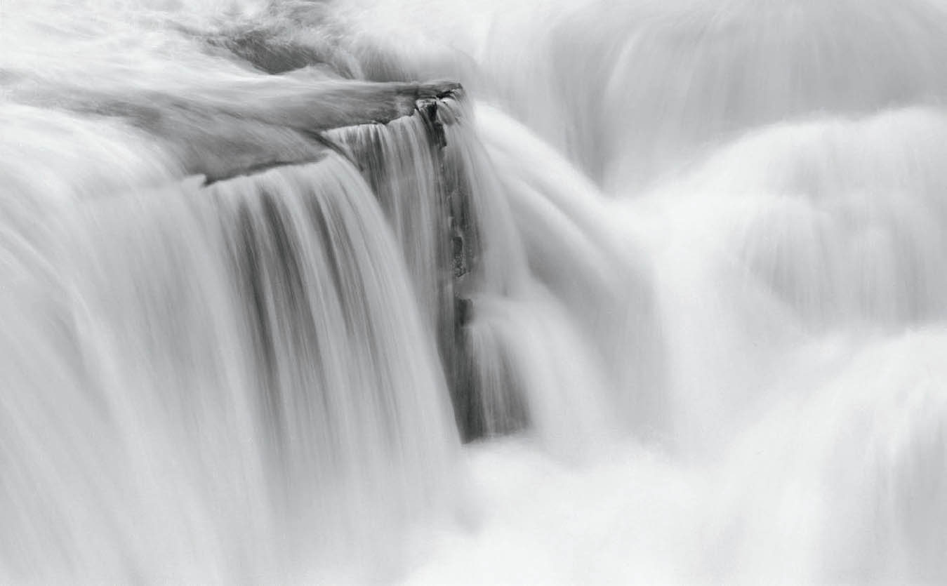
Figure 3-27: Swift-current Falls, Glacier National Park
My initial goal was to “capture the thunderous sound of the waterfall” by nearly stopping the motion through use of a fast shutter speed. But I made a second exposure at the longer shutter speed, as well. Ultimately the initial goal failed to hold my interest, but the “back-up” proved to have far more staying power for me. Its ethereal cloud-like qualities proved to be a far more evocative feel of the waterfall.
In figure 3-27, I used a relatively long shutter speed (one second) at the fast-flowing Swiftcurrent Falls in Glacier National Park to create an impression of clouds rather than water. It’s almost as if the rock ledges, over which the water is flowing, emerge out of the clouds. In fact, I made two separate exposures; the one-second exposure and another at ⅓ second. The shorter exposure created a bit of flow on the waterfall itself, but virtually stopped the action in some of the eddies amidst the wild bedlam at the base of the falls. Ultimately, I chose the ethereal aspects rendered by the longer exposure as the more effective image of the two.
Most of the time, photographers are concerned about eliminating movement in their images. Landscape photographers may wait a long time for a breeze to stop so that leaves, grass, or branches stop moving. Portrait photographers try to make sure that their subjects do not blink or move and harm the image. Surely this is appropriate at times, but there may be more latitude for movement during the exposure than some photographers allow. We have all seen photography in which moving cars are blurred streaks, or experimental photographs in which movement is incorporated into the image. With film cameras, the look of the image cannot be determined until the negative or transparency is developed. With digital cameras, it can be seen almost instantly. This obviously affords benefits to the digital photographer: you can immediately check to see if the shutter speed you chose gave you the effect you desired . . . and you can try a variety of shutter speeds to finally arrive at the desired effect. (But let me suggest that if you try this, don’t discard all the exposures you didn’t like, because your thoughts about the best shutter speed may change a year or two down the road.) It may be worthwhile to experiment with shutter speeds and open yourself up to visual experiences that can be attained photographically, such as Bullock’s extended surf exposures, ones that cannot be seen with the naked eye.
Sometimes movement can create a surprising departure from reality as we perceive it. Try photographing a tree at one-second shutter speed (or longer) on a windy day as a gust sweeps through the branches. The branches and leaves may appear as a series of swirled lines, but the lower trunk may appear sharp and unmoving. It could prove to be an opening for other creative imagery.
Relationships
We have now run through all the elements of composition (except light and color, which are covered in chapters 5 and 6). We have looked at them as individual entities separate from one another, but we have briefly mentioned them in relation to the others. In reality, compositions invariably combine these elements to create the total visual effect. They cannot be considered as isolated entities in practical usage.
The relationships within a photograph are the things that make an image sing or fall flat. This includes how much space is taken up by the elements that are most important and by those that are supportive or unimportant. As a quick example, how often have you seen photographs of a cityscape or an old Western town in which the road in the foreground takes up ⅓ or more of the image? It’s generally a waste of space, with nothing of importance within that space. So if all the real importance is above the empty road, you should eliminate most of the road. Make every element within your photographs count, and make them interact strongly with other elements within the image. That’s what holds the viewer’s attention and makes him think about the meaning of the photograph.
Lines interact with other lines and forms, within and without patterns. Textures play off one another. Lines radiating out of forms create balance or imbalance; forms relate with other forms to create movement, depth, and variation of pattern. Tonal variations superimposed over lines, forms, and textures create visual interest.
Of course, in well-crafted photographs these elements (lines, forms, etc.) are not abstract things but real things (tree trunks, faces, clouds, buildings, shadows, tools on a tradesman’s wall, etc.). A good artist relates real things to one another as abstract elements to see if they work together successfully, or if they fail.
Let’s look again at Fallen Sequoias (figure 3-7) as an example of a photograph that works successfully for me. In making the photograph, I walked all around the cluster of standing and fallen trees before choosing my camera position. From that location, the line of the dominant, diagonal sequoia tree was effectively echoed by a clump of fallen branches lying diagonally in the lower-right corner. That relationship created a wonderful dynamic in opposition to the stately vertical lines of the standing giants. Lighter lines (trees in the background receding into the fog) and the lines of the small dead tree on the right (vertical trunk and horizontal branches) lend variety and tonal interest to the near uniformity of the vertical trees. All of these things, taken together, make the image work for me.
Sometimes a building, or other backdrop, serves as nothing more than a good stage setting, but has little interest without some interactions within the scene, whether human or otherwise. There is no rule (as there never is) as to when a structure tells a story by itself, or whether it requires some activity in front of it. Such may be the case in figure 3-28, in which the house’s facade by itself may or may not be of real interest. But the curious interaction between the strutting chicken and the utterly nonchalant dog, with its front paws crossed in apparent indifference, lends an element of interest—perhaps some humor—that the structure, by itself, lacks.
For portraiture (outside of studio settings) it may be wise to pick a good backdrop first—a stage setting, you might say—in order to assure interesting visual relationships between the portrait subjects and the rest of the image. If the backdrop is one that relates to the person being photo-graphed—perhaps something closely related to his or her known line of work—then the relationships could be very strong, indeed.

Figure 3-28: Dog and Chicken, Ollantaytambo, Peru
Without the interplay between the dog and chicken, it’s unlikely that this house’s facade, by itself, would prove to be a strong image. But the apparent interaction between the two subjects takes the image to a higher level of interest.
Always consider the elements of composition in combination. A line, by itself, is not a photograph, nor is a texture. Balance or imbalance implies a relationship between at least two elements. Photography flowers when relationships exist, when they are made evident either subtly or boldly. To me, the essence of photography—of all art—is in the relationships that are created. A musical note is meaningless unless combined with others. Rhythms, harmonies, timbres, and other aspects of musical composition must be added before a musical work emerges. The same is true of photography.
Just as the sciences advance by finding relationships within their realm of endeavor—and sometimes beyond it—photography and the other visual arts become most meaningful when they relate objects and forms to the viewing public in ways that have never been shown previously.
I cannot overemphasize the importance of this statement. When a photograph includes a bunch of things but shows no compelling relationships among them, it simply fails. It doesn’t matter if you walked 15 miles and nearly killed yourself to get the image; if it has no interesting visual relationships, it fails.
All too often a photograph fails because it is strictly an “object” photograph: an isolated object of visual interest. The object exhibits no interesting relationship to anything else in the photograph, and the remainder of the image is strictly background. With rare exceptions, such photographs are mere documentation of objects; lacking internal relationships, they fail artistically. Perhaps the most famous exception of all is Edward Weston’s Pepper #30, in which case, the convoluted forms of the store-bought green pepper prove to be so evocative of human emotion that the image takes on a solitary significance transcending the fact that it’s still just a green pepper. (After photographing it, Weston chopped it up and ate it as part of dinner.)
Even if there is a central object of overwhelming importance, a photograph of it is usually enhanced when it can be related, however subtly, to other elements in the image space. Visual relationships spawn visual harmonies and impart heightened interest. Most photographers start out with an overriding concern with subject matter. As time goes on and they become more sophisticated, their emphasis turns more toward studies of light and form and the wonderful relationships that exist among the elements of the scene—even in the context of a particular type of subject matter that intrigues them.
![]() Balance or imbalance implies a relationship between at least two elements. Photography flowers when relationships exist, when they are made evident either subtly or boldly.
Balance or imbalance implies a relationship between at least two elements. Photography flowers when relationships exist, when they are made evident either subtly or boldly.
This does not imply that you should avoid relationships of “things” in your images. The relationships between objects in any scene are of primary importance, but they will become even stronger if they not only relate in terms of object relationships, but also in terms of visual relationships brought about by lines, forms, colors, lighting, etc.
Involvement with the Scene
Just as you must consider the relationships between the various elements of composition, you surely must also consider your basic interest in the scene. In my case, I could possibly put together a well-composed photograph if I think strictly in terms of the elements of composition; but what meaning would it have? Probably none. It surely would not excite me if I have no real interest in the subject.
My interest in nature and the landscape initially pulled me into photography. My interests expanded to architectural objects quite early in my career. Along the way I have periodically done portraits, delved into multiple-negative imagery, experimented with fragmented, cubist images, and worked with toning and chemical coloration of images, which increasingly fascinated me. These genres are not the central focus of my photographic efforts today, but they’re part of my output, my thinking, and perhaps one day will again be a major part of my work. Where I will go in the future is anyone’s guess. My main interest is the interrelationships of light and form to create visual dynamism. I find my most pleasing subjects in nature and architecture. I naturally gravitate to those areas, and not surprisingly, I feel that I make my strongest statements there. But I try not to be static in my approach, no matter what I’m photographing.
Yet there are areas I have not delved into and never expect to because they have no interest for me. The abstract details of walls that Aaron Siskind did so well do not move me enough to want to photograph them. The grotesque cadavers and flabby women of Joel Peter Witkin actively repulse me. Whether I like or dislike the subject matter, I will not attempt to produce meaningful work with it if I am not moved by it. At best, I could produce a well-composed but meaningless composition, much like a grammatically perfect speech that communicates nothing. My photograph would have no internal conviction, and I seriously doubt that it would stir much of a reaction in anyone else. It shouldn’t, in fact!
All this relates to the ideas presented in chapter 1 about understanding what interests you and how you respond to those interests, and then conveying your thoughts through a photograph. Unless you have that gut-level involvement, you’ll probably take pictures but you won’t make photographs.
If photography is truly a nonverbal form of communication (as stated in the opening sentence of this book), then it’s best to learn what interests you most, and to understand why it does. When you get a handle on both, you have a far better chance of conveying your thoughts to others. As a means of promoting this type of thinking in my workshops, I ask students the following question when reviewing their work: “What are you trying to say, and what are you trying to communicate in the work you’re showing us here?” The reason for the question is to push students to think about and express the relationship they feel to their subject matter. In essence, I encourage students to focus more deeply on their own interests, for unless you know yourself well you’ll always be groping around for subjects to shoot. You will produce little of interest until you find your area of interest.
Rules, Formulas, and Other Problems and Pitfalls
Before ending this chapter, I’d like to examine several pitfalls that can ruin potentially fine photographs. The first—and worst—is looking for, or following, “rules” of composition. Rules are foolish, arbitrary, mindless things that raise you quickly to a level of acceptable mediocrity, and then prevent you from progressing further. Several of the most well-known rules—the rule of thirds, the rule of avoiding a horizon in the center of an image, the rule of having an image read from left to right, the rule of not placing the center of interest in the center of the image, and so many others—are undesirable constraints with no validity. (Just look at Ansel Adams’s “Moonrise over Hernandez” to see how many rules are broken.) Again, heed Edward Weston’s words that “Good composition is the strongest way of seeing.” If your composition happens to adhere to rules, fine! If it happens to break rules, fine! Forget the rules; just make strong images.
Related to following rules is the common pitfall of following formulas. As an example, if you successfully increased contrast on a softly lit cloudy day, does that always indicate that you should increase contrast on a softly lit cloudy day? Of course not! Sometimes it works; sometimes it doesn’t! If you dramatically enhanced contrast by using a red filter on a sunny day with deep blue sky and puffy white clouds, should you always use a red filter on that kind of day? Certainly not. If increasing color saturation by moving the slider to the right gives you a better image on the photograph you’re now working on, should you always move the color saturation slider to the right? Again, no! Sometimes it works; sometimes it doesn’t! No two images say exactly the same thing, nor should they. Your goals may change from day to day—even under similar circumstances—and changing conditions may force a change in your approach. Avoid rules. Avoid formulas. Look at each individual case on its own merits.
Another common problem is the inadvertent inclusion of distracting areas or objects in an image. As photographers, we often get so involved with the object of prime importance that we fail to see distractions that intrude into the frame. How often have you seen pictures of spectacular landscapes marred by such things as power lines in an upper corner or a yellow trash can in a lower corner? Or pictures where the top of a camper-trailer peeks into the bottom of the frame below the waterfall? Or pictures of a friend or relative with a distant tree or phone pole appearing to come right out of the top of his or her head?
These annoyances can be avoided by studying the composition for just a few seconds before tripping the shutter. Run your eyes around the edge of the image—all four sides—to see if there are intrusions that pull your eye from the important areas. I have dubbed this “border patrol.” See if there are strong contrasts or bright objects at the edges or corners of the monitor, viewfinder, or ground glass that may prove distracting. You may be able to block them out by moving your camera position slightly so that a meaningful object of importance serves as a blockade for the intrusive one. You may be able to crop them out later during image editing or you may be able to deal with such distractions effectively in printing, but it’s best to beware of them when exposing your image.
![]() Rules are foolish, arbitrary, mindless things that raise you quickly to a level of acceptable mediocrity, and then prevent you from progressing further.
Rules are foolish, arbitrary, mindless things that raise you quickly to a level of acceptable mediocrity, and then prevent you from progressing further.
Forget the rules; just make strong images.
Study the whole frame to see what percentage of it is visually interesting. If the frame is filled with unnecessary or distracting elements, eliminate them entirely or at least reduce them significantly. If you cannot reduce these distractions, just enjoy the scene and make a “mental image” of it. You may be attracted to the distant mountain with its mantle of gleaming snow, but it may be 30 miles away and even your longest lens will take in too much of the landscape in front of that peak. You may still want the picture, but when you show it to others—people who weren’t at your side when you took the shot, and who are responding only to the photograph—they may not react as positively as you expect because you fail to show them anything exciting. You are showing them an expanse of flat land with a little spot of white in the center where that distant mountain stands.
A good memory is better than a bad photograph any day! Discipline yourself to put the camera away without taking the picture. This is also true for standard and digital SLRs. One of the greatest pitfalls of being able to work quickly is snapping off far too many exposures. It can be almost addictive. But it’s rarely productive. Putting the camera away without making a photograph is often the hardest thing to do. Most people seem to have an uncontrollable need to take a picture once they pull out the camera. It’s like drug addiction. They quiver and shake if they put the camera away without first pressing that little button on the top. Once they press that button, all is well. It matters little that the image is awful, it was taken and that’s what counts!
Of course, that’s not what counts. What counts is saying something meaningful, producing something with impact and insight. Millions of people each year take pictures in places of outstanding natural beauty and show them to friends and relatives afterwards. And they say, “You really should have been there.” It’s undoubtedly a true statement, because the snapshots fail to tell you anything. It was a beautiful scene, to be sure, but not a well-conceived photograph. These snapshots are constantly taken by people with no understanding of the elements of composition that form the basis of a real photograph.
Blurred objects are another pitfall to watch out for. When shooting with 35mm or digital cameras, stop the shutter down to the f/stop at which the picture will be taken just to see if there are any blurred or unseen objects close to the lens that could become fuzzy intrusions once the shutter automatically stops down to the pre-set aperture. This may occur in a forest, for example, where there are cross branches everywhere. As you position your camera, the branch that is inches from the lens and unseen at f/2 becomes an ugly blur at f/16.
The human eye’s three-degree angle of sharp vision makes it easy to overlook the distractions that are in the frame, away from points of high interest. You must be aware of the entire picture space in order to direct the viewer’s attention to the important areas, not to the distractions. The distractions can often be avoided before the photograph is exposed, but rarely afterwards. Look for such distractions as much as you look for the good compositional interactions because they represent weaknesses in your image. Every good photograph reduces the weaknesses while accentuating the strengths; the finest photographs eliminate the weaknesses entirely.
Sometimes a simple cropping of the final image is all that is needed. Photographers who work digitally or in the darkroom regularly crop their images, but many 35mm slide shooters seem to abhor that concept with a passion. To them there is a pervasive religious feeling that God created the world in 35mm format and nothing should be allowed to violate that sacrosanct shape. Today, however, some of that thinking has thankfully been overcome by those who scan original film transparencies for digital printing, and then they seem more amenable to cropping the scanned image. That’s a real step forward. If cropping strengthens the image, crop it! There is no reason to avoid a long, narrow composition or a square format if it enhances the total effect. You may even want to break all the rules by considering a non-rectangular format!
One final technique of composition that is blatantly misused (to the point of abuse!) is the technique of “framing” the photograph. Its misuse can best be explained by example: a distant range of mountains is set in the center of the frame, and along the left edge is a massive, nearby tree trunk, with one branch of the tree hanging in the sky over the mountains. To most people this type of composition is wonderful. To my way of thinking it is atrocious!
Why? Because the dark tree has no tonal, object, or form relationship to anything else in the photograph. If you look at it from a purely compositional point of view, a heavy line or form (the tree) stands at the edge of a lighter form (the mountains), but the two do not interact in any way. True enough, both the tree and the mountains are natural objects, but rarely is there even one other tree in sight that could start to form a compositional relationship. The tree relates no more to the mountains than a lamp post would. Furthermore, there is nothing aesthetically pleasing about cutting off the image with the dark mass of the tree trunk. Unfortunately, this wretched misuse of compositional technique is so widely seen that most people accept it and many even love it. I strongly urge you to avoid it!
Generally, framing is used in an attempt to create an impression of depth and “presence,” yet framing of that type is meaningful only in the scene, not in the photograph. The intent may be good, but the method used to achieve it is inappropriate. It is the perfect example of the difference between merely “seeing” and “photographic seeing.”
Framing a scene can be highly effective if the framing element relates to the scene in terms of object, or tone, or both. A tree along the left edge could relate to a forest of other trees. An abandoned piece of mining machinery seen through the doorway of the mine entrance could be appealing, if not compelling. Examples of effective framing abound. They should be used. But use them when they have compositional integrity with other elements in the frame. Unify the photograph with elements that interact logically, not with objects that disrupt the overall composition.

Figure 3-29: Abazio St, Antimo, Italy
The marble floors, columns, and walls of this small monastery in north-central Italy seemed almost translucent in the midday light. I wanted to concentrate on the overwhelming feeling of light throughout the space, while imparting a feeling of translucency to the marble.