CHAPTER 16
Investor Attention
16.1. INTRODUCTION
As we have discussed, news volume can be an important metric to use to understand the market, and in particular market volatility. However, it should be noted that ultimately journalists (i.e. producers of news) are writing news they believe will be read by investors. It is not necessarily the case that because articles are written, they will attract investors' attention and be consumed. Hence, we can view news volume as broad proxy for investor attention, but with this obvious caveat.
Potentially, a closer proxy for investor attention can be seen in the way that investors actually consume information, such as their readership levels of news articles or their web search activity. Other metrics for attention can also include volumes of web traffic and page views. In this chapter, we give some specific examples of measures of investor attention, ranging from examining the readership of news articles related to payrolls, to looking at search data traffic, to Investopedia, to understanding investor anxiety. We will also create a trading strategy for EMFX based on combining measures of online attention with news volume.
16.2. READERSHIP OF PAYROLLS TO MEASURE INVESTOR ATTENTION
There are many market events that occur regularly. One of the most important of these repeated events is the US employment report, which features the release of the change in nonfarm payrolls statistics and we have discussed it many times already. While it is a repeated scheduled event, obviously some releases of the report are more important than others. The first issue is how we define “important.” One measure can be the number of news articles written about the data release beforehand. However, as we have already established, just because news is written does not mean it will always garner attention. Another measure of importance can be related to readership statistics of news articles on payrolls.
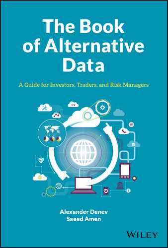
Benamar, Foucault, and Vega (2018) discuss how it is possible to measure demand for information prior to release of nonfarm payrolls and use this metric to help understand the market reaction. Their dataset consists of clicks on Bitly links. Bitly provides a service where a long URL is converted into a short URL form. The shortened form can more easily be shared on social media where the number of characters you can post often has hard constraints (e.g. 280 characters on Twitter). It is also possible to keep track of statistics associated with the Bitly shortened link, such as number of clicks, the geographical location of the users clicking, and so on. Benamar, Foucault, and Vega (2018) examined a click-based dataset of about 10 TB associated with 10 billion clicks. While there are indeed many economic releases, they restricted their study to those on payrolls to reduce the complexity of the exercise. They filtered the clicks for URLs that contained the word “payroll.” This yielded around 40,000 clicks for the period between January 2011 and June 2016. Unlike other measures of “attention,” such as Google Trends, which might be available on a weekly or daily basis, they note that these click-based measures are available on a high-frequency basis. Benamar, Foucault, and Vega (2018) calculate the average number of readership clicks for “payrolls” article on the days of the US employment report by time of day (see Figure 16.1). They note an obvious spike at 8:30am EST, which is the time of the release of the US employment report.
Later in the paper they also discuss controlling for the supply of news articles and note that the correlation between news volume on payrolls (as measured on the RavenPack news dataset) and Bitly's click readership data for payrolls is around 13%. Hence, while news supply and demand might be related, they are certainly not identical. One of the main discussions of the paper revolves around the relationship between payrolls clicks and the market reaction in US Treasury Note futures to a surprise in the change in nonfarm payrolls number. Surprise in this context is defined as the difference between the actual payrolls release number and median forecast of professional forecasters before it. Typically, these consensus forecasts are compiled by firms such as Bloomberg. Negative surprises are typically associated with falling Treasury yields (i.e. rising bond prices) while positive surprises tend be coincident with rising yields (i.e. falling bond prices). This is, of course, intuitive; when economic data is stronger (in the case of more jobs), you would expect yields to go higher, as the market expects tighter Fed policy. Conversely, poor data is seen as a sign of a more dovish Fed.
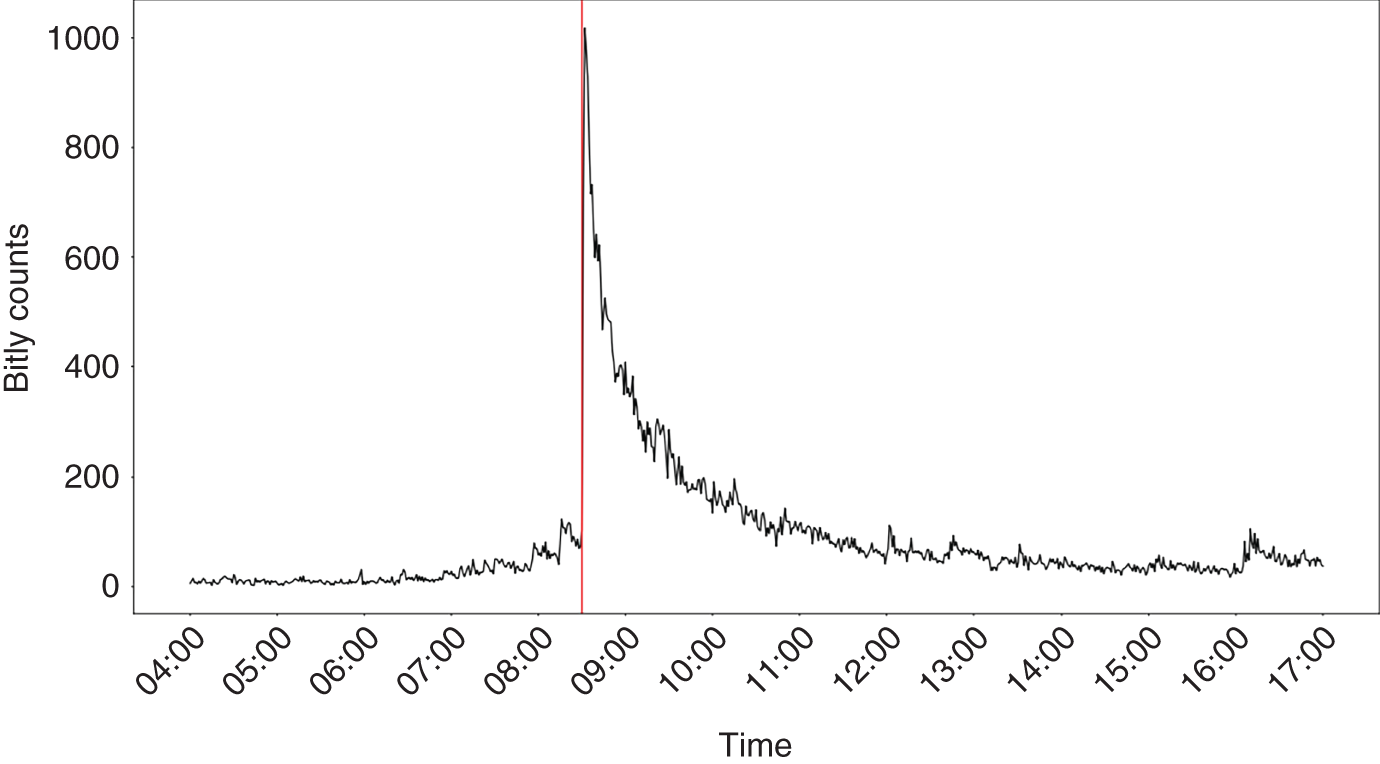
FIGURE 16.1 “Payrolls” clicks on the days of US employment report.
Source: Federal Reserve Board, bitly.
They show that when the number of payroll Bitly clicks is high, the price response in US Treasury note futures is nearly double. When payroll clicks are low, the market reaction is more muted. Hence, greater demand for information about payrolls can impact the market's reaction function to a surprise even when that demand comes before the actual event.
Later in this chapter we use a similar notion to adjust online attention from various Predata datasets, based on web traffic, with news supply as measured by the volume of articles about a similar topic published on Bloomberg News.
16.3. GOOGLE TRENDS DATA TO MEASURE MARKET THEMES
One commonly used measure for internet search traffic is Google Trends. Figure 16.2 shows an example of the search volume for “world cup” in the USA. We see an obvious spike every four years, which coincides with the FIFA World Cup. Obviously, this is not very surprising. However, could this type of internet search dataset be of use in financial markets? If we want to find out about something, typically the first port of call is an internet search, potentially before an action. Say we would like to buy a new car. Before doing so, it is likely that we might do some research on the internet concerning the various car brands. Hence, we might conjecture that internet search data can be useful for understanding what topics people are thinking about, and in particular it might be a leading indicator. This could potentially be a useful source of information if we were trading automotive stocks.
However, can we use internet searches to tell us something more broadly about the macroeconomic situation? Amen (2013) discusses how Google Domestic Trend indices can be used to develop systematic trading rules. Google Domestic Trend indices were historically produced by Google to measure the search traffic associated with various economically important themes. There was, for example, an index measuring “luxury,” which was composed of searches related to brands like Prada, Gucci, and the like.
Figure 16.3 shows a chart from Amen (2013), which reports the T-statistics of the linear regressions of the year-on-year changes in Google Domestic Trend indices against year-on-year returns in S&P 500. Some of the search indices have a statistically significant positive correlation with stocks, such as “Business & Industrial.” Others such as bankruptcy and unemployment have a negative correlation, which is not surprising, given that concern around these topics is likely to be associated with an economic slowdown and hence falls in stocks.
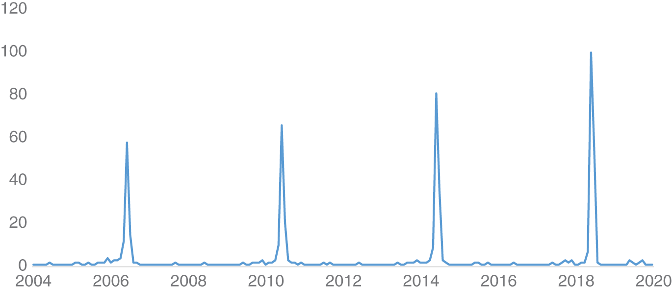
FIGURE 16.2 Search volume for “world cup” in the United States.
Source: Google.
FIGURE 16.3 Regressing Google Domestic Trend Indices.
Source: Based on data from Thalesians, Google.
Amen (2013) then discusses the creation of a Google Shock Sentiment index, specifically using the (inverted) searches associated with bankruptcy and unemployment. In Figure 16.4, we plot this against the year-on-year changes in S&P 500 as a time series between 2005 and 2013 and in Figure 16.5 as a scatter plot over the same period. The ![]() of regressing these variables is 41%, which suggests that there is a strong relationship between these variables. Later, according to Amen (2013), the Google Shock Sentiment index is used to filter exposure to risky assets, namely S&P 500 and G10 FX carry trades. The author shows that cutting exposure to these assets during periods of high shock, as measured by the shock index, helps to improve risk-adjusted returns compared to a long-only strategy. There are caveats around using data from Google Trends, notably the fact that it is difficult to ascertain how it has been calculated. Also, in practice, the historical data can change over time, which can make it difficult to backtest, given the difficulty in having point-in-time data. There has also been the notable case of Google Flu trends, where Google search terms were used to predict the spread of flu. While it seemed to work effectively in-sample, it proved a failure out of sample (Salzberg, 2014). However, the difficulty is that many people doing web searching for “flu” might not actually have flu and effectively misdiagnose themselves.
of regressing these variables is 41%, which suggests that there is a strong relationship between these variables. Later, according to Amen (2013), the Google Shock Sentiment index is used to filter exposure to risky assets, namely S&P 500 and G10 FX carry trades. The author shows that cutting exposure to these assets during periods of high shock, as measured by the shock index, helps to improve risk-adjusted returns compared to a long-only strategy. There are caveats around using data from Google Trends, notably the fact that it is difficult to ascertain how it has been calculated. Also, in practice, the historical data can change over time, which can make it difficult to backtest, given the difficulty in having point-in-time data. There has also been the notable case of Google Flu trends, where Google search terms were used to predict the spread of flu. While it seemed to work effectively in-sample, it proved a failure out of sample (Salzberg, 2014). However, the difficulty is that many people doing web searching for “flu” might not actually have flu and effectively misdiagnose themselves.
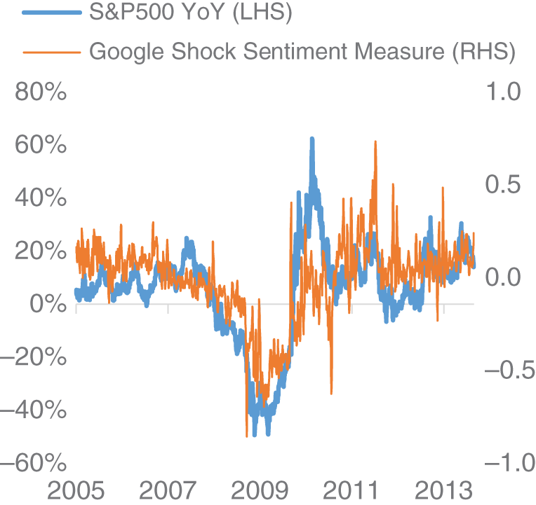
FIGURE 16.4 S&P 500 versus Google Shock Sentiment.
Source: Based on data from Thalesians, Google.
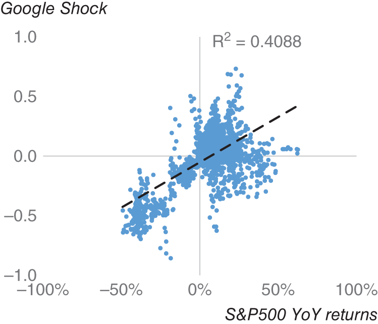
FIGURE 16.5 S&P 500 vs Google Shock Sentiment scatter.
Source: Based on data from Thalesians, Google.
16.4. INVESTOPEDIA SEARCH DATA TO MEASURE INVESTOR ANXIETY
Investopedia is a large financial education website that contains a huge amount of information concerning how the market and the economy work. If you do a Google search for a general financial term – for example, “bond market” – it is likely that a page from Investopedia will pop up on your search among the top results. Just as with our earlier example of Google searches, could the volume of web searches that end up at Investopedia provide us with actionable market insights? Investopedia created the Investor Anxiety Index (IAI), which specifically collects search traffic that ends up in specific pages on their website. These pages relate specifically to investor anxiety, and include topics such as “short selling,” “bankruptcy,” and “default.” Amen (2016) discusses the IAI in some detail. An obvious parallel to the IAI is the VIX, which measures the implied volatility on a number of S&P 500 options and is commonly known as Wall Street's “fear gauge.” The correlation of the level of VIX against IAI level in this sample is 30% and the ![]() is around 9% (see Figure 16.6). In Figure 16.7, we plot the IAI against the VIX, and we find that the two track each other, which seems like a broadly intuitive result.
is around 9% (see Figure 16.6). In Figure 16.7, we plot the IAI against the VIX, and we find that the two track each other, which seems like a broadly intuitive result.
The paper later discusses using the IAI as a filter for a long S&P 500 strategy as follows. The trading strategy involves having a flat position in S&P 500 when the IAI spikes higher. The idea is that when investor anxiety is high, investors should steer clear of stocks. The hypothesis is that when investors are anxious, they are more likely to liquidate their stocks and gravitate toward safer assets such as cash. When IAI is not spiking, we maintain a long position in S&P 500. The rationale is that during periods when investors are calm, they will be willing to invest in riskier assets such as stocks, or prioritizing returns over safety.
The paper also compares this trading strategy to one purely based on VIX spikes, to a strategy of being long only S&P 500 as a benchmark. Traditionally the VIX is referred to as Wall Street's “fear” index, and it is often used as a proxy of investor anxiety. The VIX is constructed from the implied volatility of various S&P 500 options. As investors become more anxious, they are likely to buy options to hedge their underlying cash positions, which feeds into a higher VIX.
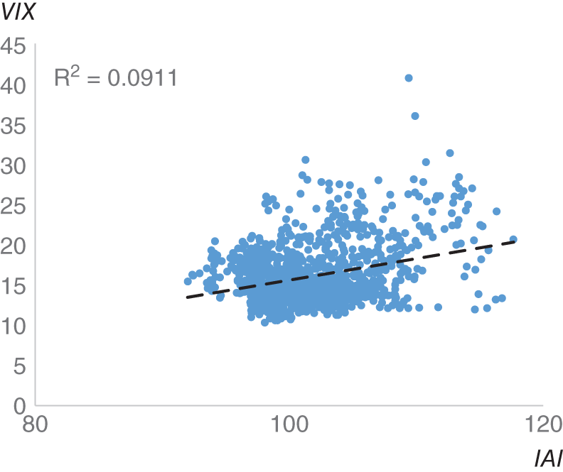
FIGURE 16.6 IAI vs VIX.
Source: Based on data from Cuemacro, Investopedia.
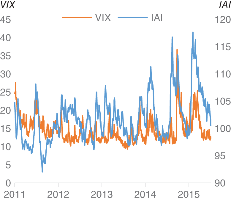
FIGURE 16.7 IAI vs VIX as a scatter plot.
Source: Based on data from Cuemacro, Investopedia.
In Figure 16.8 we show the cumulative returns of all three strategies from the paper. We see that the strategy with the lowest risk-adjusted returns in our sample is long-only exposure to S&P 500. Both active filters (VIX and IAI) outperform long only S&P 500. We note that the IAI-based filter has the highest risk-adjusted returns and lowest drawdowns of all three strategies. This suggests that there is additional value in using IAI as an indicator for investor fear compared to using VIX.
In the next few sections, we continue along this theme of using web-based traffic data to generate trading signals for financial markets, this time looking at page views on Wikipedia.
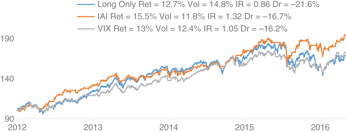
FIGURE 16.8 Trading S&P 500 with IAI and VIX.
Source: Based on data from Cuemacro, Bloomberg, Investopedia.
16.5. USING WIKIPEDIA TO UNDERSTAND PRICE ACTION IN CRYPTOCURRENCIES
One of the first tasks we might want to undertake when researching a topic is a web search. This very often results in coming to a page on Wikipedia, the crowdsourced encyclopedia. ElBahrawy, Alessandretti, and Baronchelli (2019) use data associated with Wikipedia pages devoted to cryptocurrencies to understand price action. In particular, they examine the edit history and page views of these articles. Edit history can be viewed as a proxy for news volume and the creation of information. This contrast to page views can be seen as proxy for interest in the subject for an audience of nonexperts.
They note that there is a significant correlation (42%) between the daily number of Wikipedia page views and the price of bitcoin, and these correlations are robust over time. They show that, by and large, there is a relatively small number of individuals editing cryptocurrency pages and the editors seem largely to be experts in the field, judging by the number of similar pages in the area they also edit. Hence, they note that it is likely that the audience of viewers of these cryptocurrency pages are likely to be different from those people who create this content.
The authors focus on using page views to develop a trading strategy, given that edits tend be fairly sporadic (roughly every 10 days), as opposed to page views, which are obtainable on a high-frequency basis. They use a relatively high-frequency trading rule examining the daily changes in page views to trigger trading rules. The Wikipedia trading rule outperforms a baseline strategy that examines purely the price as an input and another randomized strategy. However, the authors note that the backtested results do not include any trading fees. The introduction of transaction costs would likely significantly impact returns of a relatively high-frequency trading rule. One way to reduce the impact of transaction costs would be to reduce the trading frequency. In Chapter 19, we explore the subject of liquidity in some depth in the FX market using a dataset from Refinitiv.
Next, we assess how online attention can be used to understand the EMFX market.
16.6. ONLINE ATTENTION FOR COUNTRIES TO INFORM EMFX TRADING
We have seen how web traffic can be a way to understand if, for example, investors are focused on particular payrolls releases or seek to understand price moves in cryptocurrencies. The rationale for this is that metrics like page views can be a way of measuring concern or “attention” about a particular topic. In this section, we expand on the idea of using “attention” to inform decision making. Predata analyzes web-derived traffic data. In particular, they filter this data for specific subsectors, which are likely to be most closely followed by professionals and academics.
Time series are then constructed that are representative of interest in these subsectors. There are, for example, time series for countries that give an idea of the overall online attention in that country on a particular day, which is our focus here. Figure 16.9 plots the Predata geopolitical volatility index for Turkey alongside USD/TRY 1M implied volatility. The Predata geopolitical volatility index is based upon online attention on web traffic related to the political situation. In this stylized example, we see that there does appear to be some relationship between these metrics at times. We note that jumps in Predata's index are sometimes accompanied by jumps in the implied volatility. However, it is not a universal. Indeed, there are times when spikes in geopolitical concerns are not always reflected in the market. This is likely just a reflection of the fact that markets are not always purely driven by geopolitical concerns but can be driven by other factors as well. However, this example does suggest that it is worth delving further into the relationship between markets and online attention.
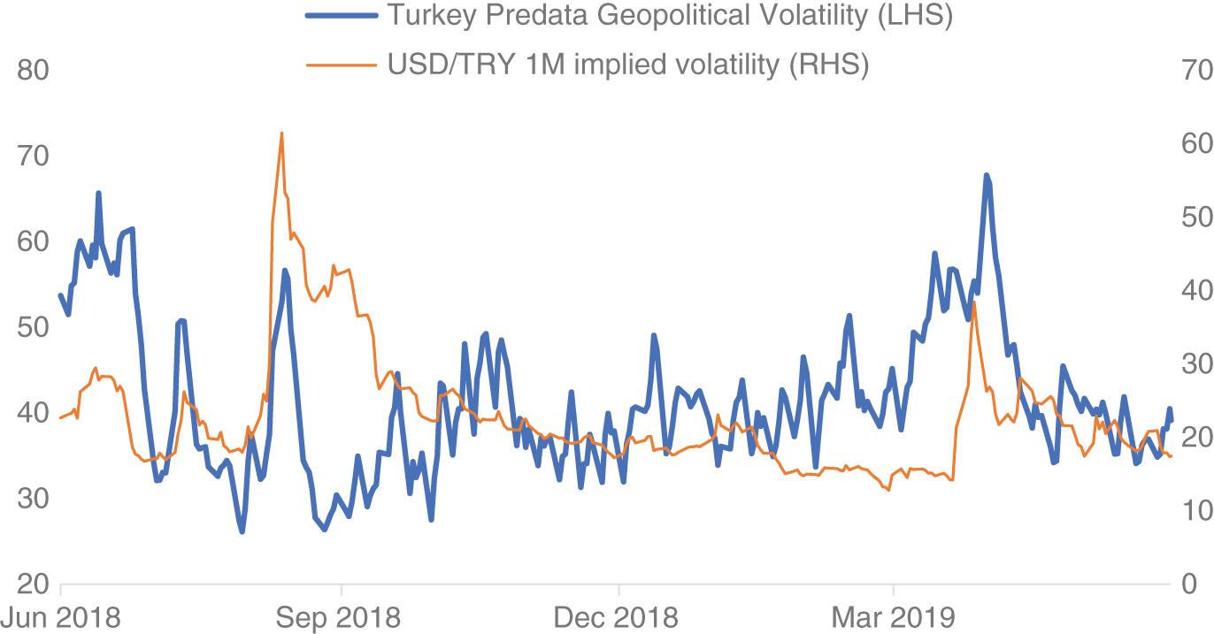
FIGURE 16.9 Turkey PVIX indicator vs USD/TRY 1M implied volatility.
Source: Based on data from Predata, Bloomberg.
Next, we look at more granular online attention data. Each country has a different array of subsectors that have been curated by analysts and specialists. These subsectors can include “attention” related to, for example, macroeconomy, microeconomy, foreign policy, or military. However, not every subsector is tracked for every country. For example, the subsector for “terrorism” is tracked for Turkey, given that it has historically been an important area of concern for that country. This contrasts with South Korea, where there is no “terrorism” subsector, given that it has not been a significant issue there historically. The web sources used in the construction of the various Predata indicators include both the official languages of each country and also English.
In Figure 16.10, we plot the macroeconomy subsector for Brazil based on English content and also content in Portuguese. The dataset is normalized between 0 and 1. For comparison, we have also included the number of articles on Bloomberg News that mention Brazil, which is relevant to the supply of news.
We have applied a 20-day SMA (simple moving average) to smooth the data (excluding weekend data). We see that while the subsectors do appear to have some sort of relationship, there are some divergences. The rationale is that English is likely to capture attention on a more international basis, whereas, obviously, Portuguese is likely to be more representative of local attention.

FIGURE 16.10 Comparing English attention with local content for Brazil.
Source: Based on data from Predata, Bloomberg.
We see that the metric for news mentions does appear to have some sort of relationship with both Predata indicators, as we might expect, but again there are divergences. As we noted in the section on payroll article readership, the supply of information and the demand for information are likely to be different quantities. It is not necessarily the case that just because something has been written about, it will capture the interest of readers.
We can explore this idea further by investigating the difference between demand for information and the quantity of news that is written. In order to do this, we construct an indicator by calculating the ratio of attention on the macroeconomy versus news mentions for that same country. We use Bloomberg News as our source of news mentions. This ratio will therefore give us the attention, which has been normalized for the amount of news available for a country. We will use this ratio as a basis of a trading rule. We will apply the following rule to a number of emerging market currencies across a number of regions (IDR, INR, BRL, TRY, MXN, and RUB):
- When attention is greater than that suggested by the news mentions (i.e. the ratio is above its 20D SMA), we sell the currency of that country versus USD.
- When attention is less than that suggested by the news mentions (i.e. the ratio is below its 20D SMA), we sell the currency of that country versus USD.
The idea is that we can strip out the part of the attention that might purely be driven by the supply of news. Hence, when there is a lot of attention, when adjusted for the supply of news, it is likely to be bullish. Conversely, a lack of attention is likely to be bearish, when we have taken into account the amount of news available.
In Figure 16.11, we present the cumulative returns of a basket of IDR, INR, BRL, TRY, MXN, and RUB that have been actively traded based on this “attention”-based trading strategy between 2016 and 2019 versus USD. Carry and transaction costs are included. We also assume an equally weighted notional across each currency pair. As a benchmark, the cumulative returns of a long-only EM versus USD basket are plotted alongside it.
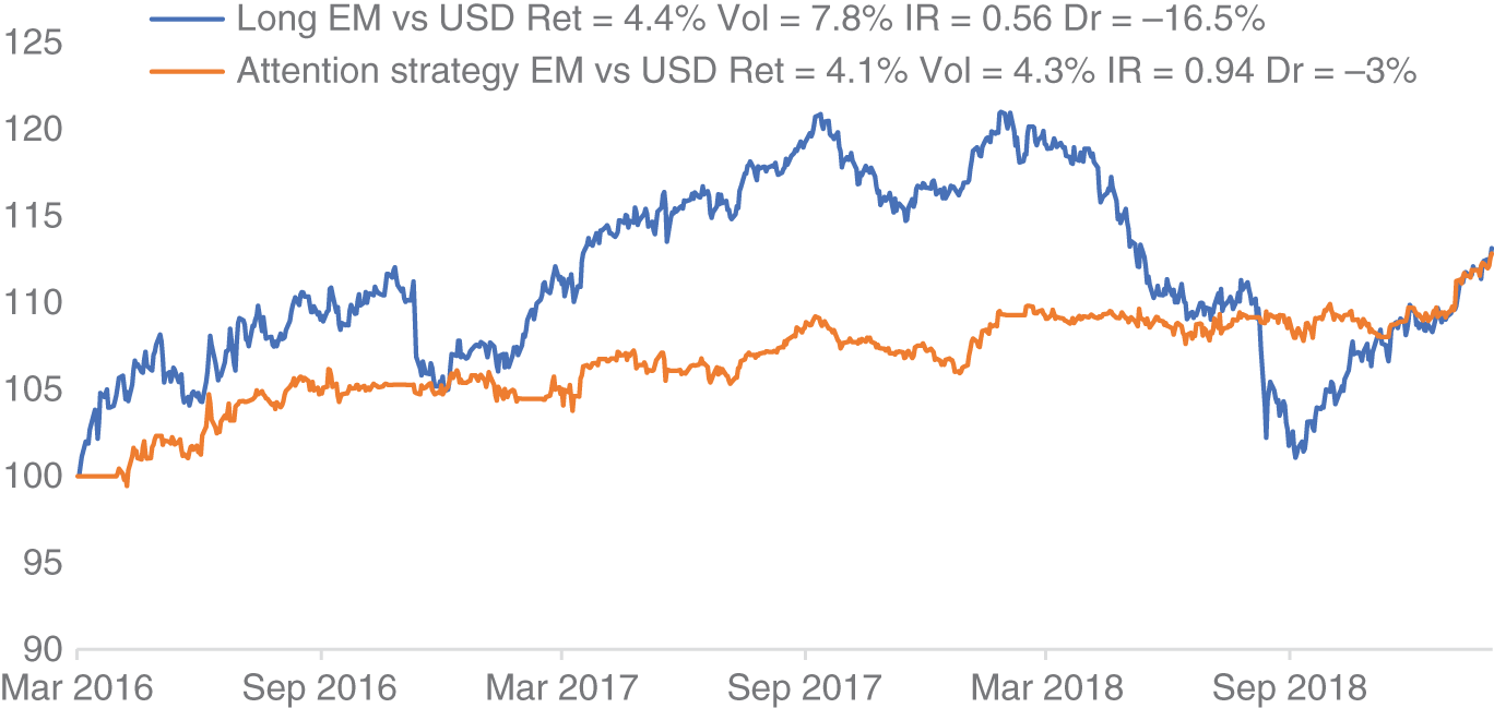
FIGURE 16.11 Trading a basket of EM currencies using macroeconomy “attention.”
Source: Based on data from Predata, Bloomberg.
The returns of both the active strategy and the long-only benchmark are relatively similar over the full sample. However, the information ratio of the active strategy is considerably higher. Furthermore, the drawdowns of the benchmark are considerably higher, compared to the actively traded strategy, as is the volatility. Hence, overall the risk-adjusted returns are much higher when adopting an attention-based strategy for EM. It does seem to suggest that measures of “attention” have been useful historically for trading emerging market currencies.
Further work could be done to investigate whether country-based attention measures can be useful in understanding currency volatility.
16.7. SUMMARY
It seems intuitive that being able to track investor interest should help us to understand what is driving the markets. The concept of investor attention is subtly different from that of news volume. Indeed, as discussed in the chapter, news demand is different from news supply. While journalists will endeavor to write what is likely to be read, it is not always the case that readership will tally with this.
In this chapter, we discussed several different ways of understanding investor attention, such as deciphering search data, looking at Google Trends data and also search traffic associated with Investopedia. Later, we looked at examining page views and edits on Wikipedia in the context of cryptocurrencies. We showed how combining different datasets on news supply (Bloomberg News volume) and online attention (based on, for example, Predata datasets) can be used to trade EMFX profitably on a historic basis.