Overview
By the end of this chapter, you will be able to append audio and video elements to a web page; create custom controls for media playback; implement different ways of adding images to a web page and evaluate the pros and cons of each; and create and animate graphics using the canvas element.
This chapter aims to get you acquainted with the visual and audio elements that you can add to a web page. By adding audio, video, and image elements to a web page, we can improve the visual interest of it and add content that will enrich our users' experience in a way text alone cannot.
Introduction
In the previous chapter, we laid the foundations of our web pages by learning about structural elements, how to style text, and how to add interactive forms.
In this chapter, we will learn about elements that we can use to greatly enrich the experience a user has on a web page. We will look at how we can showcase video, music, images, and programmatic art on our web pages.
With the advent of HTML5, powerful tools for rich interaction have become available in the browser. We can now embed video and audio directly in a web page. We can use the canvas to draw interactive graphics and make games. Previously, you would have needed a plugin such as Flash or Silverlight to be able to show a video or play a song in the browser.
There are so many reasons to add these elements to a web page. We can use images as content in a blog or a news article. We can use images and video to showcase a product in a catalog or on an e-commerce site. Logos and images can be used to add a visual style to a web page or brand. Video is often used for adverts on web pages and also to showcase content on sites such as Vimeo and YouTube. With audio embedded in a web page, you can provide your own radio channel online or release a podcast that is easily accessible to users of your web page.
Animation can further enrich the style of – and even give personality to – a web page. You will learn more about that topic in the next chapter.
By adding a media player to the case study website, we will see how we can use the video and audio elements to playback media, and how we can style the controls for a media player. We will then see how the canvas element can be used to add graphical effects for video effects, visualizing audio, and animation.
Audio
If we want a user of our web page to listen to our weekly podcast without leaving the page or we want them to be able to hear our latest song recording or mixtape, we can do so in HTML5 with the audio element. The audio element allows us to embed audio in a web page.
The audio element can have a single audio source as an src attribute or as a source element, or it can have multiple audio sources (in which case, these are added as children of the audio element as a list of source elements). We will look at how and why we would want to provide multiple sources for an audio file later in this chapter. Until then, we will only consider the MP3 format, which is one of the most commonly used formats for music and audio tracks.
Let's look at a basic example:
<audio
controls
src="media/track1.mp3">
It looks like your browser does not support <code>audio</code>.
</audio>
This simple example will load a single audio source and provide your browser's default interactive controls for you to play the audio.
We have added content between the opening and closing <audio></audio> tags. This content acts as a fallback on browsers that do not support the audio element. Most modern browsers do support the audio element, but it is still a good idea to provide a fallback message to let users of older browsers know that they aren't able to play the content back.
We added the controls attribute to allow you to play the audio. The audio will not automatically play in the browser. We will look at the various attributes that are available for the audio element in the next section.
If an audio element has no controls and is supported by the browser, that element will not appear on the web page; instead, it will load the audio referenced in the src attribute.
Having looked at an example of an audio element being embedded in a web page, let's try it out.
Exercise 7.01: Adding Audio to a Web Page
In this exercise, we will add an audio element to a web page. We will use the browser's default controls and a provided audio track. The steps are as follows:
- First, we will create a web page. Create a new HTML file and name it Exercise 7.01.html. Then, copy and paste the following code to create a minimal web page with a container (audio-container) for our audio player:
<!DOCTYPE html>
<html lang="en">
<head>
<meta charset="utf-8">
<title>Exercise 7.01: Audio</title>
</head>
<body>
<div class="audio-container">
</div>
</body>
</html>
- Create a directory called media and download the audio track, track1.mp3, into it. We will use this audio track as the source for our audio element.
- Next, we need to add the audio element to embed the audio track source in our web page. We will add an audio element to the div.audio-container element and set the controls attribute so that we can control the audio playback from our web page:
<div class="audio-container">
<audio id="audio-1" src="media/track1.mp3" controls>
Your browser does not support the HTML5 <code>audio</code> element.
</audio>
</div>
- Save the page. The full code listing is as follows:
<!DOCTYPE html>
<html lang="en">
<head>
<meta charset="utf-8">
<title>Exercise 7.01: Audio</title>
</head>
<body>
<div class="audio-container">
<audio id="audio-1" controls src="media/track1.mp3">
Your browser does not support the HTML5 <code>audio</code> element.
</audio>
</div>
</body>
</html>
- Now right-click on the filename in VSCode on the left-hand side of the screen and select open in default browser, shows the result of this code that is, we can now play the audio track from our web page.
The following screenshot shows the media controls provided by Google Chrome:

Figure 7.1: Chrome media controls playing audio
In this exercise, we have learned how to add an audio track to our web page. We have learned how to create an audio element and how to add the controls attribute to the audio element, allowing us to play and control the audio playback with minimal effort.
Next, we will look at the audio element in a bit more detail by considering the attributes we can use to modify the audio playback before we look at our options for customizing the controls a user has for audio playback.
Attributes
The following attributes can be used to modify the audio element:
- autoplay
- preload
- loop
- controls
The Autoplay Attribute
The autoplay attribute is a Boolean that lets the browser know to start the audio track as soon as it has enough information to do so. The whole file does not need to download before playback begins.
If you decide to use the autoplay attribute for any reason, be very careful with it. Not many users appreciate music or sound blaring out from a web page without them having any control over it. It is much better to give the user control over starting and stopping audio and this can be done with the controls attribute or with your own custom control UI.
While there are some valid use cases for autoplay, including working with switching audio sources in a web app or game, the different autoplay policies of various browsers can be a bit difficult for developers to work with. We'll look into autoplay in a bit more detail later, in the Limitations section.
The preload Attribute
The preload attribute lets you tell the browser how you would like it to handle the loading of media sources. The attribute has a few options:
- none: The audio will not be preloaded.
- metadata: The browser will load audio metadata but not the whole file.
- auto: This is the same as an empty string; that is, preload="" – the whole audio file will be downloaded.
Different browsers handle the default preload behavior in different ways. The W3C HTML5 specification recommends that the default setting is metadata. In most use cases, preloading metadata is the preferred method because this gives us enough information to tell the user about the audio but does not load the rest of the audio file until the user has clicked play. This prevents unnecessary loading, which can be quite costly for those on mobile plans with limited data.
You can see the difference in behavior between a preload value of none and metadata in the following screenshots. In Firefox (version 66.0), in the Network data section, at the bottom of each image, you can see that when preload is set to none, there is no network traffic and for preload set to metadata, 560 KB of an audio file has been loaded. The loaded metadata means the browser can include the duration of the audio in the user interface (UI) and will have to load less data before playback can commence.
The following screenshot shows the network activity of the browser when an audio element has the preload attribute set to none. It shows that no part of the audio file has been downloaded:

Figure 7.2: Preload attribute set to None
In contrast to the preceding screenshot, the following screenshot shows the network activity of the browser when an audio element has the preload attribute set to metadata. It shows that part of the audio file has been downloaded, allowing the user to get information about its duration:

Figure 7.3: Preload attribute set to metadata
The loop Attribute
The loop attribute is a Boolean attribute that loops the audio back to the beginning once the end of the audio track has been reached.
An example use case is in an HTML5 game where, in addition to sound effects that play once, we may want a background score to play in a loop during a level.
The controls Attribute
The controls attribute adds the default media controls for the browser. This allows a user to control the playback of audio. While the browser's media playback UI shares many common features (volume, mute toggle, and scrub bar, to name a few), the style of these controls varies greatly. The following screenshot shows more examples:

Figure 7.4: Default audio controls in the Firefox, Chrome, and Edge browsers
Styling Audio Controls
The default controls provide a lot of functionality for free. They may well be all that you need. However, as you've seen, the styles are different for each browser and may not fit with your own design or requirements. The best option for customizing the controls is to not set the controls attribute and to create your own custom controls with HTML, CSS, and a little bit of JavaScript.
In the next exercise, we will look at how to style our own audio controls. This means we can create custom media players and keep the style in sync with our web page's look and feel.
Exercise 7.02: Styling Controls
In this exercise, we will add a minimal set of custom controls to our audio player. We will then style the controls. The behavior will be handled by JavaScript, which we will add with a script element. The design of the controls will be handled with CSS.
We will use a minimal amount of JavaScript in this exercise to handle some events from the audio element and to trigger playback. A thorough explanation of JavaScript is beyond the scope of this book, but we will provide an explanation of the small snippets that are used in the exercise.
The steps are as follows:
- We start by creating a new file, which we will name Exercise 7.02.html. We will copy this basic web page structure into the file and save it:
<!DOCTYPE html>
<html lang="en">
<head>
<meta charset="utf-8">
<title>Exercise 7.02: Styling Controls</title>
</head>
<body>
</body>
</html>
- In the body element, we want to add a wrapper div with the audio-player class and add our audio element in it. We deliberately do not want to set the controls attribute on the audio element:
<div id="audio-player" class="audio-player">
<audio id="audio-1" src="media/track1.ogg">
Your browser does not support the HTML5 <code>audio</code> element.
</audio>
</div>
- Next, we will add another wrapper, div.audio-controls, after the audio element. In there, we will add buttons for playing and pausing the audio track and information for the duration of the track and the time played so far. The markup looks like this:
<div id="audio-player" class="audio-player">
<audio id="audio-1" src="media/track1.ogg">
Your browser does not support the HTML5 <code>audio</code> element.
</audio>
<div class="audio-controls">
<button id="play-btn" class="button">Play</button>
<button id="pause-btn" class="button">Pause</button>
<div class="audio-status">
<span id="played">00:00</span> / <span id="duration">00:00</span>
</div>
</div>
</div>
- Next, we can add some initial styles to the audio player. We'll add a style element just beneath the title element in the head of the HTML document. We will also set the font and text color for the .audio-player and .audio-controls class selectors, respectively:
<style>
.audio-player,
.audio-controls {
color: white;
font-family: Arial, Helvetica, sans-serif;
font-size: 16px;
font-weight: 200;
}
</style>
- We want to style the .audio-controls container as a media player. We'll give it a dark background, light border, and rounded rectangle shape (with border-radius). We'll also use the flex box to control the layout of the children of .audio-controls:
.audio-controls {
align-items: center;
background-color: #0E0B16;
border: 3px solid #E7DFDD;
border-radius: 30px;
display: flex;
justify-content: space-between;
max-width: 240px;
padding: 8px;
}
The result of our styles, so far, can be seen in the following screenshot:

Figure 7.5: .audio-controls styled
- We want to make the Play and Pause buttons stand out more. By default, button elements have an appearance property with a value of button, which sets the appearance to that of the browser's native button. By setting this property to none, we can easily style the buttons. Add the following at the bottom of the style element:
.audio-controls .button {
-webkit-appearance: none;
appearance: none;
background-color: #4717F6;
border: 1px solid #E7DFDD;
border-radius: 16px;
cursor: pointer;
outline: none;
padding: 4px 16px;
text-transform: uppercase;
}
- We will also add the button class selector to the CSS ruleset for handling the text color and font size at the top of our style element:
.audio-player,
.audio-controls,
.audio-controls .button {
- We want to control what appears, depending on the state of the audio player. A data element data state will be added to the .audio-player element via our JavaScript. We can use this to control styles with the attribute selector:
[data-state="playing"] #play-btn,
[data-state="paused"] #pause-btn {
display: none;
}
- For the audio player to control our audio element, we need to use JavaScript. We will add a <script> element beneath the div.audio-player element. We'll use document.getElementById to select the elements that are used by the audio player using their ID attributes:
<script>
const audioPlayer = document.getElementById('audio-player');
const audio1 = document.getElementById('audio-1');
const playButton = document.getElementById('play-btn');
const pauseButton = document.getElementById('pause-btn');
const duration = document.getElementById('duration');
const played = document.getElementById('played');
Note
In JavaScript, the const keyword is used with a name to create a constant value. We can store anything (DOM element, number, string) in it, but trying to replace it later will not work. If you need to replace the value, you can use the let keyword.
- We will set the data-state attribute for the audio player to the "paused" value initially:
audioPlayer.dataset.state = "paused";
- Next, we want to add a click event handler – that is, a function that will be triggered when the user clicks the button – to the Play and Pause button. This will change the state of the audio player and set the audio track to play or pause:
playButton.addEventListener("click", function() {
if (audioPlayer.dataset.state === "paused") {
audio1.play();
audioPlayer.dataset.state = "playing";
}
});
pauseButton.addEventListener("click", function() {
if (audioPlayer.dataset.state === "playing") {
audio1.pause();
audioPlayer.dataset.state = "paused";
}
});
- Finally, we will set the time played and duration text based on the duration and currentTime values of the audio. We will use event listeners for loadedmetadata and timeupdate to set these values when the time has updated and the duration is known. We've added a formatTime function to format the time value as minutes and seconds (mm:ss):
audio1.addEventListener("loadedmetadata", function(event) {
duration.textContent = formatTime(audio1.duration);
});
audio1.addEventListener("timeupdate", function(event) {
played.textContent = formatTime(audio1.currentTime);
});
function formatTime(time) {
const minutes = Math.floor(time / 60);
const seconds = Math.round(time) % 60;
return `${
minutes < 10 ? "0" + minutes : minutes
}:${
seconds < 10 ? "0" + seconds : seconds
}`;
}
</script>
If you now right-click on the filename in VSCode on the left-hand side of the screen and select open in default browser, you will see a simple but usable HTML audio player:

Figure 7.6: The play state of our styled audio player
The paused state of our player will look as follows:

Figure 7.7: The pause state of our styled audio player
In this exercise, we have learned how to style the controls for an audio player. Using a small amount of JavaScript and data attributes to maintain the state of our audio player, we are able to create our own custom audio controls for a web page.
Next, we will look at adding more than one source to an audio element. This can be useful because browsers have varying support for audio formats.
Multiple Sources
While it is easy to get started with the audio element, browser support for different audio formats adds some complexity. Due to licensing issues and other historical reasons, not all codecs (mp3, ogg, and so on) are supported by all browsers. Because of this, it is recommended to support several formats when you publish audio on the web.
The webm format has good browser support and is optimized for loading on the web. However, there are a few browsers that don't support WebM (such as IE 11). The MP3 format is well supported and is used a lot for music. A good open source option is ogg, which is also well supported.
Note
You can learn more about media formats and browser compatibility from MDN at https://packt.live/33s2I6V.
Happily, the audio element provides nice support for multiple sources with the source element. The following is an example of this:
<audio controls>
<source src="media/track1.webm" type="audio/webm">
<source src="media/track1.mp3" type="audio/mpeg">
<source src="media/track1.ogg" type="audio/ogg">
It looks like your browser does not support <code>audio</code>.
</audio>
Rather than setting the src attribute of the audio element, we have set three source elements as children of the audio element. Each source element refers to a different audio source. We have also provided a type attribute for each source element to let the browser know the MIME type of the referenced audio source file.
The order of the source elements is important. The browser will attempt to play the first element but, if that codec is not supported, the browser will try the next source and then the next, and so on until it runs out of options.
The video Element
The video element and the audio element are both HTML media elements and have a lot in common. It is even possible to play audio files with the video element and video files with the audio element. The main difference is that the video element provides a display area.
Attributes
The video element shares most of its attributes with the audio element. There are a few additional attributes to do with the display area:
- height
- width
- poster
The width and height Attributes
The width and height attributes set the width and height of the video display area, respectively. Both values are measured in absolute pixel values – in other words, the values must be non-negative integers and they cannot be percentages.
The poster Attribute
The poster attribute allows you to provide the source for an image that will be shown while the video is being downloaded. If we do not set the poster attribute, a blank square will appear until the first frame of the video has been downloaded, and then the first frame of the video will show in place of the poster image.
Exercise 7.03: Adding Video to a Web Page
In this exercise, we will add a video element to a web page to embed a video. We will use the default browser controls, just like we did with the audio element.
The steps are as follows:
- Create a file, Exercise 7.03.html, copy the following code into that file, and save it. This will create the outline for a simple web page:
<!DOCTYPE html>
<html lang="en">
<head>
<meta charset="utf-8">
<title>Exercise 7.03: Video</title>
</head>
<body>
</body>
</html>
- In the body element, we will add a div element to contain the video player with the video-container class. In that container, we will add our video element:
<div class="video-container">
<video id="video-1">
Your browser does not support the HTML5 <code>video</code> element.
</video>
</div>
- We will add a poster attribute to the video element to show an image while the video is loading, and a controls attribute to show the browser's default controls for media playback:
<video id="video-1" poster="media/poster.png" controls>
- We will add some source elements in several formats to the video file. Here, we are adding a WebM and MP4 version of the same video. The WebM format is designed especially for the web but is not supported in all browsers:
<video id="video-1" poster="media/poster.png" controls>
<source src="media/html_and_css.webm" type="video/webm">
<source src="media/html_and_css.mp4" type="video/mp4">
Your browser does not support the HTML5 <code>video</code> element.
</video>
- We will add a style element in the head of the HTML document and add rules to resize the video according to the size of the web page and to control the maximum size of the video:
<style>
.video-container {
max-width: 1080px;
margin: 16px auto;
}
.video-container video {
width: 100%;
}
</style>
If you now right-click on the filename in VSCode on the left-hand side of the screen and select open in default browser, you will see a video player in the browser, similar to what's shown in the following screenshot:

Figure 7.8: HTML video with a poster frame
In this exercise, we have learned how to embed a video in a web page using the HTML5 video element. We have added a poster image to that video and used the default browser controls for playback.
Next, we will consider some limitations of the media elements in HTML5.
Limitations
There are some limitations to the HTML audio element that can add complexity during development. These behaviors are different depending on how browsers and different devices implement the audio and video elements.
On most mobile devices, limitations on downloading content without the user's approval have been put in place to prevent a browser using up data allowance. Audio and video files, especially high-quality and stereo formats, can be very large.
One common policy is to only allow audio content to play when user input is recorded. This may mean content can only play when the user presses the Play button, even if we set the preload and autoplay attributes on a media element. This can be particularly problematic if you are using media in a JavaScript application, such as a game, and you want to have full control of media playback and loading.
On an iPhone, the volume at which audio plays in the browser is tied into the device's volume controls and cannot be controlled with JavaScript.
Another common policy is that you can preload and autoplay video content but only with the muted attribute set on the video element.
Note
You can learn more about various restrictions and policies from the browser vendors from a variety of sources. For example, good information about Safari and iOS can be found here: https://packt.live/2CivkDQ.
Information on autoplay in Chrome can be found here: https://packt.live/2qrGTWH.
These policies are not defined by a standard and are subject to change as the browser vendors try their best to serve a diverse audience.
The track Element
The track element lets us specify a time-based text track that has some relationship to a media element. This means we can show text at time cues that are synchronized with media playback.
Using the track element, we can make our video and audio accessible to more users. This can be used to provide subtitles, closed captions, or a description of media content that may not otherwise be accessible to users for various reasons such as blind users and users with hearing difficulties or technical or contextual restrictions that mean the user cannot play sound.
Similar to how we can use the source element with video and audio, we can add multiple track elements to one media element and these can have different relationships to the media or provide different language translations of the content.
The following attributes let you modify a track element:
- src: The location of the external file with the text track.
- default: One track element per media element can be set as the default track. This attribute acts as an indication and it may be overridden by user settings (such as language).
- kind: Specifies how the text track is supposed to be used. There are several options, including subtitles, captions, descriptions, chapters, and metadata. The default value is subtitles. The difference between subtitles and captions may not be entirely obvious; the former is meant for the translation of content that a user may not understand, for example, a non-English dialogue in an English film, while the latter is more suited to users who are deaf or for when content is muted.
- srclang: The language of the track text; for instance, en for English, fr for French. If the track is a subtitle track, then srclang is required.
- label: A human-readable title that's used to differentiate between captions and subtitles.
Take a look at the following example code to see how the following track labels would appear in Chrome's video controls as caption options:
<track src="media/track1-en.vtt" kind="subtitles" label="English subtitles">
<track src="media/track1-sparse.vtt" kind="captions" label="Sparse captions">
<track src="media/track1-full.vtt" kind="captions" label="Full captions">
The following screenshot shows the output for the preceding code:

Figure 7.9: Caption options with multiple tracks in Chrome
Adding Subtitles
The most common format for text tracks used on the web is Web Video Text Tracks Format (WebVTT). The format is a plain text means of describing timestamps and captions. A full explanation is beyond the scope of this book, but here's a simple example:
WEBVTT
00:00:01.000 --> 00:00:05.000
First subtitle text
00:00:10.000 --> 00:00:25.000
Second subtitle text
The first line declares that the file is in the WebVTT format. The rest of the file consists of cues. Each cue is separated by a blank line and has a starting time and ending time separated by the --> string. On the next line, the text content of the subtitle or caption is presented.
Exercise 7.04: Adding Subtitles
In this exercise, we will add two WebVTT files to a video player to provide subtitles for a video. When we turn captions on, we can see how this is presented in the browser. The steps for this exercise are as follows:
- We will start with the final source code from the previous exercise, which gives us a video element with default browser controls:
<!DOCTYPE html>
<html lang="en">
<head>
<meta charset="utf-8">
<title>Exercise 7.04: Adding Captions</title>
<style>
.video-container {
max-width: 1080px;
margin: 16px auto;
}
.video-container video {
width: 100%;
}
</style>
</head>
<body>
<div class="video-container">
<video id="video-1" poster="media/poster.png" controls>
<source src="media/html_and_css.webm" type="video/webm">
<source src="media/html_and_css.mp4" type="video/mp4">
Your browser does not support the HTML5 <code>video</code> element.
</video>
</div>
</body>
</html>
- We will save a new WebVTT file to media/subtitles-en.vtt. The content of the file will be as follows:
WEBVTT
00:02.000 --> 00:04.000
HTML and CSS Video
00:06.000 --> 00:15.000
Hi, I'm Brett Jephson. I'm the author of this chapter on Video, Audio, and Canvas in HTML5.
00:16.000 --> 00:23.000
In this part of the lesson, we've learned to add subtitles to a video element.
- Next, we will save another new WebVTT file to media/subtitles-es.vtt. The content of that file is as follows:
WEBVTT
00:02.000 --> 00:04.000
HTML y CSS Video
00:06.000 --> 00:15.000
Hola, soy Brett Jephson. Soy el autor de este capítulo sobre Video, Audio e Imágenes en HTML5.
00:16.000 --> 00:23.000
En esta parte de la lección, hemos aprendido a agregar subtítlos a un elemento de video.
- We want to add a track element to the video element, after the source elements, to provide the English subtitles as the default:
<track src="media/subtitles-en.vtt" kind="subtitles" label="English" srclang="en" default>
- Next, we want to add a track element for the Spanish subtitles:
<track src="media/subtitles-es.vtt" kind="subtitles" label="Español" srclang="es">
If you now right-click on the filename in VSCode on the left-hand side of the screen and select open in default browser, you will see the following image, the English subtitles track is shown over the video in the browser during video playback:
Figure 7.10: A video element with English subtitles
In the following still, the Spanish subtitles track is shown at the same point in the video playback:
Figure 7.11: A video element with Spanish subtitles
In this exercise, we have learned about WebVTT and how we can add captions to a video or audio to make media playback more accessible to those who cannot hear the sound.
In the next part of this chapter, we will look at the ways we can embed images in a web page. We will look at several HTML elements that are available for the task and the different use cases they are for.
Images
When you want to add images to a web page, there are several options available. Each has its advantages and disadvantages.
The approaches we will look at for embedding images in a web page are:
- The img element
- The picture element
- Programmable graphics
We will consider each of these approaches one by one.
The img Element
We encountered the img element in Chapter 1, Introduction to HTML and CSS, but to recap, the simplest approach to embed an image into a web page is to add an external image file using the img element.
We specify an src attribute for the image file we want to embed. This could be a file location or a data URI.
For accessibility, it is important that you provide an alt attribute for any img element that is not pure decoration. This provides an alternative text description of the image for users who cannot see the image, for example, screen reader users and users with image loading blocked.
Here is an example img element:
<img src="media/poster.png" alt="HTML and CSS poster">
The picture Element
The picture element is similar to the img element but lets you set multiple image source elements and specify rules for why the image will be the one to appear. This is best illustrated with an example:
<picture>
<source srcset="media/poster-small.png" media="(max-width: 639px)">
<source srcset="media/poster-large.png" media="(min-width: 800px)">
<img src="media/poster.png" alt="HTML and CSS poster">
</picture>
In this example, we have a picture element with two source elements and an img as a fallback. Both source elements have a media attribute.
The browser will pick the most appropriate image source. It will start at the first source element. It will test whether the condition set out by the media attribute is true. In this case, this condition is whether the width of the viewport is 639 pixels or less. If the condition is met, it will show that image and if not, it will try the next source element. If the viewport is 800 pixels or more, it will show the second source element. Finally, if neither condition is met or the picture element is not supported, the browser will show the fallback image element; that is, the last child of the picture element. The following diagram is a flow chart of this logic:

Figure 7.12: Flow chart of the responsive logic of the picture element
The condition can be a media query or it can be based on a type of image format; for example, if the type attribute was specified with a mime type that the browser can handle.
The img element fallback is required for browsers that don't support the picture element (such as Internet Explorer 11) as a default if no other source elements apply. Without it, no image will be shown, regardless of whether a source element's condition is met.
We will learn more about how we can handle the embedding of images for different display sizes and different device pixel densities in Chapter 6, Responsive Web Design and Media Queries.
Programmable Graphics
As well as loading and embedding rasterized image files, such as .jpeg, .gif, .png, and .webp, on a web page, there are some options for creating graphics programmatically:
- Scalable vector graphics (SVG) is an XML-based format for creating vector graphics on web pages.
- The canvas element gives you access to a JavaScript drawing API that you can use to create rasterized graphics on a web page.
The svg Element
An increasingly popular option and one that provides a lot of power for small file sizes is to use SVG to render vector graphics on a web page. SVG is a declarative XML-based format for defining vector graphics. Vector graphics are really useful for responsive design because they are mathematically defined and can be scaled without causing blurring. It is an extensive technology with shape and path drawing, filters, and animation capabilities. It is largely beyond the scope of this book, but we will look at a simple example to give you an idea of how it can be used to create graphics on web pages.
As an example, let's look at the SVG markup for a simple icon that could be used as a Play button icon for our media player:
<svg viewBox="0 0 100 100" xmlns="http://www.w3.org/2000/svg" width="100" height="100">
<circle cx="50" cy="50" r="48" fill="#4717F6" />
<path d="M 85,50 25,75 25,25 z" fill="white" />
</svg>
The XML format should be quite familiar. HTML5 is not a strict XML format but is syntactically similar.
The graphic declarations are nested in an svg element. In the svg element, we set a namespace value with the xmlns attribute. This lets the browser know the SVG version and the contents of the svg element.
We also set a viewBox attribute. Here, we have set the viewBox to have an x-coordinate of 0, a y-coordinate of 0, and dimensions of 100. The viewBox does not represent pixels but a rectangular viewport in the userspace. We can scale this by setting the width and height attributes on the svg element. The coordinates on the children will always stay relative to their position in the viewBox.
Within the svg element, we draw a circle with its center at the x-coordinate of 50 and the y-coordinate of 50. This means that, because our viewBox for the svg element has a width and height of 100, the circle will be centered. It has a radius of 48, which almost fills the view box. We have given the circle a fill color with an RGB hex-value #4717F6, which is the same as the background color of the button in our audio player styling exercise.
The second child of the svg element is a white path, which defines the three points of a triangle. This is given the fill color of white. This child will be drawn above the circle.
In the following screenshot, we can see the image as it would appear rendered in the browser:

Figure 7.13: The svg play button
SVG is often a really good choice if you are making graphics for a website. You can scale and change the graphics with CSS or attributes in markup. The graphics stay clean and sharp at different scales without pixelation. SVG is generally more accessible than the canvas element and doesn't require JavaScript to draw shapes.
It is not a good choice if you want direct control over pixels and, when there are a lot of shapes, it can create performance issues as the CPU is used to do a lot of mathematical calculations to work out what is being drawn. For these needs, the canvas element should be considered.
The canvas Element
You can programmatically render rasterized graphics with the canvas element. To do this, we use a drawing API in JavaScript. The API is quite low-level but allows you to create a great variety of graphics in the canvas element. We can also use the power of JavaScript to animate the canvas.
The canvas element has two commonly used rendering modes: 2D and WebGL. While WebGL provides a lot of power with shader support as well as GPU acceleration, it is beyond the scope of this book to look into this. However, we will be looking at some 2D examples.
SVG is a great solution for graphics such as icons that can appear in lots of sizes and where we may want to control the color with CSS. It has become more and more popular as a format with the rise of responsive design.
canvas is often used for programming art in creative coding and games. You can replace individual pixels with this tool, so it is good for producing effects on photos or videos. Browsers have better support for hardware acceleration in canvas than they do SVG and this means it has faster performance and consumes less processor, which can be useful on mobile devices or when you want to draw a lot of objects at once.
Checking for canvas Support
Before we can use the canvas element to render 2D graphics, we need to check that the element is supported by the browser. We do this by first creating a canvas element and then, with JavaScript, we check that the canvas element has a context of the type we request. Options for context include '2d' and 'webgl'.
With the help of the succeeding code, we could check that our context is supported. If we can get a 2D context, we can begin to draw in it. It is also worth pointing out that any children nested in the canvas element will appear as a fallback in case the browser does not support the canvas element. The fallback can be used to provide an image or an appropriate message. Here is the code:
<canvas id="canvasArea" width="320" height="240">
Your browser does not support the <code>canvas</code> element.
</canvas>
<script>
const canvasElement = document.getElementById('canvasArea');
if (canvasElement.getContext) {
const context = canvasElement.getContext('2d');
// we have a context so we can draw something
}
</script>
Drawing in canvas
The canvas context provides us with a number of commands we can use to set styles and draw primitive shapes, text, and images in the canvas element. A complete guide to programming for the canvas element is outside the scope of this book, but let's look at some of the most commonly used commands before we try them out in an exercise.
The canvas Grid
When working with the canvas, it is important to understand how its coordinate system works.
The coordinate system for the canvas starts at the top-left corner with the x and y coordinates at 0. When moving to the right, the x value increases. When moving down, the y value increases. A unit in the canvas is 1 pixel as it relates to the natural size of the canvas (the size we set with the width and height attributes of the canvas).
The following diagram represents this canvas coordinate system diagrammatically, with a rectangle drawn on the canvas:

Figure 7.14: canvas coordinate system
Most of the commands in the canvas context require an x and y coordinate.
Drawing a Rectangle
To draw a square or rectangle with a fill color, we need to use the fillRect method in the canvas context. We give the fillRect method four numbers: x- and y-coordinates for the top-left corner and a width and height. To set the color that the rectangle will be filled with, we first need to set a fillStyle on the context. The fillStyle property can be any of the values that you could use in CSS.
When setting a color value, we can use all the same values as CSS will recognize the color or backgroundColor style properties, including color keywords such as black, blue, and white; hex values such as #354555; and rgba values such as rgba(35, 45, 55, 0.5). You will learn more about the options that are available in Chapter 5, Themes, Colors, and Polish.
To draw a red rectangle with the top-left corner at the x-coordinate of 50 pixels and the y-coordinate of 50 pixels and with a width of 150 pixels and a height 100 pixels, we could use the following code:
context.fillStyle = "red";
context.fillRect(50, 50, 150, 100);
The following figure shows the red rectangle, that is, the output of this code, on a canvas with a width of 320 pixels and a height of 240 pixels:

Figure 7.15: fillRect used to draw a red rectangle on the canvas
To draw a rectangle with an outline around it, rather than a color filling it, we can set strokeStyle on the context and again give it a color value. We can set the width of the line with the lineWidth property on the context. We can then use the strokeRect method on the canvas context to draw the rectangle.
For example, if we wanted to draw a red border around a rectangle and give it a line width of 4 pixels, we could write the following set of commands:
context.strokeStyle = "red";
context.lineWidth = 4;
context.strokeRect(50, 50, 150, 100);
The following image shows a rectangle drawn with a red border with a line width of 4 pixels:

Figure 7.16: strokeRect used to draw a rectangle with a border on the canvas
To draw a rectangle with both a stroke and a fill color, we can set both the fillStyle and strokeStyle properties on the context. We can then use the rect method to create the rectangle path and then use separate fill and stroke methods on the context to fill the rectangle and draw a border stroke around it.
The following list of commands can be used to draw a rectangle that is filled blue and has an orange border with a 4-pixel line width around it:
context.fillStyle = "blue";
context.strokeStyle = "orange";
context.lineWidth = 4;
context.rect(50, 50, 150, 100);
context.fill();
context.stroke();
The following image shows the rectangle drawn with an orange border and with a line width of 4 pixels and a blue fill:

Figure 7.17: Fill and stroke used to draw a rectangle with a border and fill on the canvas
We've seen how to draw a rectangle with a border and a fill color. Next, we will look at how we can draw a circle.
Drawing a Circle
To draw a circle, we need to use the arc method. The arc method receives up to six arguments. The first two arguments for the arc method are the x and y position of the center of the circle. The third argument is the radius of the circle. The next two arguments are the starting angle and the ending angle. The last argument is a true or false value that decides whether the arc is drawn anti-clockwise (true) or clockwise (false). The default value is false.
To draw a circle with a red fill, the center of the circle is positioned 50 pixels right and 50 pixels down from the top-left corner, and the radius of the circle is 25 pixels, as shown in the following code:
context.fillStyle = 'red';
context.arc(50, 50, 25, 0, Math.PI * 2, false);
context.fill();
The following image shows the resulting red circle:

Figure 7.18: Fill used to draw a red circle on the canvas
Note
2 π radians is equal to 360 degrees, so if we want to convert degrees into radians, we can use the following formula: degrees multiplied by π and divided by 180. To convert radians into degrees, we can do the opposite calculation with the following formula: radians multiplied by 180 and divided by π.
Clearing the canvas
Sometimes, we may want to clear the canvas, and we can do this with the clearRect command on the canvas context. You define a rectangle (x, y, width, and height) that you want to clear, which means you can clear all or part of a canvas.
When we want to clear the whole canvas, we can get the values of the canvas dimensions from the canvas element, where the width and height are stored. For example, if we wanted to clear the whole of a canvas stored as canvasElement, we would use the following clearRect command on the canvas context:
context.clearRect(0, 0, canvasElement.width, canvasElement.height);
We will make use of the clearRect command when we animate the canvas later in this chapter.
In the following exercise, we will try to draw some of these simple shapes with the canvas element. By combining a few shapes, we can start to draw pictures.
Exercise 7.05: Drawing Shapes
In this exercise, we will draw a picture of an igloo at night. It will be a simple picture made up of the two shapes we have already learned how to draw on a canvas – circles and rectangles. Through this exercise, we will learn how a picture can be composed on the canvas from very simple shapes.
The steps are as follows:
- We will start by creating a new HTML file. Name the file Exercise 7.05.html and save it. Copy the following code into the file. This will create a web page with a canvas element and a script tag with JavaScript to check for canvas support. If the canvas is supported, the script calls a function, drawFrame, which is where we will add our drawing code:
<!DOCTYPE html>
<html lang="en">
<head>
<style> canvas { border: 1px solid gray; } </style>
</head>
<body>
<canvas width="320" height="240" id="canvasArea"></canvas>
<script>
function drawFrame(context) {
context.clearRect(0, 0, canvasElement.width, canvasElement.height);
// start drawing here
}
const canvasElement = document.getElementById('canvasArea');
if (canvasElement.getContext) {
const context = canvasElement.getContext('2d');
drawFrame(context);
}
</script>
</body>
</html>
- To draw our picture, we need to do three things in the drawFrame function: draw the sky, draw the igloo, and draw the icy reflective floor. We will start with the background, which will be a dark blue rectangle representing the night sky. We'll create a function that we will call drawSky. We pass the function the context so that we have access to the canvas element's drawing commands. In the drawSky function, we set a fill style and draw a rectangle that's the size of the canvas:
function drawSky(context) {
context.fillStyle = "#030339";
context.fillRect(0, 0, canvasElement.width, canvasElement.height);
}
function drawFrame(context) {
context.clearRect(0, 0, canvasElement.width, canvasElement.height);
drawSky(context);
}
If you now right-click on the filename in VSCode on the left-hand side of the screen and select open in default browser, you will see the following screenshot that shows the result of calling the drawSky function:

Figure 7.19: The drawSky function fills the canvas with a dark blue color
- The next step is to draw the igloo. To do this, we will add another function to the drawFrame function, after the drawSky function. The order of the functions decides the order of drawing and so we must draw background elements before we draw foreground elements. The new function is drawIgloo and in it, we are going to start by drawing a large white circle:
function drawIgloo(context) {
context.fillStyle = "white";
context.arc(120, 160, 60, 0, Math.PI * 2, false);
context.fill();
}
function drawFrame(context) {
context.clearRect(0, 0, canvasElement.width, canvasElement.height);
drawSky(context);
drawIgloo(context);
}
The white circle that's drawn on the canvas is drawn over the sky. This will be the main dome of the igloo, as shown in the following image:

Figure 7.20: The drawIgloo function
- So far, the drawIgloo function draws the main dome but it doesn't look much like an igloo. What it needs is a door. We are going to add the door using a white rectangle and another circle for the door's entrance. For the rectangle, we'll use fillRect. For the entrance, we will use a small circle the color of the night sky but with a light blue stroke around it. Here is the complete code for the drawIgloo function:
function drawIgloo(context) {
context.fillStyle = "white";
context.arc(120, 160, 60, 0, Math.PI * 2, false);
context.fill();
context.fillRect(160, 135, 30, 50); // igloo door
context.strokeStyle = "#cffcff";
context.lineWidth = 4;
context.fillStyle = "#030339";
context.beginPath();
context.arc(194, 160, 23, 0, Math.PI * 2, false);
context.fill();
context.stroke();
}
The following image shows the result of our drawIgloo function. While it looks a bit like an igloo, it is floating in the sky. We will take care of this in the next step:

Figure 7.21: The drawIgloo function adds an igloo floating in the night sky
- The last step is to add drawFloor to finish our picture by adding an icy floor. This is done with the fillRect function. We can use a light blue color for the fill (#cffcff) to make the floor look like ice. Here's the code for the drawFloor function, which is called at the end of the drawFrame function:
function drawFloor(context) {
context.fillStyle = "#cffcff";
context.fillRect(0, 160, canvasElement.width, 80);
}
function drawFrame(context) {
context.clearRect(0, 0, canvasElement.width, canvasElement.height);
drawSky(context);
drawIgloo(context);
drawFloor(context);
}
The following image shows the result of adding the light blue floor:

Figure 7.22: drawFloor grounds the igloo by adding an icy floor
The igloo now sits on an icy surface.
- As an added touch, we can give the icy floor a reflective, mirror-like quality by reducing the alpha value of the rectangle's color. We can do this if we change fillStyle from #cffcff to a hex value with an alpha (#cffcffef). A standard hex value is 6 digits, with each pair representing red (cf), green (fc), and blue (ff) values. We can add an alpha value as an additional two digits (ef). This value decides the transparency of the fill.
The floor with a reflective surface is shown in the following image:

Figure 7.23: drawFloor with added reflection
In this exercise, we have learned how we can put multiple simple shapes (circles and rectangles) together in canvas to create a more complex picture. We have used these simple shapes to create an igloo on an icy surface, but we can take this method much further to create our pictures.
Next, we will look at how we can draw some other shapes using the moveTo and lineTo commands, both of which are available through the canvas context.
Drawing Other Shapes
To draw more complicated shapes, we can draw paths using the moveTo and lineTo methods. We can think of these commands as controlling a pen. When we want to lift the pen and position it on our canvas without drawing anything, we use moveTo, and when we want to move it across the canvas while drawing a line, we use lineTo.
First, we would start by drawing a path with the beginPath command. This tells our canvas context that we are ready to draw a path. When we set fill and stroke styles, they apply to a whole path, which means that if we want to change the styles, we have to start a new path with beginPath.
moveTo takes x and y arguments; these values represent the coordinates we want to move the pen to on the canvas without drawing anything.
lineTo also takes x and y coordinates but will draw a line to those coordinates. The line will start from where the pointer is currently positioned.
For example, we could use the following set of commands to draw a star, with a yellow fill:
context.fillStyle = "yellow";
context.beginPath();
context.moveTo(160, 60);
context.lineTo(220, 120);
context.lineTo(100, 120);
context.lineTo(160, 60);
context.fill();
context.beginPath();
context.moveTo(160, 140);
context.lineTo(220, 80);
context.lineTo(100, 80);
context.lineTo(160, 140);
context.fill();
The preceding code draws two paths. Each one draws a triangle and fills it with the fill style defined in the first line.
The following image shows the results of running this set of commands on a canvas:

Figure 7.24: A star shape created on the canvas with the moveTo and lineTo commands
As well as more complex shapes, we can define more complex patterns and fills for our shapes. Next, we will look at how we can define a gradient to use as a fill style.
Gradients
As well as solid fills, we can create radial and linear gradients to fill a shape. This can add greater texture and depth to a picture, as well as giving us access to more patterns and effects.
We can create two types of gradients:
- Linear
- Radial
For both, first, we create the gradient and then add color stops, which define the color at a certain point in the gradient.
To create a linear gradient with the canvas context, we would use the createLinearGradient command. This function takes two sets of x and y coordinates. These two points define the direction of the gradient. For example, if we wanted to create a linear gradient starting with white at the top and ending with black at the bottom, we could use the following commands:
const gradient = context.createLinearGradient(0, 0, 0, canvasElement.height);
gradient.addColorStop(0, 'white');
gradient.addColorStop(1, 'black');
This would create the gradient, which we could use via a fill command. For example, we could fill a rectangle the size of the canvas element with this gradient using the following code:
context.fillStyle = gradient;
context.fillRect(0, 0, canvasElement.width, canvasElement.height);
The result would be a canvas filled with a white to black gradient, as shown in the following image:

Figure 7.25: A top to bottom linear gradient from white to black
If we wanted the direction of the linear gradient to be from left to right, we could set the first point at the top left of the canvas and the second point at the top right of the canvas.
For example, let's say we make a change to the first line of the preceding code, as
shown in the following code:
const gradient = context.createLinearGradient(0, 0, canvasElement.width, 0);
The following image shows the result, with the white to black gradient from left to right:
Figure 7.26: A left to right linear gradient from white to black
To create a radial gradient, we would use the createRadialGradient command on the canvas context. This time, we pass the gradient two circles represented by the x and y coordinates of the center of the circle and a radius:
const gradient = context.createRadialGradient(
canvasElement.width * 0.5,
canvasElement.height * 0.5,
1,
canvasElement.width * 0.5,
canvasElement.height * 0.5,
canvasElement.width * 0.5
);
gradient.addColorStop(0, 'white');
gradient.addColorStop(1, 'black');
Similarly, we could then use the radial gradient as a fill style. If we were to fill the whole canvas with this gradient, it would create the following image:

Figure 7.27: A radial gradient from white to black
In the next exercise, we will see how we can use gradients to enhance the canvas drawing we created in the previous exercise.
Exercise 7.06: Gradients
In this exercise, we will learn how to use gradients as the fill style for a canvas drawing. This will help us to enhance our drawings further and give us more tools with which to draw more complex and interesting graphics. We will use both linear and radial gradients to add a bit more interest to our igloo picture.
The steps are as follows:
- This exercise will start from where Exercise 7.05, Drawing Shapes, left off. Make a copy of the Exercise 7.05.html file and save it as Exercise 7.06.html. In Exercise 7.05, Drawing Shapes, we were able to create an icy floor with a reflective surface using a semi-transparent fill on a rectangle. Here, we will enhance the effect further by using a linear gradient to make the reflection fade. The gradient will have two color stops starting at the top, with a semi-transparent light blue fading to an opaque version of the same light blue. Here is the updated drawFloor function:
function drawFloor(context) {
const gradient = context.createLinearGradient (0, 160, 0, 240);
gradient.addColorStop(0.05, "#cffcffcf");
gradient.addColorStop(0.65, '#cffcff');
context.fillStyle = gradient;
context.fillRect(0, 160, canvasElement.width, 80);
}
The following image shows the result of the gradient fade being applied to the icy floor:

Figure 7.28: A fade effect on the icy floor created with a linear gradient
- The sky of our igloo drawing is still a little bit dull. It is a flat dark blue fill. In this step, we will apply a radial gradient to create a green halo around the igloo. This will represent the natural phenomenon called aurora borealis, or the northern lights. Here is the updated drawSky function with a radial gradient fill emanating from the igloo:
function drawSky(context) {
const gradient = context.createRadialGradient(120, 160, 0, 120, 160, 160);
gradient.addColorStop(0.3, "#030339");
gradient.addColorStop(0.6, "#00F260");
gradient.addColorStop(1, "#030339");
context.fillStyle = gradient;
context.fillRect(0, 0, canvasElement.width, canvasElement.height);
}
If you now right-click on the filename in VSCode on the left-hand side of the screen and select open in default browser, you will see the following image that shows the result of adding this radial gradient to the sky:

Figure 7.29: Northern lights represented by a radial gradient
In this exercise, we have learned how to use gradients in canvas drawings to add interest and texture. In the next section, we will look at how we can animate a drawing in a canvas element.
Animating a Canvas
In the previous section, we learned how we can draw shapes in a canvas context. It is possible to animate the shapes we draw on the canvas by clearing the context on each frame. We can then draw a new frame with the shapes at slightly different positions and by modifying the shapes in some way.
We need to be able to clear the canvas and we need a way of timing frames in JavaScript so that we know when to clear and redraw the frame. Let's look at these two concepts before putting them into practice in the next exercise.
In the following diagram, we can see how we can create an animation on the canvas by drawing a frame, waiting some time, clearing a frame, and drawing another frame that is slightly different:

Figure 7.30: Drawing and clearing a canvas frame to create an animation
To clear the canvas context, we use the clearRect command and pass it x, y, width, and height values. The x and y values represent the top-leftmost point of the rectangle. The width and height represent the size of the rectangle. Any pixels within that rectangle's area will be set to a transparent black value, that is, rgba(0, 0, 0, 0). In other words, those pixels will be cleared.
If we want to clear the whole canvas context for a canvas element with the canvasArea ID attribute, we could use the following code:
const canvasElement = document.getElementById('canvasArea');
const context = canvasElement.getContext('2d);
context.clearRect(0, 0, canvasElement.width, canvasElement.height);
Here, we get the width and height of the canvas element and clear a rectangle from the top-left corner of the canvas context to its bottom-right corner.
The next problem we have to solve to be able to animate our canvas is timing. If we draw on the canvas and then clear it, we will just see a blank canvas. If we draw something, wait for a bit, clear the canvas, and then draw on it again, we will see the illusion of animation.
There are several options for delaying actions with JavaScript. For example, we can set an interval or a timeout of a specified number of milliseconds using setInterval and setTimeout, or we can use requestAnimationFrame to run a function every time the browser renders a frame. We will focus on requestAnimationFrame as explaining all the options would be outside the scope of this book and requestAnimationFrame is the most appropriate way to handle animation in modern browsers.
The function we give to requestAnimationFrame will be triggered every time the browser paints a frame. The great benefit of requestAnimationFrame is that it responds to the browser's own paint events rather than a simple timer. This makes it perfect for animation.
On most desktop monitors, an animation frame happens 60 times per second. The number of frames per second is determined by the refresh rate of the monitor and in some cases may be more or less than 60.
Here is the code we could use to draw and clear a frame using requestAnimationFrame. To keep the code example simple, we have assumed we already have a reference to the canvas element and its context:
function drawFrame(context) {
// first, we clear the canvas
context.clearRect(0, 0, canvasElement.width, canvasElement.height);
// ...draw something in our canvas
// finally, request the next frame
requestAnimationFrame(function() { drawFrame(context); });
}
drawFrame(context);
We have a function called drawFrame. The drawFrame function clears the canvas context and then draws the shapes that represent the current frame. The last line of the drawFrame function makes a new request to requestAnimationFrame to call the same drawFrame function again on the next animation frame.
On the last line, we are using the requestAnimationFrame method to call the drawFrame function, which will trigger the first frame of the animation.
Let's put these techniques for animating a canvas into practice with an exercise.
Exercise 7.07: Animated canvas
In this exercise, we will animate the igloo drawing we created in Exercise 7.06, Gradients. We are going to make the northern lights in the sky move. We will use the JavaScript modulo (%) operator to create a cyclical animation that loops.
Here are the steps we will follow:
- Starting from where Exercise 7.06, Gradients, left off, we will make a copy of the Exercise 7.06.html file and save it as Exercise 7.07.html. In Exercise 7.06, Gradients, we added a radial gradient to represent the northern lights on our igloo drawing. In this exercise, we will animate this effect. To do so, we will use requestAnimationFrame to redraw the canvas frame 60 times per second. To do this, we add a single line to the end of the drawFrame function:
requestAnimationFrame(function() { drawFrame(context) });
We are now calling the drawFrame function at the rate of the screen updates. For most screens and devices, that is 1/60 of a second, or about once every 16 milliseconds.
- If you look at the output here, you will see no obvious change. This is because our current image is the same for each frame that's drawn. To animate a drawing, we need to make changes to the image in each frame. To do this, we are going to store a global counter value that will start at 0 and increment by 1 each frame.
At the top of the script, we add the following:
let count = 0;
At the beginning of the drawFrame function, we add the increment:
count++
- We can use this counter to update our sky. In the drawSky function, we will work out the size of our gradient with a calculation based on the count value. We use the modulo operator (%) here so that the value will be between count and the width of the canvas element. We then apply the size to the radial gradient:
const countLoop = (count % canvasElement.width);
const size = 1 + 3 * countLoop;
const gradient = context.createRadialGradient(120, 160, 0, 120, 160, size);
The result of this change is that we have an animated gradient. The size of the gradient expands and then loops so that the animation continues ad infinitum. If you now right-click on the filename in VSCode on the left-hand side of the screen and select open in default browser, you will see this shown in the following image:
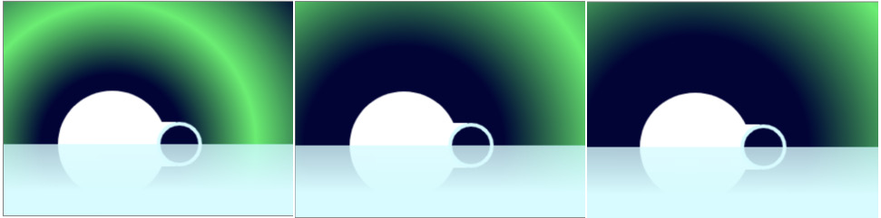
Figure 7.31: Canvas drawing with animated northern lights
In this section, we have learned how we can animate a canvas drawing by clearing a frame and applying changes to the drawing after a short delay.
Next, we will apply what we have learned throughout this chapter to an activity.
Activity 7.01: Media Page
In this activity, we have been asked to create a page to show a video on the Films on Demand website. This page will let a user play a video in the browser. For this activity, we are going to show a trailer for the website.
We want to add a video element to the page and styles for the play and pause buttons based on the custom controls we made earlier. We will add the provided icons to the buttons.
The steps are as follows:
- Create a directory called video_activity for your project. Copy over the page template we created in Chapter 1, Introduction to HTML and CSS, and name it video-page.html:
<!DOCTYPE html>
<html lang="en">
<head>
<meta charset="utf-8">
<title>Films on Demand - <!-- Title for page goes here --></title>
<meta name="description" content="Buy films from our great selection. Watch movies on demand.">
<meta name="viewport" content="width=device-width, initial-scale=1">
<link href="styles/normalize.css" rel="stylesheet">
<style>
body {
font-family: Arial, Helvetica, sans-serif;
font-size: 16px;
}
#pageWrapper {
background-color: #eeeae4;
}
.full-page {
min-height: 100vh;
}
</style>
</head>
<body>
<div id="pageWrapper" class="full-page">
<!-- content goes here -->
</div>
</body>
</html>
- Add a styles directory and copy over the normalize.css file.
- Add a scripts directory and copy over the media-controls.js file.
- Next, add a media directory and copy over the html_and_css.mp4, html_and_css.webm, and poster.png files.
- We want to change the title of the page to say Films on Demand - Video Promo.
- Replace the <!-- content goes here --> comment with a video element. We want to provide both video files using the source element. Also, provide a fallback message and an image during preloading with the poster attribute.
- We want to add custom controls for playing and pausing the video and to show the current time and duration of the video. You can follow the design shown in the following screenshot, with the control bar positioned absolutely over the bottom of the video element . Now right-click on the filename in VSCode on the left-hand side of the screen and select open in default browser:

Figure 7.32: Video controls design
- Finally, we can use the scripts/media-controls.js file to add behavior for the controls to work.
Note
The solution to this activity can be found in page 602.
In this activity, we have put together a media player from what we have learned throughout this chapter. We have added a video element and markup for controlling media playback and we have styled the controls for the media player.
Summary
In this chapter, we appended several media elements in an HTML5 document. We studied the applications of the audio element and video element and learned how to add custom controls to those elements, as well as how we can style them.
We also learned how to add a text track to provide accessible content for users who can't hear audio and video for various reasons.
We studied several different image formats available in HTML5, including SVG and the canvas element and img and picture elements. These introduced us to how these different options can help make our web pages more responsive and how we can use these tools to program our own icons, art, and animations.
In the next chapter, we will look at how we can animate the content of a web page using CSS. Combining the techniques for adding rich content that we have learned in this chapter with those you will learn in the next chapter will allow you to enhance and enrich web pages further with greater interactivity and visual style.