Overview
By the end of this chapter, you will be able to apply animation to your web page; control animations using keyframes; create a slick menu using transitions; and create a multistep preloader for your website.
This chapter introduces CSS animations by using transitions and keyframes to bring your web page to life with new effects. With the knowledge you will gain from this chapter, you will be able to create CSS animations on your web pages to add another level of interaction to the page for the user to experience.
Introduction
In the previous chapters, we discovered how to structure a web page with HTML and style it with CSS. We also introduced HTML forms, responsive web design, and media elements, including video, audio, and canvas.
In this chapter, we'll look at CSS animations. Introducing these to your web page can be a real strength as they can add valuable feedback and interaction to the page. Humans are naturally drawn to movement, so adding subtle animations can really guide users to the important parts of a web page at any given moment. A good example of this could be an HTML form submission, when the user submits the form if they didn't fill out their email address in the correct format. This means you could use CSS animations to animate the email input box for a second or two (for instance, shake it side to side by a few pixels), alongside showing the error message and highlighting to the user the location of the error that they need to correct before they can move forward with their form submission.
With CSS animations, we'll be exploring how to quickly add animations, starting with one or two lines of code, using transitions. Then, as we get more comfortable, we'll dive deeper and master how we can have more control over animations using keyframes. Let's discover more about CSS animations and add more interest to our web page, thereby engaging users in a different way.
CSS Transitions
CSS transitions are used throughout the modern web and, in short, they enable CSS properties to change values, thus creating a simple animation. CSS transitions are the basic fundamentals of CSS animations and are the basis of creating more advanced animations. However, transitions in themselves can create a whole world of effects. A common example of a CSS transition would be that the change in the color of an element on hover but rather than the color changes snapping straight away, they would have a more subtle transition from color 1 to color 2 over 250 or 500 milliseconds, instead of an instant change.
To demonstrate a very simple example with a color change, take a look at the following code snippet, which you can copy and paste into any of your HTML files, or into a new one, to see it in action:
<style>
p {
transition: 250ms;
}
p:hover {
background-color: darkolivegreen;
color: white;
}
</style>
<p>This is a very simple example of a transition</p>
The preceding code snippet will change the p element on its hover state to have a background color of 'darkolivegreen' (from the default of white) and a text color of 'white' (from the default of black). The code says that the change in colors should take 250 milliseconds.
A transition in CSS will describe how a property of a given CSS selector should display the change when given a different value. The transition-duration property specifies how many seconds (s) or milliseconds (ms) a transition effect takes to complete.
A transition will require a minimum of one value, that is, the duration of the animation, which is a numeric value. In our example, we used the most common unit, which is s for seconds.
The following screenshot shows the transition-duration property with a value of 0.2 seconds:

Figure 8.1: Transition duration property
Note
If you're planning to work with JavaScript and keeping the units consistent, you may consider using ms, which is short for milliseconds. You can read more about CSS transition duration at https://packt.live/32swmYm.
In addition to transition-duration, there are two other important CSS transition properties we can use: transition-property and transition-delay.
The transition-property property specifies what property is going to be involved in the transition. If no transition-property is set, then all the CSS properties on the selector will be involved in the transition. To help explain this further, if you just wanted the transition to occur on just the background color, then you would set transition-property: background-color;.
The transition-delay property specifies when the transition effect will start. The transition-delay value is defined in seconds (s) or milliseconds (ms). Adding a delay to the CSS selector means that the defined time must pass before the transition happens. If you set this value to 2 seconds or more, you would really notice a delay before your transition happens. This would be written as follows: transition-delay: 2s;.
Exercise 8.01: Implementing Our First Simple Animation
In this exercise, we want to create a simple tag element and animate its background-color and color properties. To trigger a transition from an initial value to another value, we'll make use of the :hover pseudo-selector.
Follow these steps to master simple CSS animations using transitions:
- We want to create a new file named Exercise 8.01.html and create a basic structure for the HTML, like this:
<!DOCTYPE html>
<html lang="en">
<head>
<meta charset="UTF-8">
<title>Required values</title>
<style>
/* Let's put our style in here */
</style>
</head>
<body>
<div class="transition-me">
CSS Animations are fun!
</div>
</body>
</html>
- Let's create our CSS selector, .transition-me, so that we can target our div element by its class name:
.transition-me {
transition-duration: 0.2s;
}
The following screenshot is the output of the preceding code:

Figure 8.2: No animation has been set yet
- We'll add a bit of styling here so that it's easier for us to view the changes:
.transition-me {
transition-duration: 0.2s;
padding: 16px;
cursor: pointer;
/* those properties will be animated from */
color: darkorange;
background: black;
}
You will notice that we are using the cursor CSS property here. Having a cursor property with the pointer value will create a pointing hand mouse cursor when the mouse is over the elements in the CSS selector statement (.transition-me, in this case). By default, the cursor will be the normal mouse cursor on mouseover. Setting the cursor CSS property can define this to be another cursor icon. You can see cursor: pointer being demonstrated in the following screenshot. This helps to understand that there's an action on this element (on click or hover):

Figure 8.3: Basic styling and properties to animate from
We've added a padding with a value of 16px to separate the content from the box edge so that it's easier to read. We've also added a color property with a value of darkorange, and a background property with a value of black. The two colors contrast so that they're easier on our eyes.
- To create a quick trigger that changes the values of our properties, we'll make use of the :hover pseudo selector:
.transition-me:hover {
/* those properties will be animated to */
background: orangered;
color: white;
}
If you now right-click on the filename in VSCode on the left-hand side of the screen and select open in default browser, you will see In the following two screenshots where,you can see the output of an exercise before hovering over the element, and then the output after hovering over the element after the transition has completed:

Figure 8.4: The element before the animation starts

Figure 8.5: The element after the animation ends
All you need to do is move your mouse over the element with the transition-me class to see the effect in action.
In this exercise, we noticed that we can animate with CSS quite quickly by using CSS transitions. All we had to do is pass a value in seconds or milliseconds to the transition property of a CSS selector and provide some sort of mechanism that would trigger a change of value for the same property to see animations in action. Our two properties are background and color, and the transition trigger was a :hover effect. The background property was animating from black to orangered, while the color property was animating from darkorange to white. Our two animations started and ended at the same time and lasted for the same amount of time. What if we want to have a different duration or start time? Let's discover how to do that in our next exercise.
Exercise 8.02: Enhanced Control in CSS Transitions
In this exercise, we want to create a simple tag element and animate its background-color, color, and padding-left properties. To trigger a transition from an initial value to another value, we'll make use of the :hover pseudo selector.
Follow these steps to master how to control CSS animations using transitions:
- We want to create a new file named Exercise 8.02.html and create a basic structure for the HTML, like this:
<!DOCTYPE html>
<html lang="en">
<head>
<meta charset="UTF-8">
<title>CSS transitions enhanced control</title>
<style>
/* Let's put our style in here */
.transition-me {
}
.transition-me:hover {
/* those properties will be animated to */
}
</style>
</head>
<body>
<div class="transition-me">
CSS transitions enhanced control
</div>
</body>
</html>
Our aim is to have one HTML tag, a div and add a class to it so that we can target it quickly and painlessly using CSS. We'll also have some random text present inside our element so that we can get away without having to declare its height. In our example, the text's content is CSS transitions enhanced control.
- Inside our style tag, in the .transition-me selector, we want to add some spacing between the content and margin using padding with the value of 1rem. We also want to give a chocolate color to the text and a ghostwhite color to the background:
.transition-me {
padding: 16px;
color: chocolate;
background: ghostwhite;
}
The following screenshot shows the .transition-me element in its normal state:

Figure 8.6: The element in its normal state
- Let's continue adding styling to our element for when we move the mouse over it. We want our background to have a honeydew color. Our text will receive a color of brown and we want to indent it from the left with a value of 32px:
.transition-me:hover {
/* those properties will be animated to */
background: honeydew;
color: purple;
padding-left: 32px;
}
The following screenshot shows the .transition-me element in its hover state:

Figure 8.7: The element in its hover state
We want to animate our element with enhanced control. We want to have some transitions starting later. First, we want to start animating our background for half a second. Second, as soon as the background animation is done, we want to animate the text color for another half a second. Finally, once the text animation is done, we want to animate our text indent for three-tenths of a second. To make our hover effect clearer, we can add a cursor pointer so that the mouse changes when we interact with our element.
- The code for animating our element with enhanced control is as follows:
.transition-me {
transition-duration: 0.5s, 0.5s, 0.3s;
transition-delay: 0s, 0.5s, 1s;
transition-property: background, color, padding-left;
cursor: pointer;
/* those properties will be animated from */
padding: 16px;
color: chocolate;
background: ghostwhite;
}
If you now right-click on the filename in VSCode on the left-hand side of the screen and select open in default browser, you will see the following screenshot that shows the .transition-me element in its hover state using the pointer cursor:

Figure 8.8: The element in its hover state with a pointer cursor
It's good to know that CSS offers us great control over our animations with the transition property. One benefit of this is that the code looks clean and easy to write. On the downside, we do have to write a bit more code and we must pay attention to declaring a value or default value for each of the properties we want to animate.
In our exercise, we declared three values, separated by a comma, for transition-duration, transition-delay, and transition-property. It can be incredibly useful to combine a CSS transition for multiple properties at the same time.
In the next exercise, we'll look at the performance of CSS transitions and compare transitions to non-transitions so that you can see the benefits of CSS animations.
Exercise 8.03: CSS Transition Performance
In this exercise, we want to create a simple tag element and animate its background-color, border-color, and font-size properties to observe transitioning of all the properties, and then just transition one property. To trigger a transition from an initial value to another value, we'll make use of the :hover pseudo-selector.
Follow these steps to master how to improve CSS animation performance using transitions:
- Let's start with our HTML document in a file named Exercise 8.03.html:
<!DOCTYPE html>
<html lang="en">
<head>
<meta charset="UTF-8">
<title>CSS transitions performance</title>
<style>
/* Let's put our style in here */
.transition-me {
}
.transition-me:hover {
}
</style>
</head>
<body>
<div class="transition-me">
CSS transitions performance
</div>
</body>
</html>
- We want to animate the color of our background over a period of half a second. We can apply a solid border with a width of 10 px and a color of wheat to our elements as well. We'll also give our element a height of 100 px as soon as we experience an unwanted behavior:
.transition-me {
height: 100px;
background: lightskyblue;
border: 10px solid wheat;
transition-duration: 0.5s;
cursor: pointer;
}
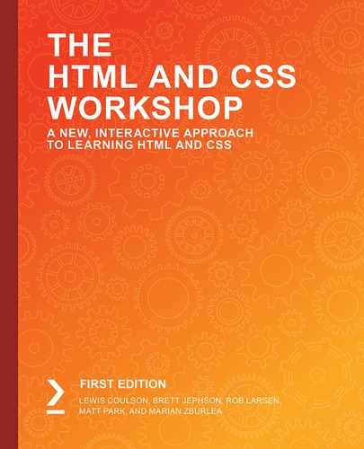
The following screenshot shows the .transition-me element in its normal state at this point:
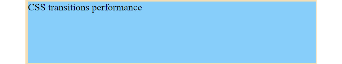
Figure 8.9: The element of the CSS transition performance in its normal state
- For our animation effect, we'll transition using the :hover pseudo-selector. We'll give an orange color to our background and a teal color to our border, while we increase the size of our font to 32 px:
.transition-me:hover {
/* those properties will be animated to */
background: orange;
font-size: 32px;
border-color: teal;
}
If you now right-click on the filename in VSCode on the left-hand side of the screen and select open in default browser, you will see the following screenshot that shows the .transition-me element in its hover state, with the transitions applied:

Figure 8.10: The element of CSS transition performance in its hover state
As far as we can see, as soon as we hover over our element, all the properties will be animated. The background color will animate from lightskyblue to orange. The font size will animate from the default 16 px that the browser has to 32 px, while the border will transition its color from wheat to teal.
As we mentioned earlier, the default value of transition-property is all CSS properties, which means the browser will animate all the properties that change by default, which can take more processing resources than intended.
When working in commercial applications or websites, behaviors that happen and are not described in the task will often come back as bugs. In order to avoid all animations from firing up and only allowing the ones we want, we can specify which transition property or properties we intend to animate.
- Let's specify a transition property with the value of background and refresh our html page. We can observe that the background animates its color, while the border and font size just jump from one state to another, lacking the animation:
.transition-me {
height: 100px;
background: lightskyblue;
transition-property: background;
transition-duration: 0.5s;
border: 10px solid wheat;
cursor: pointer;
}
The consequence of this is that the web browser isn't having to work as hard. Previously, when it was animating all the properties, it would be doing around 50 to 70 style recalculations per second, but now, we are only transitioning the background color property, which means it's more in the region of 40 to 60 style recalculations per second. This may seem like a huge saving, but this is a difference of anywhere between 2% and 4% extra CPU usage in that moment of processing. If you magnify that over an entire web page full of CSS transitions, you can see how it all adds up very quickly and may cause performance issues for users on a slower device.
In this exercise, we observed a combination of CSS transitions working together, initially with all the properties selected and transitioning together, and then just having the transition on the background color by itself. Aside from the visual difference in the animation's appearance, we've covered the performance difference in animating multiple properties.
In the next exercise, we're going to look at the CSS transition property so that we can write transitions in shorthand when we combine multiple transitions and their properties into a single line of code.
Exercise 8.04: CSS Transition with Multiple Values
In this exercise, we want to create a simple tag element and animate its background-color, color, and font-size properties. We'll be using the shorthand CSS transition property to animate all three properties in one line of code. To trigger a transition from an initial value to another value, we'll make use of the :hover pseudo-selector.
Follow these steps to learn how to use the shorthand CSS transition property:
- Let's create our HTML document in a file named Exercise 8.04.html:
<!DOCTYPE html>
<html lang="en">
<head>
<meta charset="UTF-8">
<title>CSS transition with multiple values</title>
<style>
/* Let's put our style in here */
.transition-me {
}
.transition-me:hover {
/* those properties will be animated to */
}
</style>
</head>
<body>
<div class="transition-me">
CSS transition with multiple values
</div>
</body>
</html>
- Let's now add some styles for our normal and hover state, like we did in the previous exercises:
.transition-me {
height: 100px;
background: lightskyblue;
border: 10px solid wheat;
cursor: pointer;
}
.transition-me:hover {
/* those properties will be animated to */
background: orange;
font-size: 32px;
border-color: teal;
}
- We want to add a transition property. For its value, we'll set a value that holds multiple instructions, separated by a comma:
.transition-me {
height: 100px;
background: lightskyblue;
border: 10px solid wheat;
cursor: pointer;
transition: background 0.5s, border 0.3s 1s, font-size 0.5s;
}
As can be seen in the preceding snippets, the first value will animate the background for half a second, the second one will animate the border for three-tenths of a second with a delay of one second, and the last one will animate the font size for half a second with a delay of half a second.
In this final step, we can observe how flexible we can be while animating CSS using the shorthand transition property. If you now right-click on the filename in VSCode on the left-hand side of the screen and select open in default browser, you will see the final output that is shown in the following image:
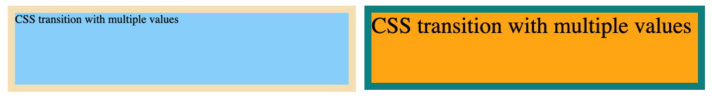
Figure 8.11: Output showing the normal state (left) and the hover state (right)
In this exercise, we've learned how to combine the transition properties in the one-line shorthand CSS transition property. So far, we've discovered how we can animate all or some properties, and how to declare the properties and values one by one or in multiples at the same time.
Advanced CSS for Animations
Before diving into the next exercise, we're going to cover a couple of topics to develop our CSS knowledge even further so that we can build more advanced animations.
CSS Positioning
First, we're going to review the CSS position property. This is an important property that we use when animating as it allows us to move the elements using the top, left, bottom, and right CSS properties to create a movement animation for our element(s). The position property also defines the start point for the top, left, bottom, and right coordinates. The position property can have several values. For this chapter, we're going to review two of those possible values: position: relative (this denotes any child elements with absolute positioning starting from this element's coordinates) and position: absolute (this denotes that any child elements positioned under the absolute position element will also use this element's coordinates for the start point of its position change, but the element itself will be relative to the nearest parent element with relative positioning).
The following diagram illustrates this further:
Figure 8.12: CSS positioning simple example
As you can see in the preceding diagram, the parent element is relatively positioned and that the child element is absolutely positioned with the parent element by the bottom: -50px; and right: -50px; coordinates. This causes the child element to go minus 50 pixels outside the right and bottom boundaries of the relatively positioned parent element.
Using the CSS position property can be really useful when working with CSS animation as it allows you to move items' coordinates. For example, you can move an element from the left-hand side of the screen to the right-hand side of the screen.
Overflow
Overflow is a useful property for adding to a parent element as it makes all the child elements only visible within the parent element. It doesn't allow child elements to "overflow" outside of the parent element's boundaries. The syntax for overflow is as follows if we wish to hide overflowing content:
overflow: hidden;
To restore overflowing content (the default value), we can use the following syntax:
overflow: visible;
To see the hidden overflow in action, take a look at the following diagram:

Figure 8.13: Overflow visible and hidden in action
Opacity
Another CSS property that's important to consider using with CSS animations is opacity. This ranges on a scale of possible values between 0 and 1, and all the decimals within. The syntax for opacity is as follows:
opacity: 0.8;
The preceding code indicates that the opacity is at 0.8 (or 80%). Once opacity reaches 0, the element won't be visible at all. This is illustrated in the following diagram:

Figure 8.14: Opacity from 1 to 0
Blur
Blur is a useful CSS property to animate when we wish to change an element or lose focus on an element. It causes the contents of the element it's been applied to either blur or unblur its contents, depending on the value that was assigned. The greater the value that's assigned in pixels, the more blur occurs, and to unblur, you would simply give it a value of 0 to reset it. The syntax for blur is as follows:
filter: blur(5px);
The preceding code would blur the element by 5 pixels. The following diagram illustrates blur in action:
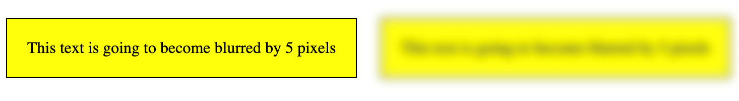
Figure 8.15: Blur in action
Inserting Content with attr()
If you want to change content in CSS using pseudo elements such as :before and :after, then we can get the data from other attributes in the element HTML, such as the title. This is where the attr() function in CSS comes into play with the content of pseudo elements. Take a look at the following syntax example of the :before part of the selector, which is using the element's title for its content:
HTML:
<a class="selector" title="Content Here Will Appear In :before">Selector Text</a>
CSS:
.selector:before {
content: attr(title);
}
We've now covered how to briefly use the position, overflow, opacity, blur, and inserting content CSS properties in the CSS from attributes using attr(). This knowledge will help us in the exercises to come. In the next exercise, we'll look at animating a website menu and changing its background color and position when hovering over the menu items.
Exercise 8.05: Animating a Website Menu
In this exercise, we want to create a simple menu with three links in it and animate the background-color and position. To trigger a transition from an initial value to another value, we'll make use of the :hover pseudo-selector. The following diagram is a wireframe of the menu we are going to build:

Figure 8.16: Wireframe of the website menu
Follow these steps to master how to build CSS animations using transitions for a menu navigation:
- Let's create our HTML document in a file named Exercise 8.05.html:
<!DOCTYPE html>
<html lang="en">
<head>
<meta charset="UTF-8">
<title>CSS transition with multiple values</title>
<style>
/* Let's put our style in here */
</style>
</head>
<body>
</body>
</html>
- Inside our body, let's add some navigation and links. We'll represent the navigation with a nav tag and inside it, we'll add three anchor tags, represented by the a tag. For each anchor tag, we want to have a class, href, and title attribute:
<body>
<nav class="top-navigation-menu">
<a class="top-navigation-link" href="https://www.google.com" title="Top Search Engine"></a>
<a class="top-navigation-link" href="https://www.packtpub.com/all-products" title="Free Coding Resource"></a>
<a class="top-navigation-link" href="https://www.packtpub.com/free-learning" title="Free PRO Coding"></a>
</nav>
</body>
- In our style tag, let's add a color for the background and provide some dimension values for our links:
body {
background-color: silver;
}
.top-navigation-link {
height: 28px;
position: relative;
width: 225px;
display: inline-block;
}
In the preceding code, we are using the height and width CSS properties to create a box since our anchor tags lack any content at the moment. We'll use a position of relative as a stopper for other elements inside the anchor tag that will have a position of absolute later on. When we use position: relative, we'll take the element out of its original flow and position it relative to its original position.
The following screenshot shows .top-navigation-link highlighted in Chrome's Developer Tools. It is currently empty because we haven't added content to it yet:

Figure 8.17: Website menu example; empty link
Looking at our code in the browser, we can see that the box has been properly created with a width of 225px and a height of 28px. We can confirm this for the other links by using the inspector and hovering over the other anchor tags inside the Elements panel of the inspector.
- To fill our links with content, we'll call attr() on our title attribute to grab its value and assign it to the content property of our anchor tag:
.top-navigation-link:before,
.top-navigation-link:after {
text-align: center;
line-height: 28px;
content: attr(title);
position: absolute;
left: 0;
right: 0;
transition: 250ms;
}
:before and :after act as additional boxes inside the original element, which can receive separate styles and content without increasing the DOM node's number. When building a complex HTML page, you want to keep the number of tags you use to render the application or website as low as possible.
This is what our menu looks like so far. The before and after have a position of absolute, which means it'll look up the document tree until it finds a parent with a position of relative, fixed, or absolute, and it'll have its left and right related to the first parent element found to satisfy the condition.
We've also positioned our text to be centered and we've added a transition of 250 ms, which we'll see in action as soon as we implement a hover effect. The following screenshot shows the website menu with the content that was imported from the element title attribute in CSS using content: attr(title):

Figure 8.18: Website menu example; links with content
Note that the before and after are sitting one on top of the other as they have the same properties and to our eyes, it looks like we can only see one. If we were to play with their properties for a moment, just to confirm what really happens under the hood, we can clearly see that there are two of them – two boxes with content inside our anchor tags. We want to get rid of this code as soon as we are done testing. There is no reason to leave the red and green-yellow text styled like this:
.top-navigation-link:before {
top: -10px;
left: -10px;
color: greenyellow;
}
.top-navigation-link:after {
color: red;
}
The following screenshot shows the website menu with the links using before and after for the content to appear before we hide one of them. This is done so that you can only visually see one at a time, that is, when the animation is coded:

Figure 8.19: Website menu example; links with before and after
- On hover, we want to have a transition where the original text flies up, blurs, and disappears, and another one flies in. We have:before visible, not blurred, sitting at the top.:after is not visible and is positioned 28 px away from the top with some blur filter added as well. The filter property defines visual effects (such as blur and saturation) to an element (often <img>):
.top-navigation-link:before {
top: 0;
filter: blur(0);
opacity: 1;
background-color: cadetblue;
}
.top-navigation-link:after {
top: 28px;
filter: blur(5px);
opacity: 0;
background-color: firebrick;
}
The following screenshot shows the website menu with the initial styling before the transitions occur:

Figure 8.20: Website menu example; initial styling before transition
- On mouse over, we want to transition:before from top 0 to negative 28 px. This will make it fly up:
.top-navigation-link:hover:before {
top: -28px;
filter: blur(5px);
opacity: 0;
}
.top-navigation-link:hover:after {
top: 0;
filter: blur(0);
opacity: 1;
}
The animation effect has been improved. We also applied a blur filter to it and reduced its visibility to zero. We did the opposite for :after. We flew it in from the bottom to top 0, removed the blur, and made it visible. A blur effect was applied to the image. A larger pixel value would create more blur, whereas a value of 0 would have no blur.
The following screenshot shows the website menu with the initial styling after the transition occurs on hover:

Figure 8.21: Website menu example; initial style with transition
- To add a finishing touch, we want to set the color of the content so that it contrasts with the background with the value of whitesmoke. We also want to convert all the characters into uppercase, while making the text more readable using an Arial font. We want the elements inside to stick to one another horizontally and we want to add a display with the value of flex:
.top-navigation-menu {
display: flex;
text-transform: uppercase;
font-family: Arial;
}
.top-navigation-link:before,
.top-navigation-link:after {
text-align: center;
line-height: 28px;
content: attr(title);
position: absolute;
left: 0;
right: 0;
transition: 250ms;
color: whitesmoke;
}
The following screenshot shows the final website menu with the completed styling and selected link, "Free Coding Resource", after the transition has occurred on hover:

Figure 8.22: Website menu example; final
Let's talk about fixing bugs. Sometimes, we position our mouse on top of the content with opacity 0, that is, the one that is positioned 28 px from the top. When this happens, the hover effect takes place, and the box with the content I've just mentioned starts transitioning up. At some point, it'll slide out and no longer be under the mouse, which will stop the mouse over effect. This means it will go back to its original state, which puts it back under the mouse. Then, the hover takes over, and everything starts again and again. This issue is a common one and I've personally encountered it many times.
- There are several fixes for this, and one of them is to instruct the browser to look for hover effects on the anchor tag and not on the :before or :after boxes. This can be done by adding the pointer-events property with a value of none:
.top-navigation-link:before,
.top-navigation-link:after {
text-align: center;
line-height: 28px;
content: attr(title);
position: absolute;
left: 0;
right: 0;
transition: 250ms;
color: whitesmoke;
pointer-events: none;
}
If you now right-click on the filename in VSCode on the left-hand side of the screen and select open in default browser, you will see the following screenshot that shows the final website menu during the transition:
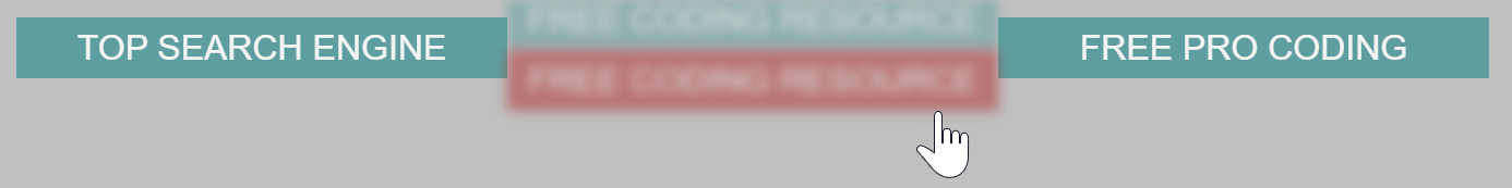
Figure 8.23: Website menu example; final – fixing bugs
In this exercise, we have learned how to apply more advanced CSS transitions using a background color and position change alongside effects such as blur to bring the website menu to life. We've experienced what CSS transitions can do. We'll be developing our knowledge so that we can look at CSS animations with keyframes in the next part of this chapter.
Transition Duration Sweet Spot
So far, while playing with our code, we've used different durations for our transitions. When animating menus, panels, boards, or other elements on the screen, a sweet spot to set our duration for is between 250 ms and 300 ms. Smaller values would make the animation happen too quickly, while bigger ones would slow it down too much. This is the case for most scenarios; however, if your animation looks better at 750 ms, just go for it. Most of the time, you want to keep it under one second.
Slowing Animations Down
When you develop the animations for your website, sometimes, you may want to slow them down so that you can inspect them visually and adjust them until you're happy with the outcome. Instead of playing with the values while going back and forth, you can use the developer tools in browsers that support this feature, such as Chrome and Firefox.
In Chrome, follow these steps to get to the interface that allows you to slow down the animations:
- Click the triple vertical dots that you can find at the far top right of the Chrome browser.
- Select More tools.
- Select Developer tools.
A better way to do this is to remember the shortcut and press CTRL + SHIFT + i on Windows, or ALT + CMD + i on a Mac.
The following screenshot illustrates how to open the Developer Tools in the Chrome web browser:
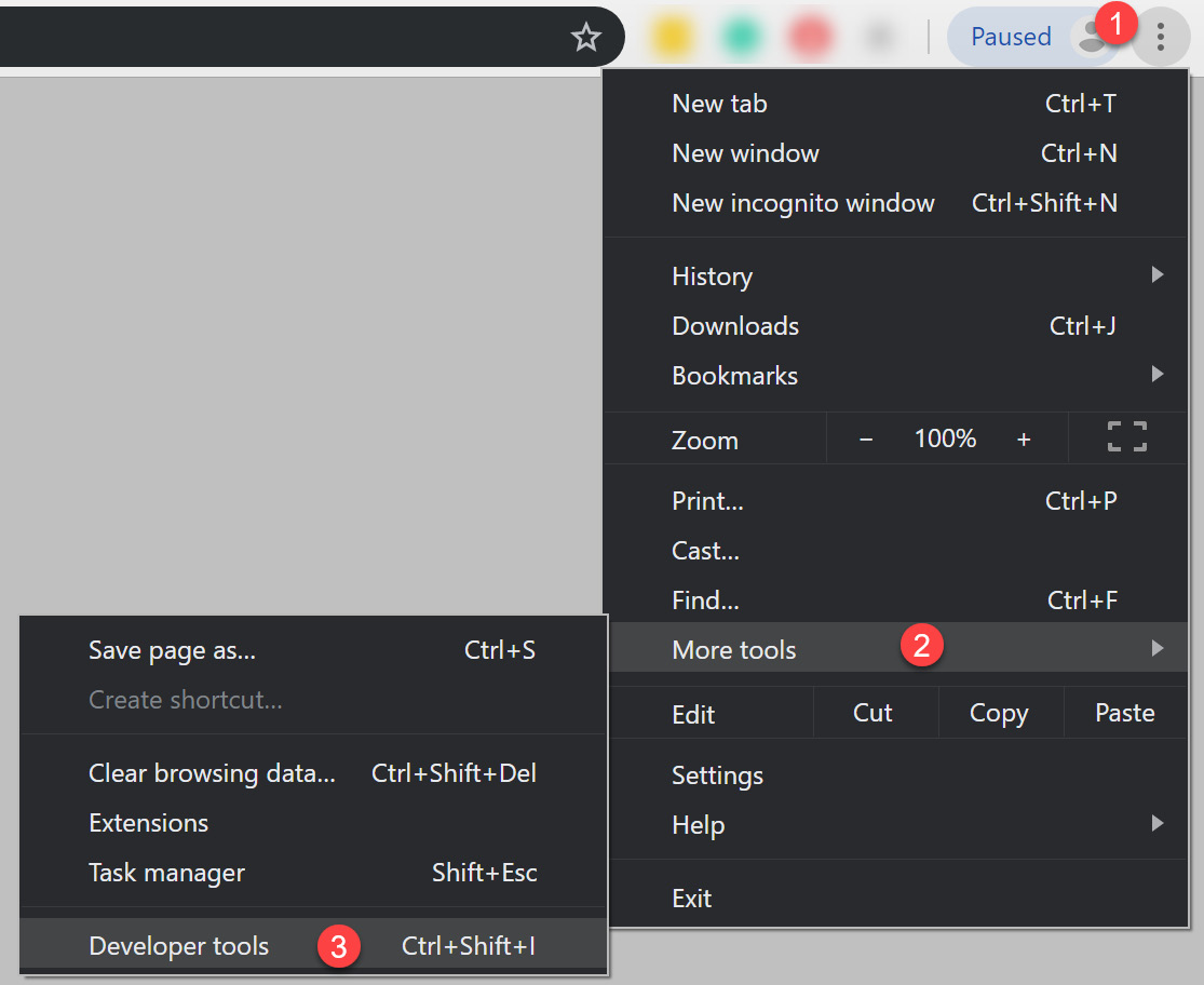
Figure 8.24: Opening the developer tools
- Find the three vertical dots in the developer tools and click on it.
- Select More tools.
- Select Animations.
The following screenshot shows how to open the Animations tab with the Developers Tools in the Chrome web browser:

Figure 8.25: Opening the animations tab in the developer tools
We can slow down the animations to 25% or 10%. We can pause all and resume play as well.
The following screenshot shows the Animation tab in Chrome's developer tools while running the animation at 25% of its normal speed:

Figure 8.26: Slowing down the Animations tab in the developer tools
Animation Acceleration and Deceleration
By default, when we animate, we see a linear animation as it does not speed up or slow down. It starts and ends at the same speed. We can customize this by using transition-timing-function in CSS. If we want our animation to start slowly, then fast, and then end slowly, we give it a value of ease:
.top-navigation-link:before,
.top-navigation-link:after {
transition-timing-function: ease;
}
If we want it to start slow, we give it a value of ease-in. If we want it to end slow, the value would be ease-out.
For even more control over the acceleration and deceleration of our animations, we can use cubic-bezier. A good place to start playing with values for cubic-bezier is the website with the same name, https://packt.live/34AI9Wb, where you can play with draggable handles and preview your animation until you find one that meets your expectations:
transition-timing-function: cubic-bezier(.93,.45,.73,1.3);
The following screenshot shows the cubic-beizer animation playground:

Figure 8.27: https://cubic-bezier.com animation playground
You can play with the cubic-bezier values directly in the browser as well. The following screenshot shows an example of using Chrome to preview animations using cubic-bezier:

Figure 8.28: cubic-bezier animation playground in Chrome icon
In the following screenshot, you can see how to update the cubic-bezier animation in Chrome's developer tools:

Figure 8.29: Updating the cubic-bezier animation playground in Chrome
Keyframe Animations in CSS
So far, we've discovered how to animate from one starting point to an ending point using transitions in CSS. There are scenarios where we may want to animate using more than two points of control, that is, more than a starting and ending point. To do this, we can use keyframes.
The syntax looks like this:
@keyframes animationName {keyframes-selector {css-styles}}
The @keyframes word indicates to CSS that you're about to write code for a keyframe-based CSS animation. The next one, animationName, can be anything that describes the animation you intend to create. An example of keyframes to animate the opacity property is as follows:
@keyframes showHide {
0% { opacity: 0; }
100% { opacity: 1; }
}
The preceding code is a simple keyframes code snippet to show or hide an element (depending on whether animation is running forward or backward).
Inside the first set of curly braces, we want to add one or more steps. An animation step starts with a keyframe selector that can be from, to, or a percentage value such as 0%, 45%, and 78%. The from keyword has the same effect as 0%, while the to keyword has the same effect as 100%. Inside the second pair of curly braces, we want to declare one or more keys: value sets, just like in our normal CSS selectors.
Using the CSS Animation Property
Before we start the next exercise, we're going to look at the CSS animation property. This is a very powerful property and it can achieve a lot. Let's start by looking at its syntax, as follows:
animation: name duration timing-function delay iteration-count direction fill-mode;
You can use all or some of the values in the preceding syntax example and all you have to do is replace the placeholders with the appropriate values. If you want to write an animation that only has a name, duration, and iteration count, you can do something like this:
animation: rotateBall 3s infinite;
The timing function property can have various values, for example, you could use ease-in-out, which means the animation will speed up in the middle, and push-ease-off (slow down) at the start and end of the animation. You could also use steps() timing-function, which means the animation will no longer transition from one initial value to the ending value – instead, it will jump directly. steps() takes one argument, that is, how many jumps from one point to another the animation should have. Since we've passed 1 as the argument for steps(), like steps(1), it will jump directly from the initial value to the end value of that step. For example, if we had top: 0 and top: -50 px, using steps(1), it will directly jump from the first value to the second.
By default, once the animation finishes, it jumps to the first frame. To allow our animation to retain the values of the last frame, we would want to give a value to the animation-fill-mode property. That value is forwards.
Now that we've covered some of the basics of CSS animation properties, we'll begin our next exercise and build a preloading animation.
Exercise 8.06: CSS Preloader Using Keyframes
In this exercise, we want to create a simple preloader that animates its width from zero to a quarter, and then from a quarter to its full width. The following diagram shows an example of the preloader that you are going to create using animation keyframes:

Figure 8.30: Preloader using keyframes
Follow these steps to master how to build a CSS animated preloader using keyframes:
- Let's create our HTML document in a file named Exercise 8.06.html and type in the following code:
<!DOCTYPE html>
<html lang="en">
<head>
<meta charset="UTF-8">
<title>CSS animations preloader</title>
<style>
/* Let's put our style in here */
</style>
</head>
<body>
<div class="preloader-wrapper">
<div class="preloader-bar"></div>
</div>
</body>
</html>
- We want to give the preloader wrapper a height of 32 px and a border radius with the value of half of the height value to produce what looks like a pill. We also want to hide the contents of the wrapper that may overflow over the corners. To hide everything inside the wrapper's visible area, we'll use overflow: hidden. We also want to give it a background color of dodgerblue:
.preloader-wrapper {
border-radius: 16px;
height: 32px;
overflow: hidden;
background-color: dodgerblue;
}
In the following diagram, we are showing.preloader-wrapper with its rounded corners:

Figure 8.31: Preloader wrapper with rounded corners
Note that you want to pay attention to the overflow hidden key: value pair. This is something you'll want to remember and understand as it's a common scenario where you want to display only the visible contents of a container, that is, of a box. So, whatever flows outside the box area will not be visible. You want to do this when you use border radius, or when you have a defined width or height and the contents inside your box exceed the length of the width or height of the box.
- Let's style the preloader bar and animate it as well. Since the parent of the preloader bar does have a height declared, we can use a percentage in the direct child, or first level child, for the value of the height property, for example, height: 100%;. Let's add a dark gold background color to it, assign the preloader animation so that it runs for five seconds, but just once, and the animation will start slow and end slow:
.preloader-bar {
height: 100%;
background-color: darkgoldenrod;
animation: preloader 5s ease-in-out 1s;
}
@keyframes preloader {
0% { width: 0 }
50% { width: 25% }
100% { width: 100% }
}
The preloader animation has three points declared: the start at 0% with no width for the preloader bar, the second point at half of the animation, which gives the preloader bar a width of 25%, and the last point, which animates the width from 25% to 100% in the other half of the animation.
- It would be nice if we could add some indication of the percentage the animation is at. Let's do that by adding the following structure to our Exercise 8.06.html file, within the.preloader-wrapper parent element, just after the .preloader-bar child element:
<div class="preloader-percentage">
<div class="preloader-value">0%</div>
<div class="preloader-value">25%</div>
<div class="preloader-value">100%</div>
</div>
We've added the div with the.preloader-percentage class, just below the div with the .preloader-bar class. Preloader percentage and preloader bar are siblings, at the same level, inside the div with the.preloader-wrapper class. The idea is to show only one preloader value div at one time. We can do that by stacking them either horizontally or vertically. I chose to stack them vertically so that when we want to show a different value, all we have to do is move the first parent that holds the preloader value's boxes to a new one. We can find the new value by subtracting the height of the preloader from the current position on the y axis.
- Let's style the preloader percentage and value. As we mentioned earlier, we'll start our animation from position 0 on the y axis. The next step would be "0 – 32" px = -32 px. The last step would be "-32 px – 32 px" = -64 px. We can also name the first step instead of using 0% by using the word from. For the last step, that is, 100%, we can name it using the word to:
.preloader-wrapper {
border-radius: 16px;
height: 32px;
overflow: hidden;
background-color: dodgerblue;
position: relative;
}
.preloader-percentage {
position: absolute;
top: 0;
left: 0;
right: 0;
height: 100%;
animation: preloader-value 5s steps(1) forwards;
}
.preloader-value {
height: 100%;
line-height: 32px;
text-align: center;
color: whitesmoke;
}
@keyframes preloader-value {
from {top: 0}
50% {top: -32px}
to {top: -64px}
}
Giving a position of absolute for our preloader percentage will take the element out of the normal document flow and allow us to position the element using the top property on the y axis, in relation to the first parent that has a position of fixed, absolute, or relative. That's why we added position: relative; to our preloader wrapper.
If you now right-click on the filename in VSCode on the left-hand side of the screen and select open in default browser, you will see the following diagram, you can see the output of this exercise in the web browser, showing its three key stages at the start of the animation, at 25% of the animation, and at 100% of the animation completed:
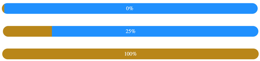
Figure 8.32: Final output of the web browser, shown in its three key stages
More CSS Tips and Tricks
When you want to position a container in the center horizontally without having to use the text-align property with a value of center, you can give it a margin of left and right with a value of auto:
margin: 0 auto;
When using transformation, you may be tempted to apply multiple transformation key-value pairs inside the same selector, assuming that all of them will take effect. Unfortunately, CSS doesn't work that way. Only one will be applied at most. If you have more than one, the one that's the last in your selector will be applied.
You can make an element smaller or bigger and shrink it or expand it using the scale transform function. So, if you want to make an element taller, you'd want to use scaleY with a value greater than 1, such as 1.25, which means it'll be 25% bigger than the original. To make an element wider, you'd want to use scaleX, with a value bigger than 1. Using a value smaller than 1, which you can think of as 100%, will transform the element into a smaller size than the original one.
Using the scale transform function will apply the value that was passed to it to both the X and Y axis. Using scaleZ will apply a transformation on the Z axis. When you want to apply transformations on all the axes, we can use scale3d and pass to it three arguments or values: the value for scaleX, the value for scaleY, and the value for scaleZ. Here is an example of how we can make our element bigger by 10% on all the axes:
transform: scale3d(1.1, 1.1, 1.1);
When we want to control the acceleration of entering and exiting the animation, just like in our previous example of using the cubic bezier in transitions, transition-timing-function: cubic-bezier(.93,.45,.73,1.3);, we can use animation-timing-function:
animation-timing-function: cubic-bezier(0.2, 0.61, 0.35, 1);
The following diagram shows the X, Y, and Z axes of an element, which is useful to help us understand how to scale items with 3D transformations:

Figure 8.33: The X, Y, and Z axes of an element
The top left-hand corner of an element is the 0, 0, 0 origin of the X, Y, and Z axes.
Now that we are comfortable with making elements bigger or smaller using scale, scaleX, scaleY, scaleZ, or scale3d, we can easily learn how to move an element away from the 0, 0, 0 origin while keeping its size the same. We can use translate, translateX, translateY, translateZ, and translate3d to do this. Passing a positive value to translateX will move the element away from its original X axis position to the right, while using a negative value will move it to the left, away from its original position.
When we want an animation to be stopped, be it before it starts or while it's in progress, we can assign the paused value to the animation-play-state property, as follows:
animation-play-state: paused;
When we want to instruct an animation to resume from its paused play state, we want to assign the running value to its animation-play-state property, like so:
animation-play-state: running;
So far, we've completed six exercises and learned about CSS transitions and CSS animations so that we can create various different effects, including a simple color change on hover, to running multiple transitions together, and then observing the difference between having and not having a property included in the transition in terms of performance and appearance.
After this, we worked with using the shorthand CSS transition property and then made an animated menu using CSS transitions to create some new effects, including blur on transition.
Our final exercise looked at using CSS animation properties, in shorthand, to achieve keyframe animations to allow you to code more detailed animations. We are now ready to start our next activity, where we will bring our video store home page to life by adding some CSS transitions and animations to the web page.
Activity 8.01: Animating Our Video Store Home Page
In this activity, we're going to take our video store home page that we used in Chapter 6, Responsive Web Design and Media Queries, and then add some transitions and animations to bring the web page to life. Take a look at the following screenshot to remind yourself of the web page before we make any changes to it:
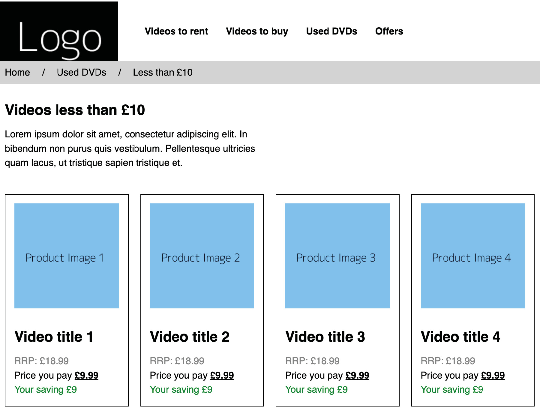
Figure 8.34: Video store home page without animation
- First, take a copy of Activity 6.01.html from your Chapter 6 folder and save this in your Chapter 8 folder as Activity 8.01.html.
- Now, we're going to edit the navigation links so that we have a CSS transition on the active hovered navigation link item by moving it slightly upward and then smoothing the transition of its hover color to red. Both transitions will be completed over 500 milliseconds. This will be triggered upon hovering the mouse over the link. Note that we only want to apply this to our desktop screen sizes since this could impair the usability of the mobile layout for users otherwise.
- Next, we're going to use keyframes to create a hover effect on the product cards as the mouse hovers over each of them. On the animation, we're going to change the background color of the card, add a thicker border to the card (while reducing the padding simultaneously so as not to increase the overall width of the box), and then change the color of the text so that it works with the new background color.
We will apply this style to mobile and desktop screen sizes, so it doesn't need to be desktop-specific this time.
- When observing your Activity 8.01.html file in your web browser, you should see that it has a vertically rising link and color change on hover when viewing on a desktop, and, on mobile and desktop, the product cards should animate to what's shown in the preceding screenshot when hovered over or tapped on a touch device. Take a look at the following screenshot for the expected end result, with the two animated hover states shown:
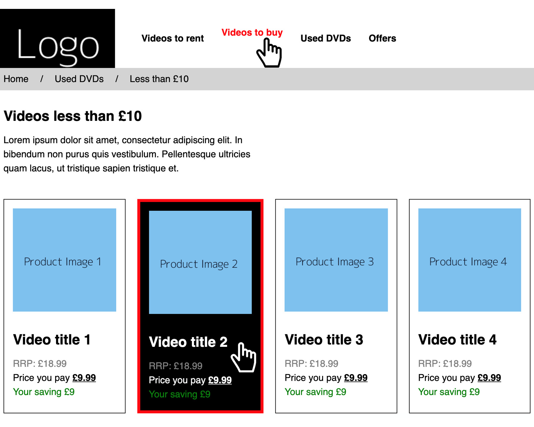
Figure 8.35: The complete output with both hover states shown
Note
The solution to this can be found on page 606.
Summary
Well done for following along and mastering how to quickly write transitions and create more complex animations to spice up the journey a user has while making use of websites you've built. The more you practice them, the easier and quicker it'll be to write code for slick animations that will make your users smile and feel comfortable as they feel that you care for them.
I encourage you to quickly write three to five basic ideas or update a piece of code you've already written where you animate some parts of your interface through transitions of keyframes and share it with your friends, workmates, or clients. Feedback is always welcome, as well as recognition for being an awesome frontend developer.
The next chapter is all about accessibility. Here, we will look at how to make our web page more accessible to technologies such as screen readers, thereby allowing users with visual impairments to still use and navigate our web page.