Overview
By the end of this chapter, you will be able to explain CSS preprocessing; use CSS preprocessing techniques; write maintainable code; write SCSS code using nesting, import, control directives, and mixins; and compile SCSS code in CSS in different output styles.
This chapter introduces the preprocessing of CSS and the tooling used to compile it, enabling you to understand and write Sassy Cascading Style Sheets (SCSS) preprocessed code and compile it in CSS3 successfully, with the aim of saving you time by writing less and achieving more.
Introduction to CSS Preprocessors
In the previous chapters, we learned about many aspects of HTML5 and CSS3 web development, including layouts, themes, responsive web design, media, animation, accessibility, and so on.
Inherently, CSS has its own issues with maintenance, particularly with large or complex projects, not to mention that it's limited in terms of its ability to process functions, logic, and variables. CSS preprocessors came about to address such issues and more, extending the capabilities of CSS to help the developer achieve more with less while keeping the code maintainable.
Now, you may have heard of CSS preprocessors such as Syntactically Awesome Style Sheets (SASS), Leaner Style Sheets (LESS), Stylus, and others. These are all scripting languages that allow you to achieve more in CSS by writing less. All these CSS preprocessors have some logic in common, such as the ability to have variables, nesting styles, math calculations, reusable mixins, and so on. The idea of CSS preprocessing is based upon the Don't Repeat Yourself (DRY) software development principle, which aims to minimize repetition and create maintainable code.
Each CSS preprocessor has its own syntax, which is then compiled by tooling into CSS that the web browser can understand. In this chapter, we will explore the CSS preprocessor scripting language called SCSS, a version of SASS. The syntax is closer to CSS3 than the likes of most other CSS preprocessors, such as Stylus or regular SASS, for example, making a smoother upgrade to your existing CSS3 knowledge. A simple example of this is the curly braces that wrap styles. These are required in SCSS (just like in CSS3) but are not required in preprocessor styling languages such as Stylus and regular SASS.
In this chapter, we're going to look at CSS preprocessors to understand what they are and learn how to write a CSS preprocessed scripting language called SCSS.
Getting Started with Node.js, npm, and SASS
In order to compile SCSS files in CSS, we'll need to install the Node.js software, Node Package Manager (npm) (a software package manager for Node.js) and the npm SASS package to run the compilation script itself.
First, we'll install Node.js. If you navigate to https://packt.live/2CmLXhz in your web browser, you will find the download links for the Node.js installation package for your operating system, as shown in the following screenshot:
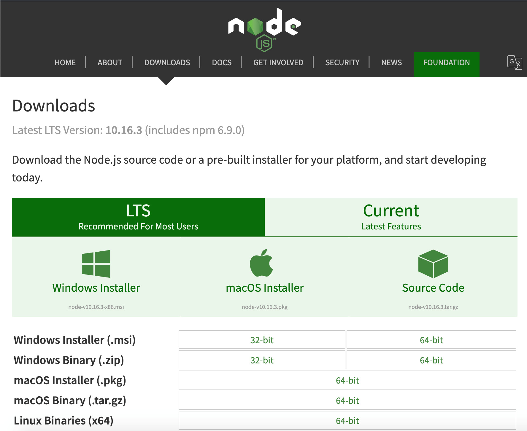
Figure 10.1: Node.js Downloads page
We recommend selecting the Long-Term Support (LTS) download package for your operating system, as this is usually the better supported and more stable version of Node, so you are less likely to encounter installation or runtime issues with this version. Once the installation package has downloaded, you can run it, and you'll see a window similar to the following screenshot:
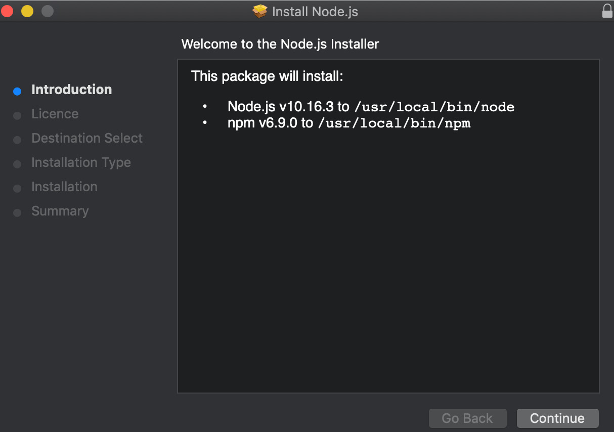
Figure 10.2: Node.js installation package
You will notice that the Node.js LTS version is bundled with the npm package manager too, so this is one less thing to install afterward. Continue through the installation by clicking Continue, and then accept the license agreement on the next screen (it's free to use the software). You don't need to customize the installation path. Proceed and select install and wait for the installation package to complete.
Once the installation of Node.js and npm is complete, you will need to open your Terminal window (Command Prompt in Windows). At the prompt, you can run the node -v and npm -v commands. Both of these should return a version number, as shown in the following figure:
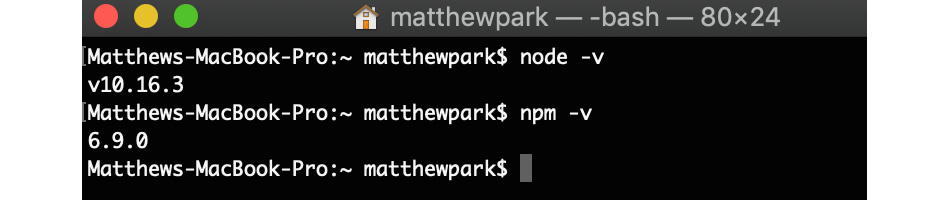
Figure 10.3: Checking that Node.js and npm are installed
This means that Node.js and npm are installed on your machine and ready to use.
Next, we will prepare our project folder with the SASS module required to build the exercises and activities in this chapter by creating a new folder on our machine's desktop called Chapter10, and then we'll navigate to it in our Terminal window. You can do this with the cd path/to/directory command; that is, cd ~/Desktop/Chapter10 (the tilde, ~, refers to your user directory, so this command means, access the Chapter10 subfolder within my desktop folder within my user directory). Once we are within the Chapter10 directory, we can create our package.json file. This is a file that contains information about the software dependencies your project requires, so it's manageable by other developers too. To create our package.json from within the Chapter10 directory, we'll need to run the npm init command. This will prompt you for the following (note that you can just press the Enter key to accept the default value):
- Package name: You can leave this set to the default (chapter10 or your folder name). You cannot have spaces in the package name, for instance, use chapter10, not chapter 10.
- Version: You can leave this set to the default, 1.0.0.
- Description: You can give your project for this chapter a description, for example, HTML5 & CSS3 Workshop Chapter10 Exercises.
- Entry point: Leave this as the default, index.js.
- Test command, GIT repository, and keywords: These can be left blank at this point.
- Author: You can write your name here.
- License: You can leave this blank.
You can then confirm everything is okay with your npm init package.json configuration values. See this demonstrated in the following screenshot:

Figure 10.4: Setting up an npm project with npm init
The next step is to install the SASS package in your project folder. We can do this with the npm install node-sass command. You can see this demonstrated in the following screenshot:
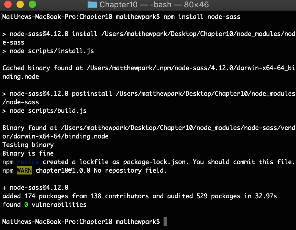
Figure 10.5: Installing the node-sass module with npm
Now, once these installation steps are completed, within your newly created Chapter10 directory on your desktop, you will find a package.json file. The contents will look similar to the following code:
{
"name": "chapter10",
"version": "1.0.0",
"description": "HTML5 & CSS3 Workshop Chapter10 Exercises",
"main": "index.js",
"scripts": {
"test": "echo "Error: no test specified" && exit 1"
},
"author": "Matt Park",
"license": "ISC",
"dependencies": {
"node-sass": "^4.12.0"
}
}
This package.json file lives within the root of your project folder and allows other developers to pick up the project and get all the software they need (just the Node SASS module in this case), by running the npm install command from the same location as the package.json file. You will notice that the generated package.json file has created a scripts value, with a test script line by default. Scripts allow the developer to run commands in the Terminal window and this is where we'll add our own script to compile the SCSS next.
Finally, we'll look at how to compile the SCSS code (a variant of SASS) in CSS code that the web browser can understand to style, we'll need to edit our package.json file to add a new script in the scripts section. Add a comma after the test script line and add a new line: "scss": "node-sass --watch scss -o css --output-style expanded". This script we've added will use the node sass module to watch the SCSS directory in the project every time an SCSS file is changed (saved), the script will output the compiled CSS file to the CSS directory. The package.json file will now look similar to the following code:
{
"name": "chapter10",
"version": "1.0.0",
"description": "HTML5 & CSS3 Workshop Chapter10 Exercises",
"main": "index.js",
"scripts": {
"test": "echo "Error: no test specified" && exit 1",
"scss": "node-sass --watch scss -o css --output-style expanded"
},
"author": "Matt Park",
"license": "ISC",
"dependencies": {
"node-sass": "^4.12.0"
}
}
The --output-style parameter of the node-sass command can have four possible values: nested (default), expanded, compact, and compressed. For this chapter, we are going to use expanded CSS output, so we can clearly read the output lines of CSS; however, we will demonstrate the difference in the outputs later on in this chapter, once we learn how to write some SCSS.
Now to test this new SCSS script out, inside the project directory, we'll need to create two empty folders named scss and css. Let's create a new file inside the scss folder called test.scss. In the test.scss file, we can add the following code to test (we'll explain this code in the SCSS Introduction section of this chapter):
$color-black: #000;
p {
color: $color-black;
}
To test whether this code now compiles, we can run our newly created script in the terminal with the npm run scss command. Then, if we save our test.scss file, you'll notice it automatically creates the test.css file in the css directory. See the following screenshot to see it running in Terminal:

Figure 10.6: Running our SCSS script to compile the SCSS code in CSS
You will now see the following compiled CSS code in the test.css file:
p {
color: #000;
}
You're ready to start using your new setup to code in this chapter. We've now covered how to install Node.js with npm, create our package.json projects, and add the node-sass module to its dependencies. We've also covered how to add a new script to our package.json file and run the scss script to compile our SCSS code in CSS. In the next section, we'll learn about coding SCSS, starting with variables first, which we've just used in our test.scss file.
SCSS Introduction
Learning SCSS is an important part of your HTML and CSS journey. It will provide you with invaluable new skills to enable you to achieve more with CSS by writing less code, in theory. It will help your code not only be more maintainable but more transferable between other developers when used correctly. Your SCSS code can be organized and structured in sensible ways that make the code maintainable (we'll discuss this in greater depth in Chapter 11, Maintainable CSS). SCSS is a popular and well-adopted scripting language in the CSS preprocessing market and a great place to start learning about the different features CSS preprocessing offers.
SCSS is a version of SASS. Compared to regular SASS, SCSS uses syntax formatting similar to that of CSS3, requiring curly braces, semicolons, and other standard CSS coding principles.
If you rename a CSS file from having the .css extension to the .scss file extension, it will compile without issue (although the output will likely be the same if it's already written in standard CSS), so you can see the syntax is CSS compatible. In the previous section, we learned how to compile a basic SCSS file in CSS using the npm run scss command with the script that we created. You'll notice we used a variable in the code, so we'll first look at how we can use variables in SCSS. The syntax for a variable is as follows:
$variable-name: value;
Now, let's look at a real example of how we can use a variable within a style:
$primary-font-color: #000;
h1 {
color: $primary-font-color;
}
At this stage, it may feel like we are writing more to achieve something simple; however, consider how these variables could be used on a larger scale in projects that have hundreds of styles. If you change the primary font color in the future, after coding with a variable in SCSS, then you'll only have one location to update the color reference, and the rest of the styles will inherit the new color through the variable automatically, making the code more maintainable and easier to understand. We'll put this into practice in an exercise.
Exercise 10.01: Using SCSS Variables
In this exercise, we're aiming to put our knowledge of using SCSS variables into practice and create a basic HTML file styled by some CSS compiled from SCSS containing variables for color and font size.
At this point, we are assuming you have already installed Node.js and npm and set up your project (Chapter10) folder ready to compile scss. If not, you will need to go back and complete the installation part of this chapter to have your machine and project ready to code this exercise.
We'll start with some starter HTML and CSS and then put the variables in place:
- Using the Chapter10 folder, open the file named Exercise 10.01_Raw.html from https://packt.live/2p5xjbs and save it as Exercise 10.01.html.
- In the Chapter10 SCSS subfolder, the exercise1.scss file needs to be created as shown in the https://packt.live/2O6zHXW.
You can see the code begins with a CSS reset of the default margin and padding for all elements. We then give a base style to the article element, with a different background color for every odd element using the nth-child() CSS3 selector. We've also created some base font and color styles for the other text elements on the page.
- Next, navigate in your Terminal window to the Chapter10 directory; that is, cd ~/Desktop/Chapter10.
To check you are in the right directory, you can use the ls command to list the current path's contents. Check the following figure to see these commands in action:
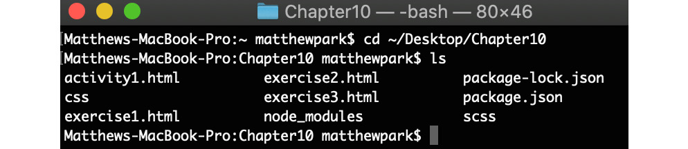
Figure 10.7: Navigating to the directory in Terminal
- Now we're in the right directory, we can compile the CSS with the SCSS command that we learned about earlier in this chapter. Type the following command at the prompt: npm run scss. This command will instruct the node-sass module to watch our SCSS files (including the new exercise1.scss file in the scss subdirectory) and output the compiled changes to the exercise1.css file inside the css subfolder upon saving the scss file. You can see this in action in the following figure:
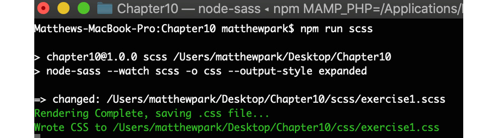
Figure 10.8: Running the npm run sass command and then saving the scss file output
At this point, we would expect Exercise 10.01.html to look like the following figure in the web browser:
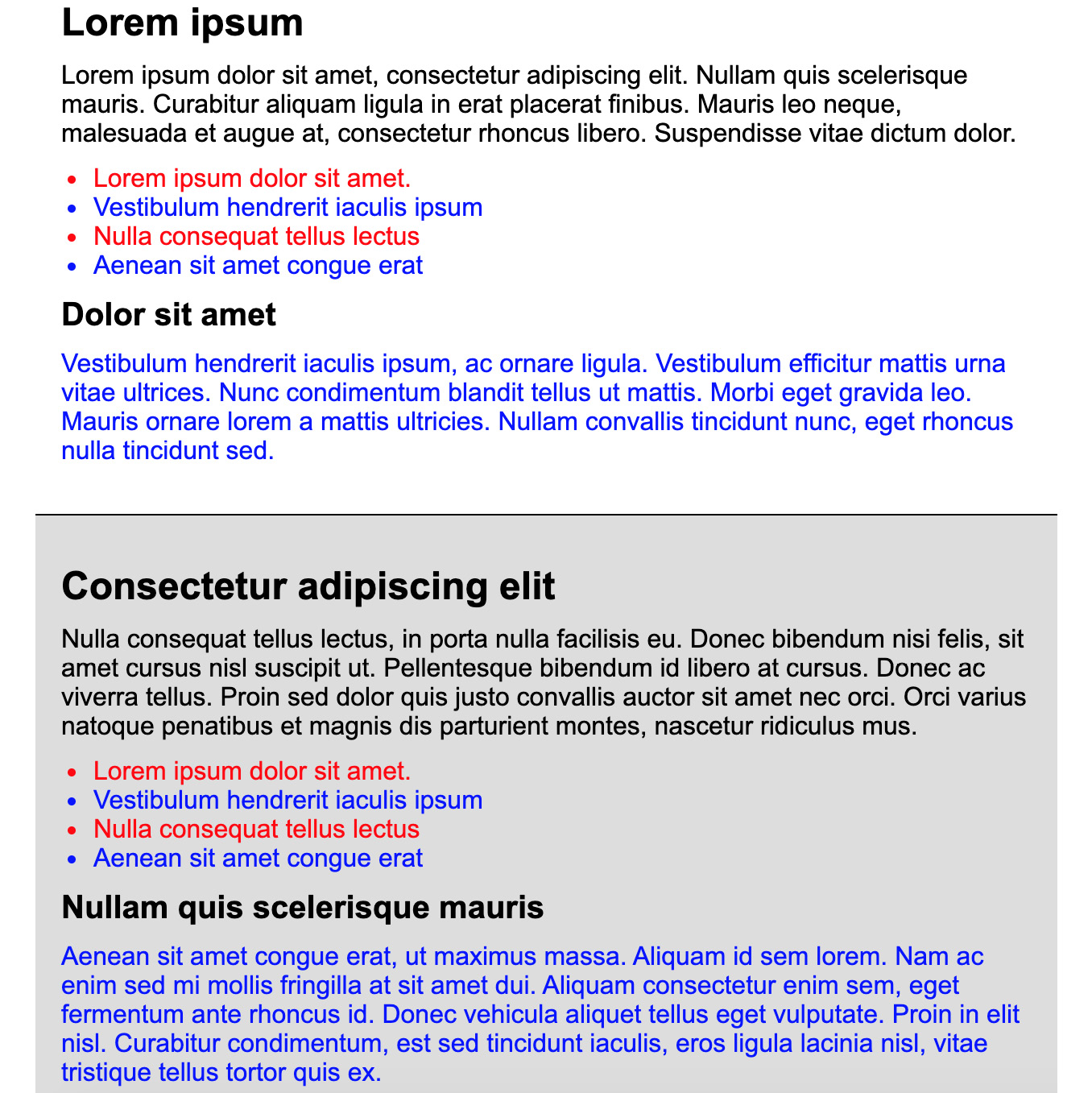
Figure 10.9: Output so far
- Next, we are going to add our variables to the top of the SCSS files:
$color-primary: #000;
$color-secondary: #0000FF;
$color-tertiary: #FF0000;
$fontsize-regular: 16px;
We've created three color variables and one font size variable to use in the next step. Save this in the top of the SCSS file and check your Terminal window to check that it's compiled in CSS. From here, you can see whether there are any compilation errors too, such as a missing semicolon causing a compilation failure, for example.
- Once the variables are in the file, we can use them within our CSS. Insert the four variables in your CSS to replace any instances of the current values, as shown in the following code:
* {
margin: 0;
padding: 0;
}
article {
font-family: Arial, sans-serif;
padding: 20px;
background: #DDD;
border-bottom: 1px solid $color-primary;
}
article:nth-child(odd) {
background: #FFF;
}
h1 {
font-size: 24px;
margin: 10px 0;
color: $color-primary;
}
h2 {
font-size: 20px;
margin: 10px 0;
color: $color-primary;
}
p {
margin: 10px 0;
font-size: $fontsize-regular;
}
p.primary {
color: $color-primary;
}
p.secondary {
color: $color-secondary;
}
ul li {
margin: 0 10px 0 20px;
font-size: $fontsize-regular;
color: $color-tertiary;
}
ul li:nth-child(even) {
color: $color-secondary;
}
When you save the SCSS file, check the CSS has compiled in exercise1.css. Everything should look the same if you open the HTML file in your web browser.
- Now we're going to change the variables and observe how the new values compile in CSS. Try assigning new colors to the three color variables and decrease the font size variable too. For example, in the following code, we have updated the variable definitions to new values:
$color-primary: #663399;
$color-secondary: #D2691E;
$color-tertiary: #CD5C5C;
$fontsize-regular: 14px;
When saving the SCSS file, once compiled in the Terminal window, you will notice in your web browser that if you open/refresh the Exercise 10.01.html file, that the colors and font size of the paragraphs and list items have changed. Now check the exercise1.css file and you will see how the SCSS has been compiled. In the following figure, you can see the expected output in the browser, followed by the complete SCSS code:

Figure 10.10: The output after variable value changes have been applied
We've now completed the exercise by adding variables in SCSS and then compiling it in CSS, which we then used in our HTML file to display styling in the web browser. You will notice that by using SCSS variables, should we decide to change the primary color on the website in the future, we'd only have to update the variable definition, instead of finding every instance of where the color is used and updating it that way. When you're working with thousands of lines of CSS code, this can be incredibly useful and makes the website code much more maintainable.
Nesting in SCSS
The next topic we're going to cover in SCSS is nesting. This is a very useful feature of SCSS as it prevents repetition in our code, so we don't have to write out the full CSS path for a styling rule each time; we can simply nest it and it gets compiled to the full path. The following is a simple example showing the article element (the parent) and the p element (the child). You can see the child element is nested inside the parent element:
article {
background: #CCC;
p {
color: red
}
}
This would compile to the following CSS code. Upon the compilation of the preprocessed SCSS code, it automatically adds the article element tag in front of the p element tag styling rule, as shown in the following code:
article {
background: #CCC;
}
article p {
color: red;
}
As you can see, this makes it a lot quicker to code by writing less, but we are still achieving the same output in CSS ultimately. Now, expanding on our example further, in the code, we've now nested an a tag within the p tag. We have also nested the hover state of the a tag, which is really useful for keeping the code in the same place, as shown in the following code:
article {
background: #CCC;
p {
color: red;
a {
color: blue;
&:hover {
text-decoration: underline;
}
}
}
}
Now, compiling this code in CSS would be done like this:
article {
background: #CCC;
}
article p {
color: red;
}
article p a {
color: blue;
}
article p a:hover {
text-decoration: underline;
}
You will notice that, in the succeeding compiled CSS code, the article element is added in front of the p tag. And also, with the a tag, the article and p tag elements are added before it, to reflect the nesting that is defined in the SCSS code. It's worth noting here that you don't need to nest this deeply normally, unless in exceptional circumstances. The previous example illustrates how nesting works, but three levels deep (for example, article p a) should always be the maximum depth, but ideally only one level deep (for example, article), or two levels deep (for example, article p or article a) at most. This will be covered again in Chapter 11, Maintainable CSS, where we will explore this topic further.
We can now understand how basic nesting works with SCSS and how it is compiled in CSS. Thinking back to Chapter 6, Responsive Web Design and Media Queries, we can incorporate these into nesting to get code together to suit maintainability by keeping the code for each element together in one place. See our example SCSS code with the added media query, which changes the background color of the article tag on browser screens of 768 pixels or higher in the following code:
article {
background: #CCC;
@media (min-width: 768px) {
background: #FFF;
}
p {
color: red;
a {
color: blue;
&:hover {
text-decoration: underline;
}
}
}
}
We can manage the background color property of the article tag for its default (mobile first) and wider screen values in one place thanks to the nested media queries. Once compiled in Terminal, the CSS file will be output with the following contents:
article {
background: #CCC;
}
@media (min-width: 768px) {
article {
background: #FFF;
}
}
article p {
color: red;
}
article p a {
color: blue;
}
article p a:hover {
text-decoration: underline;
}
At this point, now we've written some SCSS, we can demonstrate the difference between the output styles by modifying the package.json file and editing the SCSS node-sass --watch scss -o css --output-style expanded script. Currently, this is set to expand (as in the preceding output example) to produce clearly readable CSS in our learning. To demonstrate the difference, we will recompile the SCSS again in other output styles:
Nested – This increases the left indent to maintain the visual nesting of the CSS while keeping the closing curly braces on the same line as the same value. See the following code:
article {
background: #CCC; }
@media (min-width: 768px) {
article {
background: #FFF; } }
article p {
color: red; }
article p a {
color: blue; }
article p a:hover {
text-decoration: underline; }
Compact – This doesn't have an indent but puts the rule on a single line from start to end, including the curly braces, as shown in the following code:
article { background: #CCC; }
@media (min-width: 768px) { article { background: #FFF; } }
article p { color: red; }
article p a { color: blue; }
article p a:hover { text-decoration: underline; }
Compressed – This removes most of the whitespace from the CSS output, making the file size as small as possible, which is ideal for a live website where the CSS output doesn't need to be read by a developer, but just needs to be lightweight to minimize the download size for the web browser to read, as shown in the following code:
article{background:#CCC}@media (min-width: 768px){article{background:#FFF}}article p{color:red}article p a{color:blue}article p a:hover{text-decoration:underline}
You can use the SCSS script of node-sass --watch scss -o css --output-style compressed to achieve this.
Now we've covered nesting in SCSS in some detail, we're going to practice this in the next exercise.
Exercise 10.02: Rewriting Existing CSS with Nested SCSS
In this exercise, we are aiming to take some existing CSS code that we wrote for Chapter 6, Responsive Web Design and Media Queries, Exercise 6.02: Using Media Queries to Detect Device Orientation, and convert it into maintainable SCSS, to achieve the same output result in the browser:
- Get a copy of the code from Chapter 6, Responsive Web Design and Media Queries, Exercise 6.02: Using Media Queries to Detect Device Orientation, which you already completed earlier in this book and save the HTML as Exercise 10.02.html in your Chapter10 project folder.
- Remove the CSS from the style tag in the <head> tag of Exercise 10.02.html and save this separately in exercise2.scss in the SCSS subfolder of the Chapter10 project.
- Now the CSS has been moved - add the following code within the <head> tag of the HTML page:
<link href="css/exercise2.css" rel="stylesheet" />
- Next, we'll compile the SCSS we've got so far to check everything is working. Navigate to the project directory in Terminal with the following command:
cd ~/Desktop/Chapter10/
- Then, run the build script and save the exercise2.scss file to get the exercise2.css file generated:
npm run scss
At this point, we can open Exercise 10.02.html in the web browser to check everything has been generated correctly. It should appear as shown in the following figure – loading the compiled CSS:

Figure 10.11: Screenshot of desktop display
- Now we're going to update the exercise2.scss file by using nesting on the nav child elements, and the article tag and its child elements too. See the following updated SCSS code:
* {
margin: 0;
padding: 0;
}
header {
text-align: center;
}
nav {
padding: 10px;
ul {
list-style: none;
li {
display: inline-block;
margin-right: 5px;
padding-right: 5px;
border-right: 1px solid black;
&:last-child {
border-right: 0;
padding-right: 0;
margin-right: 0;
}
a {
color: black;
text-decoration: none;
&:hover {
text-decoration: underline;
}
}
}
}
}
article {
padding: 10px;
h1, p {
margin-bottom: 10px;
}
}
footer {
padding: 10px;
background: black;
text-align: center;
color: white;
}
@media (orientation: landscape) {
header {
display: flex;
align-items: center;
}
nav {
margin-left: 20px;
}
article {
columns: 100px 2;
}
}
- The final step in modifying the SCSS is to merge the media queries so they are nested in the appropriate place with the other code so the blocks are grouped together, making them more maintainable. Look at the following updated SCSS code:
* {
margin: 0;
padding: 0;
}
header {
text-align: center;
@media (orientation: landscape) {
display: flex;
align-items: center;
}
}
nav {
padding: 10px;
@media (orientation: landscape) {
margin-left: 20px;
}
ul {
list-style: none;
li {
display: inline-block;
margin-right: 5px;
padding-right: 5px;
border-right: 1px solid black;
&:last-child {
border-right: 0;
padding-right: 0;
margin-right: 0;
}
a {
color: black;
text-decoration: none;
&:hover {
text-decoration: underline;
}
}
}
}
}
article {
padding: 10px;
@media (orientation: landscape) {
columns: 100px 2;
}
h1, p {
margin-bottom: 10px;
}
}
footer {
padding: 10px;
background: black;
text-align: center;
color: white;
}
This will produce the following CSS when compiled in expanded style output:
* {
margin: 0;
padding: 0;
}
header {
text-align: center;
}
@media (orientation: landscape) {
header {
display: flex;
align-items: center;
}
}
nav {
padding: 10px;
}
@media (orientation: landscape) {
nav {
margin-left: 20px;
}
}
nav ul {
list-style: none;
}
nav ul li {
display: inline-block;
margin-right: 5px;
padding-right: 5px;
border-right: 1px solid black;
}
nav ul li:last-child {
border-right: 0;
padding-right: 0;
margin-right: 0;
}
nav ul li a {
color: black;
text-decoration: none;
}
nav ul li a:hover {
text-decoration: underline;
}
article {
padding: 10px;
}
@media (orientation: landscape) {
article {
columns: 100px 2;
}
}
article h1, article p {
margin-bottom: 10px;
}
footer {
padding: 10px;
background: black;
text-align: center;
color: white;
}
The output in the web browser should still look the same as Chapter 6, Responsive Web Design and Media Queries, Exercise 6.02: Using Media Queries to Detect Device Orientation, as shown in Figure 10.11.
We are now able to convert an existing CSS script and rework it into maintainable SCSS code using nesting. In the next section, we're going to look at import and control directives in SCSS.
Import, Control Directives, and Mixins in SCSS
In SCSS, we can import other SCSS files so that we can group the styles into their own files, helping to make a project more maintainable (we'll cover this in more detail in Chapter 11, Maintainable CSS). If you add an underscore in front of the SCSS filename, then npm won't create a CSS file for it, and you can import it into another SCSS file that gets compiled into a CSS file.
The syntax for importing another SCSS file (for example, '_filename.scss') into your main file is @import 'filename';. To see this in an example, look at the following code:
_reset.scss
* {
margin: 0;
padding: 0;
}
ul, li {
list-style: none;
}
build.scss
@import 'reset';
header {
background: #CCC;
a {
color: #000;
&:hover {
text-decoration: underline;
}
}
}
This would output with the _reset.scss file already compiled and merged into build.css as a single file outputted:
* {
margin: 0;
padding: 0;
}
ul, li {
list-style: none;
}
header {
background: #CCC;
}
header a {
color: #000;
}
header a:hover {
text-decoration: underline;
}
You can also use control directives within SCSS. These are constructed with an if statement using variables; for example, if we wanted a variable called debug and we gave it a true or false value, the syntax would look like this:
$debug = true;
@if ($debug) {
div {
border: 1px dashed red;
}
}
This code would display a dashed red border on all div elements when $debug is equal to true. If you wanted to give $debug a text value instead of a Boolean (true/false) one and also utilize the else if and else statements, then you could write it like so in SCSS:
$env: 'test';
div {
@if ($env == 'dev') {
border: 1px dotted red;
} @else if ($env == 'test') {
border: 1px dotted yellow;
} @else if ($env == 'live') {
border: 1px dotted black;
} @else {
border: none;
}
}
You can see in the preceding example, we are setting the $env variable to a text value this time. With our code example, it will change the border color to red, yellow, or black, depending on the value of the $env variable. If $env isn't equal to the 'dev', 'test', or 'live' values, then the div element will have no border applied to it. With SCSS, we can create powerful if statements to help us do more by writing less.
Next, we're going to look at mixins with SCSS. These are powerful ways of including reusable code to write less and do more. The new CSS3 column-count feature requires browser vendor prefixes to ensure we are catering for the best cross-browser compatibility. Let's look at an example of a simple mixin using the browser vendor prefixes shown in the following code:
@mixin columns($count) {
-webkit-column-count: $count;
-moz-column-count: $count;
column-count: $count;
}
article {
@include columns(2);
}
The preceding code demonstrates how we can use a mixin in SCSS to write less. Now, every time we need to use the CSS3 feature columns, we could just write @include columns(x), where x represents how many columns we'd like to have. The mixin will automatically output the browser vendor prefix variations of column-count in the compiled CSS every time we call the columns mixin in SCSS. You can see an example of the CSS3 column count feature being used in the following screenshot:

Figure 10.12: Demonstration of column count being used
Now that we have described the basics of control directives and mixins, we will implement them in the following exercise to cement our understanding.
Exercise 10.03: Using SCSS Mixins and Control Directives
The aim of this exercise is to use our knowledge of SCSS mixins and control directives to change how the logo on the page is displayed by changing the CSS3 transform property:
- We're going to start by creating Exercise 10.03.html in the project folder we created for this chapter. We can use this HTML for the file:
<!DOCTYPE html>
<html>
<head>
<meta name="viewport" content="width=device-width, initial-scale=1" />
<title>Chapter 10: Exercise 10.03</title>
<link href="css/exercise3.css" rel="stylesheet" />
</head>
<body>
<div class="transform">
<img src="https://dummyimage.com/200x100/000/fff&text=Logo" alt="" />
</div>
</body>
</html>
- Next, we're going to create exercise3.scss within the SCSS subfolder in our project folder. We can start with the following code:
@mixin transform($value) {
-webkit-transform: rotate($value);
-ms-transform: rotate($value);
transform: rotate($value);
}
.transform {
@include transform(70deg);
display: inline-block;
position: relative;
top: 100px;
left: 100px;
}
- If you open Terminal and navigate to the project directory, then run the npm run scss command as we did in the earlier exercises. Then, once you save the exercise3.scss file, it should generate exercise3.css. If you view Exercise 10.03.html, you should see a rotated logo, as shown in the following figure:

Figure 10.13: Rotated logo file
- Then we're going to extend the mixin transform, reusing what we already have. But to allow us to use a different transform property, we're going to achieve this by adding a control directive and another parameter to the mixin transform for the property. Change exercise3.scss to the following SCSS code and allow the file to recompile to CSS in your Terminal window:
@mixin transform($property, $value) {
@if ($property == 'skewY') {
-webkit-transform: skewY($value);
-ms-transform: skewY($value);
transform: skewY($value);
} @else if ($property == 'scaleY') {
-webkit-transform: scaleY($value);
-ms-transform: scaleY($value);
transform: scaleY($value);
} @else {
-webkit-transform: rotate($value);
-ms-transform: rotate($value);
transform: rotate($value);
}
}
.transform {
@include transform(rotate, 70deg);
display: inline-block;
position: relative;
top: 100px;
left: 100px;
}
As you can see in the preceding code, we've added new properties we can use in the transform mixin. It's worth noting, although we've used the browser prefixes for the transform property as an example here, as you develop your CSS preprocessing knowledge further, you may want to experiment with a Node.js module called Autoprefixer. It can be installed with npm and it does require some more dependencies and a little bit of configuration in your package.json file to create the script to run, which is outside of the scope of this book. However, Autoprefixer can automatically add any browser prefixes suggested upon compilation for the last X amount of browser versions, where X is user-defined. Next, we'll write some more HTML elements, so we can demonstrate these in action.
- We're going to add two additional logos to the HTML, to use our reusable mixin. See the following output HTML:
<!DOCTYPE html>
<html>
<head>
<meta name="viewport" content="width=device-width, initial-scale=1" />
<title>Chapter 10: Exercise 10.03</title>
<link href="css/exercise3.css" rel="stylesheet" />
</head>
<body>
<div class="transform transform1">
<img src="https://dummyimage.com/200x100/000/fff&text=Logo" alt="" />
</div>
<div class="transform transform2">
<img src="https://dummyimage.com/200x100/000/fff&text=Logo 2" alt="" />
</div>
<div class="transform transform3">
<img src="https://dummyimage.com/200x100/000/fff&text=Logo 3" alt="" />
</div>
</body>
</html>
- We also need to update the SCSS to handle these new classes for transform objects 1 to 3. Look at the following updated SCSS code:
@mixin transform($property, $value) {
@if ($property == 'skew') {
-webkit-transform: skew($value);
-ms-transform: skew($value);
transform: skew($value);
} @else if ($property == 'scale') {
-webkit-transform: scale($value);
-ms-transform: scale($value);
transform: scale($value);
} @else {
-webkit-transform: rotate($value);
-ms-transform: rotate($value);
transform: rotate($value);
}
}
.transform {
display: inline-block;
position: relative;
top: 100px;
left: 100px;
}
.transform1 {
@include transform(rotate, 70deg);
}
.transform2 {
left: 150px;
@include transform(skew, 50deg);
}
.transform3 {
left: 250px;
@include transform(scale, 1.5);
}
- Once saved and compiled, if you view Exercise 10.03.html in the web browser again, you should see an output that is the same as the following figure:

Figure 10.14: Logo outputs
The CSS output of the exercise would look as follows:
.transform {
display: inline-block;
position: relative;
top: 100px;
left: 100px;
}
.transform1 {
-webkit-transform: rotate(70deg);
-ms-transform: rotate(70deg);
transform: rotate(70deg);
}
.transform2 {
left: 150px;
-webkit-transform: skew(50deg);
-ms-transform: skew(50deg);
transform: skew(50deg);
}
.transform3 {
left: 250px;
-webkit-transform: scale(1.5);
-ms-transform: scale(1.5);
transform: scale(1.5);
}
We've been able to create a new mixin and use control directives, allowing the mixin to be reused multiple times for different purposes. Each time we've run the mixin, we've achieved a different transform property, and haven't had to type out the browser vendor prefixes each time, as this is done from within the mixin itself. Using a mixin in this way is also good for future maintainability. To explain this better, if we didn't need to use the -webkit-transform browser vendor prefix anymore, we could simply remove this output from the mixin, and wouldn't need to go through the entire collection of SCSS files removing every instance; we would just update our mixins. The same would apply if we needed to add a new browser vendor prefix too.
Loops in SCSS
Another way we can use SCSS is to create loops to create multiple CSS classes very quickly and efficiently. This makes creating lots of similar classes more maintainable as well, as opposed to writing them all by hand in normal CSS. There are three types of loops in SCSS: for, each, and while. We'll look at the for loop first.
The for loop uses the @for $variable from X to Y {} syntax, and we can create loops that will output numbers X to Y. Look at the following example:
@for $num from 1 through 4 {
.col-#{$num} {
column-count: $num
}
}
This SCSS for loop will loop through numbers 1 to 4, outputting the number in the class name and the column count property value too. Take a look at the CSS – this generates the following code:
.col-1 {
column-count: 1;
}
.col-2 {
column-count: 2;
}
.col-3 {
column-count: 3;
}
.col-4 {
column-count: 4;
}
As you can see in the preceding CSS code, the SCSS for loop code has created 15 lines of CSS code from 4 lines of SCSS code, so it's easier to maintain any future changes, especially if your loop contains a high number of iterations.
The next type of loop is the each loop. We can use this to loop through each item in a list using the @each $item in $list {} syntax. Look at the following example:
$fruits: apple pear orange kiwi pineapple melon strawberry;
@each $fruit in $fruits {
.image-#{$fruit} {
background: url("images/#{$fruit}.png") no-repeat;
}
}
The SCSS for the each loop will loop through the list of fruits, outputting each fruit in the class name and the image path value in the background property. Take a look at the CSS – this generates the following code:
.image-apple {
background: url("images/apple.png") no-repeat;
}
.image-pear {
background: url("images/pear.png") no-repeat;
}
.image-orange {
background: url("images/orange.png") no-repeat;
}
.image-kiwi {
background: url("images/kiwi.png") no-repeat;
}
.image-pineapple {
background: url("images/pineapple.png") no-repeat;
}
.image-melon {
background: url("images/melon.png") no-repeat;
}
.image-strawberry {
background: url("images/strawberry.png") no-repeat;
}
As you can see in the preceding CSS code, the SCSS for loop code has created 27 lines of CSS code from 6 lines of SCSS code, and just like with the for loop, it becomes easier to maintain any future changes.
The next loop type is the while loop. The syntax for this is @while $variable condition value {}, so the code will loop while a condition is true. Take a look at the following example in SCSS:
$box: 25;
@while $box > 0 {
.box-#{$box} {
width: $box + px;
}
$box: $box - 5;
}
This SCSS while loop will continue to run while the $box variable is greater than zero, and within the while loop, we are deducting five from the $box variable every time the loop runs. Before the loop runs, we assign the $box variable with an initial value of 25, so the code will loop 5 times before stopping. Take a look at the resulting CSS shown in the following code:
.box-25 {
width: 25px;
}
.box-20 {
width: 20px;
}
.box-15 {
width: 15px;
}
.box-10 {
width: 10px;
}
.box-5 {
width: 5px;
}
As you can see in the compiled CSS, the loop has output 19 lines, but could easily output an enormous amount of CSS classes if the $box variable was higher to start with initially, but still only using 7 lines of SCSS to create it.
All three types of loops serve their own purpose and can be used in different ways. We're now going to put this into practice in our next exercise.
Exercise 10.04: Loops in SCSS
The aim of this exercise is to create a loop in SCSS to output a list of team members with images – by creating the CSS classes for them – for a "Meet the team" web page:
- Let's start by creating Exercise 10.04.html in your Chapter10 folder. Save it with the following HTML:
<!DOCTYPE html>
<html>
<head>
<meta name="viewport" content="width=device-width, initial-scale=1" />
<title>Chapter 10: Exercise 10.04</title>
<link href="css/exercise4.css" rel="stylesheet" />
</head>
<body>
<h1>Meet The Team</h1>
<div class="team-members">
<div class="member member-david">
<h2>David</h2>
<p>Founder and CEO</p>
</div>
<div class="member member-laura">
<h2>Laura</h2>
<p>Associate Director</p>
</div>
<div class="member member-matt">
<h2>Matt</h2>
<p>Head of Project Management</p>
</div>
<div class="member member-natalie">
<h2>Natalie</h2>
<p>Office Manager</p>
</div>
<div class="member member-sarah">
<h2>Sarah</h2>
<p>Head of Development</p>
</div>
<div class="member member-steve">
<h2>Steve</h2>
<p>FrontEnd Developer</p>
</div>
<div class="member member-tahlia">
<h2>Tahlia</h2>
<p>BackEnd Developer</p>
</div>
<div class="member member-will">
<h2>Will</h2>
<p>SEO Specialist</p>
</div>
</div>
</body>
</html>
- Next, you'll need to download the images (8 images in total). You can find these here: https://packt.live/2CkSJV7. Save these in a folder called images in your Chapter10 folder.
- Then, we'll create our scss/exercise4.scss file, with the following contents to get started:
* {
margin: 0;
padding: 0;
}
body {
font-family: Arial, sans-serif;
}
h1 {
margin: 20px;
}
.team-members {
display: grid;
grid-template-columns: repeat(4, 1fr);
grid-gap: 20px;
margin: 20px;
.member {
position: relative;
padding-top: 80%;
h2,
p {
padding: 0 10px;
color: #FFF;
text-shadow: 0px 0px 10px rgba(0, 0, 0, 1);
}
p {
padding-bottom: 10px;
}
}
}
- Now we need to add the loop code to our SCSS file to output the images to our grid items. Look at the following code, which will be appended to the .member selector before it closes:
$members: david, laura, matt, natalie, sarah, steve, tahlia, will;
@each $member in $members {
&-#{$member} {
background: url(../images/#{$member}.jpg) no-repeat;
background-size: 100% auto;
}
}
As you can see in this code, we are looping through a list of names for each team member, and outputting these as a selector in this format: .member-<name>, with the background image selected.
- Compile your SCSS file by going to the Chapter10 directory in Terminal, then run the npm run scss command, and then save your SCSS file to generate css/exercise4.css. The output CSS in the css/exercise4.css file can be found in the https://packt.live/2O3DGok link.
You can see how the each loop in SCSS has iterated through the list of names to create all the classes and background image paths.
- Open Exercise 10.04.html in your web browser and look at your web page. It should look like the following figure:
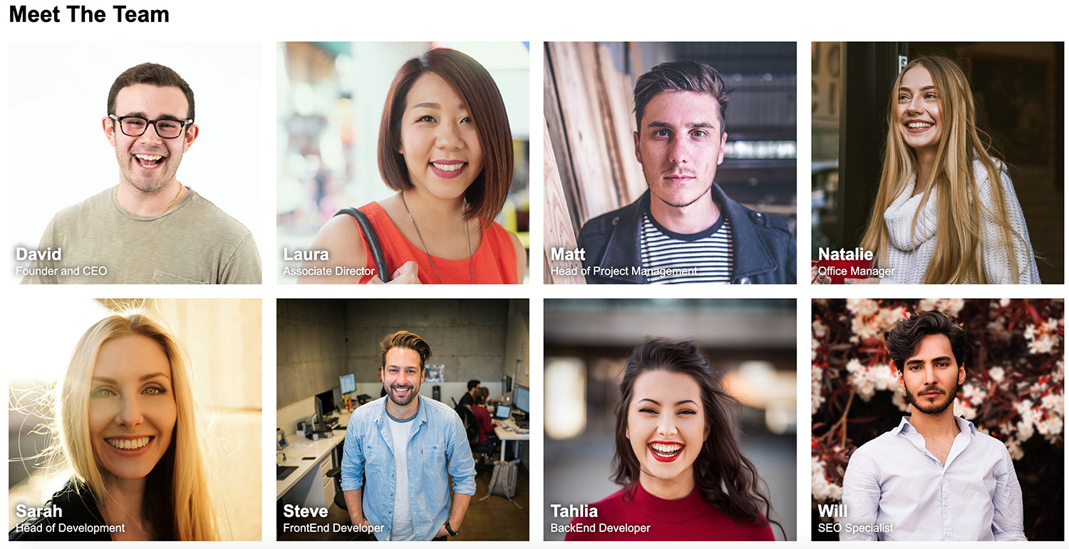
Figure 10.15: Output for loop in SCSS
In this exercise, we have learned how to put the SCSS each loop into action to quickly create new styles that are not only maintainable but also save writing more and copying and pasting similar code over and over again.
We've now covered SCSS in all the core areas, including how to compile it on your computer; writing variables; nesting selectors; and using file imports, control directives, mixins, and loops. You can use SCSS to save time by writing less and achieving more, and can also use SCSS to produce more maintainable CSS code for your web pages. We'll now look at applying your knowledge of SCSS in the activity that follows by updating your video store home page to use SCSS.
Activity 10.01: Converting the Video Store Home Page into SCSS
For this activity, we're going to take our responsive video store home page code from Chapter 6, Responsive Web Design and Media Queries, Activity 6.01, Refactoring the Video Store Product Cards into a Responsive Web Page, convert the CSS into preprocessed SCSS, and then compile it into minified CSS code:
- Get a copy of your code from Chapter 6, Responsive Web Design and Media Queries, Activity 6.01, Refactoring the Video Store Product Cards into a Responsive Web Page, and save it as a new file within your Chapter10 project folder called Activity 10.01.html.
- Remove the CSS code from within the <style> tags and save this as activity1.scss within your SCSS subfolder in the project. Add a link to the activity1.css file in your document, from the CSS subfolder of your project.
- Edit the SCSS code to add color variables, utilize nesting, and move the media queries to inside the element tags in the appropriate places, instead of having them at the end of the file.
- Edit your package.json in your project to have the SCSS script output in compressed format.
- Using Terminal, compile your SCSS code into a minified CSS code.
- The end result should look the same as Chapter 6, Responsive Web Design and Media Queries, Activity 6.01, Refactoring the Video Store Product Cards into a Responsive Web Page, but we are now coding it with SCSS and outputting this into compiled and compressed (minified) CSS. Look at the following expected output figure for reference:
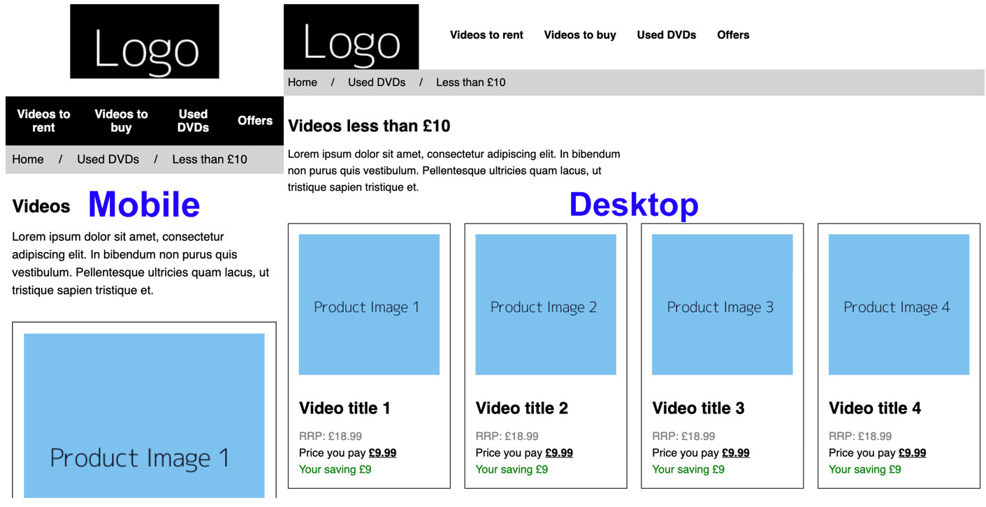
Figure 10.16 Output of mobile and desktop layouts
Note
The solution to this activity can be found in page 611.
Summary
In this chapter, we introduced CSS preprocessors, developing an understanding of how we configure the software to run the compilation of these on our machine with Node.js, npm, and with the node-sass module. We've covered how to create a project package.json file and write a script command, which we can run to compile the CSS.
We've learned about the SCSS preprocessed scripting language and its different output styles, and how we can write SCSS code to create variables; use nesting, mixins, and control directives; and import other SCSS files.
Using this knowledge, you should now be able to write and compile SCSS code to create CSS for your website projects.
In the next chapter, we will learn about what it means to create more maintainable CSS, looking at ways to implement this and how it can benefit developers working on a project.