Overview
By the end of this chapter, you will be able to identify the compatibility of features with the browser using the caniuse website; create a CSS paint worklet with the CSS Paint API; create a paint worklet with mouse input; and apply the progressive enhancement to a web page.
In this chapter, we will first introduce some methods for keeping up with changes to the web platform. We will then apply these techniques to look at some experimental browser features, such as the CSS Paint API, which is a new web technology defined by the CSS Houdini task force. We will look at what the CSS Paint API can do, and we will also see how we can use a development version of the Chrome browser to try out cutting-edge features before they are shipped to the general public.
Introduction
Throughout the previous chapters, you've learned a lot about the current state of HTML and CSS. Through the course of this chapter, we will attempt to cast our eyes to the future. We will look into the crystal ball of the web and see where these technologies are headed.
The nature of this chapter is going to be somewhat speculative, but we are going to look at some technology that is available through web browsers at the moment and may become available throughout the web ecosystem in the future.
The web moves fast, and keeping up with changes is a key skill to learn for those interested in technology and developing for the web. We hope to provide some really useful strategies and resources that can help you to do just that; to keep up with changes, to stay ahead of new web technologies, and to see what exciting and experimental features you may want to work with.
Before we experiment with the CSS Paint API and see what it allows web developers to do, we will consider some useful ways to help us, as developers, keep up with the ever-changing environment of the web.
Keeping up with the Web
Keeping up with changes in web technology and the web as a platform is one of the toughest challenges you will face as a web developer or designer.
Design trends change and technologies evolve all the time. All of the browser vendors are continuously improving their browsers on desktop and mobile, bringing out new features and improving user and developer experience with new tools and capabilities.
Several browsers are made available to developers during their development cycles, and these can be useful to a developer as they let us use experimental features and see what is changing in the next release. We can keep an eye on upcoming changes and see what effect they may have on our websites, and we can act accordingly rather than having to react in an unplanned manner when the browser updates.
Chrome Canary
In this section, we will look at Chrome Canary, the nightly build of Google's Chrome web browser. There are versions of Chrome Canary available for Windows (32-bit and 64-bit), Mac, and Android, all of which can be downloaded from the Chrome Canary website (https://packt.live/36DQASx).
Chrome Canary is a nightly build of the Chrome browser that may be unstable, but often contains experimental code and features that haven't been tested as thoroughly as they would be before being released in Google Chrome. This means there can be security issues, and such browsers should be used to assist development only. In other words, don't use them to store personal information such as credit card details and passwords.
Once you've downloaded and installed Chrome Canary, you can use it. It is very recognizable as it looks similar to the Chrome browser, though it does have a lot more yellow in the app's icon:

Figure 13.1: Chrome Canary (left) and Chrome (right)
You can also see from the About Google Chrome page that Chrome Canary will be running at least a few major versions ahead of Google Chrome.
In the following screenshot, you can see that Google Chrome is running major version 76:

Figure 13.2: About page for Google Chrome official build
In the following screenshot, you can see that Google Chrome Canary is running major version 78:
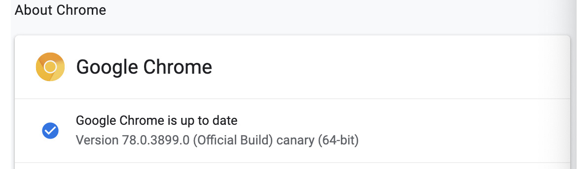
Figure 13.3: About page for Chrome Canary official build
We will look at some features that are only available in Chrome Canary later in this chapter when we look at the CSS Paint API and CSS Custom Properties API.
Nightly builds are also available for Firefox (from Firefox Nightly), Safari (Safari dev), and Edge (Edge Nightly). These browsers offer regular updates and are continuously improving the features they offer.
Experimental Flags
As well as new developments being available in the nightly builds of a browser, features are often released in the official build of the browser but behind a feature flag. This allows a developer to opt into a feature so that they can experiment or prototype a solution based on a cutting edge browser feature while protecting the general public from a feature that is still being worked on and has not been standardized yet.
You can enable and disable flags in the Chrome browser by visiting chrome://flags/ (to visit the page, type chrome://flags/ in your browser's address bar and hit Enter). This page provides a list of available experiments that the current version of the browser is running and gives you the option to enable or disable these experiments.
The following screenshot shows you what the chrome://flags/ page looks like. You can search for features and set them to disabled, enabled, or default. As the warning suggests, these are experimental features and should be treated as such. For example, there is always the potential that they can introduce an undetected security issue:
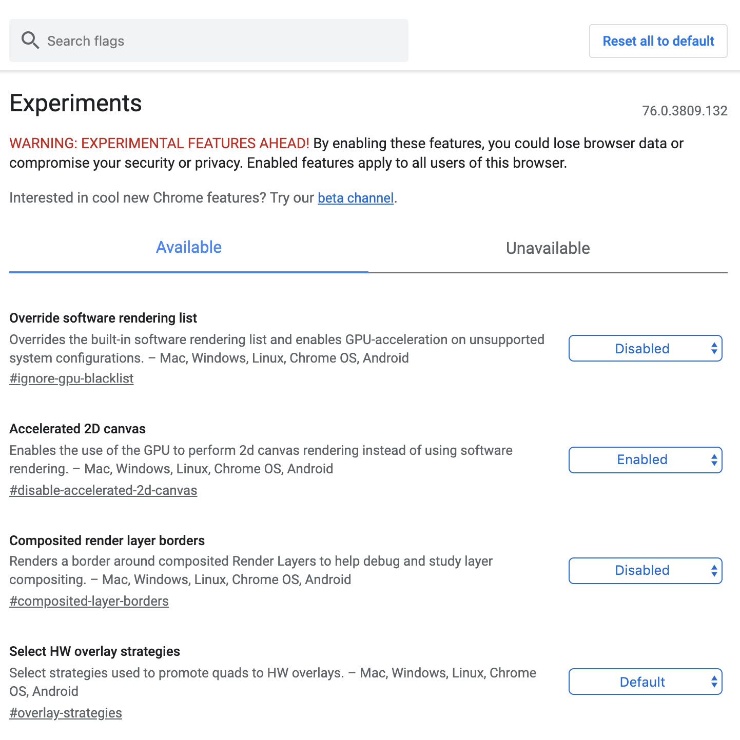
Figure 13.4: Chrome experimental flags page (chrome://flags)
These experiments relate to all aspects of the browser and can include experimental dev tools features, aspects of browser performance, and experimental web platform features such as HTML, CSS, and JavaScript. For example, in the past, this flag has included experiments relating to the new CSS grid layout and flexbox layout features, both of which we covered in Chapter 2, Structure and Layout.
Browser Vendor Status
While nightly builds of browsers can give you a chance to work with the latest features during their development and while they are still in an experimental state, browser vendors also provide useful resources for keeping up with the latest features and future roadmap of their browsers.
For the Chrome browser, you can keep up to date with current and future developments on the Chrome status website (https://packt.live/2qvpagS) and see what new features are being launched and how they are useful to web developers, The Chrome dev team's updates blog (https://packt.live/2PVR1Br) is also a great resource.
In the case of Google Chrome, information specifically about web dev tools improvements can also be accessed via the dev tools' "What's New" panel.
Caniuse
The browser landscape is a complicated one. Sometimes, a new feature will be accepted as standard and will be implemented in most or all browsers very quickly, but this is not always the case. Some features can appear in one browser and go through many iterations before a standard is agreed upon and they are implemented elsewhere.
For example, CSS Flexbox, which you learned about in Chapter 2, Structure and Layout, first appeared way back in 2009 and went through several experimental versions before a recommendation for the CSS standards was agreed upon. The browser support is now quite good, but it has taken 10 years to get there.
We, as developers, often have to work to browser specifications (that is, a list of browsers the page must support), and we may need to know whether a browser feature is available for all of the browsers included in the specification. There are several sources for this information, and one of the most palatable is the caniuse website.
If we need to know if a browser feature is available in Edge we can check the caniuse website, and it will provide a breakdown of supported browsers.
For example, to check support for the CSS grid layout, which lets us create complex layouts and page structures without adding a lot of unwanted markup to a web page, we would visit https://packt.live/2JY3z7I. The result is a map of browser support where green means full support, red means no support, and a lighter green means some support that is either behind a vendor prefix or is not the standardized version of the feature.
At the time of writing, the results for the CSS grid layout are as follows. As you can see, most of the current browsers support this feature with global support at around 91% with no prefix. IE 11 support has an older version of the specification, so it is supported with some caveats:
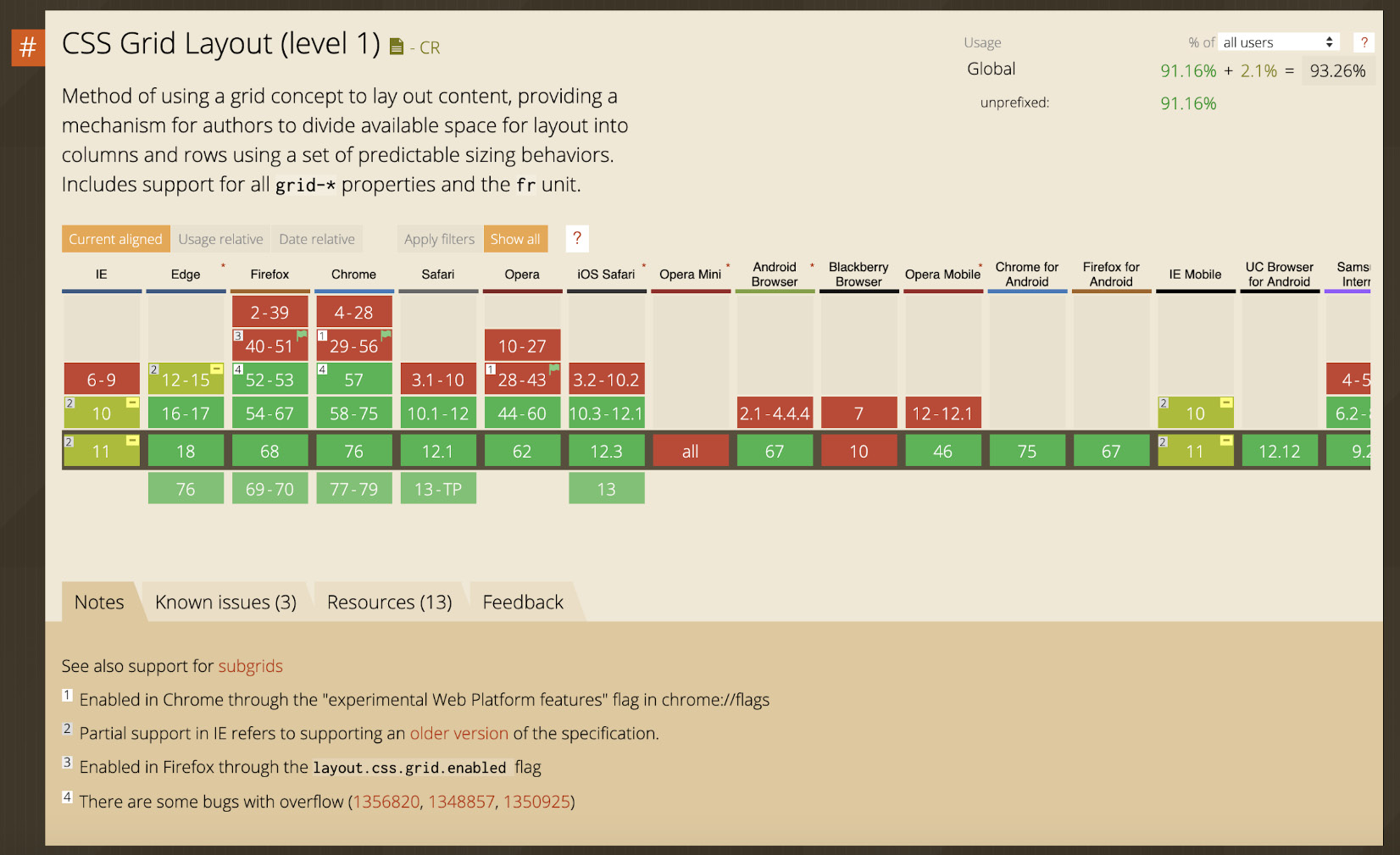
Figure 13.5: CSS Grid support
If we were to do the same for CSS grid layout level 2, that is, the CSS subgrid feature, which we can find at https://packt.live/34F3629, the story would be very different. There is very little support for this feature at the moment, with the one glimmer of green being a future version of the Mozilla Firefox browser. The results, at the time of writing, are shown in the following screenshot:

Figure 13.6: CSS Subgrid support
Using reference material such as caniuse.com, we are able to make educated decisions about whether a feature has sufficient support to be useful in our current or future web projects.
To compound our understanding, we will try using the caniuse.com website as a tool to check browser support in the next exercise.
Exercise 13.01: Verifying Browser Support for Web Pages Created Using CSS Grid
In this exercise, we will create a web page using CSS grid and check browser support and see if we can meet the browser requirements using this feature. You learned about using CSS grid for layouts in Chapter 2, Structure and Layout. Using the caniuse.com website as a tool, we will check the browser support for CSS grid and compare it to the browser requirements. Having checked the support, we will consider what we can do to match our requirements while still using a CSS grid layout.
Our browser requirements are as follows:
- The latest version of browsers that update regularly, for example, Chrome, Firefox, Edge, and Safari
- Internet Explorer support from version 11
The steps are as follows:
- Firstly, we will create a file called Exercise 13.01.html. Save this file.
- Add the following code to the Exercise 13.01.html file. This code creates a simple web page with minimal styles to set box-sizing for all the elements, which will set the padding and margin to zero and the font to Arial:
<!DOCTYPE html>
<html lang="en">
<head>
<meta charset="utf-8">
<title>Exercise 13.01: Browser support</title>
<style>
body {
padding: 0;
margin: 0;
box-sizing: border-box;
font-family: Arial, Helvetica, sans-serif;
}
*, *::after, *::before {
box-sizing: inherit;
}
</style>
</head>
<body>
</body>
</html>
- We are going to use the CSS grid to create a layout like so:
<div class="container grid">
<header class="header">
<h1>Browser support</h1>
</header>
<nav class="nav">
<ul>
<li class="current">Article 1</li>
<li><a href="#">Article 2</a></li>
</ul>
</nav>
<main class="main">
<h2>Article 1</h2>
<p>Lorem ipsum dolor sit amet, consectetur adipiscing elit. Duis sit amet porttitor dolor. Nunc sodales sodales risus. Donec vitae ex tempor leo blandit egestas sed sed odio. Vivamus nisi ligula, pharetra vel nisl sed, aliquam varius tellus. Maecenas vel semper eros, a pellentesque massa. Nullam rhoncus elit metus, sed rutrum ipsum malesuada sit amet. Maecenas nibh metus, fringilla vitae vulputate varius, consectetur nec ipsum. Suspendisse vitae fermentum felis, scelerisque imperdiet quam. Duis posuere maximus ex, tincidunt hendrerit dolor commodo id.</p>
<p>Aenean id laoreet ligula. Ut blandit odio arcu. Sed ex felis, auctor eget lobortis quis, iaculis in enim. Cras vehicula blandit odio. Aenean at imperdiet ex, sed lobortis dolor. Vivamus vehicula consectetur sem faucibus mollis. Pellentesque ac enim a velit ullamcorper varius in et dolor. Nam ultricies, urna at luctus feugiat, ante nisl maximus sapien, in rutrum dui dui at dolor. Fusce eu lorem ipsum.</p>
</main>
<section class="advertisement">
<h2>Advertise here</h2>
<p>Want your product to be noticed?</p>
<p>Advertise here!</p>
</section>
<footer class="footer">
<p>Add Copyright info here</p>
</footer>
</div>
The following screenshot shows the result of adding this markup to the body element of Exercise 13.01.html:

Figure 13.7: Markup without styles
The next step is to add markup for our layout that we can then style using CSS and apply a grid layout. The markup includes a container div on which we can apply the display, that is, the grid CSS property. Within the container, we create five elements – a header element with the page heading, a nav element with the navigation for the page, the main element for an article, a section for an advertisement, and a footer element that may contain legal information and site navigation. We can add some placeholder content to fill out the page.
- We can now use the CSS grid to layout the elements of our page. We set the grid class to use display: grid and set the element's height to the entire viewport (100 vh). Here, we will make use of the grid-template-areas property to set out our layout with named areas. We'll create a map of what our layout will look like; for example, the header section spans two columns of the first row, starting in the first column:
<style>
.grid {
display: grid;
height: 100vh;
grid-template-rows: 100px 1fr 100px;
grid-template-columns: 100px 1fr 200px;
grid-template-areas:
"header header advert"
"nav main advert"
"footer footer footer";
}
.grid .footer {
grid-area: footer;
}
.grid .header {
grid-area: header;
}
.grid .main {
grid-area: main;
}
.grid .nav {
grid-area: nav;
}
.grid .advertisement {
grid-area: advert;
}
</style>
If you now right-click on the filename in VSCode on the left-hand side of the screen and select open in default browser, you will see the following screenshot that shows the result of applying the CSS grid layout:
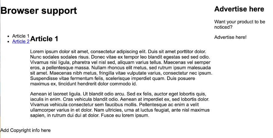
Figure 13.8: Grid layout applied
The layout now takes up the whole viewport. The header spans two columns, with the advert spanning two rows on the right. The footer spans the whole of the bottom of the page. The article expands responsively and takes up the middle section of the page.
- Next, we will update the styles of the page to give each section a bit more differentiation. We will add some borders to distinguish between sections, style the nav, and use a background color to define the advertisement and footer elements. We'll also apply some padding to give the content a bit of breathing space:
.header {
border-bottom: 1px solid gray;
}
.nav {
border-right: 1px solid gray;
}
.nav ul {
list-style-type: none;
margin: 0;
padding:0;
width: 100%;
}
.nav ul li {
width: 100%;
margin: 0;
padding: 16px 8px;
}
.current {
background: lightgray;
border-bottom: 1px solid gray;
}
.main {
display: block;
padding: 16px;
overflow:auto;
}
.advertisement {
padding: 16px;
border-left: 1px solid gray;
background: greenyellow;
}
.footer {
background: black;
color: white;
padding: 0 1rem;
}
The following screenshot shows the result of these changes:

Figure 13.9: Further styles applied to differentiate between sections of the layout
- Our web page now has a layout defined with CSS grid template areas. CSS grids mean we don't have to use additional markup to control our layout and keep style and content separate. However, we have browser requirements to meet and the CSS grid, being relatively new, may give us some concerns. In this step, we will check support using caniuse.com.
To do so, we simply visit https://packt.live/2JY3z7I in a browser. We navigate to that page and then we will see the support table for the CSS grid.
We can see the result in Figure 13.5. It shows the caniuse.com support table for the CSS grid.
Looking at the support table, we can see a lot of green, which means support for the CSS grid in most major browsers is really good. There are a few red blocks for Opera Mini and Blackberry Browser, but neither of those is included in our requirements.
The one area that may concern us is IE, which only seems to have partial support for the CSS grid.
- Hover the mouse over the IE 11 block so that we can see more details of what partial support means.
The following screenshot shows details of IE 11's partial support for the CSS grid:
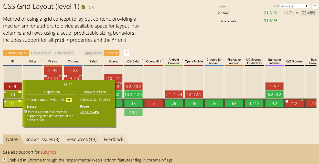
Figure 13.10: caniuse.com details of IE 11's grid layout support
The concerns we have are that the browser supports an older version of the CSS grid specification and it also expects the vendor prefix, that is, -ms-, to be used.
Checking the page in IE 11 shows us the issues that caniuse has flagged. In the following screenshot, we can see the result of opening the page in IE 11:

Figure 13.11: Result in IE 11
The result is that none of our layout code is working. We just get each element appearing one after the other.
We aren't meeting our browser requirements at the moment but we now know that IE 11 can support some version of grid layout. To meet our browser requirements, we need to add some IE-specific CSS to solve the issues in IE 11. With CSS, the last rule that the browser recognizes will be the one that's been applied so that we can support both IE and modern browser implementations of the CSS grid.
- Firstly, we apply the -ms- prefix for the grid and the row and column sizing. Instead of grid-template-rows, we apply the sizing to -ms-grid-rows and instead of grid-template-columns, we use -ms-grid-columns:
.grid {
display: -ms-grid;
display: grid;
height: 100vh;
-ms-grid-rows: 100px 1fr 100px;
grid-template-rows: 100px 1fr 100px;
-ms-grid-columns: 100px 1fr 200px;
grid-template-columns: 100px 1fr 200px;
grid-template-areas:
"header header advert"
"nav main advert"
"footer footer footer";
}
- Because the IE version of grid does not support named grid areas and the grid-template-areas property, we need to set out each of our template areas with -ms-grid-row and -ms-grid-column to set the starting row and column position and then spans to control the amount of space the elements take up. Here is the code to do this:
.grid .footer {
-ms-grid-row: 3;
-ms-grid-column: 1;
-ms-grid-column-span: 3;
grid-area: footer;
}
.grid .header {
-ms-grid-row: 1;
-ms-grid-column: 1;
-ms-grid-column-span: 2;
grid-area: header;
}
.grid .main {
-ms-grid-row: 2;
-ms-grid-column: 2;
grid-area: main;
}
.grid .nav {
-ms-grid-row: 2;
-ms-grid-column: 1;
grid-area: nav;
}
.grid .advertisement {
-ms-grid-row: 1;
-ms-grid-column: 3;
-ms-grid-row-span: 2;
grid-area: advert;
}
- The result is a CSS grid layout that works in all modern browsers and IE back to version 10, which more than meets our browser requirements.
The following screenshot shows the resulting layout in IE 11:

Figure 13.12: The result of making use of IE 11's CSS grid
As the preceding screenshot shows, we've solved the issues with our layout in IE 11 and now meet our browser support requirements.
By keeping track of the browser features we use on a web page and using tools such as caniuse.com, we can improve browser support and meet the requirements of our users and clients.
In the next part of this chapter, we will look at the CSS Paint API, which is a proposed specification that was created by the CSS Houdini Taskforce and designed to give developers more access to the CSS rendering pipeline and the CSSOM.
We will look at how we can use the technology of today by combining some of the techniques we've discussed in this chapter. We will also see how we can use progressive enhancement to provide a good user experience for those users who don't have access to the technology because it is not available in the browser they are using.
First, we will provide an explanation of the role of the CSS Houdini Taskforce and what it means for the future of web development.
CSS Houdini
The CSS Technical Architecture Group (TAG) Houdini Task Force (more prominently known as CSS Houdini) has been tasked with opening up the black box systems that make up browser rendering by providing APIs for developers to work with and for developers to change the behaviors of processes such as layout and paint.
The CSS Houdini group creates draft specifications to enhance CSS by giving developers more access to the render pipelines of the browser. We will look at two of these APIs: the CSS Paint API, which gives us greater control of the painting aspects of CSS such as background colors, gradients, and masks, and the CSS Properties and Values API, which you can use to register and define custom properties as being of a CSS type (such as a color or length). We will see how the two APIs can be used in unison.
By giving the web developer low-level access to the CSS render pipeline for layout, composition, and paint processes, developers are better able to control these processes and create more optimal scripts for rendering at the CSSOM level.
CSS Paint API
The first API from CSS Houdini to see the light of day, with an actual browser implementation, is the Paint API, which first appeared in Chrome 65 and is now available in Opera with the intent for Firefox, Safari, and Edge to implement it as well.
The Paint API gives us a way to control a 2D rendering context that we can programmatically draw to using JavaScript. This is a lot like the Canvas element we learned about in Chapter 7, Media – Audio, Video, and Canvas.
There are a couple of significant differences between the Paint API and the 2D rendering context of the Canvas:
- The main difference is that the Paint API allows us to use the 2D image with any CSS property that accepts an image as a value. For example, we can create a 2D image and then use it as the value for a background-image, border-image, or mask-image.
- The Paint API also makes use of a worklet, which is a bit like a worker, that is, a thread running parallel to the main browser thread. Essentially, this means that the worklet won't block the browser from doing other processes. The worklet has very restricted functionality, which means it can be heavily optimized for rendering.
To create a paint worklet, we will need to follow a few steps:
- Firstly, we will create a simple JavaScript class with a paint method. The paint method will receive a 2D rendering context, a geometry object with the dimensions of the area in which we can paint, and, optionally, a set of properties.
- We need to create this class in a separate file.
- To be able to use the paint worklet, we must register it, which we will do with the registerPaint function. This function is only made available when we add the file to our web page as a paint worklet module. The registerPaint function takes two arguments: a unique key that you will use to identify the worklet and the JavaScript class with the paint method.
- To add the module as a paint worklet, we'll use the addModule method on the paintWorklet object of CSS, which will look something like CSS.paintWorklet.addModule("workletModule.js");.
- With the paint worklet registered and added to our web page, we can use it in CSS wherever we may expect an image. For example, to use a paint worklet as a background image for a paragraph element, we could call the paint worklet with a special CSS paint function:
<style>
p {
background-image: paint(paintWorklet);
}
</style>
Let's run through the creation of a very simple paint worklet to get a better idea of how all of this will tie together.
Exercise 13.02: Creating a Red Fill Paint Worklet
In this exercise, we will create our first very simple paint worklet. Our first iteration of a paint worklet will be limited to painting a rectangle, that is, the full size of the canvas, with the fill color red. This exercise will get us used to registering a paint worklet and applying it to CSS. Later, we will expand upon this simple paint worklet to develop some more sophisticated effects.
The steps are as follows:
- Firstly, we want to create our worklet file. Create a new file and save it as red-fill-paint.js.
- To be able to use the paint worklet, we will need a web page. In the same directory as our paint worklet file, create a file and save it as Exercise 13.02.html. Add the following code for a simple web page:
<!DOCTYPE html>
<html lang="en">
<head>
<meta charset="utf-8">
<title>Exercise 13.02: A Simple Paint Worklet</title>
<style>
body {
padding: 0;
margin: 0;
font-family: Arial, Helvetica, sans-serif;
}
</style>
</head>
<body>
</body>
</html>
- Returning to red-fill-paint.js, we need to create a JavaScript class with a paint method. The behavior of our paint worklet will be defined in this paint method. The paint method will receive a context object that gives us access to drawing methods we can use to paint and a geometry object, which we can use to calculate the width and height of the area the worklet is applied to. To fill the rectangle with red, use the following code:
class RedFillPaintWorklet {
paint(context, geometry) {
context.fillStyle = "red";
context.fillRect(0, 0, geometry.width, geometry.height);
}
}
- For this JavaScript class to be recognized as a paint worklet, we need to register it. We do that with registerPaint. We give the worklet a name and pass it the worklet class:
registerPaint("red-fill", RedFillPaintWorklet);
- For now, we are done with the paint worklet module, but we need to add it to our web page. Returning to the Exercise 13.02.html file, we need to add a script and add the module. This will complete the registration of the paint worklet with our web page:
<script>
CSS.paintWorklet.addModule("red-fill-paint.js");
</script>
- Now, we can use the paint worklet. To do that, we will add a div element to the web page with the red-background class attribute:
<div class="red-background">
This div should have a red background.
</div>
- We will then use the paint function in our CSS and pass it the red-fill name that we have registered our paint worklet with. We'll use the following CSS to style the element, which we can add to the style element in the header of the web page:
<style>
.red-background {
background: paint(red-fill);
color: white;
box-sizing: border-box;
width: 100%;
height: 100px;
padding: 16px;
}
</style>
If you now right-click on the filename in VSCode on the left-hand side of the screen and select open in default browser, you will see the result of this code to be similar to the following screenshot. We have painted a rectangle with the color red:

Figure 13.13: A red fill paint worklet applied to a div element
We could have simply created the same effect by applying the background-color: red; style to the red-background class attribute. However, even with this very simple example, we can start to see some interesting features of paint worklets:
- The worklet is integrated with CSS, meaning we can use it for various properties, such as background-image, background-color, and mask-image, as well as for shorthand properties such as background.
- The dimensions of the worklet are dynamic and will repaint with the browser render pipeline, which means it is responsive by default.
In the next part of this chapter, we will look at how we can register properties that can be set in CSS and used in our paint worklet to make this background fill behavior more flexible and controllable via CSS styling.
Custom Properties
With CSS custom properties (often called CSS variables), we have a way to store a value for use in several CSS declarations. We can change this value as we like.
The syntax for a CSS custom property is a name prefixed with two dashes (--). We can then use the value stored in the property with the CSS var function. Here is an example of some CSS custom properties in use:
<style>
:root {
--dark-text-color: #131313;
--light-text-color: #cfcfcf;
}
p.dark {
color: var(--dark-text-color);
}
p.light {
color: var(--light-text-color);
}
</style>
The following screenshot shows the result of applying the preceding style rules to one paragraph element with the dark class attribute applied and one paragraph element with the light class attribute applied. The color variables we have created are set as the color style of the paragraph:

Figure 13.14: Custom properties for text color applied to paragraph elements
Note
The :root pseudo-class that we used in this example may be new to you. It specifies the root element of a document and is often used when setting global CSS variables.
Custom properties can be used as inputs for a paint worklet, which allows us to reuse the paint worklet with different inputs (such as color), thereby making them a lot more flexible. For example, if we wanted to use more colors than red in our fill color paint worklet, we could use a --fill-color custom property to decide which color to fill the HTML element in with.
We can register properties with the paint worklet to allow CSS properties to affect the paint worklet. A static inputProperties function can be added to our paint worklet JavaScript class and it will return an array of custom CSS properties the paint worklet expects as input, like so:
static get inputProperties() {
return ["--fill-color"];
}
Note
A static function on a JavaScript class or object is a function that is created on the class itself and not created when an instance of the class is created.
It is called through the class, for example, ColorFillPaintWorklet.inputProperties.
We can then access the property in our paint method via the properties argument. So, if we want to access the --fill-color property in our paint method, we can do the following:
paint(context, geometry, properties) {
const color = properties.get("--fill-color");
Let's try an exercise to put what we've learned into practice and to see how we can use CSS properties to make a more flexible fill color paint worklet.
Exercise 13.03: The Fill Color Paint Worklet
In this exercise, we will create a new paint worklet that extends the red fill paint worklet to allow any color to be used to fill a rectangle. While still simple and easily achieved with standard CSS, this exercise will let us see how we can use properties with our paint worklets.
The steps are as follows:
- Make a copy of red-fill-paint.js from Exercise 13.01, Browser Support, and rename it color-fill-paint.js. We will change the name of the class to ColorFillPaintWorklet.
- The paint worklet for the fill color paint worklet will be very similar to the red fill paint worklet, although we will take the color value from the --fill-color property, thus allowing us to change the color dynamically. To do this, we need to add a static inputProperties function that returns an array with the --fill-color property:
class ColorFillPaintWorklet {
static get inputProperties() {
return ["--fill-color"];
}
- We can then access the properties in the paint worklet through the properties argument of the paint method. We will get the --fill-color property and set the context's fillStyle to that value:
class ColorFillPaintWorklet {
static get inputProperties() {
return ["--fill-color"];
}
paint(context, geometry, properties) {
const color = properties.get("--fill-color");
context.fillStyle = color;
context.fillRect(0, 0, geometry.width, geometry.height);
}
}
- To complete the work on the paint worklet, we need to register it as "color-fill":
registerPaint("color-fill", ColorFillPaintWorklet);
- To make use of the paint worklet, we will make a copy of the Exercise 13.02.html file and rename it Exercise 13.03.html. We'll change the title of the HTML document to Exercise 13.03, Fill Color Paint Worklet:
<head>
<meta charset="utf-8">
<title>Exercise 13.03: Fill Color Paint Worklet</title>
<style>
body {
padding: 0;
margin: 0;
font-family: Arial, Helvetica, sans-serif;
}
</style>
</head>
- Also, in the same document, change the paint worklet module to color-fill-paint.js:
<script>
CSS.paintWorklet.addModule("color-fill-paint.js");
</script>
</body>
</html>
- Next, we will replace the .red-background style with a .fill-background style that uses color-fill instead of red-fill. We'll also set up two new class attributes – .green and .orange – that will set the --fill-color property:
<style>
.green {
--fill-color: #05a505;
}
.orange {
--fill-color: #ff9900;
}
.fill-background {
box-sizing:border-box;
background: paint(color-fill);
color: white;
width: 100%;
height: 100px;
padding: 16px;
}
</style>
- Finally, we'll replace the div element with the.red-background class attribute with two div elements, both with the.fill-background class attribute applied. However, one will have the .green class attribute applied to it, while the other will have the .orange class attribute applied to it:
<div class="fill-background green">
This div should have a green background.
</div>
<div class="fill-background orange">
This div should have an orange background.
</div>
If you now right-click on the filename in VSCode on the left-hand side of the screen and select open in default browser, you will see the following screenshot that shows the color fill paint worklet being applied to two different divs with green and orange background fills:
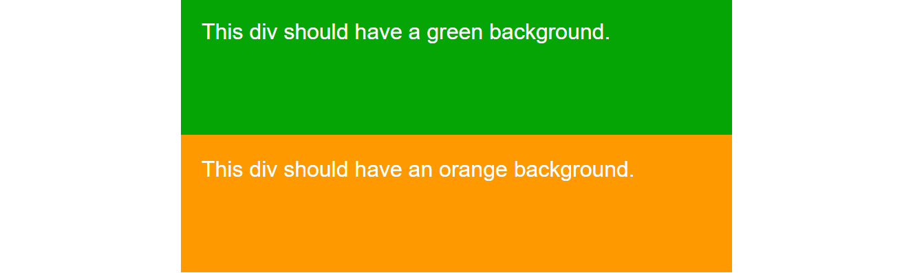
Figure 13.15: Fill color paint worklet applied with different parameters
Custom properties allow us to create more flexible worklets. We can easily apply different parameters using CSS selectors. An added advantage is that because paint worklets are intrinsically tied to the CSS rendering system, we can take advantage of properties such as CSS transition to animate a paint worklet.
Next, we will look at how we can use multiple properties and work with user input to update the custom properties. This can make our paint worklet much more interactive and opens up some more possibilities regarding what we can do with a paint worklet.
Input Properties
Using some JavaScript, we can do even more with these custom properties. For example, we can listen to a mouse or touch input and pass the x and y coordinates to a paint worklet. With these values, we can paint an element based on the point where the pointer is moving or the point where the pointer enters and leaves the element.
In the next exercise, we will introduce a few more custom properties and update them based on the movement of the mouse. In so doing, we will create a paint worklet that is a bit more complex but also goes beyond what is easily done with standard CSS properties (such as background-color).
Exercise 13.04: Paint Worklet with Mouse Input
In this exercise, we will create a new paint worklet that paints a circle that follows the mouse as it moves over an element that the paint worklet is associated with. Using CSS pseudo-classes, we will then update the custom properties when the user clicks the element in order to paint a clicked state for the element.
The steps are as follows:
- Create a new file and name it pointer-input-paint.js. We will create a new paint worklet in this file.
- In pointer-input-paint.js, we want to create a JavaScript class called PointerInputPaint. This will encompass the behavior of our paint worklet. We will register the paint worklet as "pointer" so that we can use it in our document's CSS:
class PointerInputPaint {
paint(context, geometry, properties) {
}
}
registerPaint("pointer", PointerInputPaint);
- Next, we can define a set of input properties, which is the set of CSS custom properties we will set via CSS. We want to know the x and y positions of the mouse, so we will store those positions as the --position-x and --position-y properties. We also want to customize the size and color of our mouse follower and for that, we will store properties for size and two different colors in the following properties: --size, --primary-fill-color, and --secondary-fill-color:
static get inputProperties() {
return ["--position-x", "--position-y", "--primary-fill-color", "--secondary-fill-color", "--size"];
}
- In the paint method of our paint worklet, we are going to need to do two things: read the values from our CSS input properties and use the values to draw a gradient onto the element the paint worklet is attached to.
- First, we need to read the input properties. We do this in the paint function, where the properties argument gives us access to each of the input properties. We can use the get function to get a property by its name. We get each property, that is, the x and y coordinates of the mouse, the primary and secondary colors, and the size property:
paint(context, geometry, properties) {
const x = properties.get("--position-x");
const y = properties.get("--position-y");
const primaryColor = properties.get("--primary-fill-color");
const secondaryColor = properties.get("--secondary-fill-color");
const size = properties.get("--size");
- Then, we draw a radial gradient based on the input properties. In the preceding code, we use the x and y coordinates to create a circle of the size of our size input. We then add the primary and secondary colors as color stops to the gradient. We learned about creating gradients on a canvas context in Chapter 7, Media – Audio, Video, and Canvas. This technique is the same as it is for a paint worklet because that uses a version of a canvas:
var gradient = context.createRadialGradient(
x, y, 0, x, y, geometry.width * size
);
gradient.addColorStop(0.24, primaryColor);
gradient.addColorStop(0.25, secondaryColor);
gradient.addColorStop(1, secondaryColor);
The gradient here is positioned at the x and y values, which will be defined by the mouse position.
- We use this gradient as a fill style and fill the whole rectangle for the element, like we did in the previous exercises:
context.fillStyle = gradient;
context.fillRect(0, 0, geometry.width, geometry.height);
}
That is the whole of the paint worklet.
- Next, we will create an HTML document so that we can make use of our paint worklet. Create a new file and name it Exercise 13.04.html. Copy the following markup into that file. This markup creates a web page with a single button centered on the page. The button is styled to create a large button:
<!DOCTYPE html>
<html lang="en">
<head>
<meta charset="utf-8">
<title>Exercise 13.04: Mouse Input Worklet</title>
<style>
body {
padding: 0;
margin: 0;
font-family: Arial, Helvetica, sans-serif;
}
</style>
</head>
<body>
<div class="centered-content">
<button class="button pointer centered-content">
Click me!
</button>
</div>
<style>
.centered-content {
display: flex;
align-items: center;
justify-content: center;
}
.button {
outline: none;
user-select: none;
-webkit-appearance: none;
appearance: none;
margin: 16px;
width: 375px;
height: 150px;
padding: 16px;
font-size: 24px;
}
</style>
</body>
</html>
As shown in the following screenshot, this simple HTML document creates a single button with some CSS classes and the text Click me!. We have added a few styles to replace the default button styles and to center the content:

Figure 13.16: A "Click me!" button
- In a script tag, we'll add our paint worklet to this page so that we can use it in our CSS:
<script>
CSS.paintWorklet.addModule("pointer-input-paint.js");
</script>
- Next, we need to create our CSS custom properties so that we can store the values that our paint worklet will read from. We will create these in a CSS declaration targeted at the :root pseudo-class so that they are defined globally for all CSS:
<style>
:root {
--position-x: 0;
--position-y: 0;
--primary-fill-color: #7200ca;
--secondary-fill-color: #12005e;
--size: 0.1;
}
- We can now add the pointer class definition to the CSS. This will use our paint worklet as a background to any element the pointer class attribute is added to. When the button is active (or clicked), we will change the values of two of our CSS properties, that is, the secondary fill color (--secondary-fill-color) and the size (--size). We do this by setting the properties using the CSS pseudo-classes for :visited and :active (which we learned about in Chapter 1, Introduction to HTML and CSS):
.pointer {
background: paint(pointer);
color: white;
}
.pointer:visited,
.pointer:active {
--secondary-fill-color: #12005e;
--size: 10;
}
</style>
The result is a dark purple button, as shown in the following screenshot. There is a small light purple dot in the top left corner of the button. At the moment, this will not move around:

Figure 13.17: The button with the pointer paint worklet applied
When the button is clicked, it will turn a lighter shade of purple, as shown in the following screenshot:

Figure 13.18: The active state of the button with the pointer paint worklet applied
- To get the mouse follower working correctly, we need a little bit of JavaScript. Let's add a mousemove event listener to our button element. An event listener will trigger when something happens; in this case, when the mouse is moved by the user. When the mouse is moved, we will set the --position-x and --position-y properties with the new x and y coordinates of the mouse pointer over the element. We'll use the setProperty function to set a property on the style object of the document element of the HTML DOM. This is equivalent to setting the CSS properties inline on the HTML element or using the :root selector in CSS. We add this to our script tag:
const mouseInput = document.querySelector(".pointer");
mouseInput.addEventListener("mousemove", () => {
document.documentElement.style.setProperty("--position-x", event. offsetX);
document.documentElement.style.setProperty("--position-y", event. offsetY);
});
If you now right-click on the filename in VSCode on the left-hand side of the screen and select open in default browser, we should have a pointer that follows the mouse position correctly, as seen in the following figure:

Figure 13.19: The button with pointer following the mouse
In this exercise, we have used the mouse position to update CSS custom properties and used these properties in a paint worklet to draw a mouse follower on an element.
We can begin to see some of the benefits of using a paint worklet here as we haven't had to add any extra elements or pseudo-elements to the HTML to handle the pointer.
In the next section, we will look at another CSS Houdini API, the CSS Properties and Values API, and we will see how we can use this API to register CSS custom properties and how we can have even more control of them in a paint worklet.
CSS Properties and Values API
The CSS Properties and Values API allows us to register custom CSS properties and define their initial value, the syntax they are based on, and whether the value inherits down the HTML DOM tree (as, for example, a font size or family property value would).
To register CSS properties, we need to use JavaScript. The API provides us with a method so that we can register CSS properties with the registerProperty method, which is available on the global CSS object.
Let's have a look at an example:
CSS.registerProperty({
name: "--primary-fill-color",
syntax: "<color>",
inherits: false,
initialValue: "white"
});
The registerProperty method expects an object that defines our CSS custom property. We need to give the property a name, for example, --primary-fill-color or --size, and define whether it inherits – in other words, whether the value is inherited by DOM elements that are children of the element the property is associated with.
We can also define the syntax that the property follows. If we define the syntax that the property follows, we also need to provide an initial value for the property. There are quite a few different syntax types that we can choose from, including <length>, <angle>, <color>, <number>, and <time>, which define different parts of the CSS syntax.
In the preceding example, we defined a color property that follows the <color> syntax and has an initial value set as white. The benefit of defining a property in this way is that we can tell if the value will make sense in a CSS rule and we can use it as a value in a CSS transition where interpolation from one value to another can be calculated.
At the time of writing, this API will only work in Chrome Canary, which presents a further problem that we will discuss in the next section when we talk about progressive enhancement as a technique for developing for the web, where not all users will have the same browser or a browser with the same capabilities.
In the next exercise, we will do just that. We will take the fill color paint worklet from our previous exercise and animate it by changing a custom property with the CSS transition and animation properties.
Next, we will look at how we can use CSS animations or transitions to control custom properties. We will use animation to further improve our pointer paint worklet.
Animating Custom Properties
Remember that our paint worklet is integrated into CSS and its rendering pipeline. This means that it will repaint if the style properties change. Because we can provide an input property and the paint worklet will call the paint method if the property changes, we are able to use CSS to animate the custom property. This means that we can easily animate a paint worklet with CSS using the CSS animation and transition properties.
There is one caveat that makes this more difficult, though. The problem is that the type of CSS custom property is not easily recognized. What we need is a way of telling CSS what type of property we are passing it. In other words, we need to be able to tell CSS if we are giving it a percentage value, a number, a color value, a length value (px, em), or an angle value (deg, turn, rad).
We can use the CSS Properties and Values API to solve this problem. In the next exercise, we will do just that.
Exercise 13.05: Animating a Paint Worklet
In this exercise, we will animate the paint worklet we created in Exercise 13.04, Paint Worklet with Mouse Input. We do not need to make any changes to our paint worklet for this exercise, but we will need to register custom properties so that they can be animated using the CSS transition property.
The steps are as follows:
- Make a copy of the Exercise 13.04.html file from our previous exercise. Rename the copied file Exercise 13.05.html and update the title of the web page document:
<title>Exercise 13.05: Animated Paint Worklet</title>
- We want to add a transition to our pointer class declaration, which will transition the custom properties for --size, --primary-fill-color, and --secondary-fill-color. This will cause the values for these properties to transition to the values that have been set when the element with the pointer class is clicked:
.pointer {
background: paint(pointer);
color: white;
transition: --size 1s, --primary-fill-color 0.5s, --secondary-fill- color 0.5s;
}
The transition will not work yet because the custom properties have not had their syntax type defined and the CSS engine does not know how to transition from one value to another without knowing the type of the value.
- To get the transitions to work, we need to register the properties. We do that with the registerProperty method:
CSS.registerProperty({
name: "--primary-fill-color",
syntax: "<color>",
inherits: false,
initialValue: "#7200ca"
});
CSS.registerProperty({
name: "--secondary-fill-color",
syntax: "<color>",
inherits: false,
initialValue: "#12005e"
});
CSS.registerProperty({
name: "--size",
syntax: "<number>",
inherits: false,
initialValue: 0.05
});
If you now right-click on the filename in VSCode on the left-hand side of the screen and select open in default browser to see the result in a browser. Now that we've registered the properties for the two color values and the size of the pointer, we can see the animation working when we click the button with the pointer class attribute attached, as shown in the following screenshot:

Figure 13.20: The button with a pointer following the mouse and animated CSS transitions
This exercise will work in Chrome Canary, where the CSS Properties and Values API is currently available. However, it will cause some problems in browsers where that feature is not available.
In the next part of this chapter, we will examine the support for the APIs we have used in browsers. With this information to hand, we can form a strategy for progressive enhancement with which we can deal with browsers that have not yet implemented this feature.
Current Browser Support
We can check the current browser support for the CSS Paint API feature at https://packt.live/2pT7xYi. The following screenshot shows which browsers support the feature at the time of writing. Browser support is still mostly limited to Chrome, Opera, and Android browsers. There is still a lot of red in the screenshot, but it is worth bearing in mind that Chrome makes up a good percentage of browser users:
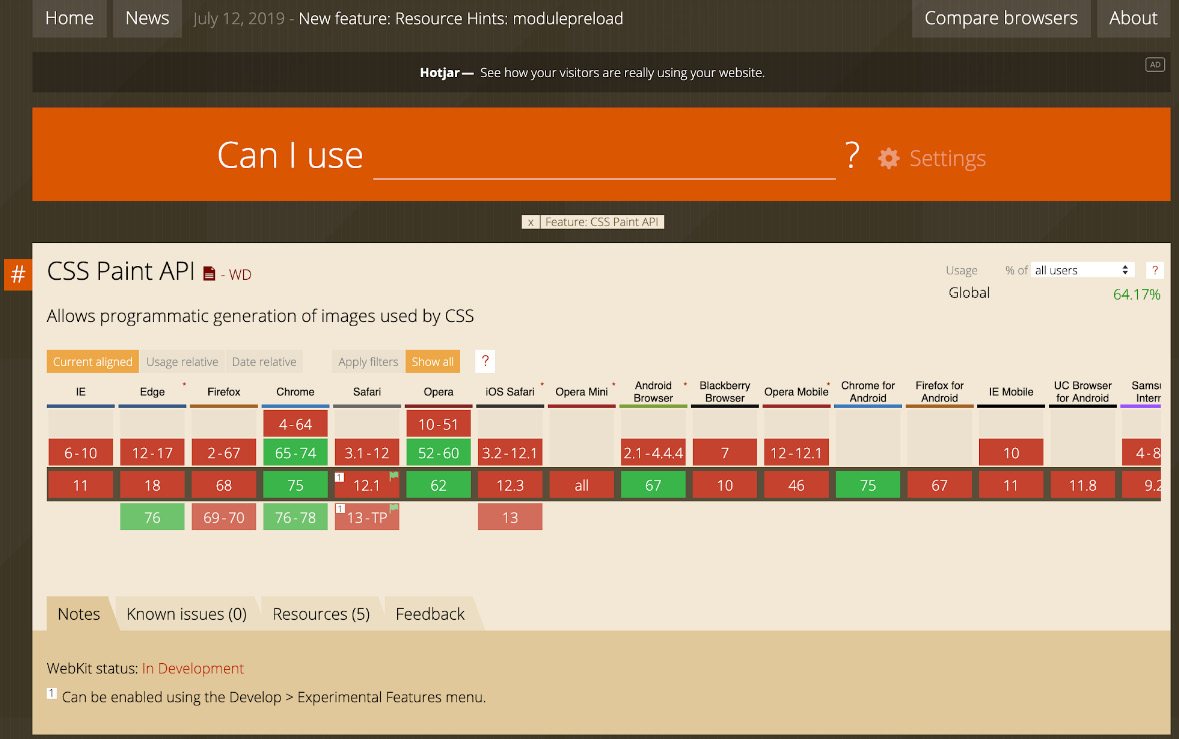
Figure 13.21: caniuse.com browser support data for the CSS Paint API
As well as this information, the Is Houdini Ready Yet site at https://packt.live/2rjZKDj is dedicated to the state of various CSS Houdini APIs. It shows where APIs have already been implemented but also where there is interest in implementing the APIs or where the APIs are currently in development:

Figure 13.22: Current state of various CSS Houdini APIs
As we can see from the preceding screenshot, many of the seven APIs that have been developed and specified by the CSS Houdini task force has seen interest from browser developers, and several have seen implementations shipped in major browsers. In particular, the Paint API and Typed OM have been actively developed and shipped in Chrome, Opera, and Samsung Browser, with Firefox and Safari showing interest in actively developing those features.
We can also see that the Properties and Values API has partial support such as that found in the Chrome Canary browser.
As we can see, the features we are using are not yet available in all the browsers we would want our web pages to work in. It is always a good idea to get as good support as we can, but it is possible to mitigate this issue with the strategy of progressive enhancement, which we will learn about in the next part of this chapter.
Progressive enhancement is really important for helping developers produce web pages that work for as wide a variety of users as possible while allowing us to use the latest technologies and giving us the freedom to experiment.
As a technique, it lets us provide our base content to any user on any device while enriching and enhancing the user experience for those with more capable browsers and devices.
Progressive Enhancement
There are several approaches that we can use when we are working with the web to make sure our websites provide the best experience possible for the greatest number of users. Unlike some closed systems, we cannot trust that all users will have the same capabilities or devices. What we can do is work from a baseline set of features and then enhance the experience for more capable browsers. This is called Progressive Enhancement.
An example of this technique is providing a simple, functional web page with text and links and then adding JavaScript to enhance the experience.
One particular challenge is CSS custom properties, or CSS variables because they are useful when used throughout your CSS declarations and are not available in IE 11. They are difficult to polyfill without having to restrict what they can do. One way of handling CSS variables is with the user of a CSS preprocessor and the build tools that replace the CSS variables at build time to create CSS that works in IE 11. We covered the use of build tools and CSS preprocessors in Chapter 10, Preprocessors and Tooling. This could then be served to the restricted browser while more capable browsers make use of CSS variables.
In the case of the CSS Paint API, we can provide a decent experience without a paint worklet, and there are often JavaScript polyfills to reach a similar experience. In the next exercise, we will apply some of these techniques to make our paint worklet example from Exercise 13.04, Paint Worklet with Mouse Input, work across more browsers.
Exercise 13.06: Progressive Enhancement
If we take a moment to analyze the code we created in Exercise 13.05, Animating a Paint Worklet, we will see that it presents a few difficulties as code we may want to use on a live website.
If you open the Exercise 13.05.html page in a browser that doesn't support either the CSS Paint API or CSS Properties and Values API, you will experience none of the stylings we expect and also some JavaScript errors.
The following screenshot shows the result of running Exercise 13.05.html in the Chrome browser, which does not support the CSS Properties and Values API. The dev tools console panel is open and shows a JavaScript error caused by a lack of support for CSS.registerProperty. The button is difficult to use as it appears with none of the expected styles:
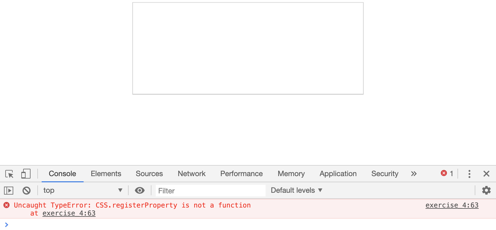
Figure 13.23: Unsupported features running in Chrome
In this exercise, we will make our code more robust and provide a decent experience for those browsers that do not support the features we want to use. We will see how we can start from a working version and can then enhance the experience depending on the availability of new features.
Here are the steps:
- Make a copy of the Exercise 13.05.html file from our previous exercise. Rename the copied file Exercise 13.06.html and update the title of the web page document:
<title>Exercise 13.06: Progressive Enhancement</title>
- One of the benefits of cascade in CSS is that unrecognized CSS rules will be ignored, and so the last rule to be defined in the CSS, that is, a recognized rule, will be the style that's applied. We can use this technique to progressively enhance CSS. We can set background colors for the pointer class for normal and active states of the button when paint worklets are not recognized:
.pointer {
background: #12005e;
background: paint(pointer);
color: white;
transition: --size 1s, --primary-fill-color 0.5s, --secondary-fill-color 0.5s;
}
.pointer:visited,
.pointer:active {
background-color: #7200ca;
--secondary-fill-color: #7200ca;
--size: 10;
}
As a baseline experience for the button, this is enough functionality for browsers without the CSS Paint API. The button still works and there is visual differentiation between the active click state and the normal state. We still have some issues to deal with to stop errors being thrown, which we will handle next.
- The next step is to prevent some errors being thrown when we register properties and the paint worklet in JavaScript. In this exercise, we can handle any issues well enough with some feature detection. Using an if statement, we can check whether a property exists in the browser. We can check that the CSS object is found on the window object, and if so, we run the rest of the code. We do the same to check for the existence of the registerProperty method, which is used for registering properties, and the paintWorklet property, which is used for adding paintlet modules to our CSS. This protects our code from throwing errors that will prevent further code from running:
if (window.CSS) {
if ("registerProperty" in CSS) {
CSS.registerProperty({
name: "--primary-fill-color",
syntax: "<color>",
inherits: false,
initialValue: "#7200ca"
});
CSS.registerProperty({
name: "--secondary-fill-color",
syntax: "<color>",
inherits: false,
initialValue: "#12005e"
});
CSS.registerProperty({
name: "--size",
syntax: "<number>",
inherits: false,
initialValue: 0.05
});
}
if ("paintWorklet" in CSS) {
CSS.paintWorklet.addModule("pointer-input-paint.js");
}
}
- We have now prevented any JavaScript errors from being thrown, which could prevent other scripts on the page from functioning. In this simple case, we have done enough to make the button function and look OK and then enhanced it as browser capabilities improved.
If you now right-click on the filename in VSCode on the left-hand side of the screen and select open in default browser, you will see the following screenshot that shows the button hover state on a browser that does not support the CSS Paint API or CSS Properties and Values API. The button style is still visible and the button is functional, but we can't see the mouse following the circle. The button is usable but does not have an enhanced experience:

Figure 13.24: Hover state of unsupported features but with improved progressive enhancement
The following screenshot shows the button click state on a browser that does not support the CSS Paint API or CSS Properties and Values API. The click state has no animation but has a color fill and shows that the user is clicking the button:

Figure 13.25: Click state of unsupported features but with improved progressive enhancement
In the following screenshot, we can see the hover state of the button in a browser with full support for the CSS Paint API and the CSS Properties and Values API, along with the mouse follower:

Figure 13.26: Overstate in a browser that supports CSS Houdini features
In the following screenshot, we can see the click state of the button in a browser with full support for the CSS Paint API and the CSS Properties and Values API. The click state is animated:

Figure 13.27: Click state in a browser that supports CSS Houdini features
Having looked at some of the features of the CSS Paint API and CSS Properties and Values API, we have considered a small subset of the CSS Houdini APIs that will provide a lot of low-level controls of the CSS render pipeline and browser layout. We have also considered how to handle experimental browser features in our current web development processes.
We will end this chapter with an activity where we will create our own paint worklet before we summarize our learning.
Activity 13.01: Button Library
You have been asked to build a library of buttons that can be used as part of a design system for consistent designs across the whole of the site you are working on. To begin with, the client is requesting four button types – default, secondary, ghost, and a special button.
The steps are as follows:
- Create a directory called design_system_activity for the project.
- Create a new file in that directory and name it index.html. Copy the following markup into the file:
<!DOCTYPE html>
<html lang="en">
<head>
<meta charset="utf-8">
<title>Activity 13.01: Buttons</title>
<style>
body {
padding: 0;
margin: 0;
font-family: Arial, Helvetica, sans-serif;
}
.button {
outline: none;
user-select: none;
-webkit-appearance: none;
appearance: none;
margin: 16px;
min-width: 128px;
min-height: 32px;
padding: 8px 16px;
font-size: 24px;
border: 2px solid #fcfcfc;
box-shadow: 0 0 5px 0 rgba(0, 0, 0, 0.2);
border-radius: 3px;
cursor: pointer;
}
</style>
</head>
<body>
<div class="actions">
<button class="button button--primary">
Primary
</button>
<button class="button button--secondary">
Secondary
</button>
<button class="button button--ghost">
Ghost
</button>
<button class="button button--special">
Special
</button>
</div>
<script>
</script>
</body>
</html>
We have added markup for four button types: primary, secondary, ghost, and special.
- Create styles for the primary button with the text color as white, the font-weight as bold, and the background color with a hex value of #f44336. When hovered over, the button's background color will change to #ff9900.
The following screenshot shows the expected primary button design:

Figure 13.28: Primary button designs for normal and hover states
- Create styles for the secondary button with the text color as white, the font-weight as normal, and the background color with a hex value of #9e9e9e. When hovered over, the button's background color will change to #7c7c7c.
The following screenshot shows the expected secondary button design:

Figure 13.29: Secondary button designs for normal and hover states
- Create styles for the ghost button with the text and border color as #9e9e9e, the font-weight as normal, and the background color as white. When hovered over, the button's background color will change to #efefef.
The following screenshot shows the expected ghost button design:

Figure 13.30: Ghost button designs for normal and hover states
- Finally, create a style for the special button. This button will have a linear gradient background with the primary color value #f44336 and the secondary color value #ff9900. The gradient will transition when hovered over since the color values are being swapped. You can use a paint worklet for this button, which you can create in a file called gradient-paint.js. The worklet name should be animated-gradient.
The following screenshot shows the expected special button design:

Figure 13.31: Special button designs for normal and hover states
- To draw the gradient of the special button, we will create a gradient paint worklet by creating a JavaScript file called gradient-paint.js and copying the following JavaScript code into it:
class GradientPaintWorklet {
static get inputProperties() {
return ["--primary-fill-color", "--secondary-fill-color"];
}
paint(context, geometry, properties) {
const primaryColor = properties.get("--primary-fill-color");
const secondaryColor = properties.get("--secondary-fill-color");
const gradient = context.createLinearGradient(0, 0, geometry. width, geometry.height);
gradient.addColorStop(0, primaryColor);
gradient.addColorStop(1.0, secondaryColor);
context.fillStyle = gradient;
context.fillRect(0, 0, geometry.width, geometry.height);
}
}
registerPaint("animated-gradient", GradientPaintWorklet);
Note
The solution to this activity can be found in page 630.
We have now completed the activity and started creating a design system by including the use of a paint worklet with the CSS Paint API and CSS Properties and Values API.
Next, we will summarize what we've learned in this chapter.
Summary
In this chapter, we have looked at the future of the web and how we can keep up with changes that are being made to the web platform as web developers.
We have considered some techniques and resources for keeping up with cutting-edge browser features.
We have also looked at several experimental features that have started getting some traction in official and upcoming web browsers, such as the CSS Paint API and the CSS Properties and Values API. We have learned how to create a CSS paint worklet and how we can use CSS properties as inputs.
Then, we looked at how we can get a good understanding of browser support for features and use techniques such as progressive enhancement to work with new features while providing a good experience for less capable browsers.
Ultimately, the future of the web is down to web developers who love the platform they work on and want to create great websites for their users. The techniques we've learned about in this chapter and throughout the previous chapters can help you on that journey.