Overview
By the end of this chapter, you will be able to create a CSS theme for a website using different CSS properties that control color, borders, and backgrounds; use different CSS color value types (Hex, RGB, RGBA, and HSL) to define colors; create a dark theme using hsl() and the CSS invert filter; and customize a theme using CSS hooks.
This chapter introduces some of the fundamental real-world uses of CSS. If you work for any period of time as a web developer, you will work with CSS to change the look and feel of a website or application. This chapter will show you how to do just that.
Introduction
In the previous chapter, you learned about forms, which allow you to work with user data in different ways. Data is important, of course – the modern world runs on it. It's not the only thing, however. For most people, all the data in the world is useless unless there's also a beautiful interface to access it with. Cascading Style Sheets (CSS) is the technology that will allow you to bring that interface to life on the web.
The power of CSS is its ability to change, sometimes radically, the appearance of a web page without updating the markup. This allows you to update the look and feel of a web page without you having any control at all over the content. This power expresses itself most commonly in themes, that is, CSS files that change the look and feel of a site or application and that can be applied easily. While some theming systems, like the ones in WordPress, allow and encourage dynamic changes to the markup, there's so much you can do with CSS alone. The classic example is the CSS Zen Garden site (https://packt.live/36HYha7). Founded in 2003, CSS Zen Garden has continued to showcase the wide range of possibilities that CSS offers to change the look and feel of a site:

Figure 5.1: Three examples of CSS Zen Garden
We won't be doing anything as dramatic as the designs on the CSS Zen Garden site, but the same lessons will apply here. We're going to take one HTML page, a simplified version of this author's WordPress blog, and apply multiple different themes to it to change its look and feel in different ways. In addition to applying different looks, we're going to also use different techniques to manipulate colors using different color value types.
The base that we'll be working with looks as follows. As you can see, it's a wholly text-based site. All of the design is provided by CSS, which makes it perfect for our purposes. We don't need to worry about creating new images – we can simply work with CSS files to update the look and feel of the site:

Figure 5.2: The design we'll be theming in this chapter
The folder structure is very simple. There is a file called index.html in the root of the folder and there is a folder called assets with one file in it: style.css. We will add new HTML files and new CSS files to this directory in order to create our themes:

Figure 5.3: The file structure
Let's get started.
The Markup
Before we get started with themes, let's familiarize ourselves with the markup we're going to be working with. Open up index.html in a text editor (preferably VSCode) to see what we're working with. The head of the document is straightforward. For our purposes, the most important element is the link element, which imports the style.css file. style.css represents the base CSS file for our exercise. It is this file that we'll be extending to create our theme. We'll be adding our theme CSS files to this section. With CSS, later rules override earlier rules, so updating styles is as simple as appending a new style sheet after the first and updating the rules with your new styles:
<!DOCTYPE html>
<html lang="en-US">
<head>
<meta http-equiv="Content-Type" content="text/html; charset=UTF-8">
<meta name="viewport" content="width=device-width, initial-scale=1">
<title>HTML5 Boilerplate 7.2.0 and main.css 2.0.0 released – HTML + CSS + JavaScript</title>
<link rel="stylesheet" id="hcj2-0-style-css" href="./assets/style.css" type="text/css" media="all">
</head>
If you're familiar with WordPress, you'll be familiar with some of the markup landmarks in the body, as well as many of the CSS classes present. WordPress themes take advantage of classes to customize pages from the template level, all the way down to the individual post level. In this case, on the body element, you can see the post-template-default class, which would allow you to style all post pages. In the same body element, you can see the postid-11002 class, which would allow you to apply styles to an individual post and no other posts. Such is the power of a well-defined theme system:
<body class="post-template-default single single-post postid-11002 single-format-standard">
<div id="page" class="site">
The header contains two areas that we'll manipulate: the h1.site-title element and nav.site-navigation. The h1 is the title of the site and is therefore one of the most visible elements. The initial design is quite simple. We'll be updating it with something a little more eye-catching in our theme. A site navigation menu is a common element across most sites, so paying some attention to that in our example will be important. It is constructed as a nav element with a child ul element containing the menu items.
Notice again that there are classes that represent unique IDs attached to the li elements. If you wanted to style one of those individually, you could:
<header id="masthead" class="site-header" role="banner">
<div class="site-branding">
<h1 class="site-title"><a href="https://htmlcssjavascript.com/" rel="home">HTML + CSS + JavaScript</a></h1>
<p class="site-description">Let's Build the Web We Want</p>
</div>
<nav id="site-navigation" class="main-navigation" role="navigation">
<div class="menu-menu-1-container">
<ul id="primary-menu" class="menu">
<li id="menu-item-10815" class="menu-item menu-item-type-post_type menu-item-object-page menu-item-10815"><a
href="https://htmlcssjavascript.com/about/">About</a></li>
<li id="menu-item-10816" class="menu-item menu-item-type-post_type menu-item-object-page menu-item-10816"><a
href="https://htmlcssjavascript.com/consulting-and-training- services/">Consulting & Training
Services</a></li>
</ul>
</div>
</nav>
</header>
The primary and secondary sections of page content are contained in div#content:
<div id="content" class="site-content">
div#primary is where the primary site content lives. It wraps a main#main element, which contains the article element, which is where the actual post lives. The article element has many classes that would allow you to target the post in many ways. We will actually use the tag-h5bp class in one of our themes to show that this particular post is about the HTML5 Boilerplate project:
<div id="primary" class="content-area">
<main id="main" class="site-main" role="main">
<article id="post-11002"
class="post-11002 post type-post status-publish format-standard hentry category-css category-html category-web tag-h5bp">
Inside the article is the article header element, which contains the article header, an h1, and some metadata about the post in div.entry-meta. Note that there are two versions of marked up metadata in this section: the time element with its associated datetime attribute and the vcard, which indicates the relationship of the author of the post with a specific URL:
<header class="entry-header">
<h1 class="entry-title">HTML5 Boilerplate 7.2.0 and main.css 2.0.0 released</h1>
<div class="entry-meta">
<span class="posted-on">Posted on <a
href="https://htmlcssjavascript.com/web/html5-boilerplate-7- 2-0-and-main-css-2-0-0-released/"
rel="bookmark"><time class="entry-date published updated" datetime="2019-06-10T13:51:01-04:00">June
10, 2019</time></a></span><span class="byline"> by <span class="author vcard"><a class="url fn n"
href="https://htmlcssjavascript.com/author/robreact/">Rob Larsen</a></span></span></div>
</header>
Inside div.entry-content is the article itself. In this case, it is just a series of p elements, links, and one list, but in the world of WordPress, it could be pretty much anything. For our purposes, some simple text is enough to theme, so we'll work with what we've got:
<div class="entry-content">
<p>We just released <a href="https://github.com/h5bp/html5- boilerplate">HTML5 Boilerplate</a> 7.2.0 and <a
href="https://github.com/h5bp/main.css">main.css</a> 2.0.0. Even with the major release number on
main.css, both of these are basically maintenance releases. Open Source isn't always about the big
stuff. </p>
<p>We also did a bunch of clean-up around the related H5BP projects, with updates to <a
href="https://github.com/h5bp/html5boilerplate. com">HTML5Boilerplate.com</a> and <a
href="https://github.com/h5bp/h5bp.github.io">h5bp.org</a>. We integrated main.css as a direct
dependency on both projects and did some other clean-up. </p>
Below the level 2 heading comes the unordered list as represented in the following code:
<h2>HTML5Boilerplate Changelog</h2>
<ul>
<li>Remove <code>defer</code> from Google Analytics snippet (<a
href="https://github.com/h5bp/html5-boilerplate/ pull/2132">#2132</a>)</li>
<li>Update jQuery to v3.4.1 (<a href="https://github.com/h5bp/ html5-boilerplate/pull/2126">#2126</a>)
</li>
<li>Update Apache Server Configs to 3.2.1 (<a
href="https://github.com/h5bp/html5-boilerplate/ pull/2128">#2128</a>)</li>
<li>Update main.css to v2.0.0 (<a href="https://github.com/h5bp/ html5-boilerplate/pull/2135">#2135</a>)
</li>
</ul>
<p>Download the latest from <a
href="https://github.com/h5bp/html5-boilerplate/releases/ download/v7.2.0/html5-boilerplate_v7.2.0.zip">github</a>
or install it from <a href="https://www.npmjs.com/package/ html5-boilerplate">npm</a>.</p>
<!--trimmed, see full content in downloaded files -->
</div>
Following the body of the article, there's a small footer element for links to the different categories and tags for the content:
<footer class="entry-footer">
<span class="cat-links">Posted in <a href="https:// htmlcssjavascript.com/category/css/"
rel="category tag">CSS</a>, <a href="https:// htmlcssjavascript.com/category/html/"
rel="category tag">HTML</a>, <a href="https:// htmlcssjavascript.com/category/web/"
rel="category tag">Web</a></span><span class="tags- links">Tagged <a
href="https://htmlcssjavascript.com/tag/h5bp/" rel="tag">h5bp</a></span> </footer>
That ends the primary content section:
</article>
</main>
</div>
The secondary content section is contained in an aside. It normally contains a number of section elements with different content. In this case, there is one section with an h2 and a small list of links:
<aside id="secondary" class="widget-area" role="complementary">
<section id="pages-3" class="widget widget_pages">
<h2 class="widget-title">Pages</h2>
<ul>
<li class="page_item page-item-2"><a href="https:// htmlcssjavascript.com/about/">About</a></li>
<li class="page_item page-item-5"><a href="https:// htmlcssjavascript.com/privacy-policy/">Privacy Policy</a>
</li>
</ul>
</section>
</aside>
</div>
And finally, there is a footer element with copyright information:
<footer id="colophon" class="site-footer" role="contentinfo">
<div class="site-info">
<p>© Rob Larsen</p>
</div>
</footer>
</div>
</body>
Now that we've taken a look at the markup, let's work at creating a "dark" theme for the site.
Inverting Colors
Many of the examples we'll be going through will use complementary inverted colors to create dark themes. To get the complementary or "opposite" color, you can use something like the invert tool in Photoshop or the one from https://packt.live/2WOOY3K.
Using the Opposite Color Tool (https://packt.live/2pGhUyS) is as simple as pasting the color you want to invert into the left text box and copying the output from the right text box:

Figure 5.4: The Opposite Color Tool
To invert colors in Photoshop, open the file and run the invert command. From the menu, go to Image > Adjustments > Invert. On the keyboard, use Ctrl + I on Windows or Apple + I on mac. This produces the following output:
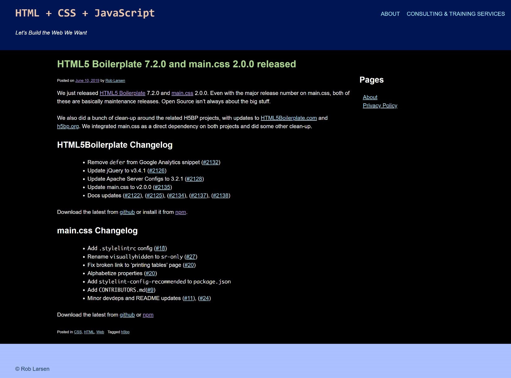
Figure 5.5: The output of the invert command in Photoshop
While this is a good baseline, we'll be adjusting some of the colors by hand in order to maintain some web design conventions with regard to traditional link colors.
We'll learn about another, much easier, way to invert colors in a later exercise.
New HTML Elements in the Theme
Theme files are, by nature, supposed to be inclusive of any markup you may use on a page. To that end, there are a few new HTML elements present in these files. This section will briefly introduce them:
- The pre (preformatted) element presents text that matches the text exactly as it was written in the HTML file, including all whitespace. The text is typically rendered in a monospace font, where each character takes up the exact same space in a line of text (like in a code editor).
- The abbr (abbreviation) element represents an acronym or abbreviation.
The deprecated acronym element serves the same purpose as abbr. While deprecated, it's included because themes have to handle a wide range of markup, including older, obsolete elements.
New CSS Background Properties
The following exercise uses three new CSS properties that all relate to background images. Let's introduce them before we go onto this new exercise.
background-image controls the background image of an element. Pass in the URL of your image to url() so that image appears as the background of your element.
background-repeat controls how the background image tiles or whether it tiles at all. The possible values are as follows:
- repeat indicates that the image should repeat as much as is needed to cover the available space. The last image will be clipped if it doesn't fit into the available space.
- space indicates that the image should repeat as much as possible without clipping. The original aspect ratio of the image will be maintained and the spacing between the first and last images, which are pinned to the edges, will change to fill the area.
- round indicates that the repeated images should stretch or compress (depending on whether greater than one half or less than one half of the image will fit the next slot).
- no-repeat indicates that the image is not repeated.
Let's use all the CSS knowledge we have gained so far to complete the next exercise.
Exercise 5.01: Creating a Dark Theme
The first exercise we're going to go through will be creating a dark theme. Since many of the colors were originally generated using Hex values, we'll continue to use them in this first example. As you'll see, there are other, easier, ways to invert colors. Hex values are very common, however, so doing this example with Hex values is going to match itself to your real-world experience.
The finished theme will look like what's shown in the following screenshot:
Figure 5.6: The new dark theme
Here are the steps to complete this exercise:
- Create a file called dark-theme.css in the assets folder of your sample project.
- Copy index.html and paste it into a new file called Exercise 5.01.html.
- Add the following line to the head of your document in order to include the new file. You do this by including dark-theme.css in your document in a new link element:
<head>
<meta http-equiv="Content-Type" content="text/html; charset=UTF-8">
<meta name="viewport" content="width=device-width, initial-scale=1">
<title>HTML5 Boilerplate 7.2.0 and main.css 2.0.0 released – HTML + CSS + JavaScript</title>
<link rel="stylesheet" id="hcj2-0-style-css" href="./assets/style.css" type="text/css" media="all">
<link rel="stylesheet" id="dark-theme" href="./assets/dark-theme.css" type="text/css" media="all">
</head>
- Now, open dark-theme.css and start adding new rules to invert the colors that are present on the site. The existing style sheet is broken up into sections. We'll follow the same pattern in our new style sheet. We'll start with the Typography section, setting the text color for body, button, input, select, and textarea to be #ffffff (pure white):
body,
input,
select,
textarea {
color: #ffffff;
}
- Next, we'll change some colors that don't actually show up in our demo but are text elements that may show up sometime in the future. We'll set the background of pre (preformatted) elements to #111111 (a very dark gray) and the bottom border of the abbr (abbreviation) and acronym elements to be #999999 (a lighter gray):
pre {
background: #111111;
}
abbr,
acronym {
border-bottom: 1px dotted #999999;
}
- The next few changes will be in the Elements section, where we redefine certain generic HTML elements. This first edit will certainly be visible in the demo. We're going to change the background of the body element from white to black, #000000:
/*--------------------------------------------------------------
# Elements
--------------------------------------------------------------*/
body {
background: #000000;
}
- Next, we'll change the color of horizontal rules to be a dark gray:
hr {
background-color: #333333;
}
- In the Navigation section, we will change the color of links:
/*--------------------------------------------------------------
# Navigation
--------------------------------------------------------------*/
/*--------------------------------------------------------------
## Links
--------------------------------------------------------------*/
a {
color: #add8e6;
}
a:visited {
color: #b19cd9;
}
a:hover,
a:focus,
a:active {
color: #4169e1;
}
Overall, these are not inverted or complementary colors. Since there are traditional colors for the different states of links, we will simply use the same blue and purple colors people expect for links and visited links – we will just use a lighter shade of each so that they show up better when placed on a black background. The first change will be to the generic a element, which we will set to #add8e6, a light blue. Next, change the color of visited links to be #b19cd9, a light purple. Finally, change the color of the hover, focus, and active states to be #4169e1, royal blue.
- This final section of changes is going to be targeted at specific markup present in this specific WordPress theme. First, change the background of our generic .content-area element to be pure black:
.content-area {
background: #000000;
}
- Next, we need to change the color of the site header's h1 to be #EDC8AD, which is a sandy yellow:
header.site-header h1 {
color: #EDC8AD;
}
header.site-header h1 a {
color: #EDC8AD;
}
Note that we are changing the color for both the h1 element and the a element inside of it. This is to ensure that the generic a color we defined earlier doesn't override the sandy color we've generated for the h1 element.
- Continuing with the header, the next change adjusts the color of the navigation menu items and links to #AAE8FF, a pale blue, to contrast with the dark blue background we will set in the next step:
header.site-header nav .menu,
header.site-header nav li a {
color: #AAE8FF;
}
- The dark blue we just mentioned is added here, where we set .site-header to be #001655, which is, in fact, a dark blue:
.blog .site-header,
.single-post .site-header{
background: #001655;
}
- Next, we need to adjust the h1 element inside of the main article element so that it's readable against the dark background. The complementary color of the original color, #53276e, is #ACD891. This is a light grayish green:
article h1 {
color: #ACD891;
}
- Next, we need to make sure that the body text is legible. The original content text defaulted to #666666, which is a dark gray. Set it to #999999, which is a lighter gray that will show up perfectly well against the black of the background:
article .content {
color: #999999;
}
- Finally, we will updated colors in the footer:
footer.site-footer {
color: #123752;
background: #AAC0FF;
}
footer.site-footer a {
color: #123752;
}
First, we set the color of the default text and also the color of the elements to be #123752, which is a very dark blue. That's important because we set the background of footer.site-footer to #AAC0FF, which is a pale blue/magenta color.
- Save dark-theme.css, and if you now right-click on the filename in VSCode on the left-hand side of the screen and select open in default browser, it will show your dark theme:
Figure 5.7: Successfully implemented theme
While the CSS involved here is very basic, the entirety of the work is simply changing the color values of several individual properties – calculating the complementary colors of the different Hex values isn't straightforward. Unless you're very good at working with color values, you need software to do the work. There is an alternative, however, that makes getting the complementary value of a color much easier. Using the hsl() (Hue/Saturation/Lightness) function for color values is going to make it a breeze. Let's look at how this works.
Creating a Dark Theme with the HSL Function
The HSL function allows you to update the color value of a property by using one of three arguments: Hue, Saturation, or Lightness:
- H represents the hue as an angle on the color wheel. You can specify this using degrees (or, programmatically, radians.) When provided as a unitless number, it is interpreted as degrees, with 0 as pure red, 120 as pure green, and 240 as pure blue.
- S represents the saturation, with 100% saturation being completely saturated, while 0% is completely unsaturated (gray). 50% is a "normal" color.
- L represents the saturation, with 100% saturation being completely saturated, while 0% is completely unsaturated (gray).
This color system allows you to manipulate colors by hand in a way that doesn't really happen very often when working with colors in CSS. Assuming you have an encyclopedic knowledge of named colors, you could do this work off the top of your head, but otherwise, it's very difficult to manipulate Hex values or even RGB values without software. Working with the color wheel is much more intuitive, especially when dealing with inverting colors. To do so, you simply point to the opposite side of the color value. If you think of the color wheel in terms of 360 degrees, then the color 180 degrees away from your target color is on the opposite side of the color wheel.
The following image shows the color wheel and an illustration of 180 degrees being on the opposite side of the color wheel:

Figure 5.8: Color wheel
When we want to have grays inverting the color, this means we need to flip the value of the lightness value. The Hue, in that case, can be anything since the "grayness" of an HSL color is managed by the Saturation. Set the Saturation to 0 and you have a gray. From there, you adjust the Lightness from 0% (black) to 100% white to move along the grayscale.
Exercise 5.02: Creating a Dark Theme Using hsl()
For this exercise, we're not going to simply invert every color, since we've already seen how that turns out. Instead, we'll look for complementary colors where appropriate, look for entirely new colors where it makes sense, and also adjust the saturation and lightness of colors to make a new version of the dark theme. As you're following along with this exercise, feel free to adjust the colors yourself. Working with HSL makes it easy to experiment.
The new theme will look as follows:
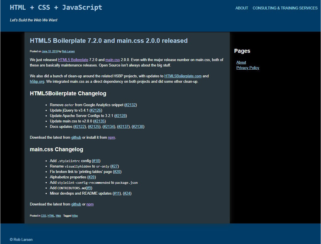
Figure 5.9: The new dark theme
Here are the steps to complete this exercise:
- Create a file called dark-theme-hsl.css in the assets folder of your sample project.
- Copy index.html and paste it into a new file called Exercise 5.02.html.
- Add the following lines to the head of your document in order to include the new file:
<head>
<meta http-equiv="Content-Type" content="text/html; charset=UTF-8">
<meta name="viewport" content="width=device-width, initial-scale=1">
<title>HTML5 Boilerplate 7.2.0 and main.css 2.0.0 released – HTML + CSS + JavaScript</title>
<link rel="stylesheet" id="hcj2-0-style-css" href="./assets/style.css" type="text/css" media="all">
<link rel="stylesheet" id="dark-theme-hsl" href="./assets/dark-theme-hsl.css" type="text/css" media="all">
</head>
- Now, open dark-theme-hsl.css and start adding new rules to create a new dark theme. The existing style sheet is broken up into sections:
/*--------------------------------------------------------------
# Typography
--------------------------------------------------------------*/
body,
button,
input,
select,
textarea {
color: hsl(0, 0%, 100%);
}
Next we'll once again change some colors that don't actually show up in our demo. We'll set the background of pre elements to hsl(0, 0%, 7%) This is the opposite of the very light gray in the original design as is indicated by the Lightness value of the original color which was written in HSL as hsl(0, 0%, 93%) We then set the bottom border of abbr and acronym elements to be hsl(0, 0%, 60%), the opposite of the original hsl(0, 0%, 40%):
pre {
background: hsl(0, 0%, 7%);
}
abbr,
acronym {
border-bottom: 1px dotted hsl(0, 0%, 60%);
}
We'll follow the same pattern in our new style sheet. We'll start with the Typography section, setting the text color for body, button, input, select, and textarea to hsl(0,0,100%) (pure white). Remember that the hue here (pure red) doesn't matter since the saturation is 0% (pure gray). All that matters is the lightness, which is set to 100%.
- Next, change the background of the body element from white to black, hsl(0, 0%, 0%); like the example with white earlier, the hue here is still set to pure red, but since the lightness is set to 0%, it doesn't matter:
/*--------------------------------------------------------------
# Elements
--------------------------------------------------------------*/
body {
background: hsl(0, 0%, 0%);
}
- Next, update the hr definition with a color that inverts the gray from a light gray to something very, very dark, with the lightness set to 20%:
hr {
background-color: hsl(0, 0%, 20%);
}
- In the Navigation section, we will change the color of the links. Once again, these are not inverted. They're similar to the colors in the original dark theme, but using HSL allows us to align them a little bit. Set the color of the a elements to hsl(195, 75%, 80%). Finally, set the a:hover, a:focus, and a:active colors to hsl (225, 75%, 60%):
/*--------------------------------------------------------------
# Navigation
--------------------------------------------------------------*/
/*--------------------------------------------------------------
## Links
--------------------------------------------------------------*/
a {
color: hsl(195, 75%, 80%);
}
a:visited {
color: hsl(260, 75%, 80%);
}
a:hover,
a:focus,
a:active {
color: hsl(225, 75%, 60%);
}
The color for basic links is a blue with a bit of green in it (imagine where 195 would be on the color wheel). It's highly saturated (75%) and very light (80%). Set a:visited to hsl(260, 75%, 80%). This is a light purple (follow the color wheel three quarters of the way around to see where the purples live on the color wheel). We set the same lightness and saturation to keep the colors feeling similar on the page. In this case, the blue is nearly a "true" blue (blue being 240) and then it's got the same saturation and a slightly darker lightness. These states are temporary, so they have some more weight to them than the links that need to be part of the text.
- Next, set the background color of .content-area to hsl(205, 20%, 20%). This is the biggest change from the original dark theme, where we've gone from pure black to a very dark blue:
.content-area {
background: hsl(205, 20%, 20%);
}
Because of the previous change, you should add some padding to the child nodes of.widget-area in order to ensure that the text doesn't bump up against our dark blue content-area.
- Set padding-left of the h2 elements in the widget area to 20px and set the padding of ul to 30px. This will give you a comfortable amount of space:
.widget-area h2 {
padding-left: 20px;
}
.widget-area ul {
padding-left: 30px;
}
This isn't a radical change to the layout but illustrates how easy it is to work with the look and feel of a site without needing to get into the weeds with the markup.
- Next, we need to change the color of the site header's h1 to hsl(205, 50%, 80%) which, unlike the sandy yellow of the previous dark theme, is a blue:
header.site-header h1 {
color: hsl(205, 50%, 80%);
}
You'll note that this blue is the same Hue as the background of the content area – it's just had the saturation upped to 50% and the lightness upped to a very bright 80%.
- Once again, make the same change to the header.site-header, h1, that is, a color definition so that the a:visited color we defined earlier doesn't mess up the site header:
header.site-header h1 a {
color: hsl(205, 50%, 80%);
}
- Continuing with the header, the next change adjusts the color of the navigation menu items and links to hsl(195, 100%, 80%):
header.site-header nav .menu,
header.site-header nav li a {
color: hsl(195, 100%, 80%);
}
This is a more saturated version of the color we're using for links elsewhere on the page. It's the same Hue and Lightness. It will look like a link in the context of the page but will be different enough to signify that's it's not the same as a content link.
- Set the background of.site-header to hsl(205, 100%, 20%). You'll notice that this is a more saturated version of the same dark blue we used for the background of the content area. Using the same hues and changing the saturation and lightness makes adding coherence to the theme easy:
.blog .site-header,
.single-post .site-header{
background: hsl(205, 100%, 20%);
}
- Next, set the h1 in the article elements to hsl(205, 50%, 80%), which is the exact same color as the main site header:
article h1 {
color: hsl(205, 50%, 80%);
}
- The next change to make is setting the body text to be a gray with 60% lightness. We do this by setting the base color of text in the .content element to hsl(0, 0%, 60%);:
article .content {
color: hsl(0, 0%, 60%);
}
- Finally, we will update the colors in the footer:
footer.site-footer {
color: hsl(205, 60%, 80%);
background: hsl(205, 100%, 20%);
}
footer.site-footer a {
color: hsl(205, 60%, 80%);
}
First, we adjust the text color and the associated link color to hsl(205, 60%, 80%). Unlike the previous version of the dark theme, this text color is a bright blue. It's based on the same 205 Hue we've been using throughout this theme. This has a saturation of 60% and the same 80% lightness that many of the other text elements have. Next, set the background color to hsl(205, 100%, 20%), which is a dark blue.
- Save dark-theme-hsl.css and right-click on the filename in VSCode on the left-hand side of the screen and select open in default browser, to see your dark theme:
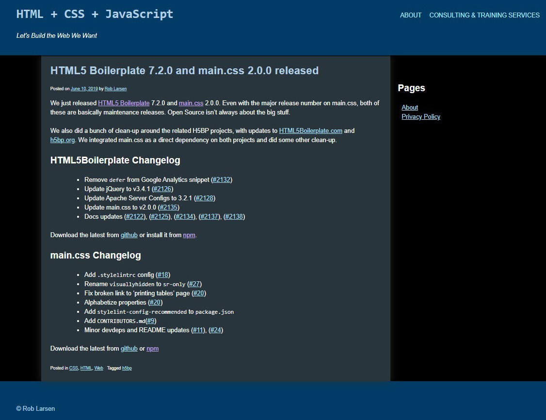
Figure 5.10: The new dark theme executed
Before we exit the topic of dark themes, there's one more CSS property and value that can provide a shortcut to a dark theme. Let's take a quick look at the CSS invert filter.
CSS Invert Filter
While you wouldn't use this particular CSS property and value in this way to create a full-on theme, it does present an interesting CSS-based shortcut for inverting the color scheme of an HTML element. CSS provides a number of filters that apply graphical effects to an element. There are many available. The one we're going to focus on is filter: invert(). This filter does what you would expect if you've been following along in this chapter – it inverts the color of the element.
A basic example of using invert is to invert the colors of an image, as shown in the following example. The following is the original image:
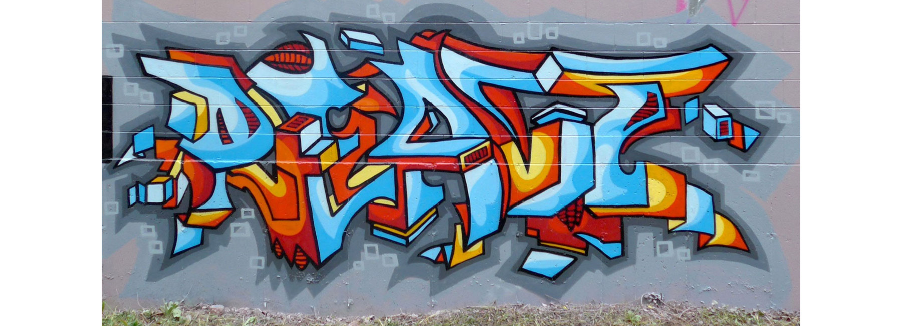
Figure 5.11: Image before using the invert filter
The following is the image after the invert filter has been applied:

Figure 5.12: Image after using the invert filter
Figure 5.11 shows the original image, while Figure 5.12 shows the inverted image after applying the invert filter. This is produced by the following markup. The .invert class that's defined in the style element in the head uses the invert filter and inverts the colors of the image. It's applied to the second of the two images:
<!DOCTYPE html>
<html lang="en-US">
<head>
<meta http-equiv="Content-Type" content="text/html; charset=UTF-8">
<title>Invert Filter</title>
<style type="text/css">
.invert {
filter: invert(100%)
}
</style>
</head>
<body>
<p><img src="./assets/react-2019-7.jpg" width="100%" alt="a mural by the author" ></p>
<p><img src="./assets/react-2019-7.jpg" width="100%" alt="a mural by the author" class="invert"></p>
</body>
</html>
While it takes away flexibility and doesn't make for the best possible design, you can, with just two lines of CSS, create a rough dark theme using this CSS property.
Exercise 5.03: Creating a Dark Theme with the CSS Invert Filter
In this exercise, we will use the CSS invert filter to achieve the results that we obtained in the previous exercises. Let's take a look at how this works. The finished product will look as follows:

Figure 5.13: The dark theme generated by the invert filter
You'll notice that it's not quite the same as the original dark theme we created since this wholesale approach means we don't have access to individual elements such as the links we hand-tweaked previously. Still, it's pretty great to be able to change things this drastically with just a couple of lines of CSS.
Let's get started:
- Create a file called dark-theme-invertl.css in the assets folder of your sample project.
- Copy index.html and paste it into a new file called Exercise 5.03.html.
- Add the following line to the head of your document in order to include the new file:
<head>
<meta http-equiv="Content-Type" content="text/html; charset=UTF-8">
<meta name="viewport" content="width=device-width, initial-scale=1">
<title>HTML5 Boilerplate 7.2.0 and main.css 2.0.0 released – HTML + CSS + JavaScript</title>
<link rel="stylesheet" id="hcj2-0-style-css" href="./assets/style.css" type="text/css" media="all">
<link rel="stylesheet" id="dark-theme-invert" href="./assets/dark-theme-invert.css" type="text/css" media="all">
</head>
- Now, open dark-theme-invert.css and add the following rules to create our quick and dirty theme. Apply the invert filter to the body element:
body {
filter: invert(100%);
background: #000000;
}
The 100% argument indicates that the inversion should be complete. You could apply a smaller percentage if you wanted, but the full version is what we're looking for here. Next, you need to apply a black background color because the invert doesn't work on the background color of the body element.
- Save dark-theme-invert.css and if you now right-click on the filename in VSCode on the left-hand side of the screen and select open in default browser, to see the following output:
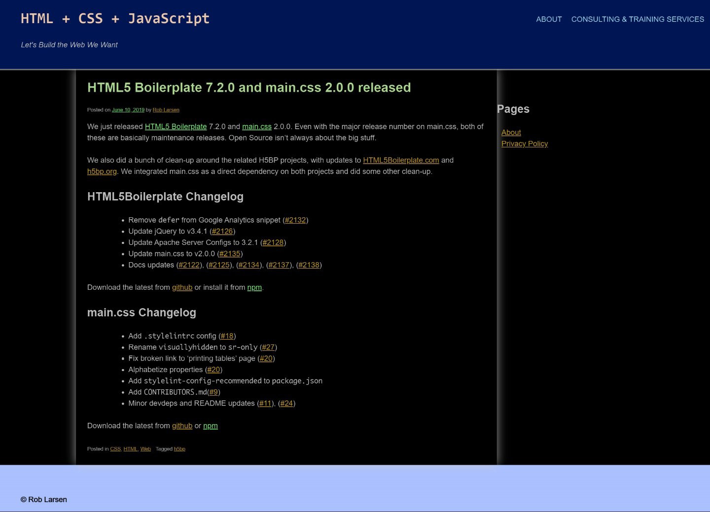
Figure 5.14: White shadows in the web page
You'll notice a couple of drop shadows that have been inverted into white shadows. Our previous dark theme work didn't show them because they were dark shadows on dark backgrounds. Here, they're distracting. Let's get rid of them.
- First, remove box-shadow from the .content-area element by setting it to the none keyword value:
.content-area {
box-shadow: none;
}
- Next, remove box-shadow from the .site-header element by setting it to the none keyword value:
.blog .site-header, .single-post .site-header {
box-shadow: none;
}
- Save dark-theme-invert.css and refresh Exercise 5.03.html. You will see that your cleaned up dark theme has been generated with just a couple of lines of CSS:
Figure 5.15: White shadows cleaned
It's not perfect, with the lime green links and yellow visited links, but we've avoided a lot of work. If you wanted to use this as part of a more complete theme, you could couple the invert technique with one of the previous techniques, that is, you could use the invert function in some places and then hex values or HSL functions where the application of individual styles is more important.
Now that we've covered the basics of theming, let's look at a few of the ways we can alter the look and feel of a site using the various hooks that WordPress (or another theme) can provide.
CSS Hooks
As I mentioned earlier, WordPress adds a lot of CSS hooks to the output markup to allow for a lot of customization regarding the look and feel. This starts with classes that are unique to the page and post and includes classes for the type of page, any tags or categories that were added to the post, and a number of other attributes. We're going to take advantage of those classes to make a few changes to the theme that would be specific to this particular post, as well as any posts that are tagged in a specific way.
Imagine you were a blogger and you wrote about web technology. You could tag posts with "css", "html", or "javascript" and then change, for example, the background color of the page:
<!DOCTYPE html>
<html lang="en-US">
<head>
<meta http-equiv="Content-Type" content="text/html; charset=UTF-8">
<title>Using CSS hooks</title>
<style type="text/css">
.tag-css {
background: #003366;
}
.tag-html {
background: #006600;
}
.tag-javascript {
background: #660000;
}
</style>
</head>
<body class="tag-css">
</body>
</html>
Two classes have been applied to this page in two places. We're going to use them to change the appearance of just this page. These are the unique postid-11002 class on the body (that class references the internal post ID in WordPress) and the tag-h5bp class on the article element (which indicates that it's been tagged as h5bp).
Exercise 5.04: Customizing a Theme with CSS Hooks
In this exercise, we're going to build a theme on the same foundation as the rest of the themes in this chapter. The finished product should look as follows:

Figure 5.16: The individual post theme
As before, no changes have been made to the markup. All of the differences are down to CSS and if you applied this style sheet to any other page in that site without the postid-11002 class, nothing would happen. Let's get started:
- Create a file called post-theme.css in the assets folder of your sample project.
- Copy index.html and paste it into a new file called Exercise 5.04.html.
- Add the following line to the head of your document in order to include the new file:
<head>
<meta http-equiv="Content-Type" content="text/html; charset=UTF-8">
<meta name="viewport" content="width=device-width, initial-scale=1">
<title>HTML5 Boilerplate 7.2.0 and main.css 2.0.0 released – HTML + CSS + JavaScript</title>
<link rel="stylesheet" id="hcj2-0-style-css" href="./assets/style.css" type="text/css" media="all">
<link rel="stylesheet" id="theme" href="./assets/post-theme.css" type="text/css" media="all">
</head>
- Now, open dark-theme.css and start adding new rules to create your single post theme. Since this is going to be a darker theme, let's start by redefining the link colors. First, using the postid-11002 class to differentiate it from other pages on the site, change the color of the a elements to be #a5dff2, a light blue. Then, once again, using the postid-11002 class to differentiate it from other pages on the site, change the color of the a:visited elements to be #c0a5f2, a light purple. Finally, in the same manner, change the hover, focus, and active links to #4c72e5, which is a bright blue:
.postid-11002 a {
color: #a5dff2;
}
.postid-11002 a:visited {
color: #c0a5f2;
}
.postid-11002 a:hover,
.postid-11002 a:focus,
.postid-11002 a:active {
color: #4c72e5;
}
- Next, we'll change .content-area so that it fits our new style:
.postid-11002 .content-area {
background: linear-gradient(to bottom, #222222 30%, #333333 70%, #666666 100%);
width: 100%;
float: none;
padding: 0;
box-shadow: none;
border: 10px solid #999;
}
In the preceding snippet, first, we add a linear-gradient from top to bottom, flowing from a very dark gray, #222222, to a dark gray, #333333, to a medium gray at the bottom. Next, we increase the width to be 100% with width: 100%. Remember that, previously, this content area was floated to the left with the widget-area element floated to the right. So, we need to also remove the float with float: none. We also need to remove the padding from this element because we want site-header to fit nicely inside this containing element. We do that with padding: 0. Finally, we remove the box-shadow with box-shadow: none and replace it with a chunky light gray border with border: 10px solid #999. Note that the shorthand border definition is equivalent to setting border-width, border-style, and border-color individually.
- Next, we hide the .widget-area and.main-navigation elements in order to make a slightly cleaner look for this specific post. This is done by setting the display property to none for both elements:
.postid-11002 .main-navigation,
.postid-11002 .widget-area {
display: none;
}
- Next, we're going to adjust the header. In the original design, it was the width of the page. In this version, we're going to cap the width at 1200px, change the color of the background, add a logo, and remove the box-shadow:
.postid-11002 header.site-header {
max-width: 1200px;
margin: auto;
background: #999;
box-shadow: none;
}
In the preceding code, first, we set max-width: 1200px and add margin: auto to center the header element on the page. Then, we set the background to #999 (which you'll notice is the same color as the border of the .content-area element – this is intentional) and the box-shadow to none. We still have to add the logo, but we'll do that in the next section.
This is the downside of pure theming. If we could change the markup, this would be done in another way – maybe by using one of the many available image replacement classes or by just inserting the image directly with proper accessible markup. We don't have any option to do anything like that, so instead, we're going to replace the text of the link inside the h1 element with an image.
- Let's do this by setting the background shorthand property to use url(logo.png) as the source of the background and to not repeat the background image with no-repeat. The rest of the rules are designed to allow the entire area to be clickable. To that end, give the a element a height of 75px, a width of 750px, and set the display to inline-block so that the height and width will stick. Finally, we use text-indent: -9999px to move the text off screen:
.postid-11002 header.site-header h1 a {
background: url(logo.png) no-repeat;
height: 75px;
text-indent: -9999px;
width: 750px;
display: inline-block;
}
- Next up, we target the article.tag-h5bp element. First, change the text color to #ddd, a light gray. Remember the padding we removed from the .content-area? We've moved the padding here with padding: 0 2%:
.postid-11002 article.tag-h5bp {
color: #ddd;
padding: 0 2%;
}
A new wrinkle to this design is targeting the .entry-header specifically. We do this in order to add a logo specific to the tag-h5bp class. This image is 200px square and is a star on a dark gray (#222) background.
- First, we set the background color to match background-color: #222. Next, we add the background image itself by adding background-image: url(icon.png) and suppress tiling of the image with background-repeat: no-repeat. Adding background-size: contain scales the background image so that it's as large as possible without cropping or stretching the image. Finally, set a height of 200px on the entry-header and a padding-left of 200px on the left to ensure that the text doesn't cover the icon:
.postid-11002 article.tag-h5bp .entry-header {
background-image: url(icon.png);
background-size: contain;
height: 200px;
padding-left: 200px;
}
- Earlier, we set the color of this article element to #ddd. Here, change the color of the article h1 to be #fff (white) to make it pop a little bit compared to the body text:
.postid-11002 article.tag-h5bp .entry-header h1 {
color: #fff;
}
- The final update is going to be made to the .site-footer element. The background, like the header, is set to be #999, which matches the border on the article. This connects the three sections of the page. Finally, set the color of the text to #222, which is a dark gray:
.postid-11002 .site-footer {
max-width: 1200px;
margin: auto;
background: #999;
color: #222;
}
Like the header, the footer in the original design fits the full-width of the screen. This version has a max-width of 1200px. margin: auto is added to ensure that the element is centered on the page.
- Save post-theme.css and right-click on the filename in VSCode on the left-hand side of the screen and select open in default browser. Now, you will be able to see your changes, as shown in the following screenshot:

Figure 5.17: Final output
We began this chapter by creating a dark theme using the standard way, hsl(), and the invert filter. Then, we learned about CSS hooks. We will use all of these newly developed skills in the upcoming activity.
Activity 5.01: Creating Your Own Theme Using a New Color Palette
Suppose you're working for a company as a web developer and your boss comes to you with a task – it seems that the folks in the marketing department have just changed the company's colors or brand palette. Your boss would like you to create a theme based on those colors. You get the following image, which shows the brand colors:

Figure 5.18: Brand colors
This activity will allow you to create your own theme based on the brand colors. Assuming that #4C72ES is the main brand color and that #FFE13F (yellow) and #FF9B3F (orange) are secondary and tertiary colors, you will create a theme based on our existing markup that embraces the new brand's color scheme.
Here's how you'll do it:
- Change the background of the body element to use the lightest blue (#9DB3F4) and change the default text for the page to be something dark blue (something like #333355).
- Change the header and footer background to be the main brand blue (#4c72e5) and change the text in those elements to be pure white.
- Change the links to match the brand colors and choose a purple of the same value as the darker brand blue (#0e3ece) for the visited link color (something like #bf0ece).
- Make the background of the whole site-content area white and add a brand blue border to the right and left-hand sides.
- Change the color of the content area's h1s to brand blue.
- Add a definition for the content area's h2s so that they use the secondary orange (#FF7a00).
- Remove the box-shadow definitions from site-header and content-area.
It will look something like this when you're done:
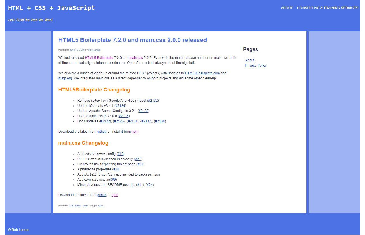
Figure 5.19: Expected web page
Note
The solution to this activity can be found on page 594.
Summary
In this chapter, you learned about using CSS to theme a web page with new colors, backgrounds, and borders. By adding a small CSS file on top of an existing CSS design, you were able to easily create four different versions of a web page using nothing but CSS properties and values that you applied to your existing markup.
First, you created an inverted dark theme using Hex values for complementary colors of the colors in the original theme. Next, you used HSL colors to create a more polished theme, where design considerations trumped pure complementary values for the colors in the theme. Next, you used the invert filter to create a quick-and-dirty inverted theme. Finally, you created a post-specific theme by taking advantage of the hooks that a good CMS such as WordPress provides to be able to style individual pages.
In the next chapter, you'll learn about some very important technologies for today's modern, many-device web – Media Queries and Responsive Web Design. With Media Queries and Responsive Web Design, you'll be able to make sites and applications that elegantly scale to work with whatever browser/screen/device your user happens to be using at that moment.