Overview
By the end of this chapter, you will be able to use the correct HTML5 elements to markup a web page; style a web page using float, flex, and grid layouts; describe how the box model works; and build a home page and a product page layout.
This chapter introduces the essential HTML elements that are required in order to build a web page. Finally, this knowledge will be utilized by carrying out a number of exercises to create a few well-structured web pages.
Introduction
In the previous chapter, we learned about the basics of HTML and CSS. In this chapter, we will consolidate this basic understanding and look at how web pages are structured with HTML and CSS. When creating web pages using HTML, it is imperative that you use the correct elements. This is because HTML is read by both humans and machines, and so the content of a web page should be associated with the most appropriate element. Additionally, any error in the code might be difficult to track if the code base is too large.
The HTML language offers a vast array of different tags that we can place at our disposal. In this chapter, we will focus on the structural elements that are used to divide the web page up into its key parts. You may be familiar with the concept of a page header or footer, and these would be examples of structural elements. We will be looking at these amongst many other HTML structural elements.
In this chapter, we will focus our attention on the HTML5 version of the language, which is the most current version of HTML. HTML5 offers us additional tags that enable us to make our markup more meaningful. The developer experience is more enjoyable compared to writing XHTML as the HTML5 language is less strict with regard to syntax.
Note
In this chapter, we will use the terms "tags" and "elements" synonymously.
Web pages are typically styled using CSS. Once we have our web pages marked up correctly, we need to know how to style these into a range of layouts. CSS offers us a range of options for laying out our pages, but the three most common methods are float, flex, and grid-based. In this chapter, we will explore each of these techniques in turn.
Just knowing the various layout methods is not enough to style web pages. We will investigate the box model, which is foundational to understanding how HTML elements are styled. We will break this down into the individual layers – content box, padding, border, and margin. With this knowledge in hand, you will be free to develop a host of different web page layouts.
We will now take a look at the structural elements provided by HTML and examine what the key elements are one by one.
Structural Elements
HTML5 provides us with a variety of tags that we can use when dividing our page into different parts. When browsing the web, you would have noticed that web pages typically have a few common things to them. For example, a web page will typically have a logo and page navigation area at the top of the page. We would call this area of the page the header. You may also have noticed that the bottom of the page may include a list of links and copyright information. We would call this area the footer. The following diagram shows the representation of a few of the main elements of a web page:

Figure 2.1: HTML5 page elements
In this topic, we will be looking at the following HTML5 page elements:
- header
- footer
- section
- article
- nav
- aside
- div
The header Tag
The header tag is used to describe the header or top area of a web page. Typically, inside this tag, you would have the page heading, a logo, and, possibly, the page navigation. Prior to HTML5, you would use a div tag with a class name so that the header could be styled, and its intention was clear to developers. HTML5 improves on this by giving us a tag specifically for this very task. You will learn more about this improvement under the section, Semantic Markup in Chapter 3, Text and Typography. Now, examine the following codes that show the differences between the old and new way of writing the markup for the header area:
<!-- old way -->
<div class="header">
… heading, logo, nav goes here
</div>
<!-- new way -->
<header>
… heading, logo, nav goes here
<header>
Now, let's open the Packt website at https://www.packtpub.com/ to see how a header is represented in an actual website. In the following diagram, you can see that the header element is highlighted via a box, illustrating where a header element is typically placed on a web page:

Figure 2.2: The header element
In the following figure, you can see that the header element is highlighted via a box. As this is an example taken from the Packt website, you will notice that it contains items such as the company logo, search bar, and the Sign In button:

Figure 2.3: The header element on the Packt site
The footer Tag
The footer tag is very similar to the header tag but is used at the bottom of a web page. You would typically have the copyright information and website links inside the footer. Similarly, with the header tag in the previous version of HTML, you would use a div tag with a class name. Since the use of footers on web pages is so common, HTML5 provides a new tag solely for this purpose. The following codes show the differences between the old and new way of writing the markup for the footer area:
<!-- old way -->
<div class="footer">
… copyright, list of links go here
</div>
<!— new way -->
<footer>
… copyright, list of links go here
<footer>
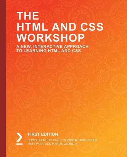
In the following figure, you can see that the footer element is highlighted via a box, illustrating where a footer element is typically placed on a web page:
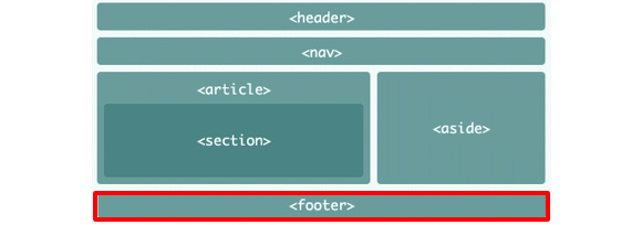
Figure 2.4: The footer element
In the following figure, you can see that the footer element is highlighted via a box. As this is an example taken from the Packt website, you will notice it contains items such as useful links and social media icons:

Figure 2.5: The footer element on Packt site
The section Tag
The section tag is different from the header and footer tags as it can be used in many different places on a web page. Some examples of when you would use a section tag could be for the main content area of a page or to group a list of related images together. You use this tag anytime you want to divide some of the markup into a logical section of the page. Again, prior to HTML5, you would most likely use a div tag with a class name to divide a section of the page. The following codes show the differences between the old and new way of writing the markup for the section area:
<!-- old way -->
<div class="main-content-section">
… main content
</div>
<!— new way -->
<section>
… main content
</section>
In the following figure, you can see that the section element is highlighted via a box, illustrating where a section element is typically placed on a web page:
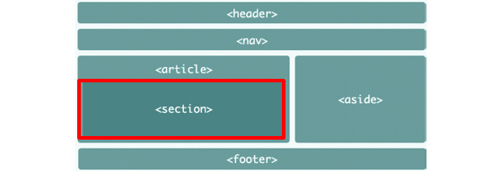
Figure 2.6: The section element
The article Tag
The article tag is used for the self-contained part of a web page. Some examples of an article could be an individual news article or blog post. You can have multiple articles on a page, but each must be self-contained and not dependent on any other context within the page. It is common to see the article tag used in conjunction with section tags to divide up an article into discrete sections. The following code shows this:
<article>
<section>
...primary blog content
</section>
<section>
...secondary blog content
</section>
</article>
In the following figure, you can see that the article element is highlighted via a box, illustrating where an article element is typically placed on a web page:
Figure 2.7: The article element
The nav Tag
Inside the navigation area, you will have a list of page links for the different pages of the website. Prior to HTML5, you would again use a div tag with a class name. The following codes show the differences between the old and new way of writing the markup for the navigation area:
<!-- old way -->
<div class="navigation">
… list of links go here
</div>
<!-- new way -->
<navigation>
… list of links go here
</navigation>
In the following figure, you can see that the nav element is highlighted via a box, illustrating where a nav element is typically placed on a web page:
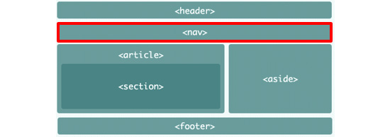
Figure 2.8: The nav element
In the following figure, you can see that the nav element is highlighted via a box. As this is an example taken from the Packt website, you will notice it contains a list of page links:

Figure 2.9: The nav element on the Packt site
The aside Tag
The aside tag is used to show content that is indirectly related to the main content of a document. You will typically see this tag used for sidebars or for showing notes relating to some content. Again, before the advent of HTML5, developers would use a div tag with a class name for this type of content. The following codes show the differences between the old and new way of writing the markup for the aside element:
<!-- old way -->
<div class="sidebar">
… indirectly related content goes here
</div>
<!—new way -->
<aside>
… indirectly related content goes here
</aside>
In the following figure, you can see that the aside element is highlighted via a box, illustrating where an aside element is typically placed on a web page:
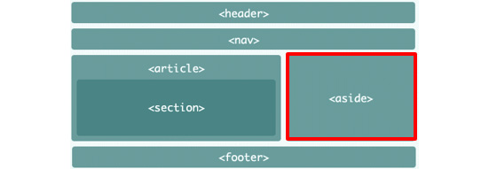
Figure 2.10: The aside element
The div Tag
The div tag is probably the most widely used tag on the World Wide Web. In fact, if you view the source code of your favorite website, most of the HTML elements you see will be div elements. This tag actually stands for division and is used to divide or group content together. Although HTML5 provides specialist elements for the most common types of page groups, you will still find many uses for using div tags. It might help to think of this element as a generic way to group the markup into logical parts. The following are a few example codes of how a div tag may be used:
<div class="sidebar">
… indirectly related content goes here
</div>
<div class="navigation">
<div class="navigation-inner">... navigation links go here</div>
</div>
That concludes our tour of the structural HTML elements that are important to us. We will now apply some of this theory with the help of an exercise.
A News Article Web Page
Now that we have an understanding of the structural elements provided by HTML5, let's put our newly acquired knowledge into practice by writing the structural HTML for a news article page. You can get a sense of what this type of page will look like by visiting a popular online news website such as https://theguardian.com or https://bbc.co.uk/news and clicking on an article.
Exercise 2.01: Marking up the Page
In this exercise, we will create the markup for our HTML5 page. Our aim will be to produce a page with output, similar to that of Figure 2.10 without the <section> element in it.
Let's complete the exercise with the following steps:
- Create a file named news.html in VSCode.
- We will use the following starter HTML document, which contains some basic styling for our structural elements. Don't worry if you don't understand the CSS just yet; you will by the end of this book:
<!DOCTYPE html>
<html>
<head>
<title>News article page</title>
<style>
header,
nav,
article,
aside,
footer {
background: #659494;
border-radius: 5px;
color: white;
font-family: arial, san-serif;
font-size: 30px;
text-align: center;
padding: 30px;
margin-bottom: 20px;
}
header:before,
nav:before,
article:before,
aside:before,
footer:before {
content: '<';
}
header:after,
nav:after,
article:after,
aside:after,
footer:after {
content: '>';
}
article {
float: left;
margin-right: 20px;
width: 60%;
}
aside {
float: left;
width: calc(40% - 140px);
}
footer {
clear: both;
}
</style>
</head>
<body>
<!-- your code will go here -->
</body>
</html>
- First, let's add our first structural element, which is the header tag. We will place it in between the opening and closing body tags. In this example, we will just add some text as content but, when building a real web page, you would include things such as logos, search bars, and links:
<body>
<header>header</header>
</body>
- After our header tag comes the navigation area, which is used for including links to different pages of the website. Once again, we will just add some text for the content but, when building a real web page, you would include a list of links:
<body>
<header>header</header>
<nav>nav</nav>
</body>
- For the main news article content, we will use an article tag. Once again, we will just add some text for the content but, when building a real web page, you would include the content of the articles:
<body>
<header>header</header>
<nav>nav</nav>
<article>article</article>
</body>
- To the right of the article tag, we have an aside tag, which will typically contain content such as advertising images or related content links:
<body>
<header>header</header>
<nav>nav</nav>
<article>article</article>
<aside>aside</aside>
</body>
- Finally, we can finish off the markup for our web page by adding the footer tag at the bottom of the page. For now, we will just add some text as content but, in real life, you would include elements such as copyright information, and links to other pages:
<body>
<header>header</header>
<nav>nav</nav>
<article>article</article>
<aside>aside</aside>
<footer>footer</footer>
</body>
If you now right-click on the filename in VSCode on the left-hand side of the screen and select open in default browser, you will see the following web page in your browser:

Figure 2.11: Output for the product page
If you look at this page in your browser, you may not be impressed with what you see, but you actually have the foundations in place for a web page.
Wireframes
When working on commercial projects, it is common for web page designs to be provided to web developers in the form of a wireframe. A wireframe is a low-fidelity design that provides enough information about a page for the developer to start coding. Usually, they will not include much visual design information and are focused on the main structure of a page. The following figure is an example of a wireframe for a new home page:
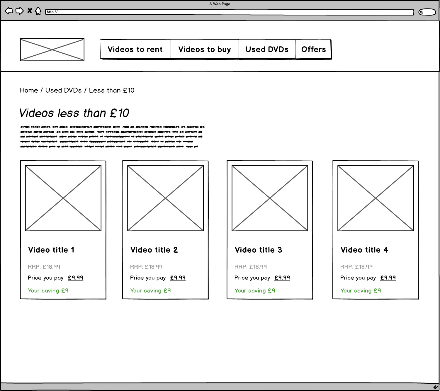
Figure 2.12: Example of a wireframe
Activity 2.01: Video Store Home Page
Suppose you are a frontend developer working for a tech start-up. You have been asked to build a home page for the online video store. You have been given the following wireframe from the UX designer:

Figure 2.13: Wireframe as per the UX designer's expectation
Using your newly acquired HTML5 knowledge, you can start to convert the wireframe into working HTML code. At this stage, you should just be concerned with writing the structural HTML tags and shouldn't worry about content right now.
The aim will be to achieve a web page similar the following output screenshot:
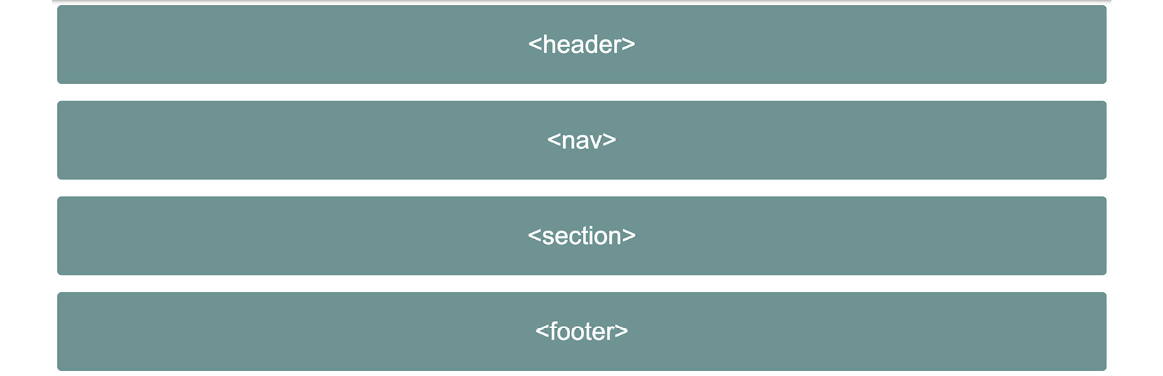
Figure 2.14: Expected output of video store home page
The steps are as follows:
- Create a file named home.html in VSCode.
- Use the following code as a page skeleton. Again, do not worry about not understanding the styling part of the code:
<!DOCTYPE html>
<html>
<head>
<title>Video store home page</title>
<style>
header,
nav,
section,
footer {
background: #659494;
border-radius: 5px;
color: white;
font-family: arial, san-serif;
font-size: 30px;
text-align: center;
padding: 30px;
margin-bottom: 20px;
}
header:before,
nav:before,
section:before,
footer:before {
content: '<';
}
header:after,
nav:after,
section:after,
footer:after {
content: '>';
}
</style>
</head>
<body>
<!-- your code will go here -->
</body>
</html>
- Start adding the HTML5 structural elements inside the body tag one by one, the same as we did in Exercise 2.01, Marking up the Page.
- As with Exercise 2.01, Marking up the Page, we will just add the tag name for content such as header and footer.
If you now right-click on the filename in VSCode on the left-hand side of the screen and select open in default browser, you will see the web page in your browser.
Hopefully, you are now getting a feel for the process of putting basic web pages together. We will build on this knowledge in the coming exercises.
Note
The solution to this activity can be found on page 580.
We are now ready to start making our web pages more realistic by learning some CSS page layout techniques.
CSS Page Layouts
CSS provides us with a range of possibilities for laying out web pages. We will be looking into the three most common techniques for laying out web pages. These are as follows:
- float
- flex
- grid
Armed with this knowledge, combined with your knowledge of HTML structural tags, you will be able to code a range of web page layouts. The concepts learned in this part of the chapter will form the core of your frontend development skillset and you will use these techniques over and over throughout your career.
Video Store Product Page
In order to gain a solid understanding of how these three different approaches to layout work, we shall use a video store product listing page as a concrete example. We will work through solutions to the following design using the three most common layout techniques, one by one. For the examples that follow, we will only be concerned with the product section of the page:

Figure 2.15: Product page wireframe
Float-Based Layouts
The float-based CSS layout technique is the oldest of the three. Whilst CSS provides us with improved techniques for layout, the float-based layout is still used today. Having a firm grasp of how float-based layouts work in practice will set you up for more advanced styling segments in this book.
The float Property
The CSS float property, when applied to an element, will place the element to either the left or right of its containing element. Let's examine a few examples of the most common values for this property.
To float elements to the right, you would use the right value, as shown in the following code:
float: right;
Whereas, to float elements to the left, you would use the left value, as shown in the following code:
float: left;
The none value isn't used as frequently but, with the following code, it can be handy if you wish to override either the left or right values:
float: none;
The width Property
When we apply the float property to elements, we typically will also want to give the element an explicit width value as well. We can either give a value in pixels or percentages. The following code shows the input for width in pixels, that is, by writing px after the value:
width: 100px;
Whereas the following code shows the input for width as a percentage, that is, by entering the % symbol after the value:
width: 25%;
Clearing Floated Elements
As the name suggests, floated elements do, in fact, appear to float in relation to the other non-floated elements on the page. A common issue with floated elements inside a container is illustrated in the following figure:
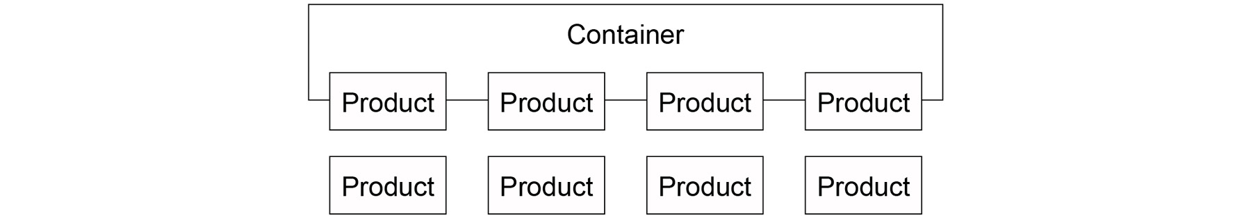
Figure 2.16: Floating elements' illustration
Note
This solution of clearing floated elements has been used for simplicity.
There are many solutions to this issue, but by far the easiest solution is to apply the following CSS to the containing element:
section {
overflow: hidden;
}
With the preceding code added to the container, we will now have floated elements contained inside the wrapping element, as illustrated in the following figure:
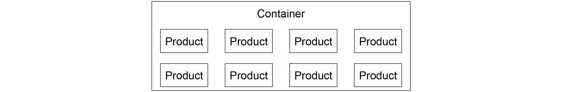
Figure 2.17: Cleared floats' illustration
The following example code shows how you could achieve the preceding layout using float:
<!-- HTML -->
<section>
<div>product 1</div>
<div>product 2</div>
<div>product 3</div>
<div>product 4</div>
<div>product 5</div>
<div>product 6</div>
<div>product 7</div>
<div>product 8</div>
</section>
/* CSS */
section {
overflow: hidden;
}
div {
float: left;
width: 25%;
}
Flex-Based Layouts
The flex-based CSS layout technique is a new and improved alternative to the float-based approach. With flex, we have much more flexibility and can easily achieve complex layouts with very little code. With flex, we no longer have to worry about clearing floating elements. We will now look into some of the key properties and values in order to let us build the product page layout using flex.
The flex Container
When developing flex-based layouts, there are two key concepts you must first understand. The first is the flex container, which is the element that contains the child elements. To activate a flex layout, we must first apply the following code to the container or parent element that holds the individual items:
display: flex;
We also have to choose how we want the container to handle the layout of the child elements. By default, all child elements will fit into one row. If we want the child elements to show on multiple rows, then we need to add the following code:
flex-wrap: wrap;
The flex Items
Now that we know how to set the flex container up, we can turn to the child elements. The main issue of concern here is the need to specify the width of the child elements. To specify this, we need to add the following code:
flex-basis: 25%;
You can think of this as being equivalent to the width in our float-based example.
The following example code shows how you could achieve the product layout, as shown in Figure 2.15, using flex:
<!-- HTML -->
<section>
<div>product 1</div>
<div>product 2</div>
<div>product 3</div>
<div>product 4</div>
<div>product 5</div>
<div>product 6</div>
<div>product 7</div>
<div>product 8</div>
</section>
/* CSS */
section {
display: flex;
flex-wrap: wrap;
}
div {
flex-basis: 25%;
}
Grid-Based Layouts
The grid-based CSS layout technique is the newest of the three different approaches we will be exploring. This new approach was introduced in order to simplify the page layout and offer developers even more flexibility vis-à-vis the previous two techniques. We will now look into some of the key properties and values to enable us to build the product page layout using a grid-based approach.
The grid Container
When developing grid-based layouts, there are two key concepts you must first understand. The first is the grid container, which is the element that contains the child elements. To activate a grid layout, we must first apply the following code to the parent element:
display: grid;
Now that we have activated the container to use the grid-based layout, we need to specify the number, and sizes, of our columns in the grid. The following code would be used to have four equally spaced columns:
grid-template-columns: auto auto;
The grid Items
When we used float and flex layouts, we had to explicitly set the width of the child elements. With grid-based layouts, we no longer need to do this, at least for simple layouts.
We will now put our new-found knowledge into practice and build the product cards shown in Figure 2.15. We will use the grid layout technique since the product cards are actually within a grid layout, comprising four equally spaced columns.
Exercise 2.02: A grid-Based Layout
In this exercise, we will create our CSS page layout with the aim of producing a web page where six products are displayed as shown in the wireframe Figure 2.15.

Figure 2.18: Expected output for the grid based layout
Following are the steps to complete this exercise:
- Let's begin with the following HTML skeleton and create a file called grid.html in VSCode. Don't worry if you do not understand the CSS used here; you will soon enough:
<!DOCTYPE html>
<html>
<head>
<title>Grid based layout</title>
<style type="text/css">
div {
background: #659494;
color: white;
text-align: center;
margin: 15px;
padding: 100px;
}
</style>
</head>
<body>
</body>
</html>
- Next, we will add the product items using div tags, which are placed inside a section tag. We will just add a product with a number inside each item, so we know what product each represents:
<body>
<section>
<div>product 1</div>
<div>product 2</div>
<div>product 3</div>
<div>product 4</div>
<div>product 5</div>
<div>product 6</div>
<div>product 7</div>
<div>product 8</div>
</section>
</body>
- Now, let's add the following CSS in order to activate the grid-based layout. If you compare this to the other two techniques for laying out web pages, the code is very minimal:
section {
display: grid;
grid-template-columns: auto auto auto auto;
}
If you now right-click on the filename in VSCode on the left-hand side of the screen and select open in default browser you will see the web page in your browser repeat output for consistency.
If you now look at this page in your web browser, you should see a layout resembling the one shown in the screenshot.
We will now take a detour and look into some fundamental concepts of how CSS styles HTML elements.
The Box Model
So far, all the elements on our pages look almost identical because we have not learned how to adjust the size of each element. We are now ready to progress to more realistic page designs by introducing a foundational layout concept called the box model.
Try to picture each HTML element as a box made up of different layers. The different layers are the element's content box, padding, border, and margin. We will explore each of these layers one by one. The following figure illustrates how all aspects of the box model relate to one another. You can see that the margin is the outermost part, followed by the element's border and padding between the border and content area:
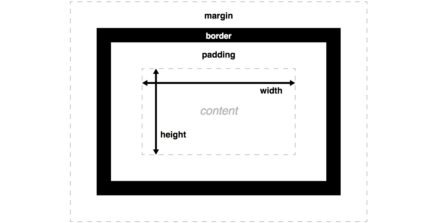
Figure 2.19: The box model
We will now look at each of the box model elements, in turn, starting with the innermost content box.
Content Box
The content box is the part of the element where the actual content lives. This is typically text but could contain other child elements or media elements such as images. The most important CSS properties for this layer are width and height. As a developer, you would typically give these values expressed in pixels or percentages. The following code shows some example values, followed by the corresponding output figure for these properties:
width: 200px;
height: 100px;
In the following figure, we will see what the content area looks like after CSS is applied to the preceding code:
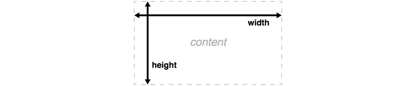
Figure 2.20: The content box
Next, we will work our way out to the next layer of the box model – padding.
The padding Property
The padding area is the layer that provides spacing between the content box and the border. The amount of spacing in this layer can be specified in all directions – top, right, bottom, and left. CSS provides a padding property where you can specify values for the amount of spacing in all directions. If you want to apply the same amount of padding in all directions, you can just give a single value. If you want to apply the same values for vertical and horizontal directions, you can specify two values. It also provides direction-specific properties – padding-top, padding-right, padding-bottom, and padding-left. The following code shows a number of example values for these properties:
/* 50px of padding applied in all directions */
padding: 50px;
/* 50px of padding applied vertically and 0px applied horizontally */
padding: 50px 0;
/* 10px of padding applied to the top */
padding-top: 10px;
/* 10px of padding applied to the right */
padding-right: 10px;
/* 10px of padding applied to the bottom */
padding-bottom: 10px;
/* 10px of padding applied to the left */
padding-left: 10px;
The following figure illustrates what the content and padding areas would look like after CSS is applied to the following code:
width: 200px;
height: 100px;
padding: 25px;
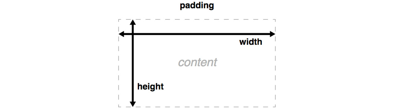
Figure 2.21: Padding
Now that we understand how the content and padding layers relate to one another, we will work our way out to the next layer of the box model – the border.
The border Property
The border area is the layer that sits between the end of the padding area and the beginning of the margin. By default, the border isn't visible; it can only be seen when you explicitly set a value that will allow you to see the border. Similar to the padding property, CSS provides a shorthand property called border, and also the direction-specific properties – border-top, border-right, border-bottom, and border-left. All of these properties require three values to be provided; the width of the border, the border style, and finally, the color of the border. The following code shows some example values for these properties:
/* border styles applied in all directions */
border: 5px solid red;
/* border styles applied to the top */
border-top: 5px solid red;
/* border styles applied to the right */
border-right: 15px dotted green;
/* border styles applied to the bottom */
border-bottom: 10px dashed blue;
/* border styles applied to the left */
border-left: 10px double pink;
The following figure illustrates how the four different border styles would appear if applied to an element:
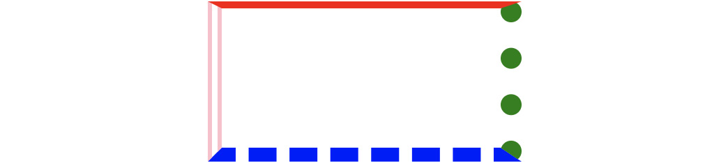
Figure 2.22: Border styles
The content, padding, and border layers is obtained with the following code:
width: 200px;
height: 100px;
padding: 25px;
border: 10px solid black;
The following figure is the output for the preceding code:

Figure 2.23: Border
Now that we understand how the content, padding and margin layers relate to one another, we will work our way out to the final layer of the box model – the margin.
The margin Property
The margin area is the layer that provides spacing between the edge of the border and out toward other elements on the page. The amount of spacing in this layer can be specified in all directions – top, right, bottom, and left. The CSS provides a margin property where you can specify values for the amount of spacing in all directions. It also provides direction-specific properties – margin-top, margin-right, margin-bottom, and margin-left. The following code shows a number of example values for these properties:
margin: 50px;
margin: 50px 0;
margin-top: 10px;
margin-right: 10px;
margin-bottom: 10px;
margin-left: 10px;
The content, padding, border, and margin layers is obtained with the following code:
width: 200px;
height: 100px;
padding: 25px;
border: 10px solid black;
margin: 25px;
The following figure is the output for the preceding code:
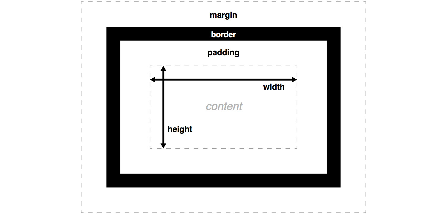
Figure 2.24: Margin
To get some practice looking at how different HTML elements make use of the box model, you can use the webtools inspector in your favorite browser. In Chrome, you can inspect an element and investigate how the box model is used for each element. If you inspect an element and then click the Computed tab on the right-hand side, you will see a detailed view. The following figure shows an example of an element from the Packt website revealing the values for properties from the box model:
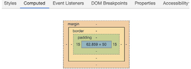
Figure 2.25: Chrome web tools box model inspection view
In the following exercise, we will play around with the different box model properties to get some practice with box model-related CSS properties.
Exercise 2.03: Experimenting with the Box Model
The aim of this exercise will be to create the three boxes as shown in the following output screenshot:
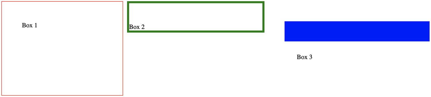
Figure 2.26: Expected boxes
The steps to complete the exercise are as follows:
- First, let's add the following HTML skeleton to a file called boxes.html in VSCode:
<!DOCTYPE html>
<html>
<head>
<title>Experimenting with the box model</title>
<style type="text/css">
</style>
</head>
<body>
<div class="box-1">Box 1</div>
<div class="box-2">Box 2</div>
<div class="box-3">Box 3</div>
</body>
</html>
- Now, let's add some CSS to the first box, observing the width, height, padding, and border properties we are adding. We will add the CSS in between the opening and closing style tags, as shown in the following code, to render the following figure:
<style type="text/css">
.box-1 {
float: left;
width: 200px;
height: 200px;
padding: 50px;
border: 1px solid red;
}
</style>
The following figure shows the output of the preceding code:

Figure 2.27: Output for box 1
- Now, let's add the CSS to the second box in Figure 2.25, observing how the width, height, padding, and border properties differ from the first box. We are using percentage-based measurements for the width and height properties, as shown in the following code:
.box-2 {
float: left;
width: 20%;
height: 20%;
padding-top: 50px;
margin-left: 10px;
border: 5px solid green;
}
The following figure shows the output of the preceding code:
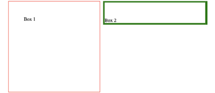
Figure 2.28: Output for boxes 1 and 2
- Finally, let's add the CSS to the third box in Figure 2.25, observing how the width, height, padding, and border properties differ from the first and second boxes, as shown in the following code, to render the following figure:
.box-3 {
float: left;
width: 300px;
padding: 30px;
margin: 50px;
border-top: 50px solid blue;
}
The following figure shows the output of the preceding code:

Figure 2.29: Output for boxes 1, 2, and 3
If you now right-click on the filename in VSCode on the left-hand side of the screen and select open in default browser, you will see the web page in your browser.
This should give you a sense of what's possible with the box model. Feel free to change the various different properties and experiment with different combinations.
Putting It All Together
We now know how to correctly markup a web page with the correct HTML5 structural tags. We also know how to use the three most popular CSS layout techniques. Finally, we have an understanding of how the box model works. We will now build the two complete web pages, combining all of the things we have learned so far in this chapter.
Exercise 2.04: Home Page Revisited
In this exercise, we will be using the wireframe in Figure 2.13 for a home page design used in Activity 2.01, Video Store Home Page. We will build a version of this page, incorporating the concepts from the box model topic. Our aim will be to build a page as shown in the wireframe Figure 2.15:
The steps to complete this exercise are as follows:
- Create a new file called home.html in VSCode.
- Use the following HTML code as a start file. Again, don't worry if some of the CSS doesn't make sense to you. We will look into this part of the styling in more detail in Chapter 3, Text and Typography:
<!DOCTYPE html>
<html>
<head>
<title>Video store home page</title>
<style>
header,
nav,
section,
footer {
background: #659494;
border-radius: 5px;
color: white;
font-family: arial, san-serif;
font-size: 30px;
text-align: center;
}
header:before,
nav:before,
section:before,
footer:before {
content: '<';
}
header:after,
nav:after,
section:after,
footer:after {
content: '>';
}
</style>
</head>
<body>
<!-- your code goes here -->
</body>
</html>
- Now, let's add some styling for the structural elements. Notice how we have used what we have learned from The Box Model topic to include border, padding, and margin with our structural elements. We will use a border to visually define the outer edge of the element, along with some padding to add spacing between the text and the outer edge of the element and a bottom margin to provide vertical spacing between the elements. We will add this just before the closing style tag:
/* CSS code above */
header,
nav,
section,
footer {
border: 1px solid gray;
padding: 50px;
margin-bottom: 25px;
}
</style>
If you now right-click on the filename in VSCode on the left-hand side of the screen and select open in default browser, you will see the web page in your browser as shown in the following figure:

Figure 2.30: Output of home page
You should see a web page resembling the one shown in the home page wireframe.
Exercise 2.05: Video Store Product Page Revisited
In this exercise, we will be using the wireframe for a product page design as in Figure 2.15. We will build a more realistic version incorporating the box model. Our aim will be to build a page as shown in the wireframe Figure 2.15.
The steps to complete the exercise are as follows:
- Create a new file called product.html in VSCode with the following code:
<!DOCTYPE html>
<html>
<head>
<title>Video store product page</title>
<style>
</style>
</head>
<body>
</body>
</html>
- In order to add styling, add the following code in between the style tags:
header, nav, section, footer {
background: #659494;
border-radius: 5px;
color: white;
font-family: arial, san-serif;
font-size: 30px;
text-align: center;
}
header:before, nav:before, footer:before {
content: '<';
}
header:after, nav:after, footer:after {
content: '>';
}
- We will now add the HTML for the page elements, which are header, nav, section, and footer. The product items will be div elements inside the section element, as shown in the following code:
<body>
<header>header</header>
<nav>nav</nav>
<section>
<div>product 1</div>
<div>product 2</div>
<div>product 3</div>
<div>product 4</div>
<div>product 5</div>
<div>product 6</div>
<div>product 7</div>
<div>product 8</div>
</section>
<footer>footer</footer>
</body>
- Now, let's add some styling for the structural elements. This is the same code as in the previous exercise. We will use a border to visually define the outer edge of the element, along with some padding to add spacing between the text and the outer edge of the element and a bottom margin to provide vertical spacing between elements. Again, we will add the CSS just before the closing style tag:
/* CSS code above */
header,
nav,
section,
footer {
border: 1px solid gray;
padding: 20px;
margin-bottom: 25px;
}
</style>
- We will now need to add some styling for the product cards. We will use the grid layout technique, as this will allow our code to be as concise as possible:
/* CSS code above */
section {
display: grid;
grid-template-columns: auto auto auto auto;
}
section div {
border: 2px solid white;
padding: 30px;
margin: 10px;
}
</style>
If you now right-click on the filename in VSCode on the left-hand side of the screen and select open in default browser, you will see the web page in your browser as shown in the following figure:
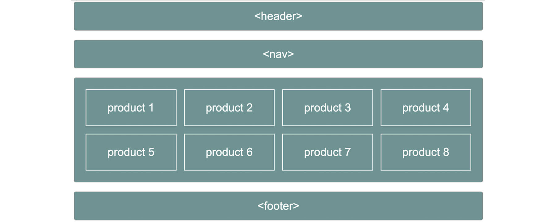
Figure 2.31: Output for the video store product page
You should now see a web page resembling the one shown in the product page wireframe.
Activity 2.02: Online Clothes Store Home Page
Suppose you are a freelance web designer/developer and have just landed a new client. For your first project, the client wants a web home page developed for their online clothes store.
Using the skills learned in this chapter, design and develop the home page layout for the new online store.
The steps are as follows:
- Produce a wireframe, either by hand or by using a graphics tool, for the new home page layout.
- Create a file named home.html in VSCode.
- Start writing the markup for the page.
- Now, style the layout with CSS.
The following figure shows the expected output for this activity:

Figure 2.32: Expected output for the online clothes store home page
Note
The solution to this activity can be found on page 582.
Summary
In this chapter, we have begun our journey into building web pages. Knowing the range of HTML tags available to you is crucial in writing well-formed HTML documents. These include header, footer, and section tags.
You should now feel comfortable taking a visual design or wireframe and converting this into the skeleton of an HTML document. We also looked at three common ways of styling a page layout with CSS. These involved the use of float-, flex-, and grid-based layout techniques. We then looked into what makes up the box model and used this knowledge to build the home and product pages of the video store.
In the next chapter, we will learn about the non-structural HTML elements used for content on a web page. We will then look into a number of common styling approaches to these elements using CSS.