About
This section is included to assist you in performing the activities present in the book. It includes detailed steps that are to be performed by the students to complete and achieve the objectives of the book.
Chapter 1: Introduction to HTML and CSS
Activity 1.01: Video Store Page Template
Solution:
- To start, we open the chapter_1 folder in VSCode (File > Open Folder…) and we will create a new plain text file by clicking File > New File. Then, save it in HTML format, by clicking File > Save As... and enter the File name: template.html. Start with the doctype and the html, head, and body elements:
<!DOCTYPE html>
<html lang="en">
<head>
</head>
<body>
</body>
</html>
- Add the title in the head element to describe the site and add a placeholder for the part of the title specific to the page:
<!DOCTYPE html>
<html lang="en">
<head>
<title>Films on Demand - <!-- Title for page goes here --></title>
</head>
<body>
</body>
- Next, add the metadata to provide the document character encoding, site description, and the viewport:
<!DOCTYPE html>
<html lang="en">
<head>
<meta charset="utf-8">
<title>Films on Demand - <!-- Title for page goes here --></title>
<meta name="description" content="Buy films from our great selection. Watch movies on demand.">
<meta name="viewport" content="width=device-width, initial-scale=1">
</head>
<body>
</body>
</html>
- Add an h1 element in the body element to provide a page heading. Add the text Lorem ipsum to this element:
<!DOCTYPE html>
<html lang="en">
<head>
<meta charset="utf-8">
<title>Films on Demand - <!-- Title for page goes here --></title>
<meta name="description" content="Buy films from our great selection. Watch movies on demand.">
<meta name="viewport" content="width=device-width, initial-scale=1">
</head>
<body>
<h1>Lorem ipsum</h1>
</body>
</html>
- Finally, add a p element beneath the h1 element to provide content. Add the paragraph of lorem ipsum provided above to the p element:
<!DOCTYPE html>
<html lang="en">
<head>
<meta charset="utf-8">
<title>Films on Demand - <!-- Title for page goes here --></title>
<meta name="description" content="Buy films from our great selection. Watch movies on demand.">
<meta name="viewport" content="width=device-width, initial-scale=1">
</head>
<body>
<h1>Lorem ipsum</h1>
<p>
Lorem ipsum dolor sit amet, consectetur adipiscing elit. Nullam quis scelerisque mauris. Curabitur aliquam ligula in erat placerat finibus. Mauris leo neque, malesuada et augue at, consectetur rhoncus libero. Suspendisse vitae dictum dolor. Vestibulum hendrerit iaculis ipsum, ac ornare ligula. Vestibulum efficitur mattis urna vitae ultrices. Nunc condimentum blandit tellus ut mattis. Morbi eget gravida leo. Mauris ornare lorem a mattis ultricies. Nullam convallis tincidunt nunc, eget rhoncus nulla tincidunt sed. Nulla consequat tellus lectus, in porta nulla facilisis eu. Donec bibendum nisi felis, sit amet cursus nisl suscipit ut. Pellentesque bibendum id libero at cursus. Donec ac viverra tellus. Proin sed dolor quis justo convallis auctor sit amet nec orci. Orci varius natoque penatibus et magnis dis parturient montes, nascetur ridiculus mus.
</p>
</body>
</html>
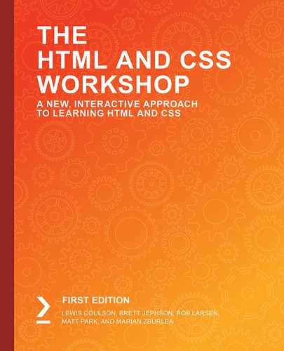
- If you now right-click on the filename in VSCode on the left-hand side of the screen and select open in default browser, you will see the following web page in your browser:
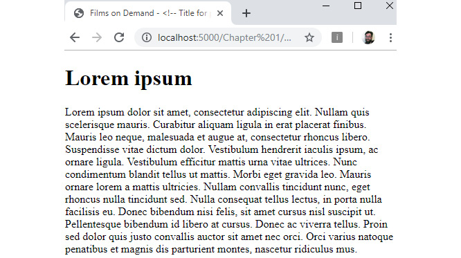
Figure 1.38: The result
Activity 1.02: Styling the Video Store Template Page
Solution:
- To start, we open the chapter_1 folder in VSCode (File > Open Folder…) and we will open the previously saved template.html from the previous activity. Now, we will add a link to the head element of template.html pointing to a local copy of styles/normalize.css:
<link href="styles/normalize.css" rel="stylesheet">
- Next, beneath the link, we add a style element to the head of template.html:
<style>
</style>
- In the style element, we want to set the page to use border-box as its box-sizing model.
<style>
html {
box-sizing: border-box;
}
*, *:before, *:after {
box-sizing: inherit;
}
</style>
- Then, we are going to add the following styles to the body element of the style element to set the font size and family to 16px and Arial, respectively:
<style>
html {
box-sizing: border-box;
}
*, *:before, *:after {
box-sizing: inherit;
}
body {
font-family: Arial, Helvetica, sans-serif;
font-size: 16px;
}
</style>
- Next we are going to add a div element to the body element. We will give it an ID of pageWrapper and a class of full-page. We will wrap this element around the h1 element and p element that is the content of the body element:
<div id="pageWrapper" class="full-page">
<h1>Lorem ipsum</h1>
<p>
Lorem ipsum dolor sit amet, consectetur adipiscing elit. Nullam quis scelerisque mauris. Curabitur aliquam ligula in erat placerat finibus. Mauris leo neque, malesuada et augue at, consectetur rhoncus libero. Suspendisse vitae dictum dolor. Vestibulum hendrerit iaculis ipsum, ac ornare ligula. Vestibulum efficitur mattis urna vitae ultrices. Nunc condimentum blandit tellus ut mattis. Morbi eget gravida leo. Mauris ornare lorem a mattis ultricies. Nullam convallis tincidunt nunc, eget rhoncus nulla tincidunt sed. Nulla consequat tellus lectus, in porta nulla facilisis eu. Donec bibendum nisi felis, sit amet cursus nisl suscipit ut. Pellentesque bibendum id libero at cursus. Donec ac viverra tellus. Proin sed dolor quis justo convallis auctor sit amet nec orci. Orci varius natoque penatibus et magnis dis parturient montes, nascetur ridiculus mus.
</p>
</div>
- We will add styles to set the background color for the page and to set the minimum height to 100vh, the full height of the viewport:
<style>
html {
box-sizing: border-box;
}
*, *:before, *:after {
box-sizing: inherit;
}
body {
font-family: Arial, Helvetica, sans-serif;
font-size: 16px;
}
#pageWrapper {
background-color: #eeeae4;
}
.full-page {
min-height: 100vh;
}
</style>
- Finally, we will add change the margin and padding of the h1 element. We can add this to the bottom of the style element:
.full-page {
min-height: 100vh;
}
h1 {
margin: 0;
padding: 0 0 16px 0;
}
</style>
- The resulting code is:
<!DOCTYPE html>
<html lang="en">
<head>
<meta charset="utf-8">
<title>Films on Demand - <!-- Title for page goes here --></title>
<meta name="description" content="Buy films from our great selection. Watch movies on demand.">
<meta name="viewport" content="width=device-width, initial-scale=1">
<link href="styles/normalize.css" rel="stylesheet">
<style>
html {
box-sizing: border-box;
}
*, *:before, *:after {
box-sizing: inherit;
}
body {
font-family: Arial, Helvetica, sans-serif;
font-size: 16px;
}
#pageWrapper {
background-color: #eeeae4;
}
.full-page {
min-height: 100vh;
}
h1 {
margin: 0;
padding: 0 0 16px 0;
}
</style>
</head>
<body>
<div id="pageWrapper" class="full-page">
<h1>Lorem ipsum</h1>
<p>
Lorem ipsum dolor sit amet, consectetur adipiscing elit. Nullam quis scelerisque mauris. Curabitur aliquam ligula in erat placerat finibus. Mauris leo neque, malesuada et augue at, consectetur rhoncus libero. Suspendisse vitae dictum dolor. Vestibulum hendrerit iaculis ipsum, ac ornare ligula. Vestibulum efficitur mattis urna vitae ultrices. Nunc condimentum blandit tellus ut mattis. Morbi eget gravida leo. Mauris ornare lorem a mattis ultricies. Nullam convallis tincidunt nunc, eget rhoncus nulla tincidunt sed. Nulla consequat tellus lectus, in porta nulla facilisis eu. Donec bibendum nisi felis, sit amet cursus nisl suscipit ut. Pellentesque bibendum id libero at cursus. Donec ac viverra tellus. Proin sed dolor quis justo convallis auctor sit amet nec orci. Orci varius natoque penatibus et magnis dis parturient montes, nascetur ridiculus mus.
</p>
</div>
</body>
</html>
- If you now right-click on the filename in VSCode on the left-hand side of the screen and select open in default browser, you will see the result that looks like the following figure:
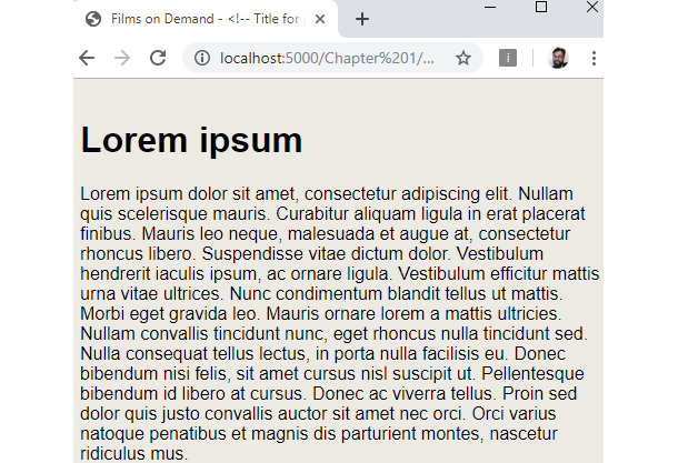
Figure 1.39: The resulting web template
Chapter 2: Structure and Layout
Activity 2.01: Video Store Home Page
Solution:
- Start with the following HTML skeleton:
<!DOCTYPE html>
<html>
<head>
<title>Video store home page</title>
<style>
header,
nav,
section,
footer {
background: #659494;
border-radius: 5px;
color: white;
font-family: arial, san-serif;
font-size: 30px;
text-align: center;
padding: 30px;
margin-bottom: 20px;
}
header:before,
nav:before,
section:before,
footer:before {
content: '<';
}
header:after,
nav:after,
section:after,
footer:after {
content: '>';
}
</style>
</head>
<body>
<!-- your code will go here -->
</body>
</html>
- Now, let's add the header tag:
<body>
<header>header</header>
</body>
- Then, the navigation:
<body>
<header>header</header>
<nav>nav</nav>
</body>
- Now, add the main page content section:
<body>
<header>header</header>
<nav>nav</nav>
<section>section</section>
</body>
- And finally, let's add the footer tag:
<body>
<header>header</header>
<nav>nav</nav>
<section>section</section>
<footer>footer</footer>
</body>
- If you now right-click on the filename in VSCode on the left-hand side of the screen and select open in default browser, you will see the output in a browser.
Activity 2.02: Online Clothes Store Home Page
Solution:
- Start with the following HTML skeleton that contains all of the CSS we need:
<!DOCTYPE html>
<html>
<head>
<title>Video store product page</title>
<style>
header,
nav,
section,
footer {
background: #659494;
border-radius: 5px;
color: white;
font-family: arial, san-serif;
font-size: 30px;
text-align: center;
}
header:before,
nav:before,
footer:before {
content: '<';
}
header:after,
nav:after,
footer:after {
content: '>';
}
header,
nav,
section,
footer {
border: 1px solid gray;
padding: 20px;
margin-bottom: 25px;
}
.products {
display: grid;
grid-template-columns: auto auto auto auto;
}
.products div {
border: 2px solid white;
padding: 30px;
margin: 10px;
}
</style>
</head>
<body>
<!-- your code goes here -->
</body>
</html>
- Now, let's add the header element between the opening and closing body tags:
<body>
<header>header</header>
</body>
- Then, the navigation element, which will be placed after the header element:
<body>
<header>header</header>
<nav>nav</nav>
</body>
- Then, a section element for an image carousel, which comes after the nav element:
<body>
<header>header</header>
<nav>nav</nav>
<section>Image carousel</section>
</body>
- Then, a section element for the product items. Observe how we add a class name to allow for different styling between the two section elements:
<body>
<header>header</header>
<nav>nav</nav>
<section>Image carousel</section>
<section class="products">
<div>product 1</div>
<div>product 2</div>
<div>product 3</div>
<div>product 4</div>
</section>
</body>
- Finally, we add the footer element, which will go after the section element used for the product items:
<body>
<header>header</header>
<nav>nav</nav>
<section>Image carousel</section>
<section class="products">
<div>product 1</div>
<div>product 2</div>
<div>product 3</div>
<div>product 4</div>
</section>
<footer>footer</footer>
</body>
- If you now right-click on the filename in VSCode on the left-hand side of the screen and select open in default browser, you will see the output in a browser.
Chapter 3: Text and Typography
Activity 3.01: Converting a Newspaper Article to a Web Page
Solution:
- Start with the following HTML code, which will form the starting point:
<!DOCTYPE html>
<html>
<head>
<title>Newspaper article</title>
</head>
<body>
… your markup goes here
</body>
</html>
- Now, let's add the HTML, starting with the article heading and then followed by all text-based elements:
<!DOCTYPE html>
<html>
<head>
<title>Newspaper article</title>
</head>
<body>
<article>
<h1>News article heading</h1>
<p><strong>Introduction text</strong></p>
<p>Lorem ipsum dolor sit amet, consectetur adipiscing elit. Curabitur consequat egestas mauris, non auctor justo sagittis sit amet. Donec mattis ut magna non rutrum. Morbi dolor risus, venenatis non semper id, maximus ac lectus. Phasellus pulvinar felis
nibh, eu imperdiet metus finibus vel.</p>
<ul>
<li>Lorem ipsum dolor</li>
<li>Donec mattis ut</li>
<li>Phasellus pulvinar</li>
</ul>
<p>Lorem ipsum dolor sit amet, consectetur adipiscing elit. Curabitur consequat egestas mauris, non auctor justo sagittis sit amet. Donec mattis ut magna non rutrum. Morbi dolor risus, venenatis non semper id, maximus ac lectus. Phasellus pulvinar felis
nibh, eu imperdiet metus finibus vel.</p>
</article>
</body>
</html>
- Now we will add some styling for the news article. Notice that we add a font family and customize the size of each text-based element:
<!DOCTYPE html>
<html>
<head>
<title>Newspaper article</title>
<style>
body {
font-family: "Times New Roman", Times, serif;
}
h1 {
font-size: 50px;
}
p,
ul {
color: #666;
font-size: 16px;
}
</style>
</head>
<body>
<article>
<h1>News article heading</h1>
<p><strong>Introduction text</strong></p>
<p>Lorem ipsum dolor sit amet, consectetur adipiscing elit. Curabitur consequat egestas mauris, non auctor justo sagittis sit amet. Donec mattis ut magna non rutrum. Morbi dolor risus, venenatis non semper id, maximus ac lectus. Phasellus pulvinar felis
nibh, eu imperdiet metus finibus vel.</p>
<ul>
<li>Lorem ipsum dolor</li>
<li>Donec mattis ut</li>
<li>Phasellus pulvinar</li>
</ul>
<p>Lorem ipsum dolor sit amet, consectetur adipiscing elit. Curabitur consequat egestas mauris, non auctor justo sagittis sit amet. Donec mattis ut magna non rutrum. Morbi dolor risus, venenatis non semper id, maximus ac lectus. Phasellus pulvinar felis
nibh, eu imperdiet metus finibus vel.</p>
</article>
</body>
</html>
- If you now right-click on the filename in VSCode on the left-hand side of the screen and select open in default browser, you will see the output in a browser.
Chapter 4: Forms
Activity 4.01: Building an Online Property Portal Website Form
Solution
- Start with the following skeleton HTML and create a new file in VSCode called Activity 4.01.html:
<!DOCTYPE html>
<html>
<head>
<title>Activity 4.01</title>
</head>
<body>
<!-- your markup goes here -->
</body>
</html>
- Now, let's add the HTML for our property search form. We will start by adding the HTML for the search radius, price range, and bedroom fields. The HTML for the radius field will consist of a label and select box; likewise for the price range and bedrooms fields:
<div class="row">
<div>
<div class="item">
<label for="radius">Search radius:</label>
<div class="select-wrapper">
<select id="radius" required>
<option value="">This area only</option>
<option value="1">1 mile</option>
<option value="5">5 miles</option>
<option value="10">10 miles</option>
</select>
</div>
</div>
<div class="item">
<label for="price">Price range:</label>
<div class="select-wrapper">
<select id="price" required>
<option value="">Any</option>
<option value="100">Up to 100k</option>
<option value="250">Up to 250k</option>
<option value="500">Up to 500k</option>
</select>
</div>
</div>
<div class="item">
<label for="beds">Bedrooms:</label>
<div class="select-wrapper">
<select id="beds" required>
<option value="">Any</option>
<option value="1">1 Bed</option>
<option value="2">2 Beds</option>
<option value="3">3 Beds</option>
</select>
</div>
</div>
</div>
- Now we will continue writing out the HTML for the remaining form fields. For the property type and added to site fields, we will use a label and a select box. For the "include sold properties" option, we will use a label with a checkbox. Finally, we will add a submit button to allow the user to submit the form:
<div class="item">
<input id="sold" class="checkbox" type="checkbox" name="sold" />
<label for="sold">Include sold properties</label>
</div>
</div>
</div>
<button type="submit">Find properties</button>
</fieldset>
</form>
</body>
</html>
- Now that we have our HTML in place, we can add the CSS to improve the look and feel of the form. We will start by adding a font to all text on the web page and setting some spacing properties for the form elements:
<style>
body {
font-family: arial, sans-serif;
}
fieldset {
border: 0;
padding: 0;
width: 900px;
}
fieldset > div {
margin-bottom: 30px;
}
</style>
- Next, we will add some CSS for the individual form elements, including inputs, selects, and labels:
label {
display: block;
margin-bottom: 10px;
}
input,
select {
border: 1px solid gray;
padding: 10px;
width: 200px;
}
select {
background: transparent;
border-radius: 0;
box-shadow: none;
color: #666;
-webkit-appearance: none;
width: 100%;
}
.select-wrapper {
position: relative;
width: 100%;
}
.select-wrapper:after {
content: '<>';
color: #666;
font-size: 14px;
top: 8px;
right: 0;
transform: rotate(90deg);
position: absolute;
z-index: -1;
}
button {
background: green;
border: 0;
color: white;
width: 224px;
padding: 10px;
text-transform: uppercase;
float: right;
margin-right: 30px;
}
- Finally, we will add some styles that handle the layout of the form elements and also the styles for form validation:
.row,
.item {
display: flex;
}
.item {
margin-bottom: 15px;
margin-right: 30px;
}
.row > div {
flex-basis: 50%;
}
label {
margin-right: 15px;
line-height: 35px;
width: 150px;
}
.checkbox {
margin-left: 122px;
margin-right: 10px;
width: auto;
}
.checkbox+label {
width: auto;
line-height: 20px;
}
select:valid {
border: 2px solid green;
}
select:invalid {
border: 2px solid red;
}
If you now right-click on the filename in VSCode, on the left-hand side of the screen, and select open in default browser, you will see the form in your browser.
You should now have a form that looks like the following figure:
Figure 4.28: Property portal website form
- Finally, we will check that the validation works for our required fields by submitting the form with empty fields:
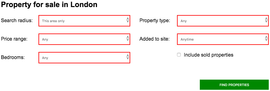
Figure 4.29: A form highlighting fields that are required to be filled in to submit the form
Chapter 5: Themes, Colors, and Polish
Activity 5.01: Creating Your Own Theme Using a New Color Palette
Solution
- Create a file called new-colors-theme.css in the assets folder of your sample project.
- Copy index.html and paste it into a new file called Activity 5.01.html.
- Add the style sheet to your document with a new link element:
<head>
<meta http-equiv="Content-Type" content="text/html; charset=UTF-8">
<meta name="viewport" content="width=device-width, initial-scale=1">
<title>HTML5 Boilerplate 7.2.0 and main.css 2.0.0 released – HTML + CSS + JavaScript</title>
<link rel="stylesheet" id="hcj2-0-style-css" href="./assets/style.css" type="text/css" media="all">
<link rel="stylesheet" id="dark-theme" href="./assets/new-colors-theme.css" type="text/css" media="all">
</head>
- Now, open dark-theme-hsl.css and set the text color for body, button, input, select, and textarea to #335:
body,
button,
input,
select,
textarea {
color: #335;
}
- Next, change the background of the body element to a light blue #9db3f4:
body {
background: #9db3f4;
}
- Next, we change the color of the links. The default link color is set to be the darkest brand blue, #0e3ece, while visited links are set to be #bf0ece, which is a purple of the same value as the darkest brand blue. The active, focus, and hover links are then set to be another of the brand colors, #2a56db:
a {
color: #0e3ece;
}
a:visited {
color: #bf0ece;
}
a:hover,
a:focus,
a:active {
color: #2a56db;
}
- Next, .site-content is updated with a new background color and two new borders on the right and left. The background color is pure white, and the 10-pixel border is set to be the brand blue:
.site-content {
'background: #ffffff;
border-right: 10px solid #4c72e5;
border-left: 10px solid #4c72e5;
}
- Now, update the text in the site header. Change the h1, the link inside the h1, and the main navigation menu items to #fffff and add a new rule for .site-description so that it's the lightest brand yellow, #ffef98:
header.site-header h1 {
color: #ffffff;
}
header.site-header h1 a {
color: #ffffff;
}
header.site-header nav .menu,
header.site-header nav li a {
color: #ffffff;
}
.site-description {
color: #ffef98;
}
- Now, change the background of the site header to brand blue, #4c72e5, and remove the box-shadow from the element:
.blog .site-header,
.single-post .site-header{
background: #4c72e5;
box-shadow: none;
}
- Now, make some changes to the text in the article element. Change the h1 to brand blue, #4c72e5, and then add a new rule to make the h2 elements brand orange, #FF7a00:
article h1 {
color: #4c72e5;
}
article h2 {
color: #FF7a00;
}
- Remove the box-shadow from the .content-area:
.content-area{
box-shadow: none;
}
- Finally, change the background of the footer to brand blue and change the text to pure white:
footer.site-footer {
color: #ffffff;
background: #4c72e5;
}
footer.site-footer a {
color: #ffffff;
}
- Save new-colors-theme.css if you now right-click on the filename in VSCode on the left-hand side of the screen and select open in default browser, you'll see the following screenshot in your browser:
Figure 5.20: Resulting web page
Chapter 6: Responsive Web Design/Media Queries
Activity 6.01: Refactoring the Video Store Product Cards into a Responsive Web Page
Solution
- Save a new HTML file called responsive-product-page.html using the existing code from Chapter 3, Text and Typography Exercise 3.06, Putting It All Together. Insert the viewport meta tag into the <head> of the HTML document. This would be inserted at the top of the <head> section, ideally, as follows:
<!DOCTYPE html>
<html>
<head>
<meta name="viewport" content="width=device-width, initial-scale=1" />
<title>Video store home page</title>
- In order to make the CSS mobile first, we must first remove the desktop-only styling and add new mobile-friendly styles.
Remove the fixed width of 1,200px from the <body> tag.
- Edit the <header> styling to remove the display, align-items, and margin-bottom properties, as these are not required in mobile-first styling.
- We removed the display grid properties from the product cards element, as they are not required in the mobile-first version. We'll use them later in the media queries for higher resolutions.
- On the <nav> element, we added a 20px top margin to separate it vertically from the logo, then removed the left margin as this isn't required for mobile-first styles. To update the styling, we added a black background to the navigation bar.
- Inside the navigation list (<ul>) element, we added horizontal and vertical centering within flexbox, using the align-items: center; and justify-content: center; properties.
- Inside the navigation list links (<a>) elements, we've changed the color to be white, so that it's visible on the new black navigation background.
- Next, we updated the navigation list link's hover state (a:hover) to have a font color of red, and also gave the breadcrumb element a light gray background.
- We updated the width and padding on the intro element and removed the display property from the product card to make it mobile-first suitable.
The updated code after removing the desktop-only styling and adding the mobile-friendly styles can be found in https://packt.live/2NFdEc3.
- We've created the following new CSS additions to provide a different style for screens of 768px or higher. This will be appended to the end of the mobile-first CSS we created in step 3. The CSS is as follows:
The header element is restored back to the original flexbox model and centered.
The navigation background is removed and the margin updated for larger screens.
For the navigation links, the colors have been reset back to the former colors (before step 3), without the navigation background anymore. We've also updated the width in the intro section.
For the product cards section, we've restored the former grid display, and for the product cards, we've restored the display inline block style to ensure that the product cards are laid out in grid format for display on larger screens.
The code for step 4 looks as follows:
<style type="text/css">
@media (min-width: 768px) {
header {
align-items: center;
display: flex;
}
nav {
background: transparent;
margin-top: 0;
margin-left: 30px;
}
nav a {
color: black;
}
nav a:hover {
text-decoration: underline;
color: black;
}
.intro {
width: 50%;
}
.product-cards {
display: grid;
grid-template-columns: auto auto auto auto;
}
.product-card {
display: inline-block;
}
}
</style>
- The additional CSS with the print media query could be as follows. We've hidden the <nav> element when in printing mode. You can test this by doing a print preview from your web browser:
<style type="text/css">
@media only print {
nav {
display: none;
}
}
</style>
- If you now right-click on the filename in VSCode on the left-hand side of the screen and select open in default browser, you will see the end result that would look something like the following figure:

Figure 6.25: Screenshot on mobile and desktop screen sizes
Chapter 7: Media - Audio, Video, and Canvas
Activity 7.01: Media Page
Solution
- Create an HTML file and name it video-page.html. Save the following code in the file. This is a copy of the template provided. We have changed the title to Films on Demand – Video Promo:
<!DOCTYPE html>
<html lang="en">
<head>
<meta charset="utf-8">
<title>Films on Demand - Video Promo</title>
<meta name="description" content="Buy films from our great selection. Watch movies on demand.">
<meta name="viewport" content="width=device-width, initial-scale=1">
<link href="styles/normalize.css" rel="stylesheet">
<style>
body {
font-family: Arial, Helvetica, sans-serif;
font-size: 16px;
}
#pageWrapper {
background-color: #eeeae4;
}
.full-page {
min-height: 100vh;
}
</style>
</head>
<body>
<div id="pageWrapper" class="full-page">
<!-- content goes here -->
</div>
</body>
</html>
- Next, we need to replace the <!-- content goes here --> comment with a video element. The video element has an ID value of video-1, which the JavaScript will use to find the video element. We need to add a poster image (media/poster.png) and the WebM and MP4 source for the video. We also create a fallback message for users with no video support in their browser:
<div id="pageWrapper" class="full-page">
<div id="media-player" class="media-player">
<video id="media-1" poster="media/poster.png" preload="metadata">
<source src="media/html_and_css.webm" type="video/webm" />
<source src="media/html_and_css.mp4" type="video/mpeg" />
It looks like your browser does not support <code>video</code>.
</video>
</div>
</div>
- The next step is to create the markup for the video player. We have added this after the video element as a div with a class attribute with the value controls. The controls container hosts a play and pause button and a div for the current time and total duration of the video element. After the controls markup, we also add the media-controls.js JavaScript file, which will add event listeners and behavior for the controls of the media player:
<div id="media-player" class="media-player">
<video id="media-1" poster="media/poster.png" preload="metadata">
<source src="media/html_and_css.webm" type="video/webm" />
<source src="media/html_and_css.mp4" type="video/mpeg" />
It looks like your browser does not support <code>video</code>.
</video>
<div class="controls">
<button id="play-btn" class="button">Play</button>
<button id="pause-btn" class="button">Pause</button>
<div class="status">
<span id="played">00:00</span> / <span id="duration">00:00</span>
</div>
</div>
<script src="scripts/media-controls.js"></script>
</div>
- Next, we will add styles to the media player and controls. We give the .media-player container a width of 768 pixels and the video element a width of 100% so that it will fill the area of the container while maintaining its aspect ratio. We also set general color and font styles for the controls:
<style>
.media-player {
position: relative;
margin: 0 auto;
padding-top: 24px;
width: 768px;
}
video {
width: 100%;
margin: 0;
padding: 0;
}
.media-player,
.controls,
.controls .button {
color: white;
font-family: Arial, Helvetica, sans-serif;
font-size: 16px;
font-weight: 200;
}
- Next, we lay the controls out so that they're left- and right-aligned with space between them by using flexbox CSS for the layout. The controls bar is black but has slight transparency so that you can see the underlying video. It is positioned absolutely at the bottom of the video element:
.controls {
align-items: center;
background-color: rgba(0, 0, 0, 0.75);
bottom: 5px;
display: flex;
justify-content: space-between;
margin: 0;
padding: 10px 0;
position: absolute;
width: 100%;
}
- We remove the default button appearance and style both the play and pause controls buttons with a bright purple to stand out on the dark controls bar:
.controls .button {
-webkit-appearance: none;
appearance: none;
background-color: #4717F6;
border: 1px solid #E7DFDD;
border-radius: 3px;
cursor: pointer;
outline: none;
padding: 4px 16px;
text-transform: uppercase;
min-width: 128px;
margin-left: 8px;
}
.status {
margin-right: 16px;
}
- Finally, using a data attribute to express the state of the media player, we hide the pause button or play button depending on whether the video is playing or paused, respectively:
[data-state="playing"] #play-btn,
[data-state="paused"] #pause-btn {
display: none;
}
</style>
- If you now right-click on the filename in VSCode on the left-hand side of the screen and select open in default browser, you will see the output in a browser.
Chapter 8: Animation
Activity 8.01: Animating Our Video Store Home Page
Solution
Complete this activity by following these steps:
- First, take a copy of Activity 6.01.html from your Chapter 6 folder and save this in your Chapter 8 folder as Activity 8.01.html. Now, we're going to edit the navigation links so that they have a CSS transition on the active hovered navigation link item. We will do this by moving it slightly upwards and then smoothing the transition of it's hover color to red. Both transitions will be completed over 500 milliseconds. This will be triggered upon hovering the mouse over the link. Note that we only want to apply this to our desktop screen sizes since this could impair the usability of the mobile layout for users otherwise. We'll achieve this now.
In the CSS <style> tag, within the @media (min-width: 768px) media query selector, while editing the nav a selector, we're going to add the following new properties:
position: relative;
top: 0;
transition: top .5s, color .5s;
We're then going to edit the nav a:hover selector with the following properties. Note that we are changing the text's color:
top: -10px;
text-decoration: none;
color: red;
Now, you can observe the navigation transition effect in your web browser. The result is shown in the following screenshot:
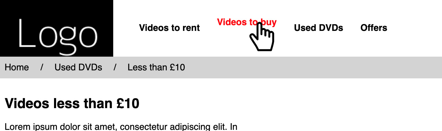
Figure 8.36: Navigation hover
Next, we're going to use keyframes to create a hover effect on the product cards as the mouse hovers over each of them. On the animation, we're going to change the background color of the card, add a thicker border to the card (while reducing the padding simultaneously so as not to increase the overall width of the box), and change the color of the text so that it works with the new background color.
We will apply this style to mobile and desktop screen sizes, so it doesn't need to be desktop-specific this time.'
- Add the keyframes animation text in the CSS <style> tag, just before the .product-card selector statement. Add the following code:
@keyframes productCards {
from {
background-color: white;
color: black;
border-width: 1px;
padding: 15px;
}
to {
background-color: black;
color: white;
border-width: 5px;
padding: 11px;
}
}
Next, we're editing the .product-card:hover selector and adding it to the animation property code, as follows:
animation: productCards 2s;
Finally, we'll add the .product-card:hover a selector statement and make the color change for the link when we hover over the product card. Add the following code:
.product-card:hover a {
color: white;
}
- If you now right-click on the filename in VSCode on the left-hand side of the screen and select open in default browser, you will see the following screenshot that shows the expected result:
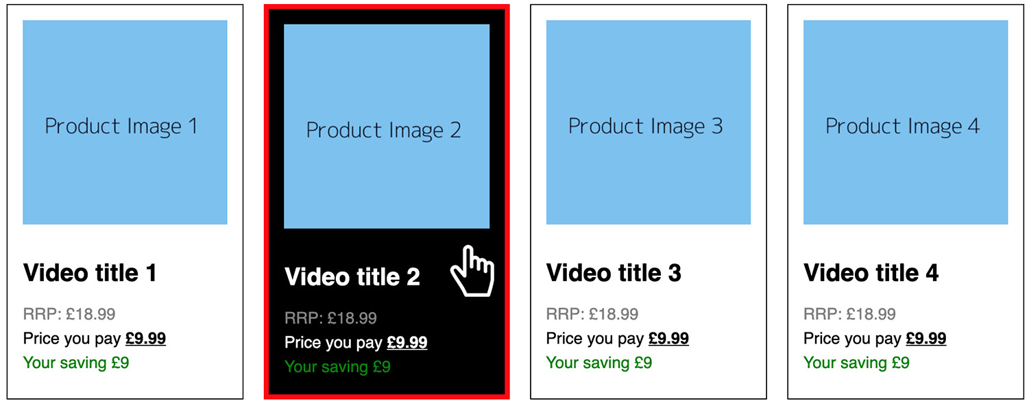
Figure 8.37: Appearance of the product cards when we hover over them on a desktop screen
To recap, the following screenshot shows the expected output, with the animations completed:
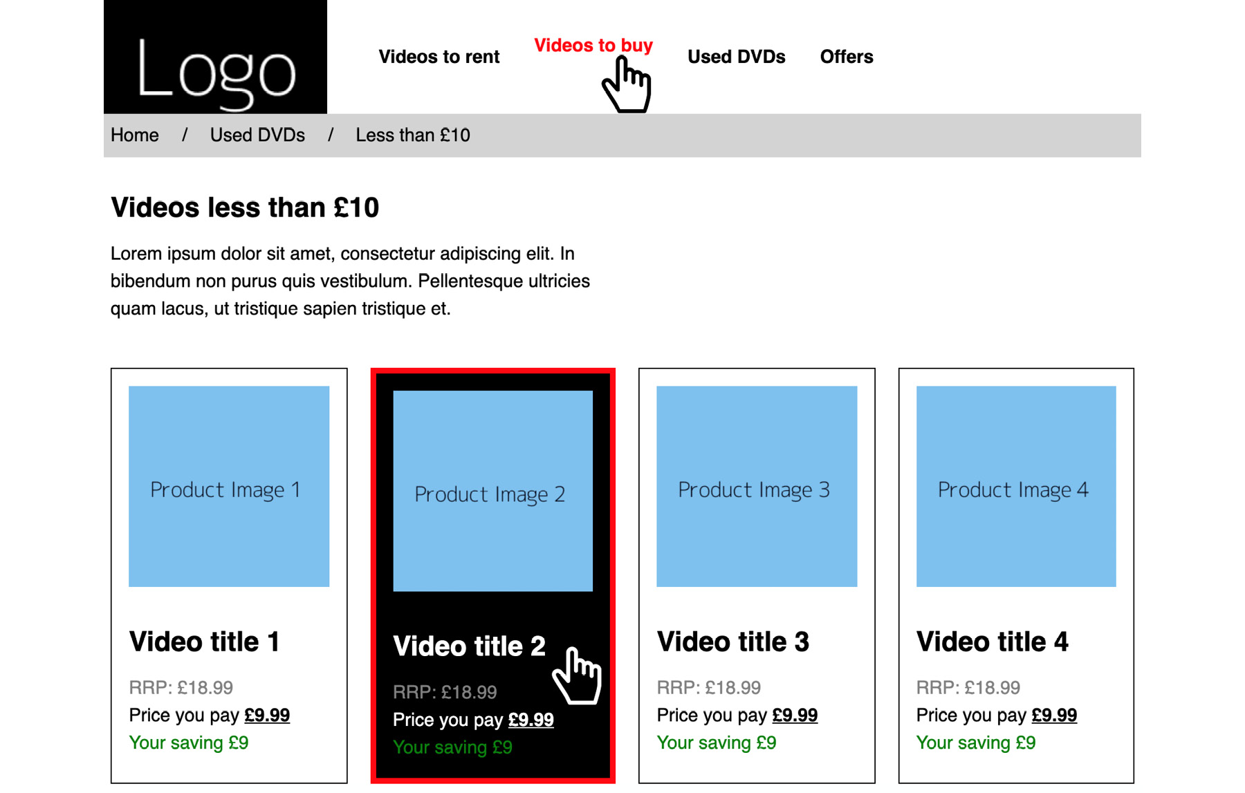
Figure: 8.38: The output with the hover states and completed animations shown
Chapter 9: Accessibility
Activity 9.01: Making a Page Accessible
Solution
- To start, create a file called Activity 9.01.html and copy the code from activity_1_inaccessible.html into it.
- Open that page in the browser and run the Axe accessibility checker in the developer tools.
The following screenshot shows the results you should see for this page. There are five distinct issues, with multiple occurrences of some of the issues (form label issues):
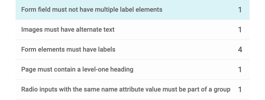
Figure 9.22: Issues with the page reported by Axe
- The first issue to solve is changing the second label in the Rating the product section. It and the first label are associated with the same form field. Changing it to associate the label with the form field with the "rate-2" ID makes sense:
<input type="radio" name="rating" value="1" id="rate-1">
<label for="rate-1">1</label>
<input type="radio" name="rating" value="2" id="rate-2">
<label for="rate-2">2</label>
If we run the Axe tool again, we will see that the first issue has been solved and that the Form elements must have labels issues have decremented by one.
- The next issue is to fix the lack of alt text on the product image. For now, we will add an alt attribute with a "Product" value:
<img src="images/product.png" class="product-image" alt="Product">
- Next, we will fix the third issue, which relates to label elements not being associated with form fields. We need to add the for attribute to the first two label elements to fix them:
<label for="first-name">First name:</label>
<input id="first-name" type="text" />
<br />
<label for="last-name">Last name:</label>
<input id="last-name" type="text" />
We also need to change the fourth label of the Rating the product section, which has an incorrect value:
<input type="radio" name="rating" value="4" id="rate-4">
<label for="rate-4">4</label>
- The penultimate issue is that the page does not have a top-level heading. To fix this, we can change the first heading with the text Product Store so that it's an h1 element. This will improve the structure of the page:
<h1>Product Store</h1>
- Finally, we need to resolve an issue where the five radio inputs for rating the product need to be grouped properly. To do this, we can use a legend element in the second fieldset instead of a p element:
<legend>Rating the product:</legend>
- If we run the Axe tool again, we should see that all the issues have been fixed. We should see the following message from Axe:
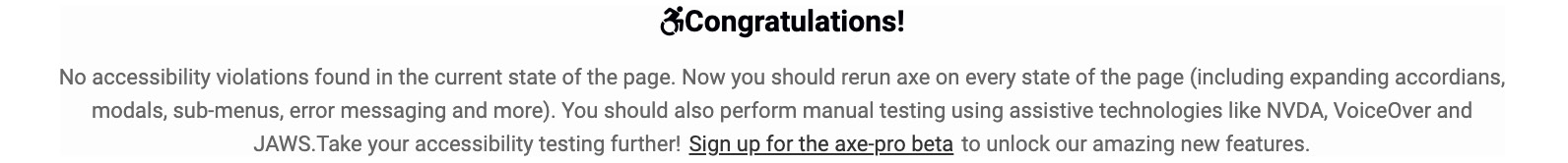
Figure 9.23: All issues fixed in Axe
Chapter 10: Preprocessors and Tooling
Activity 10.01: Converting the Video Store Home Page into SCSS
Solution:
- Get a copy of your code from Chapter 6, Responsive Web Design and Media Queries, Activity 6.01, Refactoring the Video Store Product Cards into a Responsive Web Page, and save it as a new file within your Chapter10 project folder called Activity 10.01.html. Remove the CSS code from within the <style> tags and save it as activity1.scss within your SCSS subfolder in the project. Add a link to the activity1.css file in your document from the CSS subfolder of your project.
Activity 10.01.html can be found in https://packt.live/36YzkXZ.
activity1.scss code can be found in https://packt.live/32FW5fY.
- Update the SCSS to use nesting and color variables, keeping the media queries within the relevant tags, instead of at the end of file. Here's the updated activity1.scss file:
$primary-color: black;
$secondary-color: white;
$hover-color: red;
$bg-color: lightgray;
$saving-color: green;
$original-color: gray;
* {
margin: 0;
padding: 0;
}
body {
font-family: sans-serif;
margin: 0 auto;
}
header {
text-align: center;
@media (min-width: 768px) {
align-items: center;
display: flex;
}
}
.product-cards {
margin-bottom: 30px;
}
nav {
margin-top: 20px;
background: $primary-color;
@media (min-width: 768px) {
background: transparent;
margin-top: 0;
margin-left: 30px;
}
@media only print {
display: none;
}
ul {
display: flex;
list-style: none;
align-items: center;
justify-content: center;
}
a {
color: $secondary-color;
font-weight: bold;
display: block;
padding: 15px;
text-decoration: none;
@media (min-width: 768px) {
color: $primary-color;
}
&:hover {
color: $hover-color;
@media (min-width: 768px) {
text-decoration: underline;
color: $primary-color;
}
}
}
}
.breadcrumb {
display: flex;
list-style: none;
background: $bg-color;
li {
padding: 10px;
&:after {
content: "/";
margin-left: 20px;
}
&:last-child:after {
content: "";
}
}
a {
color: $primary-color;
text-decoration: none;
&:hover {
text-decoration: underline;
}
}
}
.intro {
margin: 30px 0;
padding: 0 10px;
@media (min-width: 768px) {
width: 50%;
}
h1 {
margin-bottom: 15px;
}
p {
line-height: 1.5;
}
}
.product-cards {
@media (min-width: 768px) {
display: grid;
grid-template-columns: auto auto auto auto;
}
}
.product-card {
border: 1px solid $primary-color;
padding: 15px;
margin: 10px;
@media (min-width: 768px) {
display: inline-block;
}
a {
color: $primary-color;
text-decoration: none;
}
img {
width: 100%;
}
h2 {
margin: 30px 0 15px;
}
p {
line-height: 1.5;
}
}
.original-price {
color: $original-color;
text-transform: uppercase;
}
.current-price span {
font-weight: bold;
text-decoration: underline;
}
.saving {
color: $saving-color;
}
- Edit your package.json in your project to have the SCSS script output in compressed format.
package.json file:
{
"name": "chapter10",
"version": "1.0.0",
"description": "HTML5 & CSS3 Workshop Chapter10 Exercises",
"main": "index.js",
"scripts": {
"test": "echo "Error: no test specified" && exit 1",
"scss": "node-sass --watch scss -o css --output-style compressed"
},
"author": "Matt Park",
"license": "ISC",
"dependencies": {
"node-sass": "^4.12.0"
}
}
- Using Terminal, compile your SCSS code into minified CSS code.
Navigate to the project directory: cd ~/Desktop/Chapter10.
Run the following command to run the compile script: npm run scss.
Then, save the activity1.scss file to generate the activity1.css file.
- The end result will be compressed (minified) CSS code, as shown in the succeeding snippet. The browser's visual output should be the same as in Chapter 6, Responsive Web Design and Media Queries, Activity 6.01, Refactoring the Video Store Product Cards into a Responsive Web Page, if done correctly. Check Figure 10.14 for reference:
*{margin:0;padding:0}body{font-family:sans-serif;margin:0 auto}header{text-align:center}@media (min-width: 768px){header{align-items:center;display:flex}}.product-cards{margin-bottom:30px}nav{margin-top:20px;background:#000}@media (min-width: 768px){nav{background:transparent;margin-top:0;margin-left:30px}}@media only print{nav{display:none}}nav ul{display:flex;list-style:none;align-items:center;justify-content:center}nav a{color:#fff;font-weight:bold;display:block;padding:15px;text-decoration:none}@media (min-width: 768px){nav a{color:#000}}nav a:hover{color:red}@media (min-width: 768px){nav a:hover{text-decoration:underline;color:#000}}.breadcrumb{display:flex;list-style:none;background:#d3d3d3}.breadcrumb li{padding:10px}.breadcrumb li:after{content:"/";margin-left:20px}.breadcrumb li:last-child:after{content:""}.breadcrumb a{color:#000;text-decoration:none}.breadcrumb a:hover{text-decoration:underline}.intro{margin:30px 0;padding:0 10px}@media (min-width: 768px){.intro{width:50%}}.intro h1{margin-bottom:15px}.intro p{line-height:1.5}@media (min-width: 768px){.product-cards{display:grid;grid-template-columns:auto auto auto auto}}.product-card{border:1px solid #000;padding:15px;margin:10px}@media (min-width: 768px){.product-card{display:inline-block}}.product-card a{color:#000;text-decoration:none}.product-card img{width:100%}.product-card h2{margin:30px 0 15px}.product-card p{line-height:1.5}.original-price{color:gray;text-transform:uppercase}.current-price span{font-weight:bold;text-decoration:underline}.saving{color:green}
Chapter 11: Maintainable CSS
Activity 11.01: Making Our Video Store Web Page Maintainable
Solution:
- First, we'll take a copy of the Chapter 10, Preprocessors and Tooling, Activity 10.01, Converting a Video Store Home Page into SCSS, HTML file and save it in our Chapter11 project folder under Activity 11.01.html. Next, we need to take a copy of the Chapter 10, Preprocessors and Tooling, Activity 10.01, Converting a Video Store Home Page into SCSS, SCSS file and save this in our Chapter 11 project folder, under the scss/activity1.scss path.
- Edit the Activity 11.01.html file so that it uses a BEM semantic markup. This involves changing the existing CSS classes to follow the BEM structure; for example, header would become .header and header img would become .header__logo.
Once the HTML file has been updated, the markup will look like this:
<!DOCTYPE html>
<html>
<head>
<meta name="viewport" content="width=device-width, initial-scale=1" />
<title>Video store home page</title>
<link href="css/activity1.css" rel="stylesheet" />
</head>
<body>
<header class="header">
<img class="header__logo" src="https://dummyimage.com/200x100/000/ fff&text=Logo" alt="" />
<nav class="nav">
<ul class="nav__list">
<li class="nav__item"><a class="nav__link" href="">Videos to rent</a></li>
<li class="nav__item"><a class="nav__link" href="">Videos to buy</ a></li>
<li class="nav__item"><a class="nav__link" href="">Used DVDs</a></ li>
<li class="nav__item"><a class="nav__link" href="">Offers</a></li>
</ul>
</nav>
</header>
<section class="breadcrumb">
<ol class="breadcrumb__list">
<li class="breadcrumb__item"><a class="breadcrumb__link" href="">Home</a></li>
<li class="breadcrumb__item"><a class="breadcrumb__link" href="">Used DVDs</a></li>
<li class="breadcrumb__item">Less than £10</li>
</ol>
</section>
<section class="intro">
<h1 class="intro__title">Videos less than £10</h1>
<p class="intro__paragraph">Lorem ipsum dolor sit amet, consectetur adipiscing elit. In bibendum non purus quis vestibulum. Pellentesque ultricies quam lacus, ut tristique sapien tristique et.</p>
</section>
<section class="products">
<div class="products__card">
<img class="products__image" src="https://dummyimage. com/300x300/7EC0EE/000&text=Product+Image+1" alt="" />
<h2 class="products__title"><a class="products__link" href="">Video title 1</a></h2>
<p class="products__price products__price--original">RRP: £18.99</p>
<p class="products__price products__price--current">Price you pay <span>£9.99</span></p>
<p class="products__saving">Your saving £9</p>
</div>
<div class="products__card">
<img class="products__image" src="https://dummyimage. com/300x300/7EC0EE/000&text=Product+Image+2" alt="" />
<h2 class="products__title"><a class="products__link" href="">Video title 2</a></h2>
<p class="products__price products__price--original">RRP: £18.99</p>
<p class="products__price products__price--current">Price you pay <span>£9.99</span></p>
<p class="products__saving">Your saving £9</p>
</div>
<div class="products__card">
<img class="products__image" src="https://dummyimage. com/300x300/7EC0EE/000&text=Product+Image+3" alt="" />
<h2 class="products__title"><a class="products__link" href="">Video title 3</a></h2>
<p class="products__price products__price--original">RRP: £18.99</p>
<p class="products__price products__price--current">Price you pay <span>£9.99</span></p>
<p class="products__saving">Your saving £9</p>
</div>
<div class="products__card">
<img class="products__image" src="https://dummyimage. com/300x300/7EC0EE/000&text=Product+Image+4" alt="" />
<h2 class="products__title"><a class="products__link" href="">Video title 4</a></h2>
<p class="products__price products__price--original">RRP: £18.99</p>
<p class="products__price products__price--current">Price you pay <span>£9.99</span></p>
<p class="products__saving">Your saving £9</p>
</div>
</section>
</body>
</html>
- Then following the updates we made to the Activity 11.01.html file, we'll need to edit the activity1.scss file to follow the same updated BEM semantic markup. In the following code, you've see that we've now got a block for .header, .nav, .breadcrumb, .intro and .products, and in each of these new blocks, we have the elements directly related to these blocks, which are nested within.
In the .products__price element, you can see that's we've added two modifiers for .products__price--original and .products__price--current. These modify the .products_price element to extend them with the right styles for the original and current prices.
Once the updates have been done, the updated code will look similar to this:
$primary-color: black;
$secondary-color: white;
$hover-color: red;
$bg-color: lightgray;
$saving-color: green;
$original-color: gray;
* {
margin: 0;
padding: 0;
}
body {
font-family: sans-serif;
margin: 0 auto;
}
.header {
text-align: center;
@media (min-width: 768px) {
align-items: center;
display: flex;
}
}
.nav {
margin-top: 20px;
background: $primary-color;
@media (min-width: 768px) {
background: transparent;
margin-top: 0;
margin-left: 30px;
}
@media only print {
display: none;
}
&__list {
display: flex;
list-style: none;
align-items: center;
justify-content: center;
}
&__link {
color: $secondary-color;
font-weight: bold;
display: block;
padding: 15px;
text-decoration: none;
@media (min-width: 768px) {
color: $primary-color;
}
&:hover {
color: $hover-color;
@media (min-width: 768px) {
text-decoration: underline;
color: $primary-color;
}
}
}
}
.breadcrumb {
&__list {
display: flex;
list-style: none;
background: $bg-color;
}
&__item {
padding: 10px;
&:after {
content: "/";
margin-left: 20px;
}
&:last-child:after {
content: "";
}
}
&__link {
color: $primary-color;
text-decoration: none;
&:hover {
text-decoration: underline;
}
}
}
.intro {
margin: 30px 0;
padding: 0 10px;
@media (min-width: 768px) {
width: 50%;
}
&__title {
margin-bottom: 15px;
}
&__paragraph {
line-height: 1.5;
}
}
.products {
margin-bottom: 30px;
@media (min-width: 768px) {
display: grid;
grid-template-columns: auto auto auto auto;
}
&__card {
border: 1px solid $primary-color;
padding: 15px;
margin: 10px;
@media (min-width: 768px) {
display: inline-block;
}
}
&__link {
color: $primary-color;
text-decoration: none;
}
&__image {
width: 100%;
}
&__title {
margin: 30px 0 15px;
}
&__price,
&__saving {
line-height: 1.5;
}
&__price {
&--original {
color: $original-color;
text-transform: uppercase;
}
&--current span {
font-weight: bold;
text-decoration: underline;
}
}
&__saving {
color: $saving-color;
}
}
- Now that we've written the SCSS, we're going to split the activity1.scss file's SCSS code into suitable subfolders and files, and then import these into the activity1.scss file.
Listed in the following code blocks are all the files you can separate activity1.scss into to provide a more maintainable structure in which this project could grow:
scss/activity1/abstracts/_variables.scss:
$primary-color: black;
$secondary-color: white;
$hover-color: red;
$bg-color: lightgray;
$saving-color: green;
$original-color: gray;
scss/activity1/base/_reset.scss:
* {
margin: 0;
padding: 0;
}
scss/activity1/base/_body.scss:
body {
font-family: sans-serif;
margin: 0 auto;
}
scss/activity1/components/_breadcrumb.scss:
.breadcrumb {
&__list {
display: flex;
list-style: none;
background: $bg-color;
}
&__item {
padding: 10px;
&:after {
content: "/";
margin-left: 20px;
}
&:last-child:after {
content: "";
}
}
&__link {
color: $primary-color;
text-decoration: none;
&:hover {
text-decoration: underline;
}
}
}
scss/activity1/components/_intro.scss:
.intro {
margin: 30px 0;
padding: 0 10px;
@media (min-width: 768px) {
width: 50%;
}
&__title {
margin-bottom: 15px;
}
&__paragraph {
line-height: 1.5;
}
}
scss/activity1/layout/_header.scss:
.header {
text-align: center;
@media (min-width: 768px) {
align-items: center;
display: flex;
}
}
scss/activity1/layout/_nav.scss:
.nav {
margin-top: 20px;
background: $primary-color;
@media (min-width: 768px) {
background: transparent;
margin-top: 0;
margin-left: 30px;
}
@media only print {
display: none;
}
&__list {
display: flex;
list-style: none;
align-items: center;
justify-content: center;
}
&__link {
color: $secondary-color;
font-weight: bold;
display: block;
padding: 15px;
text-decoration: none;
@media (min-width: 768px) {
color: $primary-color;
}
&:hover {
color: $hover-color;
@media (min-width: 768px) {
text-decoration: underline;
color: $primary-color;
}
}
}
}
scss/activity1/layout/_products.scss:
.products {
margin-bottom: 30px;
@media (min-width: 768px) {
display: grid;
grid-template-columns: auto auto auto auto;
}
&__card {
border: 1px solid $primary-color;
padding: 15px;
margin: 10px;
@media (min-width: 768px) {
display: inline-block;
}
}
&__link {
color: $primary-color;
text-decoration: none;
}
&__image {
width: 100%;
}
&__title {
margin: 30px 0 15px;
}
&__price,
&__saving {
line-height: 1.5;
}
&__price {
&--original {
color: $original-color;
text-transform: uppercase;
}
&--current span {
font-weight: bold;
text-decoration: underline;
}
}
&__saving {
color: $saving-color;
}
}
scss/activity1.scss:
@import 'activity1/abstracts/_variables';
@import 'activity1/base/_reset';
@import 'activity1/base/_body';
@import 'activity1/components/_breadcrumb';
@import 'activity1/components/_intro';
@import 'activity1/layout/_header';
@import 'activity1/layout/_nav';
@import 'activity1/layout/_products';
As you can see, in scss/activity1.scss, we have imported all the files we created from splitting up the file originally. It's important that the variables are in the first file that's imported as this will be used by the files after it.
- Now that we've written the SCSS, it's time to compile it in your Terminal to generate the css/activity1.css file.
First, navigate to the project directory, cd ~/Desktop/Chapter11.
Next, run the following command to run the compile script: npm run scss.
Finally, save the scss/activity1.scss file to generate the css/activity1.css file.
- The last step is to test the web page in your browser to ensure it's loading as expected. Check this against Figure 12.10 by opening Activity 11.01.html in your web browser.
Chapter 12: Web Components
Activity 12.01: Creating a Profile
Solution
The following is the solution to this activity:
- We will start with the template that we used to create the Films on Demand page, which we created in Activity 1.01, Video Store Page Template, Chapter 1, Introduction to HTML and CSS. Copy and paste the code into a new file called profile.html. We can set the title of the document as Profile:
<title>Films on Demand - Profile</title>
- For the content of the element with the ID attribute pageWrapper, we will add a custom element, which we will call fod-profile.
<div id="pageWrapper" class="full-page">
<fod-profile>
</fod-profile>
</div>
- At the end of the HTML document, we can add a template element that will hold the HTML structure for our fod-profile component. It will have slots for the avatar, name, and email. These slots contain content that we can replace for each instance of the component:
<template id="fod-profile-template">
<section class="profile-container">
<div class="profile-body">
<div class="avatar"><slot name="avatar"><img src="media/placeholder.png"></slot></div>
<div class="info">
<p class="name"><span class="attribute">Name:</span> <slot name="name">John Doe</slot></p>
<p class="email"><span class="attribute">E-mail:</span> <slot name="email">[email protected]</slot></p>
</div>
</div>
</section>
</template>
- We then style the custom element by providing the following styles for the template:
<style>
.profile-container {
display: flex;
padding: 16px;
}
.profile-body {
display: flex;
margin: 16px;
background-color: #fff;
border-radius: 3px;
box-shadow: 0 4px 12px rgba(0, 0, 0, 0.6);
}
.avatar {
line-height: 0;
margin: 8px;
}
.info {
padding: 8px 16px 8px 8px;
}
.attribute {
font-weight: bold;
}
</style>
- Now that we've created our template, we need to use it in the fod-profile custom element, which we can do with the script for defining our fod-profile custom element:
<script>
customElements.define("fod-profile", class FODProfile extends HTMLElement {
constructor() {
super();
this.attachShadow({ mode: "open" });
}
connectedCallback() {
const tmpl = document.getElementById("fod-profile-template");
const node = document.importNode(tmpl.content, true);
this.shadowRoot.appendChild(node);
}
});
</script>
- If you now right-click on the filename in VSCode on the left-hand side of the screen and select open in default browser, you will see the output in a browser.
Chapter 13: Future of HTML and CSS
Activity 13.01: Button Library
Solution:
- After creating the index.html file with the markup, the first task is to add styles for the primary button. We do this by adding a class selector (.button--primary) to our style rules and adding the appropriate styles (background and text color) for the default and hover states (with a :hover pseudo-class):
.button--primary {
background: #f44336;
color: white;
font-weight: bold;
}
.button--primary:hover {
background: #ff9900;
}
- Next, we do the same for the secondary button. We add styling for the default and hover states. The only difference is the colors and styling that's applied:
.button--secondary {
background: #9e9e9e;
color: white;
font-weight: normal;
}
.button--secondary:hover {
background: #7c7c7c;
}
- We repeat this again for the ghost button. The main difference for this button is that we have a white background and have set a darker border color to define the outline of the button:
.button--ghost {
border-color: #9e9e9e;
background: white;
color: #9e9e9e;
font-weight: normal;
}
.button--ghost:hover {
background: #efefef;
}
- Next, we add the styles for the special button. This button requires some different techniques to provide an animated gradient. We will add a :root selector to initialize the custom properties for --primary-fill-color and --secondary-fill-color. These will be the colors of the gradient and will change during the animation:
:root {
--primary-fill-color: #f44336;
--secondary-fill-color: #ff9900;
}
- We will then add our style rules for the special button. First, we'll add the default state, which will include a transition for both of the custom properties we defined in the previous step:
.button--special {
background: #f44336;
color: white;
font-weight: bold;
transition: --primary-fill-color 0.5s, --secondary-fill-color 0.7s;
}
- The hover state for the special button will set the background color and also set the color values for our two custom properties (--primary-fill-color and --secondary-fill-color). When we hover over the button, these values, which will be used in a paint worklet to draw the gradient, will be changed and the change in state will be animated:
.button--special:hover {
background-color: #ff9900;
--secondary-fill-color: #f44336;
--primary-fill-color: #ff9900;
}
- For the color properties to be animated, we need to register them using JavaScript:
if ("registerProperty" in CSS) {
CSS.registerProperty({
name: "--primary-fill-color",
syntax: "<color>",
inherits: false,
initialValue: "#f44336"
});
CSS.registerProperty({
name: "--secondary-fill-color",
syntax: "<color>",
inherits: false,
initialValue: "#ff9900"
});
}
- We also need to create a paint worklet to draw the gradient. We will add this to the web page using the JavaScript CSS.paintWorklet.addModule method:
if ("paintWorklet" in CSS) {
CSS.paintWorklet.addModule("gradient-paint.js");
}
- We also need to apply the paint worklet to our special button:
.button--special {
background: #f44336 paint(animated-gradient);
- The complete GradientPaintWorklet in gradient-paint.js is as follows:
class GradientPaintWorklet {
static get inputProperties() {
return ["--primary-fill-color", "--secondary-fill-color"];
}
paint(context, geometry, properties) {
const primaryColor = properties.get("--primary-fill-color");
const secondaryColor = properties.get("--secondary-fill-color");
const gradient = context.createLinearGradient(0, 0, geometry.width, geometry.height);
gradient.addColorStop(0, primaryColor);
gradient.addColorStop(1.0, secondaryColor);
context.fillStyle = gradient;
context.fillRect(0, 0, geometry.width, geometry.height);
}
}
registerPaint("animated-gradient", GradientPaintWorklet);
If you now right-click on the filename in VSCode on the left-hand side of the screen and select open in default browser, you will see the following screenshot that shows the expected final result:

Figure 13.32: The four buttons when styled