1. Before You Begin
I know, I know—you want to jump right in and start creating amazing things! But first take just a couple of minutes to read through this short chapter and set a few preferences that will make your drawing life easier.

What is vector-based illustration?
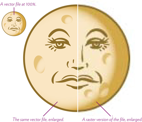
All computer images are either pixel-based (as in photos you work with in Photoshop) or vector-based.
Pixel-based images (often referred to as raster or bitmap images) are made of tiny blocks of color (pixels), created at a certain resolution (a specific number of pixels per inch). The resolution for an image that’s destined for high quality output, such as a commercial printing press, is usually set to 300 pixels per inch (300 ppi). The resolution for an image that’s destined for low-quality output, such as art on a web page, is usually set to 72 ppi (a common screen resolution).
When you enlarge a raster image, individual pixels are enlarged, creating pixelated, blocky edges in place of smooth edges. If you enlarge a raster image too much, the image quality degrades noticeably.
A vector image is a mathematical description of shapes, fill, colors, strokes, gradients, and blends. The mathematics behind a vector image means you can resize it any amount without degrading the quality at all.
Even though Illustrator is primarily a vector application, you can combine both vector and raster elements in your projects if necessary. However, be aware of possible resolution issues in the raster elements.
A few helpful settings before you start
Before you create a new document or start an illustration, modify some of your Illustrator settings to optimize your workflow, and so your settings will match ours as you follow along with the tasks in this book.
Task 1 Adjust Illustrator’s color settings
1 From the Edit menu, choose “Color Settings.”
2 In the “Color Settings” dialog, make your settings match the ones shown below.
3 Click “Advanced Mode.” In the “Conversion Options” section that appears, change the “Intent” pop-up menu to “Perceptual.”
4 Click OK.

Tip
The “Working Spaces” RGB option called “Adobe RGB (1998)” provides a larger color range than the default “sRGB” option.
Task 2 Change a few settings in Preferences
Illustrator’s Preferences settings provide lots of options that allow you to work in a way that’s most comfortable for you.
1 To open the Preferences dialog box, do one of the following:
• Mac: Choose Illustrator > Preferences > General.
PC: Choose Edit > Preferences > General.
• If a document is open, with nothing selected, click the “Preferences” button in the Control panel across the top of the document window.
![]()
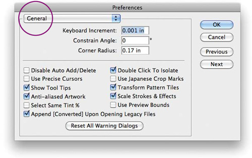
The most important General setting for now is Keyboard Increment (above). This value determines how far a selected object moves when you press the arrow keys on the keyboard. Enter a small number, as shown above, so you can make tiny adjustments when moving objects in your document.
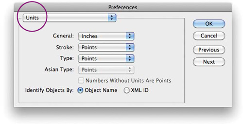
2 From the Preferences pop-up menu, choose Units.
Set the “General” unit of measurement you prefer to be used in numerical entry fields and for settings in various panels.
For “Stroke” and “Type,” choose “Points.” This is the best unit with which to specify stroke and font sizes.
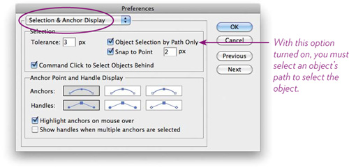
3 From the pop-up menu, choose Selection & Anchor Display.
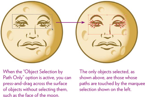
Check the “Object Selection by Path Only” item.
With this option checked on, you must click on an object’s path (its edge) to select it.
When this option is turned off (unchecked), you can select an object by clicking anywhere on its fill or on its edges. This, however, makes it difficult to select a path (or multiple paths) that’s on top of or inside another object without accidently selecting the surrounding object. By thus limiting object selection to “Path Only,” you can drag inside a shape to select other shapes, without selecting the shape you’re dragging within (as long as the drag doesn’t touch the path of the surrounding shape). Read more about selections in Chapter 2.
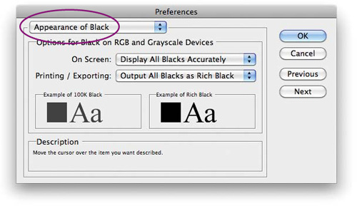
4 From the Preferences pop-up menu, choose Appearance of Black.
There are two types of black you can use in artwork: pure black (plain ol’ 100% black ink) and rich black (100% black ink plus a percentage of the other three CMYK colors—cyan, magenta, and yellow, usually 20 percent of each). Rich black increases the black color’s density and opacity. Rich black is used when a black color overprints other colors and you want the black to be opaque enough to prevent underlying colors from showing through.
a From the “On Screen” pop-up menu, choose “Display All Blacks Accurately.”
Pure black (100% black) actually appears on the screen as a very dark gray, and rich black appears as a dense, opaque black. Being able to see the difference can help you decide which black fills or strokes may need to be changed to a rich black color. If you were to choose the “Display All Blacks as Rich Black” option, all blacks will appear the same on-screen, but will output according to the “Printing/Exporting” option below.
b From the “Printing/Exporting” pop-up menu, choose “Output All Blacks as Rich Black.”
This setting affects documents printed to non-PostScript desktop printers and documents exported to an RGB file format, such as a JPEG image. If you choose the “Output All Blacks Accurately” option here, you’ll be able to see the difference between pure blacks and rich blacks when you print to a non-PostScript desktop printer or export to an RGB file format.
The Illustrator Preferences provide many other settings you can customize to your liking. Explore them all! Meanwhile, these settings will get you started.