10. Working with Type
There are many reasons to set type in Illustrator—to create a graphic, a logo, brochures, flyers, business cards, letterhead, rack cards, posters. Illustrator’s type tools provide all of the options and control you need, no matter what your project’s typographic ambitions may be.
In this chapter, you’ll learn the basics of typesetting in Illustrator, how to create styles with multiple attributes, how to use tabs and indents, and more.
If you’re an experienced InDesign user (or if you’ve read the type section of The Non-Designer’s InDesign Book), you’ll find Illustrator’s type features very familiar.
Basic typesetting
Methods for importing existing text
There are several ways to get type into your document:
• Copy text from another document and paste it into an Illustrator document. Pasted text does not retain its formatting.
• Import text: Choose File > Place. Select a text file to import, then click “Place.” Imported text retains character and paragraph formatting, a nice advantage when there’s lots of text and it’s already been formatted.
Methods for creating type within Illustrator
Illustrator provides four basic ways to create type, outlined below and explained in detail on the following pages. Once you’ve created the type you need, you’re almost unlimited in what you can do with it.
• Point type: Point type is when you set a point and type. With the Type tool, click in the document and type. The type path extends as you type.

• Paragraph type in a text frame: Choose the Type tool, drag diagonally to create a text boundary, then type inside of it. When the text reaches a boundary edge, it wraps to fit the shape (below, left).
• Paragraph type in a shape or area: Draw a shape, use the Area Type tool to click the shape’s path, then type to fill the shape (below, right).

• Type on a path: Type is set to follow the edge of an open or closed path (a line or shape).
Task 1 Create point type 
1 Choose the Type tool.
2 Click in a document, then start typing. The text extends to the right, so make sure you click on the left side of your document. It continues to the right until you hit Return/Enter or stop typing.
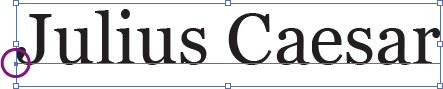
The placement of the small dot on the baseline (circled above) indicates the type alignment: left, right, or centered.
3 Resize the type. Do one of the following:
• With the black Selection tool, click on the text to select it. Hold down the Shift key (to resize the type proportionally), and drag one of the corner handles of the text frame diagonally upward.

• Or use the Font Size pop-up menu in the Control panel.
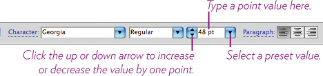
• Open the Character panel, then set a point size in the Font Size pop-up menu, shown below.
4 Change the font: Use the Font pop-up menu in the Control panel or in the Character panel to choose another font.
Tip
To start another piece of point type, you have to “let go” of the first one: Hold down the Command key (PC: Control key) and click in an empty spot.
5 Change the font style: Use the Font Style pop-up menu in the Control panel or the Character panel to change to italic, bold, etc. (if that font family includes different styles).
Task 2 Create paragraph type in a text frame
1 Choose the Type tool.
2 Drag diagonally to create a rectangular shape in which the text will be restrained.
3 Type some text. When the text reaches the boundary of the text frame, it automatically wraps to the next line (so don’t hit a Return/Enter).
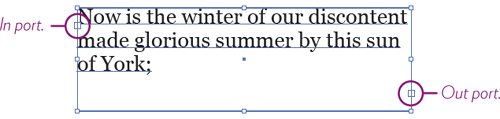
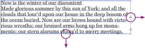
A paragraph text frame has an in port and an out port (circled above). The ports indicate if there’s more text linked to the text frame.
Empty ports mean all text is visible.
An out port with a red plus sign (below, left) means the box contains overflow text that’s not visible. In this case, you must enlarge the existing text frame, or link it to another text frame so the extra text flows into it (see the following page).
A port with a blue triangle in it indicates that linked text is coming into, or flowing out of, the current text frame (below, right).
4 Paste text into the text frame: Copy some lengthy text from a document or a web page, then paste it into the box you created in Step 2.
5 Resize the text frame: With the black Selection tool, drag the right handle of the text frame to the right to enlarge the box and lengthen the lines, or drag the bottom-middle handle to make the box deeper.
6 Reshape a text frame: Select the white Direct Selection tool, then marquee around a corner point of the text frame to select it.
Drag the corner point to a new position. Hold down the Shift key as you drag to constrain the drag to a horizontal path (below, left).
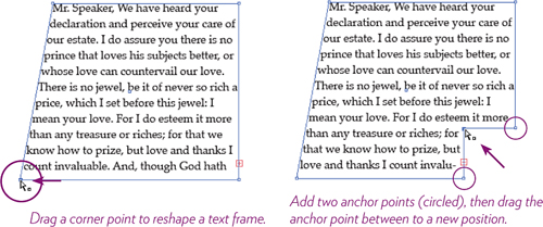
Add points to the text frame (above, right) for more reshaping: Select the Pen tool and hover over the text frame path. When the Pen tool pointer icon changes to show a plus sign next to it, click to add an anchor point. Add additional anchor points along the path as needed. Get the white Direct Selection tool and drag those anchor points to positions to create the shape you want.
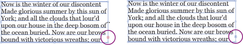
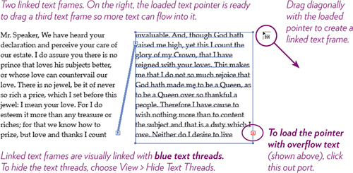
7 Link overflow text to another text frame: With the black Selection tool, click the overflow out port of a text frame (circled below, middle).
The pointer changes appearance (below, right) to indicate that it’s loaded with the overflow text.
Drag the loaded pointer diagonally to create another text frame. When you let go, the hidden text flows into the linked text frame.
Task 3 Create text in a shape 
1 Select the Ellipse tool, then drag diagonally to draw an ellipse.
Hold down the Shift key as you drag to constrain the ellipse to a perfect circle.
It doesn’t matter if the shape has a color fill or stroke; the Area Type tool removes any such attributes in Step 3.
2 Select the Area Type tool (it’s hidden under the Type tool).
3 Click anywhere on the circle’s path (make sure you click the path and not inside the shape).
4 Type text, paste text from another document, or import text into the circle (choose File > Place to import).
As with text in a text frame (pages 124–125), overflow text is indicated by an out port with a red plus sign in it (shown below).
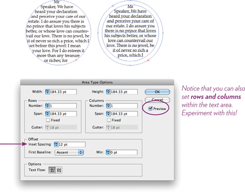
5 Set a text inset margin: Choose Type > Area Type Options....
In the “Offset” section, set the “Inset Spacing” value to 12 pt.
Click the “Preview” checkbox to see the results (below, right) and change the settings if desired.
Tip
You can also use this dialog box to set an inset (or rows and/or columns) in a regular paragraph type text frame.
Task 4 Create type on a closed path 
1 Select the Ellipse tool, then drag diagonally to draw an ellipse. If you want a perfect circle, hold down the Shift key as you drag.
It doesn’t matter if the shape has a color fill or stroke; the Type-on-a-Path tool removes any such attributes in Step 3.
2 Select the Type-on-a-Path tool.
3 Click the top-center edge of the path (that is, not inside the shape).
4 Type a few clever words on the path.
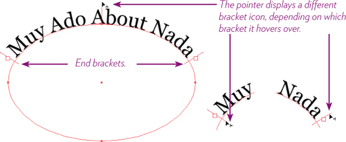
5 Choose the white Direct Selection tool.
Three brackets appear on the path: a center bracket and end brackets on both sides of the type. Drag these brackets to position the type on the path where you want.
To drag a bracket, hover the white Direct Selection tool over a bracket until a small bracket icon appears next to the pointer (shown below); drag the bracket to slide the type left or right along the path.
To help prevent the type from flipping to the other side of the path, hold down the Command key (PC: Control key) as you drag.
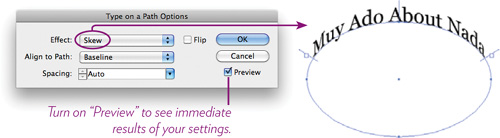
6 Apply effects to type on a path: Double-click the Type-on-a-Path tool icon in the Tools panel to open the “Type on a Path Options” dialog box.
With the text path selected, choose different options in the “Effect” pop-up menu. Also experiment with the other options.
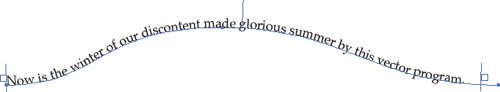
Task 5 Create type on an open path
1 Select a drawing tool (the Pencil, Pen, or Paintbrush tool) and draw a path similar to the one below.
2 Select the Type-on-a-Path tool (it’s hidden under the Type tool), then click the left side of the path.
3 Type some clever words on the path.

If the type is too large to fit on the path, adjust the font size: With the Type tool, triple-click the text to select it. Go to the Font Size pop-up menu in the Control menu and choose a smaller font size.
4 To reposition the type on the path, choose the white Direct Selection tool. Hover over the left end bracket until the small bracket icon appears, then drag the bracket to the right.
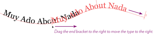
5 Position the type where you want it, then enlarge the text (below) so that it fills the path.
6 Adjust the path’s curve: Choose the white Direct Selection tool. Click on the curve, then drag anchor points, direction handles, or path segments to reshape the curved path.

Tip
To adjust font size, you can use keyboard shortcuts:
To enlarge selected type, press Command Shift ] PC: Control Shift ]
To reduce selected type, press Command Shift [ PC: Control Shift [
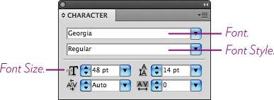
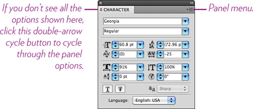
The Character panel
The character formatting options found in the Control panel are convenient for basic formatting, but you often need more than basics. The Character panel contains a complete set of options for typographic control at the character level (meaning the controls apply to individual characters that are selected, as opposed to the paragraph level where options apply to the entire paragraph).
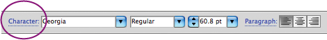
To open the Character panel, choose Window > Type > Character. Or click the word “Character” in the Control panel, circled below.
Task 6 Format text with the Character panel menu
The Character panel menu contains a pop-up menu of options.
1 Choose the Type tool, and set this line of text: To Town To Vote.
2 Choose the black Selection tool, which automatically selects the text.
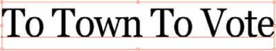
3 Open the Character panel menu. Choose the font named Georgia, and a font size of 60 point.
4 From the Character panel menu, choose “All Caps.” The selected type is converted to all caps formatting.
![]()
5 Now choose “Small Caps,” and you see that the selected type is converted to small caps formatting.
![]()
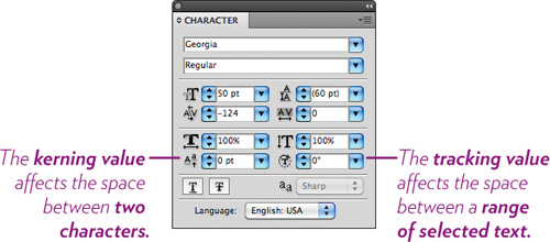
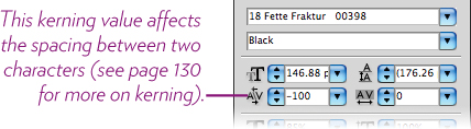
6 You can see a common typographic problem in Steps 2 and 5: There is too much letterspacing between the T and the o, due to the shape of the T and all that open space under its crossbar. The same spacing problem happens with the V and the o, as shown below, left. You need to adjust the spacing between the letter pairs. Adobe calls it kerning when you adjust the space between two characters, and tracking when you adjust the space between a range of characters.
To adjust the letterspacing in the entire line automatically: With the black Selection tool, click on the line of type to select it; in the Character panel, change the kerning value (see the callout in the panel below) from “Auto” to “Optical.” The result is shown below, right.

7 Adjust the letterspacing manually: With the Type tool, click between a T and o.
Click the up or down arrow on the left side of the kerning field to change the value; watch the characters shift. Hold down the Shift key as you click to change 5 times the value with each click.
The increment in which the value changes is based on the setting in the Preferences’ (see page 6) Type pane; the default “Tracking” value is 20. We suggest you change that to 5 so you have more precise control.
8 Because kerning and tracking are so intrinsic to working with type, we suggest you learn the keyboard shortcuts:
Mac: Option Left or RightArrow for small increments;
Option Command Left or RightArrow for 5 times the increment.
PC: Alt Left or RightArrow for small increments;
Alt Control Left-or-RightArrow for 5 times the increment.
9 Experiment with the other settings in the Character panel. Use the tool tips to see what each field controls.
Tip
If you’re using one of the Selection tools, you can double-click in the text to switch to the Type tool.
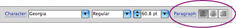
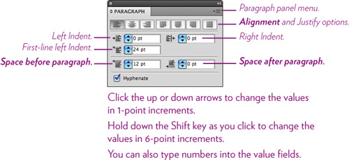
The Paragraph panel
The paragraph level formatting options in the Control panel are convenient, but limited. For a full set of options, open the Paragraph panel: Window > Type > Paragraph. Or click the word “Paragraph” in the Control panel, shown circled below.
Task 7 Change paragraph formatting
1 Create a paragraph of type, as you did on page 124.
2 To apply paragraph formatting to all the paragraphs in the text frame: With the black Selection tool, select the text frame, then experiment with the various options in the Paragraph panel (shown below).
3 To apply paragraph formatting to one specific paragraph: With the Text tool, click anywhere within a paragraph, then experiment with different settings in the Paragraph panel.
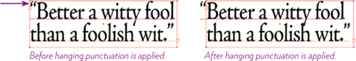
Task 8 Create hanging punctuation
Hanging punctuation moves punctuation marks outside the paragraph margins to make edges look more even (and more professional).
1 With the Type tool, click in a paragraph that uses an opening quotation mark.
2 From the Paragraph panel menu, choose “Roman Hanging Punctuation.”
The Glyphs panel
Many fonts have alternate characters built into them, such as swash versions, ornaments, oldstyle figures, fractions, foreign alphabets, etc. The Glyphs panel is the best way to access these alternative characters. It lets you view glyphs (characters of any sort) and insert them into your document.
OpenType fonts usually offer more glyphs to choose from. Font formats other than OpenType (TrueType or Postscript) may or may not have alternate characters included. Check the Glyph panel to find out.
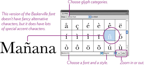
Task 9 Insert glyphs into text
1 Open the Glyphs panel: Choose Type > Glyphs. The panel shows all the characters available in the currently selected font.
2 Replace a character with an alternate character: Use the Type tool to select a character (or a pair of characters such as ff) that you want to replace with an alternate character or a ligature (a specially designed combination of two characters).
3 Double-click a glyph in the panel to replace the selected character/s.
4 Insert a glyph: With the Type tool, click in the text at the position you want to insert a glyph (perhaps an ornament or fraction); double-click the glyph in the panel.
OpenType options
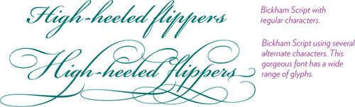
Perhaps you’re working on a special project with lots of type, using an OpenType font that includes a ton of alternate characters, and you’d like to litter the text with the more unobtrusive characters (such as special ligatures like ![]() some swash glyphs like Q, or oldstyle numbers), but you don’t have the hours available to select characters and replace them with glyphs from the Glyphs panel. The OpenType panel can automate this process (to a certain point).
some swash glyphs like Q, or oldstyle numbers), but you don’t have the hours available to select characters and replace them with glyphs from the Glyphs panel. The OpenType panel can automate this process (to a certain point).
Task 10 Automatically replace glyphs with alternates
1 Select a range of type: With the black Selection tool, click on a text frame of either paragraph type or point type.
2 Open the OpenType panel: Choose Window > Type > OpenType.
The black-on-white icons at the bottom of the OpenType panel indicate available glyph options that are built into the currently selected font (see their tool tips). The gray-on-gray icons represent glyph options that are not available in the selected font (try another font!).
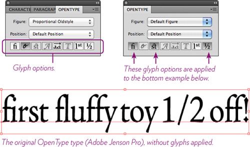
3 Apply the glyphs to your selected type: Click the glyph option icons you want to apply (the tool tips will tell you about each option).
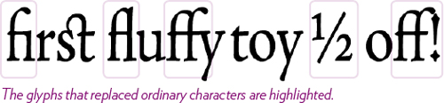
The selected text updates to show the results (below).
Tabs and indents
If you use the Spacebar to indent a paragraph or act as “tabs,” or use the Return/Enter key to create extra space between paragraphs, STOP IT! These techniques create sloppy alignments and big gaps between paragraphs, and when you want to change the indents, fake tabs, and spacing, you have to change all those spaces and Returns manually. (Other than that, no problem.) Spend a few minutes learning to be more efficient (and more professional).
Task 11 Create paragraph indents
A standard paragraph indent is not five spaces with the Spacebar. That is so half-a-century-ago typewriter mentality (even if you’ve never even seen a typewriter). A standard indent is about two spaces, the width of the point size of the type; 12-point type has a 12-point indent.
1 Type several paragraphs in a text frame: Let the text bump into the edge of the text frame and wrap to the next line. When you want a new paragraph, hit ONE Return/Enter.
Use the black Selection tool to select the type frame. The tab and indent settings will affect all paragraphs in the frame.
To affect only one paragraph, click in it with the Type tool.
To affect multiple paragraphs, click anywhere in one, then press-and-drag to select all or part of adjacent paragraphs.
2 Open the Tabs panel: Choose Window > Type > Tabs.
The Tabs panel opens directly above and aligned to the selected type frame. (If it’s not aligned, click the magnet icon on the right side of the panel to make it snap to the frame.)
Tip
To get a specific amount of space between paragraphs, use the Paragraph Space After field shown on page 131.
Highlighted below are two indent markers. The top marker indents the first line in a paragraph; the bottom marker sets the left indent of all the rest of the lines in a paragraph.
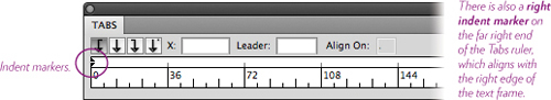
3 Indent the first line (below, left): Drag the top indent marker to the right. A vertical line appears as you drag as a visual guide. When you let go, the first line snaps to the indent position.
4 Indent all other lines of the paragraph (below, right): Drag the bottom indent marker to the right. Let go when the vertical black line is where you want the indent positioned.
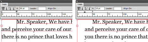
5 Create a hanging indent (below, left): Leave the top indent marker in the far-left position; drag the bottom indent marker to the right to indent all lines of type except the first line.
6 Indent all lines of type (below, right): First, align both indent markers together. Then, to drag the markers together, hold down the Command key (PC: Control key) as you drag.
Task 12 Create and use tab stops
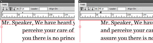
When you have multiple columns of information to align, use tabs. After you’ve created the tab stops you need, you can always drag the tab stops to make changes when necessary.
The Tabs panel ruler has invisible default tabs set at every half-inch, so when you hit the Tab key, the insertion point moves to the next half-inch mark it can reach. Those settings are never what you want, so you just need to learn how to customize them.
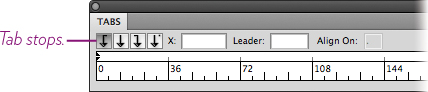
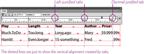
The close-up below highlights the four types of tab stops; Illustrator calls them Left-Justified, Center-Justified, Right-Justified, and Decimal-Justified.
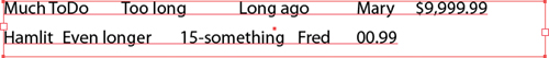
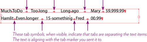
1 Create some text similar to the example below.
After typing each item, hit the Tab key instead of the Spacebar.
The text is jumping to Illustrator’s hidden, default tab markers, which is not what you want, but don’t worry—you’ll override those markers with your own, in Step 3. Right now we just want to make sure that each piece of text has been told to go to a marker.
2 It’s often helpful to see the hidden characters, such as tabs and spaces, as shown below. To show hidden characters, choose Type > Show Hidden Characters.
Tip
If you have rulers showing in your document, understand that the Tabs panel ruler has nothing whatsoever to do with the document rulers! The Tabs ruler measures each text frame separately.
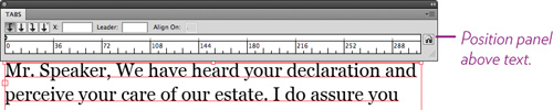
3 Open the Tabs panel: Choose Window > Type > Tabs.
The Tabs panel positions itself above the text in which the insertion point is flashing.
4 With the Type tool, drag to highlight the two lines of text because the settings in the Tabs panel apply to selected paragraphs.
5 Select the “Left-Justified Tab” (shown to the left), then click the position in the ruler at the point where you want the second column of items to align (since the first column of items has no tab marker attached, and the column sits at the left margin).
![]()
6 Next, click farther to the right where the third column should align, and then set a tab marker for the fourth column.
As you set left-justified tab markers, you can see the items move over to snap into alignment with the markers.
7 For the last column ($9,999.99), choose the “Decimal-Justified Tab” icon (shown to the left), then click the ruler approximately where you think the decimals should line up (widen your text frame if necessary).
![]()
8 Don’t forget, after you set the tab markers, you can drag them left or right to fine-tune the column alignments.
Once you’ve got tabs set up, click (with the Type tool) at the end of the last word, hit a Return/Enter, and continue to create more columns. The tab settings you created will carry on as long as you keep hitting Returns.
Tip
The Tabs ruler displays the measurement unit that is set in the Preferences, under “Units,” which you can change at any time.
You can also change the measurement units on the fly: In a document, make sure the rulers are showing (Command R/PC: Control R). Right-click in a ruler and choose the measurement units you would like to use. This also changes the units in the Tabs ruler.
Paragraph and Character style sheets
When a project requires a lot of text formatting, you can save a great deal of time and ensure consistency by creating paragraph and character style sheets. A style sheet is a collection of formatting specifications that you can apply with a single click; when you want to change the formatting on the page, you change the style sheet definition, and everything that has that style applied changes automatically. This is truly wonderful, and this chapter is truly a very brief introduction to this powerful feature.
Paragraph style sheets
Paragraph style sheets apply to entire paragraphs—things like alignment, linespacing, tracking, paragraph spacing, tabs, indents, etc. Anything you can set in the Paragraph panel (except kerning) can be used in a paragraph style definition.
As usual, to apply paragraph-level formatting you only need to click in a paragraph to select it. You can select a number of text frames with the black Selection tool and also apply paragraph formatting (including paragraph style sheets) to all the text in the frames.
Every piece of text in this entire book has a style sheet applied.
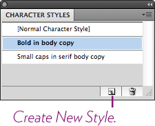
Task 13 Create and use a paragraph style
Create a new style using the Paragraph Styles panel
If you know at least approximately what you want the text to look like, you can go straight to the Paragraph Styles panel and set it up.
1 Open the Paragraph Styles panel: Choose Window > Type > Paragraph Styles.
2 Create a new paragraph style: Click the Create New Style button at the bottom of the panel.
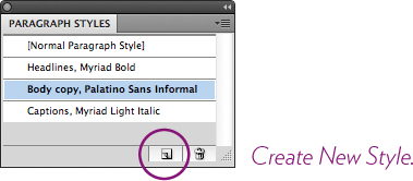
3 A new style appears in the panel named “Paragraph Style 1.” Double-click that name to open the “Paragraph Style Options” shown at the top of the opposite page.
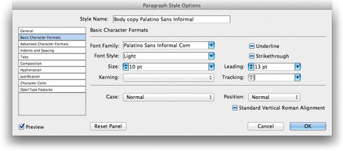
4 Name the style something that will make it clear to you what it is for when you later see it in a lengthy list of styles!
5 Select a formatting heading on the left to set the options for it on the right. You don’t have to set something for every field—just choose options that you know you want.
6 Click OK, and that style sheet name appears in the panel.
Create a new style from existing text
But perhaps some text is already on the page and you’ve formatted it visually; now it’s perfect and you want to turn that into a style sheet.
7 With the Type tool, click in the formatted text.
8 In the Paragraph Styles panel, click the Create New Style button.
9 Double-click the new style that appears in the panel, named “Paragraph Style 2” (or some other number).
10 In the options dialog box, shown above, name the style and click OK.
Apply a paragraph style to text
11 With the Type tool, click in a paragraph to select it, or press-and-drag to select more than one paragraph, or use the black Selection tool to select one or more text frames.
12 With the text selected, click the style name in the Paragraph Style panel. The formatting is applied to the selection, and that text is now considered tagged with a style sheet.
Edit a paragraph style
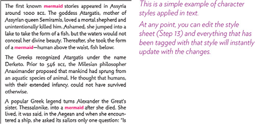
When you edit the style sheet, the changes will apply to every paragraph that is tagged with this style. This is a good thing. In fact, this is the point!
13 Double-click the style name in the Paragraph Styles panel. In the “Paragraph Style Options” dialog box that opens, make your changes. Click OK and everything updates!
Character style sheets
Character style sheets apply to selected characters; any settings in the Character panel can be used. The bold characters that you see in this paragraph and throughout the book were created using a character style sheet. If I want every bold setting like that in the entire book changed to red italic, I can do it with a click of the button in the style sheet definition. Amazing.
Paragraph style sheets, as you learned on the previous pages, apply to entire paragraphs. Character style sheets can override the paragraph style sheet for selected characters, so you can use both in the same paragraph, as shown above.
You can create a style sheet from scratch, as explained in Steps 1–6, or format the text first, then use that to define a new style sheet, as explained in Steps 7–10.
Task 14 Create and use a character style
Create a new style using the Character Styles panel
If you know at least approximately what you want the text to look like, you can go straight to the Character Styles panel and set it up.
1 Open the Character Styles panel: Choose Window > Type > Character Styles.
2 Create a new character style: Click the Create New Style button at the bottom of the panel.
3 A new style appears in the panel named “Character Style 1.” Double-click that name to open the “Character Style Options” shown below.
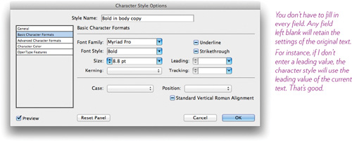
4 Name the style something that will make it clear to you what it is for when you later see it in a lengthy list of styles!
5 Select a formatting heading on the left to set the options for it on the right. You don’t have to set something for every field—any field left blank will pick up the formatting of the current text.
6 Click OK, and that style sheet name appears in the panel.
Create a new style from existing text
But perhaps some text is already on the page and you’ve formatted it visually; now it’s perfect and you want to turn that into a style sheet.
7 With the Type tool, click in the formatted text.
8 In the Character Styles panel, click the Create New Style button.
9 Double-click the new style that appears in the panel, named “Character Style 2” (or some other number).
10 In the Options dialog box, shown opposite, name the style and click OK.
Apply a character style to text
11 With the Type tool, press-and-drag to select the characters to which you want to apply the style sheet.
12 With the text selected, click the style name in the Character Style panel. The formatting is applied to the selection, and that text is now considered tagged with a style sheet.
Edit a character style
When you edit the style sheet, the changes will apply to every character that is tagged with this style. This is a good thing. In fact, this is the point!
13 Double-click the style name in the Character Styles panel. In the “Character Style Options” dialog box that opens, make your changes. Click OK and everything updates!
Modify type objects
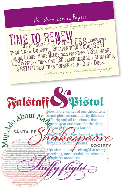
The ability to modify type is one of the main reasons to use Illustrator. It’s great for logo projects because it’s so easy to customize the look to make it unique. Type can be treated not only as text, but as an object. To get the basic idea of how to modify type, follow along in this task and build yourself a logo.
Task 15 Format the basic text
1 Set some type for a logo, such as below. Include two words and an ampersand (&), no spaces. I used 72-point Georgia just to get started.
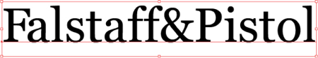
2 Change the font: Use the Font pop-up menu in the Control panel. I chose Fette Fraktur, but use anything you like.

3 Select the ampersand: With the Type tool, drag to select it (shown, below).
4 Change the font size: In the Font Size field in the Control panel, type a value of 150 point.

5 With the ampersand still selected (highlighted), change its color: Click the Font Color pop-up menu in the Control panel, then choose a purple color swatch. The ampersand changes to a purple fill.
Change the color of any other type you want: Drag across it to select it, then choose a fill color in the Control panel.
6 Remove any extra space that might be trapped between the giant ampersand and the letter to its right (this will depend on the font and the combination of letters you chose): With the Type tool, click between the “&” and the “P” (shown at the top of the opposite page).
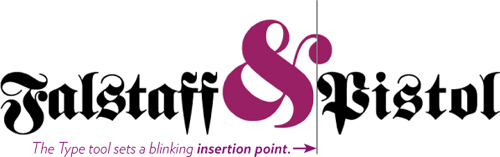
7 Click the word “Character” in the Control panel to open the Character panel, then enter a value of -150 in the Kerning field (you might need a different value, depending on the letter combination).
Task 16 Modify the type object shape
The formatting you did in the first seven steps was nothing new. But a great thing about Illustrator is that you can also affect the text as an object.
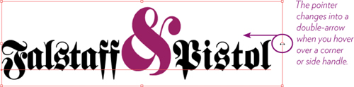
1 To select the type as an object, use the black Selection tool. A bounding box with corner and side handles appears around the type.
2 To distort the proportions of the type object, hover the black Selection tool over a corner handle. When the cursor changes into a double-arrow, drag in any direction.
To resize the type object proportionately, hold down the Shift key as you drag.
3 To condense the type width (but keep the height the same), hover the black Selection tool over a side handle. When the cursor changes into a double-arrow (circled below), drag inward, toward the center.
To widen the type (but keep the height the same), drag outward.
To reduce the height (but keep the width the same), drag the top or bottom handle toward the center. To enlarge the height of the type, drag outward.
Task 17 Warp the type object 
1 If you created a type object in Task 15, select it with the black Selection tool (if you didn’t create one, do so now).
2 In the Control panel, find the “Make Envelope” icon (shown above) in the Control panel. Click the triangle on the right side of the icon to open its little menu, and choose “Make With Warp....”
3 Click the “Preview” checkbox so you can see the results of your settings as you experiment.
4 In the “Warp Options” dialog box that opens, choose “Arc” from the “Style” pop-up menu.
(Also experiment with the other style options, and try it sometime with a few paragraphs of text.)
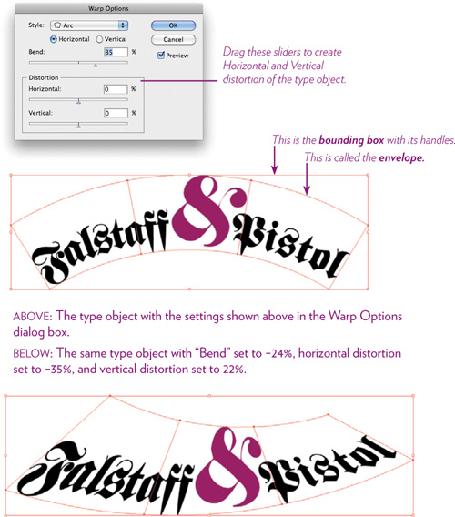
5 Move the “Bend” slider to 35%. Click OK.
6 Now let’s get really weird, typographically speaking—let’s edit the envelope (see the callout on the opposite page for envelope).
With the white Direct Selection tool, click an anchor point on the envelope (shown circled below).
Drag the anchor point to another position to reshape it.
Drag a direction handle to reshape it.

Tip
To create more uniform distortion (is that an oxymoron?), marquee around two connected points (or Shift-click them), top and bottom, so they reshape in unison with each other.
7 Edit the type in its distorted envelope: With the black Selection tool, select the object. Click the “Edit Contents” icon in the Control panel.
![]()
8 Choose the Type tool; move the Type tool over the object. The original, unwarped text appears in whatever color is assigned to the object’s layer (see Chapter 9 on layers).
Click within the type or drag to select characters, then make editing changes. Choose the black Selection tool to see the changes.

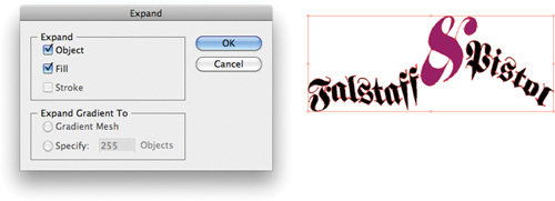
9 To make the graphic independent of the font so you don’t need to include the font every time you want to use the logo, convert it to outlines. Keep in mind that once you do this, the type is no longer editable as text! You will, however, now have anchor points that you can manipulate with the white Direct Selection tool.
To convert to outlines, select the object, then choose Object > Expand....
Try this!
Create a postcard, a flyer, or CD cover using only type—no graphics or art. Use the tools in Illustrator to create an artful, typographic piece with visual interest. Don’t forget about the brush effect techniques on pages 80–81. It always helps, of course, to have some interesting fonts on hand; check MyFonts.com for inexpensive ones.