Chapter 4. Color Me Badd: color correction for photographers

Photographer: Matt Kloskowski
Exposure: 1/200
Focal Length: 18mm
Aperture Value: ƒ/11
The subtitle for this chapter is “Color Correction for Photographers,” which invites the question “How is color correction for photographers different from color correction for anybody else?” Actually, it’s quite a bit different, because photographers generally work in RGB or black and white. And in reality, digital photographers mostly work in RGB because, although we can manage to build reusable spacecraft and have GPS satellites orbiting in space so golfers here on earth know how far it is from their golf cart to the green, for some reason creating a color inkjet printer that prints a decent black-and-white print is still apparently beyond our grasp. Don’t get me started. Anyway, this chapter isn’t entirely about black-and-white prints, and now that I think about it, I’m sorry I brought it up in the first place. So forget I ever mentioned it, and let’s talk about color correction. Why do we even need color correction? Honestly, it’s a technology thing. Even with traditional film cameras, every photo needs some sort of color tweaking (either during processing or afterward in Elements), because if it didn’t need some correction, we’d have about 30-something pages in this book that would be blank, and that would make my publisher pretty hopping mad. So, for the sake of sheer page count, let’s all be glad that we don’t live in an ideal world where every photo comes out perfect and 6-megapixel cameras are only 200 bucks and come with free 1-GB memory cards.
Before You Color Correct Anything, Do This First!
Okay, before you start along your merry color correcting way, there are a couple of settings that you should consider changing. These settings can definitely affect the results you get, so make sure you read this first. Also, keep in mind that these changes will remain as your defaults until you change them again, so you don’t have to do this each time you open Elements.
Step One:
From the Edit menu, choose Color Settings (or press Ctrl-Shift-K [Mac: Command-Shift-K]).

Step Two:
In the Color Settings dialog, choose from the four options: No Color Management, Always Optimize Colors for Computer Screens, Always Optimize for Printing, or Allow Me to Choose. To a large degree, your choice will depend on your final output; but for photographers, I recommend using Always Optimize for Printing because it reproduces such a wide range (a.k.a. gamut) of colors using the Adobe RGB profile (if your photos don’t already have a profile assigned), and it’s ideal if your photos will wind up in print. Note: For more on color management, see Chapter 12.

Step Three:
Now we’re moving to a completely different area. Press the letter I to switch to the Eyedropper tool. In the Options Bar, the default Sample Size setting for this tool (Point Sample) is fine for using the Eyedropper to steal a color from within a photo and make it your Foreground color. However, Point Sample doesn’t work well when you’re trying to read values in a particular area (such as flesh tones), because it gives you the reading from just one individual pixel, rather than an average reading of the surrounding area under your cursor.

Step Four:
For example, flesh tones are actually composed of dozens of different colored pixels (just zoom way in and you’ll see what I mean); and if you’re color correcting, you want a reading that’s representative of the area under your Eyedropper, not just a single pixel within that area, which could hurt your correction decision-making. That’s why you need to go to the Options Bar, under the Sample Size pop-up menu, and choose 3 by 3 Average. This changes the Eyedropper to give you a reading that’s the average of 3 pixels across and 3 pixels down in the area that you’re sampling. Once you’ve completed the changes on these two pages, it’s safe to go ahead with the rest of the chapter and start correcting your photos.

The Advantages of Adjustment Layers in Elements 8
Before we really dive into color, we need to spend two minutes with the Adjustments palette. Of all the new enhancements in Elements 8, the new Adjustments palette is at the top of the list, because it streamlines our workflow so dramatically that even if you’ve never used adjustment layers before, you’ve got to start working with them now. In fact, from this point in the book on, we’re going to try to use adjustment layers every chance we get, because of all the advantages they bring. Here’s a quick look at them and why we need them:
Advantage One: Undos That Live Forever
By default, Elements keeps track of the last 50 things you’ve done in the Undo History palette (shown here), so if you need to undo a step, or two, or three, etc., you can press Ctrl-Z (Mac: Command-Z) up to 50 times. But, when you close your document, all those undos go away. However, when you make an edit using an adjustment layer (like a Levels adjustment), you can save your image as a layered file (just save it in Photoshop format), and your adjustment layers are saved right along with it. You can reopen that document days, weeks, or even years later, click on that adjustment layer, and either undo or change that Levels (or whatever other one you used) adjustment. It’s like an undo that lives forever.

Advantage Two: Built-In Masks
Each adjustment layer comes with a built-in layer mask, so you can easily decide which parts of your photo get the adjustment just by painting. If you want to keep an area of your photo from having the adjustment, just get the Brush tool (B) and paint over it in black. There’s more on layer masks to come. They offer tremendous flexibility, and since they don’t actually affect the pixels in your image, they’re always undoable.

Advantage Three: Blend Modes
When you apply an adjustment layer, you get to use the layer blend modes. So if you want a darker version of your adjustment, you can just change the layer blend mode of your adjustment layer to Multiply. Want a brighter version? Change it to Screen. Want to make a Levels adjustment that doesn’t affect the skin tone as much? Change it to Luminosity. Sweet!

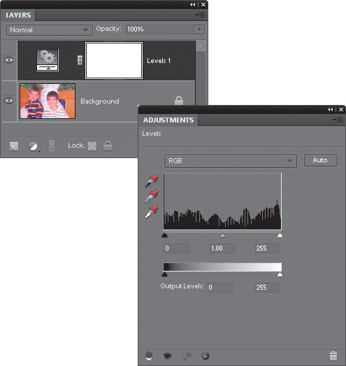
Advantage Four: Everything Stays Live
Back in previous versions of Elements, when you created an adjustment layer (let’s say a Levels adjustment layer, for example), it would bring up the floating Levels dialog (as seen here). While it was onscreen, the rest of Elements was frozen—you couldn’t make changes or do anything else until you closed the Levels dialog by either applying your adjustment or clicking Cancel. But thanks to the Adjustments palette, everything stays live—you just go to the Adjustments palette and make your changes there. There is no OK or Apply button, so you can change anything anytime. This will make more sense in the next step.

Step One:
The best way to understand this whole “live” thing is to try it, so go open any photo (it really doesn’t matter which one), then click on the Create New Adjustment Layer icon at the bottom of the Layers palette (it’s the half-black/half-white circle) and choose Levels from the pop-up menu to open the Adjustments palette. Rather than bringing up the Levels dialog in front of your image (and freezing everything else), the Adjustments palette displays the Levels controls, so you can make your adjustments while everything stays live—you can adjust your Levels sliders, go up to the Layers palette and change the blend mode of a layer, or paint a few brush strokes, then grab another slider and adjust it. There’s no OK button, and again, everything stays live. This is bigger than it sounds (ask anyone who has used an earlier version of Elements).

Step Two:
Let’s delete our Levels adjustment layer by clicking-and-dragging it onto the Trash icon at the bottom of the Layers palette and then let’s add a Hue/Saturation adjustment layer by clicking on the Create New Adjustment Layer icon at the bottom of the palette again, but this time choose Hue/Saturation from the pop-up menu. When the Hue/Saturation controls appear in the Adjustments palette, drag the Saturation slider all the way over to the left to remove the color, for the look you see here.

Step Three:
Now, the way adjustment layers work is this: they affect every layer below them. So, if you have five layers below your active layer, all five layers will have their color desaturated like this. However, if you want this adjustment layer to just affect the one single layer directly below the active layer (and not the others), then click on the clipping icon (it’s the first icon on the left at the bottom of the Adjustments palette, shown circled here in red). This clips the adjustment layer to the layer directly beneath it and now the adjustment layer will only affect that layer.

Step Four:
There are a some other options when working with adjustment layers: To edit any adjustment layer you’ve already created, just click on it once in the Layers palette and its controls will appear in the Adjustments palette. To hide any adjustment layer you’ve created, click on the Eye icon (either at the bottom of the Adjustments palette, or to the left of the adjustment layer itself in the Layers palette). To reset any adjustment layer controls to their default settings, click the round arrow icon (the fourth from the left) at the bottom of the Adjustments palette. To see a before/after of just your last adjustment layer change, click the icon to the left of the Reset icon.

Photo Quick Fix
Elements’ Quick Fix does exactly what it says. It quickly fixes your photos and it’s a great tool if you don’t have a lot of experience with color correction or fixing lighting and tonal issues. Basically, if you know that something is wrong but you’re not sure where to go, then give Quick Fix a try first. As you become more comfortable in Elements, you’ll outgrow Quick Fix and want to use Levels and Unsharp Mask and all that cool stuff, but if you’re new to Elements, Quick Fix can be a fantastic place to start.
Step One:
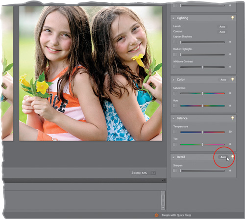
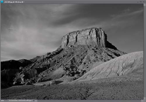
Open the photo that needs color correcting (in the example we’ll use here, our photo [shown below] needs the works—color correction, more contrast, and some sharpening). So, choose EDIT Quick from the Edit tab’s pop-up menu at the top of the Palette Bin to go to Quick Fix mode.

Step Two:
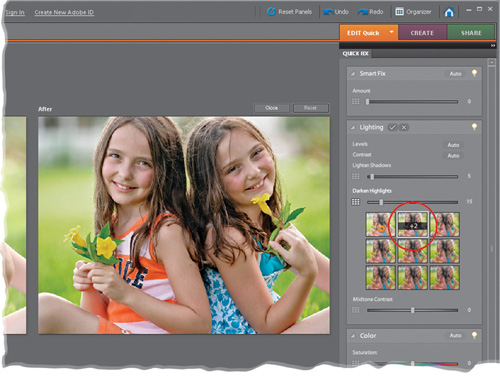
The Quick Fix window shows you side-by-side, before-and-after versions of the photo you’re about to correct (before on the top or left, after on the bottom or right). If you don’t see this view, go to the View pop-up menu in the bottom left of the window and select Before & After (Horizontal or Vertical). To the right of your side-by-side preview is a group of nested palettes offering tonal and lighting fixes you can perform on your photo. Start with the Smart Fix palette at the top. Click the Auto button and Smart Fix will automatically analyze the photo and try to balance the overall tone (adjusting the shadows and highlights), fixing any obvious color casts while it’s at it. In most cases, this feature does a surprisingly good job. There’s also an Amount slider within Smart Fix that you can use to increase (or decrease) the effect of the Smart Fix.

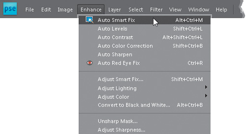
TIP: Auto Smart Fix
By the way, you can also access the Auto Smart Fix command without entering Quick Fix mode by going under the Enhance menu and choosing Auto Smart Fix (or just press the keyboard shortcut Ctrl-Alt-M [Mac: Command-Option-M]). However, there are two advantages to applying the Smart Fix here in Quick Fix mode: (1) you get the Amount slider, which you don’t get by just applying it from the menu or the shortcut; and (2) you get a side-by-side, before-and-after preview so you can see the results as you’re making your edits. So if it turns out that you need additional fixes (or Smart Fix didn’t work as well as you’d hoped), you’re already in the right place.
Step Three:
If you apply Smart Fix and you’re not happy with the results, don’t try to stack more “fixes” on top of that—instead, click the Reset button that appears over the top-right corner of the After preview to reset the photo to how it looked when you first entered Quick Fix mode. If the color in your photo looks a little flat and needs more contrast, try the Levels Auto button, found in the Lighting palette (the second palette down). I generally stay away from Auto Contrast, as Auto Levels seems to do a better job. There’s another very powerful tool in this palette—the Lighten Shadows slider. Drag it to the right a little bit, and watch how it opens up the dark shadow areas in your photo (mainly in the hair here). When you’re done with the slider, click the Commit checkmark in the palette header.

Step Four:
You may notice a tiny icon to the left of each slider in Quick Fix. This is new in Elements 8 and lets you adjust each setting in a more visual (and sometimes precise) way. Just click on an icon and a group of thumbnails will appear below the slider. As you hover your cursor over each thumbnail, you’ll see a preview of your image with that setting, so you don’t have to drag the slider back and forth. If you like one, but want just a little more (or less) of the setting, click-and-drag from side to side on a thumbnail to move the slider in increments of 1. Now, on to more Quick Fixing.
Step Five:
The next palette down, Color, has an Auto button that (surprisingly enough) tries to remove color casts and improve contrast like Smart Fix and Levels do, but it goes a step further by including a midtones correction that can help reduce color casts in the midtone areas. Hit the Reset button to remove any corrections you’ve made up to this point, and then try the Auto button in the Color palette. See if the grays in the photo don’t look grayer and less yellow. In fact, with this photo, everything looks cooler and less yellow. Here’s the thing, though: just because it looks cooler doesn’t mean that it’s right. Elements is just trying to neutralize the photo. In this case, I personally like the warmer feel, but it’s a creative choice by you at this point. The Saturation and Hue sliders here are mostly for creating special color effects (try them and you’ll see what I mean). You can pretty much ignore these sliders unless you want to get “freaky” with your photos. In the Balance palette, the Temperature and Tint sliders will let you manually remove color casts, but honestly, the Auto button in the Color palette is probably going to be your best bet.

Step Six:
After you’ve color corrected your photo (using the Auto buttons and the occasional slider), the final step is to sharpen your photo (by the way, to maintain the best quality, this should be the final step—the last thing you do in your correction process). Just click the Auto button in the Detail palette and watch the results. If the photo isn’t sharp enough for you, drag the Sharpen slider to the right to increase the amount of sharpening, but be careful—oversharpening can ruin the photo by becoming too obvious, and it can introduce color shifts and “halos” around objects.
Step Seven:
There are a few other things you can do while you’re here (think of this as a one-stop shop for quickly fixing images). Along the bottom of the window are icons you can click to rotate your photo (this photo doesn’t need to be rotated, but hey, ya never know). In the Toolbox on the left, there’s a Red Eye Removal tool, if your photo needs it. Just click-and-drag over the problem area in your After preview for red-eye control. The Toolbox also has tools for whitening teeth, making skies blue, and making your photo black and white, but you’ll probably find you like other techniques shown in this book for those tasks better. You know what the Zoom and Hand tools do (they zoom you in, and then move you around), and you can also crop your photo by using the Crop tool within the After preview, so go ahead and crop your photo down a bit. Lastly, you can make a selection with the Quick Selection tool.

Step Eight:
Okay, you’ve color corrected, fixed the contrast, sharpened your image, and even cropped it down to size. So how do you leave Quick Fix mode and return to the regular Elements Editor? Choose EDIT Full from the Edit tab’s pop-up menu at the top of the Palette Bin (the same menu you used to get into Quick Fix mode). It basically applies all the changes to your photo and returns you to the normal editing mode.

Before

After

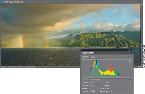
Getting a Visual Readout (Histogram) of Your Corrections
A histogram is a graph that shows you the tonal range of your photos (lights, darks, and grays). It’s usually seen in the Levels dialog, but here’s the thing: as you make Levels adjustments, the histogram there isn’t updated live. That’s why there’s a palette dedicated to showing the histogram. That means you can have it open while you’re making adjustments to your photos and get a live reading of how your histogram is looking while you edit.
Step One:
Open the photo that needs a tonal adjustment. Now, go under the Window menu and choose Histogram to open the Histogram palette. (By the way, this palette is only available in Elements’ Full Edit mode—not in Quick Fix mode.)
Step Two:
Go under the Enhance menu and choose Auto Color Correction. Take a look in the floating Histogram palette and you’ll see how the Auto Color Correction command affected the photo’s histogram. Note: If you see a small symbol in the upper right-hand corner of the graph that looks like a tiny yellow yield sign with an exclamation point in it (as seen in Step One), that’s a warning that the histogram you’re seeing is not a new histogram—it’s a previous histogram cached from memory. To see a fresh histogram, click directly on that warning symbol and a new reading will be generated based on your current adjustment.

Color Correcting Digital Camera Images
Ever wonder why the term “color correction” gets thrown around so much? That’s because every digital camera (and even most scanners used for capturing traditional photos) puts its little signature (i.e., color cast) on your photos. Most times it’s a red cast, but it can also be blue or green. Don’t get me wrong—they are getting better, but the color cast is still there. Here’s how to help combat those color problems in Elements:
Step One:
Open the digital camera photo you want to color correct. (The photo shown here doesn’t look too bad, but as we go through the correction process, you’ll see that, like most photos, it really needed a correction.)

Step Two:
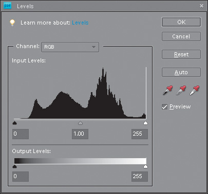
Go under the Enhance menu, under Adjust Lighting, and choose Levels (or press Ctrl-L [Mac: Command-L]). The dialog may look intimidating at first, but the technique you’re going to learn here requires no previous knowledge of Levels, and it’s so easy, you’ll be correcting photos using Levels immediately.
Step Three:
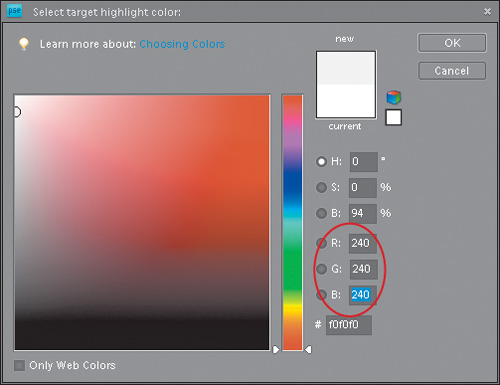
First, we need to set some preferences in the Levels dialog so we’ll get the results we’re after when we start correcting. We’ll start by setting a target color for our shadow areas. To set this preference, in the Levels dialog, double-click on the black Eyedropper tool (it’s on the right-hand side of the dialog, the first Eyedropper from the left). A Color Picker will appear asking you to “Select target shadow color.” This is where we’ll enter values that, when applied, will help remove any color casts your camera introduced in the shadow areas of your photo.

Step Four:
We’re going to enter values in the R, G, and B (red, green, and blue) fields of this dialog.
For R, enter 10
For G, enter 10
For B, enter 10

TIP: Tab to Change Fields
To move from field to field, just press the Tab key.
Then click OK. Because these figures are evenly balanced (neutral), they help ensure that your shadow areas won’t have too much of one color (which is exactly what causes a color cast—too much of one color).
Step Five:
Now we’ll set a preference to make our highlight areas neutral. Double-click on the highlight Eyedropper (the third of the three Eyedroppers in the Levels dialog). The Color Picker will appear asking you to “Select target highlight color.” Click in the R field, and then enter these values:
For R, enter 240
For G, enter 240
For B, enter 240
Then click OK to set those values as your highlight target.
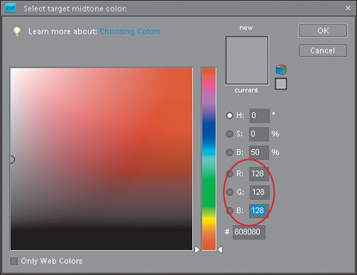
Step Six:
Finally, set your midtone preference. You know the drill—double-click on the midtones Eyedropper (the middle of the three Eyedroppers) so you can “Select target midtone color.” Enter these values in the R, G, and B fields (if they’re not already there by default):
For R, enter 128
For G, enter 128
For B, enter 128
Then click OK to set those values as your midtone target.
Step Seven:
Okay, you’ve entered your preferences (target colors), so go ahead and click OK in the Levels dialog (without making any changes to your image). You’ll get an alert dialog asking you if you want to “Save the new target colors as defaults?” Click Yes, and from that point on, you won’t have to enter these values each time you correct a photo, because they’ll already be entered for you—they’re now the default settings.

Step Eight:
You’re going to use these Eyedropper tools that reside in the Levels dialog to do most of your correction work. Your job is to determine where the shadow, midtone, and highlight areas are, and click the right Eyedropper in the right place (you’ll learn how to do that in just a moment). So remember your job—find the shadow, midtone, and highlight areas and click the right Eyedropper in the right spot. Sounds easy, right? It is. You start by opening Levels and setting the shadows first, so you’ll need to find an area in your photo that’s supposed to be black. If you can’t find something that’s supposed to be the color black, then it gets a bit trickier—in the absence of something black, you have to determine which area in the image is the darkest. If you’re not sure where the darkest part of the photo is, you can use the following trick to have Elements tell you exactly where it is.

Step Nine:
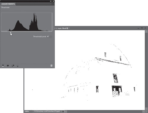
Go to the bottom of the Layers palette and click on the half-black/half-white circle icon to bring up the Create New Adjustment Layer pop-up menu. When the pop-up menu appears, choose Threshold, which brings up the Adjustments palette with a histogram and a slider under it.

Step 10:
In the Adjustments palette, drag the Threshold Level slider under the histogram all the way to the left. Your photo will turn completely white. Slowly drag the slider back to the right, and as you do, you’ll start to see some of your photo reappear. The first area that appears is the darkest part of your image. That’s it—that’s Elements telling you exactly where the darkest part of the image is. Now that you know where your shadow area is, make a mental note of its location. Next, find a white area in your image.
Step 11:
If you can’t find an area in your image that you know is supposed to be white, you can use the same technique to find the highlight areas. With the Adjustments palette still open, drag the slider all the way to the right. Your photo will turn black. Slowly drag the slider back toward the left, and as you do, you’ll start to see some of your photo reappear. The first area that appears is the lightest part of your image. Make a mental note of this area, as well (yes, you have to remember two things, but you have to admit, it’s easier than remembering two PINs). You’re now done with Threshold, so in the Layers palette, just click-and-drag the Threshold adjustment layer onto the Trash icon at the bottom of the palette, because you don’t actually need it anymore.

Step 12:
Press Ctrl-L (Mac: Command-L) to bring up the Levels dialog again. First, select the shadow Eyedropper (the one half-filled with black) from the right side of the Levels dialog. Move your cursor outside the Levels dialog into your photo and click once in the area that Elements showed you was the darkest part of the photo (in Step 10). When you click there, you’ll see the shadow areas correct. (Basically, you just reassigned the shadow areas to your new neutral shadow color—the one you entered earlier as a preference in Step Four.) If you click in that spot and your photo now looks horrible, you either clicked in the wrong spot or what you thought was the shadow point actually wasn’t. Undo the setting of your shadow point by clicking the Reset button in the dialog and try again. If that doesn’t work, don’t sweat it; just keep clicking in areas that look like the darkest part of your photo until it looks right.

Step 13:
While still in the Levels dialog, click on the highlight Eyedropper (the one half-filled with white). Move your cursor over your photo and click once on the lightest part (the one you committed to memory in Step 11) to assign that as your highlight. You’ll see the highlight colors correct.

Step 14:
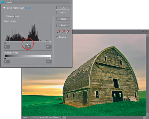
Now that the shadows and highlights are set, you’ll need to set the midtones in the photo. It may not look as if you need to set them, because the photo may look properly corrected, but chances are there’s a cast in the midtone areas. You may not recognize the cast until you’ve corrected it and it’s gone, so it’s worth giving it a shot to see the effect (which will often be surprisingly dramatic). Unfortunately, there’s no Threshold adjustment layer trick that works well for finding the midtone areas, so you have to use some good old-fashioned guesswork (or try “Dave’s Amazing Trick for Finding a Neutral Gray” next in this chapter). Ideally, there’s something in the photo that’s gray, but not every photo has a “gray” area, so look for a neutral area (one that’s obviously not a shadow, but not a highlight either). Click the middle (gray) Eyedropper in that area. If it’s not right, click the Reset button and repeat Steps 12 through 14.

Step 15:
There’s one more important adjustment to make before you click OK in the Levels dialog and apply your correction. Under the histogram (that’s the black mountain-range-looking thing), click on the center slider (the Midtone Input Levels slider—that’s why it’s gray) and drag it to the left a bit to brighten the midtones of the image. This is a visual adjustment, so it’s up to you to determine how much to adjust, but it should be subtle—just enough to bring out the midtone detail. When it looks right to you, click OK to apply your correction to the highlights, midtones, and shadows, removing any color casts and brightening the overall contrast.
Before

After

Dave’s Amazing Trick for Finding a Neutral Gray
If you read the previous tutorial and are saying to yourself, “But what about that middle gray eyedropper? How do I accurately set that point?” you’re not alone. It has always been kind of tricky actually, but Dave Cross, Senior Developer of Education and Curriculum for the National Association of Photoshop Professionals (NAPP), showed us this amazing trick. Being the friendly Canadian that he is, he even offered to let us include it in the book so everyone else can see it, as well.
Step One:
Open any color photo and click on the Create a New Layer icon at the bottom of the Layers palette to create a new blank layer. Then, go under the Edit menu and choose Fill Layer. When the Fill Layer dialog appears, in the Contents section, under the Use pop-up menu, choose 50% Gray, and then click OK to fill your new layer with (you guessed it) 50% gray.

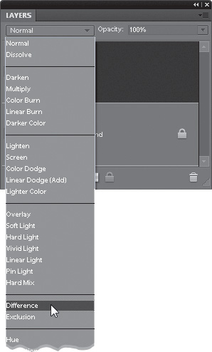
Step Two:
Now, go to the Layers palette and change the blend mode pop-up menu to Difference. Changing this layer’s blend mode to Difference doesn’t do much for the look of your photo (in fact, it rarely does), but just remember—it’s only temporary.
Step Three:
Choose Threshold from the Create New Adjustment Layer pop-up menu at the bottom of the Layers palette. When the Adjustments palette appears, drag the slider all the way to the left (your photo will turn completely white). Now, slowly drag the slider back to the right, and the first areas that appear in black are the neutral midtones. Make a mental note of where those gray areas are, and then click-and-drag the Threshold adjustment layer onto the Trash icon at the bottom of the palette, because you no longer need it. (In the example shown here, there are neutral midtones in the edge of the blanket.)

Step Four:
Now that you know where your midtone point is, go back to the Layers palette and drag the 50% gray layer onto the Trash icon (it’s also done its job, so you can get rid of it, too). You’ll see your full-color photo again. Now, press Ctrl-L (Mac: Command-L) to open Levels, get the midtones Eyedropper (it’s the middle Eyedropper), and click directly on one of the neutral areas. That’s it; you’ve found the neutral midtones and corrected any color within them. So, will this work every time? Almost. It works most of the time, but you will run across photos that just don’t have a neutral midtone, so you’ll have to either not correct the midtones or go back to what we used to do—guess.

Studio Photo Correction Made Simple
If you’re shooting in a studio—whether it’s portraits or products—there’s a technique you can use that makes the color correction process so easy that you’ll be able to train laboratory test rats to correct photos for you. In the back of this book, we’ve included a color swatch card (it’s perforated so you can easily tear it out). After you get your studio lighting set the way you want it, and you’re ready to start shooting, put this swatch card into your shot (just once) and take the shot. What does this do for you? You’ll see.
Step One:
When you’re ready to start shooting and the lighting is set the way you want it, tear out the swatch card from the back of this book and place it within your shot (if you’re shooting a portrait, have the subject hold the card for you), and then take the shot. After you’ve got one shot with the swatch card, you can remove it and continue with the rest of your shoot.

Step Two:
When you open the first photo taken in your studio session, you’ll see the swatch card in the photo. By having a card that’s pure white, neutral gray, and pure black in your photo, you no longer have to try to determine which area of your photo is supposed to be black (to set the shadows), which area is supposed to be gray (to set the midtones), or which area is supposed to be white (to set the highlights). They’re right there in the card. Note: We’ve even included a Camera Raw White Balance swatch if you’re working with RAW files. See “The Essential Adjustments: White Balance” in Chapter 2 for more info.
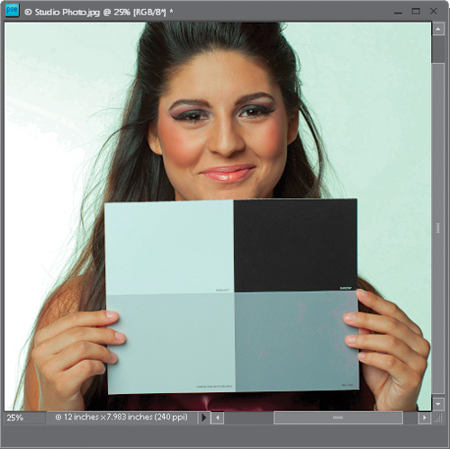
Step Three:
Press Ctrl-L (Mac: Command-L) to bring up the Levels dialog. Click the black Eyedropper on the black panel of the card (to set shadows), the middle Eyedropper on the gray panel (for midtones), and the white Eyedropper on the white panel (to set the highlights), and the photo will nearly correct itself. No guessing, no using Threshold adjustment layers to determine the darkest areas of the image—now you know exactly which part of that image should be black and which should be white.

Step Four:
If you’d like to still use this photo, then press C to get the Crop tool and crop the card out of the image. However, the more likely situation is that you don’t want to use this photo (since it does have a big card in it), but you’d now like to apply this color correction to some other photos. Well, now that you have the Levels settings for the first image, you can correct the rest of the photos using the same settings. Just open the next photo and press Ctrl-Alt-L (Mac: Command-Option-L) to apply the exact same settings to this photo that you did to the swatch card photo. Or, you can use the “Drag-and-Drop Instant Color Correction” method that appears next in this chapter.

TIP: Try a Color Checker Chart
If you want to take this process a step further, many professionals use a Munsell ColorChecker color-swatch chart (from X-Rite; www.xrite.com), which also contains a host of other target colors. It’s used exactly the same way: just put the chart into your photo, take one shot, and then when you correct the photo, each color swatch will be in the photo, just begging to be clicked on.
Drag-and-Drop Instant Color Correction
Here’s a trick for quickly correcting lots of photos that have the same lighting problem. It’s a huge time saver! You’ll see that it’s ideal for photos where your lighting conditions were the same (indoor studio shots are perfect candidates for this one), but it works in plenty of other situations, as well.
Step One:
First, here’s a tip-within-a-tip: If you’re opening a group of photos, you don’t have to open them one by one. Just go under the File menu and choose Open. In the Open dialog, click on the first photo you want to open, then press-and-hold the Ctrl (Mac: Command) key and click on any other photos you want to open. Then, when you click the Open button, Elements will open all the selected photos. (If all your photos are contiguous, press-and-hold the Shift key and click on the first and last photos in the list to select them all.) So now that you know that tip, go ahead and open at least three or four images, just to get you started.

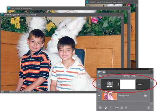
Step Two:
At the bottom of the Layers palette, click on the Create New Adjustment Layer pop-up menu and choose Levels. Note: An adjustment layer is a special layer that contains the tonal adjustment of your choice (such as Levels, Brightness/Contrast, etc.). There are a number of advantages to having this correction applied as a layer, as you’ll soon see, but the main advantage is that you can edit or delete this tonal adjustment at any time while you’re working, plus you can save this adjustment with your file as a layer.

Step Three:
When you choose this adjustment layer, you’ll notice that the Adjustments palette appears with your Levels controls. Go ahead and make your corrections using Levels (see “Color Correcting Digital Camera Images” earlier in this chapter). In the Layers palette, you’ll see that a new Levels adjustment layer is created.

Step Four:
Because you applied this correction as an adjustment layer, you can treat this adjustment just like a regular layer, right? Right! And Elements lets you drag layers between open documents, right? Right again! (Note: You must have them open as floating, not tabbed, documents to drag a layer between them.) So, go to the Layers palette, click on the Levels adjustment layer, and drag-and-drop it right onto one of your other open photos. That photo will instantly have the same correction applied to it. This technique works because you’re correcting photos that share similar lighting conditions. Need to correct 12 open photos? Just drag-and-drop it 12 times (making it the fastest correction in town!).
Step Five:
Okay, what if one of the “dragged corrections” doesn’t look right? That’s the beauty of these adjustment layers. Just click directly on the adjustment layer thumbnail for that photo, and go to the Adjustments palette, where the last settings you applied are still in place. You can then adjust this individual photo separately from the rest. Try this dragging-and-dropping-adjustment-layers trick once, and you’ll use it again and again to save time when correcting a digital roll that has similar lighting conditions.

Adjusting Flesh Tones
So what do you do if you’ve used Levels to properly set the highlights, midtones, and shadows, but the flesh tones in your photo still look too red? You can try this quick trick for getting your flesh tones in line by removing the excess red. This one small adjustment can make a world of difference.
Step One:
Open a photo that needs red removed from the flesh tones. If the whole image appears too red, skip this step and move on to Step Three. However, if just the flesh-tone areas appear too red, get the Quick Selection tool (A) and click on all the flesh-tone areas in your photo. (Press-and-hold the Alt [Mac: Option] key to remove any areas that were selected that shouldn’t have been, such as the clothes and hair.)

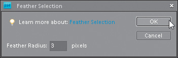
Step Two:
Go under the Select menu and choose Feather. Enter a Feather Radius of about 3 pixels, then click OK. By adding this feather, you’re softening the edges of your selection, preventing a hard, visible edge from appearing around your adjustments.
Step Three:
Click on the Create New Adjustment Layer icon at the bottom of the Layers palette, and choose Hue/Saturation from the pop-up menu. Then, in the Adjustments palette, click on the popup menu near the top and choose Reds, so you’re only adjusting the reds in your photo (or in your selected areas if you put a selection around the flesh tones).

Step Four:
The rest is easy—you’re simply going to reduce the amount of saturation so the flesh tones appear more natural. Drag the Saturation slider to the left to reduce the amount of red (I moved mine to –20, but you may have to go further to the left, or not as far, depending on how red your skin color is). The changes are live, so you’ll be able to see the effect of reducing the red as you lower the Saturation slider. Also, if you made a selection of the flesh-tone areas, once you create the adjustment layer, it will hide the selection border from view and create a layer mask with your selection. When the flesh tones look right, you’re done.


Warming Up (or Cooling Down) a Photo
Before digital photography, you had to adjust your camera for each particular lighting situation (the photo might come out too blue or too warm because of the lighting), and there were filters that you’d screw on to the end of a lens to help combat the effect. Well, Elements has a Photo Filter adjustment, and it works so well at warming and cooling digitally that I don’t even carry those filters in my bag anymore. Here’s how to use it:
Step One:
Open the photo that needs cooling down (or warming up). In the example shown here, the photo is too warm and has a yellowish tint, so we want to cool it down and make it look more natural. Go to the Layers palette and choose Photo Filter from the Create New Adjustment Layer pop-up menu at the bottom of the palette (its icon looks like a half-black/half-white circle).


Step Two:
When the Photo Filter controls appear in the Adjustments palette, choose Cooling Filter (82) (or choose a Warming Filter if your image is too cool) from the Filter pop-up menu (this approximates the effect of a traditional screw-on lens filter). If the effect is too cool for you, drag the Density slider to the left to warm the photo up a little. I took mine down a bit to 14% to not cool down the sky too much.

Step Three:
Because this Photo Filter is an adjustment layer, you can edit where the cooling is applied, so press B to switch to the Brush tool. In the Options Bar, click on the down-facing arrow next to the Brush thumbnail and choose a soft-edged brush in the Brush Picker. Then, press X to make black your Foreground color, and begin painting over any areas that you don’t want to be cool (for example, if you wanted the barns and trees next to them to stay warm, you’d paint over that area). The original color of the image will be revealed wherever you paint.

Color Correcting One Problem Area Fast!
This technique really comes in handy when shooting outdoor scenes because it lets you enhance the color in one particular area of the photo, while leaving the rest of the photo untouched. Real estate photographers often use this trick because they want to present a house on a bright, sunny day, but the weather doesn’t always cooperate. With this technique, a blown-out sky shot at daybreak can become a beautiful blue sky in just seconds.
Step One:
Open the image that has an area of color you would like to enhance, such as the sky.
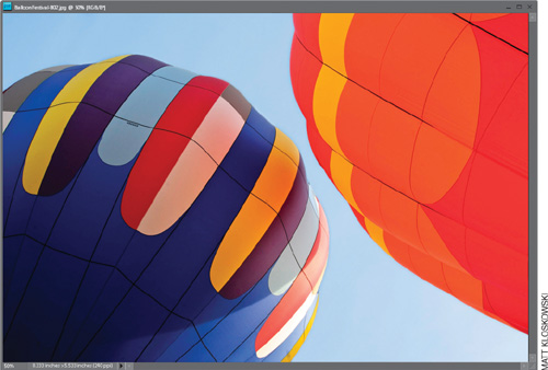
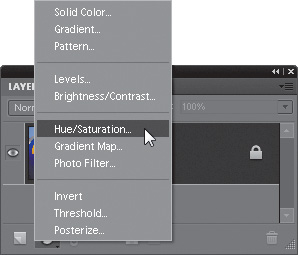
Step Two:
Go to the bottom of the Layers palette and choose Hue/Saturation from the Create New Adjustment Layer pop-up menu (it’s the half-black/half-white circle icon). A new layer named “Hue/Saturation 1” will be added to your Layers palette and the Hue/Saturation controls will appear in the Adjustments palette. (Note: If you prefer using the Smart Brush tool [covered in Chapter 5], you’ll find it has a Blue Skies option that also works pretty well in cases like this.)
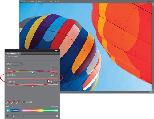
Step Three:
From the pop-up menu at the top of the Adjustments palette, choose the color that you want to enhance (Blues, Reds, etc.), then drag the Saturation slider to the right. You might also choose Cyans, Magentas, etc., from the pop-up menu and do the same thing—drag the Saturation slider to the right, adding even more color, until your image’s area looks as enhanced as you’d like it. In the example here, I increased the saturation of the Cyans to 30 and the Blues to 60.
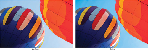
Step Four:
Your area is now colorized, but so is everything else. That’s okay; you can fix that easily enough. Press the letter X until your Foreground color is set to black, then press Alt-Backspace (Mac: Option-Delete) to fill the Hue/Saturation layer mask with black. Doing this removes all the color that you just added, but now you can selectively add (actually paint) the color back in where you want it.

Step Five:
Press the letter B to switch to the Brush tool. In the Options Bar, click the down-facing arrow to the right of the Brush thumbnail, and in the Brush Picker, choose a large, soft-edged brush. Press X again to toggle your Foreground color to white, and begin painting over the areas where you want the color enhanced. As you paint, the version of your enhanced photo will appear. For well-defined areas, you may have to go to the Brush Picker again in the Options Bar to switch to a smaller, hard-edged brush.

TIP: Fixing Mistakes
If you make a mistake and paint over an area you shouldn’t have—no problem—just press X again to toggle your Foreground color to black and paint over the mistake—it will disappear. Then, switch back to white and continue painting. When you’re done, the colorized areas in your photo will look brighter.

Getting a Better Conversion from Color to Black and White
I’ve run into a lot of digital photographers that use the Remove Color function in Elements to convert from color to black and white. Nearly every single one of them is disappointed with the results. That’s because Elements simply removes the color from the photo and leaves a very bland looking black-and-white image. Plus, there are no settings, so you can’t customize your black-and-white photo in any way. Here’s a great technique that creates a better black and white and gives you plenty of control to really customize the way it looks.
Step One:
Open the color photo you want to convert to black and white. Press D to set your Foreground and Background to the default black and white.

Step Two:
To really appreciate this technique, it wouldn’t hurt if you went ahead and did a regular conversion to black and white, just so you can see how lame it is. Go under the Image menu, under Mode, and choose Grayscale. When the “Discard color information?” dialog appears, click OK, and behold the somewhat lame conversion. Now that we agree it looks pretty bland, press Ctrl-Z (Mac: Command-Z) to undo the conversion, so you can try something better.
Step Three:
Go to the bottom of the Layers palette and choose Levels from the Create New Adjustment Layer pop-up menu (it’s the half-black/half-white circle icon). The Levels controls will appear in the Adjustments palette. and a new layer will be added to your Layers palette named “Levels 1.”

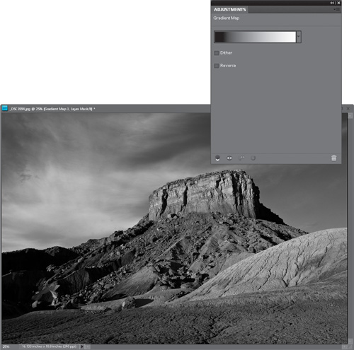
Step Four:
Press X until your Foreground color is set to black, then go to the bottom of the Layers palette and choose Gradient Map from the Create New Adjustment Layer pop-up menu. This brings up the Gradient Map options in the Adjustments palette.

Step Five:
Just choosing Gradient Map gives you a black-and-white image (and doing just this, this one little step alone, usually gives you a better black-and-white conversion than just choosing Grayscale from the Mode submenu. Freaky, I know). If you don’t get a black-to-white gradient, it is because your Foreground and Background colors were not set at their defaults. Click-and-drag the Gradient Map adjustment layer onto the Trash icon at the bottom of the palette, press D, then add your Gradient Map adjustment layer again. This adds another layer to the Layers palette (above your Levels 1 layer) named “Gradient Map 1.”
Step Six:
In the Layers palette, click directly on the Levels thumbnail in the Levels 1 layer to bring up the Levels controls in the Adjustments palette again. In the pop-up menu at the top of the palette, you can choose to edit individual color channels (kind of like you would with Photoshop’s Channel Mixer). Choose the Red color channel.
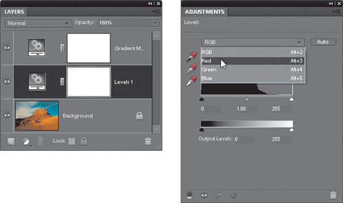
Step Seven:
You can now adjust the Red channel, and you’ll see the adjustments live onscreen as you tweak your black-and-white photo. (It appears as a black-and-white photo because of the Gradient Map adjustment layer above the Levels 1 layer. Pretty sneaky, eh?) You can drag the shadow Input Levels slider to the right a bit to increase the shadows in the Red channel, as shown here.

Step Eight:
Now, switch to the Green channel in the pop-up menu at the top of the Adjustments palette. You can make adjustments here, as well. Try increasing the highlights in the Green channel by dragging the highlight Input Levels slider to the left, as shown here.

Step Nine:
Now, choose the Blue channel from the pop-up menu, and try increasing the highlights quite a bit and the shadows just a little by dragging the Input Levels sliders (the ones below the histogram that we’ve been using). These adjustments are not standards or suggested settings for every photo; I just experimented by dragging the sliders, and when the photo looked better, I stopped dragging. When the black-and-white photo looks good to you (good contrast and good shadow and highlight details), just stop dragging.

Step 10:
To complete your conversion, go to the Layers palette, click on the flyout menu at the top right, then choose Flatten Image to flatten the adjustment layers into the Background layer. Although your photo looks like a black-and-white photo, technically, it’s still in RGB mode, so if you want a grayscale file, go under the Image menu, under Mode, and choose Grayscale.

Before (lame grayscale conversion)

After (awesome adjustment layers conversion)

Correcting Color and Contrast Using Color Curves
Users of the full professional version of Adobe Photoshop have had the benefit of using Curves since version 1, and it’s the pros’ choice for color correction without a doubt. There’s only one problem—it’s a bit hard for most folks to master. That’s why you’ll fall in love with the Color Curves adjustment—it makes using Curves so easy, it will actually make pro users of Photoshop jealous. Adobe has done a really brilliant job of giving us the power of Curves without the hassles and steep learning curve. Life is good.
Step One:
Open the photo you want to adjust with Color Curves (a typical situation might be a photo that lacks contrast or has an obvious color cast, but in reality most photos can benefit from a short trip to Color Curves, so don’t just save it for really messed up photos). Then go under the Enhance menu, under Adjust Color, and choose Adjust Color Curves (as shown here).

Step Two:
When the Adjust Color Curves dialog first appears, you’ve got two options for using it. First there’s the simple fix (I know, it’s not the official name, but it’s what we call it). This simple fix lets you simply select what you’d like to do with your photo from a list of choices on the bottom-left side of the dialog (you can compare the before and after views to see if you’re happy with the changes). Just click on a choice in the Select a Style list and it applies a color curve for you. Easy enough, right? (By the way, don’t click on Solarize unless you’ve had a few glasses of Merlot first.) Note: You can only apply one curve at a time. If you want to apply more than one style adjustment, click OK, then reopen the Adjust Color Curves dialog and select another adjustment to add it.

Step Three:
So, you might get lucky and find a choice that works great for you right off the bat. Your photo will look better, and life will be good. However, to reveal the real power of these curves, you’ll need to go to Adjust Sliders at the bottom right of the dialog. That’s where you’ll see four sliders and the curve itself. Now, as you drag the sliders, you’ll see how the curve is affected. For example, drag the Adjust Highlights slider to the right, and you’ll see the top-right curve point move upward. That’s because the highlights are controlled by that upper-right point.

Step Four:
The center point represents the midtones in your photo. Try dragging the Midtone Brightness slider to the right, and look over at the curve. See how the center point moves upward? Now, drag the Midtone Contrast slider to the left, and watch how the contrast increases. Anytime you make the curve steeper, it adds contrast to your photo, but you don’t want it to get too steep, or your photo will lose quality. Lastly, drag the Adjust Shadows slider to the left. Notice how the shadow point on the curve (the far-left point) moves downward, darkening the shadow area. These sliders make it easy to adjust the tone and contrast in your photo without having to manually move points on the curve (like you do in the pro version of Photoshop).

Step Five:
Now, let’s click the Reset button and start over from scratch. Let’s fix the problem photo we have here, using nothing but Adjust Color Curves. First, let’s start with the preset styles and see if any of them look better than our current photo. To me, the Increase Contrast style looks better than the original photo, so go ahead and click on that. It makes a great starting point for our correction.

Step Six:
Okay, here’s the problem (at least as I see it). Although we increased the contrast, and I think the photo certainly looks better than it did, it seems a little dark, and it looks like it’s lacking highlights. So, drag the Adjust Highlights slider over to the right a little bit and see how that looks. Now, to me, that looks better (but hey, that’s just me. There is no official government agency that determines whether your photo has enough highlights or not, so the choice is really up to you—the photographer). In fact, since it’s up to you (or me, in this case), I think I might even drag it a little farther to the right, to really open up those highlights in the sky. In fact, I’ll keep dragging until the white areas of my photo start to look blown out (lacking detail).

Step Seven:
Now, if it were me (and it is, by the way), I’d then drag the Midtone Contrast slider to the left a bit to add more contrast in the midtones. This tends to brighten the midtones. I won’t do this for every photo, but for this photo, it seems to look better. That’s the great thing about these sliders—you can drag one to the left, and if your photo looks better, then great. If it doesn’t, drag it to the right and see how that looks. If it looks better when you drag it to the right, then great. If not, drag it back to the center and leave it alone. In this case, I dragged both ways, and I like the way the midtone contrast looked when I had the slider dragged to the left a bit, so that’s where I’m leaving it.

Step Eight:
My final two tweaks are to drag the Midtone Brightness slider to the left, then the right, to see which one looks better. I like the way it looks when I drag it to the right, so to the right it stays. I know this sounds like a really simplistic way to adjust your photos, but it’s deeper than you think. If you drag a slider in either direction, and your photo looks better, then how could that be wrong? Lastly, let’s drag the Adjust Shadows slider. Dragging just a little bit to the left seemed to make the shadow areas darker, while dragging it to the right made them look washed out. So, needless to say, I left it a little to the left. If you look at the curve itself, you’ll see the classic “S” shape (known as the “S” curve), which is pretty common in curve correction, as that shape adds contrast and helps to make colors rich and saturated. So, in short, don’t be afraid to slide those sliders.

After