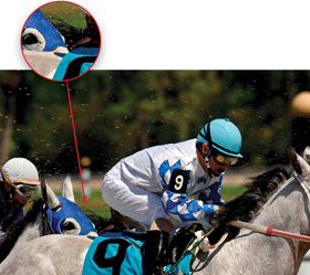

Photographer: Scott Kelby
Exposure: 1/200
Focal Length: 200mm
Aperture Value: ƒ/8
The chapter title above is actually the name of a band. I ran across their song “Love Broke” as I was searching in Apple’s iTunes Store under the word “Special.” Of course, iTunes came up with songs from bands like .38 Special, as well as a band called The Specials, but somehow in the midst of all this, another title caught my eye. The song was named “Specinal” (which is either a typo or a very clever misspelling of Special designed to throw off authors using iTunes as a research tool for naming chapters), but it wasn’t the name of the song that drew me to it, it was the name of the band—Dufus. That’s right, they named their band Dufus. Now, I’m not entirely sure, but the name Dufus might not be the best name for attracting members of the opposite sex (if you can, indeed, determine what that would be). I mean, imagine the following conversation between the bass player for Dufus and a potential date chosen at random from the crowd before they take the stage. Bass player: “So, we haven’t met. I’m Mike, the bass player for Dufus.” Audience member: “Buh-bye, Dufus.” See what I mean? It’s hard to put a good spin on that name. I think I might call a band meeting and politely request a snappier name, citing the bass player’s bad experience transcribed above. Some alternate names might be The Studs. Or The Heartbreak Kids, or even Eddie from Ohio. So, let’s try that scenario again, but using one of these new and improved names. Bass player: “So, we haven’t met. I’m Mike, the bass player for Eddie from Ohio.” Audience member: “Can you introduce me to Eddie?” Bass player: “Uh, I dunno, he’s pretty busy.” Audience member: “Leave me alone, you Dufus.”
This is just about the hottest Photoshop portrait technique out there right now, and you see it popping up everywhere, from covers of magazines to CD covers, from print ads to Hollywood movie posters, and from editorial images to billboards. It seems right now everybody wants this effect (and you’re about to be able to deliver it in roughly 60 seconds flat using the simplified method shown here!).
Step One:
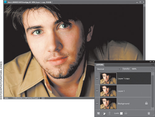
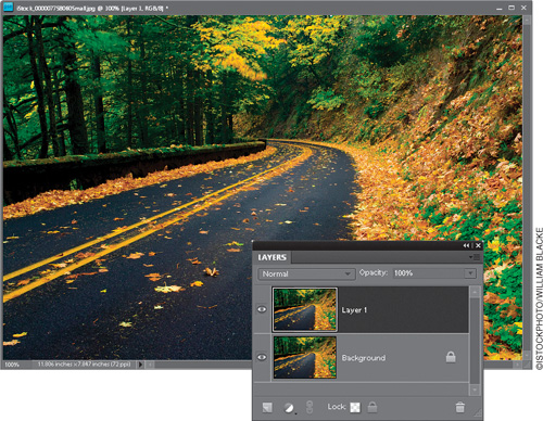
Open the photo you want to apply this trendy high-contrast portrait effect to. Duplicate the Background layer by pressing Ctrl-J (Mac: Command-J). Then duplicate this layer using the same shortcut (so you have three layers in all, which all look the same, as shown here).
Step Two:
In the Layers palette, click on the middle layer (Layer 1) to make it the active layer, then press Ctrl-Shift-U (Mac: Command-Shift-U) to desaturate and remove all the color from that layer. Of course, there’s still a color photo on the top of the layer stack, so you won’t see anything change onscreen (you’ll still see your color photo), but if you look in the Layers palette, you’ll see the thumbnail for the center layer is in black and white (as seen here).
Step Three:
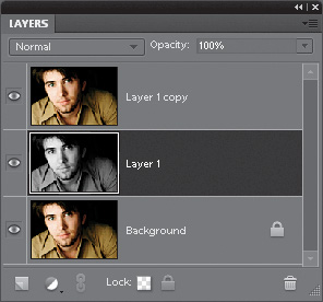
Now lower the Opacity setting of this black-and-white layer to 80% (as shown here), which lets a little bit of the color from the Background layer show through. Now, of course, you still can’t see this, because the top layer is still visible, so if you want to see what lowering the opacity to 80% looks like (just for kicks), simply hide the top layer from view (click on the Eye icon to the left of the layer thumbnail), but don’t forget to make it visible again before you go on to the next step.

Step Four:
In the Layers palette, click on the top layer in the stack (Layer 1 copy), then switch its layer blend mode from Normal to Soft Light (as shown here), which brings the effect into play. Now, Soft Light brings a very nice, subtle version of the effect, but if you want something a bit edgier with even more contrast, try using Overlay mode instead. If the Overlay version is a bit too intense, try lowering the Opacity of the layer a bit until it looks good to you.

Step Five:
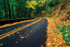
Flatten the image by clicking on the down-facing arrow in the top-right of the Layers palette and choosing Flatten Image from the palette’s flyout menu. The final step is to add some more noise, so go under the Filter menu, under Noise, and choose Add Noise. When the Add Noise filter dialog appears (seen here), set the Distribution to Gaussian, and turn on the Monochromatic checkbox (or your noise will appear as little red, green, and blue specks, which looks really lame). Lastly, dial in an amount of noise that, while visible, isn’t overly noisy. This is a very low-resolution photo, so I only used 4%. On a high-res digital camera photo, you’ll probably have to use between 10% and 12% to see much of anything. You can see the before/after below. Beyond that, I gave you an example of how this effect looks on another portrait.

Before

After

Step Six:
Here’s another example using the exact same technique and you can see how different the effect looks on a completely different image. I particularly love the almost bronze skin tone it creates in this image. Very cool stuff.
Before

After

Tip: Don’t Add Too Much Noise
Be careful not to add too much noise, because when you add an Unsharp Mask to the image (which you would do at the very end, right before you save the file), it enhances and brings out any noise in the photo.
One of my favorite features in Elements is its black-and-white conversion tool. Well, it’s not really a tool, it’s more like a dialog where you decide how you want your color photo converted into black and white. It’s a very visual way to make the jump from color to black and white, and if you can point-and-click, you can do it. Here’s how it’s done:
Step One:
Open the color photo you want to convert to black and white (yes, you need to start with a color photo), and then go under the Enhance menu and choose Convert to Black and White (as shown here).

Step Two:
When you choose Convert to Black and White, a dialog appears and your photo (behind the dialog) is converted to black and white on the spot (in other words, you get a live preview of your changes). At the top of the dialog is a before and after, showing your color photo on the left, and your black-and-white conversion on the right, which honestly is of little help, especially since you can see your full-sized photo behind the dialog. Anyway, your first step is to choose which style of photo you’re converting from the list of styles on the lower-left side of the dialog. These styles are really just preset starting points that are fairly well-suited to each type of photo. The default setting is Scenic Landscape, which is a fairly non-exciting setting. Since I’m generally looking to create high-contrast, black-and-white photos with lots of depth, I recommend the Vivid Landscapes style, which is much punchier. Go ahead and choose that now, just so you can see the difference.

Step Three:
Whether you stay with the default Scenic Landscape, or try my suggested Vivid Landscapes (or any of the other styles to match the subject of your photo), these are just starting places—you’ll need to tweak the settings to really match your photo, and that’s done by dragging one of the four Adjust Intensity sliders that appear on the bottom-right side of the dialog. The top three (Red, Green, and Blue) let you tweak ranges of color in your photo. So, for example, if you’d like the sky darker, which is blue, you’d drag the Blue slider to the left, as shown here. If you want the sand itself brighter, which is mostly reddish, you’d drag the Red slider to the right. There’s not much green in this photo, so moving the Green slider won’t have quite as much impact as it would in a scenic landscape shot.

Step Four:
So, basically, you use those three sliders to come up with a mix that looks good to you. You don’t have to use these sliders, but if you can’t find one of the presets that looks good to you, find one that gets you close, and then use the Red, Green, and Blue sliders to tweak the settings. The fourth slider, Contrast, does just what you’d expect it would—if you drag to the right, it adds contrast (and to the left removes it). I’m very big on high-contrast black-and-white prints, so I wouldn’t hesitate to drag this a little to the right just to create even more contrast (so, personally, I’m more likely to start with a preset, like Vivid Landscapes, and then use the Contrast slider, as shown here, than I am to spend much time fooling with the Red, Green, and Blue sliders. But hey, that’s just me).

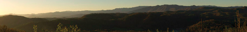
Elements has had a feature to help you stitch multiple photos into a single panoramic photo for years now. As long as you did everything right in the camera (shooting on a tripod with just about every auto feature turned off), Photomerge worked pretty well. However, Photomerge is now so vastly improved that you can pretty much hand-hold your camera without regard to the auto settings, and Photomerge will not only perfectly align the photos, but now it will also seamlessly blend the pieces together, even if the exposure or white balance isn’t “on the money.” This is very cool stuff.
Step One:
Select the individual pieces of your pano in the Organizer (Mac: Bridge). Here, I choose eight separate photos we’re going to stitch together into a panorama. Go under the File menu, under New, and choose Photomerge® Panorama (on a Mac, go under the Tools menu, under Photoshop Elements, and choose Photomerge® Panorama), or simply open all eight photos in the Editor, then go under the File menu, under New, and choose Photomerge® Panorama.

Step Two:
In the Photomerge dialog, click on the button for Add Open Files, and your photos for the pano will appear in the center column. You have five different choices in the Layout section for how your pano will be constructed, and I recommend using Auto (which does a brilliant job). The choices below Auto (Perspective, Cylindrical, and Reposition Only) give you funky looking panos—not the nice long pano we’re shooting for. The Interactive Layout brings back the “old” way of stitching panos (the semi-manual way), and that’s why I prefer the Auto method. Click OK, and within a minute or two (depending on how large your photos are), your pano is seamlessly stitched together (you’ll see status bars that let you know that Elements is auto-aligning and auto-blending your layers to make this mini-miracle happen).

Step Three:
Usually, to make your pano fit perfectly together, Photomerge has to move and rearrange things in a way that will cause you to have to crop the photo down to get the final result you want (we get the easy job; cropping only takes about 10 seconds). So, get the Crop tool (C) and drag out your cropping border (like you see in the bottom image here), encompassing as much of the pano as possible without leaving any transparent areas.

Step Four:
When you press Enter (Mac: Return), your pano is cropped down to size (as shown here). I encourage you to try shooting panos “as is”—without changing all your camera settings, or turning off the auto exposure, or auto focus, or any of those things. Just hand-hold, point, and shoot as many frames as you’d like. There’s now just one rule to remember: try to overlap each photo by around 20% to make things easier for Photomerge.
This is a great technique that lets you focus attention by using dramatic, soft lighting. The technique I’m showing you here, I learned from famous nature photographer Vincent Versace. I had been getting a similar look by filling a layer with black, making an oval selection, feathering the edges significantly, and then knocking a hole out of the layer (as you’ll see in the next technique), but Vincent’s technique, using the Lighting Effects filter, is so much easier that it’s just about all I use now.
Step One:
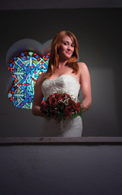
Open the RGB photo to which you want to apply a soft spotlight effect. In this example, I want to focus attention on the bride by darkening the area around her. Next, press Ctrl-J (Mac: Command-J) to duplicate the Background layer.

Step Two:
Go under the Filter menu, under Render, and choose Lighting Effects. I have to tell you, if you haven’t used this filter before, it’s probably because its interface (with all its sliders) looks so complex, but luckily there are built-in presets (Adobe calls them “Styles”) that you can choose from, so you can pretty much ignore all those sliders. Once you ignore the sliders, the filter is much less intimidating, and you can really have some fun here. The small preview window on the left side of the dialog shows you the default setting, which is a large oval light coming from the bottom right-hand corner.
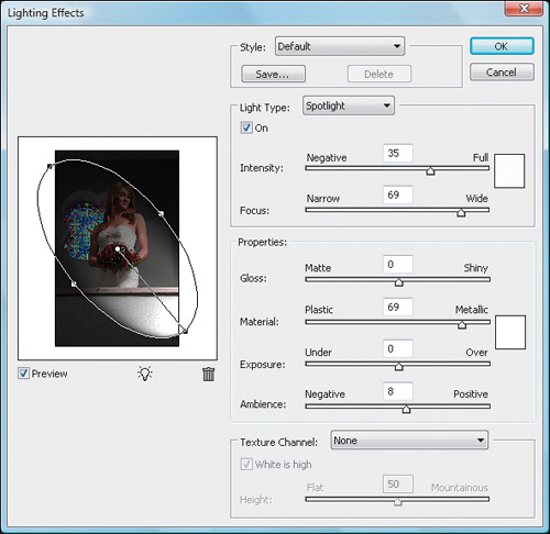
Step Three:
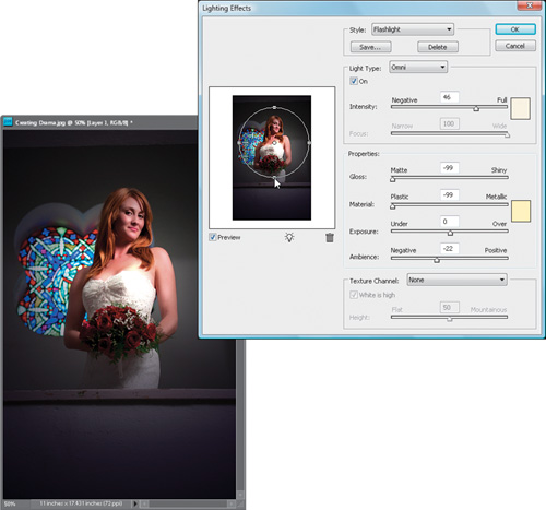
For this effect, we’re going to use a very soft, narrow beam, so go under the Style pop-up menu at the top of the dialog (this is where the presets are) and choose Flashlight.

Step Four:
Once you choose Flashlight, look at the preview window and you’ll see a small spotlight in the center of your image. Click on the center point (inside the circle) and drag the light into the position where you want it. If you want the circle of light a little bit larger, just click on one of the side points and drag outward. When you click OK, the filter applies the effect, darkening the surrounding area and creating the soft spotlight effect you see here.
Step Five:
If the Lighting Effects filter seems too intense, you can remedy it immediately after the fact by lowering the Opacity setting in the Layers palette to reduce the effect of the filter. The lower the setting, the less the intensity of the effect. Then, while in the Layers palette, change the blend mode of this layer to Darken, so the Flashlight effect doesn’t make the colors seem too saturated.

Before
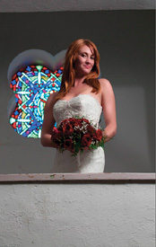
After
If you want to focus attention on something within your image, applying a wide vignette that acts like a soft light is a great way to do this (which is really just an alternative to the previous tutorial). What you’re doing is creating a dark border that will burn in the edges of your image. Here’s how to do just that:
Step One:
Open the photo to which you want to apply a burned-in edge effect. Just so you know, what we’re doing here is focusing attention through the use of light—we’re burning in all the edges of the photo (not just the corners, like lens vignetting, which I usually try to avoid), leaving the visual focus in the center of the image.

Step Two:
Go to the Layers palette and add a new layer by clicking on the Create a New Layer icon at the bottom of the palette. Press the letter D to set your Foreground color to black, and then fill your new layer with black by pressing Alt-Backspace (Mac: Option-Delete).

Step Three:
Press M to get the Rectangular Marquee tool and drag a selection about 1″ or so inside the edges of your photo. Then, to greatly soften the edges of your selection, go under the Select menu and choose Feather. When the dialog appears, enter 50 pixels for a low-res photo (or 170 pixels for a high-res, 300-ppi photo), and click OK.

Step Four:
Now that your edges have been softened, all you have to do is press Backspace (Mac: Delete), and you’ll knock a soft hole out of your black layer, revealing the photo on the Background layer beneath it. Now press Ctrl-D (Mac: Command-D) to Deselect. Note: If the edges seem too dark, you can go to the Layers palette and lower the Opacity of your black layer (in the example shown here, I lowered the Opacity to 70%).

Before

After

This is a popular technique for focusing attention by the use of color (or really, it’s more like the use of less color—if everything’s in black and white, anything that’s in color will immediately draw the viewer’s eye). As popular as this technique is, it’s absolutely a breeze to create. Here’s how:
Step One:
Open a photo containing an object(s) you want to emphasize through the use of color. Go under the Layer menu, under New, and choose Layer via Copy (or just press Ctrl-J [Mac: Command-J]). This will duplicate the Background layer onto its own layer (Layer 1).

Step Two:
Press B to get the Brush tool from the Toolbox and choose a medium, soft-edged brush from the Brush Picker in the Options Bar (just click on the down-facing arrow next to the Brush thumbnail to open the Picker). Also in the Options Bar, change the Mode pop-up menu to Color for the Brush tool.

Step Three:
Set your Foreground color to black by pressing the letter D and begin painting on the photo. As you paint, the color in the photo will be removed. The goal is to paint away the color from all the areas except the areas you want emphasized with color.

Tip: Fixing Mistakes
If you make a mistake while painting away the color or later decide that there was something else that you really wanted to keep in color, just switch to the Eraser tool by pressing the E key, paint over the “mistake” area, and the original color will return as you paint. (What you’re really doing here is erasing part of the top layer, which is now mostly black and white, and as you erase, it reveals the original layer, which is still in full color.)
Before

After

This is a quick way to emulate the effect of a soft focus filter on your lens. Besides being quick and easy, what I like about this effect is the soft glow it gives your images. Try this technique on a sharp photo of some trees and you’ll love what it does for the image.
Step One:
Open the photo to which you want to apply a soft focus effect. Duplicate the Background layer by pressing Ctrl-J (Mac: Command-J). By default, this duplicate layer is named Layer 1.
Step Two:
Go under the Filter menu, under Blur, and choose Gaussian Blur. For low-res images, enter about 6–10 pixels (for high-res images, try 20 pixels instead) and click OK.

Step Three:
That amount of Gaussian Blur will blur the entire image so much that it’ll be hard to see any detail. So, to bring back the detail, go to the Layers palette and lower the Opacity setting of this blurred layer to between 25% and 50%. Lowering the Opacity setting allows the detail to come back, but along with it comes a soft glow that gives the image a dreamy, almost painted look, which completes the effect.

Before
After

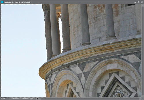
When shooting outdoors, there’s one thing you just can’t count on—the sun. Yet, you surely don’t want to take a photo of your house on a dreary day, or shoot a photo of your car on a gray overcast day. That’s why it’s so important to have the ability to replace a gloomy gray sky with a bright sunny sky. Is it cheating? Yes. Is it easy? You betcha. Do people do it every day? Of course.
Step One:
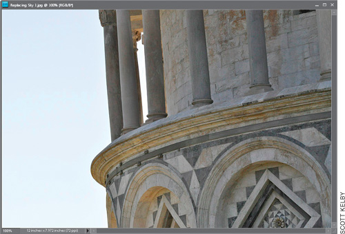
Open the photo that needs a new, brighter, bluer sky.
Step Two:
You have to make a selection around the sky. Usually, you can click in the sky area with the Magic Wand tool (W) or the Quick Selection tool (A) to select most of it, and then choose Similar from the Select menu to select the rest of the sky—but as usual, it likely selected other parts of the image besides just the sky. So use the Lasso tool (L) while pressing-and-holding the Alt (Mac: Option) key to deselect any excess selected areas on your image. If needed, press-and-hold the Shift key while using the Lasso tool to add any unselected areas of the sky. You can use any combination of selection tools you’d like—the key is to select the entire sky area.
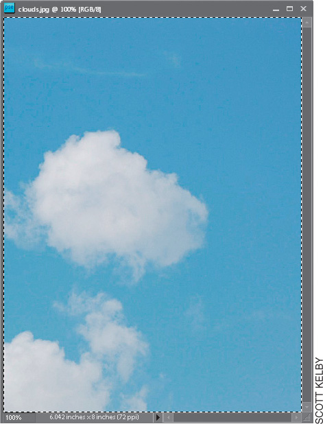
Step Three:
Shoot some nice blue skies and keep them handy for projects like this, or steal a sky from another photo. Simply open one of those “blue sky” shots, and then go under the Select menu and choose All to select the entire photo, or use the Magic Wand, Quick Selection, or Lasso tool as you did in the previous step to select just the sky you want. Then, press Ctrl-C (Mac: Command-C) to copy this sky photo into memory.
Step Four:
Switch back to your original photo (the selection should still be in place). Create a new layer by clicking on the Create a New Layer icon at the bottom of the Layers palette, then go under the Edit menu and choose Paste Into Selection. The new sky will be pasted into the selected area in your new layer, appearing over the old sky. Press Ctrl-D (Mac: Command-D) to Deselect.

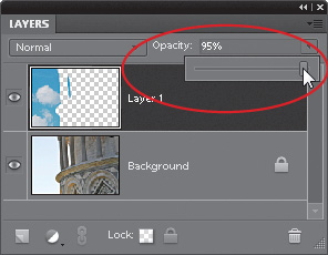
Step Five:
If the sky seems too bright for the photo, simply lower the Opacity of the layer in the Layers palette to help it blend in better with the rest of the photo. That’s it—newer, bluer sky.
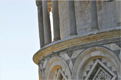
Before
After

One of the most popular lens filters for outdoor photographers is the neutral density gradient filter, because often (especially when shooting scenery, like sunsets) you wind up with a bright sky and a dark foreground. A neutral density gradient lens filter reduces the exposure in the sky by a stop or two, while leaving the ground unchanged (the top of the filter is gray, and it graduates down to transparent at the bottom). Well, if you forgot to use your ND gradient filter when you took the shot, you can create your own ND gradient effect in Photoshop Elements.
Step One:
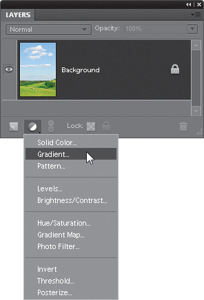
Open the photo (preferably a landscape) where you exposed for the ground, which left the sky too light. Press the letter D to set your Foreground color to black. Then, go to the Layers palette and choose Gradient from the Create New Adjustment Layer pop-up menu (it’s the half-white/half-black circle icon) at the bottom of the palette.
Step Two:
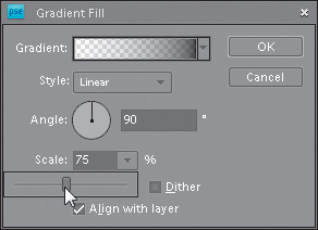
When the Gradient Fill dialog appears, click on the little, black downward-facing arrow (it’s immediately to the right of the Gradient thumbnail) to bring up the Gradient Picker. Double-click on the second gradient in the list, which is the gradient that goes from Foreground to Transparent. Don’t click OK yet.

Step Three:
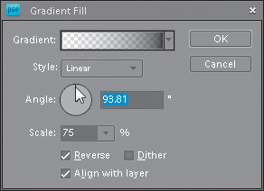
By default, this puts a dark area on the ground (rather than the sky), so turn on the Reverse checkbox to reverse the gradient, putting the dark area of your gradient over the sky and the transparent part over the land. Your image will look pretty awful at this point, but you’ll fix that in the next step, so just click OK.

Step Four:
To make this gradient blend in with your photo, go to the Layers palette and change the blend mode of this adjustment layer from Normal to Overlay. This darkens the sky, but it gradually lightens until it reaches land, and then it slowly disappears. So, how does it know where the ground is? It doesn’t. It puts a gradient across your entire photo, so in the next step, you’ll basically show it where the ground is.

Step Five:
In the Layers palette, double-click on the thumbnail for the Gradient adjustment layer to bring up the Gradient Fill dialog again. To control how far down the darkening will extend from the top of your photo, just click once on the Gradient thumbnail at the top of the dialog. This brings up the Gradient Editor. Grab the top-right white Opacity stop above the gradient ramp near the center of the dialog and drag it to the left; the darkening will “roll up” from the bottom of your photo, so keep dragging to the left until only the sky is affected, and then click OK in the Gradient Editor.

Step Six:
By default, the gradient you choose fills the entire image area, smoothly transitioning from a dark gray at the top center to transparent at the very bottom. It’s a smooth, “soft-step” gradient. However, if you want a quicker change from black to transparent (a hard step between the two), you can lower the Scale amount in the Gradient Fill dialog.
Step Seven:
Also, if the photo you’re working on doesn’t have a perfectly straight horizon line, you might have to use the Angle control by clicking on the line in the center of the Angle circle and dragging slowly in the direction that your horizon is tilted. This literally rotates your gradient, which enables you to have it easily match the angle of your horizon. When it looks good to you, click OK to complete the effect.
Before (exposing for the ground makes the sky too light)
After (the ground is the same, but the sky is now bluer and more intense)

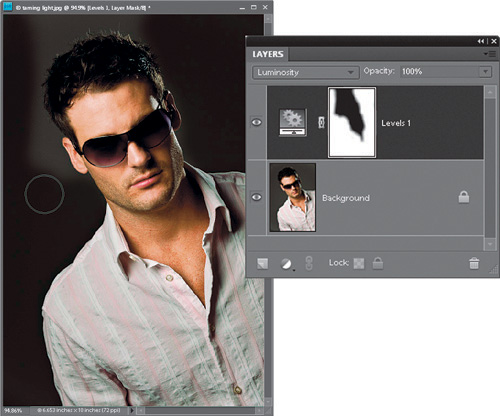
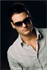
Sometimes the light falls where you don’t want it, and sometimes you just mess up (like in the case here, where not enough attention was paid to the spread of the light, and both the model’s face and shirt share pretty much the same intensity of light. The subject really is the model’s face, and his shirt just plays a supporting role, but it was lit like they’re sharing the starring role). Luckily, it’s pretty easy to tame and refocus the light in Elements.
Step One:
As I mentioned above, here’s the shot where the model’s face and shirt are both equally as bright, which is not a good thing (in fact, his shirt may even be a little brighter, and is drawing your attention away from his face, which is absolutely not what you want). So, we’re going to tame our light using a very simple Levels move. Choose Levels from the Create New Adjustment Layer pop-up menu at the bottom of the Layers palette (as shown here).

Step Two:
The changes I make in the Levels controls of the Adjustments palette will affect the entire photo, but since adjustment layers come with their own built-in layer masks, we’ll be able to tweak things very easily after the fact. At this point, you want to darken the shirt, so drag the middle gray slider (right below the histogram) to the right a bit to darken the midtones (and the shirt), and then drag the bottom-right Output Levels slider to the left a little bit to darken the overall photo. One downside is that this oversaturates the colors quite a bit, which can also draw attention away from the face, but that’s easy to fix.

Step Three:
First, to reduce the oversaturation caused by our Levels move, go to the Layers palette and change the blend mode of the Levels adjustment layer from Normal to Luminosity. This keeps the darkening without oversaturating the color. Next, press Ctrl-I (Mac: Command-I) to Invert the layer mask, which hides the darkening added by our Levels move behind a black mask. Now, get the Brush tool (B), press X to set your Foreground color to white, then with the layer mask active, paint over everything in the photo except for his face, chest, and hair. As you paint, it darkens those areas (as shown here, where I’m darkening the background, so now the model’s face is the focus).
Before (the shirt has at least as much or more light than the model’s face)

After (everything else is darkened, leaving the model’s face nicely lit and making it the visual focus of the portrait)
Here’s a great way to blend multiple photos together to create a photo montage (often referred to as a collage).
Step One:
Open the photo that you want to use as your base photo—this will serve as the background of your collage. (Note: Make sure you have the Allow Floating Documents in Full Edit Mode checkbox turned on in your General Preferences, found under the Edit menu on a PC or the Photoshop Elements menu on a Mac.) Now, open the first photo that you want to collage with your background photo.
Step Two:
Press V to switch to the Move tool, and then click-and-drag the photo from this document right onto your background photo, positioning it where you want it. It will appear on its own layer (Layer 1) in the Layers palette of your background image.
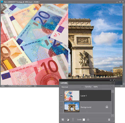
Step Three:
Press-and-hold the Ctrl (Mac: Command) key and, at the bottom of the Layers palette, click on the Create a New Layer icon. This creates a layer directly beneath your current layer (Layer 1). Now, click back on the top layer, then press Ctrl-G (Mac: Command-G) to group your photo with the blank layer beneath it and create a clipping mask. Press the letter D to set your Foreground color to black.

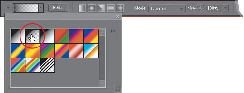
Step Four:
Switch to the Gradient tool by pressing G, and then press Enter (Mac: Return) to bring up the Gradient Picker (it appears below the Gradient thumbnail in the Options Bar). Choose the second gradient in the Picker (this is the Foreground to Transparent gradient) and press Enter again to close the Picker.
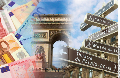
Step Five:
Click on the middle (blank) layer in the Layers palette to make it active. Although you can’t see your top photo, try to click the Gradient tool near the center of this photo and drag toward the center of the document. The point where you first clicked on the top layer will be at 100% opacity, and the point where you stopped dragging will be totally transparent. Everything else will blend in between. If you want to start over—easy enough—just press Ctrl-Z (Mac: Command-Z) to Undo and click-and-drag again. (Be careful: If you drag beyond the image’s border, your Foreground color will appear in the gradient.)

Step Six:
If you want to blend in another photo, click-and-drag that image onto your montage, click on the top layer in the Layers palette, then start again from Step Three. Add as many images as you’d like.
One of the questions I get asked most about my portraits is how do they look so sharp, but at the same time have a soft quality to them? It’s because for all portraits of women, children, or families, I apply a three-step Photoshop Elements finishing technique that does the trick. It actually combines two techniques you’ve already learned, and introduces a third. They’re all exceedingly easy—it’s just the order you do them in, and the settings you use. Here’s exactly what I do:
Step One:
Once you’ve color corrected the photo, done any retouching, etc., that’s when you add these three finishing steps. The first step is to add a lot of sharpening to the photo (because in the second step, you’re going to blur the entire photo). I always use luminosity sharpening for this, so start by pressing Ctrl-J (Mac: Command-J) to duplicate the Background layer. Then, go under the Enhance menu and choose Unsharp Mask. The settings I use are pretty strong—Amount: 120%, Radius: 1, and Threshold: 3—but you generally need it. With a small, low-resolution file like this, you might need to lower the Amount to 80%. Click OK.

SCOTT KELBY
Step Two:
Now go to the Layers palette and change the layer blend mode of this sharpened layer to Luminosity (as shown here), so your sharpening is applied to just the luminosity (lightness details) of the photo, not the color areas. Doing this allows you to apply more sharpening to the photo without getting unwanted halos. Next, press Ctrl-E (Mac: Command-E) to merge this layer down into the Background layer.

Step Three:
Duplicate the Background layer again, then you’re going to apply a pretty significant Gaussian Blur to this layer. So, go under the Filter menu, under Blur, and choose Gaussian Blur. When the dialog appears, enter 6 pixels for a low-res photo (for a regular high-res digital camera file, use 20 pixels), then click OK to apply the blur to this layer.

Step Four:
Now, in the Layers palette, lower the layer Opacity of this blurry layer to just 20% (as shown here), which gives the photo almost a glow quality to it, but the glow is subtle enough that you don’t lose sharpness (look at the detail in the hair and eyes).

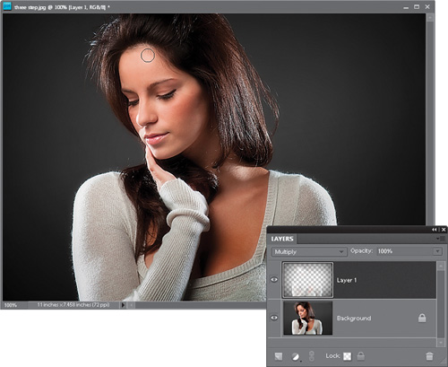
Step Five:
Press Ctrl-E again to merge those two layers together and flatten the photo. Now, you’re going to add an edge vignette effect (which looks great for portraits), so start by duplicating the Background layer again. Once you duplicate the layer, change the blend mode of the layer to Multiply (which makes the layer much darker). Then get the Rectangular Marquee tool (M) and draw a rectangular selection that is about ½″ to 1″ inside the edges of your photo (as shown here).

Step Six:
Now you’re going to majorly soften the edges of your rectangular selection, so go under the Select menu and choose Refine Edge to bring up the Refine Edge dialog (shown here). Below the three sliders, click on the icon on the left, so you view your photo as a full-color composite image (as shown here). Now, to soften the edges, drag the Feather slider all the way to 100 pixels (if you’re using a high-res file, feather it 200 pixels), and click OK. One advantage of this Refine Edge dialog is you can see the amount of feathering as you move the slider. Now press the Backspace (Mac: Delete) key on your keyboard to knock a soft-edged hole out of your darker Multiply layer (as seen here).

Step Seven:
Press Ctrl-D (Mac: Command-D) to Deselect, and you’ll see the effect is like a really soft spotlight aimed at your subject. If the edge darkening actually is close enough to their face to matter, get the Eraser tool (E), choose a soft-edged brush, and simply paint over the top of the head and hair (as shown here) to remove the edge vignetting in just that area. The final photo is seen on the next page. Notice the general overall sharpness, but there’s also a general overall softness, enhanced even more by that soft spotlight vignette you added at the end.
Before

After (applying all three steps)

The duotone tinting look is all the rage right now, but creating a real two-color duotone, complete with curves, that will separate in just two colors on press is a bit of a chore. However, if you’re outputting to an inkjet printer, or to a printing press as a full-color job, then you don’t need all that complicated stuff—you can create a fake duotone that looks at least as good (if not better).
Step One:
Open the color RGB photo that you want to convert into a duotone (again, I’m calling it a duotone, but we’re going to stay in RGB mode the whole time). Now, the hard part of this is choosing which color to make your duotone. I always see other people’s duotones, and think, “Yeah, that’s the color I want!” but when I go to the Foreground color swatch and try to create a similar color in the Color Picker, it’s always hit or miss (usually miss). That’s why you’ll want to know this next trick.

Step Two:
If you can find another duotone photo that has a color you like, you’re set. So I usually go to a stock-photo website (like iStockphoto.com) and search for “duotones.” When I find one I like, I return to Elements, press I to get the Eyedropper tool, click-and-hold anywhere within my image area, and then (while keeping the mouse button held down) I drag my cursor outside Elements and onto the photo in my Web browser to sample the color I want. Now, mind you, I did not and would not take a single pixel from someone else’s photo—I’m just sampling a color.

Step Three:
Return to your image in Elements. Go to the Layers palette and click on the Create a New Layer icon. Then, press Alt-Backspace (Mac: Option-Delete) to fill this new blank layer with your sampled color. The color will fill your image area, hiding your photo, but we’ll fix that.

Step Four:
While still in the Layers palette, change the blend mode of this sampled color layer to Color.

Step Five:
If your duotone seems too dark, you can lessen the effect by clicking on the Background layer, and then going under the Enhance menu, under Adjust Color, and choosing Remove Color. This removes the color from your RGB photo without changing its color mode, while lightening the overall image. Pretty sneaky, eh?

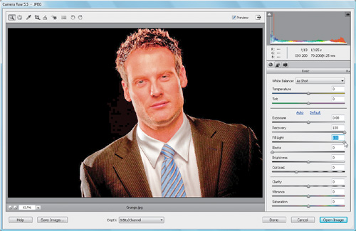
Here’s an effect that has taken the photography community by storm. It gives a photo a very surreal, almost illustrative effect, and looks pretty darn cool when applied to the right photo. The best part about it is that you can do it all in Camera Raw.
Step One:
Open a photo in Camera Raw. It can be a RAW photo, or even a TIFF or JPEG (see Chapter 2 to find out how to open non-RAW files in Camera Raw). Keep in mind, though, that the photo should be the kind that will look good when it has a very edgy effect applied to it. Photos with dramatic lighting, sports photos, senior portraits, cars, and certain landscapes will work really well. Photos of babies and tiny, soft, fluffy puppies probably won’t look so good with this effect applied to it.

Step Two:
Leave Exposure and Blacks alone for now—we’ll fine tune those last. First, take your Recovery slider and crank it up to 100. Do the same for Fill Light. You should already have a very odd effect in the making.
Step Three:
Now try taking the Clarity setting all the way up to 100. Are you seeing a pattern here? Next take the Vibrance slider and move it to, you guessed it, 100. Then move the Contrast slider to 100.
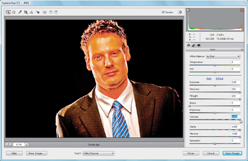
Step Four:
Now you’ve probably got a really odd- looking photo. Well one of the things that characterizes this effect is a desaturated look. To achieve that, try dragging the Saturation slider toward the left. You don’t want to go to −100 but somewhere between −60 and −70 should do the trick.

Step Five:
Finally, the photo should be pretty flat, so trying increasing the blacks just to add a little more contrast here. I’ve found that a setting around 25–40 (I used 35 here) usually works well, but don’t go much higher. You still want a lot of that detail in the shadowy areas to show through. If you find the photo is too light or too dark, then try adjusting the Exposure as a final step here, but again, not too much.

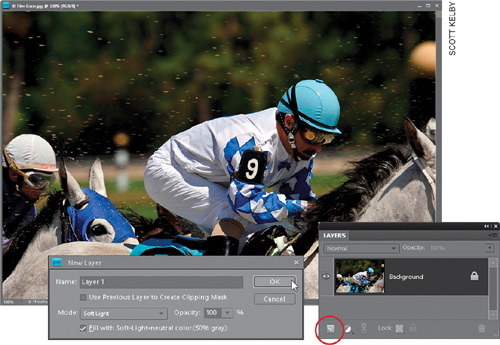
There’s a big difference between digital noise and film grain. Digital noise (those red, green, and blue dots that appear when shooting at high ISOs) is what we want to avoid (or, at the very least, make less noticeable), because it ruins the image. However, simulating the look of traditional film grain (which doesn’t have those colored dots) is really becoming a popular effect. In fact, there are third-party plug-ins you can buy that specialize in recreating it, but I still do it myself, right in Elements (but I don’t use the lame Film Grain filter, which to me never actually looks like film grain). Here’s what I do:
Step One:
Open the photo that you want to add a film grain look to. Go to the Layers palette and Ctrl-click (Mac: Option-click) on the Create a New Layer icon at the bottom of the palette to access the New Layer dialog. When the dialog appears, choose Soft Light from the Mode pop-up menu. When you choose Soft Light, you’ll see the Fill with Soft-Light-Neutral Color (50% Gray) option (right under the Mode pop-up menu) is now available. Turn on its checkbox and click OK.
Step Two:
This creates a new blank layer filled with gray, but because you set the Mode to Soft Light first, this layer will be see-through. So, if it’s see-through, why did we need it in the first place? Well, it’s because some filters in Elements won’t run on an empty transparent layer (you’d get a “there’s nothing there” warning). So, this way, it fools the filter into working, and then we can not only apply the filter to a transparent layer, we can control it after the fact. Sneaky. I know.

Step Three:
Now, go under the Filter menu, under Noise, and choose Add Noise. When the Add Noise filter dialog appears, we want to make sure that the noise we add doesn’t have little red, green, and blue dots, so first choose Gaussian as your Distribution method, then turn on the Monochromatic checkbox at the bottom. Now, lower your Amount to around 4% (or 5% for 12-megapixel images), then click OK. This applies a noise pattern to your gray layer, and since this layer is transparent, you now see this film-grain-like look on your photo (if you don’t see it right away—zoom in to 50% or 100%).

Step Four:
If the simulated film grain effect looks a bit too heavy, you can lower the Opacity of this noise layer in the Layers palette, until it blends in nicely (you are supposed to actually see the noise). Also, if you’re going to be making a print of this image, let the grain be a little heavier onscreen, because when you print it, much of that grain will be hidden in the printing process. So, if I know I’m going to be printing, I go a little heavier with the Opacity amount, or even go back and redo it with a higher Amount setting (like 5% or 6%, which I did for this example) in the Add Noise filter. If you really want to make the noise more apparent (for effect), in the Layers palette, change the Layer Blend mode of this layer to Overlay (also done here), and it will become much more pronounced (again, don’t forget you can control it afterwards using the Opacity slider on that layer). By the way, Overlay mode supports the whole “gray is transparent” trick, too! That’s it—simulated film grain made easy.