Photographer: Matt Kloskowski
Exposure: 1/30
Focal Length: 24mm
Aperture Value: ƒ/22
At some point in all of this, you’re eventually going to want to show your client, or more likely a potential client, samples (or even finished products) of your work. Make sure you work on this part of the process long before your client is within 100 miles of your studio because (and this is a little-known fact) hard-wired into your color inkjet printer is a small integrated chip that actually senses fear. That’s right—if you’re on a tight deadline, and you have to get your samples out of the printer right before your client arrives, the tiny electrodes in the chip sense your fear, and as a defense mechanism, it releases millions of tiny silicon wafers into your printer’s USB port, which causes your printer to basically go into sort of a prolonged hibernation mode which makes it just sit there and quietly hum. This auto-sleep or shut down mode is called “mocking mode” and is the digital equivalent of a small child giving you a raspberry. The more freaked out or rushed you get, the more of those tiny silicon wafers it releases, and the sleepier your printer becomes until it gets to the point that it has the operating functionality of a block of cheese. Now, you can fool your printer into printing again, but it’s not easy. First, you have to continue to act freaked out, but when the printer’s not paying attention you sneak out of the room and use your cell phone to call the studio phone nearest the printer. Once it starts ringing, you rush into the studio, and looking exasperated, you grab the phone and pretend it’s the client on the line, and they’re calling to cancel today’s appointment. When your printer hears this (and trust me, this is true), it will instantly start outputting your prints. Try this—it works every time.
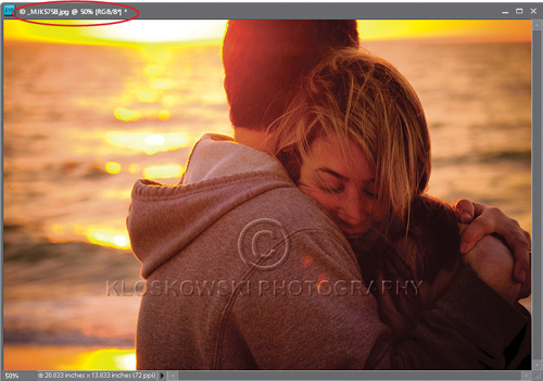
This two-part technique is particularly important if you’re putting your photos on the Web and want some level of copyright protection. In the first part of this technique, you’ll add a see-through watermark, so you can post larger photos without fear of having someone download and print them. Secondly, you’ll embed your personal copyright info, so if your photos are used anywhere on the Web, your copyright info will go right along with the file.
Step One:
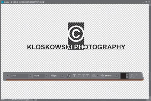
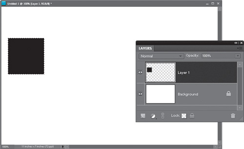
We’re going to start by creating a watermark template. Create a new blank document in the Elements Editor (go to File, under New, and choose Blank File) in RGB mode in your typical working resolution (72 ppi for low-res, 300 ppi for high-res, etc.). Click on the Foreground color swatch at the bottom of the Toolbox and choose a medium gray color in the Color Picker, then click OK. Now, press Alt-Backspace (Mac: Option-Delete) to fill the Background layer with medium gray. Press the letter D to set your Foreground color to black.
Step Two:
Press T to switch to the Horizontal Type tool. In the Options Bar, choose a font like Arial Bold from the font pop-up menus, and then click on the Align icon and choose Center Text from the pop-up menu. Click the cursor on the gray background, press-and-hold the Alt key, type “0169” using your numeric keypad, and release the Alt key to create a copyright symbol. (Note: On a laptop, press-and-hold the Function key to access your key-pad. On a Mac, press Option-G.) Then, press Enter (Mac: Return) to move your cursor to the next line and type the name you want for the copyright on the photo. If needed, adjust the leading (space between lines) by selecting all your text (Ctrl-A [Mac: Command-A]) and choosing a point size in the Set the Leading pop-up menu in the Options Bar. Now hide the Background layer by clicking on its Eye icon in the Layers palette.

Step Three:
Highlight your name (but not the copyright symbol) with the Horizontal Type tool and increase its size by using the Set the Font Size pop-up menu in the Options Bar. When your name is at the right size, highlight just the copyright symbol instead, and resize it upward until it’s quite a bit larger than your name. Try the type at around 50 points (unless your last name is huge, like mine, then you may need to go with something smaller) and the copyright symbol at 150 points. When you’re done, click the green Commit checkmark in the Options Bar.
Step Four:
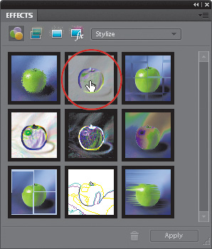
Go to the Effects palette (if it’s not visible, go under the Window menu and choose Effects), and from the palette’s flyout menu, choose Large Thumbnail View. At the top of the palette, click on the Filters icon (the first icon on the left). In the pop-up menu in the palette’s upper right-hand corner, choose Stylize. Now double-click on the Emboss effect (as shown here). A warning dialog will appear letting you know that the Type layer must be simplified. Click OK.
Step Five:
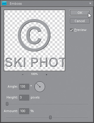
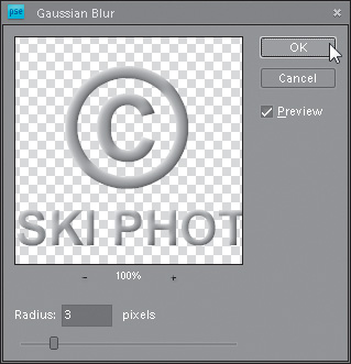
In the resulting Emboss dialog, set the Angle to 135°, Height to 3 pixels, and Amount to 100%. Click OK, and this will apply a beveled effect. To smooth the edges of the Type layer, go to the Layers palette and click on the Lock Transparent Pixels icon at the bottom of the palette (the second icon from the right). Then, from the Filter menu, choose Blur, and add a 2- or 3-pixel Gaussian Blur.
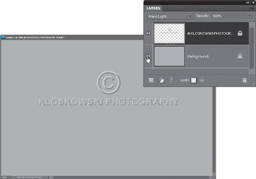
Step Six:
Go back to the Layers palette and change the blend mode of this Type layer from Normal to Hard Light. This will make the watermark transparent. Now you can make the Background layer visible again by clicking in the empty box where the Eye icon used to be. You can now see the Emboss and blurring effects clearly.
Step Seven:
Open the photo you want to contain this transparent watermark. Make sure this photo and the document with your embossed watermark are both visible within Elements (if not, go under the Window menu, under Images, and choose Float All in Windows).

Step Eight:
Press V to switch to the Move tool, then click-and-drag the watermark’s Type layer from the Layers palette (in the embossed watermark document) and drop it onto your photo (you’re dragging a layer between documents). Once the watermark is in your new document, you can resize it as needed. Just press Ctrl-T (Mac: Command-T) to bring up Free Transform and click-and-drag one of the corner handles. Add the Shift key to resize the type proportionately, or turn on the Constrain Proportions checkbox in the Options Bar. Press Enter (Mac: Return) to complete your transformation.

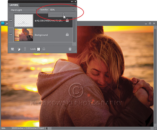
Step Nine:
Now go to the Layers palette and lower the Opacity of your Type layer so it’s clearly visible, but doesn’t dominate the photo. Press Ctrl-E (Mac: Command-E) to flatten the image.
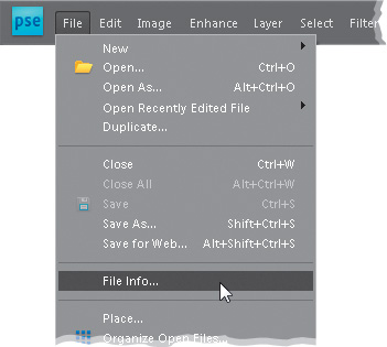
Step 10:
Now for the second part—we’ll embed your personal copyright info into the photo file itself. Go under the File menu and choose File Info. This is where you enter information that you want embedded. This embedding of info is supported by all the major file formats (such as TIFF, JPEG, EPS, PDF, and Elements’ native PSD file format).
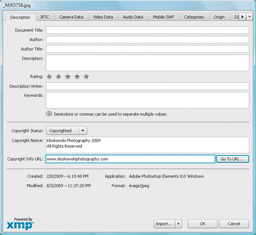
Step 11:
In the dialog, click on the Description tab, and change the Copyright Status pop-up menu from Unknown to Copyrighted. In the Copyright Notice field, enter your personal copyright info, and then in the Copyright Info URL field, enter your full Web address. That way, when others open your file in Elements, they can go to File Info, click on the Go To URL button, and it will launch their Web browser and take them directly to your site.
Step 12:
Click OK and the info is embedded into the file. Once copyright info has been embedded into a file, Elements automatically adds a copyright symbol before the file’s name, which appears in the photo’s title bar. That’s it—you applied two levels of protection: one visible and one embedded.
One way to personalize your work and make it less “computerish” is to add your own signature to it. In Elements, there’s a way to create a custom brush of your signature so that it’s always just a click away. When you’re done and ready to sign, you just grab the Brush tool, choose your signature brush, click once, and it’s there.
Step One:
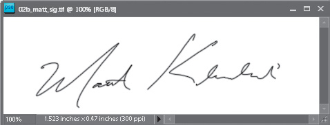
The first step to all this is getting your signature into Elements. There are basically two ways: (1) take a nice black writing pen, sign your name fairly large on a piece of paper, and then scan your signature (which is what I did here), or (2) if you have a Wacom tablet with its wireless pen, just open a new document (at a resolution of 300 ppi), press D to set your Foreground color to black, get the Brush tool (B), then choose a small, hard-edged brush from the Brush Picker, and sign your name at a fairly large size.
Step Two:
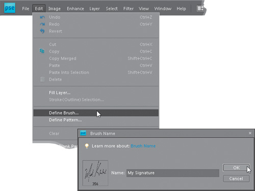
Now go under the Edit menu and choose Define Brush. This brings up the Brush Name dialog (shown here), where you give your new signature brush a name (I named mine “My Signature,” which is a carefully thought out, highly original name) and click OK. That’s all there is to creating your signature brush, and the nice thing is you only have to do this once—it’s saved into Elements’ Brush Presets for use in the future. Now let’s put this new signature brush to use.
Step Three:
When you want to apply your signature to a photo, open that photo and get the Brush tool (B). Right-click anywhere inside your image area, and the Brush Picker will appear right at the location of your cursor (as seen here). The new signature brush you just created in Step Two will appear as the last brush in the list of brushes, so scroll all the way down to the bottom, and click on that very last brush (you’ll see a tiny version of your signature as the brush’s thumbnail).
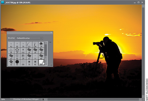
Step Four:
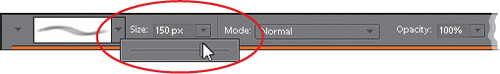
By default, the brush will be the size it was when you created your Brush preset, so if you need to change the size of your brush, just drag the Size slider in the Options Bar (shown circled here in red). In my case, I needed to drag that slider to the left to make the brush much smaller, because if you look directly under the thumbnail, it shows your brush’s size in pixels, and mine was 356 pixels. Kinda big, don’tcha think?
Step Five:
Now that you’ve got your signature brush, and have adjusted the size, go to the Layers palette and click on the Create a New Layer icon at the bottom. In our example here, the photo has a dark foreground so I’ll have to change my Foreground color from black to something easily seen on a dark foreground (in this case, I just pressed X and changed it to white). Then, take the brush and simply click once where you want the signature to appear (as shown here, where I clicked in the bottom-right corner), and press Ctrl-E (Mac: Command-E) to flatten your image.

I’ve often joked that we’re now one click away from becoming a Sears Portrait Studio since Adobe invented the Picture Package feature, which lets you gang-print standard, common photo sizes together on one sheet. With Picture Package, Elements does all the work for you. All you have to do is open the photo you want gang-printed, and then Elements will take it from there—except for the manual cutting of the final print, which is actually beyond Elements’ capabilities. So far.
Step One:
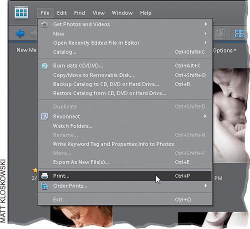
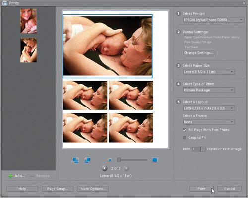
Select the photo in the Elements Organizer that you want to appear in multiple sizes on one page, and then go under the File menu and choose Print.
Note: On a Mac, this feature works a little differently. For a quick explanation, see the end of this tutorial.
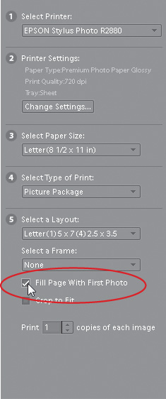
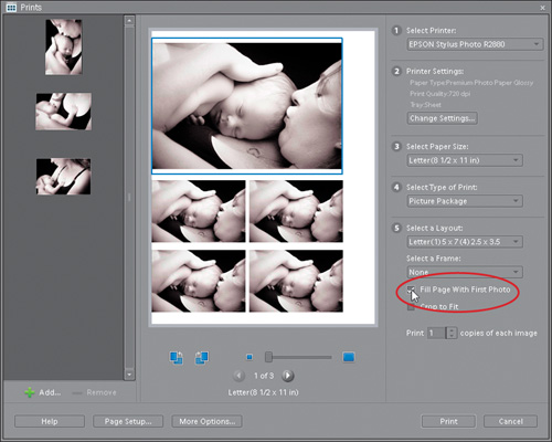
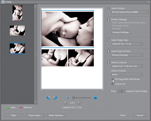
Step Two:
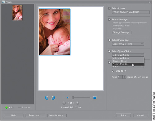
When the dialog appears, on the right-hand side, choose which printer you want to use. Then in section 4, choose Picture Package from the pop-up menu. (Note: For more info on your printer settings [section 2], see Chapter 12.)
Step Three:
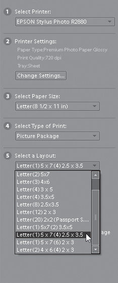
In the fifth section down, choose the sizes and layout for your Picture Package from the Select a Layout pop-up menu. In this example, I chose Letter (1) 5×7 (4) 2.5×3.5, but you can choose any combination you like.
Step Four:
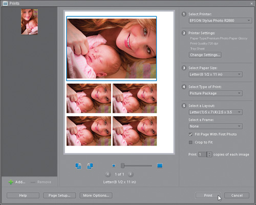
Even though you’ve chosen a multi-photo layout, only one photo will appear in the layout preview in the center of the dialog, so you’ll need to turn on the Fill Page With First Photo checkbox to place your image multiple times.
Step Five:
When you turn on the Fill Page With First Photo checkbox, Elements automatically resizes, rotates, and compiles your photo into one page that you can then print and cut. This is a simple use of Picture Package, but it’s actually more flexible than it looks, as you’ll see in the next steps. (Note: When you click Print, you may get a printing warning letting you know that the image will be rendered at less than 220 dpi at the requested print size. Just click Continue.)
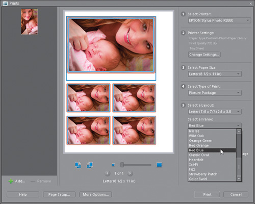
Step Six:
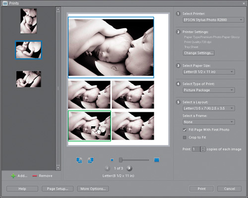
Another option you have is to add a custom frame around the photo in your Picture Package. To add a frame, just choose one from the Select a Frame pop-up menu and your choice will be immediately reflected in the preview.
Step Seven:
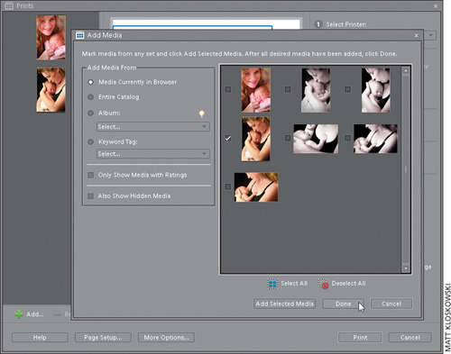
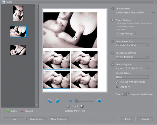
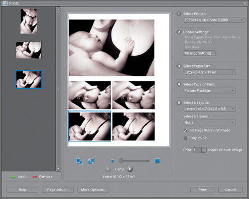
If you’d like to create more Picture Package layouts using your same settings, all you have to do is import another photo. You do that by first clicking on the Add button near the bottom left-hand corner of the dialog. This brings up the Add Media dialog, where you can find the photo you want to import from the Media Browser, your Catalog, etc. (Here I chose to add another photo from this shoot.) Just turn on the check-box to the left of the image’s thumbnail in the dialog, and click Add Selected Media. Once imported, a small thumbnail of your photo(s) will appear in the list of photos on the left side of the Prints dialog (you can see here that I added one more photo). When you’re finished adding photos, click Done.
Step Eight:
To see the layout with your new photo, click the right-facing arrow button just below the large preview in the center of the dialog. It will toggle you to a layout for your second photo. If you import several photos, you’ll be able to toggle to a layout for each photo.
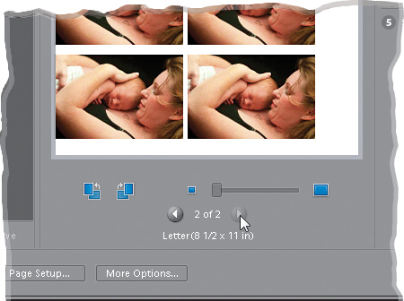
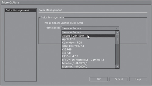
Step Nine:
If you’re a more advanced user who understands Color Management options and assigning color profiles, you can click on the More Options button, located directly below the preview, and assign a color space to your photos before printing. But if you’re not comfortable making these choices, just skip the More Options button (or check out Chapter 12 for more on Color Management).
Step 10:
Click Print for your additional Picture Package output.
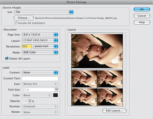
Picture Package on the Mac is a little different. You’ll start at the File menu in the Editor and choose Picture Package. It’s all in one dialog, and you basically work from the top down. First, you select the photo you want to create a Picture Package from. Then, in the Document section, select what size paper you’re going to print on, and choose your layout. Finally, under Label, you can choose to add the filename of the photo, copyright, or title of the image (plus a few other choices) from the Content pop-up menu. You can also specify what size and color text you want that information to print in. If you want to change the image sizes in the layout or create a new layout, click the Edit Layout button below the preview. That’s pretty much it. Click OK, and you’ll have a Picture Package ready before you know it.
Although the Picture Package feature is most often used for printing one photo multiple times on the same page, you can substitute different photos in different positions, and you can customize their location. Here’s how:
Step One:
Once you have the Prints dialog open and you’ve selected Picture Package as your type of print (see previous tutorial), click the Add button (near the bottom left-hand corner of the dialog) to add additional photos from the Media Browser, your Catalog, etc., until you have a row of thumbnails appearing down the left side of the dialog. Make sure the Fill Page With First Photo check-box (found on the right side of the dialog, just below the Select a Frame pop-up menu) is turned on.
Step Two:
To add a new photo to your Picture Package layout, just click on the image’s thumbnail on the left and drag-and-drop it onto the preview area in the center of the dialog on the position you want it to appear. (Note: As you drag, you’ll notice a highlight around the preset picture position in the preview area.)
Step Three:
If you want to move a photo to another position, just click directly on the photo in the preview area and drag it to a new position. It will automatically resize if necessary.
Step Four:
You can have as many different photos as you have positions in your layout, so just continue dragging-and-dropping thumbnails from the left side of the dialog into position within the preview area.
Step Five:
If you’d prefer to just have all your imported photos appear on the page at once (rather than dragging-and-dropping them), turn off the Fill Page With First Photo checkbox and all imported photos on the left of the dialog will automatically flow into place.
Before we get going, I’ve separated this tutorial into two parts: Part 1 is about making a full-blown PDF Presentation, where you get total control over everything. If you’re the impatient type, though, and you just want a quick PDF slide show for email, then check out Part 2. It doesn’t have as many options, but it gets you there in just a couple of clicks. (Note: If you’re using a Mac, this is done through Bridge, so it’s covered in the online chapter mentioned in the book’s introduction.)
Part 1: Creating a Real PDF Presentation (with More Control Over the Presentation Part)
Step One:
Open the photos you want to use in your PDF presentation in the Editor, click on the Create tab at the top of the Palette Bin, and then click on the Slide Show button. (Note: You can also Ctrl-click images in the Organizer, and then click the Create tab, and then the Slide Show button.)
Step Two:
This brings up the Slide Show Preferences dialog, where you choose various options for your slide show. In this case, let’s go with the default settings, so click the OK button near the bottom-right corner of the dialog.
Step Three:
Clicking OK brings up yet another dialog. At the bottom of the dialog are thumbnails of all the photos that will be included in your slide show. The thumbnails are arranged in the order in which they’ll appear, but to change the order, just click-and-drag a thumbnail to where you’d like it to appear. If you want to remove an image, Right-click on its thumbnail and choose Delete Slide from the contextual menu. To add an image, click on the Add Media button in the top center of the dialog, choose Photos and Videos from Elements Organizer or Photos and Videos from Folder, and browse for your image.
Step Four:
By default, Elements will provide a Fade transition between your slides, but you may want some variety. To choose a different transition, click on the tiny, right-facing arrow to the right of any transition’s icon and select a new transition from the pop-up menu that appears. To play it safe, choose something that nearly always works, like Dissolve. To apply this to all of your slides, choose Apply to All from the same menu.
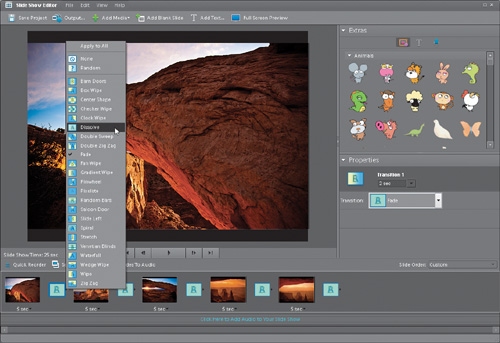
Step Five:
Along the right side of the dialog, in the Properties palette, you can customize your active slide by changing its background color, enabling effects, etc. In the Extras palette, you can add graphics, text, or narration, but since we’re doing a simple PDF slide show here, I left the settings at their defaults and clicked the Output button near the top left of the dialog (to learn more about the Slide Show extras, see “Making Full-Blown Slide Shows” later in this chapter).
Step Six:
This brings up the Slide Show Output dialog, where you can save your slide show as a PDF. Choose Save As a File from the list of options on the left, and then on the right side of the dialog, click on the PDF File radio button. Here’s where you choose your slides’ settings. I like to use Small (800×600), but you can choose any size you’d like from the Slide Size pop-up menu (or enter your own preferred size by choosing Custom from the menu). Click OK, choose where you want to save your PDF, and Elements will create a PDF file that’s ready for you to email to your client.
Step Seven:
When your client opens your emailed PDF, it automatically launches Adobe Reader in Full Screen mode (your photos appear centered on a black background), and the presentation begins. The capture here shows the second slide in the PDF presentation in Full Screen mode, right before it transitioned to the next photo. (Note: If for some strange reason your client/friend doesn’t have Adobe Reader installed, he or she can download it free from Adobe’s site at www.adobe.com.)
Part 2: Creating a Quick PDF Slide Show to Email (with No Control Over the Presentation)
Step One:
Here’s the no-frills way of creating a PDF slide show if you want something quick and don’t care about things like how long each slide stays up and the transitions you get in between each photo. First, select the photos you want in your slide show by Ctrl-clicking on them in the Organizer. Then click on the Share tab, and click on the More Options button. Choose PDF Slide Show (as shown here) from the list that pops up.
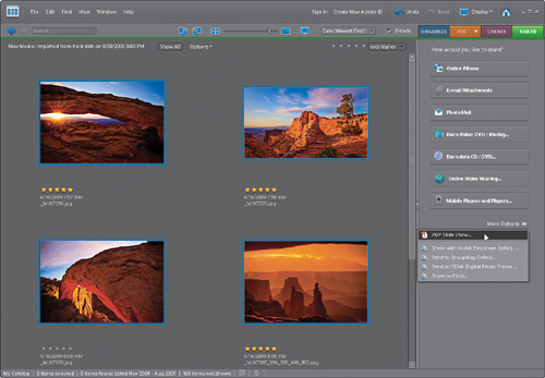
Step Two:
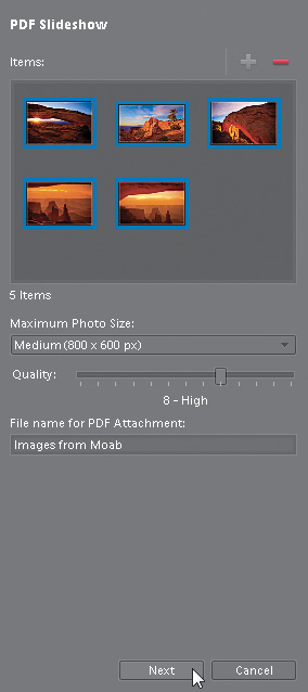
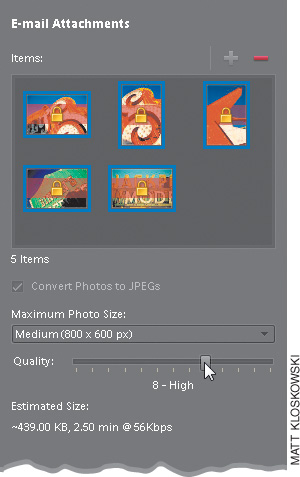
The first time you do this, you will get a dialog asking you to choose your email client. Choose it from the pop-up menu and click Continue. The PDF Slideshow pane will open on the right side of the Organizer. The only settings you get here are how large (Maximum Photo Size) you want the PDF to be and the Quality setting. Here, I’ve chosen the same size as in the other tutorial (800×600 px) and 8-High for the Quality setting. Give your PDF a descriptive name and click Next.
Step Three:
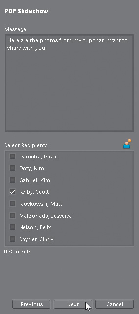
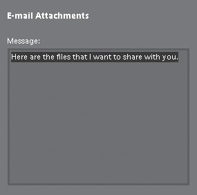
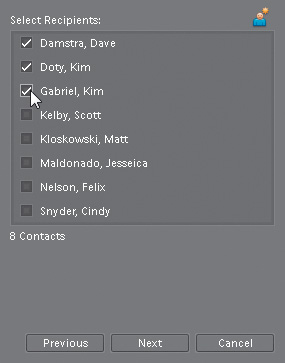
When the next pane opens, feel free to add a custom message to your email using the Message section at the top. Then choose who you want to send this PDF to under Select Recipients. If you’ve already set up your contacts, then turn on the checkbox next to their name(s). If you haven’t, then click on the Edit Recipients in Contact Book button at the top right of the section to add a contact to the list. Finally, click Next, and the PDF automatically will be generated and placed into an email. All you have to do is hit Send in your email program, and your recipients will receive a PDF in their email. When they open it, the PDF will open in Full Screen mode, just like it would in Part 1.
Believe it or not, this is one of those most-asked questions, and I guess it’s because there are no official guidelines for emailing photos. Perhaps there should be, because there are photographers who routinely send me high-res photos that: (a) get bounced back to them because of size restrictions, (b) take all day to download, or (c) never get here at all because there are no official guidelines on how to email photos. In the absence of such rules, consider these the “official” unofficial rules.
Step One:
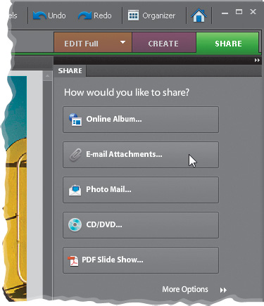
Open the photos that you want to email in the Elements Editor. Above the Palette Bin, click on the Share tab and then click on E-mail Attachments. (Note: You may get an E-mail dialog asking you to choose an email client as your default. Choose your email client [Microsoft Outlook, etc.] from the pop-up menu and click Continue. On a Mac, your email client will launch and the photos will be inserted into a new message, ready to send.)
Step Two:
This opens the Organizer, with your photos appearing in the E-mail Attachments Items bin. Choose the size at which you’d like to send your images. You also get to choose a Quality setting. Remember: The higher the quality, the larger your file size will be, so try to find a happy medium. Try a 7 or an 8. Only go higher if you know the person to whom you’re emailing these photos has a high-speed Internet connection. Now click the Next button.
Step Three:
If you’d like to add a message to your email, enter that in the Message section at the top of the pane.
Step Four:
In the next section, you choose who you want to email these photos to. (Adobe calls this simple task Select Recipients, because that makes it sound significantly more complicated and confusing.) To choose who will receive your photos by email, click in the checkbox beside the contacts (who are in your Contact Book. If a contact isn’t in the list, click on the Edit Recipients in Contact Book button at the top right of the section to add a contact to the list).
Step Five:
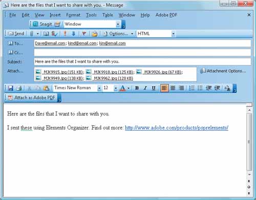
Once your options are set, click the Next button in the bottom of the pane. Clicking Next launches your default email application, and your photos and message are automatically attached. All that’s left to do now is click the Send button and they’re on their way.
This technique is the perfect thing to do once you’re done with a photo and are getting ready to have it printed and framed. It gives you the layout of a pro-quality poster and it’s really easy to do.
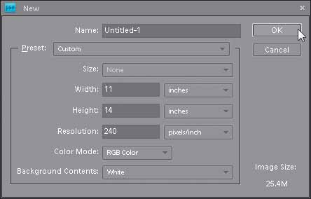
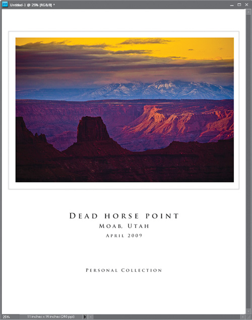
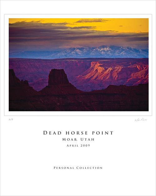
Step One:
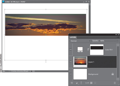
In the Elements Editor, press Ctrl-N (Mac: Command-N) to create a new document in the size you want for your fine art poster layout (in our example here, I’m creating a standard-sized 11×14″ print). Set your resolution to 240 ppi (for color inkjet printing), then click OK to create your new blank document.
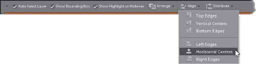
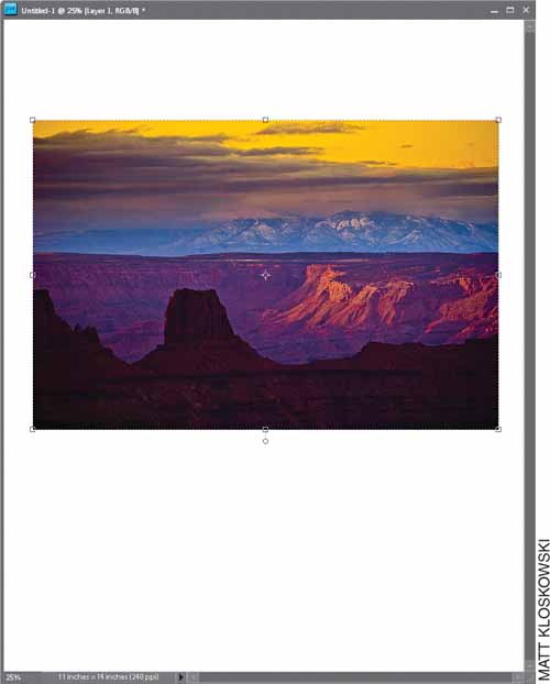
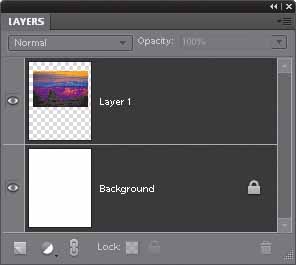
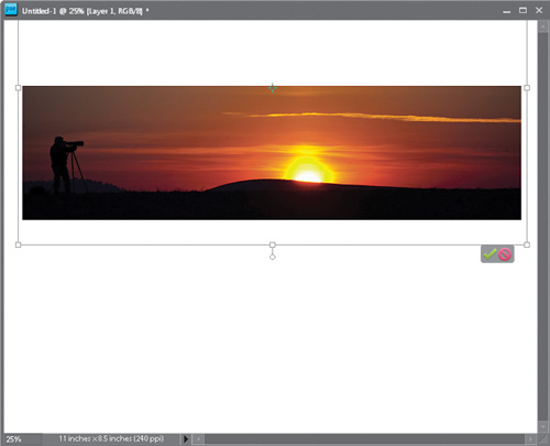
Step Two:
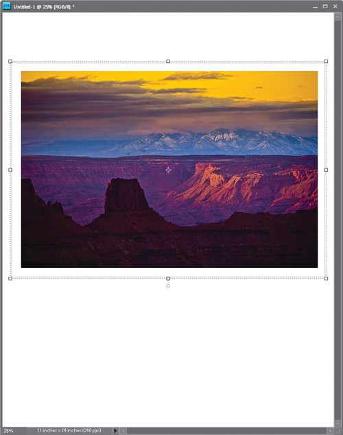
Open the photo you want to feature in your fine art poster layout. Get the Move tool (V) and click-and-drag that photo over into your fine art poster layout. Press Ctrl-T (Mac: Command-T) to bring up Free Transform. Grab a corner handle, drag inward or outward to size the photo so it fits within your layout like the photo shown here, and then press Enter (Mac: Return) to complete your transformation. To perfectly center your photo within the document, in the Layers palette, click on the Background layer, press-and-hold the Ctrl (Mac: Command) key, and then click on the photo layer to select both layers. Then go up to the Options Bar, click on the Align button, and choose Horizontal Centers from the pop-up menu to center the photo side-to-side (as shown here).
Step Three:
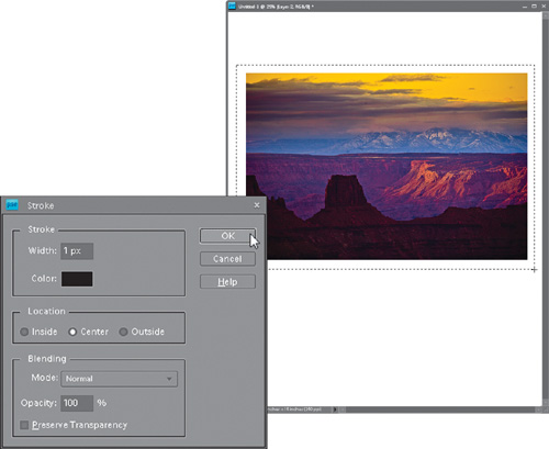
With the Background layer selected, click on the Create a New Layer icon at the bottom of the Layers palette to create a new blank layer between your two layers, then get the Rectangular Marquee tool (M) and click-and-drag out a selection that is about ¼″ larger than your photo (as shown here). You’re going to turn this selection into a fake mat. Press D to set your Foreground color to black, then go to the Edit menu and choose Stroke (Outline) Selection. Enter 1 pixel for the width, choose Center for the location, and click OK. Press Ctrl-D (Mac: Command-D) to Deselect.
Step Four:
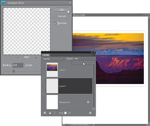
To create the mat effect, we’ll need to blur the stroke. From the Filter menu, choose Blur, and then choose Gaussian Blur. Enter 4 for the Radius setting and click OK. Then lower the Opacity of this blurred stroke layer to 50% (as shown here) to create the subtle shadow of a beveled mat (since the stroke is so thin, it is hard to see here, but you’ll be able to see it in your layout).
Step Five:
At this point, you’ll see the mat-like effect is in place around your photo. Although you want the photo centered side-to-side, you don’t want the photo centered top-to-bottom. Fine art posters generally have the photo well above the center of the poster, at what is called the “optical center,” which is the area just above the center. To move the photo up, go to the Layers palette and Ctrl-click (Mac: Command-click) on both the photo layer and the mat layer beneath it to select them. Then get the Move tool, and use the Up Arrow key on your keyboard to nudge the photo and mat upward until they are well above the center top-to-bottom (as seen in the next step).
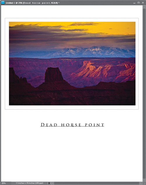
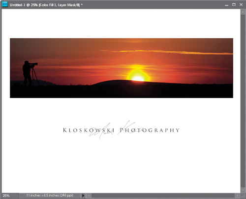
Step Six:
Now it’s time to add your poster text. Press the letter T to get the Horizontal Type tool to add your text (i.e., the name of your studio, the name of the poster, whatever you’d like). I chose the font Trajan Pro at 24 points in black, and I typed in upper- and lowercase. The extra space between the letters adds an elegant look to the type. To do that, hit the Spacebar once between each letter in a word and add three spaces between each word.
Step Seven:
The easiest way to add more type is to switch to the Move tool, press Ctrl-J (Mac: Command-J) to duplicate the Type layer, then use the Down Arrow key to move the new line of type down. Switch back to the Type tool, highlight the type to change the text, and change the size of it. Add additional lines of text if you want (as I did here, where I added lines underneath the top line for the location and date the photo was taken. Then I duplicated the Type layer again and added the bottom line of text). To center all four lines of type side-to-side perfectly within your image area, click on the Background layer in the Layers palette, and then Ctrl-click on each Type layer, so all five layers are selected. Press V to get the Move tool again, and in the Options Bar, click on the Align button and choose Horizontal Centers from the pop-up menu to center your text beneath your image.
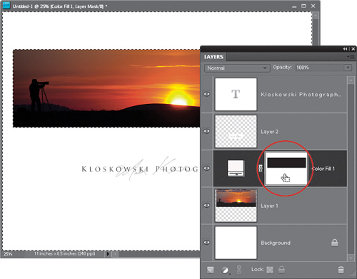
Step Eight:
Lastly, you can add your signature (either after it’s printed, or right within Elements itself if you have a scan of your signature or a Wacom tablet, where you can just use the tablet’s wireless pen to create a digital signature. See the “Turning Your Signature into a Brush” tutorial earlier in this chapter). Here’s the final photo with my signature added under the right corner, and the letters “A/P” under the left corner, which stands for “Artist Print,” indicating the print was output by the photographer him/herself.
So far, you’ve seen ways to create a print that shows off one photo at a time. But what about those times when you want more than one image on a print? Here’s a really simple layout that works great at showing off several photos on the same print.
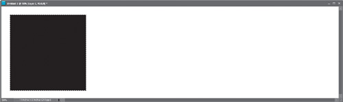
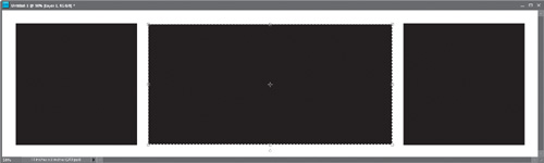
Step One:
In the Elements Editor, press Ctrl-N (Mac: Command-N) and create a new document that is very wide (the one shown here is 11″ wide by 3″ deep). Go to the Layers palette, click on the Create a New Layer icon at the bottom of the palette, and then get the Rectangular Marquee tool (M). Press-and-hold the Shift key and, on the left side of the document, click-and-drag out a square selection (since you’re holding the Shift key—don’t worry—it will be perfectly square) that is almost as tall as the document itself (leave approximately ½″ of white space at the top, left, and bottom). Press D to set your Foreground color to black, and then press Alt-Backspace (Mac: Option-Delete) to fill your selection with black. Don’t deselect yet.
Step Two:
Press V to get the Move tool from the Toolbox. Press Ctrl-Alt-Shift (Mac: Command-Option-Shift), and click-and-drag yourself a copy of your selected black square. Drag it all the way over to approximately the same position on the right side of your document, as shown here (holding Ctrl-Alt makes a duplicate of your square, and holding the Shift key keeps it perfectly aligned with the other square as you’re dragging to the right).
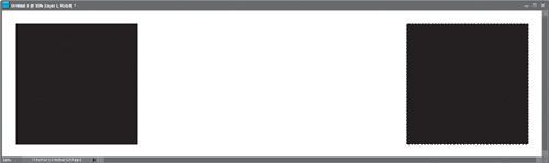
Step Three:
Deselect by pressing Ctrl-D (Mac: Command-D). Switch back to the Rectangular Marquee tool, but this time don’t hold the Shift key (that way, you can draw a rectangle). Now, draw a rectangular selection between the two squares, leaving approximately the same amount of space between your shapes (as shown here). Then fill that long rectangle with black (press Alt-Backspace). So, what you have is (from L to R) a black square, a long black rectangle, and another black square. Now deselect.
Step Four:
Open the photo you want to appear over the square on the left. Get the Move tool and drag-and-drop it onto your three-square document. Once the photo appears, press Ctrl-T (Mac: Command-T) to bring up Free Transform. Now you’ll resize the photo (probably making it smaller) so it’s slightly larger than the square on the left (as shown here), and then press Enter (Mac: Return) to lock in your resizing. Note: If you can’t see the Free Transform handles, press Ctrl-0 (zero; Mac: Command-0) to zoom out to where they will show.
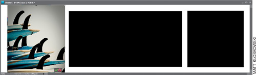
Step Five:
Now press Ctrl-G (Mac: Command-G) to mask your rectangular photo into that black square (as shown here). You can get the Move tool and reposition your photo inside that black square by just clicking-and-dragging on it. Don’t freak out if you see part of your photo appearing in the center rectangle, because we’ll cover that with a different photo layer.
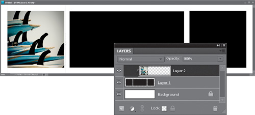
Step Six:
Now repeat the last two steps, opening two other photos, dragging-and-dropping them onto your three-square document, and resizing them so that they’re slightly larger than the boxes they’re going to be masked into. Once one of them is sized, press Ctrl-G to mask it into the shape. Then do the same for the other photo. If, when you’re done, any one of those photos extends into a different box, just go to the Layers palette and move that layer down one (or two) layers until that extra area is hidden behind one of the other masked photos.
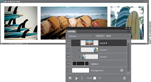
Step Seven:
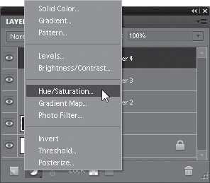
Now, unless the three photos were taken in almost the exact same light, chances are at least one of them is going to look a bit funky (colorwise), so you might want to consider creating a tint over all three (it’s an easy way to ensure the colors match). Click on the top layer in your layer stack, then choose Hue/Saturation from the Create New Adjustment Layer pop-up menu at the bottom of the Layers palette (as shown here).
Step Eight:
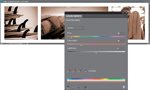
When the Hue/Saturation controls appear in the Adjustments palette, turn on the Colorize checkbox, then set the Hue to 25 and the Saturation to 25 to add this slightly reddish-yellow sepia tone effect to all three photos at once. By the way, this is a great combination for instantly adding a sepia tone effect to wedding photos.
Step Nine:
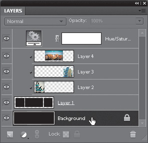
The final step is to go to the Layers palette, and click on the Background layer to select it (as shown here). Press D to set your Foreground to black, and then press Alt-Backspace (Mac: Option-Delete) to fill the Background layer with black.
Step 10:
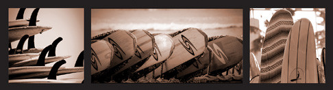
Here’s the final image, and I think what makes it work is the balance and visual interest between the two square shapes on the ends and the longer rectangle shape in the middle. One more thing: remember, you could always save this as a template (the black squares and rectangle, that is), then open it again later and repeat Steps Four through Nine with different photos (just choose Save As from the File menu, and then choose Photoshop from the Format pop-up menu in the Save As dialog). This way, you don’t have to go creating those black squares and that rectangle over and over again.
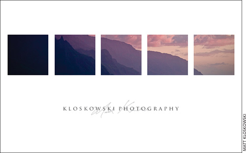
Here’s a slick way to show off your work because it’s a little out of the ordinary. Usually we’re used to seeing the photo in the middle of the page, right? This is a little different because it uses several boxes, each with part of the same photo in it. The separation between the boxes draws your eye in, and even though you’re just using one photo here, it looks like you’re using more.
Step One:
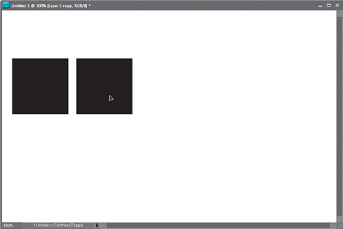
Press Ctrl-N (Mac: Command-N) to create a new document in the size and resolution you want for your final print. Go to the Layers palette and click on the Create a New Layer icon at the bottom. Get the Rectangular Marquee tool (M), and click-and-drag out a small square box over to the far-left side (you’re going to fit five of these boxes across, so keep that in mind when choosing how big to make your first box; press-and-hold the Shift key while you drag to make it square). Once your box selection is in place, press D to set your Foreground color to black, then press Alt-Backspace (Mac: Option-Delete) to fill your square selection with black (as shown here). Deselect by pressing Ctrl-D (Mac: Command-D).
Step Two:
Press Ctrl-J (Mac: Command-J) to duplicate the square layer. Get the Move tool (V), press-and-hold the Shift key (to keep your alignment straight), then click-and-drag the copy of this square straight over to the right, leaving a small gap between the two squares (as shown here).
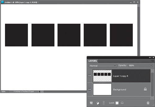
Step Three:
Repeat Step Two three more times. Now you’ll have five squares in a row (as shown here). One more thing, though: Click on the bottom square layer in the Layers palette to select it, then Shift-click on the topmost square layer to select it, along with all of the square layers in between. From the Layers menu, choose Merge Layers (or just press Ctrl-E [Mac: Command-E]) to merge them all into one layer.
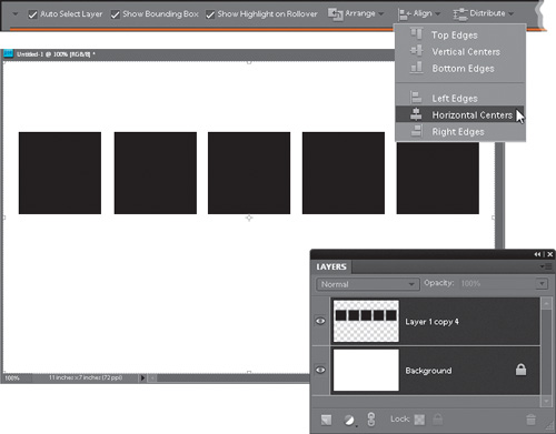
Step Four:
Now, to perfectly center this row of five squares within your document, first click on the Background layer in the Layers palette, then press-and-hold the Ctrl (Mac: Command) key and click on the five-squares layer to select it, as well. Once both layers are highlighted (as you see here), get the Move tool, then go up to the Options Bar, click on the Align button, and choose Horizontal Centers from the pop-up menu (as shown here).
Step Five:
Next we’re going to bring in our photo, so just go under the File menu and choose Open. Get the Move tool and drag-and-drop your photo into your five-square document. Once the photo appears, press Ctrl-T (Mac: Command-T) to bring up Free Transform. Now you’ll resize the photo (probably making it smaller) so it’s a little larger than the five black squares, then press Enter (Mac: Return) to lock in your resizing.
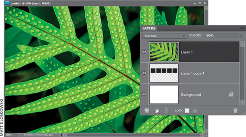
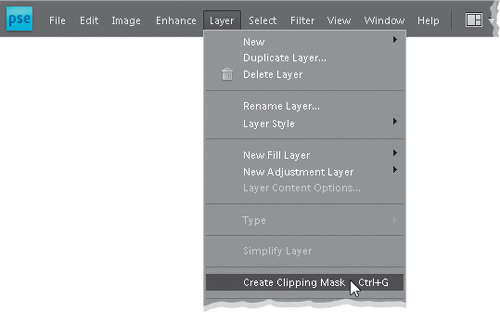
Step Six:
To get your photo inside those five boxes, start by making sure that in the Layers palette, your photo layer is at the top of the layer stack. Now either go under the Layer menu and choose Create Clipping Mask or use the keyboard shortcut Ctrl-G (Mac: Command-G).
Step Seven:
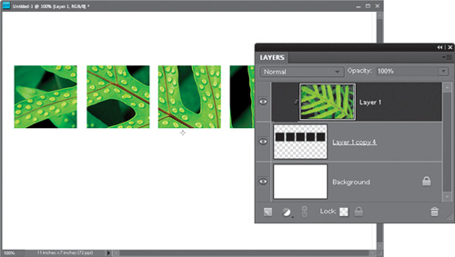
When you choose Create Clipping Mask (or use the keyboard shortcut), it masks your photo layer inside the five boxes on the layer below it (as shown here, where the photo is clipped into those five boxes).
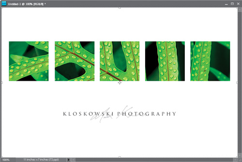
Step Eight:
The final step is to add your studio name over a scan of your signature (just sign your name with a thick black pen on a white piece of paper, and scan it on a flatbed scanner. Of course, if you have a Wacom tablet and wireless pen, you can just get a small, hard-edged brush and sign your name right in your document). Position your signature so it’s centered at the bottom of the five boxes, about halfway between the bottom of the document and the bottom of the boxes. Lower the opacity of its layer to around 40% or 50%, so it looks like a medium gray color. Now, take the Horizontal Type tool (T) and add your studio’s name (or your name), and position this type centered, right over your signature (here I used the font Trajan Pro). To add a little elegance to this type, try adding a space between each letter and several spaces between each word.
Step Nine:
Don’t forget, just like the last tutorial, you can save the black squares as a PSD file. In other words, you’re creating a template. The next time you want to use this technique, all you’ll have to do is open the PSD file you saved and repeat Steps Five through Eight using another photo. It sure beats making all those little squares again.
I originally saw this idea while watching Scott create a custom print template in Adobe Photoshop Lightroom. He showed me, and I loved it. He showed a crowd of 800 people, and they went crazy over it. So we knew that we had to find a way to do it in Elements. Well, here it is:
Step One:
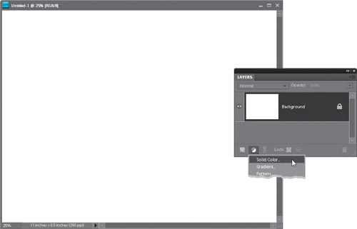
In the Elements Editor, press Ctrl-N (Mac: Command-N) to create a new document in whatever size and resolution you’d like. In my example, I created a wide letter-sized document (11×8.5″) at a resolution of 240 ppi (for inkjet printing). Once you’ve created the document, choose Solid Color from the Create New Adjustment Layer pop-up menu at the bottom of the Layers palette (it’s the half-black/half-white icon, as shown here).
Step Two:
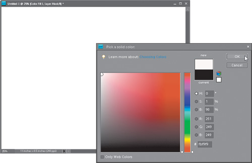
This brings up the Color Picker, prompting you to Pick a Solid Color. Since our background is white (which is the default setting in the New document dialog), choose white as your solid color (as shown here), and click OK. This fills your new adjustment layer with solid white (okay, it’s kind of hard to see a white-filled layer on top of a white background, so you’ll just have to trust that it worked. Well, for now anyway).
Step Three:
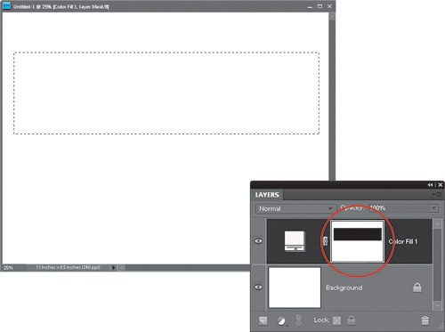
Get the Rectangular Marquee tool from the Toolbox, or just press M, and click-and-drag out a wide rectangle about 2″ from the top of the document (as shown here). Don’t make the selection too deep (in fact, while you’re dragging out your selection, try dragging it out in the shape of a panorama—wide, but not very deep). Once your selection is in place, press the letter X on your keyboard until your Fore-ground color is black, then press Alt-Backspace (Mac: Option-Delete) to fill your selected area with black. Now, you’re only filling the white Solid Color adjustment layer’s mask with black, so you won’t see anything change onscreen. To confirm that your black fill worked, take a look in the Layers palette, and you should see a black rectangle in the adjustment layer’s mask thumbnail (as shown circled here). Press Ctrl-D (Mac: Command-D) to Deselect.
Step Four:
Click on the Background layer, then go under the File menu and choose Open. Now, locate the photo you’d like to have become an instant pano, and click OK to open that photo. Get the Move tool (V) and drag-and-drop your photo into your pano document. Press Ctrl-T (Mac: Command-T) to go into Free Transform, then click on one of the corner handles to drag inward or outward and scale the photo to size. You want to make it so it’s just slightly larger than your pano opening.
Step Five:
Once you have it sized the way you’d like it, you can click in the center and drag it up or down to reveal a different part of the image, then press the Enter (Mac: Return) key to complete your resizing. The cool thing is it already looks like a pano, because all you can see of it is that wide, not very tall opening (which was the selected area you filled with black).
Step Six:
Now that your photo is in place, you can add any poster-style text you’d like using the Horizontal Type tool (T). Here, I added the text-and-signature look that I showed you how to create in the previous tutorial.
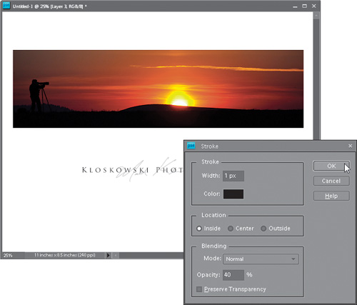
Step Seven:
Now, we’re going to add a thin border around our photo that you’ll be able to turn on/off—depending on how it looks with the particular photo you’ve imported—with just one click. Go to the Layers palette and Ctrl-click (Mac: Command-click) on the layer mask thumbnail to the right of the Solid Color adjustment layer. This loads everything but that rectangle as a selection.
Step Eight:
From the Select menu, choose Inverse to invert the selection so just the rectangle is selected. Now, in the Layers palette, click on your top layer and then click on the Create a New Layer icon to add a new layer on top of all the others. From the Edit menu, choose Stroke (Outline) Selection. In the Stroke dialog, set the Width to 1 pixel, set the Color to black, set the Location to Inside (this makes the corners of your stroke nice and square), then lower the Opacity to 40% (this makes your stroke appear thinner). Click OK when you’re done. Deselect, and you now have an outline on a separate layer that you can turn on and off depending on the photo.
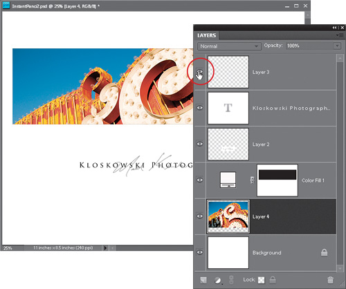
Step Nine:
At this point, you’ve created an instant pano template that can be used again and again. Just make sure you choose Save As from the File menu and save it as a Photoshop PSD file. Now, let’s say it’s a week or so later and you want to turn a different photo into an instant pano. Open your template, then go to the Layers palette and delete the layer with the photo on it. Now you should only have the Background layer, the Solid Color adjustment layer, your signature and Type layers, and the layer with the outline on it (as shown here). Click once on the Background layer to select it.

Step 10:
Now choose Open from the File menu and open a different photo you’d like to see as an instant pano (here’s the photo that we’re going to use—I’m just showing it to you here so you can see the full photo before it’s brought into the template).
Step 11:
With the Move tool, drag-and-drop the photo into your template document. Since we selected the Background layer back in Step Nine, the new photo should pop in right under the Solid Color adjustment layer (just where we want it to). Now go back and repeat Steps Four and Five if you’d like to resize or reposition the photo in the pano layout.
Step 12:
Oh yeah, remember that thin black border we added (well, at 40% opacity it actually looks gray)? Once you’ve imported your photo, you can decide whether it looks better with or without a border, and you can turn that border on/off with just one click. In the Layers palette, just click the little Eye icon next to the outline layer to toggle it on and off.
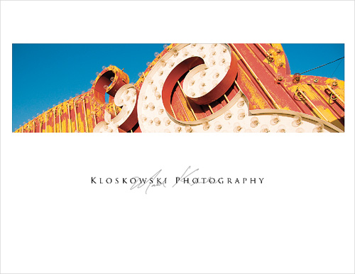
Step 13:
Here’s the final image. Now, since you’ve created a template, at this point you’d want to flatten the image (choose Flatten Image from the Layers palette’s flyout menu), then choose Save As from the File menu, and give your file a different name. That way, your template stays intact, and the next time you want to try a different photo as an instant pano, you just open the original template and replace the photo. Once you’ve set this up like this, instant panos are about 30 seconds away.
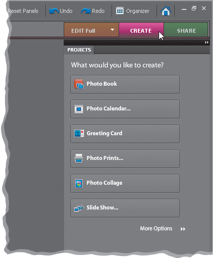
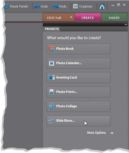
There is an entire area of Elements dedicated to creating projects with your photos. By projects, I mean transforming your photos from just prints into “creations” like photo collages, greeting cards, photo books, slide shows, and even CD/DVD covers and jackets. Here, we’ll take a look at the overall process of making these types of creations, because they all pretty much work the same. But since there are so many variations on what you can actually make, we’ve also put a video online (www.kelbytraining.com/books/elements8) that goes into them in more detail and shows how you can use Elements’ online services to order them.
Step One:
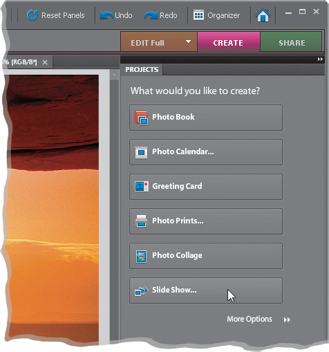
There are about half a dozen ways to get to the Create section of Elements, but the easiest and most visible way to get there is to just click on the purple Create tab that appears above the Palette Bin in the Elements Editor (or at the top right of the Organizer on a PC) and a list of “creations” will appear (as shown here. On a Mac, your options are slightly different). If you click on More Options, you’ll see even more creations. Note: You don’t have to have a photo open to build a creation—you can add the photo(s) after you’ve built the creation. I know, this sounds weird, but you’ll see why this works in just a few moments.
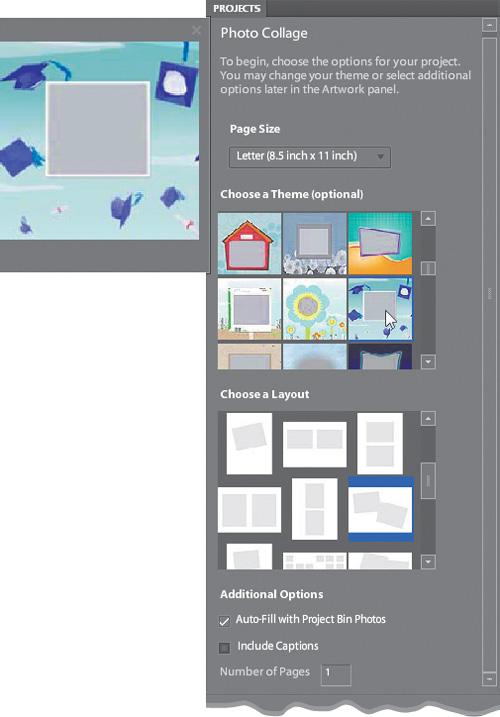
Step Two:
When you choose a creation from that list (I chose Photo Collage here), the Palette Bin changes to where you can customize the way your final creation will look. Generally, you’ll start by choosing the size of your creation (from the Page Size pop-up menu at the top). Then you choose whichever theme you’d like, and you get a preview of how each one looks. Next, you have the option to choose a custom layout for your photo(s), and finally you get to choose any additional options in the fourth and final step. If you just start at the top and work your way down, it’s really pretty easy.
Step Three:
When you click Done, Elements builds a new document using your custom settings, and it leaves a gray square where your photo(s) will appear. To get your photo in that gray square, you have two choices: (1) open the photo in Elements, then get the Move tool (V) from the Toolbox, click-and-drag the photo from the Project Bin onto the gray square, and it automatically fits inside your layout. Or, (2) you can click on the gray square and the standard Open dialog appears asking you to find the photo on your hard disk that you want to open. Once you choose a photo (or drag-and-drop one onto the gray square), a small resizing slider appears in the upper-left corner of your placed photo. Drag this slider to change the size of your photo within the layout. When the size looks good to you, click the green Commit checkmark beside the slider. If you don’t want to resize the photo, just click the red international symbol for “No!” (the circle with a slash through it). That’s it!
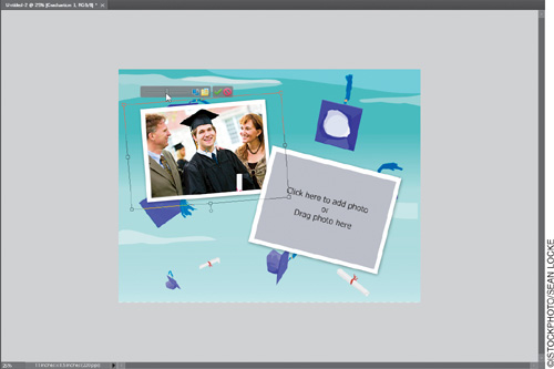
Note: You can always go back later and resize or reposition the photo within that frame by double-clicking directly on the photo. Or you can replace the photo by simply dragging a photo from the Project Bin and dropping it right on the existing photo. This makes swapping out photos very quick and easy.
Earlier in the chapter, we looked at how to create a simple slide show from photos open in the Editor. But that tutorial was really geared toward creating a PDF slide show that you’d email to someone. If you really want to create a slide show masterpiece (complete with titles, cool transitions, pans and zooms, and even music), this is where you come. Unfortunately, the full-blown slide show feature is currently not available in the Mac version of Elements 8.
Step One:
You start by clicking once on the Create tab in either the Elements Organizer or the Editor, and then clicking on the Slide Show button (as shown here). Choosing the Slide Show creation from the Editor will launch the Organizer because this particular feature is actually part of the Organizer.
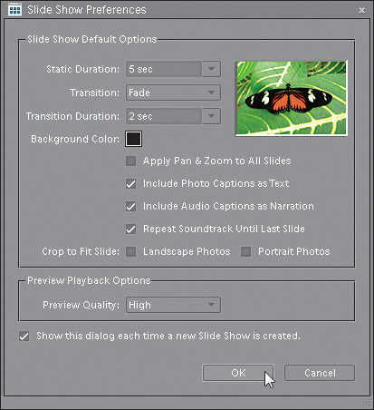
Step Two:
So, once the Organizer appears onscreen, the Slide Show Preferences dialog will also appear. This is where you choose how you want your slide show set up. For example, at the top you choose how many seconds each slide will appear onscreen. Below that you choose the transition between slides (will it be a soft dissolve or a quick cut between photos?), and how long your transition will last. A popular transition effect is called Pan & Zoom (which slowly moves [pans] your images across the screen), and to turn this on, turn on the checkbox for Apply Pan & Zoom to All Slides.

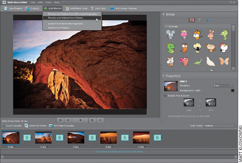
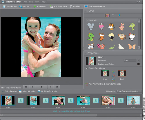
Step Three:
Once you click OK, the Slide Show Editor appears, and this is where you’ll create your magic (okay, “magic” is probably pushing it a bit, but this is where you’ll “do your stuff”). If you opened photos in the Editor (or selected them in the Organizer) before you chose Slide Show, these photos will appear in the Slide Show Editor’s Photo Bin at the bottom of the dialog, as shown here (which means you can skip Step Four). If not, you’ll notice that the Photo Bin is empty, except for the prompt Click Here to Add Photos to Your Slide Show. So, click there (I know, that seems pretty obvious) to bring up the Add Media dialog (shown in the next step).
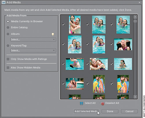
Step Four:
Basically, here’s where you choose which photos will wind up in your slide show. Note: Again, if you opened photos in the Editor (or selected them in the Organizer) before you chose Create’s Slide Show option, you can skip this step, because photos will already be imported into your slide show—you’ll only use Add Media if either (a) you don’t have any photos in your slide show yet, or (b) you want to add another photo (or more) to your existing slide show. Turn on the check-box beside each photo you want in your slide show, then click the Add Selected Media button at the bottom of the dialog and click Done.
Step Five:
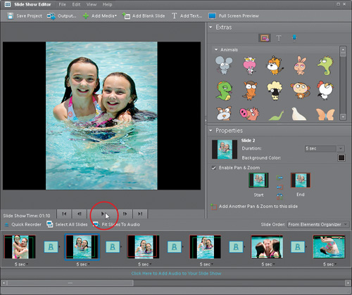
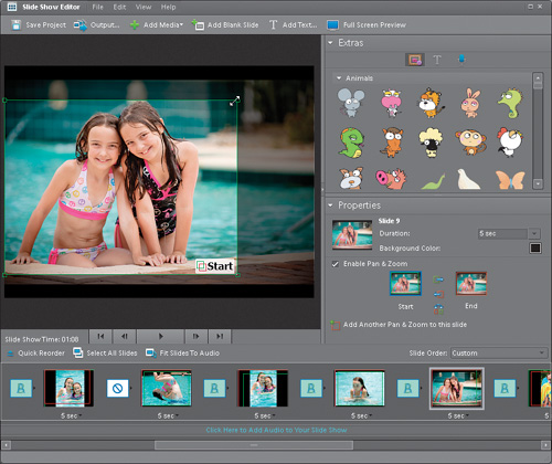
To see a quick sample of what your slide show looks like at this point (before you start customizing it), click the Play button beneath the main preview window. You’ll see a slide show of your imported photos in the order they were imported, with whichever transitions you chose in the Slide Show Preferences dialog. To stop, click the Pause button (which appears where the Play button used to be). If you’re not thrilled with your slide show, it’s probably because you’re only seeing the default slide show: the slides aren’t in order, there’s no background music, and you haven’t customized the slide show your way. Well, that’s about to change, because it’s time to tweak your slide show.
Step Six:
The first thing to do is put the slides in the order you want them. To do that, just click on a thumbnail in the Photo Bin at the bottom of the dialog and drag it where you want it (the slides play from left to right, so if you want a particular slide to be first, drag that slide all the way to the left). As you drag slides around in the Photo Bin, you’ll see a blue bar indicating where the slide will appear when you release the mouse button.
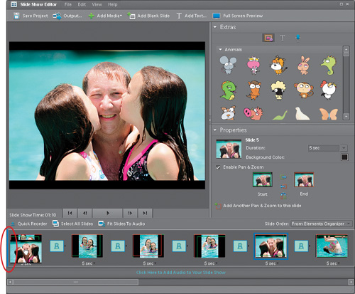
Step Seven:
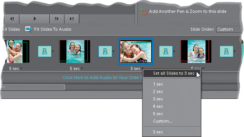
With the slides in order, take a look directly beneath your photo thumbnails in the Photo Bin. You’ll see “5 sec.” That’s telling you that this slide will stay onscreen for 5 seconds. If you want it onscreen for a shorter amount of time, just click directly on that number and a pop-up menu of duration times will appear. If you want to apply a particular duration to all your slides (for example, you want them all to appear onscreen for 3 seconds), after you choose 3 sec for one slide, click on the time again for that slide and choose Set All Slides to 3 sec. If you choose Custom, you can type any number in the Set Slide Duration dialog.
Step Eight:
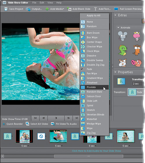
Finally, the fun part—choosing your transitions. You can go with the one you originally chose in the Slide Show Preferences, or you can choose a new one. To do that, click directly on the little right-facing triangle that appears to the right of the square transition box (which is between your slides in the Photo Bin). This brings up a pop-up menu of transitions—just choose the one you want and it changes only that transition between those two slides. If you want that transition applied to all your slides, after you choose it, choose Apply to All at the top of the pop-up transition menu. (By the way, if you choose None, the international symbol for “No!” [a circle with a slash through it] will appear between your slides instead, but you can change that by clicking on the right-facing triangle next to it and choosing a transition from the pop-up menu.)
Step Nine:
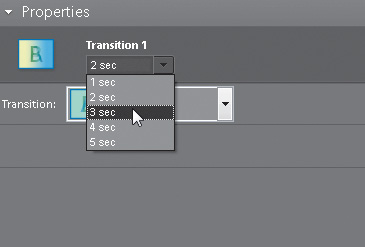
To change the duration of one (or more) of your transitions, click on the transition, then in the Properties palette (on the right side of the Slide Show Editor dialog), change the Transition time (which is measured in seconds) in the pop-up menu.
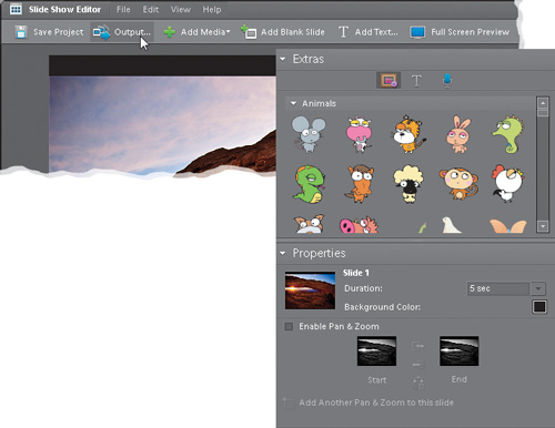
Step 10:
Okay, what’s even cooler than transitions? Pan & Zoom (in fact, you can have transitions and Pan & Zoom). Pan & Zoom brings movement to your slides, and this movement makes your slide show feel less static, as the photos move slowly left to right, top to bottom, while they slowly zoom in and out. That’s why this effect is so popular. If you turned on the Apply Pan & Zoom to All Slides checkbox in the Slide Show Preferences (when you first opened your slide show), then all you have to do to edit a Pan & Zoom is click on a slide and the Pan & Zoom controls will appear in the Properties palette on the right side of the dialog.
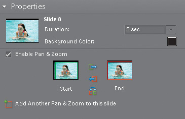
Step 11:
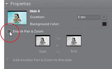
If you didn’t turn on Pan & Zoom for all slides from the start, it’s easy to turn it on now. Just click on the slide you want to apply it to, and then in the Properties palette, turn on the checkbox for Enable Pan & Zoom. (Needless to say, to turn off the Pan & Zoom for any slide, just click on the slide and turn off the Enable Pan & Zoom checkbox in the Properties palette. I know, I said “needless to say,” but then I said it anyway. It’s a personality disorder.)
Step 12:
Once you’ve got Pan & Zoom turned on, you can tweak it in three very distinct ways: (1) When you turn on Pan & Zoom, a green square appears in the preview window, and the word “Start” appears in the bottom-right corner. You can reposition the location and size of this green square (shown here) to where you’d like the panning and zooming to start. In the Properties palette, if you click on the End thumbnail, you can position the panning end point by moving (and/or resizing) the red square. (2) You can swap the positions of these squares by using the three little buttons between the Start and End thumbnails in the Properties palette. (3) You can add an additional Pan & Zoom, which essentially duplicates your slide, and lets you add another Pan & Zoom segment, so you could have your photo pan from left to right, then in the second segment, zoom from large to small. To do this, click on the Add Another Pan & Zoom to This Slide prompt at the bottom of the Properties palette.
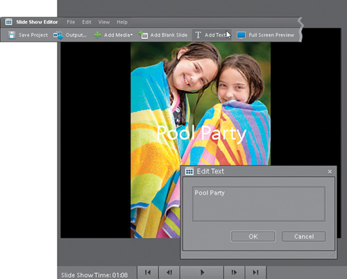
Step 13:
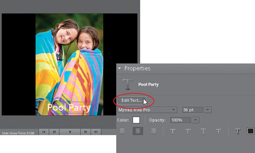
Now, on to adding titles: If you want to add a title to the beginning of your slide show, click on the first slide in the Photo Bin, and then click the Add Text button at the top of the Slide Show Editor. This brings up the Edit Text dialog, in which you enter your text. As you begin typing, your text appears onscreen.
Step 14:
Once you click OK in the Edit Text dialog, you can reposition your text by just clicking-and-dragging it where you want it. You can also now choose which font, size, style, opacity, and color you want for your text (and a host of other type tweaks) in the Properties palette on the right side of the dialog. If you need to edit your text, just click on the Edit Text button in the Properties palette or change your font, style, etc., in the bottom of the palette.
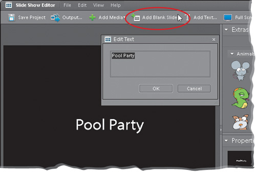
Step 15:
If you want your title to appear over a blank slide, rather than over a photo, you can create your title over a blank background by clicking the Add Blank Slide button at the top of the dialog. This creates an empty black slide after your first slide (you’ll have to click-and-drag it before your first slide). Now you can either click the Add Text button to create the text that will appear over your black slide, or you can click on the Text icon in the Extras palette (on the top right of the window), which reveals a list of pre-designed type treatments, including text with shadows (which are about impossible to see over a black background, by the way).
Step 16:
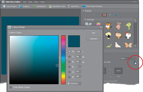
If you want to change the color of your blank slide (from the default black color), you can do that by clicking on the blank slide (in the Photo Bin), and then in the Properties palette you’ll see a black color swatch named “Background Color.” Click on it to bring up the Color Picker, where you can choose a different color. Once you’ve chosen a new color, click OK, and your currently selected slide’s color will be changed.
Step 17:
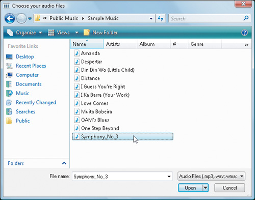
All right, the slides are in order, the transitions have been chosen, and the title has been created. Now, for the finishing touch—music. To add some background music to your slide show, click on the gray bar directly beneath the Photo Bin with the words “Click Here to Add Audio to Your Slide Show.” This brings up a dialog prompting you to choose your audio file. You can browse for your own music files or choose from the music files in Elements’ sample catalog. When you find a song you like, click on its name in the list, and then click the Open button.
Step 18:
Now it’s time to preview the finished slide show. Click the Full Screen Preview button on the top-right side of the Slide Show Editor’s task bar, then sit back, relax, and enjoy the “magic.” If, while watching your preview, you see something you want to change, just press the Esc key.
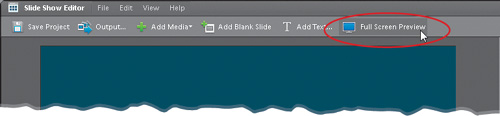
Step 19:
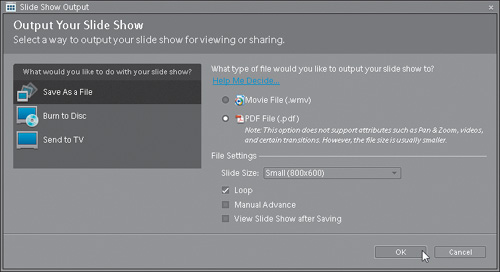
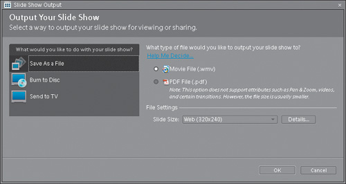
When the show is tweaked to perfection (or your personal satisfaction, whichever comes first), it’s time to output it into its final form. Click on the Output button in the Slide Show Editor’s task bar to bring up the Slide Show Output dialog. Now you just click to choose what you want to do with your final show: save it as a file, burn it to CD or DVD, email your slide show to a friend (in which case, you’ll choose Save as a File and choose the PDF option), or watch it on TV. When you click on your choice, some options for that choice will appear on the right side of the dialog. When you’re done, click OK.
If you want to expand the reach of your photos to a wider audience, there’s no better way than to create a photo gallery online, and once again Elements does all the hard work for you. All you have to do is basically choose which photos you want, which layout you want, and it does the rest. (Note: If you’re using a Mac, this is done through Bridge, so it is covered in the online chapter mentioned in the book’s introduction.) Here’s how to go global with your photos:
Step One:
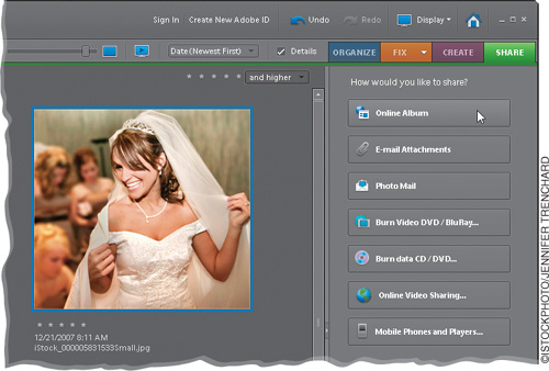
Open the Organizer and Ctrl-click on the photos you want to appear in your online Web gallery. Then, click on the Share tab at the top right of the Organizer, and click on the Online Album button (as shown here).
Step Two:
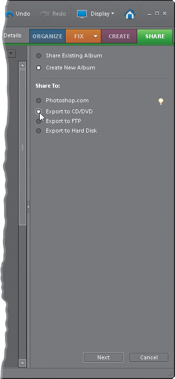
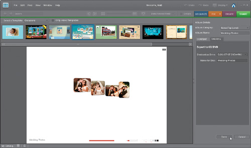
This brings up the first section of the Online Album wizard, where you decide whether you want to share an existing album or create a new one (here, I’m choosing to create a new one). Next, you’ll choose how you want to share the online album. The options are listed in the Share To section, and this determines how the gallery is exported (to Adobe’s free/pay service Photoshop.com, to a CD/DVD, to your FTP site for uploading to the Web, or to a hard disk). Click on the radio button for the one you’re going to use and click the Next button at the bottom.
Step Three:
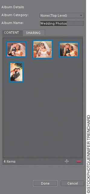
This brings up the next section (shown here), and the photos you selected in the Organizer appear inside the Content bin. If you want to add more or remove any, this is the place to do it. To add a photo, select it in the Organizer’s Media Browser, then click the + (plus sign) at the bottom right of the Content bin. To remove a photo, select it in the Content bin, and click the − (minus sign). You can also click-and-drag your photos around in the Content bin to change their order. You’ll need to give your gallery a descriptive name, so go ahead and do that before moving on.
Step Four:
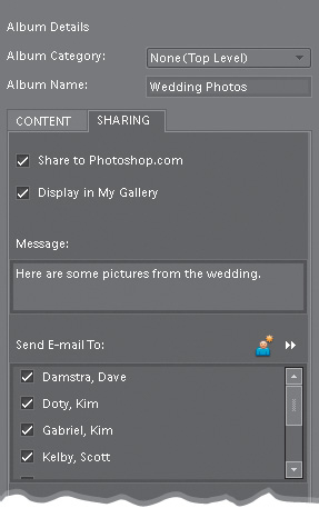
Now, click on the Sharing tab near the top of the Album Details section. As soon as you do that, Elements builds a preview using its default online album, and you’ll see it in the center of the Organizer window. If you’re using Photoshop.com, then skip to the next step. If not, then enter any settings for the sharing method you’ve chosen (this may require you to sign in to Photoshop.com) and click Done at the bottom. Photoshop Elements takes care of the rest. It even saves a copy of your new album right into the Organizer’s Albums palette, so you can find it again easily.
Step Five:
If you choose to share to Photoshop.com, when you click on the Sharing tab, you’ll want to turn on the Share to Photoshop.com checkbox at the top, and sign in to Photoshop.com from the dialog that appears. Once you sign in, you’ll be presented with a few more options. The first specifies whom you want to share the album with—your choices are everyone or just specific friends. If you want to share your images publicly, then also turn on the Display in My Gallery checkbox, but if you only leave the Share to Photoshop.com checkbox turned on, then you have to select which contacts you’d like to email this album to by turning on the checkboxes next to their names in the Send E-Mail To section. Just above this section, you can also include a message.
Step Six:
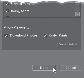
There’s also a neat feature at the bottom that lets your album’s visitors: (1) download the photos from your online album directly to their computer, and (2) order photo prints directly from your online album, so they don’t have to go through you to get them. Pretty nifty, huh?
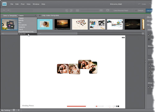
Step Seven:
Once you’ve chosen your Sharing options, you can change the template that you want to use for your online album by double-clicking on another template in the filmstrip that runs across the top of the Preview area. These templates include pre-designed animations and interactive websites where the people viewing your photos actually get involved in the process. There are some built-in templates that come with Photoshop Elements and if you’ve got a Photoshop.com Plus membership (this one has an annual fee), you can see others by clicking on the Select a Tem-plate pop-up menu at the top left and choosing Plus Members Only. The ones that are on your computer within Elements are listed by category in the Select a Template pop-up menu, so you can choose to only show those categories, only show Photoshop.com Plus content, or Show All content. It’s usually easiest to choose Show All here.
Step Eight:
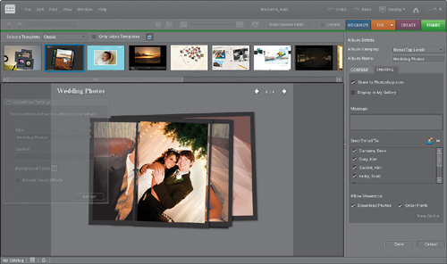
For our example here, I’m going to go with the 4×5 Transparency template that’s shown second from left in the filmstrip (and also when you choose Classic from the Select a Template pop-up menu). So double-click on that template in the filmstrip. Elements thinks for a moment while it builds the preview, then you’ll see the new online gallery appear in the Preview area with the same photos you selected back in Step One.
Step Nine:
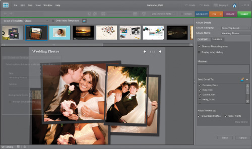
Remember back when I mentioned that with some of these templates, the viewer interacts with them? This template’s a great example. You can click on the photos and rearrange them, moving them around on the page. You can also click on the left and right arrows at the top right of the preview to scroll through the photos one by one.
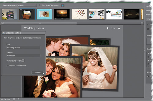
Step 10:
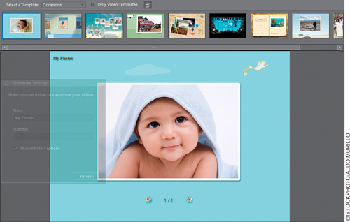
In the Slideshow Settings dialog (which, for certain templates, appears dimmed and floating on the left side of the window), you can replace any dummy text with real text of your own. Just move your cursor over the dialog and you can give the site a title, a subtitle, and even change the background color of the online gallery. Below that is a checkbox to have sound effects included on your webpage that happen when your visitors move or interact with the photos. The sounds are kinda cute at first, but get old fast, so you might want to try it once with the sounds, and see if they don’t get on your nerves in short order. Once you’ve customized your gallery, click the Refresh button. You’ll see a live preview of your gallery, with your selected photos, your new text and color, and sound effects, just like the public will see it. You can click on the photos and move them around the page, and interact with it just like it was live.
Step 11:
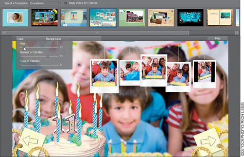
Normally you’d be ready to move on and save the gallery, but I wanted to take a quick look at some of the other templates because they’re just so darn cool. Try going under the Occasions category in the top Select a Template pop-up menu. The first of the templates (the baby theme) is great if you’ve just had a baby—double-click on it to see your photos in that template.
Step 12:
Let’s try something else. You’ve got to try the birthday one (the fourth one from the left) to see what these things are really made of. Double-click on it to see how you can actually change the number of candles, the number (age) candle itself, and lots of other things from the pop-up menus at the top of the Preview area. Try it, I’ll wait (I don’t mind waiting while you have fun. I’ll just wait over here). Okay, you done playing around? See, it’s pretty cool, eh? When the page looks the way you want it to, it’s time to save it, so click Done and, in a few moments, your Album is uploaded to Photoshop.com (or emailed to your contacts, if that’s the option you chose), ready to view. Just visit Photoshop.com to see the album (or get the link from Photoshop.com to share it with others) and you’re in business.