14
MACHINE INTELLIGENCE

How many times a day do you submit something like “cats and meetloafs” to a search engine only to have it come back with, “Did you mean cats and meatloaves?” You probably take this for granted, without pausing to consider how the search engine knew not only that there was an error in your input, but also how to fix it. It’s not very likely that someone wrote a program to match all possible errors with corrections. Instead, some sort of machine intelligence must be at work.
Machine intelligence is an advanced topic that includes the related fields of machine learning, artificial intelligence, and big data. These are all concepts you’ll likely encounter as a programmer, so this chapter gives you a high-level overview.
Artificial intelligence was first out of the gate when the term was coined at a Dartmouth College workshop in 1956. Machine learning was a close second with the perceptron in 1957, which we’ll discuss shortly. Today, machine learning has a huge lead, thanks in part to two trends. First, technological progress has dramatically increased storage size while reducing the price of it, and it has also led to faster processors and networking. Second, the internet has facilitated the collection of large amounts of data, and people can’t resist poking at all of it. For example, data from one large company’s book-scanning and translation project was used to dramatically improve a separate language translation project. Another example is a mapping project that fed into the development of self-driving cars. The results from these and other projects were so compelling that machine learning now is being applied to a large number of applications. More recently, people have also realized that these same two trends—cheaper storage and more computing power, and the collection of large amounts of data—support revitalizing artificial intelligence, resulting in a lot of new work in that area as well.
The rush to employ machine intelligence, however, mimics the “What can possibly go wrong?” philosophy that already pervades the computer security world. We don’t yet know enough to avoid producing psychotic systems such as HAL from the 1968 movie 2001: A Space Odyssey.
Overview
You should know by now that programming is the grunt work needed to implement solutions to problems. Defining the problems and their solutions is the interesting and harder part. Many would rather devote their entire careers trying to get computers to do this work instead of doing it themselves (another example of the “peculiar engineering laziness” mentioned in Chapter 5).
As noted earlier, it all started with artificial intelligence; machine learning and big data came later. Though the term wasn’t coined until the 1956 Dartmouth workshop, the notion of artificial intelligence goes all the way back to Greek myths. Many philosophers and mathematicians since have worked to develop formal systems that codify human thought. While this hasn’t yet led to true artificial intelligence, it has laid a lot of groundwork. For example, George Boole, who gave us our algebra in Chapter 1, published An Investigation of the Laws of Thought on Which Are Founded the Mathematical Theories of Logic and Probabilities in 1854.
We’ve accumulated a lot of information about human decision making but still don’t really know how humans think. For example, you and your friends can probably distinguish a cat from a meatloaf. But you might be taking different paths to reach that distinction. Just because the same data yields the same result doesn’t mean that we all processed it the same way. We know the inputs and outputs, we understand parts of the “hardware,” but we don’t know much about the “programming” that transforms one into the other. It follows that the path that a computer uses to recognize cats and meatloaves would also be different.
One thing that we do think we know about human thought processing is that we’re really good at statistics unconsciously—not the same thing as consciously suffering through “sadistics” class. For example, linguists have studied how humans acquire language. Infants perform a massive amount of statistical analysis as part of learning to tease important sounds out of the environment, separate them into phonemes, and then group them into words and sentences. It’s an ongoing debate as to whether humans have specialized machinery for this sort of thing or whether we’re just using general-purpose processing for it.
Infant learning via statistical analysis is made possible, at least in part, by the existence of a large amount of data to analyze. Barring exceptional circumstances, infants are constantly exposed to sound. Likewise, there is a constant barrage of visual information and other sensory input. Infants learn by processing a big amount of data, or just big data.
The massive growth in compute power, storage capacity, and various types of network-connected sensors (including cell phones) has led to the collection of huge amounts of data, and not just by the bad guys from the last chapter. Some of this data is organized and some isn’t. Organized data might be sets of wave height measurements from offshore buoys. Unorganized data might be ambient sound. What do we do with all of it?
Well, statistics is one of those well-defined branches of mathematics, which means that we can write programs that perform statistical analysis. We can also write programs that can be trained using data. For example, one way to implement spam filters (which we’ll look at in more detail shortly) is to feed lots of collected spam and nonspam into a statistical analyzer while telling the analyzer what is spam and what isn’t. In other words, we’re feeding organized training data into a program and telling the program what that data means (that is, what’s spam and what’s not). We call this machine learning (ML). Kind of like Huckleberry Finn, we’re “gonna learn that machine” instead of “teaching” it.
In many respects, machine learning systems are analogous to human autonomic nervous system functions. In humans, the brain isn’t actively involved in a lot of low-level processes, such as breathing; it’s reserved for higher-level functions, such as figuring out what’s for dinner. The low-level functions are handled by the autonomic nervous system, which only bothers the brain when something needs attention. Machine learning is currently good for recognizing, but that’s not the same thing as taking action.
Unorganized data is a different beast. We’re talking big data, meaning that it’s not something that humans can comprehend without assistance. In this case, various statistical techniques are used to find patterns and relationships. For example, this approach—sometimes known as data mining—could be used to extract music from ambient sound (after all, as French composer Edgard Varèse said, music is organized sound).
All of this is essentially finding ways to transform complex data into something simpler. For example, one could train a machine learning system to recognize cats and meatloaves. It would transform very complex image data into simple cat and meatloaf bits. It’s a classification process.
Back in Chapter 5, we discussed the separation of instructions and data. In Chapter 13, I cautioned against allowing data to be treated as instructions for reasons of security. But there are times when it makes sense, because data-driven classification can only get us so far.
One can’t, for example, create a self-driving car based on classification alone. A set of complicated programs that acts on classifier outputs must be written to implement behavior such as “Don’t hit cats, but it’s okay and possibly beneficial to society to drive over a meatloaf.” There are many ways in which this behavior could be implemented, including combinations of swerving and changing speed. There are large numbers of variables to consider, such as other traffic, the relative position of obstacles, and so on.
People don’t learn to drive from complex and detailed instructions such as “Turn the wheel one degree to the left and put one gram of pressure on the brake pedal for three seconds to avoid the cat,” or “Turn three degrees to the right and floor it to hit the meatloaf dead on.” Instead, they work from goals such as “Don’t hit cats.” People “program” themselves, and, as mentioned earlier, we have no way yet to examine that programming to determine how they choose to accomplish goals. If you observe traffic, you’ll see a lot of variation in how people accomplish the same basic tasks.
People are not just refining their classifiers in cases like this; they’re writing new programs. When computers do this, we call it artificial intelligence (AI). AI systems write their own programs to accomplish goals. One way to achieve this without damaging any actual cats is to provide an AI system with simulated input. Of course, philosophical thermostellar devices such as Bomb 20 from the 1974 movie Dark Star show that this doesn’t always work out well.
A big difference between machine learning and artificial intelligence is the ability to examine a system and “understand” the “thought processes.” This is currently impossible in machine learning systems but is possible with AI. It’s not clear if that will continue when AI systems get huge, especially as it’s unlikely that the processes will resemble human thought.
Machine Learning
Let’s see if we can come up with a way to distinguish a photograph of a cat from a photograph of a meatloaf. This is a lot less information than a human has available with real cats and meatloaves. For example, humans have discovered that cats typically run away when chased, which is not common meatloaf behavior. We’ll try to create a process that, when presented with a photograph, will tell us whether “it sees” a cat, a meatloaf, or neither. Figure 14-1 shows the original images of a meatloaf-looking Tony Cat on the left and an actual meatloaf on the right.
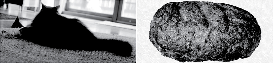
Figure 14-1: Original Tony Cat and meatloaf
There’s a high probability that you’ll encounter statistics at all levels of machine intelligence, so we’ll start by reviewing some of the basics.
Bayes
English minister Thomas Bayes (1701–1761) must have been concerned about the chances of his flock getting into heaven because he thought a lot about probability. In particular, Bayes was interested in how the probabilities of different events combined. For example, if you’re a backgammon player, you’re probably well aware of the probability distribution of numbers that result from rolling a pair of six-sided dice. He’s responsible for the eponymous Bayes’ theorem.
The part of his work that’s relevant here is what’s called a naive Bayes classifier. Leaving our meatloaf with the cat for a while, let’s try to separate out messages that are spam from messages that aren’t. Messages are collections of words. Certain words are more likely to occur in spam, from which we can infer that messages without those words might not be spam.
We’ll start by collecting some simple statistics. Let’s assume that we have a representative sample of messages, 100 that are spam and another 100 that aren’t. We’ll break the messages up into words and count the number of messages in which each word occurs. Since we’re using 100 messages, that magically gives us the percentage. Partial results are shown in Table 14-1.
Table 14-1: Words in Messages Statistics
Word |
Spam percentage |
Nonspam percentage |
meatloaf |
80 |
0 |
hamburger |
75 |
5 |
catnip |
0 |
70 |
onion |
68 |
0 |
mousies |
1 |
67 |
the |
99 |
98 |
and |
97 |
99 |
You can see that some words are common to both spam and nonspam. Let’s apply this table to an unknown message that contains “hamburger and onion:” respectively, the spam percentages are 75, 97, and 68, and the nonspam percentages are 5, 97, and 0. What’s the probability that this message is or isn’t spam?
Bayes’ theorem tells us how to combine probabilities (p) where p0 is the probability that a message containing the word meatloaf is spam, p1 is the probability that a message containing the word hamburger is spam, and so on:

This can be visualized as shown in Figure 14-2. Events and probabilities such as those from Table 14-1 are fed into the classifier, which yields the probability that the events describe what we want.

Figure 14-2: Naive Bayes classifier
We can build a pair of classifiers, one for spam and one for nonspam. Plugging in the numbers from the above example, this gives us a 99.64 percent chance that the message is spam and a 0 percent chance that it’s not.
You can see that this technique works pretty well. Statistics rules! There are, of course, a lot of other tricks needed to make a decent spam filter. For example, understanding what’s meant by “naive.” It doesn’t mean that Bayes didn’t know what he was doing. It means that just like rolling dice, all of the events are unrelated. We could improve our spam filtering by looking at the relationship between words, such as the fact that “and and” appears only in messages about Boolean algebra. Many spammers try to evade filters by including a large amount of “word salad” in their messages, which is rarely grammatically correct.
Gauss
German mathematician Johann Carl Friedrich Gauss (1777–1855) is another statistically important person. You can blame him for the bell curve, also called a normal distribution or Gaussian distribution. It looks like Figure 14-3.

Figure 14-3: Bell curve
The bell curve is interesting because samples of observed phenomena fit the curve. For example, if we measure the height of basketball players at a park and determine the mean height μ, some players will be taller and some will be shorter. (By the way, μ is pronounced “mew,” making it the preferred Greek letter for cats.) Of the players, 68 percent will be within one standard deviation or σ, 95 percent within two standard deviations, and so on. It’s more accurate to say that the height distribution converges on the bell curve as the number of samples increases, because the height of a single player isn’t going to tell us much. Carefully sampled data from a well-defined population can be used to make assumptions about larger populations.
While that’s all very interesting, there are plenty of other applications of the bell curve, some of which we can apply to our cat and meatloaf problem. American cartoonist Bernard Kliban (1935–1990) teaches us that a cat is essentially a meatloaf with ears and a tail. It follows that if we could extract features such as ears, tails, and meatloaves from photographs, we could feed them into a classifier that could identify the subject matter for us.
We can make object features more recognizable by tracing their outlines. Of course, we can’t do this unless we can find their edges. This is difficult because both cats and a fair number of meatloaves are fuzzy. Cats in particular have a lot of distinct hairs that are edges unto themselves, but not the ones we want. While it might seem counterintuitive, our first step is to blur the images slightly to eliminate some of these unwanted aspects. Blurring an image means applying a low-pass filter, like we saw for audio in Chapter 6. Fine details in an image are “high frequencies.” It’s intuitive if you think about the fine details changing faster as you scan across the image.
Let’s see what Gauss can do for us. Let’s take the curve from Figure 14-3 and spin it around μ to make a three-dimensional version, as shown in Figure 14-4.

Figure 14-4: Three-dimensional Gaussian distribution
We’ll drag this across the image, centering μ over each pixel in turn. You can imagine that parts of the curve cover other pixels surrounding the center pixel. We’re going to generate a new value for each pixel by multiplying the values of the pixels under the curve by the value of the curve and then adding the results together. This is called a Gaussian blur. You can see how it works in Figure 14-5. The image in the middle is a magnified copy of what’s in the square in the image on the left. In the right-hand image, you can see how the Gaussian blur weights a set of pixels from the center image.

Figure 14-5: Gaussian blur
The process of combining the value of a pixel with the values of its neighbors might seem convoluted to you, and in fact it’s mathematically known as convolution. The array of weights is called a kernel or convolution kernel. Let’s look at some examples.
Figure 14-6 shows a 3×3 and a 5×5 kernel. Note that the weights all add up to 1 to preserve brightness.

Figure 14-6: Gaussian convolution kernels
Figure 14-7 shows an original image on the left. Your eye can trace the outline of the tree trunks even though there are many gaps. The center image shows the results of a 3×3 kernel. While it’s fuzzier, the edges are easier to discern. The right image shows the results of a 5×5 kernel.
You can think of the image as if it’s a mathematical function of the form brightness = f(x, y). The value of this function is the pixel brightness at each coordinate location. Note that this is a discrete function; the values for x and y must be integers. And, of course, they have to be inside the image boundaries. In a similar fashion, you can think of a convolution kernel as a small image whose value is weight = g(x, y). Thus, the process of performing the convolution involves iterating through the neighboring pixels covered by the kernel, multiplying the pixel values by the weights, and adding them together.
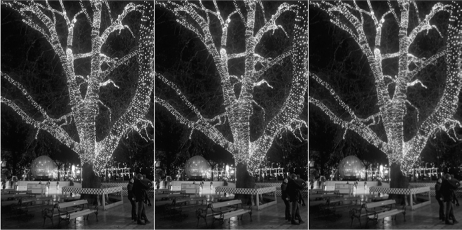
Figure 14-7: Gaussian blur examples
Figure 14-8 shows our original images blurred using a 5×5 Gaussian kernel.

Figure 14-8: Blurred cat and meatloaf
Note that because the convolution kernels are bigger than 1 pixel, they hang off the edges of the image. There are many approaches to dealing with this, such as not going too close to the edge (making the result smaller) and making the image larger by drawing a border around it.
Sobel
There’s a lot of information in Figure 14-1 that isn’t really necessary for us to identify the subject matter, such as color. For example, in his book Understanding Comics: The Invisible Art (Tundra), Scott McCloud shows that we can recognize a face from just a circle, two dots, and a line; the rest of the details are unnecessary and can be ignored. Accordingly, we’re going to simplify our images.
Let’s try to find the edges now that we’ve made them easier to see by blurring. There are many definitions of edge. Our eyes are most sensitive to changes in brightness, so we’ll use that. The change in brightness is just the difference in brightness between a pixel and its neighbor.
About half of calculus is about change, so we can apply that here. A derivative of a function is just the slope of the curve generated by the function. If we want the change in brightness from one pixel to the next, then the formula is just brightness = f(x + 1, y) – f(x, y).
Take a look at the horizontal row of pixels in Figure 14-9. The brightness level is plotted underneath, and beneath that is plotted the change in brightness. You can see that it looks spiky. That’s because it only has a nonzero value during a change.

Figure 14-9: Edges are changes in brightness
There’s a problem with measuring brightness changes this way—the changes happen in the cracks between the pixels. We want the changes to be in the middle of the pixels. Let’s see if Gauss can help us out here. When we were blurring, we centered μ on a pixel. We’ll take the same approach, but instead of using the bell curve, we’ll use its first derivative, shown in Figure 14-10, which plots the slope of the curve from Figure 14-3.
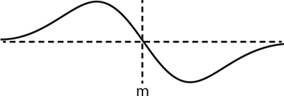
Figure 14-10: Slope of the Gaussian curve from Figure 14-3
If we call the positive and negative peaks of the curve +1 and –1 and center those over the neighboring pixels, the change of brightness for a pixel is Δbrightnessn = 1 × pixeln – 1 – 1 × pixeln + 1. You can see how this plays out in Figure 14-11.
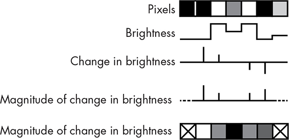
Figure 14-11: Brightness change centered on pixels
Of course, this has the same image edge problem that we saw in the last section, so we don’t have values for the end pixels. At the moment, we don’t care about the direction of change, just the amount, so we calculate the magnitude by taking the absolute value.
Detecting edges this way works pretty well, but many people have tried to improve on it. One of the winning approaches, the Sobel operator, was announced by American scientist Irwin Sobel along with Gary Feldman in a 1968 paper.
Similar to what we did with our Gaussian blur kernel, we generate a Sobel edge detection kernel using values from the slope of the Gaussian curve. We saw the two-dimensional version in Figure 14-10, and Figure 14-12 shows the three-dimensional version.
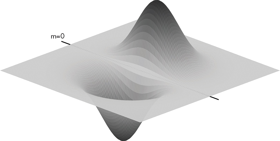
Figure 14-12: Three-dimensional slope of Gaussian curve from Figure 14-10
Since this isn’t symmetrical around both axes, Sobel used two versions—one for the horizontal direction and another for the vertical. Figure 14-13 shows both kernels.
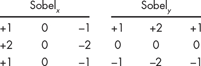
Figure 14-13: Sobel kernels
Applying these kernels produces a pair of gradients, Gx and Gy, for each pixel; you can think of a gradient as a slope. Since we have a gradient in each Cartesian direction, we can use trigonometry to convert them into polar coordinates, yielding a magnitude G and a direction θ, as shown in Figure 14-14.

Figure 14-14: Gradient magnitude and direction
The gradient magnitude tells us how “strong” an edge we have, and the direction gives us its orientation. Keep in mind that direction is perpendicular to the object; a horizontal edge has a vertical gradient.
You might have noticed that the magnitude and direction calculation is really just the transformation from Cartesian to polar coordinates that we saw in Chapter 11. Changing coordinate systems is a handy trick. In this case, once we’re in polar coordinates, we don’t have to worry about division by zero or huge numbers when denominators get small. Most math libraries have a function of the form atan2(y, x) that calculates the arctangent without division.
Figure 14-15 shows the gradient magnitudes for both images.

Figure 14-15: Sobel magnitudes for blurred cat and meatloaf
There’s an additional issue with the direction, which is that it has more information than we can use. Take a look at Figure 14-16.

Figure 14-16: Pixel neighbors
As you can see, because a pixel has only eight neighbors, there are really only four directions we care about. Figure 14-17 shows how the direction is quantized into the four “bins.”
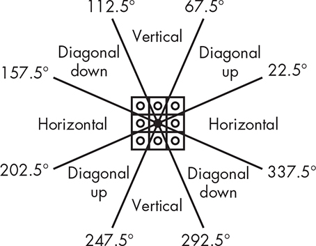
Figure 14-17: Gradient direction bins
Figure 14-18 shows the binned Sobel directions for the blurred images. You can see the correspondence between the directions and the magnitudes. The top row is the horizontal bin followed by the diagonally up bin, the vertical bin, and the diagonally down bin.

Figure 14-18: Sobel directions for blurred cat and meatloaf
As you can see, the Sobel operator is finding edges, but they’re not great edges. They’re fat, which makes it possible to mistake them for object features. Skinny edges would eliminate this problem, and we can use the Sobel directions to help find them.
Canny
Australian computer scientist John Canny improved on edge detection in 1986 by adding some additional steps to the Sobel result. The first is nonmaximum suppression. Looking back at Figure 14-15, you can see that some of the edges are fat and fuzzy; it’ll be easier later to figure out the features in our image if the edges are skinny. Nonmaximum suppression is a technique for edge thinning.
Here’s the plan. We compare the gradient magnitude of each pixel with that of its neighbors in the direction of the gradient. If its magnitude is greater than that of the neighbors, the value is preserved; otherwise, it’s suppressed by being set to 0 (see Figure 14-19).

Figure 14-19: Nonmaximum suppression
You can see in Figure 14-19 that the center pixel on the left is kept, as it has a greater magnitude (that is, it’s lighter) than its neighbors, while the center pixel on the right is suppressed because its neighbors have greater magnitude.
Figure 14-20 shows how nonmaximum suppression thins the edges produced by the Sobel operator.

Figure 14-20: Nonmaximum suppression cat and meatloaf results
This is looking pretty good, although it makes a good case for meatloaf avoidance. Nonmaximum suppression found a lot of edges in the images. If you look back at Figure 14-15, you’ll see that many of these edges have low gradient magnitudes. The final step in Canny processing is edge tracking with hysteresis, which removes “weak edges,” leaving only “strong edges.”
Back in Chapter 2, you learned that hysteresis involves comparison against a pair of thresholds. We’re going to scan the nonmaximum suppression results looking for edge pixels (white in Figure 14-20) whose gradient magnitude is greater than a high threshold. When we find one, we’ll make it a final edge pixel. We’ll then look at its neighbors. Any neighbor whose gradient magnitude is greater than a low threshold is also marked as a final edge pixel. We follow each of these paths using recursion until we hit a gradient magnitude that’s less than the low threshold. You can think of this as starting on a clear edge and tracing its connections until they peter out. You can see the results in Figure 14-21. The strong edges are white; the rejected weak edges are gray.
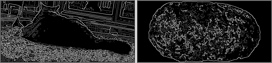
Figure 14-21: Edge tracking with hysteresis
You can see that a lot of the edges from nonmaximum suppression are gone and the object edges are fairly visible.
There is a great open source library for computer vision called OpenCV that you can use to play with all sorts of image processing, including what we’ve covered in this chapter.
Feature Extraction
The next step is easy for people but difficult for computers. We want to extract features from the images in Figure 14-21. I’m not going to cover feature extraction in detail because it involves a lot of math that you probably haven’t yet encountered, but we’ll touch on the basics.
There are a large number of feature extraction algorithms. Some, like the Hough transform, are good for extracting geometric shapes such as lines and circles. That’s not very useful for our problem because we’re not looking for geometric shapes. Let’s do something simple. We’ll scan our image for edges and follow them to extract objects. We’ll take the shortest path if we find edges that cross.
This gives us blobs, ears, cat toys, and squigglies, as shown in Figure 14-22. Only a representative sample is shown.

Figure 14-22: Extracted features
Now that we have these features, we can do just what we did with our earlier spam detection example: feed them into classifiers (as shown in Figure 14-23). The classifier inputs marked + indicate that there’s some chance that the feature is indicative of our desired result, while – means that it’s counterindicative and 0 means that it has no contribution.
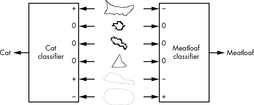
Figure 14-23: Feature classification
Notice that there’s information in our images that can be used to improve on naive classification, such as the cat toys. They’re commonly found near cats but rarely associated with meatloaves.
This example isn’t good for much other than showing the steps of feature classification, which are summarized in Figure 14-24.

Figure 14-24: Image recognition pipeline
While meatloaves are mostly sedentary, cats move around a lot and have a plethora of cute poses. Our example will work only for the objects in our sample images; it’s not going to recognize the image in Figure 11-44 on page 323 as a cat. And because of context issues, it has little chance of recognizing that the cat in Figure 14-25 is Meat Loaf.

Figure 14-25: Cat or Meat Loaf?
Neural Networks
At a certain level, it doesn’t really matter what data we use to represent objects. We need to be able to deal with the huge amount of variation in the world. Just like people, computers can’t change the inputs. We need better classifiers to deal with the variety.
One of the approaches used in artificial intelligence is to mimic human behavior. We’re pretty sure that neurons play a big part. Humans have about 86 billion neurons, although they’re not all in the “brain”—nerve cells are also neurons, which is possibly why some people think with their gut.
You can think of a neuron as a cross between logic gates from Chapter 2 and analog comparators from Chapter 6. A simplified diagram of a neuron is shown in Figure 14-26.
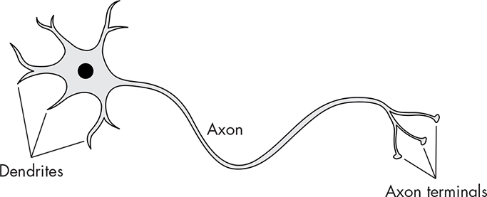
Figure 14-26: Neuron
The dendrites are the inputs, and the axon is the output. The axon terminals are just connections from the axon to other neurons; neurons only have a single output. Neurons differ from something like an AND gate in that not all inputs are treated equally. Take a look at Figure 14-27.
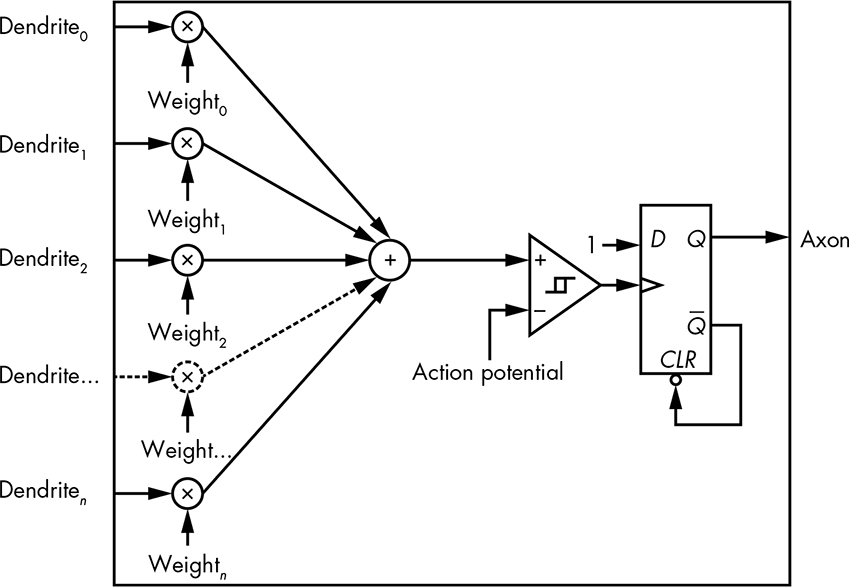
Figure 14-27: Simplified gate model of a neuron
The value of each dendrite input is multiplied by some weight, and then all of the weighted values are added together. This is similar to a Bayes classifier. If these values are less than the action potential, the comparator output is false; otherwise, it’s true, causing the neuron to fire by setting the flip-flop output to true. The axon output is a pulse; as soon as it goes to true, the flip-flop is reset and goes back to false. Or, if you learned neuroscience from Mr. Miyagi: ax-on, ax-off. Neuroscientists might quibble with the depiction of the comparator as having hysteresis; real neurons do, but it’s time-dependent, which this model isn’t.
Neurons are like gates in that they’re “simple” but can be connected together to make complicated “circuits,” or neural networks. The key takeaway from neurons is that they fire based on their weighted inputs. Multiple combinations of inputs can cause a neuron to fire.
The first attempt at an artificial neuron was the perceptron invented by American psychologist Frank Rosenblatt (1928–1971). A diagram is shown in Figure 14-28. An important aspect of perceptrons is that the inputs and outputs are binary; they can only have values of 0 or 1. The weights and threshold are real numbers.

Figure 14-28: Perceptron
Perceptrons created a lot of excitement in the AI world. But then it was discovered that they didn’t work for certain classes of problems. This, among other factors, led to what was called the “AI winter” during which funding dried up.
It turns out that the problem was in the way that the perceptrons were being used. They were organized as a single “layer,” as shown in Figure 14-29, where each circle is a perceptron.
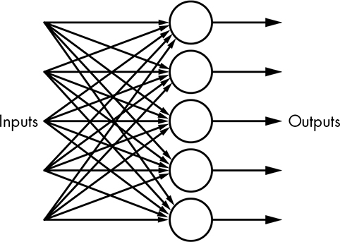
Figure 14-29: Single-layer neural network
Inputs can go to multiple perceptrons, each of which makes one decision and produces an output. Many of the issues with perceptrons were solved by the invention of the multilayer neural network, as shown in Figure 14-30.
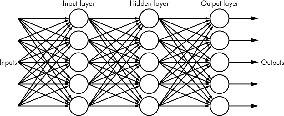
Figure 14-30: Multilayer neural network
This is also known as a feedforward network since the outputs produced from each layer are fed forward into the next layer. There can be an arbitrary number of hidden layers, so named because they’re not connected to either the inputs or outputs. Although Figure 14-30 shows the same number of neurons in each layer, that’s not a requirement. Determining the number of layers and number of neurons per layer for a particular problem is a black art outside the scope of this book. Neural networks like this are much more capable than simple classifiers.
Neuroscientists don’t yet know how dendrite weights are determined. Computer scientists had to come up with something because otherwise artificial neurons would be useless. The digital nature of perceptrons makes this difficult because small changes in weights don’t result in proportional changes in the output; it’s an all-or-nothing thing. A different neuron design, the sigmoid neuron, addresses this problem by replacing the perceptron comparator with a sigmoid function, which is just a fancy name for a function with an S-shaped curve. Figure 14-31 shows both the perceptron transfer function and the sigmoid function. Sure looks a lot like our discussion of analog and digital back in Chapter 2, doesn’t it?

Figure 14-31: Artificial neuron transfer functions
The guts of a sigmoid neuron are shown in Figure 14-32.
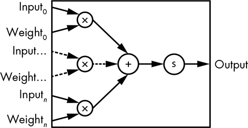
Figure 14-32: Sigmoid neuron
One thing that’s not obvious here is that the sigmoid neuron inputs and outputs are “analog” floating-point numbers. Just for accuracy, there’s also a bias used in a sigmoid neuron, but it’s not essential for our understanding here.
The weights for neural networks built from sigmoid neurons can be determined using a technique called backpropagation that’s regularly lost and rediscovered, the latter most recently in a 1986 paper by David Rumelhart (1942–2011), Geoffrey Hinton, and Roland Williams. Backpropagation uses wads of linear algebra, so we’re going to gloss over the details. You’ve probably learned how to solve simultaneous equations in algebra; linear algebra comes into play when there are large numbers of equations with large numbers of variables.
The general idea behind backpropagation is that we provide inputs for something known, such as cat features. The output is examined, and if we know that the inputs represent a cat, we’d expect the output to be 1 or pretty close to it. We can calculate an error function, which is the actual output subtracted from the desired output. The weights are then adjusted to make the error function value as close to 0 as possible.
This is commonly done using an algorithm called gradient descent, which is a lot like Dante’s descent into hell if you don’t like math. Let’s get a handle on it using a simple example. Remember that “gradient” is just another word for “slope.” We’ll try different values for the weights and plot the value of the error function. It might look something like Figure 14-33, which resembles one of those relief maps that shows mountains, valleys, and so on.
All that’s involved in gradient descent is to roll a ball around on the map until it lands in the deepest valley. That’s where the value of the error function is at its minimum. We set the weights to the values that represent the ball’s position. The reason that this algorithm gets a fancy name is that we’re doing this for very large numbers of weights, not just the two in our example. And it’s even more complicated when there are weights in multiple layers, such as we saw in Figure 14-30.
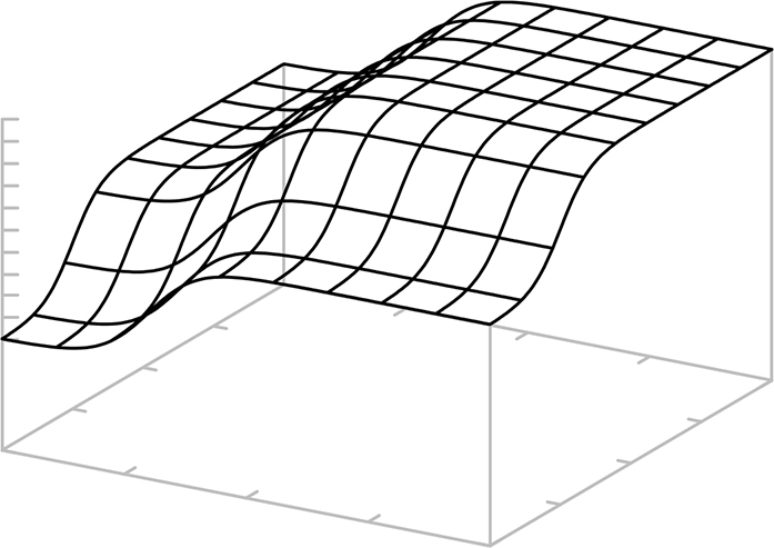
Figure 14-33: Gradient topology
You might have noticed the mysterious disappearance of the output pulsing mechanism that we saw in Figure 14-27. The neural networks that we’ve seen so far are essentially combinatorial logic, not sequential logic, and are effectively DAGs. There is a sequential logic variation called a recurrent neural network. It’s not a DAG, which means that outputs from neurons in a layer can connect back to the inputs of neurons in an earlier layer. The storing of outputs and clocking of the whole mess is what keeps it from exploding. These types of networks perform well for processing sequences of inputs, such as those found in handwriting and speech recognition.
There’s yet another neural network variation that’s especially good for image processing: the convolutional neural network. You can visualize it as having inputs that are an array of pixel values similar to the convolution kernels that we saw earlier.
One big problem with neural networks is that they can be “poisoned” by bad training data. We can’t tell what sort of unusual behavior might occur in adults who watched too much television as kids, and the same is true with machine learning systems. There might be a need for machine psychotherapists in the future, although it’s hard to imagine sitting down next to a machine and saying, “So tell me how you really feel about pictures of cats.”
The bottom line on neural networks is that they’re very capable classifiers. They can be trained to convert a large amount of input data into a smaller amount of outputs that describe the inputs in a way that we desire. Sophisticates might call this reducing dimensionality. Now we have to figure out what to do with that information.
Using Machine Learning Data
How would we build something like a self-driving ketchup bottle using classifier outputs? We’ll use the test scenario shown in Figure 14-34. We’ll move the ketchup bottle one square at a time as if it’s a king on a chessboard with the goal of hitting the meatloaf while avoiding the cat.

Figure 14-34: Test scenario
In this “textbook example,” the classifiers give us the positions of the cat and meatloaf. Since the shortest distance between two points is a straight line, and since we’re on an integer grid, the most efficient way to reach the meatloaf is to use the Bresenham line-drawing algorithm from “Straight Lines” on page 292. Of course, it’ll have to be modified as shown in Figure 14-35, because cats and condiments don’t go well together.
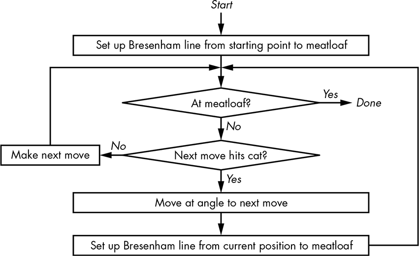
Figure 14-35: Autonomous ketchup bottle algorithm
As you can see, it’s pretty simple. We make a beeline for the meatloaf, and if the cat’s in the way, we jog and make another beeline for the meatloaf. Of course, this gets much more complicated in the real world, where the cat can move and there may be other obstacles.
Now let’s look at one of the other machine intelligence subfields to see a different way to approach this problem.
Artificial Intelligence
Early artificial intelligence results, such as learning to play checkers and solve various logic problems, were exciting and produced a lot of funding. Unfortunately, these early successes didn’t scale to harder problems, and funding dried up.
One of the attendees at the 1956 Dartmouth workshop where the term was coined was American scientist John McCarthy (1927–2011), who designed the LISP programming language while at the Massachusetts Institute of Technology. This language was used for much of the early AI work, and LISP officially stands for List Processor—but anybody familiar with the language syntax knows it as Lots of Insipid Parentheses.
LISP introduced several new concepts to high-level programming languages. Of course, that wasn’t hard back in 1958, since only one other high-level language existed at the time (FORTRAN). In particular, LISP included singly linked lists (see Chapter 7) as a data type with programs as lists of instructions. This meant that programs could modify themselves, which is an important distinction with machine learning systems. A neural network can adjust weights but can’t change its algorithm. Because LISP can generate code, it can modify or create new algorithms. While it’s not quite as clean, JavaScript also supports self-modifying code, although it’s dangerous to do in the minimally constrained environment of the web.
Early AI systems quickly became constrained by the available hardware technology. One of the most common machines used for research at the time was the DEC PDP-10, whose address space was initially limited to 256K 36-bit words, and eventually expanded to 4M. This isn’t enough to run the machine learning examples in this chapter. American programmer Richard Greenblatt and computer engineer Tom Knight began work in the early 1970s at MIT to develop Lisp machines, which were computers optimized to run LISP. However, even in their heyday, only a few thousand of these machines were ever built, possibly because general-purpose computers were advancing at a faster pace.
Artificial intelligence started making a comeback in the 1980s with the introduction of expert systems. These systems assist users, such as medical professionals, by asking questions and guiding them through a knowledge database. This should sound familiar to you; it’s a serious application of our “Guess the Animal” game from Chapter 10. Unfortunately, expert systems seem to have matured into annoying phone menus.
We’re going to attack our self-driving ketchup bottle problem with a genetic algorithm, which is a technique that mimics evolution (see Figure 14-36).
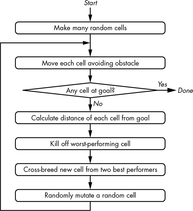
Figure 14-36: Genetic algorithm
We randomly create a set of car cells that each have a position and a direction of movement. Each cell is moved one step, and then a “goodness” score is calculated, in this case using the distance formula. We breed the two best-performing cells to create a new one, and we kill off the worst-performing cell. Because it’s evolution, we also randomly mutate one of the cells. We keep stepping until one of the cells reaches the goal. The steps that the cell took to reach the goal are the generated program.
Let’s look at the results from running the algorithm with 20 cells. We got lucky and found the solution shown in Figure 14-37 in only 36 iterations.

Figure 14-37: Good genetic algorithm results
Our algorithm created the simple program in Listing 14-1 to accomplish the goal. The important point is that a programmer didn’t write this program; our AI did it for us. The variables x and y are the position of the ketchup bottle.
x++;
x++;
x++; y++;
x++;
x++;
x++;
x++;
x++;
x++;
x++;
x++;
x++;
x++; y--;
Listing 14-1: Generated code
Of course, being genetics, it’s random and doesn’t always work out so cleanly. Another run of the program took 82 iterations to find the solution in Figure 14-38. Might make the case for “intelligent design.”

Figure 14-38: Strange genetic algorithm results
You can see that AI programs can generate surprising results. But they’re not all that different from what children come up with when exploring the world; it’s just that people are now paying more attention. In fact, many AI results that surprise some people were predicted long ago. For example, there was a lot of press when a company’s AI systems created their own private language to communicate with each other. That’s not a new idea to anybody who has seen the 1970 science fiction film Colossus: The Forbin Project.
Big Data
If it’s not obvious from the examples so far, we’re processing a lot of data. An HD (1920×1080) video camera produces around a third of a gigabyte of data every second. The Large Hadron Collider generates about 25 GiB/second. It’s estimated that network-connected devices generate about 50 GiB/second, up from about 1 MiB/second a quarter-century ago. Most of this information is garbage; the challenge is to mine the useful parts.
Big data is a moving target; it refers to data that is too big and complex to process using brute-force techniques in the technology of the day. The amount of data created 25 years ago is fairly trivial to process using current technology, but it wasn’t back then. Data collection is likely to always exceed data analysis capabilities, so cleverness is required.
The term big data refers not only to analysis but also to the collection, storage, and management of the data. For our purposes, we’re concerned with the analysis portion.
A lot of the data that’s collected is personal in nature. It’s not a great idea to share your bank account information or medical history with strangers. And data that is collected for one purpose is often used for another. The Nazis used census data to identify and locate Jews for persecution, for example, and American census data was used to locate and round up Japanese Americans for internment, despite a provision in the law keeping personally identifiable portions of that data confidential for 75 years.
A lot of data is released for research purposes in “anonymized” form, which means that any personally identifying information has been removed. But it’s not that simple. Big data techniques can often reidentify individuals from anonymized data. And many policies designed to make reidentification difficult have actually made it easier.
In America, the Social Security number (SSN) is regularly misused as a personal identifier. It was never designed for this use. In fact, a Social Security card contains the phrase “not for identification purposes,” which was part of the original law—one that’s rarely enforced and now has a huge number of exceptions.
An SSN has three fields: a three-digit area number (AN), a two-digit group number (GN), and a four-digit serial number (SN). The area number is assigned based on the postal code of the mailing address on the application form. Group numbers are assigned in a defined but nonconsecutive order. Serial numbers are assigned consecutively.
A group of Carnegie Mellon researchers published a paper in 2009 that demonstrated a method for successfully guessing SSNs. Two things made it easy. First is the existence of the Death Master File. (That’s “Death” “Master File,” not “Death Master” “File.”) It’s a list of deceased people made available by the Social Security Administration ostensibly for fraud prevention. It conveniently includes names, birth dates, death dates, SSNs, and postal codes. How does a list of dead people help us guess the SSNs of the living?
Well, it’s not the only data out there. Voter registration lists include birth data, as do many online profiles.
Statistical analysis of the ANs and postal codes in the Death Master File can be used to link ANs to geographic areas. The rules for assigning GNs and SNs are straightforward. As a result, the Death Master File information can be used to map ANs to postal codes. Separately obtained birth data can also be linked to postal codes. These two sources of information can be interleaved, sorting by birth date. Any gap in the Death Master SSN sequence is a living person whose SSN is between the preceding and following Death Master entries. An example is shown in Table 14-2.
Table 14-2: Combining Data from Postal Code 89044
Death Master File |
Guessed SSN |
Birth records |
|||
Name |
DOB |
SSN |
|
DOB |
Name |
John Many Jars |
1984-01-10 |
051-51-1234 |
|
|
|
John Fish |
1984-02-01 |
051-51-1235 |
|
|
|
John Two Horns |
1984-02-12 |
051-51-1236 |
|
|
|
|
|
|
051-51-1237 |
1984-02-14 |
Jon Steinhart |
John Worfin |
1984-02-20 |
051-51-1238 |
|
|
|
John Bigboote |
1984-03-15 |
051-51-1239 |
|
|
|
John Ya Ya |
1984-04-19 |
051-51-1240 |
|
|
|
|
|
|
051-51-1241 |
1984-04-20 |
John Gilmore |
John Fledgling |
1984-05-21 |
051-51-1242 |
|
|
|
|
|
|
051-51-1243 |
1984-05-22 |
John Perry Barlow |
John Grim |
1984-06-02 |
051-51-1244 |
|
|
|
John Littlejohn |
1984-06-03 |
051-51-1245 |
|
|
|
John Chief Crier |
1984-06-12 |
051-51-1246 |
|
|
|
|
|
|
051-51-1247 |
1984-07-05 |
John Jacob Jingleheimer Schmidt |
John Small Berries |
1984-08-03 |
051-51-1250 |
|
|
|
Of course, it’s not quite as straightforward as this example, but it’s not much more difficult either. For example, we only know the range for SSN SNs if there’s a gap in the Death Master data, such as the one shown between John Chief Crier and John Small Berries. Many organizations often ask you for the last four digits of your SSN for identification. As you can see from the example, those are the hardest ones to guess, so don’t make it easy by giving these out when asked. Push for some other means of identification.
Here’s another example. The Massachusetts Group Insurance Commission (GIC) released anonymized hospital data for the purpose of improving health care and controlling costs. Massachusetts governor William Weld assured the public that patient privacy was protected. You can probably see where this is going, with the moral being that he should have kept his mouth shut.
Governor Weld collapsed during a ceremony on May 18, 1996, and was admitted to the hospital. MIT graduate student Latanya Sweeney knew that the governor resided in Cambridge, and she spent $20 to purchase the complete voter rolls for that city. She combined the GIC data with the voter data, much as we did in Table 14-2, and easily deanonymized the governor’s data. She sent his health records, including prescriptions and diagnoses, to his office.
While this was a fairly easy case since the governor was a public figure, your phone probably has more compute power than was available to Sweeney in 1996. Computing resources today make it possible to tackle much harder cases.
Summary
We’ve covered a lot of really complicated material in this chapter. You learned that machine learning, big data, and artificial intelligence are interrelated. You’ve also learned that many more math classes are in store if you want to go into this field. No cats were harmed in the creation of this chapter.