CHAPTER 10
Trend Following in Various Macroeconomic Environments
Trend following strategies perform well during periods of market divergence. Underlying macroenvironmental factors can drive market divergence creating tradable price momentum. In this chapter, several key macro aspects of markets are discussed: interest rate environments, postcrisis recovery in a period of quantitative easing, government interventions, and regulatory forces. The results across macro environments are mixed and often highly idiosyncratic. As a caveat, this chapter provides a summary of different perspectives on macro effects and market interventions. The analysis is qualitative, historical, and in some cases anecdotal. In addition to discussion of macro events, this chapter provides an analysis of the recent strong equity bull markets following the credit crisis, a period of quantitative easing. In general, the question of macro-wide effects and the link between these effects and trend following is complex. There are still many open questions that are left for future research.
■ Interest Rate Environments
Returning to the historical study of trend following in the introduction of this book, return data for a set of stock index, bond, and commodity markets going back as far as 1693 can be used to examine macro environments from a longer term perspective. Figure 10.1 illustrates the cumulative performance of a simple trend following system over the roughly 300-year period.1 The Sharpe ratio for the entire 300-year sample period is 0.72. The average return is 0.9 percent monthly and monthly returns have a positive skew of 0.33. To quantify the relationship between trend following and traditional asset classes, an equity index and a bond index are constructed by averaging the monthly returns of several global equity indexes and bond markets with data starting in the 1870s.2 Using monthly returns, the overall correlation between trend following and the equity index is 0.10, and 0.13 with the bond index. This correlation demonstrates that the overall correlation between trend following and traditional asset classes is low.
FIGURE 10.1 Cumulative performance (log scale) for a simple trend following system over a 300-year period from 1700 to 2012.

Figure 10.2 plots the average monthly return for a trend following system during periods of negative equity index or bond index performance. For equity markets, the primarily top panel demonstrates that the average trend following return is positive during negative months for equity indices. More specifically, for the months where the equity index is down more than 10 percent, the average trend following return is almost 2 percent. For the case of the bond index, the bottom panel presents a less consistent pattern. It is important to point out that the average return for trend following is positive at times when the bond index is the most negative.
FIGURE 10.2 The conditional average monthly returns for trend following conditioned on negative returns for the equity index (top panel) and bond index (bottom panel).

Much of this book is dedicated to crisis as defined by equity markets. It is also important to take a closer look at interest rates. Returning to the analysis in Chapter 6, the potential impact of interest rates on trend following performance originates from two sources: additive interest income in funded investments and futures prices, inherent dependence on interest rates.
An Analysis of Two Interest Rate Regimes
Interest rate regimes have varied substantially during the past 800 years or even in the past 50 years. Figure 10.3 plots the Fed Funds rate from 1954 to 2013. During this almost 60-year period, there are two distinct interest rate regimes: rising interest rates before 1981, and falling interest rates after. The conditional performance of trend following during both of these regimes may provide some insight into how two very different interest rate regimes might impact performance.

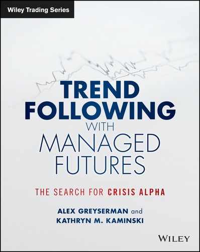
Because futures prices for long-term bonds are not available until the 1980s, numerical methods can be applied to derive futures prices using yield data since 1962.3 Using a portfolio made up of only the five-year and 10-year U.S. Treasury bonds, Figure 10.4 plots the portfolio Sharpe ratios for the rising and falling interest rate regimes. The Sharpe ratios are similar in magnitude with a slightly higher Sharpe ratio during the rising interest rate regime. Figures 10.5 and 10.6 plot the two-year rolling Sharpe ratio for trend following in the same two bond markets. From these two figures, the performance of trend following on both of these bond markets does not seem to be correlated with the corresponding change in yields.
FIGURE 10.4 Sharpe ratios for a trend following portfolio consisting of the five-year and 10-year U.S. Treasury bond futures for two distinct interest rate regimes: rising from 1962 to 1981 and falling from 1981 to 2013.
Data source: Global Financial Data.

FIGURE 10.5 The two-year rolling Sharpe ratio for trend following five-year U.S. Treasury bond futures and the five-year yield from 1963 to 2013.
Data source: Global Financial Data.

FIGURE 10.6 The two-year rolling Sharpe ratio for trend following the 10-year U.S. Treasury bond futures with the 10-year yield from 1963 to 2013.
Data source: Global Financial Data.
In addition to the derived futures prices (where futures prices are derived from yields), the potential impact of rising interest rates can also be examined using time-reversed prices series. The price formation process is time-irreversible, but this exercise is illustrative in the sense that increasing interest rates would create an environment where the fixed-income futures prices decrease. Table 10.1 displays the Sharpe ratios for nine long-term bond markets using real prices and time-reversed prices in the same period. On average, the Sharpe ratios using real prices (decreasing interest rate) are relatively close to those achieved using reversed prices (rising interest rate). These empirical tests demonstrate that trend following performance in long-term bond markets are unlikely to be significantly affected by different interest rate regimes. Trend following strategies take advantage of both upward and downward price trends in bond futures. Whether price trends are upward in decreasing interest rate environments or downward in rising interest rate environments seems to be of little consequence for trend following performance.
TABLE 10.1 Sharpe ratios for nine long-term bond futures based on real and time-reversed prices.
Real Prices |
Reversed Prices |
Start Dates |
|
| Average | 0.42 |
0.33 |
|
| U.S. 2-year | 0.83 |
0.77 |
Dec. 1990 |
| U.S. 5-year | 0.37 |
0.29 |
Nov. 1988 |
| U.S. 10-year | 0.33 |
0.27 |
Oct. 1982 |
| U.S. 30-year | 0.24 |
0.14 |
Feb. 1978 |
| Gilt Long | 0.13 |
–0.16 |
May 1983 |
| Euro Bund | 0.61 |
0.50 |
June 1991 |
| Euro Schatz | 0.55 |
0.53 |
Nov. 1999 |
| Euro Bobl | 0.47 |
0.32 |
Nov. 1996 |
| Japanese 10-year | 0.22 |
0.34 |
Apr. 1986 |
Short-Term Interest Rate Interventions
The analysis in the first part of this chapter has focused on longer-term interest rate regimes. Because most trend following systems are medium to long-term, these are the types of opportunities they are designed to capture. On the other hand, trend can occur in interest rate markets based on intervention or short-term shifts in interest rate markets. To examine the impact of short-term shocks in interest rates, interest rate hikes provide a simple example. Despite the evidence for long-term interest regimes, it can be argued that spikes in short-term interest rates can be detrimental for long-term strategies. This concept may be best explained with a simple interest rate intervention example. In early 2014, in comparison with other major currencies, the Turkish Lira exchange rate was at record lows. To boost the Turkish Lira, the Turkish Central Bank hiked up short-term interest rates. In Figure 10.7, the left graph plots short-term interest rates (overnight lending rates) for the Central Bank of the Republic of Turkey in January 2014. The right graph plots the Turkish Lira exchange rate in comparison with major currencies from October 2013 to January 2014.
FIGURE 10.7 The left graph plots Central Bank of the Republic of Turkey Overnight Lending Rate in January 2014. The right graph plots the USD/TRY exchange rate from October 2013 through January 2014.

From a one-month perspective, the jump in short-term interest rates presents itself as a spike in interest rates. Prior to the rate hike by the Turkish Central Bank, there was clearly a downward trend in Turkish Lira (TRY). This suggests that long-term trend following strategies would have been short the TRY up until the rate hike. The 4.25 percent rise in short-term interest rates and 5.5 percent rise in one-week repo rates could have easily activated stops in trend following signals. This example demonstrates how government interventions can cause trends but they also have the ability to catch trend following systems off guard. Sustained trends are the most profitable for trend following, not short spikes. Not all trends are created equal.
■ Regulatory Forces and Government Intervention
Despite the concept of free markets, especially in recent times, markets have been overwhelmed by regulatory forces and incessant government intervention. The interaction of regulatory forces and government intervention is an interesting topic for trend following. It may be unclear if such effects can create or hinder price trends. Despite the fact that it is clear that both government intervention and regulatory changes will impact markets, how this occurs is somewhat unclear. To discuss this in further detail, some literature on government intervention is summarized followed by a few comments on regulatory forces.
Government Intervention
To discuss the impact of government intervention, first this section discusses several examples where government intervention was significant. The first example is the crude oil market. Since the 1950s, the crude oil market has been the focus of constant interventions by OPEC and other agencies. Stevens (2005) provides a comprehensive review of the factors that affect oil markets. More specifically, oil prices are influenced by factors related to supply and demand as well as the policies and agendas of government agencies. It is possible to argue that these factors may be cyclical or even structural. In either case, the price of oil exhibits evident price trends. Supporting this fact, trend following models on crude oil futures has demonstrated robust performance and a Sharpe ratio above 0.45 over the past few decades. This is higher than the average Sharpe ratio for trend following on individual markets, which is approximately 0.35.4
For a second example, the economic environment in Japan during the 1990s, often called the lost decade, is a period characterized by government intervention as well as frequent fiscal and monetary policy. To examine the effects of this period, the performance of trend following can be applied on the Japanese equity index (Nikkei), Japanese government bond index (JGB), and the yen (JPY). Table 10.2 displays the Sharpe ratios for trend following when applied to Japanese equity, bond, and currency markets during the 1990s. During this period of frequent intervention, all three markets exhibited price trends, which could have been captured by trend following. The Sharpe ratios for each of the asset classes, in particular the Japanese government bond index, are all above the overall average for a typical individual futures market.
TABLE 10.2 Sharpe ratios for a representative trend following strategy on the Nikkei, JGB, and JPY during the 1990s.
| Index | Sharpe Ratio |
| Nikkei | 0.37 |
| JGB | 0.97 |
| JPY | 0.67 |
The impact of government intervention on price volatility and trends has also been examined. For a specific example, Kneib and Wocken (2012) analyze prices in the dairy sector following EU interventions. They find that the impact of intervention on the price dynamics and volatility is mixed as well as determined by the intervention price. McCauley (2012) concludes that international flows of funds cast risk-on markets into a positive feedback loop. During risk-on periods, emerging market central banks tend to put downward pressure on global bond yields because of the capital inflows. This downward pressure further reinforces the risk-on mode. Kelly, Lustif, and Van Nieuwerburgh (2013) examine option markets and demonstrate a direct link between the financial sector and government bailout policy.
Following six specific significant interventions in currency markets, an InschQuantrend white paper (2011) examines the performance of trend following in FX markets during periods of intervention. The authors postulate that, when the purpose of intervention is to stabilize nervous markets, it has a favorable effect on the strength and smoothness of trends. Looking specifically in metal markets, Mingst and Stauffer (Winter 1979) estimate that the International Tin Council intervention caused a 10 percent rise in the price of tin from September 1968 to February 1969. In this particular case, the intervention resulted in a six-month trend in tin prices. For a range of metal markets (rubber, tin, and copper), Mingst and Stauffer (1979) show that it is difficult to recognize or measure how price interventions affect long-term price trends. For the case of stock markets, Bhanot and Kadapakkam (2006) analyze the Hong Kong Monetary Authority’s massive stock market intervention in 1989. Their study concludes that the information effect of intervention contributed to a significant abnormal return on the Hang Seng. During the period following the intervention, the abnormal returns did not reverse indicating that the effect was not due to temporary price pressure.
Despite the fact that studies on government intervention are a relatively mixed bag, government intervention does not necessarily degrade trend following performance, and it may sometimes enhance it if longer term trends result. Despite this, Bond and Goldstein (2010, 2012) argue that government intervention can create trading risks for speculative trading. This is a particularly relevant point for commodity markets. For a concrete example, in the United States, the government performs a $20 billion subsidization for agricultural farmers. The question of whether this creates trends or increases risks is difficult to answer. Shorter term effects may be easier to examine. Although consistent with Bond and Goldstein, just as the Turkish Lira example earlier in this chapter, short-term intervention can be difficult for trend following. Using a specific example in commodity markets, in January 2014, the Egyptian agency GASC (General Authority for Supply Commodities) decreed that it will no longer accept wheat with a moisture content of higher than 13 percent. This simple declaration means that French wheat, which has a content of just over 13.5 percent, will be ineligible for trade in Egypt. Given that roughly 1 million tons of French wheat is exported to Egypt yearly, this new policy will have a substantial impact on French wheat prices. Not surprisingly, French wheat prices are down 22 percent in 2013. Short positions in French wheat would have benefited substantially from this policy change. U.S. wheat is a potential substitute with a moisture content of 12 percent, but the residual effect of this change coincided with only a 0.4 percent increase in price for U.S. wheat in 2013. Across a range of interventions, the evidence is highly idiosyncratic and difficult to predict from a case to case basis.
Returning to currency markets, several studies, including LeBaron (1999), Saacke (1999), and Sapp (1999) document strong correlations between periods of intervention (both German and U.S.) and positive performance for technical trading strategies in currency markets. This research might suggest that currency trends may be more tradable than interest rate trends. To support this claim, Neely (2002) finds evidence that interest rate interventions often come as a response to short-term trends and claims that intervention does not generate technical trading profits. The source of profits from the trends was the result of trends leading up to the intervention as opposed to after. To examine government intervention in currencies with an example, Figure 10.8 plots the dollar–yen exchange rate (USD/JPY) from 2000 to 2003. Consider the graph without the dots; do the interventions seem to substantially change price series in the graph? Neely (2002) may be correct in many cases as it is exorbitantly difficult to disentangle intervention from fundamental factors.
FIGURE 10.8 Effect of government intervention from 2000 to 2003. The “dots” represent the Bank of Japan’s intervention.

Regulatory Forces
In the wake of the previous financial crisis and infamous Bernard Madoff scandal, lawmakers and regulators are pushing for new regulations to help avoid future financial crises. There also has been a call for the harmonization of these regulations at the international level.
The focus of these regulations has been on:
Unintentional Impact of Regulation: A Comment Although well-intentioned, the push for further regulation may create even more structural reasons for why investors will be coordinated in their actions during losses in equity markets. First, the act of limiting or prohibiting short selling allows fewer investors to alleviate their long bias to equities possibly further exacerbating their need to sell during equity losses. Second, restrictions in the use of derivatives and commodity markets, such as those proposed for pension funds, can make them less diversified and less flexible in their portfolios in response to stress. Third, regulations that focus on risk taking, similar to Basel III, can further force investors into action when they take losses and volatility and correlation spike. Fourth, regulations for increased transparency in financial markets via the harmonization of regulation, reporting, and registration of positions and counterparties might help to reduce some of the problems seen in the banking sector during the last crisis. When it comes to future crises, many might criticize that harmonization of financial systems and the centralization of clearing and reporting could create new systemic risks financial monsters that also may be deemed “too big to fail.” CCPs were discussed in Chapter 2. One of the key criticisms for CCP structures is based on systemic risks. The focus on the banking sector can unintentionally move problems to other market sectors, exchanges, insurance companies, shadow banking, and through other pathways.
As in all past financial crises, new regulation and rules are often well-intentioned. Despite these efforts, financial crises continue to manifest themselves in new areas, seemingly more often. The global market environment merely adapts to these rules and regulations. As a result, new rules and regulations may exacerbate the driving or forcing of market participants into action by limiting their adaptability and flexibility during times of market stress. If this is the case, in certain scenarios crisis alpha may be found across markets during these moments. Trend following is an opportunistic strategy that is poised to capture trends when they occur. Some trends are easier to catch than others. For example, the tulip mania bubble and the Wall Street crash of 1929 were discussed in the introduction to this book. In October 1929, a month when the Dow Jones index lost approximately half of the value, a representative trend following system had a slightly positive return. During the two years around the pre- and post–Black Monday, trend following realized a 90 percent return. On the other hand, during the Flash Crash of 2010 in the middle of the European debt crisis, capturing crisis alpha in this scenario proved more difficult.
■ Postcrisis Recovery
Post 2008, the financial world has been turned upside down. Reactions to the 2008 crisis have delivered an onslaught of regulation and nearly unprecedented fiscal and monetary policy. This includes, of course, quantitative easing. During this same period, for the five-year period from 2009 to 2013, the S&P 500 has slowly and steadily inched up to a whopping 175 percent! To put recent performance into perspective, this performance is in the 98th percentile of all five-year rolling periods since the S&P 500 index inception in 1928. Figure 10.9 plots the cumulative performance of the S&P 500 from 2009 to 2013.
FIGURE 10.9 The cumulative performance of the S&P 500 Index from 2009 to 2013.

It would seem that trend following systems should have profited strongly from this large “trend.” Has this in fact been the case? In this section, a representative trend following system is used to examine performance on the S&P 500 Index. This analysis can provide insight into performance across trading speeds in general.
Fast, Medium, or Slow?
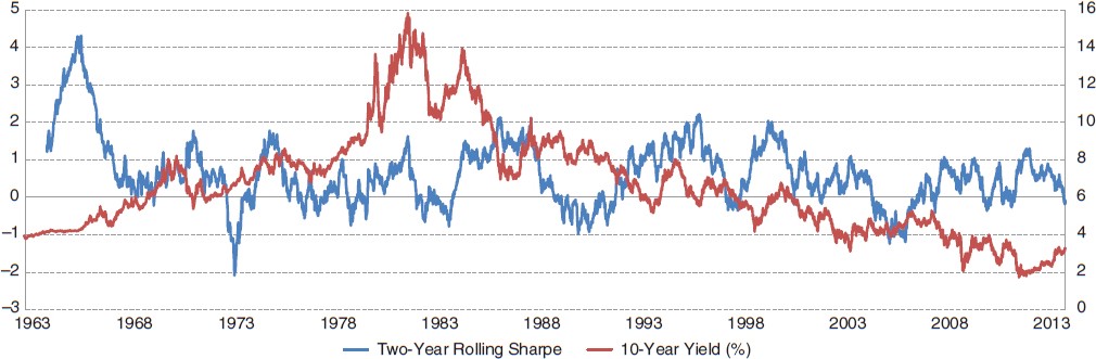
Although this “up-trend” is obvious to the naked eye, it is not obvious that any particular trend following strategy would be able to capture this trend. To discuss this in further detail, the performance of different speeds of trend following systems over both the recent and entire histories can be examined. A trend following system will attempt to determine if the S&P 500 is climbing a hill or plummeting to new lows using sets of systematic rules. To classify different approaches to trend following, trend following systems are divided by trading speeds into buckets as a function of the average holding period. A fast system is defined as a holding period of less than four weeks. Medium systems are defined by 7- to 11-week holding periods and slow systems are defined by holding periods greater than 14 weeks. Although these cutoffs are relatively arbitrary, the results in this analysis remain relatively robust to this choice.5
For each holding period in Table 10.3, two arbitrarily selected generic trend following systems are used. For each particular trading speed, the correlation with the S&P 500 Index and Sharpe ratios are listed for 2009–2013 and since the inception of the S&P 500 Index in 1928. Since 1928, medium-term trend following systems have the highest Sharpe ratio with a low but positive correlation with the S&P 500 Index. The faster systems have the second-highest Sharpe ratio and they have a slightly negative to zero correlation with the S&P 500 Index since inception. The slowest systems have the lowest Sharpe ratio and the highest positive correlation with the S&P 500 Index since inception. During the postcrisis recovery, with a significant rise in the S&P 500 Index, the fast and medium systems have much lower Sharpe ratios than the slow systems.
TABLE 10.3 Sharpe ratios and correlations with the S&P 500 Index for fast, medium, slow, and an equal weighted combination of speeds for both the five years post the credit crisis (2009–2013) and since the inception of the S&P 500 Index in 1928.
| Holding Period | Sharpe Ratio 2009–2013 |
Sharpe Ratio since 1928 |
Correlation to S&P 2009–2013 |
Correlation to S&P Returns since 1928 |
| Fast | –0.026 |
0.466 |
0.037 |
–0.060 |
0.156 |
0.492 |
0.125 |
–0.010 |
|
| Medium | 0.386 |
0.541 |
0.302 |
0.084 |
0.120 |
0.522 |
0.420 |
0.056 |
|
| Slow | 0.503 |
0.415 |
0.804 |
0.214 |
0.623 |
0.397 |
0.786 |
0.222 |
|
| Combo6 | 0.379 |
0.581 |
0.514 |
0.102 |
| Average7 | 0.294 |
0.472 |
0.412 |
0.084 |
In terms of correlation during the postcrisis recovery, all three speeds of trading systems have somewhat higher than average positive correlation, with the slow system having correlations as high as 80 percent. For the entire period, a typical slow system exhibits a correlation of roughly 20 percent with the S&P 500 Index, indicating that during the postcrisis recovery from 2009 to 2013, the uptrend was so strong that the correlation with a long equity strategy was four times the average correlation in history. This demonstrates how a slow system was the most similar to a buy-and-hold strategy in equity markets in this particular period. The high level of correlation between the slow systems and the buy-and-hold portfolio demonstrates the pure strength of the uptrend in equity markets post 2009.
Table 10.3 can also motivate a discussion of the impact of diversification. To examine diversification in a simple manner, the difference in performance of a combined system with several speeds and the average performance across all speeds can be compared. The difference between these two indicates the benefits of combining speeds in one trend following system. In both cases, the postcrisis recovery period and since inception, the combined Sharpe ratio is nearly 25 percent higher than the average Sharpe ratio of the individual trading speeds.
A Longer-Term Perspective 2009 to 2013 is a particular period where slow systems outperform. The natural next question to ask is whether this particular period is an anomaly. In order to put this into perspective, five-year rolling Sharpe ratios can be compared since inception of the S&P 500 Index in 1928. For the case of overlapping five-year periods, there are a total of 81 data points. Table 10.4 lists the percentage of time that each system speed is the best performing in terms of Sharpe ratios. Throughout history (the postcrisis recovery period included), slow systems have performed the least often. During the entire period, either fast or medium-term speeds outperform slow systems roughly 73 percent of the time.
TABLE 10.4 The percentage of time each system (fast, medium, and slow) has the highest Sharpe ratio from 1928 to 2013.
Percentage of Time with the Highest Sharpe Ratio (%) |
|
| Fast | 37.42 |
| Medium | 35.80 |
| Slow | 26.78 |
As seen in Table 10.4, the slow system was the best performer (over a rolling five-year period) only just over 25 percent of the time. It is also interesting to see which speeds have performed the best during periods across history. Figure 10.10 plots the best performer based on trading speed, where best performance is defined as the highest rolling five-year Sharpe ratio against the S&P 500 Index price chart (log-scale).
FIGURE 10.10 The best-performing five-year Sharpe ratios for fast, medium, and slow trend following systems from 1928 to 2013. These periods are plotted relative to the log-scale performance of the S&P 500 Index.
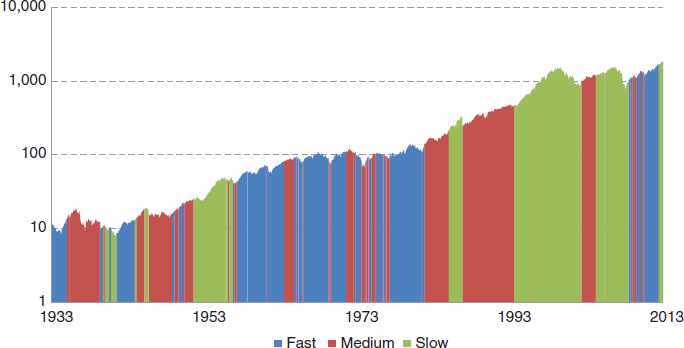
Figure 10.10 demonstrates how there are certain five-year periods where one strategy is the best performer. Because five years is a rather long period, shorter periods can also be examined for comparison. Figure 10.11 displays the best-performing trading speed in terms of one-year Sharpe ratios since the inception of the S&P 500 Index compared with the cumulative log-scale performance of the S&P 500 Index.
FIGURE 10.11 The best-performing one-year Sharpe ratios for fast, medium, and slow trend following systems on the S&P 500 Index from 1928 to 2013. These periods are plotted relative to the log-scale performance of the S&P 500 Index.

When slow systems outperform the medium and fast systems, it is also interesting to determine how extreme the outperformance is. Table 10.5 shows the frequency of time that the slow system’s Sharpe ratio is greater than the respective fast and medium systems (in combination). For example, the bold number 5.34 indicates that 5.34 percent of the time the slow-system Sharpe ratio is greater than the medium-system Sharpe ratio by 0.3 (x-axis) and the slow-system Sharpe ratio is greater than the fast-system Sharpe ratio by 0.5 (y-axis). The bold number is relevant because this represents the state of the S&P 500 Index during the postcrisis recovery period from 2009 to 2013.
TABLE 10.5 The percentage of time the slow trend following system outperforms the medium-system Sharpe ratio by x and the fast-system Sharpe ratio by y from 1928 to 2013.
Medium |
|||||||||
x = 0 |
0.1 |
0.2 |
0.3 |
0.4 |
0.5 |
||||
| Fast | y = 0 |
26.78 |
13.87 |
9.23 |
6.90 |
5.75 |
5.16 |
||
0.1 |
23.01 |
13.24 |
8.74 |
6.48 |
5.44 |
4.98 |
|||
0.2 |
18.84 |
12.45 |
8.01 |
6.01 |
5.00 |
4.55 |
|||
0.3 |
15.60 |
11.68 |
7.55 |
5.66 |
4.80 |
4.38 |
|||
0.4 |
14.02 |
10.73 |
7.30 |
5.52 |
4.66 |
4.30 |
|||
0.5 |
13.06 |
10.08 |
6.98 |
5.34 |
4.53 |
4.18 |
|||
The top left 26.78 number shows the percentage of time that slow is better than medium and slow is better than fast, which is the same result as in Table 10.4. In general from Table 10.5 it is clear that slow systems are fairly infrequently significantly better than both medium and fast. Put simply, it’s relatively rare to see such substantial outperformance by the slow system.
The performance of fast, medium, and slow systems can also be examined in aggregate graphically. For the period of 1928 to 2013, Figure 10.12 plots a histogram of the five-year Sharpe ratios for fast, medium, and slow systems. For each histogram, the postcrisis recovery period is shown by the single highlighted bar for comparison. The distribution for fast systems is markedly different from the medium and slow systems. Faster systems do not seem to exhibit a normal distribution. Instead, fast systems are positively skewed with lower dispersion in performance. Table 10.6 lists the skewness for fast, medium, and slow systems applied on the S&P 500 Index in comparison with the S&P 500 Index itself.
TABLE 10.6 Skewness for fast, medium, and slow systems on the S&P 500 and the S&P 500 from 1928 to 2013.
Fast |
Medium |
Slow |
S&P 500 |
|
| Skewness | 0.21 |
0.03 |
–0.17 |
–0.22 |
FIGURE 10.12 Histograms for five-year rolling Sharpe ratios for fast, medium, and slow trend following systems from 1928 to 2013. The postcrisis recovery period is shown by the single highlighted bar for comparison.
It is interesting to note that the slow system has a very similar skew to the S&P 500 Index; intuitively this makes sense as the longer the holding period, the more the system resembles a buy-and-hold strategy. For both the fast and medium speeds, the Sharpe ratios during the postcrisis recovery (2009–2013) are somewhat below their long-term averages. This demonstrates that although a buy-and-hold investor in the S&P 500 Index during this period is in the 98th percentile, this period does not appear to be a tail event for trend following systems.
The Need for Speed … Diversification
Post 2008, equity markets have taken a slow and steady climb upward. The analysis in this section suggests (albeit not shockingly) that slow systems outperformed during this period. From a longer-term perspective, the occasional outperformance of a slow system is simply one data point and one period in time. This analysis and discussion does not imply that slow systems are better or worse than medium and fast. It only demonstrates the value of diversification across speeds and the importance of not overemphasizing individual time periods.
Since the inception of the S&P 500 Index, the average combined trend following portfolio has a Sharpe ratio of 0.58 with a low correlation of 0.1 with a buy-and-hold investment in the S&P 500 portfolio. This performance is greater than the Sharpe ratio of the S&P 500 Index itself. This, in and of itself, makes a compelling case for trend following as an alternative asset class.
To discuss diversification benefits more concretely, the addition of different speeds of trend following can be examined to determine how speed impacts total performance in combination with the S&P 500 Index. To do this, a long-only portfolio in the S&P 500 Index with a 50/50 allocation to trend following is considered. Since inception, the S&P 500 Index has had a Sharpe ratio of 0.37. Figure 10.13 compares the portfolio Sharpe ratio of a 50/50 mix of S&P 500 Index in combination with different types of trend following portfolios on the S&P 500 Index. The darker solid horizontal line indicates the original Sharpe ratio for a portfolio that is 100 percent long the S&P 500 Index with a Sharpe ratio of 0.37.
FIGURE 10.13 A 50/50 mix of the S&P 500 Index with fast, medium, and slow trend following systems on the S&P 500 Index. A combo system with all three speeds is listed for comparison. The period is 1928 to 2013.

The benefit of diversification with trend following is quite apparent. One point that may be slightly counterintuitive in Figure 10.13 is the fact that the diversification benefits for the slow system are the lowest. This is due to the fact that the slow system is the most similar and also the most positively correlated with a long-only investment in the S&P 500 Index.
Diversification over the Long Term It is undeniable that the postcrisis recovery period of 2009–2013 has been a joyous ride for the long-only equity investor. In this section, this slow and steady trend in equities is examined to determine which speed of trading systems would have performed during this period. During the postcrisis recovery, slower systems have performed rather well but not exceptional from a long-term perspective. Fast and medium systems would have found this trend difficult to follow. A historical perspective from 1928 to 2013 demonstrates how this five-year period is simply one sample period in history. The thought experiment uncovers a more important portfolio issue: the value of diversification across speeds. Slow systems tend to have a higher correlation to the market itself, providing marginal diversification benefits to an equities investor. Across time, diversifying across a wide spectrum of time frames provides a simple way to improve long-term performance of trend following from a portfolio perspective.
■ Summary
This chapter focuses on macro forces that may affect the performance of trend following over time. More specifically, interest rate regimes, government intervention, regulatory forces and the postcrisis recovery period were discussed. Interest rate regimes seem to have little impact on trend following performance. Government interventions are somewhat of a mixed bag but it seems that the act of forcing markets creates trends that may be exploitable. Shorter term interventions have the possibility of working against long-term trends following strategies. For a period of quantitative easing, a period of a large uptrend in equity markets, trend following performs in line with historical expectations. In aggregate, it is clear that it is very difficult to disentangle the impact of intervention and underlying fundamental factors. Lastly, regulatory forces are often well intentioned, yet they can create strange externalities in markets. Regulatory forces may from time to time create trends and thus opportunities for trend following strategies over time.
■ Further Readings and References
Bhanot, K., and P. Kadapakkam. “Anatomy of a Government Intervention in Index Stocks: Price Pressure or Information Effects?” Journal of Business (March 2006): 963–986.
Bond, P., I. Goldstein, and E. Simpson. “Market-Based Corrective Actions.” Review of Financial Studies 23, no. 2 (2010): 781–820.
Bond, P., and I. Goldstein. “Government Intervention and Information Aggregation by Prices.” Working paper, 2012.
“Central Bank Intervention: If the Trend Is Your Friend, Is Central Bank Intervention Your Enemy?,” InschQuantrend 4 (April 2011).
Greyserman, A. “Trend-Following: Empirical Evidence of the Stationarity of Trendiness.” ISAM white paper, February 2012.
Greyserman, A., and K. Kaminski. “S&P500: Is the Trend Your Friend?” ISAM white paper, 2014.
Kaminski, K. “Regulators’ Unintentional Effects on Markets,” SFO, 2011.
Kelly, B., H. Lustif, and S. Van Nieuwerburgh. “Too-Systematic-to-Fail: What Option Markets Imply About Sector-Wide Government Guartantees.” Working paper, 2013.
Kneib, T., and M. Wocken. “Tobit Regression to Estimate Impact of EU Market Intervention in Dairy Sector.” 123rd EAAE Seminar, Dublin, February 2012.
LeBaron, B. “Technical Trading Rule Profitability and Foreign Exchange Intervention.” Journal of International Economics 49 (1999): 125–143.
McCauley, R. “Risk-On/Risk-Off, Capital Flows, Leverage and Safe Assets.” BIS Working Paper, July 2012.
Mingst, K., and R. Stauffer. “Modeling Equilibrium Trends and Interventions in Commodity Markets.” Empirical Economics 4, no. 2 (1979).
Mingst, K., and R. Stauffer. “Intervention Analysis of Political Disturbances, Market Shocks, and Policy Initiatives in International Commodity Markets.” International Organization 33, no. 1 (Winter 1979).
Neely, C. “The Temporal Pattern of Trading Rule Returns and Central Bank Intervention: Intervention Does Not Generate Technical Trading Rule Profits.” Journal of International Economics 58, no. 1 (October 2002): 211–232.
Saacke, P. “Technical Analysis and the Effectiveness of Central Bank Intervention.” University of Hamburg, unpublished manuscript, 1999.
Sapp, S. “The Role of Central Bank Intervention in the Profitability of Technical Analysis in the Foreign Exchange Market.” Unpublished manuscript, Ivey School of Business, University of Western Ontario, 1999.
Stevens, P. “Oil Markets.” Oxford Review of Economic Policy 21, no. 1 (2005).
Tang, K., and W. Xiong. “Index Investment and Financialization of Commodities.” NBER Working Paper 16385, 2010.
1 The trend following system uses simple moving average based on monthly returns. Prior to 1900, the portfolio consists of 17 markets in the equity index, bond, and commodity sectors.
2 The equity index is the average of monthly returns of FTSE 100 Index, S&P 500 Index, CAC 40 Index, and the Australian SPI 200 Index, and the bond index is constructed by the average monthly returns of U.S. 10-year Treasury note, Canadian 10-year Bond, and Japanese 10-year Bond. Before the existence of these several individual stock indexes or bond markets, the returns of equivalent markets were used to extend the data so that all components in these two indexes begin in the 1870s.
3 A linear relationship is derived using a regression between yields and futures prices. Empirically, the daily PnL of a trend following system based on the derived prices is highly correlated with actual futures prices.
4 Trend following individual markets has lower Sharpe ratios than an aggregate trend following system, which spreads risk across all asset classes.
5 For each classification of speed, two trend following systems are selected arbitrarily that meet the holding period requirements.
6 The Combo system is the combined strategy of all six systems.
7 Equally weighted average of the six Sharpe ratios.