
![]()
Creating Plots
It is always a good idea to include a plot as part of your statistical analysis. Plots allow for a more intuitive grasp of the data, making them ideal for presenting your results to those without statistical expertise. They also make it easier to spot features of the data such as outliers or a bimodal distribution, which you may overlook when using other methods.
One of the strong points of R is that it makes it easy to produce excellent quality, fully customizable plots and statistical graphics. This chapter explains how to create the most popular types, which are:
- simple line plots
- histograms
- normal probability plots
- stem-and-leaf plots
- bar charts
- pie charts
- scatter plots
- scatterplot matrices
- box plots
- function plots
This chapter concentrates on creating plots using the default settings. In Chapter 9 you will learn how to make your plots more presentable by changing titles, labels, colors, and other aspects of the plot’s appearance.
This chapter uses the trees and iris datasets (which are included with R), the people2 dataset (available from the website), and the sexeyetable table object (created in Chapter 6).
To create a basic plot of a continuous variable against the observation number, use the plot function. For example, to plot the Height variable from the trees dataset, use the command:
> plot(trees$Height)
When you create a plot, it is displayed in a new window called the graphics device (or for Mac users, the Quartz device). Figure 8-1 shows how the plot looks.
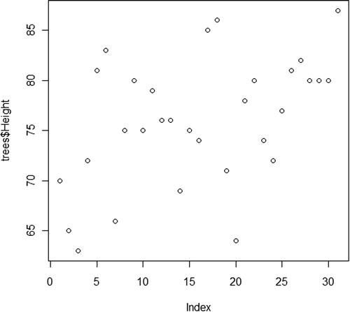
Figure 8-1. Simple plot created with the plot function
The plot function does not just create basic one-dimensional plots. The type of plot created depends on the type and number of variables you give as input. You will see it used in different parts of this book to create other types of plots, including bar charts and scatter plots.
By default, R uses symbols to plot the data values. To use lines instead of symbols, set the type argument to "l":
> plot(trees$Height, type="l")
Other possible values for the type argument include "b" for both lines and symbols, "h" for vertical lines, and "s" for steps. Figure 8-2 shows how the plot looks when these values are used. Depending on the nature of your data, some of these options will be more suitable than others.
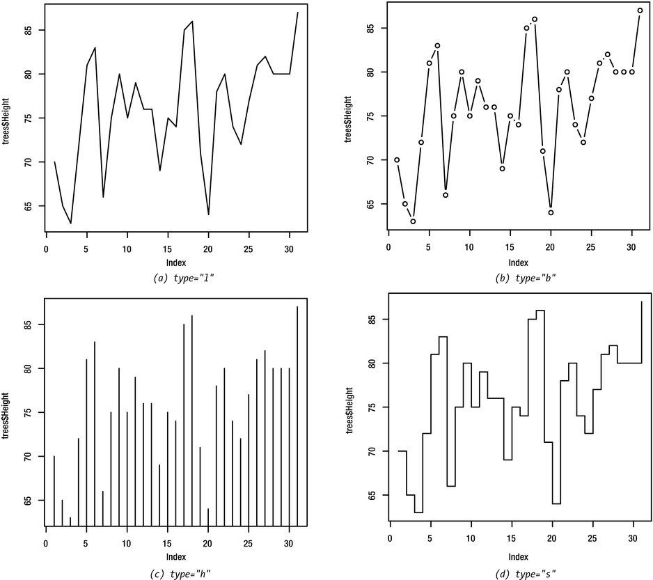
Figure 8-2. Simple plot showing some of the options for the type argument
Histograms
A histogram is a plot for a continuous variable that allows you to assess its probability distribution. To create a histogram, the range of the data is divided into a number of intervals and the number of observations that fall into each interval is counted. A histogram can either show the frequency for each interval directly, or it may show the density (i.e., the frequency is scaled so that the total area of the histogram is equal to one).
You can create a histogram with the hist function, as shown below for the Height variable. Figure 8-3 shows the result.
> hist(trees$Height)
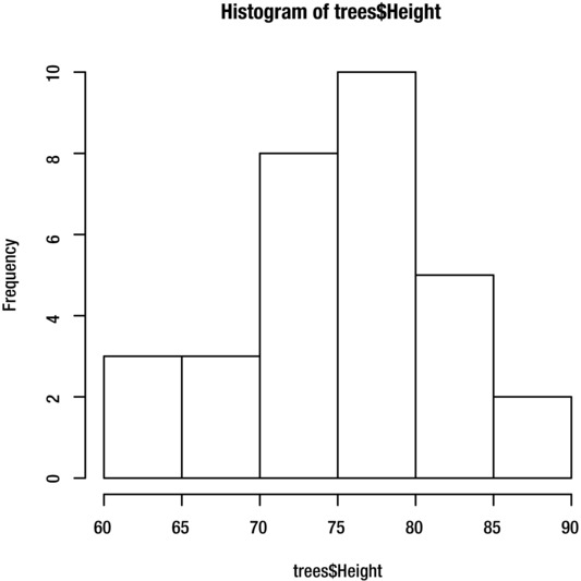
Figure 8-3. Histograms of the Height variable from the trees dataset
R automatically selects a suitable number of bars for the histogram. If you prefer, you can specify the number of bars with the breaks argument:
> hist(dataset$variable, breaks=15)
By default, R creates a histogram of frequencies. To create a histogram of densities (so that the total area of the histogram is equal to one), set the freq argument to F:
> hist(dataset$variable, freq=F)
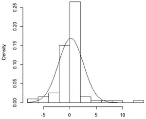
You can use the curve function to fit a normal distribution curve to the data. This allows you to see how well the data fits the normal distribution. Use the curve function directly after the hist function, while the histogram is still displayed in the graphics device. Adding a density curve is only appropriate for a histogram of densities, so remember to set the freq argument to F:
> hist(trees$Height, freq=F)
> curve(dnorm(x, mean(trees$Height), sd(trees$Height)), add=T)
The result is shown in Figure 8-4.

Figure 8-4. Histogram of the Height variable, with normal distribution curve superimposed
If the variable has any missing data values, remember to set the na.rm argument to T for the mean and sd functions:
> hist(dataset$variable, freq=F)
> curve(dnorm(x, mean(dataset$variable, na.rm=T), sd(dataset$variable, na.rm=T)), add=T)
The curve function is discussed in more detail later in this chapter in the “Plotting a Function” section, and in Chapter 9 under “Adding a Mathematical Function Curve.” The dnorm function is covered in Chapter 7 under “Probability Density Functions and Probability Mass Functions.”
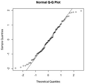
A normal probability plot is a plot for a continuous variable that helps to determine whether a sample is drawn from a normal distribution. If the data is drawn from a normal distribution, the points will fall approximately in a straight line. If the data points deviate from a straight line in any systematic way, it suggests that the data is not drawn from a normal distribution.
You can create a normal probability plot using the qqnorm function, as shown for the Height variable:
> qqnorm(trees$Height)
You can also add a reference line to the plot, which makes it easier to determine whether the data points are falling into a straight line. To add a reference line, use the qqline function directly after the qqnorm function:
> qqnorm(trees$Height)
> qqline(trees$Height)
The result is shown in Figure 8-5.
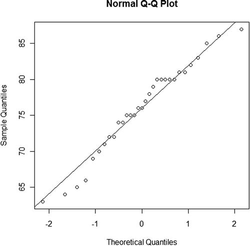
Figure 8-5. Normal probability plot of the Height variable
There is also a function called qqplot, which allows you to create quantile plots for comparing data with other standard probability distributions in addition to the normal distribution. Enter help(qqplot) for more details.
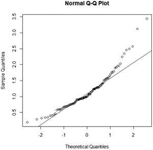
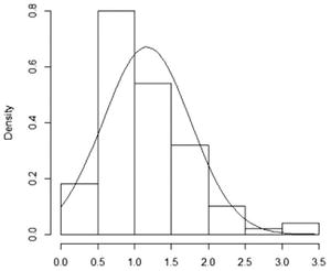
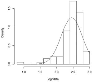
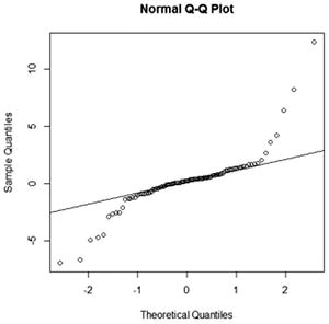
INTERPRETING THE NORMAL PROBABILITY PLOT
The way in which the data points fall around the straight line tells you something about the shape of the distribution relative to the normal distribution. Table 8-1 shows some patterns you might see and how to interpret them.
Table 8-1. Patterns Seen in the Normal Probability Plot and Their Interpretations
Normal probability plot |
Corresponding histogram |
Pattern and interpretation |
|---|---|---|
|
|
Pattern: Data points curve from above the line to below the line and then back to above the line. Interpretation: Data has a positive skew (is right-skewed). |
|
|
Pattern: Data points curve from below the line to above the line and then back to below the line. Interpretation: Data has a negative skew (is left-skewed). |
|
|
Pattern: Data points fall below the line toward the left and above the line toward the right. Interpretation: Data has a sharper peek and fatter tails relative to the normal distribution (positive excess kurtosis). |
|
|
Pattern: Data points fall above the line toward the left and below the line toward the right. Interpretation: Data has a more obtuse peek and slender tails relative to the normal distribution (negative excess kurtosis). |

The stem-and-leaf plot (or stemplot) is another popular plot for a continuous variable. It is similar to a histogram, but all of the data values can be read from the plot.
You can create a stem-and-leaf plot with the stem function, as shown here for the Volume variable:
> stem(trees$Volume)
In R, the stem-and-leaf plot is actually a semigraphical technique rather than a true plot. The output is displayed in the command window rather than the graphics device.
The decimal point is 1 digit(s) to the right of the |

1 | 00066899
2 | 00111234567
3 | 24568
4 | 3
5 | 12568
6 |
7 | 7
A bar chart is a plot for summarizing categorical data. A simple bar chart summarizes one categorical variable by displaying the number of observations in each category. Grouped and stacked bar charts summarize two categorical variables by displaying the number of observations for each combination of categories.
You can create bar charts with the plot and barplot functions. If you have raw data such as the Eye.Color variable in the people2 dataset, use the plot function as shown below. The result is given in Figure 8-6.
> plot(people2$Eye.Color)
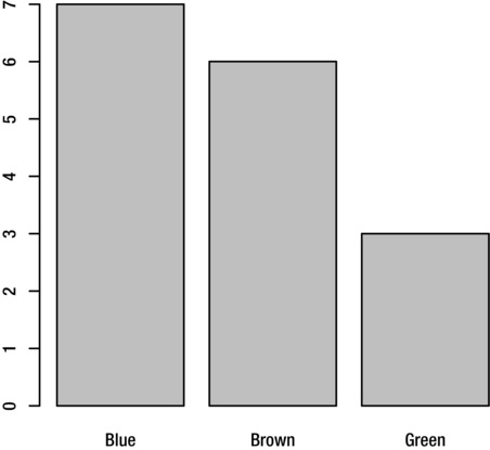
Figure 8-6. Bar chart of the Eye.Color variable from the people2 dataset
When creating a bar chart from raw data, the variable must have the factor class. The “Variable Classes” section in Chapter 3 explains how to check the class of a variable and change it if necessary.
To create a bar chart from a previously saved one-dimensional table object (see “Frequency Tables” in Chapter 6), use the barplot function:
> barplot(tableobject)
For a horizontal bar chart like the one shown in Figure 8-7, set the horiz argument to T. This works with both the plot and barplot functions:
> plot(people2$Eye.Color, horiz=T)
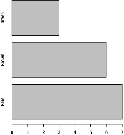
Figure 8-7. Horizontal bar chart of the Eye.Color variable from the people2 dataset, created by setting horiz=T
The barplot function can also create a bar chart for two categorical variables, known as a multiple bar chart or a clustered bar chart. There are two styles of multiple of bar chart, as shown in Figure 8-8.
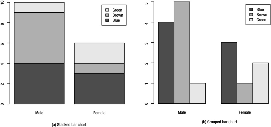
Figure 8-8. Two styles of multiple bar chart of Eye.Color by Sex
The first is the stacked style, which you can create from a two-dimensional table object:
> barplot(sexeyetable, legend.text=T)
The second style is a grouped bar chart, which displays the categories side-by-side. Create this style by setting the beside argument to T:
> barplot(sexeyetable, beside=T, legend.text=T)
To create multiple bar charts from raw data, first create a two-dimensional table object, as explained in the “Frequency Tables” section in Chapter 6. Alternatively, you can nest the table function inside the barplot function:
> barplot(table(people2$Eye.Color, people2$Sex), legend.text=T)
The pie chart is a plot for a single categorical variable and is an alternative to the bar chart. It displays the number of observations in each category as a portion of the total number of observations.
You can create a pie chart with the pie function. If you have previously created a one-dimensional table object (see “Frequency Tables” in Chapter 6), you can use the function directly:
> pie(tableobject)
To create a pie chart from raw data, nest the table function inside the pie function as shown here. The result is given in Figure 8-9.
> pie(table(people2$Eye.Color))
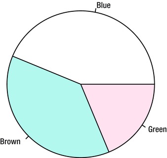
Figure 8-9. Pie chart of the Eye.Color variable
If your variable has missing data and you want this to appear as an additional section in the pie chart, set the useNA argument to "ifany":
> pie(table(dataset$variable, useNA="ifany"))
A scatter plot is a plot for two continuous variables, which allows you to examine the relationship between them.
You can create a scatter plot with the plot function, by giving two numeric variables as input. The first variable is displayed on the vertical axis and the second variable on the horizontal axis. For example, to plot Volume against Girth for the trees dataset, use the command:
> plot(Volume~Girth, trees)
The output is shown in Figure 8-10.
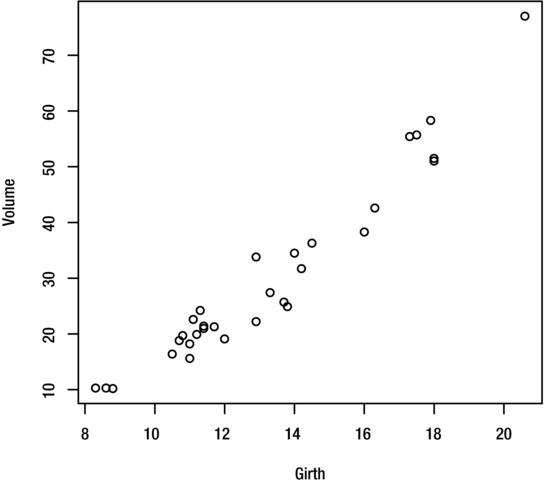
Figure 8-10. Scatter plot of Volume against Girth, for the trees dataset
To add a line of best fit (linear regression line), use the abline function directly after the plot function as shown here. Figure 8-11 shows the result.
> plot(Volume~Girth, trees)
> abline(coef(lm(Volume~Girth, trees)))
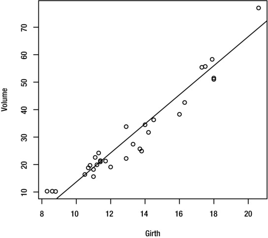
Figure 8-11. Scatter plot of Volume against Girth, for the trees dataset, with line of best fit superimposed
You will learn more about the abline function in Chapter 9 under “Adding Additional Straight Lines,” and the lm and coef functions in Chapter 11.
If it is meaningful for your data, you can join the data points with lines by setting the type argument to "l". To create a plot with both symbols and lines, set it to "b". The effect is shown in Figure 8-12.
> plot(Volume~Girth, trees, type="l")
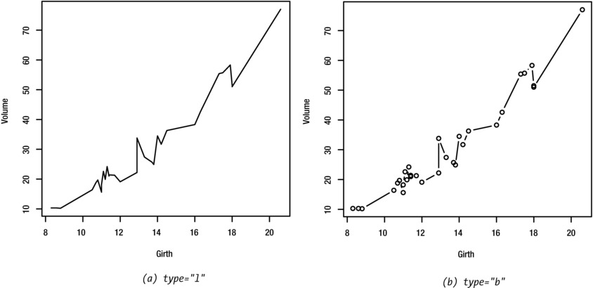
Figure 8-12. Scatter plots with (a) lines and (b) both lines and symbols
Scatterplot Matrices
A scatterplot matrix is a collection of scatter plots showing the relationship between each pair in a set of variables. It allows you to examine the correlation structure of a dataset.
To create a scatterplot matrix of the variables in a dataset, use the pairs function. For example, to create a scatterplot matrix for the iris dataset, use the command:
> pairs(iris)
The output is shown in Figure 8-13.
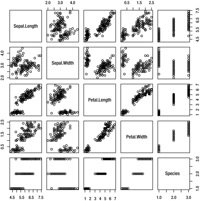
Figure 8-13. Scatterplot matrix for the iris dataset
You can also select a subset of variables to include in the matrix. For example, to include just the Sepal.Length, Sepal.Width and Petal.Length variables, use the command:
> pairs(~Sepal.Length+Sepal.Width+Petal.Length, iris)
Alternatively, you can use bracket notation or the subset function to select or exclude variables from a dataset, as explained in Chapter 1 under “Data Frames” and Chapter 3 under “Selecting a Subset of the Data,” respectively.
A box plot (or box-and-whisker plot) presents summary statistics for a continuous variable in a graphical form. Usually, a categorical variable is used to group the observations, so that the plot summarizes the distribution for each category. This helps you to understand the relationship between a categorical and a continuous variable.
You can create a box plot with the boxplot function. For example, the following command creates a box plot of Sepal.Length grouped by Species for the iris dataset. Figure 8-14 shows the result.
> boxplot(Sepal.Length~Species, iris)
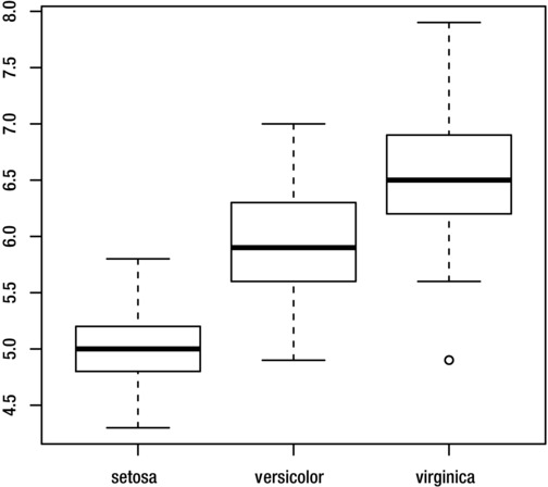
Figure 8-14. Box plot of Sepal.Length grouped by Species, for the iris dataset
When interpreting a box plot, recall that the thick line inside the box shows the group median and the boundaries of the box shows the interquartile range. The whiskers show the range of the data, excluding outliers, which are represented by small circles.
To create a horizontal box plot as shown in Figure 8-15, set the horizontal argument to T:
> boxplot(Sepal.Length~Species, iris, horizontal=T)
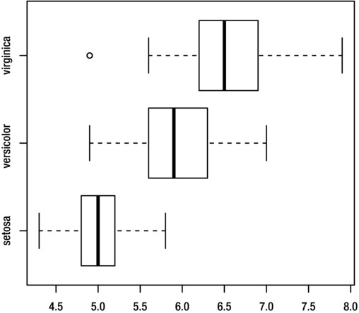
Figure 8-15. Horizontal box plot of Sepal.Length grouped by Species, for the iris dataset
You can also create a single box plot for a continuous variable (without any grouping):
> boxplot(iris$Sepal.Length)
By default, the whiskers extend to a maximum of 1.5 times the interquartile range of the data, with any values beyond this is shown as outliers. If you want the whiskers to extend to the minimum and maximum values, set the range argument to 0:
> boxplot(Sepal.Length~Species, iris, range=0)
Figure 8-16 shows the results.
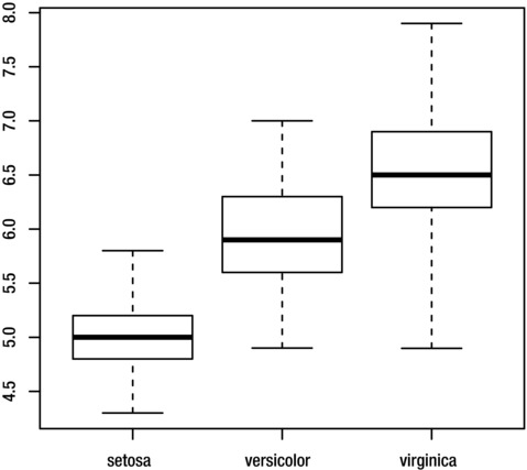
Figure 8-16. Box plot of Sepal.Length grouped by Species, with whiskers showing the full range of the data
You can plot a mathematical function such as y=t3 with the curve function. Express the mathematical function in terms of x, as shown here. Figure 8-17 shows the result.
> curve(x^3)
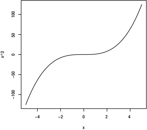
Figure 8-17. Plots of the function y=x3, created with the curve function
![]() Note To display the most relevant part of the curve, you may need to adjust the axes, as explained under “Axes” in Chapter 9.
Note To display the most relevant part of the curve, you may need to adjust the axes, as explained under “Axes” in Chapter 9.
To plot a curve of the probability density function (pdf) for a standard probability distribution, use the relevant density function from Table 7-1 (see Chapter 7). For example, to plot the pdf of the standard normal distribution, use the command:
> curve(dnorm(x))
The results are shown in Figure 8-18.
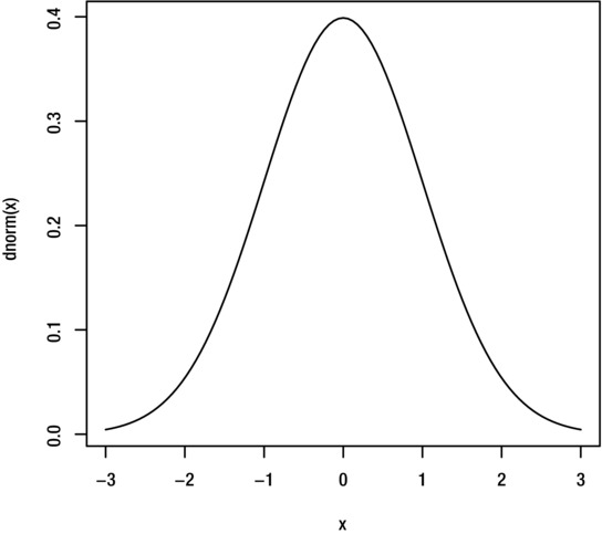
Figure 8-18. Plot of the density function for the normal distribution
Exporting and Saving Plots
Before exporting or saving a plot, resize the graphics device window so that the plot has the required dimensions.
For Windows users, the simplest way to export a plot is to right-click on the plot and select Copy as bitmap. The image is copied to the clipboard, so that you can paste it into a Microsoft Word or Powerpoint file or a graphics package.
Alternatively, R allows you to save the image to a variety of file types including png, jpeg, bmp, pdf, and eps. With the graphics device as the active window, select Save As from the File menu. You will be given a number of options for saving the image.
Mac users can copy the image to the clipboard by selecting Edit then Copy, or save the image as a pdf file by selecting File, then Save.
Linux users can save the current plot by entering the command:
> savePlot("/home/Username/folder/filename.png", type="png")
Other possible file types are bmp, jpeg, and tiff.
Summary
This chapter looked at how to create the most popular plot types for continuous and categorical data. This included plots that allow you to look at the distribution of a single variable as well as plots that help you to examine the relationship between two or more variables. You also learned how to save your plot to an image file or paste it into another program.
This table summarizes the main commands covered.
Plot Type |
Command |
|---|---|
Basic plot |
plot(dataset$variable) |
Line plot |
plot(dataset$variable, type="l") |
Histogram |
hist(dataset$variable) |
Normal probability plot |
qqnorm(dataset$variable) |
Stem-and-leaf plot |
stem(dataset$variable) |
Bar chart |
plot(dataset$factor1) |
barplot(tableobject1D) | |
Stacked bar chart |
barplot(tableobject2D) |
Grouped bar chart |
barplot(tableobject2D, beside=T) |
Pie chart |
pie(tableobject1D) |
pie(table(dataset$factor1)) | |
Scatter plot |
plot(yvar~xvar,dataset) |
Scatterplot matrix |
pairs(dataset) |
Single box plot |
boxplot(dataset$variable) |
Grouped box plot |
boxplot(variable~factor1,dataset) |
Function plot |
curve(f(x)) |
In the next chapter, you will learn how to customize the appearance of your plots so that they look more presentable.