
![]()
Customizing Your Plots
In the previous chapter, you learned how to create the most popular types of plots. This chapter explains how you can customize their appearance. Good use of titles, labels, and legends is essential if you want your plots to be useful and informative to others, and carefully selected colors and styles will help to create a more polished look.
You will learn how to:
- add titles and axis labels
- adjust the axes
- specify colors
- change the plotting line style
- change the plotting symbol
- adjust the shading style of shaded areas
- add items such as straight lines, function curves, text, grids, and arrows
- overlay several groups of data onto one plot
- add a legend
- display multiple plots in one image
- change the default plot settings
Most changes to the appearance of a plot are made by giving additional arguments to the plotting function. In this chapter, the plot function is used to illustrate. However, most of the arguments can also be used with other plotting functions such as hist and boxplot.
This chapter uses the trees and iris datasets, which are included with R, the CIAdata dataset (created in Chapter 4), and the people2 and fiveyearreport datasets, which are available with the downloads for this book.
Whenever you create a plot, R adds default axis labels and sometimes a default title, too. You can overwrite these with your own titles and axis labels.
You can add a title to your plot with the main argument:
> plot(dataset$variable, main="This is the title")
To add a subtitle to be displayed underneath the plot, use the sub argument:
> plot(dataset$variable, sub="This is the subtitle")
If you have a very long title or subtitle that should be displayed over two of more lines, use the escape sequence to tell R where the line break should be. The command below adds a two-line title to a plot of tree heights, as shown in Figure 9-1.
> plot(trees$Height, main="This is the first line of the title
 and this is the second line")
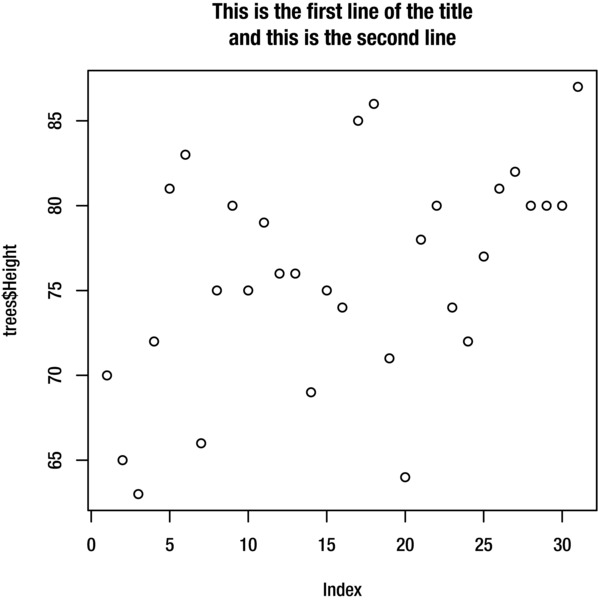
Figure 9-1. Plot with two-line title
To change the x and y axis labels, use the xlab and ylab arguments:
> plot(dataset$variable, xlab="The x axis label", ylab="The y axis label")
You can also add additional arguments to control the appearance of the text in the title, subtitle, axis labels, and axis units. Table 9-1 gives a list of these.
Table 9-1. Additional arguments for customizing the font of titles and labels
Aspect |
Argument |
Possible values |
|
|---|---|---|---|
Font family |
All text |
family="serif" |
sans, serif, mono |
Font type |
Title Subtitle Axis labels Axis units |
font.main=2font.sub=2font.lab=2font.axis=2 |
1 (normal) 2 (bold) 3 (italic) 4 (bold & italic) |
Font size |
Title Subtitle Axis labels Axis units |
cex.main=2cex.sub=2cex.lab=2cex.axis=2 |
Relative to default, e.g. 2 is twice normal size |
Font color |
Title Subtitle Axis labels Axis units |
col.main="red"col.sub="red"col.lab="red"col.axis="red" |
See the “Colors” section later in this chapter for details of how to specify colors |
For example, this command adds a title, sets the font family to serif, and the title font to be gray, italic, and three times the usual size. The result is shown in Figure 9-2.
> plot(trees$Height, main="This is the title", family="serif", col.main="grey80", cex.main=3, font.main=3)
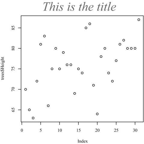
Figure 9-2. Plot with serif font and large gray italic title
For plots that include a categorical variable such as the bar chart, pie chart, and box plot, you can also customize the category labels. If you plan to create several plots, then it is easier to change the level names for the factor variables in your dataset, as explained in Chapter 3 under “Working with Factor Variables”. This means you won’t have to modify the labels every time you plot the variable. However, it is also possible to modify the labels at the time of plotting.
For pie charts, use the labels argument:
> pie(table(dataset$variable), labels=c("Label1", "Label2", "Label3"))
For bar charts, use names.arg:
> plot(dataset$variable, names.arg=c("Label1", "Label2", "Label3"))
For box plots, use names:
> boxplot(variable~factor,dataset, names=c("Label1", "Label2", "Label3"))
When plotting continuous variables, R automatically selects sensible axis limits for your data. However, if you want to change them, you can do so with the xlim and ylim arguments. For example, to change the axis limits to 0–30 for the horizontal axis and 0–100 for the vertical axis, use the command:
> plot(Volume~Girth, trees, xlim=c(0, 30), ylim=c(0, 100))
Figure 9-3 shows the results.
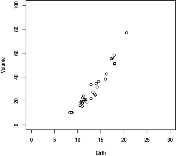
Figure 9-3. Plot with adjusted axis ranges
To rotate the axis numbers for the vertical axis so that they are in upright rather than in line with the vertical axis, set the las argument to 1. The result is shown in Figure 9-4.
> plot(Volume~Girth, trees, las=1)
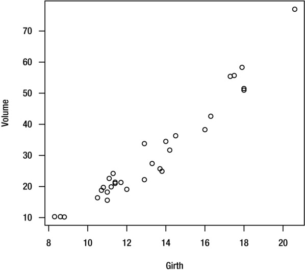
Figure 9-4. Plot with rotated axis numbers
R allows you to change the color of every component of a plot. The most important argument is the col argument, which allows you to change the plotting color. This is the color of the lines or symbols that are used to represent the data values. For histograms, bar charts, pie charts, and box plots it is the color of the area enclosed by the shapes.
There are three ways to specify colors. The first is to give the name of the color:
> plot(dataset$variable, col="red")
The colors function displays a list of recognized color names (the British-English spelling colours also works):
> colors()
The second way to specify colors is with a number between 1 and 8, which correspond to the set of basic colors shown in Table 9-2.
Table 9-2. Basic plotting colors; note that these may vary for some platforms; enter palette() to view the colors for your platform
Value |
Name |
|---|---|
1 |
black |
2 |
red |
3 |
green3 |
4 |
blue |
5 |
cyan |
6 |
magneta |
7 |
yellow |
8 |
gray |
For example, to specify red as the plotting color, use the command:
> plot(dataset$variable, col=2)
Finally, if you require more precise control over the appearance of the plot then you can specify the color using the hexadecimal RGB format. This command changes the plotting color to red using the hexadecimal color notation:
> plot(dataset$variable, col="#FF0000")
HEXADECIMAL COLOR NOTATION
Hexadecimal color notation (sometimes called hex colors or html colors) allows you fine control over the colors in your graphics.
In the hexadecimal color notation, each color is regarded as unique combination of the three primary colors (red, green, and blue), each with a strength between 00 and FF. This combination is written in the format #RRGGBB. For example, bright red is written as #FF0000, white is written #FFFFFF, and black is written #000000.
To identify the hexadecimal code of a color in an image, use a graphics package or a website such as http://imagecolorpicker.com/. This is useful if you want to make elements of a plot match your slides or company logo.
To design a color scheme of hexadecimal colors from scratch, try http://colorschemedesigner.com/.
As well as specifying a single plotting color, you can give a list of colors for R to use. This is particularly useful for pie charts and bar charts, where each category is given a different color from the list:
> plot(dataset$variable, col=c("red", "blue", "green"))
The numeric notation is useful for this purpose:
> plot(dataset$variable, col=1:8)
There are also functions such as rainbow, which help to easily create a visually appealing set of colors. This command creates five colors, evenly spaced along the spectrum:
> plot(dataset$variable, col=rainbow(5))
Other color scheme functions include heat.colors, terrain.colors, topo.colors, and cm.colors.
You can change the color of the other elements of the plot in a similar way, using the arguments given in Table 9-3.
Table 9-3. Arguments for changing the color of plot component (*the background color must be changed with the par function)
Component |
Argument |
|---|---|
Plotting symbol, line, or area |
col |
Foreground (axis, tick marks, and other elements) |
fg |
Background |
bg* |
Title text |
col.main |
Subtitle text |
col.sub |
Axis label text |
col.lab |
Axis numbers |
col.axis |
Note that the background color cannot be changed from within the plotting function but must be changed with the par function:
> par(bg="red")
> plot(dataset$variable)
Changes made with the par function apply to all plots for the remainder of the session, or until overwritten.
![]() Note For more details on using the par function, see “Changing the Default Plot Settings” later in this chapter, or enter help(par).
Note For more details on using the par function, see “Changing the Default Plot Settings” later in this chapter, or enter help(par).
This section applies only to plots where symbols are used to represent the data values, such as scatter plots.
You can change the plotting symbol with the pch argument. The numbers 1 to 25 correspond to the symbols given in Table 9-4.
> plot(dataset$variable, pch=5)
Table 9-4. Plotting symbols for use with the pch argument
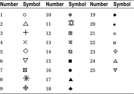
Symbol numbers 21 to 25 allow you to specify different colors for the symbol border and fill. The border color is specified with the col argument and the fill color with the bg argument:
> plot(dataset$variable, pch=21, col="red", bg="blue")
![]() Note For more information on plotting symbols, enter the command help(points).
Note For more information on plotting symbols, enter the command help(points).
Alternatively, you can select any single keyboard character to use as the plotting symbol by placing it between quotation marks, as shown here for the dollar symbol:
> plot(dataset$variable, pch="$")
You can adjust the size of the plotting symbol with the cex argument. The size is specified relative to the normal size. For example, to make the plotting symbols 5 times their normal size, use the command:
> plot(dataset$variable, cex=5)
This section applies only to plots with lines, such as scatter plots and basic plots created with the plot function and where the type argument is set to an option that uses lines such as "l" or "b". It also applies to functions that add additional lines to existing plots, such as abline, curve, segments and lines, covered later in this chapter in the sections “Adding Items to Plots” and “Overlaying Plots.”
You can change the line type with the lty argument. The numbers 1 to 6 correspond to the line types given in Table 9-5.
Table 9-5. Plotting line types
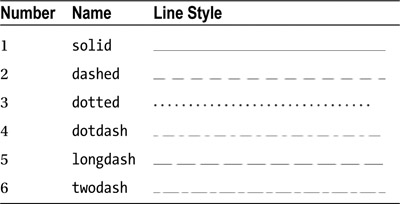
For example, you can change the line type to dashed:
> plot(dataset$variable, type="l", lty=2)
You can also select a line type by name:
> plot(dataset$variable, type="l", lty="dashed")
You can adjust the thickness of the line with the lwd argument. The line thickness is specified relative to the standard line thickness. For example, to make the line three times its usual thickness, use the command:
> plot(dataset$variable, type="l", lwd=3)
This section applies only to plots with shaded areas such as bar charts, pie charts, and histograms.
The density of a shaded area is the number of lines per inch used to shade. You can change the density of the shaded areas with the density argument and the angle of the shading with the angle argument:
> barplot(tableobject, density=20, angle=30)
As a guideline, density values between 5 and 80 give discernible variation, while a value of 150 is indistinguishable from solid color.
You can also give a list of densities and R will shade each section of a pie or bar chart with a different density from the list. Figure 9-5 shows the result of the following:
> pie(table(people2$Eye.Color), density=c(10, 20, 40))
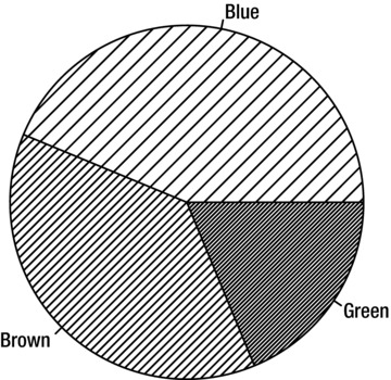
Figure 9-5. Pie chart with a different density of shading for each category
Adding Items to Plots
This section introduces some functions that add extra items to plots. You can use them with any type of plot. First, create the plot using plot or another plotting function. While the plot is still displayed in the graphics device, enter the relevant command from this section. The item is added to the current plot.
You can add straight lines to your plot with the abline function.
To add a vertical line at x=5 use the command:
> abline(v=5)
To add a horizontal line at y=2 use:
> abline(h=2)
To add a diagonal line with intercept 2 and slope 3 (i.e., the line y=2+3x) use the command:
> abline(a=2, b=3)
To draw a line segment (a line that extends from one point to another), use the segments function. For example, the command below draws a straight line from coordinate (12, 20) to coordinate (18, 55):
> segments(12,20,18,55)
The result is shown in Figure 9-6.
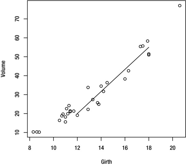
Figure 9-6. Plot with added line segment
You can change the line color, type, and thickness with the col, lty, and lwd arguments, as explained earlier in the chapter.
Adding a Mathematical Function Curve
To add a mathematical function curve to your plot, use the curve function (introduced in Chapter 8 under “Plotting a Function”). By default the curve function creates a new plot. To superimpose the curve over the current plot, set the add argument to T:
> curve(x^2, add=T)You can add text to your plot with the text function. For example, to add the text ‘Text String’ centered at coordinates (3, 4), use the command:
> text(3, 4, "Text String")
![]() Note If you need to know the coordinates of a given location on your plot, the locator function can tell you them. While your plot is displayed in the graphics device, enter the command:
Note If you need to know the coordinates of a given location on your plot, the locator function can tell you them. While your plot is displayed in the graphics device, enter the command:
> locator(1)
R will then wait for you to select a location in the graphics device with your mouse pointer before returning the coordinates of the selected location.
You can adjust the appearance of the text with family, font, cex, and col arguments. For example, to add a piece of red, italic text which is twice the default size, use the command:
> text(3, 4, "Text String", col="red", font=3, cex=2)
The text function is useful if you want to add labels to all of the points in a scatter plot using text taken from a third variable or from the row names of your dataset. For example, these commands create a scatter plot of per capita GDP against urban population, where each observation is labelled with the country name (using the CIAdata dataset shown in Chapter 4 under “Appending Rows”):
> plot(pcGDP~urban, CIAdata, xlim=c(50, 100), ylim=c(0,40000))
> text(pcGDP~urban, CIAdata, CIAdata$country, pos=1)
Figure 9-7 shows the results.
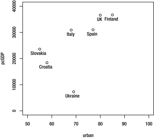
Figure 9-7. Results of using the text function to add labels
The pos argument tells R where to place the labels in relation to the coordinates: 1 is below; 2 is to the left, 3 is above; 4 is to the right. You can also use the offset argument to adjust the distance (relative to the character width) between the coordinate and the label. The command below creates the result shown in Figure 9-8.
> text(pcGDP~urban, CIAdata, CIAdata$country, pos=4, offset=0.3)
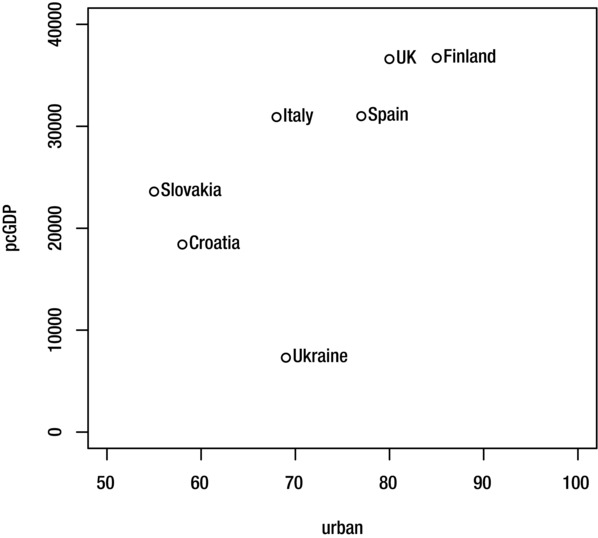
Figure 9-8. Plot with text positioned to the right of data points
If you just want to label a few specific data points (such as any outliers), you can use the identify function after the plotting function:
> plot(pcGDP~urban, CIAdata, xlim=c(50, 100), ylim=c(0,40000))
> identify(CIAdata$urban, CIAdata$pcGDP, label=CIAdata$country)
After you have entered the command, R will allow you to select points on the plot using your mouse pointer, and will label any points that you select. Once you have selected all of the points that you want to label, press the Esc key.
To add a grid to a plot (as shown in Figure 9-9), use the grid function:
> grid()
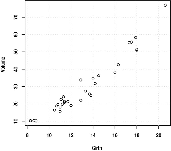
Figure 9-9. Plot with grid lines
By default, the grid lines are aligned with the axis tick marks. Alternatively, you can specify how many grid lines to display on each axis:
> grid(3, 3)
To add horizontal grid lines only (as shown in Figure 9-10), use the command:
> grid(nx=NA, ny=NULL)

Figure 9-10. Plot with horizontal grid lines
For vertical grid lines only, use:
> grid(ny=NA)
By default, R uses grey dotted lines for the grid, but you can adjust the line style with the col, lty, and lwd arguments, as explained earlier in this chapter.
You can add an arrow to the current plot with the arrows function. For example, to draw an arrow from the point (10, 50) to the point (12.7, 35) use the command:
> arrows(10,50,12.7,35)
The result is shown in Figure 9-11.
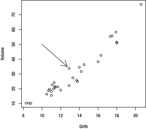
Figure 9-11. Plot with arrow
For a double-ended arrow, set the code argument to 3:
> arrows(10,50,12.7,35, code=3)
You can adjust the line style using the col, lty and lwd, as explained earlier in this chapter. You can specify the length of the arrow head (in inches) with the length argument, and the angle between the arrow head and arrow body (in degrees) with the angle argument. This command adds the arrow shown in Figure 9-12:
> arrows(10,50,12.7,35, angle=25, length=0.1)

Figure 9-12. Plot including arrow with adjusted arrow head
R has two functions called points and lines that allow you to superimpose one set of data values over another.
The points function is very similar to the plot function. However, instead of creating a new plot, it adds the data points to whichever plot is currently displayed in the graphics device. The lines function is very similar to the points function, except that it uses lines rather than symbols to plot the data (i.e., the default value for the type argument is "l").
These functions are useful if you want to plot two or more variables on the same axis (as demonstrated in Example 9-1) or use different plotting symbols to represent different categories (as shown in Example 9-2).
EXAMPLE 9-1. OVERLAY PLOT USING FIVEYEARREPORT DATA
Consider the fiveyearreport dataset shown in Figure 9-13, which gives the U.K. sales of three supermarket chains over a five-year period. Suppose that you want to display the sales data for Tesco, Sainsburys, and Morrisons in the same plot.
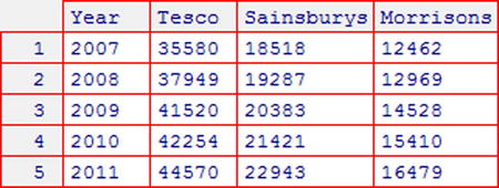
Figure 9-13. fiveyearreport dataset (see Appendix C for more details)
To create this plot, first plot the data for Tesco in the usual way, making sure to set the axis ranges so that they are wide enough to also accommodate the data for Sainsburys and Morrisons:
> plot(Tesco~Year, fiveyearreport, type="b", ylab="UK Sales (£M)", ylim=c(0, 50000))
Once the plot is displayed in the graphics device, you can add the data for Sainsburys and Morrisons using the lines function, which superimposes the data over the current plot. Use the pch and lty arguments to change the symbol and line type, so that the data for the different chains can be distinguished. Alternatively, you could use the col argument to give each chain a different color:
> lines(Sainsburys~Year, fiveyearreport, type="b", pch=2, lty=2)
> lines(Morrisons~Year, fiveyearreport, type="b", pch=3, lty=3)
Figure 9-14 shows the results. The plot will require a legend to identify the chains, which you can add with the legend function as explained in the “Adding a Legend” section.
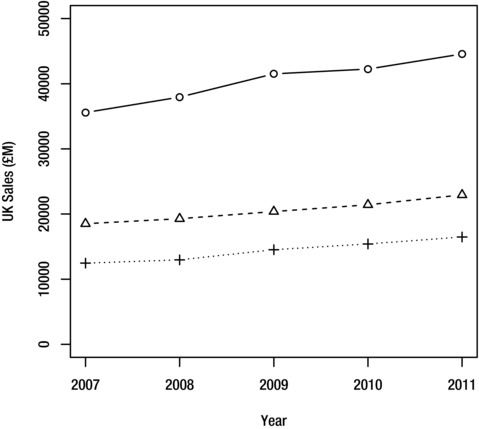
Figure 9-14. Overlay plot for the fiveyearreport dataset
EXAMPLE 9-2. OVERLAY PLOT USING IRIS DATA
Suppose that you want to create a scatter plot of sepal length against sepal width for the iris data, using a different plotting symbol to represent each iris species. To create this plot, you will need to plot the data for each species separately using the points function, overlaying them onto the same plot.
First plot the original (complete) data with the plot function, adding any labels or titles that you require. Set the type argument to "n" to prevent the data values from being added to the plot. This creates an empty axis, which is the right size to accommodate all of the data for all three species:
> plot(Sepal.Length~Sepal.Width, iris, type="n")
Next, plot the data for each species separately with the points function. Use the subset argument to select each species in turn. Use the pch argument to select a different plotting symbol for each species. Alternatively, you could use the col argument to give each species a different colored symbol:
> points(Sepal.Length~Sepal.Width, iris, subset=Species=="setosa", pch=10)
> points(Sepal.Length~Sepal.Width, iris, subset=Species=="versicolor", pch=16)
> points(Sepal.Length~Sepal.Width, iris, subset=Species=="virginica", pch=1)
The result is shown in Figure 9-15. The legend is added with the legend function, as explained in the next section.
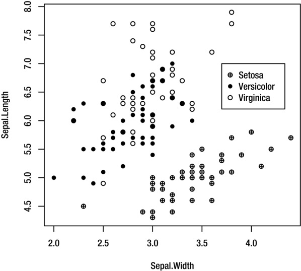
Figure 9-15. Overlay plot for the iris data
You can add a legend to your plot with the legend function. The function adds a legend to whichever plot is currently displayed in the graphics device.
The following command creates the legend shown in Figure 9-15:
> legend(3.7, 7, legend=c("Setosa", "Versicolor", "Virginica"), pch=c(10, 16, 1))
The first two arguments (3.7 and 7) are the x and y coordinates for the top left-hand corner of the legend. In addition to using coordinates, there are two other ways of specifying the position of the legend. The first is by using one of the location names: "top", "bottom", "left", "right", "center", "topright", "topleft", "bottomright", or "bottomleft". The following command positions the legend in the top right-hand corner of the plot:
> legend("topright", legend=c("Setosa", "Versicolor", "Virginica"), pch=c(10, 16, 1))
The second is by using locator(1). This allows you to manually select the position for the top left-hand corner of the legend with your mouse:
> legend(locator(1), legend=c("Setosa", "Versicolor", "Virginica"), pch=c(10, 16, 1))
The legend argument gives the labels to be displayed on the legend. The pch argument gives the plotting symbols that correspond to each of the labels.
You can substitute the pch argument with the lty, lwd, col, cex, fill, density, or angle arguments, according to what is relevant for your plot. You may need to use two or more of them.
Note that you don’t need to use the legend function to add a legend to a bar chart, as the barplot function has a built-in legend option (see “Bar Charts” in Chapter 8).
EXAMPLE 9-3. LEGEND TYPES AND EFFECTS
The following three examples demonstrate how to create some different types of legend. The results are shown in Figure 9-16. Then we’ll look at another example of how to display a legend over more than one column (shown in Figure 9-17).
LegendShowing Shaded Areas of Different Densities
To create a legend for shaded areas of different densities as shown in Figure 9-16a, use the command:
> legend(locator(1), legend=c("Label1", "Label2", "Label3"), density=c(10,20,40))
Legend Showing Different Line and Symbol Types
To create a legend for different line and symbol types as shown in Figure 9-16b, use the command:
> legend(locator(1), legend=c("Label1", "Label2", "Label3"), lty=1:3, pch=1:3)
Legend with Lines of Different Colors and Types
To create a legend for lines of different types and colors as shown in Figure 9-16c, use the command:
> legend(locator(1), legend=c("Label1", "Label2", "Label3"), col=c("black", "grey40", "grey70"), lty=1:3)
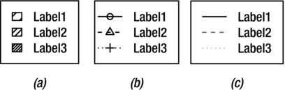
Figure 9-16. Different types of legend
Legend That Extends over Multiple Columns
To display a legend over more than one column, use the ncol argument to specify the number of columns. This command creates a legend with two columns, as shown in Figure 9-17:
> legend(x, y, legend=c("Label1", "Label2", "Label3"), lty=c(1,2,3), ncol=2)
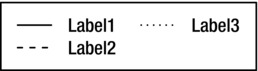
Figure 9-17. Legend with two columns
Multiple Plots in the Plotting Area
As well as creating images of single plots, R allows you to create an image composed of several smaller plots arranged in a grid formation.
To set up the graphics device to display multiple plots, use the command:
> par(mfrow=c(R,C))
where R and C are the number of row and columns in the grid. Any plots that you subsequently create will fill the slots in the top row from left to right, followed by those in the second row and so on.
For example, to arrange four plots in a two-by-two grid, use the command:
> par(mfrow=c(2,2))
Then you can create up to four plots of any type to fill each of the slots, as shown in Figure 9-18:
> hist(iris$Sepal.Length)
> qqnorm(iris$Sepal.Length)
> pie(summary(iris$Species))
> plot(Petal.Length~Sepal.Length, iris)
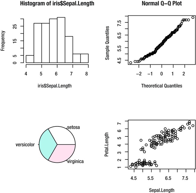
Figure 9-18. Multiple plots
When you create a fifth plot, a new image is started. The graphics device will continue to display multiple plots for the remainder of the session, or until you reverse it with the command:
> par(mfrow=c(1,1))
Changing the Default Plot Settings
So far, this chapter has explained how you can make modifications to a specific plot. However, you may want to change the settings so that they apply to all plots.
The par function allows you to change the default plotting style. For example, to change the default plotting symbol to be a triangle and the default title color to red, use the command:
> par(pch=2, col.main="red")
Any plots that you subsequently create will have red title text and use a triangle as the plotting symbol (if applicable). These changes are applied for the remainder of the session, or until they are overwritten.
R allows almost every aspect of the plots to be customized. Enter the command help(par) to see a full list of settings. Some arguments that you cannot change with the par function include main, sub, xlab, ylab, xlim, and ylim, which apply to individual plots only.
Summary
You should now be able to make your plots more informative by adding appropriate titles, labels, text, legends, and other items. You should also be able make them more visually appealing by adjusting aspects such as the colors and styles of lines and symbols. If necessary, you should be able to overlay several groups of data onto one plot, or display several plots in one image.
This table summarizes the most important arguments and commands covered in this chapter.
Task |
Argument or command |
|---|---|
Add title |
main="Title Text" |
Add subtitle |
sub="Subtitle text" |
Add axis labels |
xlab="X axis label", ylab="Y axis label" |
Change axis limits |
xlim=c(xmin,xmax), ylim=c(ymin,ymax) |
Change plotting color |
col="red" |
Change plotting symbol |
pch=2 |
Change plotting symbol size |
cex=2 |
Change line type |
lty=2 |
Change line width |
lwd=2 |
Change shading density |
density=20 |
Add vertical line to plot |
abline(v=2) |
Add horizontal line to plot |
abline(h=2) |
Add straight line to plot |
abline(a=intercept, b=slope) |
Add line segment to plot |
segments(x1,y1,x2,y2) |
Add curve to plot |
curve(x^3, add=T) |
Add text to plot |
text(x,y, "Text String") |
Add grid to plot |
grid() |
Add arrow to plot |
arrows(x1,y1,x2,y2) |
Add points to plot |
points(dataset$variable) |
Add lines to plot |
lines(dataset$variable) |
Add legend to plot |
legend(x,y, legend=c("label1", "label2", "label3"), ...) |
Display multiple plots |
par(mfrow=c(rows,columns)) |
Change default plot settings |
par(...) |
In the next chapter, we will leave plotting behind and move on to look at hypothesis testing.