
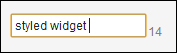
The default CSS style of a custom widget is based on the GWT style. In this recipe, we will show how to change it. As shown in the following screenshot, we will make a simple change. The label of the counter is aligned at the bottom and has a gray color.
We create a widget text field with a counter as described in the Creating a TextField with counter recipe.
Carry out the following steps to learn how to style a widget:
- In the constructor of the
CountedTextFieldWidgetclass, we set the primary CSS style name of each widget because we want to set a new style for a specific widget. The name consists of a base style name plus a general name of the widget separated by a dash.public CountedTextFieldWidget() { setStylePrimaryName(CLASSNAME); textBox.setStylePrimaryName(CLASSNAME + "-field"); countLabel.setStylePrimaryName(CLASSNAME + "-label"); … } - On the same level as the
*.gwt.xmlfile, we create thepublic/countedtextfield/styles.cssfolder with thestyles.cssfile. The folder structure is shown in the following screenshot: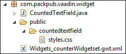
- In the
styles.cssfile, we write the CSS style of our widget..countedtextfield-label{ color: gray; vertical-align: bottom; } - Now we can recompile the widget set, run the server, and show the
Demoapplication in the web browser.
By default, the class name for each component is gwt-<classname>. For example, the Label widget has a default style of gwt-Label. Using the setStylePrimaryName(String style) method removes the default style and replaces it with our style name. Then we can define this new style in the styles.css file that is placed on the same level as the *.gwt.xml file.
We can change each part of our component through CSS. We can also import and use the default CSS styles Reindeer or Runo.
When we want to change the style of all labels, we can do it by the default CSS class name. In that case, we replace the name .countedtextfield-label with .gwt-Label in the styles.css file. And we don't use the setStylePrimaryName() method.