

© 2004 by Ralph W. Lambrecht, all rights reserved
Presentation Is Everything
Mounting and Matting Prints
Solid steps to successful print presentations
In addition to supporting and protecting the print, the main function of the mount is to isolate the print and clear the immediate image surroundings from visual distractions (fig.1), thereby providing an aesthetically pleasing, neutral and complementary viewing environment, without any attempt to compete with the image for attention. A truly successful image can probably stand on its own, but even the best image benefits from appropriate presentation, if we want to portray its full potential. A properly mounted, matted and framed print has clear advantages over its loose counterpart, including focused communication, the perception of increased value, some protection against rough handling and optimized longevity. When processed to archival standards and competently mounted with quality materials, an appropriately stored and displayed print can be admired for several lifetimes.
Description
Fig.2 shows the basic components of mounted artwork ready for framing. First, the print is securely attached to the mount-board using dry-mount adhesive or suitable alternate means. Then, the mounted print is covered and protected with a window overmat, as well as supported by a backboard. The difference between mounting and matting board is in the way they are applied, either carrying or overmatting the print, but some manufacturers make significant material differences between the two. Unless, for creative reasons, you cannot live without a color or texture difference between mount-board and overmat, I suggest using the same material for both to give the print consistent protection and appearance.

fig.1 The mount supports and protects the print, while clearing the immediate image surroundings from visual distractions, without competing for attention.

fig.2 The basic components of dry-mounted artwork ready for framing. The print is securely attached to the mount-board, using an adhesive tissue or film. The mounted print is then covered and protected by a window overmat, and supported with a backboard.
Mounting Styles
There are various mounting styles to choose from, the selection of which too often depends on the type of presentation and longevity requirements. They all differ from one another in the material choice, the size of the mount-board, the attachment method for the print, a preference for an overmat and the equipment required to put it all together. Some mounting styles aim for the most favorable print presentation and protection, while also providing best possible archival conditions; others just aim to improve short-term print presentation without any claims of permanence. This chapter offers an overview of several mounting styles but concentrates on archival mounting and professional print presentation.
When the print and mount-board are of the same dimensions, it is called a flush or bleed-mount style. This stiffens the prints but offers little protection around the edges. Bleed-mounting also completely fails to isolate the print from potentially disturbing surroundings, because no mount-board is left showing, and as a result, it makes for a rather lackadaisical presentation style. Having said that, I have used bleed-mounting successfully in assembling photographic aids, as shown in ‘How to Build and Use the Zone Ruler’. In all other cases, I prefer a rather wide border around the print, which is referred to as the border-mount style.
To attach the print to the mount-board, we have the option of creating a permanent bond or just loosely holding the print in place and securing its location later with an overmat. Both methods have pros and cons, so before we decide, let us explore each in more detail.
A permanent bond always requires some kind of an adhesive. Stay well away from liquid or spray adhesives. They are extremely messy, make a smooth bond a matter of chance and rarely have any archival properties. Dry adhesives are far better, and there is the choice between cold and hot dry-mounting, which both use an adhesive tissue or film. Dry-mount adhesive, once applied, creates an irreversible bond and acts as a protective layer between mount-board and print. This layer protects the backside of the print from any environmental contamination coming through the backboard and potentially being absorbed by the mount-board, leaving only the print’s image area exposed to air-born contaminants.
In cold dry-mounting, the adhesive is laid upon a release layer and then rolled onto the back of the print. Full adhesion only comes through the application of pressure. The adhesive does not come off on your hands and makes for clean, odorless working. However, the classic permanent bond is only accomplished through hot dry-mounting (see fig.14). It requires the use of an expensive dry-mount press, which securely sandwiches the dry-mount adhesive between the mount-board and the print under pressure, while applying enough heat to melt the adhesive. Some of the molten dry-mount adhesive is then absorbed by the surface fibers of mount-board and print, forming a permanent and waterproof bond between them, once the adhesive has been given enough time to cool and solidify. Dry-mounting makes for a perfectly flat mount with an unrivaled professional look. It is clean, dependable, fully archival, and every serious fine-art photographer is well advised to seriously consider this method. Unfortunately, some print materials do not react well with the heat, and then, the use of cold-mount adhesive might be the better option. Nonetheless, hot dry-mounting is my preferred choice for mounting FB-prints.
There might be one good reason not to dry-mount at all, if your prints are destined for a salon or gallery showing. The person in charge of the exhibition may simply not accept dry-mounted prints. Galleries often present the works of more than one artist and may insist on consistency of presentation between images. To ensure this, they need the flexibility of remounting and reframing your prints at will. The permanency of a dry-mounted bond does not allow this flexibility. To maintain the option of selecting a different mount in the future, we need to select a reversible mounting method. Two different methods are commonly used, hinge-mounting and corner-mounting.
To hinge-mount a print, a piece of tape is used as a flexible hinge; half of it applied to the mount-board and the other half directly to the print. Only use conservation or museum-quality, gummed, acid-free cloth tape with a water-soluble adhesive. Self-adhesive tape is not acceptable, as it can dry out and eventually fail. Of course, the print should feature a white non-image border to provide some room for the tape. The overmat then covers tape and border.
Mounting board, matting board and backing board are terms referring to the ‘raw’ stationery materials used.
Mount-board, mat-board and backboard are usable sheets, cut to size from the above stationery materials. Cutting a window opening into a mat-board turns it into a functional ‘window’ overmat or just a mat.
Mount is a general term, referring to the mounting style or the entire assembly but without the frame.
To corner-mount a print (see fig.16), small corner pockets of acid-free paper are taped to the mount-board, holding the print loosely at all four corners. As with hinge-mounting, the print should feature a white border, so the corner pockets do not infringe into the image area, and the overmat covers the corners, tape and border. Hinge-mounting is simpler, but for non-permanent mounting, I prefer corner-mounting, because it leaves no tape residue on the print and makes freeing it from the mount as simple as slipping it carefully out of the paper pockets.
If the print is dry-mounted and you prefer a plain mount, the mounting effort is finished at this point. Unfortunately, we need to consider that the mounted print has been raised off the mount-board by the combined thickness of the dry-mount adhesive and the print paper itself. This makes the print edges vulnerable to damage from handling and stacking. Therefore, before a mounted print is framed and put behind glass, an overmat with its window opening must be cut and placed on top of the mount-board. This will protect the print from irreparable damage and keep it from rubbing or touching the inner glass surface, allowing it to ‘breathe’ and circumvent the emulsion from sticking to the glass over time. Furthermore, to keep the overmat securely aligned with the print, it helps to hinge-mount it on one side to the mount-board, using acid-free cloth tape. The additional overmat raises the optical appeal of the print. Consequently, an overmat should be considered for both framed and unframed prints alike, in order to make for the finest print presentation possible.
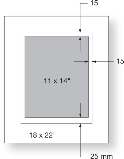
fig.3 To enhance the print presentation and protect the print from physical damage, an overmat with its window opening is prepared and placed on top of the print and mount-board. For a dry-mounted print, the window is cut large enough to provide clearance on all sides of the print. Below the print, a bit more space is needed to allow enough room for print edition number, signature and date.
To give this mounting arrangement an even more pleasing look, it is customary to cut the inner window, exposing the print, with a bevel cutter. The resulting bevel joins the mount-board and overmat smoothly at an angle between 45° and 60°, eliminating harsh and distracting shadows, yet framing the print delicately. The size of the window opening depends on the type of print attachment used. If the print is hinge or corner-mounted, the window needs to be smaller than the image area of the print to cover the tape, corner pockets and print border, and to hold the print firmly in place. If the print is dry-mounted, you have some flexibility in choosing the window dimensions. I cut my windows large enough to provide about 5/8-inch (15 mm) clearance on the sides and on top of the print (see fig.3). Below the print bottom, I allow a bit more space, sufficient to add the print edition number, and to sign and date the print later. I find 3/4 to 1 inch (20-25 mm) to be adequate for that task.
Before deciding which prints to mount and what style to choose, consider that quality print mounting takes time, effort and money, and not every print deserves this treatment. However, if the value of an individual image was mirrored by your choice of print materials and was processed to archival standards, then it makes sense to continue this standard through the mounting and presentation steps. I only mount my best prints, which are targeted for exhibition or sale, and I do it just prior to these events, using only the best materials. It takes less space to store loose prints in archival boxes until they are needed. Mounting valuable prints is a presentation technique, not a storage method. I use RC paper only for preliminary work, such as artwork for magazines or as a give-away for model portfolios. Consequently, I do not mount RC prints. Nevertheless, it can be done if you prefer RC prints, and the techniques described in this chapter work for FB and RC prints alike.
Mounting Materials
Board is manufactured from different paper materials to support varying archival requirements and budgets. Regular illustration board or standard board is made of virgin cellulose fibers (wood pulp). It contains lignin, which forms the cell walls in plants. Untreated, this material contains acid (pH<7.0) and is, consequently, harmful to silver-gelatin prints. Over time, lignin and acid will degrade the artwork. Standard board discolors visibly within a few years, accelerated by temperature, humidity, pollution attack and exposure to light. This can typically be seen at the beveled edges first. Illustration or standard board is a low-budget material and not recommended for our treasured prints.
Conservation board is made of alpha-cellulose wood pulp, which has been chemically treated to eliminate acid and lignin. It gives artwork a higher degree of protection, and FB paper itself is made of this acid-free material. Conservation board is a good choice for photographic prints, providing a professional finish and a minimum level of archival protection. These benefits justify the increase in cost.
Museum board or cotton-rag board is made of 100% cotton fibers, which are naturally acid-free and lignin-free. The term ‘rag’ dates back to the time when cotton rags and cloth were the principal materials used for paper manufacture. Cotton is a time-tested, fade-resistant and durable material, offering the highest level of archival protection. It is used by museums and discerning photographers for the preservation of fine prints. The inherent expense should not stop us from using it for prints of high value.
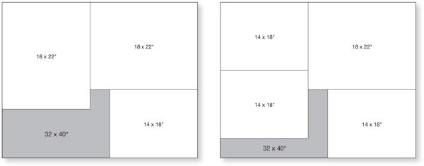
fig.4 Mounting and matting board comes in a variety of full-sheet sizes, with 32x40 inches being the most common dimensions. It is advisable to prepare cutting plans for your favorite mount-board dimensions to minimize waste. Two examples are shown here.
As an alternative to the choices above, some manufacturers offer ‘buffered’ boards. Buffering, or pH-balancing, is an additional fiber treatment to neutralize acid, which might be generated in the future from aging prints or boards, or from environmental pollution. A buffered board or paper has calcium carbonate added to the fibers, which provides an alkaline reserve (pH7.5-9.5), just waiting to counterbalance any potential acid attack in the future. Buffered materials are a good choice, although not in combination with some historic photographic processes, like Cyanotype, because the alkaline environment will actually damage these types of prints.
Dry-mount adhesive is an acid-free, dry acrylic adhesive, available as thermoplastic rolls or sheets in two basic compositions, as tissue or film. Dry-mount tissue has a center carrier of porous or non-porous tissue with adhesive applied to either side of the tissue. Dry-mount film has no carrier tissue at the center; it is pure, non-porous adhesive. Non-porous dry-mount tissue and dry-mount film may trap air or steam between print and adhesive during mounting. This will create objectionable bubbles with RC prints. With FB prints, on the other hand, trapped air has the opportunity to escape through the print. I prefer porous dry-mount tissue, because it works well with both RC and FB prints.
Backing board provides a stiff and flat print support, which is needed to securely frame the mounted artwork. It typically has a rigid foam core, sandwiched between two layers of paper. The foam center is made of extruded polystyrene, an inert and resilient plastic material, which keeps the board light and easy to cut. For archival mounting, the surface papers must be made of the same acid-free and lignin-free material as the mounting and matting board used in order to offer consistent protection. Otherwise, an optional acid-free barrier can be placed between mount-board and backboard, providing additional protection against environmental contamination. Some framers suggest using a sheet of inert plastic or glass as a barrier, but I am concerned that they create a potential humidity trap and recommend using an acid-free paper barrier instead.

fig.5 Our subjective sensation of reflection density is noticeably influenced by the surroundings of the evaluated sample. A medium gray appears to be darker in the vicinity of white than when surrounded by black.
Sheet Size and Thickness
Many suppliers offer boards in either standard or custom sizes. The standard sizes are often too restrictive, and the custom sizes are quite expensive. If you have available storage space and the proper equipment, it is more flexible and more economical to purchase the boards in ‘full’ sheets and cut them to size yourself. Full sheets come in a variety of sheet sizes, with 32 × 40 inches being the most common dimensions, and it is advisable to prepare a cutting plan (see fig.4) to minimize waste. Nonetheless, do not turn prudence into false economy. Select a mount-board size that suits the image, your style and the intended presentation, not the one that gives you the least amount of scrap. Conveniently cutting four 16x20-inch sheets from one 32x40-inch board may illustrate efficient planning but little aesthetic consideration. No one will see your cut-offs, but many will notice an inappropriate mount size. I keep my cut-offs to create useful tools, jigs and spacers for studio and darkroom work.
Mounting and matting board comes in thicknesses of 2, 4, 6 and 8 ply, with 4 ply, which is equivalent to 1/16 inch or 1.5 mm, being the most popular. Galleries and museums often use the thicker boards for large mounts or special effect. Backing board is thicker and varies from 1/8 to 1/2 inch, but not all sizes are available in museum quality. Consider also, before you order expensive thick boards, whether your mat cutter can actually cut that thickness. For example, few cutters can handle bevel-cuts in 8-ply boards.

fig.6 It is commonly agreed that a print, centered on the vertical axis, appears to be too low on the mount. This print placement creates an optical illusion that the print is not equally spaced at top and bottom; the print seems to sag below the vertical center (a). To overcome this illusion, alternative print-placement techniques must be considered (b).
Color
Selecting an appropriate color for the mounting materials seems largely to be a matter of personal taste and preference. Nevertheless, a few facts should be considered before making a final color choice. As already stated, the mount needs to complement the print without becoming a distraction. As a general rule, this disqualifies the use of colored mounts for B&W prints. There may be the odd exception to this rule to support an intended mood, as I have seen in an exhibition of reenacted Civil War images, where prints were sepia toned and suitably displayed on a light tan mount to imply age. However, most B&W prints are presented on either white or black mount-board, and there have been heated debates as to which is the better of the two options.
Our subjective sensation of reflection density is noticeably influenced by the surroundings of the evaluated sample. The medium gray in fig.5 appears to be darker in the vicinity of white than when surrounded by black. In fact, all print tones are sensed to be darker on a white mount than they are perceived on a black mount. Consequently, a black mount brings maximum brightness to the highlights but fails to show the full potential of deep shadows. On the other hand, a white mount allows for rich shadows but at the risk of foggy highlights. Neither black nor white seem to be the optimum color choices for skilled B&W print mounting.
As we will see in ‘Fine-Tuning Print Exposure and Contrast’, the human eye is far more sensitive in detecting reflection density differences in highlights compared to shadows. This presents an obvious solution. Choosing mounting board slightly darker than paper-white creates enough variance for the highlights to be seen as true whites while this tonality change is too minute to detectably degrade the shadows. Selecting even off-white mounting board will improve highlight appearance over the use of bright-white mounts and mats. Although I discourage using black mounting board, I admit that it lifts the highlights of a print, when displayed in dimly lit surroundings, and improves the appearance of poorly printed images containing veiled highlights.
Mount Size
Assuming a border-mount style, the question of how wide the print-surrounding mount borders and, consequently, how large the whole mount-board should be, needs to be answered. The print mount and frame separates the image from the rest of the wall, adjacent images and the room, allowing the eyes to concentrate exclusively on the image. The dimensions for the mount are mainly a subjective consideration and an indication of the photographer’s style or an exhibition’s theme. The mount size, nevertheless, also must be a reflection of what is exhibited where.
I prefer some ‘breathing space’ around the print. Large mount borders seem to raise the visual importance of a print. Small borders offer a more economical look. Really hefty mount borders can look pretentious, but depending on the situation, it sometimes works well. A single 5x7-inch print mounted on an 18x22-inch board inarguably demands a certain level of respect and conveys preciousness. Large exhibition spaces with high ceilings also tend to suit larger mounts, even if the images are small. Brightly colored walls need larger mounts to separate the photograph from that potentially disturbing influence. Images that are not related to those hanging next to them require a substantial mount to convey separation. If the exhibition context is unknown at the time an image is mounted, you are less likely to go wrong with a good-sized mount. As a rough guide, consider a 3-inch mount border as a minimum and 4 inches as standard, but do not hesitate to claim 6 inches or more, if it suits the print and its presentation.

fig.7 To find a pleasing print placement, locate the ‘optical center’ (a), and place the print at that location (b). If this results in the print being too high or too low on the mount, slide it up or down until you reach a more attractive distribution of space, but always maintain a minimum, vertical print offset (c).
Print Orientation and Placement
Since it is one of the most important functions of the mount to visually isolate the print, optimum print orientation and placement consists of properly apportioning the space around the print. Most photographers, unless specializing in landscapes, produce the majority of their images in a vertical print composition. Generally, the presentation mirrors the print: vertical presentation for vertical prints and horizontal presentation for horizontal prints. Horizontal prints, however, can also be successfully mounted on vertical mount-boards, especially when exhibited within a panel, dominated by vertical prints on vertical mounts. Square prints call for a vertical mount-board orientation more often than not.
Unless you are aiming for a very special effect, there is little argument against placing the print centered on the horizontal axis of the mount. However, attractive print placement on the vertical axis requires a closer look into optimum print isolation and subjective preferences.
It is commonly agreed, and obvious even to the most untrained observer, that a print centered on the vertical axis appears to be too low on the mount. This print placement creates an unfortunate optical illusion that the print is not equally spaced at top and bottom (see fig.6a). In other words, the print seems to sag below the vertical center. To overcome this illusion, alternative print-placement techniques must be considered (see fig.6b).
One accepted technique involves placing the print near the ‘optical center’ of the mount (fig.7a-b). This makes for an attractive print placement in most situations. To find this optical center, align the upper left-hand corners of the print and mount-board in point ‘A’. Now, bisect the remaining spaces to the bottom and right of the print, creating lines ‘a’ and ‘b’, respectively. Then, connect point ‘B’ and ‘0’, creating line ‘c’, which intersects line ‘b’ in point ‘1’ (fig.7a). Finally, align the lower right-hand corner of the print (point ‘C’) with point ‘1’ on the mount-board (fig.7b). The print is now at the optical center of the mount.
This technique is only a good starting point, and not an automatic substitute for accomplished design or personal preferences. If placing the print at the optical center results in an unattractive, narrow border on top or bottom of the print, additional vertical adjustments have to be made. While making these adjustments, the bottom of the print must never lie below line ‘d’, or the print is in danger of suffering the illusion of sag (see fig.7c). Line ‘d’ reflects your individual, minimum, vertical print offset. Its location depends on your personal preference and style, but I suggest keeping line ‘d’ at least 10% above line ‘a’.
Let us summarize the method of finding an optically pleasing print placement. Locate the optical center (see fig.7a), and place the print at that location (see fig.7b). If this results in the print being too high or too low on the mount, slide it up or down until you reach a more attractive distribution of space, while always maintaining a minimum, vertical print offset (see fig.7c). In most cases, optimum print placement is achieved when the print is horizontally centered and its bottom edge is vertically located between points ‘1’ and ‘2’.
Mounting Tools and Recommended Practices
In addition to a clean, comfortable and well-illuminated work space, you need a few special tools and utensils to mount and mat your prints effectively. The most expensive item by far is a dry-mount press (fig.8). It holds mount-board, dry-mount tissue and print in place under pressure, while melting the tissue to form a permanent bond. With a bit of luck, a dry-mount press can be found secondhand, and they usually last a long time, before they might need a heating element or a thermostat replaced. You also need a good mat cutter, which ought to be large enough to cut 32x40-inch sheets in width (fig.9). Make certain that it can cut bevels into 8-ply boards and at least 1/4 inch (6 mm) thick backing board to size.
Continuing down the list of specialty items, we come to the tacking iron (fig.10). This is a miniature iron, obtainable from your mounting supplier, or often for less money, in hobby and craft stores. I prefer the adjustable type with the smooth Teflon finish. They do not get hot enough to melt the dry-mount tissue thoroughly, but they heat it just enough to tack it to the backside of the print and to the mount-board, keeping everything together and in place until the final bond is completed in the dry-mount press. In order for the dry-mount tissue to stick to the print and mount-board, but not the tacking iron, you need a sheet of release paper. This paper has a silicon coating on one side, which inhibits the adhesive from bonding to it. Your mounting supplier sells release paper by the roll, but the backing sheets of printer labels work adequately as a substitute. The last special mounting tool required is a simple burnishing bone (see fig.15f). It is used to give the bevel cuts in the overmat a final touch. They are also available from your mounting supplier.

fig.8 The most expensive mounting tool is a dry-mount press. It holds mount-board, dry-mount tissue and print in place under pressure, while melting the tissue to form a permanent bond.

fig.9 A good mat cutter is large enough to cut 32x40-inch sheets in width. It can also cut bevels into 8-ply boards and 1/4 inch thick backing board to size.
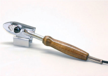
fig.10 A tacking iron is used to keep print, dry-mount tissue and mount-board temporarily aligned, until the final bond is made in the dry-mount press.
The remaining utensils required are minor items, and you probably have some of them already. They include a short and a long stainless-steel ruler to take a few measurements and to have a solid cutting guide; a soft brush to frequently dust things off; a couple of drafting weights to serve as an extra pair of hands; a small but sharp knife with replaceable blades to trim the print and dry-mount tissue precisely; lint-free gloves to avoid fingerprints on the print; a hard and a medium soft pencil to mark dimensions and to sign the artwork; and a calculator and a soft eraser to avoid and correct mistakes.
Physical print placement, with only the aid of a ruler, is certainly possible, but it can be tricky and cumbersome. It often necessitates many, continually decreasing adjustments until the print is precisely in the preferred location on the mount-board. If you plan to mount prints regularly, consider the acquisition of a mounting jig. There are different models available for purchase, but I made mine from a spare baseboard of my, now wall-mounted, enlarger (fig.11). It makes the horizontal alignment of mount-board and print centers effortless and keeps the print horizontal, while trying to find the best vertical location.
Finally, you need a large and rigid surface, free of obstacles, on which to work. For this purpose, I made myself a 3x8-foot table from birch wood. It has a comfortable working height and shelves to store supplies (fig.12). To protect the table-top from cuts, I use a 2x3-foot self-healing cutting-mat (obtainable from craft or fabric stores), or if more space is necessary, I just use a fresh piece of mounting board. The table is large and rigid enough to accommodate the long mat cutter (on the left) and to carry the heavy dry-mount press (on the right).
Another prerequisite for successful mounting is cleanliness. Fingerprints on fine photographs are totally unacceptable, but fortunately, they are also completely avoidable. For that reason, I strongly recommend always wearing lint-free gloves whenever handling, mounting, matting or framing prints.
Unfortunately, there are other gremlins, trying to spoil our print presentation. Always guard against small particles, coming from framing debris, paper trimmings, fabric fibers, hair or dust, just to name a few. If they get under dry-mount tissue or print, they are likely to show through the print surface and create an objectionable ‘pimple’. If such particle finds its way between the print surface and the upper plate, or the insertion board, of the dry-mount press, it may leave a visible imprint and unsightly ‘dimple’ on the print. Pimples are impossible to remove and ruin the already mounted print. Dimples cannot be completely removed, but first swelling the emulsion with a tiny drop of distilled water or alcohol, and then leaving it to dry, can reduce the indentation. Even so, dimples still cause unnecessary labor and needless frustration.

fig.11 If you plan to mount prints regularly, consider the acquisition of a mounting jig. Different models are available for purchase, or one can be made from a spare enlarger baseboard.
Always have the soft brush handy to frequently dust off all mounting and supporting surfaces to bring an end to pimples. For example, when preparing a print for dry-mounting, put it down, faceup onto a clean piece of mounting board, and dust off the image side. Then, pick the print up, dust off the mounting board and place the print facedown. Now, dust off the backside of the print, before applying the same procedure to the dry-mount tissue. This is an elaborate process, but it is the only way to steer clear of pimples. Occasionally, clean the upper plate of the dry-mount press, or replace the insertion board to prevent dimples, and never forget to wear the gloves.

fig.12 A self-made table offers a large and rigid surface to work at a comfortable height, while providing extra shelves to store supplies.
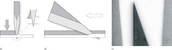
fig.13 During cutting, the wedge-shaped blade forces its way through the paper under a certain angle, pushing the upper paper fibers further aside than the lower fibers (a-b). This different displacement of interwoven fibers causes them to bulge, and occasionally rip, at the paper surface, unless fiber movement is somehow restricted. By sliding the cutting blade alongside a steel ruler, and pushing this ruler firmly down onto the paper during cutting, one side of the paper is constrained, while the other remains free to move. As a result, the side sandwiched between ruler and cutting-mat will have a reasonably smooth and clean edge, whereas the other side will be rough and jagged-looking (c).
Using exclusively fresh, truly sharp, cutting blades is another requirement to avoid disappointment. Trying to squeeze the last bit of performance out of a blade is definitely false economy. The sensitive cotton fibers of museum board, for example, demand the sharpest blades possible to guarantee a smooth and clean cut. If the blade is even remotely dull, it will rip the fine fibers more than cut them. For simply cutting boards to size, this might be tolerable up to a point. However, for delicate and forever-visible bevels of an overmat, anything less than a flawlessly clean cut is completely unacceptable. A less than perfect overmat must be discarded and replaced, before it gets a chance to spoil the entire print presentation and ruin the photographer’s reputation. At today’s material prices, the replacement cost for a new overmat is roughly equivalent to the cost of thirty new blades. A timely blade replacement proves to be a worthwhile investment!
When trimming prints, the cleanest cut is attained using a steel straight-edge or ruler, and a scalpel with a fresh, very sharp blade. However, handle these tools with extreme care. A sharp scalpel respects the toughness of steel as a guide, but it does not differentiate between paper and fingers. I strongly suggest using a ruler with a finger guard. Always keep the ruler on the print and not on the cut-offs. It is inherent to the cutting process that the material is divided, but unlike sawing, no material is lost or removed; it is just displaced. However, the displacement is not consistent. As the wedge-shaped blade forces its way through the paper under a certain angle, it always pushes the upper paper fibers further aside than the lower fibers (fig.13a-b). This different displacement of interwoven fibers causes them to bulge, and occasionally rip, at the paper surface, unless fiber movement is somehow restricted. By sliding the cutting blade alongside a steel ruler, and pushing this ruler firmly down onto the paper during cutting, one side of the paper is constrained, while the other remains free to move. As a result, the side sandwiched between ruler and cutting-mat will have a reasonably smooth and clean edge, whereas the other side will be rough and jagged-looking (fig.13c). Consequently, it makes for cleaner print edges to always trim print and dry-mount tissue with the ruler placed on the print and not on the cut-offs. Be sure that the steel ruler has no sharp edges or burrs, which could scratch the sensitive print surface.
Mounting and Matting (Step by Step)
Dry-Mounting
Start by preparing a clean and well-lit work area, and get all tools and materials ready to go. Turn-on the tacking iron and the dry-mount press, select the appropriate temperature for the dry-mount tissue used, and leave them to warm up. Meanwhile, cut a mount-board, matting-board and a backboard to size, and put them aside for now. Do the same for the dry-mount tissue, unless you have the pre-cut sheets (see fig.14a). The tissue dimensions should be slightly larger than the untrimmed print (1.5 mm or 1/16 inch, on each side), to make double sure that the adhesive will reach the entire print periphery, even if it is slightly misaligned in the next step.
Cover the work surface with some spare, but clean, mounting board to have a smooth surface to work on. Dust-off work surface, print and dry-mount tissue well. Put the print facedown, cover it with the dry-mount tissue, and place a piece of release paper on top. Use one hand or a drafting weight to hold it all in place, and press the heated tacking iron onto the release paper (see fig.14b). Make certain that the flat surface of the iron rests evenly on the paper. Without pressing it down too hard, and while keeping the tacking iron in small circular motion, apply the heat for about 20 seconds, until the dry-mount tissue sticks to the print. Repeat in a second location, but stay on the same half of the print. We need the other half to be unattached, when we tack it to the mount-board later.
Turn the print and dry-mount tissue carefully around, and trim the edges, as appropriate for the print composition (see fig.14c). I suggest trimming off at least a millimeter or two, regardless of any artistic considerations. This way, all residual chemicals, which penetrated the print edges and were not washed out completely during print processing, are removed. After trimming, print and dry-mount tissue are precisely the same dimensions and are perfectly aligned to each other (see fig.14d).
Take the two pieces of already sized mount-board and critically inspect them front and back. Mounting board often has unavoidable minor flaws or imperfections. As tiny as some of them are, they will certainly catch the observer’s eye and create unwanted distractions. It is almost impossible to remove these flaws from the fibers, without leaving obvious telltale signs of repair work. It is far easier to leave them alone, but relegate minor imperfections to the back of the boards. If you find them on both sides of a board, hiding them becomes more difficult, although you may still have the opportunity to successfully conceal them with the print or the overmat, or better yet, you may be fortunate enough to lose them to the window cut-out of the overmat. Inspecting both boards prior to use will also help you decide which of the two pieces is more appropriately used as a mount-board and which as an overmat. Nevertheless, every once in a while, it seems impossible to lose or hide all board flaws. In that case, replace it with a fresh piece, and save the rejected board for a future application, hoping for the next print or overmat to cover or lose all imperfections.
Select which board is to be used as the mount-board, and save the other as the mat-board. Depending on the storage conditions of the mounting board used, you may elect to slip the mount-board into the dry-mount press for two minutes to dry it out before mounting the print. High initial moisture content of the mount-board can cause adhesion problems with the dry-mount tissue or may cause the board to bend or warp after bonding. Leave the board, for two more minutes, to dry and cool down.
Take the dried mount-board and select the most suitable mount orientation, considering print orientation and presentation style. Use two drafting weights, as an extra pair of hands, to keep the mount-board from moving around (see fig.14e). Then, use a jig, or a small ruler, to determine the optimum print placement on the board. The print should be centered left to right, and the bottom border should be larger than the top (see fig.14f-g). Start with the optical center, and work your way up or down from there, if needed.
Set another drafting weight on the print to secure its location, but be sure to put it on the side that is already attached to the dry-mount tissue. On the other side, slip the release paper between the print and the tissue. Now, place the tacking iron below the print but on top of the release paper, and tack the dry-mount tissue to the mount-board at one or, better, two places (see fig.14h). Remove the release paper. The print and the dry-mount tissue are now attached to the mount-board at the desired location, while still perfectly aligned to each other (see fig.14i), but the bond is still weak. Handle the assembly carefully, and do not hold it upright or the print might tear off.
It is important to choose an appropriate dry-mount operating temperature. If the temperature is too low, the bond is weak, and the print will delaminate at the corners and edges. If the temperature is too high, the print will get damaged, or if high enough, the adhesive will form bubbles and ruin the mount. The actual press temperature can be tested with a small thermometer, fitted into the press between two sheets of mounting board. FB prints can be exposed to fairly high operating temperatures (up to 225°F or 105°C). RC prints require lower temperatures (not more than 200°F or 95°C), otherwise the plastic layers on the paper will melt and ruin the print. Therefore, RC papers call for special dry-mount tissue, which melts at a lower temperature than the plastic on the paper does. I prefer porous dry-mount tissue with a low minimum operating temperature (175°F or 80°C), which is, consequently, suitable for both FB and RC prints, as well as other sensitive materials.

fig.14 a) Cover the work surface with some spare mounting board, to have a smooth surface to work on. Get the print and dry-mount tissue, and dust-off everything well.
b) Put the print facedown, cover it with the dry-mount tissue, and place the release paper on top. Put the heated tacking iron down flat, so it rests evenly on the paper. Apply the heat for about 20 seconds, until the dry-mount tissue sticks to the print. Repeat in a second location.
c) Turn the print and dry-mount tissue around, and trim the edges, as appropriate for the print composition, but trim off at least a millimeter. This way, all residual chemicals, which were not washed out completely during print processing, are removed.
d) After trimming, print and dry-mount tissue are precisely the same dimensions and are perfectly aligned to each other.
e) Take the mount-board and select the most suitable mount orientation to present the image. Generally, the presentation mirrors the print: vertical presentation for vertical prints and horizontal presentation for horizontal prints.
f) Use drafting weights as an extra pair of hands to keep the mount-board from moving around. Then, use a jig, or a small ruler, to determine the optimum print placement on the board.
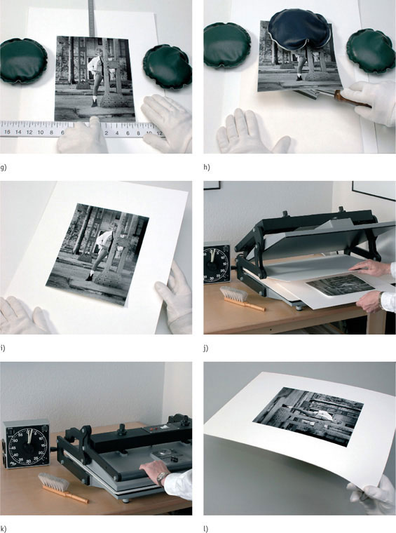
fig.14 g) The print should be centered left to right, and the bottom border should be larger than the top, while not letting the top border to become smaller than the sides.
h) Set a drafting weight on the print to secure its location, and slip the release paper between the print and the tissue. Now, place the tacking iron below the print but on top of the release paper, and tack the dry-mount tissue to the mount-board.
i) Remove the release paper. The print and the dry-mount tissue are now attached to the mount-board at the desired location, while still perfectly aligned to each other, but the bond is still weak. Handle the assembly carefully, and do not hold it upright or the print might tear off.
j) Insert the print assembly between two sheets of clean mounting board and close the dry-mount press.
k) Keep the press closed for up to two minutes for RC prints and up to three minutes for FB prints, but follow manufacturer’s instructions for operating temperatures and times.
l) Take the mounted print from the press, and place it under glass for five to ten minutes. After it has completely cooled, check the print adhesion, by holding the mount-board at each edge without permanently bending it. Inspect all print corners to make sure that print and tissue are not delaminating from the mount-board.
Heat distribution in the dry-mount press must be even, without hot spots. I have two sheets of mounting board in my dry-mount press. The top sheet distributes the heat from the upper plate more evenly and reduces dimpling of the print surface. The bottom sheet keeps the lower foam pad clean. Insert the print assembly between the two sheets and close the dry-mount press (see fig.14j-k). Keep it closed for up to two minutes for RC prints and up to three minutes for FB prints, but follow the instructions of the dry-mount press and tissue manufacturer for appropriate operating temperatures and times.
Take the print from the dry-mount press, and quickly place it under a thick sheet of glass for five to ten minutes, which allows the molten adhesive to cool and solidify, without curling the print or warping the mount-board. Some printers recommend the use of an aluminum sheet instead, for improved heat dissipation, but for me glass works fine, is perfectly flat and inexpensive. After the print has completely cooled, you might want to check the print adhesion. To do so, hold the mount-board at each edge (see fig.14l) without permanently bending it. Inspect all print corners to make sure that print and tissue are not delaminating from each other or from the mount-board. If they are, simply return them to the press for more time, possibly at a slightly higher temperature.
Matting
The only difference when cutting an overmat for a dry-mounted print or a corner-mounted print is the size of the window opening. When matting a dry-mounted print, as illustrated in fig.15, the window opening may be large enough to expose the entire print and some of the mount-board around it. The window opening for a corner-mounted print, however, needs to be small enough to secure and cover the print periphery.
Get the mat-board and inspect it for imperfections again, making sure that any imperfections either are on the backside or will be removed with the window opening. It is easier to mark the window cutting if a relatively large work surface is available, so the mount and mat-board may be positioned next to each other.
Put mount and mat-board down so that the print and the backside of the mat-board are facing you. With the help of a ruler, measure the distance from the print border to the edge of the mount-board on all four sides. Deduct 5/8 inch (15 mm) from the left, top and right measurements to derive the desired dimensions for the overmat window (see fig.15a). Draw soft, thin lines from edge to edge onto the mat-board at the respective locations (see fig.15b). Do the same for the bottom of the mat-board, but deduct 3/4 to 1 inch (20 to 25 mm) to gain more room below the print. You will need this extra space to identify the mounted print with your signature and an edition number. Mark the top-right corner of the mat-board as ‘top-left’ (see fig.15c). Remember, the mat-board is still lying facedown, so ‘left’ and ‘right’ are opposite! This will help to identify and maintain the correct mat-board orientation on the mount-board after cutting the window opening.
Refer to the instructions that came with your mat cutter for the correct procedure on how to cut the window opening into the mat-board, as this depends somewhat on your specific equipment (see fig.15d). However, some advice for efficient use of a bevel-cutter seems universal. Cut the short edges first, so the remaining edges give maximum support to the window cut-off. Over-cut all edges by about one or two millimeters, ensuring that the corners are cut all the way through. A window cut-off hanging from one corner can rip the fibers and ruin the entire mat-board. The cuts along all four edges must completely separate the window cut-off from the overmat.
Matching the ‘top-left’ marking on the backside of the overmat to the print’s top-left, place the overmat on the mount-board and verify that the window opening has been cut correctly (see fig.15e). The freshly cut bevels always have a slight burr on the show-surface of the overmat, no matter how sharp the blade is. Use the burnishing bone to smooth all four edges and the corners of the bevel (see fig.15f). To do this, run the bone across the bevels, with only light pressure applied. Using one of the bone’s edges, get deep into the bevel corners, and use the bone tip to smooth out the bevel over-cuts on the show-surface. A burnishing bone improves bevel appearance significantly.
Place mount-board and overmat next to each other, like two facing pages of an opened book, with the overmat still lying face-down. With the aid of a thin steel ruler, wedged between the two boards, create a thin, consistent gap between the two boards to provide room for a taped hinge (see fig.15g). Secure the position of the boards with two drafting weights. At a safe distance from the mounting area, get a clean, dripping-wet washcloth, fold it and put it into a 5x7-inch processing tray, large plate or dish. The set-up shown in fig.15h is purely for illustration purposes. I cannot recommend allowing water so close to your artwork, since it creates a significant risk of getting spills or drips onto the print.
Cut two pieces of the gummed, acid-free cloth tape of generous length. Four to six inches (100 to 150 mm) is about right. These will be used to create the hinge between mount-board and overmat. Take one of the two pieces of tape, thoroughly wet the gummed adhesive by pressing the tape onto the washcloth, and gently press the tape onto one half of the boards, trying to get the tape evenly onto both boards (see fig.15h). Repeat on the other half of the boards with the second piece of tape, and remove the drafting weights (see fig.15j). Before the water-soluble adhesive has a chance to dry, making slight adjustments impossible, close the assembly, and make sure the overmat and the mount-board are aligned correctly. If not, there is still time to tweak the arrangement (see fig.15j). After you are completely satisfied with the alignment, use the drafting weights again to keep everything in place for a minute or two, while the adhesive dries.
To finish dry-mounting and matting a print, make the artwork identifiable by adding an edition number on the left (see fig.15k), and by signing and dating the mount-board on the right (see fig.15l), just below the print. The dry-mounted and matted print is now presentable and ready for framing.
Corner-Mounting
Fig.16 illustrates corner-mounting, which is an alternative to dry-mounting. Both processes utilize the same tools and materials with the exception that a corner-mounted print is held, as the name implies, at the corners by plastic or paper pockets. The corner pockets can be purchased or self-made from acid-free paper. Since most purchased pockets, made of plastic (polypropylene), are backed with a self-adhesive of unknown origin, I prefer to make the corners myself from acid-free cotton paper.
Cut a 1x2-inch (25x50-mm) piece of acid-free paper, and fold it from the center of one of the long sides to both opposite corners, creating one large and two small triangles (see fig.16a, step 1-4). Unfold the paper, and ‘hollow’ out the large triangle, leaving only a small border of about 1/8 inch (see fig.16a, step 5-6). After turning the paper around, the newly made paper pocket is slipped over the print corner (see fig.16b).
Make a pocket for each corner, slip them over the print, place the print on the mount-board and secure it with a drafting weight (see fig.16c). Cut an overmat, with a window opening small enough that the corner pockets and the print borders are hidden. Place the overmat on top of the print, and check the window opening for size (see fig.16d). Hinge-mount the overmat, and adjust final print alignment if necessary (see fig.16e). Finally, cut four pieces of 2-inch (50 mm) long, gummed, acid-free paper or cloth tape, and firmly press the tape onto the corner pockets, avoiding contact between the tape and the print (see fig.16f).
The print is now corner-mounted and ready for framing. Do not expect the print to be as flat as its dry-mounted counterpart would be. This is a tradeoff for the flexibility of being able to remove the print from its mount with ease.
Print Identification
The final touch to a competently mounted and matted print is the full identification and personalization of the artwork. This not only provides future observers and prospective buyers with providence of the print, but it also increases the print’s potential value as a collector’s item and demonstrates the artist’s full commitment to the work accomplished. To follow the guidelines of not distracting from the image itself, print identification must be clear, but modest.
I prefer to have the print edition number, the date and my signature (but not the image title) readily available while looking at the image. Therefore, this information is entered just below the print onto the mount-board, where it is still exposed by the window in the overmat (see fig.15k-l). I use a medium soft and almost dull pencil, making clearly legible but delicate entries. A freshly sharpened or hard pencil will mar the surface and disrupts the smooth flow of writing. A pencil too soft, on the other hand, will make the writing far too dominant, demanding more attention than this secondary information deserves.

fig.15 a) Put mount and mat-board down so that the print and the backside of the mat-board are facing you. Measure the print borders and deduct the desired clearances to derive the dimensions for the overmat window. Leave more room below the print to have some extra space for signature and edition number.
b) Draw thin lines onto the mat-board at the respective locations.
c) Mark the top-right corner of the mat-board as ‘top-left’. Remember, the mat-board is still lying facedown! This will help to identify and maintain its correct orientation on the mount-board after cutting the window opening.
d) Refer to the instructions that came with your mat cutter, for the correct procedure on how to cut the window opening into the mat-board.
e) Matching the ‘top-left’ marking on the backside of the overmat to the print’s top-left, place the overmat on the mount-board and verify that the window opening has been cut correctly.
f) Use the burnishing bone to smooth all four edges and the corners of the bevel. Using one of the bone’s edges, get deep into the bevel corners, and use the bone tip to smooth out the bevel over-cuts on the show-surface.
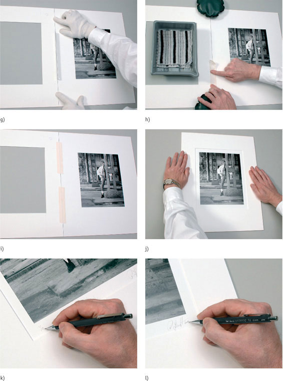
fig.15 g) Place mount-board and overmat next to each other, with the overmat still lying facedown. With the aid of a thin steel ruler, wedged between the two boards, create a consistent gap between the two boards.
h) Secure the position of the boards with two drafting weights. Cut two pieces of gummed tape, four to six inches in length. Take one, wet the adhesive, and gently press the tape onto one half of the boards, trying to get the tape evenly onto both boards.
i) Repeat on the other half of the boards with the second piece of tape, and remove the drafting weights.
j) Before the adhesive has a change to dry, close the assembly, and make sure the overmat and the mount-board are aligned correctly. If not, there is still time to tweak the arrangement. Again, use the drafting weights to keep the boards aligned, and let the adhesive dry.
k) To finish dry-mounting and matting a print, make the artwork identifiable by adding an edition number below the print on the left.
l) Then, sign and date the mount-board on the right.
The mounted and matted print is now presentable and ready for framing.

fig.16 a) Cut a 1x2-inch piece of paper, and fold it from the center of one of the long sides to both opposite corners, creating one large and two small triangles (step 1-4). Unfold the paper, and ‘hollow’ out the large triangle, leaving only a small border of about 1/8 inch (step 5-6).
b) Slip the newly made paper pocket over the print corner.
c) Make a pocket for each corner, slip them over the print, place the print on the mount-board and secure it with a drafting weight.
d) Cut an overmat, with a window opening small enough that the corner pockets and the print borders are hidden. Place the overmat on top of the print, and check the window opening for size.
e) Hinge-mount the over-mat, and adjust final print alignment if necessary.
f) Cut four pieces of 2-inch long, gummed tape. Firmly press the tape onto the corner pockets, avoiding contact between the tape and the print.
The print is now corner-mounted and ready for framing.
It is clearly up to the artist whether to prepare limited-edition prints or to make an unlimited amount of copies. In the past, I limited my fine-art print editions to twelve copies of any size, after which I made no further prints from that negative. Other typical edition limits are 50, 100, or optimistic photographers may choose 250, 500 or even more. If you are uncomfortable with the potential confinement and the inherent commitment of limited editions, there are alternatives. First, you can just number your prints, starting with ‘#1’, instead of ‘1/250’, or you can prepare print editions like the publishing industry does for books. You will see more on this in the chapter ‘What Size is the Edition’.
Next to the signature, in very small print, I routinely add the year the image was taken. Dating the image is often considered necessary to create a meaningful association with a certain era or period, thereby putting the visual information into perspective and making the print more consequential.
Any additional information may be helpful but does not belong on the presentation side of the mounted print. A custom-made rubber stamp (fig.17), which contains the photographer’s full name, a copyright and quality statement, room for the date the image was taken and the print was made, as well as space for the print number and the edition, is a good way to record additional information. Stamp the backside of the mount-board and the backboard with acid-free ink, and complete the missing information using an acid-free pen (not a pencil) on both. Now, add the image title somewhere near the stamp.
I keep the image title on the back, rather than on the front of the print. An observer’s interpretation of an image is always filtered by personal experiences and current emotions. Therefore, an image is likely to provoke different responses in different people. By presenting the image title on the print, these individual responses are muted, because this title reflects the photographer’s image intent and is influenced by the photographer’s experiences and emotions. An untitled image is far more likely to provoke a genuine emotion and response in the viewer.

fig.17 A custom-made rubber stamp, which contains the photographer’s full name, a copyright and quality statement, room for the date the image was taken and the print was made, as well as space for the print number and the edition, is a good way to record additional information. Stamp the backside of the mount-board and the backboard, and complete the missing information using an acid-free pen.
fig.17a This is my old rubber stamp for when I limited my fine-art print editions to twelve copies of any size, after which I made no further prints from that negative.

fig.17b This is my new rubber stamp, after switching from ‘limited printing’ to ‘true editioning’. During each printing session, I usually make 1-4 prints. If I reprint on another day, it’s the next printing session. If I change the printing style for the image, it’s a new edition. This allows for an unlimited number of prints and still defines each print precisely for collectors and galleries.
Print Spotting
Closing in on perfection with a bit of cleanliness
Few freshly made prints are completely free of visual defects. Unavoidable dust and tiny scratches on the negative, plus the occasional emulsion damage and fingerprint, create unwanted spots, lines and other blemishes on the print. These imperfections must be concealed, because they spoil a clean presentation and distract from the image. Print spotting is the process in which unwanted spots are disguised by adjusting their tonality to match the surrounding tones.

fig.1 There is usually a remarkable difference between unspotted and carefully spotted prints, especially when considering how minute the alterations often are. Print spotting removes disturbing visual defects, which disturb the print enjoyment and lessen its visual impact.
Print spotting is not just cosmetic. Its main function is to remove disturbing visual noise, which gets in the way of print enjoyment and lessens its impact. There usually is a remarkable difference between un-spotted and carefully spotted prints, especially when considering how small the alterations often are (fig.1). This makes spotting a highly effective and rewarding task, but it can also be a labor-intensive, time-consuming and sometimes frustrating task, particularly when it does not work as well as we had hoped. As always, prevention is better than repair, and consequently, it is best to eliminate the need for spotting as much as possible. The less spotting your prints require, the better off you are. The root cause for print blemishes is dirt and dust. To minimize the need for spotting, keep your negatives clean and handle them with care to prevent scratches. Make sure your entire camera equipment and darkroom are as tidy and dust-free as possible. Remove dust from work surfaces, cameras and film holders on a regular basis. Gently remove all loose dust from the negative and the enlarger’s negative holder with compressed air or an anti-static brush before printing them. Carelessly stored, ill-treated or much-printed negatives may benefit from a gentle wash prior to using them again.
White Spots and Black Spots
There are two types of print imperfections that require spotting, white spots and black spots. Most blemishes are much lighter than their surroundings. Most are caused by small dust particles stuck to the negative or to the glass of the negative carrier. They are highly distracting but easy to remove. Others are telltale signs of small fibers and hair, leaving thin, bright trails on the print. They need a bit more patience and practice to disguise. Dark spots are typically caused by dust on the film during in-camera exposure or by damage to the negative emulsion. Some literature recommends etching the print surface to remove blemishes that are darker than their surroundings. However, etching requires scratching and irrevocably damaging the print’s surface. I will demonstrate how this is completely avoidable when print spotting is combined with other retouching techniques.
Spotting Equipment and Materials
Print spotting is accomplished by using a small brush and repeatedly applying a darker dye to a lighter spot, line or blemish, until its shade closely matches the surrounding tones and blends into the rest of the print. The goal is not to eliminate the imperfection altogether, but to move it from attention-grabbing boldness to inconspicuous obscurity.
The ideal work area for spotting is dry, uncluttered and dust-free. It also provides bright and even lighting, has a good-size sturdy table and comfortable seating. Typical spotting tools include a large magnifying glass or extra-strong reading glasses, a set of very small, fine-tip, high-quality brushes, a pair of clean, lint-free nylon or cotton gloves, some blotting paper or a paper towel, a few spare pieces of mount-board and a saucer or porcelain palette to mix and dilute the spotting dye (fig.2). Make sure to also have a cup of distilled water and an eyedropper handy.
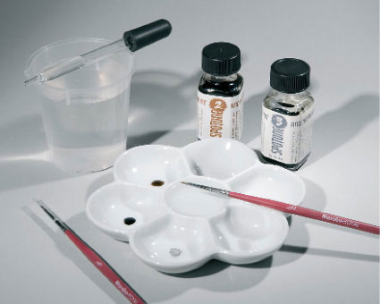
fig.2 Typical spotting tools include a large magnifying glass, a set of high-quality brushes, some blotting paper, a porcelain palette to mix and dilute the spotting dye, a cup of distilled water and an eyedropper.
Spotting Brushes
Your set of fine-tip brushes needs to include only the smallest sizes. Start with a #000 (3/0) brush for larger spots, and attack smaller imperfections with a #00000 (5/0) brush. Be sure to buy only the best, evenly shaped, animal-hair brushes available, or your spotting efforts will be more tedious and frustrating than necessary. A high-quality brush features enough bristles to readily absorb the spotting fluid, while still forming a fine-point tip and allowing full control over the fluid amount released by varying the pressure applied to the tip of the brush.
Spotting Dyes
The best-suited materials for spotting monochrome prints are light-stable, black dyes and pigments, which are suspended in a quick-drying, water-soluble solution. This way, the spotting dye can be diluted with water to create any shade of gray from a barely visible light tone to a deep dark black. Once applied to the print, the dye is absorbed by the paper emulsion and penetrates into the fibers without appreciably changing the surface texture or its reflectance.
One prominent brand of spotting dye was Spotone, made by Retouch Methods, Inc., but unfortunately, the company no longer exists. They produced dyes of various colors, and by mixing them, one could match any print color, regardless of paper brand or toner used (see fig.3a). You may still be able to acquire a bottle of Spotone through a secondhand source, in which case, you will be glad to know that a single bottle will most likely last you a lifetime. The most useful color in the Spotone line of shades is #3 (neutral-black base), which has a colorless, black tone. By mixing #3 with small amounts of #2 (selenium brown), the tonality can be changed to closely match the tones of a typical sulfide or selenium-toned print. Further color matching is possible with #0 (olive black) and #1 (blue-black), but most spotting needs are adequately covered with Spotone #3 and #2. Marshall’s manufacture an alternative line of spotting dyes, called Spot-All (fig.3b). It is available in neutral-black, selenium-brown and blue-black. As of this writing, they are still available and just as easy to mix and apply as the Spotone products. I would not hesitate to work with either of these ink-based materials. Conversely, I had little success with products containing egg white, shellac or other glazing agents and lacquers. Their ingredients are not absorbed by the print, but build a hard, shiny layer on top of the emulsion, similar to a coat of paint. They alter the surface reflection and make tonal blending far more difficult than with penetrating inks.

fig.3a Spotone is, unfortunately, no longer available, but it is still possible to acquire this once-prominent brand of spotting dye through secondhand sources. By mixing various colors, any print tone, regardless of paper brand or toner used, can be matched.
fig.3b Marshall’s Spot-All dyes are still available, very similar to Spotone and work on the same principle. The dye is readily absorbed by the emulsion and paper fibers without appreciably changing the surface texture or its reflectance.
fig.3c Going back to the very roots of ink making, grind some solid India or China ink, mix it with an equal amount of gum arabic and dissolve together in distilled water. Gum arabic promotes print adhesion and controls the gloss level of the spotting dye.
fig.3d Special opaque liquids are used to cover up small holes in the negative emulsion. This way, they convert hard to remove, dark print spots into bright white spots, which are much easier to spot and blend into their surroundings.
If you are concerned about photographic product availability in general and monochrome, fine-print products in particular, spotting dyes should be the least of your worries. In the absence of specially made retouching products, one is well-served with archival inks as they are used in drafting and calligraphic applications. You might even go back to the very roots of ink making and produce your own spotting dyes from solid India or China Ink sticks (fig.3c). Grind some ink off the stick, mix it with an equal amount of gum arabic and dissolve together in distilled water. Alternatively, fill an ink rubbing stone with some water, rub the ink stick against the stone until the water turns deep dark and add some gum arabic to it.
Gum arabic promotes the adhesion between spotting dye and print emulsion while also controlling the gloss level of the dye. Therefore, use more gum arabic for spotting glossy prints than for spotting matt prints, and always try to match the surface reflection of the surrounding print area. Gum arabic can also be applied to professional spotting dyes in order to increase their inherent gloss levels.

fig.4a A light dye is mixed and applied numerous times to carefully build up the tonality required to fill the spot.
fig.4b Using a small brush to repeatedly apply a slightly darker dye to a series of lighter spots, a blemish is disguised and blends into the surrounding tones.

fig.5 An initial enlargement of the print revealed numerous imperfections of different origins. On the left, typical white spots and lines, caused by dust on the negative, are joined by a dark blemish (arrow), which was actually a tear in the paper of the studio background. On the right, there are more dust spots, together with a large dark spot, caused by a small emulsion defect in the negative.

fig.7 After retouching the negative and turning the dark spot into a white spot (right), a new enlargement was made. The dark blemish, caused by the tear in the paper, was bleached with Farmer’s Reducer during wet processing until it was lighter than its surroundings (left). These actions eliminated the need for etching, and the print is now ready for spotting.

fig.6 After making sure that all print imperfections are lighter than their surroundings, the print was carefully spotted. The goal is not to eliminate the imperfections altogether, but to move them from attention-grabbing boldness to inconspicuous obscurity. The telltale signs of spotting are only visible upon close inspection and by knowing where to look for them.
Dark spots on the print create a unique challenge to retouching efforts. They cannot be covered up with spotting dyes, because the dyes are made to build up tonality in the emulsion and not to paint over it. One way to remove dark spots is to bleach the print locally, while still wet, until the area is slightly lighter than its surroundings and spot it back in when dry. This is rather difficult with dark spots approaching maximum black, in which case, the blemish is best removed by turning a black spot into a white spot first. This is done by covering the corresponding negative area with an opaque liquid on the substrate-side of the film. This way, what printed as a black spot now prints as a white spot and can be easily disguised through print spotting. Any damage to the print emulsion, which is an unavoidable result of etching, is prevented by this method. Special opaque liquids are on the market (see fig.3d), but any near-opaque ink will work as well.
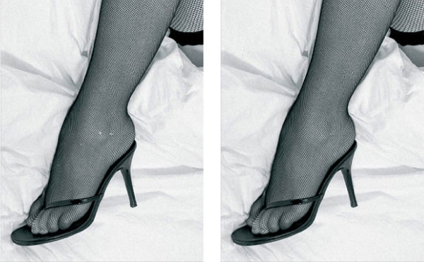
fig.8 Print spotting is not limited to removing dust and other print blemishes. As this example shows, it can also be used to retouch image-based imperfections. A few tiny holes in the stockings have been successfully repaired by simply correcting the damaged stitches with a small brush and some spotting dye.
Print Spotting Process
Professional print spotting takes a lot of practice and experience, but it does not take too long to learn the basic steps and improve the appearance of a print significantly. The main challenge is to understand the need to resist the initial impatience. Print spotting is not something that should be done in a rush, or the results will look rushed.
I do all my spotting after print mounting, because this has the benefit of being able to work with a perfectly flat print. However, it has the disadvantage of potentially wasting a mount-board if something goes terribly wrong during spotting, a risk that gradually diminishes with increasing spotting skills.
Clean up your work area, and make certain that it is dry, uncluttered and dust-free. Provide for bright and even lighting and get a comfortable chair. Get a large magnifying glass or use extra-strong reading glasses in addition to your corrective eyewear. Have all your spotting tools and materials ready, put on your gloves and continue with the following general steps:
1. Place a single drop of undiluted spotting dye into the saucer or porcelain palette (see fig.2). Using a mixing brush and distilled water, dilute the dye and create several drops of decreasing strength.
2. Place a spare piece of mount-board on top of the print, close to an area that needs spotting. Start with the lightest spots and the weakest dye.
3. Dip the tip of your brush into a dilution significantly weaker than the spot seems to require.
4. Blot the wet brush tip gently against some blotting paper. You have more control over spotting with a dry brush than with a wet brush.
5. Carefully touch the print with the tip of the brush. Aim for the center of the blemish. Do not stroke the brush; you are spotting, not brushing.
6. Compare the first spot you made to the tone of the surrounding area. If it is darker, quickly blot off what you can before it dries, apply a drop of distilled water to what is left and blot that off too. Repeating this a few times will not remove the stain at all, but it will make it less obvious.
7. The first spot application should look significantly lighter than the surrounding area. The goal is to start with a light dye and gradually build up density. Spots that are too light are easily darkened, but spots that are too dark are hard to remove and can ruin an otherwise perfect print.
8. Once you have the correct tone of dye, hold the brush straight up, and keep spotting the rest of the blemish by repeatedly applying tiny spots until it is filled in. Again, do not paint, spot. Be patient, and give the dye time to dry between applications.
9. After the first blemish is completely filled in, examine the print for blemishes of similar tone, and spot them next. While working on increasingly darker spots, slowly increase the strength of the dye. Repeat this procedure until all print imperfections are sufficiently disguised.
Final Hints
By far the most common spotting mistakes are to work with too wet of a brush and to use too dark of a dye. Until a certain spotting proficiency has been obtained, work with an additional copy of the print to practice and fine-tune the tonality of the dye, before spotting the actual print. When you feel more confident, simply use the trimmed white borders of the print itself to verify the tonality of the dye.
Correcting large blemishes takes a lot of tiny spots and effort. Resist the temptation to make larger spots. It quickly turns professional spotting into amateurish painting, and results will be perceived accordingly.
Framing and Displaying Prints
Fully protected and ready for the exhibition
A print’s appearance is improved significantly through mounting and matting, and subsequent spotting provides the cleanliness every good print deserves. However, framing a print behind glass is the ultimate aesthetic enhancement. No matter how much impact the print has on its own, if left unframed, it will always look inferior next to its framed counterpart. It takes a significant amount of time and money to frame a print professionally, but it is well worth the effort and expense for all prints going on display. Skillful framing gives our best prints the attention they deserve and us an opportunity to proudly exhibit our work.
The purpose of a frame is to isolate the print from its surroundings, enhance it aesthetically and protect it against dirt, dust and rough handling. Always select a frame design and color that complement the print without drawing any attention from it. A good frame supports the print without dominating it. Make sure to exhibit the print and not the frame.
The effort involved to turn a print into a framed print must not be underestimated. Mounting, matting and framing enough prints to fill a small exhibition can take a week or two of labor, and the materials alone might cost more than a camera. If you decide to frame your own prints, it certainly makes sense to be familiar with the materials and procedures available for framing and to find the best local sources for your supplies. But, even if you decide to take your prints to a professional framer, a little background on suitable framing materials and procedures helps to negotiate the best deal. A good frame will keep the print safe and representable for years to come.

fig.1 A frame isolates the print from the wall, enhances it aesthetically and protects it against dirt, dust and rough handling. Select a frame design and color that complement the print without competing with it.
Choosing a Frame
If we ignore all archival considerations, we are able to choose from an almost bewildering assortment of frame materials, including wood, metal and plastics. However, if we want to protect our photographs from harmful odors and fumes, the selection becomes much more limited. Wood contains aromatic oils, which vaporize over time and attack our photographs. Paints and varnishes emit harmful fumes, which do the same. The safest frame materials are chemically inert plastics and unpainted metals.
For aesthetic and chemical reasons, plastic frames are considered to be inferior and not suitable for high-quality framing. Mass-production plastic frames are often sold in combination with a cheap cardboard backing, which rules them out for archival reasons. This leaves us with unpainted metal frames.
Attention to weight, cost and corrosion issues make aluminum the professional frame material of choice. Extruded aluminum is light, relatively easy to cut and machine, and its smooth finish can be corrosion protected without paint. For all these reasons, I use anodized aluminum frames exclusively and committed to a personal standard of a matt black finish. The type of finish is a personal choice, but in my opinion, a thin black frame is the perfect companion for a white or light-gray overmat, creating enough contrast to clearly isolate it from the wall and quietly continue the style of the black and white photograph all the way to the edges of the frame. When a print is framed this way, and exhibited alongside others on a white wall, it always comes across as a well-coordinated, professional design concept that one can be proud of.
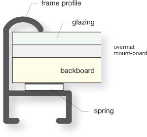
fig.2 Extruded aluminum profiles are the material of choice for professional framing. Here, the popular Nielsen & Bainbridge profile #15 offers enough room to comfortably fit one sheet of glass, two mat-boards and a backing board inside of it, while still leaving a gap to fit a number of springs, which later compress and securely hold the assembly in place.
A secondary consideration when choosing a frame is the selection of a suitable profile. Except for appearance of the exposed contour and a choice between smooth and sharp edges, this is mainly a matter of package requirements to fit the glass, mounted print and the backboard. Nielsen & Bainbridge, a well-known manufacturer of mounting and framing materials, offers a popular profile design called ‘#15’. It is about 1 inch tall and provides a 15mm pocket inside the profile to comfortably fit a 2mm sheet of glass, two 4-ply mat-boards and a 1/4 inch backboard, while still leaving a gap to fit a number of springs, which later compress and securely hold the assembly in place. Several framing material suppliers have copied this profile with only minor modifications.

fig.3 A print is put behind glass for protection, even though that degrades the print’s appearance, because it slightly changes the image color and reduces image contrast significantly.
Glazing Considerations
A print is always put behind glass to protect it, but without exception, this degrades the print’s appearance to some degree. Still, framing without glazing is not an option to me. Too high is the danger that innocent or careless, greasy fingers will find their way to the print’s surface, leaving possibly permanent fingerprints or scratches. A thin sheet of glass protects the print against thoughtless touching, unavoidable dust, and accidental transport damage, scuff marks, rough handling, temporary pollutants and UV radiation. In other words, the glass protects against all the typical dangers a print faces when we are not there to guard it. To avoid playing sentry, I am willing to accept that a print behind glass does not show its full splendor.
A print behind glass suffers from a slight change in color but mainly from a noteworthy loss of contrast. It is worthwhile to understand how the optical properties of a particular picture glazing material affect the image contrast. If perfect glazing material existed, it would be invisible, transmitting all light and absorbing or reflecting none. Unfortunately, perfect glazing does not exist, and we have to deal with reflections, absorption and a loss in transmittance.
A significant portion of the light is immediately reflected off the glass surface (8%), and depending on surface smoothness, specular or diffuse reflections are created. The remaining light makes its way through the dense glass material, and some of it is absorbed along the way (2%). What is left (90%), is the light transmitted by the glass (fig.4). Light absorption acts like a mild filter, which has a slight impact on color appearance, but this is usually of little concern. Light reflections and the loss in light transmittance, on the other hand, have a noteworthy effect on image contrast, changing print appearance in different ways.
A loss in transmittance dulls print highlights. Bright highlights (Zone VIII) reflect about 81%, and dark shadows (Zone II) reflect just over 1% of the light they receive, which makes for a difference (or contrast) of roughly 80%. Observed behind glass, the brightness values of highlights and shadows are reduced, because the glass transmits less than 100% of the light reflected by the print. This affects highlights and shadows by the same percentage, but in absolute values, highlight brightness is reduced more than shadow brightness. For example, at 90% transmittance, Zone-VIII reflection drops to 73% and Zone-II reflection is still above 1%. Consequently, the image contrast drops to 72%, almost entirely due to a loss in highlight brightness. At 80% transmittance, image contrast is reduced to 64%.
The image contrast is degraded further through light reflections off the outer glass surface, because reflections dull image shadows more than image highlights. That is to say, uniform exhibition lighting has a non-uniform effect on print highlights and shadows, because adding some light to bright areas is less noticeable than adding the same amount to dark areas. Let’s assume that a framed print is observed from a direction at which 4% of the exhibition lighting is reflected off the glass. Adding this 4% reflection to a Zone-VIII highlight lifts its brightness by just 1/3 zone. Adding the same reflection to a Zone-II shadow catapults its tonal value by two zones to Zone IV. This contrast loss must be avoided by carefully considering the position of all display light sources. The combined effect of reflections and reduced transmittance is easily demonstrated by covering a portion of a print with a sheet of glass, as shown in fig.3. The uncovered, unprotected print area clearly exhibits more image contrast and brilliance.
Within limits, it is possible to battle the reduction in image contrast by preventively increasing the contrast of prints intended to be shown behind glass. For example, a negative, typically printed at grade 2, is purposely printed at grade 2 1/2 to compensate for an anticipated contrast loss of 10% behind glass.
Compared to the potential danger of damaging the print, a small degradation in print appearance is of no concern. However, to get the optimum compromise between protection and visual degradation, we need to choose an appropriate glazing material.
Plastic Glazing
Typical plastic glazing materials are polycarbonate and acrylic, often called by its trade names Plexiglas or Perspex. Of the two, acrylic glazing offers less UV protection but transmits up to 90% of the light it receives, which is comparable to regular glass (fig.5). Polycarbonate is more resistant to impact and absorbs more UV radiation, but yellows within years if exposed to sunlight and transmits only 80% of the light. Consequently, acrylic is the preferred plastic glazing material for picture framing, and is used instead of regular glass whenever shatter proofing and weight are serious considerations. Hence, it is recommended for shipping framed prints and wherever there is a chance of prints falling off the wall, as with small children. However, it must always be coated with a specialized foil to filter harmful UV radiation and fully protect the print.
Nevertheless, acrylic surfaces have a propensity for attracting dust and cannot be cleaned with regular glass cleaners. In addition, due to their inherent material properties, they are never perfectly flat when upright and suffer from waviness with temperature fluctuations. This waviness takes away from a professional presentation and limits its use to exceptions.
Transparent Glass
Regular transparent glass, also called float glass, is a pane of glass manufactured by floating molten glass on a bed of molten tin. The float glass process was pioneered by the well-known British glass manufacturer Pilkington in the 1950s, and this relatively recent manufacturing technique makes it possible to create an even sheet of glass of uniform thickness and with absolutely smooth surfaces.
Float glass is inexpensive, easy to clean, impermeable by harmful pollutants and fumes, insensitive to variations in temperature and humidity, always remains perfectly flat, and it is far more resistant to scratches than plastic glazing. This makes it a prime candidate for protecting framed images, and since modern window glass is also made from float glass, we can easily obtain the required supplies at any local glazer.
Float glass provides adequate UV protection (fig.5) and has a transmittance of just above 90%. Of the remaining 10%, roughly 2% are absorbed, and 8% of the light is returned as a specular reflection (fig.4a), which, depending on the lighting situation, can obscure viewing the image. A possible countermeasure is non-reflective picture glass. This is also made from regular float glass, but one surface is chemically etched to mildly roughen the surface and diffuse reflections, similar in effect to the anti-Newton glass used for slide frames or negative carriers (fig.4b). This does not affect the UV protection, but it has the disadvantage of reducing the light transmittance to about 80%.

fig.4 A significant portion of the light is reflected off the glass surface, and depending on surface smoothness, specular or diffuse reflections are created. The remaining light is either absorbed by the dense glass material or transmitted through it.

fig.5 Typical picture glazing materials differ in light transmittance and the amount of UV protection they provide.
An alternative is to use a specially made, white float glass. Pilkington sells such a float glass under the brand name Optiwhite. White float glass has a reduced iron content, which eliminates the faint yellow or green tint, otherwise observed in regular float glass. This increases the light transmittance slightly but, unfortunately, also reduces UV protection (see fig.5). Overall, a print behind white float glass is more neutral in color and exhibits a bit more contrast than a print behind regular float glass. But, in the long run, I don’t think that this minor viewing improvement is worth the risk introduced with increased UV exposure.
A much better, but very expensive, glazing alternative is to frame the print behind white optical glass. This is similar to the glass used in camera or enlarging lenses. Its special anti-reflection coatings increase the light transmission to 99%, while eliminating reflections almost completely and improving UV protection, compared to regular float glass (see fig.5). Under normal lighting conditions optical glass is hard to detect and almost invisible. Schott, another well-known glass manufacturer, markets an optical picture glass under the brand name Mirogard, but its prohibitive cost typically limits its application to luxurious galleries and well-subsidized museums.
For my own framing work, I stick to thin, regular window glass. It’s a cost-effective compromise with only minor disadvantages. But, regardless of the kind of glazing you select, a print must never be placed directly against the glazed surface, or the emulsion will make contact with the glazing. This combined with normal humidity levels is sufficient for the gelatin emulsion to swell and eventually stick to the glass surface, in which case, separating the print from the glass will be close to impossible, and the print is most likely lost. This cannot happen, of course, if you use a standard overmat. The overmat provides an adequate gap between the print and the inner glass surface, making a touch condition impossible.
Glass Cleaning
When I receive my glass from the local glazer, it is not clean enough to be used right away. Coming out of his workshop, it is full of dust and fingerprints and needs a thorough cleaning before it can go into the frame. But, getting glass perfectly clean is not an easy task.
Before placing the sheet of glass on top of a flat work surface, brush off loose dust and dirt from all surfaces to avoid scratching the glass during cleaning. Then, spray a small amount of commercial glass cleaner onto one side of the glass, and use a clean towel to remove all dirt until there is no cleaning fluid residue left. Repeat if necessary, always using a fresh section of the towel, otherwise the dirt is not removed but only distributed. After both sides seem to be clean, check their actual cleanliness by observing the reflections from a nearby lamp in the glass.
All commercial glass cleaners contain potentially harmful chemicals, including acids, ammonia, dyes and fragrances. We might need some of them to effectively clean the glass, but we don’t want any cleaning residue within the confines of a frame and archivally processed prints. That’s why I go through the extra effort and clean the print-facing side of the glass again with distilled water and another fresh towel.
Framing Techniques
The right frame is often a compromise between quality, cost and convenience. Mass-production frames can be purchased ready-made in a number of standard sizes, but they usually do not meet archival standards. Custom-made frames, put together by a professional frame shop, have any quality level you are willing to pay for. They are also a very convenient but never the least expensive option.
High-quality framing at the lowest cost requires you to do the framing yourself. Two framing options are introduced in this chapter: first, a more permanent framing option, which I use for purchased prints, and second, a unique reusable framing option, which I recommend for print exhibitions.
Permanent Framing
This is a very reliable framing option for all prints that are intended to go on permanent display. Over the next few pages (fig.6-9), you will find step-by-step instructions to put these frames together. As you will notice, this framing method is not as irreversible as the term might imply, but compared to other framing options, the result is perceived as providing much more than just a temporary home for the print.

fig.6 a) Cover the work surface with a spare piece of mounting board and brush it off to provide a clean and smooth work surface. Get four pre-cut frame profiles, all double-plate corner hardware and a screwdriver ready.
b) If not already done, assemble the double-plate corners, and adjust the screws, so that the corners snugly fit into the open profile.
c) Insert a hardware corner for each corner of the frame, and continue loosely connecting all profiles, thereby closing the frame, but do not tighten the double-plate corner screws yet.
d) At this point, the frame is still only loosely assembled, but the corners of the frame are at almost perfect right-angles.
e) While firmly pressing the miter joints together with your fingers, tighten all screws, and then, turn the frame around to verify the accuracy of the joints.
f) Loosen two screws again, to open the frame on one side, and slowly insert a clean pre-cut sheet of glass all the way into the open frame. The white tissue shown was used to separate the glass sheets during storage, keeping them free of scratches. Always wear protective gloves when handling glass!
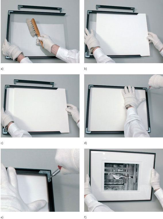
fig.7 a) Take advantage of this last opportunity, and clean the print-facing side of the glass one more time, making sure that every tiny dust particle is removed.
b) While inserting the mounted and matted print facedown, be sure to lift the boards slightly, otherwise the window cut of the overmat may catch on the edge of the glass and ruin the mat.
c) Insert a pre-cut, acid-free, 1/4-inch-thick backboard made of foam core. It supports the mount from the back and presses uniformly against the glass, holding the print always nice and flat.
d) Unless you choose to add an additional plastic sheet as a pollution barrier, which may only trap humidity and cause more problems than it is worth, close the frame and tighten all screws carefully.
e) Remember that you are dealing with a relatively thin aluminum profile. The corner screws are very strong and easily over-tightened, which will ruin the frame.
f) Before clamping and fixing the print assembly into place, carefully inspect the print and mount-board for dirt and dust, accidentally left behind, in which case you need to open the frame one more time to remove it. Otherwise, this is the last opportunity to fine-tune the final print position inside the frame.

fig.8 a) Six metal bow springs firmly hold an 18x22-inch print assembly in position. Positioning these springs, however, can be a tricky task. Fletcher makes a specialized product called Spring Mate, which is the perfect tool for this job.
b) Insert one end of the spring into the tip of the Spring Mate, and push the other end into the aluminum profile. Then, while turning the tool, push the entire spring into the profile. Distribute all other springs evenly. Don’t do this without safety glasses!
c) The next step is to attach two screw-fixed hangers. They are loosely inserted into the profile first, and with the aid of a ruler and a screwdriver, slid and then fastened into a standard position 100 mm from the top of the frame.
d) For solid support, which does not stretch or leave unsightly marks on the wall, use a 1.5mm braided stainless-steel picture wire, push one end of it up to 3 inches through the eye of the hanger, and bend it over.
e) With your left index finger, position the wire to the approximate future position of the nail, and cut the wire to a length that allows for a symmetrical wiring setup.
f) Unprotected, the bare ends of the picture wire are a potential source of painful finger injury. These sharp ends are stylishly covered by crimping them to the main wire, using a pair of brass ferrules. Before bending over the second end of the picture wire, slide two brass ferrules onto it, and get a pair of crimping pliers ready.

fig.9 a) Covering the sharp ends of the picture wire with neatly crimped ferrules adds a professional touch to framing. Pass the end of the wire through and back through the ferrule before crimping it tight. The inside diameter of the ferrule should be approximately 2.5 times the outside diameter of the wire for a snug fit.
b) It is useful to have a custom-made rubber stamp, which contains all your standard, print identifying information.
c) Stamp the backboard with your customized stamp, sign it and complete the missing print information using an acid-free pen.
d) You can add perceived value to a framed print by adding your calling card and an elegantly shaped hook and nail.
e) Insert the calling card and the hanging hardware into a small mailing envelope, and glue it shut around the picture wire, so it cannot get lost.
f) As a final touch, glue a small plastic or felt bumper onto the back of each bottom corner of the frame. The bumpers prevent the frame from marking the wall, and they also reduce the frame from slipping along the wall, making frame leveling a less frustrating and more permanent task. The framed print is now presentable and ready for display.
Permanent framing, in combination with Nielsen aluminum profiles, is the most popular choice of serious amateur and professional photographers in North America. Many established black and white photographers use it almost exclusively. The reason may be that Ansel Adams taught this framing method to his students, who in turn, continue to teach it to their students. Nevertheless, it is also a framing technique used by first-class museums and galleries, because it fully complies with archival standards if proper framing materials are selected. Other benefits include the durability and flexibility to match any print size and proportion, and the profiles required can be bought as pre-cut pairs or ordered to length.
Unfortunately, permanent framing also has a few disadvantages. You need several tools to get started and some special hardware, which usually fits only one brand of profile. In addition, permanent framing requires an additional backboard to support the mounting-board and overmat from the back. The backboard must be made of acid-free, 1/4-inch-thick foam core, to provide a uniform pressure against the glass, making sure the print is always held nice and flat. Another disadvantage is the time it takes to put the frame together. This is of no concern when framing the occasional print at your leisure, but when you are in a hurry, because you are getting ready for an exhibition, there is never enough time.
Reusable Magnetic Frames
With permanent framing, every print belongs into its own frame. Exchanging a print with another is possible but cumbersome. Permanent framing is a time-consuming and expensive undertaking, and some photographers are looking for more flexibility. This is especially true for photographers who prefer to ‘rotate’ their prints through a limited number of frames or frequently put a themed exhibition together from a larger body of work.
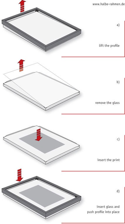
fig.10 Professional framing can be done in just a few steps with a magnetic frame. First, the profile is detached by simply lifting it off. Then, the glass is taken out, the print is inserted and the glass is put back. Finally, the profile is pushed into place, where it will adhere magnetically to the metal base. It is that simple!
For these occasions, a reusable frame is a better choice than a permanent frame. In 1975, Heinrich Halbe invented and patented a reusable frame in Germany, and his company has manufactured these unparalleled magnetic frames in standard and custom sizes ever since. The Halbe magnetic frame allows fast and simple framing from the front, ensuring maximum convenience and flexibility (see fig.10). It is now one of the most popular professional framing concepts in Europe.
If you are lucky enough to live in the UK, you can order all your framing supplies at Lion in Birmingham (www.lionpic.co.uk). In any case, it’s worth taking a look at their website to get an idea of all the materials and tools available for professional framing.
The magnetic coupling is the foundation for all Halbe frames. Every Halbe frame consists of three main components: the base element, the glass and the aluminum profile. The base element is a combination of a dimensionally stable, hard-foam backboard and a sheet-metal base. Projecting edges in the sheet metal allow the mounted print, overmat and glass to be quickly inserted and securely fixed. The pH-neutral, hard-foam backboard is PAT-tested by the Image Permanence Institute (IPI). It provides perfect flatness and has a white, acid-free paper layer in the front and back, as well as a hidden aluminum barrier to protect the print against humidity. Several magnetic strips on the inside of the aluminum profile ensure that the frame adheres fully and reliably to the base element.
A mounted and matted print is professionally framed in just a few steps. The aluminum profile is detached from the base element by simply lifting it off, while simultaneously pressing against the glass to hold the base element down. Then, the glass is lifted out of the base element, the print is placed onto backboard, and the glass is inserted again. To finish framing, the aluminum profile is pushed into place, where it adheres magnetically to the sheet-metal base. It is that simple; no tools or hardware required! The print is securely positioned, perfectly framed, and it can be replaced just as quickly.
Exhibition
All photographs are made to be seen; outstanding photographs are meant to be exhibited. There is little sense in going through all the work and expense of creating prints to then hide them from public view at the bottom of a filing cabinet, or with digital images, in the obscurity of a computer directory. No matter if you are limited to a single wall in your own house, where only you and your visitors can enjoy your images, or if you already belong to the selected few who are invited to have their own exhibition on public display, it seems logical to include a few helpful remarks on how to effectively present framed prints.

fig.11 Due to its individual composition, each print within the panel can be classified as being a left, right, top, bottom or center print. This can be taken as a clear recommendation for the print’s most or least effective position within the panel.
Designing a Panel
With the possible exception of Leonardo’s Mona Lisa, prints are usually not exhibited individually. Most photographers select what they perceive as their best prints, and use them to create a representative display of their work. However, that’s not necessarily the best way to design a successful exhibition! Individual photographs may have all it takes to create an admiring audience, but viewed in combination with other prints, they might not get the attention they deserve, or worse yet, they may be clearly out of place.
A panel of prints is a coherent display of a number of images (fig.12). Careful attention must be given to any print that is considered for the panel. Sensibly done, different print sizes and some print styles, as in high or low-key, can be convincingly combined to make for an attractive panel. But in general, each print must fit a common theme and must be printed, toned, mounted and framed in a style matching the other prints. This is an easy task for photographers who have already established their own, uniform workflow, because their prints will already have a common ‘signature’. However, photographers still experimenting and in search of their own style must be aware to never mix different toning efforts, mount-boards or frames within one panel. A panel is not a display of the photographer’s multi-talented capabilities or lifetime accomplishments. A well-designed panel is a successful piece of art in itself.
Once a number of complementary prints have been selected to be combined into a panel, an effective print arrangement has to be found. Taking a closer look at each print quickly reveals that some are more suitable for a certain location within the panel than others. For example, the top left-hand corner print in fig.12 would not fit well into the bottom right-hand corner of the panel. Choosing that location would force the model to look out of the panel and disturb the overall impression. A similar consideration applies to the current bottom right-hand corner print. This is the most effective location within the panel for this particular print, because of its center of interest. A similar example of this is the top-row center print. Because it is a borderline high-key image, it has to be in the center to maintain a tonal symmetry within the panel. Some prints, however, could be located almost anywhere within the panel. The image in the bottom center is a very good example of such a print.

fig.12 A panel of prints is a coherent display of a number of images. Careful attention must be given to any print considered for the panel, because each print has to fit a common theme and must be printed, toned, mounted and framed in a style matching the other prints.
Based on its individual composition, each print within a panel can be classified as being a left, right, top, bottom or center print. Observing each print independently and locating its center of interest, which is the area of the print that catches the attention first, helps to identify the print’s best and worst position within the panel. Fig.11 illustrates how this can be done in abstract terms, but turning the print upside down and looking at it for just a split second will also assist in doing this. With a bit of experience, you will be able to consider a print’s admission to the panel and its potential panel position at the same time.
Designing the Exhibition
An exhibition is an opportunity for a photographer to show his or her work. This is reason enough to ensure that everything concerning the exhibition is as good as it possibly can be. Unfortunately, you will not always be able to control every aspect of the exhibition, and you may have to make some compromises, but make sure that everything you can control is absolutely perfect. This also makes it easier to convince others to do their part as well.
First, make sure your panel is totally in line with the announced theme of the exhibition. Only display prints that look like they belong together, and make certain that they are all carefully spotted. No matter how interesting your images may be, or how much impact your prints may have, unspotted prints suggest technical incompetence. The same is true for print mounting and matting. Dirty mount-boards and raggedly cut overmat windows have no place in an exhibition. Inspect the frames to avoid chipped paint and scratches, and verify that prints and overmats are properly aligned and secured. Clean the glass to remove all dust and fingerprints, and handle the frames only when wearing gloves.
If you have control or influence over the exhibition facilities, consider the following criteria. White or light gray walls work well in conjunction with monochrome photographs. Make sure the frames are level and securely fastened to the wall at about eye-level height. If you are also able to secure a location with bright, even lighting, and without annoying reflections, your exhibition is off to a good start.
What Size Is the Edition?
Should I only make a limited number of prints from each negative?
by Brooks Jensen
Every time I’m involved in a workshop, there is a predictable series of debates that crop up: “Is it better to meter for Zone II or Zone III? Can a decent print be made on RC paper? Is photography really art?”, and one of my favorites: “Who was the greatest photographer of all time, Ansel Adams or Edward Weston?” To workshop students who have never endured these debates, such topics, I’m sure, seem exciting and full of mystery, worthy of monopolizing the valuable time in a workshop. To anyone who has been around workshops for a while, these questions immediately inspire a yawn and the need to get away for a walk on the beach. There is, however, one question that I believe is worthy of discussion because it’s a practical question that influences the photographer’s entire career: “How many prints should be made of a given negative, and should they be limited and numbered?”
Thorny issues, like roses, are often best handled with protective gloves. The problem with gloves, of course, is that they both protect and numb. I stand accused and guilty of being numb about the issue of edition sizes to the point where I was unwilling to take a stand based on some underlying principle. In truth, I’ve struggled with the question of edition size for quite some time. I have politely avoided the issue, because I was not certain of my own position. Having thought about it a great deal now, for more than 25 years, my position on edition sizes has clarified. I am now prepared to take off my gloves (fully aware of the combative double meaning in such a phrase) and take a stand. In short, I’ve decided, I am against limiting an edition, period. Let me be specific: I am against a predetermined limit imposed as a strategy to make the artwork scarce. I am now prepared to say that ‘1/250’ is a bunch of bull.

To begin this chapter, I’d like to make a case for not limiting the size of an edition in the hopes that my thought process might be useful as you think through this issue for your artwork. There are, of course, two sides to consider in any debate such as this. There are those (I assume many of you reading this chapter) who will vehemently disagree with me. My challenge is to persuade you, and I will attempt to do so by considering, one by one, the arguments for limiting editions.
I should add parenthetically that this chapter fairly accurately portrays my internal vacillations about this issue. There have been times when I leaned toward limiting, and other times when I have leaned away. It was only after considering each of the points that follow that I finally came to a firm stance. In some regards, I hope even this process adds value to your consideration of this issue.
Arguments for Limiting Editions
1. The limited edition in photography is inherited from artistic tradition!
The entire idea of the ‘limited edition’ is a concept borrowed from the world of fine-art print making. The ‘original’ was a plate or stone marked on, or carved by hand, by the artist. Marking on or into this printing surface (typically limestone, wood, or copper) the artist made a printing plate. The prints were then made from this one-of-a-kind plate, using the metal, stone or wood block as an ink delineator, not dissimilar to the way a modern-day rubber stamp is used to create an image. The process of applying the ink to the stone, wiping off the excess and/or applying the paper to the stone for printing, all done with repetition, eventually wore physical scratches in the image or degraded the carved edges. In short, the more prints that were squeezed and then pulled from the printing plate, the more the resulting image suffered from the effects of pressure, abrasion and friction. Editions were limited because the physical materials that created the image were themselves limited. Obviously, because this is a slow process of degradation that occurs incrementally with each successive print, the earliest copies in the sequence of prints were more likely to be ‘pure’. Later copies would exhibit the degradations so much so that eventually the stone or wood block would have to be discarded as no longer usable. Since it was a one-of-a-kind original, this ended the edition with finality.
This is the historical context for two related ideas: the limited edition and the vintage print. In fine-art print making, the limited edition implied a scarcity that was medium-imposed and the vintage print was more valuable because it was the one least degraded. The world of fine-art photography has misappropriated these terms and introduced the ‘limited edition photograph’ in spite of the obvious misnomer and obfuscation. More recently, we’ve seen the blossoming of the market for the ‘vintage photograph,’ a supposed premium value if the photograph was printed near the same time that the negative was made.
First, let’s be honest about the mechanical logistics in photography. There is no mechanical reason why the number of photographs should be limited. The obvious exceptions might be Polaroid originals, emulsion transfer images, or hand-colored images, but we are not addressing these media in this book. With these few exceptions, there is no limit to the number of copies that can be made from an original negative, transparency or even a hybrid negative, for example, a digital negative. When the light from an enlarger passes through the negative to make an exposure on photographic paper, there is no degradation to the negative. None. The mechanics of the process do not degrade the original; hence, there is no medium-imposed limit to the edition nor is there a medium-defined vintage print.
Limited editions in photography are, quite honestly, a fiction. There is a limit to the number of copies of a photograph only because someone decides to impose an arbitrary limit for some purpose.
Vintage prints are, to put it bluntly, a strategy to sell inferior images for a higher price. This may be a bit harsh, but it is true. There is simply no relationship whatsoever between the quality of a photograph and its first appearance. First is not always better, but better is always better! Of course, scarcity (as in short supply) is a factor in the pricing of most vintage prints. But, it is important here to distinguish between the use of the term vintage (out of date, meaning old, historic, from a time long past) and vintage (period, meaning produced near the time when it began), which might be yesterday, in the case of a contemporary photograph. The idea that print #1 is better or more valuable than print #100 is arbitrary and a valuation that is, in all likelihood, not based on image quality.
2. Even negatives are subject to time. They can be scratched, lost, burnt or destroyed. Certainly, negatives are limited!
True, but this argument seems to me as missing the much larger point. Regardless of whether or not the negative is limited, certainly the photographer is. We are mortal and time is short. You may quote me on this. Certainly the number of prints a photographer can make from their negative is finite, limited primarily by the amount of time they can spend doing photography or making repetitious copies of the same negative; limited ultimately because they are. Isn’t this obvious? As Ansel Adams said: “Photographers fade faster than photographs.” Why then make such a big deal out of the actual limited number of prints? All artwork is limited in the sense that the photographer will eventually be unable to create the art. The edition limiting that I am against is an artificial limitation that imposes a predetermined limit on the number of reproductions that will be made from a given negative.
3. Limiting is a time-honored tradition, even in photography. Lots of photographers limit the number of prints they will make from a given negative!
Why? If the image degraded with repetition, I could understand it. But, if the motivation to limit the number of copies is not mechanical, what is it?
The photographer might just become bored with an image and not want to make any more copies of it.
Then just stop, and be done with it. Why announce a predetermined limit?
If there will be a limit to the number of prints anyway, why not announce it?
Again, why would a photographer choose to do this? What value is there to a photographer to announce to the world that there will be a limit to the number of copies of an image?
If there is going to be only a finite number of copies, it might be useful for the people who buy or collect an image to know there are a finite number of copies.
Of course there are a finite number of copies. There are a finite number of grains of sand on the earth. Of what use is it?
It’s important and useful to know how limited the print edition is.
Useful in what sense? Let me be specific: For whom is it useful? How is this useful, say, for the buyer? Be honest, why announce the limit? In fact, isn’t it really only useful to the seller? Buyers may, of course, eventually become sellers. But, it’s only the seller who benefits from the limit. Cut to the chase: imposed limits are artificially placed on photography for the benefit of the seller — read ‘marketing’.
There is only one reason to limit the number of photographs made from a negative, and this is because we all know that artwork and photography are subject to the laws of economics, the most important of which is supply and demand. An edition is limited so as to limit the supply and push the price higher. There is no other reason to do it.
There is a myth believed by most artists that I must admit bothers me greatly. This myth is that artwork is not subject to the laws of economics. According to the train of thought, artwork is not supposed to be a commodity. It is supposedly somehow above the machinations of buying and selling that governs potatoes, T-shirts, oil or pork futures. It is holy, sacrosanct and, not to put too fine a point to it, different. Hogwash. Artwork is subject to the law of supply and demand just like any other commodity that is bought and sold.
Limiting the size of an edition is not an artistic question, it is a marketing strategy. Unless we can be honest with each other about this fundamental issue, we are simply fooling ourselves. And, there is nothing more sadly comical than a self-deluded artist. The argument usually is stated: “There is a limit; therefore, the price must go up.” In fact, the truth of the strategy is just the opposite — we want the price to go up; therefore, we will impose a limit to facilitate justifying a higher price.
Fine, but what is wrong with this? It’s a free country and an artist (or gallery) is free to determine any marketing strategy they want. Why shouldn’t they try to sell work for as much as they can?
• They should. But ultimately, I’ve seen this become unhealthy for photography and in particular for beginning and mid-career photographers. I say this for several reasons:
• The higher print prices rise, the fewer buyers there will be.
• This ultimately limits the market for photography to those few who can afford it.
• This breeds an elitism, which limits the market for new or mid-career photographers.
• Photography becomes judged by the signature on the work rather than the image itself.
• When sales galleries have to choose between dedicating an exhibition space to a newcomer (with, say, a $400 price) and a master photographer (with a $4,000 price), they choose the master for the obvious reasons.
• The more the established (and deceased) photographers dominate the gallery scene, the more repetitious become the exhibitions and publications. The audience gets bored and moves on.
I am not blaming galleries for this trend. If I were in their business shoes, I would probably follow their same path. It just seems to me that when a paradigm is employed that ultimately creates a smaller and smaller market with higher and higher prices, very few people can be involved in collecting and this cannot be healthy for photography. Photography is the quintessential democratic art form, both in making photographs and (theoretically) in collecting them. When a strategy (like limiting editions) interferes with this ideal, it has to be questioned.
But some art buyers want to know that they own a piece of artwork exclusively, or almost exclusively. A limited edition is useful to them.
An ego in the world of the art connoisseur is not wholly unknown. But why not buy sculpture or painting? If they love photography, let them collect in other ways. Let them commission work from a photographer with the stipulation that only one print will be made. Let them buy prints of deceased masters (where the limit is not artificially imposed). Let them seek out beautiful but rare images. There are alternatives that can satisfy their ego. But why should mid-career or even late-career photographers place limits on their own work? If they want to collect contemporary photographers, let them buy only print #1 of an unlimited edition.
This is precisely the market known as vintage prints. Surely, they should sell for a higher price.
Again, look at the historic model. In lithographs, the earlier in the print run, the cleaner and truer the printing plate. Vintage lithographs are more desirable because they are better, not because they are printed first. How does this relate to photography? Ask any photographer. Simply put, the best print is always the most recent one - never the first one. With repetition, a photographer become better and better at printing a negative. They learn as they go. Later prints are always more subtle, refined, finessed. In short, later prints are always better. There are only two exceptions to this and that is the occasional demise of a product, say a particular printing paper, or the aging of the photographer where eyesight, coordination or stamina begin to wane. Again, I’ll say that later prints in photography are always better. If better is the criteria for vintage prints in lithography, why shouldn’t it be the same in photography? Why aren’t photographs that are printed later valued more?
I admit, I get tired of the game. Vintage prints in photography are supposedly worth more because they are rare and there are fewer of them. To whose advantage is this? The seller, of course. Again, it is a marketing ploy to prop up prices to unsuspecting (though not always naive) buyers.
Look at this another way: in lithography where the printing plate deteriorates, the later prints are the rare ones. Lots of plates simply give out and deteriorate. Using the logic from photography, these later prints would be worth more because they are so rare. Fortunately, collectors of lithographs understand the higher principle that quality counts for something even more important than scarcity.
So why all this emphasis on the rare photograph? Ask the snake oil salesman why his elixir is not made from common ingredients and you’ll find the answer to this question. This ‘induced scarcity’ associated with both limited editions and vintage prints is a concept that has been capitalized on and abused by a common human emotion — greed. For example, it was reputed that Salvador Dali signed hundreds of sheets of blank paper shortly before his death so his printers and estate could continue to flood the market with original prints. Where there is will to defraud, there is a way.
Thus, as always, the government steps in to save us from ourselves. The states of New York, California, Illinois, Arkansas, Hawaii, and Maryland have laws protecting the consumer from the abuse of fraudulent misrepresentation of edition sizes and authenticity. For prints sold into these states with a value of at least $100 (less frame), the print must be accompanied by a certificate of authenticity that describes the name of the artist, the medium, when it was produced, the size of the edition, whether the print was signed, if it is estate signed (posthumous), a photo reproduction, if unsigned was it authorized by the artist or estate, etc. — in other words: a written guarantee.
So what to do?
The True Meaning of ‘Edition’?
Dictionaries can sometimes be misleading because they define words as they are supposed to be used, not as they are used. I tend to discount arguments that rely on dictionary definitions to prove a point. This time, however, I think there is something to be gained from a consideration of the dictionary definition of the term edition. This is from my favorite dictionary, the Encarta World English Dictionary:
1. Printed Version, one version of a publication issued serially, periodically, or in multiple formats
2. Broadcast Version, a version or installment of a broadcast for a particular time or purpose
3. Printed Batch, a batch of identical copies of a publication all printed at the same time
4. Batch of Items, a batch or number of items all produced at the same time
5. Similar Thing, a version or copy of something
The term ‘edition’ developed from the Latin edere ‘to give out,’ and from dare ‘to give’, and there are so many lessons to take from this dictionary definition.
Lesson 1
First, notice in the third definition referring to a printed batch the phrase ‘printed at the same time’. I laugh. How many times have you seen a photograph marked 1/250 or 1/50? Do you actually believe the photographer made all those copies? Or do you instinctively know this is a theoretical limit only. I maintain that 99% of all photographs marked 1/50 never make it past print #5.
And don’t you love the reference in the first definition to ‘multiple formats’. Let’s see now, if I do an 8x10 version and it should sell out completely, can I then do a 16x20 version with integrity? How about an 11x14 version? What about 10x13? Or 9x11? Is 8x10 okay? Just where do I cross the line of integrity? Will this line of integrity be the same for the photographer, the gallery owner and the collector who owns the sold-out 8x10 version?
What if I change the toner from selenium to brown toner? Is this now a new version, which I can reissue as a new edition with impunity? What if I change from Ilford to Forte printing paper? What if I change from silver-gelatin to photogravure or digital inkjet? Are these different editions? What if I crop the image to a panorama or a square? Am I violating a trust by reissuing a sold-out image with any of these changes?
And this is the core of the issue — trust. Nothing could devalue an artist’s work faster than to violate the limit of an edition, except forgery. There is the recent controversy about Lewis Hines’ work being printed posthumously by Walter Rosenbloom and offered as ‘vintage prints’ (see ‘The Photo Review’, edited by Stephen Perloff). Was this so controversial because they were fakes or because they, by sheer numbers, diluted the value of the original photographs? Or was it that these prints violated the trust between photographer and the collector, the gallery and the buyer?
The issue of limiting an edition of photographs is all about this trust. If there is anything sacred in the economic transaction it is this trust. You trust that the buyer will give you more money for your work, and they trust that you won’t ever produce it again. Once this bargain is forged, it must not be broken. But if you box yourself into this corner, as an artist you are committing yourself to never again deepen your creative vision with this image. Doesn’t this violate a trust you have with your creative self, your personal pursuit of excellence? If you are prevented from making it better when you know you can; prevented because you are contractually obligated to leave it inferior — haven’t you sold out just a bit to the least common denominator of economics? Doesn’t this violate a trust inherent with the artistic process?
There is another part of this that is even more bothersome. Once the edition is sold-out, who makes money on it then? If the artwork is viable in the art market, it is only the gallery, reseller or collector who can ever make money on the sale of that artwork once it can no longer be produced by the photographer. Does it make sense for the artist to limit their income this way, enabling others to profit while they are cut out of the economic equation? Limiting the size of the edition can only hurt the artist. If the artwork is not saleable, the size of the edition is non sequitur. If the image has market potential, a predetermined edition limit can only reduce the photographer’s income. The only exception to this would be when the photographer can perfectly predict the market potential of an image. Enough said.
And, by the way, we all know that the price goes up dramatically once the edition is completely sold out or the photographer dies, right? There is an old (and somewhat sick) joke around art and photographic circles that says if you want to raise your prices, start a rumor that you’ve contracted a deadly and incurable disease. Geez.
Then, there is the issue of time, particularly of changing tastes and fashions. Limiting an image today limits it for all time, assuming the prerequisite integrity on the part of the photographer. What if an image, style, subject or vision develops a larger audience in a year or a decade from now? Fashions change. Demand does, too. How can it be successful to create a marketing and distribution scheme today that you must abide by twenty years from now? Thank God, we didn’t do that with hair and clothing styles!
Lesson 2
From the Latin edere, ‘to give’. There are people (artists) who work only for themselves, caring nothing for the world at large or for an audience for their work. These are the sane artists, I think. The rest of us long to have our work seen. I have produced a lot of photographs in my art career, and I hope to create many more. When I am gone from this earth, I hope, I don’t have a closet full of matted photographs, stored away in archival boxes with little tissues to keep them all pristine. They’d probably end up in a box on the front lawn in the garage sale for 25 cents each, where buyers would salivate over the chance to buy cheap mats for salvage. I would prefer to die artless — at least of my own work. I make photographs for others to enjoy, and I work hard at it only so they can fly away to homes other than mine. Collecting my own art seems a bit redundant.
I have often proposed a question to workshop students as follows: If a year from now, you had to look back on your photography career and assess the success of your artistic endeavors over the last twelve months, which would you prefer: That you had sold a few pieces of work for lots of money, or that you had lots of your images hanging in people’s homes and offices, which they enjoyed every day, even if you had no money to show for it? It’s amazing how many photographers unhesitatingly would prefer distribution over income. Of course having both would be perfect, but if the choice must be made, distribution seems the clear preference for most folks.
Then, why limit the edition? If virtue lies in sharing, why not strategize for maximum distribution rather than to maximize income? By the way, here is a hint: if you want to make a lot of money in life, being a photographic artist might not be your best first choice!
“But,” you say, “I can’t afford to give away all my artwork.” Then don’t. Give what you can. Sell it for what you must. Find another way. As an artist, you are a creative individual. Why not apply a portion of your creativity to developing an audience for your work that you can afford!
One of One?
Have you ever considered producing only one print from a negative, marking it 1/1 and taping the cut or scratched negative to the back of the mount-board as proof? I have often been entertained discussing this idea with photographers and have been surprised how many of them have, at one time or another, contemplated this idea. I like this idea, even if I’ve never been able to convince myself to try it. I’ve never known anyone to have the commitment to do it either.
Why? When pressed, I hear photographers respond that they are afraid that they might just limit their best-ever image to that one copy or that they hope that someday they might learn a technique to print the image better. Either of these points of view demonstrates my ideas in practice. Marketing prevents the singular print. Knowledge renders the vintage print impotent.
Have you ever made a print from a negative, sold it and then subsequently learned how to print it better? Did you contact the buyer of the earlier version and offer to exchange their inferior version for the new, better one? If not, why not? Could it be that, as Ansel Adams stated so well, the negative is the score and the print is the performance? Like a performance, a print is a statement in time of your abilities, sensitivities, skill and artistic savvy.
To do editions of one, and only one, might be fun and challenging, but unless the physical materials dictate such a severe approach, this seems disingenuous and somewhat phony. Again, it’s all marketing and ultimately self-defeating.
No Limits Whatsoever?
The most popular alternative to limits is the no-limit approach. I know many photographers who don’t limit their images or even number them. I used to be one of these photographers — until I saw firsthand the effects of this strategy.
A number of years ago, I visited numerous people and galleries in the Carmel area, doing research for LensWork. In the course of my travels, I coincidentally happened to see six different prints of the same image, ‘Horizontal Aspens’ by Ansel Adams. The prints were different sizes, different papers, and different renditions. There was one version, however, that simply glowed. It wasn’t simply better than the others — it toasted them. This clearly wasn’t just another copy in a long edition run. It simply could not have been printed at the same time as the others. What was its history — to use the art world term — its provenance? Why was it different? Unknown, lost to history.
This experience set me to thinking about the context of history, personal development as an artist, the history of an image and the full development of the creative vision for an image. I realized that this is a process, not an event. And it is not just a process of the darkroom and of technical skill in printing. It is also a matter of artistic sensibilities and talent. As we grow as individuals, our artistic talent does too, hopefully! As time passes and our maturity deepens, so does our creative vision and talent. This is a part of our personal history and the history of our art. With this in mind, I have always disclosed full information on my fine-art photographs. For me, this started with a simple question: What date should one use on the surface of the print near the signature? The date of the negative, the date of the print or the copyright date? Just to avoid confusion, I list all information on a single sheet of paper that is affixed to the back of the mat board. Where I make images without limits, this information at least creates a personal provenance and brief history of the print.
Alternatives
Having now taken full aim on the most popular paradigms and shot holes all over them, I suppose I now bear the responsibility to suggest a better solution. I can suggest one, but I hope my idea can be seen for what it is: my idea, not a definitive one for all times, all places or all people.
I have developed two ideas that seem to me to make sense, both from a mechanical/production point of view, as well as an economic one. My criteria in creating these strategies are rooted in the most important of all the ideas I’ve discussed in this chapter — trust. Any discussion of edition size must be able to stand the test of trust, both to the collector and to the artist. Edition numbering must also be truthful to the medium and based on honesty about the mechanical process, as well as the realities of the market. If it fails these criteria, it will be no better than the phony edition limits we see so often used in photography today — unfaithful to the medium, a perversion of the historical context, and merely a market game, whose intention is to defraud rather than clarify.
Numbering Only
The first idea is this: Do not limit the number of copies of a photograph, but do number them. This creates a sequential history for the image and allows collectors to know where, in the sequence, any particular version was created. This method is simple, easy to administer, and honest. It neither limits the image, nor ignores the importance of time in the production of the photograph, or in the maturing and creative vision of the photographic artist. Instead of ‘1/250,’ why not just ‘#1’? To collectors this delineates the vintage print without denying the photographer the opportunity to refine his or her vision or execution of that negative.
True Editioning
The second idea is better, albeit somewhat more detailed and involved. Follow the plan of the book publisher, using the ideas in the dictionary definitions above. Books are printed in a ‘first edition’, a ‘second edition,’ and so forth. Each edition is limited by the number of copies produced at that time. Also, a ‘first edition’ might undergo more than one printing: ‘first edition, first printing’ followed by a ‘first edition, second printing’, and so on. Each of the prints are also dated, and so, enumerated.
I see no reason why this paradigm cannot be adopted verbatim in photography. Begin with the creation of a ‘first edition’ with a defined and limited number of copies, printed all at once, dated and defined in time. Should this ‘edition’ sell out, it could be reprinted as a ‘second printing’, and so designated. Instead of a second printing, a variation in the image could be created with improvements in the execution and be called a ‘second edition’, again with a defined and limited number of copies, printed all at once, dated and defined in time. In fact, the first edition need not even sell out to create the second edition. Maybe the first rendition would be preferred by some collectors or buyers.
This strategy has the significant advantage of allowing the photographer an unlimited number of prints in their lifetime, allows for artistic growth in creative vision, which would be realized by the various editions, and at the same time, defines the work precisely for the collector/gallery who value such information. For example, in book printing a ‘first edition’ will often be more valuable than a later edition, even though the later one might be ‘better,’ that is, more durable, legible, and so on. The collector looks for the most valuable edition, the reader might look for the most functional, the decorator looks for the most handsomely bound.
Is this more cumbersome? Perhaps, but an even more important question is: Is it more honest? If the trust between buyer/collector and the artist is paramount, how could this be seen as anything but an improvement over the fuzzy ‘1/250’ silliness that is now so prevalent in the photographic world? The key to implementing this strategy for your artwork lies not so much in the nomenclature as in the full disclosure of information and the force of your commitment to honesty and integrity.
Will the galleries like it? Probably not. Their economic interests are served too well by limited editions and the ease with which they can use the threat of a limit to motivate a hesitant buyer. Will the better galleries protest? I suspect not. They know that the more knowledge they can provide their buyer/collector, the better their relationship with that client. Don’t forget, their relationships are also built on trust and honesty. Besides the best galleries understand their responsibility to the artist’s economic well-being is just as important as their own. Galleries who don’t think this way must consider artists disposable and replaceable, and I suspect these folks would make bad partners for your art career.
Conclusion
I am sure that painters, sculptors and other artists will laugh at this idea of editions and the convolutions of this debate. But we are photographers and our chosen medium allows us to define ourselves differently. It is this freedom to define that also places on us a responsibility to think clearly about these issues and mold our career and our artwork in the best possible way. To deny the reproducibility of photography is to deny its very nature. To ignore the implication of artificially limiting the size of an edition is to be numb to the realities of our production.
I began this chapter by stating this issue is a thorny one. As you can see, there are no hard and fast answers to this issue, but that does not mean there are no hard and fast answers for individuals. Next time you are in the darkroom producing an image, how many will you make?
Brooks Jensen is a well-known fine-art photographer, specializing in small prints and hand-made artist’s books that incorporate original photographs. He is also the co-founder and editor of LensWork, a bimonthly magazine on photography and the creative process. His articles, interviews, and books make Brooks one of fine-art photography’s most influential innovators.