
© 2000 by Ralph W. Lambrecht, all rights reserved
On Assignment
Above Malham Cove
Depth-of-field markings
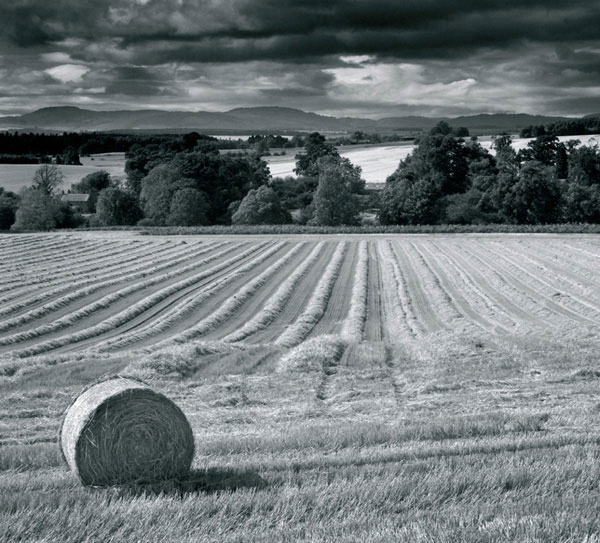
Yorkshire in general, and Malham Cove in particular, are quintessentially English. This series of desolate moors and curious exposed limestone plateaus, eroded over time, pull a constant stream of visitors like a magnet. These limestone ‘pavements’ are found in several locations in Yorkshire and also appear in a similar form in western Ireland. The exposed rock surface features deep vertical fissures, which can trap the unwary in good weather and are positively lethal in snowy conditions. I used my second visit to this unusual natural landscape as a chance to try out a new 43mm lens on my Mamiya 7 rangefinder camera. It is impossible not be influenced by the many wonderful existing photographs of the Yorkshire Dales, and my simple treatment of this image was unconsciously influenced by the subtle landscapes of photographer Fay Godwin.
Keeping It Simple
My mind’s eye pictured an unusual stone feature set against a diminishing pavement and background. As I walked around the plateau, weighing up the visual potential of each stone in context to the surrounding scene, it was difficult to find any particularly distinctive stone. Eventually, I found a solitary fern hiding in a fissure, which I placed off-center in the foreground. Unfortunately, it was necessary to remove distracting evidence of modern civilization, so I first picked the surrounding litter. My initial challenge with this unfamiliar lens was to determine the aperture and focus setting required to keep both the fern and the distant hill in acceptable focus. Using the classic depth-of-field markings, which have unfortunately disappeared from many modern lenses, I set the hyperfocal distance by placing the infinity mark opposite the selected aperture, minus 2 stops. Fig.2 shows how to set the hyperfocal distance and how it distributes the depth of field, so the extreme points are in acceptable focus.
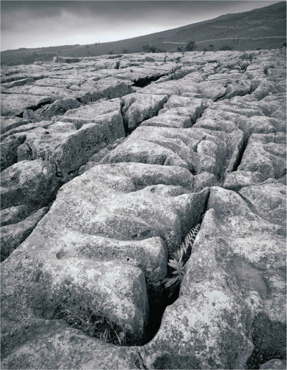
fig.1 Final print on Agfa Multicontrast Premium, burned, bleached and selenium toned

fig.2 a) Focusing on infinity and stopping the lens down to f/16 will provide a depth of field starting at the hyperfocal distance (7 m), but half of the depth-of-field potential is wasted.
b) Focusing on the hyperfocal distance, by matching the right f/16 marking with infinity, optimizes the depth of field but leaves distant objects at the threshold of sharpness.
c) However, stopping the lens down to f/16 and aligning the infinity mark with the right f/8 marking secures distant-object sharpness with a 2-f/stop ‘safety factor’.
As discussed in ‘Sharpness and Depth of Field’, sharp focus is, strictly speaking, limited to the focus plane. Any subject detail in front of or behind the focus plane is out of focus. In practice, however, sharp focus begins at the front limit of the depth of field. With the lens focused at ‘infinity’, this front limit of the depth of field is referred to as the hyperfocal distance (fig.2a). A lens focused at the hyperfocal distance provides sharp focus from half that distance to ‘infinity’. The standards for acceptable focus differ between manufacturers, and more importantly, they differ according to the photographer’s needs.
Fig.2 shows a few examples of how the hyperfocal distance is used and how the depth of field can be controlled with the distance and aperture markings on the lens barrel. Medium and small-format lenses have very different depth-of-field scales. A 35mm negative requires approximately twice the enlargement of a medium-format negative to produce the same size image. A corresponding reduction of the circle of confusion is required to produce a similar level of sharpness at the extremes of the in-focus range. Even so, taking the format into account, you will discover that different lens manufacturers use different quality assumptions for their lenses, which result in different depth-of-field scales for similar focal-length lenses.
One disadvantage of working with the hyperfocal distance to determine depth of field is that distant objects are left at the threshold of sharpness. Where this is critical, as in landscape photography, I recommend using a 2-f/stop safety factor to secure overall sharpness, an example of which is shown in the third depth-of-field illustration in fig.2c.
Print Visualization
The scene above Malham Cove had a pleasing composition and was lit through the natural diffuser of low clouds. The light cast soft shadows and gave interesting form to the weathered rocks. However, the background clouds were very bright and the foreground rock texture quite subtle, making for a high contrast scene. A perfect print, retaining sky detail and accentuating the foreground textures, would be difficult to achieve without some print manipulation, and heavy filtration was not an option, since I could not afford the loss of film speed with this handheld shot.

fig.3 Photographers have always been attracted by the limestone plateaus of the Yorkshire Dales, and this location near Malham is no exception. It is not easy to find and hard to get to, but well worth the trip alone.
The only remaining alternative was to create a normal negative and manipulate the image in the darkroom. I took a shadow reading from the lower fissure and reduced the exposure by 3-stops to place the shadows on Zone II. The film was XP2 Super, so I let the extensive film exposure latitude and the shoulder roll-off that standard C41 processing offers take care of the highlights.
Printing
A straight print of the negative, as shown in fig.4, required a filter-2 contrast setting on Agfa Multi-contrast Premium. In this print, the light rock and the brightly lit sky draw attention away from the fern. This print required a balancing of image tones to create mood and guide the viewer’s eye. Using a derivative of split-grade printing, the entire scene was exposed for 10.1 seconds with filter 2 with a further exposure through filter 5 in the middle area to emphasize the rock texture and show a full range of tone. In the final print, the fern was gently bleached, after fixing and washing, in a solution of Farmer’s Reducer to emphasize its delicate fronds.
The fissures run in all directions, potentially leading the viewer’s eye out of the picture. To suppress distracting edge detail, I made several further print exposures at a lower contrast setting to darken the rock highlights and bring out cloud detail. A flexible red card was used to fade in the filter-0 exposure. Using a red card as a burning or dodging tool is advantageous, because it is light enough to show an image on its back, yet reflects only light that is harmless to the paper. A 1/4-stop increment test strip over the rock and sky regions determined a 1/2-stop burn-in exposure with filter 0. My favored edge-burn technique is building up the exposure by a series of fanning sweeps with the red card. A foot-switch allows the card to be in place from the start of these exposures. I keep the card moving to avoid telltale halos.
The sky had only faint detail and did not convey the feeling of imminent rain, which is a fact of life in this wet part of England. Burning down the sky for 1/2 stop with filter 0 added the necessary drama. Again, the bent red card was used in a series of sweeps to avoid telltale straight-line demarcations on the print, to which the eye is particularly sensitive. The final print, fig.1, was toned in selenium. A 1+9 concentration was used to enhance the Dmax of the paper and change the cold shadow print tones to warmer blacks.

fig.4 This is the straight print using filter 2. Some print manipulation is required to emphasize the stones.
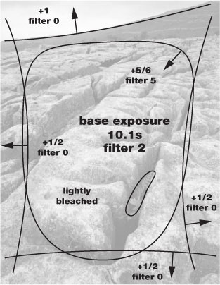
fig.5 The printing map identifies the bleached area and records the burning exposures in f/stops.
Besides improving print longevity, toning is a way for the photographer to convey a desired mood and emotion. In this case, I preferred a suitable warmer print tone for this earthy image and used the no-longer-manufactured Agfa Multicontrast Premium paper, which took on a very attractive warm tint in selenium toner. Warm tones are also made possible using dedicated warm-tone papers, or other neutral-tone papers and sepia toning, but they often turn into a less natural plum-brown color after selenium toning. Since each paper tones differently, the paper choice is often dictated to the practitioner by the image colors created through the available toners.
Cedar Falls
With the help of a custom burning mask
by Frank Andreae

Water covers a majority of the earth, and while most of it simply appears flat and stretched out over the lakes and oceans, in many cases it can be found flowing over stones in a stream, or cascading down mountain-sides with great power. Ever changing due to rain or melting snow, these waterfalls produce an abundance of photographic opportunities. One such place in the United States, contained within a state park in Ohio, is called Hocking Hills.
Although Ohio is mostly thought of as a flat state containing much farmland, there is actually a system of gorges and rivers flowing through its boundaries, while making their way to the Mississippi. Here I have come across many falls within a five-mile radius, and in particular, one named Cedar Falls. In June of 1997, while traveling through Hocking Hills, I noticed that the water levels were still high from the spring thaws, and a storm that week had dropped more rain onto the ground, producing a fall of great beauty.
Armed with both my Linhof Technikardan 4x5 and the Mamiya 645 Pro, I walked around this fall trying to find a way to convey its beauty and rugged terrain. I have photographed many waterfalls around the world, and after a while, they start to look the same. At this fall, I was especially intrigued with the rocks lying in the shallow pool, and positioned myself in line with the unique triangular shaped stone, which leads the viewer upward into the cascade of water.
It would be a partly sunny day, but at eight o’clock in the morning, the sun had not yet risen above the trees. As I faced eastward, I determined that the sun would come up over the trees, illuminate the top of the rocks and then continue to shine right into my camera lens within half an hour. I composed my image and metered the dark rock wall in shadow as an EV 5 2/3 on my Pentax Digital Spotmeter. The rock slopes away, and is in deep shadow, but a few highlights remain, and I wanted these visible to give the image depth. I placed them in Zone III and took a light reading of the water flowing around the right side of the rock in the middle of the composition. Here, I was reading EV 9 2/3, and falling on Zone VII, it would require a normal development. I could also get a little detail from the water, though I knew that with a longer exposure it would blend together and end up a little brighter. For Kodak’s TMax-100 film at f/22, I had a 2 1/3 second exposure. I added 1 2/3 second for reciprocity and exposed the film for 4 seconds. This gave some flowing movement and would be well exposed to work with in the darkroom. As I packed up the Linhof, I noticed that I had packed a 120 roll of Kodak’s Tech Pan film in my case. I usually carried a roll with me, just in case, but very seldom actually shot with it. Here was my opportunity to experiment.
fig.1 This straight print is properly exposed for the shadows but suffers from burned-out highlights and lacks the desired depth. All detail is present in the negative and burning down the highlighted rocks will certainly enhance the mood of the waterfall.

fig.2 A custom burning mask is created to allow precise areas to be given additional exposure. By placing a piece of thick mat board above the print easel and tracing the projected image, the specific areas can be later cut out and hinged for repeatable burns on future prints.
The scene was very nice, but it lacked the dramatic impact that I wanted to portray in the gorge. I was surrounded by walls of rock and trees on three sides with no other photographers around. The water was flowing well, but I wanted it soft against the harsh rock. The early morning light was starting to fade as the sun was rising closer to the treetops. The tops of the foreground rocks were getting brighter, and wanted more contrast. I loaded the Tech Pan film into the Mamiya and checked my exposure. I determined that an 8 second exposure at f/22 would give me the desired effect, and I shot the first frame with a focal length of 70 mm. As a back up, I added 4 seconds to my exposure time and took a second shot. By this time, the sun was breaking through the trees and was starting to illuminate the top of the rock. I was done.
When I developed my film and produced the contact sheets, I was pleasantly surprised to find that my assumptions were correct. The 4x5 negative held a nice image that captured the scene, but the first image on the roll of Tech Pan film had great potential. The film holds the basis for the life of the print, but the printing process gives it birth. With this negative, I wanted to tone down the highlights on the tops of the foreground rocks, as well as the stone around the falls themselves thus giving most attention to the water. By burning down these areas, I would achieve the final image I was looking for, but to do it precisely meant cutting a mask for each area to be burned.
My test prints had determined that five areas needed a burn-in to achieve the results that I had visualized. I used thick mat board sized a little larger than the print itself, in this case an 11x14-inch print was to be made. After focusing the negative, I placed the mat board on top of the print easel and projected the image. On the board, I traced the major areas of the image such as the waterfall, foreground rocks and stone areas around the fall, paying close attention to the areas I planned to cut out. This yields a pencil drawing of the photograph to work from. I cut out each area with a sharp knife, angled slightly so that the piece of board cannot fall though the opening when closed. Each piece is hinged and tested for ease of opening but tight fit.

fig.3 With the upper left burn-in area of the mask opened, the print receives the additional 2/3-stop exposure, as tested. The precise cut restricts the exposure to the highlighted rocks. Carefully keeping the mask in motion during exposure will hide otherwise disturbing telltale signs.

fig.4 The final print exposure map, as determined by test strips and working prints, records the printing instructions for the base print and the five burn-in areas for future use.
With my Zone VI variable contrast cold-light dialed to ‘E/F’ for the soft and hard settings (similar to a 2. 5-contrast filter) I got a 28-second base exposure at f/8 on the Kodak’s Polymax Fine Art double-weight glossy paper. After reducing the hard setting slightly from ‘E’ to ‘D’, I gave a burn-in exposure to each area according to the printing map in fig.4. An additional corner- and edge-burn helped to maintain the viewer’s eye from wandering outside the image.
Clapham Bridge
An example in split-grade printing
It is ironic that one of my favorite images from my 35 mm days was taken with the worst lens I have ever owned. It only took two films before I identified serious aberrations and terrible color fidelity. In the early days of zoom lenses, the standard zoom of the 20 to 80-something variety were optically worse than their fixed focal length cousins. Their use, however, was popular with many walkers, for the dramatic improvement on portability and convenience that they provided.
In this case, I was walking through Yorkshire in England, starting from the delightful village of Clapham, following the Clapham Beck towards Trow Gill, fully laden with waterproofs and supplies. Bitter experience and weary limbs dictated that camera equipment had to be small and light, or it was left behind. Yorkshire is a magnet for many photographers and walkers. Often the two pastimes do not go hand in glove, especially when your companion is a walker. A keen eye is needed for an image opportunity, slippery rock and the path ahead, all at the same time. Thankfully, an obligatory chocolate-stop allowed the opportunity to make the most of this idyllic scene.
Exposure
The camera was a trusty old Contax RTS II, with the anonymous zoom lens set to 28 mm, loaded with Ilford Delta 400. The oversize filter thread and the threat of vignetting dissuaded the use of filters. I used the center weighted metering with the zoom lens set to 90 mm, measured under the arch and returned to the 28 mm setting, reducing the exposure by 2 stops. I wanted the water to show movement, but I needed to avoid camera shake. Three handheld frames were taken, all with the same exposure, but with increasingly smaller apertures and slower shutter speeds. By taking the frame at the end of an exhalation, I was fortunate to obtain a sharp image with a 1/15 second exposure. Today, I take along a Leica mini tripod as a shoulder stock or my carbon-fiber tripod on all but the longest treks.
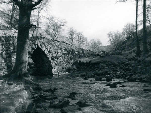
fig.1 straight print, filter 2.5, 6.7 seconds, Agfa Multicontrast Classic
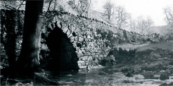
fig.2 split-grade test, filter 00, 2.1 seconds, plus filter 5, starting at 4.2 seconds in 1/3 stop-increments

fig.3 Basic split-grade print with first exposure at 2.1 seconds filter 00, plus a second exposure at 8.5 seconds filter 5. Notice how the sky has gone blank white and the bridge has become more dynamic.

fig.4 Basic split-grade print, water dodged during first exposure, sky and tree tops dodged during second exposure. The sky was burned down for an additional 3 1/3 stops with filter 00.
Processing and Printing
Film development was with my then standard soup of Ilford Ilfotec HC, diluted 1+31, for 9 minutes at 20°C. The negatives showed good shadow detail and a dense sky area, from the bright flat cloudy sky, typical of the sort that frustrates the landscape photographer. A straight print is shown in fig.1. The exposure and contrast were chosen here to show the information on the negative. An evaluation of this image shows several weaknesses, starting with the bright, featureless sky. Since the trees on the hillside cross the horizon, a simple burn-in exposure to the sky area would darken the treetops unacceptably. The bridge and beck lack sparkle, and there is no depth or feeling to the picture. Visually the eye follows the water, right out of the picture. I realized that the only way to get a satisfactory print was to use variable contrast paper and use different contrast settings for different parts of the image. This might be done by combining separate exposures, or more easily, by selective dodging during a split-grade exposure.
The next image, fig.2, shows a test strip for the split-grade exposure. Here the stone highlights were determined with an enlarger meter and printed in with filter 00. A test strip using filter 5 was overlaid on top of this filter-00 exposure to set the overall contrast, tonal separation and shadow definition to the bridge. The straight split-grade print is shown in fig.3 and is made up of 2.1 seconds with filter 00 and 8.5 seconds with filter 5.
To make things easier, the two timing channels of the StopClock enlarger timer were used to store these base exposures. These two times and any burn-in sequences at either filter setting could then be selected quickly, saving valuable time and confusion.
Turning our attention to the sky, the plan was to mask the sky area, including the treetops, using a bent card during the hard-grade exposure. This reduces the print density of the dark branches in preference to the basic sky tone. Now, in theory, the sky could be darkened with a soft-grade burn-in exposure, using a soft-grade setting, such that the treetops looked tonally balanced with their bases and with a considerably darker sky density. For this, a test strip was used with a basic +2 stops filter-00 exposure, and 1/3-stop exposure increments at the same filter setting. The treetops are matched with the tree bases from fig.3 and the correct burn-in exposure was determined. In this case, an additional 3 1/3-stop exposure was required with filter 00.
Fig.4 shows the fruits of this approach. In fig.4, I dodged the water for 50% during the 2.1-second soft-grade exposure to lighten the highlights and add sparkle. Then, without changing filter, I used a rough card mask to subject the sky to another 3 1/3-stop burn-in. Now, during the 8.5-second hard-grade exposure, I masked the sky area with a rough, moving mask to lower the density of the treetops. Even so, the water was still flowing out of the picture and the sky lacked weight. In fig.6, the exposure was completed, using a floppy mask and a further 2 1/2-stop burn-in along each edge, through filter 00. This darkened the highlights without adding much shadow tone. In addition, the witness mark on the main trunk was disguised with a further filter-5 exposure of 1 stop through a hole in a piece of card. Lastly, the gate in the middle was dodged briefly for 1/3 stop during the main filter-5 exposure to add a feeling of airy light.
Finally, the print was briefly toned, washed, lightly bleached, washed and then toned again in variable sepia toner, using 1 part toner and additive to 9 parts water. Apart from the archival qualities that sepia toning bestows, for me, the warm tone imparts a timeless feeling to this tranquil scene and gives a painterly feel.
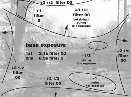
fig.5 This is the printing map for the final print, showing highlight and shadow dodging during the split-grade exposures and burn-in exposures for sky and edges.

fig.6 Final print, exposure as fig.4, but with additional dodging during filter-5 exposure around gate, additional 2 1/2-stop filter-00 exposure for each edge and some added exposure to tree trunks. Finally, the print was lightly bleached and toned in variable sepia toner.
Corkscrews
Considerations for reflective objects

fig.1 This shows the final image, printed for sufficient tone and detail in the ‘ribs’ of the corkscrew and yet still showing adequate detail in the black plastic boss. This enables good midtone contrast but lets deep shadows and specular highlights reach Dmax and paper white. The exposure was changed to 9.7 seconds with filter 1/2.
Photographing and printing shiny objects present unique problems that the landscape and natural history photographer rarely encounter. With most images of natural subjects, we consider the reflectivity of the objects and their relative illumination to determine exposure, development and printing. Although the subject brightness range may be high, it is normally possible to expose and print an image with a literal rendering on paper within a reflection density range of 2.0.
Luckily, extreme subject brightness ranges are uncommon since we rarely include God’s light source directly in the final image. The exceptions are mostly sunsets and reflections off water for which, in most cases, the subject brightness range and, more significantly, the expected image treatment do not give rise to tonal compression problems. In fact, if one were to include the sun in an image it would show up the limitation of optics and emulsion alike, with lens and film flare as well as the possibility of the sun’s image becoming a dark circle in the printed image.
Problems
Clearly, the most obvious problem with photographing reflective subjects is the treatment of the bright highlights, caused by reflections of the incident light source. In addition, reflective objects can also reflect areas that have little illumination, creating a dark abyss and compounding the subject brightness range problem. Lastly, as is often the case with still life, the object will also show unwanted reflections of the object surroundings, picking up cameras, tripods, clothing and so on. For this case study, we shall consider the problems with film exposure and printing options for these reflective or ‘specular’ highlights and leave the logistic considerations of still life setup for another time.
Picture Setup
In fig.2 we have the still life setup for two chromed corkscrews placed on black plastic, often known as Perspex or Plexiglas. This image is made entirely of reflective surfaces, apart from the black plastic bush on the fish-shaped corkscrew. The Perspex is surrounded on three sides by 2 × 2 feet, 1 inch thick polystyrene sheet, painted black on the inside and topped with a large diffuser made of white plastic. Lighting comes from a single domestic 100-watt tungsten spot lamp mounted above the setup and aimed towards the middle of the diffuser. The hot spot on the diffuser creates a natural lighting gradation over the black plastic background. The camera was a Fuji GX680 with the multi-format back set to 6 × 8 cm and loaded with Ilford Delta 100 film. The 4.5/150 mm lens was set to f/8. A high viewpoint and a small degree of lens tilt were applied to ensure sharpness throughout the image. With the help of a small homemade lookup table, it was determined that 2/3-stop additional exposure were required to compensate for the lens extension.
Metering Considerations
Metering this still life presents a number of issues. When you meter a subject with natural surfaces, it is natural to stand somewhere alongside the camera and take the measurements. For these subjects this approach is perfectly adequate, but accurate readings of reflective surfaces demand measurements along the lens axis. With reflective objects, we are really metering the diffuser surface illumination, via different reflective surfaces. If we were to meter liberally from the side, the meter would potentially pick up a different part of the diffuser’s surface and give a wrong exposure indication. In this setup, it was impossible to get very close to the lens axis, because the Fuji is a big brute. Therefore, I had to remove it from the tripod so that I could place the spotmeter in its place.
The second metering issue concerns the shadow exposure. Exposing for the shadows is tricky, since they only appear as empty voids on the black plastic. They showed no detail in the viewfinder, even when a small fill in reflector was used from the front. In a final print, these would be dense black, so instead it makes pictorial sense to meter the black plastic bush, which shows some texture and detail, place it on Zone II and let the cast shadows become empty clear film.

fig.2 This is the still life studio setup showing overhead diffuser, reflectors and lighting.
The third practical metering issue with this subject is that the image has many small shadow and highlight areas, too small for a 1° spotmeter to work effectively. Normally the optics in a spot meter are designed for a minimum distance of 1 meter. Used closer than this, the image loses focus in the viewfinder and on the sensor and the preciseness of the measuring area is lost. To make the best of the situation, I moved in closer along the lens axis and placed strips of black cloth over the bright metal parts of the ‘fish’ to avoid nearby highlights influencing the shadow reading. Even so, with this image, I took the precaution of making a Polaroid to check everything was in order.

fig.3 This is an ‘automatic’ print, using the full density range of the negative from 0.04 to 1.80. It was printed for 14 seconds with Ilford filter 00 on Agfa Multicontrast Premium paper.
Last but not least, our fourth dilemma is highlight choice and zone placement. The temptation is to meter the brightest highlight in the image on the lower corkscrew. The chrome surface is reflecting the brightest part of the illuminating diffuser and is a true specular highlight. If we desired this to translate to a Zone VIII highlight on a normal grade paper, it would require less development (N-) to reduce the negative density range and risk compressing the vital midtones of the printed image. An alternative is to meter the bright ribs of the ‘fish’. A meter reading here is at least two EVs lower than the specular highlight, a subject brightness range now within the range of normal development. The metal here has a slight tint and a textured surface, making it immediately more suitable for visualizing as a print Zone VIII, with the extreme highlights beyond Zone IX. The key is to meter the key parts of the image, in this case the texture extremes of the subject, aiming the spotmeter at the ribs and the black plastic boss. The specular highlights are Zone IX or higher. They will be paper-white in the print.
The metered exposure was 4 seconds at f/8. Allowing for film reciprocity failure, the final exposure was set to 8 seconds. A monochrome Polaroid picture was used to check the exposure and annoying in-focus reflections at the taking aperture.
Print Visualization
The same zone placement dilemma occurs at the printing stage. If we use the entire tonal scale of the subject and translate these into print values between II and VIII, avoiding dense blacks and bright whites, the interesting midtones are compressed and the result is dull. This is printed just so in fig.3 with the specular highlight on the corkscrew placed on Zone VIII.
If we consider the texture range of the subject, using the ribs and the black boss as the key elements and print these for Zone VIII and II then the midtones have more local contrast, and the print has a greater dynamic impact, as shown in fig.1. In this print, the ribs of the ‘fish’ have a reflection density of 0.04, the small highlight on the lower corkscrew is paper white and the shadows under the corkscrew have a reflection density of 2.2. This print shows better detail in the black plastic and an overall sparkle that sets it apart. Further improvements for commercial purposes might also require an emphasis of the ‘lazy fish’ logo. This might be accomplished by applying a localized burn-in exposure at a high-contrast setting, or with filter 5, to pick up the black edges of the embossed letters, without adding appreciable density to the rest of the ribs.
Portrait Studio Lighting
Fundamental lighting setup to illuminate beautiful faces
The purpose of a portrait photograph is to create a representative image of a person. The task can be as simple as capturing a mirror-like image, clearly identifying the person, as is needed for a passport, for example. Or, it can be as complex as having to portrait and express an individual’s personality as part of the picture. Creating both images is made easier with a fundamental understanding of how different lights are effectively used to illuminate model and background.
Studio Lights
In a typical portrait studio, we differentiate between five different sources of illumination to provide the most suitable lighting for people photography: key light, fill light, rim light, backlight and ‘kickers’.
Key Light: The key light is the main source of illumination and is normally the strongest and largest light, casting harsh shadows. Common equipment for this light is a small soft box, an umbrella, a diffused reflector or a so-called ‘beauty dish’.
Fill Light: The fill light reduces the deep, strong shadows created by the key light. This light is often a large soft box or umbrella set to 1/4 of the key-light strength, but a large reflector may be all that is needed to sufficiently illuminate key-light shadows.
Rim Light: One or more small but strong reflectors from the back create a rim of light on hair and clothing, which separates the model from the background and enhances the illusion of three dimensions.
Backlight: The backlight separates a dark subject area from a dark background by illuminating the background directly behind the subject with a small reflector of low to medium power.
Kicker: Kickers are small spotlight reflectors at various power settings, which are used to highlight important subject areas or to keep supporting shadow areas from disappearing into total darkness.

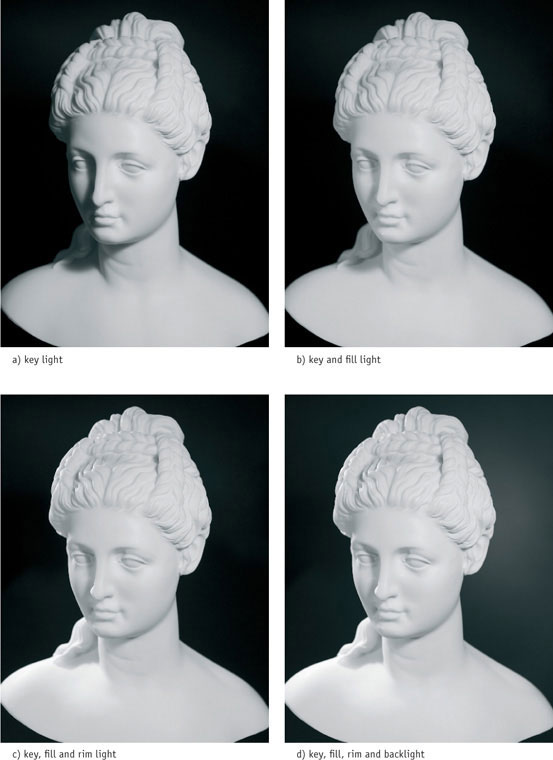
fig.1 Starting with the key light and then adding the other light sources one by one slowly builds up the standard three-point lighting setup, used for this classic three-quarter portrait.
a) The key light is the main source of illumination. A diffused reflector provides a sufficient amount of light from above the model to illuminate one side of the face, while casting undesirable shadows onto the other.
b) A large fill light throws light into the shadows, cast by the key light, without eliminating them. A soft box, set to 1/2 or 1/4 of the key-light’s power, illuminates the dark side of the face without adding intolerable shadows of its own.
c) Pointing a small but strong reflector at the back of the model’s shadow-side creates a seam of light, or rim light, lifting it from the background, while adding brilliance to the picture and enhancing the illusion of a three-dimensional image.
d) A low-power backlight, selectively illuminating the background behind the model, adds interest and depth to the image. This light finds more application with dark-haired models against a dark background.
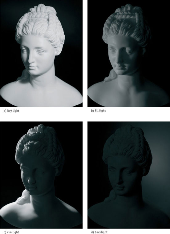
fig.2 Evaluating the four lights separately illustrates their individual contribution to the overall effect.
a) In this three-quarter portrait, the key light provides contrast and highlights the structure of the entire face without over-emphasizing skin imperfections. Start by positioning the key light 45° to your right and well above the model’s head.
b) The fill light is the soft opposite of the key light. Start by positioning it to your left and slightly above the model’s eyes. To reduce the shadows cast by the fill light, move it closer to the camera or use a large reflector.
c) Using a rim light is similar to taking outdoor photographs against the sun. Start by positioning it as far and high as possible, and point it at the model’s hair. Adjust until the model’s contour is accentuated by a seam of light. Watch for disturbing hot spots on cheek and nose.
d) The backlight is optional in this setup but helps to separate dark subject areas from dark backgrounds. Start by positioning it at the same height as the model’s head, and point it at the background behind the shadow-side of the model’s hair.

fig.3 A dark-haired model, wearing dark clothes in front of a dark backdrop, can easily blend into the background, but three-point lighting can help to master this challenge by clearly separating all dark subject areas from each other.
Three-Point Lighting
Many different and effective lighting setups for portrait photography are practiced. Nevertheless, it is sensible to start with three-point lighting (fig.4), which is easy to set up and provides the opportunity to explore more creative settings from there.
Most full-face portraits are taken with the head in a three-quarter position (see fig.1). When deciding which side of the face to feature, keep in mind that many people have a dominant eye, which is more open and appears bigger than the other. This difference is minimized if the less dominant eye is the closest to the camera. Positioning the key light on the same side as the visible ear is referred to as ‘broad lighting’. If it is placed on the opposite side, we refer to it as ‘short lighting’. To choose between the two, one should always consider the features of the subject to be photographed. Short lighting makes a full face appear thinner and further minimizes the appearance of differently sized eyes. Broad lighting complements a thinner face and avoids potential reflections in eyeglasses. However, a single, small catchlight reflection in each eye itself is welcome, because it adds a spark of life to the subject (fig.3a).
The purpose of the fill light is to add detail to the shadows cast by the key light (fig.3b). This reduces the overall subject contrast and ensures that skin imperfections are not exaggerated. Selecting the largest fill light available and keeping it slightly above the model’s eyes, close to the camera, prevents it from creating disturbing shadows itself. The amount of fill required depends on the subject and the desired effect. Typical lighting ratios between key and fill light range from 2:1 to 4:1. Too small and too strong of a fill light may add extra catchlights to the eyes, which most photographers find objectionable.
Rim and hair lights are used to illuminate the edges of the subject and produce a separate highlight, setting dark hair and clothing apart from the background (fig.3c). A rim light is usually placed behind the subject and opposite to the key light, but hair lights can be anywhere behind the model. Nothing supports the illusion of three dimensions more than strategically positioned rim and hair lights.
An optional backlight, pointed at the background (fig.3d), surrounds the subject with a pleasing glow and helps to set its shadow areas apart from a dark background. Small additional spotlights, so-called kickers, can be used to add illumination to any part of the scene. Beyond these fundamental instructions, perfect lighting is not a mechanical textbook exercise but requires experience, patience, creativity and the willingness to experiment.

fig.4 A three-point lighting setup is the ideal starting point for a frontal or classic three-quarter portrait, but it is also an effective way of providing successful lighting for product and table-top photography.
Ingatestone Hall
Lime walk, a study in infrared
For many years, I was unaware of the creative effects of infrared film. It was only when I began to see the now familiar eerie images in photographic journals that I started to take note. Ironically, in the early days when I was restricted to 35 mm, grain was the target of my condemnation. I can remember swapping films and developers almost weekly trying to find the combination that made my results smooth. Now, the coarseness of the image was part of the aim.
Nature or Nurture
Confronted with a variety of pictorial scenes, the photographer has a couple of choices, either 1) to apply a standard style or 2) to choose from a variety of materials and techniques to complement the scene. In recent years, I would walk about the grounds of historic buildings, the regimented rose beds and the ghastly light gravel paths, without a firing a shot. In this instance walking around the Tudor edifices at Ingatestone Hall in England, with its mellow brickwork and rampant wisteria, Kodak High Speed Infrared (HIE) complemented the autumn scene and rescued the day.
Kodak HIE must be loaded and unloaded in complete darkness. The clear base of the film, which has no antihalation layer, acts like a fiber optic and beams light along its length. If even the tip of the film leader were exposed to light, the light would beam back into the cassette and ruin the entire film. The film instructions suggest 1/125 s at f/11 with a red filter as a starting point. I pre-loaded the Leica R6 and 24mm lens and attached the go-everywhere mini-tripod to the base plate.
The user of infrared film has a number of filter options to choose from before actual picture taking can occur. Infrared films not only see shortwave infrared, but also the visible spectrum. This broad spectral sensitivity allows the photographer to mount a number of different filters, mostly oranges, reds and dark reds, to alter the relative proportion of visible and invisible light reaching the film. Changing the relative strengths of infrared and visible light changes the tonal rendition of different materials, as well as the effective speed of the emulsion. In this instance, I chose the common 25A red filter for a balance of effects.
Metering and Contrast
Metering is a rather unpredictable affair with infrared film. Generally speaking, one does not bother. Camera and handheld meters do not have the same color sensitivity as film, and so would give entirely false readings. Instead, many users follow the instructions supplied with the film, which gives exposure recommendations for different daylight conditions. In this instance, I remained undecided with my classification of the lighting conditions, so made a mental note to bracket my exposures. Prior experience had shown that a range of exposures produces a variety of images, from low-contrast grainy effects, to high-contrast images with less obtrusive grain.

fig.1 Ingatestone Hall in Essex, England, Kodak HIE, Leica R6, 24 mm, 25A filter, lith print, selenium toned

fig.2 This is the printing map to prepare the final image. The burn-in exposures are in f/stops and referenced to the base exposure time.
By chance, the wonderful long tonal range of HIE gives the user the ability to alter the contrast of the negative, by changing the exposure. As the exposure is increased, not only does the shadow detail build up, but also the overall negative contrast is reduced. Infrared negatives can become exceedingly dense, so dense, in fact, that images virtually disappear into darkness, only to resurface evocatively on the print with a long exposure and filter 5.
Back in the grounds, the autumn damp chill had not yet descended over Britain. Only a few sharp frosts had started the leaves on their earthly descent. The gardens extend at the back of the house, dominated by a plain rectangular stew pond, used to provide the house of old with fresh fish and freshwater mussels. Along one long side is an elegant avenue of lime trees, with a two level coppice in the traditional style. The willowy branches formed an ethereal canopy overhead, backlit by the weak autumn sun. This was the perfect hunting ground for infrared film, sun, foliage and earth.
A low viewpoint emphasized the glorious leafy canopy. The fallen leaves broke up the dark path nicely, but they needed to be sharp. An aperture of f/16 was set on the 24 mm lens with the hyperfocal distance set to f/11 to extend the focus throughout the picture. The miniature tripod sat on its six-inch legs, and the self-timer ensured a vibration free shutter trip. Since the image was in shade, a series of bracketed exposures centered on the film carton setting, 1.5 stops apart, ensured at least one good negative.
Development
Back in the darkroom, I knew that this Kodak film had a grain attitude. I had to decide whether to emphasize or mask it. As it happens, my choice of developer was influenced more by the available development information. Contrary to my own recommendation, I had not performed any exacting development test with my preferred developer, and so I relied upon the published times for Kodak developers. Since my then standard developer, Ilford Ilfotec HC, was similar to Kodak’s HC110, I estimated the times to be equivalent. The film was developed for 7 minutes at 24°C, with an initial 30 seconds of continuous inversion, followed by vigorous tank inversions every 30 seconds punctuated by tank tapping to avoid air bells and streaking. The negatives were fine, with the bracketed sequences covering a wide span of density and contrast.
Printing
After contact printing the film through filter 1, the best looking image of the sequence was chosen for printing. This image showed sufficient shadow detail and good separation of the midtones. A straight print was made on 8x10-inch Agfa Multicontrast Premium paper through filter 1 for 10.4 seconds, which I judged to give a pleasing contrast in the main area of the trunks and leaves.
The test print, not shown, had several problems with this exposure setting. The sunlit leaves on the far left were too light, as was the gate in the distance. In addition, the foreground ground and leaves were weak and needed some bite. The printing map, fig.2, shows the final solution. After the main exposure, with the aid of a punctured burning card, a further exposure of 2/3 stop with filter 00 was applied to the gate and leaves between the tree trunks on the left. The bright highlights at the edge of the print were suppressed by additional exposure at a soft grade. This was accomplished with four 2/3-stop filter-00 burn-in exposures, using a floppy card for a mask. Lastly, the foreground was emphasized with another 1/2-stop filter-5 burn-in exposure. It is easy to leave telltale marks with a high-contrast burn-in, so the mask used for this exposure was kept on the move and rippled to avoid any possible telltale signs of its application.

fig.3 Lime Walk, Ingatestone Hall, Leica R6, 24 mm 1/30 s, f/16, printed according to the printing map in fig.2, Agfa Multicontrast Premium
The final print is shown in fig.3. In order to achieve the desired image color, the print was bleached and toned using a variable, odorless, sepia toner. The benefit of variable sepia toners is that the image color can be fine-tuned from a warm to a cool brown by altering the proportions in the toning solution mix.
This particular scene has a peaceful, painterly quality, which suggests a number of diverse print interpretations. Over the years, the image has been lith printed and the prints selenium toned, as well as sepia toned, and combination toned in sepia and gold. In addition, I have printed a successful high-key version with a low-contrast, overexposed negative on the roll.
It is important to note that, even at a modest enlargement, the grain in infrared film is well defined, very obvious and easily draws attention to itself. Therefore, the larger the print, the more important it is to achieve overall grain sharpness. In doing so, it is essential to select the optimum aperture of the enlarging lens and to double-check each corner for critical sharpness with a grain focuser. As well as precisely aligning the enlarger and easel, one should use a glass negative carrier with an anti-Newton glass on top, to ensure the film is flat, and consequently, focus is pinpoint sharp throughout.
Heybridge
A low-contrast subject on a high-contrast day
The Heybridge Basin is near the town of Maldon in Essex, England on the River Blackwater where it meets the Thames estuary. Maldon was an important marine town until transport by road became more economical than transport by water. Until the early 20th century, sailboats transported hay bales, brought from the fields of Essex, to the city of London. There, the hay was needed for horses, still a main mode of transportation.
The old boats have long since been replaced by modern marine vessels, used by wealthy weekend yachtsmen for entertainment, but some of the old boats remain and are maintained by a few enthusiasts. The ones beyond repair have been left neglected on the river bank exposed to the elements, and the constant movement of the tide allowed them to sink slowly into the mud where they silently rot.

© 2001 by Don Clayden, all rights reserved

fig.1 With a darkroom meter, the bright cloud and the bow of the dark ship were measured to estimate exposure and negative contrast. The image was printed on Ilford Multigrade IV RC, grade 0.5 and exposed at f/11 for 42.7 seconds. The result was disappointing and did not reflect the light and mood of the original scene.

fig.2 The image is treated in two sections. The bottom was dodged, improving the dark foreground, but underexposing the white boat and the water to the right of the boat. These were burned-in with a selective exposure through a constantly moving hole in the burn-in card.
This photograph was taken on a sunny Sunday afternoon in November 2001 by Don Clayden. He used Delta 100 in a Mamyia 7 with a 65mm lens to capture the image. The film was rated at EI-80, exposed for 1/15 s at f/22 using a polarizer and developed in ID-11, 1+1, for 9 min at 20°C.
Don had printed the image according to the measurements taken with his darkroom exposure meter, selecting the bright cloud to determine the exposure time and the bow of the dark ship to estimate the required paper grade. The resulting image, fig.1, was printed on Ilford Multigrade IV RC, grade 0.5 and exposed at f/11 for 42.7 seconds. The print was far from what Don had hoped for, and he was disappointed. He showed me the print, and we decided to give this another try.
The negative showed only faint density in the foreground, but the clouds and the white boat were rendered extremely dense. It would have been far better to have given more exposure and less development, but it was too late for that. We used my darkroom meter, to measure the same negative areas Don had selected and came up with a very similar result. The high overall contrast of the negative demanded this low paper grade. The meter had not malfunctioned, we just did not use it appropriately for this image. The overall negative contrast was very high (white cloud − dark bow), but the local contrast (foreground − dark bow) was relatively low. In cases like this, the local contrast areas have to be dealt with separately. An overall contrast evaluation, as we attempted, will always yield a print that looks too soft.
Determined for success, we treated the image in two sections, one above the horizon and one below. For the top section, there was no need to modify the base exposure, as we liked the tonality and detail of the white cloud. For the bottom section, the exposure was reduced, and the paper grade was raised until the foreground had enough contrast to reveal its detail. Electronic exposure meters are capable of performing selective image evaluations without further test exposures, but the task can also be completed using one or more simple test strips.
The final image, fig.2, was printed again on Ilford Multigrade IV RC, although the paper contrast was raised to grade 3.5, while the base exposure was kept at f/11 for 42.7 seconds. The bottom section was covered up (dodged) after one quarter of the time (-2 stops). This improved the dark foreground as a whole, but the white boat and the water at the right suffered from underexposure. Additional exposure through a hole in the burn-in card compensated for this local lack of density. The final image looks sharper and comes much closer to representing the original light on that sunny Sunday afternoon.
Karen
An example in print manipulation

fig.1 This is a straight print exposed for 6 seconds with filter 2.

fig.2 The printing map for the final print records all edge-burns and modelling burn-ins.
Occasionally, in the heat of the moment, one forgets the golden rules of composition. These rules, as applied to the image in the viewfinder, include scouting around the main subject for distractions and omissions. These distractions can often seem harmless enough at full aperture but zap into focus on the negative, complicating matters further. A recent studio session with an amateur model proved to be just such an occasion.
I was happily shooting away with a Mamiya RB67 Pro SD, 645 back and the superb 140mm f/4.5 macro lens, mesmerized by Karen’s glorious hair and eyes. My favorite image from the shoot, taken at an unusual angle, has two big problems. A straight print, illustrated in fig.1, clearly shows that a shortfall in the satin backdrop as well as the flowing hair highlights are competing for attention with the face, drawing the viewer’s eye out of the print.
Printing
In fig.1, the print shows good shadow detail, for example in the weave of the black blouse. The dark hair shows plenty of sharp detail, too much in fact, and with this exposure, the face is a little bland and shows little modelling. To remedy the situation, the main 6-second filter-2 exposure is supported by burn-in exposures along each side, using filter 00. For these a piece of flexible red card was used with a sweeping motion to fade the effect. The shape of the card was carefully chosen to follow the natural lines in the image. This suppresses the hair detail at the print boundaries and places more emphasis on the face. These burn-in exposures, however, were not enough to eliminate the bright top left corner. A test strip, (not shown), indicated a further 6 stops were required to render the corner black.

fig.3 This is the final print. It was exposed according to the printing map in fig.2. The top left corner was given 6 stops with filter 00, and the cheek and neck received 1/3 stop with filter 2. Finally, the print was selenium toned, lightly bleached and sepia toned.
For this corner, I chose to use a straightforward burn-in with the negative in place, rather than a flash exposure, for two reasons. 1) The main exposure was fleetingly short, so I could use a sensible burn-in time. 2) It would be difficult to control the flash exposure to just the required area without using a fixture to hold the card in the right area. In the end, I opened up by 2 stops on the enlarging lens and burned-in the corner using filter 00 with the help of a card mask for the same time as the edge-burns.
I did try using a flash exposure to suppress this corner on another print, with similar results, and would recommend this approach for tired arms and when the burn-in time is over 2 minutes. If a flash exposure is tried, it is good practice to protect the print from stray light, which finds its way around the mask. This is accomplished with a piece of black cloth over the required area. During the flash exposure, the mask is moved to avoid telltale signs in the print, fading the effect up to the boundary of the black cloth.
In the final print, fig.3, in addition to the suppression of the print corner, the face has some additional modelling created with an additional exposure to the cheek, forehead and neck. This exposure was made using filter 2 using a mask with a small crescent hole. As usual, the card was kept on the move to ensure no telltale marks were made in the print. The print was toned fully in selenium, followed by a light bleach and sepia toning to warm the image.
The negative of this print is a reminder to check the viewfinder more thoroughly. Fortunately, in this case a striking portrait has been retrieved with a little darkroom work. Interestingly, when exhibited this print was preferred in portrait format, especially when viewed in a mirror.
Light-Painted Flowers
Creative lighting and lots of patience
by Hisun Wong
The light-painted flower images shown here were created in the mid-1990s. They represent a whole set of images that sold well, and one of which is now exhibited in the Hong Kong Heritage Museum.
I have always been fascinated by the visual impact of painting with light, where light is selectively added to specific portions of the subject and occasionally to the background. In the early 1990s, light-painting was revived by Arron Jones, who designed and marketed a high-end light-painting tool, called HoseMaster.
At first, it was not easy to find unusual and perfectly shaped flower specimens locally, so I ended up buying imported flowers to obtain the perfection I wanted. My regular home studio, set up in the attic and lit by a skylight window, was of little use, since light-painting requires a darkened room.
The Concept
I use a light-painting technique, which can selectively emphasize the main features of the flower through applied light. The placement of a solitary flower in the photograph emphasizes the flower as a whole. By way of comparison, a traditional approach, using soft lighting from an overhead soft box, produces a textbook reproduction of the flower rather than an artistic interpretation. At first, I used dark backgrounds as they were easier to manage during light-painting, but as I gained more experience, I began using light backgrounds in light-painting photography to produce high-key images, such as the one on this page. The emotional impact of a dark background is very different from the livelier effect of a light background. Not only do the dark tones of a low-key image suggest something mysterious, but more importantly, the viewer’s attention is drawn to the powerful highlighted portions of the flower. Conversely, high-key images can be more delicate and ethereal.
The Tools
As I did not own a HoseMaster system at the time, I experimented with a powerful hand torch made by SureFire. Having checked its power was sufficient, I was left with the technical problem of how to measure the exposure. Light-painting uses a continuous but moving light source, and any hesitation creates a hot spot in the photograph. The first step was to measure the torch intensity with my Minolta Flash Meter V. An incident reading of the light beam indicated an exposure of 4 seconds at f/22 at a preset distance. This aperture was chosen to obtain the necessary depth of field and ensure the whole flower appeared sharp in the photograph. Having determined that an exposure time of 4 seconds was required, I adjusted the process with Polaroid film for proofing. Since the time element is critical, the aperture was opened up to accommodate the difference in ISO sensitivities between the emulsions. This clearly affects the depth of field in the test print but keeps the same overall exposure time and light-painting dynamics. Although the exact light path and local exposure duration cannot be precisely repeated when finally using negative film, Polaroid test prints still confirm the broad concept and prepare the mind and hand for the actual photograph.
My shooting table consisted of a simple tabletop covered with black cloth, which was also large enough to serve as the background. A long and narrow vase held the flowers in place. The camera was securely mounted on a tripod to ensure no significant vibration occurred during the long exposure time, required for the light-painting movements.
Taking the Photographs
At first, the light-painting technique seems disarmingly simple. One opens the shutter, paints the light according to the mental plan and closes the shutter again. However, at the end of my first session, I had exposed several rolls of film, not really knowing if I had succeeded until they were processed.
Even with more practice, it is rather difficult to create a desired effect with confidence, since we can only anticipate the outcome of combined exposures. Some of the guesswork can be eliminated by deploying a digital camera, alongside the film camera, to quickly verify the result of combined exposures. In any event, the torch has to be kept moving to avoid hot-spots, and to create the required exposure, some areas must be ‘painted over’ repeatedly. The flowers also need to be lit sufficiently, so the viewer can easily identify them as flowers, but not too uniformly, otherwise the result is similar to the bland lighting of a soft box. After all, if that is all we want, we do not need to undergo the complex and unpredictable process of painting with light!

To improve my chances of success, I took a few frames of each flower and moved the torch according to my mental plan, knowing full well that I would never be able to repeat the process exactly. In the end, only a few frames had the sought-after combination of light and exposure, while others either were overexposed in certain areas or had the lighting in the wrong place. My aim was to selectively create an attractive balance of light and exposure. As in any type of photography, subtlety requires patience to be achieved.
Metalica
Printing from a less than ideal negative
The Zone System is a great way to control exposure and development, but when working in the studio with a live model, it is not a very practical way to operate. The model is often asked to quickly modify a pose and the lighting is constantly changed, trying different effects, making the typical model shoot a rather busy and even hectic event. The photographer should do his or her best to provide an environment as relaxed as possible, but asking the model to hold every pose long enough to take shadow and highlight readings cannot be part of it.
A reasonable compromise between the time it takes to evaluate the light and a proper exposure for the controlled lighting conditions of a studio is brought by the use of an incident lightmeter. It takes an average light reading with the push of a button, and its typical small white half dome is a familiar sight in many professional studios. The meter is placed into the scene itself, while pointed towards the camera. Consequently, it measures the light falling onto the scene rather than the light reflected from it and the subject tones themselves are not part of the measurement. As a result, the incident reading is equivalent to a reflective lightmeter reading of a gray card.
fig.1 final print, with highlight and edge burn-in exposures

fig.2 The straight print is optimized for the center of the image, but the highlights of the upper body on the left are completely burned out and the bruise on the leg is very distracting.

fig.3 A few additional exposures create a balanced print.
The drawback is that the subject brightness range cannot be detected with just one measurement. The exposure is centered on Zone V, with shadows and highlights having sufficient detail as long as the lighting ratio is normal. However, this approach can lead to unsatisfactory detail in shadows and highlights whenever the subject brightness range is greater or smaller than 5 stops. This is exactly what happened with the negative for ‘Metalica’.
Metalica is a figure study I did in November of 1996. The model was lying sideways on a metal foil, and I was interested in capturing the lines and shapes of the human form, playfully emphasized by multiple light reflections from the foil. The professional lighting system of the studio was turned off and the only light source was one 12-volt halogen light bulb, the kind you see used in shopping window displays. This single, almost point like light source, bounced off the wavy foil in many directions, creating unexpected but interesting light patterns on the body.
The desired affect was achieved, but the final negative revealed that the single bulb had created a very harsh lighting condition. The incident light reading and the correct exposure for the midtones, in conjunction with the normal development of the film, had created a negative density range, which was far beyond normal with very dense highlights in the upper body.
It is my typical recommendation to set the exposure for the highlights and to control the shadows with paper contrast, but this approach required a bit of artistic license and interpretation in order to make this particular print work. Fig.2 shows the straight print, where the exposure is controlled for the flesh tones and the reflection highlights in the center, while ignoring the upper body highlights.
I decided that the flesh tones in the center were about right, and I liked the light reflections in this area as well. To me, this was the most important area of the image and should be left as it was. The print contrast at grade 2 created detailed shadows and rendered the foil as intended, but the bruise on the left leg was very distracting. Fig.3 shows the final printing map and how a few additional exposures balanced the print. The image center was left untouched, the left was burned-in to match the tonal values of the rest of the body, and the bruise was disguised by blending it further into the shadows.
This example shows that printing rules cannot be applied rigidly, but need to be interpreted from case to case. I suggest selecting the print area that is most representative of the desired intent and then to optimize the exposure and contrast to make this area the center of interest. Finally, adjust the rest of the print to support the center of interest, without creating competition and hide any possible distractions.
Alternative Processes
Historic photographic processes and digital negatives combined

fig.1 (opposite page) This cyanotype print was made in 2004 from a digital-camera file by creating a halftone negative and then contact printing it in just the same way as John Herschel did in 1842!
The invention of photography is based on the fact that silver salts are sensitive to light. However, other metal salts are also light-sensitive and usable for photographic purposes. One of the first to experiment with other metal salts was Sir John Herschel, and in 1842, he published his account on the cyanotype process, which is based on ferric salts.
Herschel was a key figure of early photography, making numerous inventions but also improvements to existing photographic processes. By far his most important contribution, however, was his discovery that sodium thiosulfate is a solvent of silver halides and can be used as a photographic ‘fixer’. He is also credited with coining the term ‘photography’, as well as the terms ‘negative’ and ‘positive’.
Due to the sometimes too aggressive and almost virulent looking prussian-blue color (cyan) of the cyanotype process, it never became really popular for portraiture or other pictorial purposes, in spite of occasional attempts of revival. It did, however, turn out to be a convenient and cost effective way to duplicate text and drawings, and is, therefore, the precursor of the engineering blueprint and photocopying.
In addition to cyanotype, many other historic photographic printing processes are still in use today. They are supported by individuals who love the craft and their distinctive tonal results. Among these processes are albumen, carbon, gum, oil, platinum, palladium, salt and VanDyke or kallitype printing. Compared to modern silver-gelatin, historic process emulsions are relatively slow, because they are predominantly sensitive to UV radiation. Consequently, negative enlargements are impractical and contact printing is the only way to produce a large-size print, which is often a steep hurdle, as it calls for a large, full-size negative.
This creates a unique opportunity for the use of digital negatives, allowing the gap to be bridged between historic photographic processes and modern digital imaging. The image shown here is a ‘true’ cyanotype made from a digital-camera file. The digital image was processed as described in the chapter ‘Digital Negatives for Contact Printing’, and a halftone negative was made using the imagesetter of a local service bureau. Then, back in the darkroom, a cyanotype was produced in just the same way as Sir John Herschel did it in 1842!

fig.2 This is an example of a gum print made from a digital negative. The scene was originally photographed in Norway in 1991 with a 35-mm film camera on Ilford XP2. Years later, the negative was scanned and an inkjet negative was made, from which this gum print was created in 1997.
(image © 1997 by Andreas Emmel, all rights reserved)

fig.3 This is an example of an oil print made from a digital negative. The scene, Schloss Eisenbach in Germany, was originally photographed in 2005 with a digital camera, using its infrared modus and an infrared filter. A year later, a digital inkjet negative was made, from which this beautiful oil print was created.
(image © 2006 by Andreas Emmel, all rights reserved)
MonoLog
Right place, right time, wrong camera
If the ultimate frustration for a photographer is to pass a fantastic scene without a camera, a close second must be to have the wrong film or camera on your person at the time. This is about an image made under such conditions (fig.1). Its bold composition, dramatic lighting and unusual sky shout film camera and orange filter, followed by a toned full-scale fiber print.
A photographer sees an image where others walk by. One November evening in 2006, as he walked along the banks of the Chelmer and Blackwater navigation canal in Essex, England, all that Gerry Sexton had at his disposal was a digital SLR. Later on, at home and after a little experimentation on his computer, it was obvious that dramatic monochrome rendering made the most favorable impression. Un-impressed by the quality of monochrome prints from his inkjet printer, Gerry turned to me for advice. This image, on the wrong medium and in color (see fig.2), is a perfect example of where an alternative method might lead to a better result. I suggested that a practical application of the digital negative process would recover the situation, and reward the photographer for his artist’s eye and incredible luck of being in the right place at the right time.

fig.1 The final analog print, using Agfa Multicontrast Classic paper toned in Viradon, has a little judicial burning-in around the edges and at the corners.
(image © 2006 by Gerry Sexton, all rights reserved)
Image Processing
The original color image was generated from a raw 12-Mpixel digital-camera file. In this case, good technique and optics ensured sufficient image resolution to produce an inkjet print of reasonable quality at 300 dpi and 11x14 inches. Fortunately, the image had not been over-sharpened but the original raw file had been accidentally deleted. (It happens to all of us, but when was the last time you lost a negative?) The color image, enhanced at the time with a polarizing filter, already suggests a monochrome rendering, with cloud streaks emanating from the naked weather-bleached trunk. A straight conversion is obtained with our recommended starting-point channel-mixer settings (see fig.3a) to produce the literal monochrome print in fig.3. Further experimentation with this control resulted in the final mixer settings (see fig.4a), which suppress blue and boost red luminances, to produce the more dramatic monochrome rendering in fig.4. A bonus of this tonal manipulation was the increase in local contrast between the living and dead grass stalks that punctuate an otherwise plain foreground. The on-screen image in fig.4 then appeared as if it had been photographed through a red filter on B&W film. Unfortunately, it also showed the first signs of tonal posterization and some noise in the shadow areas. Consequently, I decided to delegate any additional dodging and burning manipulations to the less damaging techniques of the darkroom. But first, the on-screen image (fig.4) was printed with an inkjet printer onto glossy paper to later serve as a darkroom reference for the final silver-gelatin print.
Following the proposed digital-to-negative process, outlined in ‘The Copy-Print Process’, a transfer function was now applied to the on-screen image (fig.4). This transfer function had been previously determined for the combination of film, developer and paper intended for the final print. The resulting flat, odd-looking image was also printed, but this time onto smooth, matt inkjet paper for the sole purpose of copying it onto film.

fig.2 The color contrast of this image is the key to making a dynamic monochrome print.
Wet Processing
The flat inkjet copy print was attached to a diffusely lit wall in my conservatory, captured onto 4x5 Kodak Tri-X with an Ebony field camera and then processed normally in D-76 (1+1). The resulting large-format copy negative was modestly enlarged to 11x14 inches for display purposes, using my dwindling stock of Agfa Multicontrast Classic. The current equivalent to this paper is Ilford’s Multigrade IV, but I prefer the warmer image tones that the Agfa paper produces after selenium and sulfide toning. A split-grade exposure using an Ilford 500 enlarger head and an RH Designs Analyser 500 meter/timer combination was made. The cloud and grass were dodged during the green exposure to lighten their highlights without weakening the dark tones. One last manipulation was to add 1/4 stop extra exposure to each edge of the print, fanning it in with a piece of flexible red card to avoid telltale bands.
Finally, to give a depth and resonance to the image, the fully fixed and washed print was lightly selenium toned and then toned in Agfa Viradon for 2 minutes at its recommended dilution. This brown toner is apt to catch out the unwary. With some papers, the apparent lack of activity in the toning bath is made up for in the wash, where, unless it is monitored and arrested in a wash aid or a toner stop bath, the print will change to a deep chocolate color by the time it is fully washed. Finally, the print was rubbed lightly under water to remove any surface deposits, rinsed in Sistan and hung up to dry. The effort of creating this print was considerable, and it serves as a reminder that the best camera in the world is useless, if it stays at home.

fig.3 Applying the starting-point channel-mixer settings in fig.3a to the color image produces a monochrome image with normal tonal separation.
fig.3a These channel-mixer settings are a good starting point for color to monochrome conversions.
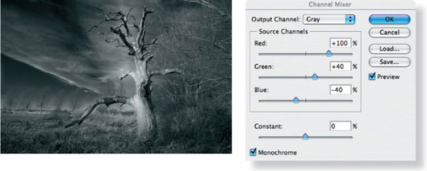
fig.4 Applying the custom channel-mixer settings in fig.4a to the color image translates image colors into a dynamic monochrome representation, while exploiting the primary RGB elements of the color scene.
fig.4a These channel-mixer settings lighten warm colors and darken cool colors, similar to red on-camera filtration with B&W film.
Parnham Doorway
Toning with mood
During a summer vacation trip to Dorset in England, my family happened upon Parnham House. The building is the creative center of the master cabinet-maker, John Makepeace, with to a splendid display of his and others’ contemporary furniture. All the items are fashioned with the utmost attention to design, detail and craftsmanship within the workshops behind the country house. Since it looked like the kind of place that would offer some photographic opportunities, as well as being of interest to the rest of the family, we went to investigate.

fig.1 This is the work print, exposed for 4.4 seconds with filter 3 on Agfa Multicontrast Premium paper.
Unfortunately, it was only an hour until closing and the light was fading fast due to gathering gray clouds. I immediately set out to work on the wonderfully weathered exterior with warm stonework, withered wisteria and original oak doorways by quickly setting up the Hasselblad 503CX and tripod. The only film I had was the slow, but fine-grained, Agfa APX25, hardly the best choice for low light and the movement of the leaves in the light breeze. Working rapidly, I used my spotmeter to take a reading of the shadow under the arch and adjusted by 3 stops to place it on Zone II. The lighting was flat, so I did not trouble myself with extreme contrast or compensation development. Even so, I had to use a 1 second exposure at f/8 to make the exposure.
After several minutes of waiting for all of the wisteria blooms to be still and metering the falling light level, I decided to get one shot ‘in the bag’ just in case. It was a good thing too, because the gathering gray clouds began precipitating over my equipment shortly afterwards, further reducing the already dim light.
Processing
Back in the darkroom, I developed APX25 in its family developer, Rodinal. Throughout my years of using Agfa B&W films, I have always found them to respond best to this ancient developer, which is still considered to be a benchmark for others. In Rodinal, grain is well defined and bitingly sharp. Other developers such as Ilford Ilfotec HC, Tetenal Ultrafin and Ilford Perceptol yield a much reduced film speed, which is critically low anyway in the case of the slow APX25. This remarkable film was, unfortunately, discontinued by Agfa in 2000. It seems that those seeking ultimate quality are moving up format and use the latest emulsions such as Ilford’s Delta or Kodak’s TMax range of films.
The straight print in fig.1 was made on Agfa Multicontrast Premium without the need for a test strip. I used my darkroom ‘Analyser’ to place the metered door shadow and lichen highlights on the tone scale, using the exposure and contrast buttons. The print was exposed with a contrast filter 3 at 4.4 seconds.
Initial examination of the straight print showed some print imbalance issues and a rather austere neutrality. To keep the emphasis on the doorway, the top and sides were burned-in for 1/2 stop at a low filter setting, and the bottom received 1 stop with the same filtration, toning down the path to something less eye-catching. A quick look around the borders (see fig.1) revealed an annoying highlight at the bottom right, screaming for attention. An additional 1/2 stop local exposure with a low-contrast filter put it in its place.
To add a hint of nostalgia to the image, I used a combination of direct and indirect sepia toning (see ‘Sulfide Toning’ in ‘Archival Print Processing’). After development, stop and two-bath fixing, the print was first washed for 5 minutes to significantly reduce residual fixer. This is important, because left in the print, this fixer in combination with the bleach, used later during indirect toning, will remove faint, delicate highlights. Then, the print was directly toned in sepia, also protecting the dark shadow tones against this bleach, while converting them to neutral-warm tones. Finally, the print was indirectly toned, that is first rinsed and briefly bleached in a strong solution, reducing only the highlights, and then toned in sepia once more to redevelop them to silver sulfide. This gives the stonework its natural appeal, while the protected shadow tones are kept neutral-warm.

fig.2 This is the final print with 1/2-stop edge-burn at the sides and top, using filter 0. The bottom received 1 stop more exposure with filter 0 to prevent the path from competing with the door. The print was combination toned to add warm highlights, while preserving neutral shadow tones.
Large-Format Nudes
Using a view camera in the studio

What is the best camera? Leaving obvious financial restrictions aside, Ansel Adams purportedly answered this question, “The biggest you can carry”. This answer does not come as a surprise from a great landscape photographer, who was well aware of the inherent benefits of a large negative. Alternatively, the optimum camera choice may depend on the photographic subject. Allowing the photographic application itself to be the guide pays tribute to the fact that camera versatility changes with negative size. As the negative format increases, the weight of the equipment typically goes up with it and electronic conveniences diminish. This gives smaller formats the edge, if speed is of the essence, but at the unavoidable expense of image quality. To prepare themselves for all possible photographic challenges, many photographers invest, therefore, in a 35-mm outfit for action photography, a medium-format outfit for studio and portrait photography, and in a large-format (4x5 or larger) outfit for architecture and landscape photography. These task-dependent equipment preferences are commonly accepted to be reasonable compromises between image quality and speed of operation.
So, what is the best equipment for fine-art nude photography? Most of my work in this area is done in a professional studio, and my equipment preference for portrait and nude has always been a medium-format camera with normal to slightly long focal lengths. Nevertheless, I found it intriguing to discover if there is any benefit in using a large-format camera for studio nudes. After all, many well-known fine-art nudes have been made with large-format equipment in the past.
I work mostly with amateur models, but this time, I selected a more experienced professional model. The reason being, I anticipated longer delays between sets and shots, due to the larger camera and my lack of familiarity with it. Therefore, I wanted a patient and more relaxed model, a character trait not always found with less-experienced amateurs. Other than that, the objective was to concentrate purely on the camera differences alone, and hence, my normal working preparation and operation was not changed, apart from selecting a different camera and type of model. After juggling all involved schedules, model, studio owner, make-up artist, lighting-assistant and my own, we agreed on a day and time. To take no chances, I booked the studio for the whole day.
The decision of which camera to take took me a while. In the end, I selected a 4x5 metal-field camera with a 210 mm lens. This selection comes with a few restrictions, but it represents standard and commonly used large-format equipment, making the test more valuable to others. The camera choice turned out to be no serious handicap, but the focal length was a bit short for this type of work. Next time, I will get an additional lens of at least 300 mm focal length. The film selection was easier. I rarely use anything but TMax-400 and saw no need to change that here. At the end of the day, 24 sheets of film were exposed and all received a normal development in Ilford’s ID-11 1+1 for 10 minutes. It is wonderful to have so much control over the light in the studio.
A small selection of these images is shown here. None of these images really show off the flexibility and potential of a view camera — I might leave that for another session — but making them gave me a pretty good idea of what it takes to work with a large-format camera in the studio. Here is a small summary of the experiences made that day.
Setting up the view camera and framing the scene takes me just as long as doing the same with my Hasselblad. The weight difference is minimal, and framing the shot upside-down does not bother me too much. It is something to get used to, though. It does, however, take a bit longer to focus a view camera. Checking the focus on the ground glass just takes more time than doing it in a viewfinder. On the other hand, some time was saved, because there was no need to change film. My film holders were loaded the night before, and 24 frames were enough for the whole day.
Until I actually used the view camera in the studio, it had not occurred to me that I, obviously, would not be able to see the focused image on the ground glass anymore, once the film holder was inserted. Sure, rough posing is done before and while the shot is framed, but a lot of fine-tuning is still done after the image is, and hopefully stays, in focus. Often, the photographer needs to direct or wait for optimum facial and body expression. The make-up artist might have to get into the frame again to correct the hair, or we have to wait for a light to be moved slightly into an optimum position. During all this time, the film holder blocks the view onto the ground glass, and we are working ‘blind’. Sounds like a big handicap and a potential risk for poorly framed or focused images. Well, none of this happened during our shoot. Of course, if the shot needs more than a minor modification in composition, we need to pull the film holder, frame and focus again, but that does not happen very often while creating portraits or nudes. Nevertheless, it is best to plan the shot carefully up-front and leave as little as possible to chance. Several dry runs are better than one out-of-focus image.
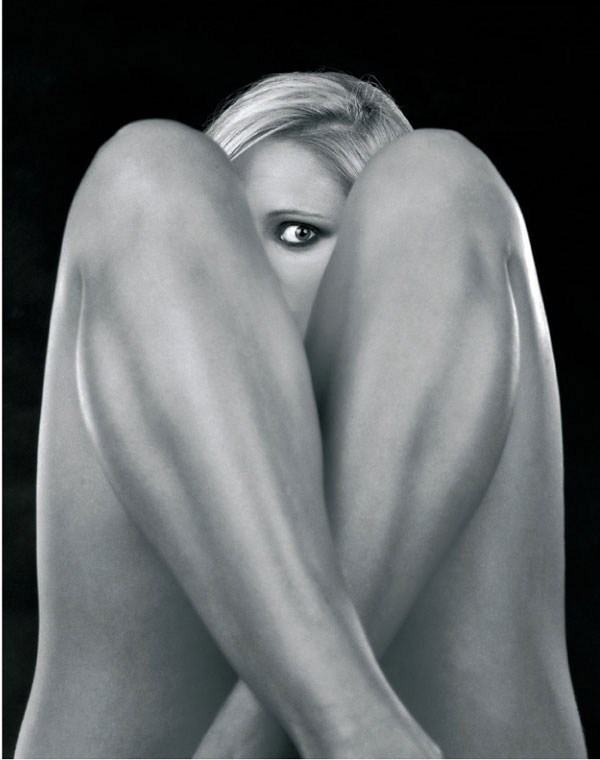
One benefit of using a view camera comes, of course, with the larger negative format itself. Assuming one has the darkroom equipment to support the larger negative, it is just easier to handle, leaves more opportunity for modifications such as retouching and unsharp masking, is far less prone to dust-related issues, and has unbeatable clarity, tonality and resolution with little or no grain. Overall, I agree that the large-format camera, compared to the medium-format camera, did slow me down on the shoot itself somewhat. But this was by no means a bad thing. The large-format camera inherently forces the photographer to compose, frame and focus more carefully. In my opinion, this often replaces potential serendipity with strategy, and that usually makes for the better picture.

All images shown here were taken with a Toyo 45AX metal-field camera and a Nikkor-W 210mm f/5.6 lens at f/16 on Kodak TMax-400 sheet film. The film was rated at EI-250 and developed in Ilford’s ID-11 1+1 for 10 minutes. The prints were made on Ilford Multigrade IV with a Durst L-1200, using an EL-Nikkor 150mm f/5.6 enlarging lens, and then developed in Agfa Neutol WA 1+7.
Rape Field
A little ‘liquid light’ can go a long way
In Southeast England, rape fields are in full bloom throughout the month of May. The appearance of the entire countryside benefits from the fresh look of these bright yellow fields, announcing summer to be just around the corner. Few can escape the view’s demand for attention, simply ignoring it seems impossible, and no photographer can resist the temptation to capture an image of this magnificent exhibition. Color film seems the obvious choice for a scene so full of intense and vibrant color, but I wanted to try something different. It took some confidence knowing the behavior of my favorite materials, some experience in visualization and a never-ending interest in experimentation to load the camera with B&W film.


fig.1 The first straight print on grade 5 has the right exposure for the background field but is too light in the foreground and the sky. The foreground requires additional exposure, but the sky would also benefit from a local contrast increase to emphasize the white clouds and make them an additional center of interest.

fig.2 The intermediate printing map shows a sequence of dodging and burning steps to alter the appearance of the print and increase impact. Sky and foreground field are darkened, but the large white cloud is held back during the main exposure to increase the contrast to its surroundings and provide the additional center of interest.
The image shown here was taken in May 2000 between the villages of Billericay and Ingatestone. I drove by this field every day on my way home from work, observing nature’s progress all the time, before I decided to take the picture. My mental image of the scene was strong and left little room for compromises. I wanted bright direct sunlight to make the rape glow, dark sky to provide a contrast and stormy clouds to give some extra interest. One Sunday, the conditions seemed really promising, and the unexpected tractor tracks offered an additional benefit, enhancing the perspective and leading the viewer into the picture.
Patience was required to get bright sunlight and stormy clouds captured in the same image. The cloud cover was not very dense, but the occasional patches were rarely big enough for the sun to illuminate the entire field at one time, and they didn’t seem to come my way. It took 1 1/2 hours until the conditions were right. By then I had many opportunities to set up the Toyo 4x5 field camera, focus the 210 mm lens, take light readings, place tonal values and decide on supporting filtration.
The darkest part of the background was placed on Zone III, and the rape field just in front of the lonely tree fell on Zone VII·5. That was not bright enough for what I had in mind. An orange (15) filter was added, and I expected it to lighten the yellow field by about half a zone. The film was marked for N+1/2 development to elevate the field to Zone VIII·5 and, therefore, borderline white. The orange filter would also help to darken the sky, but the clouds did not measure darker than Zone VI. An additional graduated neutral density (ND0.6) filter reduced the highest clouds by 2 stops to Zone IV. The exposure was made on Kodak TMax-400 at an aperture of f/32 to maximize the depth of field. I rate this film at EI 250 and exposed for 1/8 second, taking into consideration the orange filter.
The film was developed in Kodak’s Xtol 1+1 for 8 minutes and the resulting negative turned out to be rather thin. I have never gotten along with Xtol and have since switched to using either D-76 or ID-11. Xtol has a rather limited quantity of active ingredients and when used with a Jobo processor, where the amount of liquid is efficiently minimized, chemical starvation of the highlights may occur. Simply using more developer can cure the problem, a fact I didn’t know at the time. To print on grade-2 paper, I typically aim for a negative density range of 1.20, but this negative measured a mere 0.62, which made grade-5 paper a starting point for printing. It is my experience that this type of rescue attempt changes the tonal distribution of the image somewhat and increases visible grain, but the overall print quality does not necessarily suffer. Fig.1 shows the first straight print on grade 5 with correct exposure for the field. It almost has the look of snow as was intended, but several other areas needed improvement. The closest part of the field is too light, but the sky is still dark enough and lacks impact. A mixture of white and dark clouds could add some visual interest to an otherwise peaceful but boring print. The combination of a few burn-ins and the dodging of the cloud are recorded in the printing map in fig.2, which resulted in the work print shown in fig.3. The dodging efforts for the cloud improved the mood of the sky and the print has more impact now, but the additional sky exposure also brought much of the cloud density back, leaving it dirty and failing to create much impact.
In these situations, a little bit of darkroom bleach can be a creative tool, and I recommend to use potassium ferricyanide, ‘ferri’ or ‘liquid light’ as I like to refer to it. For this application, you can buy it together with the fixer as Farmer’s Reducer or follow the formula in the appendix. I mix 10 g of the powder with 1 liter of water to make a 1% stock solution. This stock solution is then mixed 1+1 with fixer to make a working solution and applied with a brush to the area to be bleached. The working solution is not very stable due to a chemical reaction between the ferri and the fixer, and within 10-15 minutes, it has lost its entire strength. Consequently, I prepare only a small quantity of working solution and make more as I need it.
Alternatively, you can use the ferri alone and finish up with a final fixing bath. However, the full effect of print bleaching is visible only after fixation, and unintended over-bleaching is not uncommon when ferri and fixer are used in sequence. On the other hand, the entire bleaching effect is immediately visible when the above mixture is used, which makes over-bleaching a less-likely occurrence.
To get started, mix 15 ml of ferri stock solution with 15 ml of fixer in a small beaker to a working solution. Place the print onto a horizontal surface and wet it thoroughly. Wipe excess water from the area to be treated, and brush on the working solution. Leave it to work for no more than a few seconds, and then, rinse it off with a water hose. The bleach will reduce print density from shadows and highlights in equal amounts, consequently having proportionally more effect on the highlights, affecting midtones and shadows to a lesser degree. The result is an increase in local contrast. Keep a close eye on the highlights and repeat the process until the desired effect is achieved. If at all possible, keep a wet duplicate print nearby for comparison. Fig.5 shows the sequence of steps as they were used for this image.
During the process, I prefer to keep the print on a horizontal glass surface, because any runoffs will leave unrecoverable telltale marks. Keep in mind that any accidental spills will have a similar effect. Up to a point, midtones and shadows can be protected from accidental bleaching through prior selenium or sulfide toning. However, bleaching after toning creates a different shift in print colors than toning after bleaching. Nevertheless, it also creates a unique lith-like color shift of the midtones with selenium-toned prints, which could be used as a creative visual effect. After bleaching, fix the print in fresh fixer and continue with your normal print processing procedure.

fig.3 The intermediate work print shows the improvement to the foreground and the sky. The dodging efforts for the cloud improved the mood in the sky, and the print has more impact now, but the additional sky exposure also brought much of the cloud density back, leaving it dirty and failing to create much impact.

fig.4 The final printing map suggests additional bleaching of the two white clouds. Mix the bleach as described in the text, or purchase Farmer’s Reducer, which is a mixture of potassium ferricyanide and fixer. The bleach will reduce print density from shadows and highlights in equal amounts, consequently having proportionally more effect on the highlights, affecting midtones and shadows to a lesser degree. The result is an increase in local contrast.
fig.5a The potassium ferricyanide is applied with a brush.
fig.5b Be careful of spills, and leave it to soak only for seconds.

fig.5c Rinse immediately and thoroughly to hide telltale marks.

fig.5d Wipe the wet print and repeat the process until done.
The lead image shows the result from bleaching two clouds. Bleaching can make a significant difference to the overall impact of an image. Use it to draw attention to key areas, provide sparkle to highlights, open up otherwise dull shadows, and improve local contrast in general. Bleaching is a valuable technique where other contrast-increasing methods are either too limited, difficult or impractical to apply, as in this case, where the maximum paper grade was already needed for the base print.
St. Mary’s of Buttsbury
An English mystery church in Essex
On my way to and from work, I drive right by St. Mary’s of Buttsbury. This beautiful English church is located in Essex midway between Stock and Ingatestone, southwest of Chelmsford. It can be found on Ingatestone Road between Elmbrook Farm and Buttsbury Hall Farm.
The church is dedicated to St. Mary and was built in the early 14th century. Throughout the centuries, many people have worshipped at this church, and some have found their final resting place in the shaded churchyard. Unfortunately, nothing is known of the actual village of Buttsbury, which some people think may have been situated around or near the church. Indeed, its position on high ground indicates the probable existence of a village. From the tower, seven church spires can be seen. In medieval times, the nuns from St. Leonard at Stratford came to stay and worship at Buttsbury. One assumption is that the village disappeared with the ‘Black Death’ in the 14th century. Even so, the church has continued over the years, thanks to the loving care of successive generations.
Today, the small church stands alone surrounded by farmland above a wide grass valley. Once inside, you will find modestly decorated white walls and a ceiling, which had the plaster removed to reveal the oak beams. The two wooden doors have been weathered by the centuries. The square tower is built of flint and stone and has one bell, cast in the 15th century. Parts of the floors are brick from the potteries of Stock and include two tombstones dating 1680 and 1688. Large stained glass windows are a generous and attractive light source during the day.
The church is still used for services and it is open for private prayer during the day when visitors are most welcome. With the ever increasing need for housing in this part of Essex, and the continuing expansion of Ingatestone and Billericay, houses may again appear in the proximity of the church. Apart from the present farms, Buttsbury may indeed have a full population of its own again. A fitting reward for the loving care that has preserved this beautiful old church over the centuries.


fig.1 The exposure record shows how the zones were placed on the shadows and how they fell on the highlights.
I have stopped often at Buttsbury church and I have taken many images there within the last years. The one shown here was taken on a sunny Saturday afternoon during one of my Zone System classes. It shows one of the stained glass windows and the southeast window to the right. With the Pentax Digital Spotmeter, I placed Zone II·1/3 at the end of the bench, not needing anything but some texture in this area. The rest of the shadows on the bench fell mostly on Zone III. The windowsill fell on Zone X·1/3 and demanded, therefore, N-2 to N-3 development. The glaring center of the window fell on Zone XI·1/3. N-3 development is required to compensate for this large range of luminance, and I have successfully developed TMax-100 in ID-11 for N-3 in the past, but I was worried about losing much of the local contrast if I were to develop the negative that soft. Therefore, I decided to leave the development at N-2 to maintain local contrast. The highlights would need some special attention in the darkroom. I noted the negative for N-2 development in my exposure records. At this point, it was clear that the windowsill would be just above the threshold of the paper, but would have a hint of detail. The rest of the window would need some burning to reveal detail.

fig.2 The printing map records how the edges and the lower window area of the image were burned down.
My typical film speed for TMax-100 medium-format roll film is EI 64 for normal development, but for N-2 development, I reduce it to EI 40. The reduced development time will ‘starve’ the shadows, and the extra exposure will help to retain shadow detail. I had the Carl Zeiss Distagon 4/50 mounted to my Hasselblad 501C and stopped it down to f/22 to get the depth of field this image required. This Hasselblad has no front lens tilt, but a subject like this would not have benefited from it anyway. So, the 4x5 stayed in the camera bag. I was left with a measured exposure time of 2 seconds and I extended that time to 3 seconds to compensate for the reciprocity failure. I carry a manual stopwatch with me to time exposure times above 1 second, which is the maximum limit of the Hasselblad lenses.
I normally carry three film backs for the Hasselblad. One is marked ‘N’ for normal and the two others are marked with ‘N-’ and ‘N+’ development, respectively. Often, the ‘+’ and ‘-’ developments are averaged in the darkroom for development, but on this day, all ‘-’ developments ended up at N-2. The negative was developed for 6 minutes in ID-11 diluted 1+1 at 20°C (68°F). The shadows had a transmission density of 0.25 and the windowsill was at 1.3, which is a difference of 1.05, and therefore, a grade-2 paper was needed.
The filters on the color head for my Durst enlarger were set to simulate an ISO grade 2 and the test strip revealed a base exposure of f/8 at 14.3 seconds. I was using 11x14-inch Ilford Multigrade IV fiber base paper. I ended up tilting the head slightly to compensate for some converging lines, which are unavoidable when you point the camera up, unless you use a view camera. The window frames and the candlestick are now parallel to each other. A 1/6-stop edge-burn was applied to ‘pull’ the viewer into the print. As predicted, the window needed some additional burning down. Another test strip gave a satisfying result with one additional stop of exposure at grade 4 through a hole in my self-made burning card. I often choose a hard burn-in to get some extra local contrast. Here, the leaded frames in the windows needed such a treatment to get the required density into the print. This image represents some of the peace and quiet I always feel when I visit St. Mary’s of Buttsbury.
Stonehenge
Accepting a printing challenge
The ancient and mysterious stone circle of Stonehenge is located in England, about 10 km north of Salisbury, just off the A303 main road. What visitors see today are the remains of a monument erected between 3000 and 1600 BC. The structure is comprised of an outer circle of large upright standing stones, topped by lintels. Inside the circle, five stone pairs, with a lintel across each pair, once formed a horseshoe. The structure is aligned so that the horseshoe opens to the rising sun at the midsummer solstice.
The original purpose for which Stonehenge was built has been debated for many years. Many scholars believe it was a sacred place of religious worship, while others maintain it was simply a huge astronomical calendar. The mystery may never be solved, but it is clear that only an organized and sophisticated society would have been able to plan and erect such a structure. Ingenuity and an enormous investment of time and labor were needed to transport the stones for many miles, and then shape and raise them.
The final image of Stonehenge was made from a hopeless looking negative. Nevertheless, heavy print manipulation restored the feeling of mystery that surrounds this ancient site.
Film Exposure and Development
This wasn’t my first visit to Stonehenge, but I had never returned with an image capable of representing the mystery of this ancient site. A longer business trip from the US to London provided a free weekend in February of 1997, and with it came a chance to give it another try.
The Hasselblad 501C and Planar 2.8/80 were supported by my traveling tripod, and I was ready to meter the cloudy scene. The darkest area of the stones was placed on Zone III and the brightest clouds fell on Zone IX. Kodak TMax-100 demanded 1/2 s at f/16, and I settled for ‘N’ development.
Printing Challenge
After reviewing the contact sheet, I had little hope of a good picture. The small image had no sparkle, and it didn’t appear to have a full range of tones, despite the fact that all detail seemed to be there. However, something about this image kept me interested, and I wasn’t about to give up easily. Under normal circumstances, I would probably have gone back to shoot the scene again, but unfortunately, by now I was back in the US and flying back to England was not a real option. Moreover, if I were honest with myself, I wouldn’t know what to do different the next time anyway. After all, I had used the Zone System to get the whole subject brightness range into the pictorial negative density range.
The first full size straight print, fig.1, verified the information from the contact sheet. The print exposure was optimized for the highlights in the sky, and the contrast was chosen for the bottom of the center right stone to be on a print Zone III. The exposure time used was 12.7 seconds on grade-2 paper. Technically, the print was fine. Everything was there, the sky had plenty of detail and so did the stones, but what a horrid photograph. It had no mood, was not representative of Stonehenge’s mystery and communicated none of the feeling I had when I was actually there. Is this a totally hopeless case? Should I give up and cut my losses? Not yet, let’s accept the challenge.

fig.1 The straight print shows that all shadow and highlight detail was captured in the negative. Therefore, film exposure and development were correct, but still, the resulting print on grade 2 has little appeal. The overall contrast is normal, but there are no midtones to speak of, and the image seems to be separated into low-contrast highlights and shadows, which makes for a dull and muddy print.

fig.2 A work print optimized for the sky, grade 4.5 at 30.2 seconds, renders the sky at intended but leaves the stones completely black.

fig.3 A work print optimized for the stones, grade 4.5 at 17.0 seconds, renders the stones at intended but leaves the sky completely white.
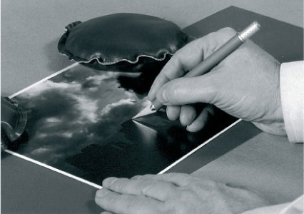
fig.4 A work print can be turned into a customized exposure mask with the help of a sharp utility knife.

fig.5 Another work print can be used to check the accuracy of the mask. The fine-tuned mask will be carefully aligned with the print to cover the stones during the second exposure.

fig.6 A bit of darkroom ‘magic’ has allowed us to combine the optimized sky and stones into one print. A few attempts may be required to find the best mask position, and a few white marks can be easily spotted away after the print has dried. Additional burning down of the sky was added to the sky to create the final image.
A close inspection revealed the overall contrast between the highlights in the sky and the shadows in the stones was normal and, therefore, printed well on grade-2 paper. However, the image consists mainly of very light tones in the sky and fairly dark tones in the stones. There are no midtones to speak of, and this separates the picture into two areas, each having a very low local contrast.
The solution is to concentrate on each area separately. Fig.2 shows a print optimized for the sky. The highlights in the right half of the sky have the same density as in the straight print, but the paper contrast was increased to grade 4.5, requiring an exposure increase to 30.2 seconds. Now, this is more like it! This is the type of sky I had in mind, and it will definitely help to create and support the right mood for a representative Stonehenge image. However, there was a price to pay for the fact that the stones were ignored in this attempt to create the perfect sky. The foreground went completely black and shows no detail at all. That may have a unique appeal, and some viewers may even prefer it, but it was not my intended outcome for this image.
The next step was to optimize for the stones and in turn ignore the sky, as shown in fig.3. The local contrast was very low again, but printing with grade 4.5 and reducing exposure time to 17.0 seconds allowed me to keep the shadow on the lower stone on Zone III, while raising some of the highlights in the stone to Zone VI and VII. What an improvement. The muddy look is gone and detail in the stone is revealed.
Putting It All Together
In principle, it seemed possible to get the print the way I wanted it. I had the right sky and a pleasing print of the stones. All that needed to be done was to put the two together. The separate prints of the sky and the stones were both printed with grade 4.5, but at different exposure times. The sky simply needed more exposure than the stones. Therefore, dodging the stones during a second exposure should do the trick. Nevertheless, this was not a simple task due to the complex skyline of the stones, and normal dodging would undoubtedly have left telltale signs. In cases like this, a customized dodging mask is called for.
I made another print, similar to the one shown in fig.2, being careful to make the whole skyline clearly visible and easy to identify. At this point, the stones were separated from the sky with the help of a very sharp knife, fig.4, creating the mask. Be extremely careful and make your fingers the first priority. Make the cut as precisely as you can. Trimming off too little and leaving the mask too big will partially cover the sky during the second exposure, creating a white line on the print. On the other hand, trim off too much and the stones will be doubly exposed, leaving an ugly black line. White lines are easy to get rid of. You can try to trim the mask a bit more if they are really big and obvious, or you can spot them in on the dry print if they are small enough. Avoid black lines, because they are there to stay. You can check the accuracy of the mask, fig.5, with one of the test prints.

fig.7 The printing map records the basic exposure and all additional print manipulations. It might look rather complex at first sight, but in practice, it is a sequence of simple steps. The bottom edge burn is achieved by gradually pulling the burning card off the print from left to right.
Fig.6 shows the result of the two exposures using the mask. First, the whole print was exposed for 17.0 seconds at grade 4.5 to get the desired tonality for the stones. Then, the mask was registered on top of the print, using either the edge of the easel or the edge of the paper itself as a guide. A second exposure was given, this time for + 1 5/6 stops, or the difference in time required to get the sky to a 30.2 second exposure. You may have to experiment with the mask placement to minimize the telltale signs of the mask, but the results are usually worth the effort.
The leading image shows the final print. Additional burning down of the sky and some edge burning took place to maximize the impact of the scene (fig.7). There is little comparison to the straight print in fig.1, and this example clearly shows how much creativity is possible even after the image has been dedicated to film and the negative has been developed. Regardless of the time and effort spent to create an ideal negative, the creative process does not stop until the final print is committed to paper.
Summer Storm
The way I want to remember it
Scotland is well known for its beautiful landscape and harsh, rapidly changing weather conditions. My wife and I had already witnessed both, when we came to the end of a brief vacation there in August 2000. We decided to take the back roads that day, in hope of finding some interesting photographic subjects.
Near the small town of Balholmie, just north of Perth, I saw this field in the early afternoon. The farmer was in the process of collecting the hay bales, but for some reason one was left behind. A storm had gone through earlier, and the sun found an opening in the disappearing cloud pattern to illuminate the entire valley. The warm light and the simple lines of the scene intrigued me. Afraid to lose the light soon, I quickly set up the Toyo 45AX and mounted the Nikkor-W 210mm f/5.6 lens.

The spotmeter measurements revealed a low overall subject brightness range and even less contrast in the foreground. I placed the shadows in the background trees on Zone III and marked the film for N+1 development to lift the field from Zone VI to Zone VII. An orange filter was used to increase tonal separation in the hay and brighten the field further. The stormy clouds added a lot to the atmosphere and a graduated neutral 0.6 density filter was added to darken the sky and increase this effect. I noticed that the highlight on the left of the hay bale would need some burning down, since it fell on Zone IX·5, but I preferred that to the danger of getting the image too soft. My normal EI for TMax-400 is 250, but it changes to 320 for N+1 development. Considering the orange filter, but ignoring the graduated filter since it affected the sky alone, I exposed at f/45 for 1/4 second. This was just in time, I might add, because the sun disappeared soon behind a thick cloud and the farmer came back to pick up the last bale of hay. The window of opportunity was less than half an hour long.
Once in the darkroom, the electronic analyzer recommended a print exposure of 13.5 seconds and grade 1.5 to get started. Fig.1 shows the resulting print. This type of darkroom tool is highly operator dependent and relies on accurate calibration, but it can quickly get you onto ‘first base’. In principle, a highlight and a shadow reading is taken, and the exposure is then determined from the highlight reading, and the contrast is calculated from the density range between highlight and shadow reading. In this case, the exposure was correct, but the print lacked impact and mood. In addition, the N+1 development had helped, but the print was not as I wanted to remember the scene.
I tried a variety of test strips to alter the print appearance and finally decided on a print treatment, which is summed up in fig.2, the printing map. The main exposure is maintained, but the contrast has been raised to grade 2. During the main exposure, the shadow side of the hay bale was dodged for 1/3 stop to increase shadow detail. In addition, the entire background was dodged for a full stop or half the time. This was done with the intent to later burn it in at grade 5 for 1 1/3 stop. This partial split-grade printing will raise local contrast. But first, the highlight on the hay bale was burned-in for 1 1/3 stop at grade 2 to bring some detail into that area. Three edge-burns helped to keep the viewer’s eye from drifting off the print. Finally, the left sky was unnaturally light, and another grade 5 burn for one stop gave a more evenly distributed sky.
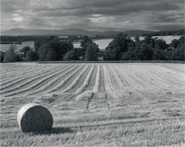
fig.1 This is a straight print after following the electronic analyzer’s recommendation.

fig.2 the final printing map after several test strip trials
The final print is conveying the light, which intrigued me in the first place. The sky is stormy and dramatic. The foreground has a warm glow and the simple lines of the field lead the viewer from the hay bale to the background.
Toothpaste Factory
Small detail helps to create a dramatic image
by Frank Andreae

Throughout the world, cities are filled with all sorts of buildings, both new and old. As a new building is created, it is photographed to show the latest architectural materials, efficiency of energy or majestic views of its surroundings. As the decades recede into the past, the buildings are transformed to meet new space requirements, torn down to make way for new structures, or simply left abandoned until such time when fate resurrects them again. At that point, the buildings are photographed to show where a new mall or parking lot will be built, or possibly, for a history book to save for new generations what once was.
The Ident Toothpaste Company abandoned its building in Detroit, Michigan USA in the 1960s. It was never torn down, but after all these years, there are tentative plans and demand to turn it into loft apartments. The peeling paint, rusting pipes, and vandalized interior add character and texture to the once bustling factory, full of workers and life. The multistory building stands empty now and makes a wonderful background for shooting environmental figure photography.
There are no working lights in the building, but fortunately, there are many windows on each floor to let the natural light flow across the space and upon the subject at hand. During the shoot, we experimented with a variety of poses at several locations throughout the building, working our way up from one floor to the next. On our way to the roof, we stopped on a floor that had fewer windows than most but more texture on the walls. Noticing the sunlight streaming through a smaller window, the model was placed in the light’s path and cupped her hands as if trying to capture the rays. A light reading was taken through the auto prism of my Mamiya 645 Pro and double-checked with my Pentax Digital Spotmeter. Knowing that the window was many stops of exposure greater than the wall, I exposed for the peeling paint and decided to burn in the window accordingly later in the darkroom. With TMax-400 film and a 100mm lens, an exposure of 1/8 second at f/8 was calculated.
fig.1 The straight print shows no detail in the window, and the model does not appear to be as much the center of interest as is desired. The washed-out highlights of the window require additional exposure, and the model needs to be lightened to attract the viewer sooner.

fig.2 The printing map shows that a precise burn mask is needed to properly burn down the window area detail. The model is dodged during the base exposure, while the edges of the print are gradually burned down to give the image a more directed and dramatic feel.
With the film processed, dried and the contact print made, I realized that the composition captured the mood of the surroundings and assumed that the final print would be easily created. As I started doing test exposures, I determined a base time of 35.9 seconds with filter 2 for the entire print and dodged the model by 2/3 stop so she stood out more from the background. My initial test exposures on the window however, proved to be a little disheartening. I could see some detail on the negative, but for the amount of burning that was needed to show this detail, I was not able to hold a square hole above the print exactly as was necessary. I, therefore, proceeded to create a mask for this window by laying a piece of thick mat board on top of the printing easel and traced the image of the projected negative. I used a sharp utility knife to cut out just the five panes of glass, which were too bright, and left the window frames in place. The window now received a burn-in of 1 3/4 stops with filter 3.5 to show the detail of the scene outside. I applied an additional 1/3-stop burn-in to the top and the sides, while a 1/2-stop burn-in completed the image on the bottom.