
Quality Control
Continuous exposure and development control
Over the years, we have consumed most of the photographic texts in our libraries, and a few others besides. These texts include those by Adams, Davis, Henry, James, Mees, White, Thornton and Zakia. Although considerable emphasis is placed on film exposure, subject brightness range and development compensation, there is little attention paid to the concept of simple quality methods in the craft of photography.
For instance, after a considerable section on film measurement, characterizing exposure and development to the lighting conditions of the scene, it is assumed by some authors that the practitioner upholds repeatable lab practices, the materials never vary, and the equipment never wears. Of course, this is unlikely to be the case.
Simple Photographic Controls
This is not a point to lose sleep over. We only want you to recognize that photography, just like a manufacturing process, suffers from variability in process, materials and human nature, all of which affect the final outcome. In industry, there are elaborate methods for working out all the variables, their significance and control by measurement and mistake proofing.
Our objective in photography is to eliminate the ‘nasty surprises’ and reduce the variability in our negatives and prints to within sensible limits. Although there are many variables associated with the picture making process (over 50), it is welcome news that only a handful are significant on a daily basis. Throughout this book, we have and will discuss several ideas to improve exposure accuracy, meter, camera and equipment testing, as well as good darkroom practices. The quality of the print is limited by the quality of the negative, starting with the exposure and continuing through to development and printing. Development control is especially important for users of fixed-grade paper, where effective matching of negative density range and paper contrast is critical.

Keep It Simple
We use a concept borrowed from the manufacturing industry for our film processing. We start most of our films with a test exposure. After development, the density information from this test gives valuable information about the exposure and development accuracy, and by comparing it to previous ‘identical’ films, also about exposure and development repeatability.
In one case, this test method identified the exhaustion of a developer concentrate. The film was a little underdeveloped and even though a slight correction in development time was made to bring it back on track, the next film was about the same. After a few months, the developing time was 30% longer than what it started at with the new bottle. Subsequently, although these negatives were printable, to bring things under better control, a protective spray was used to reduce developer oxidation and, as a precaution, the concentrate was stored in smaller bottles.
All Change
For film processing, the principal process variables are time, temperature and agitation rate. The choice of developer, active volume and agitation technique are also significant but they are, for the immediate discussion, assumed constant. For a moment, let us consider an arbitrary emulsion and developer combination, Ilford Delta-100 and Tetenal Ultrafin. Let us say that the standard development time is 4.5 minutes with 300 ml Tetenal Ultrafin 1+20, at 24°C, with four tank inversions once every minute. The timer is started as the developer is poured in and emptied when 10 seconds of development time are left.
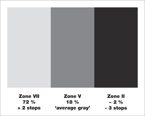
fig.1 This self-made test target simulates a subject brightness range of 5 stops and provides a useful alternative to the Kodak Gray Card.
Consider another session, when the development timer is started after pouring in the developer and emptied when the timer stops. In this case, the development time would be increased by 20 seconds, approximately 7.5%. Murphy’s law states that accidents never happen one at a time; therefore, if at the same time the developer was above temperature by 1°C, it would increase effective development by a further 10%. Since bad luck always happens in threes, if we also agitated once every 30 seconds rather than every minute, we would increase effective development by another 10%.
Each process error has added a small overdevelopment, but the net result is a 30% increase on the original film development. This is enough to make you print with a full grade softer paper. If we rule out individual frame development for 35mm and roll film users, it is easy to predict that some negatives may well need the softest grade of paper for an acceptable print, without any room for any artistic maneuvers. Hence, in your darkroom, you should decide on the methods for temperature control, agitation and timing, and then stick to them and, consequently, measure their effectiveness with an ongoing quality test.
Quality Testing with a Target
There is a descriptive and a measurement based approach to quality testing. Both require a test target (fig.1), which creates three negative densities when photographed. The resulting test negatives provide a regular check of your materials and technique, representing a typical highlight, average gray and shadow tone. Here we will only make use of the highlight and shadow tones, since they are the best indicators for exposure and development deviations. However, the average gray bar is included as a reference and it turns the test target into a useful alternative to the Kodak Gray Card.
The test target is readily made using an 8x10-inch sheet of printing paper, preferably in a semi-gloss surface finish. The semi-gloss provides a more consistent exposure range than a high gloss surface for an assortment of lighting conditions. Make a number of increasing plain dark test prints, record the print exposures and measure the brightness in comparison to a Kodak Gray Card with your spotmeter. Using the same lighting conditions that you have chosen for the test, find a print tone equal to that of the Kodak Gray Card, followed by another 3 stops darker and a third 2 stops brighter. They will serve as representatives of subject Zone V, II and VII respectively. Combine the test exposures to one print as in fig.1 and mount it to a piece of card. Occasionally, photograph the test target, which will tell you a lot about that film, as well as the repeatability, reproducibility and stability of your processing.
If you find numbers and graphs daunting, however, consider the evaluation chart shown in fig.2. With it, you can evaluate the highlight and shadow densities of the test negative. Use your subjective assessment to identify the extent of the required amount of exposure and development correction. This table is great for reminding oneself of the warning signs of poor negative control. However, it cannot tell you accurately the amount of correction necessary.
For this, a numerical technique is required where the test negative densities are compared to target transmission densities. These negative densities give important information. The density readings may show film-to-film randomness, hinting that your technique is not under strict control, or it may show a trend, which might be the influence of season, ambient conditions or developer exhaustion.
We recommend, at the beginning, to develop several films with identical exposure and development settings, to ensure that your technique is consistent. Keep good records of the time, agitation, developer and ambient temperature to remind yourself of the process. These records will also indicate where variability may be occurring. Once your technique is producing stable results, use the negative density data to correct for trends caused by aging film, developer and seasonal fluctuations.
By comparing the negative densities of these two standard exposures to a line on a graph, either the simplified one provided in fig.3, or one created from your own exposure and development experiments, you can determine an exposure and development correction for the next film. From all that has gone before, we already know, to some extent, that both highlight and shadow portions of a negative are affected by exposure and development. This makes life rather complicated, so we make what engineers call a ‘first order approximation’ and state that for small changes in development, the negative shadow density does not vary. Having made this approximation, we can say that exposure affects the shadow density while exposure and development affect the highlight density. In practice, we first evaluate the exposure correction with the shadow exposure density and then consider the difference between the shadow and highlight exposure densities to calculate the development correction. This will be explained fully later on, but for now, the important point is that, rather than making a complicated test, we can ‘home-in’ on the correct settings after a few films. In fact, for some, it is an alternative way to determine film speed and development settings by what mathematicians call ‘successive approximation’.

fig.2 The exposure and development evaluation chart allows for a subjective assessment of any required corrections.
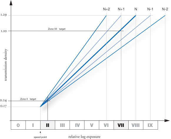
fig.3 Actual test densities are compared with target values to predict exposure and development corrections in fig.4 and 5.

fig.4 The actual shadow density of the test negative for a given development reveals the exposure correction needed.

fig.5 The actual negative density range of the test negative for a given development reveals the development correction needed.
Exposure and Development Corrections
Depending upon your individual circumstances and film format, this test requires a single exposure of the test target in fig.1, or two separate frames, using different exposures, of a neutral evenly lit plain surface. In the case of a test target, the practical reflective properties of a flat object limit the subject brightness range to 5 stops. To ensure correct shadow exposure we assume that the low exposure represents Zone II and the high exposure represents Zone VII.
If separate exposures are made, then clearly the exposures should be 5 stops apart. In either case, we have assumed that one of these exposures is set to Zone II and the other is set Zone VII. Using these shadow and highlight values will enable you to clearly determine exposure and development corrections for a wide range of conditions. Whichever technique is used, to increase accuracy, extreme shutter speeds and apertures should be avoided, as well as close focusing and changing lighting conditions.
In fig.3, we have simplified the film characteristic curves to straight lines, crossing at the effective speed point and reaching the desired negative density at a Zone VI, VII or VIII. In fig.4 and 5, it is assumed that our test target, with its 5-stop brightness difference, has been photographed. When you photograph the target, set your spotmeter to your film exposure index for the chosen development, take a spot reading of the shadow bar, and place it on Zone II by reducing this exposure by 3 stops. To avoid flare and glare, use a lens hood and ensure that the lighting is principally off-axis and that there is no shadow over the test target, either when metering or exposing.
Exposure Correction
Assuming the standard densities of Zone I·5 and VIII·5 exposures with N, N+1 and N-1 development set in the chapter ‘Creating a Standard’, and the film curves simplified into straight lines, it is possible to make a linear graph, as in fig.4, with which to calculate the exposure error. This exposure correction is applied to the exposure index used for this film, rather than some theoretical index determined at another time. In this way, if a film is slowly becoming less sensitive through age, the correction will track the change. Although this correction is based on a simplification of the complex film characteristic, the error it introduces is several times smaller than the error it removes. Some may find it useful to program a calculator or use a computer spreadsheet to record this information, calculate the corrections and plot the results to check how good your technique is.
Development Correction
In a similar manner, the difference between the shadow and highlight densities can be used to give a predicted development time correction. In the graph shown in fig.5, it is assumed that the typical film/developer combinations require 25% more development, per zone of expansion and 15% less time for each zone of compression. These percentages hold good for many films and developers, with a few exceptions. TMax-100, for example, is usually about twice as sensitive to development than conventional emulsions. In contrast, extremely dilute or two-bath developers, both of which have a compensating effect, automatically reduce negative contrast variation. In these cases, you will need to measure your own film/developer characteristics and make your own graph for development corrections.
Fig.5 shows the development adjustments for three development schemes. To use this graph, take the difference between the Zone II and Zone VII densities, select the line that corresponds to your intended development scheme, and read off the development time factor from the other axis. Again, apply this factor to the last development time.
Process Control
If you were to record and plot the various results for the exposure index and the development time for any film development scheme, the randomness of the points would indicate the degree of control exercised by the film manufacturer, your equipment, materials and technique. In particular, if film development times have more than +/-10% spread, the timing, agitation and temperature control methods that you use should be carefully checked. If, however, the points show little random variation, but form an increasing or decreasing trend, especially for development time, then the chemistry may be expiring, or the effect of season on the ambient conditions is playing its part.
Once you have proven to yourself that your technique is consistent, then it may only be necessary to check your material and equipment when new supplies are purchased or serviced. If you change printing papers, or use alternative enlargers for print contrast control, it may be necessary to tune your negative contrast to a new setting. This will then require new graphs for fig.3, fig.4 and fig.5, the generation of which is not shown here.
Unsharp Masking
Contrast control and increased sharpness in B&W

An unsharp mask is a faint positive, made by contact printing a negative. The unsharp mask and the negative are printed together after they have been precisely registered to a sandwich. There are two reasons to do this, the first being contrast control and the second being an increase in apparent sharpness.
Unsharp masks have been used for some time to control the contrast in prints made from slide film. They can also be used for B&W prints when the negative has an excessively high contrast due to overdevelopment. The mask has typically no density in the highlights, but has some density and detail in the shadows. Fig.9 shows how the sums of the densities result in a lower overall contrast when the mask is sandwiched with the negative.
However, this chapter is not about using an unsharp mask to rescue an overdeveloped negative, but rather to utilize this technique to increase the apparent sharpness of the print. A word of warning may be appropriate at this point. This is not for every negative, but more importantly, it is not for every photographer. It is a labor-intensive task to prepare a mask, and some printers may not be willing to spend the time involved to create one.
The technique is very similar to a feature called ‘Unsharp Mask’ in the popular image software Adobe Photoshop, but usually takes several hours to execute in the darkroom. The masks need to be carefully planned and exposed with the enlarger light, then developed and dried. Afterwards, it needs to be registered with the negative to a sandwich and printed. Batch processing several masks together cuts down on the time involved. Despite the workload, I would not be surprised if, once you have seen the dramatic difference it can make, you never print an important image without a mask again. Many fine-art photographers make masks for all their important images, and some do not ever print them straight anymore, because few images look better printed without an unsharp mask. You may be less committed, but I hope this chapter will encourage you to try it out.
How It Is Done
We start with the selection of an appropriate film to generate a mask. Specially dedicated masking film is either not available anymore, hard to come by or very expensive. For this reason, I now propose using either Ilford’s Ortho Plus in Europe, or Kodak’s TMax in the USA. Other film will probably do fine, but I have not tested them. Ortho Plus from Ilford has the advantage of being able to be handled under a strong red safelight, but it is, unfortunately, sometimes hard to find in the USA. I use 4x5-inch sheets exclusively to make masks for all film formats and see little reason to store masking film in different sizes. For me, it is easier to handle and store larger rather than the smaller film sizes.
The enlarger should be set up to allow for an even illumination to the entire baseboard with an empty negative carrier in place. A copy frame is helpful to hold the negative and the mask. Mine is made of plastic and has a gray foam backing with a hinged glass cover. A piece of 1/8 inch glass will do, however, if no copy frame is available. Place the mask film, supported by a piece of black cardboard, into the middle of the open copy frame, making sure that the emulsion side of the masking film is facing up, as in fig.1. Place the negative on top of the masking film, again with the emulsion side facing up. Close the cover or hold the sandwich down with the glass.
The precise exposure may require some testing, but I have given you a starting point for the two films mentioned at the end of this chapter. Fig.1 also shows how, during the exposure, the light passes through the emulsion of the negative first and then through the base of the negative to reach the emulsion of the mask. This base has a typical thickness of about 0.18 mm (0.007 inch) and it also diffuses the light slightly. This effect is responsible for the creation of a slightly unsharp mask. The thicker the base, the more the light is diffused and the mask becomes increasingly unsharp. Ironically, the unsharp mask is responsible for the sharper image when printed later as a sandwich. It is common practice to use clear plastic spacers, available from art supply stores, between the negative and the mask to increase the effect, but I find that it looks unnatural. Therefore, I do not use spacers anymore. However, you may want to experiment with clear plastic sheets of 0.1-0.2 mm (0.004-0.008 inch) thickness, to find the effect you prefer.
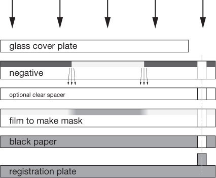
fig.1 Negative and unexposed masking film are placed, emulsion side up, on top of the baseboard. The carefully planned exposure creates a faint and slightly unsharp positive, called the unsharp mask. An optional plastic spacer may control the degree of sharpness.
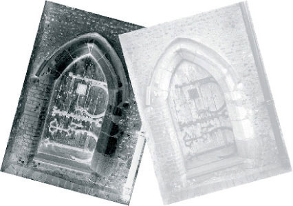
fig.2 Negative and unsharp mask will be printed together as a precisely registered sandwich. This reduces the overall contrast of the negative, but increases edge sharpness and local contrast of the print.

fig.3 The registered sandwich is placed into the negative carrier and printed together with the emulsion side down. The increase in required paper contrast and the ‘edge effect’ create a sharper image.
After the exposure, process the mask as you would any other film. The developing times mentioned at the end of this chapter are starting points and they work well for me. I use a Jobo processor with constant agitation, but your times may differ if you use a different method. Fig.2 shows the negative and the mask for the cover photo.
The negative and the mask are sandwiched, as shown in fig.3, in order to print them together. Relatively expensive pin-registration equipment is available from several sources, and I have tried a few of them. Nevertheless, patiently aligning the negative and the mask manually, with a piece of tape and a loupe on a light table, works well with a bit of practice, and I suggest you try that first. You may decide that masking is the way to go, and then, the purchase of such equipment may be a wise investment.

fig.4a-b These two examples show a detail of the brickwork to the left of the door. fig.4a was printed with the negative alone, and fig.4b was printed with the negative and the mask registered to a sandwich. The increase in local contrast and edge sharpness is significant and clearly visible. Paper grade 2.5 was used for fig.4a and increased to grade 4.5 for fig.4b to compensate for the reduced contrast of the sandwich.
What a Difference
The lead image shows the north door of St. Mary of Buttsbury in Essex, one of my favorite English churches. The original negative density required a paper grade of 2.5 and, being taken with a 4x5 camera, produced a rather sharp image. The image reproduced in this chapter was printed including the mask and it reduced the contrast of the sandwich to the point that a paper grade of 4.5 was necessary. The result is significantly sharper than the print from the negative alone. The enlarged details in fig.4 and 5 demonstrate the difference well. You can probably guess that figures 4b and 5b were printed with the mask.
In order to be fair to the original image and not to generate unrealistic expectations, it must be noted that the difference is much more obvious when the two techniques are compared side to side. The original print is very sharp in its regular size of 11x14 inches, but the masked negative produced a print of increased local contrast, clarity and apparent sharpness.
Why It Works
It might interest you why unsharp masks work, now that we know how it is done and what a difference it can make. I am aware of two governing phenomena for unsharp masks to increase sharpness.

fig.5a-b These two examples show a detail of the lower right hand side of the door. Here the difference in sharpness is clearly visible between negative fig.5a and sandwich fig.5b.
You have probably noticed the first phenomenon during regular darkroom work already. A print just looks sharper when printed on a higher contrast paper. Figures 6 and 7 demonstrate this effect in form of an example and a diagram. In both cases, the same negative was printed onto paper of different contrast range. The same effect can be observed when the highlights are printed darker. This is similar to using a higher contrast paper, because the increased exposure causes the density in the darker highlights (Zone VII) to increase more quickly than in the brighter highlights (Zone VIII), due to their relative location on the toe of the characteristic curve. In either case, the result is either a local or an overall contrast increase.
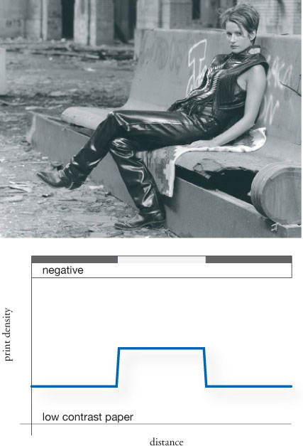
fig.6 A normal negative printed onto low-contrast paper creates a modest density difference between shadows and highlights. Print shadows are weak and midtone contrast is low. The image appears to lack sharpness.
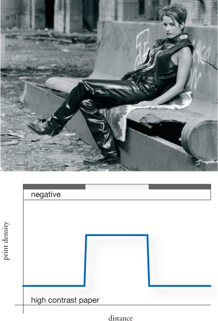
fig.7 A normal negative printed onto high-contrast paper creates an increased density difference between shadows and highlights. Deep shadows and high midtone contrast make for a sharper image.
The second phenomenon is explained in fig.8 and is referred to as acutance, edge contrast or simply as the ‘edge effect’. You see the negative and the mask sandwiched together. Looking at the sandwich density and reading from left to right, there is a relatively high density up to point 1, responsible for a relative low density in the print. At point 1 this changes, because the fuzzy edge in the mask causes the sandwich density to increase up to point 2, while the print density is lower than the adjacent highlights. Of course, at point 2 things change again, because the sharp negative edge is now switching to the shadow area and the print density increases sharply. However, the fuzzy mask does not reach its highest density until point 3 where the print density finally settles. The reverse effect can be observed from point 4 to point 6, at which the print reaches the final highlight density again.
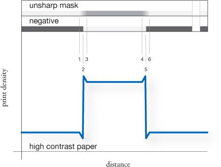
fig.8 A higher contrast paper is required when a negative is printed together with an unsharp mask. This alone increases apparent image sharpness. Additionally, the ‘fuzzy’ edges of the unsharp mask increase the density differences at all image contours, which raises acutance and creates an ‘edge effect’, increasing image sharpness even further.

fig.9 A typical negative has a high density range and requires a paper grade-2 to print well. A mask can reduce the shadow density while not affecting the highlight density. The resulting sandwich prints well on a higher paper grade while raising local contrast and sharpness.
In summary, when using an unsharp mask, a higher paper grade is required, due to the contrast reducing effect of the mask, which creates an ‘edge effect’ at the boundaries of highlights and shadows. Both phenomena work together to increase the apparent sharpness of the print.
Planning a Mask
This section of the chapter is aimed to guide you in the successful planning of the exposure and development of the masking film. I made a special effort to consider photographers who are fortunate enough to own a densitometer, as well as the more traditional darkroom enthusiast, who is more familiar with paper grades. In both cases, we will determine the original negative characteristics, and then design a mask to change it to a desired sandwich characteristic. Fig.9 and fig.10 will work in combination with each other to help with the understanding of the process, the evaluation of the negative and the design of the mask.

fig.10 Negative density range and paper grades have a defined relationship. A target paper grade for the sandwich will determine the required mask density range.
We will begin with the evaluation of the overall density range of the negative to be printed. If you have a densitometer, take a density reading of the important highlights and shadows and calculate the difference. Fig.10 suggests a negative density range, if you know the paper grade at which the negative printed well. For example, let’s assume that you determined a negative density range of 1.05, which is equivalent to a paper grade-2, as shown in the table. Now, estimate how much the local contrast needs to be raised. This depends on the image itself, your intent for the image and your personal taste, but raising the paper contrast by two grades is common. To continue our example, you want to raise paper contrast from grade 2 to 4, which requires a mask density range of 0.35 as shown in the table.
The graphs in fig.11 will help you with the exposure and the development of the masking film. The development times are starting points, which were tested with my Jobo processor and constant agitation in my darkroom. We will use the previously determined negative and mask density ranges to find the appropriate development time. The negative density range is on the vertical axis and the mask density ranges are plotted as individual curves from 0.3-0.7 in 0.1 intervals. In our example, assuming Kodak’s TMax-400 for a moment, picture a horizontal line at 1.05 negative density. Then, interpolate a curve between 0.3 and 0.4 to represent a desired mask density of 0.35, and estimate the intersection with that horizontal line. This gives a development time of about 7.5 minutes. The exposure index changes with the development time and the table to the right recommends an EI of 160 for a 7.5-minute development time.
The exposure times for both films are assumed to be 1/4 of a second given an illumination of EV of -3.0 on the baseboard. I have used a Durst color head with a halogen light source, no filtration, and again your conditions may vary, but it should be a good starting point. The other assumption is a negative highlight density of 1.37, my standard density for Zone VIII·5, and the exposure must be changed to reflect the highlight density of the target negative. This is easy, using a densitometer, since a density of 0.3 is equivalent to 1 stop of exposure. Bracketing the exposure is advisable without the use of such a tool.
As you may have noticed, I have chosen to use rather short exposure times, below 1 second, to stay within the reciprocity window of the film. Therefore, I mount one of my large format taking lenses to my enlarger. This assembly allows me to use the shutter to get any of the typical exposure times between 1/500 and 1 second. Typical enlarger timers do not allow precise timing in this range, and I suggest using longer times of several seconds if you cannot utilize a large-format taking-lens. Modify the illumination by changing the aperture of your enlarging lens, and perform your own tests to get the right exposure and contrast of the mask. Be aware that the reciprocity failure of conventional films may generate an increase in contrast if the film is exposed longer than 1 second. Modern films, like TMax, Delta and FP4 are less sensitive to this effect.
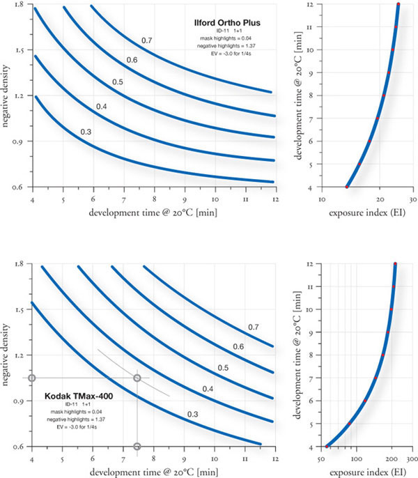
fig.11 Planning a mask is easier with starting point values for development time and exposure index for two films. The input variables are negative and mask density ranges.
Masking for Complete Control
More masks, more opportunities for control

Land of Standing Rocks, 1988 - Canyonlands National Park, Utah
Along the remote region of Utah’s Canyonlands National Park known as the Maze District, I noticed an interesting sweeping cloud formation moving toward the east. Recognizing a potential photograph, I quickly stopped my vehicle and set up my 4x5 camera. The cloud moved into perfect position in relation to the coarsely textured standing rocks, and I made two exposures on Kodak’s Tri-X film using a deep yellow filter to darken the sky a bit and cut through some of the distant haze. After shooting the second exposure, I noticed that a jet trail had encroached into the image area. My only good negative came from the first exposure (without the jet trail), and I call it ‘Land of Standing Rocks’. It is a very difficult image to print, and the main challenge was achieving a sense of luminosity and desert light, while simultaneously avoiding excessive contrast. Aesthetically, this image symbolizes to me the vast and open wilderness of the American West, but it is also a good example of masking for complete control.
Masking
The unsharp mask, in its various forms and names, has been around for quite some time, during which its primary use has been in the production of color prints from transparencies or negatives. This process often required the need for reduced contrast. A contrast reduction mask, a variation of the unsharp mask, helps to reduce the overall contrast of the transparency, allowing the full tonal range to print on the relatively high-contrast medium.
In B&W work, there are many other problems that we face when attempting to achieve a fine print. Many of these problems cannot be solved by meticulous exposure, processing and/or printing alone. Fortunately, there are many opportunities for creative control when it comes to masking. Masks can be made to increase highlight contrast or brilliance, or to increase local contrast within the shadow values. Masks can also be fashioned to act as accurate flashing tools, useful for smoothing out excessively bright, distracting areas of the image. Similar masks can be used for accurately burning down the sky areas without affecting adjacent values. Masks can also be made to selectively lighten certain elements of the image, better separating those elements from surrounding values. This highlights important image elements and creates enough impact to draw the observer into the picture.
Pin Registration
Although the unsharp mask and the contrast reduction mask can be registered with the original negative by eye, some masks, particularly the Shadow Contrast Mask, require the use of an accurate pin-registration system for accurate creation and usage. Such a system can be made by the photographer, using metal registration pins and a two-hole punch of the same diameter as the registration pins. My Contrast Masking Kit contains full instructions on making such a system for your own darkroom. Essentially, the method is to produce a glass carrier for the negative, with a set of metal registration pins taped or fastened permanently to it. This carrier must also be placed in the enlarger at precisely the same position every time, which again requires the carrier to be registered in some way to the negative stage in the enlarger. This can be done with another set of registration pins fastened to the enlarger negative stage. The objective is that each time an original negative or a mask is placed in the enlarger, it is placed in exactly the same position, in order to avoid misalignment when multiple exposures are made on one sheet of photographic paper. Once a good pin-registration system is made, it becomes a simple and efficient task to prepare and print with a number of different masks.
The Shadow Contrast Mask (SCIM)
One of the most useful masks in my work, and I believe one of the most powerful masks in general, is the Shadow Contrast Mask. Not a true mask in the technical sense, this mask is actually a separation negative. It was primarily designed and proposed by photographers Dennis McNutt and Marc Jilg, and its full name is Shadow Contrast Increase Mask or SCIM. It is primarily used to enhance the contrast within shadow or midtone values, while leaving highlight values completely unaffected. The degree of effect this mask has in printing is absolutely remarkable, as you can see in comparing fig.4 and fig.6, taken at Zabriskie Point.
It should be noted that the effect of this mask, either dramatic or subtle, could not be duplicated by altering one’s exposure or printing routine. Furthermore, the use of this mask allows the photographer to take advantage of the maximum tonal range of the paper. The use of the Shadow Contrast Mask literally increases the depth of the black accents in the image, often to the point where the accents achieve maximum black and serve as a visual key. The result is an amazing increase of life and vitality in the broad shadow values, which contribute to the overall tactile quality of the print.

fig.1 Making the interpositive for the SCIM. Litho film is placed emulsion up in a pin-registered glass carrier, with the original negative, also pin-registered, placed emulsion down so that the emulsions are touching. The glass carrier is closed and the ensemble given an exposure with a controlled light source. The resulting interpositive should look like a fairly thin black and white transparency.

fig.2 Making the SCIM. Litho film is placed emulsion side up in a pin-registered glass carrier, and the interpositive is placed on top, emulsion to emulsion. The glass carrier is closed and the ensemble given an exposure with a controlled light source. A good SCIM should look like an extremely high contrast negative, with fairly clear shadow accents and completely opaque midtones and highlights.

fig.3 Printing with the SCIM. Using a pin-registered glass carrier, the original negative (along with any unsharp mask or highlight mask sandwiched with it, if desired) is given an initial exposure with any appropriate dodging and burning done during this step. After the exposure, the contents of the glass carrier are replaced with the SCIM and a second exposure is given to the paper. The effect is a deepening of the darkest values resulting in more vitality in the shadows.
Without the use of the Shadow Contrast Mask, a standard print often exhibits relatively flat, somewhat empty shadows. This is particularly true in high-contrast scenes containing a rather high subject brightness range, where the negative was exposed and processed to compress the range in an attempt to control all the values and increase the ease of printing. Merely resorting to a higher contrast paper grade and exposing the print a bit lighter, in an attempt to keep the shadows from going excessively dark, may help the local contrast in the shadows, but the highlights may burn out and the midtones may become too light.
The Shadow Contrast Mask is extremely effective when used in combination with an unsharp mask or contrast reduction mask. These serve to reduce the overall contrast of the image as a whole, particularly by raising the shadow values somewhat. This assumes that the photographer does not want to select a higher paper grade when using the unsharp mask, as doing so may increase the highlight contrast too much. Without the Shadow Contrast Mask exposure, the print may exhibit fine, open shadows with plenty of obvious detail, but the shadows may look dismally flat and gray, lacking local contrast. However, if the paper is given a follow-up exposure using the mask, open shadows will be brought to life by deepening the fine dark accents to black or near-black depending on your intent. The results can be striking.
Making the Shadow Contrast Mask
Typically, the Shadow Contrast Mask is made in a two-step process, using ordinary litho film and any standard print developer. A one-step method using Kodak LPD4 positive litho film is also possible, but it affords a little less creative control. Using the pin-registration glass carrier placed on the enlarger baseboard in a central area of the light circle, a punched sheet of unexposed litho film is placed on the pins of the carrier emulsion-side up. The original negative, with a punched strip of leader film taped to it, is placed on the litho film emulsion-side down so that the two sheets of film are emulsion to emulsion. The top glass is closed on the ensemble and an exposure is made with the enlarger or any other controllable light source. The litho film is developed in a fairly dilute solution of print or film developer at a standard temperature. The resulting interpositive is examined after fixing and judged for the proper exposure and contrast. A good interpositive should look like a thin B&W transparency, with plenty of detail showing in the shadow areas. The shadow areas must not be too dark and are ideally on, or around, the middle of the characteristic curve. The final, properly exposed and developed interpositive is washed and dried normally.

fig.4 Moon Over Zabriskie Point, 1980 - Death Valley National Park, California. Shortly after sunrise, I photographed Zabriskie Point as the moon began to lower in the western sky. Within a minute after this exposure, clouds began to cover the moon. I like the look of the lunar-like landscape set against the setting moon. The negative contains excellent detail throughout, and the original print shows surface details in the moon. My first attempts at printing this back in 1980 were futile. A decade later, I reexamined the potential expressions of this image and successfully achieved my desired print in fig.6.

fig.5 SCIM used in making the final print. Note how the deep shadow values and black accents will print through affecting the foreground mud hills.

fig.6 Final print using a SCIM to enhance the local contrast within the dark values of the foreground mud hills. Unlike the results that would occur with a paper grade change, the midtones were unaffected. I applied a highlight brightening bleach to lighten and increase the contrast of the background mountain range.
Next, place a punched sheet of litho film in the pin-registration glass carrier emulsion-side up as before. This time, the interpositive is placed emulsion-side down on the litho film in the carrier, again so that the films are emulsion to emulsion, and the carrier top glass is closed on the ensemble to hold the film in tight contact.
As before, the ensemble is given an exposure with the enlarger light, and the litho film is developed in a stronger solution of paper or film developer. This developed litho is the Shadow Contrast Mask, and looks pure black everywhere except in the deepest shadow accents, which are nearly clear. It takes a little experience to develop an eye for a proper Shadow Contrast Mask, but once you see how it affects the final image, a good mask will spring out at you.
Printing with the Shadow Contrast Mask
When printing with the Shadow Contrast Mask, the paper is given the first exposure as usual with the original negative, perhaps sandwiched with another special mask. Without touching the paper in any way, the carrier is removed from the enlarger, the negative is replaced with the Shadow Contrast Mask, and the carrier is returned to the enlarger. The paper is given a second exposure with the mask, which serves to deepen the darkest accents within the shadows. You must test, as usual, to determine the desired exposure.
The Shadow Contrast Mask can overcome practically any flattening problem that results from low-contrast paper, the use of contrast reduction masks, soft developers, etc., and can be one of the most valuable creative tools in the darkroom worker’s arsenal. Once the carrier is made and some initial tests are done, the ease and speed with which one can make and use the Shadow Contrast Mask makes this a very useful tool for improving print quality.
The Highlight Mask
It can be somewhat frustrating when we examine the finished dried print after a long day’s session in the darkroom. The wet print had far more luminosity, and the highlights were bright and crisp. When dry, however, the highlights tend to lose brilliance to the surrounding areas, giving the entire image a somewhat dismal gray look. Localized highlight bleaching, commonly done with Farmer’s Reducer or with my print bleach formula, detailed in my Contrast Masking Kit, is certainly an option during the printing session. However, it can be a time-consuming process, as it must be hand-applied to each print individually. An effective alternative, particularly useful if multiple prints must be made and consistency is important, is the Highlight Mask.
Essentially, the Highlight Mask is custom tailored to the original negative, to produce just the right amount of highlight contrast enhancement, subtle or dramatic, in certain areas. Compare fig.7 and fig.9 taken in Marble Canyon. Once the Highlight Mask is made, it can be used repeatedly to produce consistent results, regardless of print size. Furthermore, the Highlight Mask can be adjusted in density and contrast for finer creative control over the resulting print highlights, and areas of the Highlight Mask can be bleached clear (on the mask itself) so it affects only the desired areas of the image.
Making the Highlight Mask
As in the making of a Shadow Contrast Mask, either a two-step procedure, using standard litho film, or a one-step procedure, using LPD4 film, can be followed. This chapter will discuss only the two-step procedure, since as of this writing (2002), standard litho film is much easier to find than positive litho film. Additionally, the two-step procedure allows for greater creative control.
With a pin-registered glass carrier placed on the enlarger baseboard, a punched sheet of litho film is placed emulsion up in the carrier. On top of that, the original negative with a punched leader taped to it is placed emulsion-side down on top of the litho film so the emulsions are touching. The glass carrier is closed to assure the films will be in contact with one another. The film is given an exposure with the enlarger light, removed from the carrier and developed in a fairly dilute solution of print or film developer. After fixing, this interpositive is evaluated to determine the proper exposure. A good interpositive for a Highlight Mask looks like a rather dark and somewhat low-contrast B&W transparency when viewed with transmitted light. In particular, the highlights of the image should show plenty of detail and should not appear burned-out or clear. Flexibility and creative control can be exercised here by adjusting the exposure and contrast of this interpositive.

fig.7 Marble Canyon Petroglyphs, 1987 - Death Valley National Park, California. A short hike at the end of a rough road in a remote canyon in Death Valley leads to this interesting set of Indian petroglyphs. Located high up on a rock shelf, my assistant affixed a rope to my backpack containing my 4x5 camera, which I carefully pulled up to the appropriate camera position. The striated rock wall looming above the petroglyphs formed a sort of visual curtain opening above the rock drawings, forming a sort of stage setting. I shot one negative with an orange filter, which revealed the primary shapes more intensely. In an effort to separate the essential forms, I could have used a higher paper grade, but doing so would increase the differences in the dark rock values to a disturbing degree.

fig.8 Highlight mask used in printing the final image, and viewed against a white paper background.

fig.9 Final print made with a highlight mask sandwiched with the original negative. Note the contrast and brightness increase seen only in the areas affected by the mask.
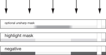
fig.10 Orientation of highlight mask sandwiched with original negative in a pin-registered glass carrier when printing. Any other masks, such as unsharp mask, that the photographer uses should be placed on the top position in the ensemble.
This dried interpositive is used to make the final Highlight Mask. An unexposed sheet of litho film is placed in the pin-registered glass carrier emulsion-side up, and the interpositive is placed on top of it emulsion-side down, again, so that the emulsions are in contact with each other. The glass carrier is closed and the ensemble given an exposure with the enlarger light.
The newly exposed Highlight Mask is then developed in approximately the same dilution of print or film developer, fixed and washed. When evaluating the Highlight Mask, the highlight areas of the image should show only slight density, while all other values are absolutely clear. Remember, this is a severely underexposed negative image, but it resembles the original negative. It shows absolutely no detail, other than in the brightest highlights, where we wish to brighten the resulting print.
Printing with the Highlight Mask
This printing mask is used in the same way as an unsharp mask. The original negative is placed in the pin-registration carrier emulsion-side down, and the Highlight Mask is placed on top of it emulsion-side down as well. The carrier is closed so that the two films make good contact and the ensemble is used to print. When using the Highlight Mask, it becomes obvious very quickly that even a very thin and low-contrast mask can have a very dramatic effect on the highlights of the image. If an unsharp mask is used in conjunction with a Highlight Mask, the Highlight Mask is placed closest to the original negative, with the unsharp mask on the very top of the ensemble.
I began using Highlight Masks in my B&W work, in one form or another, back in the late 1970s. One tactic I often employed was to design the Highlight Mask so that its primary effect increased contrast in the midtones of the image. This usually required blocking out certain areas of the interpositive with a black felt pen so that those areas, usually bright highlights, which I did not want affected by the Highlight Mask would not yield any density on the final mask. In this way, I was able to design Highlight Masks to selectively raise the brightness and contrast of certain midtones and occasionally even large, open shadow areas.
The Fog Mask
The majority of my prints are improved by darkening unwanted bright areas of the image, such as specular reflections on leaves in a forest scene or distracting bright rocks or branches. Photographers often employ various techniques designed to darken or soften harsh, disturbing highlights that distract from the essential elements of the image. These methods are sometimes called flashing or fogging the print and are discussed in detail in the ‘Print Flashing’ chapter. The print is given a non-image forming local or overall pre-exposure to sensitize the emulsion so that the slightest additional exposure is recorded on the paper. This technique reveals subtle values in highlights, which might otherwise become textureless, burned-out whites. Flashing techniques can also be used to subdue other distracting areas, and when combined with burning, allow the photographer greater creative control over the final image.
One problem with flashing the print in localized areas is that it is difficult to know precisely where to flash, as the image cannot be seen when using non-image forming light. Placing a deep red filter under the lens to prevent exposure allows you to see the image while using a special penlight to flash the print, but it is a somewhat inaccurate technique, and it is impossible to flash specific areas precisely without affecting adjacent areas.

fig.11 Storm Over Chesler Park, 1977 - Canyonlands National Park, Utah. Observing a threatening thunderstorm in remote Chesler Park, I waited nearly two hours for the light to change until it agreed with my intended image. This print was made from a sandwich of the original negative with an unsharp mask using standard dodging and burning techniques, followed by a SCIM exposure to enhance the local contrast within the deep shadows. The bright sky did not give the mood that I intended for this image, and standard burning techniques were unsuccessful.

fig.12 Fog Mask used in printing the final image. This is also the interpositive used to prepare the final SCIM for this image. Note that the sky is nearly clear.

fig.13 Final print using the same procedures in fig.11 but also applying a Fog Mask exposure rather severely in the sky area and along the edges and bottom corners. The effect is a darkening and smoothing of the values, particularly the sky, without affecting adjacent values to a large degree. Unevenness and grain in the sky were also reduced to a great extent. I think the print successfully reveals the brooding gray mood of the scene.

fig.14 Multiple exposures are made when printing with a fog mask. The first exposure is made with the original negative and any optional masks. After the initial exposure, the negative is replaced with a sheet of textureless diffusion material and the fog mask, and a second exposure is made with this ensemble wherever a fogging effect is desired.
The following technique, using a Fog Mask, allows me to actually see the projected image on the paper, in positive form, so that I can burn or fog the highlights more accurately, using my standard burning tools, without affecting adjacent areas. I use a positive mask with a sheet of Kodak’s Duratrans diffusion under the mask, sandwiched together in the pin-registration carrier, because it creates a soft, positive image projection on the paper. This allows me to burn through the clear highlight areas with non-image forming light, while adjacent darker areas are somewhat protected from excessive darkening or fogging.
Making and Printing with the Fog Mask
Ideally, the mask used for this process has clear or nearly clear highlights, resembling an overexposed or light B&W transparency. It is a positive image on film. The interpositive that is created in the two-step Shadow Contrast Mask process is usually ideally suited for use as a Fog Mask.
Although a Fog Mask and a Shadow Contrast Mask interpositive may be one and the same, their difference lies in the printing process. After the paper is initially exposed, the original negative and any masks sandwiched with it are removed from the pin-registration carrier and replaced with a sheet of punched Duratrans or other thin textureless diffusion material on the bottom and the Fog Mask on top. The glass carrier is closed and returned to the enlarger. A burning card is held under the lens, and the enlarger light is turned on. Any desired areas can now be burned down. Keep in mind that the highlights will darken very quickly, since the clear highlight areas of the mask are doing most of the burning. The diffusion material, such as Duratrans, diffuses the edges of the Fog Mask and reduces the possibility of unwanted edge effects, which might otherwise occur on the print. I often use a softer grade filter when burning with the Fog Mask, in order to produce the smoothest fogging without any adverse line effects. A harder grade can be used to further decrease local highlight detail.
Another Use for the Fog Mask
When I burn the edges of a print down, I attempt to create a gradual darkening toward the edges in addition to a slight reduction in local contrast. Usually, this is accomplished by burning down the edges with a softer grade. Sometimes, however, a softer grade alone is not sufficiently effective, particularly when distracting bright areas are near the edges of the print, such as in a forest scene with skylight showing through the trees. A Fog Mask is used to darken these disturbing bright areas successfully. I often burn the edges of the image first with the original negative in the enlarger. Then, I give an additional edge-burn, using a low-contrast filter and a Fog Mask/Duratrans sandwich. This effectively diminishes unwanted, distracting highlights, when done judiciously. In addition, this type of print looks comparatively richer or brighter towards the central area, due to the surrounding lower contrast and darker values.
I use a Fog Mask in the majority of my prints, particularly because it allows me to darken distracting highlights or bright areas with accurate control. It is quick and easy to make and is very forgiving of deviations in exposure and development. It is difficult to make a bad Fog Mask, because most imperfections in the mask have no adverse effects on the final print.
The Dodge Mask
Another mask I find useful is what I call the Dodge Mask. Often, an image has many areas, varying in size and shape that I would like to lighten, and standard dodging tools and techniques do not suffice. An old remedy for this problem is what photographers call the jiggle-device.
The jiggle-device is essentially a sheet of clear glass, painted in areas needing to be dodged with red or black opaque paint. The glass is placed in a frame with bendable legs, which sits a few inches above the photographic paper. The paper is exposed in two parts. It is first exposed with the image projected through the glass, which is aligned so that the opaque areas correspond with the same areas of the negative projecting through it. During the exposure, the glass is gently jiggled, in order to soften the edges of the dodged areas. The glass is then removed and the remaining exposure is made. The process works well, but is cumbersome and does not yield repeatable results.
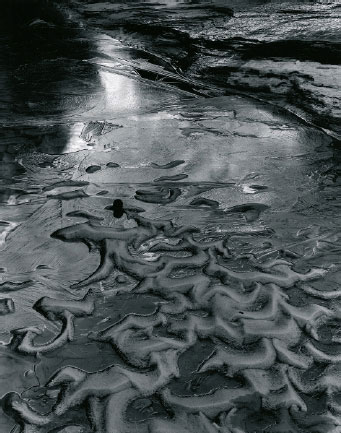
fig.15 Sand and Ice, 1986 - Zion National Park, Utah. In a remote canyon, my assistant and I came across this patch of sand mounds, still frozen from the previous brisk evening, protruding from an icy pond. This print was made using standard dodging and burning techniques. Increasing the contrast of the print with a higher-grade paper helped to separate the highlight detail to some degree, but it also caused certain details to conflict with the sand ripples. Early prints were made using a jiggling dodging device, which lightened the ripples of sand, but consistency and ease of use were always an issue. An alternative, which enables consistent results, was to use a Dodge Mask.

fig.16 The actual Dodge Mask was made by drawing with a marking pen on a pin-registered overlay of clear film placed on top of the original negative.

fig.17 Final print made with the use of a Dodge Mask. Note that the mask lightened the sand ripples, without increasing the local contrast in the ripples. This provided precisely the effect I wanted and visualized. In a sense, this method is akin to complex dodging which would otherwise be exceedingly difficult, if not impossible.

fig.18 Printing with a Dodge Mask. A pin-registered glass carrier must be used for this technique. The first exposure on the paper is made using a sandwich of the original negative on the bottom, a sheet of textureless diffusion film on top of that and the dodge mask on top of the entire assembly. A portion of the printing exposure is given to the paper, then the mask and diffusion film is removed, and the remaining exposure is given to the paper with only the original negative in place.
A more accurate and repeatable method is to use a Dodge Mask. This technique is similar to what is termed dye-dodging in that the photographer paints on a clear sheet of film, which is then placed in register with the underlying negative. This technique is best suited for 4x5 or larger negatives.
Making the Dodge Mask
To make a Dodge Mask, the original negative is placed emulsion-side down on either a light table or an open registration carrier and held in registration pins. A sheet of clear unexposed film (litho film works well) is punched and placed on top of the original negative using the same registration pins. Kodak’s Red Opaque or a black marking pen are used to draw on the clear film itself, filling-in the areas to be dodged, and being careful not to extend beyond the edges of the underlying subjects. When dry, the mask is ready for use.
Printing with the Dodge Mask
Printing with this mask requires a two-step exposure. For the first exposure, place the original negative in the glass carrier, next to a sheet of Duratrans or other thin textureless diffusion material, then the Dodge Mask painted side up on the top of the assembly. Close the glass carrier and place the three-part ensemble in the enlarger. The first exposure holds back all the light in the opaque areas. After the first exposure, remove the carrier from the enlarger and remove the Dodge Mask and Duratrans from the carrier. Replace the carrier, which now contains only the original negative, back in the enlarger and continue the printing exposure. Obviously, several tests are needed to find the appropriate balance of the two exposures.
A Printing Variation of the Dodge Mask
An interesting variation to consider when printing is to use a Dodge Mask as a Fog Mask. The Dodge Mask is used to pre-expose the print prior to the base exposure. When printing, the initial paper exposure is made with a sandwich consisting of a sheet of Duratrans on bottom and the Dodge Mask on top in the registration carrier. The original negative is not used during this first exposure. A very slight exposure is given to the paper through this Dodge Mask and Duratrans sandwich. In essence, the paper is flashed with non-image forming light. However, the opaque areas of the Dodge Mask dodge the light from this flash exposure.
After this initial exposure with this sandwich, the carrier is taken out of the enlarger and the contents replaced with the original negative only (or original negative with any desired mask). The base exposure is then made as usual. The resulting areas protected from the flash exposure will appear bright, and other areas affected by the pre-exposure are subdued in brightness. This is an effective way to comparatively brighten certain elements, such as bushes, while darkening competing highlights.
This flashing method has some benefits over print mask flashing techniques, which requires making a mask by hand to fit the final print size. Therefore, if the photographer wants to change the print size of a particular image, he or she must remake the mask to match the intended print dimensions. Using the Dodge Mask, however, the mask is placed in the negative plane and not the print plane, thereby allowing the photographer limitless print-size capability without the necessity of making or hand-registering new masks to suit the final print size.
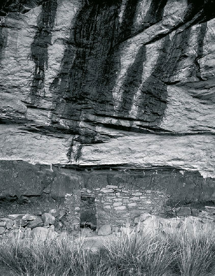
fig.19 Horse Collar Ruin, Natural Bridges National Monument, Utah. Unfortunately, the Indian ruin has little local contrast and merges into the background rock values.

fig.20 To create an inkjet dodge mask the Indian ruin is printed in magenta onto clear film. Sandwiched with the negative, the mask will brighten and increase the contrast within the ruin and separate it from the merging background rock values.

fig.21 The inkjet dodge mask brightened and separated midtones and highlights selectively for the Indian ruin and nearby boulders. The effect is similar to using a highlight mask, but in this case, the inkjet dodge mask was much easier to implement. The merging values between Indian ruin and background rock would be difficult to define and isolate in a highlight mask.
The Inkjet Dodge Mask
A computer can be used to make a more accurate form of dodge mask. Similar to dye dodging, and similar to handmade pencil or opaque masks, the use of the computer allows the photographer to create a remarkably accurate and detailed dodge mask, complete with the advantages of using different colors to achieve different local contrast effects.
A scanner is needed to create a digital file of the negative that needs masking. I standardize on a scanning resolution of 300 dpi and scan my negatives at 100% size using the color mode. With an image manipulation program, such as Adobe Photoshop, the areas that you wish to dodge must be selected and isolated from the rest of the image. Once a detailed selection of the specific areas is achieved, the next step is to fill the selection with 100% density using a color of your choice, depending on what kind of local contrast effect you are after.
To keep things simple, there are three basic color choices: yellow (to reduce local contrast), red (to dodge without altering local contrast – similar to using typical dodging methods) or magenta (to increase local contrast). After filling the selection with color, invert the selection and hit the delete key to clear the contents. Deselect, leaving only the local areas of color, which will be used to dodge the corresponding areas of the image (see fig.20).
At this point, the image must be sized to obtain a close to perfect fit when registered with the original negative. Using your inkjet printer, set the driver to use only black ink (to save ink during the sizing calibration process) and make a print of your file on plain paper. On a light table, place the printed paper image over your original negative and check to see if it matches in size. If it doesn’t, continue testing by changing the image size parameters until you obtain a digital image that is the same size as your original negative. This may require a bit of experimenting and several tries.
The final step is to make your inkjet dodge mask on a transparent inkjet material, such as Pictorico’s OHP inkjet film, using your printer’s color mode. Some tweaking of the mask densities can easily be done by altering the colors in specific areas, by dodging or erasing areas, or by feathering or blurring edges anywhere in the mask image.
Once you achieve a good dodge mask, you should ideally pin-register it by eye with the original negative. Once registered, it can be stored separately from the original negative and re-used at any time in the future without the need to re-register it. A glass carrier is recommended when printing the negative-dodge mask sandwich, and a sheet of thin, textureless diffusion material, such as Kodak Duratrans, must be used in between the mask and the original negative when printing in order to diffuse the otherwise detectable ink dots of the mask.
In this chapter, I have shown you some basic masking techniques, and I am sure you will find ways of combining and modifying these masks to get the most from your negatives. Additional and more detailed information can be found in my Contrast Masking Kit and on my website.
Lynn Radeka’s professional photography career spans nearly forty years. He has traveled and photographed the American landscape extensively since the late 1960s, making the nation’s West and Southwest his forte. His B&W photography is currently featured in eight National Park posters and is represented by several galleries throughout the United States and Europe. Lynn Radeka teaches several workshops throughout the year, and his photographic work is showcased in his books: Ghost Towns of the Old West, Historic Towns of America, Forts and Battlefields of the Old West, Legendary Towns of the Old West and Great American Hotels. He is also the inventor and sole source of several photographic tools, including the Contrast Masking Kit and the Precision Pin-Registration Carrier System.
Digital Negatives for Contact Printing
Analog and digital combined to hybrid halftone printing
For the most part, I favor the distinctive attributes of analog photography and, hence, prefer to work in the darkroom. But, there are some advantages to digital imaging that cannot be ignored by even the most diehard of film enthusiasts. The option and flexibility to take a digital image and easily make the necessary tonal corrections, or dramatically manipulate its composition and contents, does either not exist or is only difficult to achieve in a purely analog environment. Still, some photographers just do not want to give up on the unique qualities of an analog, fiber-base print. The reasons are mostly subjective in nature, because a well-made fiber-base print is clearly in a class of its own and truly ‘beautiful’. But sometimes, the reasons to opt for a fiber-base print may be based on a specific customer request, or they simply serve as a trademark to be clearly distinguished from competing photographers. Nevertheless, there is no longer a compelling reason to make an either-or decision between analog photography and digital imaging, based on the desire to have a fiber-base print as the final output, because analog and digital techniques are easily combined. Through use of hybrid halftone printing, time-proven materials and digital image manipulation are successfully incorporated, and the final product is a fiber-base print, which is impossible to distinguish from its analog counterpart.

Process Overview
Hybrid halftone printing starts with digital image data, which is first transformed into a ‘digital negative’ by using image manipulation software and then printed onto clear film. The digital negative is contact printed onto photographic paper and chemically processed in a conventional darkroom.
The origin of the digital image data is of no consequence to the process. The image data might come directly from a digital camera, or indirectly from a scanned analog negative or print. However, with the aim of contact printing, the digital negative must be of the same dimensions as the final print. In order to prepare the image data and turn it into a digital negative, image manipulation software, such as Photoshop, is used to adjust, customize and invert the image. The actual digital negative is then produced by a professional service bureau, which will use a high-resolution imagesetter to expose the image data onto clear photographic film. These machines are still used for analog printing processes, and a good offset printer in your area will help you find a local source. A digital negative differs from an analog negative only through the fact that not all image tones are continuous but are simulated through a sophisticated and imperceptible halftone pattern (see fig.10). The hybrid halftone printing process is completed in the darkroom, where the digital negative is contact printed onto light-sensitive photographic paper, after which, all remaining process steps are identical to conventional, analog photographic processing.
The cost of a digital negative depends on its size and is approximately $10-15 for an 8.5x11-inch (DIN A4) or $15-25 for a 12x16-inch (DIN A3) print. These are average prices for ‘films’, as they are referred to in offset printing, but unfortunately, some service bureaus charge much more, as soon as they discover the photographic intent. In that case, just make sure to simply ask for a film and not a digital negative. Store your digital negatives in traditional large-format sleeves, in a cool and dry place, alongside your other analog negatives.

fig.1 Before a digital negative can be produced, the image has to be prepared for it through several process steps.
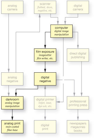
The imaging path of the digital-negative process bridges the gap between digital manipulation and analog processing.
Digital Image Preparation in Detail
After opening the data file in Photoshop, the image is first improved for its pictorial impact. This includes giving emphasis to essential image content, all burn-in exposures and retouching of image flaws. In other words, in hybrid halftone printing, typical photographic improvements are transferred from the darkroom to the software and carried out only once for each negative, and not again and again for each print. Afterwards, the image is prepared for output to an imagesetter. Since the required process steps are the same for every negative, it is straightforward to list and explain them by means of an example (fig.1).
Digital Image Preparation in Brief
1. Adjust Tonal Values
2. Set Image Resolution Set Image Size
3. Correct Image Sharpness
4. Fix Canvas Size
5. Add Process Controls
6. Apply Transfer Function
7. Invert Image and Save Data
1. Adjust the Tonal Values
Digital negatives are always monochrome, which is why the image data is immediately converted into this mode (Image > Mode > Grayscale). This reduces the amount of data to a minimum without losing any image detail. On the other hand, special care needs to be taken that subtle highlights and shadows do not become too light or too dark, respectively. There is a risk that extreme tonal values are otherwise lost in the image transfer process from digital image, through digital negative to fiber-base print. To prevent this from happening, the image data is adjusted up to a point where the brightest highlights are not brighter than 4% and the darkest shadows are not darker than 96% (Image > Adjustments > Curves…). At this point, all tonal manipulations are completed, and if the image is still in 16-bit mode, it can be safely reduced to 8 bit now, since this is sufficient to represent up to 256 different shades of gray (Image > Mode > 8 bits/channel).
2. Set Image Resolution and Size
To produce quality halftone negatives, digital images of relatively high resolution are required. Consequently, I recommend an image resolution of 450 ppi. Since the final negative size is known, in this example DIN A3, we can specify the image resolution and size together in one operation (Image > Image Size…). To have the benefit of a border around the image, make sure that the image dimensions are about 40-60 mm smaller than the DIN-A3 canvas (297 × 420 mm) itself, and resample the image data, using the bicubic option in Photoshop, which will minimize the side effects of extrapolating image data (fig.2a).
3. Correct Image Sharpness
After the image is set to the final dimensions, it may be necessary to correct the overall image sharpness. Photoshop’s unsharp filter is an excellent tool to do so (Filter > Sharpen > Unsharp Mask…). Acceptable image sharpness depends heavily on personal preference, but with this powerful filter, it is easily overdone. To maintain a realistic-looking image, the settings in fig.2b are recommended as a starting point for digital negatives.
4. Fix the Canvas Size
We need to expand the canvas now in order to match the DIN-A3 format (Image > Canvas Size…). This is done symmetrically on the horizontal axis, but in the vertical direction, it is to our advantage if we leave a wider border below the image than above it. This provides the necessary space to add two process controls in the next step. Nevertheless, final image placement on the canvas is not overly important and also depends on image size (fig.2c). At this point, our new canvas should look very similar to the example in fig.1a.
5. Add Process Controls
This is an optional but highly recommended step when preparing a digital negative. Add two process controls, by opening a reference file and placing it twice, side by side, below the image. This reference file is called ‘ProcessCheck.tif’ and is available from my website at no cost (fig.3). It is designed as a step tablet and is used to easily verify significant process parameters. With the aid of a densitometer, the step tablet on the left is used to confirm correct exposure and development of the film at the service bureau. The step tablet on the right is a useful guide to determine the best exposure and contrast in the darkroom. Depending on image size, it may be necessary to adjust the scale of the step tablet in order to fit it in twice below the image. While doing so, be sure to keep the tablets and image resolution identical. After placing both step tablets, reduce all layers to one (Layer > Flatten Image). Following that, the canvas should look like the example in fig.1b.

fig.2 Subsequent to artistic image manipulations and adjustment of tonal values, it takes three more steps to specify image resolution and size, to correct image sharpness and to define the final digital negative dimensions.
6. Apply the Transfer Function
Most photographic processes are nonlinear, or in other words, the relationship between their input and output is not proportional. As an example, doubling the film exposure does not necessarily double the transmission density of the negative. During hybrid halftone printing, all image tones are transferred from the digital image, through the digital negative to the fiber-base print. Through careful selection of exposure and contrast, it is not difficult to control the highlight and shadow endpoints to prevent a loss of detail at the extremes of tonality. However, all remaining tonal values are forced to follow material characteristics alone and fall predictably somewhere in between the endpoints of tonality. In order to achieve a close match between on-screen image and final print, it is important that the influence of these material characteristics are compensated through the use of a transfer function. Applying such a function is easy, and creating a transfer function only needs to be done once, but it does involve a few additional steps. That is why we added a chapter with detailed instruction to the appendix and called it ‘Make Your Own Transfer Function’.
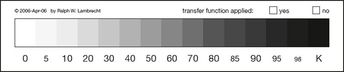
fig.3 ‘ProcessCheck.tif’ is an optional process control to monitor exposure and development at the service bureau and in the darkroom.
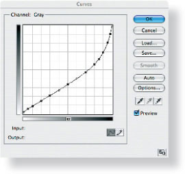
fig.4 Nonlinear photographic processes are controlled through a compensating transfer function.
The transfer function is not applied to the entire canvas. The step tablet on the left serves only to verify the service bureau’s film quality, and must, therefore, be excluded from the transfer function. This is done by first selecting the left step tablet, and immediately inverting this selection again (Select > Inverse). As a result, everything but the left step tablet is now selected. The appropriate transfer function is activated through the curve menu (Image > Adjustments > Curves… > Load…). For this example, I have chosen a transfer function that was specifically developed for Ilford’s Multigrade IV FB (see fig.4 and text box on the left). Once the transfer function has been applied, the entire selection is turned off (Select > Deselect). At this point, our canvas should look similar to fig.1c, which in many cases may not look right at first sight. But, that is no reason for concern, because it just illustrates how much image tonality needs to be skewed in order to compensate for the subsequent nonlinear reproduction of tonal values.
Transfer Function Example
(monitor g = 2.2 > imagesetter > MGIV-FB)
Input |
target |
Output |
|
density |
at |
0 % |
0.05 |
2 % |
5 % |
0.11 |
5 % |
10 % |
0.16 |
9 % |
20 % |
0.27 |
15 % |
30 % |
0.38 |
21 % |
40 % |
0.51 |
27 % |
50 % |
0.66 |
33 % |
60 % |
0.83 |
40 % |
70 % |
1.04 |
47 % |
80 % |
1.30 |
56 % |
85 % |
1.45 |
62 % |
90 % |
1.63 |
69 % |
95 % |
1.84 |
81 % |
98 % |
1.99 |
90 % |
100 % |
2.10 |
100 % |
7. Invert the Image and Saving the Data
So far, we have worked exclusively with the image positive, but obviously, contact printing requires a negative. Photoshop makes this conversion as simple as possible (Image > Adjustments > Invert). This concludes the digital image preparation, and the only step left is to select an appropriate data storage format and medium for storing the digital negative.
Many image data formats, including jpg, are good options for storing digital negatives, but I recommend using the lossless Tagged Image File Format (tif). Don’t compress the file, and don’t attach a color profile to it. Professional service bureaus are most accustomed to tif data, and color-management features are often incompatible with their imagesetter software. High-resolution negatives, for DIN-A3 or 11x14-inch print formats, easily require 40-60 MB of memory, which makes a compact disk (CD) an economical and convenient choice for transferring and storing several negative files.
Overview of Work Instructions for the Service Bureau
1. Order a typical ‘film’ as it is used in analog pre-press work for offset printing.
2. Ask for an imagesetter resolution of at least 3,600 dpi.
3. Demand a halftone screen ruling of 225-300 lpi.
4. Request the film to be made emulsion-side up but imaged right-read, which means no image flipping or mirroring.
Digital Negatives from Imagesetters
We leave the exposure and actual production of the physical digital negative to a professional service bureau. They use a raster image processor (RIP) to convert the digital image to a half-tone bitmap and send the data to an ultra-high resolution printing device, called an imagesetter, where a piece of high-contrast film is exposed by a laser. This film is then developed, fixed, washed and dried to produce a digital negative for contact printing.

fig.5 There is no physical difference between analog and digital negatives. Both have a transparent base that is coated with a silver-gelatin emulsion. However, the formation of continuous image tones is very different between the two.
There is little physical difference between analog and digital negatives. Both have a transparent base that is coated with a silver-gelatin emulsion. However, the formation of continuous image tones is very different between the two. In an analog negative, image tones depend on negative density, which in turn is directly related to how many microscopically small silver particles have randomly accumulated in a specific area. This allows for almost perfect continuous image tones. In a digital negative, on the other hand, continuous tones are only simulated through a complex bitmap halftone pattern, which mimics the equally spaced dots of varying sizes, used for conventional halftone printing. This does not allow for a truly continuous-tone image, because only a limited number of gray tones can be created this way, but the increments can be kept so small that tonality boundaries become imperceptible to the human eye.
The resolution of a halftone pattern, also called ‘halftone screen ruling’ or simply ‘halftone screen’, is measured in lines per inch (lpi). Newspapers, which use halftone patterns to simulate photographs, use a rather coarse halftone screen of about 85 lpi, which is easily detectable by the naked eye. High-quality magazines make use of much finer halftone screens of up to 133 lpi, which makes it much harder to detect the pattern. For digital negatives, an extremely fine halftone screen of 225-300 lpi is used to simulate continuous tones, approaching the quality and fine graduation of analog photographic prints. This is roughly equivalent to 6-9 lp/mm, and even with perfect eyesight, such a fine halftone pattern cannot be detected without the aid of a loupe.
Glossary of Abbreviations
dpi (dots per inch)
Printers reproduce text and images by marking film or paper with numerous dots of ink or light. Printer resolution is measured in dpi.
lpi (lines per inch)
Grouping several dots into a halftone cell provides the potential of simulating many different shades of gray. Halftone cells are organized in line screens, and their resolution in measured in lpi.
ppi (pixels per inch)
Monitors display text and images through tiny pixels. Monitor resolution is measured in ppi.
spi (samples per inch)
Scanners, scanning backs and digital cameras detect image and print detail in fine increments and record them as image samples. The resolution of image-capturing devices is measured in spi.
To use the processing steps of hybrid halftone printing as an example, one would say:
An image was recorded by a scanner or digital camera with 300 spi, then displayed on a monitor with 300 ppi, extrapolated by Photoshop to 450 ppi in order to rasterize it with a 225-lpi halftone screen and print it on film with a 3,600-dpi imagesetter.
Contact Printing
In the darkroom, the digital negative is positioned, emulsion-side up, onto photographic paper and both are securely and tightly held together in a contact frame. If such a frame is not available, the weight of a thick sheet of glass (1/4 inch or 6 mm) is usually sufficient to press negative and paper gently together (fig.6). For larger prints, light clamping around the edges may be necessary to ensure that they are in contact across the entire surface.
Subsequent exposure and paper processing are identical to analog contact printing, because the same fiber-base materials are used for hybrid halftone printing. This also means that the halftone print can be chemically toned to add to its life expectancy; it can be retouched, dry-mounted, presented and stored like any other analog fiber-base print.
Contact printing the digital negative with the emulsion-side up brings the film emulsion in direct contact with the glass, and separates emulsion and paper by the film thickness. This minimizes the formation of Newton’s rings and causes some light scattering in the film base during the print exposure, which has advantageous consequences. The scatter is strong enough to diffuse the halftone pattern somewhat, but it’s too small to produce a detectable loss of image sharpness (fig.7). In other words, if the digital negative is printed emulsion-side up, the simulation of continuous tones is improved without a detrimental effect on overall image quality. Also, a diffused halftone pattern is more responsive to paper-contrast manipulations, which the halftone image is largely resistant to, if printed emulsion-side down.
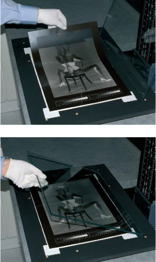
fig.6 In the darkroom, the digital negative is positioned, emulsion-side up, onto the paper and both are tightly held together by the weight of a thick sheet of glass. Subsequent exposure and paper processing are identical to analog contact printing.
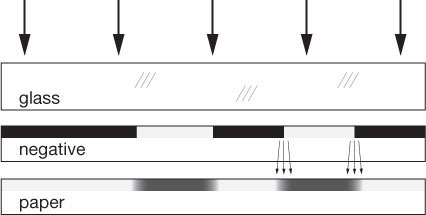
fig.7 Contact printing the digital negative emulsion-side up causes some light scattering and a welcome loss of clarity in the halftone pattern, without a loss of image sharpness. It also makes the halftone image more sensitive to skillful paper-contrast manipulations.
Exposure
Determining the ideal exposure for the hybrid print is greatly simplified by utilizing the right step tablet as an aid and process control. This step tablet was customized through the transfer function, and hence, it contains all required tonal values in smooth increments.
First, the enlarger light filters are set to a normal paper contrast of grade 2. Then, while making test strips of the step tablet, an exposure time is established at which step 0K still maintains paper white, but step 5K clearly shows the first signs of density.
Once the ideal exposure is found, record all enlarger settings and refer to them for other hybrid printing sessions. This can be done, because digital negatives have a very consistent density due to tightly controlled processes at the service bureau. This process stability can be alternatively checked, measuring the left step tablet with a densitometer before printing a digital negative for the first time.
Contrast
Well-designed transfer functions allow creation of digital negatives that easily print on normal-grade paper without the need for further manipulation. Nevertheless, there are always small process-dependent deviations while working in the darkroom, and to compensate for them, moderate contrast adjustments are sometimes necessary. Remember that halftone images are not very susceptible to paper-contrast changes. It will often take modest increments to see minute affects. Nevertheless, the ideal paper contrast is determined through a second test strip, using the ideal exposure found above, but altering the contrast until steps 95, 98 and 100K are still distinguishable from each other. Optimizing print exposure and contrast ensures that all tonal values, captured in the digital negative, are fully represented in the final hybrid print.
About Halftones
The history of halftone printing dates back to 1850, when William Fox Talbot suggested using ‘screens’ in connection with a photographic process. Several screen designs were proposed, but it took until 1880 for the first reproduction of a photograph to be published in the New York Daily Graphic by Stephen H. Horgan. Shortly after, in 1881, the first successful commercial implementation was patented by Frederick Ives. Prior to his invention, newspapers and magazines could not be easily illustrated with photographs, because publishers were limited to woodcuts, engravings or etchings, in order to include images into the printing process. Ives’s method, still in use today, was the first not limited to printing just black or white, but made it possible to reproduce all shades of gray. In 1992, Dan Burkholder rediscovered halftone printing for B&W photography, by using offset printing films as contact negatives. In 1995, he published his technique in a book called Making Digital Negatives.
Analog halftone printing is a reprographic technique that simulates continuous-tone images through equally spaced dots of varying sizes. In digital halftone printing, this is accomplished by creating varying bitmap patterns through equally spaced halftone cells. A single dot only represents one of two conditions; it either exists (black), or it does not (white). However, grouping several dots to a cell, organized as a matrix in rows and columns, provides the possibility of reproducing many different shades of gray. Fig.8 shows four halftone cells, all of which consist of the same 4x4 matrix of printing dots. By printing none, all, or only specific dots, a halftone cell of these dimensions can simulate 16 shades of gray plus white. A 12x12 matrix can represent 144 shades of gray, and using a 16x16 matrix allows for 256 different grays, which are more than the human eye can possibly differentiate in a photograph.

fig.8 Grouping several dots to a cell provides the potential of reproducing many different shades of gray. By printing none, all, or only specific dots of a 4x4 halftone cell, 16 shades of gray plus white can be simulated. A 12x12 matrix can represent 144 shades of gray, and using a 16x16 matrix allows for 256 different grays, which are more than the human eye can possibly differentiate in a photograph.
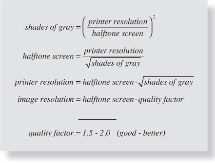
Unfortunately, combining several small printing dots, in order to form larger halftone cells, reduces the available image output resolution. To make things worse, the technique can only be successful if the cells are small enough, or seen from a sufficient distance, for the halftone pattern not to be resolved. Halftone screen rulings of 225-300 lpi satisfy this requirement, but this calls for relatively high digital image and printer resolutions. The image resolution depends on individual quality requirements and must be 1.5-2x higher than the halftone screen. The printer resolution, on the other hand, depends on the required shades of gray and must be 12-16x finer than the halftone screen. Fig.9 shows the mathematical relationships involved, which can be easily illustrated through the following examples.
Let’s assume that our service bureau is using an imagesetter with a maximum printer resolution of 3,600 dpi. If we prefer a very fine halftone screen of 300 lpi, we will be limited to 144 shades of gray. However, if we require 256 shades of gray, we are forced to reduce the halftone screen to 225 lpi. If we demand both, we need an imagesetter with a printer resolution of 4,800 dpi. And, using a 225-lpi screen, we can expect to get the best halftone print possible, if our digital image has a resolution of 450 ppi.
The development of the ideal halftone pattern for each cell is a rather complex mathematical task. We gladly leave this chore to the service bureau and their Raster Image Processor (RIP). It’s our job as photographers to make sure that we maintain the correct digital image resolution, and that we provide the service bureau with all the data they require to produce a high-quality digital negative for us. Then, we will finish our hybrid halftone prints in our dark-rooms, just as we do with our analog prints.
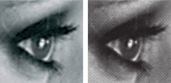
fig.10 These close-ups represent roughly 12x magnifications of their original images. Individual pixels can easily be detected in the monitor representation on the left, and the halftone pattern is clearly visible in the hybrid halftone print on the right. Nevertheless, one can get as close as 250 mm to the original hybrid print without detecting the halftone pattern with the naked eye. In relation to these magnifications, this is equivalent to a 3-meter (12-foot) viewing distance. Try to view this page from such a distance, and see if you can detect a difference between the two images.
The Copy-Print Process
How to get silver-gelatin prints from inkjet positives

This is a photograph of Layer Marney Tower, a Tudor palace dating from 1520, which was taken with a Nikon D200 and an 18-55 f/2.8 DX lens while planning a wedding venue. A medium-format Mamiya 7 would have been better for this image, but I made the most of the opportunity and prepared a toned silver-gelatin print via an inkjet-printer positive.
In ‘Digital Negatives for Contact Printing’, we introduced a precise and repeatable digital-to-analog process for the perceptual conversion of monitor images to photographic prints, using halftone negatives. This process has the remarkable property of being consistent between pre-press offset printers, and is also largely tolerant of paper characteristics, as well as exposure and contrast deviations. For these reasons, we are able to suggest accurate starting points for hardware calibration, which will work without modification for all readers who have access to this type of equipment or an old-style service bureau.
The recent expansion of digital printing technology has improved to a point that it competes with traditional offset printing, unfortunately resulting in fewer outlets for creating photographic halftone negatives. At the same time, consumer inkjet printers have become consistently acceptable for photographic color proofs, but their lack of performance in tonal purity, permanence, bronzing, compatibility with gloss paper surfaces and metermerism is significant enough to deter the discerning monochrome worker. These factors, together with a desire to have complete control over the reproduction process, have prompted many to consider using consumer inkjet technology on translucent media to produce large contact negatives. The limitations of inkjet technology are of little consequence when their output is used as an intermediate step on the way to a photographic print.

fig.1 Creating a silver-gelatin print from a digital file is done in several steps.
a) A monochrome digital master is prepared from the color original.
b) A matt inkjet copy print is made after a transfer function is applied.
c) A copy negative is made by photographing the matt inkjet copy print onto regular film.
d) The final silver-gelatin print is made from the copy negative with traditional photographic methods.
Process Overview
It turns out that a simple copy negative, made of an adjusted inkjet print onto regular film, is a viable alternative to a halftone negative. In practice, a large inkjet copy print of a digital master image is photographed onto monochrome film and the resulting negative is conventionally enlarged onto silver-gelatin paper. Since the photographic process compresses extreme print values, it is necessary to apply a transfer function to the digital image prior to inkjet printing to cancel out these tonal distortions and faithfully reproduce the original image. The copy negative can be on 35mm, medium or large-format film, depending on the intended grain and final enlargement size. Figure 1 shows the imaging sequence of the copy-print process from digital master to final print.
1. Preparing the Digital Master
A digital color original is first converted to monochrome, carefully manipulated and optimized in the photo-editing software, so that the highlight and shadow values are adjusted to recommended values. To achieve the best image quality, the digital master file is acquired and remains in 16-bit mode with sufficient resolution to support the intended print size. Assuming standard vision, an 8x10-inch print requires a minimum file resolution of 280 ppi. The monochrome digital master file is saved for later use.
2. Making the Inkjet Copy Print
Apply the transfer function, which has been previously determined by a calibration process, to the digital master file. The adjusted image is printed onto smooth, matt inkjet paper. The printer settings must be identical to those used for the copy print during the calibration process. Best results are obtained if all color management is disabled and a suitable media setting for the paper surface selected.
3. Making the Copy Negative
The matt copy print is pinned to a wall and photographed onto film, after ascertaining that the camera is square-on. The light level is determined by an incident light meter, but the film is overexposed by 1 stop. Then, the film is developed in the same manner and for the same contrast as in the original calibration process, ideally N+1.
4. Making the Final Print
During the calibration process, an optimum print exposure and contrast setting were used to obtain a final silver print. Our copy negative is now printed with these same exposure and contrast settings. Unlike the halftone process, however, further creative expression can be introduced with global or local adjustments to silver-print exposure and contrast, just as with any conventional negative.
The Copy-Print Process in Brief
1. Prepare Digital Master
2. Apply Transfer Function
3. Make Inkjet Copy Print
4. Photograph Copy Print
5. Develop the Copy Negative
Process Optimization
Excellent print results require careful consideration of the tonal accuracy within the entire digital workflow, a robust and repeatable method for copying prints onto film and an optimized film exposure and development. Also, the resolution of the digital master and all inkjet print settings must support the required resolution of the final silver-gelatin print.
Digital Master Preparation
1. Acquire 16-bit Image
2. Adjust Tonal Values
3. Scale Image to Inkjet Paper
4. Check File Resolution
5. Correct Image Sharpness
6. Create Canvas Margins
7. Add Process Controls
Tonal Accuracy
Successful digital editing considers the human perception of on-screen images and the mechanical production of digital prints. Although the plan is to use the proposed rendering intent in ‘Make Your Own Transfer Function’, we should be aware that digital editing is influenced by the human response to the appearance of the image on the screen. Human perception is adaptable, and the response to a displayed image varies in relation to ambient light levels, surroundings and emotions. To solely use the image data to determine tonality, is not a practical solution. The data can be used to set key image tones, but it is not the most reasonable proposition to determine local contrast settings for textured areas.
Effective digital editing is done in two steps. Tonal endpoints, as well as key highlight and shadow tones, should be adjusted first, using the image data in the info palette. This is followed by global or local tonal shaping, using visual cues and relationships. Visual editing requires a monitor that does not clip highlight or shadow tones and has a defined reproduction between them. If the final print does not convey the same brightness and tonality as the screen image, feel free to adjust the proposed rendering intent and the target densities for the transfer function to create your personal rendering intent.
Copying the Inkjet Print
On glossy and luster paper surfaces, dye-based inkjet printers can achieve remarkable reflection densities in excess of 2.4, which suggests a normal (N) development scheme for the copy negative. Unfortunately, these surfaces are difficult to copy without including unwanted reflections from surrounding objects and light sources. Fortunately, all inkjet printers also work with matt paper surfaces. This not only allows the use of pigment-based printers, but more importantly, it also removes many disadvantages, otherwise typical to copying prints onto film, including the sensitivity to unwanted reflections. Quite unlike for a standard copy setup, diffuse daylight is the most effective light source. It is feasible to copy a print with nothing more than a small mirror, a tripod, a few pieces of sticky tape, an empty wall and a large window on the opposite side. The mirror is used to ensure that the camera is square on to the inkjet print. With the mirror held flat to the wall and in the middle of the print, the camera is in the correct position when the lens appears centered in the mirror and the print fills the viewfinder.
Exposing and Developing the Copy Negative
The maximum reflection density (Dmax) of a matt print is approximately 1.5, which makes for a 5-stop subject brightness range. Such a low-contrast subject requires an increase in film development (N+1) or a boost in paper contrast to achieve a full-bodied print. An incident light meter is used, preferably with a flat diffuser, to determine the exposure and check for even illumination. It is prudent to increase the exposure in order to correct for the unavoidable and inherent exposure loss of close-up photography, and ensure that the darkest image values are not lost.
It is worth experimenting with the N+1 development scheme in combination with 0 and +1 stop exposure compensation from the metered value. Sufficient exposure will improve shadow separation, beyond which, print grain and resolution will deteriorate. Depending on the film emulsion, a hard print contrast and a normal negative contrast may produce a more pleasing result than the reverse arrangement.
Resolution
The copy-print process introduces two additional steps into the imaging chain with potential for resolution loss, associated with the matt inkjet print and copying it to the negative. To confirm that the resolution capability of the copy-print process is sufficient to support the requirements for the final silver-gelatin print, a high-resolution image of the USAF/1951 test pattern was printed on matt paper and photographed onto 4x5-inch Kodak Tri-X and medium-format Fuji Acros 100. The negatives were then printed at the same scale as the original test chart. In each case, short telephoto lenses were used at their optimum aperture for maximum resolution and sharpness.
The silver-print resolution, achieved with both films (fig.2), exceeds the required print resolution for standard observation of about 6.5 lp/mm. The Tri-X result is a little sharper, but the grain structure is similar to Acros 100, which is a result of the different enlargements required for the two formats. This represents the peak performance, and in practice, other printer hardware and image file resolution settings affect the final outcome.
1. Hardware Resolution
Every inkjet printer has a specific print resolution, measured in dpi, which is not to be confused with the image file resolution, measured in ppi. The image file resolution is adjustable by the user, depending on whether the image is to be being viewed on screen or as a physical print. Assuming a fixed number of image pixels, the higher the ppi setting, the smaller the printed image becomes. Some printers require a specific ppi to match their hardware dpi setting, others (principally inkjet printers), can use any image ppi, since the printer driver automatically scales the image.
Confusingly, inkjet printers spray complex patterns of ink, which defy any convenient theoretical resolution calculation (you can breathe a sigh of relief). Several ink blobs of varying intensity and sizes are required to define a single colored ‘dot’. Annoyingly, in a bid to outdo each other, print manufacturers often claim highly exaggerated resolutions that bear little relation to the actual print resolution of their products. These spurious numbers together with their complex printing algorithms, ink bleed and paper surface effects, just to form an ink dot, utterly confuse the issue. To make matters worse, many inkjet printers have higher resolution in one direction than in the other. As a result, the user can change the file ppi setting prior to printing and in some cases change the printer ‘dpi’ setting, in a printer control panel, to produce an effective dpi that matches neither number! Suffice to say, in practice, all modern photo inkjet printers achieve sufficient mechanical resolution as long as their highest hardware resolution settings are used for this process.
2. Image File Resolution
A relationship between the image file resolution and print resolution is required to determine the required file ppi setting. Similar to the physics of digital capture, a printer, when laying down ink on paper, requires about 67 ppi per lp/mm to assure that line pairs are printed with 50% contrast, but only 53 ppi per lp/mm to print them with 10% contrast. For example, an inkjet print can resolve 5 lp/mm in all directions using a 300 ppi file setting, confirming a similar ppi and lp/mm relationship to that established for digital capture. Fig.3 shows the measured print resolutions for various image ppi settings and 10-50% contrast. These test prints were made with a high-resolution inkjet printer, which was specified as having a fixed 2,400 × 4,800 hardware dpi setting.

fig.2a The final print, made from the 4x5 Tri-X copy negative, achieved a resolution of 6.5 lp/mm, which is only slightly less than that of a traditional contact print.
fig.2b A silver-gelatin print, made from a medium-format Acros 100 negative, achieved a similar resolution and grain structure to that of Tri-X on 4x5 sheet film.
If an image file has sufficient resolution for a standard print, it can be used to make larger prints by deploying the image pixels over a larger area with a corresponding reduction in print resolution, assuming a proportional increase in viewing distance.
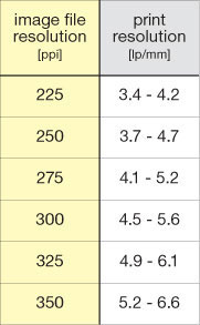
fig.3 During the printing process, the image file resolution is converted by the printer into the actual print resolution. The measured values, shown here, were obtained from a high-resolution inkjet printer, which are in line with our standard viewing requirements at minimum viewing distance. However, this printer is able to produce a resolution of up to 10 lp/mm.
Making a Transfer Function
A halftone negative simulates minute tonality differences, as found in continuous-tone images, through a series of equally spaced dots of varying sizes, which makes it remarkably tolerant of variations in paper exposure and grade settings. The copy-print process, however, is not as tolerant and requires the user to make an individual calibration for each choice of material and process setting. Nevertheless, the calibration method proposed in the appendix under ‘Make Your Own Transfer Function’ creates very accurate transfer functions for any workflow from digital image to final print. The following calibration process, outlined in the following steps, is an example of the method proposed in the appendix. It assumes a consistent darkroom operation and uniform negative and print processing, because it manipulates the inkjet copy print to account for the tone reproduction in negative and final print. The calibration compares the target densities to the actual output densities, in order to produce a close match between the on-screen image and the final print. The resulting correction or transfer function consists of 15 pairs of input and output values, from white (0%) through to black (100%). The transfer function is a curve, which can be saved and applied to other photographic images, prior to printing the matt inkjet copy print. The creation of the transfer function assumes the use of a digital step tablet, which is available from our websites or can be constructed easily with any suitable drawing software.

fig.4 The inkjet calibration print on the wall simulates a matt copy print to be captured onto roll-film. The camera is set up square to the wall, and the exposure is determined by an incident light meter. The same setup is used for copying the actual inkjet copy prints. Diffuse daylight is the most effective light source for copying matt surfaces. When copying inkjet prints, ensure the lens is set to its optimum aperture, and use all the available techniques to reduce camera vibration.
Step 1 Inkjet Calibration Print
Open the digital step tablet and make an unadjusted inkjet print, selecting the software options to ignore color management. This print should be on matt paper and use a matt paper media setting to avoid over-inking. Ignore if it has a color hue or a tonality, different from what you may have expected. The print is allowed to dry and is hung on an evenly lit wall.
Step 2 Calibration Copy Negative
Set your film camera up opposite and perpendicular to the inkjet calibration print and make two exposures, one using an incident light reading at the effective film speed and another giving 1 stop overexposure (see fig.4). Develop the film with N+1 development. The resulting increase in negative contrast helps to avoid needing extreme contrast grades at the printing stage, and gives some freedom for further manipulation in the darkroom. In general, any film can be used, but it is of benefit to select the same film as for other direct silver prints in your collection. That way, a homogeneous exhibition of prints can be achieved. After calibration, store the negative, as it can be used for subsequent calibrations with other silver-gelatin paper.
Step 3 Silver-Gelatin Calibration Print
It may take several attempts to make a silver-gelatin print from the calibration copy negative at an exposure and contrast setting that just shows a full range of image tones from white to black. Note the contrast setting and metering method for later use. For films with an extended toe region, the overexposed negative may be more suitable. A typical silver-gelatin calibration print, as shown in fig.5, exhibits a high midtone contrast as well as blocked highlights and shadows.
Step 4 The Transfer Function
The transfer function must compensate for the tonal deviation that the inkjet copy print, the copy negative and the silver-gelatin print process introduce into the copy-print process. The relationship between the target densities of our personal rendering intent and the actual output densities of the silver-gelatin calibration print provides a direct measure of the compensation required, and it is the basis for the transfer function.
Take the calibration print and, using a densitometer, find the patches closest in value to the desired target densities. Interpolate the values if necessary, and list the actual percentages in the output column of a table similar to the one shown in fig.6. The values are then entered into the imaging software, appropriately labelled and saved for later application (fig.7). The transfer function will most likely resemble an inverse S-curve (fig.10), reducing midtone contrast and increasing highlight and shadow contrast.
Final Optimization
A close look at the curve of the silver-gelatin calibration print in fig.7 reveals a dramatic change in contrast between the tonal extremes and the midtones. As a result, the tonality of the silver print is sensitive to digital highlight values and print exposure. To identify potential problems and provide data required to tune the transfer function, it is useful to print a small step wedge on the margins of the matt inkjet copy print (shown in fig.1), which is used to verify the consistency of the inkjet printer and our darkroom work.

fig.5 This example of a silver-gelatin calibration print has noticeably compressed highlight and shadow tones, as well as high-contrast midtones. A little care is required with print exposure and contrast settings to ensure a full range of tones. In this case, an ISO(R) value of 75 proved sufficient, together with a negative developed to (N+1) contrast.
fig.6 Using the calibration print and a densitometer, the patches closest in value to the desired target densities are determined. The actual percentages, achieving target density values, are listed in the output column. A template for this table can be found in the appendix.
fig.7 This sample ‘Curves’ adjustment dialog box in Adobe Photoshop shows a transfer function, correcting for my particular printer, film and darkroom setup. Although your settings will most likely differ, the overall shape of the curve will be very similar, as it is determined by the general characteristics of inkjet, film and paper. This transfer function is applied to the digital image, just prior to printing the inkjet copy print onto matt paper. As you can see, with my setup, the highlight contrast must be increased by about 500%, the shadow contrast by about 200%, whereas the midtone contrast must be reduced by about 60%.
Comparing with Other Processes
The copy-print process successfully combines digital and analog photography. What follows is a brief comparison with alternative digital negative techniques.
Halftone Negatives
It is interesting to look back on our two distinct methods to create a silver-gelatin print from a digital file. In the case of the halftone negative (fig.9), we have a very repeatable and robust method. It resists later manipulation to some extent but requires available imagesetter facilities, which are getting increasingly harder to find these days. The process requires planning and careful execution to ensure the final silver-gelatin print has the required size and tonality. On the other hand, the copy-print process is more flexible, in that it produces a traditional negative on film and can be manipulated conventionally in the darkroom. This convenience comes at a price, because it requires greater rigor at the inkjet printing, copying and developing stages to ensure accurate tonality.
Inkjet Negatives
Following in the footsteps of Dan Burkholder and others, I also evaluated the application of full-size inkjet negatives for contact printing (fig.10), to create a fine-art silver-gelatin print from a digital file. In common with other respected photographers, we were unable to consistently make convincing silver-gelatin prints from an inkjet negative. Unlike alternative print processes on coated matt paper, silver-gelatin paper has a very high resolution and shows the smallest negative detail or imperfection, which is lost when making inkjet prints. During our research, several clear and white plastic substrates were tried and ultimately rejected as a suitable material for inkjet negatives.
Contact prints from clear film show obvious evidence of its mechanistic origin, revealing regular inkjet dots and mild banding (fig.11a), even if the printer head is perfectly aligned and ink-nozzle are at peak performance. The same issues are present, but to a lesser extent, with translucent white plastic film (fig 10b). Although its diffusing properties disguised the inkjet dot patterns if properly clamped, in practice, the smallest gap between the facedown negative and printing paper degrades the print resolution to less than acceptable levels (fig.12). Also, white inkjet films work best with large-format dye-based printers, which limit the maximum transmission density and require a high-contrast setting, further accentuating the inkjet-negative limitations.

fig.8 the two copy-print process imaging paths
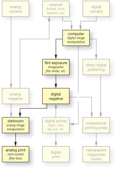
fig.9 the halftone-negative imaging path
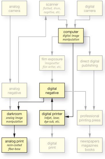
fig.10 the inkjet-negative imaging path

fig.11 In the magnified scan of a contact print, which was made by using a clear inkjet film (a), vertical banding and individual inkjet dots are clearly visible, especially in the midtones. The vertical banding was greatly reduced, but not completely removed, by using white inkjet film and applying some pressure through the weight of a thick glass cover (b). Another scan of a silver-gelatin print, made by using the copy-print process (c), proves that this technique successfully masks printer issues such as ink dots or banding. The combination of a matt paper surface, ink dot gain and negative grain disguises all hardware issues.
fig.12 These magnified scans of contact-printed, silver-gelatin prints demonstrate the typical resolution performance of inkjet-negatives, resolving up to 8.0 lp/mm in a) and b), if lightly clamped between the paper and normal picture glass. Relying on the weight of the glass alone, as in c), caused negative and paper to be close but not touching in all areas, resulting in a blurry image and lost resolution. Even with clamped glass, it is not uncommon to have uneven sharpness.

fig.13 This table summarizes and compares the performance of two inkjet-negative methods with the copy-print process, showing superior gradation, repeatability, flexibility and permanence by making regular film negatives from adjusted inkjet prints.
It is also difficult to make prints from inkjet negatives with smooth tonality in highlight regions. Digital imaging systems are optimized for positive images and have about 5x more tonal resolution in highlight than in shadow areas, to match our eye’s ability to discriminate print tones. When one considers an inkjet negative, one needs the opposite by requiring fine tonal discrimination in high-density areas.
With each trial, the copy-print process produced a silver print with superior gradation to that of an inkjet negative print, especially in the highlight regions, and all signs of the mechanistic properties of the inkjet printer vanished, masked by the inclusion of film grain and the print qualities of the matt inkjet paper. Fig.11c demonstrates this with an enlarged scan of a silver print from a Kodak Tri-X negative. Unlike the images in fig.11a-b, this print exhibits normal film grain and no signs of its mechanistic origins.
Final Thoughts
The copy-print process is the most tolerant and practical method to make fine silver prints from digital files with a variety of inkjet printers, inks and media (fig.13). The extra steps involved introduce a mild resolution loss, but it is insufficient to impact the perceived resolution of a print at the normal viewing distance. Additional sharpening of the original digital image can compensate the mild softening. In cases where a portfolio is made from a mixture of classical and digital images, the lack of telltale inkjet dots and the presence of film grain disguise the reproduction process to create a homogeneous body of work with other conventional silver prints.
Although this copy process requires additional materials, matt inkjet papers cost significantly less than plastic film, and the resulting conventional negative allows final images to be printed at any size and classically manipulated under the enlarger. A hidden benefit is the realization that A4 inkjet printers have sufficient resolution for critical silver-gelatin print resolution after they have been copied. Furthermore, these negatives can be archivally processed, stored conveniently in standard negative filing systems, and the matt copy prints discarded. By using the same film stock, the appearance of the final print can be made so it is virtually indistinguishable from a conventional print. Although digital halftone negatives can produce high-quality prints, their lack of grain is a clue to their origin, unless, that is, you are really ingenious and add it artificially to the digital image file.
Review Questions
1. Which of the following is true about exposure?
a. panchromatic film is evenly sensitive to all colors of light
b. matrix metering is equivalent to spot metering in the Zone System
c. very long exposure times do not follow the reciprocity law
d. underexposure can be compensated with overdevelopment
2. What is the best way to photograph a high-contrast scene?
a. take an incident reading to average the contrast range
b. expose normally and decrease development
c. increase exposure and decrease development
d. set the meter to a higher exposure index
3. Which of the following is true about film exposure latitude?
a. film has very little overexposure latitude
b. film has several stops of overexposure latitude
c. latitude does not change with exposure
d. latitude does not change with development
4. What is the purpose of pre-exposing film?
a. adding shadow detail to the negative
b. increasing overall negative contrast
c. increasing highlight separation
d. avoiding reciprocity failures
5. How can I tell that a negative was underexposed and overdeveloped?
a. the rebate numbers are very faint
b. impossible to tell before making contact sheets
c. it will print better on a harder paper
d. shadows are too weak and highlights are too dense
6. Which of the following is true about unsharp masking?
a. it can rescue an underexposed negative
b. it increases apparent print sharpness
c. it cannot be used to rescue excessively high-contrast negatives
d. it only works with large-format negatives and special equipment
7. What is the benefit of hybrid printing?
a. it combines the advantages of analog and digital technologies
b. it does not require a darkroom
c. it is the fastest way to make a print
d. it is a low-cost alternative, but it affects print longevity
1c, 2c, 3b, 4a, 5d, 6b, 7a